Transcripts
1. Welcome!: Alright, check this
out, everybody who doesn't love a happy, excited, cuddly cute dog. In this course, we're
going to paint one with a completely free
software treater. This is a follow along
digital art process that you can enjoy in Windows, Mac, Linux, or even
an Android tablet. You're going to learn how
to use this program from an experienced artist and paint in this really cool and
versatile art style. But here's the twist. The
interesting part about this. Honestly, I'm not a huge
expert on painting dogs. I've painted, like,
one or two good ones in my career as an artist. Maybe three if you count
the scrabble as a dog, which you shouldn't this
is actually perfect, because the focus of this
course is going to be, how do you approach a
subject that you don't know? You don't have any technical
knowledge about it. You haven't painted a lot
of similar things before. How can you still make it work? You know, it would be kind
of lame if I, the teacher, just painted something that I've practiced 100 times before, and you try to follow me
because there will be many things that I
don't even think about anymore and just
do subconsciously, and you'd never be able to fully understand what I'm doing. So in this course,
I want to go in the complete opposite
direction and tackle a new subject
together with you. I'm going to show you my
process that allows me to paint new things without having to make
studies all the time. And I'll tell you exactly what I'm thinking during each step. Those include finding
a good reference, breaking it down
and sketching it, blocking in colors and shapes, using Creta's amazing
brushes to create detail, and even adding your own personal flavor
without messing it up. So I think it'll be fun. We're going to break
it down, so you can do this project in multiple
days if you want. Doesn't have to be all in one sitting if you're
scared of that. And yeah, regarding the
software, we're using Creta, as I've said, and I'm
going to give you a quick overview for
it before we start. So even if you've
never used it before, you can participate here because the software is not
too complicated. By the way, I'm
Duple your teacher. I'm an experienced artist
and designer from Germany, and I am a huge
proponent of Greta. I've been using
it for many years to paint impressionist
landscapes, abstract artworks, make logos, and web graphics,
all kinds of stuff, because the software
has so many options and the best brushes
in the game. Aside from that, I
really like thinking about and developing
art and design theory. So my courses are always
littered with little tips and tricks that are applicable beyond the current project. At least that's
what I try to do. Now, our use of Krita is going to be quite
minimal in this course. We're only using simple functions
like brushes and layers because I want to focus on the actual art approach
with a project. So if you have a computer
and a drawing tablet, there is nothing
stopping you from downloading Creta
and joining me. It runs on any operating system. It costs nothing, and you don't even have
to create an account. It even works on Android
tablets, as I've heard. So there you go. Ladies and gentlemen, if you're interested, I invite you to join me in the first lesson. See you there.
2. Krita Overview: Okay. Welcome, everybody,
to this little course. In this lesson, I'm
going to show you the basics of using Creta. So if you're already
familiar with this program and you're
just here for the project, you can move on to
the next lesson. But let's say you're
starting from zero and you don't know what
any of this is about. Well, the first thing
you got to do is go to rita.org and download
the installer for your operating system. Then just open it up and
click through everything. The installation process
is really quite simple. And once you've installed
it, you can open it up, and you should end up on
this start screen here. This is what you see by default every time you open up Krita. So if you can see this,
you've done everything right. Now, right here, we
can enable some news about updates and stuff.
I don't really need that. And you can view your
recently edited documents. You can just click them
and continue working. But yeah, this is probably empty for you if
you're new to this. And then on the left, we
got the important stuff, which is making new images
and opening up images. You can open up pretty much any image file in Creta,
and it will work. But let's click on New Image. Then we get this little
window where we can define a few attributes
that our image will have. So things like the
default background color or the number of layers, and we have a few
templates here. But I'm usually just worried about the resolution
and the image size. So the format of the image and its dimensions and the quality, which is, of course,
also very important. But right here for this demo,
it doesn't really matter. So let's just set it to
something like thousand by 1,000 or ten ATP,
like right here, and then we can
click on Create Evo, this is the user
interface of Krita. This is what you
see all the time when you make digital art. Nice. Now, it might be a
little bit confusing at first, but it's actually really simple. And if this looks any different
for you, don't worry. You can adjust pretty much everything about
this interface. But here is what we
want for this course. First of all, you want to be
able to see your tool bar, which is probably
on the left side. There we can select all
these awesome tools that Krita offers us. You can slide here
to change its shape, and you can right click on this tool bar in order
to change the icon size. I think like this, it's
pretty cool with two columns and size 32, but it's up to you. Then on the right
side, it gets a little bit more complex with
multiple dockers. I have the color selector really important than the layers which we're also going
to use in this course, and down here is
the huge selection of brushes that Creta offers us. Now, here's the thing
about these dockers. You can put them pretty
much anywhere you like. So you can drag this
color selector and put it up here or
change the size. That's possible
with every docker. And if any of these dockers
are missing for you, go to settings, dockers, and there you have an overview
for the different options. So these are the
ones that I have active and the ones that I
recommend for this course. Make sure you also have
these dockers and put them somewhere where you
can quickly access them. I think this right
here is pretty close to the default interface. If you're happy with your
arrangement of Dockers, which is called a workspace, you can also save it
by clicking up here. You can type in a name for your current arrangement
and then save it. So you can always
return to this point. Mine is called Duplos standard. So if I select
anything else here, the interface changes
or I mess up something, I can just always return on this button and click
on Duplos Standard, and then I'm back
to my comfort zone. So, yeah, that's very useful
to know for the start. You might also be
interested in checking out the different themes by clicking
on settings and themes. And there you have a
little selection of different color
schemes for Creta, but honestly, I pretty much only enjoy Creta darker, so that's
what I'm working with. But yeah, once again, you can choose what you
prefer and look around a bit. Alright, so much about
the appearance of Creta and adjusting
it to your liking. The first practical thing
you should be able to do in Creta is navigating the canvas. The canvas, by the way, is
this white box in the middle. This is where you
can put the paint, where you can use the tools, and the thing that you will
save as an image later on. You can zoom in and out by
pressing minus or plus on your keyboard or alternatively by scrolling on your mouse, which I find way more practical. You can move the canvas
around by holding down your space bar
and then clicking and dragging or alternatively
by holding down your scrolling wheel on the mouse and then just
moving your mouse. I definitely prefer navigating
the canvas with my mouse, so I always have it right
next to my drawing tablet, and I'm switching back
and forth between the pen for drawing and
the mouse for navigating. But yeah, there are
a couple options. What's also interesting
is that you can rotate this canvas to the
left by pressing four, rotate it to the right
by pressing six, and neutralize it
by pressing five. Might seem weird, but
it actually comes in handy in a few
different situations. Alright, so you should
get comfortable with your way of
navigating the canvas. You do it all the
time in digital art. So yeah, just try it out a few times and make sure
that works for you. Then let's move on
to the functions, what we can actually
do with Creta. For that, let's start
up here at File. Of course, you can save your
documents or export them or open up another one and edit multiple
documents at once. Then we have all kinds
of options for edit, view image, layer select. Most of those are not
really important here. We are going to
use some filters, I think, maybe one or
two in this project. But yeah, you don't need to know about all that stuff now. But what might also
be interesting is settings and configure Creta. You can change a few
more general settings like about the performance, the shape of your color
selector, and stuff like that. If you have
performance issues or your drawing tablet
doesn't work or something, then you might want to look into this and change a few settings. But you can also ask me, and I'll try to come back to
you as soon as I can. Alright, so this is how
it basically works. You have all kinds of options,
all kinds of stuff here. Most of that you can
figure out if you need it. But the core of
it is, of course, still using the
tools and functions. So let's start with the
most important one, which is the brush tool. If you click on this
icon right here, or you press B for brush, then you have the brush tool. And this is how you
can draw and paint. If you have the brush tool selected and you click and drag, you are performing digital art. Great. The most
important settings for that are the brush
that you've selected. If you click on any brush here, then the paint that you drag on the canvas will have the
shape of that brush. You can change the size of
your brush by sliding here. You can change the
opacity by sliding there, so your brush strokes will
be more dense or more light. And you can, of course,
select a color on the color selector by
sliding on the circle to change the hue or in this triangle to change
saturation and value. So that's cool. If you want to remove all the paint
on your current layer, you can press delete,
and it's gone. Or you can select an
eraser as a brush, which are these ones with
a transparency pattern. And if you don't like what you've changed about your brush, then you can always
click on this icon here to reload the
original preset. Alright, then what's
absolutely essential to know in digital art is
how to undo and redo. You can undo any
action by pressing Control C and redo any
action that you've undone by pressing Control Shift C. These are important
hot keys that I use so much that I've actually mapped them to buttons
on my drawing tablet, so I don't have to use
my keyboard for that. And this is something that
I generally recommend. If you have any buttons
on your drawing tablet, map undo and redo to them, which you should be able to
do in your tablet software. So this is the core
action of digital art. You select a brush, you
put paint on the canvas, and you change the size,
opacity, and color. And if you don't like it, you can use an eraser and remove it or you press undo. That's it. By the way, you can
access these options as well by right clicking
with your brush, and there you have this
quick access window. There you can also
select the color, opacity, size, brush, all
that important stuff. I don't use it too often, but many artists wear on it. So yeah, maybe you like to work that way. Keep it in mind. So this is basically how you do 99% of your digital painting. It's just navigating the canvas
and putting paint there. Nevertheless, I
should probably also show you some of
these other tools. For example, this line
tool with which you can drag straight lines that also have the shape
of your brush, and the same applies for
these other shape tools like the rectangle tool, the circle tool, and these
other ones that we don't need. In any case, you can always view the tool options for these. If you go to this
tool options docker, you can activate it
under settings and dockers if you don't have
it and put it somewhere, and there you can, for example, set it to fill with
foreground color. So your circle is filled with a foreground color
or stuff like that. But for digital painting, this is really useful. It's mostly for design, and that's not what
this course is about. What we are going to
need, however, is layers. Layers are like different
overlapping work spaces that you can independently edit. For example, if I
paint this line here, then this is on paint layer one, as you can see, on
the layer docker. And if I want to
make a new layer, I can click on this plus and
then paint another line. Let's make it in a
different color like that. And then you can independently
ddt these layers. For example, with this
transformation tool with which you can move them
around or change their size, and as you can see, it only
works on this one layer. If I want the other
layer, then I have to click it on
the layer Docker, and then I can edit that one. So this is how it
basically works. And I can tell you
already, it's very, very useful to separate
different parts of your image by putting
them on different layers, so you can independently
make adjustments. This is a huge advantage
of digital art, so we're going to make
use of it in this course. Then we have some
more tools like this gradient with which
you can drag a gradient over the canvas and this
color picker tool with which you can click on any color on your canvas to select it. But this tool is basically obsolete because you can
always with your brush, hold Control and then click
in order to select a color. And that's just way faster than first selecting this tool. Then we got the fill
Bucket tool. Very simple. You can just fill
the whole layer with the selected color
just by clicking. And down here are
the selection tools. Selections are the
last big thing that you need to
understand about Creta. So here's how it works. If you select an
area, for example, with this rectangular
selection tool, then you can only draw and
paint inside this area. So yeah, that's basically it. You can undo any selection
by pressing Control Shift A. And yeah, you have these
different options for different shapes of selections
like circular selections, free hand selections or also selecting a specific color
on the canvas with this one. Here we go. This is basically
everything you need to know to start
making art with Creta. Of course, there are many
more smaller options or different ways to do something that I've described
here that I'm not going to go over here because I feel like it's just
wasting your time, but you can always play around
with this program and find out potentially useful or
just interesting things. You should also do that if
you're not comfortable yet navigating the canvas or using the basic tools
that I've shown. Just make a few
documents, save them, maybe experiment with layers, put some paint there, put some shapes there,
move them around, and edit them, and maybe also experiment with
these brushes and see how they react
to pen pressure because that can also
be quite interesting. But, yeah, that's on you. If you feel comfortable with
these main functions, that's an excellent basis to start making an actual artwork. So let's go.
3. The Setup: Before we get started
painting our dog, we need to set up a few things. First of all, let me make clear how you should participate
in this course. What is the ideal way to do this project
together with me? Well, we're going to make a digital painting of
a dog from reference, which means you should have your software on your main
screen or your tablet. But also, you want to look at both my course and
the reference. And there are a few
different options for this. For example, when I'm
making a digital painting, I always have Creta on my
main monitor and I pull up my references on my second monitor that
is right next to it. And I could also switch
back and forth between a tutorial and the reference
on my second monitor. So that would be ideal, but you don't necessarily need that if you don't have
a second monitor. You can also watch my
course on your phone or even better a tablet that you set up right next to
your single monitor. That's a great option.
And I'm going to show the reference in my course
in the corner like that. So it's going to look like
this during the course. So you can look at the reference while you look at my course. However, it would be ideal if you could view this
reference bigger. This is pretty much
just a backup if you're too lazy to set it
up in any different way. But I believe it would be way more productive for you if you, for example, printed
the reference out so you can just
see more detail there. And if you have a choice between a bigger screen and a smaller
screen like your phone, for example, I would always put the reference on
the bigger screen. Because here's the
deal. If you paint, you want to look more at
the reference than at my painting and my course
because our main task is, well, paint the dog
from reference. And this might seem obvious, but many people actually get this wrong about
online courses. Yes, you want to
watch my process, listen to my explanations,
and my tips. But as soon as you pause
to do a step yourself, you want to turn
to the reference and not my course anymore. That is the crucial point here. If you see me sketch
the basic shapes and explain something
about it and you pause, then you don't want to look at my sketch and try to
recreate that sketch, but you should look at
your reference and try to sketch the basic shapes as you
see them in the reference. I'm just giving you
an example process, and I'm telling you
what you should do and what order and
what you should focus on. Use my process as orientation for what you should be
doing step by step, but don't use my painting as a reference for
your painting. That's basically all
I'm trying to say here. Because you can
actually get stuck, and you have to rely on digital art processes
or tutorials or courses every
time you want to make an artwork. And
I don't want that. I want to enable you with this course to
make art yourself, to be able to choose
any reference you like, break it down and recreate
it in your interpretation. That's the goal. So if you see me use a certain
type of brown, don't try to pick the
exact same brown as me. No, you learn nothing that way. But ask yourself, why does
Duple use this brown? Okay, he said he's looking for the average color
of the dog's feet. So you look for the
average color of the dog's feet in your reference,
and then you use that. And who knows? Maybe your brown is even more accurate than mine. That's the whole point here. Alright, I think you get it now. This is just how you can extract the most value out
of this course, and that's what we want, right? So make sure you're able
to see the reference as big as possible
and always watch a bit ahead to see me
complete a step of this project and see what
I have to say about it, and then do it yourself by
looking at your reference. So, yeah, it could also be an option for you to
switch back and forth between the course
and the reference on the same screen. Maybe
that works for you. There are also programs
like PUREf that let you overlay a reference over a certain window
on your computer. You can check it
out if you want, but I don't personally use it because I
have two monitors. Yeah, get yourself set up
comfortably before we start. But the way we're
going to look for that reference together
in a different lesson, where I tell you a few tips
what I'm looking for in a reference and where I'm looking for references
and all that stuff. So yeah, just keep that
in mind until then. This lesson was maybe a bit abstract and just me rambling, but it's going to get a lot more simple in the
practical part. I just feel like too
few art teachers actually talk about this
issue. So here we go.
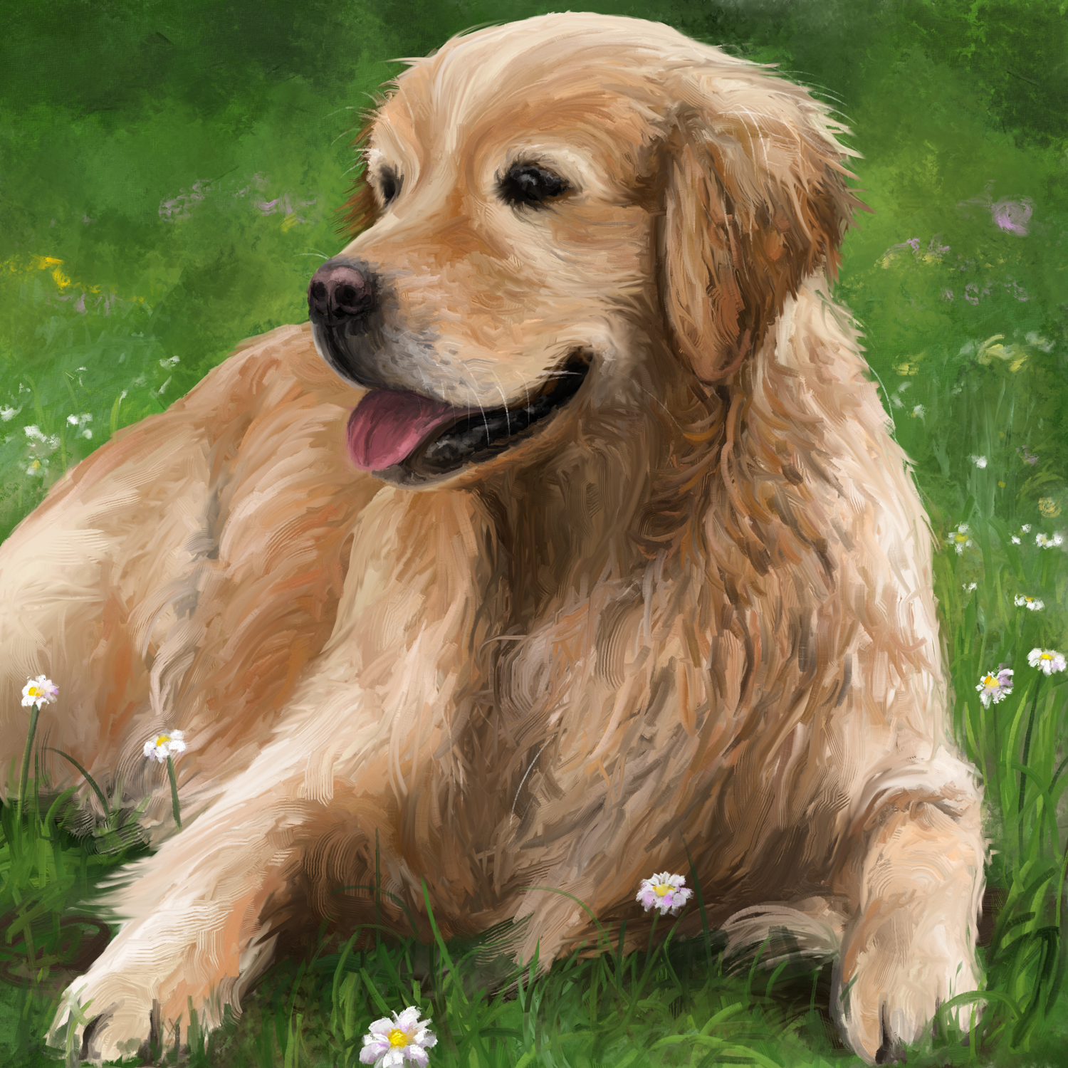
4. The Reference: Ladies and gentlemen, let's have a look for a
beautiful reference. I know it might seem unnecessary to you because you've probably already seen what you're
going to paint in the course thumbnail
or the intro, but me right now,
I don't know yet, and I want to take
you with me through the whole process of
making an artwork. And that starts well, at the very beginning
with finding out what you want to
paint in the first place. So yeah, maybe you can
already learn something here. So, I want to paint
art dog today. Dogs are cute.
Everybody likes dogs, and they are a very
fun subject to paint. So I think it would be cool
to make a little course about painting a dog to get more
people into digital art. That is my first vision here. However, I'm not very
experienced with dogs, so I'm going to
need a reference, and I look for a
reference that I can replicate without
thinking too much. I don't want to construct a unique composition in
this case with combining multiple references
or using lots of art theory to find the right arrangement of
the subjects and whatever. That's something that I do
in some of my other courses, but right here, let's keep it very simple and
beginner friendly. Still, I want our painting to
have quite a bit of detail. So I'm going to look for
a reference that has high quality where you can
see everything clearly. And because that's all for
now in terms of ideas, I'm going to go on
the world wide web to a place where I can find many
high quality references. For me, that place is usually
paxels.com or pagesaby.com. On these stock photo sites, you have pretty much unlimited
images with no copyright, and they've been uploaded
by actual photographers, and they're not
just indexed from random websites like
the Google Images. So if you want a clean, high quality depiction
of a simple subject, I highly recommend you
these two websites. Obviously, if your search
gets very specific, then you might find
just more stuff with a standard search engine. But for something generic
like in our case, dog, this is perfect. So let's type in dog on pexels.com, and
let's see what we got. I pretty much only want a dog
with nothing too complex in the background and ideally
very simple light conditions. Usually, I'm a big fan of extreme light conditions because I like impressionism and I like exaggerating light effects and sunsets with high
contrast and stuff like that. But I think it would
be too difficult here to pick the correct colors. Let's keep it chill with
something like this, maybe. As you can see, if you
click on any image here, you can scroll down and you
will find similar ones. So if something looks close enough to you but not quite it, then don't ignore
it, but click on it. I mean, this right
here is quite good, but I ideally want to
paint a bit more of the body as well and
not just the head. So maybe how about this one? That's a very cute dog. We have a well, very
high quality image. That's awesome. We have a simple background
with only grass, so it's gonna be easy to paint. And also we have very
simple light conditions, just a little bit of
shadow on the bottom, but that's pretty much it. The only thing that's
bothering me about this is that it's not central. You see the dog is pretty
high up and we got this unnecessary bit of
blurry grass at the bottom. So perhaps this
would look good as a square image where we
leave all of that out. You know what? Let me just download this and open up Creta, so I can make a few
adjustments to this reference. You don't have to follow me yet. Don't worry. Now, you could open up your reference in Creta and just adjust it with a crop tool, but I'm going to
make a square image right away and fit the
reference into it. So new file 2000 by 2000, that's going to be big enough. And then I'm going to pull
the reference in here and insert it as a new
layer. Here we go. Now I'm going to use the
transformation tool that I've shown you to move the reference
around and adjust it. So like this, it's a little bit too narrow to fill
out the whole square, but there are a couple of things that we could
do about that. For example, we could
fill this empty area on the right here with a
solid color like that, so we could just expand the grass in our painting
so it would fit. However, that would
mean that the dog is a little bit off center,
and I don't want that. So maybe we can just make the dog layer bigger so
it fills out everything. Let's hold down
shift while we drag this corner to keep
the proportions. And okay, let's move it down. And, yeah, now it fits, and the dog fills out
pretty much everything. We have just a tiny bit of empty space around
it with the grass. Usually, empty space is
really important in art, especially if you have
multiple elements interacting with each
other in a composition. But right here, we have
a central subject, single depiction of one dog, and I think it's fine like that. So yeah, let me save this as reference and as a standard
image file like PNG or JPEG. So we can open this up with a simple image viewer
while we make the artwork. Alright, I'm going to put
this reference that I've just edited down in
the course resources. So you can download
it right now. Or if you want, you can also go through
this whole process yourself by following
my path on pexels.com, finding this image, then
importing it in Creta, and cropping it and whatever. You can do all of
that for practice, or you just download this
ready made reference. It's up to you. Now, what is the takeaway
from this lesson? Well, it's a little
insight into what I'm thinking when I'm
preparing an artwork. I think it's really useful to think about many factors when, for example, selecting
a reference. You see, I thought about the art style in which
I want to paint, the background, if it's
simple or complex, the lighting, if I want to
make it difficult for myself and maybe make something more
exciting or very simple, like right here with
just nice textures. And of course, I want you
to be aware of the fact that you can always
adjust your references. So you don't have to look for the absolutely perfect image on the Internet that you can
replicate one by one. But if you open up
your mind to imagine what you could possibly change about references that you see, you'll suddenly see a
lot more possibilities for what you could
do as an artist. Right here, obviously,
it was very simple. We just scaled the reference a bit and adjusted the format. But you can do so much
more if you want, if you use the basic
tools of Creta, you can mirror a reference, you can adjust its colors,
if you don't like them. You can even combine
multiple references to construct a
unique composition. The creative part of digital art already starts with selecting a reference and imagining how you could adjust it to
your personal needs. So make sure you got the
reference, and let's move on.
5. The Brushes: Okay, one last thing before we move on to the
practical part, you'll have to download
some brush bundles. Brushes, as you
hopefully know by now, are these things in Creta
that you can click on, and they change the way you're applying paint to the canvas. And there are many pretty
nice brushes in Creta, as you can see, they all react very differently and in kind
of a unique way often. But, ladies and
gentlemen, in my opinion, the best ones are not
in Creta by default, so you'll have to download them. There are these things called brush bundles that are
basically collections of custom brushes that other artists have
kindly created for us. And I've added the ones that I'm currently using to
the course resources. So download the file that says something like Duples
brush bundles and then save it somewhere on your computer where it doesn't annoy you, but
you can still find it. Those are the two most
important criteria. Because once you got
them, you can open up Creta and go to settings, manage resource libraries, and there you can manage
your brush bundles. For example, you can
import the ones that you've downloaded and
let them show up here. Mine are already there, but
I'll have to activate them by clicking on each and then
clicking on Activate. And yeah, this is
basically how it works. The brushes should show
up in the brush list now, and we'll have a
lot more options to apply paint in
beautiful ways. Obviously, we're
not going to use 100 different brushes
in our painting. I mean, these are
quite many now, but it definitely doesn't hurt to have more brush bundles, and I just want that you have the same options as me
when we make the artwork. If you want, you can look for certain brushes by
filtering for a tag here. For instance, we've downloaded the Mimi Leo impasto brushes
that I found just last year, and I've already used
them so many times. These brushes are
absolutely amazing, and I'm pretty sure
that we're going to find a use for them
in our artwork. As you can see, they make these beautiful
painterly brush strokes, and they even automatically mix the paint like
it's real impasto. As you can see, if you scribble with different colors
next to each other, you have this
really cool effect, and all these brushes have a
slightly different texture. So yeah, download my brush
bundles, import them in Creta, as I've shown you,
and perhaps you maybe want to even get a little bit of
practice with them. You can just take 5 minutes and click on different
brushes here, maybe the new ones that you've imported and just play
around with them, see how they react to
different pen pressure and to different colors. And a, that would
be a great basis. So if you're ready,
let's finally move on to the dog painting and start with a simple but effective sketch.
6. Sketching: Okay, everybody.
I hope you're all ready to start with the artwork, and let's get right into it by making a new image in Creta. Actually, let's make it a bit
bigger than the reference. So 2,500 by 2,500. That way, we'll be able to
see some very nice detail. If you really want, you can also make this a different
resolution, but it has to be a square. Then you're all good. So here
we have our nice document. And the first thing I want to do is go to the layer Docker, double click on paint Layer one, and rename it to sketch. This is really important,
so we're able to paint underneath our sketch and see
it while we are painting, but also to be able to
deactivate it later on. You know, we don't
want any scrappy pencil lines on our
beautiful painting, but we need them nonetheless to know where everything goes. So let's select a
nice sketching brush. The best ones for that are
usually these pencils here, but my personal favorite
is always this one, this pencil for soft. With it, we can make these
very smooth and thin lines. Look at that. Oh, that
was a pretty good circle. It's usually not super important which exact
sketching brush you use because they won't be visible in the final
painting anyways, but I can highly
recommend you this one. So this is the basis
for our artwork. Whenever you feel like saving, save your artwork as a
Krita document like this. Click on Save and then select the file type Krita document. That way, you're going
to keep all your layers. And that's really important if you want to be
able to continue. Alright, that's everything
you need to know. So let's pull up the reference
like that and get started. The first thing I'm always
looking for in a reference is the big shapes
and the big lines. We want to divide our
image into smaller parts, smaller shapes that we can then divide into
even smaller ones. So we first want to recreate the big shapes as
accurately as possible. You want to think like
this, for example, the head is an ellipsis
that is this far away from the left edge and that far away from the top edge, and I'm going to make it a
bit easier for myself here by just creating more of these
edges for orientation. So let me divide this image into four equal parts
using the line tool. If you hold down shift
while dragging your line, you can make it perfectly
horizontal or vertical, and we want one of each. Apply just a little
bit of pressure on your drawing table
because these lines should be very light. Okay, maybe a bit more
to the right like that. These lines are going to help us to position the big lines and shapes more accurately and therefore make the
artwork look better. And let's see what are the easiest things
that we can draw now? Well, the back of
our dog comes out at pretty much exactly the
middle of the left side. So let me draw this angle
here, how I see it. That should be quite accurate. Then the dog's head is about this far away
from the top, I think. And it makes a little
curve like that. And the ear is about this far away from the
right side, I think. So let me indicate it
with a line. Very likely. So this is how I usually
proceed when making a sketch. I'm first looking
for the easy parts. So something like
the horizon line or the center line or if we
have anything like that. Right here, a defining
characteristic of the composition is definitely the big circle
that makes our dog's head. So let me try to draw it in an appropriate
size and position. This is definitely
going to take a few attempts because I'm just drawing free hand and
not with a circle tool, which you can also
use in a sketch, but I don't know, I like to
practice making circles. So yeah, this is maybe not
the most beautiful circle, but it looks like the head of our dog in the right place.
So that's what we want. And now that we have the circle, we have one more object for orientation where
the other stuff goes. So now I know that the top edge of the head goes
something like that. So let me scribble
it very lightly. And on the right side,
the head connects to the ear in a downward
line like that. Let me also indicate a few
of these hairs already. And then it goes down and it comes back up
about here into the head. Looks pretty good,
so I'm already intensifying these
lines a little bit. Then what would also
be quite easy to do is the right side of our dog because we can always measure the distance between
the right edge and the edge of the dog. It gets a little bit more
narrow as we move down here. And then comes the foot
approximately like that. So yeah, when making a sketch, we're basically just measuring
the distance between the big shapes and putting our best guess on the canvas
with very light lines. And it doesn't matter
at all what you're painting or what the
anatomy of that thing is. If you just look at
these big shapes, their differences, and their
distance between each other. Our dog is just one
big wacky shape in the middle of green that consists of smaller
wacky shapes. If you make a mistake,
it does matter. Just draw over it and
remove the lines that you don't want anymore
in eraser mode, which you can
activate by pressing E. You can see the closer you are to
the edge of your image, the easier it is to
estimate the distances. So this is usually where I start working when I'm making
a sketch like that, just scribbling the
outside edges like that. I'm also drawing very quickly
and dynamically here, just to put many
lines on the canvas. This feels better to me
when sketching than drawing slow and precise lines because I can kind of feel the shapes better when I'm drawing quickly, especially when they
are round shapes, and we got quite a
few of those here. It doesn't matter if you make your sketch in the
exact same order as me. You can also start
on the left side and go counterclockwise or
something like that. But I just want
you to be aware of what you're trying to
do when sketching. You want to make a skeleton of your artwork so you know where to put all
the paint later on. It's not about making a beautiful line art
where no lines go slightly outside or you have too many different scribbles
next to each other. You just want to know
where are the big shapes, and where should I put
my paint later on? Right here, as you can see,
I've procrastinated on the face because I think that's
the most difficult part. But now I have more other
shapes for orientation. So let me start with the chin. And for that, this middle
horizontal line is very useful. And always check if the
differences between the shapes that are already
there are roughly correct. So look at your reference and estimate how big
the difference is between the ear and the mouth and the mouth
and the middle line. And if it all kind of works, then you're on the right track. Sometimes when it's very
difficult, like with his nose, you just have to
invest a few attempts and undo with Control
C until you like it. Okay, and now as
we've drawn the head, it also becomes obvious
how it connects to this part on the left side that we sketched
at the very start. This is the nice thing
about sketching. It's very hard in the
beginning, usually, but you just start with the obvious shapes and the
obvious lines and distances. And then as you keep going, it clears up more and more. So I think this left side of the dog looks
especially accurate. In order to estimate
the proportions, it makes sense to zoom
out once in a while. And yeah, you can see I'm intensifying the lines
that I already like. Now, for the eyes, I'm
especially careful because I know that those are
really important factors. If the eyes are off, it's
just not going to look good. So I'm trying to measure as many distances
here as possible. So the distance between
the ear and the eye, between the top
part and the eye, between the mouth and the eye, and this is where I
think it should be. Maybe it could also help to indicate some of these
color differences in the fur here just to have more reference points for
the right proportions. Actually, now as
I've intensified some of these lines
and I zoom out a bit, I noticed that the head
is not quite right. I mean, it's okay, so I'm not going to erase it
with the eraser, but if I could just shift the shapes a little bit,
that would be awesome. Luckily, there are a few
options for that increta. So look at this
method for a second. I'm using this freehand
selection tool here to select the area that I
want to shift a little bit. So this left side
of the dog's face Just like that, just
go around all of it, and then I have it selected. Then I can press
Control C, delete, and Control V to copy, delete and paste this
area onto a new layer. And then I can use the
transformation tool here to transform this layer
and therefore shift the shapes of this area
that I want to fix. So maybe like that,
you can see I can slightly rotate this, and it's always helpful to zoom out to measure the proportions. And yeah, I think
that's not quite it. So let me undo all of that
and re select this time, including the ear as well. Then same thing once
again, copy, delete paste, and then we can perhaps rotate the whole head
a little bit like that and squeeze it
together just a tiny bit. When you're done with a
transformation like that, you can press Control E to merge your layer
with a layer below it, so you have everything
on one layer again. I think the grand proportions
are pretty good now, so I'm just intensifying some of the best lines and then maybe shifting the whole
layer a bit to the right. So these are tools and
functions that you can use to make your sketch
as accurate as possible. Always measure the distances
between shapes that you can see in your head and check
if they're roughly correct. Before moving on to
the painting part, I usually like to clean up
my sketches a little bit. That means I'm going
over it in eraser mode, and I'm erasing all the lines
that I don't quite like, and I replace them
with more clean ones. In sketching, it often happens that you just have many lines. And when you're painting,
you pretty much only want to use the best ones
for orientation. So let's make them as
clearly visible as possible. Okay, I hope that you understood
this sketching process, and your dog looks something
like this in the end. Remember, if something
looks totally off to you, just use the selection tool
to select that area, copy, delete, paste it
onto a new layer, and then you can perhaps
transform it into a better version of it with
a transformation tool. This is, of course, not only the head,
like I did it here, but it could also
be just the foot or the body of the dog or something
like that. Does matter. If you use these basic tools
well and you take your time, you can sketch pretty
much anything. You just have to break
it down into shapes, constantly measure the distances between them in your head, and put your best guess on
the canvas until you like it. And I would really not make the sketch any more detail
than it is right now. Too many lines could be
confusing when you're painting. You just want to indicate the important shapes that have a lot of difference to
their surroundings. So the bright dog in the middle, to the grass on the sides, the colored tongue,
and the dark chin, these things should be
outlined in your sketch. And if it looks something
like this for you as well, then save it with Control
S. And then I would say we're totally ready to add
some paint to it. Let's go.
7. Blocking in Colors: Okay, I hope you all have
your sketch ready because now comes the real deal
of making a painting, which is adding the paint,
who would have thought. And yeah, let's just
start practically. In digital art, the
best way to add paint, in my opinion, is to add
it underneath the sketch. So we can still see the
sketch while we're painting, but it doesn't interfere
with anything. So let's go ahead and make a new layer underneath
the sketch layer. For that, let's select the
background layer and then click on this plus icon to
make a new layer above it. I'm going to double
click and call it grass because that's the first thing that
I want to paint. So now let's try to find the average color of
our background grass. It doesn't have to
be 100% accurate, but it should be as
close as possible. In order to do
this economically, let's use the fill Bucket
tool and just click. Yeah, that's not
quite it, I think. Maybe like that. Okay, if it's just a bit more desaturated,
I think it should work. Alright, that's a good basis. So I'll go ahead and
make a new layer above the grass layer called dog because that's
the only other thing we got. So let's select a
brush with which we can nicely block
in some colors. And I'll go with this one. Mm eo one brush, flat tip. That's a good one. I know it very well, and, yeah, it's quite versatile, so I'm going to use it
for this artwork. But before we start
with the painting, let me make the sketch layer a little bit less
opaque by selecting it and then sliding the
opacity around here, I think. And then we can switch
back to the dog layer. Nice. Let's do the same thing
once again for the dog. What is the average
color of the whole dog? Once again, look
at the reference and not which color I'm picking, but I think it could be
something like this. So let me scribble a
little bit with this, and, yeah, I think I'm going to fill the whole dog with
this color first. I painted a bit
over the edge here, so let me use this
selection tool, select that area,
and then delete it. And then let's keep
going. Just scribble and fill out the
whole thing with the average color that
you think the dog has. This is always a great way
to start your painting. By the way, I'm first
making my brush very big to fill out
everything in the middle. But I'm leaving a little bit of empty space on the sides
on the outlines of the dog because I want
to make the brush a bit smaller for that so
we can be more precise. You see, now I can just
make the brush a bit smaller and be more
precise at the outlines. And this is also
why I like reducing the opacity of my sketch
when I'm painting. If your sketch is
at 100% density, it's not easy to see where all your paint starts and stops. But still, it doesn't have
to be super precise yet. We just want to block in the basic colors that
we can see one by one. I Okay, now we have the
dog in one color. And the next step
is to divide it into two colors for the
next layer of detail. We can, for example, divide it into light parts and dark parts, and this is pretty light. So let's block in
some dark parts. What is the average color
of the dog's shadow parts? Let's look for that. Could
be somewhere around here. So let's make the brush bigger again so we can just roughly block that in and try to
recreate those dark shapes. Okay, maybe it's a bit
more on the red side. So it's dark around here at the neck and also the
ear is pretty dark. So let's follow the
sketch at that point. And then here on the right side, the foot and the bottom. I'm just quickly blocking in all these dark parts where I see them in the sketch. I
mean the reference. So in the middle, we have kind of a mix
between dark and bright, so I'm not filling this out,
but just scribbling a bit. And then we got something
on this foot, as well. Okay, this should be
it for the dark parts. So let's look for the next
division that we could make. And yeah, our dog
has some mitons. You see, there is a
lot of difference between the dark and
the bright parts now. So let's try to
look for a color in the middle and kind
of connect them. So that's about here, I think. And then let's just block that in everywhere where we see it. You will see that this
is an amazing brush. It varies both its size and opacity as you vary the pressure
on your drawing tablet, and it mixes with the paint
that's already there. So it kind of reacts
like real oil paint, and that's so awesome. If you just look
at these values, these dark parts,
and bright parts, and try to blur them in, it almost starts looking
three dimensional already. Okay, I would say that's a
good first layer of detail. So let me switch
to another thing that's quite easy to do, and that is blocking in those
black parts in the face. They are also pretty distinct. For that, we use
black, of course, but also let's make
the brush a little bit smaller so we
can be more precise. And then let's just add this nose and this
mouth, these black lips. And then the ice with
an even smaller brush. And this is so easy if
you have a good sketch. Then we also have
a little bit of black between the nose
and the lip like that. And after that, let's
immediately move on to the tongue because that's
also clearly visible, and we can just block in this
average color that we see, which should be
something like this. Let's just paint that
beneath the sketch. It's literally just coloring
the lines at this stage. Nice. Now we can move back
to the dog's fur texture, I would say, and just add
another layer of detail. So let's go back to brown, maybe make it a bit
more saturated, and then try to find these
more defined shadow areas. Don't worry too much about the texture of your
brush strokes yet. You still just want to put the right colors
in the right place at approximately the size that you see them, if
you can understand that. But I already try to
go a little bit in the direction that the
fur grows with my brush. So if the fur grows
sideways in a place, I paint more sideways. If the fur goes down,
I paint downwards. This just feels so intuitive to you as an artist if
you paint lots of fur or also trees and
stuff like that to kind of mimic the direction of the shapes with your brush. But I think many beginner
artists don't know that yet. So try to paint how
you would pet the dog. I think that's a good analogy. Just follow the
direction in which the fur grows with your brush. Just block in the most common
average colors of this dog. You can see if I deactivate
the sketch layer, it already kind of
looks like a dog. In the end, we of
course, want to deactivate the sketch
layer altogether. So it makes sense
to just click on this eye icon once in a while to just see where
the artwork is going. As you get a little
bit more detailed, you also notice that you have to shrink your brush a little bit in order to still be able to recreate the shapes that
you see accurately. But I would say you
should not make it smaller than 50 pixels
in this lesson. We first want to put all the basic colors
where they belong. You see, I'm mainly using very big brush strokes in
order to achieve that, and I'm also painting
very dynamically. Of course, for some
finer sections like this gray around the nose, it's okay to make
the brush a bit smaller and paint
a bit more slowly. But we still want to
follow the same principle. Just block it in. By the way, it
doesn't really matter that much in digital art,
what you paint first. In traditional art, you should usually start with
the background, so the sky usually or the ground, depending
on what you paint. But in digital art, with these layers, you
have the freedom. You don't have to always paint above the stuff
that's already there, but you can also
paint behind it. So there is no strict rule for what you should paint first. But be aware you
always want to work in these layers of detail
like we're doing it here. The first brushstrokes of a
painting will always be ugly. That's just a
timeless rule of art. So you just have to
start and push through, and it kind of
unfolds as you go. Start really easy
with one color, then two colors, then try to mix in a third color and
just keep going like that. Don't think about any details, just colors and shapes
and work layer by layer. If you're able to just
think in colors and shapes, it doesn't matter at all
what you're painting. I'm not thinking, Oh, let me paint an ear
here, but I'm thinking, let me paint some dark, desaturated brown here that's slightly underneath this
more saturated brown. It's just colors and
shapes. Nothing else. And also, I've deactivated my sketch at this point
because I already have quite a lot of paint on the canvas that I can
use for orientation, but you can still have it on
for this lesson if you want. I think this would
be a reasonable goal for this lesson to
put enough paint on the canvas that you don't need the sketch anymore to
distinguish the different areas. No more and not less. Just use this beautiful brush to define where are the dark parts, where are the bright parts, and how do they connect
with each other. A When your dog looks something like
this like a dog, then you've done
a very good job. This is always the first step
of making a great painting, just blocking in all
the basic colors. So when you're done, save it, and let's dive a bit
deeper in the next lesson.
8. Painting smaller Shapes: Welcome to the next lesson. Right now, we are at a
very interesting point of making a painting because
we have many options now. All the stuff that
we did until here, like sketching and
blocking and colors, that's a process
that you can follow pretty much always
in the same way, and it will work out as a
great basis for an artwork. But as it gets more
detailed and you put on the brushstrokes
that the viewers will actually see in the end, you have a lot more options. So what we'll be doing
from now on will be a little bit more specific
to our painting. But let me explain more about
that while we're doing it. So let's just start.
I've told you that we want to work
in layers of detail. That's not going to change
throughout this course. So a good way to progress
through your painting. Remember this is
to always look out which part is lagging behind
in terms of detail now. And in our case, that's
definitely the background, which is just one color. So let's go back to
the grass layer. We still just want to block in the basic colors as we've
done it for the dog. And for that, I think this brush would be fitting quite big. Choosing the right
brushes is something that unfortunately just
comes with experience. There is no trick or anything. You just have to know
them and use them. But the ones that I'm
showing you in this course are ones that I use very often, and I can highly recommend them. Every brush that you use in Creta is kind of a
new learning curve. So you should definitely not use too many brushes
in the beginning, but try to understand the ones that you're
using very well. So just follow me, use the
brushes that I'm using. And yeah, I think that way,
you're on a good path. With this one, as you can see, we can make a nice blend of different colors into
a chaotic texture, and it kind of goes in the direction of the grass that we can see
in the reference. It definitely takes a few layers to get this looking good. But we just want
to make a texture of slightly different tones of green that approximately looks like in the reference
in terms of color. Again, don't worry too much
about texture and detail yet, but just about the colors
and where they are. Okay, I think like this,
it's pretty right. So let's add another layer
of detail to the dog, of course, on the dog layer. And I would say still with this brush, it has
served us well. I want to start in the face with these lighter hairs,
and for that, I'll make the brush quite a bit smaller. Now look
how I'm doing it. I'm doing the exact
same thing that we've done last lesson just
on a smaller scale. Now we have quite
a few colors and shapes on the dog as
reference points, so we can divide them into
slightly smaller ones, and we can zoom in a little bit. So just look at your
reference a little bit more closely and put the right
colors in the right place. You can see I'm still trying to follow the direction in which the hairs of our dog grow
with the brush strokes. I'm making them long and thin, so they look like fur
a little bit more. Once again, I recommend
that you start in a place where
you're confident. So the top of the head
is quite easy here, I think, and the ear too, because it's very chaotic, so it's not super important which exact color
every place has. Around the eyes, however, I'm trying to be a bit more precise, and I'm making my bras
strokes a bit shorter. Don't forget to zoom out once in a while to check if the
proportions are still right. Sometimes adding a new layer of detail can throw
things off a bit. So never stay zoomed
in for too long. When making a digital painting, you could lose track of
the grand composition. As you can see, the face
is especially tricky, and I'm working with very
small brush strokes here. Y. It might take you a few layers
to get it right. Like right here, I'm
making the whole thing darker again because there are too many bright
brush strokes. Also on the ear.
Actually, putting many layers of paint on
the canvas over each other can look really
cool if you do it right. It gives you this very rich
and busy look in the end, and I always find that very interesting to look
at in digital art. Here's the thing about
this layer of detail. We're still not putting on the final texture for this dog. This layer serves the same
function as the last one, just on a more detailed level. It's a definition where the colors are at their
approximate size. If we do this well,
then we'll have many options in the end to create a more fine tuned texter, maybe with multiple
different brushes. But this right
here is the basis. I mean, we can continue
working like this and make a final texture with
this exact brush, but then we'd have to be a bit more careful than right now. Also, it might be a bit boring and you don't learn
as much if we just do everything
with one brush. We could do it, of course. I mean, it's a really good one, but we have so many options in digital art that I want to highlight something
special in this course, because I've decided to go with a painting technique that many artists don't use,
but I really like it. So let me spoil what we're going to do in the next lesson. We're going to use
blending brushes to create a really smooth and
beautiful texture out of the colors that
we're adding right now. So here we are basically just preparing by putting the
colors in the right place. And in the next
lesson, we will blend them together and
create awesome detail. Sounds weird, and maybe
you don't know how, but you're going to like
this method, I promise. And it's actually big enough friendly because
it allows us to be a bit more chaotic right now at this stage of the painting. We just have to be a bit more patient and finish
this layer of detail. You can clearly see how dense my different
brush throats are. So make sure your dog
has the same level of detail when we're
done with this lesson. And there really isn't that
much else to say here. Just divide the shapes that
are already there into slightly smaller ones by looking between your
painting and your reference. I'm still painting
very dynamically here, especially the fur, because that's a chaotic
texture anyways, and it just looks better if you paint those fast and
with confidence, no matter if the brush
strokes are super accurate at the end, at
least in my opinion. You see this fur
in the middle here is very chaotic and dynamic. So let's try to mimic that
with our bras strokes, so we get this more
natural feeling to it. I think that's always
a good way to do it. So let's add a bit more
detail to the chin. And then the lip a little bit. It's probably like that. And the nose with
very low pressure. There is a colour transition
from gray to white to brown. So if we apply low
pressure here to blend those colors together,
it's got to look awesome. And then I'm moving back down to the fur and just
scribbling with different colors to create
this texture. Don't worry. There is no exact rule for
what you should paint first. You work in these
layers of detail, which means that you first give the whole artwork
about the same detail before you move on
to the next one, and you always start
with a part that you think is the easiest that
you want to paint right now. I think that helps usually. Right here, you can
see, I'm not quite happy with the whole
color of the dog. So I'm going over it
with a bit brighter, more saturated brown on the ear, on the head, on the nose. And I think we also
need some of that color down here on the
fur and the foot. And then let's give
the whole thing a bit more contrast by taking
care of the shadow parts. I'm still painting mostly in the direction in
which the fur grows. This is just the best
way to do it for these organic subjects,
in my opinion. But still, this is not
the final texture, so it's fine if you
paint a bit differently. In the next lesson, when we
use the blending brushes, this is going to
be more important. Alright, you will notice as
you paint more and more, how you're better able to tell where all the
colors and shapes go. The more you paint, the more
reference points you have, and the more
everything clears up. But still, let's stay patient here and create an
awesome texture. Don't rush. I think patients may be the most
difficult part about art. If you break it down,
every single brushstroke is really a simple thing. You just have to make them and a good amount of them until
anything starts looking good. Just take your time. Don't
worry too much about whether it's detailed enough or the
colors are exactly right. We can easily fix all of
that in the next lesson. Just look at the colors in your reference and their
approximate shape, measure them with your eyes and put your best guess
on the canvas. Okay, I think the
whole thing needs a bit more brightness.
Just like that. You will probably
get a good feeling for this particular
brush at this stage. While in the
beginning, it always feels a bit weird
to use a brush. If you make a nice little
painting like right here, you already understand
it a lot better. And a layer of detail like this definitely already
counts as a painting. Not a super fine tuned one, of course, but we're
still doing a lot. Don't forget that. So, yeah, this brush should
start feeling more and more comfortable
to you as we move on. It's so awesome and versatile
that I'm sure you'll be able to use it in many more situations
beyond this course. Really good for
blocking in colors, but also merging them
and painting textures. And yeah, it has a
lot going for it. Let's add a bit more
detail to our tongue. It has this little shadow on it, and then a few highlights
at the bottom. I'm leaving out the
dirt because I think nobody wants to see that
in the final artwork. Don't shy away from
changing things. If your reference doesn't
portray exactly what you want, a reference is more like a tool to use than a
guideline to follow, as I always say, use a
reference for help to make your artwork look more realistic and to know where
everything goes. But if you want to change
something, go through it. It would be boring if
we as artists just recreate reality
exactly one by one. We got photographers
to do that job. I'm pretty sure we're going
to find something to add to this artwork in the end.
That's not in the reference. All right. So in the end, your dog should
look something like this with this level of detail. No clearly defined shapes, no sophisticated texture, all the colors put approximately
where they belong. If you got that, let's move on and bring some order
to this chaos.
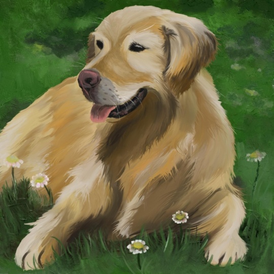
9. Creating the Texture: Ladies and gentlemen, welcome to the fun part of this course. Our fairy friend
has taken shape, but he looks a bit
messy right now. So let's take care of that. We are going to create
the main texture of our dog using
blending brushes. Blending brushes are an amazing and underrated tool
in digital art. So I hope that you'll get
it in this lesson and see the possibilities to use
them beyond this course. Without further
ado, here they are. Blending brushes are all
these white ones in Creta, especially this blending
knife is one of my favorites. And here's the deal.
With blending brushes, you cannot add any new
paint to the canvas. You can only manipulate
the paint that's already there on the
layer that you're on. Like this, you can see I can drag this paint around
with this knife, and it always takes the
color that I start on. Maybe watch me paint first and explain a few things
before you start. Let me just make
this a bit smaller, and then you can see with
this blending knife, I can just scribble
back and forth to create these blurry lines
with these peaks at the end, always with a color
that I click on first. This also works with transparency
like on the ear here. I can drag this
nothing from outside in if there is a bit too
much brown and vice versa. I can pull this brown outside to expand the dog and create
some of these hairs here. And, yeah, this is
basically how it works. It's definitely something
to get used to, but once you get it, this opens up so many possibilities
for your art. Right here, we basically want to scribble back and forth over the whole dog to create the fur texture with
this blending brush. So we have these overlapping
lines that together make a really detailed
and smooth surface, pretty much automatically. Like with almost all brushes, you can merge the
colors together more smoothly if you apply low pressure on your
drawing tablet, or you can drag the colors more aggressively if you need it
when you apply high pressure. Then you can create
these long hairs. We still want to look at
the reference in order to determine where we
should pull this paint, and now it's really
important that you follow the direction in which the
fur grows with your brush. I'm starting at the
head once again, but it's also fine if you
start somewhere else, especially if you're not used
to these blending brushes and just want to experiment,
start on the body. There is more chaos anyways, and you can't do
that much wrong. So feel free to begin. It might take you a bit to get used to this method of painting, but it's very adjustable. You can mess up everything
with this brush, but you can also fix everything. So don't be afraid,
scribble back and forth on this fur and
see how it reacts. I recommend you set
your brush size to something similar to mine, maybe even a bit bigger. Otherwise, it's
going to take too long to complete this
layer of detail, and we still want to be able to see these individual hairs. So if you make them too small, it might not work as well. Just drag the paint around and try to understand
how this works. You can see on the ear here, I'm scribbling back
and forth a lot because the ear is quite
complex in terms of texture. The awesome thing about
these blending brushes is that you don't have
to select any color. You can just manipulate the
ones that are already there. So if you need more
orange in a place, you just go to an orange bit that's nearby and
you drag it out, just like I'm doing it here on this ear with all these colors. Look at your reference
to determine how long you should make
your brush strokes. Where there are shorter hairs, you make them shorter
and paint more quickly. Where there are
longer hairs like on the ear or the fur on the body, you can make longer
brush strokes and add a few more curves to them because with these
blending brushes, we can basically simulate
the hairs of our dog, and this is going to result in a very natural texture that's pleasing to look
at if we do it right. I Now I'm moving a bit more down to the body. For that, I'm making my
brush a bit bigger because, like, bits of hair are also bigger there,
you know, the shapes. But I'm still painting
pretty freestyle, just wherever I feel
like it's necessary. So I might go back to
the ear for a moment or the face and just do
everything bit by bit, slowly expanding this beautiful texture
over the whole thing. If you don't follow the direction in
which the hairs grow, it's going to look really
weird with this brush. So this basically forces us
to understand this dog a bit better and get a feeling for these organic shapes
of which it consists. This blending brush style
is especially good for, I think, solid but
organic shapes. You know, you wouldn't
use this for foliage. It's kind of hard, and
you wouldn't use it for static structures
like buildings. It's too chaotic for that. But stuff like branches and tree trunks or ground
like sand, snow, and earth, but also
faces and skin, and, of course,
all kinds of fur. These blending
brushes are amazing for that once you get behind it, and now you can also
see why we just put the colors in the right place
in the previous lessons. That was the preparation
for these blending brushes. All we have to do right now is patiently pull
this paint around. This is why I think it's beginner friendly to
paint in this style. You first have this blocking
in colors part where you measure the shapes
with your eyes and you roughly throw
in some colors, and then you create
the fine texture by blending them together. It's a really relaxing process. You just have to take
your time and do it well. I don't forget about the reference and use
it for orientation, but I would say it's
fine at this point if your painting diverges
from it a little bit. Just one last instruction
for this stage, you want to aim for
visual consistency. The density of brush strokes
with this blending brush should approximately be
the same on the whole dog. So you don't want any part that's significantly more
detail than another. Obviously, in some places, there are more different colors interacting with each other, like on the ear, so you will have a bit
more detail there. But in general, you should
try to make it consistent. Many beginner artists start super detailed in one
place and take their time, and then they lose
patience and just scribble back and forth a
few times in another place. And this leads to
visual inconsistency that's not very nice to
look at in an artwork. So treat every place the same, take your time and
look at the reference, just like I'm doing it here. Alright. Now, here we go. I've taken care of
the whole dog and created a dense texture
with his blending knife. It already looks
pretty detailed and relatively consistent,
so that's what we want. But I think it would
be cool to mix in another texture just to
make it more interesting. So I'm switching to
this blending brush, this other knife, and just lightly drag the paint
in a few places. You can see it still
works basically the same, but it results in a
very different texture with these parallel lines. I'm applying very low pressure, and I'm just adding a few of these bros strokes everywhere to give the texture more life. Once again, aim for
visual consistency. So if you add some of
these brush strokes, add them everywhere at
approximately the same density. And make sure your
brush strokes go in different directions
for optimal chaos and business in the fur. We don't want to fill the
whole dog with this new texar, but just a few strokes like
this will work wonders, because then we'll have
quite a unique texar with different
elements within it. That's always cool to have. M. All right. I would say that's it for
the blending brushes. You should understand quite
well how they work now and be able to create an equally
detailed text rob with them. Just like that. If you got this, save your artwork
and then let's make a few adjustments to it
in the next lesson. H.
10. Finetuning the Subject: Okay, now, look at this. We've already made quite
an impressive artwork, only using simple tools
and a bit of patience. In this lesson, I want to
go over the dog's texture a little bit and see if I
can make some adjustments. Notice that it's not necessary
that you follow me in this lesson one by one if
you're happy with your dog. I'm just going to show
you a few methods to improve something like this and explain what
I'm thinking when fine tuning. Look at
this, for example. I often like experimenting with filters a little bit,
not just in the end, but also during the process, because there are a
few filters that can be applied that if
you then paint over, create a really cool
mix of textures. In Creta, you have all
these standard filters, but I want to go to start GMC QT or however
you pronounce that. This is like an
advanced filter engine that gives you amazing effects. Under patterns, you
can find this canvas and especially this
canvas texture effect, which I really like. You can play around
with these settings, but I'm just going to hit Apply to see how it works
on the grass layer. These filters usually take a bit longer to load
than the normal ones. But then you can see
this cool texture effect on the layer that you're on, just a little bit, but I think
this is interesting here. You can, of course, do the
same thing on the dog layer. Let me demonstrate
it real quick. But I think our
blending brass texture on its own is a
little bit better. So I'm going to undo this. Maybe you want to apply a
filter like this, as well, but if you do, I
recommend you do it only on the grass
layer, the background. Filters on the main subject can often look a
bit too artificial, but it's just another
thing to be aware of. They can spice up your painting, so it always makes sense to experiment with these
filters once in a while. Alright, then I was not super successful in creating detail in the face with my
blending brushes, so I'm switching back to the original brush to make a
few adjustments to the nose. I definitely need a bit more
saturation here, a bit red. If your colors are totally
off in some place, of course, it doesn't make sense to go over it with a blending brush, but you just have to add it. And this is how you
work more and more when you progress through
a painting like this. It becomes more and more specific what you
need to change, so it becomes less
and less structured. The part where you
go like, Alright, just blocking the colors
everywhere is over. Now we have to make
our own decisions, what we want to improve
and how we do it. So if you're totally happy with your dog's texture and you're afraid to touch it, that's fine. Just watch me anyways, and maybe you'll find something
you want to do as well. I often, after applying a texture with a blending
brush like this, go over the whole
thing again with a paint brush and add
paint where I need it, which is often the details
like the face here. I'm just going to fix the nose and the face with
this paint brush. Also, there has to be a
bit more brightness on the bottom lip. Maybe like this. And a little bit on
the eye, I think. Then I'm trying to compare
the fur texture once again to the reference to find out where I can change
something about the colors. And I'm just blocking that in. So the ear definitely needs
a bit more dark brown. Let me just put that on there just like in
the lessons before. And now, as I've painted
over with a paint brush, I can make the
texture consistent again by switching back
to the blending brush. Then we can blend
these new colors in with the old ones like
nothing happened. Easy. And yeah, this is how you
make adjustments to your artwork when
painting in this style. You can always, if you think you need it after looking
at your reference, add some paint by
blocking it in, and then you can blend it into the texture with
a blending brush. It's quite a fun
process. Try it out. So for me, the fur definitely
needs a bit more work, some shadows, some
saturation, some more detail. However, I want to
go a bit further and bring this texture
to the next level. So I'm not blending in
all the new brushstrokes, but I'm trying to
make some of them in a way that I can
just leave them. You see, we already have a textur that consists of
two different brushes, the two blending brushes. So if we leave in marks
from a third one, it might make the whole
thing even more interesting. That's a matter of
personal taste, though. You can also just blend in all your brush strokes with the blending brush to
create a uniform texture. But I prefer to have
this chaos with three different types of
brush strokes in one texter. Some blended in with
the blending brush, some with the other, and
some just put on there. Then again, it becomes important that you focus on
visual consistency. You don't want to
separate your dog into different parts
where one part of the fur is only paint brushes and one part of it is
only blending brushes. No, if you use
different brushes, use them everywhere equally
to get this consistent, chaotic texture that's
pleasing to look at. I Okay, here's another thing you can do. If you press Control
Hue in Creta, you can open up this color
adjustment window. I love it. There you can play
with hue, value, and saturation, the three
basic properties of color. So you can make your
whole layer more intense, less intense, darker or brighter or more blue
or something like that. Look closely at your reference to determine if you
need some of that. Personally, I think I was just a little bit off with
a hue when painting. So I'm shifting the whole
thing a little bit more towards yellow and I'm
making it more saturated. Just a tiny bit, though. If I now press undo and redo, I can compare the two
versions in terms of color, and I think the adjustments
were definitely worth it. With these color adjustments, you have to be very careful, but they can be a
powerful tool if you have to make big
changes about something. This, of course,
would also work on the grass or any other layer. So always be aware
of this function, control you in Creta,
when you make an artwork. I can absolutely save you. Now I can continue
with my adjustments. I need a bit more brightness
on the whole thing. And perhaps a bit of
saturation like orange. And then I'm going over some of these new brush strokes
with a blending brush, just as I've demonstrated now. I'm making these new blending
brthrokes a bit longer and more curvy to simulate
the longer hairs. It's starting to look
better and better. One small thing that's difficult to create with
the brushes so far, though, are the small
white hairs in the face. You can see in the reference, we got these tiny white hairs. So I'm switching to this RGBA
brush and selecting white, and I'm making the brush
very small, of course. For tiny detailed
features like this, it's not super important which brush you use
because you can't see any texture when it's literally just a fin line. It
just has to work. Once again, I'm
trying to paint quite dynamically here to simulate
these curves in the hair. We also got some of
them on the ear. And down here a bit on the fur. Now we're on a quite
advanced layer of detail, as you can tell,
which is awesome. And just like that,
finish your dog's texter. Use these different
brushes to create detail and focus on
visual consistency. You have experience with very powerful and
versatile brushes now. So try to find out in each detail which of the brushes would be
the best for that. Do you want to make the tongue more with a blending brush? Do you want to paint
the dark parts on the toes with the paint brush
and leave it like that? You're capable of making
these decisions now. I'm just going over the
whole thing again with this textured
blending brush just because I want to have a few
more of these brush strokes. And then that's basically it. Alright. When you like
the texture of your dog, when it has a good mix of these different brushes,
accurate details, and visual consistency, let's
move on to the next lesson. There we will take care
of the missing parts of our artwork. See you there.
11. Background and Fixing: Alright, you guys know the deal. How do we progress?
Well, which part is lagging behind
in terms of detail? And that is, at this point, our beautiful grass in
the background because, well, it's not so beautiful yet. So let's go back to
the grass layer, and let's see what we can do. In the reference, we can
see a little bit of beige, dry grass and brown ground
underneath the grass. So let's just put that on there using pretty much any brush.
I'll go with this one. But the plan right now is
once again to just block in those colors so we can put more detail on
top of it later on. We want to put this brown and
beige everywhere where it belongs and then cover it with blades of grass, just
like the reference. Okay, before we can
do that, though, let's make a new layer
above the dog layer called grass top or
something like that, because the reference,
you can see that the grass is not
only in the background, but it covers the dog's feet
and its bottom, as well. So we'll have to paint above the dog in order to get a
good result with the grass. For that, we need to block in a little bit of green
on this grass layer, too, because it's
empty right now. So I'll just put a little bit of that grass color
on this new layer. And now we can start
working the texture once again with our blending
brush, just like that. Let's simulate some blades
of grass with our brush. Actually, I think we need
some more dark brown on the regular grass
layer for more contrast. So I'll put that on there with some smaller brush throkes. And then I'm going back to the grass top layer to
add some more grass. You see, this grass part
here is very freestyle. Please don't pay
too much attention to how exactly I'm doing it, but try to see the method behind it and the
way of creation. We have a multi layered
chaotic texture in this grass. Some of it is better
painted behind the dog and some in front of it. So I'm just switching back
and forth between two layers, putting some paint where
I think it belongs, and then blending it in
with the blending brush. It's quite a simple process, but it may take a few
layers of scribbling until it starts looking
right, and that's okay. This is a common thing
in digital art that you start experimenting with
different brushes along the way. So don't get confused.
This is totally fine. Because the good thing
is, this is grass, so we don't have to paint
anything precisely. We just want to get the colors
approximately right and then create a texture with them that's somewhat consistent. And you should have a good
idea how to do that now. This grass surrounds our dog and is not part of the main subject, so it's completely fine to
not spend too much time here. The viewers will not
care so much about this, but let's give them something
to look at nonetheless. Just some overlapping lines and different colors to make this whole thing
feel more complete. You can paint your grass more with paint brushes if you want, or only blending brushes, or you mix them
together like me. Just don't get too
caught up in this. It's just grass. Put on as many layers as you have to in order to get this to
look good to you. As you can see, I'm even switching back to the
dog layer for a moment. In order to paint these hairs on the right foot a
bit more precisely, they kind of blend
in with the grass, so I've waited with
that for this lesson. Sometimes a change between subjects like this is necessary, especially in the end when
the whole process gets more free and
situational, let's say, Nice. Now, in my case, the background should be a bit
more bright and saturated, maybe even a little bit more
towards yellow. No problem. Let's just put
that on there with this brush that we've used in the beginning
for the background. In the reference,
you can see that the background is very
blurry and not detailed. So let's try to
simulate that with simple colour transitions
and big brush strokes. No need to use blending
brushes there. And just like that, it's starting to look
better and better. On the left side, we have the dog separating
foreground and background. So just add more
brush strokes in the foreground and make the
background more blurry. But on the right
side, where they flow into each other without a
clear line of separation, we have to create a little
transition in terms of detail. In order to create
an appropriate shadow underneath the dog, I'm using this big airbrush at the very top of
Creta's brush list, and I'm lightly painting
with very dark green, single clicks underneath the dog on the bottom grass layer. This is a pretty awesome brush. If you need some smooth
highlights or shadows, by the way, so try it out. And, yeah, the rest is pretty
much entirely freestyle. The only criterion for the end, try to give your grass
in the foreground the same level of
detail as the dog. This is where the sweet spot of detail is because
these two elements, the dog and the
foreground grass are both very close to the
viewers in the focus point. So try to look at the density
of your brush strokes in the grass and compare it with the density of brush
strokes in your dog. This is kind of the only
way I can explain it, but I think you can see it. You want about the
same scribbly, vibrant texture as I have here. That doesn't make a whole lot of sense if you look closely, but it absolutely looks like grass if you view the
picture as a whole. Great. Now I'm going to make a few final adjustments
to the dog. For example, adding
a few more details to the lip and the chin. This is something that often
happens in digital art. Sometimes you have to look
away from the subject for some time in order to
see it in a new light. After looking at the
dog for a long time, it becomes kind of
annoying at some point. So switching to the grass
in the background and then back to the dog is really
refreshing for the mind. If I now compare it
to the reference, I can see a lot more
little things that I want to change than when
I last looked away. This is the nature of painting
that you'll experience, especially in the later
stages of making an artwork. I hope that you see
the pattern here. In the beginning, it's all very structured and you can
clearly tell what to do next. Sketch first, start
with the easy lines, measure them more
and more precisely, then block in the big shapes
with the right colors. Lo which layer is lagging behind in terms of
detail to progress, and then make the shapes smaller and smaller to create detail. But now in the end, it's
a lot more freestyle, and you'll find
yourself switching between the subjects
and layers more intuitively because the
details that you need to change or that you want to
change become very individual. And also, you can afford to look at the reference
less and less as you progress because
your painting will take shape and become
its own thing. You have to make it look
good in its own style and not necessarily make it look as similar to the
reference as possible. The reference just shows us what a dog looks like with his
lighting and whatever. So as soon as we've put
everything in its place, approximately, we can start working on our own
and, for example, create a unique, semi
abstract fur texture that's maybe not 100% realistic
but pleasing to look at. This is the point of making art. Don't worry too much about
the reference in the end, if you like your own painting. And yeah, for me,
that's the case now. I'm very happy with my dog, except there is maybe one last thing that I could
try that I want to show you. I'm clicking on this
checker pattern on the dog layer in order to
lock its transparency. This means that we can't
paint over the edge now. And now let me go back to this big airbrush and
make it very dark brown. Then I can just click a bit on the bottom here to add
some smooth shadows, and they don't overlap
with the grass because I've locked the
transparency of the layer. Very useful trick. So we just get a tiny bit more contrast here with
these shadows, which I'm a huge fan of. Maybe on this left side as well, but let's not overdo it. If you paint too much
with this airbrush, the artwork can start
looking very artificial, but just a little bit
can work wonders. So remember this method, lock the transparency with this checker pattern
and then use the smooth airbrush to just add some light highlights
or shadows to something. Alright, I would say this is it. This is approximately what my interpretation of this
beautiful reference looks like. It's not exactly
like the reference, but it's not supposed to be. The reference has
helped us a lot, but we've created
our own painting with its own
qualities out of it. In the next and I
think last lesson, let's see if we
can spice it up a little bit by adding
something else.
12. Adding your own Touch: So I hope you're happy
with your artwork so far because we've made it. This is the subject. This
is the dog sitting in some grass that we've
painted from reference. If your painting also
looks something like this, you've done a great
job, honestly. But I think I can
even add a little bit more to this,
like some flowers. Why not? It's grass. It's sunny. It would fit in. Flowers are not
in the reference, so we'll have to use logic to
figure out how to do that. But let's keep them very simple. Flowers are definitely
more my terrain than dogs, so it's fine if you
just follow me here. There is no more
practice by breaking down your own reference and
guessing colors from it. Now you can just
do what I'm doing. First of all, we'll
need some stems to define where the flowers are. So let's make this
brush very thin. I'm just going to
use this one once again and select some
dark green like that. It makes the most sense to do this on the grass top layer. So let's paint some stems. Dynamically and slightly curved. I think this will
look very cool. Let's put these
stems everywhere on the bottom part at
about this height. Maybe with some
different green tones as well. Just like that. And then we can drop
some light yellow bits as the middle part of the
flowers on top of these stems. This is where we define where
the flowers actually are. So let's not put this
on top of every stem. Before you do this yourself, I should say that you maybe want to do this on a new layer. So perhaps make a new layer
called flowers on top, but I'm very confident
here that it'll work out. So I'm just doing this
on the grass top layer. Should also work, but yeah, if you want to be extra careful, maybe make a new layer.
Okay, let's see. I'm going to select white, and let's try this brush
so we can drag some white, chaotic blossoms around
these yellow dots. Let's make them curved and
fall down a bit and not too long. Here's the thing. I'm painting daisies here. I
think they're called that. So I make my flowers white
with a yellow center, and approximately that size if I compare them with the dog. But you can also give these flowers a different
color if you want, like orange, red,
light blue or purple. They should just have
a distinct center like yellow in this case, because then it's quite
easy to make them look like flowers with
these blossoms around. I don't think anyone
would want to paint roses or hyacinths now after
all this work on the dog. Let's make the flowers
very simple like this, but I'll give you the freedom to choose any color you like. Okay, that's a
pretty good basis. Now I'm going to
add a variation to the yellow bit in the middle
by just making it more saturated and darker in some places by literally
just clicking. And then let me fix some
of these white parts. All right, so it would be
unrealistic if we just had these six flowers in the foreground and none
in the background. But we can just add
more flowers in the same way because the
background works different. So let's just indicate some flowers and let them
fade out as you go up here with white
or whatever color you've chosen for the blossoms. Let's just scribble a
little bit with this brush. So it looks something like this. Okay. But actually,
it still looks a little bit off because there
are no flowers close to us. In order to make this visually
and logically consistent, let's add another one in the foreground at
the very bottom. This time, I'm starting
with the white parts, and then I'm adding the
yellow bit in the middle. This also works, so it's
not that important. And I think this already
looks much better. Nice. Now we need a bit more
detail on these flowers, which I'll add by scribbling
some color on top of them. Daisies often have
this pink shade to them, so I'll work with that. But if you have another color, I think it would be
best if you just add a darker or brighter
version of that color. So nothing else in terms of hue. With white, this pink works because white
is a neutral color. But if you have blue blossoms and you try to add pink on top, it's maybe a bit too much. So better just stick with dark blue or light
blue in that case. So this is how I'm
adding my own touch to paintings that I mainly
paint from reference. I stick with very
simple subjects that I either know very well or
that are easy to paint. And I change things mainly about the background and
the surroundings, not the main subjects. You can always add some
simple flowers like this or snowflakes or maybe a
new stone here and there, depending on what
you're painting and what would be fitting. But you always have to use your own logic if you
don't have a reference. So usually sticking to a
reference is the best choice. Right here, for
example, I have to carefully blur in
some white, yellow, and pink in the background
to make it seem like these flowers are fading
away along with the grass. And this is fine because
they're just flowers. So these colorful scribbles will make the painting
feel more alive. Then I'm making a few more simple adjustments
to the flowers. For example, by erasing parts
that went a bit too far. One thing that you'll always have to be careful
about when adding your own new things to an
artwork is color theory. Usually, you can just add any
saturated color you like, because this can
throw of the harmony. You can always add
neutral elements like white snowflakes, gray dirt, or
something like that. But if you add something
colorful like right here, it's better to
either make it fit the color scheme or make
the part very small. In which case, it's also okay. In this case, for once, I think it's fine if you make the flowers whatever
color you like. This has a happy spring wipe. It's very bright, and we just have two main colors,
brown and green. So it won't hurt if you add a little bit
of something else, and it won't matter what it is. But keep this in mind
for your next artwork. Colors usually have
to be carefully selected. Okay, you know what? I think some of these flowers shouldn't be this
white realistically. So let me lock the transparency of this layer and just paint a little bit dark gray with this airbrush. On this flower. And that one light comes pretty much from
above, as you can see, so our dog will block some of it from reaching the flowers, which are these ones, I think. So yeah, there is
no way around that. You just have to think a little bit when adding your own touch. But it's usually very simple. It just has to roughly
fit the color scheme and react to light the same way
that the other elements do. Then it looks like it
all fits together. Last but not least, I'm
selecting this flower and deleting it because I
think it's too much, actually. And I'm selecting this
flower, copying, deleting, and pasting it onto a new layer, so I can move it around
with a transformation tool. I feel like it should be
closer to the ground. So let me delete these
unnecessary stems as well, then and paint a
little bit below the new flower so it
doesn't float in the air. Whenever you make
adjustments like this, these are things that you
have to pay attention to. Does it still fit logically? And here we go. I
think I'm done now. This is the painting
that I want to have. So let me save this Creta
document and then go to File Export and save it as
a dot PNG file as well. That's going to be
the final image, but you can also export it as dot JPEG or whatever you want. I would recommend you, however, to definitely keep
the Krita document because the Pure image file won't have the layers anymore. So if you want to change
anything about your artwork, like making some of the
adjustments that I've shown you, or you want to paint something
differently later on, it's far easier with a Creta document where
you have the layers. And, yeah, that's basically it. This is how I make a painting of a thing that I don't understand. I just look at colors and
shapes and their scale. I follow my general
art process patiently, make some nice textures, and in the end, I
may spice it up with things that I know.
Hope you get it now.
13. Outro: Ladies and gentlemen,
we made it. This was our course on painting
this dog from reference. So let me do a little recap. You should understand
how to use Creta now. You should have a strategy, how to use references
in the future. You should have an
understanding of this art style that
you can replicate, and you should have your
finished artwork, of course. I know this course was perhaps not super easy to follow at certain times because I did give you quite
a bit of freedom. You know, this was not
exactly step by step, do the exact same thing as me, but a bit more about the
principles behind the process, because I believe this
is way more important than just following a
teacher for one artwork, and then you can't do
anything on your own. With this course, I try to find a balance between
making it easy to follow but not so easy that you don't have
to think for yourself. I hope I succeeded at
that, at least somewhat. There was a little
bit of switching back and forth between parts, having to make your
own decisions, how many layers of
detail you want, which color the flowers
have, whatever. This is how I prefer
teaching because I think that this enables
you more to make art. I know it's more comfortable
in the beginning to have someone tell you put a
line there and there, but this doesn't give
you the confetnce to make art yourself. The underlying concepts are
way more important like having a structured approach, understanding
visual consistency, seeing shapes and colors, knowing where you can be sloppy, and, of course,
knowing how to use the tools of the software
to your advantage. Oh, yeah, I hope I
managed to get that across and make you understand
the process better. So you can roughly
replicate it in the future to make your
own beautiful paintings. Very important, don't forget
to upload your project, the image file, so I can
give you personal feedback. I'm very excited to see
how this work for you. Also, feel free to ask me any question goes
without saying. I know this was supposed
to be for beginners, but there were actually quite a few advanced
art principles in here. I just can't help it,
but I believe people can always do more in
art than they think. Let's analyze our work for a moment. Does it
look like a dog? Absolutely. Does it
have some nice colors? I think, yes. Does it have
an interesting texture? Well, if we zoom in, I think, Yeah, there is a lot going on. And does it look exactly like the reference? Absolutely not. And this is what I
want you to remember. If it looks good,
this doesn't matter. Artists art and
photos are photos. Whenever you use a
reference like this, there is a pattern
that you can follow. In the beginning, when sketching
and blocking in colors, you try to be as
precise as possible and recreate the reference
as exactly as possible. And the further you go, the
more freedom you have to go in your own direction
regarding the art style, the level of detail, and even what you want
to add or remove. So always stay open to new possibilities even when you intend to paint
from reference. You'll have a lot more fun
painting like that, I promise. You know what? This is a
really cool artwork, actually. Nothing super special,
no high contrast, stunning composition that
tells a moving story, no six hour process
to perfect the eye of a hyperrealistic
depiction that's simply there to make
other artists jealous. Nope, we just painted a beautiful dog because
it's fun and looks cool. So, yeah, I also hope
that this motivates you to keep going with
digital painting, because I think it's
really important that we do this, make some art. Even if you're not super content with your
project right now, I want you to be
proud of yourself that you did it and
share it nonetheless. Just trying out a
new way of creation, a way of expressing yourself is already so much more than most
people are willing to do. Remember that whenever you're putting in the effort
to make some art, even if it's really simple, we need more of it. If you want to find
out more about Creta, I made a course about it that
goes a bit more in depth. If you want to not only
paint from reference but learn how to construct
your own compositions, there is also a course of
mine and a very good one, I think, or this one
about color theory. Also very useful. So yeah, if you're interested,
check out my profile. It would be awesome
to see you again. Also, it would be amazing if you could give me a quick review. Tell me what you liked
about this course or what I can do
better next time. And then there is
nothing else to say. Share your project,
leave a review, and then get some fresh
air. Have a good day.
 Duplo, Designer, Artist