Transcripts
1. Welcome!: If you want to make digital art, but don't know where to start, then you've come to
the right place. Creer is a completely free image manipulation
software that comes with lots of tools
and functions to edit images and create artworks. I'm experienced
artist and designer, and I've been using Creter
for quite a few years now and well, kind
of everything. From text repacks
and game assets to flyers and thumbnails, sketches and drawings,
and of course, countless paintings from
characters to abstract artworks. To be honest, I've never really thought about
committing to a paid for software like photoshop because everything
I need is here. Critter is very simple and
beginner friendly at its core, but it's still tricky to
navigate it and find out what all of this stuff means if you open it up
for the first time. I've created this course on Crea's basics to help
you with exactly that. I will teach you how
the interface works, how you can draw and paint
using different brushes, how to create shapes
and gradients, how to use layers
and selections, and how to apply filters
and added images. All the essentials
that you absolutely need to get started with
this awesome software. This is not a course where
I explain the ins and outs of every tool for 10 minutes
and flex nerdy knowledge of all the unnecessary
extra options hidden deep inside the program that nobody uses anyways and you'll have forgotten by
the time the course ends. No. Here, I will introduce you only to the
important functions and precisely and efficiently
explain how rea works and how you can use it to create things
that look nice. Additionally, to get
you some practice, I've prepared a few
exercises that will get you as comfortable with
the software as it gets. We will create very
simple digital paintings that each highlight
different tools and styles. So you can immediately put into action what you've learned
and don't forget about it. Along the way, I'll give you a bunch of tips and tricks that I use to make my life as an artist easier
regarding tools, but also the creation
process of digital art. Yeah, have fun with the course.
2. Installing Krita: What is always the very
first thing that you need to do if you want to learn
and use a new software. Correct. You need
to download it. That's what this
lesson is about. In case you have Creta already installed on your PC
and it's ready to use. You can move on to
the next lesson where we explore the
basic interface. But just so everything
is complete here, I will take you through the installing
process real quick. First of all, type in Creta in your browser and go
to download re 5.2, it should appear
right at the top. You can also find
a link to this in the course resources. All right. Then you can find a few
options here for what you want to download
creer, like Mag Linux. I'm going to go with a
standard Windows installer because that's my
operating system. Click on it, and then it's downloading the
Installer for Creta. Once it's done, you can
open it up and click on. And then the setup is loading. This shouldn't take
too long usually. Then you can select
your language. I'm going to go with
English because I'm not particularly familiar
with the other two, and then click on. Okay, once again, I have
Creer already on my PC. All right, then
just click on next, and then you have this text, which, of course, you read completely like
everybody does. Click on accept. Next
next once again. Then also next. Of course, read
everything and agree. Next, then you can choose if you want a
desktop icon or not. I want one, and then
just click on Install. Then it usually takes
a few minutes until Creer is finished and
ready to use on your PC. Okay. All right. Now it says
Installation complete, so we can click on
next and then finish. Crater either opens up
automatically or you can search for it on your
PC and just click on it. Then once it's done loading, we have crater right here, and, I already have my recent images here like this flower field that
I painted yesterday. Doesn't matter right now. See the next lesson
where we discuss all of the basic
interface. Let's go.
3. The Basic Interface: Okay. The first thing that you see when you
open up Creta is this. This is the new
welcome screen that appears in the newest
versions of Creta. You have your recently
opened images and documents which you can click on and then you can
continue working on them. But this is probably
empty for you right now. Then you have some
news about Creta on the right side about
stuff like updates. But you can click
on this thing right here and disable the news. Then there is less confusing
stuff on your star screen. But pretty much all of this is completely
unimportant because we just want to click on new
image to make a new image. You have this little window
where you can change all sorts of settings about the image that you will work on. Like, for example,
the resolution, which is these
numbers right here. Let's set it to
something like 1,000 by 1,000 and then click on create vola this is the
working interface of Creta. I know it looks a little bit confusing if you've never
worked with Creta before, but it's actually quite simple, and I will take you
through it step by step. First of all, very important. If any of this looks
different for you, don't worry, it doesn't matter. You can change pretty
much everything here, like the size of these icons, the arrangement of
the dockers with these different symbols on them and the color
selector and all that. I will show you how to
do that in a minute. But first of all, the most important thing
that you have to know is that this white box in the
middle is your canvas. This is the place
where you work, where you can place brusttrokes, where you can add
images and all of that. If you're done and you want
to save or export your file, then it will be this
white box in the middle. You can zoom in and out
and make it bigger or smaller if you scroll the
scrolling wheel on your mouse. Alternatively, you can
also press plus to make it bigger or minus to make it
smaller on your keyboard. But I think using the
mouse is way more useful, so I always have my mouse
next to my drawing tablet. If you want to move it around, you can hold down
the scrolling wheel and then as you move your mouse, you are moving this
canvas around. Or you can also hold down space, then click and then
move your mouse, and then you're also
moving this canvas around. But I think just holding down the scrolling wheel is by
far the most useful method. Then you can rotate this canvas
by pressing four or six, and if you press five, it goes back to normal. Alternatively, you can also see that at the
very bottom right, we have more options to do that. We can rotate the canvas with this little circle and we can soom in it out on this bar
in case you want to do that. I'm going to press five
to set it back to normal and that's how you
navigate the canvas. I recommend you
practice this a few times because
navigating the canvas, moving it around,
soming in it out. That's just something
that you always have to do when you
work on digital art, edit images, or whatever. Get comfortable with the
method that you're choosing. Great. Now onto the interface. The elements that make
up the interface, these boxes on the sides
are called Dockers, and they are very flexible. In case you're panicking because this looks a
little bit different for you and you wonder if you've downloaded the wrong
version of crater, or this just looks really
ugly to you. Don't worry. Here is how you can change it. For example, if I click on this color selector and
I pull it in the middle, I have it as a separate window
or I can pull it up here, which looks very weird, I think. But yeah, you can do this
with any of these stalkers. You can make them
bigger or smaller. You can make them
separate windows. You can change where they
are and all of that. You can also merge your dockers together by pulling one
of them over the other, and then you have
these different tabs where you can access
the different dockers. This especially
makes sense because you just want to access
some tools fast, but there is not infinite space for all kinds of dockers
on this interface. For example, I have
the tool options and the undo history right next
to my brushes as tabs. I can quickly access
them without having them be a separate
window on my screen, which would make it a
little bit too much. If some of these dockers
are missing for you, you can go to the settings
and then dockers, and there you have
a nice overview of what kinds of dockers there are in Creta you can
activate or deactivate them. But the most important ones
should be there by default. Those are the tools, the brushes, the layers, and the color selector. Those are the most
important ones that everybody should
have on their screen. Now, if you click on
this icon up here, you can select
different workspaces that are pre made with
different arrangements of these dockers
that are made for different situations
like vectors or drawings or whatever. But I have mine saved
here as duplex standard. I can always return
to this thing. You can save your settings by typing a name in
and then saving it. And yeah, I'm going
to go back to duplex standard because I
think that's the best one, and I would recommend you adjust your dockers they look
something like this, and then you can, if you want, save it so you can
always return. If you right click
on the toolbar, you can also change the size
of the icons of the tools, which is very useful if
you want to make them more visible or you want to see more of them at once, depending
on what you want. Yeah, that's also
useful to know. You can also go to the
settings and find a bunch of different themes to change the appearance of
creter altogether. You can make it very bright, very dark, different colors. But I'm going to be honest, I pretty much only
like Creta darker. That's what we're
going to work with. Okay. That's pretty
much everything I have to say about
the basic interface. Now it's time for you to
play around with this. Find your favorite theme, your best arrangement
of dockers and save your settings up here
if you click on this window. You can almost do
whatever you want here, but you have to absolutely make sure that you have the
most important doers, the toolbar, the
brushes, the layers, and the color selector
somewhere on your screen. That would be very
useful for this course. Find out what works for you and see you in the next lesson. Okay.
4. The Basic Process: All right. One very quick lesson about the basic process
of using creter. I think that's something
that you should know before you start
with the software. When you start Creta, you can either make a new image
or you can open an image. You will see that crea
supports all kinds of image files like PNG, JPEG, even vector files, so you can try opening up
different things here, and I will probably work. Now, if you don't have Creta in full screen or you have a
second monitor or something, you can also pull images
and just drop them in creer it will open them
up as a new document. You can always close
a document if you click on this cross
at the top right. If you've done something, then Creta will ask
you if you want to save it, which is very nice. When you make a new
file altogether, you have many options
in this window. You can change how
big the image is. As I've told you, you can
change the background color, the amount of layers,
and all of that stuff. There are also a few presets that you might
want to check out, but I usually just make a new
file depending on my needs. I find all these options pretty unnecessary because it just
changes how the image looks, which is what you do when
you edit images anyways. Yeah, let's just
make a new file, so I can show you that you can edit multiple documents at once. For example, I can just click on file and new or file and open, and I can create or
open a new document. Then you have these tabs with different documents that you can close or save depending
on what you want. Also, you can pull an image
from the outside into Creta, and then it will ask you
how you want to insert it. You can add it as a new layer or open it up as a new
document, for example. Very simple. When you're finished and you want to
save or export your file. You can do this if
you click on file and then save as or export. There you can type in the name of your image, so
you can find it. You can select the file type. There are all kinds
of file types here from which you can select, and you can choose where
you want to save it. If you want to keep working on your image and you're not
entirely done with it, I recommend you save it
as a creer document, which is at the very top. That way, it will
preserve your layers, which it doesn't
do if you save it as a regular image like PNG. There is that. In
the next lesson, let's finally explore what you can actually do with Creta. See you there. Okay.
5. Basic Functions: Ladies and gentlemen, it
is time that I introduce you to the basic
functions of Krita. What you can actually do
with this awesome software. And well, it's a lot, but let's start with the most important and
most fundamental action of digital art, which is, of course,
drawing and painting. In order to draw or paint
something in creer, you click on this brush
icon here on the left side. Then you select your
brush by clicking on it. There are many options here, which we will, of
course, explore. Then as you drag your
cursor over the screen, you are performing digital art. Great. You can
change the size of your brush strokes up
here and the opacity, how thick they are here, and how transparent they are up here. And of course, you can select
the color with which you draw or paint on the
color selector up here. You can change the hue
on this color wheel, and then saturation and
value in this triangle. Later on, we will
go more in depth here on digital
drawing and painting, and I will show you many, many options for what you
can do with the brushes. But for now just notice, this is the brush
tool, and this is how you draw or paint. Now back to the basic functions. If you don't like what
you've done in creer, if you want to undo an action, you can click on this arrow that is pointing left up here. If you want to redo an action, you can click on the
arrow next to it. Of course, there are
also hot keys for this, which is more useful than clicking on these
things all the time. The hot key for
undoing an action is control and C and the
hotkey for redoing an action is control
shift and C. And you better remember that
because these hot keys are super important
in art and design. You are doing and redoing
actions all the time. It's just so basic, so useful. In fact, I'm using the hot keys for undoing and redoing so much that I have mapped them to the big buttons on
my drawing tablet. I highly recommend you do the same thing if you
have a drawing tablet, which is quite useful if
you want to draw and paint. So yeah, I'm telling you
this right at the beginning because this is so
fundamental. All right. You can also view
your undo history in this docker right here, which you can activate or
deactivate in the settings. In the undo history, you can jump back to a certain
point in time. For example, if you paint
five lines and you're like, Oh, well, I only like
the first three lines, then you can either
press undo until you arrive at that point where you have only those three lines, or you can just jump back to that point in the undo history, which is very useful. If you don't like what
you've made altogether, then you can just
press Delete and everything on the layer that
you've selected disappears. Okay, what else can
you do with crater? You can create perfectly
straight lines with the line tool. Then you can create different
shapes with these tools, and we will dive
into that later on. You can transform and move
around different layers. You can add gradients. You can select colors
from the image. You can do some photo editing
with these tools here, and you have different
tools for selecting areas. You can only edit those
areas and nothing else. That was a very quick
overview of these tools, which we will of course explore
more in depth later on. But here, those are the
basic functions of creer. This is what you can do with it. If you want to work
very precisely and you need some
sort of orientation, you can activate a grid and edit it with this grid docker. Right here, grit and guides, and there you can type
in the x spacing, the y spacing, and, you have a few different
options here for making a grid, which may be very useful. You can activate or
deactivate this grid here. Okay. So more
interesting functions are these mirror
lines that you can activate or deactivate up
here on these symbols. When you have a mirror line activated like
this vertical one, which you can of course
move around here, then everything that you do is being mirrored on this line. This works with a vertical
mirror line with a horizontal one or
with both at once. You also have the
option to activate wrap around mode with
this icon up here. Rap around mode makes the
image repeat infinitely, and if you draw or
paint over the edge, then you come out
on the other side. This is very useful
if you want to make repeating patterns for
textures or tiles. The hotkey for act or deactivating wrap around
mode is shift and W. If you click on view and
wrap around mode direction, then you can also make it wrap around horizontally or
vertically if you want that. All right, now you
have a nice overview of the basic
functions of crater. So now let me introduce you
to brushes and drawing more intensely because there are many options for what
you can do. Okay.
6. Drawing & Painting: Before we move on and do
anything else in Creta, let's talk about brushes. There are some really important basic functions that you use all the time in digital art
like layers and selections. But at the end of the day, the core of it is still
drawing and painting. So let's cover that right now. For this lesson, I highly recommend that you have
crater open yourself and you do similar things that I'm doing because for
brushes and drawing, it's very important
that you get a feeling for the whole process
and for how it works. Let's make a new document
by the size 2000 by 2000. We have a big area where we
can put some brush strokes. Okay. Very nice. Now, sum
into the top left corner, which is where we will start playing around with the brushes. In order to draw or
painting crater, you must have the
brush tool selected, which you can do by clicking
on this brush icon, or alternatively, you
can also press B, which is the hotkey
for the brush. If you have any other
tool selected and you want to return to the
brush and draw something, then just press B
and there we go. Let's start by picking some
basic brush like this one. Then let's just
paint a few lines. As you draw on your
drawing tablet, you immediately notice
that the lines react differently depending
on how much pressure you apply with your pen. Now, I'm assuming
that most of you guys do have access
to a drawing tablet as you've clicked on a course on digital painting because
that's quite useful. I mean, you can try making digital paintings and
drawings with your mouse, but that's just very difficult. In case you go for
that, good luck. But yeah, varying the appearance of the lines that you make by varying the pressure on your drawing tablet
is incredibly useful. As you can see, with
the same brush, you can make very thin but
also very thick lines. But this varies. If I select this brush and
apply less pressure, then the brush stroke
is less opaque. It's less dense and a
bit more transparent. This is a little bit different for every single brush in cre. Some of them get
bigger or smaller and some of them get
more or less opaque, and some of them both, like
this one, for example. You can always have
a little preview how the lines will look if you look at the brush presets here and there is always
a line below the brush, which is a little
indication for what the line will look
like with that brush. Nice. So of course, you can make adjustments
to your brush. For example, you can change the opacity up here
and the size up here. I think I've shown
you that before. You can make all of
your brushes very big, very small, very light, and very dense. Just
how you like it. You can reload the
original preset if you press this icon up here. If your brushes are
really messed up with the opacity and size and you
want to go back to normal, just click on here
and it's fine. Furthermore, you can access
some brush settings if you click on these
downward pointing errors, next to size and opacity. They're both literally
the same thing, and there you can also change
opacity, flow, and size. Flow is, I think, almost
the same thing as opacity. Just try it out. But you can also change the
rotation of your brush, which comes in handy
if you have a brush that has a certain direction like this one, as you can see, it's like a tall rectangle, and if I change its rotation, then this rectangle is tilted. It's a neat function and
quite simple to understand, but I almost never use
it because for most of the brushes, it's
completely unnecessary. By the way, you can also change the size of your brush
if you whole shift, click and then move your mouse. You don't always
have to go up to the box to change the
size of your brush. If you don't like what
you've drawn or painted, then you can press
Control C to undo it, or you can also use an eraser, and there are multiple
options for using an eraser. On one hand, you can just
click on one of these erasers, which are the first
brushes up here, you can select any
brush and then click on this eraser icon up here
to activate eraser mode. When you're in eraser mode, then the brush that
you've selected will maintain its
original shape, but it acts like an eraser, so it removes paint from the
canvas instead of adding it. You can activate
already activate eraser mode by pressing
on your keyboard. Then if you click on this
transparency, I can up here. You can only draw or paint on stuff that you've already
drawn or painted. Sounds a bit weird, but
you can see that if I change the color and want
to make, for example, a blue line, I can
add it nowhere except on lines that I have
already added to the canvas. This is very useful if
you want to add textures, highlights or shadows to objects because you don't have to worry about drawing
over the edge. So that's very cool. Now, let's talk about colors. One of my favorite topics
in art and design. As I've shown you,
you can select any color you want from
this color selector. You can change the hue on
the wheel on the side, and value and saturation
in the middle. As you can see, you have a very small but functional
color history on the right side where you can access your recently
used colors. You can clear it
if you click here, if you click on this icon right next to the
color selector, then you have a few
options for it. For example, if you
click on the image, you can change what type of
color selector you have. Whether it's a
square triangle or these different circular or
rectangular value things. But here, I'm a big fan of classic triangle,
that's what I have. And then there's some
more advanced stuff here like the color model type, behavior, shade
selector, color history, you have all kinds
of settings here. You can check that
out if you want, but I don't really
regard it as necessary because the default settings
in Creta are pretty good. You can also access color
settings on this icon up here. There you have one
more color selector, and you also have a bunch
of pre selected colors. In case you're too lazy to
find out what color you like. And you can also select
your foreground and your background color
and switch them around. This literally just means that
you have one color saved, and you can always switch it in. I pretty much never use this. But now you know it's there. And if you click on the
C right next to it, then you can make your
own custom brushes, and you have many
options for that. So you can dive a bit more
into this if you want. I consider this advanced. And since there are so many different high quality
brushes in Creta, I don't think it's necessary
that you do that right now. And on the icon
right next to it, you can select these brushes. It's literally the same thing
as the brush preset docker. So yeah, you can also
access your brushes here. Okay. All right. Now, let's finally
find out what happens when you right click with
our brush in crater. I'm pretty sure this has happened to you on
accident by now. Let's clear up what
this is useful for. If you click with a brush
anywhere on the canvas, you have a quick access
window where you can, for example, select different brushes and different colors. You can change the size
of your brush here, the opacity here, and
even the angle here. This is just another way
to access brush settings. Furthermore, you can sum in and out on the canvas
down here on this bar, and you can rotate the canvas quickly if you pull
this little dog around. You can also mirror the
canvas if you click here, and you can access
Canvas only mode, where all your dockers and distractions disappear
and you're only left with your art and the option to change
stuff by right clicking. You can, of course,
deactivate this again. But yeah, maybe you really
like painting in this mode. Now you know where it is. By the way, the colors around
this color selector and the right click function
are your color history. You can select these colors, or you can clear
the color history if you click on this
icon down here. The selection of these
brushes that are shown is also customizable. So if you click on this icon, you have different
sets of brushes, like erasers, digital paint
brushes, all kinds of stuff. But you can also customize these sets by assigning
tags to your brushes. For example, you can
right click on a brush and assign it to a tag
like my favorites. And then if I select this tag
when pressing right click, I have this brush right here. So you can customize a quick selection of
brushes for yourself. In the next lesson, let's
cover brushes more in depth. And let me show
you what kinds of brushes there are and how you can install new ones. Okay.
7. Krita's Brushes: All right. In the last lesson, you've learned how
to use brushes and how to draw and
paint with them. So now I want to show you a bit more what these
individual brushes do, what the best brushes are, in my opinion, and how you
can add more. Let's go. First of all, at the very top, you have these erasers. They have different shapes and some of them
are more defined, and some of them
are more smooth, just a little bit different, but they all erase
brush strokes. Then beneath them, you
have these air brushes, and air brushes are very smooth, they apply paint softly
and they are very big. These airbrushes are
very useful for making smooth color transitions for
backgrounds, for example. But also for adding
highlights and shadows. Then you have many
standard paint brushes that just apply paint in a
very normal way to the canvas, like they vary in their
size or their opacity, have slightly different shapes. And yeah, they are very
common for digital painting. Beneath them, you have
more paint brushes that are a little bit more
textured and special. You can see if I paint
with these brushes, then the lines look a little
bit more unique and they have more texture in
them. That's pretty cool. Then we have a few more
of these texture brushes. You can just try
them out. Then we have these sketching brushes. They produce very thin and
precise lines like pencils, they are perfect for sketching. I really like this one. If you make it small, it's
like the perfect pencil brush. Then we have this one, which is like multiple pencils at once, so you can make a pencil drawing
with a bit more texture. Then we have these
different ink brushes that are especially useful for writing stuff and making fancy letters
and that kind of stuff. Then you have some more markers
and erasers followed by the more interesting
painting brushes that I use a lot like this
one and that one. And yeah, you can
make very text, very smooth brush
strokes with them. And, they are very nice. After them, you have more
interesting air brushes, and they kind of
react very uniquely. You can test them out and
just see what happens. And then you have some
more painting brushes that are a bit more textured, and they are also
very, very useful. Then you have some more random
brushes and pure textures, and then we have the wet brushes which are very interesting. When you use wet brushes, it feels like the
color is more liquid, and you can paint very smoothly. If you mix colors, it pretty much looks like
water colors in real life. So that's very cool. And of course, you have a
few different variations and different shapes for them. Then a few more ink pens
and calligraphy brushes. Then we got these very
specific watercolor brushes that are even more liquid
than the white brushes, and they mix paint
very smoothly. Yeah, you can try this out. It's quite interesting to do
digital painting like this. Then you have a few more
textured watercolor brushes. Then you have these
white brushes that don't add paint
to the canvas, but they manipulate the
paint that's already there. For example, with this one, you can pull the paint like
with a knife in real life, or you can make the
paint look more smooth and manipulate
the texture that it has. Check them out. I
like using them for enhancing textures of my
artworks after I'm done, and they can make a huge difference if
you use them right. So then you have a
few more air brushes and highlight brushes, and then many more paint brushes and especially texture brushes. There are very, very unique
texture brushes here, like ones that produce
pixel art stuff and cloudy textures like specific mountains
and grass stars. There are lots of texture
brushes in Creta. Okay. One thing that I
have not mentioned yet, but I probably should is that
you can select colors from the image by holding down control and then
clicking on that color. If you want this one
exact color right here, then just hold down control and click on it
with the brush tool, and then you got it. Okay, now comes the
interesting part because these brushes that I've introduced are not all the brushes that
I'm currently using. In Creta, you can
add more brushes by downloading and
importing brush bundles. If you click on settings and
manage resource libraries, you have an overview of your brush bundles and
you can click on Import, and then you can
select a brush bundle that you have downloaded
and it will appear here. These are my brush
bundles that I'm actively using and I've
just deactivated them, so I can just show you the
tfold brushes of Creta. But now I'm going to
activate them again, by just clicking on activate then they should
appear down here. If your newly imported and
activated brush bundles don't show up in the
brush docker immediately, then you may have to restart creer, and then
they should appear. You can find a download link to my brush bundles in
the course resources. I recommend you download and import them to
test this feature, especially the RGBA
and RGBA wet brushes, should not be missing
in your crater. Like if I filter
for these brushes, which I can do here in this
window where there are the different tags
and go on RGBA, then you have these very smooth, very traditional
brushes that produce brush strokes that look like they are straight
from real life, you're missing out
on quite a lot if you don't have these brushes. All right. The last thing
that I want to talk about quickly are
blending modes. Blending modes are a little
bit of an advanced feature, but they are still there
and definitely interesting. Blending modes can be accessed
by clicking on this bar. As you can see, by default, it's set to normal
blending modes pretty much change like the
way your colors are added. This gets especially
interesting when you have overlapping brass strokes. I would recommend you
just try them out. There are some interesting ones like darken where
you can only add darker colors to an image or multiply and stuff like that. The colors just react
differently if you have a different
blending mode activated. All right, let's send it
back to normal and do the first exercise in
the next lesson. Okay.
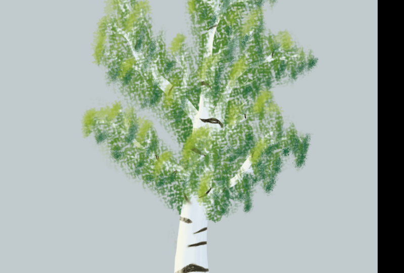
8. Exercise: Tree: All right, ladies and gentlemen, before we move on and you forget everything that
you've learned so far. Let's do a quick
stop with an excise. You did not really
think you could get away without doing
anything, did you? Don't worry. It's very simple. I want you to paint a
very simple tree using the basic drawing
and painting tools that I've shown you so far. Open up crater,
make a new image, and set the size to something
like 1,000 by 1,000. Then just start painting a tree. You can check out
different brushes first and see which
ones you like, by just painting a few lines, and then erasing them, you just find the brushes
that you like and start with a simple tree trunk and branches as you
always do for trees. Of course, choose fitting
colors from the color selector. The best brushes for painting
branches are certainly the ones that vary in
size, not opacity. Because as you paint
dynamic branches, you can just release
the pressure on your drawing tablet and then the branches always have a
thin end, which is very nice. Here's the important
thing. Your tree does not have to look at
all like my tree. Just make a tree, start with a tree trunk
and the branches, and then put foliage on it. You should just get
comfortable with the process of creating
a digital painting. Don't be ashamed to use
undo and redo, erasers, different brushes, painting
over it once again, varying the size and opacity and all the stuff
that I've shown you. This is just practice,
get used to the process and get comfortable with
these awesome tools. You can use the right
click function for your quick access window or not. Now's the time to find out
what works best for you. That's why we're painting
a tree because you can do pretty random things with the foliage and it still
looks fine in most cases. I would recommend
that for the foliage, you use at least three to four different types of brushes. As you can see, I'm using very basic paint brushes for the darker parts
of the foliage. Then for the brighter parts, I'm using down scaled
texture brushes. Use a few different brushes and slightly different shades of green to make it
look interesting. I'm even experimenting with different blending modes
like lighting right here, and you can do the same thing. Then for adding the texture to the tree trunk
of the branches, I'm using a little trick
that I've shown you, which is locking the alpha on this transparency,
I can appear. I cannot paint over the edge. This makes the process of
adding highlights and shadows to the tree trunk of
the branches very easy. I can just use
different brushes, see how they react and
just paint over it. Again, try using a few
different brushes here. You get in some practice. Remember that this tree
does not have to look realistic and you just want to practice the
different tools. When you make a series
digital painting, it makes sense to not use too many different brushes
so you have a defined style. Right here, just use different brushes to
see what they do, get comfortable
with the process. Then once you're
done, you can save your image on your PC
somewhere as a P and G five, for example, then you can
move on to the next lesson. So complete this exercise right now and paint
a simple tree.
9. Tools for Shapes: Now that you know
everything about drawing and painting in Creta, you can go out there and
draw whatever you want. Perfect lines and perfect
geometric shapes. Yeah, it's not going to happen. But luckily, Critter
has provided us with very effective tools
with which you can do that. Let's talk about the tools
for creating shapes. First of all, we
have the line tool. With the line tool,
you can create perfectly straight lines with the brush that you have
currently selected. You just click, you
drag your cursor, and then you release, and
then you have a line. If I select this brush
and make a line, it doesn't really
look like a line, but if I scale the brush
down, then it does. This works with any
brush and of course, with any color, and
also with erasers. The interesting thing
is that these lines react to the pressure
on your drawing tablet. If you have a size varying
brush selected like this one, and I start with low pressure
and then make it more, then this is represented
in the line. This also works with opacity. If you hold down shift
while dragging a line, then you'll see
that you can only select from a few angles, which lets you create
perfectly vertical, horizontal and parallel
lines, which is quite useful. Then we got the rectangle tool, which lets you create
rectangles that again, look like the brush
that you have selected. If you hold down shift, while dragging your rectangle, you can create perfect
squares. Very nice. If you hold on control
and while dragging it, you can rotate this rectangle. Now, if you go to
the tool options, which is a docker that you
should have somewhere, then you have a
few settings that you can change about
this rectangle. First of all, you can choose
if you want it to be filled. For that, you can select
your foreground color, so it looks like this. But you can also choose your background
color or a pattern. Patterns can be accessed
at this symbol up here. There you have a selection
of different patterns, and whatever you have
selected here will be filled if you have fill with
pattern selected. In the tool options,
you can also change a few things
about this pattern, like how it's rotated and
the scale of the pattern. If I make this very small, then the pattern is very dense, and if I make this very big, then it's not dense at all. Then you have a few options for the outline of your shape. By default, it should
be set to brush, so your brush is the outline, but you can also
choose your brush with the background color
or no outline at all. You could of course
combine the fill with the outline settings to get very different
looking rectangles. For example, if I set it to
not filled and no outline, then I have no rectangle at all. Very cool. All right. Then you have a few
more settings where you can fix the size
of your rectangle. For example, if I type
something in at width, then it's automatically locked, but you can manually
lock or unlock it. Then if you create rectangles, they always have the same width, and this is the same
thing for height. If you make width
and height locked, then you are always creating
the same rectangle, which is very useful for quickly creating a abs straight
artwork or something. You can also lock the
ratio of your rectangle. If the ratio is set to one, then you're always
creating a perfect square, which you can, of
course, also do by just holding down
shift, as I've told you. But, you can also lock other types of rectangles
here like 1.5, then you always have these
1.5 ratio rectangles. And, it's pretty cool. Then you can make the corners of your rectangle rounded by typing in something at the round
X and round y things here. Also something that
you can consider. Then next up, we got
the ellipse tool, which creates guess what
circles and ellipses. It works pretty much the same
way as the rectangle tool. It takes your brush, your color, and you have a few options
about having it filled with foreground color
background color pattern and the outlines. If you hold down shift, while dragging your
cursor with this tool, you are creating
a perfect circle. And you can also fix the width, the height and the ratio, depending on what you want. After that, we've
got the polygon tool with which you can click to create the corners of a
custom angular shape. Just like this.
You always have to click on the first
corner to finish it off. And of course, you also
have settings about having it filled or having
different outlines. Then we have the Polyline tool, which at first glance works the same way as a polygon tool, but you don't have to
finish the shape off. You can just hold shift and
click and then it's done. If you set it to fill
with foreground color, then it reacts in a
very interesting way. But, you can try it out. Then we have the
basia curve tool, which creates these very
smooth basi curves. Kind of a mathematical thing, if I recall correctly. I don't really use this tool, and then we got the
free hand path tool, which smoothens out the
lines that you create, which is really interesting. This is very useful for
creating vector graphics, but we'll come to that later. For now, we just got
these two tools left. We have the dynamic brush
tool where you can change the mass and the drag of your brush and you can
draw and paint with it. But you can't really
explain this. It just changes the
way your brush feels. I'd say just try
this out yourself. It's very weird, but cool. And then last but least, we have the multi brush tool. With this tool, you
can draw and paint based on a point symmetry. You can show this symmetric
point, the origin, move it around and you have
quite a few settings here, like how many times your
brush is being mirrored, the rotation, and
that kind of stuff. All right. I think the best way to learn about these tooth for shapes is to just play around with them and
see them in action. But before we can do that, we have to explore
another fundamental part of digital art,
which is selections.
10. Selections: Okay. Let's talk
about selections. Selections are an
incredibly useful tool in digital art and
design softwares. Basically, they allow you
to mark a certain area, and then you can
only edit this area. For example, if I take this rectangular selection
tool and I make a rectangle, then I can only draw end
paint within this rectangle. And if I want to make shapes, that's also only possible
in this rectangle. In order to undo a selection, press control shift and A, and then it's gone and you can edit the whole canvas again. When you have a selection and you try to make another one, then by default, your selection gets replaced by
the new selection. However, you can change
that in the tool options. Here, you can dit how new
selections are being added. You can set it to intersect, and then the intersection of two selections is
the new selection. You can set it to add and then you're just adding
new selections. You can set it to subtract, and then you're pretty much
just unselecting areas. Or you can set it to
symmetric difference, and then it reacts like this. I would recommend
that by default, you set it to either
replace or add. But no matter which
option you have selected, you can always unselect by
pressing control shift A, and you can always add a new selection by holding
down shift while making it. I recommend you
practices a few times to get used to the hotkeys
and the process. Just make a few selections, add more selections and
unselect a few times, and then you should be fine. As you can see, in
the tool options, you have simular settings
as for the rectangle tool, that this time you have a
selection instead of a drawing, it's the same thing for the
elliptical selection tool and the polygonal
selection tool. They work just like their drawing and painting
counterparts, just that they make a
selection instead of a shape. Then you also have the freehand selection tool with which you can manually draw an area
that you want to be selected. When you have a selection
and you press right click, then you have a bunch of options and an overview
for different hot keys. For example, you can select the whole image by
pressing Control A. Then you can deselect, re select and you can also
invert your selection. Inverting it means that everything is being
selected except the thing that you had originally
selected. This is very useful. If you want to edit
the whole picture except one or a few
very small parts, then you can just select these parts and
invert the selection. You can also go to transform and grow or shrink selection, and there you can type
in some pixels by which you want to grow or
shrink your selection. These are the most
important transformations. You can also view these options. If you just click on
select at the top. When you have
something selected, you can access these options. Nice. Now, in order to
introduce the following tools, I'm going to open up an image. This Autumn tree painting that I made with Creta some time ago. If you click on this
contingent selection tool, then you can select
areas based on color. For example, I can click
on this tree stem and then the whole area that
has this color is being selected
and I can edit it. If I select the tool next to it, the simular color
selection tool, then not only the
one connected area of the tree trunk
is being selected, but everything that has the
color of the tree trunk, which is also these branches that are not directly connected, but have a very simular color. So these two tools
are really useful. By the way, you can
adjust their sensitivity by changing the threshold
in the tool options. If you make the
threshold very small, then only this one exact
color is being selected. If you make it very
big, then colors that are even just very remotely similar
to your color are also selected. You can
play around with this. I think by default
is something 10-20, you can adjust this
depending on what you need. And you can also grow or shrink your selection here
in the grow option. You still have the same basis
based on the threshold, but the selection in general is just bigger or smaller depending
on what you have here. You can also play around with the father
selection option, which makes the edges
more smooth or something. You can also choose for both of these tools if you want
the colors to be selected from only the layer that you're on or from all the layers. But yeah, layers are
something that we will cover later on. All right. Then you have the
Basier selection tool, which lets you make the
smooth basier curves and the magnetic selection tool, which creates these dots and yeah I almost
never use this. These are the basic
selection tools and how you can select areas in creer. As you've seen, there are many, many different options
for what you can do. Practice is once again, the best way to figure this out. But before we can do that, let me introduce you to a few other tools that you have in CRT
11. Other Tools: All right. Before we move
on to the next exercise, let me show you a few
more useful tools and functions that
you have in Krita. First of all, when
you have a selection, there are interesting things
that you can do with it, not just draw and paint. For example, when you have
a picture or a drawing and you select something
and you press delete, then only the things inside the selection are being
deleted, not the whole picture. That's neat. If you have a selection and you want
to fill it with a color, but you're too lazy
to draw all over it, then you can just select
this fill bucket tool. When you click with this tool, then your whole
selection is being filled with the
color that you have. And by the way, you can
move around your selection. If you click on the edge, there you see you
got these arrows, and when you then click, you can move around
your selection. I forgot to mention this
in the selections lesson. So apologies. All right. But you can also use the fill bucket to when
you have nothing selected. Then it either fills your
whole canvas with a color, or you can set it to
fill a contingous region or all regions of a certain
color in the tool options. This works basically
the same way as for these selection tools. You can see you've got
the same options like the threshold and
stuff like that here. But you can also choose to fill something not with your foreground color or
background color, which is also an option,
but also with a pattern. I've shown you patterns before. You can access them up here. And you also have
options for them in the tool options of
the fill bucket tool. Then you can also add
gradients to your pictures. The gradient tool is
this one right here. With the gradient tool, you
can pull a line and then you have a gradient that follows the direction
of your line. You can adapt it depending
on how long your line is. If you make the line very small, then the gradient
tool is very small, when you make it very big, then the gradient is very big. The gradient always has the
color that you have selected except you choose a
different gradient up here in the gradient options. You have a bunch of different patterns that
you can check out. Okay. But by default, it's this color to
transparency thing, and it's very
useful for shading. You can, for example,
make a selection and then add a gradient to add a little bit of highlight or shadow to that selection. So that's a cool function. Next to the gradient tool, you also have this
color picker tool with which you can manually pick
colors from your image. But as I've told you,
you can also just hold down control and
click with your brush, and then you have
that color as well. I think that's way more simple than selecting this
tool all the time. But now you know it's there. Then we got some more tools for navigating the canvas like this Som tool with
which you can click to sum in or hold control
and click to sum out. You can select an area with it and then it sooms
into that area. Then you also got the pan tool with which you can move
around the canvas. But you should know very
well how to navigate the canvas by now by using
hotkeys and buttons, which in my opinion, is way more practical than
selecting these tools, which is why I've
told you how to do that at the beginning
of the course. But, these tools are also there. Now, you can click on Edit
and sample screen color. Then you can pick colors from
anywhere on your screen, not just from the canvas. For example, I can press control and click to select
the background color. Then if I fill the whole canvas with the fill bucket tool, then you can't see the
canvas anymore because it's the exact background color of
creer. Why is that useful? Because you can also select
colors from outside creer. You can make Creta small window. Then click on Edit and
sample screen color. Then if you hold control and click on your
desktop background, you can select the color from
your desktop background. This is really useful if you want to sample exact colors from your reference
images and you don't want to open them up
in creer directly. Then you have a few more
tools that you don't really use too often like
this perspective grid, which you can edit or
hide or move around. But, I would recommend you just learn how to
draw and paint in perspective instead
of having this grid all the time because
it's a weird function, but it's there and you
can use it if you want. And then you have this tool with which you can measure the
distance between two points. You can also measure angles. As you can see, you've got the
small box on the top left, and you can also see this
in the tool options. This is if you want to work very precisely and you need
to measure something. Then you have the close and fill to which lets you enclose
lines and shapes, and then they are filled with a certain color that
you have selected. This is also a very weird tool that I don't use super often. As you can see, you have many
options for how you want to enclose it with what shape you can
play around with this. Then on the other
hand, one thing that I use all the time is pressing control u to open up
this color editing window. You can addit the hue value and saturation of the colors on your current layer or your current selection
when you have a selection. You can slide around
here, change the hue, the saturation of something, and the value or lightness. This is so useful because
when you have a picture done, you can always go in here, press control, and see how it looks with slightly
different colors. Maybe your picture
looks a little bit better if you
lower the saturation, and it's not as striking anymore or you slightly
shift the hues, it's always interesting
to see what happens when you make adjustments
with this window. You can open up your last use setting so you have the
same thing once again. Or you can also click
on colorized when you have something
that's black and white and you want
to give it colors, you can just increase the
saturation and then you have it colored, that's very nice. I love this function. All right. Ladies and gentlemen,
I think it's time for another exercise. See you in the next lesson.
12. Exercise: Abstract Artwork: Okay. Time for the
next exercise. And for this one, the
standards are really low, so don't be afraid
to participate. We're going to practice the new features that I've shown you, which is mainly selections
and creating shapes. And what type of artwork are you making when
you just add shapes? Well, an abstract
artwork. So let's go. Let's make a new
file by the size, 1,000 by 1,000 and start
adding some shapes. I'm starting off with
a polygonal tool and I'm setting the film
mode two pattern. And, this is a quite
weird pattern. It's like contingus and
stretches all over the screen. But yeah, it's
certainly interesting. I just want to try out these different functions like different sizes
for the outlines, different film modes,
and all of that stuff. But don't forget to
use selections as well as I'm doing here
with these circles. Just select a few areas, maybe fill them with a color, add a gradient, all these different things
that I've shown you. Use at least three
different shape tools here, and try to experiment
with the tool options. As I've shown you, there are many possibilities for creating shapes and selecting areas. So there are many possibilities for creating an abstract
artwork with them, even if the tools
seem very simple. I'm also playing around
with the colors by pressing control you to
open up this color window, and I'm colorizing the whole
thing to give it more unity. Maybe you can come
up with a more interesting abstract
artwork than me. But here, I wanted to not
overwhelm anybody here. Just add some random
shapes to the screen, so you know that you
can also do that. As I've told you, these exercises are
just designed to get you comfortable with the tools and the process of using them. So make a simple
abstract artwork, save it as a dot PNG file, and then move on to
the next lesson, where we explore
our next big topic.
13. Layers: Ladies and gentlemen, we
have to talk about layers. Layers are an incredibly useful and pretty
much essential tool if you work with digital art. They allow you to
be very tactical in your process and do many, many tricks that make your life as a digital artist easier. But at the beginning,
they can be tricky to understand and a
little bit overwhelming. Let's clear up everything that you have to understand
about layers. Layers are a little bit like different overlapping
work spaces that make up your picture. When you work in creer,
when you add bras strokes, you make selections,
shapes, all of that, this is all happening
on paint layer one, as you can see on the
right at the layer docker. We have paint layer
one selected. This is what we're working on. If you make a new
document in creer, then by default, you
have a paint layer one, which is what you're working
with most of the time, and you have the
background layer, which is simply
filled with white. So when you work with
paint layer one, you cannot erase the background. It's always filled with
white no matter what. But you can select the background layer by
clicking on it here, and then you will find
out that it's locked, but you can unlock it by
clicking on this log, and then you can do stuff
on the background layer. You can show your layers
or make them invisible by clicking on
this next to them. So when I make the
background layer invisible, then there is nothing
and it's transparent, which is indicated by this
transparency pattern. And you can change the opacity of a layer by
sliding around here, then everything on your
selected layer gets more or less opaque. All right. If you want to make a new layer, click on this plus
icon down here. Whenever you add a new layer, then this layer will be above the layer that you had selected. So if you want to make a layer underneath your paint layer one, then click on the background
layer and then on the plus. But you can also just move your layers around
by dragging them. You can also rename
your layers by double clicking on them and then you can type something in. You know what your
layers are for. For example, sketch layer, a paint layer, and
stuff like that. As you can see, the things
on a layer always up here on top of the things
of the layer beneath it. When I go to a layer underneath my paint layer
one and I paint something, then all of the stuff is behind the stuff on
the paint layer one. This is basically what layers are most useful for to just have different layers of workspace that don't interfere
with each other. For example, if
you press delete, then just everything on your
current layer is deleted. If you press control
to added the colors, then only the colors of your current layer
are being changed. Then we have these two
transformation tools that also only apply to the layer that you have
currently selected. First of all, this
move around tool, which just lets you
move around the layer, and then this
transformation tool, which lets you do a bit
more like scaling a layer, moving it around,
and rotating it. You can just click here on the sides of it and
see what happens. And this is also what
layers are very useful for. If you make an object,
but you have not decided how this object
should look exactly, then just add it on a new layer, and then you can
independently edit this object alone without changing anything
else in your picture. That's really cool. If
you want to do that with objects that are already on a layer that's also
filled with other stuff, you can select this object like that with the
selection tools, and then you can press
control C and control V. Then your thing is on a new
layer and you can edit it. But when you have a selection, you can also press right click and there you find
a bunch of options. You can, for example,
directly access the transformation tool and just transform something and it's
not on a separate layer, or you can cut it to a new layer and then
you can edit it. You can also right
click on your layers, and you also have a bunch of options like copying
and pasting them. And yeah, there are many
things you can do with layers. One really important hot key is merging a layer
with the one below by pressing Control
E. For example, when you select something, you copy and paste it, then that something
is on a new layer, and you can edit it. And then you can press Control E and it's back to
where it came from. You can also click on
this transparency icon to only be able to draw and paint on the stuff
that's already there. And this just works
the same way as the icon that I've already
shown you, which is up here. What's relatively
new in creer is that you can add
multiple layers at once by pressing control and then clicking
on another layer. Then you have both
these layers selected, and if you take the
transformation tool, you are transforming both
of these layers at once, which is pretty interesting. But you can also
make group layers. If you click on plus, you have the option to make
a group layer, and then you can add layers to this group layer,
and then if you, for example, click on this icon, then all of the layers in
your group are disappearing. And you can also
move them around and transform them together, even though they are
different layers. You can click on a layer and there you also have
a bunch of options. Many of them are a
bit more advanced, and you can also view
many of these options if you just click
on layer up here. If you click on here,
you can also activate different blending modes for
your layers, and by the way, if you click on this icon, you can change the size of your thumbn like how big
the layer icons are here. You can also do that
for the brushes. This is basically how layers work and what they
are most useful for. You can separate stuff off your images by putting
it on different layers, and then you can edit these things manually
and move them around. For example, I often use
layers to make a sketch, like I draw something
on one layer, and then when I paint, I do
that on a separate layer. When I'm done, I can just remove my sketch and it doesn't
interfere with the painting. You can do stuff like
move your sketch layer above the paint layer to see if everything is
in the right place, and, there are many options for layers and they
are really useful.
14. Image Editing: Let's explore a few
money things that you can do with image
editing in Creta, because that's also possible. Let's make a new document, and let's pull this photo in here and insert
it as a new layer. First of all, let's
transform it a little bit. So it fits our canvas. If you don't want to distort your image while using
the transformation tool, you can just hold down
shift and you're fine. Then the relation between the
sides is always the same. Okay. If you click on image, you have a bunch of options. You can click on properties, and there you have a little
overview with, for example, the dimensions and
the color space, you can click on
Gray scale here, and then your image is black
and white, which is neat. There are a few things
that you can look at. You can also rotate your image or mirror it
in different directions. You can also resize your
canvas and then your image gets cut or extended
to a certain size. Or you can change the
resolution if you're not happy with it here by typing
in a new number. Okay. You can also crop your image by clicking
on this crop tool, selecting an area,
and pressing enter, and then this area
is your new image. All right, then we have
the smart patch tool, which is very useful
for image editing. You can select this tool, and then you can draw. You can adjust your
brush to a fitting size, like you draw over some part, and then creer tries
to patch this part out and merge it with
the colors around it. It usually loads a little bit
when you use this because this tool has to calculate
what it wants to do exactly. But it's quite interesting because you can actually
patch out things that you don't like
without having to select fitting colors and
drawing and painting over them. But at the end of the day, the smart patch tool
is not that smart, you're better off using
it first and then fine tuning your edit
by using brushes. This tool definitely
works better when you patch out small objects
and not complex ones, because then it gets a little
bit confused. All right. What you can also do with
your images is applying filters and changing the
colors by clicking on filter, and there you have
many, many options. You can click on adjust
and there you have these different color
adjustment windows with which you can play around. Then you have the
artistic filters and the oil paint filter,
which I really like. You can adjust the brush size, then how smooth it
is and click on. And then it usually
loads a little bit because creer likes
to do its job well. But then you have this
oil paint texture that is applied to
your whole image. And this often
looks really nice. You can see the difference of I press undo and redo a few times. And yeah, this can
make your images look pretty awesome if
you apply it correctly. Then you have a few filters
to make it look blurry, then a few color options
and edge detection, which makes it look very weird. And yeah, a few more with
which you can play around. After you're done making an
artwork or editing an image, you can always press control
you to adjust the colors or check out what it looks
like with different filters. And sometimes it really
makes a difference and makes the whole thing look
much better. All right. That's it for image editing, and it's almost it
for the course. In the next lesson,
we're going to explore the last big topic here, which is vectors and layer
styles. See you there. Okay.
15. Vectors & Layer Styles: I. The last big topic in Creta that's missing and you should know about is vectors. Wait. What even is a
vector? Let me explain. A vector is an independently
scalable graphic that's made up of very
primitive elements like lines, shapes, and curves. Vectors are not tied to
a specific resolution, but they can be made bigger and smaller and always
look the same. Let me show you an example. If I draw this normal
line and in at the sides, you can see that
it has this edge, and if I scale it up, then this edge
becomes very blurry. If I draw a line with
this calligraphy tool, then that line is
being projected onto a new vector layer
as you can see here. If I scale up this line, then you can see the edge
is exactly the same. This is also the case if I scale it down and I heavily distorted. This is because
vectors are based on a mathematical
formula and not on colored pixels to determine
what something looks like. And you cannot draw or paint on a vector layer if
you try that out. You can only create vector
lines and very simple shapes. Vectors are not for
drawings and paintings, but for stuff like logos that you want to scale up or
down when you're done. The closest thing to a
drawing tool that you have on a vector layer is this
free hand path tool, which makes your
lines very smooth and transforms them
into vector lines. You can edit your
lines and shapes by using this added shapes tool, and then you can click on
your lines and shapes and you can move around these
dots to adjust how they look. These are the nodes
of your vectors. You can fill your shapes with your foreground color
or background color, but not a pattern. As you can see, it just doesn't work when I'm on a vector layer. If I go to the pain layer, then we got this pattern, but not on the vector layer. So, you can play around with
this and find out what you can do to create very
clean logos in creer. And what you can also do is
add text with this text to. You can mark an area
where you want a text, and then that text is being projected onto a
new vector layer, which you can independently
scale up and down. You get this text window where
you can type in your text, and you have all the basic text editing things that you may
know from other programs, like adjusting the
font, the colors, the size, making it fed, cursive, and all of that stuff. Texting crea is also
a vectrographic, and you can make it bigger or smaller with the
transformation tool. If you want to edit your text, just select the text tool
and double click on it. And then you have your text
window again. Perfect. Here is something important. If you make a
vectographic and just save it as a normal
image like dot PNG, then you don't have
scalable vectors anymore. So when you want to
save a vectographic, always make sure you save it as a vector file like dot SVG. All right. Now I think it's a good time to introduce
you to layer styles, which is also an interesting
functioning crater. You can right click on
your layer and go to layer style or to
layer layer style. There you have this
window where you can activate these different
effects for your layers. For instance, you can
make a drop shadow, and then everything on your
layer has this drop shadow. There are always options
for your layer styles here, I can change the
opacity of the shadow, I can change the angle, I can change the
distance that it has from the layer and the size. This is different for
every layer style. We got outer glow, inner glow, bevel and emboss, or even stuff like
an overlay pattern where you can just make
a pattern overlay, and this is on your whole layer. If I make a paint layer
and I activate this, and then I draw something then everything has this
pattern automatically. I think layer styles
are especially useful for text and
vector graphics. In normal drawing and painting, they are not really necessary, but still it's a neat function that you can certainly
make use of. All right, and that's it for the main tools and
functions of crater and pretty much everything
that you need to know to get going as
an artist or designer. In the next lesson, let's
do the final exercise.
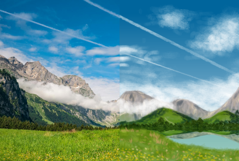
16. Exercise: Continue Picture: Ladies and gentlemen, welcome to the third and final
exercise of this course, and this time, we're going
to make something for real. First of all, I want you to
go to the course resources and download the file
Exercise three preset, which is a picture
with mountains. Then make a new file in Creta by the precise resolution of 1920 by 1080. Standard HD. This is so you can pull this
preset image into Creta and it occupies precisely
the left half of your image. If you insert it as a new layer. And here's the mission.
We're going to continue this picture by painting
on the right side. It of course doesn't have to be photo realistic like this photo, but you want to capture the style and the
colors that we have, and just continue this picture. First of all, go below
your preset layer on paint layer one and
rename it to sketch. Then take your sketching brush. As I've said, I
really like this one, and draw your picture
with very light lines. Just try to imagine how this landscape could
continue on the right side. I think there would be some
more mountains like this, some trees in the background, the grass in the foreground
obviously continues, and I'm planning in some
lake in the middle, which is marked by
this empty area here. You don't have to do
it exactly like me. You don't necessarily
need a lake there, but you can use it as
orientation if you want. Remember that for sketching, you don't want to
fill out any shapes. Just add lines so you later know where you want to
paint what? All right. Once you have a good
composition for your landscape, make a new layer below the
sketch layer and call it sky. I'm selecting colors from
the photo and adding gradients to make it look
approximately like that sky. Then it's time to find out with which brush you want to paint. I'm going with this colored
pencil texture brush, but you can choose
whatever you like here, whatever you think is fitting. Just pick a brush that you
can actually stick with because you want to have
a consistent style here. Then it's time to
paint in those clouds with very smooth
bright brush strokes. I'm doing these contrails
using the line tool, and I'm adding the
clouds very lightly. Okay, looks pretty good. Then it's time for
the grass for which I will make a new layer also below the sketch layer because we
want to see where everything goes and remove the
sketch layer in the end. So scribble around with
different shades and tones of green that you
select from the left side or from the color
selector to make some grass that looks nice and somewhat varied have a few
flowers and spots. Okay. Once you've got that,
make a new layer between the sky and the
grass layer and call it mountains there
just select colors from the left side and continue
your mountain landscape. You can from time
to time deactivate your sketch to see what your
image actually looks like, and if the edges look nice. Feel free to take
your time here to really capture the
style of the photo. It doesn't have to
be as detailed, but try to use the correct colors and
a similar composition. After having painted
the mountains and trees all on the same layer. I'm actually doing
something interesting. Because there is a lake, we have some reflections
of all that stuff, and I don't want to paint all those reflections
manually because that sucks. I'm copying and pasting the mountain layer,
so I have it twice, and then I'm using the
transformation tool to slightly distort and
mirror my layer. It looks like a reflection. If you want, you can
rename that layer to lake because that's
basically what it is. I'm painting over it
a little bit with this green bluish lake color. It actually has some
texture. And there we go. That's actually a nice artwork. Make sure that when
you're at this point, you deactivate your
sketch layer or remove it entirely because
you don't need it anymore. I'm just going to
add a few more of these clouds on top of the
mountains because that's what happens in the photo and then I'm done.
This is the painting. I'm pretty sure that you
can produce something that looks simular using all those
awesome functions of creer. You've got a really
nice overview of what the digital painting
process usually looks like. Then let's complete our practice by adding something
with vectors, a small text that says
creer digital art. Put it in the middle at the top, like a title for your image, and then try using a few different layer
styles to adjust it like a drop shadow to make it
more visible and increase the contrast, play
around with this. I'm also manually adding
an underline underneath the text and editing it
using the added shapes tool. So we got some simple
vector practice. And I'm adding the
creer vector logo in order to honor the people
who made this program, but also to cover up the clouds in the middle
that I messed up. All right. Then you can play around with a few more
layer styles like I'm adding an overlay gradient
just for the sake of it. And then I'm merging all my paint layers so I
can apply a filter to them. I'm going to go
with my favorite, the oil pan filter just a little bit to make the texture more
smooth and homogeneous. And here, now we got everything
covered that you actually need to know about Creta we got some practice for all
the different functions. You can save your image
as dot PNG file and upload it to the website
to share it with others. I'm excited to see
how successful you are applying the
lessons from this course.
17. Brushwork Exercises: All right. Last but at least, let me give you a few
tips for how you can practice and warm
up your brush work. I know it sounds a little bit weird if you come
from traditional art, why would you warm up
drawing and painting? You just make a picture, right? This makes sense because
in traditional art, you don't really
warm up because you always need a new piece of
paper for whatever you make. But in digital art where you
can make whatever you want. It makes sense to switch your mindset and actually
see drawing and painting as something that you
need to warm up for because you can actually
improve by doing that. What I like to do before starting a new
drawing or painting is drawing a few parallel
lines in different directions. Try to draw them fast
and dynamically. You get a good feeling
for how your brush works and how good
your focus is. You can prepare for the artwork and make your lines
more confidently. Another thing that
I'd like to do is drawing perfect circles. And yeah, this is
pretty damn art, like I don't get
perfect circles ever, and perfectly perfect circles
are humanly impossible. But still, if you try
to approach that, then your shapes will be better when you actually
make an artwork. You can just draw a few
lines and circles and always delete the so
you have more clarity, you just keep going
like this until you feel very comfortable
with digital art. For me, usually, this doesn't
take more than a minute, but when you're a beginner, then it makes sense to
practice this a bit longer. What I also like
to do sometimes is drawing a few dots
just like this, maybe like five to eight and
then connecting every dot with every dot with fast
and confident lines. This is a really
good exercise to improve your precision
and accuracy. When you make digital
art, you can, of course, always undo and redo your
lines until they are perfect. But if you're able to make fast confident lines between
precise points like this, then it just speeds
up your process and makes it more enjoyable. Especially when you're a
beginner and you don't feel super confident
with digital art yet. I recommend you try out these
exercises for some time. They can definitely improve the relationship that you have with your drawing
tablet. So try them out.
18. Outro: And that's about it
for the Creta basics. I hope you enjoyed the course. And I especially hope that
you understood everything, and you're able
to use Creta now. If not, then you probably just need to participate
in the exercises. Because let's be honest, we literally got every
main function covered in these exercises that you could possibly need in critter. Of course, there are
way more functions and hidden details in Creta that
you can figure out yourself. But honestly, most artists never use anything that extends
beyond these basics, like using brush as
well, applying layer, selecting something,
and sometimes using a simple color
adjustment of filter. And that's pretty much it. The amount of stuff that
you can create using these functions alone
is already enormous, so you should get really
comfortable with these things. And I hope that my exercises
could help you with that. So thank you so much
for being here, and thank you so much
to Krita for existing. The people who are working on the software are really
doing an awesome job. So you can visit their
website and leave a donation. Make sure you leave a review
for this course and tell me what you liked or maybe didn't
like. So I can improve it. And of course, feel free to ask questions
if you have any. I'm here to help you.
With that being said, I hope you have a good day. If you want to level up
your digital art skills, you can check out
my other courses. For example, on a color theory or how to draw and paint
any tree you like. So see you. Okay.
 Duplo, Designer, Artist