Transcripts
1. Intro: Alright. What's up,
everybody? It's Duplo. And I just had a very
interesting idea for a small and
practical course. And this is about solving
a problem that I think is very underappreciated
in the digital art world. We as digital artists, whether you're
working on an iPad or a computer with
whatever program, doesn't really matter here. But we often have this
problem that we start an artwork with a lot of
inspiration and motivation, and then at some point,
it just goes away, and we're left with an
unfinished painting or a sketch. This could be due to
a technical problem, like you don't know how to continue a painting.
It's too complex. It would require too much effort to finish
it or something, or you made a mistake that
just isn't worth it fixing. Or you just don't want to finish it because you don't like it or you find other things more interesting and
start new projects. In any case, I think many of you can relate to the
fact that you have image files safe
somewhere that you don't want to delete because
you put effort into them, but you also can't use them
for anything or show them to other people because
they're too bad or just totally unfinished. So, ladies and gentlemen, if you have any of these files, then I have very good news for you because in this course, I'm going to show
you how to turn them into finished artworks that look amazing and don't annoy you anymore with very low effort, actually, I'm going to
call it digital recycling. In case you don't
know me, I'm Duplo. I'm an experienced artist
and designer from Germany. I've been involved
in all kinds of design projects from level
design to web design. I also develop art
and design theory, and of course, I make many, many artworks and paintings, preferably impressionism,
abstract art, and some realism. And what can I say? Our problem
definitely applies to me. I have many of these
unfinished artworks and projects that
for some reason, I just never wanted to continue. And recently, I
looked at a few of these artworks and they really
bothered me, to be honest. I thought, What a waste of
effort because I actually put in quite a few hours
into some of these artworks, but now I can't even find
the reference anymore, and there is no chance that
I'm going to finish them. So I really dug deep
and came up with creative ideas to turn these artworks into something
that you can look at. And it actually turned out
to work surprisingly well. I just rapidly expanded
my portfolio of artworks that I like just by taking care of
these old ones. So I thought, Let's make
a little course about it. What you need for it is,
first of all, of course, some unfinished
paintings or even one is enough that
you want to recycle, and you need a way
to make digital art. So a computer or a
tablet or something. And on that, you
want a software that has a basic variety
of functions. You know, you want to be able to draw and paint, of course, but also layers and color
adjustments and stuff like. I think every popular digital art software
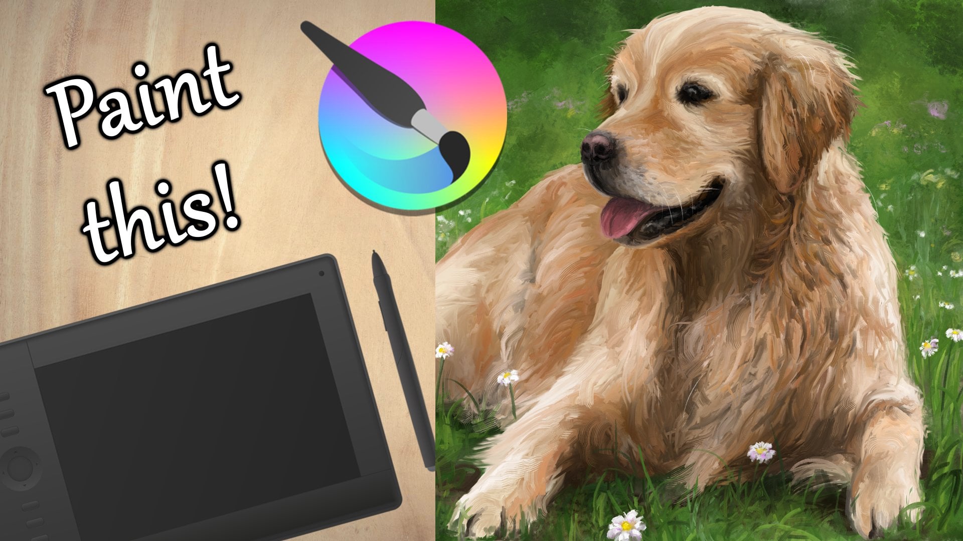
should work for this. So you can follow this course with Procreate or Photoshop, or you can do it like
me and use Krita, which is completely
free and very awesome. If you want to
know how it works, then check out my profile
for my other courses. But, yeah, I think most of these techniques should
work with any software. So let's see what they are.
2. Continue in a different style: All right. Ladies and gentlemen, welcome to the first technique
to recycle your artworks. And before you do anything, I think it's the
best if you first watch these lessons and
what I have to explain. And then in the end, we'll
have the project section. So I'm going to demonstrate
how I take care of these artworks and you'll be able to understand
my thinking process, so you can then apply
it to your own wants. Deal, let's go. The first way to recycle an unfinished artwork is to continue in a different style. This always seems
quite obvious in hindsight because you can always do it if you
lose motivation. But in the moment, it's actually hard to decide to
do that, I think. So I believe this
technique is most useful for artworks that you've
abandoned a long time ago, and you don't even know
how to continue them, at least in the same style. Let me give you a
simple example. I did this mediocre attempt at a landscape a few years ago, and now I have no idea what I envisioned
when I started this painting. You know, actually,
the colors in the composition are quite nice, which is probably why
I've never deleted it. But there is just
something missing a subject or just anything
of substance, really. In order to make this
a functional artwork, I just have to put something
on this hill, I think. And the only real way to
do that is to continue in a different style because I don't even remember which
brushes I used here. So I'm going to pick
some interesting brushes and just scribble something here that doesn't require too
much precision or effort. And what could be better
than some abstract plants? You know, some more
detail on this hill with plants would actually make
it quite interesting. But I don't want to add too much detail to these
plants because I'm kind of lazy and this is not a new artwork that I'm
very motivated for. I just want to recycle
this. So here's the trick. If your shapes and subjects
aren't that interesting, but you still want to make
them look really good, they simply need to have
super awesome colors. Yes, color theory is an insanely useful shortcut if you want to be lazy and
make something look good. So let's see how we can exploit
color theory here, too. Just add some random, simple plants in
a different style and make this whole
thing look good. Well, if we look at
this color wheel, then the main colors of
this work are like pink and purplish right here and
red orangish right here. So if you know a little
bit about color theory, then you'll notice that
there are basically two options to make a
color scheme out of that. Number one, we go in the
middle and add red plants. So we have an analogous
color scheme, which would make the whole
thing look very harmonious. You know, these colors are next to each other on
the color wheel, they have a simular
vibe or simular energy that would be very
peaceful and calm. But honestly, I don't
think this would be enough to make my scribbles
look interesting. So I'm going to go
with the other option, and that would be to
pick the color on the opposite side of
what we have right here. So we have a split complimentary
color scheme, very nice. So if we add light blue plants, then they will fit
a color scheme. And honestly, I think that would look pretty awesome if
I'm sketching like this. So yeah, let me just
jump right into it, pick some random paint brushes, and I'm going to start adding these light blue
plants everywhere. That was a lot of talking
for a very simple outcome. You know, I'm just scribbling
some blue everywhere. But that's the point, you know. If you do the right thinking and planning, you
have a good idea, then the execution of
that can be very simple, and you'll still end up with something that's
pleasing to look at. So here is a rule of thumb that you can apply
whenever you want to continue an
unfinished painting of yours in a different style. Assuming that you want to keep that style very simple
and low effort, apply as much art and
design theory as possible. If you do that right,
then you can do very, very easy and simple things
to make something look great. You know, add value
contrasts, shape contrasts, different textures,
make the picture follow a color scheme ideally, which is always a good idea. So by following the basics of art theory or simply
having a good idea, you can leave out so much
detail and realism and therefore effort and still make something that's
pleasing to look at. That's my basic point here. So it's always worth it learning a bit more about that stuff. It can save you a lot
of effort later on. But here's another
way that changing the style in which you make
an artwork can benefit you. Sometimes you just get
stuck on an art style. You don't really feel a brush anymore. It kind of annoys you. And then if you switch
up the style and just paint differently
the rest of the artwork, then this can actually lead to you regaining a
lot of motivation, and suddenly you
find yourself in the flow again adding
lots of nice details. And, yeah, that's happened
to me quite a few times now. So if you find yourself
stuck in an artwork and you lack the motivation to
continue it in the same style, maybe just try out a
totally different brush, and then maybe the motivation
will come back and you'll find yourself
putting in a lot of effort again that will pay off. So that's also an option. But in this course,
I want to keep things very simple,
very low effort. So I'm just doing
it my lazy way, exploiting art theory to the flest to make simple
scribbles look interesting. And yeah, look at that. I think it's actually
worked out quite well. It's not the best artwork, but certainly much better
than it was before. And now I actually feel confident in saving
this as a painting. It literally took me
less than 7 minutes, but now I have this
simple landscape with a very unique vibe, you know, the purple sky
and the glowy plants. It could be like another
planet or something. I think the before or after comparison really
speaks for itself. So, yeah, that's a nice
little tactic for you guys. However, I think I'm going to
do another demonstration to really showcase that this works
with all sorts of styles. Look at this. In this
unfinished painting, I tried to paint some
realistic lemons, but I clearly gave
up at some point. The details are pretty
much non existent, and the lighting
on these leaves, especially is
completely messed up. Since I can't even find the reference image
for this anymore, there is absolutely no way
that I'm going to be able to make these lemons look realistic. It's not
going to happen. So the only way is to continue
in a different style. If you don't know in which
style you want to continue, it often helps just scribbling with different brushes in
your drawing software. For example, I'm just
making a few lines, and I'm seeing if I could overlay some sort of pattern
here in a different style. And look at this one. I think that could be very interesting. So I'm making a new layer
on top of the other ones, and then I can scribble
with this brush in a few different colours that
I think match the painting. So yeah, I'm basically
covering up the lack of detail and all these mistakes that are made in the
original painting. I mean, it's not
gonna make these lemons look more realistic, but that's not the point here. I'm just trying to create a pleasing composition
consisting of different textures
and patterns, so I can finally
save this artwork. If you have something
semi realistic like this, then it often makes sense to overlay a slight pattern
because that way, your viewers will
still be able to see that there is something real
underneath this pattern, and there are some subjects
that are worth looking at. But details become a
lot less important when you have exciting textures
or exciting colors, like in the last artwork. And, yeah, look at that. I think this definitely
counts as art. This also took me
very little time, but I can finally save it. So I hope you guys understood what this technique
is all about, continuing in a different style. And yeah, once you got that, let's explore the
other techniques.
3. Make it abstract: Okay, welcome to the
second technique to save your
unfinished artworks. This one is Make the
whole thing abstract. Some artworks just
cannot be saved, even if you continue them
in a different style, or you just don't want to continue them in a
different style. So then you can resort to
this second technique which is actually even more easy than the first
one in most cases. Because completely
abstract art relies even more on art and design principles
than semi abstract art, like we've done it
in the last lesson. In abstract art, there is no subject that's interesting
on its own, right? It's only about colors, shapes, textures, and contrasts. But if you know a little
bit about these things, then abstract art is far easier than traditional art or
not really traditional. I mean, we're still
making digital art here, but, you know, art that
resembles something. So yeah, I would say, let's
just have a look at how we could make an artwork
into an abstract one. Now, for this example, I don't even know if I want to even remotely call
it an artwork. I mean, this is pretty much just a color sketch of
some flowers in a pot, but I actually believe that
I could make something out of this by making
it very abstract. Now, when you plan to
make something abstract, you have many, many, many options because the
drawing software of nowadays, they come with all these
different tools to manipulate paint layers and colors and create textures with
pretty much no effort. But right here, I
first want to do something that requires a
little bit more effort. And the second example of this lesson will be
very, very simple. In order to make this
an abstract artwork, I'm first going to merge all these different
layers that I created for whatever reason into one so I can easily edit
everything at once. Basically, I think
I want to drag the paint around of
this artwork and just make an interesting texture that somewhat resembles
the original artwork. And for that to easily make something an
abstract texture, the blending brushes
are your best friend. There should be something
that resembles this in pretty much any drawing
software. So look at this. In Krita, it's these
white brushes with which you cannot add any
new paint to a canvas, but you can just drag the paint that's already
there in different shapes. So I'm going to do this
and just scribble, crosshatch over the whole thing, and I'm just trying to make a texture that feels
interesting to me. And you can see
I'm doing that in a very simple and chaotic way
with this blending brush. I'm only following
very few principles here to make it look nice, because these brushes already provide us with a pretty
pleasing texture, I think, if we look at
the progress so far. So one thing that I think
you should pay attention to here is visual consistency. You want to stay in the same style for the whole picture if you transform it like this with a blending
brush, for example. So don't make some
of these circles. As you can see, I'm
painting in circles here, way too big or way too small or don't just change the direction
of your brush strokes. You want to apply the same
thing to the whole picture, and then it will look pleasing
and consistent in the end. That is often a safe and
reliable way to make these transformations
work because if an artwork is consistent, it looks more intentional, like that was the
intended style of the artist and what they
wanted to communicate. So keep the density of the texture and the
style of the texture consistent when you do a transformation with
blending brushes like this. Maybe there are even
nicer blending brushes and other drawing softwares. I don't know. But yeah, I actually really like this one. Look at that. That's
our artwork so far, and it actually looks like I intended to make something
like this when I started, which is absolutely
not the case. So I'm just going to
save this so I have it. But then I'm going
to experiment a little bit more with
another blending brush. That's, of course,
also always an option. You can save your artwork
once you like it, but then you experiment
a little bit more. And if you like that, then
you can also save that, or you can get rid of it easily. So yeah, I'm going over
the whole thing once again this time just with
a different brush that looks very different. But I am once again following the principle of
visual consistency. So I want this texture to
apply to the whole canvas, this density of brushstrokes. Okay, I think in the end,
this is also interesting. So I'm going to save
this one as well. Nice. These blending brushes
are really overpowered. So I'm pretty sure that if you spend a little bit
more time with them, then you can make your artworks look even nicer than this one. But yeah, I really went quick
here and just did that. Nothing complicated, but
interesting textures. Let's go. Now let me
demonstrate another way. You can make an artwork
of yours abstract. And that is starting
from a subject that has no background around it like this tree right here, but it could also
be a character or really any object that you
can replicate and manipulate. Let's just play around
with the layers here. I'm going to copy and
paste this layer, and then let me transform it with the transformation tool, so it's a little bit
tilted like this. And then let me do it again. And again, and again, and just tilt a little
bit more each time. And then at some
point, it looks like a circle with this weirdly
shifted tilted tree thing. So this is pretty much
already something that we could call
an abstract artwork, but let me see what
else I can do here. Obviously, you could
shift the hues of these individual layers to give them a little
bit of variety. But I think I'm going to change
their opacity by sliding here and just make these
layers fade out a little bit. So I'm reducing the opacity
with every other layer here. So, yeah, the principle behind this is that
you should apply this technique to objects that are not very
interesting on their own, but that have somewhat
pleasing colors or shapes that you want
to recycle somehow. Like, you still want to be
able to see these objects, but not alone because that
would look too unfinished. Then you can play around with the layers and do
something like this, and maybe you'll come up with something that's
pleasing to look at. Right here, of course, this ball of trees doesn't
really fit the canvas, so I'm making use
of the crop tool. I'm selecting this new area, pressing Enter, and then I
have this as my new canvas. You should be able
to do something like this in pretty much
every software. And then let me find an interesting color
for the background. I mean, something intense would not really be fitting here because we already have a nice
range of analogous colors. So I think I'm going
with something neutral like black to make this
yellow here pop even more. And yeah, this is
certainly something. So you still have to
watch the colors, of course, even if you make something completely abstract. That's very important
in any visual. But, yeah, that's also
a very simple technique that you can try out
with other things, and maybe it will look even better for you than
it does for me. I think how well
this technique works heavily depends on
the type of object, and you can't really
predict whether it's going to look good or not if you replicate it a few times. Right here, I think
it's alright. So yeah, let me move
on to the next lesson. I
4. Make a series: Alright. This third and final
technique of this course is, I think, my favorite, and that is to make a
series of variations. This is what inspired me to make this course because I recently did this
to a few artworks, and I found the results pretty
stunning, to be honest. And it's such a
simple way to do it. I mean, probably the most easy
way of this whole course. So yeah, let's jump right into it. What
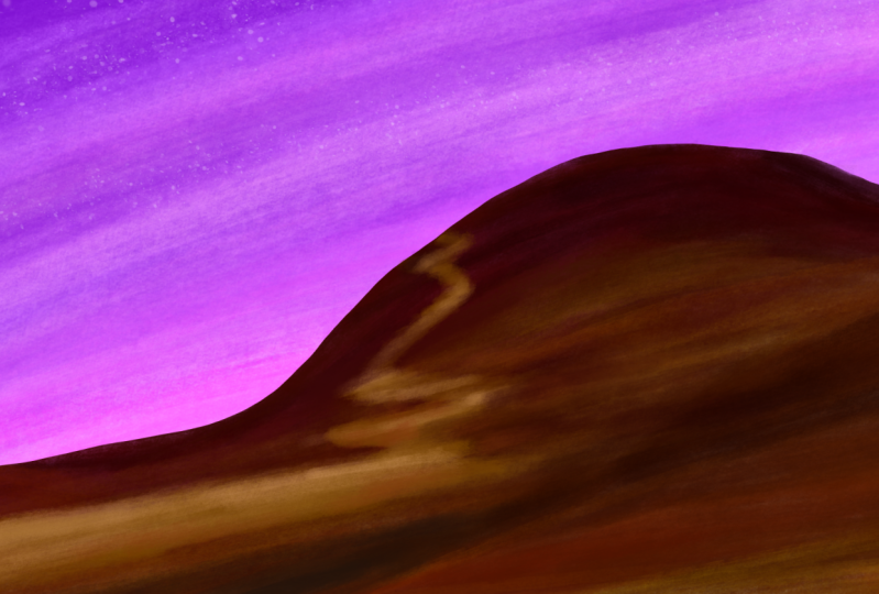
do I mean by that? Well, this right here is
an artwork that I painted, and I spent way more time on
it than what it looks like. I mean, these houses are
completely messed up. I did not know if I wanted
to do outlines or not. As you can tell from
many of these elements, the colors are right. You know, there is
some sort of detail. But if I had to
judge this honestly, I would say that there
is no artistic vision, no visual consistency, just random brushstrokes
that I try to put together. But the unfortunate reality is that I really tried
here and I invested, I don't know, like two or 3
hours to make this thing. So deleting this is just
not an option for me. But also, I'm not going
to continue this. No way. I am done
looking at this picture. It annoys me, and I don't want to judge
anymore which areas need more work and which
don't I did this test, which you can apply
to any artwork really to see if our technique
of this lesson fits, and that is simply to zoom out. You see if I zoom out here, then it actually
doesn't look too bad. You can't notice all these
mistakes that are made, and the colors and the
composition are quite nice. So if we can't look at the details, this
is actually cool. So what if we gave the viewers
an incentive to not look closely at this artwork and only consume it
from further away? And that is where
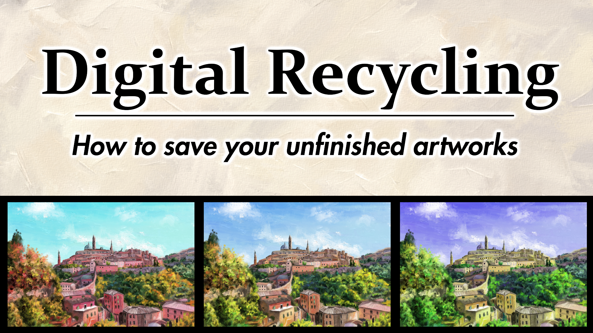
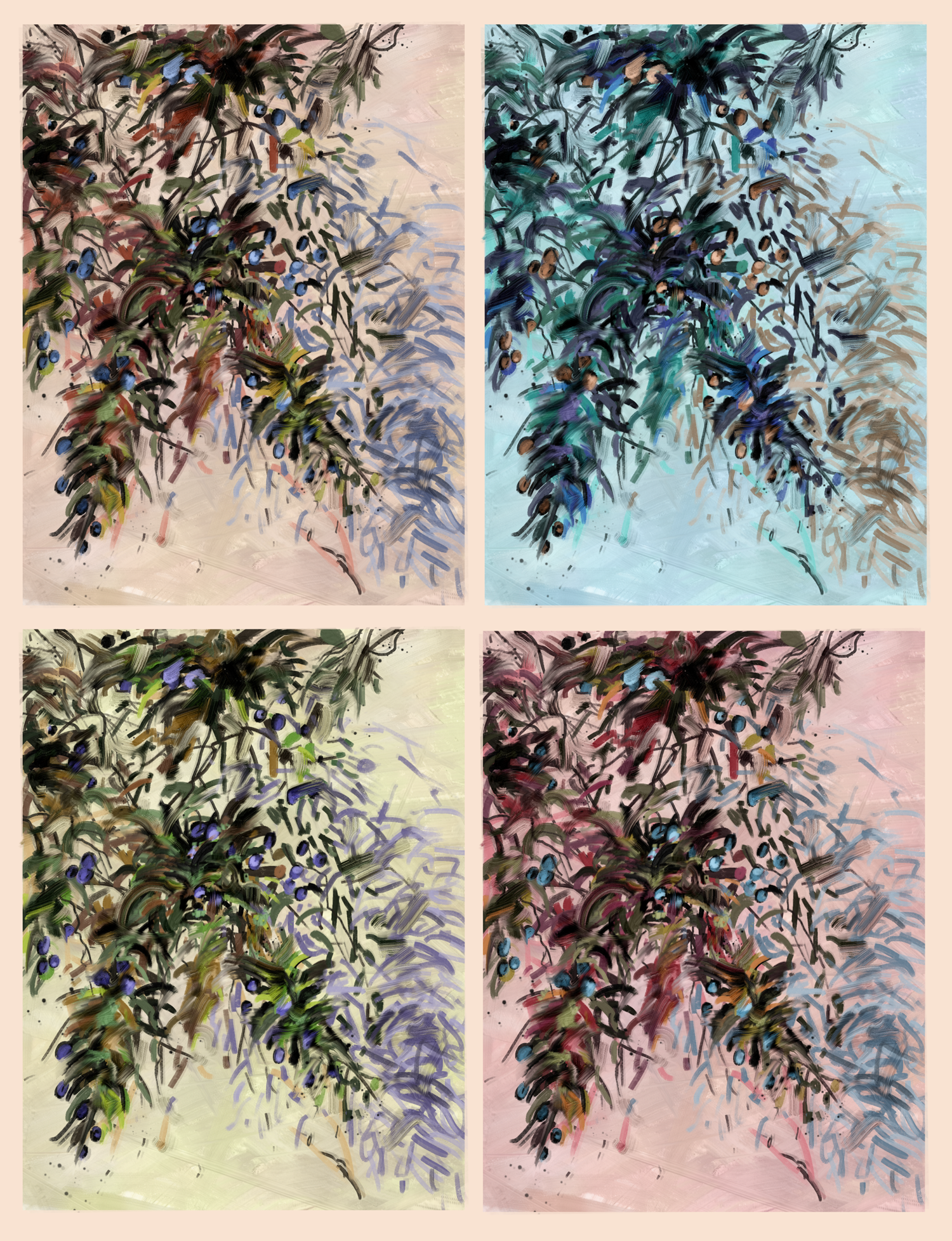
I had the idea to make this series of variations. That means multiplying
the picture and putting different
versions next to each other. So we have a series. And that is very easy. You simply need a
way bigger canvas where you can fit
these variations. You need to decide
how many variations you want and how you
want to arrange them. And then you simply have to make a very small change
to each of them, and you can have a great
picture, actually. So let's do that. I think three variations would
be good in this case, because there is
still some detail. I don't want it to be too zoomed out and too
many variations. So I'm going to
create a canvas that can hold this picture
around three times with a little bit
of empty space in between with this crop tool. And then I can simply copy
this image and paste it twice. So we can put these variations
next to each other, ideally, with the same
spacing between them. But because it
would not really be interesting to have the exact
same thing three times, I'm going to shift the hues
of these variations a bit. I can do that by pressing
Control U in Krita. So these are these
color adjustments. You should find them in any
modern drawing software. And then let me shift
the hue of this layer on the left a little
bit toward red and orange like this and the hue
of the layer on the right, a little bit toward blue, purple and this colder color. So, look at that. Come on. That's a pretty nice
composition as a whole. And the viewers
don't really have an incentive to look
too closely at this. It's just about
these variations, these slightly different wipes that each of these
old cities have. And that's really
pleasing, I think. You can then, of course, do a few more things like play around with a background color. Let's see if this actually looks better with black
or something else. Actually, it does look better with a black
background, I think. And yeah, I'm just going to save this picture because
it's already done. This is actually a
legit way to make art. You know, these series,
these variations. That's something that
even traditional artists used to do all the time. Maybe you remember, like
Andy Warhol or something. But, yeah, this is
something that you can just apply to simply save
your old artworks. Let me do it with another one. This is a landscape
that I painted quite recently,
but to be honest, it was more of an
experimentation with different styles that now
don't really fit together. You can see the brushes
that are used for these trees in the background and the grass and
the foreground. They are a little
bit too different, and they have different styles. So this artwork is not very consistent and not very
pleasing to look at. Even though there is
some nice detail. This detail, in fact, is the reason why I don't
want to delete this. You know, I kind of works
if we zoom out once again. So this is a sign that we should make a series
of variations. This time, let's arrange
them vertically. So we have something different. I'm once again using this crop tool and
estimating an area where I could fit three or maybe even four of these artworks
above each other. Then I'm replicating
these layers and arranging them
until they fit, something like this, and then I can change the hue
of each of them. This time, let's go a bit
more extreme and saturated and give these landscapes
very different colors. Oh, yeah, that
looks pretty cool. But this time,
let's actually add a bit more variation to these B, for example, mirroring
some of these layers. I'm going to horizontally mirror the second and
the fourth layer. So if we look at the dark
contrasts with these trees, then we have this kind of line here that guides the
eyes of the viewers. So we have this satisfying
S shape of attention here. Also another little art
theory trick that you can always exploit if you find
the opportunity to do it. So yeah, to be honest,
I think that's it. You should understand what
this technique is all about. It's very easy, very simple. You just need to find out how to do it once with your software, which shouldn't be
too complicated. And then you have
this reliable way to transform many of your old, not very detailed artworks into something that
looks pretty cool. So here we go.
5. How to avoid having to do this: Alright, ladies and gentlemen, before we wrap this up and
you go to your project, here is a little
extra lesson for you because I just
want to talk a little bit and give you
some advice for how you can avoid having
to do all this. You know, digital
recycling is nice, and you can definitely end
up with great results. But the goal is obviously not to have to recycle your artworks because you stopped
working on them. The ideal way is always that
you start an artwork and you finish it exactly the way you envisioned
at the beginning. So all the subjects in visual elements
speak one language, and there is a coherent
vision behind the artwork. That's what we always
want in a perfect world. Now, depending on what
kind of artist you are, what your personality is, or at what stage in your
learning process you are, this happens more
often or less often. Maybe you're someone
who doesn't even need digital recycling because you finish everything
that you started. In that case, what are
you doing in this course? But at least for me and I
think most of you guys, we would like to
get a lot better at committing to our artworks. And this is not easy, but there are definitely a few techniques that
allow you to improve the probability that you actually finish your artworks
the way you intended. Like, for me, for example, the success rate has gone up
a lot in the last two years. I don't produce nearly as many unfinished artworks
anymore as I used to. And if I had to break down
the reasons for that, I think the most
important one is that I plan my artworks way more now. I'm using references way more. I'm thinking about
colors and color schemes and how the visual elements
could make a composition. So by doing that,
I'm envisioning what the finished artwork
will look like. And that gets me a lot
more excited to stick with the idea during the process and actually keep
up the motivation. And I pretty much always
make a sketch beforehand, so I know where everything goes and what there is to
do in the artwork. And that helps so much. So planning is probably
the best thing you can do. If you know what you want to make and you envision
it in your mind, then it's more likely that you actually keep doing
it until it's done because you have that
clear path in front of when I started
making digital art, I improvised a lot
more than I do it now. I just scribbled around and saw if I could make
something out of that. And that just led to me
having so many files that I abandoned the second I had a
little drop in motivation, and you don't want
that happening to you. Motivation always
goes up and down. It's depending on many factors. So you want to stick
with your artwork, whether the motivation is
really high or really low. And yeah, by making a good plan, you can actually
make the probability higher that you keep
the motivation, or at least you know exactly
what you need to do next. That's my point here.
Then what's also really important is that you limit the projects that
you have at the same time. I think many of us
fall into that trap. I mean, it happens to me once in a while that we just
start another thing. Like, we don't even
have the intention to abandon an artwork
or something, but we just have another idea, and we start another one, and we get super motivated for that. And then another one
and another one. And yeah, we end up in a cycle of many
unfinished projects. And unfortunately, the only
real solution that I can think of now for
that is discipline. For some of us, it might
actually be the best idea to set some artificial rules like three projects at once at
maximum or something like this. And you really want
to keep that number low and finish something
once in a while because that is very important for your self esteem
as an artist to just have a little bit of final output at
least I don't know, once every two
weeks or something. You just have to
get stuff done at some point to keep
up your confidence. So, yeah, see if
that works for you. I personally don't
have a rule right now, but also I'm on a pretty
good run of making art, but at some point,
I might have to implement a limit on projects. You never know, so better
remember this in case you suddenly find yourself
drowning in too many projects. And if it's absolutely
too many, then of course, you can still apply
the techniques of digital recycling that
I've shown you here. Okay, the final advice that
I have for you when you have too many unfinished
projects is to maybe lower your standards
and set smaller goals. That can go a really long
way. So let me explain. If you try to paint a
photorealistic cat every time and you abandon it
because you're overwhelmed. And then you try
again and you're overwhelmed, you
lose motivation. So you try to paint
a photorealistic dog and you're overwhelmed. Maybe don't try to paint something too
realistic next time. You know, there are many
other art styles than realism that don't require
nearly as much effort, but are just as nice or
even nicer, in my opinion, like expressionism, impressionism, abstract
art, stuff like that. So try tuning it down
with the details if you have issues
finishing your paintings. Learn about art theory
and design principles and try to use those to make
your paintings look great. And don't just try to put
as many brushstrokes as possible on the canvas to make
something more realistic. Know yourself, know
your skill level, set realistic goals, and if those don't work out, then maybe try out a different
art style once in a while. Maybe that can also help you regain motivation
and inspiration. So that's my $0.02 about that, and I'll see you guys in the next lesson where we
finally do our project.
6. Class Project: Alright, you've made it. Last lesson of this course, and now it's time for
you to do something. Your course project will be, you guessed it taking one of your unfinished paintings and applying one of these
techniques to it. Or what you could
also do is take three unfinished paintings and apply a different
technique to each of them. Or the third option is you combine multiple techniques
in one painting. That's, of course,
also possible. For example, right here, let me demonstrate
it real quick. I have this olive branch unfinished painting here
with not a lot of detail, but I can continue in a different style here by
going over it with this brush. And then I can also make a series of
variations out of it. So I have a few different
wipes with the colors here, and the viewers have an
incentive to stay zoomed out and they won't notice the serious lack of detail here. You know how it works by now. So I want to see at
least one painting and one technique from you, and then you can share it and
upload it on this website. What software you use
for this is irrelevant. Krita, Procreate, Photoshop, clip studio paint, whatever
they're all called. But yeah, these techniques work with pretty
much all of them. So do that right now, and then
you can leave a review and tell me if you like
this little course and what I could do better. I'm always excited to hear
your honest criticism. So I know this was a
very short course. I wanted to keep it practical
and straight to the point, but I'm working on a much
bigger course right now about making an actual artwork and the thought
process behind that. So I hope to see you guys soon after my upcoming
vacation in Greece, and, yeah, have a good day.
 Duplo, Designer, Artist