Transcripts
1. Introduction: Are you looking for a beginner friendly
PowerPoint course? Do you want to learn by
actually working on products? Not just listening
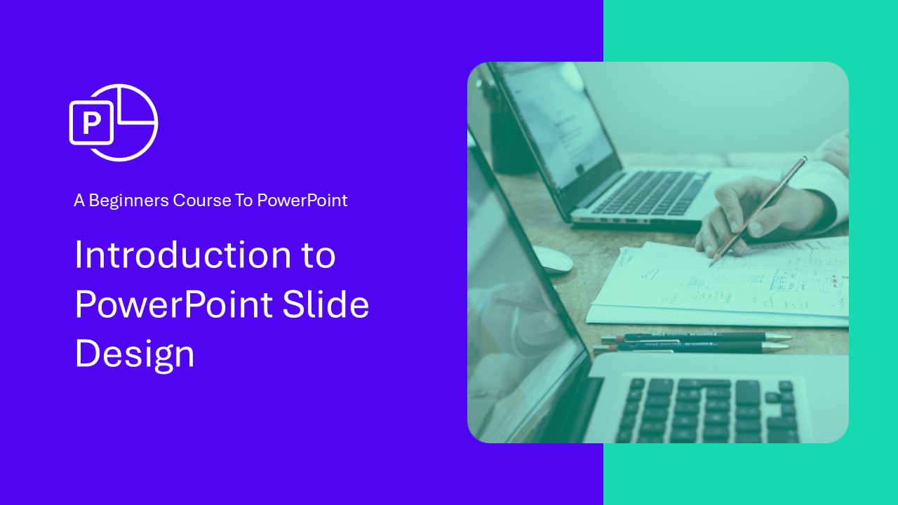
about features, then you are in the right place. Welcome to the Power
Point Basics course, a beginner friendly guide to mastering the core
features of PowerPoint, where you gain a
solid foundation and understanding
about the software. To make sure that happens, I have prepared
dedicated resources you'll use during our session. Each lecture has a tiny
project for you to complete to make the learning
practical and enjoyable. By the time you
complete this course, you'll be capable of
adding text, shapes, adding effects to it,
creating simple slides, and animating everything
you've prepared. I think you could say,
you'll find yourself at home when using PowerPoint. My name is Andrew. I'll
be your instructor here. I have completed more than 4,000 jobs as a freelancer
for clients, and I live and breed PowerPoint. If you want to give yourself a solid foundation and
understanding about PowerPoint, by completing several
projects in it, enroll now and let
us get to work. You won't be disappointed.
2. 1.1 Get to Know the Interface: Welcome to the first lecture. We'll talk about the
PowerPoint interface. I want this score to be as
little theory as possible. So we will do something useful
in the very first lecture. We will add your first shortcut to your quick access toolbar. Let me explain the
layout in a few words. The PowerPoint layout gives you all the slides that you create in your presentations
on the left side. You can resize it, make
it bigger or smaller. All the features are
here on the top side. You have different tabs where all the features are
neatly tucked inside of. When it comes to
point number three, as I have here, features,
what's important? If I say you go to
the insert tab, you'll click on the Insert tab. If I will tell you insert shape, you'll go to the Insert tab and you'll click on the shape. But here on the bottom, you have those little groups. I could say go into the
illustrations group, but this would be
a waste of time. But why it's important
to understand a little bit where
different features are? Because if you have a smaller monitor
and for some reason, you'll resize your
PowerPoint window, let me, for example, make it this small, and currently you can see
all those features are tucked inside the group that
was displayed on the bottom. If we open illustrations, we get back to our shapes, our icons, and everything
that was before here. Let's make PowerPoint big and great again, and let's continue. What I want you to do in
this lecture is to add the Itered shapes feature into
our Quick Access toolbar. The Quick Access toolbar, I have it on the
bottom, and on Windows, you can put it on the bottom. But normally, by default,
it's on the top. Let me change it so it looks
like in your PowerPoint. Show above the ribbon. Probably you have only safe, load open and a couple
of features here, but you can do as
many as you like. You can see I have a pretty
extensive collection. You can go to Insert,
and in PowerPoint, you can right click
on any given feature. Please right click on shapes and add them to your
Quick Access toolbar. This is essentially the
thing that I always teach at the beginning
of PowerPoint courses because this is a very
important feature that we'll use over
and over again, and it's very convenient
to have it here. This is everything
that you need to do for your first
interface lecture. If you are a Mac user,
it's a bit different. You don't see the names of the
groups here on the bottom. If you need them, you can go to PowerPoint to preferences, and under the view, you can
enable show group titles. What's also a little problematic
that you cannot simply right click and add items to
your Quick Access Toolbar. But you can open the three dots, you can go to more commands, and you can dragon drop anything to the Quick Access
Toolbar this way. I will go to the Insert
step on the bottom, somewhere we have shapes. Shapes, import them,
and I'll click save, and the insert shapes
feature is already added here on the Quick Access toolbar on the Mac version as well. This is it for the
first lecture. Let us continue to the next one.
3. 1.2 Interface Enhancements: You don't have to do anything
within this lecture. I just wanted to
show you because I finished recording
this course, and literally one day later, PowerPoint changed its graphical interface
just a tiny bit. There's no new features, and PowerPoint doesn't
have a lot of updates, but I want to show you that
within the insert tab, where we have shapes, the
shapes now look like that. Previously, and in
the next lectures, it will look like this. This is only a visual update. Nothing has changed here, but I wanted to mention this to you. Is there any other
change from what I know within the shape sill, when we see the colors, now they are a
little bit bigger. Previously, this entire
window looked like this. Also, this little arrow, as you can see, it is now
very big and easy to click. Previously, it was a little
smaller and looked like this. Okay. This is only
for your information. Depending on the
version, you either have this new design
or the previous one. The functionality is
completely the same. Those are only
graphical changes. Thank you, and let us continue.
4. 1.3 Creating Slides & Structuring with Sections: In this lecture, I'll tell
you everything about adding, removing slides and sections, so you will have an easier
time navigating through your presentation and
you'll never get confused. What is what here. Let's start off by adding slides
and adding sections. Adding slides can be done simply by going to
the left side here, clicking in the
appropriate place, right clicking and
selecting new slide. This way, you add a new slide. Alternatively, you can go to the Insert tab and you can
click on this slide directly. This will simply
add a new slide. Alternatively, you can
click on this arrow bottom, and this will allow you to
select the preferred layout. For this presentation, I created this purple and
this gray layout, so we have something to
distinguish between them, but you can also use the
basic PowerPoint layout. For example, a title and
content layout that allows you to add a title and add any
type of content right away, so you save a
little bit of time. But this is only a
little addition. The second thing
here is sections. Sections are basically
groups for slides. This feature was added, I believe in Power
0.2010 or 2013, and it allows you
at any given place to right click and
select at section. Why are sections useful? Because you can
collapse and expand them and you can delete
entire sections of slides. This organizes your presentation and allows you to group things. Okay, the first point is ready. I'll always bolden the
things that we've completed. Now moving slides around. You can click on
any type of slide and you can put it somewhere
else, for example, in a different group
between other slides, or you can put it back.
It's very simple. What's very convenient that
you can move entire sections. For example, I can move this
section to the beginning and the entire section
with its slides within that section will
be moved to the beginning. Okay, adding shapes should
be after adding slides. Okay, so I put it back here. Now, this is how you
move slides around. Number two is complete. Number three, duplicate slides. You can select a slide, and I always use my
shortcut Control D D, D, D D to duplicate this slide. You can, of course, we
click on the slide, and you have a variety
of options here. As you can see, you have the duplicate slide
option available as well. If you would very often
use this feature, you could add it to your
Quick Access toolbar. But since we have such a convenient shortcut,
I don't recommend that. Okay, let me delete
those slides. We duplicated this slide. Now, shift selecting slide. Sometimes there's a situation where you need to select
multiple slides at once, and if I click on a slide, you can see it has
this red outline now. If I move my mouse over it, the outline gets thicker. What if I want to select this, this, and this slide together? So I select the first one.
I press my shift key, and I select the last one. Now all three are selected. Why would I need to
select three slides? Because I want to
move them around. Or I can press my delete
key to delete them at once. I'll press Control Z
to get back to it. Shift Select slides is now complete, collapse, expand all. Something very neat about organization in your
presentation is that you can collapse and
expand all the sections. If my presentation gets too big, like for example, this one,
this one is pretty big. So you can write
it on the sections and you can collapse
all of them. Now we already see
all our groups. And since in this lecture, we are talking about
adding slides, so I'm opening the
adding slide section, and this is the only thing
I see on the left side. I can, for example, open this and I can close
it back again. I really enjoy that. We can collapse and expand
it like that. Reduce slide section size. Remember that this
entire slide section on the left side can be resized. Often, let me expand everything. Very often, I have
them rather small. This gives me a good overview about the entire presentation. I can navigate and move around. And if I have, for example, only
three or four slides, if it's a small project, I can make them bigger to preview what I've designed here. But usually, I have
it very small. Please, if you are on
the resource file, do all those tasks yourself. Once you complete a task, just select the textbox and press Control B to make it bold, or from the home tap, you can select the bolding of text in order to mark
this as complete. This is it for this lecture. Let's see each
other in the next.
5. 1.4 Adding Shapes: From Basics to Custom Options: I honestly feel like this
is where the course starts. Here, I'll teach
you how to insert different kinds of
shapes into PowerPoint. Please open the resource file at the slide with adding shapes, and this is the finished example that you
should end with. Please go to the gray slide
where it says practice here because this
is the place where I want you to practice. We'll add different shapes. Number one, I think you've
already done this, but if not, please go to Insert shapes and make sure that
by right clicking, you added this to your
Quick Access toolbar. If not, you'll always
have to click on Insert and always
click on shapes, and this is a feature that we use a lot for our designing. Once you have that, we can start inserting a shape.
Insert a rectangle. Please go to Insert Shapes, click on them, and
insert rectangle. You will have this
plus sign now. You can click, hold your
mouse click and just move drag around to
create the first shape. Okay, you have inserted a
rectangle. That's beautiful. I'll Control beta.
The next point will be to insert a
rounded rectangle. And I'll show you
the difference. This time, I'll use my shortcut from the Quick Access toolbar, insert shapes, and
the second rectangle is a rounded rectangle. What is a rounded rectangle? This is essentially the same, but we have this
little yellow dot. This yellow dot is available
on some of the shapes in PowerPoint and it allows
you to round the corners. It's a very inconvenient tool. You can essentially get
a circle out of it. This one is used very, very often, so
memorize where it is. Under the insert shapes,
I would recommend that you click around and add a
few more of those shapes, but you don't have to do
this if you don't want to. As you can see, PowerPoint is
very limited in the shapes. I am advocating and telling
Microsoft that they should add more because I'm on the
Microsoft Creators program, but maybe they will
finally listen. It's very difficult to
push any change forward. Okay, insert around
the rectangle is done. Now the last thing
you need to add for this lecture will be
a perfect square. Now, essentially, you
use the same shape, but you need to use a little
trick with your shift key. Let me go to the
Quick Access toolbar. Let me select the
first rectangle. Let me click my mouse, hold your mouse, start drawing. You can see I'm
starting to draw, but the moment I
press my shift key, it becomes a perfect square, and the shift key is a very
important shortcut that you should memorize right
now because any other shape, for example, this shape,
I want to resize it, but I want to keep
the same shape. If I do this by hand, you can see, I'm
distorting the rectangle. But if I start to
resize it and I shift, it will be exactly like
it was bigger or smaller, depending on where
I move my mouse. In this lecture, you've
learned how to insert shapes, how to use the insert
shape feature, and you memorized your first
shortcut, the Shift key. Thank you very much
for listening. Try it out yourself
on the gray slide, and we'll see each other in
the next lecture very soon.
6. 1.5 Rectangle Customization Techniques: In this lecture,
we will practice different shape options. We will make a rectangle
to look like this and a triangle to look
like this. Very fancy. Let's go to the next,
the gray slide, and at first, let's work
on the rounded rectangle. The left one is the one
you should work on. The right one is the beauty
you want to achieve. Okay. I'll click on the shape. And if you notice
on the top side, we have shape format
now. Let's go into it. By going into the shape format, we have different tools
specifically to this shape. We'll start number
one with the fill. I'll select the fill, and apart from selecting
a different color, I can also select
to have no color. In our situation, since
we want to achieve this, we will select no fill. We often do this if you want those designs where only
the outline is visible. Fill, all right, outline. Now, let's change the outline. We want a dashed outline. Can we achieve that?
I think we can. We are like Bob
the Builder here. Shape Outline. For
the shape outline, you have shape
outline features on the bottom. We can
change the weight. We can change it to sketch, and we can add some dashes. Please go for one of those dashes. You can
select which ones. For example, those
should be okay. Now, but you can see
they are really tiny, really tiny, and
those are very big. We can make something about that by going to shape outline
and changing the weight. Let's go to the weight
and make it six points. Remember, six points
isn't the limit, but I don't want to
overwhelm you right now. We can go to the
more lines options, and they will open up
on the right side. And on the right side, we
have more detailed options. I'm sticking to
those because those are the simple
aggregated options, but if you need to
go beyond that, you need to go to more options, and here on the
right side, we could increase the width to
even seven points. Let's make seven just because I showed you this and
we would be done here. Okay, outline is okay. Now for the effect,
I'll tell you a secret. This is a shadow effect. You can apply effects the same way as we apply
anything to this shape. We applied a shape fill
by giving it no fill, and we can click actually
here to make it quick. We applied the outline and we
can now apply shape effect. For the shape effects, well, some of the effects
are, in my opinion, a bit cheesy. The
reflection is good. The glow is good, but it
doesn't always look beautiful, and those soft edges bevels
aren't really that useful. But shadow is the prime
thing that you are using, and you have some
predefined shadows that you can use
directly on this shape. Let's maybe use
the first shadow. Again, if you need
to go beyond that, you can go to the bottom and here you have shadow options. But this is a little
bit too advanced. This is a basic score. So let's go for a
first simple shadow. All right, we
applied the shadow. I would select effect
as being done. Now, right click and
select shape format. Alright, right
click. Format shape. This is where you have this right panel with
all the features. Those features essentially are the same for the filling
and line options. Here we have effect options, and the last step
is size options. And in my opinion,
size is very useful to know where it is because
in the size options, sometimes you need
something to be precise. There's a chance that you
will have it in inches. I'm in Europe, so I
have it in centimeters, and there's a chance
that you want this to be a perfect square
of 8 centimeters. And this way, you can
change the size precisely. You can also do this
by going to shape format and you have also
this on the right side. So as you can see, the
most important features are put here within
the shape format tab. Okay, we have the shape size. We have some features. And the last thing
I want to show you, but this is optional
to change the shape. I can click on this shape, and from the shape format, there is added shape
on the left side. You can open the dded shape. You can change the
shape, and you can, for example, change it to a circle. Why would
that be useful? Because sometimes you make
those beautiful shapes, you add all those effects, and in the end, you decide
for a different design. You don't have to do this
design from scratch. You can go to added shape, change shape, and you can
change the shape directly. Pres control Z to
get back at it. Apart from the color, we
have everything right. If you need to change the
color, that's no problem. We have the shape outline color. We have the colors
of our presentation, and let's select one
of the green ones. We have the green one, and
they are basically the same. Apart from the shadow being a little different here,
but that's not important. We prepared the
shape the same way. In the next lecture,
I would like to prepare the
triangle with you, so bear with me and let's
go over it together.
7. 1.6 Exploring Triangle Shapes: In this lecture, we
continue our journey, and we will try to turn this square into this
beautiful triangle. Let's work on that
for the filling. The first will be the filling, and I want to teach you
to create a gradient. You as always go
to shape format, and this time, shape
fill won't cut it. We need to use a gradient, but if you do the gradient here, you have only a couple
of predefined gradients. I want you to select
more gradients, and it will take you immediately
to the filling options. The filling options, please
select gradient fill. The reason I'm going
here because here I can precisely control what
colors do we have? We have two gray colors, but I want to click
on the first color. And from the colors, I want
to select maybe the purple. It doesn't have to be
perfectly the same. I just want to show you how
we work with gradients. And for the second color, you can click on the second color, and let's go for the green. Beautiful. We have
this nice gradient. You can add colors, more colors to the gradient I'll not do this
in this lecture. Let me click away, click away, click and drag it away. So we are remaining
at two colors. Beautiful. Now for the outline, you can see the outline
is a gradient as well. Wow. This must be impressive. Close the filling options, open the line options, and for the line options, we have two features.
Solid line. Which would be a solid line
and the gradient line. Let's be fancy here and let's
go for the gradient line. The first thing I want
you to change is increase the width because I want this to be really,
really visible. Okay, something, for
example, 15 points. Beautiful. We have 15 points, and let's do a different
gradient here. You can, of course, select
the gradient that you want. And if you can see, I have one, two,
three, four stops. I'll remove this, remove this. You can also click on
this to remove it, and I will click
on the first one. This time, I'll
select the green. The second one will
be this purple. Okay, so we have a difference
between the colors. We can, of course, change
the angle of the triangle. We have the angle at 90 degrees. You can click on the direction, and if you want it to be
from the left side to the right bottom side, we
could make it like that. Okay, fill outline effect. I think we applied everything. We have everything
basically the same. The last thing I
want to do with you is change the shape
into a triangle. You should know this by now,
but do you remember it? That's the problem. Unless you use it, you don't remember it. You need to click on the
shape, go to shape format, and from the ddt shape features, change shape, change it
to this second triangle. This triangle, of course, allows you to shift it
to a different position, but let's leave it as
the basic triangle. This way, I believe you are capable not only of
inserting shapes, you are actively changing them and understanding
what's going on. Previously, you must
have been confused, but right now, if you
see this and this shape, you start to understand, Okay, this has no feeling, it has a different outline
and I can see effect on it. It has a gradient, it has a gradent outline,
and it is a triangle. And this is what I
want you to become. I don't want you to
just follow the steps. I want you to actively
see and understand what's going on on this slide and being able to replicate it. Not at this point, you
are still learning. You don't need to know
everything at this point, but you should be capable
to change this shape. Okay? Let me move now to the next lecture where we continue our PowerPoint journey.
8. 1.7 Adding and Formatting Text: In this beautiful lecture,
we will work with text. There's so much to
be excited about because when you insert shapes, insert text, you are
basically ready and primed to do everything
in PowerPoint. I want you in this lecture, to create two types
of text boxes. Let's go to the practice slide. You'll have the
instructions here on the top side and
on the right side, you can preview what
you should create. To Inter the textbox, you can go to Insert
and click on a textbox. But in somewhere
between Power 0.2019, Microsoft, to make it
a bit more convenient, added this feature also to
the Insert shape features. If you go to Insert Shapes, the very first shape
is a textbox as well. So basically, this could be deleted and it could
remain on here, but they left it because
people are used to. On a textbox, you can
either click or click and drag to make it precisely this size
like you see here. I want you to click, hold your mouse down and
drag it around. Now, nice text. I agree. I'll press Enter. Nice text. I agree. You
can click on this text. And for the text options, you can go either to the shape format because this
is also treated as a shape, and you can use those ones, or you can go to the
home tab where you have a bit more control because
in the font group, there's a lot about text
that you can work on. I want you to bolden, Italy, underline, just so you see what happens. We have this text. Another great feature
is that we can make something bigger or smaller. I very often use my
Control shift and forward bracket
to make it bigger or smaller like that because
it's very convenient. Now, if we want the text
to be the same like here, and this is now very important, there is a difference
between having text selected like that and having the entire
shape selected. If I select text, you can see we have little dots here
around the shape. But if I precisely click
on the shape itself, now the entire
shape is selected. If the entire shape is selected, if you go to your color options, you can change the entire
color of the text at once. But if you select a
part of the text, obviously, you'll recolor
only a part of the text. Is something that you need to just work with and
you need to do. Okay, I want you to create this text to make
sure that it's green, and you will be
basically done with the first and second
option. Change text color. We also did that and
change text size. We did that as well. Now for the second one, let
me work on the format tab. For the second one, I want you
to insert another textbox. Please go to Insert,
insert a textbox here or from the Insert tab, inserting a textbox here, I'll insert it that way,
and I will just click once. This allow me to start typing. This one, even better
exclamation mark. Now, I'll select again
this entire shape. I'm already so used to
selecting it right away, and I'll go to shape format. We have a bit less
features here, but still we should be
capable of doing this. The way I would do this, I
would take the text color, and I'll use one of the
purple ones that I have. Now, in case you
remember the shortcut, you can press Control Shift
and forward bracket key. On the Mac version, it's command shift and
forward bracket. And if you don't
remember the shortcut, just go to your home tab
and make it precisely, maybe 40, a font of 40 and okay. And we are basically done. You can, of course,
make it bolden, I make it all Controller B, and essentially you have done everything right
for this lecture. I wanted you to create
two text boxes. They should have
different colors, and you should work a little
bit with their features. In the next lecture, I want
to show you something that is absolutely unique to PowerPoint and not in a positive way. And I will explain
you everything about combining shapes
and texts together, so you learn this
once and for all. Stay tuned, this will be a very important lecture
that I need to show you.
9. 1.8 Text Box vs. Shape Box: What’s the Difference?: Everything that
we've learned so far comes together into
this one lecture. And there's a reason
why you've learned to add text boxes
and add shapes. I want to show you
a detail about text boxes and why they are sometimes a little bit
bad to use because textboxes can be
resized that way, but textboxes cannot be
resized to the bottom. I don't know why, but this is how they did
it in PowerPoint. Once you write, of course,
it will get bigger. You cannot make it smaller, you cannot make it bigger. It will always resize
itself to the text. On the contrary, a shape a shape that you see
from insert shapes. If I insert a rectangle, a rectangle can be
resized that way, can be resized that way. That's absolutely no
problem to make it longer. You can also start typing. So, hey, why do I need text boxes if I can start
typing within shapes? I'll tell you in a second. Let's go to the slide where
you should work with. First, resize a text box. We've already tried
that. It doesn't work. Now resize a shape. Resizing shape is not
a problem at all. Now, the magic trick here is, when I design something
in PowerPoint, I very often just put
text above a shape. Why am I doing this?
If by mistake, the text will be in front
of the shape like that, you can right click on the text and you can select
bring to front. This will move it upwards. Okay. The reason I use text that way is because when
I have a shape, and I start to type
in something here, it's always precisely
in the middle. Yes, you can place
it somewhere else, but it's so much more convenient that you
can click on the textbox, and you can move that
textbox everywhere you want within or
outside of the shape. This is why I very often put
them one above the other. I'll press my shift key. I shift select this shape, and I just right click on
them and select group. Alternatively, and this is what you will use
90% of the time, you can press Control G. This makes a group, and if you want to ungroup this, you press Control Shift G.
The reason I'm not using native text from shapes
unless I want it exactly in the middle is because I have no control
over where it is. And when I make
the shape smaller, you can see the text
gets a bit crazy. If I would like to move
the text, for example, to the left top side, you
know how I would do this? I would need to right click. I would need to go into
the format shape options, and this is why I showed you the sizing
options previously. If you go to the size, you have size, position, and textbox. If I open textbox, I can, yes, I can select the text
to be on the top side. Okay, the text will
be on the top side. Now, the left margin, I can reduce the left
and right margin. So it went a bit
to the left side. Now, if it's on the top, from the text options, I can select it to be aligned
to the left side. But look how
inconvenient that is. I need to think about
where to put it. I need to go into
the sizing options. I need to work with the margins, I need to work with
the alignment. It's so much less
hassle to just add a text box on top of it and have perfect control
over where the text is, over the size of the text,
the color and everything. It's much simpler that way. This is the intricate
detail about PowerPoint that you need to understand at this very moment
because later on, when you design slides,
you will just know that you can add a textbox
everywhere above a shape. You can group the shape, and
now it's essentially one. Yes, of course, if
you make the shape smaller, the text
will get crazy, but you know how the
shape should look like, you'll understand where it is. Don't break your
head about this. Now, just soak in what I said. As we work and progress
to the course, you will implement this
into your workflow, and there won't be any problem. See you in the next lecture. Let us continue
with the content.
10. 1.9 A History of PowerPoint: 2003 to Microsoft365: This is a little bonus lecture. I know that we have
people from a variety of backgrounds with different versions working in PowerPoint. I have so many students,
and I know that some of them work on the older
versions, newer versions, and I will show you briefly difference between
those versions, what was happening
during their years. Now, PowerPoint,
essentially, of course, we had Microsoft in 1997, but let's be real here. 2003 is the very old version, and this is how
PowerPoint looked like in the 2003 version. And if you are in this course, I don't recommend to
use this anymore. Power 0.2007 introduced
the ribbon system. And this is an essential
and pivoting point in PowerPoint's career. And for this course,
I don't recommend it. It is a bit too old, but, but it is the lowest
possible version that you can use
this course for. Later on, PowerPoint, 2010, 13 2016, PowerPoint
looked like that. It had this red bar. The capability to create
videos were added, I think in PowerPoint
in 2010 or 2013. In PowerPoint, 2010, we had
to manually add this feature, but this is a very
strong version. Any of those versions
would be okay. PowerPoint 2019 was a big step up because we have two
essential features. When it comes to
transitions and animations, we have the more feature, and
we have the Zoom feature. And overall, PowerPoint
got a little modern. After that, Microsoft
stopped to make those incremental upgrades
every three years. Upgrades were made constantly. There was a version that you purchase 2021, and since now, I believe Microsoft is going completely and pushing its
Office 365 subscription, which is now called the
Microsoft 365 subscription. This is how they
call it. Still, we have access to the
office website, but what you buy now is
the Microsoft 365 version. Version gives you always the newest updates, so
it's very convenient. And this is everything
I wanted to mention. This is a brief lecture just so you understand the
difference between versions. I didn't want to put
this at the beginning because I don't want this
course to be theoretical, but I think this is essential to understand what was
changing over the years. For this course, I recommend
at least Power 0.2019. If you are on 2016 or even
2013, it's okay as well. But the newer, the better, it would be best if you
have that 365 subscription, but if not, that's no problem. I just wanted to mention the
difference between versions.
11. 1.10 Picture Options and Cropping Essentials: We are learning PowerPoint
piece by piece, and now we will
work with pictures. Pictures are essential
to any kind of design, and let's say that you are
doing a presentation for Apple and you are doing
something about storage. We have this picture
here already inserted into PowerPoint. By the way, you can go
to Insert pictures, and there are some
stock images from the Microsoft library if you need a different
picture to work with. Can just click on
the picture and select Insert. All right. But for the lecture, you can work with those boxes. Now, cropping,
cropping is essential. If you click on the picture,
you go to picture format, there on the right
side is the cropping. And like most features
in PowerPoint, you can either directly
click on Crop or click on the arrow to open
up different options. Select Crop. Look what happens. I can crop the picture
to a different size. But beneath that,
I can even take the picture and I can
resize the picture itself. Okay, let's say that you want to display those
boxes on the right side. Now you click Crop again, and we have cropped this picture to this
one little place. But you somehow feel that it's a bit too narrow and you don't want to
do this by hand. This is by PowerPoint introduced the aspect
ratio feature. The aspect ratio, you can
make it a perfect square, and automatically it would
crop it to a perfect square. The only thing that you
would need to do is resize the picture and put
it in the appropriate place. If you don't want if you want
a two by three, no problem. Crop options, aspec ratio, and we will do it portray
or those different landscape options or those
different landscape options. I would prefer if there
would be even more of them, but for the sake of what
we need, it's okay. And what do you think? Do I make this bigger? The cropping? But if you think you can
press your shift key, and you'll remain
on the same crop and make it bigger or smaller. Well, the same way you can make the picture
bigger or smaller, but you get the idea. I will hit crop. This is now a perfectly cropped
two by three picture that we could put
on the right side, and it would be a part
of our slide design. What do we have last, we already did that crop a picture to
another shape, a circle. Okay, a different
feature that PowerPoint introduced from the cropping
options is crop to shape, like we had changed to
shape for normal shapes. In the picture, we
can do the same. For pictures, we can, for example, crop
it to a circle, but this circle is
very odd right now, right? You can click on Crop. You can a ratio and
now make it a square. Now you see very simply we achieved a perfect
circle for this photograph. And what could we do? If you would like to give
it maybe an outline, you can either put
a shape behind it or go to those
picture options. We have the picture border. Well, picture effects. We can give it the shadow
if you wanted, but what I wanted to show
is the picture of border. Let's say we want a picture
of border of six points, we can click on
the purple color, and this way, we created
this nice design. We make it a gradient?
That's a tricky question because those picture options are different than
the shape options. And if I go to format picture, I go to the filling
options and I open the line options
yes, we have it. We have the gradient line. We can change the gradient to the gradient that
we had previously with the purple and green color. And for the width we could increase the width to
make it more visible. And this way, you can
consider making such designs. This is it for this lecture. Now at this point,
you can add shapes, text boxes, and pictures, which is the holy triangle
of PowerPoint design. This is what my other advanced
courses are all about. Let us continue to the
next lecture and let us build upon this knowledge.
12. 1.11 Slide Design Fundamentals (1/2): Lecture will be a final test of everything you've
learned so far. I want to approach designing a slide like this
together with you. I've collapsed everything.
This is where we work. This is your end result. And this is the slide that
you will be working inside. I put the slide here
on the left side so you can see what
you should create. Let's go over the thing that we have to create one by one. First, format the background. We can right click on a slide, go to format background, and we can select a color
for the background. You already know that we have a gradient fill and
different fills or we can fill it
with a picture, but we will select a solid fill. From the solid fill,
select a color you like. I recommend the darker one. We can select the first purple
one or the dark purple. So this way, we are creating
this type of slide. Add subtitle and main title. As you can see, we have the title and the
main title here on the bottom because you can
inswer textboxes by hand, but I wanted to save a
little bit time for you, and I want you to insert this because inserting
isn't that important. The ability to edit
it is important. Now, let's make this
look a bit better. You can see the contrast makes
the text barely visible. This is completely inaccessible. You need to think about
accessibility and for people who have difficulties to read, the text
is now too small. The text is barely visible. It needs to contrast
with the background. Those are very
important things which every mature designer should
think of and know of. For the bottom text, a beginner's
course to power point. I somehow feel this
should be bigger. Press control shift, your
forward key and okay, make it as big as you want. Now, did we overdo it?
No, of course, not. At any given point, we can
get here and press Enter. Alternatively, we can
make the textbox smaller. Okay. We made it
smaller, a bit narrower. Okay, here, maybe the
course should be higher. How did we Oh, actually, we had the text the other way around here,
but that doesn't matter. It just needs to
feel right to you. I think the text
that is meant to be a subtitle is a bit
too small as well. I'll make it a bit big 24 and
the bigger Tex will be 48, that beautiful. I'll bolden it. Now it's bigger. I think
we made point number two, add subtitle and main title. Use the attached icon. I'll use the icon. I provided
a special PowerPoint icon for this presentation
because I'm a big fan of custom icons. Yes, there are icons
inside of PowerPoint. You can go to Insert. You can select icons, and you
can, for example, select this button,
press Insert, and it will be imported into your presentation from
the Microsoft library. But Microsoft Library doesn't
have a PowerPoint icon. Ironic, but I have imported it. It is a SVG. It's a graphic. And for the film, I want
the graphic to be either white or maybe green if you
prefer to give it some color. Now, the way you
shift objects around, you press Shift,
you click on it. You click on it, and now I can move all three to the bottom. Just make it so it
feels okay to you. Okay. We did the icon, and in the next lecture, I would like to continue with
the right side to create a different design
to do something with the picture and to
create an overlay. So we end up with this result. For this lecture, you are
supposed to do the left side of the slide consisting of
text boxes and the icon. Thank you very much
for listening. Let us continue this
slide design in the next lecture once
you finish that.
13. 1.12 Advanced Slide Design (2/2): Hello, in the second part
of designing this slide. I'm really excited that we are finally doing something
real in PowerPoint. Now, in this lecture, I want you to work on the
right side of the slide. I want you to create
this beautiful picture with an overlay over it. Now, how to approach this. At first, divide the
slide with a shape. You already know
how to ser shapes. I will go to insert shapes. I will insert a rectangle, and I will just make a visual
division of the slide. I can make it approximately of the size that I feel is correct. I can make my life
a little easier by selecting one of the
predefined shape fills right away here from
the shape styles and just going to outline and selecting no outline because I don't like that by default, PowerPoint gives outlines
to those shapes. Here we have this black
outline. Okay, beautiful. Now our final boss the picture. I'll take the picture,
and as you can see, oh, so many mistakes. First thing I need to correct, I need to right click
and bring it to front. Second thing, I
need to resize it. Third thing I need to
complain how bad it looks. Okay, we need to
organize our slide. If we want to use this picture, we definitely want to go
to picture format to crop, and I want to crop it
to be a bit smaller. Maybe a rectangle. Do I
want it to be a rectangle? Well, why not? Crop to shape. We already have a rectangle
aspect ratio one to one, and maybe crop to shape, led to a rounded rectangle. So we will have these nice
beautiful rounded corners. Great. Now the picture
looks much better. Well, I think the picture
could be a bit bigger. Okay. And definitely that text
gets in the way right now. I can click on the textbox. I can move it to the side.
It's completely fine that you change your design.
It's completely fine. Even if we make this smaller to have two lines,
that's not a problem. We are the designers here.
We can do whatever we want. Okay, let's say that the general idea for
the slide is okay, but I feel like the picture
stands a little out too much. This is why I very often create little
overlays over them. Go to insert shapes, insert
around the rectangle, start to design it and
press your Shift key. Make it approximately
as the picture. Don't worry about it right now. Now I can click on it, and I can perfectly move it to the
corner of the picture. Okay, perfect. And
I can resize it. Again, press your shift key and try to make it exactly
like the picture. Difficult, but you will manage. Now, once you have this shape in the appropriate place,
I will right click, select form and shape, and from the right panel,
let me close the line. From the right panel,
we have transparency, and you can increase the transparency to make
this kind of overlay. I'm usually going for 70%, a strong overlay
but not too strong. You can decide whether
you want it to be purple or you want
it to be green. I somehow like the purple. Let's stay with the purple here, and again, we have by
default, the outline. We don't have to select it anymore because we
have it pre selected. You just click once here, and the outline disappears. Beautiful. In my opinion,
we've completed this slide. One last adjustment I would do, I would select the picture together with the shape over it, and I would press
Control G. This way, when I move it, I move it
together with the overlay. It became now one object. And this is much
more convenient. I'll place it maybe a bit
further into the slide, since we have so much
space right now here, and I would even take this text and put it a bit
further to the right side. This looks more appropriate. I will delete this,
and we are done. This way, you created
a complete slide. Please finish this lecture by creating the picture
on the right side. I will wait for you patiently.
14. 1.13 Building and Customizing Charts: Welcome back to the course. In this lecture, I would like to add a chart
together with you. And I want our chart to look like that
because if you learn to create charts like
that or slides like this, you will have such an advantage
over all other people. Mostly what people do. They do charts like this that
look very basic, very plain and generic and just like they were the default
PowerPoint charts. Charts I would say it's an intermediate
to advanced feature. Since this is a basic course, charts may be a bit too
difficult to you right now, but they are essential to any kind of business related presentation
that you will do. So I feel like this should be
included here. Let's start. Shall we go to the
slide where we have the adding charts and the data. I'll
click on the data. I'll select everything by holding my click
and releasing it, and now I'll press Control C.
To have it in my clipboard, I'll go to the new slide. And the first point says, add a clustered column chart. I'll go to insert, I'll go to chart and we have
the column chart, and the very first one is the clustered column
chart. I'll press Okay. By default, it has our
presentation colors. I've already made
the presentation colors to be a little nicer, and that chart
looks already good. Go to the left top
corner and press Control V. Now, open this. The text is a little
big, but what we can do, we can reduce the amount of data that we have in this table because this is
just sample data. I will even delete
it. I don't need it, and I'll close this up. Okay, the chart
looks interesting, but something feels off. It's a bit difficult to
read what's going on here. Okay, we've added this chart. Now, remove the
horizontal lines. We can do this two ways. In PowerPoint for Windows, we can click on the plus sign. And where you have grid lines, you can open this arrow and
you can simply disable them. But on the Mac version, we don't have this plus sign. Don't worry. That's
not a problem because we can do this a
different way as well. We can go to Chart Design, and actually the
very first feature, if you open it, gives you all the things that you can
or remove from a chart. I'll go to my grid
lines and I will just click on them
to deselect them. Okay, beautiful. We have
removed the horizontal lines, Al Press Control B, and everything looks a
bit more readable. Now, at data labels. What I don't like
about column charts is when I have to read the data from the left
side and I need to watch, Okay, this will be 55, this will be 60. I don't want to guess. I want to click on this and just
like we did previously, either from the chart design
or from the plus sign, we can go to the data labels and we can enable data labels. This way, we have beautiful
data labels above the chart. Okay, d data labels
above the columns. Since we edit those data labels, we can click on them and
they will be selected. I'll make them bigger. We can
edit them just like text. I'll make them big like
that, maybe even bold because it may be that they
are very important here. Okay, make sure text is visible. Okay, I made sure that
the text is visible. Now, remove the left
axis and legend. Since we already have
the data above the bars, we don't need this left
side of the chart anymore. I can simply click on this
axis and I can press delete. You can remove objects from
charts like that as well. Now, we have the legend saying phone sales
in million units, and we have the title saying phone sales in
millions of units. I definitely don't need both. I'll delete the phone sales, and this is how we made such a beautiful
chart within PowerPoint. It's much more readable
than something like that where the colors are of I don't even mention
the text color, but this is how most charts look like when you open PowerPoint
and when you answer them. But if you do those
little changes, look how beautiful
this can look, and this is an often overlooked
feature of PowerPoint. I will not spend more time here. This lecture, you should
insert the chart, remove a couple
of items from it. If this is too difficult for
you right now, don't worry. Just go to the next lecture. Soon, we'll continue to
animations in PowerPoint, and we'll have a lot of fund. Animations are my favorite. So let's see each other
in the next lecture.
15. 1.14 Tips on Playing and Hiding Slides: We have learned essential
beginner tips to Power Point. I want to show you now how
to play presentations. We have different ways of
starting the presentation. The one I use the most is
a five on your keyboard. This will start the presentation
from the very beginning. If we open our first slide, it was the slide
about interface. If I press a five,
I will start right here and I can move the
slides with my arrow keys. The second way is to start from the slide where you
are currently at. This is Shift F five. By pressing
ShiftFive, I'll start immediately on the slide that
I'm currently designing, editing, and obviously it's very convenient because you often want to preview what
you've designed. If you always prefer to use
the features on the ribbon, there is the slide show tab. On the slide show tab, we from beginning and from
current slide. You can click on
from current slide, and it will bring you here as well if you don't
want to use shortcut. One last way to open presentations is on the
right bottom corner. Do you see this? There's
an icon called slideshow. You can click on the
slideshow and it will bring you to the
current slide as well. Here we can also
preview the slides with the slide sorter or go
back to the normal view. We will not expand
everything in this section, but one thing I think is also very crucial
is hiding slides. I sometimes have slides
where I have some icons, some things that I don't
want to see people. I put them at the end
of the presentation, and I make sure that I
click on Hight slide. This slide will be crossed
out and look at that. This slide, if I go to my presentation, I
had the courses. This slide wasn't
visible at all. I skipped right to the next one. So if you want something to be hidden, just
right click on it. You can hide or unhide
them to not be exported, not be visible during
your presentations. Very much for
listening. Now you know how to preview and play
your presentation.
16. 1.15 Video Exporting Methods: In this lecture, I want to show you something about exporting, and you may think it's
the most simplest thing. Okay, this is a
beginner's cross, but don't tell me
how to save a file, but you may not know the
details about exporting, for example, a video
in PowerPoint. To save a file, you go to File, obviously, safe,
and it is saved. That's if you already
know where it is. You can also go to File Save As. Now you can select
whether you want it on your One Drive or
on your hard drive. If you want this on
your hard drive, you'll select browse
and you can save with, for example, on your desktop. But one thing, you can save a type and you have different
types of files here. You can, for example, that way, save a JPEG and a PNG. If you will save a JPEG, it will ask you if you want just this slide or all
slides on separate images. This is when it comes to
saving a presentation, which is understandable, but a little less understandable
is creating videos. You may think, like, why? It's just exporting videos. You are clicking on
Export and create a video and what's
important here. You are deciding upon
the size of the file, but the full HD file is, I think, 24 or 25 FPS, and it runs rather slow. If you want your
videos to have 60 FPS, you have to export them
at four K. I don't know why Power Point didn't give us an option
to choose the FPS. If you want 60 FPS or
30 FPS for your videos, there should be a
button. But there isn't. There is a script that you can use to export full HD videos, but you need to manually insert this script
into visual basic. It's a lot of hassle. What I do, I just select a four K video. It's available in the newest PowerPoint versions,
and this way, I get a 60 FPS video, which is very fluent,
very nice to look at. And if you import it, if you upload it to YouTube, it also looks very good. This is about exporting. The most important thing
I wanted to show you here are the video
exporting options. Thank you very much
for listening. Let us continue to a
different lecture now.
17. 2.1 Animation Fundamentals: Hello and welcome in the
animation part of this course. Let me press a five and show you a preview what we will
create in this lecture. Animation number one,
animation number two, and animation number three. The first information for you is when you look at the
slide on the left side, you can see the first slide has a little star there and the
second slide has no star. A star here means that there are animations applied
inside of this slide. Here, no animations are applied, and there is no star yet. I want you to go to the animation stab click on the first object
and select Fade. Okay? Now the story is
visible on the left side, and since we have the
animation tab open, it shows a number here. Okay, we did the first thing. The second thing
is to add a fade, a fly in, and a split. Okay, we added already a fade. Now press on the second
item, select fly in. Press on the third item. It doesn't have to be split. Just do any different animation. I'll select split. It splits
up nicely. All right. We have now applied three
different animations, and the numbers show with which mouse click the
animations will happen. We have three different
mouse clicks. If I start my presentation
again, mouse click one, mouse click two, mouse
click three. Okay, works. Now, see the effect options. Some animations, if you
click on an object, some animations have effect
options that can be changed. Of course, a fate
is just a fate, so there is nothing to change, but for the fly in, you can actually select
the direction. There's from bottom,
from left, from top, I would love if
PowerPoint gave us the opportunity to directly
select the direction, but we are limited
to those here. So let's, for example,
give it from top. We have a little preview,
and for the last animation, do we have any effect options? Yes, we have for split, we can split it
from top to bottom. We can split it from the middle. You can basically see the ways
you can split the object. Just select any one of those, and this is how you apply animations and you change
their effect options. Thank you very much for
listening to this first lecture. Let us continue to explore
animations in the next one.
18. 2.2 Different Animation Modes (With Previous, After Previous, On Click): In this beautiful lecture, I will actually show you the animation pane and what you can explore
on the right side. Okay, let us go to
our example slide. You know that there is a star, and there are numbers here. This means that animations
are already applied, and the animations will play with consecutive mouse clicks. To get a bit more of
an understanding of what's going on when being
on the animation tap, open the animation pane. The animation pane shows all the currently
present animations in this current slide. Okay, we have opened
the animation pane. Now, what do we have to do? Change Animation two and
three to after previous. I will select
animation number two, Shift click the third
animation as well, and I'll right click and
select with previous. Now there is only one, one, one. This means that the second
and third animation will play together
with the previous one. If I hit play and
I click my mouse, all three animations come into the slide at once.
Okay, we did that. Okay, I did with previous, not after previous, but let's
do it the other way around. Now I will select
animation two and three, and I'll right click and
select after previous. This way, one
animation will finish. Then the next will start finish, then the next will start finish. Let's preview that. Let's
click my mouse, one, one, one. This is a different way
to play animations. Try to move them so
they overlap a little. And now is the important detail why I'm doing this lecture. If you have after previews, you can move it further, but
you cannot overlap them. This is why I very often
use with previous because with previous not only allows
you to play all at once, you can actually delay
them as long as you want. You can, of course,
use the delay here on the top side as well. And this way, you can make a very nice seamless
motion between them. Let me play the presentation. Currently, when I
click my mouse, I have them offset a little, but all three of them
are being played. When it comes to the Mac
version, it's very similar. Under the animations, you
can open the animation pane. And for the second animation, you can go onto the
timing section, and from the timing section, you can select with Previeus, give it a small delay. Then the third one as
well, start with preview. Here I'll go 1 second. And when I play the
presentation and I click, I have this nice
offset between them. This is exactly how you
do it on a MAC device. Thank you very much
for listening, and let us continue.
19. 2.3 Mastering Animation Timing and Synchronization: In this lecture, I
want to show you. In this lecture, I want to
work on the animation timing. Here we have a
beautiful animation that happens automatically. But here, we have
different mouse clicks. Let's change that. Change all three animations
to with previous. You can click on
the animation pane, click on the first animation, shift click the last one, right click and
select with previous. Now all three animations
happen at once. Extend the duration of the
animations to 1.5 seconds. And this is another
shortcut I made for myself. I can extend the duration here
directly in the shortcut, but normally you do it here. You have the duration
and the delay. The duration, let's make it, as I said, 1.5 seconds. Okay, all three animations are
this long. Now delay them. I'll select the second one, and I'll delay it by 1 second, and I'll take the third one
and delay it by 2 seconds. Okay? Beautiful. This is a
longer delay between them. So if I hit Play, one,
two, three appears. Let's say that you
aren't satisfied. Let's say that you are not satisfied with that.
The delay is too long. This time, what I would do, I would select a
third time this time, I would select the
third animation and I would go from scratch. I would make quarter a second. I would deselect the second one. I would make half a second, and now I have very brief delays between them of
quarter a second. If I play the presentation,
text one, two, three appear quickly, depending on the style
you are choosing, depending on the style
you are going from, depending on the style, you can, of course, put your
own timing here. You can put 0.3 here, you can put 0.4, and you would have
custom delays. You can do this, but it is a bit tedious to always
do this by hand. If you click, it goes
up by quarter a second. Thank you very much
for listening. Let us continue to
another animation. Okay, let us continue now
to another animation thing.
20. 2.4 Creating Complex Animations: In this lecture, I want
to show you that you can apply multiple
animations to one item. For example, the Power
Point icon, at first, it fades, and then it
moves around a little. This is how you can
approach a slide design. Let me go into this slide, and what we fade the
PowerPoint icon. Okay, I click on the PowerPoint
icon. I select Fate. Beautiful. We have the fate. Now, fly in the text. I can select text number two. I press Shift to
select multiple items, and I click on the third text, and I'll select fly in. It flies in from the bottom. I think for the text, it would look better if it
flies in from the left side. I'll change the effect
options to from left. Okay. Make everything
with previous. Not a problem. I'll
select everything, and I'll right click to
select with previous. Now all three items
will happen at once. Play select you can see it isn't really a
beautiful animation. Make everything with
previous work the delays. What I would recommend, I would recommend
selecting, again, all the animations, maybe increasing their
duration to 1 second. What I often do, I
press Control and I diselect one of them,
then I move them forward. I deselect another of them,
and I move it forward. This way, I nicely
spread them out. Okay, click on the
first animation, select Play from this
looks much better. The last thing, add another animation to
the Power Point icon. On Windows, you can click on the PowerPoint
icon and you can select Add animation to add another animation
on top of it. So let me select At animation, and I will select Teeter or spin just so it's a bit more
fancy. I'll select spin. You can see the icon
is spinning around. And when do we want
the spin to happen? Want to happen it with previous, and I can decide
whether it starts immediately when the icon
appears or a little bit later. It doesn't matter. You
can do what you want. I will extend it. I will make
it spin from the beginning. And this way, when I
play the presentation, the icon fades in
and starts spinning. After one spin because this
is what we added, it stops. This is how you add multiple
animations on Windows. On the Mac version,
it's very similar. Let me just work with the icon. I will select, for
example, a Zoom animation, and it's important that you deselect this.
You click away. When you click away and
you select this icon, you can add another
animation on top of it. I will select spin, and we have two different animations
on this one icon. I would select with previews, I would not delay it. I will increase the
duration to 3 seconds. And with that, when I
play the presentation, if I click, it comes in, it starts spinning, and
after one spin, it stops. I have two different
animations on this one icon, and it's important
that I click away. I can do this multiple times. Just make sure that you always
click away from the icon. Thank you very much for
listening. Let us continue now.
21. 2.5 Slide Transition Effects: In this lecture, I want to talk about adding transitions
to our slides. As you can see, we already
have animations on the slide because we have this
little star on this side. If I play the presentation, I have animation number one, I have animation number two, and then when I go
to the next slide, watch that, I go
immediately to the slide. Really don't like that we have no soft transition between
those slides here as well, directly into the next slide. And you see this all too
often within presentations. What I would like you to do, I would like you to
select the first, second, and third slide together. This is the way we learned
selecting multiple items. Go to the transition step. If you have Power
Point at least 2019, you will have also
the morph transition, and you can preview
what happens. Fade, push, wipe. You can, of course,
decide for yourself. I often go for the
first few ones because those are
the most beautiful. Later on, well, some of the transitions are a
bit obsolete in my opinion. They don't really look too good. But if this is the style
that you would require, then no problem,
you can go for it. I will recommend using simple
fate between the slides, and you just need to remember that on the transition step, on the right side, you
can change the duration. If you want a transition
to happen a little slower, a little softer, then you
can extend the duration. I'll play the presentation
with Shift five. Animation number one,
animation number two, and now watch it
beautifully transitions between the previous and the next slide with the fate
transition that we applied. I like this so much more than just an empty
transition between slides. Okay, beautiful. This is exactly
how you add transitions. There's, of course, a lot more
like those effect options, but not all
transitions have them. It depends on the
transition itself. This is essentially
how you apply transitions between
slides in PowerPoint.
22. 2.6 A Closer Look at the Morph Feature: In this lecture, I want to
mention the morph transition. I have dedicated
animation courses where this is explained in
much more detail, but look at the capabilities of the more transition and
why it is so important. Move things on the
previous slide to the new locations on
the current slide. To get the best results, duplicate the slide,
move things around, apply the morph transition. If you have a shape, then you have another slide
and change the shape and use the more transition it
will try to morph as good as it possibly can the previous shape
to its new form, and the end result can be as beautiful as,
for example, this. Let's imagine that you are
explaining a title slide, and then you are switching
to another slide, and it beautifully morphed
to the right side. Text is appearing and
everything is wonderful Tua a. And this is what I want
you to do in this lecture. Please take this slide. Let
me move this to the side. Duplicate this slide.
Okay, I have this slide, Ipress Control D
to duplicate it. Move, resize,
recolor the circle. You can move the circle
wherever you want. For example, let's make
it bigger like Ted. Let's put it at the bottom. Let's go to shape format and
change the color to green. Do you know what will happen? Apply MRF transition. Go to transitions
and click on MRF. It morphs the color, the size, and everything about this shape
into the new one. Sometimes, when a
shape is conflicted, then it will simply fade
from this one to this one. But if everything
works properly, we have this beautiful morphing. Just to show you
the capabilities, here's one product I did
for another of my courses, and this is the quality
you can get with morphing. You can move to next slide. Everything is shifting around. Everything looks very
unique, very original, and this is the maximum
capability of PowerPoint. Learning MRF takes time, but it's so worth because
it looks so beautiful. And you can morph
around features on the screen on the fly.
Thank you for listening. I will not go more
into detail about MRF because this is not
the time and place, but I just wanted to
make you aware of this feature and another reason why it's worth
learning Power Point.
23. Congratulations!: Big congratulations
and thank you very much for arriving at
the end of the course. If we look back at the goal
that we set at the beginning, you should be capable now
of creating text boxes, creating shapes, creating
simple slide designs, and animating those slides. You should be also
capable of creating a chart and a few other
things about animations. I feel like you are
fundamentally prepared to use PowerPoint from now on at a little bit
more advanced level. Thank you very much. Once again, congratulations and see
you in another one. A
 Andrew Pach ⭐, PowerPoint, Animation & Video Expert