Transcripts
1. Introduction: Presentations can inspire people if they're beautiful and
follow design principles. PowerPoint isn't just
slides and text. It's a tool to create
great designs, tell stories, and
leave an impact. Welcome to the complete guide to Microsoft PowerPoint
and Presentations. A hands on practical course designed to help you
master the software, slide creation, and everything
related to PowerPoint. In this course, I'll
show you how to design clean modern slides, animate your ideas, use storytelling techniques
and visualize your charts and data
like an expert. From Morph and Zoom to template creation and
Microsoft AI tool Copilot. Everything taught through
practical project, you can follow along with
the available resources. This course is perfect
for anyone wanting to be considered the
PowerPoint expert in town. Whether that's a
good thing or not. My name is Andrew. I will
be your instructor here, which makes sure
that everything that I've just said will
come to fruition. If you are ready to
learn, enroll the course, and let's meet in the
first lecture. Let's go.
2. 01-01. Design Warmup: Welcome in this lecture.
This is a practical course, so we are going into
the work straight away. Please open the
according resource file called Introduction
from Section one. When we work, you will have the ready example here prepared, so you see what
you should create. And on the next slide,
this is the working slide where I want you to perform the tasks that I've
written out here. Okay, our task for this lecture is to create
this kind of image, and this is suitable for
almost any PowerPoint design. So here I have my asset.
I have my photograph. I'll press Control C to
copy it into my clipboard. I'll go into this slide
where I'm supposed to be working and
I press Control V. I've already designed
this little data point, and now I would like the image to look a little
better around it. So first step at the
picture is done. The second step use Crop change shape
round the rectangle. You can take any
picture and change it into any shape that
PowerPoint allows you. You can click on the
picture. On the top menu, picture format will
become available, and on the right
side, we have crop. This is the most important
feature regarding pictures. I'll hit on the down arrow, crop to shape, and I'll select the second, the
rounded rectangle. Okay. But here, as you can see, we can change the roundness,
but it's still too big. What can we do? Well, you
can do two things here. Either, you select just crop and you crop it to be
a little narrower, and you hit crop
again to leave it as is or if you want
to be more precise, select the down arrow, select Aspec ratio and select portraate two
to three dimensions. What this will give you,
it will automatically crop the area to your
desired aspec ratio. I think two to three will be the perfect aspec ratio here. I'll position the guy in the
middle and I'll hit Crop. Now everything is ready. I think the roundness
is a bit too much, so I can click on the yellow dot and I can bring it backwards. Okay, we performed test number
two and task number three. We changed it to a
rounded rectangle and we used the
aspec ratio of 23. Add an outline to the
picture, all right. If you click on a picture, it's just like any shape
in PowerPoint. I'll again, go to my
picture formatting tools, and here we have three different
sections picture border, picture effects,
and picture layout. We want to work with
the picture border. Let's select maybe a dark color or do you want this
yellowish lime color? I'll select a dark color.
Let's go for a black. I've selected a picture border, but it's barely visible, so you can go to the
picture border again. And increase the weight. You can increase the weight to those predefined values here, or if you go to more lines on the right
side in the panel, you can do this by hand to
any given value you want. Let's make the width
maybe two points. So it's visible so you see that something was really
created here. Beautiful. So we added this
outline to the picture. I'll select this as completed. Add a shape behind the
picture and stylize it. Alright, you can see
this is our end result. I wanted this little
background to be here to kind of go in line with
the design that we have here. I'll take the picture. At first, I'll right click and
select send to back. All right. Now I'll
go to insert shapes, and I will insert
around the directangle. Now, you can start drawing around the direct
angle, and you can see, because I have a color scheme
selected for my template, by default, it already
gets the lion color. I think this looks very pretty. I'll go right click.
To back again. Now I can decide
whether I want this smaller like that or
I want this bigger. I can use my arrow keys to
move it, behind the picture. I think we can go for something like that.
That's no problem. It's just supposed to teach
you that you can achieve such designs with simple
photo manipulation and adding a few shapes. This is it for the first
lecture for this design warmup. You are supposed to create
something like this. This will be the left
side of our slide. If you are capable you are if you are capable to follow all the
steps, that's perfect. If not, if you are
a complete beginner at PowerPoint, don't worry. I'll teach you everything
gradually step by step, and we will work our
way through examples like this where you will
work on practical projects. See you in the next lecture. I cannot wait to meet you there.
3. 02-01. What you learn in this section: Welcome to the first
real practical section. I'll teach you all
PowerPoint features on practical real life
appliances and examples. I won't go feature, over
feature, over feature, and I won't click around the ribbon just for the sake
of showing you features. I will apply them
on real projects. Some of you know
PowerPoint already. Some of you are completely new. I'll make it suitable
for all skill groups so everything can gain
as much as possible. Please open the practical
PowerPoint resource file. After this section, you will
be capable of grouping, aligning, and you will learn a couple of shortcuts. Let's go.
4. 02-02. Grouping: In this lecture, I'll teach you everything about grouping. If you are on the resource file, you can right click and
collapse everything, and now you can open only
the group with the grouping. Okay, let's go to
slide number one. If I click on this slide
and press Control A, you can see we have this
many elements on the slide. Here on the top side, some
design, here's some text, and here different objects creating our boxes
with our people. Let's go to this slide where you are supposed to be working. This is the ready
slide and ready slide. Here we are supposed
to be working. Group the picture and vignette. Plenty of things go
into this here already because we have a vignette above the picture and
we have the picture. How do we select both? We
need to be very skillful. I need to click here and make my selection big enough so it selects both the picture
and the vignett. Okay, I should be capable
of doing so, right. And I'll press Control G. The shortcut is
displayed on the screen. Sadly, on the Mac version, the shortcut requires you
to select one button more. Okay. Now, as you can see,
we've grouped this together. I'll do this for the
remaining objects. Group and group. All right. Now group the picture
and vignette is ready. Group the entire block. Now, if I press again Control
A to see what I have here, I can put a selection by clicking and dragging
over the entire group. Pressing ContoG will allow
me to group this from now on instead of moving this around and this
around and this around. I can click on the group and I can move the entire
group together. This is essentially
why you are grouping. This will be used a lot. Okay, grouping the
entire block is ready. I'll select this. I'll
mark this as completed. Select items within a group
and move them around. All right. To select
something within a group, you need to click on the group. And then you need to click again to select objects
within the group. Sometimes, sometimes
the groups are a little bit complicated
and it's very, very difficult to select
something like for example, if this would be very visible, it would be difficult to click
on this yellow object now. You can see that.
What the solution is, you can always go to home, select there's the
selection pane that shows all the items. We'll talk later a bit
about the selection pane, but if I wouldn't
be able to click here, I would select the group. Okay, this is group 16. I could open the group and I could manually click
on the object here. Okay. Finally, I
have the rectangle. I would use my arrow key
and I'll bring it back. This is about the selection pan. Okay. We were able to selecting. Resize the entire block,
see how text behaves. The problem with resizing groups is that if you resize something, the text stays as it is. So you would need to use this
feature to make the text bigger according to the
resizing that you did and place the text properly depending on how the
text is structured. If the text is centered or
being given to the left side, because if it's
to the left side, then it's even more
problematic. All right. So you need to be
very careful when resizing groups
that include text. Now I want to show you
how you can ungroup this entire block because sometimes you are
ungrouping items. Let me go to this slide
just to show you. So I have this group
and I can press my shortcut or
right click group, and I can ungroup it again. But 99% of the time, I just go Control Shift G. Just as I did
Control G to group, I can control Shift G
to ungroup. All right. I have ungrouped it,
and now what happened? Because I've grouped those
pictures with the vignette, they are a separate
group within the group. I could ungroup this again. Now I would have the vignette separately and the
picture separate. I wanted this to happen. So this is why I
first group that. For example, I could secondly
group all the text boxes, and now I could
group everything. So I have now a
group within a group within a group. I have
two different groups. If I ungroup it, the text stays grouped and the pictures
stay grouped as well. This is everything
about grouping. You don't need to
know anything more. We will design slides later on, and we'll use it on the fly. Please practice
your grouping now.
5. 02-03. Alignment: This lecture, we are going
to talk about alignment. Please open the section
with alignment and let us start a testament to how
important alignment is. I have alignment
shortcuts very close by. I have an alignment
shortcut here. I have an additional
alignment shortcut here if it's more
convenient for my mouse. And when you click
on shape format, you also have the
alignment options here. So it's very important
to be able to align things on the slide
properly in PowerPoint. Make sure it is aligning to
slide. Okay, let us start. By default, when you
click on an object, you go to its shape format or
to its formatting options, the alignment should
be around here. When I click on alignment,
you can see it is aligned to slide because
only one object is selected, so it has to align
to something, right? But if I shift click the
second object, for example, the title here in my case, if I open alignment right now, you can see it is aligning
to the selected object. So be mindful of what you
select and when you align it, you can, of course, manually switch it to be
aligning to the slide, but that's not
important right now. Okay. When you have one object, it will align to slide because it has nothing else to align. Okay. Make sure it is
aligning to the slide. Okay. I'll click on this person, and we can align it to
the left center right and top middle bottom. If you have the slide,
this will be left center, right, and top middle bottom. Okay, I'll align center now it's perfectly in
the center of the slide. Now again, I want to align it middle align center,
line middle. And this is one of the most
used alignment features. This is why I have them
next to each other here. I have left center center,
right, top bottom. I need to have them close by
because they are used so, so often because
very often you want something in the perfect
middle of your slide. Okay, this is the
basic alignment. Let me teach you
what happens when you have multiple
objects selected. Once I have those two
objects selected, make sure it is
aligned to objects. I know it is
aligning to objects. Let me open a line
selected object. And this is an additional
shortcut that I did for myself. You can customize the ribbon if you want, but you
don't need to do this. You can always go to shape format and you have
alignment here. Now, currently,
if I select line, middle, they will align to
the middle of each other. And align center. They'll center, but both
of them shifted positions. Now, let me show you
something different. If an object like here is
outside another object, both will change
places. Look at that. If I go to align center, line, middle, yes, they are
perfectly in the middle. But this yellow box
moved to the side. But if the object is
within another object, not like that, but inside
of it, look at that. I'll now use my shortcuts. If I go to middle middle, Middle center now
only the red object moved within this object.
Why is this useful? Because, for
example, if you have a big shape and you have
the title inside of it, let me make the
title smaller and let me bring it to front. Now, if the title is
here and you would like it to be perfectly in the
middle of the yellow object, but you don't want
the yellow object to be moving, that's no problem. Now I can center and middle it, and it will beautifully center, and the yellow object
will not move. Now, here we have
those three objects, and this is exactly what you
are using alignment for. Let us go to the slide
where it says work here, and let's beautifully
align those three boxes. I'll press my shift
key, shift boof, booth. Select all three objects. Hold shift and click
on each. Align top. Okay, align top will align them to the furthest
object on the top side. So this is the highest one. So if I go to shape format, line aligned top, everything will align to
the highest object here. Now, distribute horizontally. Another beautiful
feature of alignment is that you not only
can align to the left, right, you can also
distribute items evenly. If I distribute them
evenly, horizontally, let me make it horizontally, this space and this space will be exactly
perfectly the same. If I bring this a little closer, I'm often doing that and I go to my alignment and I distribute
them horizontally again. The spaces become equal again. In this lecture,
you are supposed to learn a little
bit about alignment. Try practicing this
on those examples.
6. 02-04. Merging: This lecture, I'll show
merging shapes and PowerPoint and why
is that useful? This is what I want
you to be able to achieve within PowerPoint to
create a shape like that. And here, this is more
of a Gimme key trick, but I want to show you
the trick, nevertheless. Okay. At first, we will
work on the left object. First, select around
the rectangle first, press Shift, select the circle. Now, when you
select two objects, this is a circle on
top of this shape. I'll select the circle first. I'll press now Shift key. I'm holding my shift key and I'm selecting
the second object. And it's important which
one you selected first, which one you selected second. If you go to shape format,
Merge shapes, subtract. Okay, here on the left
side, we have merge shapes. You can hover your mouse. What happens within
different features here, intersect, subtract. Okay? What's going on? It's very weird because I've selected this red object first. But if I select
the yellow first, now this takes priority, and I'll select this 1 second. I go to merge shapes and
I'll now select subtract, you can see it is
now subtracting from the yellow object, not
the other way around. So this is what I
wanted to achieve here. We can also do
intersect or fragment. Fragment is also very useful
because sometimes you want to fragment those objects
into different pieces. So this is everything
that is cutting each other is fragmented
into separate objects. Now I could very nicely
place another shape here, and I would have
a beautiful box, a custom made box that you wouldn't be able to
achieve in PowerPoint. I only show you another trick, but this is more of a trick. The second one, select all
three rounded rectangles, align them to center and
middle, so they overlap. This is more of a trick
because PowerPoint, let me go to insert shapes. Because PowerPoint has nothing with rounded corners,
only the rectangles. But, for example, you don't have a triangle with rounded corners, you don't have a hexagon
with rounded corners. So there's a trick to make
a shape of perfect sizes. You don't have to
do this. I prepared those shapes here just to
show you the technique. I have three shapes you already know how to align
so I can align center, align middle, so they
become almost one object. They are overlapping each other. And with my little trick, with help of three
different shapes, I made another shape
in PowerPoint. Sometimes we have to do this. But the thing I wanted
to show you here is that you can merge objects
into one because currently, those are three objects and I can manipulate those objects, but the moment I take I go to shape format
to my merge shape tools. This time, I would like to
union them into one shape. I no longer have any
control over the objects. This is now one shape. Yes, it is still a
PowerPoint shape. We can change its color. We can go into right click, format shape, and here it
in the format hit options. We can change the
filling to a gradient, we can reduce or increase
the transparency. Yes, but we no longer can
control anything of it. But I wanted to show you that sometimes with
little tricks, it's possible to get
different shapes in PowerPoint like here. Now it's your turn to
create both of them.
7. 02-05. Format Paint: In this lecture, I'll teach you the format painter and how it can save you a
little bit of time. This is what you can achieve
with the format painter. Let's go to the second
slide and paint over the format to the description
of the second version. Okay, let's take this
gradient object. On the home tab, we
have format painter. We can click on
the format painter and we can click
on another object, and it automatically will apply its formatting to
all the objects that are here because
this is a group. Within the group,
we have text boxes, but text boxes are also shapes. It's painted over the formatting to all three of those objects. Don't like that, so
I'll press Control Z. What I could do, I could ungroup this object prior to
painting this over. Now I could take the
format painter and paint it over only to the
object in the back. But now the text isn't very visible, so I
don't like that. I just wanted to try format
painter saved me time. I don't have to
manually go into right click and into the format shape, and I don't have to
manually click on the gradient and try to apply the gradient
to be the same. Another use case scenario
is the second point, create a circle and paint over
the gradient format to it. Me go to insert shapes, circle, and I'll start
to draw a circle. When I press Shift, it will be a perfect circle just
like this guy here is. Okay, let me put this circle over if I
click on this person. I go to the shape
format. I have 1067. In my case, it's centimeters. So I'll just take this circle. I'll press 1067, 1068, Control V, and now it's perfect. But this guy is now invisible. What I would need to do I need to go into the
formatting options, and I could increase the
transparency of the circle. But if I want the grad can
save myself some hassle. I can click on the object
that I already have, and this is useful if
you change your designs, you'll go to Format Painter and you paint this format over. In my opinion, the
transparency isn't enough, so I anyway have to
go in here manually. I click on the first color, and I increase the transparency. I click on the second color, and I increase transparency. Why did I do this? Because
for picture overlay, bigger transparency is suitable, but here for text,
the transparency had to be a little less. I could even turn off
the transparency. Now I would have
a solid feeling, and this also looks very good. I think maybe this would look a little better
on the subject. No, the text is still invisible. I would need to
change the text to black to have proper contrast. This way, you can
play around with your designs and PowerPoint
by using the format painter.
8. 02-06. Selection Pane: In this lecture, I
would like to show you the selection pane
and animation pane. In PowerPoint,
there is something very important on the home tap. Select. We have our
selection pane. The selection pane
shows you every object that is currently present
on your given active slide. On this slide, it seems we
have this many objects. What's very useful is that
you can click on something. For example, this is the
overlay for the picture. You can double click
on it and change the name to overlay number one. Let me make it invisible. Let me click on the
picture, and, for example, press picture one
or picture of Mr. Format Painter. I can place
them next to each other. Let me make the
overlay now visible. If I place the picture
above the overlay, it gets put above it. You can see this overlay
is now in the back. You can either right click
select send two back. It will be sent completely
to the bottom of the selection pane
or sent backwards. It will be sent one
level further down. If I send backward, you can see the picture now is
below the overlay. So, this is what you need to know about
the selection pane. You can make things
visible and invisible. Since PowerPoint, I think 2021, there is an update that
allows us to lock layers. Now we can only click on them, but we cannot move them around. The selection pane is important
because it allows you to rename objects because later on when we learn
about animations, let me, for example,
take this overlay. It's overlay number one.
If I go to animations, I have a fade animation. If you open out the
animation pane, which is another pane that
shows you all the animations. The selection pane shows
you all the objects the animation pane shows
you all the animations. Now the animation is
called Olay number one. It's far easier to understand which one that is than if
I apply an animation here, apply an animation here, apply an animation here. It's just called textbook 42, Textbox 37 group 23, and you don't really know unless you know
what you're doing, you don't really know
what is sat but here, I know that this is
overlay number one. I animated overlay number one, and I perfectly know
what's happening here. About the animations
and the animation pane, we'll talk, of course, later. But for this lecture, you were supposed to learn about
the selection pane, start using it, open it, get familiar with it, deselect
a couple of elements, and this will be one
of the tools that you surely will always
use in PowerPoint. For the rest of your
PowerPoint usage, you'll surely need to
know about this feature.
9. 02-07. Shapes: Welcome in this lecture.
In this lecture, I want you to be capable and know how to create something like that from
something like that. Shape features are very
simple and understandable, but everyone doing anything in PowerPoint needs to know
how to achieve that. If you click on a shape,
you go to its shape format. As I've mentioned,
we have shape, outline and effects,
and the same for the text, fill
Outline Effects. Even though I added the text
as separate boxes here, I could just as well start
typing inside my shape, and now every of
those options would apply to this text because
they are part of this shape. If I go to shape filling, I can change its color. You can see it's changing
the color on the back, and I have a couple of
additional features. We have a gradient feature, but I have only a couple of pre selected gradients here and we have a texture feature, but in my opinion, this is a little obsolete. What you can, however, do, when you don't like the gradients
that you have here, you can select more gradients. This will open the format
shape panel on the right side. If you've already saw, you can also right
click and open the format shape panel here
by selecting it like that. What you have here is all the features but a little
bit expanded, for example. If I go to shape
format and go for my shape outline, I
can, for example, make a red outline, and I can change the size of this outline up to six points. But what if I want seven points? Then I need to go to the right format shape
panel to my line options. And here we have everything
in greater detail. We can increase it to seven
or even eight points. I know that's incredible. Can click around a little
bit with those features. What I often use, I use the cap type
to be rounded. Well, not with a
rounded rectangle, but if there is a
different shape, I want those shapes to
be a little bit rounded. I use the width. Sometimes
I use the transparency, and if I feel like it, I like to have a graden line. Okay. Let me now apply
different changes, so our object will be similar. Let me take this object first. Let me maybe delete the text. I want you to focus
on this object. First thing I want you to
do is to start rotating it. You can start rotating
it by clicking on this handle and moving your mouse or when you
press your shift key, it will rotate every 15 degrees. Let's make something
similar, like that. Okay. And now we will
do everything else within the format shape options because here we
have more features. We have the shape filling, we have effect options, and
we have sizing options. And actually, within the
size, we have the rotation, and you can see that
we have 15 degrees of rotation applied here. Okay. Now for the filling,
let's go for the filling. Et's go for a gradient and let's achieve a blue
gradient like that. I'll take the first color. I will select my blue color. Okay? And here I
have a lighter blue. I'll select the second color, and I'll select one
of the lighter blues. Okay. But now I can
change the direction. It will barely visible, but
here we have from the corner, from the top side, from right to left, from
left to right. I want from top to bottom. Okay, the second one is
perfect. We can stay with that. I can see the color
is a little darker, but I could click on
the first color and I could just select one of the darker colors
if I really wanted. For the line options,
you already know that you can work
with them here. I can see that we
have a red line, and here we have a blue line. So I actually selected
a gradient as well. By default, we have
this weird gradient. You can click and drag away, click and drag away, and let's create a gradient from the blue to the red color. Okay. They are the
other way around, but you can see you can
either manually change the angle or you can change
the direction like that. If you want the red
color to be on the top, you just select this one, and now the red color is on the top. If you want, you can
select transparency for each single
color in ingredient. This will create this
beautiful effect. No. You can also see that I have some kind of
glow effect around it. Let me take this object. Let me now go to effects. The most used
effects in reality, are shadow, shadow and shadow. Sometimes glow,
but I really like to have everything with my
shadow. So I'll select. At first, I'm always
starting with the preset, so it gives me those
basic features, and then I can increase
the blur a little. At first, I reduced transparency
to see it very harshly. Okay, this is the shadow. You can even change
the shadow color. For example, to blue. Now I can maybe increase the blur and increase the transparency so
it's barely visible. You can see a slight
shadow around it. If you want a reflection
on the bottom, just like we have here, it's barely visible, but
it's a reflection. You go to the next effect, go to reflections, and here
we have a couple of presets. Let me select a longer preset. We have a big reflection. But what you can do
with the reflection, you can either give it a blur, you can give it a blur, okay? And maybe you want a shorter
reelection like that. So we have just a part, and I'll increase the
blur and beautiful. We have this additional
object here. This is everything about shape features that I
wanted to teach you, either work on them within
the format features, or you can click on
the shape format, or you can work directly
here with the text, with the effects, and
with the outlines. Thank you and try to create a shape like
that yourself now.
10. 02-08. QAT: In this lecture, I would
like to briefly touch on the Quick Access
Toolbar for PC and Mac. On PC, you can have it on the top side or
on the bottom side. On the Mac version, for now, you can only have
it on the top side. But still, it's very useful to have the Quick
Access toolbar. The Quick Access
Toolbar allows you to put any feature here
you see in PowerPoint. For example, do you often use
the icons? You right click. You select Add to
Quick Access Toolbar. If you cannot do it
like that on the Mac, if there are some problems, you can always customize the ribbon. You can select more command you can find all
the features here. Remember to not only
select popular commands, but you can select all commands or commands from a given tab. When I search something, I
just go for all commands, and I try to type
it in to find it. Once you find it, you can add it to the Quick
Access Toolbar. Please do not copy my
Quick Access Toolbar at this point because
it's personal preference. But what I highly recommend is that you at least at least at the shapes feature and
the align feature and maybe the sizing features to your Quick Access
toolbar right now. How to do this? On Windows, you can go to Insert
Redlicon shapes and select Add to
Quick Access Toolbar. They will be on your Quick
Access Toolbar right now. You probably have the safe
and auto safe features. I recommend that
you reli on them and you remove those
unnecessary features. As you can see, I
have no saving. If I need to save my PowerPoint, I just press Controls. The reason I want to have as much space as possible
here is that on Windows, you can press your left old
key, and numbers appear. Numbers allow you to quickly
grab a given shortcut. Most often, I use old one and
old two to add the shape. So right now, when
I'm in PowerPoint and I need to add the shape
in the middle PowerPoint, I just press Alt two, boom, shape, l two, boom, shape. And this enhances my
workflow greatly. The same for alignment. If I want those shapes
to be in the middle, I either click quickly here because I went to
picture formant to align, and I've selected all of
the features and I place them manually here or
I just press old one, Alt one, and I can press C and Alt one M. You
can look at that. Old one, C, old. And now my shapes are
perfectly in the middle. I recommend that you add those shortcuts to your
Quick Access toolbar. You don't have to do this, but it's very, very convenient. The same with the
sizing options. The reason I'm doing
the sizing options here because when
I'm having a shape, for example, I'm having a shape. If I'm on the shape format, that's no problem because I
see it on the right side. But if I'm designing
something or I'm working with the animations
and I no longer remember, Hey, how big was this shape? I have the sizing options
right exactly here. Oh, I want this to be 10
centimeters per 5 centimeters. Okay. And this way, I resize this object without
manly going to shape format, and it's on the far right
side. I don't like that. I like to have my
sizing options here. This is personal preference. Once working in PowerPoint, you'll find your taste
and find your shortcuts, but I have to insist
that you at least place the insert shapes and place
the alignment options here to have the most
commonly used close by. On the Mac version, you'll
have them on the top side, but still, this will be very
useful. Try to add them.
11. 03-01. Introduction: Welcome into this section
where I'll teach you presentation
principles that apply to any type of design you make. This section will make you
a better communicator, a better presenter,
a better designer. I want to show you how
you can go from that, from a text heavy slide into
something well designed that clearly communicates the most important
information and data. Those are literally
the same slides, but just designed
differently using visual hierarchy and plenty of principles that I want
to teach you right now.
12. 03-02. Visual Hierarchy: In this lecture, I'll talk
about visual hierarchy especially the one
that applies to PowerPoint designs and
PowerPoint slides. And at first, I want
to talk about scale, the size, the importance. Let's, for example, look at
those objects in the bottom. This is plain and simple text. Everything is of the same size. The title is of the same size. The bullet points are
of the same size. Can I even call
them bullet points. I see three items here, but are they really how
to differentiate them? But here, if I
apply a little bit of size and a little bit of
importance to each of them, I can now clearly see
there is a title. There are three
different segments. They have the same size, so probably they are of
equal importance. So I've used scale to visually
show you what's happening. I would, for example, give it
a color in the background, I would elevate this
a little bit more, and it would be a tiny bit
better understandable. Those would be the very, very basics of slide design, how I would initially change the bottom text
into the top text. Then the next will be form. This means shapes, some
repetition, some balance. You don't always have to use all the same shapes within
a PowerPoint slide. But if you use
different objects, now, look at that. What do you see in
those informations? Do you think the black big
circle is more important than the other ones or which color
is here of most importance? Which object Which data? Are they equal? You aren't sure. But if you find a
form and you use it consistently throughout your presentation,
throughout your slides, and you present your data like
I can now immediately see, Okay, those objects
are equal in size. They are probably equally
ranked and equally important, depending on the presenter, how the presenter will present it. He can present one color to be more important
than the other. But in general, I see that we have now some
form and some balance. The next will be alignment. With alignment, I've noted down several items like spacing, proximity,
and placement. At those objects. Your
brain immediately thinks that those are two different groups of
objects of three, the top group and
the bottom group. You can see I placed
them just enough apart. I used spacing to
make your brain think that you have the top object and the bottom objects. Then I've used proximity. That means how close or how far apart the objects
are towards each other. The top objects are
close to each other, and the bottom gray objects are close to each other as well. Placement, I deliberately placed one on the top side,
one on the bottom side. This way, you feel that those
are two different groups. And if a situation like that
of course in the bottom, you have three objects that
seem like they are one group, but the other objects are of the same size,
of the same color. Are they equally important? Are they not? You aren't sure. So I'm using alignment
on my PowerPoint slides in order to make the viewer understand
the information. Let's do it on an example. We have information on the left side and
on the right side. Now, you aren't sure. Are those the same
kind of informations? Are they are they
equally important? Why are they spread apart? But if I organize them
next to each other, now the message becomes clear, understandable, and very
visually pleasing, I would say. Let's go forward. The
last thing I want to say when you create
presentations, you already nailed
down the scale, the form, and the alignment. Then you can become a little
bit fancy and use design, color, contrast, symmetry, all that into your
PowerPoint slides. You can see clearly, if you have just line objects, you
aren't really sure. But on the second example, you have nine objects and
two are differently colored. You immediately know that something is up, something
is with those two. They are different from
the rest of the group, and this is why you
use color and design. This is everything
I wanted to explain you for the basics
of visual hierarchy. This will be the slide
that we'll try to design based on all the
principles that I've just said. Let us continue to
the next lecture.
13. 03-03. Viewing Patterns: In this lecture, we'll talk
about viewing patterns. And before I continue
to teach you PowerPoint because you came
here to learn PowerPoint, but I cannot teach
PowerPoint without saying to you that
the human brain, the human eye, the way you absorb information
from websites, from presentation,
from data, from books. That present information
is usually on an F shaped pattern or
a Z shaped pattern. Those are the basic
viewing patterns. Of course, depending on how information is placed,
it can be different. But there are
studies about that. You don't have to take
only my word about that, and there are
literally heat maps of information of data of
blog posts that show exactly how the human
eye responds and the human brain tries to learn the information
that it sees in front of us. That information can be
very easily translated into PowerPoint designs
and designs in general. Let's take a look
at the pattern. If you take a look
at the Z pattern and you come up with the
slide that I've created, there is a reason why I created this slide like
that because I would like the viewer to at first skim a little
bit through the title. Okay, the title is big,
bold and very visible. Then I would like to inform the viewer about the
information on the bottom. I know that his viewing pattern will be exactly like that, and I can very confidently
present this slide and know that people will understand it because everything
is slowly explained. Now, I would like
to just briefly touch on the Gottenberg diagram. It basically shows you,
let me take the pen. It shows you that the
reading gravity of people is towards the
right, bottom corner. Let me erase all ink. Let me take blue color. If I divide this
slide into four, Gutenberg diagram says that
we have section number one, number two, number
three and number four. The first being the most prominent and
strongest focal area, then the viewer goes
towards the bottom, number four being
the terminal area. So if I erase everything, the human eye usually
goes around slides, something like that,
towards the end. So very often, you
want to present the most important information
in the right bottom side, but this doesn't
apply 100% always. I wanted to tell you that
in general, the human eye, the human brain works like that, and you just need to be mindful what information you
place where on slide. Sometimes you want the most important information
to be on the left side, sometimes you want the most important information to
be on the right side, and you need to use color
and visual appearance to either draw the attention towards this site or this side. Remember about that,
let's continue, and we will do this on a
practical example as well.
14. 03-04. Reducing Text: Now we will work on the
design of the slide. We have something like that, and we need to make a
nice slide out of it. If I would want to serve
you some kind of blueprint, some kind of game plan that
you can use over and over, always in your presentation,
I would say, first, work on the text because
you are gathering all the information and
then work on the design. For the text, I recommend
that you divide the text into some
important information. Then you rank what is most important, what
should be bigger, what should be
smaller, and then you reduce the amount of text
to the minimum available. If you will be presenting, then you should go
almost text less, but this is not a rule of thumb. This is a general idea
how I approach this. Okay. This is what
you want to achieve. This is how I want you to trim the text, and
this is what we have. Okay, let's start working.
Separate the blocks. Now, we have clearly three
important bullet points. I will just split them apart
by pressing Enter two times, and it would be best
if you would press Control D, and I'll do this. I'll press Control D, and I'll delete number
one and number three. Here, I want to press Control D, and I want to
delete all of them. So I'm left with
three separate boxes, and each box has the
information separately. We could use an add
on to PowerPoint from bright slide to automatically
split our boxes, but not everyone wants to use add ons, so I'll
do this by hand. Okay, I've split the text
into three separate boxes. This already will allow me to create some kind
of design on this slide. Now, rank them by
most important. We are a vending
machine company, and those are the numbers
that we are producing. We have this many
machines installed. We have this many
transactions on those machines because
we can pay with card, and we have those machines
in different countries. And I think all the
information well, I've done the research
for the presentation, so I know all the information
are of equal importance. This is why I have them bolded. And they are of the same size because if information number one would be the most important, then probably probably
you would want this to be bigger as opposed
to those other two. But this is not the case,
so let's work on it. So I have ranked them, and this is exactly fine here. Now, reduce rewrite text. You need to trim the
text considerably. Now we have 2,500
machines installed. Snack Bite has
strategically placed machines in high traffic
areas like corporate offices, fitness centers, airports, ensuring convenience and
maximizing sales potential. Well, this is redundant. This is not important. Ensuring convenience and
maximizing sales potential. This is just sale text. This is just a pitch snack bite. We know that this
is a presentation about Snack Bite.
This is redundant. We don't need to confirm
this multiple times, and this is how you approach
reducing the amount of text. Those kind of
machines installed, I'll even delete
strategically placed. Of course, we place them
strategically, not randomly. Machine may be placed mainly
in high traffic areas. I would even delete
those, but it depends whether you will present this or not. Let's leave it as that. 1.2 million monthly
transactions with AIPort recommendations
and contactless payments. Customers enjoy a frictionless
snacking experience leading to consistent and
growing transaction volumes. Well, all of that below
is not important. AI powered AI powered
recommendations and contactless payments
contribute to 1.2 million monty transactions. If I would be the presenter,
I would say that. Maybe I would say what was
written here on the bottom, but in my own words, this shouldn't be written out. Eight countries operated in. The company has expanded
into key global markets, tailoring its next selection to regional preferences
while maintaining a seamless tech driven
vending experience. The company has expanded
into key global markets like exam country,
country, country. Be data driven,
use action titles, use information that is actually clearly stating some
useful information. This is how you approach
mostly business presentations, but presentations in general. If you want to be a
better powerpoint user, you also need to be
a good communicator. So those are already much, much better. I like
the text more. Let's see what I did
here previously. Part recommendations and
contactless Payan countries, big markets like,
yeah, China, India, Germany, so I was
thinking the same thing. I would even delete that, but
we did something similar. I didn't remember what I did previously, so that's perfect. You can see this is how you
can possibly trim text. You trim redundant information, you trim unimportant information to just have the most
important data displayed. Let's continue once you
already reduced the text.
15. 03-05. Applying Hierarchy: In this lecture, I
would like us to apply some visual hierarchy into those text boxes to go
from this into that. Okay, this is the ready
slide that we created. And very often, if you have three different
informations on a slide, you can use this type of design. Of course, they could
be on the right side, but here I decided to place them in the middle.
Why did I do this? Because the human brain
likes information to be split into three information
four information, six, eight becomes a
little bit too much. So you want to avoid using eight different
information pieces on one slide. You probably should put
them on two different. Scale. Place them as three
vertical text boxes. Consider making Title bigger. Okay, let's do the first one. So the first one I would do, and because all people do always
those bullet points slides, the first thing you
do, you already stand out if you do
something like that. You put the boxes like that, and this information
is already very clear. Consider making Title bigger. Yeah. The first title
is more important. So I'll take the title.
I'll go to home, and you can enlarge the text. I most often use my shortcut Control shift
and this four bracket. So we have 28 here, 24 here. Okay. Let's make it 28. And this 28 as well. Alright. Now I'll
take the first, middle, and third box
and center the text. Okay, I see that this box
should be a little bit bigger. This can be deleted.
This can be deleted. This already looks a
little bit more clear. Okay, scale. Now form. Pick a design or template
you'd like to follow. I will recommend going
to insert shapes, and I've selected
around the rectangle. This is the nicest looking
shape within PowerPoint. You can, of course,
go for a rectangle or for those other shapes. Like for example,
this parallel logram. I have always
difficulties saying that. All right. I'll use the rounded rectangle because it gives me the most flexibility, and I'll put them behind. I want to make sure that I
nail the design right now. So I reduce the rounding. I make it a bit bigger, and I right click
select send to back. All right. Now this
is sent to back. I can position this now or
later. That's no problem. The most important thing,
I want this to be big enough to be placed
in front of the text. Right click, send it back. Do you know my alignment trick? Because the text is
already in the middle, I only have to align
center, align middle, and it will be placed perfectly in the middle of this shape. Align center, align middle. If you don't have the
shortcuts set up like me, go to shape format, align,
center, align, middle. Okay. Now I would like
to group those boxes. Group and aligned boxes. I'll group this, Control G, I'll group this, Control
G, I'll group this. Control G. Now I can
select all three of them. And I'll distribute
them horizontally. Now, the space between
them is equal. Now my other trick is to
group them once again. PowerPoint now thinks that
this is one big object, and I want to put this one big object in the
middle of the slide. For example, if it's too
far to the left side, I'll just place it center. Now we have beautiful
equal spaces here. I can take this, I can control
Shift G to ungroup it, and now I think I did it all. Now the design, color, contra symmetry, I think all
of them are symmetrical. The information is
clearly stated. Of course, we could
use some design, some color, but let's do
it in the next lecture. In the next lecture,
I would like to continue working
on the design. At any given point, I can either click on the text, I
can select the text. And for example, from
the shape format, textfil I can change
the text fill color. I can click on the shape. I can change the color of
the shape as I want. Remember about that that we have the colors
always present here, and we can change them
at any given point. In the next lecture, we'll
make the actual slide design.
16. 03-06. Slide Design Pt.1: In this lecture, I would like to finalize this design by
creating something like that. Let's see what we can do to go from a generic slide like
that into something very, very cool looking
and sophisticated. Okay. Reduce text within
three boxes completely. Let's do the first task. Now, I'm the presenter and I know that I will be capable
of presenting this. I can on the bottom
open my notes, and if I need the text to be later used,
I can put it here. So I'll reduce the
text by deleting it and showing only the most
important information. I'll place the text here.
The way you can do this, you can select a text,
Control X to cut it out. And here, Control V to paste it. Oh, I pasted in the middle. Well, I'll place it
on the left side. Okay? And now this one, I'll cut it out and
I place it here. Okay. This way, I have the text. If I need it later,
within the notes, I can close out the note. I have now all the text
boxes in the middle. Now, I'll take all
the three text boxes. I'll make this smaller, but
the text is in the middle. Would like the box to be made smaller from both
sides at the same time. You can press your left
control key while resizing. Start to resize, hold your
mouse and press left control. This way, you make
the box smaller and you see whether the
design is good or not. Now I can position the text in the middle either with PowerPoint or with
my alignment tools. I can use my alignment tools
and alignment tools here. Well, this will not work because this text is a little bigger. I'll just use my arrow keys. Let me use my arrow
keys and position it. I'll delete the bottom parts. This is why this was bigger. Okay. I have those information I think the slide is now
a little bit too empty. I wanted to use an icon here. I could use icons for one, two, three, but this time, I decided for something else. You can go to the assets, and you have either icons or this high quality icon
that I found online. Well, you can decide which
one you want to use. Alternatively, you
can go to Insert, but there is very little chance that
there will be vending machine icons and illustrations
within PowerPoint. But vending let's try. Let's try. Okay, vending, maybe some kind of vending. Most likely if I type in Shop, also not. Shop vending. Well, shop would be here if you need a very basic icon
within PowerPoint. So I'll use Control C, and place this on my slide. I'll place it on the left side, and I know that people
will read the title first. I want the title to it isn't mandatory that the title
is always on the top side. You can place the title
on the right side, and you can select
the first part and press Control B to
bolden it. The numbers. And this would be the
first part of the slide. In the next lecture, I would
like to finalize this design by changing the bottom boxes a little bit and giving them
a little bit of design. Let's see each other
in the next lecture. In this one, you
should be capable of creating the first
part of the slide.
17. 03-07. Slide Design Pt.2: In this lecture, I would like to continue the slide design. Now, do you remember what I was telling about
proximity, about size? Clearly, this is too close. We have no space here
on the top side. Position shapes. Okay, I
want to take the shapes. I want them to be lower. I'll use my arrow keys, or you can just start
to position them, but I recommend pressing shift. This way, they will
not move around, and they will slide vertically. Okay, I have on the bottom. I think they should be
a little bit smaller. The way you can achieve that, you can select the first one, the second, the third. You can start to
resize them, right? But if you press your shift key, they will be on equal
proportions and always the same. If I additionally press
my left control key, they will now all of
a sudden be resized. From its middle point. Okay, so I'll resize
them like that. Okay, now they are
a tiny bit smaller. I think this is okay.
Now, for the text, I think the data is
the most important. The text doesn't
need to be as big. So I'll reduce the
text to 18 points. This here, I should
be consistent. Do you remember visual
hierarchy consistency? Well, this is less text, but still it's the same size, so it looks really good.
We have one data point. I'll delete this.
Okay. Make sure that all three boxes are equal. Okay, I see they are equal, but if they wouldn't, I
would align them to top. Okay, all of them are perfectly aligned
next to each other. Now I can use colors
from the template. I click on the first shape. Okay, the first shape can
have the first color. The second shape, shape format. Shape I can have the
second color or the third, but I like to be the most prominent
color to be in the middle. But let's just go
for the gray one. And here, what do we
have in this template? We have a dark one. Well,
since we have a dark one, then let's use a dark one. Obviously, you need
to click on the text. Text fill and make the text white in order to
achieve some contrast. Modify the size, position
them nicely. You can do it. Use center alignment
distribution. Okay, we are working on that. I think we already
positioned them nicely. I will take this icon. I will
position the icon a little lower because I like to have some space here on the top side. And for the title, I would
prefer the title to be a bit further to the right side in order to give me visual clarity. I think the icon is
a little too big. I'll make the icon
a little smaller, and I think this could
be a little higher. This is how we make adjustments, but those are only
small adjustments to an already well designed
slide. Adjust the design. Consider adding an icon
if you feel like it. If I feel like it, if I feel like it, I could
take those icons. You don't have to, but
you could complete the design if something
is lacking to you. You can always complete the
design with some icons, with some fancy items. For example, for example, those machines, countries
and those cards. Since this is a vector icon, I can take the graphics format and change the color,
for example, to white. I would recommend to
give a circle here because I would probably
send this to back. I would probably
do something like that if I would like
those icons to be here. Because this line
is problematic now, I'll select all three boxes. Shift, click, shift,
click, shift click. All three boxes, shape format, shape Outline, and I'll
select no Outline. Now, this looks much better. And this design is a tiny bit different than
the previous one. Here I made those little lines
just so the information. This is on purpose
because I wanted you to immediately know this
information is connected, is of the same equal importance. Here, we went for a
different design. Is this okay? Absolutely.
Right click Send to back. It's just your imagination. Of course, this comes
with experience, but I wanted to show
you that PowerPoint can be very playful, okay? This automatically copies over here, and I'll change the color. You can see I have a
shortcut for that as well. If I wouldn't have a shortcut, I would go to shape format, shape fill, and I would
select the color here. Now, for those, I don't
like the black line. So shape Oline we
have pre selected. No Outline. Okay. This is the design in final
shape and form. When I would be presenting, I would probably
even animate this, animate this, animate this. For convenience, I
can select Control G, Control G, Control G, and from now on, I can move them independently and
everything at once. This is my initial slide design. To be honest, I like this more. I like this more, but I wanted to show you a different
approach that maybe this is too
much icons here because we have an icon
here, an icon here. This is personal experience
and taste. I don't like it. I would probably
delete this icon if I would make the
slide like that, and I place the title here in the middle with a
design with icons. But I wanted to show you all PowerPoints
possibilities and how easy it is to do
different designs. By default, I would like you
to create a slide like this. If you would like to make
those little connections here, you can go to insert shapes, and there are plenty
of lines available. I'm using the arc the arc line allows you to make
something like that. For the shape outline, you would like to go
for something dark. And this arc, I'm rotating it. You can take the
yellow points and you can make this
longer or shorter. This way, I placed them here. I duplicated this It click and selected sent to back
to look like a connection. Now it's your turn.
18. 04-01. Introduction: Welcome to the slide
design section. The goal of this section
is to teach you as many PowerPoint features
as possible and being able to
translate that into actual real world slide design. I have prepared a very
consistent presentation. Let me go to view Slide Sorter to show you the slates
that we will be creating have already prepared a color
scheme and some fonts so you don't have to do anything only open this file
and start working. What's the advantage of
having a color scheme? When I insert the shape,
and I go to its shape fill, I have color all the colors
pre populated in my template. I'll later teach you
also how to do this. An additional feature is
that if you go to file, options save here on the bottom, you can embed fonts inside of presentations because I don't want to force you to
install different fonts, I have embedded
all the characters of this font into
the presentation, so you only have
to open this file and start working. Let's go.
19. 04-02. Gradient: In the first lecture, we will
work on the first slide. You can scroll down and
where it says work here, this is the place
where we can work. If you want to always see the slide that you are
currently designing and you have newer versions of PowerPoint, because
of the zoom feature, you can drag and drop
this slide right here, or you can take a screenshot
and put it somewhere here or just hover it here,
and you will see it. You can enlarge the
left area as well. Okay, I'll have it here and
let us start designing. At first, I want a picture
to divide our slide. On the bottom, we have assets. From the assets, it's optional to use my image or use your own. I tried to find an image with similar coloristics to the presentation
that we are doing, and I was able to do so. If I wouldn't be able to
find a picture like that, you can always put
a gradient above the picture to somehow make
it look like the slide. Okay, work here, Control C and Control V. I have
the picture here. You already know some
cropping features. Go to picture format. Click on the cropping features
and enlarge the crop. Not the picture yet,
enlarge the crop to approximately the size what you think will be
fitting for your design. I want to start with that,
and without wasting time, I can again, click on crop
and I can select fill. This will automatically resize the picture to make a
filling to my crop area. I can decide whether I want the picture a little bit to
the left or to the right. When you press your shift key, it will be easier to hover
around horizontally. Okay, I think the picture is placed perfectly.
I'll select crop. I want to work on this area. I can either add a shape or
work with a background color. Let me maybe work with a shape. For that, I'll go to insert shapes or use my
shortcut bolt two. I prefer that, and I'll
insert a regular rectangle. You can click drag. You don't have to
be precise right now because we can always enlarge this rectangle to
the appropriate size. Okay? Perfect. Now for
the shape outline, I want no outline because I
want a very clean design. Now, how to go about gradients. I want gradients that will go in line with my presentation
with my color scheme. And since I have already
this color scheme selected, it will be so much
easier to work. Okay, let me get to the slide. Let me click on the shape, right click, format shape. And here instead
of a solid fill, I will select a gradient fill. I already have the gradient. But let's assume that I
have no gradient selected. I have random colors, and I want to do
it from scratch. I want a gradient that
goes between three colors, and my main purple color should take the majority
of this gradient. So what I'll do, I'll take the first color and
select maybe a black one. Okay? I will add another color by clicking or
by selecting this plus sign, and now I'll go for this purple. You can extend your gradient
by selecting another stop. This is called a stop and
selecting the same color. This way, this color will have
a little bit more agency. But sometimes it makes the distinction
between two colors a little bit too harsh. Okay. Let me take the last color. I'll put it at the very
bottom of the gradient, and I'll select the first orange or maybe the darker orange, or even a darker shade of the existing color
that we have because we have the main colors
of our template, and here we have lighter shades
and darker shades of it. I'll take the darker shade. Okay, I think this
works perfectly, and it also looks very nice with the
picture that we have. Try to give the purple a
little bit more agency. Okay, here on the
left side as well. Okay, I think we are
done with the gradient. We don't have to do
anything else here.
20. 04-03. Overlays: The last thing I
would like to apply here would be text
boxes with information, and this is now important. If you go to Insert
and insert a textbox, or you go to insert shapes, and the first shape
is always a textbox. This was also implemented in newer versions of PowerPoint. I think in 2019, you need to click somewhere outside of this box because if I
click inside this box, I'm just starting to type
because PowerPoint says, Hey, you don't need a textbox because you can type
within this shape. That's not true. I want to
have a separate text box, so I need to click somewhere
outside this slide. Learn enter PowerPoint because this is the topic of
our presentation, and I'll put this in the middle. Now, this allowed me to
have a separate text box. I will select my title
font for the headings. I'll make this a lot bigger because I want this to
be the main information, and I will change the
text color to white. So we can change the text color here or by going
to shape format. Here we have also text options, so two places where we can
change the text color, and you immediately see that we are
approximately right with the size if you remember
our alignment information, you can select this object
and you can center it. Now, this text will be perfectly in the center
of the left object. It's debatable whether you want this to be more
on the left side. I want this to be on the middle. Okay, to save myself time, I press Control D to
duplicate this textbox. Now I no longer need
the heading font, so I'll go to home, and I'll
select the regular font. I want to make it
much, much smaller. I want to call it online
course, And for the color, I have my shortcut, and I will use the shortcut
that I already have, and I will go for maybe the first one. So
let's go for the first one. Let's make this even smaller
so it's not so prominent. Okay. And what else
did we write here? Some subtitle,
Master the software and it's features.
Yeah, that's simple. So we can control D. Actually, I really like when
it's orange like that, so I'll leave it as that. You can decide whether you want this white or this orange. And this gives me some closure. I think this online course
text is far too big, so I'll again,
make this smaller. I want this to be just a small information
in the background. Look at it now, let me maybe still go
for the white color. I think this will
be more consistent with the oral design. I want to make this
a little smaller. Okay, perfect. The
last thing I want to do because I need some
closure within this slide. To have some
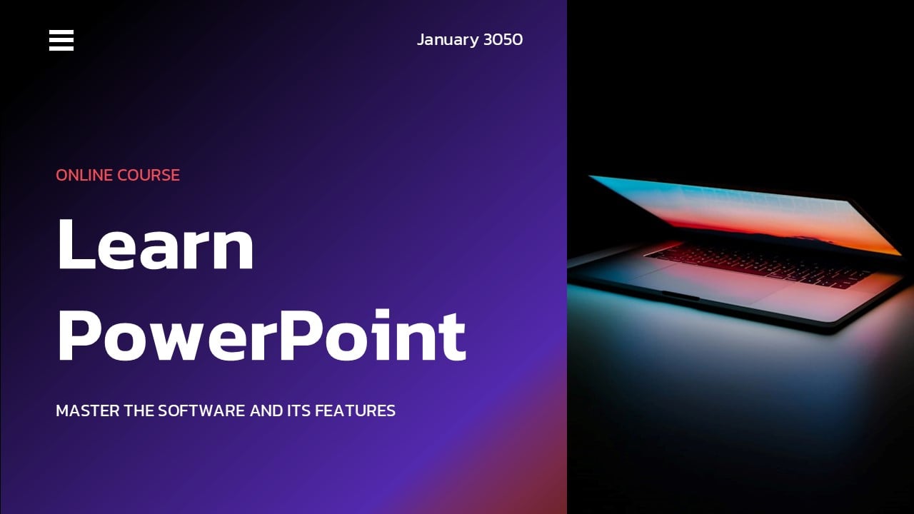
closure, what I did, I added elements
here and I added a sample date here because
it's a bit too empty to open. What you can do to
tackle those problems, you can write your name, you can write the you can write some kind
of date or you can add design elements,
a circle, rectangle. What I did, I used a rectangle. Let's make it big at first. I made a rounded rectangle. I made it like that,
and I press Control D. So we have three
little boxes. Now I can go to Shape Outline. No outline shape fill. Make it white, press
Control G to group, and I created a little
navigation design element. Maybe it shouldn't look like
a navigation design element, but I just wanted
to have something here to give my slide closure. This is also in line with
Gestalt design theories. You can read about
that a little, and when there is closure, it looks a little
better for our brain. Okay, I think this way, you should be capable of
creating the first slide. Of course, we can adjust
where the text is. We can reposition
everything I wanted to make you able to
create text boxes, create gradients, and work
with cropping confidently. Please create a slide like that, and we'll continue from there.
21. 04-04. Icon Usage: In the next two lectures, we will work on a
slide like that. What's important here is perfect alignment
to everything and making icons uniquely consistent with the presentation
that we are creating. Let me show you what
I mean by that. Let me go to the asset slide. And here I have a
couple of sample icons. You could use different ones, but it doesn't really matter. Let me select a new slide.
This is a blank layout. You can make sure that you
have a blank layout by right clicking layout and selecting a completely
blank layout. Now for the
background, let's go. Since we are going
for this dark theme, let me right click
Format background, and for the color, let's select black or the dark one
that we have here. You can decide by yourself
if you want this pure black. I'll paste the icons. They are here, but
they are invisible. Let me make the icons. Okay. It seems that I
made their filling white, but not everything
is with a filling. Some are with outlines, so I'll select the outline. White. Just this one icon. Instead of having an outline,
I'll select no fill. Instead of having an outline, it appears to have a filling. Okay, I'll select outline, no outline, and I was able
to make those icon white. Some icons are
created with shapes, some are created with outlines. Alright. But that's not
important right now. Let me place a slide here and see the design that
you are aiming for. Okay, I want two text boxes. We can go to our previous slide, and I highly recommend that. Of course, normally you would
also have animations on it, but currently, we
have no animations. I want to teach you
this separately. And let's make a point.
Let's make a point. Okay? Let me position
this on the left side, and let me Control D and
show you a little trick. You can either use Copilot to just generate
a little text for you or you can select equal
sign Lorem, one, and enter. This will give you an
entire Lorimipsum sentence. What you need to
do, you just need to delete most of the sentence, and let's just leave
a little bit of it. Okay. I want this to
be a little lighter, so I will reduce the size. I'll put this here,
and maybe I want to differentiate this text with
making it a tiny bit gray. Okay? I think 14 is too
small for presentations. Let's do it like that. Let's
delete the last few things, and this is what we want. Okay, we have one, two, three. Let me delete that. Now I'll
go to my previous slide. I'll take this gradient that we created previously, Control C, and I'll paste this gradient here. I'll make this smaller. Now, this gives
me a reference to the coloristics and style
of my presentation. What I want to achieve if
I have icons that are only white and I feel like
some design is lacking. My trick here is to go into insert shapes and use
a shape in the back, for example, around a rectangle, a triangle, a circle, or a couple of
objects depending on what form that you choose
for your presentation. Let me be very
simple here and take an oval and if you put a shape, behind the icon, it can all of a sudden
get a unique twist. Let me go to Shape Outline. No outline, right click. Send to back and put the icon, maybe make it a bit smaller. I'll press my shift key, so it's consistent in size. Okay. And I'll put it here, and it appears to be working
very well with this icon. I can decide whether I want a different color
for my presentation. For example, let's go for
this right one because I don't want to do things
exactly as I did here. Let's give it a different
twist, a different spin. The red is a little
bit intensive. It interferes a little
bit with the icon bit. Maybe let's put it
on the top side. Okay. I could repeat those
steps with all my icons, and all of a sudden, they would be a bit more interesting, a bit more consistent
with my presentation. I'll send these two back.
Okay, I'll group that, group that, group that, group that, and now I have
pretty and unique icons. I'll position them later with
you in the next lecture. Let us position them
in the next lecture. Currently, I would
like to do the design. Control D, Control D. And Control D. This is what I want you to achieve in this
presentation. Look at that. It looks completely unique like you would have some
super custom icons, but in reality, what I did, I went to insert icons. I just selected a couple
of icons and with help of a simple circle and coloristis that we have
in our presentation. I already looks a bit
more sophisticated. Thank you for this
lecture. Let us go to the next lecture where we finalize this slide
to be perfectly looking.
22. 04-05. Alignment: Let us continue our slide design so we achieve
something like that. Learning makes
everything beautiful. Okay. Let me go to
my first slide. We already have the text, and I'll paste the text here. Learning makes
everything beautiful. Let me delete the
PowerPoint text. And here for the last
sentence for the last word, let's select a different color. I used the purple
one, but it would disappear on this background. Let's use the red one because we are going for the red
one on this slide. If you feel like this gradient should
get a little darker, then maybe change the colors, maybe put the color on the left up side and put the dark one on the bottom side. This may be creating a
completely different vibe. Let me delete one
of the purple ones. You don't have to make
it completely the same. It just needs to work with the design you
are currently doing. We changed the
gradient a little bit. Well, it still is consistent
with the presentation, but I did make some changes
to make the slide unique. Now, let me show you
something about alignment. I already told you in previous lecture how
to align a little bit, but now this is in a
practical real world example. Of course, the text
in real world, the text won't be always that
perfect like we have here. But let me show you what I mean. I'll group this, group this, group this, group this. How to make sure that those two boxes are
perfectly within this space. Okay, at first, I want
to align them to top, so they are both at the
same height, align to top. Now, I'll insert the shape here. Control the insert shape here. Those are my bouncers, and I'll click this, this, this and this, and I'll simply distribute
them horizontally. This will make sure
that the two objects in the middle are
perfectly between them. Now I will just take
them a little lower, and I'll select this and this. Let me align at first
to the top side. Now you see why do I have the align features? Now
align this like that. I'm completely confident
and sure that we have beautiful consistent I
think you can feel this, and I hope you've never worked
like that in PowerPoint because this teaches you
exactly how to position items. They are a bit too
high right now. We could do the same with
the top and bottom side, but I'll just
eyeball it a little bit, put it more in the middle. And I think we created
a very beautiful slide, very consistent with
the presentation that we have so far. If I close the slides, I close the colors.
I close the assets. You are creating a
presentation that is very in line with
its own design. Me continue to the next lecture, where we'll create a
simple slide like this, and we will learn a couple
new features each time.
23. 04-06. Picture Effects: In this lecture, I want to
teach you how to create a break slide and how to work
with images in PowerPoint. All right. Let us go to
our work here section. Let's select a new slide, and let's start by
adding a photograph. We could use Copilot or
just go to insert pictures, stock images, and let's make something for
office or laptop. I often use this
keyword to bring some generic neutral
images into the scene. Okay. Let's do
something like that. Let's put it on the screen. Let us put it in the middle. And I want my presentation, my colors to be very consistent. This is why I'll go
to picture format. At first, I want to crop
it to the entire screen. Click on the picture,
click on Crop, enlarge the crop, and you already know the
trick, select fill. Okay, I'll position
it a little higher. Now I'll take the
picture, picture format, and from the
corrections and colors because we don't have plenty
of good features here, but from the color, I
often use desaturation. This will make a black
and white image. Why I do this is
because if I would put a gradient directly if I put a gradient
directly on top of it, the picture behind might
change the gradient a little. But if you desaturate
it from colors, it will look more consistent
with our presentation. Okay, I'll take the image, and I don't need to
actually see those people. I don't need to see the scene. I want to add an effect. To apply effects, you
can go to picture format and you can go to
picture format, and there are specific
artistic effect dedicated to pictures, and they weren't
upgraded in 300 years. But what's the
most important one will be this one on
the right side blur. I think blur is the most subtle, most often used and most professional looking
because other ones, you can, of course,
scroll through them. I'll select the blur. But I want to adjust
the blur for that. I need to click on
artistic Effects, artistic effect options, and it'll bring me to
my formatting tab. On the formatting tab, you know you have the
filling options, the effect options,
the size options. And since this is a picture, you have picture
specific options where you can corrections, color, and transparency
and the crop. But this is the same that we have here just in more detail. We wanted to adjust the
artistic effect, the radius. I'll increase the radius
to something about 30 because this gives me a
nicer, stronger blur, right. Now, I would like to
overlay gradient above it. I'll take the gradient from the previous slide to be consistent or for
the title slide. It depends which one
you like the most. I'll paste it here, and
I'll enlarge this shape. Now, this wouldn't
be visible at all. What you can do, you can
click on a given color within a gradient and you can
increase its transparency. Then you can click
on the second color, increase the
transparency, and on the third color and increase
the transparency further. Or as I see it, I think if I don't make this
right side transparent, it gives me this really cool, very subtle effect that we have a picture
in the background, but it isn't overwhelming. Next lecture, I would
like to briefly create the icon in the middle so
you don't get overwhelmed. For this lecture, your task
is to add a photograph, desaturate it, as
an artistic effect of blur to it and put
a gradient above it. Make sure that the gradient
will be partly transparent. See you in the next lecture
once you complete this task.
24. 04-07. Icon Usage: In this lecture, I would like
to finalize the design with you by using an icon and some
information in the middle. Okay. For the text, you can take it from
a previous slide, and this is the most
convenient way to work. Just press Control C, select an entire box, press Control V. Let's
take Let's take five. Let's be fancy here, and let's
use this slangy wording, okay, make it a little bigger, and with my alignment tools, I'll put it in the middle. Now, I would like some
kind of time icon here. I'll go to insert icons.
I'll type in time. Of course, you can use
third party websites for better icons because
the Microsoft library is a little small, but those simple icons, those UI icons are always here, so don't worry about it. So they are completely okay
to use. Do you want a time? Let's maybe make
something different. Let's make this timer. Now, I'll make this bigger. I'll position it somewhere in the middle, so I
see how it looks. And let's change its color, its outline, its fill
color to white in my case. Okay? Do you want it like that, or do you want a negative space? Let me show you how
you can achieve that. I'll select a rectangle. I chose a rounded rectangle. We could do something
like that, maybe bring this object to front. I don't need to work
with the positioning. I just select both
middle, middle, now I can press Control
G to group them, and I can position
them in the middle. Again, this is always a hassle. This is why you always need
those alignment tools. I'll make this
smaller by pressing my shift key and Control
key at the same time, I make it smaller from
the middle point, ok? Control Shift G to ungroup it, and let's now see if I think this background
is a little too strong. So what I'll do, I'll
take this background. Go to shape format, shape Oline. You have no Oline
already selected, no Oline, and maybe let's
give it a gradient as well. But the gradient, I'll
revert the gradient. Now I'll make the black on the left side and the
red on the right side. Okay. I think this looks okay. This looks more consistent with the presentation
than previously. And I'll take the black one, and I'll make the black
part a bit transparent because I feel like this icon
is a little bit too strong. I can take the red one
as well and make it. Oh, it's already transparent. This is why I like the design. Okay. And this is enough. We did a bit different
design than we did here, but I want to show you that once you have your color scheme, once you have all the
tools ready and set, it's so nice to make different slides
because everything will look consistent
with each other. Think we did a little better
than the original slide, so I'm very satisfied with that. Thank you
for this lecture. I would like to
continue with something completely unique and
custom in the next lecture. Let's go for another
custom slide design. Thank you and see you
in the next lecture.
25. 04-08. Custom Paths: In this lecture, we will start to create a timeline like that. I promise that I'll teach you new features in each lecture. So let's try to do
something completely custom and not everything can be done like
that in PowerPoint, but this one I can show you and you can
think for yourself, what will be the
use case for it? Let me now go for a gradient for the
background straightaway. I'll go to format background. I'll select a gradient, and we have already
our gradient pre selected because we
did it previously. I think this works very well, so let's continue on. Like this curved type of line to be created
in PowerPoint. How do I make it with
just PowerPoint shapes? Let me go to insert shapes and let me at first put a
frame around the slide. I'm sometimes using the frame. Mostly, let me click
on the yellow button. The yellow button
allows you to adjust the sizes of frames of shapes. And I would like to
make this smaller. I use the frame sometimes to position something
perfectly in the middle. Now I'll try to create the line. Let's make this a bit smaller. Okay. Now we can go to the line. Insert shapes and use a
custom shape called curve. Use curve and start
in the left corner, start here, go here. Go to the bottom and finish
in the right top corner. Double click on it. Now
you can delete the frame. We are left with a
shape like this. To better see it, I'll
go to shape format, Shape Outline, and I'll select white. Now
you see what we did. If I feel that this
is a bit too wide, so I can right click
and select Edit points, I can manually add the points by moving this a
little bit to the right side, extending this a little bit, and maybe this extending
a little bit as well. I would like this to be
a tiny bit more rounded. I don't like that the left
side is more rounded, so I'll right click
on the point. And instead of a smooth point, I'll select a corner point. A corner point allows me to independently use the left
side and the right side. So I want this to be
a bit more circular. Okay, I clicked away. Again, right click Edit points. I want this to be a
bit more circular. Okay, this is the shape. We can do adjustments
further down the road. I want you to click
on right click, select format shape,
so the right panel opens and not the filling
options but the line options. I want the line
width to be very, very big, like 80 or 100. Let's go for 80. Okay? We
have room for more 100. Beautiful. We have
this very thick line. And you can see the
corners are cut off. But what I very
often like to do, I like to change the
cap type to round. This gives you this
beautiful rounded object. Now what you can do, you
can just make it narrower. Make it narrow like that. Okay. And you see now the
line isn't very perfect. So you can always,
always, right, select Edit point, and you
can adjust it a tiny bit. I'll move this a bit higher. Again, I'm always
clicking this a little bit higher and
this a bit more circular. Okay? I think this line will
be perfect for our usage. I'll make this narrower again. And this is our main
design, our main line. As you can see, I
used a purple color. Let's go further
within the design. Okay. I'll take the color and the line color, one
of the purple ones. Okay, I would like to
give it some shadow. So I will close now the line and filling
to not confuse you. And let's go to the
effect options. We can either select glow or shadow. Let me select shadow. At first, I'm always starting
with the very first preset, just so you have a shadow. I decrease the transparency because I want to
see the shadow, and now I can work
with the size. So you see it better.
Okay. You can see you clearly have a
shadow around it. I'll increase the
blur very heavily. Now I can decrease
the size back again. The distance, I don't
like any distance. I would like this to
be a shadow around it. And do we want a black color? I think I want I kind of feel tempted to use our red
just to see how it looks. Okay, a bit too intensive. Okay. Me go for
the bright purple, and this seamlessly
blends into the slide. In the next lecture,
I would like to finalize the slide by
creating this design. And trust me, this
would be perfect for any kind of animations
for an animated timeline. And you can see that PowerPoint isn't perfect
with those curves, but it is possible to
create shapes like this. Thank you very much for your
attention in this lecture. Try to recreate a similar object and we will see each
other in the next one.
26. 04-09. Shapes: A in this lecture, I would like to finalize this design with this kind
of timeline elements. Okay. Let us get into the work. For the text boxes, we already created the
textboxes previously, so let us save time and
take it from this slide. Okay, we need to copy
the entire group. Let's copy the entire group, Control C, and
Control V this here. I press Control Shift G
to ungroup in my case, and I'll delete the icon. Okay. What about the circle? How to make it consistent with the design
that we have here? Insert shapes,
insert the circle. Start to draw a circle, press shift to make it. A perfect equal circle. Okay, I'll position it in
the beginning of this shape. Now, for the shape, outline, I want no outline. Okay, let us continue by
changing the color to white. Okay? The shape is now white, and let's go to our effect shadow and maybe go for the outer
shadow in the middle. The center shadow for the color, let's select the parable one
so everything is consistent, and for the transparency, I'll reduce the transparency. I'll increase the
little blur and we have some kind of
soft shadow around this. Since we are going for this blurry effect,
this should be fine. I will use this time
the text box within it, but as you can see, I'm clicking on the shape and the
text is invisible. You need to go to shape
format, text fill, and change the text
color, for example, to purple. Now you
can go to home. You can increase the
text while having this object selected or while
having this text selected. Maybe bolden it if you want, or even use the heading font because we have
two fonts here, the heading, the bigger
one, and the regular font. I'll use the heading
font and beautiful. We have one let's just go
for one, two, three, four. One, two, three, four,
like four different steps. You can see how simple
it is to position on it, and for the text, I think that I want to center
the text between them. I want to center the text. So a line center. Now, I want to make
this a little bigger. I will make this
bigger. PowerPoint is helping me with its guidelines. And because I have those
guidelines, center the text. I have similar boxes here. Well, here I went a little
bit too far. Okay? Beautiful. I have those boxes. I'll
position them here, and I'll make sure
that both text boxes are centered. Okay, beautiful. Now I could control
D, and I could point different
information into it. I can already see the animation. This would be really nice if the entire number would be
flowing from the bottom, because I know that later
on we will animate this possibly if this would be a presentation that I'm creating that surely would be the case, lPress Control G, Apress
Control G, Control G, Control G. We need
some kind of title, but this is no problem. We can take the text
that we had previously Control C, Control via text, and timeline width for features. The last text, I think it's really I think the design
looks very interesting. If we use one of the colors that we have here, okay, beautiful. I'll position this in center. I think I overdid it with
the size, and that's it. This is the slide
that we created. If you need this to be a little bit lower, just
select everything. Use your arrow keys, and
this is our slide design. I hope you are able to complete
a slide design like that. Yourself, please
go step by step. The most important part of this lecture is
this little shape. And if you at any given point, don't like how it looks, rightly edit points and try to adjust the points
a tiny little bit. It's very difficult
in PowerPoint. I have to say, it's
very difficult, so I do not often
create custom shapes. But sometimes, if I know
how to do something, I help myself with it. Thank you so much for listening. Let's see each other
in another lecture.
27. 04-10. Mockups: In the upcoming lecture,
I want to teach you how to make a mock
up slide design. But the most important part is putting something
inside the mockup, and I'll show you how to
do this in PowerPoint. Let us start. Let me create a new slide. We will
start our work. It can be on a white slide, and let's go to the assets and take this mockup
and take our slide. This is a screenshot of
the slide that we did. Okay, I'll put it on the
screen and now how to make this screenshot to
fit into this mockup. Those mockups can be
downloaded online, phone mockups, computer
mockups, any type of mockup. But I can see this picture, and well, it won't
perfectly fit here. So what do you you can crop it using the merge shape functions.
Let's click on the picture. Let's go to its filling options or even to its picture format. There we have transparency. We can increase
the transparency, so you see this object behind it. Okay, we
see this object. Now we would need
to create shapes that will basically
cut out the elements. So I'm pressing all
two in my case, to insert quickly a rectangle. And I'll just rotate this
rectangle, a little bit. If you can't get
the rotation right, go to the sizing options, size, and here you can rotate it
every one degree, okay? Three is too much.
To would be okay. And I cannot see this line now. So my preference would
be to make this shape, the filling of the shape
transparent as well. This is a little bit
advanced what I'm doing. I'll make the
outline, and we will just duplicate this
a couple of times. Okay. I'm putting this here. Now, I'm putting this
on the right side. Okay, let me do this by hand. I put my what you need to do, you need to click and
you start rotating. But if you are close, the
rotation is a bit difficult, but if you put your
mouse further away, it's a little bit easier. Okay? Okay, the rotation steps aren't helping me at
all here in PowerPoint. Shape options, the rotation
358 would be okay. Alright, the top and
bottom will be much, much simpler because we can
simply make it like this. And this Control D,
make it like this. Beautiful. Now I have four different shapes and
the picture in the middle. Now I can again from the
picture corrections, picture transparency, I'll reduce the picture transparency. Now I can select the picture. Object with my shift click. I'm pressing down on shift. Object one, two, three, four. All four elements are selected. Shape format, merge shapes, and just subtract them. Well, I see there's a
slight problem here. I can press Control Z. I can put this just a
bit further away. Again, select the
pictures, one, two, three. Four, shape format, merge
shapes and subtract. Beautiful. Now I have
this object perfectly aligned with a mockup or
at least good enough. The rounded corners
could be made as well, but it would be too much hassle and no one will see
the difference. If you want to be professional, you need to try to make things to look as
good as they can. I'll take both of them. I'll press Control G. Now
I can freely resize this, put this in the middle,
and this will be the base, the most important
part of our slide. In the next lecture, I
would like to continue the design by creating
something like that.
28. 04-11. Vector Points: In this lecture, we'll continue the design to achieve
something similar to this. Now, let us divide the slide on the left side
and the right side. Do you want to use a gradient or do you want to use
a solid color? Let me select a gradient. I really enjoy those
gradients here. I'll paste it here, I'll right click and
send this to back. Okay. This is the left
side of my slide. The monitor is perfectly
in the center. I'll make sure with my alignment
that this is the case. I wanted a custom shape
here and here to be in the corners in order to
create such custom shapes. You can go for very
normal regular rectangles and you can edit their points. You can right click,
select Edit points, but you are left with this. What I'm often doing is placing my mouse perfectly
on the line, right, click. At point, right, click, add point, right,
click, add point. I have a couple of points, and now I can make this well, let's say unique shape. At least it's not a shape that is normally available
in PowerPoint. I'll adjust it a tiny bit. And if there is too much points, you can just right click
and select the lead point. Now, this would be some
kind of flowy design here on the corner just so you don't have this
much empty space. Now, I have used some text. Again, let's copy it
from another slide. I'll put the text
on the right side. I make sure the text is
black, so we see it. With my shortcuts, I
make the text smaller. And we had something
like best PowerPoint. Course. Okay, simple text. We could add some color
to it, for example, this one to make it a bit different. Let's
go for the red. Let's make it in
the normal font, so it stands a little bit
out from the entire design. Okay, as for the left side, it depends whether
you want animations, whether you want such elements. What I did, I just
added three textboxes. I'll copy the textboxes
because it's not relevant to insert that many textboxes and teach you how to
write inside of them. I think you know by
now how to do this. For the lines, this is
however a bit more important. Insert shapes and lines
are very important because lines allow you to be
connected to those shapes, but you don't always want that. Why do you not always want that? Let me connect this and put a
line like here. Shape line. Wait. Let me make it big
six points, so you see it. Shape line for the
color, I'll go red. So you also see it. Now, if I move this, the line moves as well because
it is connected, and I'm not the
biggest fan of it. Sometimes I use
it, sometimes not, but I prefer it to be
disconnected, like that. Boom, I'll press Control D, and I want it to go
behind the monitor. How to do this, I
think you already know you can either
click on the monitor. And bring it to front. I
have my shortcut here. I'll start to use the shortcut, and now the monitor is in front. Now I could click on the
lines and I could position them so everything looks
consistent and understandable. Of course, the text would
need to be a bit adjusted. You have to not
click on the text. You have to click on the corner. Now you can move this
around and beautiful. We made a design that is very similar to the design
that we did previously, a bit different colors. We used a gradient. If you want this shape, you
can duplicate it. Shape format, shape Oline, Let me select no
Outline Control D. I could put it here. I could
give this shape a gradient. Let maybe see how that looks. Okay, a gradient is a bit
too much for my taste. I'll go for the red color here. Let's see if that looks good. I think it looks not bad, but I think it is also too much since we
have a gradient here. Thank you so much for
listening to this lecture. Please try to create
a design like this, especially the custom shapes, and this mockup here. The mock up here in the middle is the most important part. Thank you and see
you in the next one.
29. 04-12. Presentation Ending: In this lecture, I
would like to create an exit slide from
our presentation. The main focus like visual
point will be those chairs. Let's start designing. I'll create a new slide. And often I tend to make my ending slides just
like the opening slide. Let us go right
format background, or you can click on Design. Here on the right side, you have the format
background feature as well. Format background and go for
a dark black background. From the assets, let
us use this picture. Okay, let's put this
picture here in the middle and let's try
to do something similar, but maybe different than
the design I showed you. I'll make this bigger, and we need to crop this definitely. I want to go to picture format, crop and let's crop it
similarly to what we had there. I think the smaller chairs
will look a little better. Okay? Two rows of them crop. Okay, we have the base
layout of our design. Here we could say, thank you. Here could be some
contact information or whatever you prefer. Since here on these icons, we had this red element,
let me maybe take a circle, double click on it, Control C, and let's put it here
as well to continue the design and just
see how that looks. If this won't work,
I will just skip it. Okay? I'll make
this just peek out. It looks a little bit
too Japanese to me, but maybe it works
with the design. Let us see whether we
add a gradient here or not. Enjoy the experience. This is the text that we want. Okay, for the bottom,
let us use some text. I'll take a text, enjoy it. Enjoy the experience.
Let me know. If I will be the presenter, I would probably ask people. Let me go for a white color. Let me make this much bigger, and let me go for
our headings font. Okay? I want this even bigger, right? Enjoy the experience. And now for the secondary text, I want either the red
color or the purple. For the text color purple. The red. Yeah, the red
definitely stands out more. You could possibly use a
gradient for that as well. You can do this by
right clicking, going to form a shape,
selecting the text. And instead of shape options, you have text options
because each single shape in PowerPoint has its shape
options and text options. From the text options, I
want to use a gradient, and here I will get
rid of the black. I'll go between purple and red. Let's make the
purple further down. Here on the textbook
sizing options, you can increase or
decrease the margin. So if you don't want the
margin on the left side, you would like this to be perfectly aligned
to the left side, you can delete the left
margin altogether. Okay. I'm not a fan of that, but I just wanted
to show you the possibilities of
the gradient color. I also am not a fan
of this object. Either I delete this or I change it to the gradient
that we are using. Okay, let's make a gradient. I'll take the first part of the gradient and I
make it transparent, a little bit transparent, then the purple a bit
transparent as well. Okay? Now I maybe
like this a bit more. Here, I would like some kind of icon for a call to action. Let me create the rest of the
slide in the next lecture. You can decide for yourself if you like this
design, and if not, we will do some
adjustment once we finish everything.
See you in a moment.
30. 04-13. Contact Button: Let me continue the design by
putting something here and something on the right side
to not stay empty with it. We could, for example, repeat the title of our presentation. The title of our presentation
is Learn PowerPoint, Okay, not very sophisticated, but let's put it here, so people remind themselves of what they are
actually watching. And definitely this
should be much, much, much, much, much smaller. I just want some kind of
closure here on the right side. Earn PowerPoint, let me add a shape and maybe
a different shape. So you learn something
about different shapes. I like to use this shape if I
have some kind of division. This shape allows me
to make it like that, make it smaller. Okay? And I have a beautiful line dividing me two objects
with each other. You can zoom in here on
the right bottom corner or by pressing your left control key and
your mouse wheel. I very often zoom into my slide. Okay, let me make this
a bit more narrow. Shape outline. No
Oline shape fill. Let's make the red one. Okay, I made it a
bit a bit too much. Okay. I just wanted
a small, small dash. Okay? Learn PowerPoint
maybe here in the secondary text was thank you or online course
or something like that. Learn PowerPoint. Thank you. For the color, we already
have this red selected. I just position the
text how you prefer. And we created this
nice little closure. I can select all
of them. I can put them a bit further away, and I can press Control G in case I want to
move them around. Now, for some kind of
contact information, let's create a shape It can be rectangle with
those diagonal corners. The corners can be
adjusted either here or with the second
object to make this rounded. You can make the
roundness as you prefer. For example, here, a stronger one and here a little less one. Okay? This would need to be
positioned also properly. Contact us or thank
you or something else. So we finalize this
slide, make it bigger, make it the heading fun and consider whether we want
this to be a gradient. Because we had the gradient
previously like that, I don't like this
gradient very much. I like the previous
gradient, this one. So I'll take this
Control C, Control V. And do you remember we can
format the painter over. Sadly, it paints
also the text over, but I really like this design, so it's not a big problem to make the text bigger
again. Contact us. I really like this gradient. So I'll format paint this
to this object as well. I'll rotate this object, so the gradient shows
a bit different. And now we are finalized
with the design. If you feel that
this is too much, you can just if you feel
like this is too big, you can always
make this smaller. Please remember that you can always make tiny
adjustments at the end. We made a slide very similar to the design that we did here. I think the purple looks a bit better here, but
that's no problem. But you know that you
can at any given point, go here and change it to
a purple that you want. Make sure that if you select something and change its color, that people will be
still able to see it. Thank you for trying
to create this light. I hope you made a
very similar design. Please try it out yourself, and we see each other
in another lecture.
31. 05-01. Introduction: Hello. In this section, we are going to talk
about animations, and we won't only learn
what are animations, what types of animations are
available on PowerPoint, but we will apply them
to a real project, for example, such a
infographic or a timeline. So you can practice on
a real world example, and you will be capable of animating any slide
that you want.
32. 05-02. Animations: In the first lecture,
we will apply different animations to the
objects in front of us. If you have the
resource file open, please open the first
section and let us start. Explore the animation step. The animation step gives you all the animations that are available in PowerPoint
here on the top side. With this arrow, you can
preview a couple of them. Well, the most used one. And here on the bottom, if
you select more entrance, emphasis or exit effect
or more motions pads, it gives you all the animations
available in PowerPoint. It isn't as much, so
I will recommend to click on an object and
preview all of them. The right side of
the animation tab, we can add one
animation on top of the other so an object can
have multiple animations. We will talk about
that later and we can open the animation pane, which just like
the selection pane shows you all the animations. Okay, we will understand everything once
we actually work. Apply and preview an entrance, emphasis and exit animation. Work on that. Let's click
on the first object. Once an object is selected,
animations become available. Let's, for example,
select Grow and Turn. You can use a
different animation. Now I want to select
the second object. Click on animations and
select an emphasis animation. I will go for maybe Grow shrink. So it grows towards us. Now the third one will
be the exit animation. And I'll click on this.
I'll open the animations, and the red animations
are the exit animations. Let's select wheel. Sometimes you have
multiple objects on a slide and you want them to
disappear one after another. This is when you use
exit animations. Okay, I'll select
the second task as complete because we applied
different animations here. Understand when an animation
icon is displayed and what it represents the moment you add animations
to your slide. Here on the left side,
there will be this star informing you that there are animations
present on the slide. Additionally, you
have a number here. You can see this
object has number one, this number two,
this number three. This means this represents the mouse click when
the animation appears. So the first animation appears with mouse click number one, number two and number three. If I press shift a five to play the presentation and I click
my mouse the first time, second time and the third time, all three animations
will be played. It's important that you
know that those numbers are only displayed if the
animation pane is open, because if I go, for
example, to the draw tab, the home tab to the insert
tab, they are no longer here. But when I go back to
animations, they appear. They will be always visible the moment you
open the animation pane, because when the
animation pane is open and it shows the
animations that we have here, even if you click away, the numbers are still displayed. Okay. So we understood when those numbers
are displayed here. Familiarize yourself
with the animation pane. Well, the animation
pain isn't complicated. We can enlarge it, and we have
all three animations here. In a second, we will
change the type of animation and go further
into the animation pane. Here, I wanted to
show you that you can change the position
of the animations. Change the durations
and change their type. I'll explain the
types in a second. You can start with
previous after previous, but that will come later. Okay, change the duration
and delay of an animation. Okay, I showed you that you can let me go to
the animation step. Let's go for the first object. You can click here and
extend the duration, but it's a bit inconvenient. So what I like to do,
I like to work here on the top side with the
duration and the delay. So I can delay this by 1 second and give it 2 seconds of delay. This will mean let me
play the presentation. Once I click on my mouse, it will wait 1 second. Then the animation will
play for two whole second. Okay, click one, one, two. Okay. This entire sequence
took 3 seconds to play. So you need to be very mindful when you play with animations. The longer you make
them, the longer it will take on your
actual presentation. Those are the basics
about animations. This sets our
fundamental knowledge. We can move forward from here.
33. 05-03. On Click: In this lecture, we are going
to learn the three types of animations that we
can apply in PowerPoint. For that, go to animations
and open the animation pane. So let us do the first task. Apply an animation
to all objects. The quickest way to
do this is to select all the objects by
clicking and dragging, have all of them
selected at once, and just press on an animation. Let me go to Zoom. All right. As you can see here
on the right side, we have one mouse click. That will reveal all the
animations one after another. I want to change the
animation type to on click. One of the three main
animation types. You can right click at
any given place and select start on click and
select start on click. Because all animations
were selected, it will be applied to each
animation separately. Now we have six
different clicks. As you can see on
this slide, because the numbers we have
two, three, one, six, four, five, I
wanted to have it one, two, three, four,
five, six, obviously. So I need to select
the first object. I need to see which
animation it is. It is the second one, so I'll
drag it to the first place. Now, this is number one. This
one should be number two. I'll drag it to number two. And this way, you can
organize your animations. This should be four.
Okay? Four, this is five. This is okay, and this is six. If you play this presentation
with shift a five, each single click now would go from one
animation to the other. Let me show you how you can
do this on a Mac device. In case you work on a Mac, you can also select
all objects at once. You can apply an animation. It looks a tiny bit
different here. Let me apply strips,
and on the right side, you can see everything will happen with the
first mouse click. You can either click on Start
and select on click here. Or you can open the
timing options, and within the timing option, you have also on click with
previous and after previous, just like on the
Windows version. Here you can also
change the duration. This is the onclick animation. In the next lecture,
I would like to talk about with previous
animation. Let's go there.
34. 05-04. With Previous: The second part will be about
with previous animation. Apply an animation
to all objects. Okay, let me select all object, and let's apply a swivel effect. It's a bit weird of an
effect, but let's go for it. Now, change the
animation with previous. I will select the
first animation. I will shift click and click on the last animation and select
right click with previous. This will mean that everything
will start at once. If you play the presentation, you can see everything
starts together. Okay. Consider adding a delay. When you use Wood previews, you should maybe group them and give them
some kind of delay. Okay, this is animation
number two and three. This is animation
number one and six. Okay, I'll take the sixth one. I'll put it here,
and I'll select both of them and give them
delay. You know what? I prefer if they are in the
so I don't get confused. I'll delay them by 1 second. And the last two, I'll delay them by another
second one and two. Okay. This way, I staggered the animations to
happen after 1 second. Let me play this, but I don't
need to click my mouse. I don't need to do anything. Every time you need something
to happen automatically, you use with previous. I've added a delay. All right. Now the last one
is after previous. After previous is a little
bit odd because let me again apply an animation
to all the shapes, I'll select split, and I'll increase the duration of
the animation to 2 seconds. Change the animation
to after previous. After previous the third one shows with an icon
of a clock here, and the next animation will not play until the previous
one has finished. I don't like that. I see this as a limitation because I
would like, for example, the second animation to already start when
this is finishing up, not wait until it ends. So I don't like the
after previous feature. I very, very, very often, select all the animations. I select with previous and
I delay them a little bit, so they overlap each other. This looks a bit more smooth and a bit more
fluent for our slide. If you play this, you
can see what happens. Of course, the
animation isn't pretty, but I wanted to show you what happens when you select after previous and what happens when
you select with previous. I think this is understandable. We'll work with that on a
real project very soon, so you will be able to put
everything into practice. Thank you so much
for listening here, and let us continue
to the next lecture.
35. 05-05. Animation Effects: In this lecture,
we will talk about the effect options that are available for
certain animations. Okay. Our first task is to
add in a fly animation. I can select all three objects, and I can select fly in. Let me select each fly in
to be with a mouse click. I'll right click and
select on click. Now I have three
different mouse clicks. I'll click on the
first one, and you can see effect options
became available. And this is animation specific. For example, this
fly in animation, when we click on
the effect options, we can change the direction from which the animation comes. Example, let us
fly in from left. I'll select from left. I would select the
second one to be from right and the last one
to be from left as well. The result would be change affections right from
left as preferred. When I click, it
comes from the left, from the right, from
the left. All right. Let me select the second one. Let me double click
on the animation. And when you go to
the effect options, some of the animations,
not all of them, but some of the animations
can have a smooth start, smooth end or bounce at the end. You select a smooth start, it will start slower and then come a little bit
faster into this slide. Let me press Okay.
It starts Well, we can't really see it because the animation is rather short. I'll extend the duration
to 1.5 seconds. I will now select the last
animation, double click on it, and from the effect,
either select a smooth start or give it a
bit of a bounce at the end. I'll give it a bit because
if you go too high here, it will bounce very strongly. Okay you can see there's a
slight bounce at the end. Because I did change both the effect options and the animation smoting,
this would be my result. The first animation would be a regular fly in the same
speed the entire time. The second one was
starting a little slower. You can see it was peaking here and then it flew
into the screen. And the last one will have
this tiny bounce at the end. Those are just some features
we can achieve here. Let me show you a different one. For example, here, I will
apply a fate animation. Let me select all the text. I'll select fate animation, and we have no effect options
to the fate basically, other than to treat the text
as one object, all at once, or by paragraph because
those are one sentences, this will make no change. I'll take the first
one. Again, let me extend the duration, and let's select
everything with previous. Now, the first one will be
a normal fate animation. The second one but
from the effects, instead of animating
the text all at once, I'll animate it by word. And I'll delay the
animation by maybe 5%. You can see now every word
is animated separately. It makes the animation
a little longer, but it looks that much nicer. Let me select the last
one and select by letter. I select B letter, and I strongly recommend that you go for a low percentage
because else, the animation will
take very long, okay? You can see now it very
seamlessly animates, and this is the strongest
point of the fate animation. If I go Shift a five, oh, sorry, I wanted everything to happen with click, so I show you this. The first one will be a
completely normal fate. Fate. The second one
will fade word by word. It is very seamless because the animation
is rather quick, and here we'll
animate by letter. It goes even more seamless
like that. Okay, beautiful. This is what I wanted you to learn in this lecture
before we move forward that some of the
animations have effect options. For example, if
you go for wheel, you can decide
whether the effect goes for one spoke
or for more of them. When you go for a wipe, you can select from which
site it will wipe in. And additionally,
animations have their effect options once
you double click on them. Not all of them,
but most of them will do have those
smoothing options. Thank you. And let us now
go to a real life project.
36. 05-06. Animating: In this lecture, we'll make
a real professional project. Let us animate this slide, this infographic in that way. And I want you to be confidently doing that each single time you face something that you want to have animated
to your preference. Okay, let us start. Let's go to the slide
where it says work here. Note, if you want
to make it easier, remove half of the elements. Yeah. If you are just starting out with PowerPoint, then
I recommend that you, for example, delete
this and delete this and everything
becomes a bit simpler. But if you've already worked
in PowerPoint previously, then you can go for
all the elements. Now, group everything
for ease of use. I want to animate, I press Control A to show me
all the elements here, and I see, now, this
is a separate element. This is a separate
element. I would like this to be together. So I'll group this. I'll
just select Control G, Control G, Control G,
Control G. All right. Now, those are separate objects. Now, the text, is
the text grouped? Okay. We have the
text already grouped. Now this icon in the
middle it seems grouped. Everything seems to be prepared. So let us start. Add a
fly in to the text boxes. I think that the text
boxes could have a fly in. I will click on the first one. I will select fly in and definitely I want the fly in to happen from the left side. Effect options from left. Beautiful. Now I'll
select this box. Animation painter paint
this to the second one. Effect Options this
time from right. Animation painter further
down we have already from right and animation painter to the last one and change the
effect options from left. Now I have four
different clicks, four different mouse clicks. Let's start one,
two, three, four. Okay, this is actually third. So let me place this below it. So this is one,
two, three, four. Now let's work on the boxes. There's a very nice animation, and I prefer that
you click here. You select more entrance
effects and you preview all the animations while having something selected. But I know that for
something like that, if you want to reveal something, peek in is perfect. As you can see, it will peek
in from behind the scene. Okay, I'll select
Okay. And this peek in should be together
with the first object. I'll right click and
select with previews. I want this text and this box to kind of reveal
themselves simultaneously. Okay, I'm adding make adjustments
from left, smooth out. We didn't do the smooth out. Use animation painter to
paint animations over. And animate the middle ****. Okay, we are animating
the middle cox now. We selected Pekin. I'll
select animation painter. Number two, can
have pecan as well. And I'm making sure that I place it behind the
second mouse click, Animation painter
to the third one. Oh, by mistake, I
animated the icon. I need to be very precise here. Animation painter,
click further away. Okay, now this one, and I need to change the effect
options of this pecan. Effect options, not from bottom, this time from top. This will look better.
Place it behind the third mouse click and the last one, animation painter. Okay. We have this
beautiful peek in. The last things I was doing, I selected the text boxes. I pressed fade, and they can happen at the
very, very beginning. I'll put them to the beginning before even any
mouse click happens. I want to right click
and select with preview. I think we animated
everything correctly. I would prefer if we put
some kind of delays. For example, you can
select the first one. Control click group number two, group number four,
group number three, give them a lay and
extend the duration, and I think we are done
with the animation. If I press Shift a five
to play from this slide, the animation happens
at first for the text, I should animate
the icon as well, but we can adjust that. Click Number one,
click Number two, click number three,
click number four. This is what I would
like you to achieve. Please remember if
this is too much, just delete half
of the elements, delete the icon, and
you are good to go. For the icon, I'll
go for a fate. I'll go for with preview, and I'll put it into the first group because I don't want the icon
to be displayed. Okay, now it's your turn, please try to animate this.
37. 05-07. Animating Timeline: This will be our next
real life project. The end result I'd like to achieve is that with
each mouse click, one part of the
timeline appears, and I will show you now
everything step by step, how you can approach
such animations, how you even start
working on them. The way I would work on them, I would start with
the first part, the first part of it, and then I would slowly paint
that over to other objects, and I would test this slide multiple times
while creating it. Okay, Note if this
is too much for you, just delete most
of the elements. This will make it easier
for you to animate. Okay. Group everything
for ease of use. Now, let me press
Control A again, let me just see what's going on. I can see we have this
already grouped, beautiful. Now, this text is separate
and this object is separate. I think we can
group, for example, the text and this one. So we will have
only the textboxes, the icon, and this to animate. We already made ourselves
little bit less work. Okay. I'll click on this,
shift, click on the next one. Group. I'll click on this, Shift click on the
object, group. Okay. Now we have fewer
groups to work with. I will start with the textbox. We group. Apply the first
round of animation. Okay, I will start
with the textbox. The perfect animation for
such a textbox would be floating because it nicely
flows in from the bottom. For those types of icons, I very often use a Zoom effect. And we have basically two
Zoom effects in PowerPoint. Let me go to more
entrance effects. We Zoom and the basic Zoom. I like the basic Zoom because it goes very cleanly outside
of the middle point. You can, of course, change this to be from
the screen center, but I prefer it that way. I don't want any mouse
clicks between them, but I'll adjust it in a second. Now the last object, every time I got
some type of line, I go for a wipe animation because with the wipe animation, you can select it to
be from the left side. This will beautifully animate
it from left to right. And in my opinion,
this is far too quick. I want those three animations to happen automatically with
the first mouse clicks. So I select the last two, I select with previous, and now I can adjust the
timings and the delays. The second animation
was the icon. Well, the icon, I will extend
the duration to 1 second, and I will delay it slightly. Now the last one is the
line. I'll do the same. I'll just increase the
duration to 1 second, and I will delay them slightly. If I select the first animation
and I select PlayF well, I think no delay is needed. I overdid it with the delay.
Let me preview that again. Okay, beautiful. The
text comes first, and then with very little delay, the icon and the object. Now, we can start to paint things forward.
I'll take the text. I'll take my animation painter, and I'll paint it to the text. I know that all the text boxes will be
with a mouse click, so I can just continue
animation painter, boom, animation painter, boom,
animation painter, boom. Alright. I recommend that you press shift a five to
preview what is happening. The first mouse click animate
the first three objects. The further mouse click
will animate this textbox, this textbox, this text
O and this textbox. Okay. I would prefer if this effect options
would be floating down and if this would be
floating down as well. Now I need to move this
animation and copy it forward. Animation painter, boom, because it's now a
separate animation. I'll put it behind the
second mouse click. You need to remember
where you want to put it. The problem is, the moment I put it behind the mouse click, the delay gets deleted, so I can manually click on the delay or do
this in bulk later. Let me do this later,
animation painter, boom, animation painter boom, and
animation painter boom. Okay, put it behind
the third, the fourth. If you want, you
can click Control. Click, click, click and give
all of them a delay at once. This way, I can press Shift a five to see what's happening. Okay? We are slowly
getting there. The last thing would be
to animate the line. And you already know
how to do this. You can select the first
one Animation painter. Click Animation painter, click, Animation painter, click and
animation painter, click. Now it would be a
matter of putting everything group two,
three, four, five. It would be very convenient
if we named this, for example, red
line, purple line, but I didn't I
wanted to show you a real case scenario and 90% of the time when I animate when I create slides, I
do it like that. Because we have
food previews, it automatically got
the delay already. Now the animation is finished. My first mouse click, my second mouse click, my third mouse click will
animate the timeline forward. I think you get
what's going on here. I hope you will be able to
create this animation as well. Please try to replicate those steps to at least
two of those objects.
38. 05-08. Multiple Animations: In this lecture, I would
like to show you how to make multiple animations
on one object, both on Windows and on Mac. Let me press Shift a five. We have three informations here, and the first mouse click
will make this object appear, and the next click will
make it disappear. Sometimes it's very useful to have those kind of animations, and this is why adding multiple animations
to one object exists. To make this a bit
quicker and simpler, let me delete most of them. Let me just work on one
object in the middle because you could
paint the animation over if you wanted to. Okay, at first, we need
an entrance animation. Us, for example, go for maybe not flying because
we have this blue object. Let's go for split. Okay. You can see this is
mouseClick number one. On Windows, you can select at animation and add an
animation on top of it. For example, pulse. So it pulses us
forward a little. Now this is
mouseClick number one and mouselick number two. I'll right click and
select with previews. And give it some delay, for example, 1 second. What this will do when the animation plays,
when I click my mouse, this object will be split, and after 1 second, it will
pause a little bit forward. I would like this
to disappear from the screen with my
next mouse click. So what I do, I go
to d animation, and now I go for this
red exit animation, and I'll select a faith. There's a simple fade off. It fades off when I click
my mouse the second time. If you would like to
explore the motion path, there are a bit
difficult in PowerPoint, but I'll add an
animation and I'll add a line animation
on top of it, so it starts moving out. The line animation,
right click with previous and let me reduce the duration
to seven to 1 second, and let's increase
the exit animation to 1 second as well. The animation allows you to
put this object somewhere else or use the predefined
down left right up. Let maybe select
up, so it goes up. Let me decrease the duration
and look what happens. The moment I click my mouse, we have the entrance animation
and the pulls forward. The moment I click my mouse
the second time in a second, it will disappear
and move upwards. So this could be a very
cool animation that we did. For example, if this
would be a bit bigger, I could double click
on the animation and give it a smooth end. It would be a very,
very nice fade off going in and
fading off here. For that, we used
a line animation. Let me very briefly show
you that on a Mac version, because here it's different. Here, you just need to
click on another animation. Let's, for example,
select random bars, click on this
object, and now you can click on a different
one, for example, a spin. Now I'll select an exit
animation, for example, checkerboard, and you can see I have three different
mouse clicks. Of course, I could
take the second one. I could go for a delay, but it's not visually represented like in
PowerPoint for Windows, and I'll select with previous I will give you a
delay of 1 second, and playing this
animation would show you that we have different
animations on this object. It will now disappear. Thank you very much
for listening. On the Mac version, we
don't use add animation. We simply click on
another animation, and it becomes the next
one added in line. You need to click
away from the object. You need to select another
one, and this way, you can add multiple
animations to one object. Thank you so much for listing, both for the Windows and
PowerPoint versions. I hope you will be able
to replicate that.
39. 05-09. Animating Sldies: This lecture will
be your final test when it comes to animations. You should be doing
this independently from my instructions. You should be capable of opening this slide and thinking about the animations that you
would like to apply here. I will guide you, of
course, through it. But what I want to achieve with this slide is
to bring the icon separately and animate
this bottom line separately. Let's go to work. If I would have a
slide like that and someone told me,
Please animate it. I'm immediately seeing I want to animate this separately
or maybe the text, and I would like to
animate this separately. Now, do we want this on
one go like a group, or this time, I'll go
the other way around. Control Shift G to ungroup
it because I would like to animate this line
and this object separately. For that, I have ungrouped this. I can group, shift click
this and shift click. This can be one group, right click, send two back. This could be one group, and the percentage and
this box here, this object would be
a separate thing. Okay, animate the icon
with multiple animations. Now, let me take the icon. The icon would be
beautiful with a fly in. But it would be beautiful when it fles from the right side. And it would be beautiful if this fling takes a bit longer. I'll double click on
it, the effect options, and I'll increase the smooth
end to a maximum amount. Now, this is a beautiful smooth
animation from this icon. I'll add an animation
on top of it, and for example, the teeter it moves to the
left and to the right. The teeter can very well happen when the animation
moves into the screen. I'll add another
teeter on top of it. I want it to move
plenty of times. Okay, two times will be
the charm. Let me play. I don't need a mouse
click with previous. Let us play what happens. Okay, we have this beautiful
moving of this icon. This is enough. For the text, let's go for something
simple here. I'll go for a wipe
or maybe strips, so you know something different. It's not about KFC strips.
Let's go for strips. Okay? From the right
side, I very like this animation when it goes from one side, and then for the text, I'll do the same with
more entrance effect, strips again, but this time from the left top side effect
options, write down. And this effect options
has left it down. Beautiful. I can have the text
right click with previous. This again, no mouse click. I don't need any mouse
click with previous, and I prefer to have the text at the very beginning because
I selected with previous, I wanted to be with the previous animation
that was already delayed. So I'll take the text here. I'll shift both text boxes. I'll increase the duration. I'll take the second text, and I'll delay it slightly. I could copy over the animation. I don't need to have more
of them animation painter, this one as well. Now, let me put it
back at the text. It's a bit messy sometimes. Let me place the delay, and let's see what happens now. Okay, everything is
beautifully animated. Now, this object will
be the last one. I think the object can be here just the percentage fade and this should
be a mouse click. And for this line, you can probably imagine
that I'll go for wipe, but not wiping from bottom, wiping from left to right. Beautiful, like that. I don't need the second
one to be on Mouse click. I'll right click. With previous, I'll take both animations. I'll increase their duration, and I think we are done. Of course, we could also
animate this pink box, but I don't want to overwhelm
you with animations. I achieved my result,
my desired result. Maybe I'll even take this
icon and I'll delay it a bit. Let us play the slide. Okay? The text and
the icon come in. Okay, and as I see it now, I think this shouldn't
be visible here at first. So I'll
take this object. It can be even a simple
flate but let me put it here as the first mouse click and maybe this
the second mouse click. Okay, I I would be
explaining this slide, Oh, this line wasn't grouped, but that's a minor mistake. If I would explain this slide, I would probably read
the information first. Then I would click to tell you, please take a look at the customer retention rate
that we were able to achieve. With my next mouse click, the bar fills up, and it makes it easier for me to explain the slide and the
information that is presented. This is what I want
you to practice. I want you to try,
please try to approach a complete full slide
design because this is probably what you will be
doing when using PowerPoint.
40. 05-10. Transitions: Here, I would like to briefly touch on transitions
and PowerPoint. Transitions aren't
animations per se, but they are animations
between two slides. If I play this presently, we have four different
slides here. If I play those slides and
I move my mouse forward, there is nothing animated here, you just go to the next slide. But if you at least
select the first one, shift kick the last slide. If you at least
go to transitions and select for example, a fade, I already looks a little bit
nicer because here I would have a very clean fade
between those slides. Those are transitions, and there are different
transitions in PowerPoint. Morph is a very advanced transition that allows
you to animate, but all the other ones
are simple transitions. For example, the push transition can push the slide in
a given direction. You can go to the next slide, go for push as well. And the same like in animations, we have effect options where we can change some of
their features. For example, here, because the pumpkin is on the top side, I think a push from top
side would look very nice. I'll change it from top yeah, because this image
flies into the screen, the push transition from
top looks very good. What's very, very important to remember transitions
have their timing. If you increase the duration of the transition to 3 seconds, let me go for the
previous slide. It will now take 3 seconds before it starts the next slide. So be very mindful the
timings that you choose. Also, it's very important
that you have on mouse click selected because the
moment you select after a given amount of seconds, it will go to the
next slide after the specified number of seconds unless there
are animations. Okay, let me see what I mean. Let me go for 3 seconds. You can see no, no, one, two, three. After 3 seconds, no matter if you click your mouse or not, it will go to the next slide. So you need to be very careful
to have After selected. If you deselect it,
it will wait forever. Let me decrease the
duration of the transition. Now it will wait forever
until I click my mouse. When I click my mouse, it
will go to the next slide. So it's a bit weird because
if you have both selected, the first one is overwritten. But if you have only
the first one selected, it will wait for
your mouse click. The only way the slide, and this is very important if you have animations on a slide. Let's, for example, say
that I go for animations. I have a fate animation here, a fate animation here, a fate animation here, I have different animations
on this slide. We have mouse clicks, and we want to explain this slide
with our mouse click. And you assume that the slide will wait until
you click your mouse. When you click my mouse the second time, the
text will appear. But if you would have
selected after 3 seconds, it will no longer respect
your mouse clicks. It will end the slide as
soon as animations end. Even if I go for 5
seconds of delay, then after 5 seconds, once the animation finishes, it goes immediately to the next slide. Let
me show you this. This slide will take
half a second to be introduced and 4.5 seconds to complete the last animation
or 4.5 plus half a second. So after 5 seconds,
this slide is done. Okay? It introduces itself one, two, three, four, five. It will now go to the next slide immediately as the
animation happens. Be very mindful
when working with transitions at
different transitions, play with them
around, take a look which are available
in PowerPoint. There isn't too much, and you will know how to apply them. Most often, in my presentations, I go for one consistent
transition between the slides.
41. 06-01. Zoom: In this section, we will talk about two unique features
about PowerPoint. That is the Zoom and Morph. At first, please open the project file
that is called Zoom. Here, I want you to insert three slides
for the Zoom feature. On the left side, we have three different slides
within this section. Please take slide number two, slide number three,
and slide number four. And put it on the slide. As you can see, those are shortcuts to the given
slide that we entered. Those are called Zooms. Why are they called Zooms? Because if I start
my presentation, I can click on any of those
slides to Zoom into them. Then I can get back
to the main slide. This creates unique
opportunities for creating animations. This feature was added
in PowerPoint 2019. So if you have that
version or a newer one, you will have access to it. Zoom allows you to jump from
one slide to the other. However, if this is
slide number one, and this is slide number three, be aware that if you click
on slide number one, it will just continue
your presentation. So sometimes because
of the Zoom, if you, for example,
have 60 slide, and then you put slide number
25 here and number 28 here. If you click on the Zoom
for slide number 25, it will continue your
presentation from slide 25. So you need to be very
careful because if you have big presentations
and you want to use Zoom, sometimes it gets out of hand. For that very reason, PowerPoint allows you
to click on Zoom and select a feature
called return to Zoom. When you click on a slide
and select Return to Zoom, return to Zoom. Return to Zoom. When you click on this Zoomed in slide, when you
click forward, it will bring you back to the main original slide
where you clicked it on. This is to prevent
jumping inside your presentation
towards different areas. This is the basic overview
how the Zoom feature works. It's nothing special,
it's nothing complicated. You can insert Zoom either
by dragging a slide onto your presentation
or by pressing insert. Here you have Zoom and
you have a summary zoom, a section Zoom,
and a slide Zoom. Slide Zoom allows you to
insert separate slide. A section Zoom just takes the first slide from
each of your sections. In the next lecture, I
would like to show you two real case scenarios
how Zoom is usually used. See you in the
upcoming lectures.
42. 06-02. Zoom usage: In this lecture, I
would like to show you a real case scenario of how you can potentially use Zoom
in your presentation. Let's say that you have a major big slide
explaining an idea, and you would like to go
into the smaller ideas, but you didn't have enough space to put all the designs here. This is can use Zoom. You can make designs on separate
slides like I did here. I did separate designs. This is about some books
about the best seller, hidden secrets of literature, some statistics, and I would like to bring
everything here. So I will just take
slide number six, seven, eight, and
nine and put it here. What you can do, you can, of course, select
all those slides. You can make them a little smaller and you can
place them here. The advantage will be that I'll be able to zoom into
their separate slide. Sometimes you don't
like the design of it because it
might be too much, but this is how Zoom works. This would allow me to start to present
this presentation, go into each slide and
explain you the details, and then with my
left mouse click to go back into the
original slide. Alternatively, I can go to Zoom and select return to Zoom. One other feature that I haven't talked about because
I wanted to show you this in this lecture
is Zoom background. Here on the right
side, I can select or deselect for the
background to be Zoom. Let's assume that slide number seven has a
dark background. I'll go to format background and I'll give it a red background. Looks horrible, but
you can see it is now a little bit out of place when it
comes to this design. What you can do,
you can click on Zoom and make this
background transparent. However, those objects here, remember that they
should be visible. Because I made this
background transparent, it will use the background
that is on this slide. Let me show this to you.
Let's say that this is a yellow slide. I'll
start the presentation. Even though this was red, this was a slide with
a red background, I selected it to not use the background
from the original slide. It will have this
yellow background because I made its
background transparent. So it is using the background
that we specified here. Well, I kind of like
the yellow color. I will keep it. I could do this for all of the Zooms here. I could select I would
need to click on them separately,
Zoom background, Zoom Zoom background,
and this already looks a tiny bit more consistent with the actual background that
we have selected here. So please be mindful that
you can go either way, either use the
background that you have here or make this
background transparent. But sometimes it makes the remaining items look
a bit different or weird. So you need to be very aware
of how you want to use it. This is a real case
scenario of how Zoom is used in presentations in the next lecture like to show you another
example of that, where we can change the
actual designs here.
43. 06-03. Zoom Usage Pt. 2: In this lecture, I would
like to show you how you can replace the designs of the
slides with another design. If you open the resources for
the Zoom and Morph section, I created three
different objects. I designed those objects to be representations of slides
that I created in one go. Okay, let me show you
how you can do this. You will insert Zooms,
the three slide Zooms. But if I play this
presentation, well, I wanted to have
three informations here that go into deeper explanations once
I click on the slides, but I don't actually want
the slides to show up here. You can click on the Zoom. You can right click and you
can select change Image. I will change the image
to the ones that I have downloaded and
prepared for myself. From a file, from stock
images from icons, we could replace
them with icons. I'll select from a file because
I've prepared some files. You can see those
are the three files. I'll just double click on them, and those are designs
that I made previously. You can do, for example,
a design like that. You can right click and you
can save this as picture. I save them as picture, and I will replace those
information with the pictures. Change image from file. Number two, change from
file number three. Well, this would be a very
advanced case scenario where you need to
prepare and design, but this is how I wanted
my slide to look like. I wanted my slide to be very clean with all those
information here. But in reality, those
are slide Zooms. I can click on
each of the Zooms. And further information
will be revealed. What I did, I just disguised those slides with the
icons in front of me. As you can see, there is
this rectangle around this, because this slide will
use its background. If you remember our
function on the Zoom, if you select Zoom background, so the background
is transparent, this rectangle will
no longer be visible. You can play the
presentation and you see the rectangle is invisible, but this is how
PowerPoint operates. This is how the
zoom feature works. Just remember that in this case, it will use the background
from this very slide. Because all the backgrounds here are white, that's no problem. But if my background
would be, let's say, purple, this would be a problem because those icons are
barely visible now. Isn't a big problem because
when you click here, well, the text is pretty visible, but it all depends on the
designs that you did. So be very careful
with the colors. For example, here, you can barely see the text
on the right side. I would need to
change the color of the text in case I wanted
to use the purple. And this icon here,
the first icon is barely visible as well or invisible because it has the same color
as the background. Be very mindful about that. This is another use
case scenario for the Zoom effect when
I use it in projects.
44. 06-04. Morph: In this and upcoming lectures, I'll explain the
Morph feature to you. Within transitions, there is a special transition
called Morph. If you hover your mouse, it tells you three things. Duplicate a slide,
move things around, apply the Morph transition. Alright, let's do
it. I'll control D to duplicate the slide. I'll move things around. I'll make them different,
put them somewhere else, and I'll apply the
more transition. PowerPoint takes information
from slide number two and tries to animate them within the transition
area to look like that. If I go one step
forward to this slide, if I hit MRF, this is
what would happen. Okay, let me delete
slide number two. It will look very
nice if you go 1-2. If I click to Morph,
you can see we have this beautiful animation while any other transition would
be just a simple fate, a push, a wipe, depending on what we select. How transitions work. Sometimes
you can with success, use the fade, but in reality, the Morph looks absolutely
the most beautiful and it unlocks plenty of
possibilities in PowerPoint. I'll show this again on
real case scenarios. Just be mindful that with Morph, when there are multiple objects, PowerPoint selects the object, which will morph itself, but the ones that do not morph into anything,
they will just fade. In this case, we have two objects that
should morph into one. Do you think which
one will be morphed? The first one or the second? I think the second one because it's closer,
but let's see. Yes, the second one me morphing. This is how PowerPoint
figures it out. Now, there is a trick if you deliberately want this object
to be morphed, not this, you can go into home,
select selection pane, and you can put two
exclamation marks and give it the same name
on this and the next slide. If I take this oval, I give two exclamation marks
and call it oval. Let's call it oval left. And here as well, I'll go
two exclamation marks oval, left. Then PowerPoint notes. Hey, he deliberately specified the name of this object,
so I'll morph this one. If you use two exclamation
marks going to transitions, Morph will make sure that even though the left
one is further away, it will be the one morphing. Let's go to a simple
practical example. Let me delete this. Let's say
that let me delete object. Let's say on slide number one, we have this and on slide
number two, we have this. How to make a beautiful transition between
them with Morph? Because currently
PowerPoint randomly selected one object and morphed
it into the middle one. You need to have the same
objects on both slides. I have this object on slide
number one, I'll control C, and I have the same object
now on slide number two, but I'll put it on
top of the slide. This way, I'll achieve
a beautiful animation. Okay, let's be maybe
more in the center. A beautiful animation when this comes out and those
are faded in. How to make that they will
morph into the slide? I'll take them as
well, Control C, and I will put the same
objects on the previous slide, put them outside of the screen. This will tell PowerPoint, Hey, on the previous slide,
the objects were here. On this slide, they are here. Let me fly them in. Let me morph them inside, okay? Beautiful. Little trick here is. When I do something
like that, I always put the items further
away from each other. This will make a nice cascading
animation. Look at that. Beautiful, boom. And this is an animation that would be very tedious and long to
make in PowerPoint. You would have to select
fly in fall all together, and it would be difficult
to synchronize everything. But with MRF, it's
very, very simple. You just duplicate the slide
and you move objects around. You may think, why do we need
animations if we have MRF? Well, MRF happens
between the slide. You have no control over it other than changing
the duration. So everything within MRF
happens automatically. Show this to you on an example
in the upcoming lectures.
45. 06-05. Morph Example: In this lecture, I
would like to show you a real world usage of the Morph feature and how I often use this to
create animations. Let's say that I have some
text and three text boxes. With my Morph animation, I can make an animation
like that where items fly over to the next part with the next slide. How to do this? Go to the slide to the black
slide where it says work here and let me show you how you can do this.
I'll take this slide. So this is the initial state. I would actually want let me see all the
elements are grouped. Okay? I want to
select this object. Shift click this object,
shift click this object, and I want to put
them to the bottom. Or maybe even outside of the slide. To show
you everything. Maybe this even
outside of the slide. All right. Now I'll
duplicate this slide. Now I'll bring this forward, and I'll bring all the
text boxes higher. Do you understand
what will happen now? The moment I click
on Morph PowerPoint takes information from
the previous slide. Maybe even let's be
a bit more fancy. Let's put this here.
Okay, PowerPoint will take information
from the previous slide. Okay, Morph this purple
object from here, this text from the bottom, and this text from
the left side. If I click MRF, everything
happens simultaneously. I really love the design. Now I just press Control D, I take the text boxes, again, a bit higher, maybe this
more to the right side, and I'll go to home to text, and I'll make the text gray. So it's less important. I'll make this text as well. Less important. Let's
see how that looks now. Transitions Morph.
Okay, beautiful. Now, this middle text becomes
the most prominent one. I'll duplicate this object. Now I can take one text
outside of the slide. I can make this, let's
call it less important. I could even make
it smaller just so you see what will happen. But when text get smaller, it's a bit difficult
with MRF because MRF doesn't really
know how to do this. Okay, I'll bring
this text forward, and I'll change the
text color to white. Let me go to transitions Morph. Morph has already selected, but I like to click on it
to see what will happen. Okay, beautiful. And where
are we? We are on this slide. With the last
slide, I would like all the text to fly
out completely. Okay? Let me select the text. It's a bit difficult.
I'll put the text here. I'll put the purple object here, and I'll put this object here, and this would allow me
to create a new design. Me see our entire animation. My first mouse click
will fly everything in. Boom, my second mouse click
will move the text here, and my third mouse click or my arrow key will move this text in the
middle of the slide. The last click, I made
sure that everything goes away so I have a clean slate
to continue my design. Is a very sophisticated way
of using the Morph feature, but this is exactly
how you will use this. Don't worry. This will
come with experience. At first, you need to learn
PowerPoint slide design, and then you can
slowly implement morph features into your
existing slide designs. Those are real case
scenarios how to do it. In the next lecture,
I'd like to show you another scenario that
might be difficult, but we are here to actually challenge ourselves and
learn something difficult. Let's see each other
in the next lecture.
46. 06-06. Morph Practical Usage: In this lecture, I would
like to show you how you can have fun with MRF and use it, for example, to
explain a slide like that where you make certain
informations more prominent. Okay, this is a slide, and what I would
do in that case, I press Control D, I would make sure that everything
here is grouped, Okay? Those are grouped, so
I'll select one, two, and three, and I'll make all of them
smaller using my shift. Now the text is a bit too big, so you can use shortcuts
to make the text smaller. PowerPoint Morph will have a
bit of troubles with that, but it won't be really visible, and I will make this
one object bigger. This one object bigger, the text a tiny bit
bigger as well. And this is how I would
make this more prominent. Let's say that I want the
second one on the next slide, cltrsctl D. And here I
could revert the steps. I can make this smaller to the same size
of the other ones. I could make the text
smaller as well, okay? A bit higher. Maybe put
them a little bit further. If I click on Morph, you will
see what will happen now. Okay, beautiful. And this way, I can make this one larger now. I could repeat the steps
and the process until I'm satisfied with all four
different boxes of them. This slide would allow me to present
information like that. Let's focus on the first. Oh, I haven't selected
more transition. I need to go to transitions
and I need to select MRF. If you have a very old
version of PowerPoint, just use fate or something
that will make it look better. Wipe often also looks good
because you can wipe, you can change the
direction, for example, from top, and this would
make this one bigger. But we have more. I'll select. Morph would actually allow me to make this left
top one bigger. Now on the next slide,
the right one bigger. And if I would continue that, I would make the left bottom bigger and the right
bottom bigger. This is how you can
use the more feature.
47. 07-01. Introduction: In this section, I would
like to explain to you what a PowerPoint
template is. And we have two types of
templates in PowerPoint. Well, we have one type, but people understand
templates as two things. On one hand, a template can be a ready designed PowerPoint file that you open and
you adjust a little. Here, I have the colors implemented into
this presentation. I can show you because
when I create a shape, I already have my colors
pre selected here, so a color scheme is selected. I have custom fonts
in this presentation, and I have designs
that I can customize. So is this a template?
Well, anyone can open this file
and can work on it. Yes, but by a template, what Microsoft normally means is a blank presentation file
where you go to design, you select it, and this is in PowerPoint's
eyes, a template. In Microsoft's eyes, this is a template where we
have different layouts, and we have placeholders for this is what Microsoft
calls a template. I'll show you in the
upcoming lectures exactly how to do this, how to create this,
how to work with it. In reality, yes, this is
what you usually buy. Those are perfect templates, and a trick is, if you like the
design that you did, you like maybe you don't have sophisticated layout
or you have no layout, but you like the colors you
use, the fonts you use. You can always go to design. You can open it,
and you can save this current theme and use it in your other
presentations. But this will come in
the next lectures. Let us start working on that.
48. 07-03. Font Pairings: In this lecture, I'll
show you how to use, custom fonts in
your presentations on the Windows and
the Mac version. On the Windows version,
it is much simpler. Let's say I have here selected Roboto and it needs to be
installed on your system. It will be already
in this template. So if you're using my resources, you don't
have to install it. But if you would
like to save this as a font pairing for your
future presentations, I highly recommend
that you save it. Okay, I have Roboto installed. You can use Google Phones
Da font or 1001 free font. I recommend, of
course, Google Phones. And to set a font pairing, the font that will be used throughout your
entire presentation, you only go to design,
you open variants, fonts, and there you have
those font pairings. You can see as I scroll
through the pairings, they change the fonts
in my presentation. You will select
customized fonts, and I have it in Polish
in my native language, but you will select a
heading font and a body. My case, this is Roboto
black and Roboto. You can call it robot I always when I do
those phone pairings, I call it Roboto B, so I know it's bolt or black
or something like that, or even black plus. Then I type in the
second font ma. In my case, Roboto or regular
or Roboto plus Roboto. So I'll know I have
this already saved, so I'll not save this right now, and the problem on
the Mac version is that you cannot save
those font pairings. You can use it, but
for some reason, they didn't program
the save button. So on the Mac version,
it's a bit more difficult. Advantage here is that no
matter what textbook you do, you start typing and you have already this font pre selected. If you open the font,
you have your headings font and your body font
exactly like you specified. The heading font
will be for titles. So if there is a
layout with a title, the title will already
have this black text. Designer could help you
with some simple designs, but we will not use this now. Sadly, on the MC version,
it is very difficult, but I will save a couple of font pairings and
share them with you. You can copy those
files to this location, and they will be available
in your Mac as well. Just be mindful that you need to have those
fonts installed first. For example, install
the Poppins font, install railway, install Roboto, copy over those font pairings, and you will have them available
in your PowerPoint to be selected by going to
design variant fonts, they will be here even
on your MAC version. Alternatively, alternatively,
we will very soon go into the Slide Master view. On the Mac version, you can
go to the Slide Master, go to the first
biggest slide that it calls that is called
a Slide Master. I'll teach you about the
Slide Master in a second. You can specify the font
here by going to home and selecting the font
directly here and here. Then you can exit
the Slide Master. I'll explain the slide
Master in a second. And on the design tab, you can save this current theme. It will be saved with the
fonts that you selected, but it will be saved as
a separate theme file. So if that doesn't bother you, then you can do this
on the Mac as well. In the next lecture,
I'll start to explain what the slide
Master actually is, what layouts are, and
everything will come together. For this lecture,
you are supposed to pick a font pairing if
you are on Windows. On Mac, I recommend
that you copy some of my font pairings and you will be able to
select it as well. For now, you should
have the color scheme selected and a font choice. Thank you, and see you
in the next lecture.
49. 07-04. Master Slides: In this lecture, I'll talk about Slide Master specifically
about this big Master slide. Okay. When you write
click Select layout, you see different layout, but all of the layouts have
one master slide above them. In this case, it's
called of theme. Let me go to view and open
the Slide Master view. Slide Master view on
the left side shows you the one big slide master, and this is what we are going to talk about in this lecture. Below are different
layouts that we prepared and that we will also prepare in
the next lecture. Let me for a second, I made
a shortcut for myself. For a second, close,
and here I have a design element and
some little star. I'll take both, and I would like you to
take them as well. Click on this, Control or Shift, click on this, Control C, and now go to view Slide Master and put that on
your Slide Master. You will see that automatically, this will be visible
on all other slides, no matter what you put on the slide Master, if
this will be a shape, for example, it will be automatically put on all
other layouts as well, and you cannot click on it. You cannot select it.
You cannot delete it. So be very careful what you
put on the slide Masters. Some companies want
to have their logo, so it's consistent in the entire presentation
in the same place, but it depends on the
situation, whether we want it. Let's say that I
created a Slide Master. Now, I'll specify the font font. I have the color, and I have already specified
the font for this presentation because
I've selected one of the custom pairings I had.
Do I have Roboto here? Do I have Roboto safe? Okay, I have roboto black
and roboto saved, and if I wouldn't
have them saved, I would go to home
and I would pick them manually here or go
to Slide Master. I would click on fonts, and I would select
this font pairing. Now, this will make
sure all other slides will look exactly like that. And another thing, if you
take this box here, and you, for example, go to home
and change the color of the text to red. Now, by default, by default, all text boxes in this
presentation will be red. So be very careful
with the slide master. Slide Master is the big boss, the big ultra slide that specifies the design for
the entire presentation. Sometimes you need to have two different color schemes
in the presentation. For that, you can right click and you can select
another slide master. If you have a set of
another layouts under it. Let me just, for example, rename this master to second, second, second color,
second company color. If your company has two
different color schemes, I'll go to Slide Master. I'll close this view. And now when designing slides
when designing slides, let's say that I'll
select a layout, and I can select either
the layout with designs on it or my big second template. It's called second
company color. I could possibly have different layouts or the same layout, just maybe without
this design element. So this is how the
slide Master works, and this is one
of the steps when setting up templates
inside of PowerPoint. In the next lecture, we will
talk about its layouts.
50. 07-05. Layouts: In this lecture, I will explain
to you what layouts are. Their advantages
and disadvantages. In this presentation, if
I right click layout, I have a couple of
custom layouts. I can see that I have
something with a picture on the left side and a
textbox on the right side. Let me delete the text
in the background. And what is the advantage? What is the disadvantage? The advantage is that I have everything so
beautifully prepared. I can insert the picture.
Let's select a stock image. I'll select any given image
from the Microsoft library. Let's, for example, use those
pictures insert and they will beautifully fit
into my placeholder. Disadvantage is that you are limited to the
layouts that you created. What if you want a design
with three pictures? You would anyway need
to duplicate this, duplicate this, have
three pictures. So why even bother and
select this layout or that layout when there is no
layout with three pictures? Well, you have two options. Either you create a layout with three pictures if
you plan to use them, or you just duplicate and design and take the
design from here now on. Some companies want you to only use the layouts
that are prepared, so no one makes mistakes and
all slides look consistent. This is also very fine and good. The way you can create
layout is going to view slide master, and you have only
one slide master. You can have plenty of layout. Let me select right
click Insert layout, and create a new layout. I can decide whether I want
a title and the footer. They can stay empty like that, or you can make, for
example, the title smaller. If you prefer that, the title for this layout will be smaller. I'll go to home. All normal PowerPoint
functions apply here. This is just another PowerPoint
inside of PowerPoint. That's where you set
up your templates. Going to Slap Master, you can
go to Insert placeholder, and there are different
types of placeholders. You can have text,
picture, chart, table. So with one click, you can add a table or you can add a chart. But very often, you use content because
content allows you to place any from the
above mentioned ones or just start typing
to put in text here. You can duplicate
this. You can specify whether you want this textbook here or how do you
want it to look like? Or here, I can select a picture. I can place it here, and now my first layout
would be ready. In the next lecture,
I would like to make those kind of
layouts. That makes sense. Here I wanted to show
you the features. But if I would be
designing now and I wanted a picture
on the right side and I want to do two textboxes. Luckily, I did that. So I'll select
right click layout, and I'll select the
layout that I just created a few seconds
ago. I'll click on this. The picture automatically gets here because this
is the same layout. Here I have a textbox
already pre written. Here I have a second
textbox. But don't worry. You can always delete elements, then they don't have to be here. Even though you use this layout, you don't have to use
everything from it. This could be this
slide as well. This is a layout and
PowerPoint. It can help you. It can speed up your workflow, and it should be specified
for your given template, but they are not always
mandatory to use.
51. 07-06. Reusable Layouts: In this lecture, I would like to design a layout with you. Let me delete a textbox. Let's say that the blank
one is selected here, so I will no longer
be able to delete it because sometimes you
want to delete layout. Go to view Slide Master, and you can delete different
layout if they are not used. Okay, those are not used. This one is used, so
I cannot delete this. But let me select Insert layout. Okay, I don't want a title. I don't want photos. I want
a beautiful layout here. Let's make this a
picture layout. Okay. Maybe I'll use this
placeholder for a picture. W I can do, I can
go to edit shape, change shape, and I can
predefine its shape. For example, to this
rounded rectangle, I can move this around, and now this will be the
shape used for the picture. Let's say that I want
two more pictures. TD and Control D, Control D, this basically
could be a layout. I will make this a bit larger, maybe those two a bit more to the right side and I don't like that they are
touching each other, so I'll move them away, and this would be my layout. One additional very
high quality move is that you can use the
merge shape feature as well. For example, you would
like a triangle to be cut out into this one. This would be possible by
selecting displace holder, shift clicking this
triangle apologies, shape format, merge shapes, and you can subtract
from displace. A very high profile, high quality move in PowerPoint. So I would like you to
create at least this layout. And if you are capable, you can also try
to cut this out. I'll show you the
end result now. Let's say that you are
creating a presentation. Oh, it would be so nice to have a layout with a triangle
cut out of a picture. That would be perfect. Well,
apparently we did that. So I can insert the
picture from stock images. Let's maybe select
picture number one, two, and three because I have
three placeholders. All press insert. This picture will be
automatically placed here, and designer choice to give me different choices which
aren't actually that bad, but I specified this
layout for a reason, and you can now
see what happened. I have a very customized shape with this triangle cut out. Well, you could say,
why bother when I could just make a
triangle and just put the triangle above this picture. This would be so much
simpler. Yes, exactly. And this is the
problem with layout because once you
specify a layout, you'll most likely
not change it much. If you don't like this object, you'll most likely delete it. So why do it in the first place? It's nice that it was there, but if I would need that, I would just put a
triangle by hand. But some companies know
that their employers cannot use PowerPoint
to a very high level, so they assume that you are the person who wants
to learn PowerPoint, you will be the
person who creates the template for your company, so you will be the one
to create those layouts. Okay, this is the first layout. And in a lecture, we can work on a different layout so
you get the hang of it.
52. 07-07. Reusable Layouts #2: In this lecture, let us
create one last layout, and I recommend when you work a lot with slidemaster
on your layout. You can go to view
and I recommend setting Slide Master
to your shortcuts. I have entering Slidemaster
and going out of Slide Master with
those two shortcuts when I use them often. Okay, when I'm in
template designer mode, I always add those shortcuts, then I can delete them. Now, let's create
another layout and maybe just delete the
second Slide Master. We don't need that. I'll right click
select Insert layout. We have a blank new layout. Let us go to placeholder. Text on the left side, okay? Text here, and maybe
content on the right side. Slide master, insert
placeholder content, and maybe a chart
on here as well. Now, you can see
all of a sudden, we have a layout with plenty of items on it, and very often, some people want the chart
to be on the left side, depending on the information
and data you are presenting. So I could take this
layout that I have. I could duplicate this layout, and I could just put the
chart on the left side, put this on the right side,
and we are good to go. But you cannot always have
an endless amount of layout. So depending on your
companies or your own needs, design just how
much you want them. One additional feature that I wanted to show you
here, for example, your entire company
uses this design in the corner because it was set in the Slide Master and it
always has to be there. But there might be a case that on this layout,
you don't want it. There's a feature called
height Background graphics. This allows you to hight any graphic that is specified
on the slide Master, for example, the company logo, because sometimes you want to present something on
the entire slide. You don't want the company
logo you get rid of it by hiding those
pacron graphics on this specific layout. You could even
duplicate this layout. And the second version, those graphics could be again
visible. I would try click. I would rename this layout. I could make it 33 boxes. No graphic. Three boxes hidden graphics. Okay. And the second one would be
rename layout three boxes. All right, how
close the master of you when you are back in PowerPoint, when you
design something, you have layout, you have a
layout called three boxes, and there's three
boxes, hidden graphics. So this graphic and this star graphic is
no longer visible. This is exactly how you create
templates in PowerPoint. We did everything. We
edited a color scheme, we added a font, we
added custom layouts. In the next lecture, I'll
show you how to save this and make it reusable for
other presentations.
53. 07-08. Saving a Template: The last thing you'll probably
want to do at this stage is to save this template
for future use. Once I save this template, it will have the color scheme. It will have the specified font. It will have the slide master, and all the layouts
that we created. All right. Let's go to design, open it, select
Save current theme. By saving current theme, let's call it Tree box
theme just so we know it, a new theme has been
added to our PowerPoint. Don't really like
those templates. I prefer to open separate
PowerPoint files with different designs in them and even layouts
inside of them. I don't like to have too
many custom designs here. I have a few, and they are a little bit
annoying to me already. And the original PowerPoint
ones are even more annoying. If you ever saw this
presentation so many times, now you know how it was created. Someone went into the
Slide Master view. Let me go to Slide Master. Someone went to the first slide, someone added a
couple of graphics, literally just a few
boxes, a few shapes. And this is now the most popular template of all time inside of
PowerPoint. It complicated? Absolutely not. But someone had a nice idea and added
a couple of shapes, and this is how this
template was created. And you probably saw
this template 1 million times in presentations that
you saw about PowerPoint. Going back to our template, the advantage is that if I have a completely
new PowerPoint file, I will be able on my computer, go to Design and select
this design here. It is called three box theme. The moment I click on
this three box theme, I know that I have
the font selected. I know that I have the
beautiful red color scheme already pre selected for me, and I have this, let's say, beautiful shape in the corner. I will also have
all the layouts. If I send this file to someone, someone opening the file
will have the same features, but my advantage is that I have it stored locally
on my computer. At any given point, I
can open PowerPoint. I can go to Design, and
with one mouse click, I can bring those color schemes forward and the layout forward. This is perfect for usage, if you have a brand company or something that always wants
to use the same template. It's not ideal when you like different designs and you make a different
design each time. This is how PowerPoint
templates are used, created, saved, and stored. Thank you for your
attention here. Let us move to another topic.
54. 08-01. Chart Basics: H. Welcome to the section
where we talk about charts. In the first lecture,
I would like to take such a chart and transform
it into something like that, with all the changes
that were being made. Let me guide you through
that in PowerPoint. The first slide is
called the data. I want you to take the data that we will use for
this particular chart, press Control C on the data and go to the slide
where it says, W here and where all
the instructions are. I'll delete the
slide, and this is a simple slide with a
content placeholder. You can click on the chart on the placeholder, if
you have it like that. Or simply go to insert chart, and we will work
with the line chart. It can be the line
chart with markers. It's okay. I was select, Okay, it will be the
most appropriate one. I'll enlarge this a little, and I'll paste my data. I don't need the third series, so I'll just drag it forward like that
and I can close it. Okay, this is the
chart that we have. The first task is add remove, show where to add and
remove elements of a chart. On a chart on Windows,
we have this plus sign. This plus sign allows us to add or delete any
element of the chart. We can even select
directly if we want the primary horizontal
X or the vertical X, then we can select whether
we want titles or not for the axis and so
on and so forth. The Mac version, I know that currently we don't
have this plus sign, but that's no problem at all. You can at any given
point, click on the chart, go to Chart Design, and
here on the left side, there is add Chart element. By adding chart element, you
have all the same options. You can click on anything
here and you can preview what would happen if you
would select or deselect it. Okay, number one is done. Number two, design,
adjust the size of the X and Y X
is to be bigger. Okay. On a PowerPoint chart, you can select a chart, and with another click, you can select different
elements of it. What do I mean by
different elements? You can select the
Y axis, the X axis, the legend, the middle
of the chart itself, the series, and the title. I also like the Y axis, and you can format this like any other object
in PowerPoint. I can simply increase the size of the text
to be 18 points, just as I specified. The same for the X axis. Okay? Now, this would be
a little bit easier to read for people who are
viewing this presentation. Okay, charting, display
the Yxis every 100. Additional charting options,
when you click on something, can be accessed by right clicking and
selecting Format axis. By formatting the axis, it brings you not to
the filling options, not to the effect options, but a new option step, specifically to the item that
you selected on the chart. If I select the series, I'll have serious
specific options. If I select the legend, I'll have legend
specific options. If I select this axis,
I'll have options. Concerning this axis. If you would like it to
be displayed every 100, you can go to format
axis and chart options. Let me go to the chart options. And instead of the
major units being 50, I will change them to
100 and press Enter. This does change the chart
to my preference. All right. We have done number three. Number four, recall or use the legend to recall
our entire series. You can recall our items
here in PowerPoint. For example, the series
by just clicking on the series chart design going to format and changing its outline. But you can do the same by
clicking on the legend. The legend is connected
with the series. So if you click on the legend, then click once again to
select only line number one. And if you would like
it to be yellow, you can go to shape fill or not Shape Outline because this is actually an outline
shape outline. Yellow. And for example, the other one, it can be blue or we can go for
a different color. Let's go for again, hotline. Let's go for this red maybe. Alright. We have recolored them.
55. 08-02. Chart Basics #2: Add, remove the legend title. As set, items can be added
or deleted multiple ways. We can delete them
with a plus sign. For example, I get rid
of the chart title here. You could just press on the
legend and press Delete or alternatively chart
design, add chart element. Here, as well, you can
remove or add elements. If I want the chart title,
I can get it back here. All right. We did it. Now, design increase width
of both lines to four. The series themselves,
when I click on them, have their own design options, just like if I have a
shape in PowerPoint, it has its own design options
like the filling options, the line options around it, the same way for items
inside of a chart. If you click on the series, you go to its filling options. You can see we have
line and marker. For the line options, we can, for example, increase the width. Markers are the little
circles here in the middle. They don't have to be circles. You can go to marker setup, and here you have Marker
fill and marker border. Let me, for example, make a
solid fill for the marker. Let's make a different
blue so you can see it, and I would need to
increase the size. The border, I'll increase the border so you will see
what's happening here. Make them extremely big just so you clearly
see what's happening. Okay, I made them red.
Let's make them blue, and I would have those
big blue circles. This doesn't look good at all, but I wanted to show you
the possibility here. We can even open marker options, and they don't have
to be circles. Automatically, they are circles, but if I go for built
in and I, for example, go for a rectangle or this
becomes a round rectangle, we can increase the size of
the middle point as well, or it could be a
triangle like that. But then I need to consider whether I want
the border or not. I could increase the middle
part separately. All right. You can do the same
for the second line, go to the line
options and increase the width to be matching
to the original one. We made several
adjustments to the chart, just so you understand what's
possible with PowerPoint, what PowerPoint is capable
of changing within charts, so your charts won't look like the default PowerPoint charts anymore like most of people use.
56. 08-03. Adding Chart Elements: When talking about
business presentations and charts in general, I need to mention that it is possible to add items
directly inside of charts. The advantage of that is that
when you resize a chart, those items resize as well. This is very convenient
for this type of work. Let me show you how
we can do this. If you select a chart, the chart is selected
and you go now to insert shapes and
you start creating a shape while the chart is selected it will become
an integral part of it. Now, when I resize this chart, this purple object will
be resized as well. If I make this smaller, this purple object
will go with it. For example, this could
be like an information. I'll place 200 here. I'll put this in the middle. If I wanted this text to be perfectly in the
middle of this object, either I add a text
box on top of it, or I go to right
click Format object, and from the sizing options, the third options with the size, here we have different
text options. We have a vertical
alignment top, I'll change it to middle. Okay. It's perfectly
in the middle. I could make this
bigger, make this bold, and now it is an integral
part of the chart. Of course, the text will not
resize when you resize this, so you need to make the
text smaller by hand, but that's not such
a big problem. However, if I don't
select this chart, if I just start to insert
the shape, for example, like this, here, boom, I didn't have the
chart selected. Now when I resize the chart, the object says here
because this is like any other regular object added into PowerPoint
on this slide. PowerPoint doesn't know, Hey, this is an integral
part of this chart. One way you can
possibly adjust this is to cutting this by
Control X on Windows, clicking on the chart,
and pressing Control V. Now I have pasted this
inside of the chart. Now it became an integral
part of the chart. Please remember about this trick when working with
different charts.
57. 08-04. Column Chart: In the next lecture, we'll
work on an example, bar chart, but I would like to
explain to you when to actually use bar
charts in general, so you will go better
at data visualization. This is from my data
visualization course where I explain each type of chart
when to use advantages, disadvantages, practical
examples, and so on. So let us use the material
that I've already prepared. I'll collapse everything, and I'll explain to you
the bar chart here. I'll compare the bar chart
and the column chart. A column chart can be explained. That. It consists of a
X axis and a Y axis, and, of course, of the columns
themselves in the middle. They represent a given value directly on the chart itself. When it comes to the
axis on the X axis, we usually have some kind
of data labels category, year, a category like a
company or different years, so we can compare the
years with each other. On the left side on the Y axis, we often have some number
of sales value degrees, for example, money,
number of sales, amount of sales in US dollars
or something like that. You compare this
to a line chart, why do we use column charts? Because if on a line chart, you would change some data. You can barely see
the difference. Look how the difference
is represented. The entire chart changes, but with a column chart, if you change the data here, you can very clearly
see the difference, and only one of the
bars gets different, not the entire line
from a line chart. The same with a Pie chart. On a pie chart, it's very difficult to see tiny
differences between data. Have tiny differences
between data, this is an information
for you that a column chart or a bar chart might be
the good choice here. We have 3.1, 3.2, 3.3, and you can barely
tell the difference. On a line chart as well, depending on the YX
scale that you use, it would be a bit difficult
to see where is 3.2 or where is 3.3 if I didn't
have those data labels. But on a column chart, it's clearly visible that one column is a little
higher than the other. The same way a bar
chart is used, a bar chart is just a horizontal version
of the column chart. It has a bit more space for data and especially for the
labels on the left side. So if you have plenty of labels or you have
very long labels, you might want to
consider a bar chart. Here is an example. If you have that
many categories, you'll probably go
for a bar chart, but you could use
a column chart, but in my opinion, and generally when it comes
to data visualization, it is a bit more difficult
to understand and comprehend that many
data on a bar chart. It's a bit better laid out. So this is when you would consider using this
type of chart. Let us go now to a
practical example.
58. 08-05. Bar Chart Usage: In this lecture, we will create a chart to look
something like this. We will change the
colors, but I want you to understand this is the
data that we will be using. You can have degrees in
Celsius or in Fahrenheit. What do you prefer? We have
plenty of data points. This immediately tells me that
I could use a line chart. It is only one data point, but we have separate series. So a line chart would make sense because I want to
compare those series. I don't want a trend
like on a line chart. I want data, data, data, data be displayed
in different columns. Looking at that, I
immediately see that I should be using the column
chart or the bar chart. Let's copy. I'll go for Celsius because those
degrees are native to me. I'll understand them better, and I'll insert a
chart directly here. I know that I want to
use a column chart. Yes, we can start
with the column chart so you can see the difference. Okay, I have a column chart. Let me paste the data here. Let me close that
down because we only need this one series. All right. Now, it looks okay, but it's very difficult to read
this on the bottom. If I would make this bigger, it would be even worse because the moment you make this bigger, you take up so much space. Add a column chart first
to see its downsides. All right. What I'll
do, I'll click on this. I'll right click select
change chart type, and I will change it from
a column to a bar chart. Let me go to a bar chart, boom, like that.
Okay, beautiful. Now it's a little easier
to read those cities. Edit data in Excel to sort
it from highest to lowest. I don't like that we
have here nine degrees, ten degrees or 11,
then again, nine. I would like to
have this sorted, for example, from
highest to lowest. I can do this by going to
chart design, edit data. I can edit the data in Excel. Excel, of course,
is very powerful. I have the data point selected. You can just click on data, and there is A to Z and Z to A. By default, it will sort
the names of the cities. But I'll say this again, I'll click on sort and column
sort on sort by not city. I want to sort it by those
average temperatures. Okay, average temperatures, largest to smallest,
okay, and beautiful. Now it is complete. I'll close this, and now I have everything
beautifully sorted. I wanted it to
have the other way around so I can get
to the Excel data. Once again, I can
select everything. I can go to data to sorting. Average temperature, let's
go for smallest to largest. All right. This will turn
this chart around. Beautiful. I have edited the data. Now, working on the colors. At first, I see I don't
see all the cities. I can make this
bigger to showcase all the cities or make
the text smaller. All right. Now I see
everything. Work on the colors. Let's, for example, take
Click once again on it. Let's go for formatting colors, and let's use colors
from our presentation. For example, yellow,
the coldest, blue will be the coldest. Okay, let's go for
blue, blue, blue, blue. Then let's move forward to
the average temperatures. Instead of blue, let's go
for this orange, orange. I wish I could do this in bulk, but I have to do this
manually one by one. Okay. Those would be the average temperatures and
the highest temperatures, I'll select them in red. So let me go for
the first one, red. Because it represents
the hottest value. If I wouldn't have those colors, I would just use different ones. Okay, remove the
legend, remove X xs. I don't need the legend because it gives me too
much information. The X axis, as well. I don't like the
data points here because I don't want to
always move my mouse, okay? This is 17. I would like to add data label, like it says on
point number five. I'll select plus sign. I'll add data labels, and now they are much
easier and simpler to see. This is how I would approach
creating a bar chart, knowing that I want a bar
chart by looking at this data. And this is how want you to
look at charts from now on. You first look at the data
and you think a little bit, what would be the
most suitable chart. This will come with
experience, so don't worry.
59. 08-06. Filtering Data in Charts: Let us now work on
a column chart, and I want to show
you how you can show only part of the
information to this here. Let's say that you want to display only four
or five cities, how would you approach that? Okay, let us work on that. You created this and you want to filter out a part
of the information. Change the chart
into a column chart. I think for less data, a column chart
would be suitable. You can select the entire
chart, right click on it, change chart type, go to
column and just press Okay. Okay. Now a column chart. I would like to highlight
only those cities, how to do this. On Windows, we have
this filter button. This filter button
allows us to very, very easily, very easily deselect the data
that we don't want. We can deselect the data. Boom. We don't need
those data points, hit Apply, and everything
is already filtered out. But on Mac, we don't
have this available. You can do this without
a problem as well by going to Chart Design,
editing the data. Let me click on Edit Data, and you could copy this
over to have a safety copy. Let's just delete everything but the five data points
that we wanted here. I'll press Control X and Control
V to bring them forward, and I'll make this chart smaller so only the relevant
data is displayed. Okay, I achieved the same
but with a different method. Okay, remove or filter out data, so only five cities are left. We did this, adjust
colors if needed, so the chart isn't confusing. Well, now it's confusing. Now I basically tell people, Hey, this is something
different than the rest. What I would do probably is
selecting a uniform color, format shape using
a uniform color. Let's, for example,
say we go for blue. Then if you want to
highlight a certain data, let's say that I want to
highlight the highest value. I'll take this
clicking again on it, shapeful and I will give
it a different color. For example, purple or red stands out here,
yellow stands out. Okay, I would then
take the data labels, selecting all the data labels. How would press control be
so they aren't bolded Home. Let me make them tiny
bit bigger to 14 points, and let's make the last one much bigger. Alright, like that. Beautiful. No, I don't
like that this is so high. This area is basically useless. So let me maybe
adjust the Y axis. I don't see the Y axis, so I can edit by going
to chart design, add chart alumn, axis
and primary vertical. I can now click on
the X format axis, and let me not display any value 0-10 or zero and eight,
just so you see. So the bounds, the minimum
bounds would be eight Okay? Because we don't need
anything below eight. And here maybe 25, so they aren't so high. Alright, now I can
again, delete this. Now I have a bit more space
here on the top side. This is already beautiful. I'll make this
bold. I highlighted this and if I would need
further highlighting. One way I'm doing
this with animations is using a rounded rectangle.
This is just an example. You don't have to
replicate this. I'm using a rounded rectangle shape fill, no fill, shape O line. Wait, make it a bit bigger. This Okay, sorry. And this could be, for
example, animated. Let's say that I'm explaining
this presentation. Let me go for a simple fade. I'm explaining the data 0.1, two, three, four, I'm
explaining what's going on. And I would like you to focus your attention
to Athens now. And with this animation,
I can beautifully focus someone's attention to
this given data point. Okay? This is just a bonus
tip when presenting charts. I want you to do this column
chart, change the color, and know what you're
doing, for example, by changing the values from the vertical
axis, the bounds. Thank you so much for listening, and in the next lecture, we'll go to a different type of chart.
60. 08-07. Line Chart: In this lecture, before
we go to a line chart, I would like to actually
explain when do you use a line chart what
it is all about. I think a line chart is
very understandable. It seems like the
most common chart, but if you actually look closer, it represents data over time. Let me show it to
you graphically. A line chart is X axis that very often represents
some kind of time period, months, days, years and the Y axis that
represents a given value, for example, amount of sales. The important part here is
that plenty of data points when they are connected
with given time intervals, the line chart will
be the perfect chart to use in this scenario
because at any given point, any given type of data can be represented on this
bottom timeline. As said here, very often,
we have, for example, value like that,
and on the bottom, we have some kind
of time period. The line chart starts to look a little bit
difficult when there are more lines and when the data points aren't really
separate to each other. The more lines, the worse. Let's for example, see here six different series
on a line chart. Unless we change
the colors and make one series more important
than the other and thicker, then it will be very difficult to see what's going on here. So to give you a brief recap, the line chart will
be perfect for data changes over
time, for trends, for forecasts, for data
points that are connected, can be pinpointed
at any given time. They aren't great. If there are many categories or
comparisons to whole, for that, you would
most likely use a column chart or a pie chart. Let me show this to you
on a practical example. Here we have copper price. Copper prices 2012-2022. One big trend. That's not a problem. But let's see when
the same copper price is placed next to other
metal prices as well. Here we have gold, silver,
platinum and palladium. Now, I can barely
see the copper. If I very intensively
look at it, I see the darker blue line, but we aren't able to
understand anything here. So be very mindful when
using line charts, the data needs to be
clear and understandable. Let's now go to
practical examples that we will do ourselves.
61. 08-08. Line Charts Usage: In this lecture, let us start working on a
line chart like that. We can use the dark design
or the bright design. Depending on what you prefer, you can continue working on it. Okay, let us select the data. This is a global
robot workforce data. In millions of units, we have manufacturing robots,
healthcare robots, and educational robots that will slowly overtake our work. I'll take all the data points, and so many data points
immediately tells me this will probably
be a line chart. Okay, let us go. Let us start the work. I'll
insert the chart. A line chart is okay. It can be the one with
markers. No problem. This is trend over time, so it will perfectly
be displayed as a line chart because data
points will be connected. Okay. But we cannot
really see much here. We cannot understand this chart. Now, remove the legend and add it as shapes
explaining categories. What I did, I created three different shapes to go in line with the design
of my presentations. Sometimes, if you want, you can use the legend. But the legend is very
limited in its design. I'll make the chart
a bit smaller. So we have space and the
legend with the legend, you can basically only
make this bigger. You can make the text
a little bigger, and that's it. You
cannot do much here. But if you add custom
shapes, what I prefer, you can do whatever
you want with them, and they could be
more in line with the design of your
actual presentation. Let's say that you use
rounded rectangles for this presentation.
I'll select no line. I'll duplicate this, I'll duplicate this, and
I'll duplicate this. And which type of robots we have here, manufacturing,
healthcare, education. Okay, manufacturing
healthcare and education. You saw my trick. You can tic on those shapes,
format those objects, go to the sizing options
or to the text options, the sizing of the text options,
and vertical alignment, middle, and horizontal
Middle and centered. Okay, beautiful. Now they are in the center. Now I can
make them bigger. I could, of course, change the color to be the
same as the lines. Shape format, shape here blue, and here shapell red. Okay, everything now looks
a bit more consistent. I removed the legend and
added them as shapes. Make lines thicker
and without markers. Okay, now we can see those
little circles here. If you don't want to
circles, those markers, you can go to the filling
options to the marker options, and you can select no fill. Now they are no longer visible. We have only the outline
of them so for the border, you should select no line as
well. Now they are clean. I would repeat the steps
for all three of them, or alternatively, I could just change this chart to
a chart without markers. Change series type, go to line, and this is a line
without markers. This is a line with markers. Okay, now we have no
markers with one click. The width, if you
want, you can make the width of the line a bit
bigger for the line width. Let's make it 325, 325, and 325 for that. All right, what did we do? Make lines thicker
and without markers. Reduced the amount
of years displayed. Now, this is too many years to be displayed on
such a small chart. What I would do, I
would take those years, go to their axis options. Here, we have on
the bottom labels. We can specify the
interval unit and we can change the unit
to be displayed every two different years. Okay? Now we have enough space
to display all the years, and I think this is information enough for anyone
looking at this chart. I don't like that we made
those shapes so big, so I'll make them a bit smaller. Okay, beautiful.
Now, reduced amount of years displayed is done. In the next lecture,
I would like to continue adding the element.
62. 08-09. Line Chart Features: Hello, welcome. Let us continue
from point number five. What do we have here at Unit and year
description. All right. So actually, we have
Unit and description. And we can do this on
two different ways. Either, you click on the chart. You select the plus sign. And you select Xs titles. Xs titles will be added, but I don't always want to. Sometimes I'm just because they are a bit
inconvenient to use. I would need to make the chart a bit smaller. I would
need to put it here. So I just add a textbox instead. Okay. But here, I'll
use the chart titles. So we are as native as possible. Here we have your and here
we have milling of units. Okay, we added very
clear unit descriptions. Make the Y axis every 25. Okay, you already
know how to do this. We have plenty of
data points here. I can select this axis directly. I have already opened
the axis options. We have the bounds
and the major units. I'll change the
major units to 25. So every 25 is displayed. Okay, beautiful. We did that. Add tick marks to the Y axis. Marks are those
little elements here. If you want them to
appear visually. Now, let me work on that.
I'll click on the Y axis. At first, I'll add a line here. You can add a line just by going to the filling options
to the line options, giving it a solid line, and now we actually have a line. Let's go for the purple color
so it isn't as invasive. We have the purple color.
Now we can edit the tick. Tick marks are just below. I'm adding them only, so you'll see this feature
in a real example. The minor points, we specify the minor points
to be every five. So this would be too many of tick marks. I'll
select the major. They can be inside,
so they point inside. If you prefer, they can
be outside or both. I prefer them to be inside. It somehow looks a
bit better to me. Now, add a gradient
to the background. This is tricky
because the best way sadly to do this would
be just to add a shape, put this shape
behind everything, and add a gradient that way. This would look the best. If I click on this chart, you can see this is a
very blocky rectangle. If I select this part
and give it a gradient, only this part gets a gradient. If I select the entire chart, and select a gradient, I have this rectangle blocky
thing behind me. The best way to add
some kind of design is just to add a shape
directly behind the chart. So I'll be very careful
with the gradient here. Every element separately can have a gradient,
but look at that. Does this look good in any way? No, it doesn't. So be very careful when adding
elements and gradients. You can recolor even
the horizontal lines. I like to give them plenty
of transparency and give it a color consistent
with my presentations, so it looks better. I think this chart is completed. We could, of course,
place the title here. I didn't do that previously. So let me work on the title a little. Let me move this around. Let's move those
boxes a little lower. Let's make the chart smaller, so the title fits, and let's make the
entire chart bigger. Now it's a matter of
placing everything properly This information as
well, the years are okay. Now, everything is
placed a bit better. I would move them closer
to the actual data points, and this is how I would finalize this chart
in PowerPoint. I hope you've learned a
lot in this lecture about line charts and
its possibilities. Let us go to another lecture.
63. 08-10. Animating Charts: In the upcoming lectures, I would like to show
you something advanced, how to animate charts
and PowerPoint. I think some of you
already know this, but I'll show you different
tricks that you can use to have such a
beautiful reveal. What do you know how to do this? And what do you know how to
animate the Y axis here? Let me show you how I
would approach this. Now, let us start at
a fade animation. If you select a chart, go to
animations and select Fade. Of course, the chart
will be animated. If I hit Play, we have a one animation for
the entire chart. But if you open
the animation pane and you double click on
the animation itself, you can see there
is chart animation, a special feature that
allows you to group the chart as one object
by series or by category. Let me go by series, and I can decide whether the starting animation will be drawing of the actual chart. Let me show this to
you on a real example. The first animation will
be drawing the chart, and the second animation will be animating
the entire series. We have only one, so one
big animation came across. If I open this, I have
only two animations here, but if I double click
Chart animation, and I select by category, we have that many categories. We will have that
many animations. And in my opinion,
this is too much because currently
Everything would be a separate animation. Can you imagine having to click your mouse 16 times when
presenting this presentation? I think this is too much. So we would need to
group those animations into some kind of
similar groups. Okay, we addit the
fade animation. All right, get inside
the animation pen and double click
on the animation. Okay, we did that preview
by series and by category. Okay? Each series is a category. Now, divide the chart into three big animations by using with previews.
How to do this? I need to figure out which
animation is Helsinki. I know that animation number
one is creating the chart. Animation number two will
probably be Helsinki. Okay, so we have one, two, three, four, five, six. Okay, one, two, three, four, five, six animations
have been selected. I will right click and
select with previous. And then I will select the
first one and select onclick. Now, with the
second mouse click, I want six animations to happen. Let me press Shift a five. My first mouse click
is the actual chart, and my second mouse click, hopefully, will be the
first six animations. We can, of course, adjust
this if we made a mistake. Alright. Everything is done. Now I will take animations, one, two, three, four,
five other ones. So the three will remain
as a mouse click, and the four
animations below it, sorry, I selected an
will be with previous. This is mouse click
number three, and mouse click number four, we'll stay as it is, Rd click. The other ones will be with
previous Alpras shift a five. And this way, I would have an animation of
this entire chart. I could explain to you
cities that are usually a little bit colder than cities that are on average,
a bit warmer. And then the warmest
major cities in Europe would be
Athens, Rome, Lisbon, and Madrid, with having 17-19 degrees on
average in the year. Those would be the
hottest cities, and it's such a
blessing to be able to animate charts because they
become more understandable. The next lecture, I
would like to show you a trick how you can
animate the Y axis. So let us go there.
64. 08-11. Advanced Chart Animation: Let me show you how you
could take it one step further by animating
this Y axis. This would look
something like that. Where all the cities are
being revealed gradually. The way I would do this,
I would either add text boxes and animate those
text boxes and delete this, or I can just cover a part of
it. Let me create a shape. So one shape will
cover everything. This will be the
beginning shape. The next shape will
cover only those ones. And the last shape will
cover only the hottest ones. Now I'll recolor
this shape to be the same color as the
background, which will be white. And I would put the animations between two, three, and four. Let me select the
first one animations, open animations, and I want fate animation because
I want this to go away. At first, it will be here, but the moment animation
number two happens, I'll select with previews,
it will disappear. Let's look that in practice. So this will be a cover up. This will be my
first mouse click, and the next mouse click will reveal the
first part cities. Okay, now I'll take the
second one, the second one. I'll just copy over
the animation. Why bother? Select this one
Animations animation painter. This and I'll put
this after three. Now animation painter
into the last shape, and I'll make the last shape to disappear after Mouse
click Number four. Now I will align all of them. I'll select all of them,
shape format, shape outline. No outline, shape, fill, do white. All right. Beautiful. Now, this
would allow me to animate the chart gradually
as I reveal the data. Data number one,
data number two, and data number three. This would be my little trick to make this even more engaging.
65. 09-01. Introduction: In this section, we'll
talk about creating a business presentation and everything that comes into it. I will explain action titles,
how to build a story, how to use the SCQR format, how to use the Pyramid Principle
for your presentations. This is a sample business
presentation that I did. I will explain why what and where during the
upcoming lectures. We are a company called
Sweeply that creates robot vacuums that create
outdoor cleaning robots. This presentation will be about reducing our operating
costs by 40%. Let me explain everything
in the upcoming lecture.
66. 09-02. Action Titles: In this lecture, I will
explain action titles to you and where I place them
within this presentation. Okay, let us explain
action titles. Action titles are titles
that state the message, not just describe the slide. With an action title, you
actually want people to understand your slide by
just reading the title. If I go to my further
explanations here on the bottom, the action titles
explain the so what? Not just the W. It's not just about what is your
presentation about, but what comes from your presentation and the
data that you present. You need to give tangible data and answers right in the title. An additional tip is that your titles should
read like a story. There is a little
tip that I'm doing when I consult people
on presentations is, please add three dots to your titles before the
title and after the title. Now delete all the
content that you have. Will someone be
able to understand your presentation by
just reading the titles? If so, then most
likely you have used action titles for
your presentations and described
everything very well. Here, for example, this is the
title of the presentation, how Sweeply reduced operating
costs by 40% in six months. This is a tangible result directly described
within the title. If I would just call
this presentation operating costs of Sweeply like most people do in
their presentations, if they don't know how
to actually write them. The moment you understand that this gives you no information, you start to look
differently at titles. If I go a little lower
into this presentation, here I have a chart. Instead of just saying our
costs, our operating costs, I made a title like
before and after, 10.7 million to 6.6 million. Now tangible, understandable
data right within the title. In the next lecture, I would
like to show you a couple of examples of bad titles and
better written titles, and we will try to write an action title together
for a sample slide. Let's see each other
in the next lecture.
67. 09-03. Action Title Practice: In this lecture, we'll practice
writing an action title. You can always take a look at
the presentation that I did and maybe not every information
here is an action title, but most of the information
here is prepared in a way that someone
would be able to understand this presentation by just looking at the titles. Here are a couple of examples. Those would be weaker titles and those would be stronger
titles, action titles. Battery costs over time. Well, do they change?
Do they rise? Do they get lower? Battery swaps cut over costs by 12% in this quarter.
Product launch. Sweeply our company launched
over in 50 locations. Here, clear information, even with a data point.
Customer feedback. Instead of just writing
customer feedback, we could have a title
like customers rated over 4.9 out of five. This will already make
you a better writer, a better content creator and presenter
knowing about that. Instead of writing
outer expenses, you could directly
say that costs drop by 20% after
the policy shift. Our presentation, because
I didn't mention it, our presentation is about our cost reduction for our Sweeply company due to
three strategic changes. We changed the battery, we implemented a remote
diagnostic system and we are shipping our products regionally rather than
from far outside. Let us try to write an action title. We
can practice that. We have a chart here. And we have information
what the chart represents. The chart represents graphene
battery packs because we changed our lithium
batteries to graphin batteries, and this is the
change that we did. Okay, let's practice writing an action title.
What I would do? I have no year here, but this chart should
have a title as well, that this is in dollars,
this is a given year. But let's just
pretend that we are writing just by having
this information. So replacing batteries to
graph fine from lithium. Action titles can be
written very simply. Just state all the facts and information that you would
see at a glance here. Replacing batteries to
graphene from lithium allowed us to save
1.6 million roughly. I will not count
this exactly now, but roughly about 1.6 million. Quarterly because this is
about quarterly results. Let's take it at face value. Now, in case I would
delete this chart, reading this title would give you plenty of information about this exact presentation
and what this presents. If I have this chart,
of course, it's better. But even without this title, I think the chart is understandable enough
to see what happened. I should maybe put some kind of line here that
we reduce the cost. I would make it red, I
would make it bigger. This would maybe look
a tiny bit better, but this one should
be the first one. Okay. This is one way of
writing an action title. If I go back and read
what I wrote previously, changing our battery
pack technology from lithium to graphene saved more than 1.6
million in quarter 42078, something very, very similar, an action title as well. Please try to write an
action title as well. Of course, we could use
Copilot as Copilot. We could ask Copilot
to write that for us, but we don't want to do this. I want you to practice writing simple action titles
yourself. Let's go.
68. 09-04. SCQR Format: In this lecture, I would like
to present the SCQR format for you so you are able to
organize your presentation. Now, let me go to
the slide sorter. I created this presentation, but it follows some kind of format where I state the problem and solution
at the beginning, and then I start
explaining it with data. This is a simple way
how to do the SCQR. The SCQR format
stands for situation, complication, question
and resolution. The situation would be what is currently going on
in our company. The complication is what's giving you challenges
and difficulties. The question will be, so
how do we solve this issue? And the resolution will be the exact answer that
your company came up with or you have in your presentation to show
someone the solution. In our presentation, let
me show this to you. Made a separate slide on the beginning
explaining exactly this. Our company, Sweepy
has a great product, our over an outdoor
cleaning machine, and Sweeply Rover,
demand was growing fast. The biggest difficulties for us to scale is battery costs, maintenance visits,
and shipping delays. We didn't know those will exist until we had
growing demand. Then both of those
things give us limited scaling
because how can we keep expanding while
cutting operational costs? If we don't do this, we will not be able to sell more units, and we want to sell more units, but we cannot because of the high cost,
maintenance, and shipping. Our solution, and
I would do this on basically the first
slide on our presentation. I'm giving you the
solution right away, and in the next lecture,
I will explain why. The solution in place
we came up with, we redesigned the
Sweetly over to be a modular solar powered and
locally assembled device, and not only solar powered, we changed the battery from a lithium battery to
a graphene battery, which is far cheaper. Even though this is the
beginning of our presentation, I gave the answer to
my viewers right away. Let me go to the next lecture where we explain the
pyramid principle, so you will understand why.
69. 09-05. Pyramid Principle: Okay, we were talking
a little bit about the SCQR format,
situation, complication, question and resolution, and the other format
you can apply to your business presentations
and presentations in general will be the
Pyramid Principle. The Pyramid principle
created by Barbara into, as she was consulting
plenty of companies, you should start
your presentation with the answer to
your entire problem. Solution because this will get people hooked and
they don't have to wait until the end
of your presentation to get to the real point. So start with the answer first. Don't build up to your point, start with the main message. Then support the message with
two to four key arguments. These are the logical reasons
why your idea is valid. And then once everyone
knows what the solution is, you can back everything up
with points and evidence. For example, data, examples or insights from your company. We take a look here
in the presentation, I did this trick
by telling people exactly the first key point in the beginning of
the presentation. We cut costs by 40%. Here's how. You can see the conclusion. Then the supporting points. The supporting points
are on the next slide. We implemented three
strategic changes to drive cost reduction without
sacrificing performance. This is the conclusion, then supporting points,
graphene battery upgrade. Remote diagnostic system and
regional micro warehouses. Now the evidence,
the evidence to support this point is
using those batteries, cut per unit power cost by 30%. Using remote diagnostics, reduce technical
site visits by 65%. And another evidence if someone wants to hear
me out that far, regional warehouses, cut
delivery time and costs by 30%. You could, for example,
say that you used Amazon Fulfillment centers
or something of that sort. Okay. Next slide. Here again, the conclusion is the very first action title that we brought
before and after, 10 million to 6 million. Clearly, a big reduction,
the supporting points. Strategic changes
cut monthly costs across all three
main categories. And here's the evidence
backed up with data. If someone wants to read
and hear me out further, I wouldn't explain this
chart. Too much in detail. But if the audience will
be interested, yes, I can back up all
three changes with data because all three changes had significant cost reductions, and this is the Pyramid
Principle in practice. So I used the SCQR format
for this presentation, and I presented my data with the Pyramid
Principle in mind. I wanted to give the most important information
right away to people, make it bold, make
it understandable. The supporting facts are
somewhere in the bottom, but they are there if
someone wants to read them. I hope this is understandable. In the next lecture,
I want to show you how the SCQR format and the Pyramid Principle
work together in the presentation because
the SCQR format, you might think that
it would go through your entire presentation and then the Pyramid
Principle as well. But aren't they
contradicting themselves? The SCQR wants to slowly
explain everything and the Pyramid Principle wants to give you
the answer directly. Let me answer that
in the next lecture.
70. 09-06. Business Slides: In this lecture, I will
explain to you how both frameworks work
together in presentation, the SCQR framework and
the Pyramid Principle. If you remember, the
Pyramid principle wants to give you the key point, the key assumption
or the key thesis for your presentation
right away. Then it on supporting arguments, and then you can back
everything up with data. In the SCQR format, however, you want to slowly explain the situation,
complication, question, and give the
resolution at the end. How to combine both
of them together? Well, actually,
they fit perfectly. For this very reason, I present the situation
complication question and resolution at the beginning
of your presentation, meaning that the resolution is the key point stated right at the beginning
of the presentation. This is why deliberately
in the presentation, not only did I give the main thesis of the
presentation right away, we cut costs by
40% in six months. Okay, a state the
very first slide. Then the second slide basically gives the resolution right here. So why am I revealing all my cards at the beginning
of the presentation? Then the next slide, again, we cut costs by 40%. Here's how. Well, I made a flashy slide, but I wanted to get
into the details. Later, I wanted to start the presentation strongly
with all the statements. This is because I
know that in order to be communicating with
good people effectively, I need to give them
the resolution and the key points at
the beginning else, they will get bored
in my presentations. This is how business presentations
should be approached. If you take a look at
the entire situation, the SCQR could be
the opening slide. In our case, this is rising battery maintenance
and shipping costs, made scaling unsustainable. People understand my thesis and our problem in our company. Then the key point,
main message, 40% in six months reduction, thanks to blah, blah, blah. Thanks to those
supporting points, the battery changes, the remote service and
the shipping costs. Then if someone
still is listening, you can come up with statistics and those more boring things, but they will be
further down the line. The main point was made in the beginning
of the presentation. So you can use both frameworks
together by placing the resolution as the key
point of your presentation. Remember, if you want
a quick summary, the opening story uses SCQR to set the stage
and hook your audience, the Pyramid Principle will
start with your key point. This is what I tried
to implement into this very simple and short
business presentation presenting for Sweeply Company.
71. 10-01. Copilot: Welcome in the section
about Copilot, where I will explain
you the advantages and disadvantages
of Copilot itself. Copilot is available on your home tab on
the very right side where it says Copilot. Since sometime the
little Skittle, as the Microsoft Team calls
it is also above the slide. I would like to start by opening Copilot and creating a simple
presentation with you. I will not use this feature because if I click on Create
a new presentation here, it will bring up the
Microsoft narrative Builder. This is what Microsoft
is focusing on, but I will show you
this in a few lectures. Let's open Copilot, and
let's just start typing. Create a presentation about the best types of bread
in some countries. Very vague explanation, and I'll show you the advantages
and disadvantages of that. PowerPoint will now automatically
create a presentation, but because we already
have something here, we need to allow Microsoft to delete our presentation and
replace it with a new one. We have very little control
over what is being created. We need to take
Copilot word for it, but the advantages here are that it will create
everything very quickly automatically and put it directly in our presentation
for us to fine tune. As you can see, it
starts creating. It gives a simple animation
at the beginning. This is how currently
Copilot works, and it created a complete
presentation for us. It select French variables, Italian variables,
Mexican bread, and so on, and
made a conclusion. Each section, let me show
you the slide sorter. The designs of the presentations
are similar each time. I am on the Microsoft
Creators program, and I get information about new changes to Microsoft
Copilot directly, and they'll try to implement, so slides will
have more variety. Currently, the slides look mostly an image from
the Microsoft Library. Some explanations
on the right side, and depending on how much of explanations PowerPoint
wants to put in here, it will select the
appropriate layout. This is why the presentations look so similar always because PowerPoint
approximately wants to place this many texts here, so he needs a template that
has enough place for it. This is why he selects a simple layout and creates
something like that. This is basic presentation
creating with Copilot. Let me go to other topics
in the next lecture so you will start to understand
the tool more completely.
73. 10-03. Creating Images: In this lecture, we will
work a little bit with image generation because I think that the images
should be better. I don't want to go
too extensively to Mid Journey and Leonardo AI, but I'll tell you what's
going on behind the scenes. Here we are in Bink Create. If we go to our profile, I'll select my creations, you can see the Brazilian
guide that I just created, Oh, Here's a woman is
stored in my account. If I close PowerPoint
and open PowerPoint, I have no longer access to it. But if you remember, those photographs
were actually good. You can always go to
your Bin account, bin.com or type in Google Bink Create. You
can go to your account. My creations and decorations
will be stored here, even for later use. You can also use, of
course, chat GPT. This will change
rapidly and over time. But let me do the same, create an image of a Brazilian
eating bread in animus anime style I will use in my
presentation about bread. What types of bread. This will use the
Dali tree model. In theory, it's the same model, but the results will be
completely different. You need to also know that the quota for hat GPT, you
have three images. I think we can have
around three free images daily unless you have a paid subscription for het
GPT for the newer models. Let us try to create the
same in being create and see whether it will acknowledge to make this in an anime style. You can see with Bin Create, the results are
much, much better. But if I went to PowerPoint and I sent the
same message here, I hope this will be configured
better in the future. But currently, from what I know, the results aren't really listening. I even have an error. I don't know why,
but for some reason, it cannot apply currently
styles to images. So it's a bit hit or miss, but I wanted to
explain this feature. I wanted to explain this
feature the best I can to you, so you actually
get value from it. As you can see, creating
the same images in Bing Create gives you a
little bit better results. Here is the image from ChatGPT. I think it's the
highest quality, but it took the longest, and it's the most
costly because we can only have a couple
of images a day. Okay? This will be about the other sources we
can create images with.
74. 10-04. Narrative Builder: In this lecture, I
would like to explain the Copilot narrative builder
for your presentations. When clicking on the Skittle and selecting create a
new presentation, it will bring up the window for creating for the Microsoft
narrative Builder. The narrative builder let
me type a topic here. Most popular board games, top three in the world, and explain each one in
a separate section. Even if I wouldn't write this, it always creates those
separate sections. You can see exploring the world's most popular
board games, chess, monopoly and scrabble. Maybe I'll add another topic. Let me click the plus sign. Topic about introduction to those three most
popular board games. Because I don't want to
just start out with chess, I would like one additional
section about this. Okay? It will add this topic, and I'll add this introduction
to the beginning. You can see I can
change the places, but I cannot change
separate topics. I would need to add a
new topic and tell, Hey, remember to have this,
this and that and that. Okay, let's say that this
is your presentation. It shows you the approximate
amount of slides. I'll select generate a
presentation, and what it will do, it will do a title slide agenda
slide, a section header, like we have here in
black, a section header, and two or three slides
for each section. Since we have three board
games and an introduction, it should be somewhere
around 25 slides, I think, or maybe less. I think it will be 20 because this is the most he goes for. Chess one, two, three. Okay. And this is
exactly what we got. Look, the title,
the agenda section titles and three slides with explanations
about each thing. In the future, Copilot
will get better. I'll say keep it,
and this is how you can start your presentation without knowing much
about the topic, but you need to be very mindful that the information that
PowerPoint creates here, that Copilot creates are
a little bit simple, shallow and not backed
up with plenty of data. So I recommend that you cross examine what
you did, for example, in chat GPT, so you get
a bit more details, a bit more sources
and actual data. Start a general presentation,
this is perfect, but you need to have
in mind that those are very generic
informational slides. The narrative builder
gets better and better, and it's sure very easy to use. In the next lecture,
I would like to talk about
another new feature.
75. 10-05. New Slide: In this lecture, I
would like to briefly, very briefly talk
about this feature called New slide with Copilot. This is a completely
new feature. I'm in the Beta channel, so most likely this is
why I already got it, and they are trying
to very prominently show it on the home tab
and on the Insert tab. I'm not sure that this
feature will stay like that. But for now, it's here, and I also know that soon
PowerPoint will try to give you different types of
slides because currently the slides that PowerPoint
creates are very similar, but very soon we will
have different designs here and different suggestions. Let's select new
slide with Copilot, and this is basically
a mini version of the Microsoft
narrative Builder. We can add a slide about a different board game than the top three.
Let's say it like that. Here we have a couple of
examples to start our prompt, or you can use a Word file, for example, that you already have on your office account, and it would take the
information from it. But I don't have a
reference to a file. I'll just use the prompt. Let's see what he comes up with. Discover Carca actually did
a different slide about Carcasson and we could use Microsoft Designer to
adjust the design a little, but I like to have the
image on the side. You can close an open designer
on any of the slides, but it's a bit difficult for the slides where the three
objects are grouped. We could go for a dark slide, but that's not really very
sophisticated design. Okay. This way,
this new slide with Copilot allows you to add
a slide with one click. It basically will replace going to your
Copilot and setting a slide about because you can
directly click on it here, and this will probably be promoted with new
iterations of Copilot.
76. 10-06. Custom Templates: In this lecture, I would like to show you
that you can use your own templates with
Microsoft Copilot. If you want to open
the resources, open the branded template, template one that
I'm giving here. And you can see it looks
a tiny bit different than the original templates that
Microsoft Copilot created. It always created this
black and white slide, but here I made a design. I made a design with
different layouts, and the different layouts
are for title slide, agenda slide, section slide, content content content,
blank and conclusion slides. This is the setup that currently Copilot uses
for your presentation. So if you have your own template
with plenty of layouts, make sure that you
make the names of the layouts understandable
to Copilot. Call them title slide, agenda slide, and content slide. And this will make
sure it's hit or miss, but it will almost sure that Copilot will use your layout. Let me delete every Okay, let's create a new
presentation with Copilot, Microsoft narrative create a new presentation
about oranges. I don't want to think
about the topic right now. Let's do it about oranges, something simple, and
we will do less slide. Okay, I overdone
it a little bit. Please delete this,
delete this, delete this. Let's maybe make three sections,
generate a presentation, and I want to show
you that PowerPoint will now use my layout
from my template, my color scheme within
this presentation. Possibly not all layouts.
We'll have an image here. Sometimes we need to add
those images by hand, but that's just something that we need to adjust depending
on how PowerPoint works. Okay, as you can see, it
used my section slide. It used my content
slides because I've beautifully prepared
the image to be on the side. I've prepared a green
box here on the bottom. I prepared the titles to
have this underline here. Well, is this a
perfect presentation? No, but at least it looks a tiny bit different than the
other ones that we have. As you can see, for
the title slide, it did the text and everything and for the agenda
slide as well, but it didn't
insert any picture. Since I have placeholders,
this wouldn't be a problem. I can either go here, select stock images and select an
image by hand like that, or Microsoft designer will
pop up to help me here a little if I want
a different designs from my layouts that I have. And additionally, I could
go to Copilot and select at an image about something or create an image
about something, to create custom images for myself as we did in
the previous lectures. This is how you can use
your own templates. The most important thing is here that your layout
have proper naming, so Copilot will
understand what is the title slide and what
is the content slide.
77. 10-07. Suggestions: One more thing I need to
talk about when using Copilot is using Microsoft
Designer on the home tab. But I can also share
a glimpse to you that Microsoft Designer
won't be forever here. We'll have suggestions that will be within the Copilot area, because designer was an
old feature of PowerPoint, and Copilot is a new feature, but they kind of work
together because Copilot creates slides and designer tries to make them a
little bit more fancy. But those tools will be merged into a Copilot
suggestion pan. But that will come later. Designer takes your
existing slide, takes a look at your
existing layouts. For example, here I have content with picture on the right side, here I have content with
picture on the left side, and here on the bottom, I have a different design edit
for the conclusion. Copilot or rather designer takes a look at my layouts
and proposes to me, Hey, I can take this slide, I can take the text
that you have here, and I can take your
layout and maybe lay out what you already
have in a different way. Do you want a picture
on the left side? Maybe I will propose the picture to you
on the right side? Because I have that
specified in my layout, designer will be
capable of doing that. The little problem arises if I add additional shapes here. For example, I wanted
a design like that. Now Copilot sadly will no longer understand what's
going on on the slide, and designer has no
more ideas for me. The moment I delete this, oh, yeah, yeah, yeah. There is a picture, the text, and the title. I know
what to do with it. Well, I wish it worked
seamlessly even if I have custom shapes and it would give me
beautiful designs. I want to set your expectations to the limitations
of designer, but plenty of people
really like designer, so you are free to use it, especially if you have
very nice layouts that designer will understand if you have clean
slides like that. Thank you so much for
listening to this lecture. I hope this explained to you how Microsoft Copilot
works in general.
78. 11-01. Presenting: In this section, we are going to talk about presenting itself. I'll show you tools that are available in PowerPoint
that help you, and I'll show you how to possibly become a
better presenter, better communicator, and
better speaker. Let's start.
79. 11-02. Presenter View: If you want to follow along, please open the resource
file called presenting. In this lecture. I
would like to touch on the notes and
the presenter view. In PowerPoint,
whatever you design, whatever slide you are on, on the bottom, you can
open or close notes. Notes allow you to
put text in them, put bullet points,
you can bold up text, and you can just write
in type your notes what you will be saying during presentation and so
forth, and so on. Or just make private notes for yourself regarding the slide that you are currently seeing. Those notes can be
very useful the moment you present on
two different monitors. Let us go to slideshow, and here is a feature
called the presenter view. By using presenter view, if there are two
monitors, for example, your monitor connected and your audience sees
the second monitor, on the second monitor, a
presentation will be visible, but on your monitor, let me go to the three dots. Let me enable presenter
view right now. This is what you will see.
You will see the slide. You will see the next slide that will come in
your presentation, the next animation, and you'll actually see
your entire note. This would make it so
much easier for you to present to tell information that you don't want
people to see. You can, of course, enlarge this area, and here
on the bottom, you have resizing
options so you can make the text bigger if you want
to make it more prominent. All the tools that
are normally in PowerPoint are available
within the presenter view. For example, you can
use the pen to write on the slide and you can zoom in onto parts of the
slide like that, and you can zoom out
by clicking on it. Again. You can disable the
presentation if you need to, and you can enable it back. What's very convenient
here is that it shows you the time
on the left top side. So even if you go
to the next slide, it will tell you how long are you already
presenting your presentation, which may be very,
very convenient. This is for the first lecture. I wanted to show you
the presenter view, its capabilities, and
how you can use it.
80. 11-03. Recording: In this lecture, I
would like to show you the Teleprompter and how
to rehearse your timings. In PowerPoint, we have two tabs called slideshow and Recording, where we can work
with the timings of our presentation and with
recording our actual slides. So everything is prepared for us when actually presenting. Let me rehearse the
timing just to see how long will it take to make
this presentation to speak. Okay. As you can see in
the left top corner, it rehearses the timing. Okay, I would move now forward, and it continues
scouting on this slide. I'll stop here,
I'll press Escape, and PowerPoint will ask me, do I want to save the timings? I'll click yes,
just for a second. And if you go to transitions, now timing has been applied. 10 seconds for the first slide, I will just delete this because actually I don't want this. Okay, zero and IOD
select the After and here 7 seconds because
it took me 7 seconds. So this is one way how you
could rehearse the timings of your presentation and even
apply them right away, and the slides would move
forward automatically. But you know this
is a hit and miss depending if this is a video, for example, for YouTube,
then it would be okay. But if this is a
live presentation, then probably you won't
be exactly to the second. Okay, going back to slide show, I want to show you something
about the recording. I'll hit the recording. I don't want from
the first slide, I want from the current slide. I'll select from current slide. What this feature
allows you to do, it allows you basically the same to record
your presentation, but additionally in
this nicer view. On the right bottom side, we have three different views. We have the teleprompter view, which shows us the notes in
the middle of the screen. They could be even very big. Then we have our presenter view that you already know
and really love. And then is the slide view. However, know that if you
are in the recording window, I often use present interview. It's like the best for me,
but here I cannot resize it. But when I start the
presentation and I'm not in the recording and
I go to the present review, here I can beautifully
resize it. So this is one
downside to being on the recording tab.
It is how it is. If you want to record
your presentation, you can select whether you want to use your microphone
and your camera. Since I'm using my microphone
to record this lecture, I'll disable it and I
can start recording. Three to one, and it will start. Now I could record
my presentation. Of course, now it's not
listening to my microphone. So basically, this is pointless, but the timings will be there. I can move to the next slide. All right, 3 seconds
for the next slide. Let's move to the next slide. One, two, three, and
I'll end it here. Okay, my presentation
was recorded. I'll exit the recording tab, and if I go to my slides
and to my transition, you can see the timings
have been again applied because technically I have
recorded my presentation. Those are basically
movies now, not slides. If I go, for example, to slide number two and I
press Shift a five, it should move after 4 seconds. Okay? It went automatically
to the third slide. So this step here is basically to rehearse your timings,
record your presentation. And decide whether
you want to use your presenter view and on which monitor the presenter
view will be displayed. You can add subtitles and you can hide slide that you
do not want to see. If I select Hight slide,
it will be crossed out, but you can also do this here, right click and
unhide this slide. Because when you export
this to a video, you don't want certain
slides to be visible, you can hide them quickly
with this function. This is how you go about
recording your presentation.
81. 11-04. Exporting Videos in PowerPoint: I was talking about
a YouTube video, and let me show you
here how you can export things that you
only want to be exported. Let's say that you
created here a design, a video, you go to transitions. You see, Okay, this
slide has 9 seconds, almost 4 seconds,
almost 4 seconds. And now for transitions,
do we have transitions? Yes, 2 seconds of transition. Okay, let's apply a fade.
Let's apply a fade. Let's apply a fade. Okay.
I have no additional one. Now I'll have additional 0.7, 0.7, and 0.7 seconds
of transitions. So this should make for
about 20 seconds video. Okay. But I want only slide
two, three, and four. As you know, let me
expand everything. Let me press Control A to
select all the slides, and I'll go to
slideshow and select Height slide.
Everything is hidden. Now I'll select those slides. One, I'll press Shift,
select this one. So only those three
are selected, and I'll unhide only those three because I want my video
to be created out of them. To create a video,
you can either go to File Export, create a video, and I highly recommend
that you select a ultra HD video because
this video will be 60 FPS. Now, the second question is use recorded timings
and narrations. Yes, definitely, I don't want every slide
to be 5 seconds. I want to use the recorded
timing and narrations. I can preview them
before exporting. The second way to export is actually here on
the record button. When I click on
the record button, there's a shortcut here
on the top side as well. When I click on
the record button, there's the Export button, and it takes me directly to this exporting
window as well. Video resolution is
set to ultra four KHD. I will export this
to my desktop, and we will preview the result. Okay, the video has rendered. As you can see, it's almost
20 seconds, as I said, 8.5 seconds for this one, then the fade 1 second, then 3.5 seconds of
the second slide. The fading took 0.7 seconds. Now 3.5 seconds for this one, 3.5 seconds for this one, and this will be the
end of our video. Imagine if you had animations
and beautiful designs here, this could be a ready
video for your YouTube. It would be nice if you
recorded audio as well, but I'm using my microphone currently to record this
lecture, so I cannot do this. Thank you so much for
listening to this lecture. Let us go forward and talk
about something else.
82. 11-05. Cameo: This lecture, I would
like to show you how I prepare myself
for presenting. And for example, let us try to present the business slides
that we did previously. We will go either to
the slide show tab and select record or just go to the record tab and record from current slide because
here I was just preparing. This is the actual real slide
that we will record from. Before doing so, I
will clear the record on all slides because I
want to have a clean slate, no transitions, no timings. I will now go to record
from current slide, and it would allow me to
record this presentation. I will not use my microphone
and not use my camera. I could record them.
Additionally, one more thing. If you use a camera,
you can use Cameo. Cameo is a little object that will show yourself
in the camera. So if you would like to be recorded as well,
you can put it here. Of course, my camera is now
using to record this lecture, but I could have myself
speak in the presentation, and this can be a
rounded shape or a different shape as
PowerPoint allows us to do. Alright, we could insert
this into all our slides. Okay, let me record
from the current slide. I'll hit the recording button because let's pretend that I am ready and I know
approximately the timings, and I'll see now the animations. Welcome. We are Sweetly company. We are a company that
creates outdoor equipment, cleaning outdoor equipment
with our newest release Rover, we face some challenges,
and with this presentation, I would like to show you how we overcome those challenges. In the last six months, we were able to cut
our manufacturing and operating costs by 40%. In this presentation, I'll
show you how we did that. Let me continue to
the next slide where I'll paint the entire
picture to you. Why did we have to
rethink the over rollout? The Rover is our
next big launch, and we had to rethink
everything we do about this because its battery
was a bit too expensive. It turned out that we have
a lot of maintenance. We always need to go to
our clients to help them, even with the simplest issues
like resetting the device. And additionally, shipping costs made our
scaling unsustainable. Presenting it like that way, the growing demand is both a blessing and a
problem at this stage. The difficulties
were, as I said, the battery costs, the
maintenance visits, and the shipping delays. This made for limited
scaling for us. We are a fast growing company. We would like to scale,
but those three problems didn't allow us to scale at
the pace that we wanted, but luckily, we already
have a solution in place, and I would like to present
this solution to you. We actually redesigned the
sweep over to be modular, to be solar power, to have a different
battery pack, and to be locally assembled
in smaller warehouses. Everything that we did allowed
us to cut costs by 40%. Let me show you how
with some data. We implemented those three
strategic changes that I've mentioned without
sacrificing the performance of our entire company. The first big change
was the battery pack. We changed a lithium battery
to a graphene battery. This cut per unit
power cost by 40%. And allowed us to be more
efficient with our money. We implemented a remote diagnostic system
into our device. Now we can reset the device without sending someone to
do this to our clients. And the last big thing, regional microwarehouses
cut our delivery time and costs by another 30%. To put that into
perspective into numbers, before we've spent about 10.7 million monthly on all
those three segments, but currently we are
spending around 6.6 million. We save around $4 million each month on doing
those changes. If you would like to see
this on a chart on data, this is the graphene
battery upgrade. It allows us to save
more than 1.6 million. The remote diagnostic
system allowed us to save another million
200,000 on top of it. And I'm especially
proud about this one. And the regional Micro
warehouses was the next step. It had to happen, and even if we wouldn't
save as big on it, but it turned out that the
savings were tremendous. So those three strategic
changes allowed us to have one game changing impact on our company. Thank
you for listening. I hope this brought a
little bit more information about Sweepy company, about our over product, about how we distribute it, about the changes that we made, and we look forward
to grow as a company. And if you may have
any questions, I'm ready to answer them. Okay, finished. I
managed to talk through this presentation in
about 4 minutes, 20 seconds. I would save the timings. I would exit this
slide right now. And if I go to my transitions, you can see all the
durations have been applied, and I could basically hit File, Export, and export this entire
presentation as a video. I know that this video
would take about 5 minutes. This is how you record your presentations
and prepare for it. Thank you for listening
to this lecture.
83. 12-01. EMF, SVG Vector Files: In this lecture, I would
like to talk about vector graphics and what
can be done with them. After selecting a vector
graphic on the top side, it will say graphics format. This was after some
updates in PowerPoint because previously it
just showed shape format. Since PowerPoint 2019, you can import SVG vector
graphics into PowerPoint. Previously, you could
only import EMF files, so we had to convert SVG
and EPS files into EMF, and then we could use
them in PowerPoint. A vector graphic can
have its color change. But as you can see here, since those are plenty of shapes
within one vector graphic, they would change the
color all at once. What I would need to in order to be able to
change the color separately, I would need to click
on the graphic, right click, group
and ungroup it. In this moment, when we
ungroup this SVG graphic, it becomes a native PowerPoint
Microsoft drawing object, a native PowerPoint shape. And now I could change the color of each
shape separately, like I get it here on the
right side, for example, this icon is made of plenty
of different shapes, but I could click
on each of them and I could change the
color, for example, to green, the hand, green, and the hand in the back, if I'm able to click on
it, green as well. This green would be green. This would be okay, green. Now I could possibly
group them back again. Control G, control G, control G, because I don't want to have
so many separate elements. I'll group this together, and
I could move this around. Depending on the
vector, you can see how many objects are
here, how many layers. So it would be far more convenient if I'm able to
group this entire person, and now I could move
this as one object, but it remains a shape format because this is already a
shape within PowerPoint. Same comes for icons. If you import vector
icons into PowerPoint, or you go to insert
icons and you insert a native icon from
the Microsoft library, like for example, this alien, the alien will be a
graphics format too. We can ungroup this,
but this wouldn't do anything else for us
because it is still one shape, one layer, and I can recolor it. But even if this would be
still a vector graphic, I can recolor it as well. So this is how you use vector
objects in PowerPoint. If you would like
to practice this, I have this vector file as SVG, you can dragon drop to
it into your PowerPoint. And if you have at
least PowerPoint 2019, you will be able
to work with it. It will natively
work in PowerPoint.
84. 12-02. Edit Vector Points: In this lecture, I
would like to talk about editing the Vector Points. You may already know this, but
this is the original file, and let's say that you
want to slightly alter it. Let me duplicate this slide. Let me delete this and let
me try to do something else. Let's say that I
have this object, I'll press Control G.
I'll make this bigger, and I press Control Shift
G to ungroup this again. Okay, I could take the face, for example, I could right
click and select Edit points. Let's say that I
want a nose here, I would right click Add point, and I'm starting
to create a nose. Well, if it's not
perfect to you, you can add point Okay. And let's maybe make
this more rounded. If I'm able to come closer
and click on it, Okay, a more rounded, a more funny
nose. Alright, beautiful. If you want to add
an e, of course, you could add a
shape on top of it, for example, an I like that. Shape outline, no
outline shape fill. White, duplicate this
shape fill black. And this way, you could possibly alter something that you already
have if you are able to. We could do small
adjustments like that to any object we have here, but remember how many
objects are here. If you want the
boots to be bigger, you can either drag them around or right click edit
the Vector Points, just so you know any type
of shape and PowerPoint, you can go to Edit Shape, and you can edit
its points because those are basically vector
objects within PowerPoint. We can edit those points. We can make those
points rounded. Here, both sides
work independently. But remember, you can
rightly go a point and you can select it to be
a smooth or straight point. A smooth point will
try to be as smooth as possible when the bezier handles are connected now together. But I prefer them to
work independently. I very often go for a corner point because
this allows me to work with the right side and with the left side of the
point separately. Okay. But going
back to the boot, if you would like to enlarge it, I would probably
edit its points. It would be a lot of hassle because in this case,
it has a lot of points. You can also delete points if you feel they
aren't necessary here, but I wanted to show you
that it is possible to make those adjustments
within PowerPoint and play with this around. This lecture, I would like you to maybe work on the boots, maybe add something to the face. Here, for example, I also it I. Here, I did change the
hair a little bit. It all depends on the
icon that we use. The more complex the icon, the more difficult
it is to change. But for a simple icon
like we have here, there are many elements, but not so many that
we cannot change them. Try to do this
yourself, try to edit the points so you
get a feel for this.
85. 12-03. Merging Shapes: In this lecture, I would like to talk about merging shapes. I know that you may already know about merging shapes, but here, I would like to extract
the sun and extract, for example, the plants
here or one of the plants. If you find an icon and you
want to extract a part of it, I will duplicate this icon. I'll press Shift Control
G to ungroup it, okay? And I have plenty of
different items here. Now, the sun wouldn't
be a problem. I can control G,
the sun. And boom. Now, what about the plant? You can see the plant is
connected with this object. I'll delete this object. The way I could extract it possibly would be by
going to insert shape. Insert just a shape on top of it, or maybe this is too long. I will insert a shape like that. I'll insert another shape to cut off the left side as well. Now I'll select the
plant first, shift. Click on this, click
on this shape format, merge shapes, and I would
like to subtract them. We can see some little
problems on the bottom, but we can adjust
that in a second. I can either in our right click, select Edit points, and I can edit the unnecessary points. I would delete this point, I would delete this point, I would delete this point, and I would try to
make this even. If I wouldn't be
able, I would add another shape and try
to cut this off evenly. Is what I would like you to
achieve for this lecture. Please try to extract
those two items. Another thing I use a lot of merging for my designs
is, for example, if I do something
with morphing or a design like that where it gets into the
middle of my slide. I will right click,
select Edit points. Let me, for example,
do a design like that. And I don't like that it
goes above the slide here. I would like this
to be evenly cut. For that, I'm
inserting a rectangle. I even have a shortcut
for the rectangle. I insert the rectangle here, control the I'll try to
rotate it with my shift key. I insert another rectangle here. Beautiful. Let me show you
this on a different color. Now I click on the main object. I press shift, I click on the
other object, and this way, I cut out the part that is
standing outside of the slide. Merge shapes, you can either go for fragment or for subtracting. Let me this time
show you fragment. Fragment divides the shapes with each intersection because they intersected at so many places, so many shapes
have been created, but it's just the same. You can delete
them, and you have this one beautiful shape being on the edge of the slide and not going outside of the s well, if you present, you
wouldn't see it anyway, but I prefer my
slide to be clean, and if I have the time to do
so, I'm doing this cutting. Please try to replicate
the steps in this lecture so you get even more
familiar with merging tools, and I recommend that you
create a couple of shapes. For example, two, you
change their color, you select both of them. Merged shapes and see what happens when you select
all of the features here. There's nothing complicated.
Union makes one together, combine tries to combine both of them and intersects
them in the middle. Fragment divides them into separate objects
wherever it cuts itself, intersect shows only
the intersection and subtract the most used one, subtracts one from the other. In reality, subtract
is the most used one. On the second place
for me is union and sometimes fragment if I have difficulties getting
the subtraction right. Thank you for listening
to this lecture. Let us continue
to another topic.
86. 12-04. Videos in PowerPoint: In this lecture, I would like to talk about videos in PowerPoint. They are a bit of a
mystery to some people. I don't know why. So
let's explain this. I see I have locked
this video in order for this to be a background for me so I cannot
click on this. If you want to practice
completely from scratch, I addit this into
the resource files. Please take this video and
just paste it into PowerPoint. I'll go to the
selection pane and I'll delete the existing video
that is in the background. The locked one.
Okay, I will unlock. And I'll just delete it.
Okay, let's take the video. By default, a video
and PowerPoint. When you go to animations, it has already multiple
animations on them. What does that mean? If I
go to the animation pane, you can see I have two
animations on this video. I have a play animation
and a stop animation. This means that once I
play my presentation, if I click on this video, it starts playing, and if I click on it again,
it stops playing. Those are trigger
animations that trigger when I click
on this very shape. In our case, the
shape is the video. You can see it is a
trigger animation by seeing this lightning effect. You can add trigger animations
here on the right side. Those are things that happen
when you click on something. Okay, I'll delete the
trigger animations. I'll click on the
video, and I'll just give it a play animation, a normal play animation. Now this play animation will happen when I click my
mouse, no matter where. Okay, I have my mouse here, I click, and the
video starts playing. But I would like this video to be a background for myself. I'll take the video here, I'll enlarge the video
to the entire screen. I'll put it as the
first animation. I'll select start with previous. But because the video
is 16 seconds long, it will stop playing
when it ends, and I would like this to be
a background to continue on. I'm not sure if this
is a perfect loop, but I would like
this video to be rewinded when it stops playing. For that, you can
go to Playback, and here you have a couple of features that will allow
you to do exactly that. At first, I want this video
to loop until it stops. It can be rewind. It doesn't matter because it
will rewind anyway. Hi to I not playing and
play a full screen. We don't need to click
on play at full screen because it already covers
the entire screen. We can select whether we want a fate at the beginning or end, but I don't want any animations. I want this video
just to be playing. One thing you can do, however, is trim the video. You do the same for music. You can trim it to start from a certain
point, for example, from second number five,
and you could press Okay if this is the part where you want the
video to start. But I would like this video
to start from the beginning. Now when I play my
slide, shift at five. It will play in the background. If I move my mouse, you
can see the entire video. Let me rewind it a bit forward. Now it will rewind and it will
play over and over again. Now the reason I lock this video is because I would like this to be a background for myself. Right click Send to back. Okay. I want this
to be a background. I open the selection
pan and I lock it down. Way, I cannot click on it, and I can start working on
the design of the slide. For example, adding
text, adding animations. Let's add a gradient to make this look a bit more mysterious. Let's use a dark gradient. This is just an example
of what you could do format shape, fill options. I'll go for a gradient
for a black gradient. Let me delete colors. Let me add first color black,
second color black. That direction, I would like the direction to
be left to right, but we don't see
which one is which. I'll change the
color. Now we see it. I would black to purple, beautiful, and the purple, change it bed to black. I'll now make the
transparency 100%, and I'll move this
a bit forward. So we'll get those
darker atmosphere. Press Control D, I
flip this around. Oh I can see I have
an outline here. Algo shape outline. No outline. And we could get this
completely different style. Maybe not for the text, sent to if I go to
the selection pane, the rectangle should
be above the video, and this is how we
made a nice gradien. Oh, we see the outline here because the left
object has an outline. Click on the left
object, shape format. No outline, and this
should be it now, right? We have a beautiful, dark video in our background. We could move forward
with animations with design using this gradient
on the left and right side. This is just a small
addition and we could have a completely unique style
here in PowerPoint. I would possibly
duplicate this video. Now I would unlock
this video planet, and let's say that let me make
this rectangle invisible. I'll take the video,
and I'll scroll. I'll enlarge this. This
is a low quality file, so it won't look great, but I want to show
you the possibilities that we place that now here. Go to transitions, select Morph. We would have this
beautiful morphing. Maybe the text would be going
away out of the screen. I will go to animations. I'll open the
animation painting, and I make sure that there
is no animation on the text. This way, it will move
outside of the screen when we go to transitions and
use the Morph transition. Okay, this would
be my final slide. I would have the
text animated in, and I deleted the animation
on the next slide because I want this to move
out of it with MRF. Morph would give us this effect, and the video would
continue playing. Way, you could make some
unique presentations. But the one problem I see is that the moment I press
my next Mouse button, it stops the video, and it transfers to the video
from the beginning. So depending on the
video you have, it might be a bit choppy in the moment
where Morph happens. This is what I wanted
to show you how you play with videos
within PowerPoint.
87. 12-05. Aspect Ratio: Some of your presentations, some of your videos may need
a different aspect ratio. For example, if you
design something, a video for a
phone, for example, for YouTube short,
you can adjust the aspect ratio of your slides by going to the design tab. If you remember, on the design
tab, we have our template. We have our variants
for colors, for fonts, for predefined effects, but
I'm not really a fan of that. And for our background, the four defined background colors we have on our template. But there is slide size. On this slide size, we can select a standard four by three, like we used to have and
a wide screen 16 by nine, but we can also customize this. Depending on the system we
use, I use centimeters, but if I would like inches, I could have 20 inch. It would directly translate to centimeters for myself and
here 20 inch as well. Okay. I have a 50 by 50
slide right now. I'll press Okay. It asks me, what should it do with
the existing media? Should it maximize the media or should it make the
media smaller so it fits? Because I'm going
for a bigger look, let me maximize the media, especially because we
had the videos here. Well, PowerPoint
didn't do a great job, so I would need to
adjust that by hand. What I'm left with is a
different aspect ratio, but you need to know that the aspect ratio is for this
entire PowerPoint file. You cannot change the aspec
ratio for individual slide. Is not an art board.
This is a presentation, and all the slides will
have the same aspect ratio. We can go for the
slide, custom size. For example, the
width could be 1080, 1080 pixels, and the height
would be 1920 pixels. I would press Okay, and
let's maximize them. And now I would have
this vertical view for my slides. This is
something to know about. I think you should
adjust this right at the beginning depending on
what you want to achieve. Not, you'll have
some work to adjust the items to put
them back together, for example, to be visible. You know the drill.
You've probably edited a video in your life, and you know what happens when you change the aspect ratio. This is everything
about the feature. There's nothing
more complicated. Remember, it's on the design tab and here within the slide size. Thank you and see you
in another lecture.
88. 12-06. Inkscape or Illustrator: In this lecture, I
would like to show you how you can use Inkscape or Illustrator to get different designs
inside of PowerPoint. This is an advanced
thing, I would say, but further down the road, sooner or later, you will
have to install Inkscape. It is a completely free
vector editing program, and the problem I
have with PowerPoint that we are limited
to those tools. Even if PowerPoint adds new
tools in the future, well, I think the software
will be still limited, especially, for example,
let's look at a triangle. Can move a triangle,
but how do I make rounded corners
on a triangle? How do I make sure that the
rounded corners are even? How do I adjust the
items perfectly? Yes, I can go to edit points, but that's not really the
thing what I want to do. I don't want to always by hand, do this and guess if my
roundness will be perfect. This is why you probably
have to see me now, okay? Let's hide myself. This is why you possibly will use inscape. I'm sure of it.
Inkscape, for example, let's go to the star
and polygon tool. Let's make one object. I'll have to hit my Control key. I'll hit my Control
key to be even here on Inkscape with Control and let's go for three point object. Let me deselect the
tool and let's go here for a maybe six corners object. This is a six corners
object. I will change this. I don't want this to be
treated as a shape anymore. I will go to Path and
select object to path. Now when I select my nodes tool, you can see I have
my different notes. There's a feature in Inkscape that allows you to
round the corners at corner you can either click on this button in newer versions of Inkscape or within
the PAD effect, you can just add the
corners effect corners. Okay, I'll add the
corners effect. The corner effect allows
you either to drag and make the corners around it or make it for the entire shape at once, and it would be nearly impossible to make something
like that in PowerPoint. We need to combine
several shapes to do it. And look how easy it is here. I could now adjust
individual corners or, for example, because
I converted to a pad, I'll select my shift key. I'll select the three top nodes. I'll select change
only selected. Let's make those the radius
of 15. Okay, beautiful. Now I have a custom shape, and the most beautiful
thing about this is I can press
Control C. I can get into PowerPoint and
I can put that in as a native graphics format shape because this is now a vector. You can see it's transparent and it's treated as
a graphics format. That's not a problem. We
can go to format graphic. You can see the transparency
can be either turned off. Or you know the drill, you go to group, group, and now this becomes a native Microsoft PowerPoint drawing object and
normal PowerPoint shape. This way, I could increase or
decrease the transparency. I could change the shape,
fill to anything I want. I could give it effet
or I could give it a gradient if I
would need to do so. But with a couple of mouse clicks and with
Control C and Control V, I was able to do this in Ink. Same goes for this triangle. Let me quickly add
the corners effect. Without even turning
this into a path, I'll increase the radius, and this easy, you could have a triangle with
rounded corners. If this is what you
need for your designs, I did this here even
for a template, I have a triangle. How could you do a picture
placeholder like that. Well, with subtraction,
of course, let me copy this object. Let me go to view, Slide Master, select a new layout, and this layout will have, let's say, a picture layout. Okay. I'll put the
triangle here. Let's say that this is in line with the designs that I'm doing. I'll put the triangle
perfectly in the middle. If I'm not able to do so, I'll use my center
center functions. Oh, before I do so, I need to make sure it's no
longer a graphics format. I need to convert this to
a native PowerPoint shape, group, group, okay? Now this is a shape format. So the object behind it is a shape because a placeholder
is treated as a shape. The triangle is a shape, I'll shift, click on the triangle. I'll go to shape format, merge shapes, and
I'll intersect it. Subtracting would just
subtract it from the middle. I'll intersect it, and now I have a completely
custom placeholder. If I click away, it will
show you this triangle. If I click on it, it shows
the square rectangle. But if you unselect it, it becomes this unique
picture placeholder. Then new slide, right click, layout. I'll select the layout. And this is how
those sophisticated templates with custom shapes are created and how custom shapes are brought into PowerPoint. Most likely, they created
in some vector software, like, for example, Inkscape.
89. 12-07. Saving Fonts: In this lecture, I
want to show you how to save funds into
your presentation. For this presentation, I've selected the Poppins Semi
Bolt and PopinsFund, but I'm not sure that
people to whom I will send this presentation will have the funds installed
on their system. For that reason, you can
go to file Options, save. And here on the bottom, you can select whether
you want to embed the fonts inside of
this presentation, whether you only want to embed the characters because this is a ready presentation and you don't want
anyone to touch it, it is only for reading view, then you can embed
only the characters. But I recommend that you embed all characters
if the font allows it, because some fonts
are protected and some fonts don't the
very often used ones, the popular ones, the free for commercial use ones like
railway open Sands, pop ins. They work perfectly. If I save this presentation and
someone else opens it, it will display
the Pop ins font, even if the person doesn't have the PopinsFont installed
on his system. Please remember about that. Everywhere you send
your presentation or even with your
different devices, if you send it to
your laptop and your laptop doesn't have
the font installed, this would be a good
way to transfer the font inside of
this PowerPoint file. Note, it will not magically
install on your system. It will be only inside
of this PowerPoint file.
90. 13-01. Finding Media: In this section, I'll show
you the best places to find media mostly free to
use for your projects, images, color schemes,
icons, you name it. Let's watch the lectures.
91. 13-02. Free Pictures: Of course, the design of the website will change over time, but I want to give you a
very general overview. My number one is unsplash.com. This started as a free library where people were
uploading their images. Currently, it has
a premium feature that is called Unsplash plus, but you don't have
to use it if you, for example, type in office. Plenty of completely
free images, those without this plus sign. You can select the license
to be Unsplash plus or free. Now only free images
will display. You can take any image, you can download
it here for free, even in a different size. My number two is Pixels. Paxels is the same. It's a beautiful library
of photos and videos. You can search for oranges or anything you
would like to search for. And here you can
sort By popular and filter out different
sizes and orientations. As you can see, the
images are very beautiful and there is almost
an infinite amount of them, and all of them are
completely free. Please always take a
look at licenses on those websites because something
might change over time, but currently, and I think
it will stay that way, it's completely free to use. Attribution here is not
required, which is beautiful. It's under a creative
commons CC zero license. The next beautiful website
is Pixeby and Pixabay is a monster because it
highlights so many categories. But in this lecture, I
wanted to talk about photos, and this is my next
stop for photos if I haven't found them already
on OSlash or Pixels. I also use premium resources because I have an Envato
elements subscription. So for most of my project, I go there because I know that premium
content will be there, and sometimes the problem is with those free websites that plenty of people use the same images in their
presentations and media. We have such a big selection that it shouldn't
be a big issue, and the quality here is perfect. You can download any
kind of picture, and what I like that we can
change the size immediately to a smaller one so it isn't
as heavy on your PowerPoint. You can download
this picture or you can even select Copy image. You can get inside
of PowerPoint, press Control V, and the
image is already here. Alternatively, you can
also insert, of course, the pictures from
the stock images, and, for example, I have a
pixels adding that I added, but I'm not a fan of this adding because shows you only a couple of pictures if I search
for something here, so I prefer to go
to the website, to have my big screen, to have all the options,
and use it there.
92. 13-03. Free Vectors: I in this lecture, we'll talk about vectors, especially free vectors that you can use for
your presentations. One of the best websites I know about that is storset.com. This is a part of
the freepik company. Freepik is a very
powerful website, and this is one of
their projects. You have beautifully
made vectors here, and what's beautiful about them that every
situation that you see, you have put with different
characters like we have Bro, we have Amico, we have Pena, and you can switch the characters to have
the same type of scene, and you can hide the background. For example, you see
the background here. I can hide the background. I can make a simple background or the detailed background. Most often I go
for the simple or hidden if I am using those
icons in PowerPoint. Then I can hide
certain characters. I can hide certain layers
like the shadow below. This website requires
attribution, but look at the
quality that you get. You can download it
as a PNG or an SVG. And this is beautiful
because an SVG could be ungrouped and the
colors can be changed. However, if you have a set
color in your presentation, you can also use the set color
and place it already here, and then you can
download a ready image that will work well
with your presentation. The next website, undo.co. This is another
beautiful website, and this one is completely free. It doesn't even
require attribution. This is a project from
a designer, Katerina, and I think that she did
the icons kudos to them, browse now the same way, you can search for
a different color that will go in line
with your presentation, for example, red, and you have
beautiful beautiful icons. There are currently 40
pages of those icons, and this is a growing library. Beautiful images, you
can download SVG images. The next svg repo.com. I use this for icons. For example, BC and you have beautiful PC icons
free to use as well, a beautiful website.
Then vets.com. This is a more
sophisticated website when it comes to vectors. It has more advanced vectors, and most likely they
will be in EPS format. Those EPS vectors
would need to be converted to SVG in order
to work in PowerPoint. Or you could, for example, use Illustrator to
open them up as EPS and save them as SVG or EMF, so they work in PowerPoint.
Next free Pick. Freepik is also a
website with vectors. It's from the same family that story set, which
I explained to you. Here you can find different
kinds of vectors, but those will be
mostly EPS as well. And the last one, slides go, another website from
the Freepik company. This is a website
dedicated to PowerPoint, where you can download some
very good looking templates. Some of them are a premium,
some of them are free. For example, here, you can see this crown informs you that
this is a premium template. But, for example, this
one is a free one. Well, maybe it's not perfect, but it would get you going
inside of PowerPoint if you need those ready designs and
you are a fan of templates. Those are the best
websites I know to use ready items and vectors
for PowerPoint.
93. 13-04. Free Icons: When it comes to finding icons, flat icon.com will
be your best pet. This is a premium
website, but it has some icons free as well. If you go to those icons,
you have icon packs, you have separate icons, and all of them
are so beautiful. What's even better that
this is a premium pack, so you would need to buy it. But you have a PNG,
you have an SVG, and you can edit the icon
directly here within flat icon. If I search for APC, I can have, of course, very simple and diverse different
icons all around. If I click on the icon, I can download the
P&G version for free. The SVG version is a premium. I would need to attribute this, but this wouldn't
be a big problem because I'm getting
such a beautiful icon. The next one is Icon finder, and Iconfinder was bought
from another company. I think it was bought
from a flat icon, if I'm not mistaken. Here, for example,
if I go for A PC, I can go for no ink back. This will show me
completely free icons to use that I could download
and use for my project. Some of them are free, some not, and I can download
this PNG image or copy the PNG to my clipboard. And because I have
it on my clipboard, I could press Control V, and this icon is directly
pasted into my PowerPoint. I would just need to
put the link somewhere below where I took this icon
from, and I'm ready to go. And the last website
would be SVG Repo. SVG Repo has a bit of vectors, but it's perfect
for those icons. So those are the three
main websites I use for icons if I don't
use Vato elements.
94. 13-05. Free Videos: If you need free videos
for your projects, I will highly recommend,
of course, Pixabay. And all the other categories, I will recommend Pixabay as well because this is a
website with free content. So you can search
for videos like we already have some
videos here and you can download them in different
resolutions so they don't are too heavy on your PC
and on your presentations. The next website
will be VID Easy, just like you have
VT easy for vectors, you have Vt Easy for
completely free videos to use. There is a pro license, but I haven't been using it. I'm always using the
free version of it Easy. And the last websites
would be, of course, pixels because we have both
beautiful photographs and beautiful videos that we can use for our presentations
and our media. Let's go for a
laptop, and you have beautiful videos that you could use inside of your
presentations. You could download them
in different resolutions. This is by now a standard
for our website, and those are the websites
that I use mostly.
95. Congratulations!: Thank you so much for arriving
at the end of this course. I hope you've learned a
ton about PowerPoint, about different topics, about business presentations,
about storytelling, about slight creation,
about animations, and many more things related to PowerPoint and not related to PowerPoint to make you
a better presenter, communicator, designer, and
know where to get your media. If you would like to
continue learning with me, I have plenty of
PowerPoint courses that expand different areas like business presentations
or animations or slide design to
an expert level. For now, however, big
congratulations on completing this PowerPoint
complete guide. You should be equipped with all the skills needed to
create presentations, videos, and different
animations. If you ever need to dig deeper or further,
please let me know. Thank you so much
again for listening, and I'll see you another time.
 Andrew Pach ⭐, PowerPoint, Animation & Video Expert