Transcripts
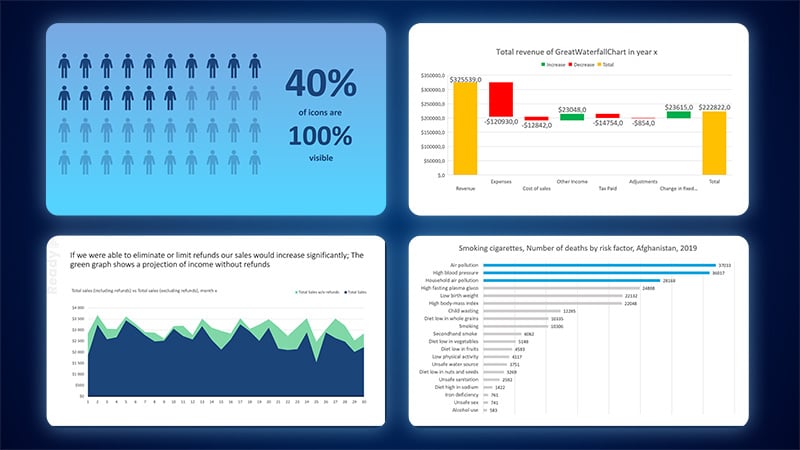
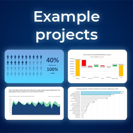
1. Introduction: Do you want to learn how to turn a chart from this into this or create charts like
this or like that? Or when to use these charts, then you are in the right place. Welcome to my C charts
and data visualization in PowerPoint course, where you learn how to choose the right chart type and all of PowerPoint's
tools to make it clearly understandable and have no more problems with all the bells and
whistles around it? At first, I will explain to you how to use a given chart type, like, for example,
the pie chart. Then we go right into practice. Rather than showing you
Powerpoint features, we'll go project
after project where I show you everything
on real examples. This way, you can
apply the knowledge directly and learn
gradually over the course. The course has dedicated
resources that work on Windows and Mac to make it a great learning
experience for you. Each chart has a dedicated
file with a sample dataset, a ready example, so
you can preview it, and a step by step instruction
written in PowerPoint, so you can start right away and practice at your own pace
without getting lost. By the time you
complete this course, you will be able to select
the appropriate chart for your dataset and use all of Powerpoint features
regarding charts. So it will no longer
be a mystery. Charts can be beautiful and easy to use if you
know what you're doing. Let me show you the features and how they should be applied.
2. Download Resources: To download the resources
for this class, please navigate to
projects and resources. Scroll down a little and click here to download the
current newest resources. Then on your PC, make sure to extract the folder and
you are ready to go. Works perfectly both
on Mac and Windows. How do sections in
this course look? Let's take the line
chart as an example. At first, in order to understand the details
of a given chart type, I will dedicate one lecture for a graphical explanation of
the chart category itself, just like you see now
playing on the right side. After that, we go
right into practice. For line charts,
we currently have three exercises to
create and follow along.
3. 2 - Things you need to know: I think I don't have to convince anyone
that data analysis, statistical thinking,
and being able to present what we analyzed
is an important skill. I want to give you
a solid foundation about data visualization and a starting point to make better charts for
your presentations and all media you
communicate with. Do not worry if you
haven't used charts before or you aren't
a great designer yet. I'll give you some
frameworks and back everything up with examples
I will go through with you. Let me open up by showing
you a couple of basics about the most important
charts you should learn about. And I'm opening up this
beautiful list with the column chart that is made up of vertical bars stacked
next to each other. A column chart is great for comparing different
categories to each other. It looks really well when there are three, four,
five categories. It gets a little messy if
there are too many of them. Next would be the bar chart. An easy and simple way to remember which is the
column chart and which is the bar chart is
someone walking a really, really long walk
from the bar home, and he needs to walk
on top of the bars. A bar chart is basically
a column chart, but flipped around.
Why do we do this? Because we have plenty
of space for labeling, and it really looks good, even if there are many
things to compare. For example, I'm sure you
looked at charts like that, and this looks perfectly fine. No matter the data,
you can put plenty of items on top of each other. The next, who else
than the line chart? The line chart is a beautiful
way of displaying data, especially showing things
continuous in time, like trends, because we can
have plenty of data points that go on and go on and go on and a line
can display that. It's good even for
plenty of measurements. Next up, the beautiful, the tasty pie chart, especially graphically,
it looks very appealing. The pie chart has
some advantages because all slices together
need to make up 100%. So it perfectly shows
part the whole ratio. But it gets a little difficult if there are more
than four or five slices. If you have like ten, 12 slices, it's really not the type of
chart you want to select. Next up, the area chart, which is a specialized form of the line chart, if you
take a look at it. But it actually has
color below it. It's used to display
two or more quantities like sales of two items, making up your entire sales. What's interesting it can
combine a line chart. And a column chart below it. It's a really interesting
form of a chart. Next up, if we talk about business and finance
waterfall chart. This is a form of
a column chart, but actually the waterfall
chart wants to show you increase and decrease
of certain values. It visualizes the
start and finish, for example, income, which
is changed by expenses, by something, by
something, and at the end, the total income is like that, and the waterfall chart can
beautifully display that. Are plenty of other chart types, like pictographs where you
show something with icons or combo charts where you have a column and a line chart
connected to each other, displaying two
different metrics. We'll work on
different chart types, and I'll explain
everything step by step. This was just a
brief introduction to allow you to dive into the topic and make your brain prepared
for chart knowledge.
4. 2 - Features in PowerPoint Pt.1: I want to be fair to everyone, even to people who never open PowerPoint and never
work with charts. This is the time to learn, and I want to challenge
you right now. If you know a lot about
charts, that's great. If not, then I'll try to show you everything
with simple steps, but they will be challenging to force your brain
to think really hard. I want you to open the practice
file on the chart basics. I'll always display
a ready chart. This is what you want to
achieve and a practice chart. This is where you want to work
and practice your skills. I'll try to write down tasks
so you don't get lost. Chart basics. Our task number zero is two
times to select something. If you select a chart in
PowerPoint, you click on it. You have selected
the entire series, here, here, here and here. But if you click once again, you can select an individual
item within a series. This also works for data
labels and for legends. If you have a legend,
I'm selecting a legend, but if I click again, I can select an individual
item within the legend. If you want to add and remove
certain items from a chart, either hit this plus sign, or go to chart design
add chart element, and you can add and remove
certain elements here. I strongly recommend
that if you never work with charts that you
open ds chart elements, and you try to add titles and a data labels to see
what they actually are. We've performed task number
one or actually zero. Let's go to task number one. Something very
important, change X axis values to
display every 20%. I will select the x
axis on the bottom. You can see it
displays every 10%. I can right click on
it, go to format axis, and specific options
to this axis appear. Not only filling options like you may know
within PowerPoint, but also those specific options for the selected chart item. Here on the units,
I want to change the major from 0.1 to 0.2. I press enter, and you can see
it displace now every 20%. This is something that
really cleans this chart up. Remember that drawbur is, that the vertical
grid lines also disappeared because they are connected to the actual axis. We have performed tasks, number one, and zero. Now go to give the
x axis a line fill. Select the x axis again. Now instead of the
specific options, go to the filling options. Under the filling options, I want to open line, and I'll increase the
width to maybe two points. It's a bit much, but I want
to clearly display this line. I can change the color to blue, and I can go back to the specific options because I also like to have tick marks. You can open tick marks major
type inside or outside. I like outside because they are facing down straight
on the number. This is how we formatted interestingly the
x axis. Beautiful. I would like us to create the rest of the tasks
in the next lecture, so you don't get overwhelmed. Try to open this file, try to perform at least
the first few tasks, and we will see each other in the next lecture when we
finalize this practice file.
5. 2 - Features in PowerPoint Pt.2: Okay, we are doing really fine. Change individual bar color. I've mentioned that you can select entire series
by clicking on it. But if you click again, you can select an individual
part of the series. This way, I can go to
the format options, shape fill and give
it any color I want. For example, a dark
gray color like here. Now, change bar color
using the legend, and actually not bar color, not individual bar, but I
should type here series color. Because if I click
on the legend, I can click again to
select an entire series. This way, I can go to
format, shape fill. For example, give
it a purple fill, and the purple fill
will be automatically applied as well to
the entire series. A really convenient
way to just click on the legend and recolor
entire series in your chart. Remember about this possibility, add one Data label per category. I want to select
this first object. Go to the last sign
and select data label. You can see this
number appeared. We have no contrast here. I need to change
the color to white, but the number appears. If I would select entire series, and I would press data labels, data labels would be added
to the entire series. Let me make it on the blue
one, so you will see it. You can see the number
appeared everywhere. But if I di select
the data labels, I select just the second block, and I select data labels. It will display the data label only on the selected object. This is especially important if there are plenty
of data labels, and you want to display only the couple most
important ones. On the MAC version of
PowerPoint, sadly, as we click on it, we
don't have the plus sign. So you need to go
to Chart Design, Add Chart element, Data labels, and select the labels
and any other change you make from the left menu
under Add Chart element. Play around with the vertical
line. Give it dashes. I can click on the line itself, right click Format axis or
actually not format axis? I can click on it and
select format grid lines. I can format the
grid lines and I can increase the width just for fun. I can change the
dash type to dashes. You can see we've changed that design of the chart itself. Beautiful. This is what we
wanted to achieve here. The last thing is reorganize
legend and Chart title. The chart title
usually is on the top. It really looks well
on the left top side, and for the legend, you
can decide for yourself. Do you want the legend
here on the right side? Or do you want to select the
chart, the chart itself, make the chart smaller, and maybe the legend
take up more space? Maybe that makes sense. You can go to the font, make the series bigger, and not that it looks beautiful, but it is possible to put the
legend wherever you want. This is what I want you to
create within this lecture. I want you to play around, be confident when clicking on individual chart
elements because it's difficult to
select some items. It's difficult, sometimes
to select the chart, sometimes to select
the gridlines, sometimes to select the series. I want you to click
a little bit around to get familiar with
how charts work. Thank you and see you in the next lecture where we
will continue our practice.
6. 2 - Specifics about Charts: Want you to learn the
most you've ever learned within this course when it
comes to charts in PowerPoint. I want to show you a
very advanced thing within PowerPoint Charts. I have a chart, where I
simply put a shape above it. If I resize the chart, the shape stays in place because this is a regular
PowerPoint shape. In the chart on the left side, I've actually embedded those
items within the chart. Now if I resize the chart, the items come with it. They become bigger, smaller, and they try to stay accurately
within the same place. This is the ready file. Now, go to the practice file. Within the practice file, put something inside
the chart and try to resize the chart
and then see what happens. You can actually
click on a chart, you need to have it selected. Right now, if you go to insert shapes and you insert a shape, for example, a rectangle, because you want to display
or highlight this part. I had the chart selected. If I resize the chart, this item resizes as well. What's even more amazing? I can click on this item and it will not go over the chart. It is bound within that chart because it is
embedded right into it. If I would deselect the chart, I go to insert
shapes and I insert a normal shape here in
PowerPoint like here, shape can go everywhere because this shape isn't embedded
within this chart. I can make it smaller. The shape stays as is. I want you to click on a chart, go to insert shapes
and insert a shape, and try to maybe right click
on the shape format object. And under the filling options, give it some transparency. This way, you have a
nice highlight that will always follow the
chart you created. There is one note, one thing I noticed
within PowerPoint. If I go to insert chart and
I insert a waterfall chart, this doesn't work on
this type of chart. I don't know why, but
Microsoft prohibits add items, at least currently,
at least today, when I add a shape, it still isn't embedded
within the chart. But water chart is a
very specific chart. You have to excuse
it regular charts, like line charts, bar
charts, column charts. Everything works,
and you can always have an item embedded
within them. Practice that and we'll see each other in the next lecture.
7. 2 - Appearance of Charts: Let me show you the
importance of colors, how they apply to charts
and how they apply to an actual PowerPoint
template like we have here. Let me insert a shape. As you can see, by de fold, the shape has this
dark blue color. When I open shape fill, I have those nice blue
colors to choose from. And this is exactly the
color scheme that I created and established
for this entire course, and that we will be
using throughout. Now, the importance of selecting a color scheme applies
to charts as well, because if I go to insert chart, and I insert any type of chart. For example, the bar chart. Let's do it as an example. You can see it has those blue colors
already applied to it automatically because this is the color scheme that we have selected for our
PowerPoint file here. Let me show you where the
color scheme is determined. If you go to design
variants and open colors, those are the color
schemes that you can choose and create for yourself. You are probably used to the
basic office color scheme. For example, this one or the
newer more accessible one. But if you like, you
can always change it. Here I have a sample chart
with five different columns, and you can immediately see that well selected colors make every graph already a
little nicer to look at. Let me put this on the
site open variant, and the chart will always reflect the selected
color scheme. Color schemes work
beautifully for slides, but not exactly great for
charts like these ones. But if you have, for example, color schemes with
similar colors, I especially love those
with similar for charts. Look how beautiful this looks. If you have colors
from the same range, the same color like vicinity, and this simply makes those
graphs absolutely beautiful. But you need to be very careful because they might be
two similar sometimes, and it all depends on the
design you are aiming for. To create a new color scheme, you can open the
variance colors, and you can set
customized colors. You can give it a name, like for example, my Colors hem, number one or 50 or ten, and there you can change
the accent colors. There are plenty of websites with actual color
schemes to choose from, like, for example,
Adobe color or CO. I often use Adobe color. I open the view, I
select color schemes, I select, for example, all, and here you can open
different color schemes, and you can copy the hex codes
directly into PowerPoint. Let's say that you enjoy
maybe this color scheme. Have the hex codes, you
can copy them over. You can get back to PowerPoint, you can change the
accent number one, and you can paste
in the hex code. Let's say that I
have changed it. M color scheme is a
bit different now. I'll save this to my
color scheme number ten. I'll press save, and now this color scheme is selected for this
very PowerPoint file. If you go to insert shapes,
you insert the shape. Now the first color, the first
accent is my pink color, and all the subsequent colors are the different ones
that I didn't change, but I could change them as well. The charts will
reflect the same. You need to remember
if I hit safe now, if I hit safe and I share this file with someone and
someone opens this file. He will already have the
same color pre selected. This is why I created my own color scheme
for this course. Additionally, I also placed
the colors on the side, if you need to
quickly preview them. The way I did this, I went to view slide master and
on the slide master, here on the bottom, I simply
put those colors in circles. I group them, and they
are always by our side. One last little
important thing about colors that depending on
what are your colors for. If they are for
charts or for text, you need to keep in
mind the accessibility. If you plan to use those colors
on backgrounds and texts, for example, for your slides, they need to be
readable for everyone. The darker the background,
the lighter the color, the higher the contrast between the background
and the text. To make this readable
for everyone, you should aim for a
contrast of at least 4.5, or it would be best for the triple A rating at any size to have a
contrast of seven. In is a bit difficult
to achieve, but this ensures that
even people with some vision impairments will be able to read what
is on your slides. For charts, you
need to eye bul it, you need to go with your gut
feeling, what looks good, so the colors don't
merge together and they should be
easily distinguishable. All right, this is
everything about colors. Let us continue.
8. 2 - Separate Elements: Here, we have a chart with a gradient background
with changed colors, with some markers, and I want you to achieve
something similar. Because normally, what people
do, they click on a chart, they go to chart design and may maybe they use those
predefined designs. And even though
you can use them, I would like you to understand
to do this by hand, How to apply this gradient, this shadow, and all the
changes that were done here. For that, I want you to
click on this chart, right click, and select format. In my case, because
I've selected the plot area format plot area. Here, we can directly select
what we want to addit. For example, series number one. Of course, we can do
this with our mouth. And this is important
because if you click on the horizontal axis, you can see you have the
axis option here selected. You need to be
mindful of what you click and what you
want to change. Let me go with the changes now. Click on the vertical axis and give it a line fill of 125. This is the vertical axis. I've selected it now precisely. I have the line options already open from the filling options, and I want to increase
the width to 125. You can see a line
has appeared on the right side of
the vertical axis. Now on the horizontal axis, we want the same, a
blue line of 125. I'm clicking on the
horizontal axis. I'm going to the
filling options. An underlying options, I can
increase the width to 125. By default, it gave
me a gray color, but I want this
blue color as well. This way, we made a very nice line here
throughout our axises. Beautiful. The first two
things are complete. Make the major grid
lines transparent. Now, again, major gridlines, those are the major grid lines. You can either just click
anywhere and select them here. Access major grid lines, or you can precisely
try to click. Let me do this. You can
precisely try to click on them. You can see the blue dots. I have managed to click on that. As any other object in
shape and PowerPoint, it has its own design options. We can increase or
reduce the transparency. We can change the
color, we can change the width if you would like to make them extreme like that. Just for preview
purposes, you can. I'll increase the transparency
because I don't want them to be as visible.
We've did this. Now add rounded
markers with size 20. Now this is tricky
because this is a line chart and
you may not know at this stage of the course that this is a line
chart with markers. You can go to the
filling options and apart from the line options, which we have underneath, we have the marker options. I'll open the marker
design options. I'll open the marker options. Instead of none, I want
to build in markers. By default, it gives me
this very small rectangle. I want maybe a circle, and I want the size
to be at least 20. Let's make it 30.
Okay, 35, beautiful. We have those huge markers. Understand how to change the
color of these data labels. Oh, we have no data labels
yet. Let me click here. Go to Chart Design
add Chart element, data labels, and select Center. Now, to change their color, I need to precisely click
on the data labels, O here, I have a new option called Series two Data labels. Going to the filling
options will not bring me much because I need to
select the text options. From the color, I will
select a white color. And on the home tab, I can even increase the text
size if I need to. Okay. Understand how to change
the marker size from here. Now, do you know how I would
change the marker size? I would click on it or I've selected the data labels
because they are so big. So I would select actually
series number two. The markers have been selected. I would go to the
filling options, to the marker options,
open the marker options. And increase the size. This is how you navigate
charts within PowerPoint. Now, give the chart a gradient background or pattern field. I can click on the entire chart
or just on the plot area. So this is the plot area, and I can give it a gradient. This will give a gradient either here or if you select
the entire chart, you can give it a
gradient as well, so the entire chart
has a gradient on it. And this is exactly
what those chart design predefined
options give you. They are just a couple of
options that are applied to a chart and to given
elements of a chart. And we will be able
now to continue through the course
with other charts.
9. 3 - Line Chart: Within this lecture,
I want to explain the line chart in more detail. This is a normal regular
looking line chart where different data points
are connected with a line. On the bottom side,
we have the x axis, and on the left side,
we have the y axis. On the chart itself, you can mark different data
points with markers. On the left side, Most often, we have some values connected
to the actual chart, like percentage
numbers, or currency. On the bottom side, usually there is some kind
of time period. This is why line charts are
perfect to display trends and data that could
potentially continue on with even time intervals. The line chart looks pretty okay if there are not too
many series like two, three, four, is perfectly fine. But if there are more, it gets a little clustered. Don't worry within this course. I'll show you how to
declutter such type of line chart if you need to use it and you need to have
this many data. There are some ways to
make it look better. I just want to highlight
that that many series is usually an indicator that the line chart might
not be the best. So a line chart.
In that example, I have 12 different data points, and this is already
an indicator for me. 12 pretty high number. You can use a line
chart for that, and it's perfect because I'm
displaying only one series. Here I have copper prices, and they are displayed over
equal periods of time. On the next chart, the same
copper price is displayed, but also other different metals. You can see if there
are six or more series, it gets really wonky
and clustered. Would need to somehow differentiate or just show you the most important metrics. Something like that
isn't the best. In the next lecture, I want to practice creating
charts with you, so you will be simply able to avoid the type of
situations or at least know how to edit
different points and different elements of this
chart to look a little better. Thank you and see you
in the next lecture.
10. 3 - Line Exercise #1 (Pt. 1): Welcome into the first
exercise about the line chart. Please open the file for
exercise number one. At first, I'll always
have a slide with data. Then we'll have the ready slide, and then will be the slide
where you have to work, where you have to practice. The first thing to do
is add a line chart. Let us grab the data. I'll take the entire table, Control C. Go to my practice slide and number
one is adding a line chart. We can add a line chart directly here. Line chart is here. You can go for a
normal line chart or line chart with markers. This is the difference. It has little markers on
the data points. I'll go without markers. I'll paste the data. Don't
worry if this shows like that. This is because the font
was a little bit bigger. I'll just move this around. I'll close this third series
because we don't need this. We only have two series. This way, we completed
the first task. Second task is to put the
legend on the right side. This shouldn't be a big issue. You can click on the chart, go to the plus sign, and you have all the
things you can add here. I'll take the legend,
I'll actually open it and place it right. This way, the tomato and cucumber sales are
displayed here. I'll control be this for myself, so I know that I completed
task number two. Task number three, we
need to add a title. The title of the chart, If
you don't want to write it, you have the title here, but if you want to write it
yourself, just take a look. At Hart title, what sales? Tomato and cumber sales. When in 2030, as you can see, by the dates below, we could also display
the months by who? By company. Let's call it for now
Company X. I'll put a coma, and the units are in
thousands of USD. In in thousands USD. What I do, I like to put
this on the left side. Press enter here. Align it to left and maybe
bolden the first sentence. This looks a little cleaner. If you don't like that there's so little space between this, you can always
click on the chart and make this chart
a little smaller. So we have more room here. I'll also make some room
on the left side because we want to label the
thousand USD later. Okay, we've performed
task number three. I'll make a pause here and
continue in the next lecture. I want you to this point to add a chart and do the
first three things, first three steps like it here. See you in the next lecture, will rectue to edit this chart.
11. 3 - Line Exercise #1 (Pt. 2): Us continue from
task number four. Format the x axis
to display months. You can see so many things
are repeated here like the year and the day, so I will right click, format xs and not only
the axis options, but we actually have
number options. Number options is exactly what is displayed. Data is okay. The type. The type
is coded like that. Month, days years. I want the type to be a
three letter abbreviation, maybe this or this, right. If you don't want the year, just take out the y letter, press ad, and it
will now beautifully display only the
letters for months. I'll make this bigger, so the months are a
bit better visible, and we are completed
with task number four. Task number five, add
y x is description. It would be nice to describe what those numbers
actually mean. I will click on the chart, Insert shapes, and insert a text box. I'll
put the text box. We're here. I'll press
my caps log in o of USD. Beautiful. I'm
repeating the title, but the title is the
title and the description of an axis is a
description of an axis. Let Captain Obvious would say. We have it here. Now this table
is beautifully described. I'll press Control B, and
I'll go to task number six add three data
labels for tomatoes. Tomatoes is this blue line, this upper blue line, and all data points
are now selected. If I would go to plus
sign at data labels, all data labels would be
added. I'm not doing that. I want only this label, this data label, and
the last data label, because this is the most
important information for me. I'll take this. Control B, make it a little bigger, and now beautiful, we have the data labels
displayed. Control B. As a simple action title, this slide is meant to portray the decrease of tomato
sales in August. This is why I wanted those
data labels at the end, and let's write a very
simple action title without overthinking it. Like the capslog,
Tomato sales fell from $7,500 in July to to
$5,000 in August, a very simple action title
without overthinking it. If I would delete this chart, you would still understand what was this slide
about to say. We've completed line
chart number one. In the next lecture,
I want to continue a really interesting
adventure is ahead of us. So let's go to the next
lecture. I will wait there.
12. 3 - Line Exercise #2: In Exercise number
two for line chart, I want to format the bottom
part here from this to this. This looks much
nicer and cleaner. Let's go and start working. This chart is meant to focus on year 2042 and display
only two companies. Place the legend
on the right side. You know how to do this
plus legend right. You need to make some
space, so you will take this chart and make this
chart a bit smaller. Beautiful. But the legend stays. Format dates to only
display one, s. You can see how many times
we do repeat the year. We cannot change this in
the number formatting, but we can actually
click on the chart, edit data, and edit data in XL. This data was written like that. Instead of using a
common formatting, someone wrote it by hand. I'll just delete the years and add the years manually
a little bit later. You can do the same
by editing data. Sometimes you'll
sadly need to make this kind of leg work
to make nice charts. Especially if you edit
someone's presentations. But right now we don't
really see the years. What I would prefer to do,
I'll go to insert shapes, insert the textbox, and this
text box would be 2040. The font size would
be 14 and beautiful. I will maybe align
this to the middle of this position it here. Control D one more here. Control D, one more here, 242, 241, and beautiful. We have the years much
nicer displayed. Control B. Now, the gridlines, I want
to focus on the years. I don't need
horizontal gridlines. I'll deselect
horizontal gridlines. I want vertical gridlines. But in my opinion,
this is too much. We have too many of
those gridlines. You can click on
the actual axis. Right click, go to the format. And what you have here
on the right side, you have also tick marks. Tick marks are
those little marks, but what you
actually can change, not just giving outside
or inside tick marks, not just only those
little tick marks. You can change the interval. Let me place the
interval at four, and you can see we
display ear number one, ear number two, and
hear number three. Beautiful, cleaner
with less lines here. Give all lines one
thickness and gray color. We have to information here. This is where the line chart gets difficult if
there are too many da. I want to click on
the legend actually. It will be a bit
quicker for me to dit. The legend is connected
to the lines. I'll go to the filling options while having the
legend selected. You want one specific
element of the legend, and the border, go to
width one and color gray. Go to the next part, 1 gray. Go to the next part, one, gray, and so on until you
finish at the bottom. T. This was really
difficult, but we have a very clean chart now. I would even write tick,
change series type. I would go to line
and change it from with markers to a
normal line chart. This makes this chart
so much cleaner. We've completed task. This is actually test
number four, Control B. Task number five,
highlight two companies, calculate and penalty, and look how quick and
simple this will be. It would be also convenient
if you click and save this as a template because this for example chart
number one, save. If you enter charts like that in the future, Insert
chart template, you will already
have a template with a gray line of a
thickness of one, only for the first three ones, but it already will
save you a little time. Okay, I wanted to highlight,
calculate and penalty. Calculate, not a problem. Click on the filling
options, the border options, maybe three points and
first blue collar, then penalty, three points, and the second blue collar. This way, we highlighted
two companies, and you made a lot of
editing to di chart. We visually declattered it. I hope you enjoyed
this type of exercise. It was a difficult one. Let us go now to
another lecture and work on other data
visualization elements.
13. 3 - Titles: In this lecture, I want to
explain action titles to you. This is an important topic when working with data visualization. I have an entire PowerPoint
business presentation course where I teach this
topic in detail, with a blueprint, with
examples to practice, but here you only need to understand what an action
title actually is. Let us talk about action
titles and why are they called action titles instead
of just regular titles. Well, action titles are supposed to be one
sentence summaries that allow to understand your entire slide
and its key insight. An action title is supposed
to answer the question, what? When someone sees your slide and reads what on it and asks, what, the action title should give him an
answer for that. Let's use it on an example. We have a product called Funyso, instead of using a regular title like Funyu market shares. Without any deeper context, an action title would
sound more like market shares of fun issues
grew by 6% in year y. I'd even scratch the by and
just leave 6% in given year. You want to make it as short
and concise as possible. This can naturally create some healthy anticipation and understanding of
your entire slide. An action title shouldn't be longer than two,
maybe three lines. It depends, of course, on the topic and what
you describing. To summarize what I've said, the desired situation would
be when your presentation could be understood by just
reading your action titles. A little trick can be putting dots before and
after your title, and would this title flow nicely into your next
slide? Let's answer that. For example, market shares of fun issues grew by
6% in this year. Keeping this year over
year growth can place fun issues as market leader
with 30% overall share. This would be an example
of two action titles on two different slides that continuously tell a story
of your presentation. Another example, instead of
just world revenue growth, I'd probably put a
title like revenue has grown 31% over
the past five years, Asia being strongest
contributor, because just world revenue
growth doesn't say anything. If I would ask, so what, this title wouldn't answer it. Action titles want to
summarize everything you've put on your
slide in one sentence.
14. 3 - Line Exercise #3: Your exercise will be to
highlight just the best selling month.
Selecting the data. I want to go to the
practice file and you have everything displayed here. Let me add a line chart. Go to the line chart, and again, go to a marker chart or a simple normal line chart
without the markers, depending on if you want the
little dots on the markers. I can skip the dots. It's no problem. Make it
smaller and deselected. Recall or forecast line, add long dashes, remove markers. I didn't add any markers, so it's perfectly fine to
just recall this line. Formal data series, go
to the filling options, select The color the same
for the original one, and try to add some dashes. Perfect. We've completed
task number one. Change main line thickness
to four. This is important. You can select just one line, and this is why I made forecast data on
two separate lines. I can edit the first one without affecting
the second one. Filling options and
increased with 24 points. Beautiful. It's now
strongly highlighted, very visible, very apparent. Add one data label you
want to talk about, maybe the lowest,
maybe the highest. I think the highest
will be more exciting. I select this data label. I select the plus sign, and I select data label. You can click on the
data label itself, press Control B, make it bigger, so it really stands
out on this chart. Let me put the
title to the site. Okay, Number three. Number four, format dates to MMM three
letter Month abbreviation. You already know or
remember how to do this. I can click on the months
right click Format Axis. I'm already here, and
we have the numbers. The numbers can be changed. It's already
formatted as a date, but I don't want the
year to be so apparent. I want MMM and ad
instead of enter, and I have beautifully
only months displayed. I really do like this. I don't like that we have
those horizontal lines. I want to change the
horizontal lines into vertical lines displaying
the different time periods. Click on the lines or
just on the chart, go to the plus sign, and under grid lines, if you open this up, you
can actually deselect the major gridlines and select
major vertical grid lines. This way, we've divided
this into time periods. It's more suitable
if I'm talking about months and
sales in that month. Control B because we
are ready with that. Highlight data label
with an arrow. Click on the chart.
Insert shapes and insert a suitable shape. It can be this line or this
arrow, this block arrow. I'll just add this arrow
and point it towards this data Iona really,
really highlight. How do you highlight
with colors of emotional significance,
like red color. This screams
attention, literally, and you can use this
on your charts. You can use green
to show increase. You can choose red
for attention. Highlight data label
with an arrow. Write simple action title. This can be again, very challenging, but unless
you challenge your brain, you'll never write
good action title, you need to practice
with simple methods, like we have July 7 0.5. Okay, Tomato sales in Ju July
reached 7.5 thousand USD. Let's not overcomplicate things. This would be a
suitable action title for what you wanted to
say within this slide. Tomato sales in July. It's very simple, but it quantifies the most
important data. What sales, when to
what amount? Beautiful. Action title ready. You don't have to do anything
more for this action. You have completed this
line chart practice. I'm really proud of you if
you are able to follow. Now, try to open this file, try to perform all the tasks, and we will see each other in the next lecture.
See you there.
15. 4 - Column and Bar Chart: Column and bar chart. The main graphical difference
between them is that one is vertical and
the second horizontal. Let's dive a little
deeper into the topic. The column chart consists
of an x axis on the bottom, a y axis, and of course, our main guest, the
columns themselves. The length of the column directly represents
a given value. We take a look, on
the bottom, usually, we have some data labels, like companies or different
years or different products. On the y axis we often have
some measurement metric, like a value degrees or
number of sales revenue, it depends on what
we are presenting. Let me show you a big advantage of this column chart over, for example, a line chart. Look at this data here
on the right side. If I change the value, not only the value changes, but actually the entire line
gets a little different. When you use a column chart, it's another story because
when you change values here, Only this 1 bar
which you change or this one data that you have changed will change graphically. So this is a really
convenient way to stay consistent across categories if you need to change something. Another benefit of
column charts is if you have data that is
very close to each other. For example, 3.1, two, three, And if you look
at the pie chart, you can barely notice any difference in size
between the pies. The same for the line chart. It goes a little bit up, but it's a bit hard to see, depending on the
scale you are using. But with the column chart, it's clearly visible that one
is higher than the other. So this is also a good way to work with data that is
really close to each other. The other way around
is the bar chart, the horizontally laid
flat on the floor. It's essentially the same, but you have a little bit
more space for labeling, and it graphically shows
itself a little different. As mentioned, especially
usable for long labels, and if there's plenty
of data points. It isn't that you can't
use a column chart here, but the bar chart might do the job better if there
is plenty of data. Let's add over now
to some examples and we will work
through them together.
16. 4 - Column and Bar #1: Let us open the column
chart. I have some data. I'll copy this data into my clipboard with
Control C immediately. We have four different
products sold over five different sales
funnel for a company. This is what the end result should approximately look like. Let's go to the
practice slide above the practice sl some things
to perform some tasks. The first task is to
simply add the chart. I'll insert a chart
with this little icon. And from the column chart, I want to select the first
clustered column chart where categories are
next to each other. The stacked column
chart would make the categories to be
put one on another and the 100% stacked column chart basically displays
always a 100% value. I will explain that
a little later. Please select the first
chart, the clustered column, press k paste the data
you copied before, go to the first column and press Control V. All the data
should be inserted. Right now, it looks like that. Make soap and bath oil series
visually less relevant. I want to compare
the two products that is face cream
and hand cream, the first and the second. I will take series number three either by
clicking on the series or by clicking on
the soap directly here by double clicking soap, and I'll change the color under the format options shapef
to a very light gray. This will make it
visually less important and put it in the background in comparison
to the two colored options. Okay, we've completed
two things. Remove soap and bath
oil from the legend. All right, I'll
click on the legend. I'll click on soap,
press delete. Click on Bath oil
again and delete. This lets the viewer know
that I want to focus on only those two things because those two
are in the legend. I could put the legend here. I could make it a little bigger, and I could go to home and increase the
font from the legend to make them a bit more
important. We've done that. Add data labels. I will add data labels
for both series. Click on the first series, go on the plus sign, and enable data labels, not the data table data labels. Then the second one,
data labels as well. Beautiful. We've
completed the next task. Task number five, dit one label and try the clone
current label feature. I want to show you a feature. You can click on the label. For example, just
this one label. I'll press Control B or
command B to bolden it up. I'll increase the font size, and I want to look at it. And if you decide that
this looks pretty okay, pretty good, you
can click on it. Click on it again, right click. Format Data label to open the formatting options
specific to this data label, and there is a feature,
but I want to teach you that this is a feature
called Clone Current label. If I click on it, all
other data series in this selected series
will look exactly alike. Sometimes you want to make
something distinctive, but it turns out to look
so good that you want to clone this label
to other ones. This was a bit too
big, so I'll press Control Z to revert it back. Just remember about this feature when editing data labels. Consider removing the
y axis data labels. Now, I'm not a fan of
having double labels. I want to show you
the two products. We already added labels. Why do we need the
labels again here? It's like an overkill. It's cluttering
division of somebody, and this would be a fully
edited normal column chart. I would recommend
to make it a little smaller because the gaps
between them are pretty big, or we can even do another
task and additional task. If you select this chart, you go to the series options by having just the
chart selected, we can increase and decrease
the overlap between them. This is a pretty
advanced feature. And reducing the gap would basically bring them
a little closer. Let's make a higher overlap. Let's bring them
a little closer, so the gaps are smaller. This way, I could edit the
size and look of my bar chart. Please try to perform at least
those basic normal tasks. And if you want to
go one step further, adjust the width and height by selecting the chart itself. You can also click on Series, go to its options, and select the gap and overlap. Thank you and see you in
the next practice session.
17. 4 - Column and Bar #2: Let us work on a bar chart. Open the bar chart section, and from the data,
select the entire chart. And you can see plenty
of data points here. This is about
smoking cigarettes. I took the data
from this website, and it's for Afghanistan, but you could select
any country you wanted. And we want to achieve
something like that. This is the ready file. This is the benchmark,
and we will try to create something like that
right here in PowerPoint. Let's see what we have to do. Add a column chart first
to see its downsides. Right. Let me take a
chart, and at first, I want you to select
a column chart, just to see what happens. I'm using a column chart. I'm inserting the
data with Control V, and I'm reducing the
area with the data. All right, let me
close that down, and as you can see,
the explanations on the bottom are
barely visible. This doesn't look clean at all. This is where it's an indicator
to you to right click. Go to change Chart Type. You can change it at any point in PowerPoint.
That's really great. Go to bar chart. This time, a bar chart would
be more suitable because we have more
space for explanation. We still need to
extend it a little to give more space for
it to be written out. All right, we've
performed the first task. Task number two
will be added data in Excel to sort it
from highest to lowest. There's a cool
thing you can do in PowerPoint with the added data, not just the added data, but added data
straight in Excel. If I go straight to Excel, I select all the data. I want to select the number first and then
select everything, go to data, can sort
it A to Z or z two A. Sometimes it bucks a little, but you need to simply
click on the number, select it once again, and it
should be completely fine. You can decide if
you want to have it sorted that way or
the other way around. I want the highest on the top. It really looks great. I'll close it out, and this way, we organize the chart to all
already look so much better. Just imagine having this
cluttered information or having it visually
organized like that. Number two is perfectly
fine at data labels. Want you to add three data
labels to different objects. For example, the first
three or the middle three, I'll go for the first three like you did in the
previous slide. Add Data label, click
on that data label. Click on that Data label. Remove the x axis. Since we have too
many points here, it's also visually a
little distracting. I'll click on the axis itself, and I'll just delete it. The most important data I
wanted to showcase is here. So I no longer need
this scale basically. I removed this axis. Color the entire series gray. I can click on the series. I still have the legend,
even I have only one series, but I still have the legend.
We will delete it soon. I'll go to format Shapefil
and I will color it gray, either the original
gray here from PowerPoint or with the
eye dropper clicking down and selecting the
gray I've selected for my color scheme to
be really consistent. Okay. Perfect. Now, pick out three datasets and
change their color. Okay, I should
consider something. I didn't write it to the end. I will click on the
series itself and go to Format Shape fill and select one of the
color scheme colors. I'll go for these turquoise,
or the lighter one. It looks really clean, the lighter one and
the lighter one. Beautifully. We've basically
created this chart. I accidentally added the
legend on the bottom. Let me delete the legend. Let me also maybe just
delete the title. We don't need it right now, and this would be
a ready organized and fully edited bar
chart within PowerPoint. We could, of course, add some
titles and action titles, but we wanted to practice
editing a bar chart. Achieved a very similar
result to this one. Thank you very much
for listening. It's now time for
you to practice. Please open the practice
file and make sure that you try to perform all the tasks
that are written out here.
18. 4 - Stacked Column and Bar: Let me briefly touch on a specific version
of a column chart, of course, also a bar chart. That is a stacked column chart, where individual values of
something you present are stacked on top of each other to reveal its entire
collective value. You can see it on an
example like that. Here we have a normal column
chart with a value of four, two, and two in
different categories. But if we put those categories
on top of each other, they amount to a
total value of eight. Let's say these are these are
thousand dollar in sales. This type of chart is perfect to both show how different items perform and change over time and how they perform
collectively. I think this is pretty
self explanatory, but it needs to be named. I want to also show
you something directly related to PowerPoint and
two other charts you create. Here, we have a
stacked bar chart, and as you can see
on the bottom, e shop has a value of 250 Paper ad has a value
of approximately 15. Now, if I right click on
it, change chart type, there is one more
chart type that is a 100% stacked bar chart. Even though the
values are completely different for the E shop
and for the paper ad, all categories will
have equal length now. This is a 100% stacked chart, and it is meant to showcase
proportions in relation to 100% relation to whole for any
product you click on here. Even the values are completely different for the sales funnels. If we use this type of chart, we could reveal,
for example, hey, on this sales funnel, this product makes up less
than in other channels. We need to take a look at that. Maybe we advertise it more
or some other conclusions. But if you want to
directly reveal the value, depending on what
you want to say, you certainly want to
use a stacked bar chart. This is enough of introductions. Let us go to the practice
file and work on a real example to really
get a feel for it. One important notice, though. If you go into insert chart, the column chart has a
stacked 100% version. The line chart has something
like that as well. The bar chart, of course, and the area chart as well. We will later talk
about the area chart, but the area chart also has a stacked area and a 100% varia, if you want to really
showcase everything.
19. 4 - Column and Bar #3: Let us work on a
stacked bar chart. We'll select the data for the products and
the sales funnels, and I'll press
Control C. This is something that we want to
achieve with our graph. Let's do something similar. I'll go here, and number one is add a stacked column chart. I'll add a chart.
I'll go to column. The second one is the
stacked column chart. I'll press o, and I
will input my data, by clicking on the first one, Control V, and
just clicking out. We've performed the first thing, at a title by what category
year and measurement. That's obvious.
Let's do category. We have those categories,
and I would say, Revenue by you always need to something of
something by something. Revenue by sales funnel. In year X, and the measurement
would be thousands USD. Okay. Just for
graphical reasons, I'll press Control B on
the left side of this, and I'll put the title here on the top left side to make
everything very neat and clean. All right. We've added a title. Now, look at those bars. There's almost no room for
the paper ads and store. I would prefer this
to be displayed horizontally because we can't really see the difference
between those two, and it would be more obvious
with a different chart. So right click on your
chart, change chart type. And I will change the type to a bar chart and a
stacked bar chart. Okay. This already
starts to look better. Okay, M E shop appear on top. This is a trick you can use
when you edit your charts. You can click on
the chart itself, right click Format Axis. And in the Axis option, when I have it selected,
on the bottom, we have categories
in reverse order. If that somehow looks
better for you. You can also reorder categories by hand
by right clicking, ddit data, and going
to the edit data here. It would require a
lot more leg work, but let's organize it that way. E SHOP is the longest.
Social media is second. Let me maybe take
social media data, Control X Control V here. Advertisement, I would
put advertisement lower. I'll take social media
back Control X Control V, beautiful, and I want to switch the store
with the paper ad. If we have only five
categories, that's no problem. If we had, we would need to
do some more organizing. Okay, I'll put that here
and that's perfect. Now, this one isn't
displayed because PowerPoint thought that I'm
deleting it. No PowerPoint. Let me bring that back,
and I've organized everything from
longest to shortest. It already looks better. Make E shop appear on top. Control B, we've completed that. Reduce x axis to 250. Look at the x axis. The x axis goes to 250, then to 300, and we
have empty space here. I want to make it shorter. So there's more room for the smaller ones or
the shorter ones. I can go to axis options, right click Axis
Options format axis. Under the Axis options,
we have bound, the minimum bound and the
maximum bound reduce it to 250. This will help us to showcase the store
and paper ad sales. All right, Beautiful. Now, what left to do is
add a simple action title. The action title should answer. So what that you are
showing me this graph. So what comes out
from this graph? I want to specifically
highlight the E shop sales. E shop sales remain our best performing sales
funnel with almost 250, almost, I'll write it that way. This 250,000 USD or 50 or 250 k, depending on if this is
acceptable by your company, I wouldn't advise it at first. Almost 250,000 USD. Okay, this would be a
simple action title. We could maybe expand this
action title by some data like the store and paper ad
sales are significantly reduced or advertisement and social media closely
follow each other, but doesn't seem to perform
as good as the E shop. Just a shorter wording. Write a simple action
title like that, and you will be ready
with this slide. This lecture was meant to teach you organizing and
editing a chart, so the titles are just
a little addition. Thank you for listening,
and now head over to the practice file and
try to do it yourself.
20. 5 - Pie Chart: Let me talk to you about my favorite chart,
the apple pie. Or like, wait a minute. In this lecture, I
actually wanted to talk about the Pi chart itself. The Pi chart represents one static number divided
into several sections. It reveals the
relationship to a whole. If we look at the pie chart, it's optimally designed to
display values in percentage. You can, of course, use normal values. But
just look at that. If you display values, they are really difficult to comprehend in your brain
to count properly out, so usually you want to
go with percentage. Pie chart looks perfect when there are just
a couple of slices. It gets a little
dicy If there are too many segments
of the pie chart, it's very difficult
to read then. The pie chart is perfect to display a relationship to whole, like, for example, market
shares, different segments. Or for example, here,
the device usage, this is only an example, but always the optimal
measurement unit will be percentage. It doesn't have to be,
but most often, it is. To summarize what we've said, The pie chart is
absolutely great. If you want to show
that one category is really big or really small, and this makes a big
impact on the actual data. Or if you want to show how one segment correlates
to other segments, for example, sales phone sales, leverage, other
sales, and so on. Also important, the
Pie chart is perfectly understandable with
values like 25%, 50, 75. It doesn't mean that you cannot use the pie chart for
any type of data, but this is graphically
easy to read. Just see this example. On the left side, I
immediately can tell you we have 50%, 25%, 25%. On the right side, it
isn't that obvious. You really need to think
a little bit about it about the percentages
behind this image. But the pie chart obviously has its drawbacks and problems. The pie chart isn't great if
the slices are very similar. You can barely tell the
difference between 20%, 19%, 21%, I can't really tell this looks almost
identical to me. As mentioned, too many values, too many slices is absolutely horrible to
read for the viewer. Also, if you have different
categories, different years, you would probably need
several of those pie charts, and this is less than optimal. If you want to compile
data on one chart, Pie chart is most likely
not the best choice. Just look what happens? I? If you change this pie
chart into a column chart, you can clearly see minor
differences between data. If you change this pie
chart to a bar chart, then you can clearly see all the data even if
there are 20 or more. And several pie charts
could be replaced by a normal column chart with
different categories. This is what I wanted to tell
you about the pie chart. It's a graphically
absolutely beautiful chart. It tastes, as you can see, wonderfully, but it's not
always our cup of cake. See you in the
practice session now.
21. 5 - Pie Chart #1: Please open the section
with the Pi charts, and let's create a
Pi chart like this. Go to this slide and you have seven different
things to complete here. At first, format data labels to include percentage
and category name. On a Pi chart, if you click on the data
labels, right click, format data labels, you'll be taken to the data label options. You can deselect the value and select category name
and percentage. Luckily, PowerPoint
automatically calculates the percentage from the values, so we don't have to do so much. You can see one of the data labels because the title is here
went very far away. I'll put it here just for now. Okay, we've completed the first
thing. Remove the legend. Nothing simpler than that,
click on the Pie chart, click on the plus sign, and remove the legend. Right now, we will have
more room to work with because the legend is already
within the pie chart. Everything is named. Okay. Perfect. Move the peer and strawberry
outside the chart. I'll take the strawberry, click on it again
and move it here. I of course, have to
change the color, but this will come in a second. I'll take the peer.
As you can see, we can move it outside
the pie chart. If you don't like the
line connecting it, you can again deselect
showing the lider lines. It applies to all categories, all data ables, or you
can keep it showing. Okay, we've completed that. Recolor them and remove
line connection. Okay, I went ahead of myself. I will click on them right now. I'll go to the format tab, and for the text fill, I'll use the eye dropper
and use the same color. Beautiful. I have a shortcut
set up for myself, old four. So I can make it quicker. And you can see this
color is pretty light. If you don't see this properly, if the contrast isn't enough,
I have a little trick. You can select this text. You can go to text fill, more fhil colors and make
it a little bit darker. Will be still very similar, but a little darker, a little better visible
for the viewer. Okay, we've completed this task. Now, number five, position Apple and NAS labels
in the middle. Okay, I'll click on the Apple label once again to
directly select the label, and I'm still on the format data labels options
within the Pie chart. Apart from the normal options, on the bottom, you
have a label position. I can of course position
it myself by dragging it, but I can also let PowerPoint
help me by pressing center pressing annus
and center as well. This organizes everything
a little better. Okay. Beautiful. Now,
bonus number one, remove bolding from percentage. If you want to be advanced and make it look a little better, you can select it and if
I click on this data, I can directly select
certain data elements. I can, for example,
select the percentage and press Control
B to unbolden it. Here, double clicking
on just the percentage. I'll do this for all the
data labels just so it graphically looks a tiny
bit more interesting. Okay, I've did the
bonus challenge. Now the next bonus
at a conclusion. Now, you can see the title
gets a little in the way. And the problem
with a Pi chart is that I cannot really
resize the title. I can only put it either
here or either here. I often tend to remove the chart title to have
more space for the Pi. I'm selecting the Pi and
moving it to the right side. Like that, I can
move it then again. And right now, I have plenty
of space within this chart. I'll go to Insert textbox, I'll insert X X box while
having this pie chart selected, and I'm pressing to Crete
custom text box here. I'll quickly write some
kind of conclusion. In this month, Strawberry
and Peer sales made up 41% of total sales. Well, not the best
math, 21 and 30. It would be more like 34, but that's just cosmetics. I would make the text,
of course, bigger. I would center it
out, and I would have a new custom title that I can
move around really freely, and I can make it smaller, bigger as I like. This is all I wanted
to practice with you within the first
pie chart example. I hope you can
follow along and you can do all the tasks as well. Please try them yourself, and we will see each other
within the next lecture.
22. 5 - Pie Chart #2: This pie chart exercise will be mostly about graphically
formatting the Pie chart. We have some example
data if you want to use this and do the pie
chart from scratch, or I have prepopulated an
example empty Pie chart. This is the practice,
and those are the tasks to perform
add data labels. Nothing simpler than that,
click on the Pie chart, go to the plus sign and
simply add data labels. They are put here. This is invisible
because this is black. We've added the data labels. Make them display categories and percentage, position
them outside. All right, I'll click
on the data labels, right click, and format
the data labels. This will open the format data labels options directly
here in PowerPoint. I don't want the value. I actually want the category
name and the percentage. Then I want to position them
on the bottom outside end. They are beyond the
actual pie chart. Beautiful. Since we've added the categories visible here now, we don't need the
legend anymore. I'll go to the plus sign, and I will remove the
legend, beautiful. Recolor data labels, make
them bigger and bold. I can do almost everything
here with shortcuts. Control B to bold them, shift control and
forward bracket to make everything
bigger like that. For the color, for the color, I need to click on
each data label and take the according
color from here. Normally, you'll do
this by going to format text fill and
using the eye dropper. But I have added the eye
dropper, right click, added it to Quick
Access Toolbar, and it's my second eye dropper. The second eye dropper
for me is for text. Now on PowerPoint four Mac, I know that this shortcut
doesn't work yet. I hope it will, but on windows, you can press old
and you can press the according number to quickly take the
shortcut you put here. I'll press old four
boom, Old four Boom. In my case, old four P, the store Old four, and this color old four, if the color is too bright, I strongly recommend using a
complimentary darker color. Since we are using gray, I'll simply go for
a, much darker gray. It will still be within the vicinity of the
original color, or I can change the
color completely. Beautiful. We've recolor them. Rotate the pie by 90%. If you have data or
little space for data, it might be a really good idea to rotate the pie chart itself. As a rule of thumb, the pie
chart starts here at 12:00, but you can rightly go to
the form of data series, and under the series options,
we have Pi explosion. And angle of the first slice. I'll change the
angle by 90 degrees, and you can see we have plenty
of space on the bottom, so I wanted to put the eso here, and everything now
fits a little nicer. You don't always have
to start at 12:00, but it's how it's
perceived as normal. Okay, we've rotated it. Now, remove borders
and add shadow. You can see by default, PowerPoint add white borders. I can click on any given
part in the series. Format, shape
Outline, no Outline. This will make clean
connections between sections. The last thing I want to
do, I want to add a shadow. This is just a graphical thing, but outside of the normal
feeling and border options, we also have the
PowerPoint effects. One of the most simple and
useful effects is the shadow. From the shadow, I usually
start with a middle shadow. Open the shadows and use
this one in the middle. Now, if you don't know
how shadows work, you can increase the size, but that looks weird, and
you can increase the blur. I usually do, I increase the blur really strongly
like 16 points. I don't increase the size, I maybe make it 100%
or 100 something, and now I work my way through
with the transparency. If I want to make
it more visible, I decrease the transparency. If I want to make
it barely visible, I increase it to 80 or 90%. Let's decrease the size to 102%, and we have a very clean shadow. I think it goes a
little bit too much. The shadow is too far away, so I'll reduce the blur to
put it a little closer. Is just a matter of making
everything a bit smaller, the blower 12, and we've completed all the tasks
for this exercise. I hope you can follow along
and do the same by yourself. Please open the practice
file and try to format, graphically format
this pie chart to look similar to this.
23. 5 - Pie Chart #3: We always mention different specialized versions of charts, and the donut chart is another version of the pie chart with a hole in the middle. This is the ready
example you can preview, and this is what you
have to work with. Go to the practice slide, and we have five things
to complete here. Click on the chart itself. Remove legend and
title at data labels. As usual with the pie chart, I want to remove
the chart title. Remove the legend and
actually at data labels. Right now, it doesn't
look appealing at all. I'll control be that and make them display categories
and percentage. The usual drill here is
very straightforward. I'll make them
display category name and percentage
instead of a value. I don't like the values
to be displayed here. We can make plenty
of room to display it by increasing the
doughnut itself. Okay. We did it Control
B arranged data by size. Number three is
arranged data by size. I don't like that we
have a long line here, a longer line here, a short, long again, so we can right
sick on the chart, go to edit data and edit
this data in Excel. With an Excel, you can see
it's just a couple of numbers. I'll go straight over to data, and I'll sort it
biggest to smallest. I need to select
the data itself, biggest two smallest, 14121185. Perfect. This was
the little mistake, and everything now
is beautifully sorted from highest to lowest. Now, number four, explode
the biggest category by 15%, reduce the hole to 45%. I'd actually recommend you
to reduce the whole first, so we'll see what's
happening here. Click on this doughnut chart. And within the series options, we have a doughnut hole size. I want to reduce the whole size. I'm giving you an
approximate value of 45%, but you can decide for yourself. Now, explode the biggest
category by approximately 15%. I'll click again to select
only this little category, and I will explode it by 15%. Be careful, though. If I would select this chart and I would make
this chart bigger, the 15% explosion no longer
is so big. Let me show you. If I click on this right now, I go to its options and I
make the explosion 15%, you can see it's barely
moving, it's not moving. This is because I have the limited bound to the
size of this chart. I need to make this
chart a little smaller, now the explosion
can take place. Be very careful. That's why
I'm telling you 15%, yeah, but 15% aren't
exactly always 15%, it depends on the size
of the actual chart. Donut hole explosion,
this one, not so much. The point explosion,
let's make it, for example, that 30%
is perfectly fine. Make sure labels are visible. You need to keep
contrast in mind. If this is not
contrasting at all, at first, I'll press Control B, I'll make everything bigger, and I'll make sure
that this gets white. This as well. This, you can decide
for yourself what's better visible if it's
on black or on white. I think this one will be
perfectly visible with white, and we have completed another practice example this
time with the Donut chart. Just as a conclusion, if you go to Insert charts, and you open up the pie chart. The first is the pie chart, and the last is the donut chart. Thank you very much for
listening to this lecture. Try to make all the
practice examples and all the tasks here, and we will see each other in the next interesting lecture. See you there.
24. 6 - Area Chart: Let us talk about
the area chart. The area chart is actually a specialized form
of the line chart. But here apart from the
connected data points, we also have the region
under it in full color. What does that bring, actually? Well, if you take a look at it, it's actually
simply a line chart and a clustered column chart. Let me present this graphically. Let's put one over the other. And Wow, we've created
some kind of area chart. Let us now preview how the
area chart is constructed. On the x axis, we have time periods. The area chart is especially effective where there is
plenty of data points, plenty of time periods. On the y xs, you
want to put values, and you want to start with zero because we are comparing
two or more values, so we need to see how they
compare to each other on the same scale starting from zero to
the current value. If we want to talk about
two basic area chart types, we would of course say
the normal area chart. That is simply a chart where
different categories are stacked on top of each other and one can
overtake the other. Here, I would, for example, compare t shirt sales
to polar shirt sales, and I'd say that
polar shirt sales in this in this have often
taken T shirt sales. On the other hand, we have
the stacked area chart. This is perfect to show
the cumulative value, for example, of sales
in our company. If our company sells
both products, I would say that
t shirt sales and polar shirt sales made up
this and this amount in June. Let us now talk
about the benefits of using an area chart. An area chart is really
good to showcase how one value overtakes or rises or falls in comparison
with the other value. An area chart is also great to simply show proportions
of given products, given categories
next to each other. And as I've already mentioned, the area chart is really great when there is plenty
of data points. You really wouldn't
be able to put like 20 columns in a
clustered column chart. It would start to look
a little bit crowded. The area chart might be the selection for
this type of data. There are also, of course, problems with the area
chart or not problems, situations where you don't want to select this
type of chart. For example, showcasing just minor differences
between the data. If you really want to talk about data and minor
differences between them, you wouldn't select
the area chart. You would most likely
select a line chart and show the
differences. Clearly. Next time, as I've
mentioned, data points, if there is less than ten
data points like only four, you will be probably better for off just showing a
stacked column chart that represents the data
directly and you can clearly see each
month separately. Also, the area chart isn't the best when there
is plenty of groups, and especially if some of the groups are
really, really small. One idea to overcome
this problem might be to group the small things, the smaller groups
into one category and call it like order or
something of that sort. This would be the basic
explanation of an area chart. Let us go and work on some
practice examples right away.
25. 6 - Area Chart #1: Let us start with the first
exercise in the area chart. We have some data, and
I've created a chart, and this is what I
want you to create. This is the end result, but by default, PowerPoint when taking the
data did something like that. The organic sales, I've
added data labels, the organic sales
are the biggest, so I would probably
put them first, put them on the very bottom, not those small categories. You can do this by
selecting the chart. You have both tasks
explained here. I will select the chart, I will go to Chart Design
and go to select data. Under select data,
both the Excel and this window appears. This window allows you to select the data and allows you
to organize the data. I want organic to be the first and most
important press K, and you can see PowerPoint
has put it on the bottom. I can now close the
Excel file as well, and I would be ready
with the first task. On the Mac version, it
looks exactly the same. You can select organic. You can put it higher.
Press. Close the Exel file, and organic will
land on the bottom. Task number two will be give the mailing category
a distinctive color. The mailing category, by
default by my color scheme, has gotten a gray color
because it's my fourth item. This gray color is
barely visible here. Unless I really don't mind that, I want to click on the legend or try to directly select it, but it's so small, it
would be difficult. I will select it on the legend. Format, shape fil,
and I'll give it a yellow or green or a color
that I can see here. Since it's so small, I would
go to more fil colors, custom, and I would
make sure that I give it a juicy color
from this range. If I want the green, I would give it a really juicy green. This would be one way to
make it at least visible. I hope you can do the same. Please try to recolor and
reorganize this chart yourself, and we will see each other
in the next practice.
26. 6 - Area Chart #2: Okay, I might get
increasingly difficult. Select all the data, press Control C, and pret you quickly, what
you have to do here. This exercise is about
grouping categories. Before we move any further,
let's take a look here. The ads affiliate
and mailing list are smaller categories I would
like to put together. I'll make sure that I
have only one, two, and three columns selected when inserting the chart.
What do we have to do? Th number one, create an area chart from
the entire dataset, but select just three
columns to display. I'll select this chart
area area chart. Okay. And here with in Excel, I'll paste all my values. I'll make sure that PowerPoint will only display
three categories. Because this is the end
result I want to achieve. We have created task number one. Task number two, try
grouping adds affiliate and mailing sales into one
category. Let's try doing that. Right click on the
chart, edit data, and edit data in Excel. So we have a little
bit more room. This is all the
data, and how can I compile those three together? I'll press Control C and
control Vedam somewhere else. Now I'll type in two together, and I'll just delete the
affate and mailing list. This together chart or others, you can call it as you please. I'll go equal sign
some, and remember, depending on the language
of your PowerPoint, this will be probably in
your language, not some. Some is simply addition
of certain cells. I'll summarize those three. I'll press okay, and I'll just copy that over by clicking
here to the bottom. Beautiful. We've created
the second category, and the third category
should be the refunds, so I select the
refunds, control X, and control V. Okay, Excel now shows me
a little error, but that's easily corrected
by exiting this entire chart. It doesn't reference it, so I go to chart design, select data. I need to once
again tell it, Hey, Excel, look, we've
changed things. I want only this data to be displayed or actually
only this data. The column number
two, three, and four, because the first column will
be automatically selected. As you can see,
the horizontal is automatically
selected to one, 230. All right, we have now
three different categories, but we compiled all three
other categories into one. I know it's a little difficult, but we have to
challenge ourselves. Recolor refunds to red.
This would be easy. Simply select what is on
the bottom because refunds on an area chart have be on the bottom because the
charts overlap each other. You cannot negatively overlap
a chart, so the area chart, the refunds, since this
is a negative value, will go on the bottom. I go to format, shape fill, and I'll give it a red color. Maybe a bit too deep, go to more fhil colors
and make it a little lighter just so it doesn't
stand as much out. Okay, this is a nice red color. Number four is
exactly what I said, the normal area chart overlaps charts on
top of each other. The refunds need to be on the bottom because this
is a negative value. This is just something
to remember. Now, format the Y
axis to display currency values and
negative values in red. I don't like that there is
no currency value here. I'll click on this
axis right click, go to format axis. If you know how to use the PowerPoint options on
the bottom, we have number, and we can quickly
change this to currency and the negative values will be displayed in red. I don't like the
zero at the end, so I reduce the decimal
places to zero. Actually, we have
normal dollar values. I do like if there is a negative sign here
next to the red ones. So under the format code, red says here, red, right before the dollar sign, I can put a negative mark
and I can press add. This will add this to
the formatting options, and everything now
looks a lot better. This is all I wanted to
create within this slide. If you have troubles grouping and selecting
different categories, don't worry about it now. We will practice that again, and slowly, you will learn
how to operate within XL. You will have to eventually
learn it anyway. So keep trying and try
to do something similar. Thank you for watching, and now it's your turn to
practice on this.
27. 6 - Area Chart #3: I'm really excited
for this exercise because here we will
actually play with data. You want to show to someone that what would happen if
we got rid of refunds? This is a completely
customized chart and the data needs to be modified
in order to display that. I'll show you
exactly how and why. If you want to show
some projective data, data that isn't fulfilled
yet isn't real, you may do some gradients or transparency or some
pattern fill like here. Let me select all the data and explain that when
we actually work. Okay. Number one, our task is, make a new table
with total sales, total sales without
refunds, and refunds. Okay, I will insert
the chart area chart, the normal area chart. Okay. And let's do the magic now. This is the entire big chart. But what I actually
wanted to show with this slide is total sales. I wanted to show you total
sales without refunds. This would be cool, if
we could get rid of refunds and refunds just to reinforce what we
are talking about. If you cannot see it, just
make it a little bigger. Total sales will be equal sign. So in my case,
opening the brackets, and just summarizing
everything we see here, sadly, including the refunds. Extend it down, and. Now, total sales without refunds is the possibility if we somehow
reduce the refunds, I'll add one, two, three, four, but not the refunds. I'll press k, and this is
a different value now. The refunds, if we want them, I can simply take this part, control C, and control here. Perfect. I've copied and I
made a new table for myself. Let me take a look
right now and let us modify the data
that is selected here. I don't want this
data to be selected. I want to click on select
in the new data range. Select the Chart, Chart Design, selected data, and
under select data, let me move that aside. I want to show PowerPoint, Hey, I've created new data,
select the new data. You can see everything
has properly selected, total sales, total sales
without refunds and refunds. 30 days. Perfect.
It automatically reads the first column. Okay, and we have something
completely different. But as you can see, one chart is overlapping the other chart and
it's not visible. So what you need to make sure, make sure that total sales without refunds are in the bag. Again, here click Chart
Design. Select the data. Under the select data
here on the left side, you can change it to go
one section down. Perfect. Now it should be revealed. You can see now it's
in front of us. Perfect. Number four, filter our refunds for a
stronger message. On this slide, I only want
to talk about total sales. I don't need the
refunds. I actually want to get rid of the refunds. You can click on the chart. There is this little
filter button. Under the filter button, you can simply deselect refunds. You can also go to select data directly here and press Apply. Refunds have evaporated
artificially from the chart. Sadly on the Mac version, we do not have those
filter options. What you can do here, you
can directly click on a series and just hit the
let, this backspace button. This will delete the entire
series from this chart. If you go to chart
design, select data, you will notice that the refunds
aren't selected anymore. If you want to bring
them back, sadly, you will have to do this by hand and select all the data again. This way, you will get
all three back again. Now, this chart
in the background is what would happen if
there would be no refunds? It's not real data yet. So I need to showcase this graphically that this
is not real data. I'll right click,
form a data series. I'll open the filling options, and I'll plain and simple
go to pattern fill. Turn fill is great for showing projective data or data
that isn't really yet. I usually go for
those vertical lines. They look the best, but you can, of course, use any
type of lines. Those are thicker, but I think the thinner ones
are pretty okay. You can swap out the foreground
and background color. For example, if I would talk
about the projective data, I would make it green, I would
make it thicker like that, and let's look at this. I would present this chart, and I would say, Hey, if we somehow reduced or even made our refund
rates to zero, we could achieve, if you
look at the green chart, we could achieve
this type of income. Pretty great, huh? This
is our current income, including refunds,
and the green chart shows our income
without any refunds. Wouldn't that be cool?
Let's work towards that. This is a great exercise to
show that you can recompile and work with the
data you already have and maybe presented
on an area chart.
28. 6 - Area Chart #4: Area chart Exercise
number four, again, let us select all the data we have here,
including the refunds. The stacked area chart
shows you data on top, on top, on top, on top of each other. Naturally, since refunds
are a negative value, it somehow wants to
show it on the chart, but actually deletes it
from the original chart. If you have small categories, the negative values can even delete them completely
and make them invisible. So it's always difficult if you work with
negative values, but I want to show you the most difficult
version because you want to be a pro at PowerPoint
and at data visualization. Create a stacked area chart from the entire data set. No problem. Crickn area chart, stacked
area chart this time. Okay. And put in the data. I will delete it
and let me quickly recolor the refunds to red so you really see
what's happening here. Now, look what happened. The refunds is a negative value, and since everything is
stacked on top of each other, the negative value
is also stacking negatively on top and
basically is making mailing, affiliate, and party
ads invisible. This is a problem.
This is why I want to move organic to be higher, the red refunds will be
deducted from the organic, not from all the small
poor categories. We've created a stacked area, filter out refunds to
think where to put it. This is what I explain
for showcase reasons. I'll go to the filter option. I'll deselect the
refunds and show you how beautiful it would
be to have no refunds here. We would see all categories, even though they are small, but we would at least see them, not like that, where the refunds basically destroy everything. Let us reorganize the chart. I'll click on the chart, Chart Design, select data. Under select data, I want
organic to be before refunds. So we save those poor
smaller categories, organic, lower, lower, lower. Not on the very bottom, just
above refunds, but here. Okay. Now you can see
organic is higher and somehow we saved those
poor little categories. Beautiful. Now, give refunds
a gray or red color. Usually, refunds should be
red like a negative value, but if this is too much, if this is too
intensive for you, you can also go to format, shape ful, and give it gray. This way, it chose a deduction from the organic sales
but isn't so apparent, isn't so in your
face on this chart. A gray color might
be a good idea here. A white color would basically
make it almost invisible, but this is dic to make it exactly like the
background color. I would choose
gray. In this way, we make a stacked area
chart that is really clean, and usually you want to put the greatest data on the bottom or the most important
data on the bottom. But if you work with refunds
with negative values, you might want to consider
putting it that way. Absolute best way would be
to get rid of those refunds, like that, apply
it, and sleep well. Thank you very much
for listening. I hope you've learned
something about the stacked area chart and you will play with it
around yourself. See you in next lecture.
29. 7 - Waterfall Chart: The waterfall chart,
in all its glory, graphically looks like
a normal column chart. It's especially useful in finance business and
human resources. Let me explain a
little bit about it. Within the waterfall chart, an initial value is either increased or decreased
by subsequent values. With the last column
showing the final value. That's pretty
understandable right now. If you wanted to
define that chart, you would say that this type of chart visualizes the difference between the start and
finish of a given period, whether it's by
time or category. These total values do not always have to be only on the
beginning at the end. You can very well have a
total value in between. For example, you'd have an initial value increased
by something, you'd show it. Then the same value
is decreased by other categories and you have
one final value at the end. It could be income, a subtotal and a total income
at the very end. Let's go to some pros and cons. The waterfall chart is absolutely great if
you want to show one value that is affected by
several different factors. For example, if income is increased by
some bonus revenue, but sadly decreased
by some taxes, you would show the
real income as the last column affected
by those categories. It doesn't always have
to be categories. It can very well be as
well with time period. For example, you have value number one at the
beginning of the year. Then each quarter,
something changes, you show the increase
and decrease in values, and the last column would be the summary of this entire year. So to recap how this chart
is built, on the bottom, we usually have a
category or time, and on the y axis
on the left side, you would expect
to have a value. Obviously, the water for chart, like any other chart has
its problems and drawbacks. A type of problem is that colors on this chart
should communicate values. You should color code discharge. If those are your
company colors and you understand them
perfectly, then okay. But here on this chart
on the left side, I don't immediately
see what's happening. While on the right side,
this is the very same chart, but I immediately know that green means increase
and red means decrease. You, of course, do not always
have to use green and red. You can use your own colors
If you color code them well and clearly explain what the gains and what
the losses here are, you can definitely go for it, but you need to be very
careful about because usually, people associate green and red with increase and decrease, and for neutral audiences,
it would be the best. Now, you know a little bit
more about waterfall charts. Let's head over to an exercise, and let's put that
into practice.
30. 7 - Waterfall Chart #1: Welcome in the Waterfall
chart Exercise. This is the end result
I want you to achieve. Note that we have the
total values here. I want to add this one, and I want to add
this one as well. These are not in the tab, so we will quickly do them. I'll take the entire data. I'll go to a new tab, and I'll do task number
one add a waterfall chart. I think in PowerPoint 2010, the waterfall chart
wasn't available, but any newer version than PowerPoint 2013 should have it. Okay. You can see PowerPoint
automatically added one, two, three total values, some increase, and
some decrease. We need to tell
PowerPoint, what is what. But first, let's
put our data here. Let me expand it so I have
a little bit of room, Let me change it a little bit. At first, I wanted to group
the sales and warranty. I'll put everything
a little lower. I'll call it income. And I'll just press
equal sign sum. It will be different in
your language if you don't use an English
version of PowerPoint, and just summarize those two. Beautiful. We have
190,000 of income, and then sadly this income is decreased by the maintenance
repairs operating costs. Again, I want to call
it maybe total or revenue as you please,
equal sign sum, and I'll summarize this,
this, this, and this, and it should amount
to 88,000 in total. Beautiful. We have all the data. Now, let's see if PowerPoint
put all the data here. Yes, all the data
is here, I'll exit. We completed task number one. Add income and revenue columns. Tell PowerPoint about
it and clear Totals. We have added those
revenue columns. Now I need to tell PowerPoint
about it and clear totals. By default PowerPoint
set the total here, it also set the total here, but this is not a
total. Right click. Click on it specifically,
once again, right click, you can
select clear Total. You can see this now became
a normal waterfall chart. You know that the
190,000 is a total, so I'll right click
on it Set as total. It might be
complicated at first, but don't worry, you'll
get it in a moment. And the last column, obviously, very often, the last
column is a total as well. Right click Set
as Total as well. Beautiful. This is our almost complete waterfall
chart because we've now correctly
established what is the total and what
is the end result. Use green for increase
and red for decrease. You can do this simply by
clicking on the legend, clicking again on the increase, going to format shape fill, and let's go green
for the increase. Now for the decrease,
I want to go red. You can of course go to more fil colors and
choose a different color. If you please. You
can do it like that. If you think this
red is too hard, you can go for a lighter red. It isn't so difficult
for the eyes, like that and beautiful. We have increase and decrease. Okay, I'll press Control B because we've
completed this task. Use data labels and remove axis. Now, since we already
have data labels here, we don't need to duplicate
this on the left axis. I do often prefer to either have the axis or the
data labels here. Let me click on the plus
sign on the axis and actually the vertical axis
can be deleted like that. Beautiful. Now, for the data, this is I go to the tab
in thousands of USD. Since these are
thousands of dollars, I'd prefer to have
$1 sign before them. I'll right click on the data
labels, format data labels. Under the number.
Here on the bottom, we have the formatting code. Instead of number, I
can have currency. There is no decimal places
because this is a total value, and PowerPoint
automatically added this dollar sign already for us. You don't have to do anything. You can press a space if you
prefer to keep a space here, but you don't have to. This is our ready
and formatted chart. Congratulations. I hope you are able to follow
all the steps. Try to perform all those
four exercises as well, and we will see each other
within the next lecture.
31. 7 - Waterfall Chart #2: Welcome in this waterfall
chart exercise, where I want to create something
like that for you with only two totals at the
beginning and the end. Let's ad over to data, and you can see we
have some data, and at the end, I
want to create total. We need to sum this in Excel. Let's go to the practice slide, and we have add a
waterfall chart and sum the total value. No problem insert the
chart, waterfall, Okay. We have the data here and the totals by default
set by PowerPoint. We need to remember to
un total this later on. Put in all the data. The last one can be deleted and here equal sign sum open
brackets and select everything. Once you are done sneezing, you can I will expand this so we can see
all the data and we have the L et's exit this and you need to
remember that by default, PowerPoint sets one
additional total. I'll click on this total. Right click Clear Total. I don't want this to be a total. The last value, however,
can be a total. You can do this by
right clicking and Set total or going to
format the data point. Here you set as total. Well, something
isn't right here. I can see we start
with expenses, but we actually should
start with revenue. Something is wrong here.
This is not a total at all. Let me clear that right click. Add data, Addit data, and see what's happening here. Well, PowerPoint didn't
take this first column. I will close this. I
will go to Chart Design, select data, and I want to tell PowerPoint specifically that he didn't select the data properly. Series number one
starts with revenue. Now we have revenue
at the first, so everything should be okay. Beautiful. This is
a minor mistake. And what PowerPoint
doesn't do properly now? It doesn't know that revenue. Let me click on it is a total. And the last one is
as well a total. Beautiful. Now everything
should be okay. Make sure there are
only two totals. It took longer than
expected. Use color coding. This will be simple.
Go to increase format. Increase should be in green, decrease should be in red, and the total values
depending on your preference, it can be, for example, for this exercise orange. I think orange is also
perfectly clear and visible. Now, let's make
some data labels. You make data labels,
display currency. At first, I want to add
data labels by going to the plus sign and
adding data labels. Data labels have been added, but they don't display
the dollar value. I can again, right click, select format data labels. Under the number section, just change number to currency. Automatically dollar
signs have been added, and I think we can
remove this left axis. We don't need it
anymore, go to xs, and the vertical
axis can be removed. You can decide for yourself. You can click on
the data labels. You can press Control B can go to the fund, you
can make it bigger. If those values are very
interesting, or for example, one value like, this one would
be the most important one. You could make it far bigger. If you would explain only
this value on this slide. This depends on
the presentation. Congratulations, you have
completed all the tasks. You've prepared this
waterfall chart exercise with two totals. Thank you and see you
in another lecture.
32. 8 - Pictograph: A pictogram or pictograph is a chart that uses
pictures or icons, of course, to
represent the data. It is one of the
most popular forms of data visualization, but not always usable, especially for business
because you don't always have time to depict everything
with icons and pictures. The benefits of using
pictographs are obvious. It can make your
data more memorable. Like most popular example of a pictograph would be
showing rating with stars. Another way of using a
pictograph is showing one icon and filling it partly and then
explaining this data. Like here, I have a ball filled to approximately one third. I will tell you that
basketball players or 30% of basketball players
something, something something. This would be another way
of using pictographs. When you talk about the
benefits and where to use them, they are great for
info graphics, where you can showcase
multiple types of data one after another. You can visualize with icons, you can depict items you wouldn't normally
be able to with graphs. And of course, they are
great if there aren't too many categories because it's easier to use just a few icons. Let me show this on an example. We have a very
simple column chart. We have apples and oranges. What do if you
replace the apples and oranges that
text with icons? It looks already a
little bit nicer, and you could also go
one step further and replace them completely with icons on the left
and right side. This is one way of
using pictographs. It isn't necessarily better. It's just graphically more appealing than the first object. As any type of chart. It also, of course, maybe
not has its problem, but isn't always usable. Definitely, it is the most time consuming because you
need to take icons, you need to somehow
establish how you run to represent them and
create a chart out of them. Then it needs loads
of creativity, not that you don't
have enough of it, but it connects to the first point where I talk
about time consumption, and it's not always possible. Every type of data
can be used with pictograms and you don't
have templates for it. You can't just click
Insert Chart in PowerPoint and pictogram.
You can't do this. Other charts like line
chart or Bar chart have their predefined preset designed and are usable straight
within the program. I think we all understand
what pictograms are. Those are just a
couple of basics. I wanted to explain to really be thorough
about the topic.
33. 8 - Pictograph #1: Let me show you one way
of using a pictograph. We have only one icon. Please go to this exercise. Take this icon, press Control C, so you have it in
your clipboard. I'll press Control V, I'll
put it on the screen, and maybe I'll make it a bit smaller using my shift key to remain on constant
proportions. Now you can decide
if you want to five persons or ten persons. I will make ten. I'll take key. I'll press Control D one. I'll put them in the
appropriate place, and newer versions of PowerPoint will automatically
duplicate here. We have two, three, four, five, six, 79810. If you don't, if your PowerPoint
doesn't work like that, and you have them put like
this or one after another, it would be probably
something like that. Then you can select everything. You can go to shape format, Align and start
with align middle. Now, everything is in one line. Go again to align, make sure that align selected
objects is selected, and just distribute
them horizontally. This will distribute
them between the first and last icon. If the last icon would be here, and you would
select all of them. Align, you can distribute them, no matter what. I
have ten of them. I will press Control D, duplicate them one more
time and control DD. The same rule applies here. You could, for example,
press Control G to group them, but
we don't have to. Now, let's say we want to
tell 50% of something. If you would like to
fill them out with 50%, I recommend selecting this icon, right clicking on
them, format object. Under the filling options, let's increase the transparency. Some of them are transparent, for example, to 60%, and you can immediately see that half of them something
and half of them something. We could draw a line here, and we could add some texts to do something
similar like here. You don't have to.
This is just for fun. I'll enter the textbox
like 50%, some data here. I'll make sure I have the same
color, I have a shortcut, and on the left side, maybe as well, and beautiful. This way, we created a very, very simple pictograph
with one icon. I cannot select this properly. Selected. Let's
put it like that. This way, we could animate, for example, under animations. The first one would be faded. The second one would be faded. This would be my final slide. I'll explain you that half of the population does
something, something, something, while
the second half of the population does
something something else. This is a nice way to really enhance your message
graphically. Thank you very much
for listening. Now, try creating
something similar, and we will see each
other in another lecture.
34. 8 - Pictograph #2: Pictographs can be really
effective if there aren't too many like data
points or too many elements. Here, I have a very
simple column chart with visitors per device. We have a phone,
laptop, desktop, and you can see it's just
one metric and one value. Like the graph doesn't
really make a lot of sense. It is okay, but it could
be presented maybe nicer with a graph like
that where you have phones, the laptop, and the desktop. I want you to create something
very similar or at least to be able to work with grouping icons and
creating textboxes. Here, the values don't matter. I want you to practice
like I do here. Let's do the three icons, Let's put them here. Let's make sure this
one is in the middle. PowerPoint helps you a
little bit with that. If you don't see the line, you can always go
to graphics format, align and simply align center. Right now a center, and let's put the computer
on the right side. Now, you can see by this line, we are approximately
in a distribution, and now for some text boxes. Let's add some text boxes. You can go to Insert textbox. Put a textbox here phone. Really we don't need the names, but I just thought it looks
cool with the colors we have. We have phone here. I'll press my shortcut to change the color. And for example, one
of the colors we have. This is why I do prefer to
have a color scheme here. I've put this color scheme
when I click on something. I put this color scheme
into PowerPoint, but I also additionally like
to have it next to my slide. Phone Control D, laptop, Maybe the text should be
centered and control D here PC. Beautiful. Now for the
data on the bottom, you see the text is
completely higher or lower. You can again select all
three boxes, shape format, and under the Align options, we can go for align middle, so they are evened out. The distribution is
completely okay, so we don't have to do this. Now, the data could
be on the bottom. On time control D, I'll go to home and make sure
my text is in the middle, and I'll put some random
data like it was 17,000. You don't have to be
precisely like 23,000, and again, it was 20,000,
something like that. And I don't like that those
two are the same color. I would select all
three of them. I would again press my shortcut, or if you don't
have the shortcut, home, here, eye dropper. You can right click
on this eye dropper and add to quick access toolbar. I already have it,
so eye dropper and this different color. Beautiful. If you don't want
the fonts to look the same, just instead of a bolding, go for an italic text like that. Or if you think this
is the most important, you can increase the
size of the font. Beautiful, like that. Now I would probably press Control G, Control G and control G
to group those elements. Now I have one consistent group and I could give some
animations to it. Open animations. I do really love flying
or maybe floating. Floating would be
perfectly fine here. Floating. From
bottom, of course, from bottom is okay,
float up animation paint, and we don't have to
animate anything more. Press animation painter boom,
Animation painter, boom. You don't have to say boom. It will work as well. I
can now play the slide, and I could explain my visitor on different devices
like Device number one, Device number two, and
Device number three. Beautifully depicted
a little bit graphically more appealing
than the normal column chart. Nothing against
the column chart, because with this
amount of data, you can do a little nicer. Thank you very much for
working through this example. I hope you can follow
the steps, do the same, and we'll see each other as usual in the next
lecture. See you there.
35. 9 - Map Exercise #1: Welcome in the section A maps, where I want to explain you a couple of things that you can or cannot do in PowerPoint
and how to work with them. Now, this is a resource
that I prepared for you, and those are
completely free to use. It is legal to use for your private or even
commercial products. So you can save this map
exercise number one resource for your future products. This is a vector map
of the entire world. This is the same map, but
with countries separated, so you can grab them right away. Here are other vector maps, S VG vector maps inserted into PowerPoint,
divided into continent. Now if you for example,
need to select Egypt like I did
for this lecture, you can either grab it
from here directly, or if you want this from here, this group ungroup, so the entire continent gets
ungrouped, take this one, and you can group it back
again with Control G. Now, let's create a design like that, but be very careful. This is only an approximate map. If you take a look
at the country, it isn't politically
perfectly correct. It's more to just
showcase the country. If you need, for example, to show perfectly
politically correct maps, you need to download them
yourself from the Internet. I did this for you
for this lecture. This is also a
completely free map, but if you come closer, you can see this is
politically much more correct, and be very mindful who
you are presenting to, where you are presenting,
you certainly don't want to offend anyone by selecting a
not politically correct map. Sometimes it's
completely okay to use for just a reference a
simpler version of map. Also, it's very difficult to get perfectly politically
correct maps like that of the entire world. This is why are very
often using those maps. Let's create a slide like
that. Something simple. Do not waste any time. I've prepared all
the assets for you. Put the image in the
background, create an overlay. I'm creating overlays usually
by selecting insert shapes, selecting a rectangle
and putting a rectangle above it for
the outline you can select. Now outline, you can
right click form a shape, and under the filling options, you can increase
the transparency. To create another
overlay over it. I'll just press Control D.
I'll make this a bit smaller, and I'll position
this into place. You can work with
that transparency and the color depending
on what you need. If you need another color, you can change that
transparency again. All right, beautiful.
Now for the country, select either one of them
that you prefer or that suits your project and put
the country map in place at the flag and
drop it to a circle. Rlick, bring to front. This will be just a simple
design because in this course, I don't want to dive too deep into design.
Bring to front. I just want to show
you the possibilities, and if you need any
learning about design, I have plenty of design
powerpoint courses that will teach you exactly
this slide design. From the cropping options,
to make this a circle, go to crop, crop
to shape, circle. Beautiful. But you can see
it's not a square circle. So I'll go again aspect
ratio one to one. Beautiful. I can hit crop. I can position this in place, I can make this a bit bigger. I added in my slide those ax and colors here
like the country map, and we will do the same. Take the country map if you want it to be white, no problem. You can recolor it to white. Now for the colors, I'll
go to insert shapes, and I'll insert a rectangle. Right now, don't
worry about the size. From the shape filling, sect eye dropper, and the red one. F the shape outline, no outline. This is one. Let's make it two. Okay. It can be approximately. Let's make it three. Beautiful. We'll arrange
everything in a second. Shapef eye dropper,
the white color, Shapeful, eye dropper,
the black color. Beautiful. With my
shift key pressed, I'll select all three of
them from the align options, align top or bottom,
it doesn't matter. Align bottom, so everything
aligns to bottom. Now they are beautiful.
With my arrow keys, I can go a couple of
notches to the left side. To get outside, and
they are now quite big. What I'm doing, I don't
want to do this by hand, I want to be precise, and I'm going to the sizing options. Let me go 0.25. I have it in centimeters
because this is my native measurement
system and beautiful. I don't like to work
with narrow objects. I need to come closer. I
need to work like that. This is why I'm selecting this
always here in the height. I'm going for a
perfectly precise value. Okay. Now for the text, you know how to add text, you can go to Insert textbox
and just press here or press here Egypt You can
position this properly, Control the sizing options for the colored white,
and you are done. You can do the same
for the subtitle, S and you're ready
with this design. I hope this has taught you
plenty of things about using, selecting, working with a map, creating a very
simple slide design, and being aware that you can use my resources here in
case you need this map. This is completely
free and legal to use. Thank you very much for listing, and let's add over to the next map exercise that I
want to show you.
36. 9 - Map Exercise #2: In this lecture, we
are going to work with the Native PowerPoint map chart, and I want to show you the advantages and
disadvantages of using it. I have a very, very
simple data because this is enough to reflect what is happening with the map chart. I'll have USA,
Russia, and China. It's essentially a heat map. Let's go to Insert charts. There is something called
Map, a filled map. As you can see, we have only
one to choose from Alpha k, and PowerPoint
automatically adds a map with a couple
of countries. Before you press Control
V to place my three data, let me delete everything
and show you what happens. If you leave only one country, only this country
will be displayed. I don't think this
is a great metric when it's just one
country shown. Let's add another country. For example, if you add China, now the entire word is visible. Only if there is one country selected one country is visible, in all other scenarios, the entire map is shown. Let me get for, for
example 50 here. You can see by the heat map, it starts with
eight and with 50, and this is much darker because this has
a greater number. If I add Russia or any other country, I
have, for example, 30 here, you can see it
adjusts the color accordingly. If I press 1,000
here, for example. Of course, this will be dark
and both of them will get light because this number
is much, much lower. Why am I telling that you basically shouldn't
use this feature? Only in this specific case if this suits you
perfectly fine, okay. But the drawbacks, I cannot
really move the title around. Look, it's stuck in place. I cannot move much here at all. I can only resize
this or enlarge this. I don't see a feature to
make this smaller to do adjustments to
individual countries or to move the series to bottom. Can only basically change
where the legend is. Even if you go to plus sign, and for the legend, you
select it to bottom, this doesn't look perfect. And this is everything
you can do with this map. So as you can see,
if you use maps, you will probably want
to download them from the Internet or use the
PowerPoint template. I'll show you this
in the next actor. But the native PowerPoint chart regarding maps in its
current form, isn't perfect. I would prefer that I could click on
individual countries, maybe select that only this and this country
should be visible, but I don't really have
much control over it. This is it for this lecture
because there is nothing more to show about this
particular feature. Please try to do
those steps yourself. And in the next lecture,
I want to show you how to get another type
of map from the Internet.
37. 9 - Map Exercise #3: In this lecture, I want
to show you how you can use one of the
official templates from Microsoft to get a vector map inside
of your PowerPoint. You can of course
use my resources if you want to know
where this is all from. This website will surely change, but you can go to
create.microsoft.com. I'll go to PowerPoint templates, and I'll search for map. There's only a few
maps that we can use, so I use this or this.
Let's use the blue one. I'll click customize
in PowerPoint. Previously, a couple
of years ago, we could download this
directly onto our PC. Currently, PowerPoint
wants you to work on their online
version of PowerPoint. So I'll click Customize
in PowerPoint. Customizing in the online
version is one thing, but the other thing is that
you can go to file Save S, and you can download a
copy to your computer. I'll click download and this file will now
download onto my PC. You can open the
downloaded file, or you can open my MP
Exercise number three, if you are paying
for PowerPoint, whether you bought the
standalone version, or you have the 365 subscription You have the license to use
the powerpoint template. I've asked Microsoft
about this specifically, and this is what
they answered me. You will get the template, but
you cannot click anything. You can only change
the pins around. But if you think about this, if you write the layout, you understand that this is only a template with
a map inside it. So you can go to view. You can go to the slide master and on one of the slides
from the slide master. Map is simply put
inside of PowerPoint. I'll control see it. I'll close the master view. Let me go here, and
I'll just paste it. I'm pasting it directly
straight from PowerPoint. Use one of the official
templates from Microsoft website or you
can get my template. Now get inside the slide
master to grab it. We've done this,
recolor the map. Now, this is as you can
see a PowerPoint shape. We can go to shape format. We can change the filling,
for example, to gray, and we can change the
outline to a lighter gray, so it is a bit more
pleasant for the eye. Consider ungrouping it, copying over any country of your choice. Now, this is an
entire world map, but what if you
need one country? I'll create a new slide, let me get back here. You can right click, select
group and select n group. Now this is ungrouped, but as you can see, it is
a group within a group. So if you click
on some countries and you still hit on a group, you can do this again,
right click group n group. Most of the countries
should be now separated. Let's say that you want
to select any country, Ctroal C, and you can now
position it on another slide. By just copying and pasting. Note that I'm not exactly sure, but this won't be perfectly
correct politically. Again. So depending
on who you are showing this to and how
precise your map needs to be, you need to decide for yourself if you want
to use this template, or if you want to simply go to Google and Google a
country map specifically. This is all I wanted to teach
in this lecture how to use native PowerPoint
templates to grab a map and be able to use it. Thank you very
much for watching. Try to grab and download
the map yourself, and we will see each other in a moment in another lecture.
38. 10 - Multiple Charts: Let us talk about a combo chart, something like that
done in PowerPoint, where two different
series are on one chart. Let's look at the data. Here, we have revenue in millions of dollars,
so many zeros. And here we have average price of units or
average price of product, and this is a normal
regular low price. Those numbers are completely
out of proportion, but we still can put it on
one chart within PowerPoint. Let me take the data, and let me show you what
is possible here. I'll insert the chart. I'll go on the bottom
to the combo chart. You could use a
normal chart as well, but the combo chart will be
much more effective here. By default, PowerPoint selects clustered clustered line chart. You can, of course, change
this to anything you want. But probably you don't want to make a pie chart behind a
column chart on a line chart. It would look absolutely crazy. So I'll not do this.
I'll go back to a normal column or
clustered column. Another little feature
that PowerPoint allows is secondary axis, and this is the entire magic. This also works on other charts, but on the combo chart, it's especially apparent when you select a secondary axis. Let me deselect it
first so you can see the normal view
and let us press okay. By default, we have
three different series, two column charts, and
one line chart on it. I'll put in my data, Control V, and I'll
reduce it by one series. Let me make this a bit larger
so I see what's going on. Okay, we have those values. Within PowerPoint, I can
click on any given series. I can right click on this series and go to Format Data Series. On the right series, we have primary axis if you want both to be on the primary
axis here on the left, or select a secondary
axis just for the series. You can see a secondary axis
appeared on the right side. Now, it's a little crazy that those big values are almost the same like those
little values. So definitely we need to
change the chart type. I'll right click. Change
series chart type. Here, especially a line chart
would be perfectly fine. So I'll change it to
a normal line chart. You can see one is on
top of each other. Okay. You can change the position of
this chart because here we have revenue
in millions. I would like something
for my brain to easier understand this
chart to be on the bottom. We added a combo chart, then the second task, change average product price
sales type to line. We did that, and now give
the line a secondary axis. We also did the
secondary axis already. I can change this axis, however, by clicking on it, going to axis options and the
minimum and maximum bound. If I want to put this lower, I would increase the
bound to maybe like 30. Let's see what happens.
Okay, It's a little lower. I would maybe decrease it to 40. You can see I'm artificially
creating those data, but I wanted this line
to be a little lower. I wanted the product price to
be a bit smaller than them. Maybe 40 is too much.
30 was perfectly fine. The steps are each five.
Maybe that's too much. I want this to be each two. So I have plenty of
data points here. All right, and this is how we created a combo
chart in PowerPoint. Remember that you can
change series type by re ticking and selecting
change series chart type. You can also select if it
should have a secondary, different axis for
itself or not. Here, this one should
have the secondary axis. We only have plates
for those two. Please try it on your own, and you'll see you'll surely enjoy this type of combo charts.
39. 11 - Animation #1: Let us open animation
practice number one, basics about chart animation. In this lecture, we
are going to make a basic animation where
we draw the chart, draw one series, and then draw another series with
another mouse click. Animation is a vast and large topic,
but at the same time, it's simple, and for
the basic stuff, it's very easy to get a few
animations going for us. Let us start with adding a Fate animation to
all three boxes. You can select all
three boxes at the same time by
clicking and dragging, going to animations,
and selecting, for example, the Fate animation. I got ahead of myself and I
opened the animation pin. You can do the same.
In the animation pain, you see all three animations
that you have added. You can also notice
here, we have 111. This represents the
number of mouse clicks it takes to start
this animation. It means that with
mouse click number one, all three animations will
happen at the same time. We added the
animation, we opened the animation pin and
the first is on click. As you can see, if I right
click on this animation, we have on click with
previous and after previous. Now, I'll start the slide,
and I click my mouse. All three will appear. All right. This is the on click. What happens if we select all of them and
select with previous? Click the first one,
Shift click the last one. All three are selected. Right click with previous. You can see we have
a zero because this animation will
start immediately. The next one will start
immediately after that, and the next one
immediately after that. We can of course increase
or decrease the delay if you would like the animations to happen a little later. Let's do so. Small delay
here and a small delay here. When I play the slide, the
animations happen immediately. I even told to make it 1 second
delay. It doesn't matter. I gave it quarter a second, but you can of course, extend
that duration to be longer. The third way to have
animations is after previous. I don't like after previous
because you cannot overlap the animations when the previous animation finishes, the next animation starts. Let me maybe make them
longer for 1 second, each. One, two, 3 seconds to
animate everything. The same applies to charts, but with one difference. Here is the ready example
of what you should do. You should add an animation, but you need to separate the
animation into categories. How to do this, go to
slide number three, add a fait imation to the chart. Now, I als like the
chart just like any other object,
and I'll click Fa. The entire difference is that I can double click
on this animation, and normally we have
all the same options. But for charts, we
have chart animation. Here we can select if this
chart should be treated as one big object or animated
by series or by category. Let's go by category first just so we see what's happening, and you can start or not the animation by drawing
the chart background. If you di select that,
the chart will be already drawn when
we start playing it. You can see a bunch of
animations have been added. If I open this, we have nine different
animations. Why is that? Because click number one
animates the entire background, and now click number two, three, four, five, six, 789. I don't like this so much. This is why I'm double clicking
on the Animations again, going to Chart animations, and I'll select by series. Okay. All right. We have this chart currently, if I hit Shift F five to
play the current slide. My first click will
animate the entire chart. And now then second click the first series and the third
click the second series. These are the very basics about animation and about
animating charts. Remember that on
the Mac version, you can simply open the chart
options here on the bottom, and you can adjust
the animation to be by series or by
category as well. For this lecture, please
animate the chart, double click on any
of the animations. Go to Chart Animation
and select y Series. Thank you very much
for listening. Let's go over to
the next lecture where we talk about
further animations.
40. 11 - Animation #2: In this lecture, I
want to show you how you can separate even a series. This is a bonus lecture
if you want to get a little bit more advanced
with your chart animations. Now, by default, as you can see, what I did with
the animations is animating the first series
and the second series. Now, what if you would like to animate half of
the first series, and then the rest
with another click? Now, this would be difficult
but not impossible. What I'm doing in
that situation, the best way I
found out is going to the chart design and
to editing the data. We will need to
duplicate the data a little bit and
watch what happens. Now, don't worry if Exel
will give you problems here. I'll take the cucumbers, I'll press control x, and
I'll put them to the side. Now I will duplicate
the tomatoes, so it appears as there will be two lines overlapping
each other. What I'm doing, I'm
deleting a part of data. For example, you want
two things to overlap and you want to delete the
rest. What will this give you? This will give you one line
that goes from here and the second line that starts in the same place and continues. Now, we need to tell
PowerPoint, hey, PowerPoint, let me
actually select the data. You want to select
the entire data, including those two new tabs. You want to press okay.
And look what happens. You have, again,
the same series, but it appears as if this
would be another series. What I'm doing, I'm sneakly
deleting one of the tomatoes. I sometimes even do it
with the same color. You can get away with that. The data is selected properly. Let me select this
new little series. You know that you can
format this data series, you can go to its
filling options, and if you want, you can go for the line color to be the same. Now it looks like this would
be just one normal series. But if I go to animations
made this with the fate. I opened the animation pane. I double click on it, and
I change into series. Instead of two series, I have three series. With this sneaky little trick, I was able to divide tomatoes
into two separate series. This is a nice way to
showcase the first part, and, for example, the
most important part, and then showcase
the second series. Please remember about that. This would be one
way to separate your charts into half and
animate them that way.
41. 11 - Animation #3: Please open the
animation practice file, Animate by Series by category. Now, it seems that you
already know how to animate by series
and by category. But do you know how to properly
delay those animations, how to sort them, and how
to group them properly? The end result I want to
achieve for this lecture is showcasing this graph
with the first click, showcasing the lower numbers. With the next click,
showcasing a couple of more, And with the last clicks, I want to showcase the biggest numbers that I'm actually interested within
this slide to explain. This would make
it much easier to explain to potential
viewers. All right. Let us go with it. Number one, add a fate animation to the
entire chart. All right. I'm clicking the chart,
and I'll select Fate. Beautiful. We created
the first animation. Disable drawing the
background, because currently, we need to click to
draw the entire chart. I'll double click
on the animation. I'll go to chart animation. I'll select by category this time because I
want each category to be separately animated, and I'll deselect
the start animation by drawing the chart background. Okay. We have done tasks
number two and three. Reduce the amount of animations
to explain the chart. Divide into three categories.
That's what I said. I wanted this to be
category number one, like this to be
category number two, and the last ones to have separate clicks
because currently, everything became
a separate click. So you would need to click
an infinite amount of times. To address that,
open the animations. What is happening here? Is this going from the
top or from the bottom? One, two, three, four, it's
going from the bottom. So you know that this
is click number one, two, three, four, five. I want one, two, three, four, five, six, seven, eight, nine, ten, about 11 to be the
first category. I select clicks 1-11, and I select with previous. Now, everything would
happen automatically. I can take the first animation and I can give it on click. This way, it will wait
and my first mouse click will reveal all the
categories that I've selected. Okay. My click number two, the click number
two will remain. I want one, two, three, four, five, six, more. I'll leave the click, one, two, three, four, five. I'll leave just the last
three, right click. With previous, you can see
I've left the second click, and now the last one,
maybe those can be separate clicks because those are the most interesting data. Click number one reveals
Stat, click Number two, reveals Tat, and
click number three, 45, reveal the main data. Right. It's almost perfect, but I would like it to
look a little nicer. Let me show you how
we can do this. I'll select the last animation, shift the first animation, and I'll increase the duration of all the animations at once. Now, I would like to give
it a very slight delay. Here we have delay, and you
can either use the arrows. It will delay it by a
quarter of a second. But if you want the
delay to be less, you need to go by a hand. Sadly, you would need
to go here 0.2, 0.3, 0.4, I'm actually pitching to Microsoft to incorporate some kind
of staggering function. So you could select animations. You could enable the delay, and it would automatically
stagger it that way. But it's still in the making.
It's still a process. I will try to inform them
about that as much as I can. I actually have now
the possibility to talk with Microsoft directly. So I hope they will
listen because it's a very important feature that is normally
used in animation. Okay, I've delayed
everything by 0.1 second. Look how that will beautifully
look on the chart. We have this beautiful
staggering animation. I can do the same for the
remaining animations. I'll start again from 0,020,304.5 a second. And we are done with the slide. Now, with my shift five, I can hit to preview it. The first click, reveal Stead, the second click, reveal
stated, click number 345. Beautiful. Try to
replicate the steps. It's a more advanced version of what we did in
the first lecture. I'll see you once
you complete that.
42. 11 - Animation #4: Please open animation practice using transitions
to visualize data. Now, I have dedicated
courses about animations, so I don't want to
dive deeper into animations because
it's unnecessary. The basics about
animations are clear. But apart from animations, we also have transitions. Transitions don't
happen on this slide because animations happen
right here on the slide. Transitions happen in
between the slides. So you can transition from
one slide to the other, but the other slide
can look different. You can, for example,
take a slide, press on a transition
like a PA transition, change the data out on
the new slide and make it appear like you would
animate the chart. We will do this in a second,
but look at this chart. Want to remove the
soap and bath oil, and I did it on the next slide. I could explain the
data in its entirety. I could go one slide further, and now the data
wouldn't be available. I would go one step further, go back to the original slide, and maybe add an animation
like data on top of it. Let's take a look on
just this metric. On the next slide, I would
use only this metric. Let me show you how
you can do this in practice. I'll
take this slide. Here, I'll press Control D
to duplicate this slide. You can also right click
and select duplicate. And on the duplicated slide, I'll make sure
that my transition is selected to,
for example, fate. I need to make some changes. So this time, I'll
just take this series. I'll filter it out
the soap and bathil, or if you're on a Mc, you can simply
delete that series. To make it consistent
between windows and Mc, I'll just delete the series. Okay. Made a slide like that, and then I'll go back
to the original slide, and I'll put it back again here. Let's say that you are
explaining this slide. I'll go to insert shapes, and I'll insert a
simple rectangle shape, and now we want to focus on the first part on the E
shop sales of the chart. Shape fill, no fill
shape outline. We already have a color. Let's go for the
weight of six points. It's just an example, and what I wanted to do here
is going to animations fate. Because I want to indicate to you that we will talk
about the statistics. Now I take this slide, control D again, and I'll delete everything
apart from the E shop. This time, I'll select
the filter options, and we delete all categories, advertisement, social media,
paperhad, and store, apply. Now we are left with
just one category. We have the face cream. I think this should be
reflected in the description, but that's not
relevant right now. Here I wanted just to show you Let's make the chart a
little smaller, beautiful. This is how I would
use transitions. Just keep in mind that
you need to go to transitions and add a
certain transition. You can use wipe if you prefer. FD is also very good. You can click with them around. The most important thing is that you have this little star here that informs you that there is a
transition on this slide. As you can see, I would
explain the first slide. Then I would go to
the second slide. Then I would showcase
the big slide again. Hey, in a second, we will talk about the first
part of the chart, and we have this
little animation. And then I would probably get back to the original
slide with everything. I would delete this box, and we could continue
from that point. Thank you so much for listening.
Try to do it yourself. This is an interesting
way to use both animations and transitions to make things a little
easier to explain.
43. 11 - Animation #5: Please open animation practice
using PowerPoint Morph. And here we will actually
work with the pictograph. We already used
some animations and used transitions to move
things around on our slide. Now, going one step deeper, under the transition step, we have something like morph. Look how Morph works. If I control d to
duplicate this slide. Now I put something
somewhere else. I resize one of those objects. I delete half of the objects, and I put half of the
objects below this slide. If I click on Morph
on this slide, PowerPoint will
automatically try to accordingly move and animate everything as good as it can. If, for example, I'll make
more of those objects, then It will again take the closest objects that it can find and try to animate it. If not, it will
simply fade this in. Knowing all that, you can
build either explainer videos or work a little bit with your data at least with
the visualizations. It's not very useful for charts, but for morphing objects. Definitely, it's a
great way to go. I'm duplicating this slide, and let me take everything
outside the screen, and those three
guys to the bottom. If you go to transitions
and add morph to the slide, this is
what will happen. Now, If you are working with more for the
first time, let's go simple. Let's make this guy bigger. And for the text, I'll put the text
outside of the screen. Do you know what will happen? If you select more, the
text will go outside, this one guy will be bigger. I go to Insert textbox, and I insert a textbox, and I call it Guy. I make Control B, I
make this bigger, just to show you
what will happen. Guy. If you go right now to transitions and select
the preview or the more, This text will fade in
because PowerPoint has no information where to take or where to morph
this guy text from. What you can do, if you want,
you can take this text. Let me quickly change
the text color to be the same blue as the guy. You can take the text control C, put it on the previous
slide and put it somewhere outside
of the slide area. This will tell PowerPoint, Hey, this text can be taken
from the top side, because it's on the top
side on the previous slide. That's a little problem
with Mp that Morph always works backwards with things that were on the previous slide. If you go to transitions
and preview that now, you can see the guy
text will fly in. This is also the
official explanation. Move things on the
previous slide to the new locations on
the current slide. If you want to go
one step further, you are duplicating
this slide again. For example, putting
this text away, giving this guy to
the right side, I'll make him a little smaller. Now getting another guy. Trying to make it the same size and putting it on the side. Here, I could, for example, write comparison or write
any given description, but I don't want to
complicate things. Let's go to transitions. Morph is already
applied because I duplicated the previous
slide preview. You can see you will get
those beautiful animations. Then once you are done,
let's say that you are done, you are having
another slide, maybe put those guys to the side. You are giving some explanations here and notice that I'm not deleting the objects
that I have on the side. This would be morph. Here would be some normal
explanation slide. Let's for example, Just add some texts so you
know explanation slide. This is an explanation slide, and on the next slide. I want to get back to my basics. I want to get back to
the original slide. I'll take control C.
I put the slide here. I make sure that I have
keep source formatting, and from the transitions, I make sure that I
select more because we had all the icons on the side here and on the
bottom and on the right side, the text PowerPoint was able to animate
everything back again. Look at that, previo.
But let's say that you have changed your
slides and you don't have those icons anymore.
Don't worry. PowerPoint gets you covered because here if we select more, The things that are
available will morph, but the things that aren't
available will simply fade in. This looks a little worse, but you get the idea. This is how PowerPoint
Morph works. Those are the beautiful
animations that you can achieve. I have dedicated courses that teach about
animation and morph. So I'm not going too
much into detail in this data visualization
course about it. But just be mindful
that this is one of the most powerful
PowerPoint features. But it sadly it's
not an animation. It doesn't happen on the slide, but it happens as a transition
between the slides. So this is something
to keep in mind. Thank you very much for watching and see you in another lecture.
44. 12 - Good Practices #1: Let me show you a couple
of things about charts. You can do within PowerPoint. Here we have a chart, but we barely can see what's
happening on the bottom. We can take this axis. The first thing we can do
is make the text smaller. It's not really a
perfect solution, but you can make
the text smaller and this way more
will be displayed. But that's not really a
professional approach. You can force PowerPoint to again display
it horizontally. Let's go to test number two. Select horizontal again. You can pick on this axis, go to format axis, And on the third option here, size and properties, I can
go and I can text direction. It is set to horizontal, but PowerPoint had
to do adjustments. I can pick something else, and then I can go to
horizontal again. Now, you can see it
displays horizontally, but there is no place. But we told PowerPoint
what to do, and it did. It displayed itself
horizontally again. Consider the format. Why do
you keep displaying day, year, day, year, day year? We could explain maybe
just the months. Right click, format axis, and in the axis options, let me close the options. We have number. I'll
increase the number, and we have the type of
date displayed here. You don't always need to
display the longest date. You can go for three letter abbreviations
of months, like, for example, here we have
January, February, March now. We can even remove the year. The 2040 is not necessary here. I'll press on the y. Now press on ad,
I've deleted it, and we have just months now. If you want this to be shorter, just press M M. This
is a chart for months. Beautiful. We've created that. Now, consider a
bar chart instead. Yeah, a bar chart
has more place. You can change or you can
select the entire chart, change chart type
from column to bar, and you would have no problem displaying longer
names like that. The second practice,
good practice I want to tell you about is
color coding your data. I have here a
couple of examples. I know this is self explanatory, but you can color code
charts from low to high or a sequence like that where
the darkest color re means the strongest and the lightest
color is like the weakest. Then temperature, you
can have a color scheme that goes both sides,
goes for stronger, deeper, darker colors, and here colder temperatures
like negative values would be displayed as blue. Another very apparent
example is color coding green for increase
and red for decrease. Another little trick I often use for charts and basically for anything is if you want to make something less
important or predicted, you give it some kind of transparency or you
give it gray color. This works perfect for charts. On a waterfall chart. I'm sure you know that you can select increase and decrease. Let me do this on an example. I can select the
increase format. Green and this red. No problem looks much better. Let's go to the next example. The next example,
very important, especially for bigger bar charts is visually sorting the data. Like this is a complete mess. But PowerPoint allows you to sort it from
highest to lowest. You can click on the data, edit data, and you can
actually open Microsoft Excel. With an Excel, it's no
problem to select your data, go to data and just sort
it Z two A or A two, the highest to lowest. No problem, close,
beautiful, ready. We sorted everything visually. Good practice number four
is it, visual editing. If you pair organizing, with color coding, with editing, you can have a beautiful
chart like that. How would you do this?
I'll click on this chart, the entire series have selected. Format shapefil. I would start with a gray color to make everything
less important. I want to know
separately click on some data that I want
to be important. Boom. Boom, I have already prepared a color scheme for
myself, and boom, beautiful. We have now colors we do like. I can add data labels for
the things I've selected. Just the three most important
ones will have data labels. Beautiful. I could take
those data labels, press Control B and make
them a little bigger. You can see we coded the
three largest categories. We added data labels and
made them bigger and maybe give the horizontal and
vertical axis a line fill. This would look a little
bit more appealing. I'll click on the bottom axis. The filling options
under the line options. I'll give it a wit of maybe 1.5, and this as well, 1.5. Beautiful. This is
gray, maybe not gray. Let me go to the
filling options. Instead of gray, also this
dark blue, beautiful. We have a consistent design across this entire slide
with beautiful colors, and it looks much better. I hope you understand
those good practices. You can apply to charts, and it will make your chart and data visualization
game simply better. Thank you very
much for watching, for working through
this exercise, and we'll see each other
in the next one. C. H.
45. 12 - Good Practices #2: Please open Let us open
the good practices number two file and work on
some simple gradient bars. Now, we have already
done this chart, but let us select from the
first slide with the data. Let us select only the face
cream and the hand cream. I'll press Control C, and I want to create
something like that where the bars have
gradients on them. We can even do two
distinctive cos. We don't always have
to use our template. Go for a chart, go
for a column chart. It can be the normal
column chart, Alpres k. For the data, Alpres Control V
to paste the data, and I will make this
smaller. Beautiful. We have the data As
PowerPoint created this. We used face cream
and hand cream. Now, reduce the
gap between them. You remember that you can write con series and format
data series directly. I want smaller
gaps between them. I go for the gap
width, I reduce it, and for the series overlap, I come a little closer, so I get big big, big pars between them. I think this is okay.
We could of course make this a little smaller
if this is too much for you, but use your feeling and just work with
this a little bit. Use gradients instead of color. Here, I want to give
you complete freestyle. And since you don't
always want to be perfectly with your existing color scheme,
of course, it's useful. It's useful to use the colors that you have natively
in PowerPoint. If you change that
design to another color, it will change
automatically with it. And this is very important. But let us go for
something crazy. Instead of the automatic fill, you can of course go
for pattern or fils, and this is used often if you want to create future
like forecast data. You can change the colors,
and it would look like that. But here I wanted
to use a gradient. Now for the gradient,
you can also use your theme colors or go completely crazy
for a custom color. But I'll show you
the difference, what happens if you
use a custom color. Now here, for the first ones, let's use a completely
custom color. A completely custom color
from more fill colors. I think the greenish red. Something completely crazy. For the second one, I'll
also go for a gradient, but within the gradient, I will use colors from my
theme, only these colors. Let's select, for
example, the first blue. Click on the second color and select another blue from it. As I told you, the importance
here will be that if you go to variants colors and change
to another color scheme, you can see the color on the
left doesn't change because PowerPoint doesn't know into
what color should it change. It stays as it is because
those are custom colors. But the second one changes accordingly to the
colors we have here. Why is that? This is because Here PowerPoint
knows directly. If I click on it. I go
to the filling options. Here PowerPoint knows precisely. Hey, from my template colors, use color number two and
accent in this place. For the second gradient, use also color number two, but the darker version of it. This is very important if you go for custom
designs like that. We went a little crazy
with the colors, but just be mindful when you do those gradients,
you can also, if you want to go for
gradient borders, remember that you not only
have the filling options, you have the border options. The border options can
either stay automatic, or also have gradient colors. You can increase the thickness, so this would look a little
crazy, but it's possible. This can be a gradient, and the inside felling
can be a gradient. It can be also filled
with pictures. No problem. You would select
a picture or textural fill. You could insert a
picture of your choice, even native PowerPoint
stock images or icons. But this would look
a little funny. I don't see an icon
filling this out properly. So just be mindful about
what you select here. Thank you for listening, and let's go over to another interesting
good practice lesson.
46. 12 - Good Practices #3: Hello and welcome
in this lecture. Please open the product file
Good Practices number three, where we will work with markers. I'm especially proud
about this lecture because now you know a little bit about maps about
creating charts, and I want to go one step deeper and use custom
markers like this. Now, you can go to this slide, add a line chart with the data. Now, I've done
this here already, but you just take the data. Let's do it from
scratch. No problem. I'll go for the chart,
and from the line chart, it's important that you
select line with markers. Because markers are
an option in itself, and I want to explain this. The data, just
remove the last one, and you can make this bigger
if you want to see the data, but that's not important. Add a data table with
all details below. Remove the legend, or actually the legend
becomes the data table. This time, click on the chart. Go to Chart Design,
Add Chart element, and you want a data table. You want a data t table
with those legend keys. Want the legend keys, so it's visually instantly
visible what is here. I want to delete the legend. I'll just press delete. Okay, we changed the legend
into this data table. Format the birth marker. No problem. The birds
are the darker blue, and I want to click on
it and on the markers. Actually, we want the markers. Right click, select
Format Data Series. Under the filling options, you have as always
the line options. But instead of just a line, we also have marker options, and not everyone sees that and many people never ever
dit their markers, and they can be so beautiful. Marker options type. Built in circle this
triangle diamond square. I'll go for a circle first. I will increase the size to
at least 12 for the color, and I want to go lower
in the filling options. I want white color, not automatic,
because automatically it makes the color
of your template, and for the border, I can go for automatic because
I want this to be blue, and I want to increase the
width to, for example, 175. Look what happened. We have those beautiful,
beautiful markers. If you want, you can
change the color, but we'll do this
for the second one. For the second one,
also, right click, form a data series, and remember that you
can add effects to it. But the effects look
a little cheesy. I prefer to go to
the filling options, and I always not
the chart options. I need to directly
select the markers. Now I selected the markers, form a data series,
series options. We can select it here, and in the series options,
go to the markers. Here, for example,
let's go for something different marker options
for a rectangle. Size 12. I think 12 for this size
of chart is optimal. For the colors, you don't
want the automatic color. You want a solid fill, you want it to be white,
and for the border, it can remain on automatic, or if you want another color, you can of course
change the color. Let's go for a red color. I even selected
one of the colors. Let's go for the 175,
as we had previously, and going one step back, go to the line and the line has its own filling
options instead of automatic or let's
remain on automatic. I'll select the red color. Basically, I've selected
only a part of this line. I want this entire line to the
entire series be selected. Go to the filling options
and select this red one. This way, you created a unique
custom good looking chart. Since this is data
about one country. You can see the
population data birds and deaths in Paraguay. You want to make it even better. You could put a
Paraguay map behind it. I've put a world map
behind it because I consider some charts to
display global data, and if you put a country
or this map in the back, it really right
click center back. It looks beautiful. It enhances the message, and it makes it clearly
readable that we are talking about a problem in a specific part of the
world or in a country, or this is a global problem
or global advantage. I like to put maps
in those places. It Hanss the message in my opinion and makes
it nicer to look at. This is it for this lecture. I hope you have
been able to create all the steps and create
a chart like that. Thank you very much
for listing and we see each other in the next
lecture. Take care.
47. 12 - Good Practices #4: Please open the product
file with the trend lines. And since you know so
much about charts now, I want to show you one
little additional feature that is outside of the regular chart
usage and that isn't available from
the Insert chart menu. I have different chart
here that we are doing. You can click on a
series within a chart. You can right click, and there's something
like the trend line. Trend line showing
you the change over time between some data. You can see we have a high
value and we have lower, lower, and very low. So the trend line is downward. But the linear trend
line shows like that and goes even beyond depending on how
much you select. You can go forward, for example, two periods, and this
will look a bit awkward. So depending on the
trendline you need, you would maybe want to select exponential because you don't expect your sales
to be negative. So this would make
mathematically sense. In that regard, I think the exponential has
far more sense. You can, of course, showcase
the moving average. Show the average
change over time. Now, depending on what you need, you can select the
according trend line. You can add different trend
lines for different series, for example, add
another trend line on top of it, exponential, and this is an item in
itself, by default, PowerPoint formats
it with these dots, and I think this is
a beautiful way. But as all options
in PowerPoint here, For example, the face scream
has its own design options. So does the trend line. You can select any trend line. You can increase the width. You can change the
compound type, and you don't have to
use the same dashes. You can use different
dashes if you prefer so. Of course, this wouldn't
look too beautiful. I would go back to
compound type normal, and you could showcase
a trend line like this. The options, I think
are understandable. What a trend line is also
plenty of you understand. But what about different charts? So for a line chart, can
we add a trend line? Yes, of course, you can add
a trend line here as well. For this type of bar chart, can you add a trend line? Certainly. Yes, of course. We have one series,
we add a trend line, but be very careful because
here, if you use exponential, it actually changes
how this chart looks, depending on how much the trend
line needs to go forward. Because we have an
increase here at the end, the trend is positive, so it has to adjust accordingly, and the bars got
a little shorter, even's even worse if we go with the forecast
a little bit forward. Let me get back to zero, so we have a trend
line like that. Now for other type of chart, this is a stacked chart, and it wouldn't make much sense to have a trend line here, so it isn't available. The same for a pirate chart. How would a trend line here look like? Would it go around? Definitely here, it
is covered as well. This is all I wanted to
teach you about trend lines. Remember that this is a
possibility to add them natively within PowerPoint
to your charts.
48. 12 - Good Practices #5: Please open the good
practices Tree file, the Marker design again. And if we did so much work to create a
beautiful chart like that, especially the
markers themselves. Why not save this? Why not save this design for
future reference? You can do this by right
clicking on the chart and selecting Save As template.
You can select the name. I have chart with
Custom markers, save This is saved as a
template within PowerPoint. Now, let's create a new slide, create a chart, and
you have a template. From the templates, you
can directly select this. The next time you
are doing this, you will no longer have
to edit those markers. Of course, if they
are more serious, then you will need
to do this by hand. This is why I recommend to
creating even four series, for example, like that, boom, creating four series, and
creating the markers. This way, you'll save
yourself time in the future. This feature luckily also
works on the Mac version. On the Mac version, you can
click on an entire chart. You can right click and select Save as template
just the same way. You can save this template. You can give it a name. I have it as chart
number one, later on, if you need to add
them under the charts, they will appear
under templates. A really convenient way both for Windows and Mac to add those little templates
for yourself. And have a couple of
steps less to do. Of course, you will
always need to adjust it depending
on the situation, but some simple edits like
this is certainly welcome. I hope this is a useful tip. Thank you for
listening, and let's head over to the next lecture.
49. 12 - Good Practices #6: Let me record a secret
trick for you as a bonus. If you go to Insert charts, you can actually
select one chart to be the default when
you open this feature. Because if you have a project
and you create bar charts, and you create 100%
stacked bar charts over and over and over again, you can right click and
select Set as default. L et me press cancel. Now,
when the click on chart, it will automatically be here
selected on the bar chart. Then if you do another project, and you use a line chart
over and over again. For example, the
one with Markers. You can set it as default. Let me quit this feature. And the moment you hit chart, it will automatically
pre select this chart. It's a little
convenience if you do some kind of chart specifically on a project multiple times, it's worth to just
click Set as default, and you are ready to go. I hope this is
another useful trick we learned together
in PowerPoint. The MAC version, however, charts are a little different, and we cannot set
them as default. Remember, also the layout
is a little different. For example, on windows, you have area chart
separately, but on Mac, you have the line charts,
and under the line charts, you have the area charts because this is just a version
of a line chart. So the little differences
aren't a big problem, but you need to be aware when you work on
the MAC version, that you do not set
things as default, you have to select them by hand. Also, under the column charts, you have both the column
and the bar chart.
 Andrew Pach ⭐, PowerPoint, Animation & Video Expert