Transcripts
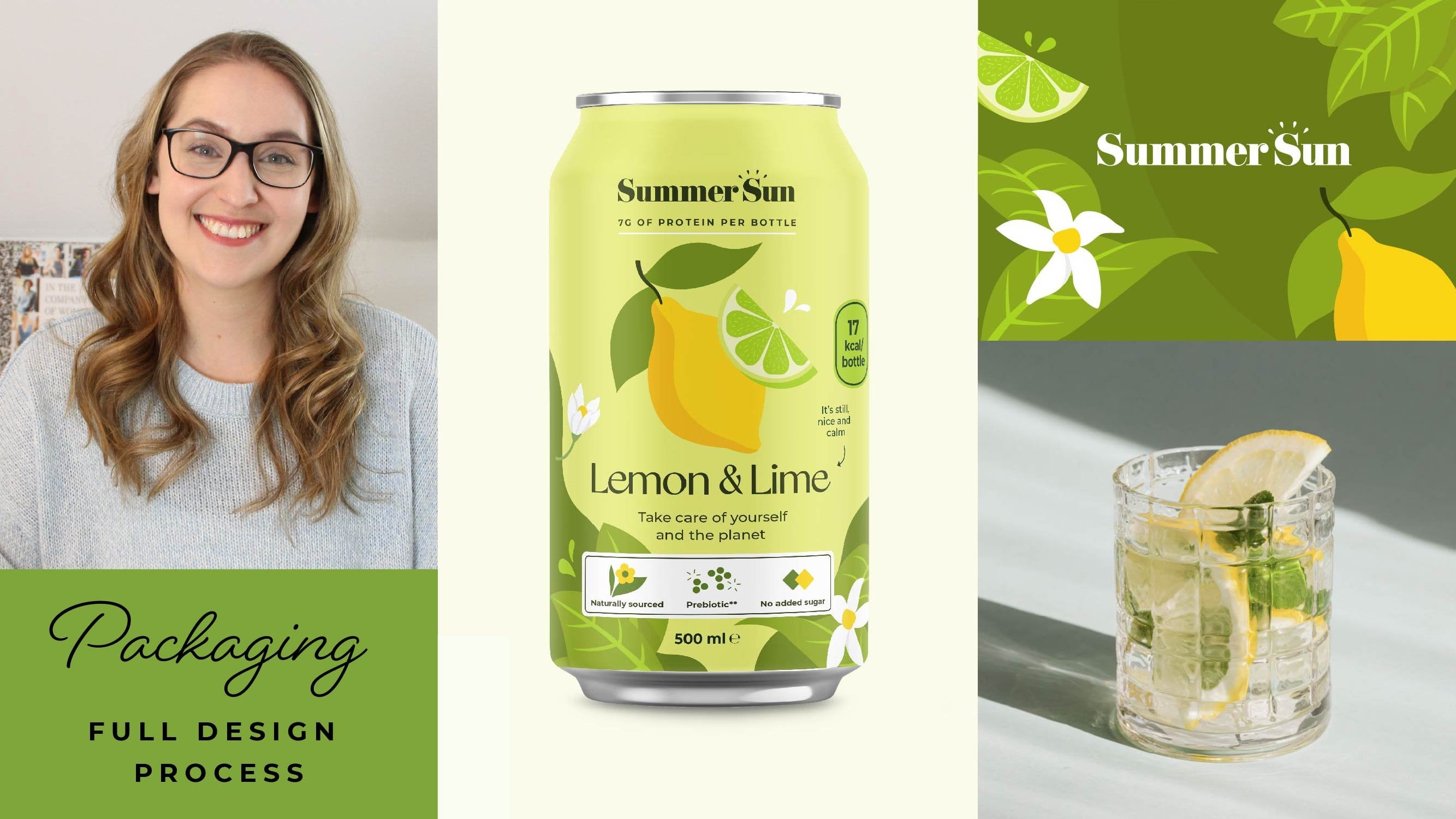
1. Class intro: Great portfolio is all
about telling a story. How will your work impact
your client's business? And how will they have a great experience working with you? Welcome to the 30 day
portfolio glow up. My name is Marlin,
and in this course, I've collected everything
I've learned about portfolio design for
the past ten years of running my branding studio. I know how hard it can
be to have the time and energy to work on
your design portfolio, especially when you are
swamped with client work. Or maybe you're
just starting out, and you're not quite
sure what to put yet. In the next four weeks,
you're going to be using the workbook and the course videos to create a crystal
clear plan for your portfolio. We're going to design
new case studies for your portfolio and even
work on your About page. Week one is all about
finding inspiration and creating that crystal
clear plan to move forward. In weeks two and three, we're going to work together to create personal projects
that are really going to be impressing
your clients. And finally, in week four, we're going to take
all that work, put together compelling
case studies, and also work on your about page and your process
on your website. I'll be with you every
step of the way, and the workbook even has a
template for case studies, so you can just swipe that
and use it as is if you like. At the end of the month, my
goal is that you're going to feel super proud to
share unit portfolio, but also that it's tailor
made to get you work. The class project is
to snap a picture of your celebration page that's
a summary for each week. And share that in
the projects tab. It's a pretty quick exercise, but it's a great way to show that progress and to
help inspire each other. Once you finish the course, you can even share a link to your portfolio and
what you've learned so we can all get inspired and visit each
other's portfolios. I'm always here if you
have any questions, and you can always post them in the discussions tab so we
can all help each other out. I can't wait to see what you create. I'll see you in class.
2. What Do I Want to Say?: Most portfolios
look quite similar, and most potential
clients have a look at more than one website before they start making a decision. Having great thumbnails for
your work is a good start, but we really want
to have a think about what feeling you want to create the first time
someone lands on your website. Like, maybe clients want a really calm and
trustworthy partner that they can hand
over the ins to. Or maybe they prefer
someone who pushes back and comes up with creative and maybe a little bit risky ideas. Thinking about those
two scenarios, those two sites would
look quite different. This also comes from who
you are as a person, since this business is
kind of a reflection of Start by thinking
about those values that you really want to portray. How you see the world and the type of clients that
you want to work with is just as important as what
those clients are looking for because that is going to be shaping that relationship
going forward, and making sure we find that personal fit is
really important. Our task today is therefore
to just think about that feeling and that first impression that
you want to make. Your website is kind of
like your storefront. So I like to have a little exercise where I
think about my dream office. Maybe it's light and bright, maybe it's filled with plants, maybe there's design books
and posted notes everywhere. Have a think about what
that would be in your mind, have a little walk
through that office and envision the feeling that
you get walking through it. In the workbook, day one
has a space for you to describe this exact feeling and what that space looks like. I call it a brand walk through, and you can use just
descriptive words, or you can even add in
little images as a kind of mood board if you
feel like that's helpful for you to
envision that space.
3. Research Time: Now that we know more about that feeling that we want to create, let's go gather
some inspiration. Plus, this exercise kind of doubles as competitor
research as well. Grab a notebook
and your computer. Then search for creative
businesses that are in the same city or in the
same area that you live in. Even if you're going to
have global clients, it's always easier to win
those local ones first. So that's why I
suggest starting here. We're going to start
really narrow, and as we go through
these businesses, depending on how big the
city is that you live in, you can always expand
it into, like, a national or an international level to find more inspiration. You go through these
websites, make a little note of what
the header says, because this is going to be
really revealing about who their clients are and what they think that
these clients care about. This is something we
can take with us, and once we start looking into
the client research part, we can go back and have a
look at this and see how it's different or maybe similar to what we're
trying to go after. For now, start by just
scrolling through the site and start making little notes of things that
you really like. Like, maybe they have a
style of mockups that you really like or maybe the
layout is really interesting. Maybe they have an about page that you're just thinking
is so personable. So make little notes of these and we can come
back to them later. Copy and messaging style
is also super important. I know we often focus on
imagery as designers, but knowing how to speak to our clients is maybe even more important because this is
where they're going to truly be feeling seen
by you as a company. If there are
specific expressions that this company is using or ways that they're talking in a more casual or
more formal style, make note of that and
things that you like, and maybe want to
try out for yourself to reflect your own
personal voice. If you want to make sure
you remember something, you can always take a
screenshot, save an image. Collect it either on your computer or I
like to save it to Mila note as a way to just
keep everything in one place. We really want to make
sure that we're paying extra attention to case
studies and to the homepage, because this is typically where most companies put
the most effort, and this is also where most
clients are going to start making those snap decisions about if this is a
good fit for them. Once you feel like
you've gathered lots of inspiration and seen
lots of different sites, the workbook has a section for you to summarize
the things that you like and the things
that you want to bring with you into
your own site.
4. The Client: The problem that we solve for our clients is
never a new design. That's why selling
ourselves by just talking about our design skills
never works that well. For example, if you're
designing a poster, the problem you're
solving might be to get more people to buy
tickets to an event. Or if you're designing a brand, it might be to
reposition the client as a more high end and
trustworthy product. But how do we know what
this problem actually is for our specific business
and our specific customers? This all starts with who
that dream client is. So that's what we're going
to be figuring out today. We want to have a
really clear definition here because when someone
comes to our website, we want them to really feel seen so that's the same reason that you're more likely
to be encouraged and excited about a
course that says that it's specifically for
creative entrepreneurs, rather than for just
generic small businesses. And you probably think
about the word niche here, and something I really
want to pinpoint is your niche doesn't have to
be a specific industry. I think this is a
huge misconception. Your Niche can be a type of
person or a type of brand. Has a specific approach or a specific set of
values, for example. For example, it could be small
businesses that care about sustainability and
eco friendliness and they make all their
products in house. That is already quite a
narrow range of customers, and they also probably share quite a lot of values
with each other. Means that you can
become an expert on this specific market, and you can start to recognize
those same problems so that when someone hires you in this niche, you
are an expert. You know all the problems that your previous
clients have faced, and you can offer a lot
more value that way, rather than if you're
coming in blind to a new industry or new type
of value every single time. When we think about this person, it's a lot easier
for us to start imagining what their day looks
like. Are they super busy? Are they very family oriented, and what really
matters to them in terms of what they look
for in a creative partner. If you feel completely unsure
what your ne should be, I suggest starting with yourself what are your special
skills, your interests? What do you bring in terms
of a passion to a project? So, for example, it could be anything from if
you love crafts, maybe handmade businesses
are a great fit for you. Or maybe you worked in retail before you started doing
your design business. Maybe it wasn't your passion, but you have all this
experience and knowledge about what's important when you're selling in a retail environment, and that helps you
be a better designer for retail businesses. There are no wrong answers. Just look inwards and think about what you
really enjoy working with and what kind of special advantages that you have that you can
bring to the table. Niche will change and evolve as your business
grows with you and you start exploring that work with different
types of clients. So don't feel like you're
stuck or locked into one niche that you're picking
early on because it will always be evolving. So give yourself that
kind of patience to pick something now and then
to see and evolve as you go. In the workbook, you'll find some helpful prompts to help you kick start this thinking and start learning more
about your clients. These will mostly be
assumptions at this point. Feel free to start updating
them or kind of adding more information as you start working with clients and
learn more about them. One of the big reasons that we really want to do
this now and not skip this step is because it's
going to help us when we're picking the type of work we want to showcase
in our portfolio, but also for that copywriting, when we're describing
projects and our process and all these different things on our website, we're going to have
so much use of having done these little
quick exercises now. So I'll let you get on with that and I'll
see you tomorrow.
5. A Review: Before we start creating
new work for our portfolio, I think it's a great idea
to review what we already have and some gaps that we
might want to be filling. This part of the class will still be really helpful for you, even if you have
almost no work yet. So just stick with me and I'll tell you some tips
to get started there. I think a really well
rounded portfolio needs to tick a few
specific boxes. The first one is that the
quality should feel consistent. So if you have some work that you feel really
excited and proud of, and some that maybe
you created very early on that you're
not as proud of, make sure that you're taking
out that lower quality item. The type of work should also be speaking to the same
type of client. This is when we talked about
that dream client before. If we maybe have switched niche, we might need to take out
some portfolio pieces that no longer fit for
that client niche, or maybe we feel like we've
learned a little bit more, and certain things
aren't kind of jiving as much as we thought
they would in the beginning. So think about taking
those out as well. And lastly, each project should
serve a specific purpose, like showing a specific
skill or showing that you have experience with a specific type of
business, for example. That note, have a look at your portfolio and all
your work samples, and have a think about
these specific questions. The first one is,
is there any work that feels either outdated or maybe it's not a good fit for my niche or the type of work
that I want to get more of? The second one is, is there any work that feels
very similar, and you don't quite feel like having all of them
is adding much? So if you're very new
and you only have a few projects and all of them are poster
projects, for example, that could be fine if that's all the work that you
want to be known for, and you feel like it's showing that consistency in the type of project that you can provide. Let's say you want to show
that you're a brand designer, and every single project is a packaging design project and you feel like you
have lots of other work, then maybe keeping a few of your best packaging
ones in there could be great to show that
you could offer those services as part
of a branding package, but you maybe don't need
to show all of them. And finally, what kind of work
do I want to add more of? Could be a skill that you
know they are really good at. Like, maybe you are great at illustration as part of
branding projects or creating brand patterns or maybe you're a website designer
and you really want to show some more
interactive websites. So have a think
about the type of work that you feel
is missing from your portfolio and
think about it from that perspective of what
skills am I showing? How is this speaking
directly to my client? And how is it showing
that I know and have experience or at
least the skills to work in this specific niche? If you're just starting
out, you kind of have a great opportunity
here to shape and create this image of the feeling that you want to create when
Son lands on your website. You want them to think, Wow, this is lots of stunning
illustration work for packaging, and you really want to show
that as one consistent image. Or maybe you want to show a little bit more
diversity and you can create some
minimalist packaging, some illustrative packaging. So try to think about
that impression you want to create
and then write down somewhere between maybe six and nine case studies that
you could eventually be getting to that you would feel creates that
whole image together. There's some really
helpful guiding questions for you to fill out
in the workbook. So go ahead and do that
and I'll see you tomorrow.
6. Keywords: The last thing we
want to do this week to make sure that our website is really bringing in all those
new people is keywords. I know SEO can feel quite
overwhelming, but today, all we're going to
do is come up with three to five main keywords and about five to ten kind
of secondary ones. The main keywords are what we really want to be known for, like Branding Studio Edinburgh. Keyword doesn't have
to be just one word. When you put different
words together, it's called a long tail keyword. These long tail keywords are
much easier to get found for because there's just
a lot less competition. The important thing
we want to keep in mind when we're
choosing our keywords is what are our
potential customers actually typing into Google? A great way to find
this out is to use a tool called
Answer the Public. Or you just choose
your location, and then you type
in one specific or maybe two keywords that you want to find out a
little bit more about, and it's going to give you
lots of opportunities to see what kind of questions people are posing using these keywords. You can even filter
by search engine like Google or even look at social medias like
Tik Tok, for example. These questions are extra helpful when we're
writing kind of FAQ sections or maybe
even blog posts where we can make sure to
answer them word by word. Another must use tool for keyword research is
Google keywords. Here you can set your location, and then you can search
for different keywords and see both how the trends
have changed over time, but also different
related keyword searches. This is a great way
to start filling out that secondary list of keywords because we're getting tons of inspiration for things
that are trending, things that people
are searching for, and are related to our initial service
or initial keyword. So your first main keywords should be related to things that you want
to be known for. So that's typically the
services that you provide, any particular style
that you have, like if you have a very bold or colorful or minimalist
style, for example, and if you want to
get clients locally, you might also want to pop
your location in there, like we talked about
with the branding studio Edinburgh, for example. By adding in our style, we can create these very
specific search terms that are quite common for
people to search for. So it can be like
minimalist branding, or we can even have our niche, like food packaging
design, for example. For our secondary keywords, we really want to try to get
a little bit of a range. So we have some that
are a little bit broader where there's lots
of searches happening, but also more competition. Also some that are a little bit more niche down where you're being a little bit more specific about the type of style
that you're doing, a little bit more granular about the type of work
that you want to get. It's very similar to
if you've done kind of keyword research for hash
tags on social media. You want to have some that are
overarching for your work, but then you want
to get specific about a couple of
different ones. If you still feel a little bit unsure what to actually
even start with, try going to different
design forums and maybe where people
are asking advice for how to do the different
services that you're proposing because there's
usually a lot of clients in and especially people
looking for advice. So there are a lot of questions
that they're asking you can start to look for keywords and different trends
that you can try out. These keywords are going to be a little bit everywhere
on our site. So some are going
to be in blogPost, some are going to
be in case studies, some are going to be
on your homepage. So it's good to
have a good variety of some that are more
posts questions, some that are single words. So that you have that
nice variety and your copy that we're going
to work out a little bit later in week four
is actually going to sound very natural and not
like your keyword stuff. You connect your site
to Google Analytics, you're also going to
start to actually see what you're being found for. And if you're seeing certain
trends, like for us, it's usually brand identity
design, for example, you can start to really
dig down on these ones and create more variations of these to make sure that
you're getting really, really deep into one kind of niche when it
comes to keywords. Like I mentioned, we're
actually going to be working on copywriting and actually using these keywords in Week four. So for now, you just
need to write down the different ones you're
choosing in your workbook.
7. Introducing weeks 2 & 3: The next three videos
are going to take you through how I approach
personal projects. They're going to be all
kinds of different projects, and they're going to
be talking about how you can create those briefs yourselves that
are tailor made to get you work and to reach
those goals that you have. We're going to be
focusing a lot on insights that I've
heard from working with my actual clients about
what's really important when you're showcasing a case study for a specific type
of deliverable. Like, for example,
what packaging clients are looking for or what branding
clients are looking for. This is all about making
it feel real because even if these are personal projects that we are creating the
briefs for ourselves, honestly, clients really care about showing that
you have the skills. They don't always really care about it being a real client. So I think this is a great
opportunity to really be taking on that work that we want to be getting more of. We will be focusing on
creating mock ups and copywriting for your website and creating those final case
studies in the last week. All we really need to do now in the next two weeks is focusing
on the design portion. Feel free to create
one or lots of different projects depending on how much time you have in
the next couple of weeks. And don't forget to
share your progress in those snapshots in the
class projects tab. If you have limited time,
start with one project now, and then you can always
come back to these videos when you have a little bit
more time throughout the year.
8. Designing Branding: Creating a new brand is a big financial investment
for a lot of clients, but also an emotional one. Our goal with this
case study is to really show that we've
understood the brief, that we can create
something that feels really appropriate
for that industry, and also something that
this client is going to feel super excited
and proud to share. This often means that we
need to show a lot of different applications
of the brand to help the client kind
of see the vision and how this could be translated
into their own business. Yes, a great logo is nice. But when you see that
brand pattern on a custom wrapping paper
or that nice signage, you really see the value of hiring an expert for get there, we're going to start by
writing that branding brief. We want to be describing what the business does and
how it functions. We also want to be describing why they need a new brand and all the different
deliverables in terms of where this brand
is going to be living. Make sure you also
describe lots of different potential
challenges that they could have with
their previous brand. These are the reasons why they would be needing a rebrand. Like, maybe you just didn't feel very unique or maybe didn't speak directly to
their customers or maybe they switched
client base recently. In my experience,
there are a lot of different reasons why
people hire a brand design. But there tends to be some
common themes that come back. For small businesses,
cohesion and saving time tend to
be huge reasons. The logo and visual identity, if there even is one, usually haven't been created altogether. So we're kind of lacking that cohesion and that
nice vision for the brand. That means that every time
that they're creating a new presentation, pitch deck, or maybe even a
social media post, they're kind of
having to figure it out and reinvent the
brand in new ways. And that is both
frustrating and makes you not quite feel proud of
the brand that you have, and also just takes
tons and tons of time. On the other hand, in some
cases for small businesses, they might be brand new
and just starting out. In that case, the founder has
usually saved up money from their own savings to invest into things
like a brand website, other things that they need
to launch this company. That means that
although they are excited to invest in branding, which is really important, they also need that money
to really stretch. So we want to show that by creating a brand that
is really effective, we're going to be making
their marketing better, their website more effective, really showing that they're
getting value for money. This means that we might want to show brand guidelines
and how that's translating into
marketing assets or pitch decks, for example. Really show them that they're
getting something super valuable that they can then use for all parts
of their business. For large companies, branding is often more of a pivot
rather than a 360. They spent a lot
of time and money making sure that
they're building up that relationships
with their customers, and they don't
usually want to throw all of that out and just
start from scratch. If this is your type
of dream client, we really want to
make sure that we can show that we can take
something that is already. Distill down what's working and what's not working and
then translate that into something that is
going to be way better and way more efficient for what
they're trying to accomplish. But showing that
transition rather than just presenting
something completely new. For the purpose of this course, when we're creating
personal projects and we're not working with
actual clients on things, there are a couple of different ways you
can approach this. So the first one is that
you could yourself create a kind of before version that you think has some
serious flaws, and you can then work on changing that into
something better. You don't want to spend
the time doing that, another way could be to go to some stock sites and purchase a stock license for
something that you feel is very generic
and not very good, and then you can
improve on that. Or you could, of course, rebrand an existing
business or brand. Now, I would be a little bit cautious with that
because we don't want clients to be confused thinking we actually
worked with this company. So we want to be super clear then that this is a
personal project. And if you're working
on something like rebranding like Coca
Cola or something, then we really want to think
about how we're presenting. But also these famous
brands would be the least likely to actually
have a lot of change. So I suggest going with one
of the two earlier options, either creating a before and after or grabbing something from a stock site that is quite generic and then
transforming that. All this to say
that the personal projects that we're creating for our branding portfolio
are going to be very much down to that type of
customer that you're after. So we really want to make sure
we're tailor making all of the different
applications and how we explain the project to
that specific need. Now, let's gather
some inspiration. My favorite sites for
brand inspiration are rebrand, Behms
Identity designed. And under considerations
brand new. All of them are also linked in the helpful link section in
the workbook at the UIN. To make it easier to actually look through
inspiration, sort it, keep it organized,
and also to leave little notes on why
you saved something, I like to use Mel note
because I can use their extension to save
something straight to the board, rather than having to save
it to my computer first, which makes my computer a lot happier to not have
to deal with that. So that is a suggestion. But there's also,
of course, tons of other tools that
you can explore. To give you an example
of how you can then take that moodboard
and turn it into a finished concept that you would be presenting to a
client or to finish work that you're putting on
your portfolio here is a mood board that I created for a small business
tech consultant. And then here, now we're
going to be looking at how we turn this into
an actual concept. The goal here was to create something that
felt professional, but that also had
kind of a playful, more modern, innovative
tech feeling. And we wanted to lean into this kind of clean design style. But then to inject
personality through custom Illustrations and a little bit more
quirky details. Based on these discussions
with my client, we started to do some
sketching for how we could merge this human side
and the technology side, because something
that came up a lot in the discussions was yes, they're creating
technology solutions, but it really is about
how people like to work already and the people who will actually be
using the technology. So it's more of a
little bridge between the different working styles and the different challenges
that they're having. And this was both the
people who are working in the company and their
actual customers. Based on this, we created a
kind of abstract icon that had this merging between the soft and the more sharper edges. We also use this little
circle here as a kind of something coming off and
evolving into something. And that is supposed to reflect the project that they're
having together. We made these decisions because in our discussions
with the client, we talked a lot about having logos that has some
sort of movement, some sort of dynamicism to them, but that still felt abstract enough that the
company can take on meaning as technology evolves and becomes different things
for different people. This also gives us a kind of modular system where we can take apart these
different shapes and create that balance between the hard technology side and
the soft kind of human side. You definitely don't always have to start with
working on the logo. Because it encompasses
so much strategy, I find that sketching
on the logo first, it can sometimes spark
a lot of ideas that we can use for things like icons
and illustrations later on. A lot of those first
ideas that we have, they tend to be quite obvious. So that's why we don't
want to use them for a logo design because that's something that is supposed
to be very unique. But using something
that is a little bit more obvious
for an icon design, or for an illustration that's communicating
something specific, that actually is
really beneficial because that brings a
lot of clarity to it. Since we're creating
this brand project for our portfolio specifically, we really want to
have a think about those brand applications. Once we have our logo,
start to think about at least three to five
other brand applications that you can incorporate
and design for. This could be anything from
brand patterns to signage to packaging to social media
templates or pitch decks, anything that you think this
client would actually use the brand for and apply
it to day to day. The type of applications
we choose can also be an intentional way to show off different aspects of the brand. For example, if you're designing packaging or a brand pattern, that could be a great
way to incorporate all the different brand colors versus if you're showing a sign, that might only be
black and white.
9. Designing Posters: Poster design might be one of the best ways to start
exploring design. It can be created in any style. And even though, of course, you could spend
hours and hours on custom illustrations
or custom fonts, most poster designs are a
little bit quicker than, let's say, creating a
full brand identity. That means it's a great way
to showcase your skill, and it means you can
get a few more projects up on your website a
little bit quicker. To create our polster design, the first thing we want
to do is to start picking the event or type of thing you want to promote
with your polster. Lot of poster designs are
going to encourage someone to go to a new restaurant opening
or to a specific event. But you could also go
the route of more like government informational
or NGO posters where you're talking
about something like biodiversity in the
city, for example. While the events
based posters are usually commissioned by
clients who are businesses, the more informational ones
are usually by universities, local governments, or
charities, for example. So I want to keep this in
mind when we're creating the style and also the settings for it later when
we're working on once you know what you
want the design to be for and who is
commissioning it, have a think about
these questions. First, what's the core message that
they want to get across? Where will this
poster be displayed? Is it going to be in a subway? Is it going to be in a park, for example, in a school? Think about where
the setting will be. What action do they
want people to take? Is this purely informational, or do they want someone
to go to a website to book tickets or to follow
them online, for example? What more detailed or granular information do you
need to include? Things like sponsors
of the events, maybe social media handles or instructions to
get to the location. That last step actually
really helps you sell that you are a
strategic designer who can create within a brief. Anyone who's thinking
about commissioning a poster design
who sees that you don't have a logo
on your examples or you're missing the
dates of the events, for example, they might
feel like you're more focused on the visuals and
not on the strategic part. Although, of course,
we're designers and we want it to
look beautiful. Our job is really to help our
client reach those goals, like getting more tickets
booked, for example. So I suggest starting by
looking at the hierarchy, which information is most important and which
information needs to be there, but we can put it a
little bit smaller and a little bit less in the
main focus of the design. So, for example, if you're
designing a music poster, the band, either their name, photograph, maybe their logo, for example, that could be something that we really
want to highlight. So the people who know that band are going to get super
excited right away. Next up, we want to
talk about the dates, the location, and the times that this event is
going to happen. And we also want to
make sure that people know exactly how to
book the tickets. And the last
information might be things like who's
sponsoring the event, if there are any
safety instructions, if there's any accessibility
instructions, for example, anything that we
think could add to this poster design
to make it a little bit more applicable
and look and feel. Make this process of hierarchy
a little bit easier, what I like to do is just create a super quick sketch
where I'm making a little bit of a grid
and then just making blocks for the different
information that I want to put. So the bigger you're
making something, and the more in the kind
of middle focus it is, the more people are
going to see it first. So that's what we
want to keep in mind, starting with the biggest thing in the middle and then placing everything out after that level of hierarchy that
you're working. If you already have an image that you want to
be working with, let's say a picture of a band, then start to look
at that picture if there are any empty
spaces where you think, Oh, this would actually
be a great place to put the dates, for example. Or you might want to, let's say, get rid of the background, just use the band members and layer the
different components. But how do you add things like sponsor logos if you're
working on a personal project? Well, in my case, when
I've been working on these for YouTube videos and I've been creating personal projects, what I've been doing is
just making these up. It's just a placeholder
to show that you know strategically that
this is something that would come up
in a poster design. Sometimes I use logos that never actually were picked
for a branding project, or I just make them
up from scratch. I'm not sure if they would
ever read this information, but showing that you're
putting it shows that you're dedicated to
that strategic angle. We'll be adding your designs to some beautiful
mockups in Week four. So for now, just focus
on the design portion.
10. Designing Packaging: Packaging design is one of my favorite types of
projects to work on, but it also comes with
a lot of moving parts. Just like with the
poster design, we need to show that we
can create something stunning that
people are going to want to pick up from the shelf, but also the incorporates tons of legal and
practical information. I think it's quite common as a designer who wants to
create something really nice for the portfolio to focus on that one bit of the packaging that we
can see on the shelves. But to really show your strategic purpose
as a design partner, I think it's a really good
idea to design the full 360 of the packaging so
that we can really show that we know how to
deal with the real project. For example, is there a design on the lid
once you open it? How do you make the nutritional
information really clear? And how do you
incorporate QR codes and bar codes and practical
information like that into a design that
still looks really nice and these details will show that you have an
eye for detail and also that you know how to
work with a realistic brief. To create a great
packaging design, start by writing out all the information that you
need to include. This could feel like a lot, but most packaging actually has more or less the same sections. So you could probably go to
your pantry or to one of the latest products
that you bought and have a look at those
different sections. Here's a bit of an overview
of what you typically find. For the cover of the product, we usually have the
name of the product, the logo from the
company itself, maybe a few little benefits and something really eye
catching for the design. For food products,
you usually always need to put the amount
of the product. And that can be the same if
you're having a product, let's say, legos, you might want to put how many pieces
are in it, for example. For the back, we might have
things like instructions, nutritional information,
allergens, for example. There might be
safety instructions or age restrictions
for a product. If it's a toy, for example, you could have things like
bar codes and QR codes, information about
the company itself. A lot of companies also
like to put, for example, badges for certifications that they've got or awards
that they won. And also, if there is space, you can always put
additional benefits or reasons to buy the product. And finally, there
needs to be a way for people to contact this company if they have any questions. Things a little bit easier, if you just want to jump
start into this, I actually added a
sample product with the information that you can
just grab from the workbook. Once we know what we're
going to be putting, we need to think
about who is going to be buying this product and why. Is this a product they
buy out of habit, for example, the same
breakfast cereal every day? Or is there something
new and exciting, a one off purchase, for example. We also want to have to
think about what we want this particular case study to say about our skills and
our work as a whole. Do we want to show off
our illustration skills, or do we want to show
that we know how to do really minimal packaging
design, for example? The workbook also has
a few questions to help you narrow this
down a little bit. Once you know
everything you want to put and the general feeling, again, we're going to
start with hierarchy. Actually sketching directly on top of a copy of the die lines. So Dilines are like the
blueprint for any packaging. It's basically going to show the printer where things
are going to be cut, where things are
going to be folded. And it's also showing us as creatives where we
can put our design. We knowing where
things are going to be cut means we know we can't
place anything there. We also look at the orientation, if it's flipped up or
down, for example. So this is all information that's very important
for us to know. And if you're going to be
working with packaging design, getting comfortable with
delines is also really helpful. Most online printing companies offer you different di lines
that you can download. So let's say you're looking
at a specific product like a folded brochure or
a box for packaging, for example, usually underneath
in that same listing, they have so that you can
download the delines. They typically come as a
PDF, sometimes in design, and sometimes Adobe
Illustrator because these are the most used programs
for designing packaging. So these will be
different formats that you can actually
work with and open. If you feel a bit confused about die lines or you have any
questions in general, don't forget to post
your question down in the discussions tab, and
I'm happy to help you out. Great packaging
encourages you to pick that one product out of the s of other
products on the shelf, whether in person or online. So we really want to
make sure that we're creating that right
feeling with our design. Think about that main graphic, that main visual that
we're going to be seeing. And how is that creating a
connection to our product? And making someone
want to pick it up. From there, try to really take a 360 approach to your
packaging design. How are you connecting the front of the design to
the back of the design, and how are you making sure that that feeling is the same
all around the packaging? Because that really
shows that you're able to take the brand in that brand visual style and kind of carrying
it all around. For the back where we have
a lot of information, you could either do a solid
color or we can create, for example, boxes
for texts to sit in. And these could be incredibly
simple and minimalist, or you can be a little bit more playful with the shape of
them, how they're tying in. C layer illustration,
for example. So if you've got
illustration on the front, you can make little
spot illustrations to incorporate on the back to really make that
feeling cohesive. The same works for a brand
pattern, for example. If you've got a brand
pattern in the background or as a part of the
design on the front, you can always
carry that a little bit back to the back
of the product. Design elements like badges or ribbons can also be
really helpful when you just need to break up the
layout a little bit and get key information
like certifications or benefits or
weights, for example. A way that feels like
they're easy to see, but also something
that is not just becoming one giant
mass of information. If you want to gain an even deeper understanding
of packaging, it's a good idea to actually print your packaging
and try assembling it. So, of course, this
might be a little bit different if you have a can
or something like that. You could print
it and try to put it on an existing
can that you have. Or if you're doing
a box, you can try to print it and
assemble it yourself. All you need for
this is a little bit of a thicker paper and, like, any home printer, just to kind of get an
idea of how it works. This doesn't have to
be something that you necessarily put as part
of your portfolio, although if it comes
out beautiful, you can always take pictures
of it and show that you know how the process of
creating something works. But it's also for
us to understand, like, Alright, this
turned out upside down. I need to figure
out the die line so I know how to turn
this upside down. Or things like, for example, understanding how big the text actually appears once you
print it at a certain size. Something else that
you can add to your packaging case study to
bring a lot more value and also as a way to create a lot more engaging mockups is to actually use one design, but then create multiple
products from it. So, for example, in this case, we've got a type of lemonade. Try to show that to
you, where we've got the same type of layout, we've got different colors. We've got different
illustrations. But as you can see, the layout
is more or less identical. And this is a really
good approach when you're designing
packaging because it shows that you can
take this one concept and then take it across a product range because most companies have
more than one product. So this could be from
anything from like a food or drink product
to let's say you're doing a brand for a construction
company that have lots of different tools, you
can do it for the drill. You can do it for the
saw, for example. So they are showing
that you have an understanding of how to make a cohesive packaging
line based on the brand. Also, since you already have
the design that you created, it's going to be way faster to create those
additional products. You don't have to start
all the way from scratch.
11. What makes a great case study?: It's easy to think
that the whole purpose of a case study is
to have stunning, beautiful mockups of your work. Although these help,
our job is actually to show that we are a
strategic partner who made these design decisions
because they were the best choice for the client and the project. So
how do we do that? I thought I would take
you through an example, and then I also put a
template in the workbook that you can use as a base structure for your
own case studies. It can help you have a kind
of guide so that when you're creating mockups
and writing copy and structuring your own, you know what to use as a
kind of kick off point. The very first part
of a case study is actually not the images
or the text itself. It's actually the
thumbnail that we use for someone to click
into the case study. Which image you choose to use is going to set the
tone for the project. And it also informs the
client what type of work it is and if this is something they even want to explore further. Something I always
recommend is to have a variety of different
motifs in your thumbnails. So, for example,
instead of just having the logo for all of your
different thumbnails, if you're a logo
and brand designer, you could do the logo for a few, but then maybe you're doing
signage or you're doing social media posts for
some just to kind of show that you have a
lot more depth and a lot more different
deliverables in your projects than
the logo itself. This is just an
example, of course, but I hope it can spark some ideas for you to
have a think about how you can create
this more well rounded image in your portfolio. Another detail we can add is
to have the image actually switch or to have a little animation when you
hover over the thumbnail. This gives you
another opportunity to show basically double the amount of images in the same real estate
space on your website. And it also makes it a
lot more interactive, so people are excited to
hover over all of them and check them out and maybe be even more encouraged
to click on one. We also want to think
about the text that we add here to describe
the project. If we just add the name of the company or just
add branding project, we're really missing out on some great opportunity to
connect with our clients. Instead, think about the
problem that you solved with your branding and what the overall feeling
of the project is. For example, for this medical company that we worked with, I wrote finding answers through research and
patient stories. It gives it a bit more context, and it's also a lot easier for those potential clients to connect with those
projects and see, Oh, actually, this is kind of similar to what
we're trying to do. Now we have this
first page ready, let's dive into what to
actually put in the case study. We want the client to quickly be able to answer
these quick questions. Your personal role
in this project? What different services
did you provide? Why did the client approach
you in the first place, meaning what problem were
they trying to solve? How did you help
them? Meaning, what was your solution? How
did you go about it? So sharing your process and your thinking behind your
different design choices. And finally, what
impact did it have? This last point is
actually really, really important but
very underrated. And it's going to be showing why it's worth investing
in your services. Let's go through
these one at a time and go a little bit
more into depth. The very first thing you
want to do when you get into a case study is get an understanding of the
tone of the work, the overall style, the industry of the company, and what
the project was about. I think it's a great idea to
have a big splash banner, kind of image that makes you feel like you're
part of the project. So this could be
one with pictures of people interacting
with the final brand. It could be like a real person interacting with the
finished items, like, let's say you're designing
something for a storefront or some merchandise
or anything where it feels a little
bit more tangible. And if you don't have
that, you could have a mock up with a person
in, for example. This first section
should also contain all the key information
about the project. So that would be
the client name, the services that you provided, any collaborators that you
worked with, for example. This is an example from
a design studio called Hyperact where they've
really taken this step a little bit further and broken
down the services so that clients can really imagine what this actually means
practically for them. As we make our way
through the project, we want to have a nice
mix of images and texts to really guide the reader and the viewer
through this story. There are a couple
ways to do this. The first one,
which is maybe the easiest is to do it
chronologically. Basically, talking about
what the project was, what the problem we're
trying to solve was, and then your solution kind of step by step as you
actually did it. Another way to do it could be to break it down into
different applications. So talking about how
you worked on the logo, then talking about
how you transferred it to colors and fonts, and then finally, how you
took all of this together and created like social media posts and packaging and
other assets from it. The key thing here is to really guide the person that's
looking at this, through your design decisions. So making sure you vary the type of images that you
have and that they kind of work together with the text so that they can
really understand, right. This was the problem they
were trying to solve. Here's the solution, and this is why they made this
specific design decision. For some creatives,
showing behind the scenes like sketching or setting
up a photo studio could be a really
great way to make that connection to how much work actually goes into a project. This could be anything
from a time lapse of your illustration work
sketching in your notebook or just pictures when
you have a little bit of different stages
like the mood board or chat with the client even. It also makes the
person looking at this feel like they get to
know you a little bit more, which kind of breaks down
some of those barriers of hesitation that
they might have for actually getting in touch
about their own projects. One company that does
a great job of this is a branding and marketing studio called SnaSk who work in Sweden. And in their case studies, you have almost a
50 50 breakdown of the final images and the behind the scenes of how
they actually took these. I think in a world where a
lot of people assume that something really spectacular
is just made by AI, this is also a great way
to show all the work and strategic input that
goes into any project. I also want to talk
a little bit about interactive elements on
any part of your website. I think as designers, it can feel a little bit like we have the pressure to create these
insanely different websites, where you've got things moving. You've got different
parallex scrolling. You've got all these
interactive elements. But actually, it might
be hurting your website because clients aren't
always the most tech savvy, and if there's anything
that gets in their way of actually looking and
taking in your information, that could actually be something
that goes against you. If all these animations and extra bits also make your
website slower to load, it also hurts your SEO, so it's harder for people to find your website
in the first place. All this to say that, of course, your portfolio
should be something you feel excited about, something you feel
proud about and do explore lots of fun ways to design it that makes
it feel like you. But don't feel like you
need to add a bunch of very complex things
just for the sake of it. Add little things
that you feel are really making a
difference and that is making the experience
for the person who's visiting your
website a lot better. This is especially true when it comes to the
mobile experience. So we don't want to put
all of our efforts into our desktop and then completely forget about our mobile version, especially if you're someone who does a lot of marketing
on social media. Because a lot of people
are going to come through your social media post into your website and be on
their mobile phone. And finally, before we wrap
this little chapter up, let's talk about accessibility. In some countries, it's
just a decent thing to think about to make
your website better. But in some places,
they're actually starting to make it
a legal requirement that your website
is actually meeting at least the minimum
levels of accessibility. This can mean things
like allowing your tags to actually work efficiently
to go from text to speech, for example, when you're using
different tools like that. Can also work with color
contrast and making sure that your text and font
sizes are not too small. It really doesn't have
to be that intimidating. There are lots of great
contrast checkers that you can actually
use just to plug in your own colors and
your own fonts and see how they are actually appearing
and how that's working. I've put some in the workbook for you that
you can go check out. If you make sure that your
all tags are actually describing what's in the image and not trying to
keyword stuff them, and you're working on your
color contrast and font sizes, you're already coming really far to making your site
really accessible. So don't feel
discouraged or it's a very complicated thing
to get started with. Next up, we're going to
talk about how to create those stunning mockups that you actually want to put
in your case studies.
12. Copywriting: One of the most overlooked parts of a case study is the text
that we choose to add. Not only is it great for SEO and helping people
find our website, but it's also a way for us to use storytelling to convince those people who are kind of on the fence if they actually
want to hire you. For example, let's look at
this picture. It looks nice. But if I tell you that
this image is for a personal finance
company who want to help millennials to plan for
the future without stress, you might get a clear image
of why this design works. If I go a little bit
further and I tell you how we made these
design choices because our research actually
showed that millennials felt very intimidated
or frustrated by money. So all of our design
choices were about creating this calm exciting energy that showed them focus
on goals specifically. So how their different
financial goals could actually help them reach goals like traveling or buying
their first home. This way, we're really showing the value of our creative work. You can see your
copywriting as telling your potential clients about your past work in a kind of
more conversational way, where you can really tell that
story and show the value. We want that tone to feel like and what it's
like to work with you. So for some designers, that will be very buttoned
up and very professional, and for some people, will be a little bit more
cheeky, for example. This is mostly up to that
client designer fit. So we spoke in week one
about finding out what your values are and what
you want to say to clients. So this is going to be super important for creating
that feeling and for your client to understand those values that you have
and your working style. Imagine you were sitting across from this potential
client in a cafe. How would you
describe your work? What kind of words
would you use, and what tone would it have? Would it feel very exciting? Would it feel very
professional, for example? Don't worry if this part
feels a little bit unnatural. I've noticed that a lot of
people when they start out, we start with a very professional
and bottom and up style because we're worried to come
across as unprofessional. So it's a great foundation. And then you can start to
look at that text and say, Does this sound like me? If I would actually
talk to someone, what words could I
maybe replace in this text to make it sound
a little bit more like me? One strategy that
you can use for this to start noticing what
words you're actually using a lot is to start describing these projects
in voice memos to yourself. You can then type it
out or some tools even let you transcribe
the voice notes. And then you can
use that as a way to start putting
together something that feels a little bit more casual or a little bit
more in your voice. Make sure you're
editing the text to go into very clear sections and also that you're
combining it together with those images so that
it makes sense together. Not that you're having
one story through the copywriting
and then just kind of putting images randomly, but they should be connected. Here's an example of a
case study we created for a company that helps patients
with chronic illness. So we start with just having a nice banner where we're
showing off the logo, but it's in the context
of this family, which is a really big part of this actual project
to make sure that the family of the
people who have that chronic illness are
actually part of the story. We then go into looking
at the little details. So we have finding answers through research
and patient stories. And then we have the
different services. So this is going
to help both with SEO but also with
describing the project. Then start with a challenge. So talking about how Unhide as a platform that
helps patients track their own symptoms and how
this is actually going to be something that patients are going
to be able to use. But currently, it's something that you needed to appeal to all these different
groups of people needing to feel inclusive
and approachable. So we had this thing
of the doctors and the patients and wanting to appeal to all of them
at the same time. We can then start to show of the brand and talk
about our solution. So we talked a lot here about collaboration between
these different groups and wanted to create
something that can actually be a smaller than
sum of its parts. And this is where this idea of this overlapping comes from. We can then start to show how
this is actually applied. So here we have a report, for example, and this is actually a photo
that isn't related, like we've not made this photo, but it's a perfect example
of someone who's using the platform and the type of target demographic
that we're looking at. The pictures are
also matching in terms of color, so
that's really important. We then start to talk
about our process here. So making sure that the
brand would connect, we start by making sure that we talk to the founders with a one, one experience of
everyone involved. And we looked at how it was really challenging for patients or families who advocated
for their loved ones. And so we talk about creating this environment that feels really assuring and dignifying. And we can then combine that together with our pictures of the research and our
more branded aesthetics. So we've got our logo, and then we got how that's
applied into social media. And knowing we have this reassuring feeling and this really empowering feeling, we can look at the pictures
here in the application, and we can see that it's translated into
the design itself. Finally, we have a section
here on the impact, so talking about how they
could reach a lot more people, talking about how
it can help people feel seen through this brand, and also giving them a
toolkit that they can actually use to create a
lot more work day to day, things like having assets
that are easy to use for their presentations or
social media, for example. And then finally, we have
a call to action for people to actually get in
touch about their own project. Workbook has a template
set out for you that shows some different layouts
for images that you could use and sections
for the copy, very similar to the one
that we just looked at. So have a look at this and see, Okay, I have these
different mockups. Do I need to create
any additional ones? What kind of copy
do I need to write? How is this going to come
together as one story? As you're writing the copy
for your case studies, this is also a great
place to start using those keywords that we
created in Week one. Incorporate them into your
SEO for your website. Since we already have this list that we
create in Week one, our job right now is to
start putting them in in a way that feels natural
and easy to read. We really want to avoid it feeling like it's
very keyword stuff. A quick way to do this
is to make sure that we have all those services
listed right at the top. This is a quick way to
get some keywords in without it being
incorporated into the text. We can then be really intentional
about mentioning how we did this work and
incorporate those keywords. A good rule of thumb is to use those core keywords that we
created our main keywords, something like three
to five times if your case study is about
500 to 1,000 words. The remaining keywords, you can sprinkle them in if
they seem appropriate, but not every case study
needs to have every keyword. It should feel natural and actually make sense
in the context. Another area where copyrighting is really important besides your case studies is your About page and
your process page. None of these
actually have to be super long or extensive, but it's just another
opportunity for us to win over those clients who
are kind of on the fence. When your About page, focus on why your skills are
actually helpful to the client instead of just making it about what
you enjoy about design. For example, you can talk about your experience with
a certain medium. Or why you have experience in
a certain type of industry, for example. Don't get me wrong. Having a few details
about you that connects with people can
be really important. The thing we want to
avoid is landing on this site where you basically have a big
picture of you and saying, Here's what I do, and
this is why I love it. But we don't really
get any understanding of how this is relating to the project or why you are
the better person for this. In my case, my
About page is also where I share our
sustainability work. And our different
values as a company. Because I know this
is something that is super important for the
client choosing us. They're coming to us
because we understand what it's like to work with
sustainably driven clients. And we also have that experience and expertise and
share their value. For you, it can be
a similar approach, but it could be anything. You can talk about how you
really love to work with small mom and pop shops because you love to see the
impact, for example. Find something that
is that connection where they can see why
you got into this, but it's relating to them
and how it's helping them. If you're a little bit
more established and you've got some nice
clients under your belt, you can always put
these logos here. You can even put a timeline
of different projects you've taken on and how
your company has expanded. Let's say you've hired
someone or you've expanded your team to
other freelancers that you can work with a
great opportunity to show your different
capabilities as a company. If you're just starting
out, this is a great place to put some pictures that
really help people connect. So it could be, for example, a picture of you sketching something or you working
at your computer. So people don't just
get that one headshot, but we actually have a bit more of you working
on something. It feels a lot more actionable and easier
to connect that. A world full of AI, this also shows that you're creating
everything from scratch, and it shows the value
of your services. The process page is here
to make sure that you and your clients are on the same
page right from the start. Clients come to you
already knowing from your website how long a
project usually takes, what steps it
involves, for example. You don't have to be
super detailed on this, but setting out all
the different stages and what the purpose
of each one is can be really important
for the client making sure that
they're preparing all the materials
that they need, that they understand
the type of time they need to invest in
the project, for example. You can, for example,
say that discovery is all about understanding
where your company is now, your future goals,
and your customers, so that we can really
make sure we're making strategic
choices moving forward. And if you like, you
could add something like it's typically
a two hour meeting, and you get a little strategic report afterwards, for example. I promise this will save you a ton of time when
you're actually managing those projects later on because clients come in with
this understanding. And you can basically
take this information and put it into your
proposal as well. So doing that work
now could also help when you start
sending out proposals. Just like with the
rest of your site, don't forget about mobile. Sure that anything that you're adding is going to actually look really good when
you're scrolling on a smaller format. So, for example, if you're
adding those different stages, make sure you're adding them in different blocks and not as one solid image because
once you get on mobile, that's going to be super duper tiny and impossible to read.
13. Creating Mockups: Today is an exciting
day because we are taking those beautiful
designs that you created, and we're turning them
into stunning mockups. Mockups are a key part of
running a creative studio because we can't always take physical pictures of the
designs that we create. Sometimes the clients is abroad. Sometimes it's not
something that becomes a physical
product right away. So knowing how to create
your custom mockups or to actually customize
ones that you can buy is a really important skill. Mockups also a great way
for clients to actually envision how a final
design is going to look. So we need them not
only for our portfolio, but also for presenting
concepts to clients. There are a couple different
ways to work with mockup. So the first one is
to buy a license or use ones that are free to
use that you can customize, but that are essentially
already set up for you. The second way is
to create your own. But let's start with using
premade ones just so that we have that down in case you want to start
exploring there. I added a list of different
websites that offer both free or options to
license in the workbook, so you can go and explore
those different options. And one that I use a lot
is one called Mr. Mockup. You can see that there are
so many different options, and you can see that
even in the free tab, we've got tons and tons
of different mockups. So how do we actually know which one to go for
for our project? We need to start by thinking about these designs that we've created and where they would
actually live in real life. For example, a logo mockup
on a coffee cup might be a great idea for a
coffee or a cafe brand, but it's probably
not a great fit for a kids clothing
brand, for example. Also want to find a nice mix of different applications
for each case study, so that it feels a lot more
dynamic rather than just having the logo put on lots of different
things, for example. For example, I recently created this cute design for
kid friendly cafe, and I decided to put the
mockup on a sign, on a menu, and we created this really
cute social media post that we put on a phone mockup. This gives a nice
set of variety, and it also shows how the brand could actually be applied. What if you design something
a little bit more static? Like, let's say,
a poster design. In this case, I think
it's a great idea to find some mockups that show it close up where you
can have the details, maybe not even showing the
entire poster at once. And you can have some
that are further away and in context of where
this polster would be. The same goes for
if you're creating a custom illustration,
for example. You could put one mockup of a notebook with
showing your sketch, and you could put the
final artwork on an iPad or you could put it even on
a finished situation like, for example, a cover design. Most mockups are prepared in Photoshop, but at the
end of the video, I'm also going to talk
a little bit about some other options if you
don't have Photoshop. It's up to the
designer who makes these mockups to actually structure the layers
and name them, but most of them have a
very similar structure. So as you're working
with a couple ones, you'll get more and more
familiar with how they function. Most of them have a
background layer, sometimes it's a color
that you can edit. Sometimes it's a texture, for example, and in some cases, it might be incorporated together with the actual thing
that you're working with. So, for example, the phone might not be separate
from the background. Also have a design layer where you will actually
place your design, and this is what we're
really interested in. And then sometimes you also have things like lighting or shadows, for example, that you could
actually tweak yourself. To add in your own design, all you have to do
is double click the design layer to get into the Smart Object. That's
what it's called. And when we paste our
design here and click Save, we can go back to the tab of our actual mockup and you'll see that it has been updated. If you do feel like
it is not quite looking accurate in terms of the colors that
you wanted to have, you can go into these other
layers that they've put in, like lighting and shadows or different color
saturations, for example. And the easiest thing
to do is just to start looking at the percentage
of it that's applied. So you can actually start
decreasing it a little bit and see how that affects the
final result of the mockup. Once you're finished
with it, just choose Export and choose a PNG or a JPEG file and
save it to your computer. Make sure you file sizes are not massive because that's going to really slow
down your website, and that could really
hurt your SEO, but also the experience
of using your website. For that reason, I
usually prefer using JPEGs because they are a
little bit lower in file size. But what about when you can't
find that perfect mockup? Or maybe you just don't
want to spend the money? I'm going to show you two ways to create your own mockups in Photoshop and one way to do
it in Adobe Illustrator. I want to take you through
two different mockups that we're going to
create in Photoshop because we have some
that are a little bit more straightforward
and some that have a little bit more texture. So the first thing we
want to do is we're going to use this notebook
as our mockup. And so I want to select
just the notebook. So what we're going to
do is create a copy by right clicking and
choosing duplicate layer. We can call this notebook, so it's easy to remember. Now, this is still
the entire picture. So what we want to do now is
head over to the menu here, and we want to select
Object Selection tool. This is going to
start working and notice different items
in your actual artwork. But what we want
to do now is just click on the one
we want to select. Now, if we zoom in a little, we can tell that it's actually selected the shading
here as well, the little shadow behind
it. And I don't want that. So I'm going to zoom
out a little bit. And I'm going to
choose deselect, and I'm going to add a square for this little area up here. I think that looks a lot better. So what we want to do
now is making sure that we're creating
this as a layer mask. And that's going
to make sure that only this area is
actually selected. So this is going to be really important a little bit later on. Now what we want to do is create a container for
our actual design. So I'm just going to
use the shape tool here and create
just a rectangle. Doesn't have to be perfect, just needs to generally
cover this area, and we can just rename this. And then what we want
to do is we want to make this into a clipping mask. And you're going to
see how this is only applying to the area that we
actually marked off before. Right now, it looks very white and there's not a lot going on. So what we want to
do now is we want to convert it into a smart
object because that is going to make sure we
can actually update our design so we don't have to recreate the
mockup every time. So if we click in here, we see we've got this
white rectangle, so we can hide that, and then we can go and actually
grab our design. So I've just made it in
Illustrator super quickly. So you can just copy
this and we can go back into Photoshop
and paste it. And we're going to paste
that as a smart object. I want to make it really
big, so it's going off of the actual notebook so you can see that this mask is working. So let's place it somewhere like this and just hit Command save, and then we're going to go
back into our original one, and you can see how it's
being cropped right now. That already looks okay, but there are a couple
other things we want to do to make it look a
bit more realistic. I want to add on a
bit more texture, so I'm going to
create another copy of the background layer, and we can name
this something like textures and shading,
for example. We're going to pull this
all the way up to the top. And what we want to do
now is we want to change the blending mode from
normal to linear burn. Now, that looks a lot right now. So what we want to
do is make sure it only applies to the notebook. So we're going to just
create a clipping mask here. And now this is only
applying to the notebook, but it's quite severe. So I'm actually going to go and reduce the opacity
a little bit here. I think that looks a lot better, but I'm going to go back into the design and show
you if we move this placement to where there's a lot more shadows
on this notebook, you'll see, like how
this is actually working and how it's picking up those shadows a bit better. So now if we zoom
in, you'll see that this edge on the notebook
where we have this shading, it's actually applying that to our design, which
is really good. I think we're pretty
close right now, but I want to show you
a few more things. So let's just move this back to the middle for now so we
see what we're doing. So one last thing that
we can do is to actually work with the opacity of
our design a little bit. So by lowering the
opacity just a smidge, we can actually create a little bit more of that
texture see through, and it just becomes a
little bit more realistic. So now that we have the basics, let's head into this T shirt. So we're going to
do the same thing. Just open it in Photoshop. So we're going to basically
do all the same steps. We're going to start
by creating a copy. We're going to
call this T shirt. We're going to use
our selection tool. I did a pretty good job. We're gonna make
it a layer mask. So we got our T shirt
layer mask here. Then we're going to
make our area for our design using the shape, and we're going to create
that as a clipping mask. Now we're gonna convert
this into a smart object. And we're gonna go in
and add our design. So we're gonna hide
our rectangle, grab our design and paste it in. This might be a little bit big. We have to try it out. Yeah,
no, that feels very big. Okay, let's make it a
little bit smaller. We still want to have
it in a big area because I want to show you
how the texture works. So now we can tell
this is on here. Yes, but we're not really
getting much of the texture. So we're going to
start by just doing the same thing we did
for the other one, duplicating the actual image. We're gonna call this
texture and shading. We're gonna pull it
at the very top, changing the blending
mode to linear burn, creating it as a clipping mask. And and if we're looking
at this right now, again, it feels a
little bit harsh. I'm going to pull it
down a little bit. It's not terrible, but we do have this fabric that is doing little
folds and things. And if we zoom in, we can tell that we are getting
the shading of that, but our design is
not at all warping, and that's what it
would be doing. So this is what I'm
going to show you now, which is a little
bit of a nice hack that you can use
for anything that doesn't have just
that straight shape like we had for the notebook. So we're going to
click on a rectangle, which is we can again
rename it to design. And what we're going to do now is we're going to click Edit. We're going to go down
to free transform. And then we can see that
this is now one big square. But if we click this
little icon at the top, we actually get
these little areas where we can start
manipulating the design. Now, what I want to do
is I want to actually add in some specific lines I can manipulate along
the fabric here. So I'm going to click
this vertical line, and I'm going to click to
add two different ones here. We can then go in and see how this design would
actually be warped. So we can go in and start
moving our design a little bit, just to start getting a little bit of that effect
that we would actually see. You really can be
very subtle here and experiment and kind
of see how you go. We can go and add in
another one over here. Start tweaking these a little Maybe that's a little
bit too harsh. We might also want to make this line feel a
little bit softer, like it's almost going
a little bit curved. And we can do that in the
same way by just adding them in this horizontal way. So if we add one here, we can actually start pulling
this down a tiny bit. You don't have to just
grab the lines themselves. You can start to actually
grab were on the mark, but it's going to warp it according to where
your lines are placed. So the more lines and the
more divisions you have, the more flexibility you have. So you can see that
if I'm doing this, it's not really
warping this part that doesn't have
any lines on it. Don't want to work in Photoshop, Adobe Illustrator recently added their very own create
mockup feature. This means that all you have
to do is find a picture, just like we did
for Photoshop that you want to use as the
base of your mockup. Then you put it into Illustrator and you put your design on top. This needs to be a vector. It can't be another picture. Then select both your image and your design and choose
object mockup make. This will automatically
create a mockup for you, where your design is doing
a pretty decent job of following the curves of the actual object that
you're placing it on. The one thing I have noticed is that it's not
amazing at following the textures or the more
kind of tactile feel of the object itself. Because of that reason, I
think it's a great option to use for things like
mugs, for example, that have a little bit
of that curve that can be more tricky to
work with than Photoshop, but it's also
something that doesn't come with a lot of texture. Way to fix this a little bit
is to add a little bit of gaussian blur to your actual design before
you start working. Of course, Photoshop gives us a lot more option to actually
customize our mockups. But I think Illustrator can be a great option when
you're working with something pretty
simple like a cup and you don't want it
to take a lot of time. But what if you
don't have access to something like Photoshop
or Adobe Illustrator? This case, there are
great websites like let's say Canva or Placet or PACDora that actually have a desktop app where you can work directly
in that program. Some of them come
with a subscription, and some of them have
lots of free options. So I've put all of these
websites in the workbook so you can go and explore them if Photoshop and Illustrator
isn't for you. Good luck creating your mockups, and I'll see you tomorrow.
14. Getting in touch: All this hard work you've dug
up until now will not pay off if clients don't actually have an easy way to
reach out to you. Start with the navigation and add a simple contact
button here. This is where a
lot of people will expect to find
this contact page. So make sure you have that in place so it's easier
for people to find. On the contact page, you can choose to add a
form, for example, or you can choose to just add your contact information like your email and your phone
number, for example. My case, I chose to have
both because I want people to be able
to give me a call if they have very
specific questions, but having the form is where
I get most of my leads, and it's really
important where we can actually ask specific questions. The longer the form is, the less likely it is that
people will fill it out. But at the same
time, it's really important to make sure you're
qualifying those clients. So when I first started out, I just had name and email
and I think maybe message, and we got tons and tons
of spam coming through. Now that I'm asking for things like a budget and a timeline, I can quickly start qualifying this client
because if they're telling me they want a
branding project for $100 in I don't know, two days. I'm
going to instantly say, there's way too
far of a distance between where I am and
where the client is. So this is probably
not a viable lead. But if they come back
with something that is pretty close to my
normal budgets, I can start to have
a conversation with them and we can
start to actually have, like, a discovery
call, for example. Next up, we want to make
sure that anyone who's reading all this hard work that you've put into
your case studies, who is already really encouraged by all
this exciting work going to have an easy
way to reach out. If you have very
long case studies, then you might want
to consider putting a call to action like getting in touch about
your own project in the middle of a case study. But otherwise, you can
always put it at the end. You can do an embedded
pop up form here or you can even just link
to the contact page. Lastly, I recommend adding some way of contacting
you in the footer. This is a place where
a lot of people go to for that
contact information, so it's just another
extra safe secure layer to make sure it's easy for
people to get in touch. Anywhere you ask people for
contact information to them, make sure you're reading up on the GDPR rules for your area. So this is not just about where
your business is located, but it's where anyone who's fill out this
form is located. So, for example, if someone from Europe could be
filling out this form, which if you have a website, that is likely, then make sure that you are really
looking into those GDPR rules. I'm not a lawyer, so I can't advise exactly what to do here, but make sure you're looking
into it, and generally, you want to make sure you
have your privacy policy, your terms and conditions really clear that people
need to accept them, and also that you're
doing double opt in. So if you're going to add
someone to an email list, they need to be actually
actively joining an email list, and you need to have double opt in where they are
confirming that that hits. Again, not a
lawyer but make sure you read up for your own area and what's relevant
to your business.
15. User journey: We have arrived at
the very last day of this 30 day
glow up challenge. I'm so proud of you for
doing all this work. And today is all about
polishing up last little bit that could
really be the make it or break it for
someone to reach out. When you design any website, you really need to think
about the user journey. This starts with where on your website visitors are
actually landing first. Now, it might seem
intuitive that that's always the homepage,
but especially, let's say you're doing
marketing or you've got a blog, people might actually come to things that you've linked
to from otherwise. So that might be your
case studies that they land on first or blog
post, for example. Goal, wherever they
land is to answer all the questions and then
encourage them to reach out. For example, let's
say someone lands on your blog about how
to design a poster. Now, in this case, we
might want to just answer all those questions
about how to design a poster. But as one of our examples
on how to do that, we could link one of our
actual case studies. So that way, they're
going from the blog, clicking on your case study, reading up about
your great skills and your knowledge in this area. And then from there, we can have a contact button to actually reach out
about your project. The same is true
for your homepage. Instead of just
showing your work, you want to make sure
that you're interlinking to your about page,
to your process. To your different case
studies, of course, as well, just to make sure
that it's really easy for people to find out that information when they
might wonder about how long a project takes or
who you are to work with. So make sure they can easily answer those questions and take those boxes and then finally get in touch with those
good call to actions. All the design
decisions you make to actually create that
style of your website, it's completely up
to you, your brand, and who your customer is. But make sure that you keep
those accessibility and user journey aspects in mind so that your website
is really functional. If you need to review those
accessibility tips again, you can find them in
day one of Week four.
16. Wrap-up and thank you!: Did it. I'm so proud of you. And I hope that this can be a course that you can
come back to whenever you need to update your portfolio or when you feel like
something isn't quite working. I would really love to know
how you actually get on. So you can actually use
the discussions tab just below to ask
me any questions, and you can use the
projects tab to post those summary
pages from each week, where we can actually talk
about everything we've done and everything that you
were maybe wondering about. We can also help each
other out as students. Don't forget to make the
most of the workbook, and thank you so much for coming along for this glow up month.
 Malin Lernhammar, Designer and teacher