Transcripts
1. Class intro: Sketching and coming
up with ideas is often the most creatively
challenging part of any logo design project. We might have an idea already, or we feel really
unsure where to start. Every project is a
little bit different, but your process
can look the same. And having this clear
framework to go off of, it will help you create
stronger concepts, while also feeling a lot more confident
about your designs. If you've seen my other courses, you will know that
I focus a lot on strategy and the relationship
with the clients. In this class, I
want to dig deeper specifically into
the sketching stage. Also see how we can
think to create balanced and versatile and
also really effective marks. I hope this course will give
you the confidence to create unique and memorable
designs and that you get all the tools to take
on any logo design project. The class project
for this class is to fill out the sketch sheet, which has 12 different prompts. The sketches don't need to be neat or even something
that you end up using. It's all about
getting creative and finding a workflow that
you actually enjoy. If you have any questions at Make sure to leave them in the discussions tab right below. That way, I can help you out, and we can all learn together. Let's get started.
I'll see you in class.
2. Brief: The very first step
to a great logo is to make sure we
have a clear brief. Logo designs are strategic. They are here to set the tone and make sure that
the right people feel connected and really
excited about the company. So how do we do that? First,
we need clear project goals. Why does the client
need a new logo? Do they already have one that is not quite
working for them? In that case, what about
it needs to change? Are there elements that
they would like to keep? And if it's a new company, what are their values and
who do they want to reach? Before even starting
to think of ideas, I always have a call with my client to talk
about their business. A lot of designers have a form for the client to fill out, and that can also be helpful. However, I think
that the ability to ask follow up
questions and also to build more of a relationship
with your client is so invaluable as we
start to work together, and our client will
trust us a lot more, and we have a much better idea of what they are looking for. I've added my discovery
meeting template below. So you can just have a
look and see if there's maybe anything that
you would like to bring with you into
those meetings. Before we sketch, I also have a mood board meeting
with my clients. This can be at the same
time as discovery, or for bigger projects, I need a little bit
more information from the client before I make them and can then put together a little bit more of
a focused moodboard. With all this feedback from the discovery and
moodboard meetings, it can be really
helpful to then create more of an official
brief for yourself. I like to set this up in
Mila notes that I use to create my kind of hub for
the branding projects. There are a couple areas that
I like to cover for myself. Number one is, what
are the project goals? And this might be
things like reaching a new audience or looking
more professional, for example, or even having
more inclusive colors. Next up, I like to
add in the moot board that my client
chose and then add little comments and things
annotated for what they really liked and also potential changes that they were asking. Number three is to
collect images from the competitors and businesses
with similar customers. This is something
I've usually done when I've been creating
the mood boards, but there's always
a lot of things that we're maybe
not focusing on for that specific mood board or
things that I think might be interesting to actually
explore moving forward. And finally, some quick ideas
that I might have already. I often find that as
I talk to the client, I get little possible
directions pop up in my head, and they are just
so easy to forget. So I add a little brain
dump section as well. With all this preparation, we can start to actually look
at our sketching supplies.
3. Word association: The very first thing I
do when I sit down to sketch is to make a little mind map with
word associations. That's because our
first associations are usually the most obvious. And so being able to keep going and getting all of these
ideas out of our head before we actually spend time sketching is usually
means that we don't actually need to
kind of get stuck on concepts that have already
been used and overused. So, for example, let's
say that we are working on a logo a flower festival. We might start with
more obvious words like floral or outdoors
and celebration. But then we can
think a bit deeper. And from the word floral, we might get colorful, fragrant, experiential,
and diverse, for example. The more we can
continue to associate, we will start to get a lot
more interesting words like maybe we have quiet, joy, energizing and natural
growth, for example. It's not that the first
words are not good, but it's helpful to
keep exploring so that we really have a lot more to pull from when we
actually start sketching. I usually like to push
myself to sit for a continuous 20 to
30 minutes just for this word association
portion because it will be really easy and obvious
words to start with. Then we're going to really
have to be creative and come up with clever ways to actually keep this
association going. Since this is not
something we need to show the client or use
or anything else, we can really be a
support for ourselves. Don't worry about getting
kind of too out of scope. Keep it light and fun and maybe it will spark
some great ideas. After the 30 minutes, take
a break and then come back to the list a few hours or
maybe even a day later. And I like to circle my
top ten words that kind of spark the most ideas or really create that
feeling that you're after. This way, you have
something truly valuable to keep on your desk as you start working
on the sketches. If you get stuck, have
another look and see if another word might
maybe be worth exploring. We are finally here. It's
time to start sketching.
4. Logo checklist: So when is an idea good and
worth exploring further? It can feel like a really
abstract question, but there are actually some
really simple criteria that I can actually use to
help you along the way. Number one, check the balance and hierarchy, like
we mentioned before. Number two, does it
feel appropriate for the industry that your
client is working in? Number three, does it follow
the brief and solve for those specific goals
that you set up with your client in discovery
and mood Bird meetings? Four. Does it work well in
large and small formats? Number five, does it work in black and white, as
well as in color? These simple questions
will have you determine if the logo is a
good fit for this project. Sometimes a logo can be so clever and really
well constructed, but it doesn't quite
fit the brief. It might be for a younger
audience or be hard to embroider for a company that will make a
lot of merchandise, for example, if that's the
case, it's not a loss. Save this idea for
a future project. I like to add ideas
that I never get to use in a board and then go back when I feel stuck or think of a really good project
for it to be applied to.
5. Supplies: Tools, Books & Websites: Don't really need anything other than a pen and paper to sketch. But there are some
really helpful tools that can make your life a little bit easier if you are looking for a little
bit of an upgrade. The first one is tracing
paper and a scissor. Tracing paper is
quite see through. So it allows you to
actually explore tweaks to the same ideas without
having to redraw them. This saves a ton of time, and it's so easy to use. Next up is grid dotted paper. You're new to sketching or
just like a little bit of guidance to keep your designs a little bit more structured. A dotted paper can
be a great support. I like to draw out
a square or circle for myself to
sketch inside of it because your logo ultimately
will be needing to end up in a circle format for things like social
media profiles, app icons, and other digital
formats in the end, anyway. If you want to sketch digitally, I highly recommend an iPad
and the program Procreate. Or if you already have
an Adobe subscription, you could go for
their own program, which is called Adobe Fresco. Will also need an iPad pen. So for a long time, I
used a generic pen, and it worked well ish, but I recently switched
to an Apple pen, and it does have a
lot more precision. With the other ones, they
would also wear down, and then I would have
to get a new one. While with the apple pen, you
can just replace the tip. So it is a little bit better from that perspective, as well. Personally, I love Procreate because it feels
really intuitive, and it's really easy to use different brushes that all
come with the program anyway. And you can also work in a
lot of different layers. It's also at the time of recording one of
payment of under $20. Besides sketching, I
also use it to make stationery and illustrations
for client projects. So it does have a wide use case besides the sketching part. The benefit of
sketching digitally is how easy it is to tweak and try new ideas without
actually needing to start over worrying about kind
of messing things up. Finally, I also have a
stand for the iPad to make it a little bit more
comfortable and ergonomic. There are lots of
options for this, and they really don't
have to be expensive. But it really has saved
me so much neck pain. If you're just
starting out, keep it simple and give what
you already have a try. So besides inspiration sites
like Pinterest and things, I think it's so important to
have other reference points, and I love design books. You definitely don't have to
buy all these design books. Lots of them are
available in libraries, but I want to share
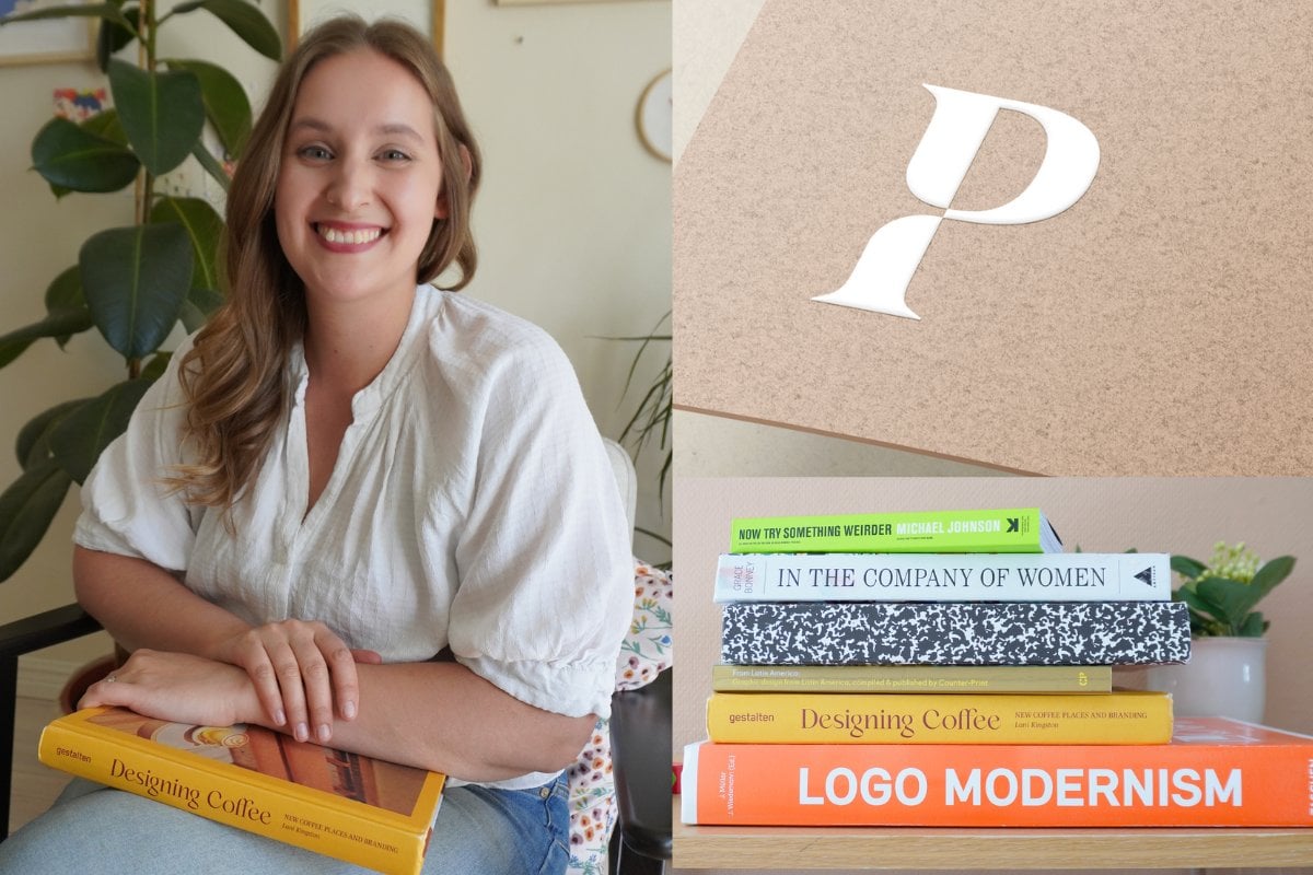
some of our top ones. So I'm going to start with just straight logo design books. So this one is called Logo by Michael Ebemey and it has
so many different examples. It's all categorized. Lot of them are famous, but there's so many
of them that I never heard about before
I read this book, so this is a great
reference point. Another one is this series from counterprint called F.
So they have from Japan, from Latin America,
different ones, and they show more
case study examples. So they have the logos, but they also show examples of how they're
actually implemented, which I think is really helpful. And then we have the giant book, Logo Modernism by Jens
Miller and Julius Wideman. And this one is something
I use all the time. You're probably going to see
me uses a lot in the course, but it just is such
an encyclopedia of different styles of logos, especially helpful for abstract marks and
pictorial marks, monograms, things like that. Lots and lots of examples. So it's a really good reference point when you also want to see how different marks are made in a kind
of similar style, like we can look at these ones. They're in a similar
layout and style, but they still have
that distinction, so you can see how you
can develop that as well. And then I want to do
some honorable mentions. So this is a book that I
like to read all the time, it's called Citizen
First Designer Second. And this is just about how you can have an impact
through your design work, and it has all kinds of brand identity and
logo design in it. So some really, really beautiful
work in here to get you inspired and thinking beyond just kind of the sketch
that you're doing. This is another great example of just thinking
outside the box a bit. So it's called Now Try Something Weirder by Michael Johnson, and this is a person
who's worked in some of the absolute most
famous projects that we see. And you can really see
the sketching process, the ideation, and
how they really were thinking about the
projects at the time. So that's really helpful.
And then finally, just because I absolutely
love these examples called Designing Coffee
by Lanny Kingston. And these are
different examples of coffee shops and how the
brands have been applied. And I just find this
endlessly inspiring, finding different examples in here of how the
brand's been applied. You've got colorful,
you've got minimalist. It's a really,
really great read. Lastly, for the supply section, I want to mention three different
websites that I use for inspiration all the time that are specifically
for logo design. The very first one is
called Logo system, and this is just a beautiful
collection of logos, but you can also see
them a bit more in action with just one
simple image for each one. This is a beautiful overview
of lots of different ones, and you can even
sort them by things like wordmark or
symbol, for example. They're a little
bit more in action, which is also really
helpful for getting you those inspiration for other
parts of the branding system. The second site is
called rebrand, and it's exactly about
what it sounds like. So it's basically a lot of different recent rebrands
for big companies, and you can see how
they've been executed, and you can see the
visual identity. You can go to the
website of the studio who made it. Super
inspirational. Really interesting and a great
way to find inspiration. And also an inspiration
for your portfolio. And lastly, the third
site is called Logomose. This is a straight up gallery of a lot of different marks. And again, you can filter or search here, and it's really, really great if you just
want to get a nice overview, especially if you
don't have access to the different design
books, for example.
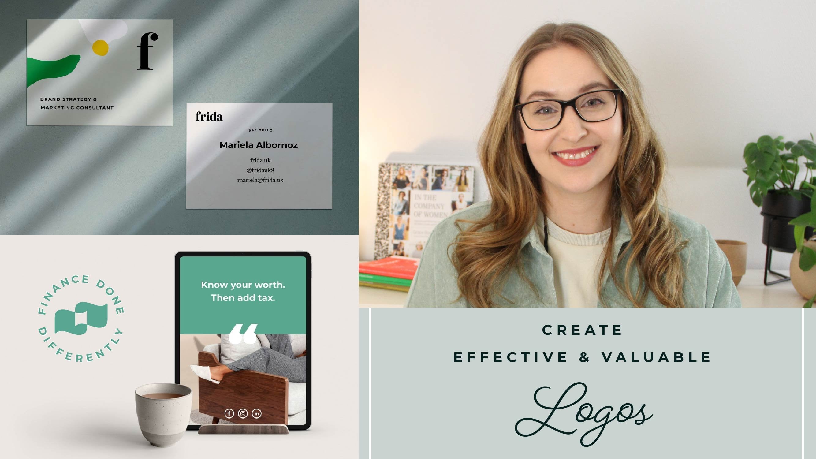
6. Types of logos: As a way to get some
more inspiration and to help us create something that will be well constructed
and long lasting. I want to share a little bit of some different types of marks, just so you can
see the different strategies in logo design. Each style has its own
characteristics and use cases. So let's get into that. The first format is a word mark. This is when the name of the
company becomes the logo. This is really common
for fashion brands. Where the wordmark could
even resemble a signature. Or you just have a really
clean and minimalist style to kind of show this sense
of exclusivity, for example. Word marks can be minimalistic,
they can be ornate. It's all about finding
intentional ways to customize the
different letters. So let's have a look
at some examples. So here we have two ones where we're using
negative space to do a simple customization to really get the message
of that brand across. But in other cases, we might have a lot
more complexity to it, like adding all these
lines, for example, or adding little imagery
inside of the word mark. Or even adding a lot of sort of this signature
style of a brand. And we really do have to
pay attention here so that we don't compromise
the legibility too much. So we always want to keep in mind that you need to be able to understand what the
word mark says if it's going to be used
as a primary mark. The first step is finding
the right base type, and then look for letters that represent or repeat
in a way to bring in a core aspect of the
brand values and that feeling that
we wanted to get to the overall
expression of the mark. This can be quite literal.
Like in this logo design, I made for tulip and twig where we have a tulip
design in the letter U. Or more subtle, like in this design I made
for athleis where we mimicked the joining of tracks to show fans and
athletes connecting. The second style is
a logo mark or icon. This is probably
the most common one that we think of when
we talk about logos. An icon is a compliment
to the company name, and it is perfect if your client needs
something that is really recognizable to add to things like merchandise or
social media content, for example, or stamp. The icon can be abstract to show the feeling
of the brand. Or a little bit more literal, like representing something from the company name, for example. So a strength of abstract marks is that you can
also sometimes use this general shape and concept to evolve it into something
that's a bit more dynamic. So we're taking this
one idea and then developing and using that shape to create multiple versions. When we have a design that looks like something else, like, let's say, a flower or a
dog, it's called pictoral. If you're going for a more
literal approach like this, make sure that you are a little
bit more careful because the logo needs to be able to be taking on meaning over time. Work for the company as
the evolve and change. For example, it makes
sense for Apple and Mailchimp to have a little
bit more literal marks. But let's say a scissor for a hair salon might be
a little bit harder to claim as your own because it can be associated
with any hair salon. The more generic the imagery, the bigger the marketing budget has to be, if that makes sense. So for smaller companies, focus on finding
something really unique from their
approach to their story, and that can really
inspire the mark. So we can really see
the balance here. This is a great example of
how we're really trying to capture a specific imagery,
like a bear in a pen, for example, but this is a great example of how they
really made it their own unique mark because it doesn't look like any other
usual bear illustration. Monograms are a combination of two or more letters and are a great compliment to
a word mark as well, especially if it's
a really long name. Monograms are often used for more ornate or high end brands. But by tweaking the style
that you actually work in, you can have a monogram
for any business. So here we're
looking at monograms with two different letters, and you can see how
some of them have a lot more clarity in
which the letters are. So this is obviously
an E and a P. Here we have a little
bit more abstract with a C and a W inside. But some of these are a
little bit harder to tell, like this one, for example. That I guess would
have a D and a G. So this really depends on what
supporting marks you have. So if you also have a
really clear logo name in the sort of word mark format, then you can be a
little bit more abstract with the way that
you do your monograms. But if it's a primary mark, I would definitely advise to keep the legibility super clear. Emblems are like a
combination of a monogram. Or logo icon and imagery. And typically, it's
things like shields, badges, or other defined shapes. This is really common for
sports teams and schools. And when we want
to really create a sense of unity in the brand. If you create an emblem, make sure that you consider legibility for different sizes. If you want to create a
design that feels like it has heritage and looks a
little bit more detailed, can be a really
good idea to have a second version that is also a little bit simplified
for small formats. Mascots kind of fall under
the logo icon group, but are sometimes considered
their own kind of category. They're often a little bit more detailed compared to
an abstract mark, and they also usually have
a connection to, let's say, a real mascot or to a significant person in the company like the
founder, for example. A common example to have is the face of the founder
as part of the logo. Things like food brands
that really want to create this heritage connection and the connection with
the customers. So let's have a look
at some mascots in a way that isn't
just sports teams. There's a really
great example in this one called bandit Coffee. Here we have an example
of how they have this cute mascot that they're
doing in different ways. And even though you
have a core mark, it can still adapt to different positions
and different layouts. And you also have the
simplified mark here, which makes it a
lot easier to use this more complex logo idea
in different scenarios. Most brands have
more than one logo because we need to create a logo suite that is
flexible to work in print, digital, and lots
of different sizes. We also need to consider
different lockups. What does the logo look like with the slogan, for example? How would a stamp look? And do you have a
stacked version for kind of longer
company names? All good things to keep in mind as we move forward
with our sketch.
7. Pen to paper: Are finally here. It's
time to start sketching. Make sure that you have
enough time for this stage that you don't try to squeeze out the perfect idea right away. We tend to get the best
ideas when we can feel curious and exploratory
rather than pressured. Have your words close at hand, get comfortable and put
on some nice music. For each idea, I suggest creating a loose
sketch at first. And then when you feel
like you're hitting on something that could be
potentially interesting, then you can start to do a lot of variations on this idea. Even if you like the first one, testing a couple of
alternative layouts can really help us feel sure, or you might find
something even better. For word marks, try and see
the letters more as shapes. Where do you get
big gaps that can create kind of an
unbalance in the mark? And are there any areas
that feel too tight? If you do have areas
that feel really empty, you can see if there's a way to change the way that the
letters are positioned. Or maybe if you can
create some sort of ligature or extension that fills that space in
a way that still creates legibility and that
feeling that you're after. If you're adding in
customizations that should represent something
from the actual company, let's say, from their name or
clear imagery in some way, look for the most
logical place to put it. So, for example, it is
usually best to put customizations either
at the beginning or the middle of the word mark. Because otherwise,
we can actually end up getting quite an
unbalanced impression. But sometimes it's really up to the shapes of the
letters themselves. For this type of customizations, we want to have a
really light hand. If we add detailed
customizations or change something about
every single letter, it can really mess up the
structure of the letters. We risk decreasing
the legibility, which is really bad
for brand recognition. A good strategy to check is to step away or zoom out so that the word mark is really small or blurry and then make sure it's
still really easy to read. The same thing goes
for monograms. We might want them
to feel really unique and even really ornate, but we still need the legibility
to be there for mascots, icons, and any pectoral
or abstract marks. We are super focused
on the feeling that we want to
create and also using visual balance to
create something that will it is usually a
good idea to think about balance and
hierarchy together as two guiding principles for
really good logo designs. So I know that the concepts of hierarchy and balance can
be a little bit abstract, so I thought I would sketch some examples and show
you what I mean. So when it comes to hierarchy, it's usually thinking about
what do we see in what order? So what are we seeing first is going to be the
most important. When it comes to balance, we can think about sketching
in a sort of square. So we talked about
using gritted paper earlier when we were doing
our supplies chapter. And we can then think about
it being further divided. So we don't only have a square. We kind of have four squares with this center here
where the points meet being the focus if we're doing a fully symmetrical,
balanced logo. Now, the most symmetrical and most balanced way to
do this would be to either have a circle or a square filling
this entire space, or if you're doing
something where the same thing is happening
in all four squares. You also want to think about it in the diagonal, because if, let's say we would do something where we are only filling up the space in the top and
bottom or in, let's say, one of the sides, we're getting kind of an unbalanced
thing where let's say you would have a very heavy part here and only a little bit
of stuff happening here, because remember, these lines will not be here afterwards. So I'll show you how
we can think about it from an example that
we did for a client. So this was a client where
we wanted the design to kind of resemble
a bit of a flag. And so what we did
was we started by creating the central point
that became the balance point. And this was something that you can see is going
down and going up in opposite
directions so that we get this kind of balance
into the diagonal, as well. And then we created this sketch all the way to the edge here and then did the same thing in this diagonal line here
on the opposite side. So by doing this, we're
basically filling this part in. We're filling this
part in. And we're getting the same white space
on either of these sides, which creates a nice
balance in the logo. Another example,
let's say you're doing a letter or something
that doesn't really conform as much to these
more abstract shapes. So let's say you want to create something that looks, let's say, a bit like an S and
kind of like a bike, which is what we did
for our project. So we have these four squares, and we created something
that was resembling kind of a bike wheel that was also a little bit
of an S like this. So we have the basic
shape with the handle, and we have the wheel itself. Now, this is kind of
an interesting shape. I like this shape,
but as you can tell, it's very bottom heavy, so it doesn't feel
very balanced. So what we did was we added
a little shape on top. And this means that we are getting a nice visual
balance in our mark, but we're still keeping that
core idea that we have. Lastly, let me do one more. So this is for a
company where we wanted to combine the
letter A with the idea of an elephant because the client really wanted to
explore having a kind of more abstract version
of a mascot animal. So we had this idea
of using the trunk of the elephant as the part of the A that kind of
goes like this. So you can see that the A comes in here,
makes a nice trunk. But as you can tell, if we're going to have the ear of the elephant on this part, our initial idea was
to basically fill this entire side of
the elephant ear, which makes this mark
feel very heavy on this side and not as
heavy on this side. So how do we fix
that? What we did was we basically took
the exact same design, but instead of having
the entire space being filled out on the right hand
side, we made a small tweak. So we made sure to scoot it over a little bit
more to this side. Let me just draw it
again so you can see. We still have the trunk here. But instead of having this
entire side filled up, we had it move a
little bit over, and then we made this side here a little bit
down like this. So now we still get that same
idea of the elephant ear, but we are using less of the space on this
left hand side here. So it feels a lot more
visually balanced. And we also thickened
up the way that this mark is done on the right hand side
with the trunk idea. You can see how this idea feels a lot more
balanced than this one. This is something that will
become second nature for you as you keep working and practicing your
logo design skills. If it doesn't feel obvious yet, try adding a line through your design and see what's
happening on either side. Does one side have a lot more going on than
the other side? Are elements bigger, and we have less white
space, for example. That could make the design
feel really unbalanced. Instead of scrapping your idea, try tweaking elements
by making them more or less prominent in your design and see what the end
result and the effect. This stage is all
about experimentation. So make sure that you
are really nice to yourself and you don't kind of add a bunch of
pressure to come up with the perfect
groundbreaking idea right away. Just focus on exploring and building out ideas
as they come up. If something feels frustrating
or you can't quite get where you want to be with
an idea, leave it for now. You can always come
back to it later, but it's good to not
get stuck somewhere on an idea that you don't
know if it's going to work.
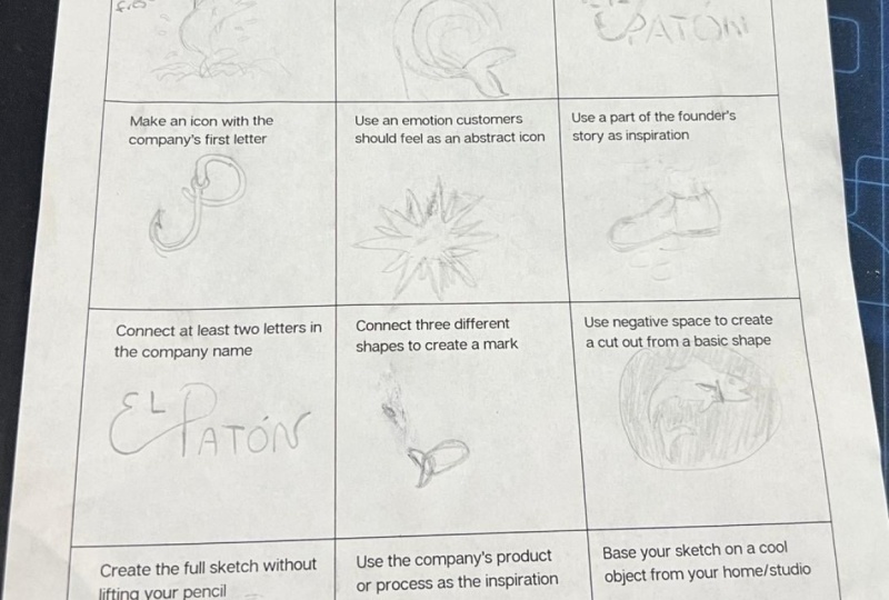
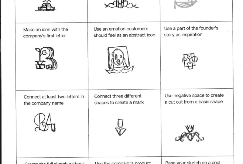
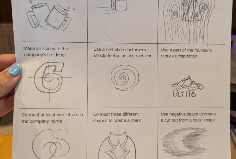
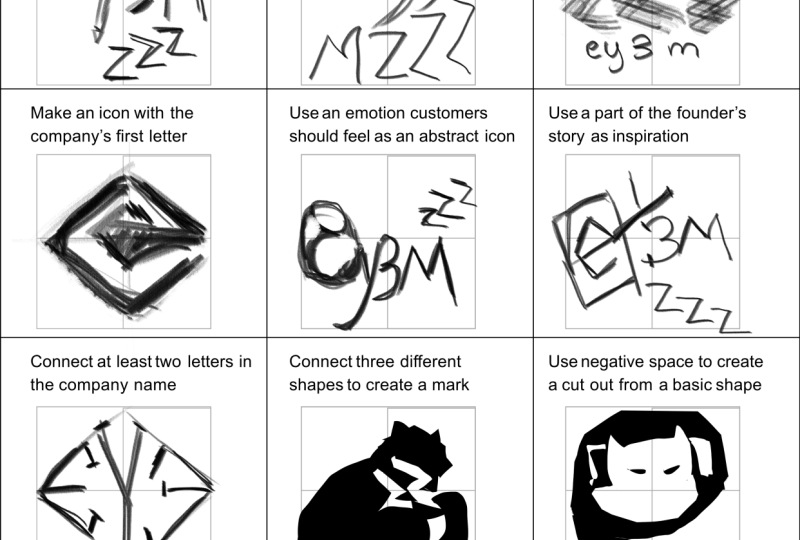
8. Sketching prompts: If you feel stuck when you're designing, you are not alone. It happens all the time. So to help you out,
I collected some of my best tips to help
you along the way. Even when we have a great brief and lots of great
keywords to play with, we can get stuck. Sometimes we could
be stressed or it might be a completely
new industry. And we have never actually
worked in the style before. When you feel stuck, try
out these 12 prompts. I added them all
to the workbook so that you can try them
out one at a time. And even if you're
not quite stuck, it can still be a great
way to just try out new styles and also get some new inspiration
for your projects. When you've created your
different sketches, make sure to upload them to the class project section so that we can all get
inspired by each other. To help you get started, I'm going to fill in the
first three with you to show you some things that you might
want to be exploring. Basically, this is just a
super simple prompt sheet with 12 different prompts. We really don't want to
take them too seriously. You don't have to
think of this as, like, a perfect
sketchbook or anything. We're just making it
super duper simple. So, for example, make a literal interpretation of
one of the company values. Now, we always want to think
about the company values, but usually our first
ideas are quite literal, so I thought might as well
put it down on paper. So, because we're working with a flower festival and we're
thinking about kind of protecting the nature that we have and these
different wildflowers, one of the literal
interpretations could be to make some sort of, let's say, a hand coming here, very kind of blocky. And then to do either, like, a kind of you know, negative space
situation with a flower inside or let's say
have let's say, we can do this, can have
the palm of the hand become like a tulip that kind of matches the
fingers or something. These ideas do not
have to be perfect. They don't have to be
something you end up using. We're just trying to
get our brain to be a little bit more creative and
have a little bit more fun. So that's our first idea, a very literal interpretation
of the values of protecting the natural nature
around us and the flowers. So next one, trying to convey
movement in your design. I'm thinking instantly when it comes to movement in nature, we have wind trying to
kind of blow, let's say, seeds from maybe something
like a dandelion, for example. Now, movement is something I
use in a lot of my designs, and it can be very literal like this or it could be a
little bit more abstract. But it just creates for
a more dynamic mark. So I'm thinking for this
kind of dandelion idea, I don't want to make something
that is super detailed and has tons of these little
seeds coming off of it. Why don't we try to
create something that would be a little bit
more geometrical? So we can create something
like let's say we have all these different kind of shapes coming
off of like this. Then we add some here, so to represent little
dandelion seeds. But we make this one have a
little bit of movement to it. So this where we have a
kind of geometrical shape, but it's a little
bit more interesting and it has a purpose of
being this dandelion. You could also
experiment with then rotating this and trying lots of different
angles and things. But this will be a way
to make a dandelion that is still a clean mark. And then, lastly, use
another medium than a pen. So let's say paint, you can use thread, you could
do clay whatever you want. And again, you can print
this, but you don't have to. You could just use these prompts and sketch on whatever
surface you like. And so I'm going to use
a really thick kind of kind of crayon. It's like an oil paint crayon, just because I
want really little control because I think that's going to help me be a bit more creative and a little
bit less restrained. So the company name for
this starts with the WU. So I was thinking, what
if we try to kind of make this shape that is
like a W that goes upwards. So can give it a try, can come around,
something like this. And as you're using
these new mediums, it's going to be a little messy, and that could open
up for opportunities. Like, for example, maybe
we quite like that some of these areas are a lot thicker and some of them
feel a little bit thinner. So just try and play
around with it. Again, it doesn't have to be perfect. There's no pressure. You can always try again, but it's just an
exercise in getting our brain to kind of think of it more creatively and
in different ways. So good luck with your sketches, and you can always ask me
questions if you get stuck.
9. Trademark check: More thing that
you might want to do before sharing any concepts with clients is to actually
trick for trademarks. Most companies and
especially smaller ones never actually
trademark their logo. But for bigger companies,
they tend to do that. And so in case your design
is actually looking really similar to a big company that has trademarked their logo, that could be a problem
for your client. As logo designers, we, of course, are not
trademark lawyers, but there are actually some
really simple ways that you can check your design
against existing trademarks. The first one that I use
all the time is called the WIPO Global brand database. And here you can upload an image of your
mark or your sketch. Then you can search for
similar looking marks based on the concept
or the shapes alone. You can then scroll
through the options and see if anything is super similar in a way that feels risky to actually then
present to a client. You can, of course, also do
a reverse image search using something like TNI
to see if there's something out on Google
that looks really similar. I don't really show these
options to my client, but sometimes if a client has a concept or
an idea that they want to bring forward that
I know is really overused, I might show them
search results for these ideas to show them it
might not be a great fit. I've added a link down to the WpoGlobal database down
in the description.
10. Class outro: Thank you so much for
taking this class. I'm really excited to
see your class projects, and I hope that you
feel more excited, empowered and like you have a clear creative process
for working on logo design. If you have any
questions at all, don't hesitate to put them
in the discussions tab. And if you have any suggestions
for other sections to this course that
you would like to see because I'm always
building them out, please let me know, as well. A huge thank you again and super good luck
with your projects.