Transcripts
1. Class intro: Up with brand concepts
that feel really thoughtful and true to the
brands vision can feel really, really challenging,
especially when we're just staring at all of our notes from a brand
discovery meeting, and we're not quite
sure what to do next. My name is Malin
and in this course, I'm going to take you
behind the scenes for real client projects
I've been working on. This course is divided into
three different parts. In the very first part, I'm taking you through every step of the creative process that I do so that you know
exactly what to expect, what questions to ask. And so that you can prepare
for it and create templates. Then my partner, Jeremy and
I will take you through two different case studies of
real projects we worked on, and we're going to
talk about what we discussed in the discovery, how we actually took that
and came up with concepts, even ideas that we
thought could be really good that we
rejected in the end, and how we actually
were able to know which ideas are good and
which ones are not so good. We even asked those two clients to give us a little statement about how they felt about
the brand concept stage. And the things that
they were expecting maybe or thoughts they
had during the meeting. So that will be a really
interesting insight into the client
perspective as well. As part of this course to
help you along the way, we have also put
together a course kit. This includes our template
for brand discovery, our template for brand research, and a guide to creating
really compelling moodboards. Lastly, we're going to summarize everything
that we've learned, and we're going to talk
about some bonus tips that will make your projects
run a lot smoother. These are based on a lot of
trial and error on our part, so it'll be really
fun to share them, and I hope that they can help
you along the way as well. Class project is to write down a description of your brand
concept and then create a mood board paired with
it so that you can just start designing and have a really clear
direction in mind. If you have any
questions along the way, don't hesitate to add them
down in the discussions tab because I'm sure it's not just you who have those questions. And don't forget to
add your class project to the projects tab as well. So we can all support each other and get inspired by
each other's work. I hope this class takes away
some of the uncertainty or perceived complexity that you might have around
brand concepts, and that help you feel confident to tackle your own projects. I can't wait to see
what you create. I'll see you in class.
2. Discovery: Discovery meetings are
usually the first more in depth contact point that
we have with our clients, because at this point, they have paid the deposit, they signed the contract, and they're ready to actually
start working together. The goal of this meeting is
to get to know each other and start building a really good client designer
relationship. We also want to understand
what they already know and understand about their own customers and their own vision. Not every assumption
that the client has about their own customers or
business might be correct. But we're really
trying to help them think about these
bigger questions and we can then do more
research later to try to validate these
different assumptions. We really want to understand
their pain points and try to understand what this new branch should achieve. The reason we really
want to build a lot of trust and
have this longer meeting in person is because
if we would just show them a brand concept fully fledged after we've just
had a quick survey. They might not feel
that confident that this is actually the
right solution for them. But if we've done
all this groundwork together and gotten to
know each other and make sure we've understood
all of their points of view from all the different
aspects of their business, we have that respect of the client that we are doing
a really thorough job. Not only do I find that this makes the project itself
run a lot smoother. Also find that clients
actually come back for years because you have that
built up report together. They know that you understand their business inside and out. There's no point for them to go anywhere else for design help. As the creative person
in this meeting, we need to make sure that we act a little bit like
a psychologist. We need to ask very
targeted questions. We need to listen a lot
more than we talk and we need to follow up on anything that feels even remotely vague. If you're unsure
about what a client means or why they're
choosing to say that, make sure that you
ask and follow up. It's totally okay to push back in a friendly
way if you want. Let's say your
client says, Well, our customers just don't
like minimalist design. Can say, great, that's
super interesting. Is that coming from
service you've done? Is that something you've seen in the different
products that you've launched because we really want to get to the
bottom of why clients feel a certain way about
different design directions, for example, or
something that they think they know about
their target customer. We do this not only
so that we can learn more about our
clients and their business, but also to help
them think a lot more deeply about
where they fit into the market and who
their competitors are and what their customers
really truly care about. Some clients might
have already done a lot of work thinking
about these questions. For some people, it might
be the first time they're actually going this in depth
about their brand strategy. If you work with someone who has done a lot of brand
strategy before, make sure you ask for that documentation
because that can be really valuable for you to read before you get started
on your own research. Also remember that you being an outsider and not knowing
exactly how their product or service works is actually
a benefit because you're going to be
able to spot things that could be confusing
for a customer. You can then use that knowledge as a way to make the visuals a lot more clear and communicative as you're creating this visual identity and brand. My discovery sessions tends to have three
different sections. In the very first section, I'm really trying to understand how the company was founded, why it was created
in the first place, what problem they were
trying to solve and just get the client
talking about the company, get them feeling
really comfortable, talking about their mission
and why they started. This is a really good
kick of point to any meeting because it's
just very open and relaxing. It's usually something clients feel very comfortable
talking about. I always think it's
a good idea to have the founders
in this meeting. But sometimes when you're
working with very big brands, they might have their
marketing department actually handle the branding. That's totally fine,
but just make sure that the decision makers
who have final say are also going to be in
that initial meeting and in every meeting in
fact because otherwise, you might end up
showcasing all this work, only to end up with someone
at the end making a decision, not being aware of any of this hard work
that you've put in. In this first section,
I also want to understand their vision and long term goals for the company. They making a new product? Are they expanding
into a new market? Is there something
they really want to focus or be known
for, for example? Ask those very targeted
questions because all this information
will help us to actually set them apart
from their competition, and we can then use visuals
to actually communicate that. One question I like
to bring up to help my clients think a little bit
more abstractly about this, is to ask them to describe their dream office or
their dream store. Maybe there's someone who will never have a physical location, but trying to describe the way
you feel when you come in, what does the decor look like? Who are you met by? Is there music in
the background? Are there lots of plants? This can be really helpful
for helping them envision that experience that they want someone to have
with their brand. When I'm taking you through
the different case studies, I'm also going to tell you what their dream offices or shops
felt like and looked like. I'm sure you're
going to find that the visual identities
that we ended up creating were quite closely tied to that overall vision that
they had in their head. Next up is a section that I find might be the most important
one during discovery, but it's also the one clients
tend to find the trickiest. That is describing not only
who their customers are, but also what they
care about and what motivates them to make a
purchase from a certain seller. I like the personas
that we create to have a little bit
of demographics, but also a lot of
psychographics. So Demographics are
the basic information that you have like your age, your income level,
what city you live in, if you're married or
not, for example. This information does have certain value when
it comes to looking at trends and looking at general things that that
group of people tend to like. But it's actually a
little bit too broad for us to actually make
any decisions based on. That's where the
psychographics come in. Psychographics talk
about our values and our motivations
for buying something. One person might be
super excited because they made a bargain and got
a car for a lot cheaper, while another person might want a very expensive car because it makes them feel proud
that they can afford it. Trying to think about who people are and why they would purchase things is a lot
more important in my opinion than just knowing
their age, for example. Being aware of these
different reasons won't only inform
the visual identity, but more importantly
maybe the messaging, because that's really
going to help us nail down how we're
going to be speaking to those customers
because we know exactly what they care about and why they make a purchase. I know this sounds like a lot. I have added my brand
discovery template to the course kits
that you have here. There you have every single
question that I ask, you have things like
competitor maps, and you've got different things that you can write down for
the different sections. Go have a look at that after this video and you can use
that as a reference point. Finally, I have a section
called How Might we questions. This section is very short, but very important
for the success of your project and to make
sure that you're actually creating something that will
work in the real world. Client has likely talked about lots of different things
during the discovery meeting. Now we want to distill
that down into very specific questions that we want the brand to resolve? We want to be very specific here so that it's
actually questions we can answer and point to as we're presenting our
brand concepts later on. Instead of saying
something very broad, how can we create a
very exciting brand? We could maybe talk
about how can we have a bigger reach on social
media with our branding? How can we create a
brand that appeals to a much younger audience
that we currently have? I suggest sticking to maybe one to five
questions because sometimes clients has more
than one and that's okay. But if we start getting into a lot of
different questions, we might start to actually contradict each
other a little bit. That might be very
difficult then to have a focus when we're
creating a branding. We want to have very
specific goals that we're trying to solve for when
we're designing the brand. Now that we know
why we're holding a discovery meeting and we have a little bit
more information about what to
actually talk about. Here are some bonus tips
that I have noticed make a huge difference for
making these meetings, not only something that
the client enjoys, but also something that gets you those really precise
helpful answers. The first one is to
build in breaks and tell your clients about those breaks at the very beginning
of the meeting. My meetings tend to take about 3 hours because
you're going through a lot, the client is telling a
story of their company. We tend to want to be open
for tangents because that's usually where little tidbits of information that
are interesting lie. But if you're sitting there in a three hour meeting and you're not quite sure
what's going to happen. You don't have any
breaks, that can feel quite exhausting
for everyone involved. We tend to have a
break either right before persona so that
they come back and they're fresh and they're
having lots of energy for those target audience
customer profiles, or if they're doing
more than one because sometimes you have
more than one persona, we tend to do it in the middle. Between let's say
persona one and two My second tip is to
turn off the cameras. Obviously, this doesn't work if you're in an in person meeting, but I find that people
are more relaxed and it's a nicer atmosphere overall
anyway, if you're in person. This is just if you're
doing a video call. Doing a three hour video
call with the cameras on. I find that at least for me
and for lots of my clients, we tend to be very focused on. Am I still smiling? Do I look, is there anything
weird in my background? Is my cat walking by? Is my kid running by? So make sure that at this point, I suggest that after you have the initial conversations and a chat to get to
know each other, you can suggest,
Hey, if you want to, you can turn off your
cameras for this part so we can just focus on
answering the questions. A lot of people really embrace this and I found that people feel a lot more comfortable in the meetings and don't
get so distracted. The third tip is to
be the moderator, because as I said, tangents
can be very helpful. But if we allow every tangent to go on for however long it could, then I've noticed it could be a six hour meeting and people
tend to get quite tired. You start getting quite confused about what's really
important to the company. Allow clients to go on
the tangents that feel important and then you can
say, that's really helpful. Let's tie that back to this
point that we're making here. This goes into my fourth tip, which is to show
them the question that you're
discussing on screen. To show them one
question at a time and maybe even have a
little progression at the top where you're showing
the different stages you're going through like
doing company background, personas, and how
might we questions. Because that's going to
help keep them on track and also help everyone know how
far is left in the meeting.
3. De-brief: Just come up our
discovery meeting and we have this mountain
of information. Sometimes that
might make you feel really excited, full of ideas, and sometimes might
make you feel a little bit overwhelmed and a little
bit unsure where to start. For this exact reason, I like to have a little deep
briefing session, either just by myself
or with my partner, just to have a think about the core themes and prepare myself for
the actual research. Jeremy I like to sit down quite shortly after the meeting, maybe the same day a few hours
later once we had a rest or the next day so that the information is quite
fresh in our mind. We'd like to grab a
coffee, and notebook, and have the notes in front of us from the meeting as well. Very first thing
we'd like to do is just write down anything that we thought could be a big overarching theme
that came up a lot. That can be keywords that
the client mentioned a lot, features, they want
to be known for. Things that they found were
big pain points, for example. Anything you think is,
this is really important. I want to keep this in mind
as I'm doing my research. Then we want to have
a look at those, how might we questions again. Have a look at how you
could break them down into more actionable
search terms, for example. For example, if the how
might we question was, how can we assure our
40-year-old audience that their medical data is safe while still feeling
personable and friendly? Your questions for research
might be something like, how do other brands build
trust through visuals? What common questions
or frustrations does this exact audience have with
this industry in general? You can ask these questions
directly in search engines, but you can also look at
competitors, websites, social media, all these different places
where you can try to gather information about
people's testimonials, comments, anything like that. We're going to go a
lot more in depth and actually do the
research in a bit. But having these
questions in mind and breaking them into these more
actionable search terms, at least is something
that I find very helpful. I also like to write
down my own assumptions about the target audience and
the project and industry. For example, let's say
we're working with a client who has a bookish niche of
people who love to read, who are women in their 30s and who are parents,
for example. That is something where a
category that I fall into. I would have a lot
of assumptions about what that audience
would like or not like. Or maybe you worked
with a client who has a similar audience
to the one that you're working with now and you have assumptions that you learned
from a previous project. Write these different
things down and then we can try to verify them or disprove them a little
bit later in our research. After this little
brain dump session, you probably have a list
of different keywords, you have different
assumptions written down, and you have more
broken down questions that you can use
for your searches. This is a really
nice kick off point I find and it feels a little bit less intimidating
than just going straight from discovery
into research. But now we're going to
dive into the research. Let's do that in our next video.
4. Research: Have done some really
important foundational work. But now it's time to dive into that research and form a
new path for this brand. Brand research
doesn't only focus on the visuals, but
more importantly, it focuses on the why and why people purchase
something specific. For example, in 2022, there was a huge
trend around Japandi, Scandinavian design, and everything that
felt very natural, a lot of textures and colors that were taken
directly from nature. This in itself is
quite interesting, but knowing that it came from Everyone feeling very cooped up in their houses
after the pandemic, knowing that people were at
the office all the time and felt like they were missing
that connection to nature. I meant that a lot
of companies were bringing in colors, textures, design elements that felt very reminiscent of actual
natural elements. It is really interesting
for us when we're designing and putting together
a brand identity as well. This is where those
psychographics that we created previously
are really important. Because, for example, a
very busy toddler parent is going to have very
different priorities from a teenager, for example. This is also where we
want to start challenging those different assumptions that came both from us
and the client. Because you might
think, for example, that no 1/30 is
going to buy this. But you look at competitors
and notice that a big portion of their
audience is 30 plus. This is where we really want to start getting into
the nitty gritty. We also want to get a
really good idea of the overall trends in
society and of course, this can be very
local or global. And really start
to understand what the general site guise is
and what people care about. These trends might not
dictate the visuals that you're going to have
for decades and decades, but we want to be aware of them so that we're
fitting nicely into the cultural sense that you have at the moment when you're
launching the brand. But you might push back a little bit here
and say that well, logos shouldn't be trendy, and I completely agree
with you on that. But there are so many
different elements of a brand and some are going
to be more foundational, like I would say a logo and
brand colors, for example, you wouldn't be
surprised if they stayed the same for
decades and decades. But when it comes to things like social media campaigns and messaging and
photography styles, this is where we can
be a little bit more flexible because you
might not expect the photography to look
the same in the 80s as you did in the 2020s, for example, even if it's for the same customer
and the same brand. How do you make sure
that you're still conveying the same brand through all of this flexibility and looking at trends
and everything? I think a great example
is Nike, for example. They've had this
very core guiding principle of someone who is very ambitious and driven
and wants to do something that might initially
seem quite challenging, but they're overcoming it and they're doing more than
they thought they could. This is something that can
guide every single campaign, even if the campaigns look
a little bit different, even if the people depicted
are a little bit different. This is something where
we want to really get to what the core
of the brand is, which is something you probably already have from the discovery. Then we want to think
about how we can tie trends and other aspects of the d of culture that we have and live in into this mission. Our job as creatives in this research stage is to
gather all this information. We can help make suggestions
for how this ties in with the brand strategy
and the core message. For a smaller project, this might be as simple as
having a mission statement, and then showcasing how the different visuals you're creating are tying into that. If you're working on a
much larger scale project, this might be a lot more extensive where
you're talking about how you're tying different campaigns to different markets, or you're talking
about how it works with different
seasons or over time, or even how they can use
different color palettes within their own brand spectrum to actually convey different
portions of their business. I know that feels like a lot. How do we actually conduct this market research and get
really valuable information? I'd like to start by
setting up a home base in a project tool like
Mila note, for example, where I can add in links to really interesting
sources that I find, where I can write myself notes, and also where I can put
imagery that I can then repurpose for moodboards
later than the world. Then we can turn to these different places to
find our answers. First place to turn
is social media, because you can look at
your own clients accounts, you can look at
competitor accounts and even accounts that have
the same audience. You can look for what people care about, what
they're commenting. What are pain points
they're bringing up? What words are they using to describe features that
they really like? All this information is going to give us a great starting point. For this psychographic
and building it out and verifying
those assumptions. Next up, we can turn to pinterest trends
and Google trends. This is a gold mine because we can search
for very specific terms, and they will also
show us what's trending related search terms, so we can start going down some different rabbit
holes and find different directions
that might not be as obvious or the ones that
competitors have taken, but that really resonate
with that same audience. You can plug in words related
to the client's industry, to their product, or service, or you can do it around
the moods, for example. This is especially useful on Pinterest, where
something like A cozy home decor will be a lot more specific than
just saying home decor. This is a great place
to start spotting trends and see what is
really important to people. You can even see seasonal
trends that they might be interested in for
specific product launches. Number three is government
and charity reports. A lot of these different
organizations actually put together a lot of
industry information that you can access for free. For example, if you
live in the UK, I know that government
gateway for a long time have done
industry reports, where you can read lots of
different interesting trends, different things that
the industry is in ways it's changing and
things that they care about, what customers care about. This is really, really valuable information that you
can then start to distill down and translate into a visual
identity eventually. Next up are white papers, and this is really
helpful if you're in an industry where there's
quite a lot of competition. White papers are essentially reports that are
usually quite well researched that try to discuss a specific topic
within that industry. For example, being able to do a specific innovation in
the industry or reaching a specific target audience or something similar
where they have asked usually a copywriter or researchers to
compile information, and then a designer to put that together in a really
compelling format. So these different
reports are usually either free or just
behind an e mail wall, where you just have
to give your e mail. Getting all this information specifically from
competitors of your company can be really important and a great insight into what the
market is doing as a whole. Then we have competitor websites and this might feel like
a very obvious one. But we really want
to look at not just the visuals
that they're using, but what features
they're highlighting? What kind of benefits
are they're bringing up? How are they representing their audience through
photography, for example? Try to write everything
down and make sure you're really analyzing what the
site is doing correct. What could be a weakness
that your client could actually highlight in their
own messaging and branding. Really try to go in depth
into the competitors as well. Then you can have a
look at recent rebrand. This is, of course,
especially important if it's in the same
industry as yours. But this can also be
really interesting to see overall because we have
seen, for example, a trend from very complex
logo marks to very, very minimalist ones in 2015, we had a lot of flat
design, for example, then going into a little
bit more ornate once again. I think it's really interesting to see as an overall trend, what companies are doing and what customers are looking for. There are lots of
sites that actually compile a lot of these rebrands, and I'll make sure to link some of them down in the
description as well. Finally, of course, we have our inspiration sites like dribble, B hands, Pinterest, where we can search for all that different
visual inspiration. We can look for trends, we can look for things we
can put on our mood board. These are of course
great places. I also think it can be
valuable to look at more design focused
blogs like dieline, for example, especially
if you have packaging, because a lot of
times they will not only show you what
has been designed, but ask the designer to describe the process or why they made
certain design choices. This can be really
helpful for understanding why certain industries are
designed in certain ways. Doing brand research
can feel very overwhelming if it's something
that you're just new to. But it's really just
about trying to understand not just
what things look like, but why they look a certain way. I hope that the brand
research template that we've put in is
going to help you out. It has very specific
structured questions and templates that
you can fill in. I hope that that will
be something that can demystify this
portion a little bit. All this hard work that you're
putting in now is going to be key as we're moving into
the next couple of stages, which are all about creating
those actual concepts.
5. Client check in: All this great
foundational work done. We can actually start
getting ready for the Moodboard and
research meeting together with our clients. This is like a check in. We're both trying to make sure that we're on the right track, making sure the client actually likes the directions
that we're picking out. But it's also a way for us to showcase to the client all the work that we're putting in, so they feel part
of the project and that they're ready for the concepts when we're
actually show them. We don't need to share absolutely everything
that we found. We want to do is distill down the key things
we think are really interesting and that
we're going to be incorporating into
the project directly. That might be different
things that you're seeing as interesting trends, highlights of competitors
that you want to bring out, or anything else that you
think relates to those how might we questions and things you really want to highlight. At this stage, you might
still have a lot of different possible
directions that you might want to
take the project. Having this check
in with the client can also be a good idea to present things that are a little bit more out
there for them, but you think could be a really interesting
opportunity and see which directions they actually think could
be relevant to them. Because of course, you
have the target audience, which is the core focus. But as a founder, you still need to be really
passionate about the branding direction
and feel like it really connects
with your mission. Everything you do day to day, because ultimately the people who are in the company
are going to be the ones who are marketing this and they need to be
passionate about it. For example, let's say you're
designing for a restaurant. You might have found two
vastly different directions. Maybe one is a one with
illustrated characters, or a retro feeling, maybe a little bit humorous, while the other
one is focused on natural ingredients
and nature colors, and a lot more focus on
the founders, for example. These two directions might both be strategically a
really good choice, but it might be
up to the founder which of these directions
they feel strongly about. This is a very
collaborative meeting, so we're not really
trying to present an idea and get a yes
or a no at this point. We're trying to present
different things that we found and see how different aspects could
tie into the final identity. Both strong yeses and strong nos are really
helpful at this stage. Get the most from this meeting, I suggest starting by restating those how
might we questions. They're fresh in mind both for you and of course
for your clients. Might be in a few weeks since you looked
at this together, so that can be really
helpful to restate them. This is a little bit of a summary meeting
of your research. You will be doing a lot more talking than you did in
the discovery meeting. We still want to give
space for our clients to actually be able
to react to things, to contemplate different
ideas and directions because we're ultimately throwing so much new information at them. We need to give them
space to actually have reactions that are
not just gut reactions, but have a think about
how it falls into the overall strategic
movement of the company. As you're presenting, take
notes of the clients likes and dislikes and also why they like or dislike
certain things. I also find that splitting
this meeting into a few different sections
like looking at trends, looking at competitors, looking at moodboards, for example. It can help make the meeting
a flow a little bit easier. Also then like to send the entire research report to my client after we
have the meeting, so they can actually dive into a lot more of the in depth
content if they want to. But here in this meeting, we're trying to summarize
the key points and discuss how they fall into
the overall strategy. Personally, I like to talk about the mood boards at
the very end of this meeting because
then we have all the context of the
research that we've done. It makes it a little
bit easier to make a judgment call on what
you actually prefer. When you're putting
together the mood boards, you want to keep a
few things in mind. First, we need to make
sure that each of the mood boards is a very
distinct and unique direction, so they can be clearly
separated from each other. I suggest giving each
moodboard a name so that you have a way to
set the tone both for yourself to keep focused and to have it for your
client as well later on so that they can
instantly understand where you're trying to
go with this moodboard. To create really
effective moodboards, we need to make sure
that we're being super consistent with the images that we choose to put in there. If we're showing logo styles, we need to make sure
those logo styles are showing the same style
within a moodboard. We're using similar font styles. We're using a similar
color palette. We're sticking to one color
palette within a moodboard. The same for anything like photography and
illustration style, it should all feel like
one brand image already. For this to happen,
you might need to actually tweak some of
these images a little bit. You might need to
adjust some colors or block out a section and add your own font
there, for example. I highly suggest making these customizations
because even though it takes a little
bit of extra time, it will be such a much
clearer guideline for you when you actually
start designing. And you know exactly why your client liked a
certain modboard. You're not trying
to second guess if they like the
more minimal font or the more flourishing and decorative font
that you chose. We also want to make
sure we have a range of different applications
within the mood board. Because this is a
branding project, we want to show, of course, logos and things like that. But you should show how
it works on wire frames. How does it work in
an e mail signature? How does it work in
a social media post or on merchandise, for example? The exact applications
are, of course, going to be unique to the company that
you're working with because it needs to be applications they
would actually use. But try to make this feel
a lot more real life. As you're presenting
these moodboards, make sure you're
always asking why a client likes or
dislikes a certain image. I have had so many times
when a client says, Oh, I like that one that, that one
and I don't like this one, that's all they say. Then you have to be
the one who says, Great, what about these
images is it that you like? Because in certain cases, a client might really dislike a certain image just
because of the color, but they actually love the
style of everything else. We really need to dig
into what is it that you like about these
different images or what is it that you dislike? Because that's going to be
much more helpful information for us than just which ones
they like and dislike. Can be a little bit
tricky for people who are non designers to describe what they like or
dislike about something. They don't have necessarily the design vocabulary for that. You can try to help them use words that maybe
are a little bit more relatable to them and make
sure you're not using a lot of jargon that could
be very confusing or alienating for your clients. I create more than one
concept for my clients. I'm okay with my clients picking
more than one moodboard. But if you're someone
who is creating one concept and
one concept only, you might want them to
pick one moodboard, because otherwise, that could be a little bit confusing for you. Once you've had this meeting and you've been discussing
everything together, Maybe it's a little bit up in
the air, what happens next. You want to make sure
that your client feels really secure in the next steps. I suggest discussing exactly when you're going to
have the next meeting. You're going to talk
about exactly what you have discussed
in this meeting. Making a little
summary where you talk about this is what we like. This is the moodboard
we're going with. These are potential
changes we want to make. Making sure that
your client feels super comfortable and
part of the projects. Now we're ready to start thinking about our
design concepts.
6. Idea dump: We had our game plan session after we had our
discovery meeting. I like to have a little
debrief session after the Moodboard and research
meeting to try to write down my different concept ideas
and try to really make them a little bit more tangible before I start
actually designing. Because you've done so much
groundwork at this point, you probably already have some ideas for different directions that you think this
brand could go in and different
concept directions. Now let's try to distill
that down a little bit. The first thing I'd
like to do is to try to put a name to each concept. I try to pick names that
really evoke some feeling. Let's say you're
designing for a cafe. Instead of just calling it, for example, plant inspired. We can have secret plant hide away or secret
forest hide away, for example, because this
is going to be a lot more emotionally evoking than
that more simple name. At this point, it can be quite a good thing to have a lot more ideas than what we're actually going to
be presenting to the client because most
of them don't pan out. Even if they seem
great on paper, sometimes when we try
to go into practice, some things just don't turn
out the way that we want. That's totally okay. It's
just all part of the process. You're going to be seeing
some clear examples of this when we go into the different case studies of ideas that we really
wanted to make work, but they just were a
little bit too complicated or had something else that
was not quite working. We want to keep a
really open mind, but use that framework that we've developed with our clients as a baseline for different
ideas that we're coming up. When you have some
ideas written down, you can start to bullet
point different ideas of ways to actually
visually represent this. For example, for our secret
forest Hideaway cafe, you might add bullet points like lots of nature inspired colors, cute creatures, botanicals,
magical influences. These different words will
help you create a lot more of a cohesive image both in your mind and once you start
putting everything together. This is completely optional, but I also like to make
a little mini moodboard for myself for each of the
different concept directions. This could be a little moodboard like you
would do for a client, but a lot less complex. Or it could be a collection of reference images that you can use so that if you're
creating illustrations or logo designs, you can have these different reference points refer back to. What does it look
like when someone is sitting reading a
book, for example? That's really useful
for you to have all of this collected
in one place. As you go through
and start creating these little mood
boards for yourself, you might start to notice
that some feel really easy and engaging and they just flow when you're trying
to put them together. Some are really tricky
to get to feel cohesive. That is usually a
sign that some of those directions are really easy and going to be working
well as a concept. It might be a little
bit of a red flag for the ones that
are very tricky. Just make a note of this and
then try to think about that when we're going into actually vetting the different ideas. With these more
clear directions, we can start to actually
design our different concepts.
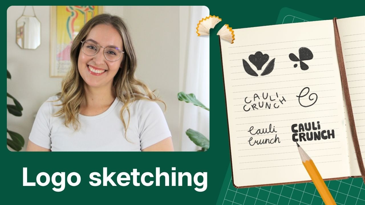
7. Sketching: Biggest challenge with
sketching in my opinion, is trying to distill down an entire emotion into
just a few lines. But this is where we can
remember that it's not just about creating a logo
that represented the company. This is such a tiny part. The emotion that you're creating is coming from the photography, the colors, the layout, everything you're putting
together into one. That's why even
though this is often a logo sketching stage
where most people start, don't feel like you have
to just sketch the logo. You can work on all
aspects of the brand at the same time and try
to tie things together. If you're feeling stuck
and you want to work on the color pattern alongside
the logo sketch, go for it. If you have an idea for an illustration that could be
great for their home page, incorporate it together.
See how it works. This is going to help you also know which brand directions are going to feel a lot more intuitive and easy to work with. To create really successful
sketches and concepts, I think it's really
important to take away as much pressure as we
possibly can at this stage. You might be on a tight
deadline or you might be working with a much bigger
client than you're used to. It's easy to feel
like you have to come up with this
amazing idea right away. And that's usually
not how it works. Our first ideas are
usually not the best ones, they're usually the
most obvious ones. What we want to do is just
take away the pressure, assume it will take time
and give yourself that creative space to take different
days to come back to it, to gather inspiration
from other sources, to be creative in other ways and let that influence
your creative process. If you come across an idea
that you really love, feel proud, feel
excited about it, and then put it to the
side and keep going. I know it's so tempting to
just go with that idea, but you might end up
in a situation where there's something practical
that isn't quite working, and you've poured
all your time and energy into this one idea. We want to make
sure we keep going. I suggest sketching at least 30 to 50 completely
different ideas because that is going to really
help you think about new and innovative ways to represent the
ideas that you want. If you want to set up
a notion or Mil not board and start adding in the different elements
as you create them. Put in the color palette, put in some illustrations, put in a photograph
that you found from a stock site that you can
use as part of the brand. You can start to build up this board that is
basically a moodboard, but it's the actual concept. I like this as a way to start making sure
it feels cohesive, that the ideas you're creating also feel distinct
from each other, so you have distinct
concepts from each other. Personally, I'm a
very visual learner, so I find this very helpful and you could try it as well,
see if it works for you. So make sure you're
going back to those how might we questions and specifically trying to design
to resolve those questions. With these different
ideas sketched out, it's time to refine and
stress test your ideas.
8. Testing ideas: Have a few ideas that
you really like. We want to make sure we're
stress testing these and that they're going to work
in the real world for the client day to day. How much you actually
choose to refine these ideas before you start testing them is
completely up to you. I know some designers like to make them absolutely perfect, which I guess is the thing, but as close to
perfect as you can, just so you can really
envision how they will look. Some people don't like to put that much energy into ideas they don't know if they're
going to be using. Find a balance that
works for you. I think the important thing
is that you know that you can check that they're going
to work at smaller scales, be accessible, that they're
giving the right feeling, feel like the right industry, and that they're going to
practically work day to day. Of course, solving for those
how might re question. I think mock ups are a great way to run these stress tests. If you're trying to add your different branding
elements to a mock up that feels really on brand for the company that
you're designing for it, and you're finding
it really difficult. That might be a sign that
you need to either make amends to that concept to
add or change something, or that is a concept
that maybe you need to put to the side and
experiment with other ones. Make sure that you're taking time to step away
and then coming back and identifying not
just if it's working or not, but what is working, what's not working, and
why is it not working? Maybe you can add a neutral
to the color palette to make it feel a little bit more friendly or easier to work with. Maybe you can add
photography that feels a lot more
personable and that brings it from that
very cold design to a lot more friendly. Look at different ways
where you can make tweaks and see if that
makes an improvement. Sometimes it can be easy for everything to feel
very the same, so having a minimalist
color palette, minimalist photography
style, minimist logo design. Sometimes bringing in an element of something different
can be the thing that makes you feel
unique and makes you feel like the brand
that you want to create. After you've been going
through this process for a few of your
different ideas, chances are you're starting to notice some winners
and some losers. Personally, I like to present
more than one concept. I usually have three because it means that I'm
able to put in a little bit more of a wildcard or something I think could be a
great choice for the client, but they might not be
ready for or expecting. As an option in there without feeling too
intimidating for them. They can always say no to it and have a more safe option
in there as well. But sometimes that wildcard is the one that
they end up loving. But sometimes you have one
concept that you know. This is much better than
all the other ones, and then it can be
a little bit worse to muddle the water with
all these other ideas. How many you choose to present
is completely up to you for what your workflow looks like and what
your preferences are. As we're getting ready to
present concepts to clients, we want to make sure
that we can help them see what we see. This is where the
presentation comes in.
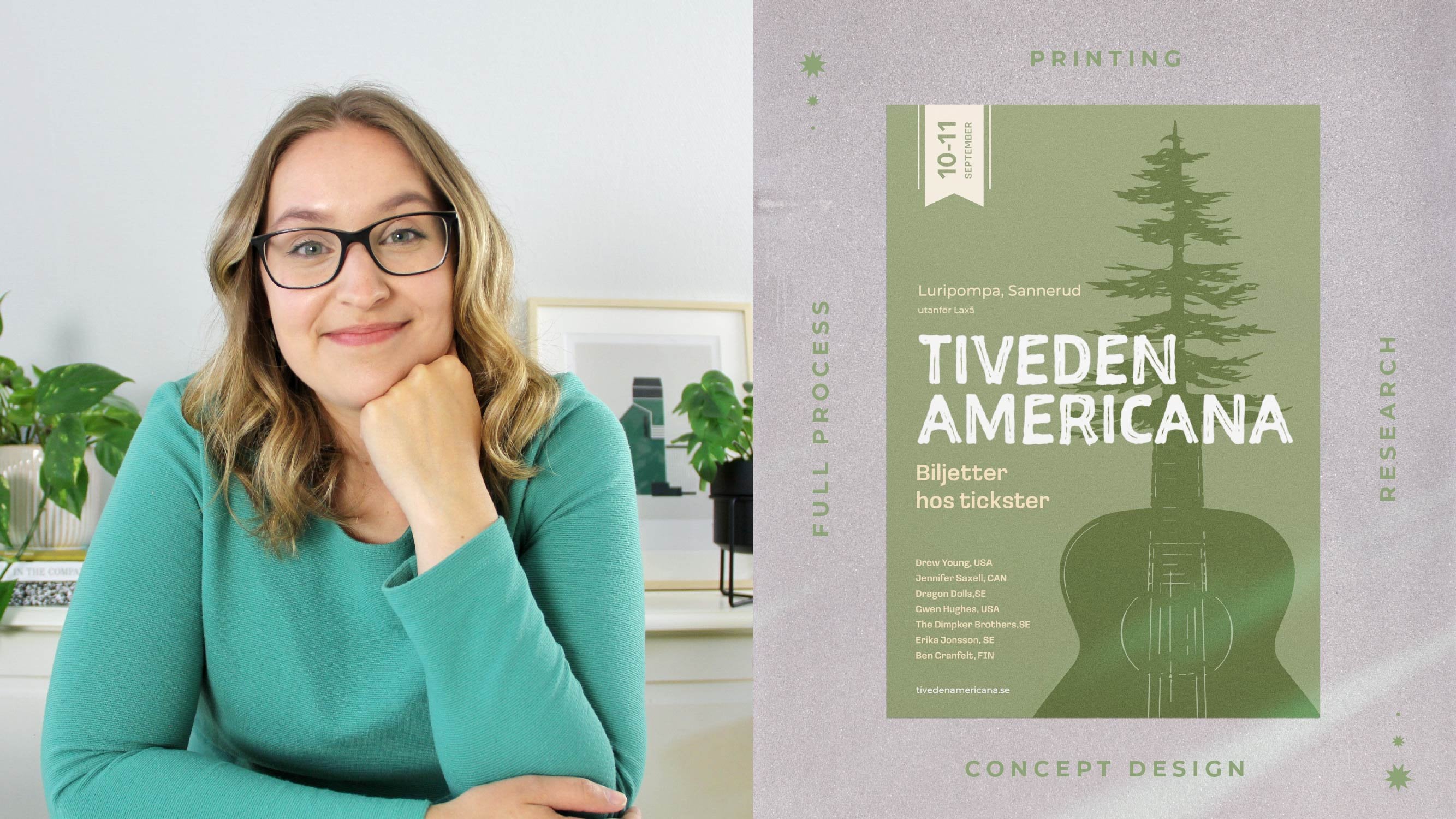
9. Presenting: You have concepts you're
really excited to share. How do you make sure
that your client sees their full potential
just like you do? I think the simple answer
here is to really show them real world applications
that really apply to them. Something as simple as showing a phone mockup of their
social media profile, with their new logo icon, maybe with a couple
posts designed in their new brand style so that they can
really envision that. Rather than having things just on a white background,
for example. It's a bit like buying a house. Yes, you might
like the location, you might like the
facade of the house, but it might not be
until you've been walking around in that
house and starting to imagine where you're going to be putting the furniture and how this can really become your home that you truly
fall in love with it. As usual, to get the
most from the meeting, I usually start by restating
the how Mt requestions. You might feel tired
of that by now, but I really think it does
make a big difference. Actually have another course on specifically concept
presentations for branding. If you like to go and
check that out as well, that could be a great
complement to this course. But essentially, you
will see that I have a very clear structure
that I'm following. Every concept is presented in the same way using the
same mock ups to make sure that we're presenting
apples to apples and it's not just another mock up that they like more
than another one. Also showcase the
structure to my client from the very beginning knowing we're going to go through logos, we're going to go
through colors, we're going to go through
social media, and so forth. They know exactly
what to expect. It's very rare that a
client falls in love with the logo at the
very first glance. They want to see the entire visual identity and
start to imagine those different
applications before we usually have that super
falling in love moments. Sometimes they can
take a little bit of time because people are very attached to their own brand that they currently have, maybe. It has a lot of history, or they might have a
very specific idea of what they want the
brand to look like. We really want to
make sure we're giving our clients time and taking them through each step of the brand and the concept. As you're presenting
each concept, you want to make sure that
you're always talking about why you have
made certain choices, how ties back to the
goals of the company, and really talking about
the strategic portion here, not just the visual one. It's quite a fine
balance here and you have to be a bit
of a moderator because you want to give your
clients space to react and to be able to talk and ask
questions if they like. But you don't want to
get stuck on anything before you've actually seen
the different concepts because it might be
that you're spending an hour discussing the pros
and cons of concept one, and when you get
to concept three, they just absolutely
love it and it doesn't matter what
happened in concept one. We want to make sure
we give the space to react and be able
to ask questions, but also moving forward until we get to the end of
the presentation. Once we're at this point and they've seen all the
different things, that is a lot of
information that your client has just seen
for the very first time. You've been working and living with these different
designs for a long time. But the client has
just seen them. What I'd like to do is
just to ask gut reaction, which one they think would be the most
interesting for them. Then we go back and
look at that one first. That usually means they
start to have a lot more of those positive reactions
that they initially had, and we can start to break down why they like that
concept a lot. Then in my experience, clients typically
like to go back to the other ones as well
and just have a look. There might be little things
that they really like about the concept that you
created that are not picked. But sometimes it can be a little bit too
Frankenstein to put them together, but
in some cases, it might be that
they just really like a photography style and that is something you
could incorporate into the one that
they actually chose. Have an open discussion and make sure you're
helping them guide them to one direction and
picking one concept at the end. People can have lots of
different levels of feedback. For some projects, you might
have very specific feedback. Some people might have no notes. That doesn't
necessarily reflect how good of a job you did with
your concept presentation. It's usually more about
the personality of the person and the approach they have to their
branding projects. When we get into
our case studies, you're going to see how
we actually tackled feedback on changing
parts of the logo, changing colors, and
all different aspects. You can see how you can
take that feedback and turn it into something that
still feels very cohesive.
10. Case study - Petra Fisher: First case study I want
to share with you is for a brand called
Petra Fisher Movements. Petra runs a business
where she shows mostly women over 50 how to start moving in ways
that can reduce a lot of pain and just give a lot more flexibility
and happiness in life. Petra has a very
personal story where she started working
really hard as a lawyer. Started to really run her body down as she was in
a lot of stress and really difficult
work environments and so she wanted to
share what helped her. She decided to start
working with a lot of natural exercises that didn't require a lot of expensive tools and that anyone with
different abilities could do. She's not grown her
Instagram account to over half 1
million followers, and she came to us to create a visual identity for her brand. In discovery, we
talked a lot about inclusion and making sure that
all these different people who maybe don't see themselves normally in the fitness industry would feel represented and her type of teaching
was for them. A lot of people who
find Petra come because they've had a
lot of chronic pain, and they felt quite
frustrated with a lot of quick fixes or
they feel like they would like to avoid
doing surgery if they can by being able to build
up their body instead. Big part of Petro's brand is
to share very well research different exercises and
to be able to build trust by showing that what she's sharing is really
based on research. When I asked them to
describe their dream office, they had this really
lovely description of almost being outside. Maybe you're able to
open sliding doors. They wanted to be really bright, have lots of pillows and things to sit on the floor
because a lot of their exercises are about getting up and down
and being able to sit on the floor
rather than sitting on chairs all day long,
like in your office. Also, we're talking about lots of plants, maybe white walls. We immediately had
this very open and positive and really
clear, I think image. At this stage of the process, the Hight requestions were quite broad, which
is quite common. We can actually go
back into them and refine them as we keep
going through the projects. The goal here was to be able to communicate this personality
and this connection that people have with
Petro on Instagram into other platforms where they don't have as much video of her. That could be like sales pages
or the blog, for example, because we really want to keep that connection to Petra
throughout the brant. With all this
information, we did our debrief and we started to dig into the actual research and we found some really
interesting trends. One big thing we saw through social media and different
reviews was that people felt a bit alienated
because a lot of times there were no
adaptations to exercises. Let's say that you had pain
in a certain way or maybe you weren't as flexible and you weren't able to
bend a certain way It was difficult for you
to actually complete the different exercises of other coaches or other trainers. That meant that they basically just stopped doing the programs. They also felt quite off
put by a lot of jargon. We know that we want to make
sure that we're keeping different adaptations for
different body types, different abilities, and that we're also very jargon free. I think that goes really
well with this idea of Petra being the central
character of the brand. We also saw that a lot
of people found it very difficult to stick
to some program. You might need to continue
doing something for months. If you felt like it was really difficult or you
kept forgetting, it was really long
and inaccessible, people just dropped off. From our background in design, we know that gameification in so many different ways can be interesting for making
sure people come back. Now, that doesn't
need to look like an app or anything
in this instance. But it might be
situations where they can do challenges
as a community, or they can have some
accountability group or they can have different challenges within the program that you're
doing just by yourself. We wanted to bring this
up as something that we can incorporate into
the branding as well. On sites like Google
Trends and Pincher trends, we also found a lot
of terms around natural movement and primal
movements were growing and this is super interesting. F the visual aspects, we also saw there was a
lot of organic shapes, a lot of inclusive
illustrations, and a lot of more
minimal Japandi inspired illustrations
and graphics in general. Now, there were of course tons of other trends that
we came across, but knowing the information
that we do from discovery, we know that these are
the ones that are going to actually apply
to this company. These are the ones
that we decided to present to the clients. At the end of the research
and Moodboard meeting, we ended up making the how might we questions a little
bit more specific. First one was, how
can we make sure that our audience
feels truly seen, regardless of their bodies and their different
capabilities, making sure that they feel like this is a
community for them. The second part we're
still focusing on getting Petras
personality through. That could be through
visuals, through messaging, any aspect where we can get Petra to be a core
central character. When it comes to the mood
burs that we presented, they really liked this first
one because it felt so open and bright and like
a lot of the things that they had talked
about in their discovery. But they also really liked
for this third moodboard, the different swirls
that we have here. This is something that
we were able to create. This wasn't part of
original pictures that we put in the moodboard, but we added these ourselves because we had so much
information about the clients, we were able to create these
very custom moodboards. This was the second
mood board that we showed them and this was
their least favorite. Were elements that they liked. The reason we put
this together was not only to be a contrast
to the other ones. But a lot of the work that Petra does is that she travels
to different places, she experienced
things, she hikes, she surfs, she does
all these things. A lot of the things that she shoots is in these different
natural environments. We thought this could be
a good angle to go down. But they felt like
it wasn't as bright as positive as the other ones. We are essentially going
with mood board one with maybe the swirls or the
movement from the third one. Now, we asked why they picked
specifically these ones. They were mostly talking
about the energy, it feeling very energetic,
positive and happy. It's really important
for us to know why they picked a certain
mood board over another one. That's really helpful for us. You could probably see quite a clear connection
between the way they describe their dream office and these mood boards that
we ended up presenting. In a little debrief
session after the meeting, Jeremy and I both had a lot
of ideas around movement. The first direction was
to be able to think about incorporating
ligatures or something into the logo itself. We had the sense of movement in the mark and to be able to take that mark and expand it into a dynamic visual identity. We really wanted to have this either cutouts
or the swirls incorporated together
with the photographies that we would cut out
portions and things. I feel very integrated and a bit more custom than
just layering them on top. We also had a second idea for a concept that would be more of a building blocks
dynamic movement that could be adapted to
any situation in anybody. This is really coming
from that idea of being able to work with whatever
situation you have. In the sketching
stage, we try to incorporate a lot of
different organic elements, and we tried to play around with how these
different cutouts and shapes could actually work in practice throughout
the visual language, not just in the
logo, because it's quite a long name,
Petra fisher movement. We decided to keep Petra
fisher together because it's the name and then
put movement underneath. We did this in lots
of different ways to create different hierarchy. Sometimes Petra fisher was really big and
movement was smaller, but we felt like movement was such an important portion of it that we wanted to give it the same hierarchy
as Petra fisher. We ended up creating a couple of different alternatives here. At the end, we presented three
concepts to the clients. Concept one is most
similar to the mood board. And here we have ligatures in the logo to create
a sense of flow. We have bright colors, and we have these organic
shapes and swirls to create a balance of movement
and being grounded. The icon is very flowy and it plays with
the first letter. For the second concept, we have the actual movement
in the first letter, which creates a really
nice icon as well. With this shape,
we can also create really interesting
cutouts and use the sense of motion
in a way that would be really easy for the
client to implement. For the third
concept, we're using the AD of building blocks. The feeling of these
two shapes coming apart creates a very light
and open impression. We can then use them
as a way to frame different people
like case studies. Now for the feedback, overall, the client loved direction one. But they felt like there were some aspects that
needed tweaking. One thing they really wanted
to do was to highlight the turquoise color because they have this in their
original branding. It was really core to
the visual identity, and they wanted
to make sure that we brought that back
a little bit more. They also felt like
the P icon that we created was a little
bit too complicated. They wanted something that
was still the same concept, and still the same feeling, but they wanted different
iterations on that P icon. They also felt like
the color that we picked for this very
highlight poppy color. Maybe needed to
feel a little bit less synthetic and
a bit more natural. With this feedback, we created lots of different
versions of the P. And we ended up presenting these three
options to the client. This was just about
drawing different ways, making sure it was
still readable as a P because as you're
creating a lot of swirls, you could be creating
something that looks like a D or a Q or
something else. We really want to make sure that the legibility is still there. We also wanted to create a little bit more of a natural
feeling with that color. We created it as more
of a sunshine yellow. We also wanted to
make sure we had these natural elements
like the sand color and this darker navy color as ways to ground these elements
like the rocks, for example. I asked Petter what they were thinking when they were
in the concept meeting. One thing that they
brought up was how important it is for them to really think about the end use cases of everything. They're thinking about how their sales page
is going to look, how their landing pages
are going to look, how social media posts, e mail, signatures, everything
is coming together. For them, they're thinking about all those
things that they're going to need to then go
and create with this brand. They were really thinking
about individual elements, having enough to build up
very diverse sets of designs, but still feeling very cohesive. This was really interesting
because we ended up actually creating
rocks and swirls and all these different
badges and things very specific for
specific use cases. I hope this case
study can help you see the connection
between the discovery, the research, and
the final concepts. And how to approach
feedback because getting feedback is not
a knock on your designs. It's something that
we all get and it is a very
collaborative process. In the next case study,
I'm going to share a concept that I really
wanted to actually make work, but I just had to
drop it in the end. Let's go and check out
second case study.
11. Case study - Unhide: Second case study I want
to share with you is for an organization
called Unhide. It was founded by
three women who has a lot of experience in
research and academia. They all have children who have experienced mental
health struggles, and they were realizing that in a lot of the
academic literature, there were signs that
brain inflammation can be causing mental
health issues. But the actual research is
just not strong enough. One of the big causes of
that is that we just don't have enough data from
real patient stories. A lot of patients get
misdiagnosed and they feel like they can't really
trust the doctors because they don't
really feel listened to. Anh came to us to create
this brand from scratch. They just picked out the name
and they wanted something that can really appeal
to pulls the doctors, patients, and the researchers. In the discovery, we
kept coming back to how the patients were so central
to this entire organization, because even though
you needed all three, the patients really was the core or the heart
of this operation. Made a note of this and knew we had to represent it somehow. For the dream office,
they described a big open space
with lots of light. They wanted it to be
colorful but not garish. It also should feel
really welcoming and not like you're coming into
a clinical environment. More like you could
bring your kids there, lots of round shapes,
cushions, things like Our research found that
brands either felt very confusing and they were using
a lot of scientific jargon, or on the other hand, you had very high end
expensive products that were more for tracking your heart rate,
tracking your sleep, a lot more about optimizing things and for a very
high end price ticket, compared to these people who
are their audience who just want to feel better and be
seen by medical professionals. In the research and
Moodboard meeting, we quickly got some really
interesting feedback We showed some examples from
organizations that are more like tech companies that are trying to address
mental health. We got a lot of feedback
from our clients that they really didn't like when it
felt like a little cheeky, or it felt like they were
using really bright colors and these really
funky illustrations. What they really wanted
was for it to feel calm, for you to feel like you're
being taken seriously, and they didn't really want
all this humor around it. With all this
information, Jeremy and I sat down to debrief. Since the name is Unhide, we thought there was a good opportunity
here to come up with a concept where we are
revealing this patient's story. Being able to somehow
shine a light on the actual data on the one hand and the stories and the personal
aspects on the other. Another part, of course, that we remember
from our discussions earlier was this patient
being in the center. We knew that we wanted
to somehow represent these different stakeholders and having the patients be
the heart of everything. At the early stages
of sketching, I had this idea of
making something blurry. So I wanted it to
be unblurred as a way to reveal the
actual story behind it. I tried so many
different variations. I tried having it
be like slats going from showing the entire image to just little pieces of it. I use different blur effects, I try using cutouts. As much as I was trying
to make it work, I was starting to realize that even though I love
the idea of it, it was not feeling like
the type of natural, warm and friendly company
that they wanted to be. I was able to come up with some ideas that visually
look interesting, but it felt more
like a tech company, a museum, something
else that was a little bit more modern and
harsh in that way, and not like this company
that they wanted to be. I had to be able to let go. But before I did that, I did try out lots of
different versions. I probably spent one
or two entire days just doing experimentation
with this one concept. That's okay because we need
to be able to fully flesh out the different ideas
before we can know which ones are going to
work and which ones are not. But in letting go of this idea, we ended up having
a much better one. One thing that kept coming up in discussions was how the
family is often so involved. We thought about using this
hand painted brush idea and using that as a way to reveal the portion that
we want to highlight. It could be scratched away, it could be something they
could use for quotes. It would be a very
dynamic visual system that would be easy for
the client to use. Then we have this patient
at the center idea. Because we were thinking
about all the work that happens with these
different parties. It made us think of n diagrams. When you have those
different circles and then there's a different color
where they overlap. We thought each of
these different groups, they bring their own set of values and their own
set of information. But the thing is it's more than the sum of its parts
when it comes together. We wanted to show that
the important part happens in this meeting. Of course, we wanted the
patient to be in the center. We created these three
shapes and we put them together and have this
little overlap where they This way, we can also
break this apart to use only one of
them for a cutout, for example, or as a little speech bubble to
bring up a patient story. For the photography of
both of these concepts, we made sure that
we really brought in pictures that
felt like real life, like family images and that didn't feel
so stock inspired. We asked the clients
about their thoughts in this meeting and
here's what they said. I was a little nervous
at first because it's just such a huge
undertaking and wanting to find just the right look
and feel can be really hard. But we soon realized we
were in good hands as they took their time and really listened to
what we were saying. And they nailed it. I
think hearing this portion about really taking your time is something very
important here. I think hearing
this portion about being able to take our
time and presenting ideas slowly to clients is really important because
it can be really nerve racking when
you're presenting your concepts and
it can be easy to try to rush through
it to get to the end where you can start getting
into which one they like. But clients are also nervous because this is such
a big undertaking for them. And being able to feel like
you're actually being able to process the information as it is being presented to you
is really important. Unhide ended up choosing this concept and they
essentially had no notes. One thing that we often tell clients in the early stages of the process is that
they will not be surprised when we show
them the concepts. This might seem a little boring, like you're not being
dazzled by a design. But as you can see, there is such a clear connection between
the different meanings, the different stages
of the process, it's a very
collaborative process. We don't want to be throwing
something at them that's completely from a
different direction that they didn't expect because that wouldn't
be suitable. I hope the second
case study made it a little bit more
clear how you can be able to lack of ideas because you know
that they just won't fit the type of client
that you have and the aesthetic and feelings
they're trying to create.
12. Summary: Now that we've gone
through the entire course. That was a lot of information. I thought I could
do a little bit of a key summary to make sure that you're taking away these
different key points that are the most important
for your process. I'm also going to
share some things that have really helped
me in my projects. The very first one is you
might have picked up one, having a really clear
process that you can repeat for every different client that comes
through your door. Not only does this save you
a lot of time for making templates and thinking about
what the next steps are. But I think it also really shines through to your clients. They feel a lot more confident. Always know what's
happening next, and you can also anticipate a lot more how much workload
you can actually take on. You know exactly how much
work you can actually book. That doesn't leave a lot of money on the table,
which is really helpful. I also want to highlight
how important it is to not just get bogged
down in the logo design, but thinking about how
everything we're doing, all the different design
choices from photography to layout style is really going to pull together that
brand visual identity. That's way more important, the entire image that
you have and having a clear direction that you're following to create
a specific emotion. That's way more important than having the perfect
logo, for example. I also find that involving
your clients in the process is absolutely key to
making sure the project runs smoothly and that you
get very few revisions. It might seem like you're saving tons of time if you
just do a survey, and then you share the
concepts with them, they pick one and you
never have to have a lot of long meetings,
a long discussion. But it usually
means that you have a lot of confusion and
misunderstandings, and you just end up in
an endless cycle of, well, that wasn't what I wanted, that wasn't what I meant. It's an easy mistake to make early on. I've
definitely done that. Having tried lots of things for the last almost ten years now, I really think having a clear process where
involving your client, not only does it help
with the project at hand, but it helps build a
long term relationship. They will come back to you and ask you for more work later on. I also think that these
different brain dump sessions are one of the most
overlooked sections because As we're coming out of meetings, we're excited to
jump on designing. Although it feels like
you're saving time, it's a bit similar to
having a clear process. If we're able to sit down and really define what
the concept is, write it down, make
bullet pointed lists, maybe create another
mood board for yourself. It really will focus you
and it will save a lot of time feeling uncertain or
confused in your process. Also want to give a big
gold star for how might re questions because they
really are a game changer, to be able to have something that truly guides the project that both you and
the client have agreed is the goal
of the project. That is something
that is going to make your job a lot easier to
be able to point and say, I made these design choices because this is the how
might re question we post. Lastly, I just want to say that creating your own process and workflow and realizing that everyone works
differently is really, really key, I think to having a good and happy
creative career. It's really easy to look at other people's
process and think, well, that's just how it's done. This is how the professional
way of doing it is. Although I think that overall having a structure
is very important, how that structure
workflow looks like is completely up to you because all of our brains are a
little bit different. We have different experiences,
different strengths. Try something out,
notice where you have a lot of friction and then try to make tweaks
along the way.
13. Class project: Now it's your turn. The class project for this class doesn't need to be creating an entire finished concept because that is quite
an overwhelming task. Instead, I thought
what we could do is you do this portion where
we really break down, describing what the concept is, making sure you bullet
point out what kind of inspiration and what kind of things are really
defining this idea. You could even put together a little mood board of your own. Have as the direction
for the concept, and make sure to put all together and share it
in the projects tab. If you have any questions
at all along the way, make sure to post them
in the Discussions tab. If you enjoy this course
and you want to see a lot more actual
real world designing and how we're creating brand
identities from scratch. You can go and check out
my YouTube channel where we have tons of videos
on exactly this. Thank you so much for
taking part of this class. I had so much fun creating it, and I can't wait to have
lovely discussions and seeing your work in the
discussions on the projects tab. Thank you so much. Good luck with your projects and see
you for the next class.