Transcripts
1. Welcome to the Class!: Have you ever wanted to turn yourself into a colorful work of pop art? Well, you can totally do that with my new class, popped me up. You can turn any old boring photo into a colorful, bold, masterful piece of colorful pop art. Hey there, I'm Amanda from the buzz artist.com and I am a self-taught artists rate to show you the colorful work of pop art that'll fill you with that delicious, creative, artistic confidence that you deserve. Welcome to the pop knee up class. If you've always wanted to take a photo and literally transform it into anything that Andy Warhol would be jealous of. This is the class for you. Pop me up, will show you my entire process of turning any ordinary photo into a stunning pop art masterpiece. And in this class, you're going to learn how to choose colors to make your work pop, scale your image to suit any size Canvas. How to master the Subtle Art of minimizing lines to get the boldest looking results. How to ink, to get those amazing eye-catching shadows and details, and how to develop your unique artists style all while using acrylic paint. This class is for any beginner who just loves comic book art or colorfully bold art pieces and want to try their hand at making it too. Or anyone that really wants a turn themselves into a fun, colorful work of pop art. I mean, that just sounds way too fun, right? And this class is also for anyone that really wants to start dipping their toes into the world of pop art. Understanding all of the steps and the processes that go into making something look so stunningly colorful and into a bold masterpiece, even if you've never touched a brush before. Each lesson within this class, we'll go through all the specific techniques that I use in the process of making Pop art, breaking it down step-by-step to create a colorful masterpiece you'll be excited to display on your wall or give to a friend. So by the end of this class, you'll have the know-how and most importantly, the confidence to create gorgeously colorful and bold works of pop art. They'll have you feeling proud and in your new found skills. So head on over to my next video and I'll see you there.
2. Supplies You'll Need For This Class: Hey there fellow pop artists and welcome to pop me up. This is going to be a really fun class and a great way to just dip your toes into the wonderful fun world of pop art. To do this class, you'll just need several supplies. One, you'll definitely need some sort of camera or a camera phone so that you can go ahead and take a picture of yourself and whatever subject matter you deem fit. Second, you need access to a desktop computer or laptop where you can do a little bit of editing magic. And don't worry, I showed you a lot of free applications that you can use to do those steps. And you'll also need access to a printer so that you can print out the appropriate size that you need for your final support. And speaking of which, you're going to need a final support like piece of paper you want to use or a canvas. And because I'm actually using acrylic paints for this pop art painting, I'm going to be using a canvas. And honestly you can use any color medium you like. But I always loved to do pop art with acrylic paint just because of how easy and versatile and forgiving the medium is. So choose whatever colors that you would like to do. Because later in this class, I'm going to show you how to pick the different colors that you like. So if you happen to have a few paints lying around, those are perfectly great to use for this project. And you're also going to need some sort of transfer paper. And in this class I'm going to show you a DIY approach to doing that, which is simply just using a little bit of tracing paper with a charcoal pencil. Or if you happen to have chalk, that's good too. And you're going to need a regular pencil as well as some masking tape. Lastly, this is kind of the crux of what makes Pop art, Pop art, the inking. There's a lot of different types of inks out there that you can use. And every artist has their own thing, can use any type of ink that you have available, such as a marker, a Sharpie, black acrylic paint, even Micron pens are really great for this too. Now of course, if you're using a micron pen, that's probably better on a piece of paper than it is on Canvas. So Just keep these in mind as you're choosing your ink. But for the sake of this class, I will be using a mix of Sharpie as well as black acrylic paint with a liner brush. That's all you're really going to need for this project. So strap in, get all your materials and I'll see you in the next lesson.
3. Take that OH-SO-GOOD Reference Picture: Now comes the fun part and something that I always recommend any person do is to take their own photos for setting up the reference picture for making their pop art. Only thing you're really going to need here is any sort of camera, whether it be on your phone or any sort of digital camera. So I'm going to show you a few of the things that I like to do to make sure that I get the right shot for my reference picture. So firstly, you just want to think about the expression or the pose that you wanna do and feel free to just have fun with this. Do multiple poses, isn't it never hurts to take multiple poses when it comes to doing reference pictures. So the more you can take and more you can play around with the different angles and expressions. The better. Always recommend it. I'm just going to grab my phone. I'm just going to be posing on my phone to get the right picture. And if you happen to have an iPhone or a lot of cameras do happen to have this. There's grids. So you just want to make sure that you position your head at a certain point along the grid lines to get a really cool, interesting shot. So I'm just going to take my eyeline at that grid line right there. And so we're just going to do several pictures and see what happens. Feel free to use your hands to feel notice to a lot of pop art links that go really up close to their subjects. Feel free to do that. Get really up close to be like too. So I have a few pictures that I can go ahead and sift through to see what I like as you're looking through and figuring out what it is that you like and don't like. Have fun with your camera. Do a couple of poses and really let your inner DBA shine. So your lesson assignment will be to take multiple pictures of yourself using some of the tips that I just outlined for you in this lesson. And from there, choose the picture that you want to use for your pop art painting. I'll see you in the next lesson.
4. Prep Your Picture: So once you have the perfect picture that you want, we're going to hop over to our computer and I'm going to show you how you can just do a few little enhancements to make it ready for printing so that we can use it for our pop art rendering. Let's hop over to my computer right now. Now before we hop onto my computer and show you the editing magic, now we're going to be doing with our image. I want you to keep in mind the output size of your canvas, AKA what size canvas I you are planning to use for your final painting. Make sure that you know this before we get onto this next lesson, because we're going to be adjusting our image according to that size. And in my case, I'm going to be using an 11 by 14 canvas paper. That will be a really great exercise to show you how you can enlarge an image to suit that size Canvas. So be sure you know that size before you hop onto your computer to do your editing work. Okay, without much further ado, let's get to it. Hey, welcome to my computer. So you've done a bunch of pictures and you found the one that you wanted to do in this case. I want to use this one right here. Orders, isn't it? So the first thing we're going to do is to adjust our resolution of the picture because we're going to be printing this in a few steps. I want to make sure that I give myself as much the pixel clearness of my photo. Now I am using a Mac, but there's a lot of similar programs out there for PC users as well. So just be sure to take a look at how to do this with your PC, but they're relatively the same steps. So I'm gonna make sure I have my photo window selected and then hit tools, adjust size. And from here I'm going to take the resolution from 72 to 300. So this ensures that I have 300 pixels per inch. So you can see that makes it a really, really crystal clear picture. So I'm gonna hit okay. And now this should render so that I have a 300 DPI resolution. So now that we have the proper resolution for our photo, now we're going to start getting it setup for printing. So at this point now that you have done a little bit of editing onto your image, I'm going to show you two different ways that you can enlarge your image so that it can appropriately fit on the final size canvas that you want. So in the next couple lessons, I will show you two different ways to do that. You are free to choose either one or use both and see what you like better. It's totally up to you. I'll see you in the next lesson. For your lesson assignment, please upload your desired picture to your computer and adjust the resolution to be 300 pixels per inch.
5. Scaling Method I: So now that we have the proper resolution for our photo, now we're going to start getting it setup for printing. Now, there are two ways that you can adjust the sizing of your image so that it can match the exact size canvas at your wish to use for your painting. I'm going to show you how you can use the raster Bader or raster bit or dotnet to take your image and adjust it to any size, uh, you deem fit, so that you can then use that to transfer to your Canvas. This is a really cool trick and a little free resource that I like to use every now and then when I want to do a one-to-one transfer for my drawings. So let's just hop right in. We're going to click create your poster. And you're going to want to choose the file you wish to you. So I'm just going to choose the picture that I want to use. It upload. After about a minute or so, your image should come up. Now, we're going to adjust our paper size and make sure that it will suit the size printer that we have. Now a lot of printers that people own. We'll do US letter sizing. I'm referring to people mostly in the United States, but just check the output size of your printer paper to adjust the paper settings here to make sure that you've got it right. And you can adjust between portrait and landscape. It just depends on the amount of paper you want to use. It looks like using portrait, we use less paper. You'll also notice too, there's a graphic here and a silhouette of a person. So this will tell you in relation to the average size of the person. In this case a six-foot tall person. This is how big the poster we'll look at in the current settings. So you can go ahead and adjust that. I usually will add some sort of margin and you use 0.2 inches on each side. Now, if we pay attention to output size, you also want to pay attention to the sizing right over here. So you can see right here poster size with the margins and without margins, I like to look at margins cutaway. So if we're looking at a paper size, a printer and a half by 11, which is usually the common size. Poster size as is we'll we'll give you a 32, 0.44 inch by 43, 0.25 inch poster. So this is fairly big. So once again, you just want to understand how big your canvas and then adjust accordingly. So if I wanted to do something that's 11 by 14, I'm just gonna go ahead and mess around with the setting here so I can do 2.5 if I want to, and that changes the poster sizing. So that's 25, 27. So what if we did 2, 16 by 20, one, getting closer? And I like how you can use decimals to get closer and closer to your desired setting. So this is 12. We're getting closer. So I would just mess around with this and get a size that best suits you. 11 by 15, we're getting so close. So if I do that, 1.3, yeah, 11 by 14 were very close and I'm going to call that good. And you can see how all the grid lines kind of adjust. And I can do I can go back to landscape. Yeah, I prefer portray people go mess around with all the toggles here to get a size that you prefer. And then we're going to hit the next button. Really don't want to have any effects done to those quite yet. So hit Continue and then hit Continue. We're going to keep it on at large. Hit complete. Now raster batter will just process the file to your design specification and download it. So I'm just going to label this art prints and then save it to my desktop. And you will receive it as a PDF. So here is my masturbation. Pop art reference dot PDF. I'm just gonna double-click on that and you will see your entire PDF lists with the cut lines to form an 11 by 14 size image and you print it out. And then from there you're just going to want to hit the print button. Just want to make sure that the toggle for printing grayscale is selected because really you don't have to have a quality photo. You just wanna make sure you have the contrasting values showing in your picture so that we can proceed on to the next steps in the next lessons. And then you just want to make sure for Pete, page size and handling it's on size and you're just going to go ahead and hit. All four pages will be printed and then you can assemble them in the way you'd like to get it ready for your next step in this process.
6. Scaling Method II: Now another way that you can take your image and adjust it to any size they like is with Adobe Acrobat Reader. This is a free resource and I think it's actually fantastic to use. Well, you're going to do is just go to Acrobat dot adobe.com four slash us slash or slash Acrobat forward slash pdf, dash reader dot HTML. And from there you're going to click Download reader. You only really need this version to do what we're trying to do. So if you just click Download reader and follow the steps and get it properly downloaded to your desktop. That would be great. From there, once you have it installed, you can go ahead now and go back to the original image that you'd like to use. Click File, Print. From there we're going to go to paper size. I'm going to click US letter and click US letter borderless. So this will give us the maximum amount of space. From there. We're going to click on PDF, save as PDF. And from there we're just going to label this Adobe. And then click Save. This will give you a document that's a PDF pop art reference Adobe. We're gonna click on that. So now we are in the Adobe space here. So what we're going to do is you're going to click the print button and we're just going to finagle a few things. So the first thing I want you to do is to make sure that print in grayscale is toggled. Again. We don't really need to have any color for warmer doing this part, we just want to make sure that the grayscale is showing so that you can see the color contrast or when we do our tracing later. And then we're gonna go to page sizing and handling. You're going to click on poster. We're going to make sure that cut marks is selected. Now comes the fun part. If you notice here this is a little preview of what your paper will look like and what the output would look like. So of course, we are using the standard 8.5 by 11 printer paper size, and you put them together, it will form an 11 by 17 poster, if you will. So in the case of this picture, I'm looking to use an 11 by 14 Canvas. So I want to make sure that all of this will fit within 11 by 14. So I can just go over the tile size and adjust the sizing. So you can see that the picture here starts to get bigger and bigger. So I can mess around with this to get a specific size that I want that will get printed. And you'll see that these, these dotted lines represent each individual paper that when put together, will form a 17 by 22 poster. So really the possibilities are endless. Mess around with the overlap. Get rid of it if you'd like or keep it. It's totally up to you. But in my case, I'm only going to use an 11 by 14 Canvas. So really in the grand scheme of things, there's going to be a big border here. I think this will actually fit 11 by 14 very nicely. Courses is not the most perfect form of doing this, but it gets you a little closer and saves you a little bit of headaches along the way from there. Once you have everything set up and ready to go, All you have to do is click on Print. And then your pictures will start to print.
7. Assemble That Pic: Once you are done printing, these are the two resulting pages that you will get. And you'll notice that each page has some margins as well as some cut lines. So this will tell you where to cut on your paper to align everything. Now in this case, I don't want the white border, so I'm just gonna go ahead and cut right through those. And so we're just going to go ahead and start assembling this so you can go ahead and use scissors. I have her cutting tool you like to use. So now that I've cut everything, I left a little white border here just so I can take these two together. But as you can see, I'm just aligning everything as best as I can. And that pretty much gives us 11 by 14 piece of image. So I'm just going to go ahead and tape this picture together. All right, there we have it. No, I can take this picture. And it will fit very, very nicely on my 11 by 14 Canvas. And with a little bit of wiggle room, which I like because that means I can kind of go a little more out of the box and my image here, which is perfect. So that's how you can take any image, enlarge it, or shrink it down whatever size you'd like to be output Canvas that you desire. I will see you all in the next lesson.
8. From Image to Canvas: All right, welcome. In this lesson, I'm going to show you how you can take your blown-up image that you we did in the previous lesson and actually transfer that to your final Canvas. This part, It's so fun, always so exciting. I really need to use here. This is something that I love to do for all my pop art painting transfers. It's really just doing a one-to-one transfer technique using just tracing paper, a carbon pencil, aka a charcoal pencil, and a graphite pencil, as well as some masking tape. Never hurts to have masking tape. The reason why I'm not showing you how to draw everything from scratch, which is something I also do for some of my pop art, is because there is so much packed into this lesson and to this entire class that relate to what pop art really is. It would be a very, very massive class to take. So in order for you to get the hang of what pop art looks like and how to get the feel for it. It's very important that we do a more simplistic tracing technique. So I can show you how to utilize the pop art so that later on, if you want to do everything from scratch, you'll know exactly what to do to render this into a pop art masterpiece. I'm just going to take my image, I'm going to tape it down with my masking tape. You do have the choice to just put the straight up on a desk like I'm doing. You can also put this behind a light source like a window. And that helps you actually see the details much, much better. And I'll show you a little clip of me putting this on the window. It's pretty much the same exact concept. A tape, all sides of my image, a little bit of masking tape. I'll take my tracing paper, put a right on top. I will take my tracing paper on top so it does not shift. Now of course, it just so happens that my tracing paper happens to match the size of the image that I plan on using, which is great. If in the event that you're using tracing paper that's a little smaller. You just want to combine multiple pieces of tracing paper together and then just go ahead and do exactly this technique. And another really cool thing about this whole technique. This is a one-to-one transfer, meaning I don't want to do anymore enlarging or resizing of this image. We're literally just going to copy this straight up and trace it onto our final piece. And I usually like to leave one side and hate you so I can do a quick look under fights like to, but as long as the rest of this paper doesn't really shift around, That's really the key here. Now you can either use your charcoal pencil or just a regular pencil for this part. I'm just going to go with the charcoal pencil. It's a little easier. I'm just going to go ahead and start to trace the outline of my piece. Now the important thing here, you are literally just looking at basic shapes. I don't want to get too complicated and be too perfect with what shapes I put in. Because right now we're literally just transferring, transferring. We're going to worry about the details and how everything looks and feels in another lesson. But right now, we're literally just looking at the big elements, the big elements that we want to transfer. And what I really like about this process too. It helps me map out what lines I'd like to eventually simplify. Which is really cool because it's practice for the inking later on in a pop art is really all about minimization and making things a lot simpler and cleaner. So this is kinda like my first pass at doing that too. I'm kinda looking for the more simple, the more simple block lines. Which is pretty great. And of course you have all the decisions to make in terms of what you want to keep and what you want to format. I'm going to actually keep my hands in this way. I can do something pretty cool. So I'm going to keep them in. But you can you can emit them. You don't need to have them. If you don't want to. It's totally up to you. So now I'm going to switch over to my window just so I can get the better details underneath. If you actually have a light box, go ahead and use that. But since I don't have a light box, I'm just going to go ahead and progress on my window and complete the other details that I really can't see as well in this setup. So I just made sure to take both the image itself as well as the transfer paper. And I just go ahead and continue. So once you have everything pretty much established with your lines. We're just gonna go ahead and remove the tape, the tracing paper to see our finished work. Okay, so that is going to be what we are going to transfer onto our canvas. Now, something I want to call your attention to has to do with the orientation of your tracing paper once you've done your tracing. So we've already done one side of the tracing paper where we just put it on top of the image. But what you have to remember is because you have to turn this paper over to transferred onto your canvas, what will happen is that your result will be mirrored. So what's going to show up on the canvas is going to be the opposite orientation. So if you don't want that to happen, what you're going to have to do is take your tracing paper, turn it over to the other side, and then redraw all those lines. And so once you do the transfer and turn it over onto your final Canvas, the result is going to be the same orientation as the original. Okay, let's get back to the video. So back with my carbon pencil. Go over all those lines and I look at this kind of like a finessing. I am re-establishing the lines, but I'm also making them a little smoother, fixing them up a little bit. Given them a cleaner look. And don't be too concerned about making this looks so pretty right away. We're just trying to transfer the general shapes onto the canvas and then we will be adding details later on. Also notice I changed my hair line from the original and that's okay. You can take this time to embellish, to play around doing anything you'd like really, it is after all your piece of work. So here we are. Finally have everything established with the charcoal pencil. It is now ready to be transferred. This is where it gets exciting. We're going to take our final Canvas this time. I'm going to lay down. And now you go into take your tracing paper with your charcoal rendering and you're just going to flip it to your desired orientation. So in this case, I want this to be transferred this way just so it matches my picture in that direction. So I think I'm kinda liking, think I'm liking this where it's kind of like off to the side a little bit. Once I figured that out, we're gonna take our masking tape and a tape down the tracing paper onto the canvas so it does not move. Now this part does get a little messy just because charcoal likes to rub off really easily. So just be a little careful on how much pressure you're putting on this main part right here. And I'm just going to be this part open so I can kinda check as I'm going now. We're just going to grab a pencil. And bird is going to work our magic. So to transfer, all you really need to do is apply that pressure on that area that you lay down your charcoal lines. And then you're just going to very lightly do a little scumbling with your pencil to transfer those lines straight onto your canvas. And you don't have to be perfect with this. Okay, Now comes the grand reveal. So we're just going to slowly and carefully take out the masking tape. Ta-da. Look at that. So you have now successfully transferred from your image straight onto your canvas. So for your lesson assignment using either transfer paper or the tracing paper with charcoal technique as outlined in this lesson, begin to outline and place your lines onto your tracing paper and then make that transfer onto your Canvas. I will see you in the next lesson.
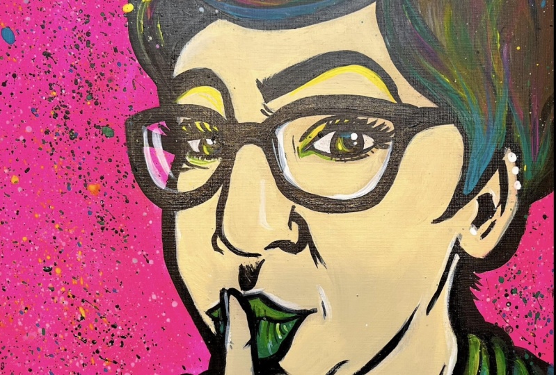
9. Choosing Those Eye-Popping Colors: So now we get to the really fun part of making pop art. And that is adding in those eye-catching, delicious colors that really make your piece stand out and literally pop. Choosing colors may seem kind of intimidating and scary, but once again, you just need to know a few things in order to play around with them. And that's where the color wheel comes into play. Now the color wheel is simply all the colors of the rainbow shaped into a circle. And it is such a godsend when it comes to choosing color palettes, as well as mixing with them. We're not gonna go into a super deep dive into the color wheel because we can be here for hours. But I just wanted to give you some really good color tips so that you can get started and really have some fun. Now when it comes to colors on the color wheel, there are something we like to call complimentary colors. Complimentary colors are purely the colors on the opposite side of the color wheel. So for example, green, its complimentary color would be red. Now, when we want to make features pop, you want to choose a color for either the background or another feature and then choose another color that's its complement on the color wheel. And it actually helps create a very pleasing contrast. So if you were to look at this apple image, the read of that Apple really stands out and almost pops out of the scene because the green of the background and the apples on the forefront and background are helping to make those colors come through. So if you're looking to make something where a color really pops and stands out, consider taking that color that you want and also adding its complimentary, aka the color that's on the opposite side of the color wheel. And now, another thing to consider when it comes to choosing colors is split complementary colors, which is kind of a similar thought process, but it just means you choose two colors on either side of the complimentary color that you want. So for example, if I wanted to take purple, the split complimentary colors that I would use would be green and orange. Because if you look on the opposite side of the color wheel, it is yellow. But if you take those two adjacent colors next to the yellow, the green, and the orange, you get a really nice split complimentary color. And it creates another beautiful set of pop colors. Plus you had a third color in there, which adds a bit more value and intrigue. And if you notice with this Picture, this flower, those flip complementaries really shine together and it looks fantastic. So honestly going with either a split complementary or a complimentary color palette, when it comes to choosing your colors, you really can't go wrong. Now what do you want to create a painting that doesn't quite have the stark contrast of color pop. What did you just want more harmony like you once and that looks a bit more calm and unified. Well, that's called color harmony. And basically what you would do is, for example, if you decided to go with this particular shade of green, what you would do is you would pair that green with its adjacent colors on the color wheel. So for this shade of green, you would want to pair it with yellow and with a darker shade of green. And that creates a beautiful color harmony in your piece. So not only can the color wheel help you pick color palettes to choose from, it can also guide you on how to mix certain colors together. So if, for example, if you've ever wondered how to make that particular shade of orange, all you need to do is to select the colors equivalent on the wheel and check the two adjoining colors at border that orange color. So as you can see here, that particular shade of orange is made by mixing a darker shade of orange with a yellow. So that's just another example of how the color wheel can really help you understand how colors work together, especially when it comes to color mixing. And just to kinda give you an example of how all this kinda comes together, if we just take a look at the quick sketch that I already transpose on our Canvas from the previous lesson, I can show you what this looks like with a complimentary color palette and with a more harmonious color palette in the simple rendering, you see that I have a hot pink background with a green shirt. I did this for a reason. If you notice on the color wheel, green and pink are almost opposite each other. So that creates a complimentary color palette. Therefore, the piece kind of just pops out at you. And in this example on the right, I changed the background to be more blue. And now if you notice on the color wheel, blue and green happened to be very close to each other on the color wheel, so it creates a bit more of a harmony. So your piece isn't quite look so stark and contrasts, but it has a different feel to it. And that's how knowing how to play with your color wheel and the different colors of palettes can help to create a piece that has a different feeling brought to it. It just depends on what you want to do. And my best recommendation is always to make your own color wheel and see what color combos and you can make. You will learn so much from that process and you're going to want to make every sort of color palette imaginable, and it's so much button. So for your lesson assignment, I want you to choose the color palettes that you would like to use for your pop art painting using good old color wheel. I will see you all in the next lesson.
10. Color Blocking I: Let's Get Started: Now comes the actual painting and adding a color for our piece. So I've already selected some colors from the previous lesson. I have a hot pink, blue, yellow, and various shades of green. So I can play around with that, with this piece. What I'm going to do first is because this is a canvas paper, I'm just going to keep it down. So if you are using any sort of medium for your final painting, tape it down so that it'll stay down during the painting process. Now that we have everything taped down, I'm just going to go ahead and pick up my brushes. I don't want to obsess too much about brushes and what you need to use. But generally, you want to have a nice flat wash brush to help doing a larger areas, filbert brush to help you do the more rounded areas. And then of course, a couple of small flat brushes to help get at the more straighter lines. And I also have here a detail round brush to help me with that. But of course, if you have variations of these types of brushes or something similar, that's okay too. It's really not a requirement to have all these types of rashes. It just helps you get the job done a little easier. And of course I have some water off to the side well as a towel. And to start off, I'm just going to go ahead and start to do my background are just going to take our brush, our largest one that we have for me, it's my flat wash. And I'm just going to grab some of that hot pink. And I'm just gonna go ahead and start applying that color. And wow, is it Poppy? Now I'm going to go over in a minute how to do more of the skin tones of this. But for now, just want to lay down the colors first before we go into the more complicated parts. So this is the part where you start to see all those colors really come alive and you're painting starts to take some sort of life. So I want you to really enjoy this process and as you're adding in the colors, It's okay if you happen to paint into some sections, you're going to be doing multiple layers. Best to just take your time with this and apply as many even strokes as you can. Once you've gotten your first layer down, by then, it's probably all dried up so you can go away with second layer of this color just so it creates a more even coverage. Want to do the other parts of my painting that need a little bit more of that detail. So I'm just going to grab my flat brush with the same color and just start to fill in those areas. So now that we have that, let's work on our shirt. I decided to go with a more of a greenish blue. So it kind of has a nice pop. So I'm just going to grab some of that green, a little bit of that yellow, just so I can really bring that green out. You want a nice lighter green? Just add that yellow when based off of the color wheel, and it really does pop. You can use any color set you want. Don't just rely on what I'm using here. These are just my color preferences. This is just kinda what I wanna do. I really encourage you to explore, to use up the ones that you like. And I even switched back to my flat wash because I wanted to get a better, more even coverage then with my small brush. So if you have a large area, it's just easier to use a larger brush because then you get even coverage. They want to go a little crazy with the color, you can totally go do that. So in this case, I just added a bit more yellow to my green and just I ended up very nicely. Or some more layers you're adding or parent this color becomes, which is nice. So at this point you've already color blocked your background and probably some other aspects of your painting. In the next lesson, I'm going to show you how to color block skin. So be sure to finish up your color blocking for your background as well as other aspects of your painting. And then we're going to move on to making skin tone. See you in the next lesson.
11. Color Block II: Painting in Skin Tone: I want to talk about how I do skin tones. They can be a little tricky. I don't like to stress out too much about skin tones, but what I usually do is I have a little hat on bleached titanium white. And this is a really great base for making skin tones. So you can start with this and if you want a darker skin tone, just add a bit more brown and then lighten with yellows as you go. Or you can always darken it with a little touch of red or blue. It's a great little hack that I've found over the years. I think it's a great use of your paint supplies without having to go through so many bottles. Highly recommend on bleached titanium white. So considering the head, I'm just doing my own self portrait and I pretty much have a skin tone that is very, very light. I would just maybe add the tiniest, tiniest, tiniest bit of brown to that. And if you don't have brown, what together? Blue, red, and yellow, that should give you a nice brown to work with. So I'm just taking a little bit of brown and a lot of that titanium bleached titanium white finding those together. I just wanted a little bit just to get it going. That that looks good to me. And then I just start to paint over. Now because this is skin and there's so much of it to paint here. I am just very liberally applying it and I'm just being careful not to completely cover what I've drawn on top watching where I'm putting my lines and my paint so that I can go back later on when I ink and I know where I'm going. And of course for the areas that have more details, I'm just going to grab my filbert and a little bit of water and do the areas like my ears. So now that you've got the gist of what it takes to make skin tone, go ahead and mix your own skin tones and begin to color block them into your painting. See you in the next lesson.
12. Color Block III: Finishing it Up: My hair is brown, so I'm just going to use primarily that brown color that I poured out for myself. But that in but of course, if you ever want to kind of play around with your hair color, you can do that. Like if I want to add a little bit of yellow to it, to lighten it up a little. We can do that. And already you can start to see how it lightens up my hair color and add more color variety so you can totally play around. You don't have to do just one solid color. And of course I always go back with the darker browns in the areas where those shadows. So there's some shadow under here. I'm just adding in, maybe just a little bit over here. And I can always go back in with the yellow just to fix that up, I would like to I kinda wanna be sassy. I want to put a little bit of that teal in my hair because one has got to make it fun. So really play around, have fun with this. I'm just going to grab onto some titanium white because I just want to fill in my eyes the whites of the eyes. So I'm just gonna grab my detail brush, dip into my white. Then you can fill in the pupils. I'm just gonna go ahead and use at Brown. This is morely harmonious colors combining just putting the harmony with the shirt and the lips. So I thought that was a neat little thing. So if this is looking weird to you right now, have faith. This is like the weirdest part of this whole process. Because just everything kinda looks a little unfinished. Don't worry, just keep on pressing on doing your thing. So from here, I would just go back in and to some areas and then just tidy them up. Once you've had to have all the big blocks done, you are now ready to move on to inking. So I'll see you in the next step.
13. Lines Gone? Try This Neat Trick: Now this is a common problem that I personally have encountered when painting over my trace lines. Lines sorta kinda disappear on yeah, a little bit. So instead of panicking, here's a little trick that I like to use. Usually what I'll do is I'll grab that same tracing paper that I used. And charcoal is still pretty active on the other side. So I just make sure to align my tracing paper on top of my painting very gingerly. And also you want to make sure your painting is sort of dry when you're doing this. And as you place everything and have everything aligned, you just go over it with a pencil over the areas that you want to have retrace so that you can get an idea of where everything is and it should transfer pretty easily.
14. Inking Basics I: The Perks of Contrast: Hey there and welcome to the lesson that's all about the master of inking. This is probably my favorite part of doing pop art because it takes a regular looking piece of art that you have and really sorts of transform it when you add in those bold lines and make those details, it truly is a transformative experience and it's definitely something I'm excited to share now when it comes to inking something that I like to personally use as my mantra is, keep it simple and keep it minimal. There are some different rules that you can follow when it comes to inking and to blocking out your entire piece. But that also varies artist to artist. So I'm just going to share with you a couple of things that I personally look out for when it comes to placing my lines on my character's a big thing that I always look for when it comes to creating my lines is looking for the areas of high contrast on the face itself. Because of course, we're really primarily focusing on the face. Normally, wherever you would typically see shadow, a separation from one feature to the other is where I would typically place a line or consider placing a line. So this could be your eyes, your nose, your eyebrows, your mouth, et cetera, which is kinda pretty simple when you think about it. Another thing I want you to consider when you're thinking about where to put your lines is do you want to draw in the skin folds and the wrinkles, the more lines you end up putting onto a character, especially when it comes to wrinkles, the older they tend to look. So this is a really great way to learn how to minimize, what to omit and maybe what to keep just so you can get the right look for your character. Other really cool trick, just to help you figure out where those areas of high contrast are. Take your picture and turn it into a grayscale, which we have already done in our previous step. So this is a really great opportunity for you to look at the grayscale and figure out where exactly you want to put those lines. So let's go into a really quick demo where I show you how I go ahead and figure out where I place my lines. Here we go, how to start doing your inking and get comfortable with it before you actually ink your final piece. I grabbed my original image and I grab a page protector. It's one of those clear plastic items that you would usually put paper inside. A great way to practice inking. If you don't happen to have one of these Saran Wrap would be very helpful to many sort of clear surface that you can draw onto and practice and clearly see the other side is perfect, even tracing papers and that's a great, great way to practice. Well, let's talk about the lines that we're going to be setting and what we want to ink. I'm just going to grab this as a dry erase marker. The areas that I would personally Inc would be areas of high contrast anywhere in this gray scale that you see a dark contrast, I would outline. So I would do that with my glasses. Honestly, you kinda did this when we transferred our drawing. This is just a way to show you how inking really works. I'm going to omit putting in this dark circle here. So even though it is actually there, I don't want to show that because it just looked very tired. And it's just not the look I'm going for around the lips. There's high contrast between the skin and the lips. So you can start to see how easy this exercises once you get the hang of it. So usually there's contrast from the borders of the edge of the face to the outside of that, as well as the hair. There's borders around the hair. Eyebrows. Hi guys. And I'm drawing the eye lids. That that's an important feature. This is a perfect way to see what lines you want to put in and what you would like to omit. So if I were to remove this, you can see one way to go ahead and ink all this. So this is just a really great way to really get acquainted with inking and what you can do with it. So your lesson assignment will be to use your portrait reference photo and locate the areas of high contrast and practice placing your lines. I'll see you in the next lesson.
15. Inking Basics II: Finding Your Style: Welcome to this lesson that's all about inking basics. So there's just a few little things you're going to want to learn and know about when it comes to inking. One being line weight, meaning how big is that specific line? You'll have a fat line which is a heavier line weight than a more skinny one. And this is kind of important when we talk about inking items that look further away or closer to us. And we're going to talk about that in a little bit. There's also line texture. So you could make a line look very fuzzy or very concise, and those all do different things. The textured line that looks a bit more fuzzy could be something that can go in hair to give it a little bit more texture. But that's totally up to you and totally what you'd like to do. And then there's feathering, which is also a gradient technique. And this is something you'll see very often when it comes to creating a feathering gradient that looks like it's a shadow that is eventually receding. So this is just a few things to keep in mind as we're going through our inking. And here are just some of the inking tips that I always keep in mind when it comes to placing those bold lines. This is a piece that I've done in the past. I have used several inking techniques to get it done when it comes to broader lines, those happened to appear when an item is in the forefront. So when an item seems to be in front of something else, that item will usually be outlined with a broader line, aka a heavier line weight. And broader lines also indicate darker areas. So if you have an area that is more encased in shadow, you're also going to want to use broader lines. When it comes to finer lines. Those indicate where light is hitting on the face. Just to sum up what that really means, more like a rule of thumb I like to use is use broad lines for larger areas of the face like the hair, the chin, and a neck. And you want to use the finer lines for the facial features or any areas that are exposed to more light. So for example, the broad lines you'll see I use outline the hair as well as outlined parts of the chin, as well as the neck and the hands. If you look at the hands, the hands happened to have a very broad line weight and it appears to be in front of her hair. And that's because I use broader lines in comparison to the hair. And if we're looking at finer lines, I look at the facial features and use those primarily with nose, parts of the lips and the eyes, as well as cheekbones, parts of the neck line. So this is just again, a rule of thumb. It's not set in stone if you want to. Go ahead and twist those a little bit, that's also cool, but this is just something I like to think about when it comes to laying my inking down. Now there's also another part of inking which is shading. Every artist's kinda does this a little differently. There are some people that like to shade with blocks, so we'll use broad blocks of ink to show shadowy areas, as you'll see here in this example. Under the chin, where that would normally be exposed to shadow. It's given a much broader line and it's shaded in a block to show you that there is actually a shadow there. Other artists like to shade using just parallel lines. And sometimes I'll even use a combo of block shading with parallel line shading, you just use a series of parallel lines to indicate where the shadowy areas are. This is kind of a style choice and some people are really into it and some really aren't. It's just totally up to you. How you would like to do is with my own original piece, I use a series of slanted lines are all parallel to each other to reflect the areas that are more encased in shadow. And then you'll also see in this other rendering here, someone also uses the same technique of parallel lines and even in some ways crosshatching those lines, aka crossing them at some points in different areas to show the form of the face, but also to show that it's also encased in shadow. So really, you have a lot of possibilities here to play with. And as you can guess, there are just so many different styles of inking with this graffiti art. It's using a lot of blockchain, but also a lot of detail lines to express the fluffiness of hair. This example, it does use bit more block shading, but it is a bit more crisp with its lines in a little more sparing. Some people don't even use a lot of block shading and instead rely on the use of their colors to get the shading across, which is again, another type of style. In the end, find a style that suits you. And I always recommend that you take tracing paper or a paper protector, put it over the artwork you want to make, and then practice the shading techniques that you want to use using block shading, using line shading, using a combo or maybe just using color shading that is totally up to you. So you're less than assignment is to experiment with the various inking styles we just went over and see what you gravitate towards. And once again, you can go ahead and use tracing paper or clear paper protector to help you figure it out. And in the next lesson we're going to actually start inking our final painting. See you there.
16. Ink Your Painting (yay!): All right, at this point my painting is pretty much dry, so I'm just going to go and so we'll just start, I'll just keep this as reference as I'm inking. Make sure you always have your reference picture as you're doing this, but you can just start to go ahead and ink you're drawing. So at this point, we've pretty much practice doing our inking. So you're really just going to repeat what you were doing in the previous lesson onto your actual painting. Now you may be wondering why I'm using two types of inking materials. Well, I like to use sharpie first when I'm doing my inking so I can get it down quickly, kinda establish where my general lines are going to be. And then I like to take my acrylic paint and liner brush and really clean up those lines and get them to be super, super crisp. But that's just my method of doing it. You can do whatever you would like. Take this part super slow. Obviously, I have the sped-up because this is a long process when it comes to inking. And I want you to really just take your time, but this is just the general process by which I do it. I laid down all my lines. I figure out where everything has to go and fill in the best that I can with my sharpie and my markers. And I really go ham on this. I like to go and do my details. I like to establish wrinkles in my shirts and that's just my style choice. Something that I also wanted to point out to you is some of the line weights that I'm using. Once again, I like to use thicker line weights around the outer portion of my face, chin, and areas where as covered in shadow. And then I like to do even finer lines around the facial features. And that's kind of like the style choice I'd really like to do. Alright, now we're switching over to my black acrylic paint and my liner brush, which just so happens to have a longer body then a detail round brush. And it's really, really good for inking, especially once you get the feel and the control on the brush, you really get these beautiful, smooth, crisp looking lines. And I proceed just to go over all the lines I have already put in with my sharpie. And I go over that with my acrylic and I really start adding in those line weights. I like to do the darker outlines with a heavier line weight. And I like to make sure that my facial features have thinner line weights because there is more light hitting on that and I do want to emphasize the more delicate features. Now, if you're wondering how I do this with a liner brush, I'm just taking my time and I'm making sure that my hand is holding the brush very close to the Pharaoh, which is the metal part of the brush. And I'm making sure that I'm about perpendicular to the paper with my brush head. And that helps me get much more control on my brush. And another really cool tidbit. I like to turn my paper around as I'm working on it. So if you've got Canvas, you've got something that can move, move it around. Don't be afraid to get at it at different angles so that you can get a really good brush stroke. When it comes to painting and inking hair, you want to think about hair as something that's very wavy and done in partitions. For example, I want to place kind of like a line coming off the bank here. That kind of flows down like this. So it kind of demonstrates little flow. And when it comes to anything with hair, you want to just follow the hair line so that it just looks a lot more real. I always like to say, think of the S shape and doing hair lines. Hair is very wavy. Even straight hair tends to have a very wavy like shape to it. And then I also like to do a little eye details, some little line around the pupil of the eye. But just I find that adds a little something, something. So that's how you can go about doing the inking portion of your pop art piece. And the next lesson I'm going to show you how to do those finishing touches. I really make this stand out. I'll see you there.
17. Choose Your Shading Style: Now it's time to go ahead and ink those shadows. So like we talked about before, there are several techniques and styles, parallel lines. You can do color blocking, you can do a mix of both, or you can just do actual color blocking where you just use various colors instead of stark black lines totally up to you. In this case, I decided to go for the series of parallel lines. The way I'm adding shadows is by creating diagonal lines for areas that I see are encased in shadow. So be sure to take a look at your reference photo as you're doing this and anywhere that you do see any sort of shadow, I went ahead and put in a darker area, aka just putting in a bunch of lines consistently in the same diagonal orientation. So whatever angle I decided to do my lines, I just kept doing that throughout the entire painting. And that's again, a style choice that I decided to go with. In this case, I decided to add some under the hair, under the chin on the left side of the shirt. And of course he kinda went back later and took out some of the shadow lines under the eye about those a little too stark. So it's always a good idea to take tracing paper and you're clear plastic covering to play around with your inking style for your shadows. And if you're wondering what I ended up doing to get rid of those lines under the eye because you'll see later they are not there anymore in my painting. I simply just waited for my black ink to dry and then I just repainted over it with the same skin tone that I was using. And this is why I really, really, really, really, really, really recommend acrylic paint because of just how forgiving it as you can make little mistakes like this and easily go back once your paint is dry to fix it all up, totally recommend it. So your lesson assignment will be to add your desired shading into your painting and don't be afraid to get the jitters out with tracing paper or clear paper protector first.
18. Highlights & How They Work: All right, so we're almost at the finish line and we're going to just add a few more little details to really make this piece standout. So I'm just going to go back with either my liner brush or my detail brush. We're going to just dip it in some white. We're just going to go ahead and add some highlights, aka the spots in the painting that are hit with light. And that's going to add luminosity to this. So I'm just gonna go ahead and add light reflection on the eyes here. I just completely changes the painting right then and there. And I like to look around to see where I also see those, those highlights. So I see summary here. Of course, you don't have to add them if you don't want to. I think it's a cool look. Yeah, you just want to keep, keep looking at your reference picture. Just kinda see and look for those lightest of lights and add those in, especially in your hair. So I'm just following natural waviness of the hair, but just adding a bunch of white in that area to show that there is in fact a reflection happening. So you just want to think about where the light's going to hit and that's honestly where you would put your highlights. I also like to do the glass, It's in front of the eye, wear my glasses. And to do this trick, I don't completely paint the entirety over the eye, but I do some parts in white. The two corners gives you the illusion that there is in fact light coming through from glass. You'll see the light reflection right here. On the top of my lip. There's also some so some around Manila area. You can always use your fingers to mellow out some of the colors if you wish. So now that you've gotten the hang of what highlighting looks like, go ahead and proceed to add highlights to the lighter areas of your painting. And don't forget to use a reference photo to see where those highlights actually are. I'll see you in the next lesson.
19. Add Those Finishing Color Touches: Now in this step we're going to talk about how to use up your background as well as to add those tiny fine little details to really get your piece to look just like chefs kiss Fourier. So when it comes to backgrounds and when you decide to do with it, you can really do anything you want. And tons of artists have different styles, some light to do really bold lines in the background. So I'd like to do bubble sunlight to do combinations of bubbles in lines, sunlight to do abstract, which is what I'm going to show you. And others just like to leave the background just as is with the original color that they chose. And that's fine too. It all depends on what you like and what you want to experiment with. So let's hop on over to my desk and I'm going to show you some of the tactics that I use to really Zhe of my piece. Here we go. You can now take this opportunity to add even more color and variation. And in some ways like an abstract version into your pop art, the more color you can add in, the better. So just with my liner brush, I'm just going to go back in into aspects of my hair, in my eyes and just add more color. And of course, if you're working with hair, they just want to follow the shape of your hair. Just so it creates this really natural waviness. I like to use the same colors that I have been using for this entire piece. So it can just pull everything together. And it looks like one cohesive piece. And really the sky's the limit. You can do this, do this with the pupils of the eye. You can do this on the shirt itself just anywhere you want to add a little bit more of a pop of color. And one of the reasons why I love using acrylic paint. You can build on the layers. Something just didn't quite work. Just wait for the layer to dry and then just go back in and repaint on top. This is why kinda recommend doing pop art with acrylic paint because it just how versatile it is, giving us up some stuff. Why not? This is your time to have fun. Go wild and take this time to do some makeup if you want to add a bit more flair. In my case, I added some shadows, added some color under my eyebrows as well. The sky's the limit. So really have fun with this. And of course, if you want to do something in the background and you don't want it to affect what's going on in your piece here. You can just put a set of paper like right on top and just kinda work on the background so it doesn't disturb it. And you just want to make sure that everything is kinda dry before you do that. Now to get that very abstract looking background, all I simply use is toothbrushes. Or if you have a toothbrush that's even better, I'd like to take one brush and dip it into a certain color that I want to use. In this case, I just went with a lot of different colors like black, white, yellow, and some of the turquoise. I dip that in water, get that really loose and wet so that when I hit my two brushes together, it kind of flips the paint right off onto the canvas and it creates this really cool splatter effect. Just kinda adds to the more abstract look that I was going for. And that's how you can create your own piece of colorful pop art. It totally stands out, is because so many colors going on for it. And it's definitely something that's super, super eye-catching. And you'll be so happy to post this on your wall or share it to whoever you would like.
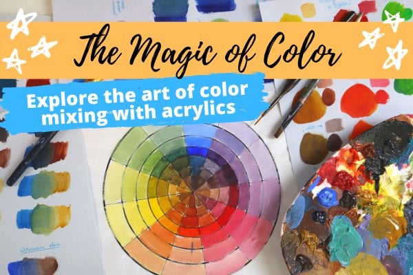
20. Congrats & Next Steps: Congratulations, you have just completed the pop me up class a. Hope you learn something new and that you're excited to dive more into the world of pop art at all. It has to offer and making gorgeously colorful and edgy art. I wanted to offer you some next steps. What do you do next? Well, the first thing I always recommend is to play and experiment and give yourself that freedom to play around with your acrylics and supplies and keep on practicing and know that as a first-time pop artists, you may not get the results you want right away. And that is totally okay. You're never supposed to get it right on the first go. It's not about comparing yourself to others, but comparing yourself to yourself. So take it slow and be patient with yourself. I also want to offer you to challenge yourself when it comes to your painting experience. One way to do that is to recreate a colorful pop art piece without actually falling along with me in the videos. Or you can experiment with different inking textures and styles on your tracing paper or on your clearer paper protectors to see which ones really resonate with you and do different iterations and see which ones you really are into. Learn by intuition and develop your own style from there, please share your completed projects because I would really love to see them. And you can do that by using the class Instagram hashtag, pop me up. And you can tag me on Instagram with my handle at the buzz to artists. And I would really love to see what you come up with, so please share away. Now I did want to mention that this class you just took us also offered on my website with even more bonus content like my deep dive into the world of color and a detailed printable instruction guide, a perfectly summarizes all the key steps and strokes for many of the pop art techniques you learned in this class, if you want lifetime access to all the videos here, you can check it out at the bus artists.com, forward slash, pop, dash it. Now if you really want to dive deep into the magical world of acrylic painting, but you're not quite sure how to get started or what supplies you'll need. My Skillshare class, the magic of acrylics, acrylic painting basics for beginners will help you answer all those burning questions like, what supplies you need that best suit your project? How to mix dozens of bright colors without having to buy hundreds of dollars a painting tubes and waste to stay motivated. So you're always brimming with ideas for future paintings. So if you've always wanted to make paint slapping magical art with acrylics, occasionally have dabbled here and there in the Canvas. Or you just want to brush up on your acrylic painting skills and learn something new. This is the class for you, and you can find that class via the URL V boast artist.com forward slash, acrylic dash magic. And finally, if you really want to dive deep, creating eye-catching, vibrant colors and palate settled turn heads and not required but Chilean art supplies, you'll want to consider my class, the magic of color here you'll learn to paint any scene or picture using your own colors without having to follow all those YouTube tutorials and even allowing you to go off script and add your own style and help you leverage the tools you already have to turn your painting from MIT to wow, who's just go to the URL be boasts artist.com, forward slash color, magic. And of course, if you want to see the full listing of courses I do offer, you can just go to Vbus artist.com forward slash courses. Once again, I just want to thank you for being a part of this class. I truly enjoyed putting this together for you. Forget to use the class hashtag, pop me up and I cannot wait to see what you create.
 Amanda Rinaldi, Teaching you to Art with Confidence