Transcripts
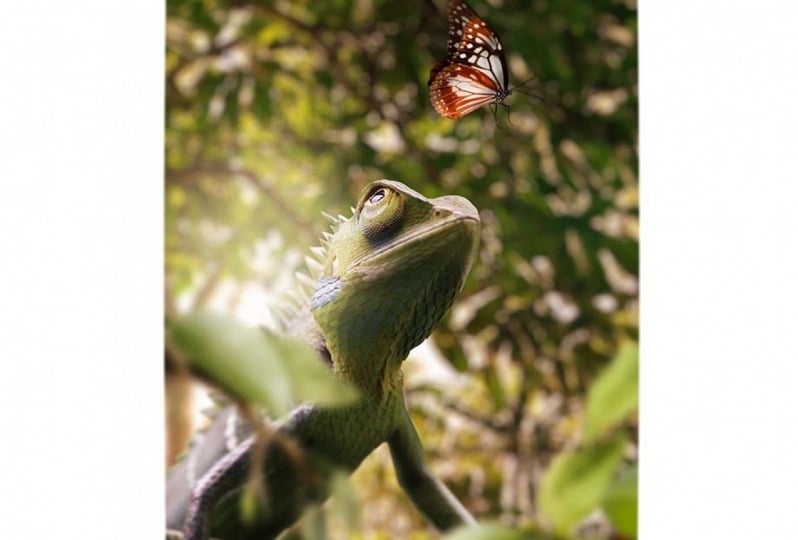
1. Introduction: everyone. My name is Enya and I am a digital artist. And in this class I will teach you everything in it. No, to create the father realistic photo manipulation. So for this class, we are going to use this photo and transform it into this one. So we are going to go through all the steps that is needed to make this look like a real photo. We're going to brush shadows. I'm going to show you how to blend images together, how to create the background. It looks real. So you can come at any any object that you want and change the background and the other other stuff, like color blending and making highlights and other the good stuff. So if you're wondering, where am I? Create a lot off stuff with animals and the thing I always do is I make them look for the realistic, for instance, the technique that they used in this class. I also used to create this. This is also some old work from me that I also created using the same technique and also this one. And this one actually went viral. Instagram. You might have seen it on this you're going to get shared A lot of times in This is also shared by a page wildlife Leonard F like four million followers. And this is another work for me. They also shared because simply it looks for the realistic and this one also, I used the same technique for this one. And maybe if see my work on the forests of general, they also shared my work. He could find it here and some other stuff. So let's not get into all these stuff. I want to tell you that this glass that I have here, this is for beginners. So if you're just starting out with for a shop, it's really easy to follow along because I'll explain every step in it through. But even if you are advanced user, it's gonna help you to create stuff that looks like a real photo. So maybe you want to start with instead off, starting with cutting out subjects, you might want to directly start with the chapter where I just start editing, for instance, you can just skip the 1st 2 parts and just go on from the 3rd 1 So I hope to see in this class, and I will promise you you will learn a lot from this
2. The Interface of Photoshop: All right, let's open a father ship and have a look at the interface. So this is the start screen from a latest version of photo shop. Yours might look a little bit different if here for all the version, but it doesn't matter. So let me start with great new foul. And this doesn't matter here. I just want to show the in the face. Now, if you look at the interface of followership on the left side, we have the tools here which we can select different tools to edit our image once you selected to you get the full bar here with the options. So every time you select a different tool from the toolbar, the Stober here, the option panel changes and he can set the settings for that too. Now, here we have the file menu on the topside and at the right side, three of our billets. So if you're Photoshopped looks a little bit different. You Congar Oto window workspace and reset chewer workspace. Now, what I usually like to do is I like to get rid of all these things here because I know I want to have more space in the working area instead of all this information around it. So if you reset your workspace and get rid of all these panels by clicking on these but near and close this and that's it and also closed the other tools, the only thing that I would suggest to leave is leave the layers and the properties. Or you can also just get rid of everything because they're gonna papa back when you create something and it's needed to use that. So, for instance, I have usually I worked like this with only the layers here and some channels and parts they don't part of me here, So every time I select to, for instance, here create something and I will Great, um, Layer on top of this is gonna pop up. And I have three settings here, and this is fine. You could even make it smaller. So this is how I usually like the work or like this. This is even better when you get a lot off layers in your file. In your document, you can put this here or drink this here so you can open up when you need this, and that's it. So that's really easy to understand. Now, if you're dumb, nails look, look really small. You can go here and select Ben options and, hey, select the different size of hitam nails. I'm using a big time now because I record this for a tutorial so you can see this better. But I suggest you maybe wanna take this or this one, especially when you have a lot off layers. It's better to use a little bit smaller size thumbnails and also make sure to select Lay abounds. I think this came out at one of the late versions so far. Trump. If you don't see this, don't mind it. It's not really important. Just a little bit. You slay bond so you can see what you're working in in the 40 Shortfall instead of not seeing the image itself. So this is fine
3. The Tools: All right, let's have a look at The two were on the left side. So here we have the move toes. This is a tool to move objects around here. Image. After that, we have a selection school, These tools I used to make selections off things in your subject. Here we have the couple with the crop tool, we can change the size of the image. We can also select different dimensions here, for instance, if you want to create something for Instagram for by five will be excellent because there's the size of Instagram and we have all the things like square. Although this stuff but moving on here we have the eyedropper to which you can use toe select color. So if it's like this and you click on a color image, it's gonna select here, and it's gonna change vehicle. Obviously, this is white, so you can see it changes to work. Next, we have tools to remove objects in your image. This is good. If you like work on portrait or something, they wanna get rid off some pimples and stuff like that. That will be really good to use one of these tools and Also, the clone stamp was also good to remove things from here from your photo. Now move around the Bristol. This is a really important tool for for the manipulations, because informant places you're going to use a lot of brushing. And when you select the brush, you can open of this brush settings and t of different settings. And here these are brushes that I Donald. These are just free brushes that you can download on the Internet. You just import them into father Ship and you get him here so face to sit on a great clouds . I have, like different club brushes, and I can just make clouds. All right, let's move on toe the next tools theory of the race. It'll teaches everything's, but I'm going to show you that another way to race thing. So I don't really use this one here. We have the great until to create Grady. It's also important for this, for for the manipulations, and here we have a blur tool to brought things to sharpen things and to us, much things. Here we have the Dutch burn and spine stole. These are really important to tell the sponsor isn't really important because I don't use it. But the touch and burn tal is really important when you use it for photo manipulations with the Dutch till you can make things lie there in different parts off your subject. So, for instance, if you want to create some light of parts on something, you can use this tool. And if you create dark parts, use that'll. We'll also go through this. These tools to create Goodman off further manipulations. Now, moving on, we have the mental here, but mental is really good toe to make advanced selections. So if you want to cut out a human or a car or anything else, you use the mental to make an advance Good selection. It takes more time toe. Use this tool, then to automatically use like something like Mitchell Quanta, which are medically select your subject. So try to use depend to always because it's the best tool to use to cut out subjects moving on toe the textile. This is the type text, maybe for a flying proposal, whatever and these tools I don't really use so he can like to like different shapes and stuff like that. This is not something you kind of using for the manipulations. And he can move the document around and the sum total to zoom in and out. I zoom in and out by holding them all and schooling a mouse, so I don't really have to select this too. So the best way to learn is to also get known toe shortcuts. So every time I will create something I will tell you what shirt could I use? And that way you will use this shortcut instead of select in this torrid zooming in changing to zoom out and stuff like that. It takes a lot of more time, and here we have the color selection tool. So every time you want to change color this clinic and they said, change it to something you like And here if the background konolige can also change and you can rotate these so this really isn't the unsent. And the best way to obviously learn is to actually do something instead of going through the theory off it. So let's just start off right by doing a formal operation right now.
4. Changing Backgrounds: All right, let's start with creating. First thing I would like to do is to open up the file that I want to use. So for this, I could go to file open, or I can just simply drag it into the photo shop screen to open this up. Now, the first thing we need to do here is to get rid of this background so I can create my own background now for creating backgrounds. We need to make sure to get rid of this one first. And for this I would use the mental that you can find here or press p on your keyboard toe . Select the mental. Now he wanna make sure the select part in that shape because we want to make part of it and make sure to have, like, this one and start with zooming in now to zoom in. I'm holding are out and schooling Miami the mouse. So I don't have to select the zoom zoom function here. So this is really easy. And if I moved the subject around, I hold on the space bar and I just click and I move it around, so this is really easy. So I don't have to switch between different tools. Now the first place I will start this somebody here and just make one point. Now make another point somewhere there, all the mouse and make a little curve. Make another point. All the Mars make kerf. And this way I would go around the whole subject to make a selection like that. So I'm going to do this, really, precisely because this is like a made subject, and I wanna make sure you don't see bad cut outs off this image. Now, if you go around the subject like this, you can do this slowly to get used to it. And sometimes you don't want to make this gulf. For instance, if you get the points like like this, you can see it's ghost like that way. So the best way to do this is toe make a point here. So if we don't see this doesn't work. So I'm gonna press control set to call back. And if I present despite make this curve hold down out on the keyboard will hold it on the mouse, bring this anchor point to the start, and that there were started from a new point without this curve, and that way I can create a nice curve that makes the subject better to cut out. So also, when you get to this point, you need to go back. So I'm gonna bring the anchor point back and the same for this one. If you want to have it really precise E to get this like like this art ages and make it look good. So all these little things that will matter if you do this precisely because its anti will see this all if you don't do this good. So try to do this until you are around the whole subject and you have a nice guy. Now, when she have this selection, just go to the first point again out of the artwork birth. And here you want to select the first point again to close it. Now, if you press right mouse, we can select, make a selection and say we have the radios that we can set. If we set it to zero pixels, we have, like, zero Federer. That means it's like a really straight edge without a little bit of blur in it. So I would say this to want to make sure it looks a little bit more realistic, like for the realistic got out. So don't use zero use one most of the time and that's fine. Press OK, and we have our selection, and the next thing I would need to do here is to make a mask of it. If I click on this one, it's gonna make a mask, and we ever selection off our subject. And now there is some part that we also need to do like this part here. So I would do basically the same. Go around the subject and make the selection by close knit. Make sure to always have this selected, because when you have this selected, you're working on the image itself and we won't work on the mosque because we are getting rid of the background. So make this selection again. Make selection, do the same steps, and if you press the only key birth, so you have the black background color. It's like this and press control or command backspace, and that's gone, so that's really easy to understand.
5. Creating a Composition: let's start with creating with this. So for this, I would create a new file first. So you can either go to foul new or press control or command. And on your keyboard, I want to make something vertical. So I'm gonna go for 2160 by 2 700 And it's fine if the Resolution 72 this is Friend. This doesn't really matter. All right? Now, press create every file created. Now, the next thing to do is to go back to this phone and just simply use the move toe and just drag right into our file. Now, when we re size things, if for a shop it's gonna ruin the quality unless we're making a smart object. So when you have a selection, press right mouse here next to it and convert this to a smart object. That way, we are creating like a hidden file off this subject. So for press double click on this, I can open this up and do some changes here and save it, and it's gonna look at the same at this file, so I don't need this, But try to remember to always use a smart objects because If you don't do that, it's gonna get ruined when you criticize it. So next thing to do is we need to make sure this fits our image. So if I press control or command key on the keyboard is going to open up the free transform window and here we can rotate this and make this bigger or smaller. So in the last version of foolish up, some off, the last versions you can rotate make this bigger and smaller by just doing this in all the versions. I think he had the older shift, so it doesn't stretch out like that. So this depends on which version F. If you have all the version, you need to hold on shift to make sure it doesn't get like that. So for this, for me, it's fine. I can just stretch it out like I want to m police where I want to. So let's put it somewhere here and make sure it fits the image. This doesn't matter, because I'm gonna make sure you won't see that later. Just make sure it's somewhere in the center. Think this looks fine? Next thing to do is to import our butterfly I have this butterfly that I found and I can just drag this year. This is being G fall, so I don't have to worry about getting this out. So let's put is somewhere there make sure toe have like realistic sizes. I have seen a lot of people that create something in the butterfly or the other. Things in the image doesn't have realistic size, and it just doesn't look really anymore. So tried to spend a little bit of time on making sure it's the right size, because if you do it like this, it just looks weird. It doesn't look. He's like he's looking at it, so make something realistic like that. All right, Next thing to do is to import our background. You can see here on this image. Let me remove this and show you we had a green background. So to make this look realistic in this one, I would also use something doing in love, for instance, blue or something, because we have all these things. He got out, and you can still see a bit of green of that. So try to use also the same color tones as the original image So I'm just gonna import this background press, enter and move this layer underneath those. So these layers are like stacks off. You can compare that with sticks of paper. She put something off the other paper, you won't see the thing that's under needed. So try toe, put this background here, consulte again, and let's make this really big. So I don't want to see this. These humans in the background, I only wanna have, like, these trees and stuff like that. I'm just gonna make this really big and put it somewhere like that. Maybe this is fine. Maybe even like that. I can also eventually go to edit, transform and flip this horizontal because someone knife like this left side lighted in the right side. So I'm gonna do it like this.
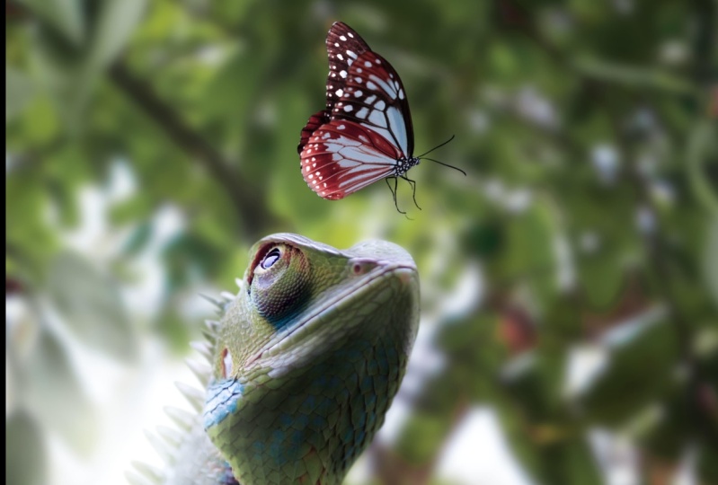
6. Blending The Background: right. Next thing we need to do is to make sure this looks real. So to make things look riel, you need to blur out the background because we have a close up shot here. So too blurred backgrounds. I'm using Filter Blur Landsberg, but because it's a smart object, we can't use this one, so we don't have to make smart objects for the background. So what I'm gonna do is press right mouse and restaurants. This and it's not a smart object anymore. Then go to filter, blur, lens blur. When you blur our backgrounds, it's better to use a lens broke because that's good, like a real photo. And if you use other blues, it's not good for the background. So try to use Let's blow for backgrounds and he can set the radius. How much you want to blow it out and you can see the temple outlooks so we can make this, like, really blurred out because we have a close up shot here, has believe this out and see how that look. So its image All right, you can see here. This looks pretty good now for the background. Don't watch this stuff here that's we gonna fix the late and now we can move this around until we find a nice, But that looks really so usually I try to watch these parts here. You can see here, here, this got here. You can see it a little bit. It's not real. So try to find something like this, for instance. He can see it gets already better, and it looks more real. So I probably would use something like this, Maybe over the bid around until I got a nice spot. Where want this? Let's use the white area here. All right. I think this looks fine like this. I'm gonna leave it like this. Next thing we need to do is tow. Make sure these things here, you won't see this anymore. So let me first off this a bit around because I feel like maybe Carol Davis slightly like that.
7. Edges Blending: Now I want to make sure you don't see this stuff here. So what I'm gonna do is I'm gonna press right, mouse, and also rest. Arise this. And now we're going to select the Blue too, because I don't want to see this thing. So I'm gonna blur the bit out because in the original image, we had also a blur. So select the blur toe. He can set the strength How strength you want. So if you have found, it's gonna blow this out really a lot. If you said a bit less, it's gonna blow less. So use the blur toe and start brushing these parts to blurt this out. So it blends better with this background. So just do it on these parts. Don't do it on this part because you can clearly see in this image we have all focus on this, I hear. So don't do it. Here may be a bit here. I will drop the strength here bid so he can see doesn't do it too much, but a little bit. That's a little bit here. Here we can little bit more because you can see it was blood out in the original one. And never mind this one. People fix it later. It's too Sembler here. So here also these parts and just basically around the edge where we had grown original image. I think this looks fine. And now you can see it looks already a lot better than the original one. Maybe a bit more here. I would eventually increase the strength here a bit more here, make sure it's really blurred out. So we have all our focus on on these areas here, and this is stuff in the background. It's like when you use a real photo, you will see stuff blood out in the background. This area will be sharp.
8. Hiding Flaws & Creating Depth: all right. Now we can start own hiding these flowers here. So this part here instead off trying to cut its out really good or tryingto add some stuff here to it I would hide flows when I Usually when I create something and I see flaws in this image, I tried to hide it and the best way to high things is toe have something in front of it. So for this, I would use these branches with leaves. Here, let's make this really big just in parties and put him up off all the other layers. I put it, put it like that in front of them. So now we can see that anymore. So that's really easy to hide things and look, it make it look like a real photo. But they need to be blurred out because we have focused on this side, this area off the image and not here. This is close to the camera. We can even make this bigger to make it look more real like that. And now we can blurt this out to make it look like a real photo. So for this, I won't use lens blur, but I'm gonna use blur. Gosh, simpler. And with the guards from Blur, I could make like father racialist blur like stuff is in the foreground like that. They can see how beautiful this makes this whole image, Chris. Okay, and that's it. And now you can move this around until you have something that looks really nice. Maybe even like that. You can eventually rotated a bit, so it doesn't really room the image itself, but just a little bit of blood on the sides off this image like that. Now you can even see that we don't even need to blend this better because the green really fits the green off. This image of this looks five about also duplicated. If a press control command J I can duplicate this layer niven another version of it. And I can also maybe it's, um, here to feel this area's a bit more up with these blood out leaves. Maybe even here. Let's rotate this goto flip Jen's form, flip horizontal and play some here. I would also hide this a bit when you see these this area here, So it looks like we have, like, really nice depth in this image When I do this, maybe one more. Let's put let's put some here to get a really nice depth. So this way we air, create, recreated. Some kept in his image. He can see here. This could be even blew out more, something a little bit more blurry here. I feel like when you blurting south, you don't get distracted by it, especially when it's like in the background, so this is better.
9. Changing The Lighting: All right, let's work on the lighting off this image. We have a couple off layers here now, and it's going to get a lot more so the best way to organize this is the whole downshift and select the layer that belong together. For instance, this foreground players, It's like the mall president is full. The here, and we have from folder double click on this and give it a name. Like for ground blur. We can simply just dissemble This enabled bliss whatever. So this is really better to organize things that's also put this lizard here in the folder lizard it needed just make folder, drag it inside. And this is our but the fly also in a folder. So this is really good to organize things. And if you press right mouse, you can even give it the color if you want. But I barely do it. I just make folders and this is fine. And we can also make, like, folder for the background if you want. All right, now we have background. Now we have fooled us for everything. Now we can start on working on the lighting for these different subjects here. So for this I first want to define Where is my lighting gonna come from? For one maligning coming from there. I need to make sure this side off these animals this this lizard this But the flight is going to get darker. So let's imagine our lighting will be coming from there. We can let's make a new layer and selected brush. And if you go here, you have the brushes that you can select to select a normal soft round brush. Bring the opacity all the way up and bring the hardness all the way down. So we have a soft brush, Select white. Does your foreground color make it a bit bigger and just let's make not quite a bit yellowish, so we can see this better make it a bit bigger like that. All right, this is our lighting. It's gonna make it bigger if I change. The blend mounts here. I can create different type of affects to this layer, so these blend months are to make a darker. The 1st 2 are well, most used here, also the most used. And this is these are to make a darker These are to make a lighter and this is other effects. And this is more creative stuff that you barely use. And this is for the colors. So for the lighting, about the make it lighter, obviously. So usually I select screen you can see here we get a nice, beautiful glow from coming from the background now. But because we have this glow here now, need to make sure the area here on this lizard is gonna get a bit dark to look more like a real photo. So for this, I'm going toe select the lizard layer here, this one. And if I go down here, I have adjustment layers here that that can select and this will affect the layer on the needed. So for this, I'm gonna select curves girls. I always usedto create lighting. So if I click on this and effect like this button, it's a gonna only affect the lay under needed. So if I disable, this is gonna also affect the background and stuff on the needed. I don't want that. I only want affect the light under needed only this one. So let's press this. If we move the slightest around these discover for me, this these are the highlights here. So if you move this to the left, it's gonna get really light. These are the mid tones here to pick him in front. And this are the shadows. Now we want to make this a bit darker, so obviously we need to drop the highlights lower like that. I can see this image changes and we wanna create something darker. Let's move it. Tow this point. Not too dark right now. We have this dark area, but we need to make sure this area will get lighter again. So what I'm gonna do is I'm gonna press on this mosque, then select the brush and make sure to have a black brush for the black brush. You can get rid of some parts and with a wide brush you can bring back some parts from this layer. So press on the mosque of it, select the black brush, make sure you have opacity and flow at the 100 and bring the hardness down. Make sure it's a soft operations, this standard brushing for the ship. Let's make it smaller. And let's start bursting these areas back to light again. And now you can see we get a nice, beautiful shed on this side and decide will be lighter. So you have need to have a little bit of imagination where the light is gonna hit the lizard. So obviously here because lighting is gonna come here. It's still bit here. Also, Lily's And here here, here, here, like death, maybe also a bit here. And this will be darker. I can see the differences of a disabled this it's got darker. And if I want a great a bit more concerts to it, I'm just gonna slick to make sounds and drop this a bit. Maybe not too much, just a little bit extra.
10. Creating Highlights: all right. Now we have some shadows here and now I'm gonna do is I'm going to use the Dutch member. It'll to make this even look better. Let's move this big there. So we're from nice glow coming from They're not too big. All right, let's create a new layer here on top off the curse layer. So creating new layer press right mouse and create the clipping mask. If a created clipping mask You see this barrow, it's gonna only effect inside this layer. So inside this selection. So if I go to get it now, feel and select 50% gray press, okay, Every if, like this gray color inside these lizards, if a changes the hopefully you won't see this anymore. And that's exactly what I want. I just want this layer to work with. If I don't have this layer, I cannot use the the Dutch or parental because you need something to work in. And if you're gonna work directly on this image, you can never change it or get rid of it later. So it's better to use 50% really for this. This is only for the Dutch in Bertel. All right, Let's start with the Dutch deal with the Dutch so I can make area slider. So let's like the Dutch stool. And here we have the settings. Let's go for midterms. Explosion. Let's do around 50% and make it bigger and just let's start brushing a bit. So now you can see these areas I getting lighter and this is what I usually do. Toe lighting up highlights. So these areas that got light, I can make it lighter. It's do also these sticky things that this lizard has a little bit here. I can see if you do too much, it's going to get a white and we don't want to do too much. So let's drop the exposure here. It's a little bit more here, so even nice, beautiful glow here it's to this part may be a bit here. It's a just little things. It's also a bit here. Let's leave this part because this is what it should always. All right, this is our highlights. You can see the difference we could. Nice highlights Now
11. Creating Shadows: Let's create the same 50% greater again. Create the clipping mask. Go to edit film 50% gray Change the bill in Malta overlay. And now I'm going to select the brutal Everything burned so I can make shadows. So let's select. I let When you doing shadows, it's better to start off with highlights. First, let's around 40 50% maybe even less. And you can you can see here I'm making shadows Now you don't have to do this much. Just do it a little bit. So we have a nice shadows. This image already has shadow, so I wouldn't do this too much. Now, once you got a little bit of meat on sun go a little bit the file, it's and go to meet, owns and drop the exposure. And a bit more not a little bit. Here, you can make the small It's still a bit of this I hear behind him like that. Maybe some shadows here and drop the exposure again. And still a bit here here. All right. I think this looks finally. Don't don't want to do this to my Children is gonna get room. So if you compare this out. It looks This was first, and this is now and you can see the light matches the shadows Highlights now and now. I can move this a bit around because I feel like I don't wanna ruin this image. Too much is gonna go like this, stretched out something like this. Maybe this is even a bit too dark now, so it can go toe the curse here. And that's bring this a bit up so it doesn't get really dark because it followed Look still like daylight. And to make sure it's right and this shadows, I would eventually trump the best year, so you won't see that much just a bit.
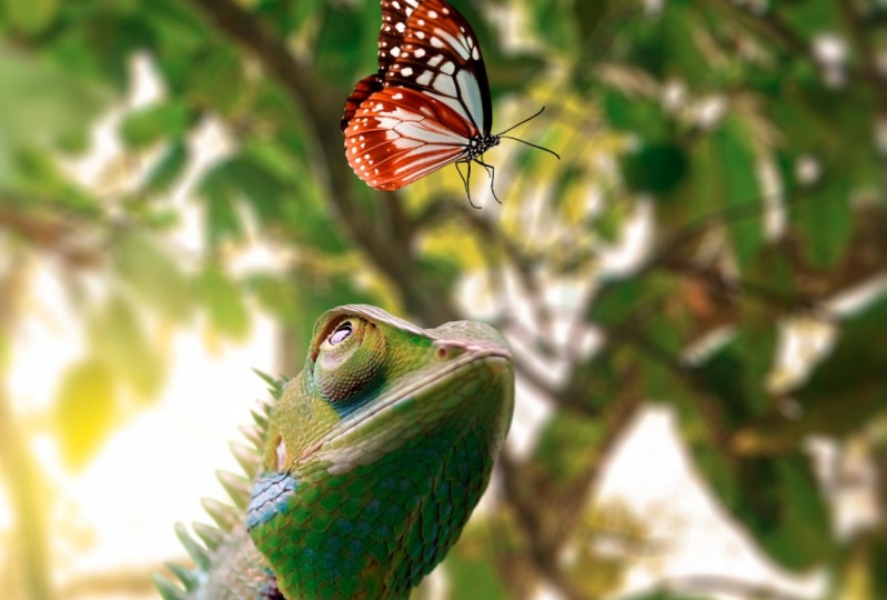
12. Color Blending: I also give these butterfly some curves to make this darker, to give it a big machine. So make sure to select this so only affect the butterfly. Get a bit darker and just brush these parts away because we have lighted from there that make sure some areas Aleida instead of like a flat image with the highlights. This is better like that right now. It's timeto work on the corners here to blend this better together, so you need to make sure the colors managed to get him now. For this, I would first, let's first do the background. The background here is really light, so I'm gonna create a human situation, and this is what I usually do. The blend images better together. I would select your situation for the colors, make sure the president's again so we only fake this layer, and I would like to drop some color from it. When you drop collars from everything, it's gonna look better together directly. So this is really easy. Trick toe blend expected together, and when you're done, you can increase the color skin. So let's drop this like around this rage. Think this looks fun? It already it looks more real. Let's do the same for the lizard. I'm gonna put these these darker things a little bit less capacity. I feel like it's bitter, Dark like it. Let's do some here situation on this lizard. Make sure, Princess, you can see here we have, like this takes off adjustment layers on top of it, and everything effects. Only this lizard. It's trump these. It's down like that, so we get less color. It blends better together, and eventually, if you want to change the color, you can use thes sliders. If you want to make more like that, maybe this even works for this room. Let's make more like the background. This looks mad already. All right, let's do the colors off the city's leaves. Have this leaves. So what I could do is I could put this in folder inside our folder and do Hyun situation. So I directly infect these or folder off it. It's kids. Well, if the scholars with the slider submit around, and I think this looks fine and let's also do some color from this butterfly, so here situation again and let's see if we can change this a bit, a bit less color, and we can eventually even change the color for it if you want to. But I still wanna have this, like a real photo, so I'm not gonna do this too much. All right? I think this looks looks fine.
13. Final Tips & Tricks: this is basically done. There are some next step that you could do. For instance, apply presets in light room to give a different kind of color tones over. Just play around with settings and you're looking great, different stuff. You can also do camera filter, which you can find here. But I'm not gonna do that because not everyone has camera, Father. So I'm just gonna leave it like this because this class is about how to make it 42 realistic. And I think this looks pretty much for the realistic all the steps. After that, it's just accept. All right, At this point, I have everything as I want to. So I want to do some final adjustment to this. I'm going to create a new layer on top of everything press command or control on windows are shifting the so we have a duplicated version of everything converted to a smart object and go to filter blur gallery and it respond. And here I can give more focus on the main subject here. So I want to make sure these areas around it are blurred out more and here can set the month of blur. This is way too much, but I want to make it look like a real photo. So I wanted too much, but a bit more blur on the edges, off everything, and you can move thes the's points around toe, see what it answer starts so on. Make sure the blood it doesn't bear out their subjects, but just the stuff around it. Maybe even a bit more like that. And just place it. Oh, let's weigh too much like that. So this gives that extra feeling. Three. Image toe Do like a real photo. And once you're satisfied, Chris Okay, that's it. And this is done so you can see the difference here and gives a bit mobile, maybe even a bit more. Let's talk a bit more like that. So this is the good thing about smart objects. Economics. Double click on it and change it again. So this is fine for me. Cassie would get a bit more blur. So that is it for this one. So thanks for watching. You can always apply some presets in life with friends to change the colors and stuff like that. But this glass was about how to make it look for the realistic. So thank you for watching. I hope you enjoy disgrace, and I hope to see you in the next one.
 Zenja Gammer, Digital Artist & Educator