Transcripts
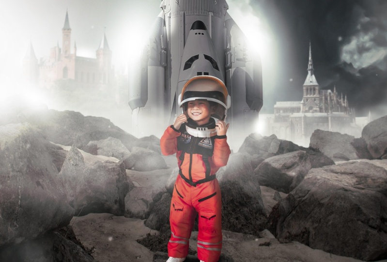
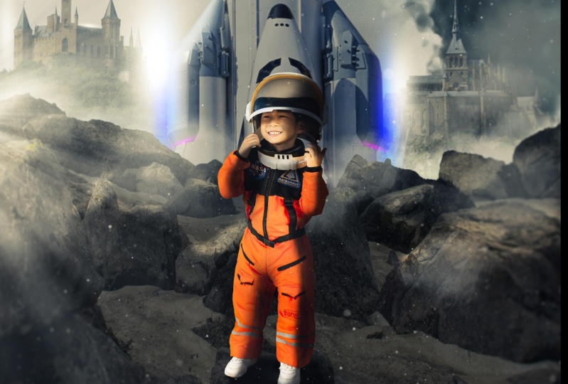
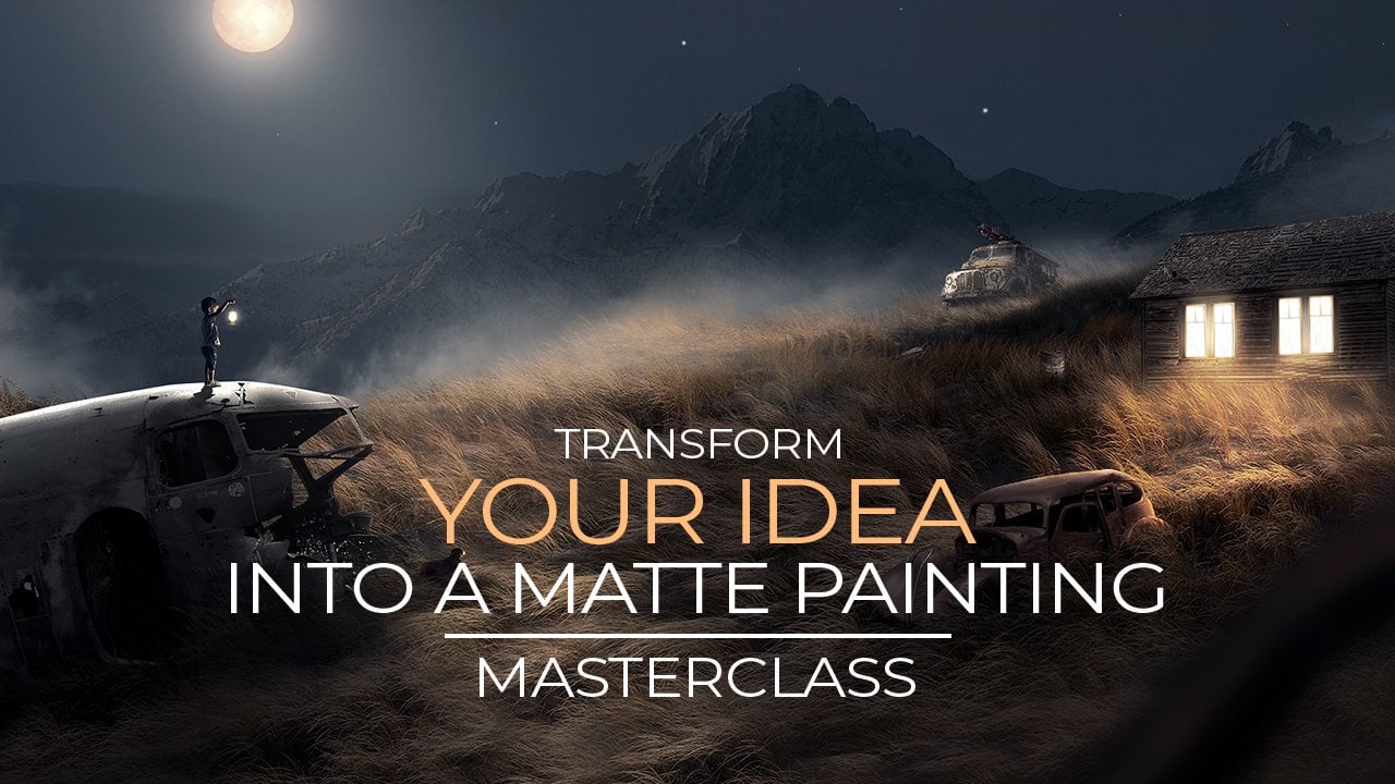
1. Introduction: What's up, everyone, my name is Anya. I'm a digital artist and I teach Photoshop to people. I upload a lot of work on Instagram. I also been featured on the official Adobe Photoshop page, Instagram page a couple of times you can also find more work there because I uploaded a lot of suffering and scan what I create. So in this video, I'm going to teach you how to use these images. You can also use your own images instead of this boy here. And we are going to change it into this one. So it's going to be a digital artwork. Lot of fantasy in this. So you're going to blend this image is better together. Create this whole sitting great depth and all the other special effects and stuff like that. So I will show you all the things you need to also show you how to remove backgrounds from images correctly. So it's going to be a lot of fun. So I hope to see in this class and you will learn a lot of interesting stuff.
2. Removing Backgrounds: Let's start from the beginning. The images that I have here in this class are PNG files mostly. And they don't have a background, which means we don't have to spend time on removing backgrounds for images. These are pretty easy to use. This one does have a background. We will easily remove the background from this one when we get there. And this one also has a background. So this is the image I'm going to use to show you how to remove backgrounds correctly. This is actually pretty easy because it has one color, but I will also show the process of to remove a background if it's a different color or maybe a lot of stuff going on in the background. So you might want to use your own foil for this. I have this photo, you can also use this one. That's all, that's all on you. So let's just start off with this image, with dragging this image into Photoshop and it will open automatically. Now, if you have a photo, death is like one-color background, may be wide or something like this yellowish. You can always go to Select and click on subject. And with Select Subject, it will automatically select or at least try to select the subject that is in this image. And you can see here, it does a pretty good job. If you have an older version of Photoshop, you might not have this feature. So that way, you need to cut out the image itself by using the Pentel, which I will show in a minute. Now, if you do have this feature and it works for an image or you have this image. You can see here it made already the selection for us. But as you can see here, it's not really correctly. There is a little mistake AT selected the image, correct? So what we need to do here is to fix these little parts. Now, if we go to the Quick Selection Tool or press right mouse, we can select the Quick Selection Tool and t we can select plus and minus. Now, if you select, we make a selection. It's going to add some selection to it. If we select minus, it's going to remove some selections. And I'm going to press Control Z or Command Z on a Mac. Go back because I don't want this. I need plus. So I'm gonna make this selection like this. And this is basically what you have to do around the whole image. You have to check the whole image and add a little bit selection. Now you can see here we have some more yellowish here. There is something that you shouldn't worry about. It's better to have extra selections from the background instead of x's minus extra selections from the backup. Because if it's like this, it's harder to later fix. So have some extra background. So it doesn't matter much. Because if you make the selection, you can always brush a little bit. Now, this is the first way to make the selection. Now, once you have this whole selection of your image, you can just go right here to the bottom and click on Add a Mask. And it made this selection. And you can see how easily I remove the background. Now, this part here obviously needs to be fixed because this is the background, the yellowish also this a little bit here. So this is the first part. Now to fix all these little things like this, I will first make the background grades because I can barely see what's going on here. So I will go here and select this and select solid color, the first one. Now, and here, I will take the mouse and click here and drag it somewhere in the middle for neutral color, like gray. Press. Okay, now let's it. If I take this layer here, here we have the layers. If I click on it and hold my mouse, I can drag it underneath it. And that way I will put it behind this image that's above it. Now I'm just to tell you how I zoom out. I hold down Alt, Enter, scroll my middle mouse. Or you can hold down Option on Mac if you're using a Mac. So I can zoom out, zoom in quickly, I don't have to spend time. And if I hold down space on my keyboard, I can move the artboard around, right? So zoom out and move with space. Now, these parts here are needed to be fixed. We can easily do this with the Quick Selection tool like we did before. You can see here it made selection, but it's not really good. So now we're going to use the Pen tool. The Pen tool you can find here, or you can press P on your keyboard. Select the Pen Tool. Make sure you have Parthia selected and not shape because we want to make a path and we don't want to draw a shape now I want to make but to remove it. So first we're going to select the point here. It doesn't really matter which point you can also start somewhere else. But I like to start at corners now and now we make another point here. And if we click and hold the mouse, we can stretch it out like that. The go exactly in the same line is this image. Now, if you hold down Option, I'm still holding my mouse. Now if I hold down Option or Alt, or Alt on Windows, I can take this little anchor point and bring it to the start. And this way I can start over. You can see here, I can start over. And if I don't hold my mouse, or sorry, if I don't hold out here, I can make these curves because the direction it goes, it goes like this anchor point. So if I would do this and all the Alt again, I would have like a really hard corner here. I don't want a hard corner there. I wanted to make a soft round swirl here. So I'm not going to hold out. You hold Alt or Option on Mac when you want to enter the point-like here when you have some part corners, right? So let's do this here. Don't hold out. I just hold my mouse until I have the right direction. So just check where the finger goes and also make that direction with that point. Now at this point I have to hold Alt again because you can see the anchor point goes inside its finger. If I don't hold out, I cannot go there, right? So press here, make this curve out to bring this point to the center so we can start over, right, that I'll be there. Right. So do this around this whole finger. I tried to be as precise as possible. When you do this a couple of times she learn how to work with this end. It's pretty easy. Now we have a really big curve here. So usually I try to see if it works for this one it works. We can open up here again to go back here and close it. Now, when you go to the first again, you just close it. Once you have that selection, press right mouse, make selection. And here you can set the federal radius. So for one pixel, it would have a little bit of a blur at the edge. If you have 0 pixels is going to make a hardcore like you use some scissors on paper, right? So want to have it natural? So I'm going to use one, so it's a little bit softer. Press, Okay, and that's it. And now if you press D on your keyboard, you can bring the course to default. You can see it gets black, and I'll rotate this with black in the background. Make sure you select the mask now and not the layer. So the mask here and press Control Backspace or Command backspace, sorry, we have to make sure the blacks and the background backspace. And that is gone. We made that selection. So this is what you could do for all the parts that are needed to remove. So the same goes for this part here. We need to fix the Talmud and it should be pretty easy to just select this part, make this like this curve. Try to do this precisely. And maybe all the way here, although it out, bring it to the start and just do it like this to close it. Let's see, this was a helmet. I think I accidentally moved piece of cellmate, but it doesn't matter. This is just to show you how it's done. Again, press right mouse feather at one. Press OK, click on the mask to make sure you have the mask. Make sure the background is black, press Control Backspace, and there is gone, right? And if you just select the Rectangle Marquee Tool, you click on this, it makes the selection gone. Alright, so this is the selection we have already. So I already moved the background from this image. So that is pretty easy. Now, let me remove the layer mask again here to show you. So this is from the start again, if this doesn't work for you or you don't have select subject, maybe sometimes you have old version, it doesn't really work that well. Or you have an other image of yourself and you want to remove the background. Just start with the pen tool from the very beginning. So just take the pen tool here, make sure you have part here selected. And just zoom in on the Alt, scroll your mouse and just pick a point somewhere, maybe this corner here. And just hold on space, move it a bit to the left and start with making a selection and go around your subject with this. So this is actually better than using the automatic thing from the shop because this is really precisely, and I always try to use this one. Of course it takes a little bit more time. It's a bit boring work to do, but if you get used to it and if you don't mind spending a lot of time on creating something really cool, then you don't mind on cutting objects out. So I have in this project all these files that are PNG, so you don't have to do this, but I just wanted to show you for this first chapter two, how to remove the background. So once you do this on the image, so for instance you done this on the homepage. I'm just going to go quickly to show you. And you go to the first again, of course you do this correctly, not like me. Now, you go to the first again, you make a selection. You have fit a one radius, you press Okay. And you just make a mask and you Vagrant is gone. So that's pretty easy, but I'm going to remove the layer mask again. I'm going to use Select Subject here. And I'm gonna make my selection like this and just going to brush it quickly.
3. Creating Idea: Now it's time to start with the artboard. Now. First of all, if you had problems with removing this background from the previous chapter, I will save this image also is a PNG file, so don't worry about it. You can also use this image if you want. Okay, Now the first thing after you made the selection is press right mouse and converts to a smart object. So we have like one layer without any masks we can use for the design. Now, let's start with creating a new file by pressing Control or Command N are going to File New. Now here we can select the size we want and all the other stuff. So resolution doesn't matter because we only work for digital. Now, if you work with pixels, the resolution doesn't matter. Now, if we make something like two 160 by 27, 100, that will be fine. This is a portrait size, not too big, not too small. It's good enough to work if you have all the computer, you could also probably broke with the size. Now let's see if this at 72 and all the other stuff. It doesn't matter here, Create. Now, let's go back to the boy and just start with taking this image. Make sure you have this layer selected and just drag it in our new image. Now you can see here is way too big for this image. So we have to resize this boy. Now, if we press Control or Command on Mac and D on your keyboard, you can bring the Free Transform window. Now if you take one corner, you can make it smaller and bigger. And you can see it stays in the right ratio. If you have an older version of Photoshop, it might stretch out like this. So you have to hold down, Shift on older versions of Photoshop, but in the latest versions they changed that so you don't have to hold Shift if you see this going on this strange thing, hold down Shift so it doesn't stretch out like that. Alright, so let's put his voice somewhere in the center here. I think we will put him somewhere here. Let's leave it like this for now. Okay, We now need to import our images. We have like these images here. These crystals will be for the background and these rocks will be the foreground. So let's start with taking these rocks and put them here. Now, this will be our foreground. The boy will be placed on the rocks. So let's first see, let's, let's first make it small like this so we can remove this. And let's put it behind the boys, so just drag the layer underneath it. Now, if we zoom in here, you have a little eye that you can enable disable and this means you're not showing the layer. So if you just want to work with this, you can disable it for, for a couple minutes until you are done and then you can enable it again. So UCI just disable if it's annoying, distracting me. So I'm going to disable this for now and then click on the layer or two rocks. And now we want to remove this background from the rocks. So I'm going to select the Quick Selection Tool here. If you press right mouse VNet, you can select this. And let's make the brush a bit bigger here. It can use the size. And let's see if we can make a selection of these trucks. So I'm going to select them first like this. You can also see here we took a little bit of the background. Probably doesn't matter. And let's just click here a couple of times. If you all done out the scroll gain, you can zoom in and make selection here. You can make the best model on these areas. I'm not sure how this button is called to make your brush smaller and bigger, but it's next to the letter P on your keyboard. So if you press these buttons next to the letter B, you can make them smaller and bigger brush. Alright, so let's do this here. And also here. Oh, if you accidentally took TO parts, press Command Z or Control Z to go back. You can see here it takes too much there. So I'm not going to go there. Let's zoom out. And let's do here. And here. Well, it takes a little bit too much there. So I'm gonna make the brush a bit smaller like that. And you can see here it takes way too much parts here. So I'm going to leave this part out. I'm going to remove that with the pencil. So first let's make the selection. And if you want to remove this again, Let's loop it here. Just trying to do this a bit better, right? So now they're there. Let's leave it like this. It doesn't really matter because this will be the background. Now, I'm going to press here to make a mask. And you can see here this part is gone. We need to bring that back. So I'm going to click on the mask here and then select the brush tool. So if you go here to the brush, select the brush tool. Then go here to the settings. You can set the size. Let's leave the heart and set a 100 percent so we have a hard edge. Make sure you have white here selected and here a 100 percent for the opacity and flow. Now can bring back these parts of edges. Brush here. I can bring these back, right? So let's brush, but they're there. And for this part we need to remove this. So I'm going to take the bird chicken, but change it to black to remove it. And then it's gone. So that's fixed already. And maybe this part here, I can just easily take the pen tool here and make a selection of this. So I'm going to do this quickly. That's been emitted. This is in the background, so you probably won't see that much like that. Make a selection clause. It press right mouse. Make selection. Press. Okay. Make sure you have black in the background and press Control Backspace or commands makes place.
4. Placing Objects: Alright, once you have all these little things down here, you can do this a bit more precisely the night it like this, just don't make don't make these weird corners. Make it a bit like that. So it looks like real works. Alright, we have this waxy now, the next thing to do is to add the other stuff here. We have the boy already in our thing, in our composite. And let's just import our kestrel now. So this will be somewhere in the background. So just take it here and drag it in the background. Maybe like this. I think these rocks need to be a little bit more big. So I'm going to press Control or Command T and make them bigger because we only filled the bottom area. I want to see them a bit more. And if you hold down shift, we can stretch the other bit like that so it fills up this area nicely. Maybe even bigger. Just like that. Take this guest all again and press Control or Command T. Make this bigger like that. This will be somewhere in the background. Now I have another customer may be you can place like to crystals, maybe one there. You can also be creative and maybe have another composite with different places for discussed. I will make this smaller like it's behind it, somewhere there. All right. And let's see what we have here. We have rock, so you have the boy, we have the moon. We have the clouds. I'm not sure at this point if these clouds will work, but I will place them in the background like that. Let's just put in there. Let's make this big, Let's see Just something like this. You can see here this image. Let's see which one is it? This guest WHO as a background. So we need to move this a bit. So I'm going to select the magic wand tool here and just press on this area plus the Delete. Make sure it's a restaurant's layer. First suppress right mouse restaurants it, and then select this area and press Delete. You can see it wasn't a really good PNG file sometimes that happens. And also select this area. Just press Delete, press this and press here. Now go back to your magic wand to select this area and press Delete. And that's pretty much gone. Impress these parts bit away with with the eraser here. Make sure you don't, don't affect the castle itself like that. So that's really easy, fixed. And now make sure to press right mouse and convert to smart object again. Or else when we resize the image, it's going to lose the quality. All right, so this is probably fine. I'm going to leave it like this for now, can always change it later on. Now, the boy here that we disabled, we can enable again and you will be placed somewhere here. And now we can make the composite a bit better. I think we need to move this a bit more up like that. And the boy also bit more to the center. Let's put them on this rock. And this I'm going to stretch out. So I'm going to press Control T again, stretches out just like that. Now, I also have this, this rocket here. Let's see rock V2 rocket to also been a place here. I'm not sure if this is going to fit this image. So I'm going to try, Let's put this rocket somewhere here, like he came with this rocket to this area. So we have to make this Castile smaller or else it doesn't look real, just like that. So if you place things and press Control, T can make them smaller. Let's put this in the background. And let's see, maybe somewhere there and t is somewhere there. Alright, so this is the composite we have for now. So we have to make everything better. Now, let's make this small. So the first thing is to make the composite S as your idea. So this is the idea for now and now I have two, we have to blend this better together. So make sure you don't see these corners here. So I have to place this correctly like this. Now we have to make sure that everything looks nice to blend this better together.
5. Color Blending: To make this look more real, we have to blend everything together. So this means we have to make sure the lighting is correct, the colors are correct, and the quality of the images are somewhere correct. Now, let's start with blending the colors. You can see here the colors are really off. They don't look the same. It doesn't look like it's from the same place. So we need to start doing changes to the colors. Let's start off with these rocks here, down here. Make sure to save your work. I just saved my work just in case. You can go here, file, Save As and save it because if Photoshop crashes somehow you're going to lose everything and you don't want to lose it. So save your work. Now, these are the rocks. Let's create a folder by clicking this. And if I double-click on group 1, the name, I can name this rocks and press Enter, take the rocks and drag it inside it. So if you take it, drag it, ECL is blue stuff going on. It's inside this folder. So it's time to make folders so we don't get confused. Now, the rocks, by clicking here and selecting Use situation, we can change the human situation. Now, if you press this button here, It's only going to affect the layer underneath it. So not all the other ones. So we only want to change the color of the rocks now. So I'm going to press this and only affect the rocks. So first of all, let's take the situation and if we move the left, we can move the colors. If we move to the right, we can increase the colors. So let's remove some columns from it. Right? So this is a bit dark now. It's like evening setting. So we need to remove a bit of the colors. I'm going to bring it like minus 23, something like this. Now let's close this. We don't need this now. Obviously the boys really orange here. So let's also make a folder and name this boy, maybe if you're on photo, you can name this how you want. And click on this again and create new situation again. Now you can see if I do this without pressing this button, it's going to affect the whole thing. We only want the boy. So let's move this one to the left. He's really orange. So what you could also do here is press this button and you can pick a color from this layer. For instance, this is going to show it, okay, he thinks it's red. Now, we can move the red here so we don't really remove the color from everything just from this red. But I think let's use master and move this to the left. It's also nice. All right, so this is already better than the colors. Look already better. Let's move this one. Now, if I click this and hold down control, I can click on this layer and we'll select Automatically or Command on Mac. This is the guest or two, Let's make them up. Castile too. It's in this folder. And just basically do the same situation. Click this again and move it a bit to the left. Now you have to make sure the colors are a bit the same. So first of all, let's use for this other Castile here. Same thing, gusto. Put it in this folder. Create a new situation, press the button again, and move it to the left. And you can already see we have some nice colors that fit this image. Now, this rocky, I'm not sure about this rocket. It's a bit annoying. I think. Maybe you can make it smaller. Maybe probably remove it, maybe it was a bad idea. Let's see. Let's do it without the rocket. It's kinda annoying now. Let's see. All right, so I'm going to move all the stuff a bit up. So what I'm going to do is I select all these arrays by over that shift and movies them, get up and move this boy here, so it's more in the center. All right, now we have did our color blending. Now, this is just for the beginning to make this look more real. And now we can work on the lighting.
6. Lighting Rocks: So the lighting for the lighting, we need to make sure we use the same. Like where does the light come from in this image, you can see in the background the VF shadows here and the light is here. And let's see the other one. This one goes to the right. So obviously one of these Gastel says sliding from the other side. So the best thing to do this is to just watch those images, see where the original lighting came from. Uh, make sure it's from the same place. So for this, I'm just going to go to this guest 0 here to make sure it's from the same angle and go to Edit Free EP horizontal. And now we have lighting from the same side, right? So this will make the image look more realistic to make sure the lighting is same. So I'm just going to do it like that or you can do it with this one. You can also flip that one to make sure the lighting comes from the same size site, right? So this is also k. So I'm going to let see which one is better. Maybe, maybe the other one. I think that always better. So I'm going to do the left one, flip horizontal to make sure the lighting comes from say spot. Let's make it a bit bigger here. Alright, now we can work on this image for lining. So first of all, I'm going to close these folders so we don't get confused. I'm going to create a new folder on top of all the folders, and double-click on it and name this on lighting and lighting. And now I'm going to go here to select the brush tool best, right mouse bristle or press B on your keyboard. Go here to the settings and bring the hardness all the way down. So if a really soft brush, and here we have the opacity and flow, let's leave that at a 100, so we have a good reasonable brush. Now, we need to create a new layer first by clicking this. Now if you make this brush a bit bigger, you can also make it bigger here. And just make a dot like that. Now, if you select the move tool, we can move the data around. Now if you press Control T or Command T to bring up the Free Transform, we can make it bigger like this. And we can make it a bit bigger and play some relighting. Now, we need to make sure we define the lighting will come from the left side here because we have obviously shadows on the right side of these images, except for this one. This boy, does it really have shadow? So we have to create some shadows. Now, let's place this somewhere there. This is where our light, it will come from, somewhere in the background. On the left side to make this look more real. Now we have our lighting spot, now we need to make sure the image looks better. So to correct the lighting, we need to work on everything. So let's first start off with these rocks. I'm going to disable this boy for now so it doesn't distract me. So the rocks here, if we go here and we create a new layer on top of this. So new adjustment layer and select curves. And with a curse we can edit the lighting. So these are the highlights in the curves. You can see here. If I move this to the left, the highlights will pop out. And these are the dark tones. And you can see this in the mid-tones are here. And you can select ranges in-between. So first of all, I'm going to bring the highlights down. And again, we need to press this button so we only affect the layer of these rocks. And you can see here we got some darker, nice rocks. So let's make them like really darker than the original one to this point. Now, if we click on the mask here and we go here to brushes, select a brush tool. We can select the D on the keyboard saved default colors. If you select black. So just switched those, select black. Make sure the pestle and flow here is at a 100 percent and you have hardness at 0, just a soft launch, an old brush, make it a bit smaller and you can brush areas light again. So we have lighting coming from there. So we need to make some parts lighter like for instance, the top parts of these rocks here, like there. And just gently press the top parts bit lighter. And that way we are creating more realistic, darker and lighter areas. Also do it. Maybe these parts, if you wanted to this really possess, you can zoom in and just do it like this. Just pressure bit of this rock slide so they don't get too dark, right? So maybe you want to also brush the sand here. I'm not sure if you want to do that. I'm not going to do it. I just wanted to do this rugs because they are sticking out. It will look really cool at the end. Let's also do here. Let's do bit there. The only part that I'm brushing is actually the top part and the left one because we have lighting coming from the left side and also from the top side because it's coming from up there. So it's going to hit the left side and top side has a little bit here just to make sure these rocks don't get too dark. So do bit here. Here. And you can see this already starts to look a bit better than just dark parts like that. Maybe also bit here. Maybe this area will get sunlight. Bit here. Now it'll do distribute precisely. Now we have this boy, I need to put this boy back so I can see where I need the brush. So these parts are okay. Now once you have done these tougher parts, a bit lighter, Let's see bit here. Once you have made these top parts a bit lighter, we can click on this and we can adjust this. So don't do it like this is too much. So I'm going to make this a bit lighter because I feel like it's too dark. This is okay for now. Maybe this was a bad idea here. Let me break this up a bit back. So if he switched the scholarship can bring it back or remove it. Now, let's work on the contrast of these rocks. So I'm going to create a new contrast layer, and this time the curves again. Make sure to press this and select the midtones here where this thing goes up and just bring it a bit up and down like that. So it's a bit darker. Now let's do the same for the boy now.
7. Lighting Boy: To do the lighting on the boy, we have to do the same as with Iraq. So let's first make sure we select the right layer here and select the US situation above it to create a new layer above everything of these layers. So select cursor again. Make sure to press this and let's make them dark first, like this. Child to be in the same range as the other stuff like this. And just close this one and click on the Mask of it. Then go to the brush again, select the brick brush. And now you can brush parts lighter. So we need to make sure the left side is a bit lighter. I think we made him a bit too dark now, but we can always change it later. So let's first make the left side a bit lighter. Maybe also here. Just some parts that are sticking out that we need to make lighter. So this part here I will make a bit lighter, like death. Here. Let's make the brush smaller here, just like did also here. Here. Let's make his face slider here. So I'll make sure you can see his face and don't want to have it to that. If you have your own father, you have to watch how your photo is. So Let's also make the nasa here lighter. Just like that. This is a bit grade if now, so let's just look real. So I have to go here to the curves, double-click on it, and make it a bit lighter to darker. Now, this is the first step to do. Now the next thing is to create a new layer on top of it. Press right mouse, create a clipping mask. Then go to edit. With a clipping mask. I forgot to tell you that. That's actually the same as this button that we do to make sure it's only working inside this layer. So we created a clipping mask. You see this arrow here. And if I'm going to go to Edit, Fill, select 50 percent gray, press, Okay, it's going to create 50 percent gray layer. If I change the blend mode to overlay, we won't see this layer anymore. But if you're going to use one of these tools here, we will see the effect of this tool. So I'm going to use here the burn tool. With the Burn tool, we can make area's darker and where did those two lighter and we'll respond slow. You can make areas with less color so you remove colors. We want to use the Burn tool here. So select the burn tool, select the highlights here. Let's start off with, let's start off with 50 percent. Now, if you're making this bird smaller, I can make area's darker. You can see I will burst the right apart a bit darker to blend the spin them. So let's start with brushing. You see here shadows in this clouding, I would also breast it that will make the image look cool at the end. Not too much, just a little bit. And also these parts darker at the bottom here. And start with brushing parts darker, especially on the right side because we have lighting on the left side now. It's also MOOC here, bit darker behind them. And here. And just basically brush these parts darker. Also disclosing here. Just to make it more creative. Now, let's make sure all these areas here are darker here. And bit here. I'll see his face on this side inside his helmet. So this photo was really light because it was taking studio. This is a stock photo and you want to make sure you burst parts darker, so we have some nice shadows in this composite. So this is for now file. You can even remove this to check it. And now I'm going to switch to meet those here and I'm going to drop the exposure. This way it looks more natural when you have a final design. So let's bring it down to, let's see, in 2005 is fine year and just do the same with a bigger brush. Just a bit brushing there. Let's see. There they're just a bit dark on these areas again. And less the shadows and job the exposure again. And brush again. If, if you burst too much, you're going to get this red thing so it's burnt too much. Don't don't try to avoid that stuff. All right, I think this is fine for now. The curves I had here, I think it's too dark, so I'm going to increase this again so it looks more natural, right? So that was way too dark. All right, so now we have to move on to the next thing. So we have for lighting for now, this is fine. For now. I will maybe give him a bit more contrast. So I'm going to create the curves again on top of this layer. Press this again and move this a bit like that, just a bit with the mid tones down. So if a bit more contrast. Now, let's save this work and do the lighting for the background.
8. Background Lighting: All right, So in the background we have these guests holes here and also this rocket ship, which I don't know where to place it yet. It's still it later. I have this guest OS here, so I'm gonna move this around. And when you have stuff in the background, it needs a little bit more grayish color, so it's really test to be less, less contrast. So the due this weekend just double-click on this background layer to bring up the layer style here. And if we select Color Overlay like this, you can see here this made Sokoloff late. We can click on the color here and let's pick a color from the background. For instance, this grayish press, Okay? And if you bring the opacity back down, we get, make sure we don't have too much, just a little bit to make it a bit grayish, just like that. And this will make it look more realistic. You can also try this column, maybe think is lighter is better. Now, just maybe in between. This is just to blend this better with the background. Now press okay, and if we press right mouse, copy layer style, we can copy this Layer Style and go to this gusto press right mass paste layer style is going to copy these settings to that one. Now, you can also take the opacity and bring it slightly down. Let's say around 90, don't do too much or else we have like guest so that's transparent. We only want to have it better in the backup. So let's bring it down to maybe 85 is fine. Let's do the same for this Gusto. And this will make it blend better with the background. She can see here it's somewhere in the background. Maybe this was too much. Let's do 99 is fine. And this one also somewhere at nine. Alright, so this will make the background better. These rocks here also need to have a little bit of grayish dentin and background because it looks like it has too much contrast on these areas here. So we could do is take these rocks and we create a new layer on top of this. Press right mouse and create clipping mask. Then go to your brush. You can see if we can brush inside this layer. And now let's pick something like this background where it ends. Slit a bit grayish here. And we can brush a bit on the top parts here. Now let's drop the opacity here so we don't do it too much, just a bit here. And also the flow. And just brush a bit on the stop words. So it blends better. Just like that. Now if it's too much, you can also bring down the opacity London if too much, I just wanted to blend this better with the background. Maybe a bit more grayish. Let's try a bit grayish. Let's see how it looks. This green was better. So try to use this green from the background. It will make this better, just like that. And you can already see the difference here. You can see this goes but in the background, it looks more real for this image. Now, we have these clouds here. I want to move them a bit around. You can see it goes a little bit true discussed away, move it but doesn't matter because you won't see that in the final result. Now, if I press Control T, we can bring up the frequencies from if we rotated like this, we can change the whole Cloud. Now, I want to make it and think something like this maybe. And you can use your own imagination for this. Maybe wanted somewhat like that. Just try out different parts where you like this and maybe we'll find something better than me. I'm just going to move this a bit around to try to make this all composite look a bit more interesting. I think this is fine. Now, we had this lighting here, and let's move it around so it's placed somewhere data. Alright, so this is fine for now.
9. Corrections: This point we have the basic idea. We did a bit of correcting things, but it's time to make things look better. So we still have disrupted here and think I'm going to select this rocket now. And let's put this also in a folder. This will be rocket. If I press Control T, I can make this bigger. Maybe you can place it here. Like really big. Like it's behind those rocks somewhere there. So we still use that one. Now. Of course it looks a bit off now, so we have to change the color of it. So I'm going to use situation again like we did before. Press this button here so we only affect the layer of the rocket. And let's bring the color down here. Like that. Let's also do curves. Press this button again, and let's bring the highlights down. And take a brush. And let's bring up the opacity and flow again to a 100. And let's brush this side beta. Let's make it smaller. Just on the left side here to get some nice lighting. All right. I think this already looks pretty good. All right, Now, we need to make this a bit better. Like I mentioned before, this boy, I think he's too big now, so I'm going to select this whole layer and make them smaller. Let's make them, Let's wait small, bit smaller, like this. The orange suit of him. I think it doesn't really fit this image. So I'm gonna go here, you situation again. And even remove some more color from it. Let's also do the reds here and try to move that orange bit more like that. And this already looks better in this image. Now, let's also draw some shadow for this boy. So I'm going to go here, click on them, layer this one, click the Create a new layer, drag it inside this folder, and take a brush. Let's click on the color here first. And simple, some color from this rock, for instance, make it a bit darker by bringing it down. Press Okay, and then zoom in here and we need to make some, some shadows. So first, let's change the opacity here to 20 and the flow also, so 2020. That is fine to start. Let's make the bursts bit smaller here. And start with clicking. Now when you click your brush, you can see here I made shadows. Now, to make this more realistic, we need to change the blend mode to multiply. And with multiply, it's going to look more realistic. Let's do a bit on this side. So basically I'm just rushing some shadows here. Just a little shadow here to bend this better with this image. And you can already see it makes a big difference. S when you don't have shadows. So here, just these parts like on the right side of his feet. And you can hear I click a lot of times here so I can make sure it's really dark on these parts. And a little bit dark on these parts. Also here with darker here, here. All right, so these are the shadows didn't make this image lot better. Let's also do their bit there. All right, now we have shadows. Let's also make sure he has a little bit more contrast. So I'm going to create curves layer here and take this MIT those and bring it a bit down like that. This looks already better. I think these curves that we did before, this one is still a bit too dark, so I'm going to slightly play around with these to make sure it fits this image, right? I think this is right for now. All right, the next thing to do is these rocks. These rocks can look a little bit better. So I will also breast this again. So you can see I do a lot of things again, because when you do something first time, you have to correct it every time. So it's actually not that simple to just make something and think, alright, it's going to look good. Now you have to correct things. Every time you create something. You can see here are going to correct the lighting with these curves here. I think the top part looks better if we create these parts a lot lighter like there. And the front part, for instance here, will be darker because we are blocking light here by these rocks here, for instance. So these parts will be darker and the background will be a bit lighter like that.
10. Creating Mist: Now it's time to add some special effects like mist and creating depth. Now, the first thing I would like to do here is to create a bit more depth. So we have these guests, those in the background. I want to blur them out to create more depth in this image. So first let's select this gusto here. Then go to Edit Blur, Gaussian Blur. And with regards from globe, we can blow this out. And you can see here, it looks like we have more focus on this boy now, you can set here the amount of blur you want. So I think somewhere in this range is fine. Press. Okay, that's it. Now, let's do the same for the other Castile here. So I'm just going to click on the layer again. Go to filter blur, gaussian blur. And let's give the radius the same because they are somewhere at the same range and background. And you can see already this makes a lot of difference. It looks way more colon now. Alright, so now we can do some other stuff to make this better. So I'm going to close these folders for now. I want to add some miss to this to make it more mysterious. So for this, I'm going to use a brush. And here I have these SS missed brushes. I will link these brushes also in this project file. So you can just install those if you want to know how to install, you go to your brushes and E you can import brushes and there you select that file and it's edit to your brushes folder here. So you can also download a lot of pressures on the Internet. They are free, mostly if you search on Google for free Photoshop brushes, they are a lot of kind of rest. She can download PDF like some beams or other miss or clouds and stuff like that. It's really cool for this. We're going to use the midst. So let's select the midst here, and here we have a lot of different missed. So let's first make sure where we want the MSE. We want a mismatch between the rocks and these guest OS. So these are the rocks here and this is the capstone, so probably between these two layers. So I'm going to create a new layer here first, drag it between these two, and this will be our midst. Now, here we can select a color for the missed. I think we need something a bit grayish like this, like the background. Let's make it smaller. And here we can set the opacity and flow how much you want the midst. Think it's fine for now. And I'm going to press a bit there. They're there. And you can see we care. It's some cool mist in a bag on now. It can also be more creative. You can also add some missed, maybe behind the rocket. Let's see, where is our rocket here? In front of the rocket. Maybe bit here. Great, some mysterious effect there. Try to change the color of the myths sometimes to create a bit more different kinds of columnist may be a bit darker there. Just a bit of variations here. I think this is already fine. Now this is our midst. We can also drop the opacity here to blend this better. Just a little bit like 1890, something like this. Alright, you can also do a bit missed in these rocks here. So a greater than you laid on top of this. And we're going to also do a bit here, like it's going on, on these rocks now. Just a bit there. I think this is too much. And try to use different brushes here we have other versus here. Maybe a bit in the sky here. These brushes have some weird square here going on. So if you accidentally used at the image, just erase it with the, with the eraser. Let's see. Let's try another one. Let's change the color here. Bit o. Something lighter. Maybe this one is nice. Let's make it smaller. All right. I think this is fine for now for the missed I don't want to overdo it. May be a bit more behind him also. Alright, I think this looks fine for I missed. Now. Try to avoid the front here. We have here the fore front. Usually you only see MR. the background and not like close to the camera. So try to avoid these parts here at the front. Maybe a bit here. Not much.
11. Effects: Okay, I think the background can be a little bit lighter, so I'm gonna go here to the background. I have created a new layer here. She can see here, let me show you how to create a new layer in case you forget this, create a new layer. And then take a brush and select the soft round brush again. Pick white is the color. Make sure the opacity and flow is at 100 and your hardness is at 0. And now, if I just click here, I can make this really cool background light effect. I think this is better, so we have little bit more, more contrast between the background and this foreground. So this is nice, this looks better. All right, let's correct some things here. We can also create a little bit of light effects. If we go all the way up here, create a new layer. And then we have this brush again. We can create this light. And now I can just move this around. And maybe I want to create some sort of light effect coming from there somewhere in the background to make this more interesting. So let's create that there. If we press Control or Command J, we can duplicate this layer. And I'm going to move this to some other sides. Just to make this all more interesting to look at, they're just going to rotate this bit there. Just some sort of light effects in the background to make this look really cool. Now, let's also do somewhere there. Let's see if this works. Maybe somewhere there. So basically I'm just placing these little light effects in this background to create a bit more like some lighting is going on there. Let's see if this works. I think this is, this is fine, maybe small here. So basically I'm just copying these live things. Now. This is fine for now. Let's work even more on the lighting. We had this. Let's see, I've a lot of layers now, so it's a bit difficult now to organize thing. This one, this was the big lighting. I'm going to move the big lighting bit here. If I press Control Command T, hold down Control or Command, take one corner, I can stretch it out like that. And I get, put its more into this frame. So let's make this bigger. And now it's going to go over this boy. So we create this really cool lighting in the foreground now, and to also blend this image better. Alright, lets me save the work now again, The boy needs a bit more shadow here. I think we can create a nice shadow of him. So I'm going to find the boy layer here. This one. Let's open up the folder and I'm going to select all these layers, but not the shadow layer here. These are these. So if you hold down Shift, select all these layers. Press Control J to duplicate them. Press Control E or Command E on Mac to make it one layer. Now, if I go to Edit Transform, I can flip this vertical. If I press Control or Command U, I can bring up the UN situation and t I can bring the lightness all the way down. So making black this will be a shadow. Now let's move this layer down here, underneath all those. And let's move them here so we can create a shadow for him. Of course, it doesn't go in the right direction now. So if you hold down, if you press Control T or Command T, we can bring up the free transform again. And if I'm going to pull down Control or Command to make, I can take one corner and stretch it out that way. Let's take this corner now, stretch it out. And let's move it a bit here. It doesn't really have to be precisely just a little shadow to make this a little bit better. Now, let's press Enter. You can see here we can even brush parts. So I'm going to take brush here and bring the hardness up. So for instance, these parts need to be black because this is where it starts and make it like that and like that. So this is probably fine. Just like that. Just still it a shadow. Now of course she does it look real, so we have to give it a bit of a blur. So I'm going to first make a smart object here right now, smart objects. So if we add some blue, we can always change the values later. Now, I'm going to add some Gaussian blur to this. Just a little bit, not much like that. Press Okay. And now if I make a mask, I can brush parts away. So I'm going to brush some parts away. Let's first make sure the hardness is a 0 of our brush. So we have like soft edge. So this is fine. Let's see. Let's worship bit the way. Let's pause here. Here. Just a little shadow. And if we change the opacity here, we are making sure it looks real. Break though basically all the way down. Maybe you can bring back the shadow here. Let's see how that looks. I'm just trying out here to see how this will look for the shadow. Let's pursue a bit there, something like this. Fine. All right, this is just the letter shadow to make it look more real. It's there. All right, now we have a little extra shadow. It isn't much, but okay, it will help it the nth. Now we need to make sure the whole overall image has the right colors. So let's first maybe make this rocket bit smaller. Maybe something like this. And now I have to move this sliding a bit to there. This is fine. All right, so let's move on to add some special effects. I'm going to create a new layer and just take a white brush. And I'm going to take these, place, these little dots. So I'm making the brush bigger, smaller, bigger. Click a couple of times. Smaller, click a couple times, maybe even smaller. So these are just particles it I'm creating now. To make this whole image a little bit more interesting. Let's create some more. Like these are flying around everywhere. Let's do some here. Here. All right, now this is enough, I think maybe bit more here. And now if I press the, sorry, if I change the opacity here, I can make them a bit more grayish. Don't want to see them too much. It's a little bit.
12. Camera Raw: So at this point we are almost done with this. And now the fun part starts where we can change the colors and stuff like that. So I'm going to go all the way up here. I would let's first work on the boy here. He needs a little bit more contrast. So I'm going to click the layer above him, the summer here and then add brightness contrast. Make sure this is pressed so on effective Slayer and give him some consciously feel like is a bit too gray, so a bit more conscious to be better. All right, now let's move all the way up here. Now. If I take a brush here and for instance, may be something bluish, make sure, make sure it's on a new layer. So create a new layer and bring the hardness to 0 and capacity flow at 100 and just make a dot like this. Now, if I change this blend mode to overlay or color, I can make like this color effect in this image. Let's press Control T or Command T and make this really big. And I could, for instance, make this part that a bit more bluish. You can also do offline here. You can see how cool this is to create some cool, like fantasy colors in this whole design. So maybe you can add some color to this lamp, something like this. Let's make it a bit smaller. So let's make the right side, left side, sorry, bit bluish. Like there's something blue going on. Now, if we want to make another color, you can also do another call if you want. Let's change the color here. And make for instance, you on that side, like greenish, just do the same, change the blend mode to fillet and move it there. Now, let's make this big again. And this will make like really weird colors now. So if you want to change this color, press Control U, and just move this, this use light around to another color if you want. So this is if you really want grade something creative, I'm not going to do the side. I'm just going to do the left side a bit bluish. I think I like is when it's blue. Now, let's move on now. Let me remove this. Let me move this really to the left. All right, so the next step to do is to give this whole image more color. So what I'm going to do is I'm going to add a gradient map. And here I'm going to select black to white, like that. Put it in reverse so we can see this better. Press Okay, and change the blend mode to overlay or soft light. Let's do soft light here and bring the opacity down. So get a bit more contrast in this image. Just a little bit. Now the next thing is to add another one. And this time I'm going to select Color Lookup as slick tree strip. And this will give the image color. And this really nice LET can use. Let's bring the opacity down. So I'm not sure about this fluid. It is cool, but it is something you need to decide for yourself, you before, and so I think I'm going to remove it for now. All right, let's go up here, create a new layer and press Command Alt Shift E. So we made the duplicated version of everything. Then if we press right mouse, Convert to Smart Object and go to Filter camera and a camera, we can do final judgments. Now, the color I'm not going to change here. I'm going to play with these settings. So for the exposure, we can maybe bring it a little bit up. Now, contrast, let's bring the contrast first down so it blends better. Because I feel like this looks better now. And the highlights here, let's see, maybe a bit less highlights. The shadows we can make darker by moving them to the left. And let's see the whites. If we increase the whites, we get this nice light effects. Just a little bit more and see the legs here. All right, so the texture and the clarity are always interesting to look because the whole image changes with the settings. So usually I play around with these, the, bring the texture to the left so the image gets more soft. And move the clarity to the right so we see, still see all the details. Now, let's move on. Let's see what we have here, D Hayes, to give it a bit more contrast. Just like that. And let's move on here. Now, we can play with the highlights here again for wanna create some really cool highlights in the background. Let's see the lights here. Let's bring this a bit down. And the darks here bit to the right. There's like that. All right, let's see what we have here. We can do some noise reduction. We don't really have noise. So let's, It's a bit like this. All right, the column mixer is where you can really be creative with the colors. So you can see here his suit was, we leave red, so you can change it here. Of course, his face also changes a bit so I wouldn't mess with it too much. You can play with this with the situation here for the colors. Think we can remove some yellow from the stones. Probably won't need much to do here. Can also play with the lighting here a bit. All right, let's move on. We need some vineyard tenants image, so I'm going to add SVN, so we have more focus on this boy here. And if you go to effects, we can also do some more vignette here. Probably not too much, just a little bit like that. And here you can also be created for the colors. If you want to change the color for sued, for instance. I think this is fine for now. I don't want to mess with this too much. Just like this. All right. Now I'm gonna go to Okay, to save this. And it got a little bit better.
13. Final: All right, So at this point most of the stuff is done to make this better. I'm going to create a new layer and press Command Alt Shift E, and use the blur tool here to blur out the edges between this boy in the background. So this blends better together. So if you do this correctly, go around the edge. It will blend bit in this image, like it's one photo instead of paste it into this like we did. So just go around the edge like this to make the H bit softer like this. So this is just the correct things at the end, you could also do this earlier. I didn't do this because I was too busy with all design. So actually right now is the fun part of everything because you can get creative now with the colors. So let me just quickly do this now to make this a little bit better. Just like that. It doesn't have to be really precisely that make the brush too big, like edit, make it a bit smaller. Right now. To be more creative, you can create a new gradient map on top of this. I have these 105 inspiring be gradients. I will also link these. You can just import these into for the show. And you can see here we can change the whole color of this image. Now, if I, for instance, change this to, let's see, maybe we can do now. If we change this to pin light. Let's see pin light. We can create like really creative caucus. So I'm gonna go through these. The sheep may be a fall like one of these. You can change the whole setting of this image now. So let me find something that's really creative to change the whole image of this. So this is just a personal preference. If you want to get like really colorful stuff going on in design, try out one of these. You can also edit these by just taking these colors and changing them. But I just want to use something that's already here. Let's see three F here. I think we can find something really interesting. I like this one. This one looks pretty creative. So I'm going to use this one for this design. I think this looks really nice. It makes it a little bit my EPI think. And now let's add some curves to this to finalize this. Just moving the slide is like that. You could change the values here to read the change the colors, then green, change this one also if you want to. And blue, I think I'm going to live like this. You can also add color balance to finalize your colors. Maybe you want to add some blue, which you can do here. Something like this. I don't think it's ever needed. Now, I'm going to create a new layer again, you can see how much times I created a new layer and then press Command Alt Shift E again. So I've duplicated version and I want to add a little bit of a blur. So I'm going to go to Blur Gallery and select Filter Blur. And here I'm going to set the blur value to 0. If I hold Alt or Option on Mac, I can copy these settings. So I don't want blue here on a bit of blur here in the foreground. And here, probably here a bit. Let's build this out. And I don't want to learn here just these coordinates with their nobler here. Just a bit there and there. Maybe even more. And this will give effect like we have focused on this point, not on the foreground. All right, I'm going to press Okay here. This is enough blur. And this is pretty much done. You can always just add your own imagination to this and change stuff like I did here with the color. You can play around with that. Change the blend mode here to overlay, sinking, create some nice colors. Just try out different stuff. The best way to learn is to just try out stuff and see how that changes your image. So that is pretty much it for this one. Thank you for watching. I hope you learned something new and try to be as creative as possible and maybe catch you in the next class.
 Zenja Gammer, Digital Artist & Educator