Transcripts
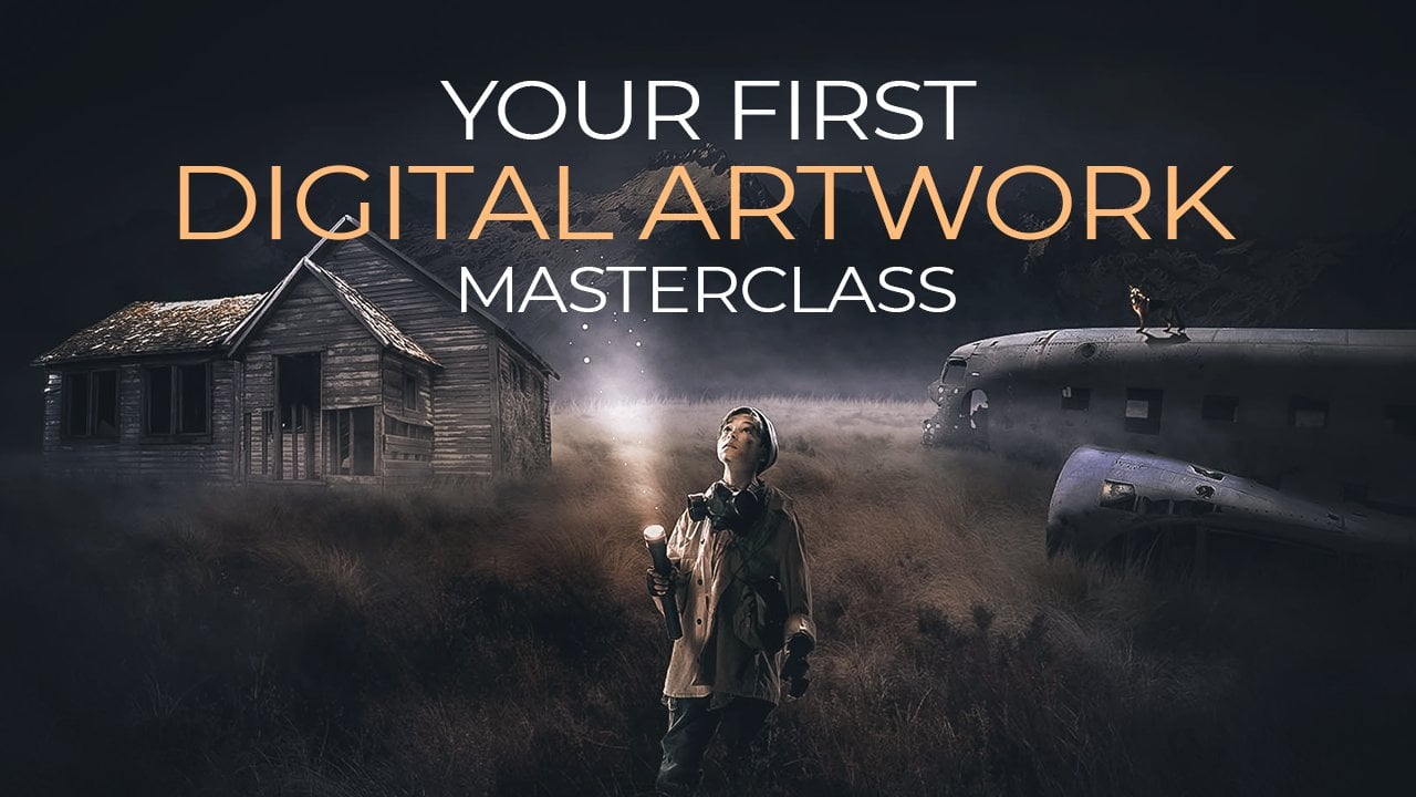
1. Introduction: Everyone, my name is Anya. I'm a digital artist
and I enjoyed teaching people all the
Photoshop skills I learned. So in this class, we will be learning how
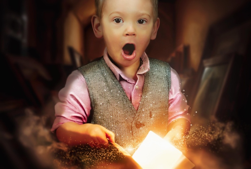
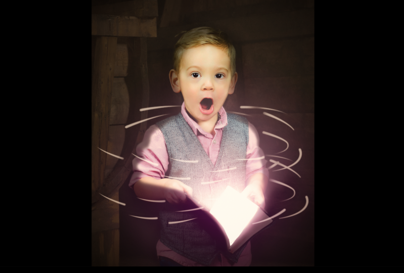
to create this image. So for the starting image, we are going to use this
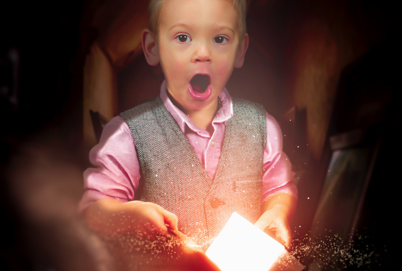
image of this boy here. You can also use your own image if you want. That
doesn't matter. But we are using this one and we are going to transform
it into this. So basically you will learn
how to use brushes here, how to create this
kind of light effect. How to make it mysterious, and how to make your image look more soft and
then the original one. So what we are doing here is we're going to create
this glowing book. We're going to play
with the exposure. We're going to change
the background colors. We're going to do brightness and contrast highlights,
correct thing, special effects, creating
glow and a lot more stuff. So this class is
good for beginners because everything is
really slow explained. So if you are totally
new to Photoshop, this is fine because I
explained everything really slow so everyone
can understand anything. So the only thing you need is Photoshop and all
the other stuff. The images is in this project. So I hope to see
you in this class. It's going to be a lot of fun.
2. How To Use Select Subject: Welcome back to
another awesome video. So in this video we are going to create
something magical. So let's start off from the beginning by
open up Photoshop. And now I'm just going
to drag the image of the boy JPEG into this file. Now, first of all, we need to get rid of
this original background to work with this image. So for these background, It's quite easy
because we have like a one-color background
areas and there is enough contrast
between the background and the boy itself here. So for this, what I want to
do is go to Select subject. And this way for a shop
is automatically going to select the image
from the background. So you can see here, it already made a
selection quite easy. So we don't have to
spend much time on using bento or whatever
automated you are using. Now, let me zoom in here and
see if this is all correct. You can see here we need
to fix this a bit here, and also on this side. So this is something
we do need to do, but for the other parts
it looks quite good here also maybe some
brushing. And let's see. There's a quite a good
job also here maybe. So once you have this, we only have to make mask
by pressing mask here. Now, we have a mask
of our selection. I'm going to put a bare ground here so I can see this better. So I'm going to click on this
one and select solid color. And with solid color,
I could just fill the whole area with one
color in a separate layer. Now, let's pick something great. Something like this. It
doesn't really matter. Drag it underneath
the layer one. And now we have
this behind them. Now I want to see this better. So I'm going to double-click
on a gray and maybe try out a bit lighter color so I can see the H better.
Something like this. This is almost white. Press Okay. Now, for this part, I need to bring this part back. So I'm going to take
the brush here, select the brush tool. Or you can press B
on your keyboard and just take the
general So from Bosch. Now, make sure to list, let's get the
hardness up to a 100. The opacity and flow also here. And pick white as the
foreground color. Now, make sure to click on
the mass of the boy here, not the ball itself,
but the mask. And let's make the brush
smaller n. So why not like yes, and bring these parts back where he made the mistakes
in the selection. This also is a bit weird, but I do think that with matter. Let's see probably here, bring it back here. And there. And see here also
probably too much. Let's look at the whole part. So what I'm doing
now is I'm brushing the original
background back so I can fix these parts
for the Pinto. So once you have the go down here and
select the Pen Tool, make sure you have path
selected here and not shape. And let's start with
fixing these parts now, want to make sure that big on spec and let's zoom in here. I'm going to use the
pen tool here to make the selection a bit better
than the original one. So simply like this. And it's already improved
the cut if we had before. Now, once you have
the selection, just go around with and
close it. Press right mouse. Make selection, leads
the fitter at once. So a little bit of a soft edge. Now, once you have that, just press Control or
Command backspace, Rowen, Control Z, press right. Let's select this
one, the rectangular to right mouse select inverse. So we select them the other
area and the outer area. And now if I press Command
backspace accurate, move it, and that's it. And this is what I have to do
with the other parts also. So again, use the pen tool to the selection is a bit
better than the original one. Just like that empty
clip quickly do this because we don't
have much to do. You could also just use the Pen Tool to cut this image out if you want to do,
it's really precisely, but I don't think it's
necessary for this one because after after sometime they're going to be a
lot of designs in this. So you probably won't even
see these little things here. If they will be Facebook
and I was brushed later on. All right, So once we get to, Let's also do this part here. It's got this little part here. And she's going to
do this quickly. This is always the
boring part of everything that removing
the backgrounds. But it's so important that
we always have to do this. Cannot pick up this one again. Once makerspace
get rid of death. Can see this is probably
the side of his body, so we're going to
leave that one. All right. I'm going to make
the background here a bit darker so I can see is hair better? Let's make it all black. Press. Okay. And to fix the hair here, we can do a little trick
from forest rope itself. So we're going to click on the mask layer and press
right mouse, select a mask. And with the select and
mask, with this one, you can make the hair bit better than the
original cut-out. So these settings, I will just leave them
as the original one. Usually they are fine.
And I just gonna do this. You can see here already improve the hair selection and you get rid of that leg
that we don't need. And also here and here. And with this, you could also do like precise selections
with people's hair or even from animals if they
have like first taking out, do the same with the firm. Once you have the selection, just make it a bit
better with this one. And you can see here, you've got a really good
gotten out of the hair. We even have this hair
sticking out here. All right, so this
is probably a press. Okay, we have our selection
and this looks quite good. So let's make a smart objective by pressing a right mouse on it. Convert smart object.
3. Burning Image: Okay, right now we can start
with creating a new file. So let's go to File New or press Control or Command
N to create a new file. Now the size I will be
using here is 21 6700. You can use a biggest
size if you want to, for instance, use it for print. You can use for 1000
by 5000 pixels. The other stuff don't
need to change it, and let's create it. Now. First of all, I'm
going back in this one and I'm making sure
this is a smart object. I can see that there. And now what I want to do is I want to import
this in the other one. So I'm just going to simply
drag it in the other file. Place it somewhere here. And if we press Control T or Command T to bring up
the free transform, hold down Alt to scrolling
my mouse to zoom out a bit. And let's make this smaller. Now, I want to still want to have him in the center
here somewhere. So I'm going to place
them somewhere here. Like that. Alright, so zooming in, you can see here is, here is a bit messy from
the cut we curated. But I wouldn't worry about
it because this will probably be pretty
dark background so you won't even notice it. And if you do notice it, we can always fix that later on. So don't worry about
this stuff in it here. So let's first of all make the background black by clicking
on the background here, I'm pressing Control I to
invert it or Command I. So this better because I can now focus
better on this boy. All right, so first of all, I would like to do some
brushing on this boy to give him a bit of
a soft effects out. It's a bit more software
equals some pressure. So let's first start with creating a new layer,
pressing this. And go to edit out. Make sure to press
on the layer itself. Go to Edit and select Fill. And here we can fill the
area with something. Now, we use 50 percent gray to use the
Dodge and Burn tool. And that is exactly
what I wanted to. So I'm going to select
50 percent gray press. Okay. Now I want to make
sure it's only filling the area of the boys. I'm pressing right mouse, create a clipping mask. And that way we only working
inside the layer of the boy, as you can see with this arrow. Now, let's change the blend mode here from normal to overlay. We won't see it. We only see in what we're doing
with the tools here. Now, for this one, I'm going to select
the Burn tool. And the burn tool
you can find here. We making areas that
are first of all, I want to make the
shadows of him darker. So I'm going to
select the Burn tool and go down, go up here. And first two highlights
and bring this a bit up. He's pretty light in this photo, so I don't want to do too much, just a little bit of brushing. And you can see here, if I do these dark areas, uh, giving them a bit more shadow, we have like a pretty dark image when we are finished
with this creation. So I wanna make sure that areas are a bit darker than now. Pretty light now, this photo is I think it is in a
photo studio maybe, and it has a lot of light, so we need to make sure we
have some darker tones here. So let's first do especially
the stuff behind him. So like when you go to the back side of his
head of his clouding, those places need
to be a bit darker. So let's first do also here, Let's also these here, here. And you can see here
like for instance, this clotting is goes like this, and I'm always trying to
brush this darker areas. Same goes for this area here. Here. Here. All these little things
here that are shadows. You might wandering
by Buddha braces. I can barely see it
well, at the end, when you are finished with
everything and you have brushed all these
sponsor bit darker, you, you're gonna get
some really cool effects to make this more magical. So first of all, let's make sure to
brush all these spots. Now, if I compare this
before and after, because here we get
a bit more shadows. Now what I'm going to do now is I'm going to switch
the midtones. And I'm basically
going to do the same. But the only thing that changes is the exposure we're
going to jump to, let's say 25 or 30. 25 maybe. Let's try it out. Let's do 30, can barely see it. And I'll do it on 30. And
I'm going to do it again. And now you can see it a bit
better because we're doing the maintenance now there's
a lot more mid-tones here. So Eve, especially
these parts here, let's do this again. You can also make
the brush a bit bigger and a little bit there. Especially these here
on this side here. Don't do it too much, just a bit darker
like I'm doing now. Because if you're
doing too much, you can see here,
if it's too much, it's just gonna get rid. I don't want to see
that with coming. So if you see a skin gets red, it's already too much. Just go back with control
C and D with a bit less. So try to avoid that threat. Now let's compare the
before and after you get C here we get some
nice darker tones. Now, let's do shadows for now. And again, let's
chuck this exposure. And this time I'm going
to make the brush pretty big because I don't
want to push too much. Just wanted an extra
bit of shadow layers. Shadow brushing. Especially these parts here where it goes to the beginning, you see we get this
really cool effect now. Like there might be an
a here with his hands. And these parts, you
can barely see it because it's all
highlights here. Now, I think this is
enough and you can already see this effect
that we created. So the image got a bit softer. We can always jump the opacity here in
case it feels too much. But for now, I'm
going to leave it at, let's say 90 to keep it a lot, but not at a 100.
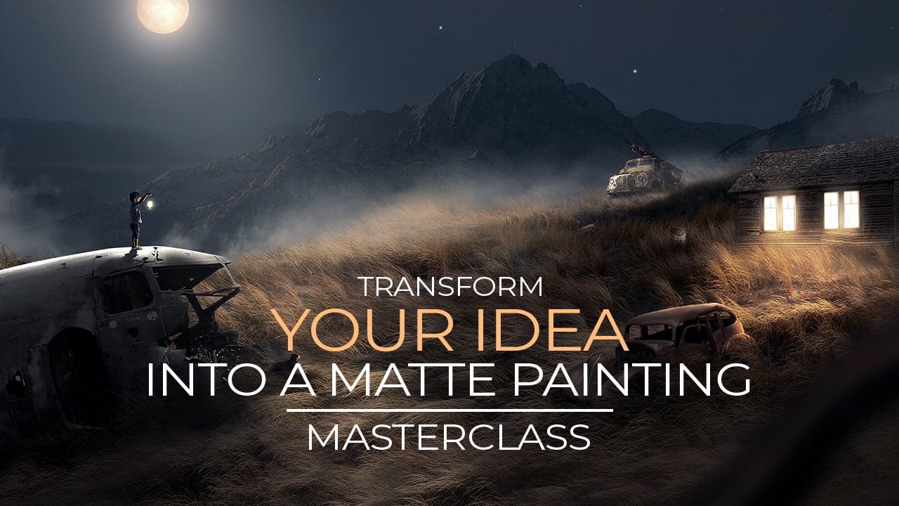
4. Glowing Book: At this point, I would like
to work on the book itself. The book is going to get
some magical page in it, which contains lighting and
some fantasy stuff going on. So that's why E is
obviously surprised. Now, I want to do this effect now so I can have an idea of what I'm
actually working on. So let's start off with
creating this light effect. Now, first of all, you can see this book as text. And if we have some
light effects here, you're not going
to see that text because it's really light. So let's get rid of that
text first by creating a new layer and pressing right mouse and creating
a clipping mask. So we're working
inside this coil. And again, I'm
going to fill this with 50 percent gray like
we did with the other one. Press Okay, change the
blend mode to overlay here. And that's it. Now. And
instead of the burn tool, now I'm going to use the Dodge tool because what it does show, if you remember this, we are making a real slider
instead of darker. Now, let's try up midtones and C. And this already
makes the page white. Now let's just
brush it like this. Maybe we can even increase
the exposure here. So it's even more. Just like that. We simply brushing
all the pages white. Now, it doesn't matter if
you go over the edge here because this is actually a light source that
we are creating now. So you probably going to see some lighter pages on
the other pages also. So let's just brush it like
that and that is gone. Alright, so let's now
create the life itself. So for the light itself, I'm going to create a new
layer on top of this. And what I'm going to do now is I want to make a
selection of the book. So I'm going to select the
Pen tool, which is here. Now, make sure you have path
selected here and not shape. And let's start with taking
the page of this book. So only this page, I want to make a
selection of this page. So I'm going to go
around the edge. To make a selection
of this page. It doesn't have to be perfect. But let's try to do a
little bit of perfect. Now, if you remember this, I will use the pen tool
from the other modules. It's pretty easy when
you use it a lot, you get used to it like that. Now, this doesn't mean that now, if we press right mouse
and make a selection, we are going to
create a selection. But it's made a selection from the other sites or not the page, but all the other stuff. So I'm going to select
the marquee tool here, Rectangular Marquee Tool. Press right mouse
and select inverse. And now make sure your
background is set to white and press Control
Backspace to delete it. And now we have
this white stuff. She can see here if I move this, we have this thing created. Now. I just want to blur
this out first. So let's go to filter blur, gaussian blur, and
Gaussian blur. We can blow stuff up. I can already see we are getting some cool light
effects from this. Now. I just want to have this a little bit
around the edge. So I'm going to
leave it like this. Now, for the next one, I would like to
create a new layer. And I'm going to select
the brush this time. Make sure to have white
selected as a color, not black. And if we go to the
Settings Share, make sure it's the
general brush soft round. Hardness should be
at 0 and the opacity and flow at a 100. And if I make this bigger with these two key keys next to the
letter P on your keyboard, it is between the
P and the Enter. And if I make this dot here, then take them move to, I'm going to put it here. And now I want to make
some sort of a light beam. So we're going to
press Command T or Control T to bring
up the free transform. And if I hold down control, I can stretch it out like that. So I'm going to zoom out
here with holding down Alt and scholar mouse and
take the other canal, so maybe rotate it a bit. And this is fine. Now, we can always
change this later. I just want to have a basic
idea. You can move it around. Now. The glow, it shouldn't come to the bottom because
the book is facing upwards. So we need to get rid
of some of the glow. It's a bit too much now. So what I'm going to do is
instead of brushing it away, maybe I wanted to bring back the glow later on
for some reason. I don't know. So I want to make a
mask of this glow. So let's go here and make a
mask by pressing this one. And now if I take a black brush, I can brush some stuff away. So let's make it smaller
so I can precisely, so the bottom part here, I will brush away like that. So leave it at the original. We have to brush it here also. And here. So only one to go this
go blow up like that. And that's already better, so we don't have anything
glowing on the bottom side. Alright, now we can try
to maybe rotate it the better you can move this. I'm layer around. So if you move this around, it's also going
to take the mask. But we only want to move the
party that's in the mask. So you have this thing here, this icon, this means it's
locked with the mask. If I press on this, it's going to remove
it and I can move this inside the mask so it doesn't
move the whole thing, just the layer inside it. So this really good
to use sometimes. So I'm going to move
this a bit around. So Baby bit to the right, maybe rotate it a bit like that. The third got
something nice thing. This is nice and I was
shy to lock it back in, so I don't forget it later on. Now, let's brush
a bit more here. Maybe make this
light go it there. Just like that. Doesn't
have to be too much, but we are getting some
nice light effects now. And we can jump the opacity. Maybe, maybe it's too much. All right, so this is
our face light effects. We will improve it later on, but we have our first thing, let me brushes bit better here. We have our first light effect, and later on, I
will improve this.
5. Exposure: All right, Let's start with making some more
shadows on this boy. If you haven't saved
your work yet, don't forget to save it as a Photoshop file in
case something happens. Now, let's start
off with creating a new layer on top of these. And the layer I want to
use now is exposure, which you can find here. So great. These on top of these layers. Now, don't forget the
press this again. So we only affecting the board. Now, let's take the
exposure and bring it to the left so we can make
the boy bit darker first. So we still want to have
like natural shadow. So if it's going
to get too dark, it's not gonna look natural. So I'm going to
do this slightly, maybe to something like this. Let's do it like this first. Now, obviously we have this book now that
is really light. So we need to make sure that we are getting some light on
this boy from this book. So let's click on
the mask here from this layer and then
select the black brush. Don't need this for now. And make sure it's the
soft round pressure again, the opacity flow at the a
100 and the hardness at 0. Like always. I think you're getting
used to it now. Let's start with
bulging areas lighter. So the book is here, the light is going up. So these areas will be lighter. So let's just gently
start brushing here. Like his hand is going over. So this part will be light and this part underneath
it, it will be darker. So let's make the
brush smaller year, maybe not so small. Brush bit there,
just like there. Maybe a bit less. And
let's also brush here. Year. This is just the basic
idea to get the lighting. Some basically just the front
side of him get slider. And the backside there
will be a bit darker. Now, let's see, probably
hear some light, maybe bit darker behind this. And some lighter here. Is phase will always
also be a light. We don't want to
make its face dark because obviously we
want the C S phase, for instance, these
areas behind them is air that we can leave the UK. Now, let's brushes phase slider. I did, and the stuff that's in the background
leave it a bit darker. Now let's see here we have his hand That's gonna
make the brush smaller. I'm going to choose
bullshit like that. Try to make some
movement so it's not like one thing the
same as the edge, but like a little bit
of movements like that. Okay, I think this is enough. Maybe hear a bit
more. Let's see. You can always enable
the same list to see which areas you
forgot the brush. Let's leave this light or
else it gets too dark. Let's see something like this. This would be probably
bit darker here. So maybe we need to try to have one side of his face a bit darker so we have
some more shadows. But this is a bit too much. I need to reverse
this like that. Just a bit in a
background thing this already looks pretty good effect compared is before and after. We already have some nice
shadows in the background. Maybe this part is also darker. Let's push this birth
bit darker like that. So try to bridge these parts and switch from white to black to either remove it or bring it back till you got
something nice. It doesn't have to be perfect because this is
still for the shop. So obviously it's not real. But if you have some
nice shadows going on, DOT image cannot be
interesting to look at. Maybe some bit of movements
from his hand here. Just like that. All right. I think this is an enough may be a bit
lighter here because his fingers up getting
light air, they're there. I think this is fine now. I can always change this later
on in there for a month. So if I'm opening
up this window, I can even make it
darker if I wanted to. Maybe a bit darker. And let's see, not too
dark. I think this is good. I'm going to leave it
like this for now.
6. Background And Colors: Okay, right now, I want to add a background into this image
so I can see a bit better. But the final result
will be usually I do backgrounds at the end, so I can always switch him. But for this one, I would like to do
it now because I feel like we are
missing some big round here to actually doing some
changes to the boy itself. So let's start with
adding the background. So simply click on the
background here and drag the background
image into this file. Now it's just going to
place it behind them. Now while holding Alt, I'm going to take
one corner here and tried to find a nice spot. Our one, this image. So maybe he's standing here and he's in some
sort of base month. So try out some
different composites, maybe you can also make it, we'll bake and only use
this part for instance. But I would like to see a bit, I would like to see a bit
of depth in this image. So I'm going to try to see some stuff in
the background here. So let's make it a bit smaller. We still need to make
sure it looks realistic. So if the photos like this, it looks a bit weird. So I'm gonna make sure I
don't see the flow here, so it doesn't look weird. Now, let's move this way. They're going to make
it even smaller. Maybe some light from
the floor there. Let's see something like
this. I think this is fine. Now, once you have the
background as you 12, or maybe you have your own background,
doesn't really matter. I'm using this one. Press Enter and it's placed. Now, we need to make sure the
colors are blending well to get it in this form because he's obviously way too
light for this. Now, first of all, let's make sure the colors
are a bit the same. Now the best way to blend things together is
to just get rid of most of the colors and later on just color lighter image. Now, let's make sure we get
rid of some of the colors from this boy because he
is also a dark scene. So at the arcsine, she won't see that much color. Now, first of all, let's make sure we are here
on top of this oil layer and click on this one and
select Hue in situation. And with you in situation, we can drop the situation. Now, wanna make sure we only
affect the boy for now. Let's press this.
So don't forget that and drop the situation here so we can make them a bit
more to black and white. Something like this. Also here is clouding here. Maybe we can change the color. So if you want to change one color in this
image, for instance, this pink shirt here as on, I want to change pink. I'm going to press
this one here, and it's going to sample
the color I click. So if I, for instance, want to change the score,
I will press this. And I would then
click on summer where it's visible,
discolored like there. And you can see
here it picks red. So this is read what is big, but it's also the
color of his skin, so I wouldn't mess
with it too much, but you could just jump in
a little bit like that. All right, let's move on to
the color of the background. So I'm going to click
on the background now. And I'm going to add some US situation also
to the background. Now, also press this
and don't forget that. And let's drop some color from the background so we have a bit more black or white thing. You can also play
around with these, maybe on a bit more greenish. Let's try out this,
how this looks. Maybe a bit more to
the right like that. Alright, so this is the
first step of the colors.
7. Brightness And Contrast: If you look at this image, it feels like he's
way too light, still too light for days. So what we have to do
here is we have to change the brightness and the
contrast of this boy first. So we can simply do that by clicking on these adjustment layers we have from this boy, so going up all the
way to the top, but the last one here, you can see that as the arrow. Let's add a brightness
and contrast. And with the brightness
and contrast, we can simply adjust the brightness and
contrast of this point. Now, don't forget the
press this again. I wonder why for a ship doesn't
have an automatic thing, that this thing is always crest because I always use that. So don't forget this thing. Now, let's do brightness first. Let's drop the brightness
because he's way too bright. And you can already see when
we dropping this brightness, he blends lot better
in this kind of environment that PDF now because we have a
pretty dark room. So let's run this. Now. I want to have a bit
more contrast because I see the black tones there
are a bit darker than here. So I'm going to
increase this one. You can crank it all the
way up if you want to. And you can see it
gets real punchy now, but I tried to leave that
final adjustments for the end, so I'm still going to
leave it somewhere there. So not too much. And now I need to play
around with these to find a nice area where I want this. Let's see, I think something
like this is fine. Now press X to close it and we are
finished with this one.
8. Highlights: Okay, So at this point we have, is a whole body face darker, but I still want to
have some highlights because we have this
really glowy book. I wanted to create a bit of
a highlights everywhere. So for this, I'm going to go here again and
create a new layer. Now, this layer will be a 50
percent gray layer again. So I'm gonna go to Edit, Fill and again select
50 percent gray press. Okay, and don't forget to
create a clipping mask. Now, change the blend
mode to overlay again. And for this, we are going
to use the Dodge tool. So for the mantle, we did the
dark areas for industrial, we are going to do area slider. So Let's start off
with the dodge tool. The lighter areas,
select midtones here. Summer range 41 IS 41 at
this would be finite thing. Let's try it out so you can see this cloud is sticking out. So I'm going to brush, this part is sticking out a bit smaller brush
here like that. And you can see here I'm rushing like some
sort of a rim light. Maybe not so much, just a bit. Now, let's also do this one
there and there, and deer. And this will create
some nice effect at the end when we are
doing final adjustments. So we're getting all these
highlights then at the end. Now, maybe a bit
less exposure here, so it doesn't get
too wide just a bit. Also, there may be, there are these kind of
things that are sticking out. Now, for instance,
here we get brush it. Also brush this one. Just the edge of
this clause here. He has maybe been there, maybe this button here bit. And with brushing
like little parts, we're getting some
nice highlights. Lights wrong. Maybe
also is hand EBIT year. Let's see how it looks. Also these clothing here. I said this before at the beginning that
when we are bursting, first the dark areas, it will look better at the end. Well, we don't, we don't
forget the lighter areas. We also have to brush. So that's like two things. You have to bridge
the dark areas with the Burn tool and the lighter areas
with the dodge tool. So just a bit like that, it doesn't have to be much. Now if I compare this
before and after, you can see here, we get
some cool highlighted areas. Now, you can really
go crazy and do it on a lot of places you
can also do is face. But it's going to look less natural if you do
it way too much. So you have to find a
better is if you want to have a real like
photoshopped image, you can also do is
ice here, white. I'm not going to do it, but
they're just showing quickly. Or for instance here, but here I would definitely drop the exposure so it doesn't
get too, too light. So maybe bit here. Not too much. Or else we are rolling
This boy is phase. Let's see, Maybe bit there. You have to do it a
bit more precisely. They are not going to do it. There are also I'm
going to ruin his face, so I'm going to
leave it away here. Maybe only it's shinier bit. So if you want to be
precisely, go ahead, try it out, see what it
should look like on skin. Tried to do it like
slightly on the edge. So I'm not too much. Let's see the Dutch though. I think this is even
enough what I have now. Maybe a bit more here. Let's see, maybe a bit
there and some maybe there. All right, now you can see this really good clothing
where you brushed it. So before after we get
some nice highlights, every bit of his face here. All right. I'm going to leave it like this. I think this is fine for now. Later on, we will
see the difference when we are doing
final adjustments.
9. Correcting And Organizing: Before we continue
with the next, the next chapter, I'm going
to do some corrections. It's always good to do some corrections while
you work on something. Because at the end you're
going to get so much layers, it's going to be difficult to try and find every little thing. So at this point, we still
have organized layers here. We can still see everything. So it's good to do
some corrections. Now, the corrections I
would like to do here is to check this book first, this glow here, and that's
so satisfied with it. It looks a bit too soft for me. So what I'm going to do
is I'm going to disable this blows for now
just this year. So I can see it. And you can see here
this is the Exposure laid at we pressed, so we have to press
this light again. So I'm going to click
on this one, the mask, and I'm going to make
sure that this is white because this is
obviously our light source, so this has to be light. So let me do this a
bit more precise here. So we don't see some
weird stuff going on. So just like that, Maybe a bit also
the other pages. So bit lighter. This will be better at the end. Now if I enable this again, Let's see, this was
the first glow. I'm going to play with
the opacity here. Let's increase the opacity. I think I like this color. It looks really,
really punchy here. And this one, Let's see, in this one is a bit too much, I think so this one, I would probably drop a bit, something like this
and you can already see it looks a bit better. Now, I guess you some glow
going on at the bottom. So I don't know if you
have this in your version, but when they say, well nevertheless, I'm just checking if I see
everything right. So maybe get rid of the glow
here to need it in his face. Because his face
is already light. Now, this already is better. So these are little
things that I'd like to do where our post stuff. Let's see if it might
be bit like that. If I correct this stuff now, later on it will be easier to
have a better at this time because obviously we are
gonna get a lot more layers. So let's also put
these in folders. This is the boy. So I'm gonna hold down, shift and select
all these layers, and then press Control G or Command G to put it in a group. And this will be the boy. And let's do this
one also, Comanche. This is our background. So you have a bit of
organized file now.
10. Special Effects: Let's create some
special effects. Now. For special effects who we could add some mist coming
out of this book. For instance, for missed, I have brush called
SS missed precious. And I cannot link this in this project because
those are not my brushes, but I will link the URL
where you can download them. So this is on Deviant Art. It's from someone else,
from another author. And he has this
honest Deviant Art and you can download
it for free. So just check the link in the description where
you can download this. So once you download this file, just simply unzip
it and then go into Photoshop and import
brushes here. To import these brushes, you could also use Google to search for free missed brushes, for instance, that also works. But I think this marshes S is Ms. Bursts are really
good Miss brushes. That's why I use them always. Now, let's first go
to the SS MS brushes. And you can see you have
a lot of brushes here. And we can simply
just pick someone. Some of these. Now, they meant to press that. Let's create a new layer on
top of all these layers, and this will be the midst. So let me see how this looks. So if you click on mist brush and you move your
mouse to the right, you can see how they look. So I wanted to make sure it's some nice miss versa,
maybe this one. Here we can set the
color for the brush. So if I click on the color, I want to have a bit. Let's do it a bit. Like really yellow, wish, Quiet, almost the white,
something like this. Once you have the
color press Okay, and you can just click
anywhere in here for missed. Now, be aware bit
if you are pressing here and you have missed
what you want to move it. If you're going to take the Move tool and you're
going to move it. You can see this edge here. It's not so nice. So make sure to, if you want to
place and move it, maybe get the big, a
bit smaller like that. And if you press
Control or Command T, you can see here it doesn't go to the edge, so this is fine. I can now move it and even
make it bigger or smaller. So let's play some myths
around this book like that. And it even looks like this. Mrs. go on around them. Now, let's create a new layer
and let's try another one. Let's see what we have here. So there are a lot of
these verses here, just trying to see
which one a month. Maybe something different. Let's see. This one is too strange now. Probably this one was pretty good that a head the first time. Maybe this one. Let's make it smaller. Now. This is fine. And now I can just place it
where I wanted to. Don't do it too much
through it a bit. Like reasonable. Because if you're going
to do it too much, it's going to be to miss the night you don't
want to miss. You can see already
this is a bit too much. I'm going to remove that one. If you take both of these and press Control G to
put it in a folder. And now we have a
folder for mistake. Let's call this mist. So play around with this. Now, the next effect
that we could do is to, let's create a new layer. And I want to create
some sort of sparkles. But for this, I could just use a general brush and
make it really small. Let's take white as a color. I'm going to make the
brush really is one. Let's zoom in here a bit. And I'm going to
place these dots. If you make them
small like this, make the smaller,
bigger, smaller, bigger. And just play some thoughts around the guy can barely
see it in his clothing. So I'm going to play some here. Here. Don't make them too big because they're going
to look not real. So place some dots
there, there, there. Once you have some of these, you can simply just press Control or Command
J to duplicate this one and just rotate it so you don't
see a pattern somewhere. And now we have even more. You can duplicate it one
more time if you want to. And other time are many
times you want actually. So if you want to
have a lot of these, the sparkles gone or you
can just duplicate this. I'm going to move them a bit to the center so they
don't go death much out of this book on and
make sure they are looking like they're coming
out of this book and not from the side somewhere. So make sure they are
looking like the gone up. Maybe these here with the
blue write like that. Just some simple extra effect.
11. Changing Colors And Particles: Okay, Now if we
look at this image, it feels like it's a bit bluish. So I wanted to make it a
bit more red, bit warm. So the easiest way to
do this is to go down here and select Color Balance. And with the color balance, we can change the
colors of this image. Now, here we have
the red Tennessean. If we just move the
slider to the right, you can see how this
changes to red. So before, after that
got a lot more warm. I feel like this is a lot
better than the bluish. Now, let's add some
particles to this. I have this image particles. We can just simply drag
it here and put it there. Now the only thing to
do here is to change the blend mode here
from normal to screen. And it already is transparent
because it was all black. Now we need to make sure it's black and not the dark blue. So I'm going to add a
levels here. Levels. Don't forget to press this. And I'm going to
take the black one here and define
where is the egg. So this should be
black and blue. And I'm going to click there
and it instantly removes it. So that's really easy to make something real black
and not like dark blue. Now, these particles
are also bluish. I want to have them like
not blue but just white. So I'm going to add
a huge situation to them and simply take the
situation and bring it down. And you can see they
are instantly not black anymore and just more
like yellowish, whitish. Okay, we can see here, there is still a bit
feasible from background. So the easiest way to fix it. Little thing is to
just make a mask. And then they can black
brush and just make sure you have the hardness at
0 and just brush this away. So sometimes there's
still a little bit of areas left that are
not really black because we have
this glow gone on. So easiest way to fix
it, It's like this. Now, let's try to put these particles not in
his face, but somewhere. I'm first going to put
this in one folder. So I'm pressing Command G to put these in a folder and
this is our particles. So we have a pretty organized
for now, so that's good. So if I want to add some
other stuff to this, I can easily just edit and I can see
everything I have here. So let's first put
them somewhere there. Maybe press Control
T to bring up the free transform and take
the corner and rotate it. Let's put it to the pages. So to say maybe
something like this. This is how you
want to show here. You can do some creative
stuff if you want to. But I think I like this.
I think this is fine.
12. Chang Glow Color: Can make this glow bit more magical by adding
some color to it. Right now we have a white
kind of glow going on here. We can make it
more orangey like. So let's make a new layer
on top of everything. Let's also put the particles
on the color balance, so they are also in
there, that one. So let's make a new
layer for the color. We need to pick something, something really
colorful, bright. So I was thinking about bit orange because we have
now a warm image. So orange would fit
good for this one, maybe something like this. You can copy these settings
if you want to press. Okay, and let's take
a breadth-first. Now, let's make sure the
hardness is all the way at 0. The software on general brush and the opacity,
a flow at a 100. First I wanted to make I dot. I'm going to make a dot in
the center of this image. Let's see somewhere here. Just make sure if
you press Control D that the edges are inside this image and
not over the edge. Because if you remember this, when you go over the edge, it is you're going to get
this heart a hard edge. So I'm not like this,
but someone is centered. It's incentives image. So you can just make a
dot first like this. And let's place it here. So here will be the globe. And if I change this to overlay, you can immediately see
we get this orange color. Now. We can press Control T and hold on Alt and
make it bigger. We can make this really
big if you want it. So if you want like a really
cool kind of orangey glow, you can make this rubric
if you want to like this. Maybe you wanted to like this. This looks pretty cool. But maybe it's too much
you are thinking, Oh, he got, so orange
maybe should be less. You can change the opacity here. So this is really
something dead. How you want your
image to create. If you want real
fantasy kind of image, you can go crazy here. And you can also press Control T and maybe
stretch it out like that. So it's phase also gets
orange if you want some really orangey stuff. But I think I like to have a bit of a bell and so I'm not going to go
for a 100 percent. I'm going to go for let's see, maybe somewhere around
60, something like this. Also tried to change
the background from from light to dark to see
how it looks on your, on your eyes when you have a darker and lighter background. So usually I switch
around these. Sometimes I checked black. I think this looks pretty nice.
13. Background Editing: All right. If you remember, before I said, I like to have the bare ground at the
end of the creation. Now, this is a perfect time to start experimenting with
different backgrounds. So I have found
another background, and I want to try this one out. So this is big round number two. I'm just going to go here
and I'm going to disable this background for now to see how this image will look
with different backgrounds. So the best way to do this is to try out different
backgrounds. You will see immediately death. Sometimes image can
improve a lot with just simply changing
a paragraph. Now, I have this background
now and I want to input a, so I'm going to input is
here and hold it now, I'll make this bigger. And I think this is a lot more depth
then the other one does look so super interesting. And I think this is a lot
better than the other one. Now, the only thing I don't want to see here is that room, that window in the background. Because if we have
that winner there, we will need to create
some lighting on him, but we made him dark
in the background. So I'm going to make
this a bit like death. I'm holding down Alt and
Shift and stretching these to make this room
are paid more flat. So if I can stretch it out, you probably won't even
see that there's a row, there's a window there. Because we also kinda
make this a bit darker. So I'm going to do it like this. Now, the next thing to do is
to make this a bit darker. This is way too light. He is, he has to be, has to
have some darker back. Wow, so let's add
some curves to this. Curves, make sure to press this. And let's disrupt
these highlights. And that's also the midtones. So we have some darker
shadows even more. And now I can just
play around with this. And let's see, maybe
something like this. So try to play around
with the curves. If you make like this
little curve until you've got something
that looks really nice. Maybe, something like this. If you bring up deeds, he
can bring up the highlights. So I'm trying to
find something nice. Let's change this
to another color to try out how they seize. Maybe something like this. Not too dark because we still want to see what's
going on there. But I just want to make sure
that it's barely visible, that there is a window. I don't want to see
a window there. And the next thing to do here is to blur this background
that bit out. So we have more focus on the
boy, I think this is nice. Now if we want to blur that out, we simply using blurred, if you can find here with blurs. Now if you want
to use Lens Blur, we have to rasterize this layer. But I don't want to lose
the original layer in case I later want to go back
and change something. So what I'm going
to hold down Shift, let's say these
words and pressing Command or Control J
to duplicate these. Now let's take these two. Hold Shift and press Command
G or Control G to group. And let's call this backup
BG Becker background. So I guess I want to change later on month ago bag
economics go back. So now we can rasterize this layer by pressing
right powers or SSRIs. And if we apply a blur, we can now apply less blood. So we have to find a range debt. Looks nice for this. Let's see. I'm just going to
make this a bit smaller and compare
this with this image. So once I have these,
we probably don't need. We only want to play
with the radius here. The other staff, I barely
changed I0 sleeve with it 0. So let's try out this radius to see how
much blue we want. We can also just take
a blurred press. Okay? If we like it, it's fine
if you don't like it. We press Control Z to go
back and do it again. Actually, I don't want
the blurred out a lot because I like the
details in the background. So maybe just the layer a bit, not much like that. Now I'm going to press
Control Z again. To go back. Maybe even less, maybe too. This is just like a little blur in the
background. It's not much. You're going to press
Control Z again. Let me put this to gray. And let's see. I just have to try out different blurs to define
how much blur I want. This looks also nice. All right, so this is
something you could decide for yourself how
much beer you want. I think something I guess
maybe a bit less so Blur. We're going to do it again. Oh, wrong one. Blurred lens blur. So this was 2004, maybe something like 14. Something like this. I think we're going to
leave it like this. Now. I want to make it a bit darker, so I'm going to add another
curves so the background, because I feel like
it's a bit too light, so still make it a bit darker. Now that one. Just the highlights
here, like that. And let's play around
with this also. And I'm also going to try
to move it a bit to see if I can make this even
more like this. So I don't see this window anymore and just
stretching it out like some sort of
really narrow room. Or we can also remove
these parts here by, let's see, the clone stamp tool. If you take the constant
though we can close them and if all that out, I can make this selection, release it and I
can bring it there. So we can simply get rid of
that because I have a feeling this Windows still be feasible and they'll
want to see it. So hogan out, make a selection
that release it and then click and just simply bring it. All right,
it's a lot better. And also these parts
may be a bit darker. I think this is fine. All right, I like this one. Now we need to add some
saturation to this. So let's go all the
way to the top here. And at some hue saturation. Now forget the priestess and get rid of
some of the color. Not much. Minus 10 is fine. And you can see here, Let's put this in a folder. This is our B. Now, you can see
here in case we want to use this Becker maybe
like this one better. You can still use this one. But I think I still want to have this a bit
dark in a background, so I'm going to use that one.
14. Camera Raw: Okay, let's make some
magic happen to this. So let's create a new layer
on top of all the layers. And press Command Alt Shift E, or Control Alt Shift E to make a duplicated version
of all the layers. Now, right mouse to this layer and convert this
to a smart object. And now we're gonna
go into camera. Oh, why go into Filter,
camera Raw Filter. And here we can do some really a lot of
adjustments to this image. So first, let's go to Basic. If you have an older version, it might look different, but
dF all the same settings. So exposure maybe let's do a
bit more exposure, not much. The contrast, I'm going
to drop this a lot. So we can have more like
a soft kind of image. So with less contrast, I feel like this is better. We can always increase
the contrast after this. So the highlights, I'm
going to increase a bit, so we get that punchy
highlights and the shadows. Let's also make the
shadows bit lighter so it doesn't get really
black in the background. Now the whites, Let's increase the White-Smith going
to increase this one, say Route 40. And the blacks. I'm also going to make
them a bit more grayish. Now, if we drop
the texture here, we can make this a
release of the image. So I'm going to drop this a bit and increase a bit
of clarity here. Now, next thing let's move on. Don't need this for maybe let's increase the vibrance here so we get more colors,
something like this. Alright, let's move on
to curse and curves. Let's, let's increase
the highlights bit here. That much. The other things I
won't touch here, Let's see, Let's move
on to a nice reduction. If I'm going to increase this, you can see here we get this
really soft kind of image. So if you want to make like your skin soft drink
it increase this. But sometimes people
will say, oh, it looks so much Photoshopped. But I think in this image Looks nice because it's
not a real image. It's obviously Photoshop, so give it this effect
that it's really soft. I think I like it in this one with a
written another image, I would probably say
don't do it because it's the skin gets
through soft like this. Some people like it.
But some photograph is, we'll say now it's not real, it's to Photoshop, but
in this case I will, would, would do it. So let's do within this one. Now let's move on. Let's
see what we have here. Column mixer. Let's go to hue and let's
try to change this. So this is the red. We can really change
these colors here. This is also how you like it. So I think maybe bit
to the left like that. And this orange, let's see, minus 14, something like this. And also this one. Just make sure you
also have to look at the skin color
because you can see here maybe the book looks
nice when it's green, but his skin color also changes. So make sure you don't
throw in the skin color. That's a lot more important
than the color of the Gloss. I'll make sure the skin color
States bit more realistic. All right, let's move
on to situation here. Let's see if we can change
this orange bit here. This is from the glow. So maybe plus 50. So really glowing image. And let's also change this one. I think I like this one. It's like really
glowing like this. Keeps it magical factor it. All right, let's move
on to color grading. I dog, that's usually maybe
some vignette to make the outer part a bit darker because we have
him in the center. So making the outer part dark, it's better to have. Alright, so let's move on here. Let's see vignette. This is if you want
to go even more, but I'm going to leave it at 0. Now, let's move on
to calibration. Here we have some more things
that we can do to recolor. So maybe play around
with these settings. So if I'm moving these sliders slightly changes this image. So now we can get
some really nice glow from the color glow. I mean. And let's move this a bit
to the left like that. And let's see,
maybe this one also BID unless the debt side. I think I like it like this. Think if I press Okay now and I compare the
before and after, you can see a whole
different kind of image. And this is the tricks
you can do in Gemara. You can change the
whole image here. So I think I like this,
this looks pretty nice.
15. Finalizing: While we are curating all
these kind of effects, this image, guts
or fantasy like. Let's do even more
editing tricks in there. So we have this layer
now here on top. Let's create a new layer on
top of that again and again, press Command Alt Shift E or Control Alt Shift
T to make another duplicate iteration of
everything we have. So and convert this
to a smart object. Now, I want to add some, some areas that are blurred out to make it
more like edit it. So let's go to filter and let's select the field
blur in the blue category. With field blur, we can set
some points to blur out. Obviously we don't
want to blur them out. So here we have the
settings on the right. Let's just use filbert
and let's put this to 0. So nobler ethane, Let's
zoom in a bit, a bit. So let's especially as phase, we don't want the
blur is phase out. Now if you want to
copy these settings, so for instance, I
have a 0 blurrier, I want to copy these settings. I'll just hold on
out and it's going to take the last
point that you put, it's going to copy also there. So we don't want blur here. Don't Bob blurred there. Nobler here, nobler on his
hand and probably not there. And now we can add
some points with blur. So for instance, maybe
month add some blur here. I'm going to place
this point here and I'm going to play
around with these. And you can see here, we can create some effects with this. Now obviously this is
way too much so we need to find something that
looks a bit realistic. So this will give
the illusion like the camera did
focus on its face. And this area here I've
got blurred out a bit. So this is some really
nice thing that you can do to your image to
even make this more like, like some fantasy like image. And it'll even give
more focus on its face. So let's also blur bit out here. I'm going to zoom in here a bit because it can barely see it. Maybe not too much, maybe
just some extra areas there. Let's zoom out here. Let's try out here.
Maybe this looks nice. Day this way too much of course, maybe just a bit
somewhere there. And let's also do maybe here. In any case, see these
particles starts from sharp and they are going away
and getting blurred out. And there's some really nice little effects
that you can do. Let's see, maybe, maybe they're
a bit, maybe also there. Now you have to be careful here because if you're
gonna do it too much, it's going to blur them out. So I'm going to place another
point here and put this to 0 to make sure he
doesn't kill it. But without just someone
who coordinates Just a couple of these points and it will give something
extra to this image. It's not necessarily. So you have to do
this a bit carefully, but I think I like it, so I'm going to leave it like
this, maybe a bit there. And once you are happy
with it, press Okay. And maybe you don't even see it, but I can see this little
blue it's going on. All right, so the next thing
I would also do here is to blur also the
edge off his shirt. So I'm going to
take the blur tool. Now if the restaurant's
this layer or else I cannot do this, I'm gonna make this
a bit smaller. And let's see the
strength we have had 15 and I'm going to, maybe
this is too much. Let's put this really low, like maybe six and just
go around the edge. And this way, he will blend bit better
with the background. So this is also a little trick that you can do to make sure it blends very nicely
with the background. Dog do it too much,
just a little bit. You can even drop
this law maybe tree so you don't ruin the
quality of his image. And remember I said
in the beginning, is here, it looks weird. Now you can barely see a type. It's something little thing that you don't even see anymore. So all these little things we don't have to
worry about anymore. Everything is fixed now. And here we have the blur, so doesn't have to. And I think this is probably it. So if you compare this, we get some areas blurred out. Now. Maybe you want the
darkest darks, a bit more like black
instead of grades. Or you can also add some curves and just take this one and bring it a bit down and then
it gets a bit more blackish. This one can go up to get more
highlights if you want to. But remember his faces, really shiny now, so
don't do too much. Maybe just slightly like this. And this, I think I even
like a grayish like, like it makes the
image a bit softer. Now we can also try
out color balance. Maybe we need some changes
to the colors if you want f and more neutrally can
bring this a bit to the left, give it a bit more
bluish like that. Let's see the difference. I think I like it like red. Looks really nice. Ad Let's try color lookup like ours
tried to do with the nth, some color lookup, maybe
this will be better at that. Now, this is really red, so I'm going to drop this,
be just a bit reddish. And that is pretty much it. So this design is
actually completed. So I'm happy with this one and I hope you learned
something new in this, in these lessons, and I hope you can do this to
your own image. So thank you for watching.
16. Presets (Bonus): Okay, So this is a
little bonus for the people that have
got my presets. You can get my presets also on my website if you
want my presets, they add a little bit of
extra stuff at the end. They can drastically change
your image to make them look really different
from the original one. You just have to know how to use them and I'm
going to show you quickly how I use them so
you can use them for photos. I use them for digital art
because I don't take photos, I just create artwork. So first of all, let's create a new layer and
press Command Alt Shift E. Now, let's make a
smart object of this. Like we do our weights and
let's go into camera roll. And in Kimara, we can load the
settings from the presets. Now, if I press this
three dots here, I can click on Load Settings
and I can load the presets. So I have these presets here. They are eight breaches in this. I've tried them out
with this image and I the number two is the best
one that works for this one. So I'm going to use number 2. And you can see
what's changes here. The gods really
soft kind of image and even blend everything
better together. Now, press Okay, I'm not
going to change anything now. I'm just going to apply
this one on top of these. Of course, this is way too much. You don't want to
ruin the image TO. Whether you should do is
I play with the opacity. Sometimes I just slightly apply them and maybe
somewhere around 20. And sometimes I use like AD 90% of the preset
on top of my image. So in this case, undoes
one Arun is too much. I want to have them slightly
edit to this design. And I think something like this already changes this image. So that's how easy they are. I usually use them in Lightroom itself because
he Lightroom you can do a bit more editing
like you can change the circle of the preset
and stuff like that. And I'm going to go into this one now because this is just for this, this lesson now. So maybe another video I will go more into
depth of these, but you can definitely try this out on different images and you will see how
your image changes. So thanks for watching. I hope you enjoyed
the whole video.
 Zenja Gammer, Digital Artist & Educator