Transcripts
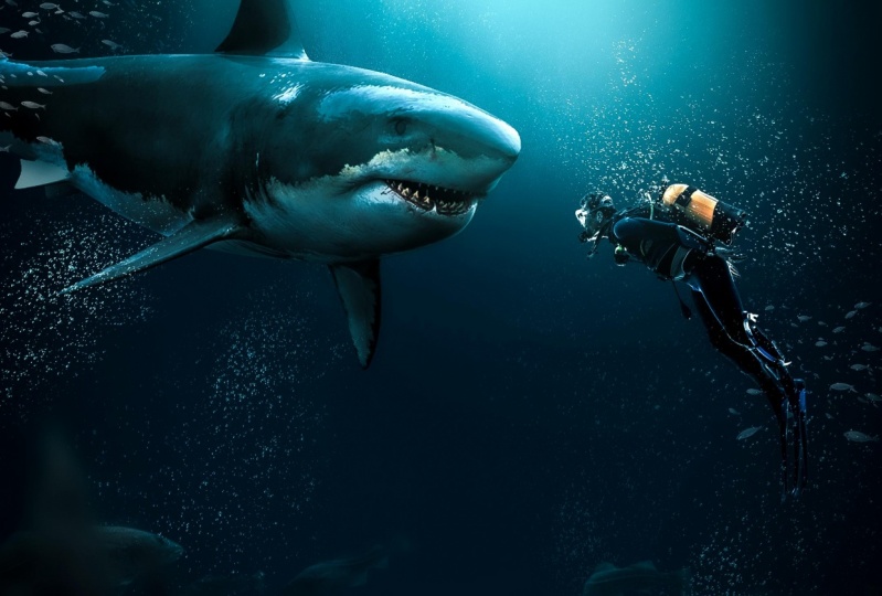
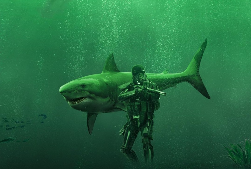
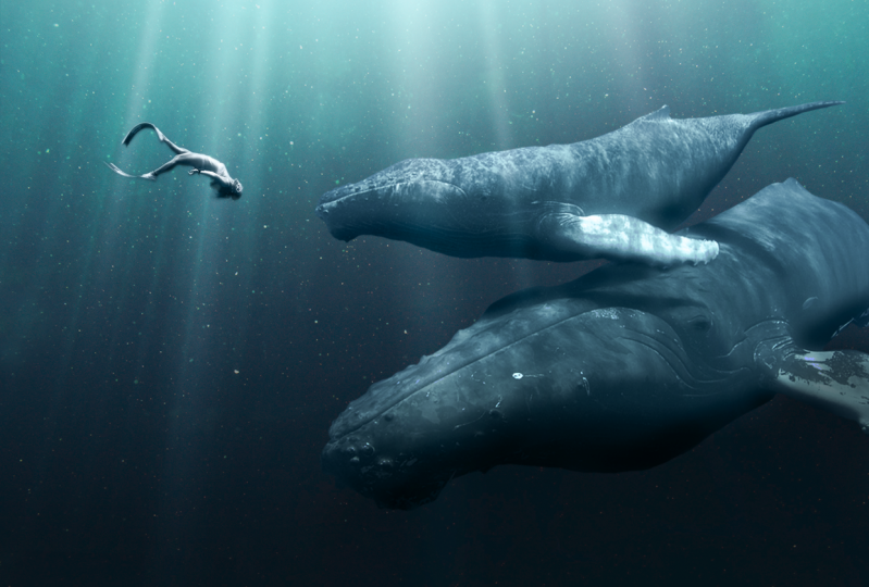
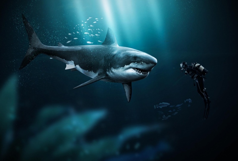
1. Introduction: everyone. My name is Sonya and I am a digital artist and I love to teach for a ship to people. So in this class I will show you how you can use thes two images to create this composite. So basically, we are going to learn how to plant images on the water. So it all looks like natural in the water image. We also going to create lighting here, going to get all these realistic bubbles create depth in this image. So it looks like a real photo and also do some Dutch and burnt to create dark areas here and lighter areas on top off these images. So we're gonna go through all the steps that you need to do to create this image by just using these two images that I have here so we don't have to spend time on kata Grandma, these are PNG file, so we can just easily create ISS without doing the boring stuff. So if you're wondering who I am, I upload a lot off work. My instagram almost daily and this is usually from created from animals. So you could find marble games can maybe if see my work on the official for the Ship channel. They also featured my work a couple of times. Here is one of them with a fox and another one with also the same composite, like a date. Now this one. So this is like basically the same idea is we're going to create in this class. So if you want to learn how to create this, just start from the beginning. It's really easy. I will show all the steps that you need to do to create this yourself.
2. Creating Background: All right, let's start off with creating a new file in photo shop. So we're going to start from scratch here. And this is the size I will be working in this usually the size, I think, because when I have, like, two times instagram size, I can always move, move the design around. I want to make it smaller. Bigger, whatever. So that's great. And you found make sure to select RG being a great skill. Not sure what it was there create. And first thing I would like to do is to get the color right. So I have this design that I created before, and I really like the Skarlatos. So what I'm going to do is I'm gonna simple this color and used it for the backgrounds are gonna great solid color here. So if this really nice, like navy blue and this lighter area, I'm gonna also simple maybe a bit lighter like that, because scholars are so important. And if you have, like, a bit call a blue, it's gonna look bad. So you need to make sure you start with working with the right colors. So let's first take the brush. I have this color here, make sure to drop the archness zero. And let's first, like, make this letter. That and this will be our light source from the top. Because we have, like, this guy off the sea or ocean. Whatever. And this is what it like will come from, so need to make sure this area will be lighter. So this is fine. Phenomena can always change that later on. Stretched out a bit like that. All right, now, I don't need this one anymore. I can just remove that. It was just for reference.
3. Placing Objects: All right, let's import our shark. Let's see, I have a shark here that I want to use and let's flip. There's or is simple because I don't know if the shot on the left side and when I have a die for on the right side. So this is fine. You can place it above layer so we can blend this better. And let's also add to die for and just what they this Let's see. Let's make this a bit there or else we don't if enough space. So if you just prison layer and press control or command Tomac and D, you can bring up the free transform and you can rotate this and make it smaller become so I need to make sure he is like facing this shark. So something like this is fine. It's moving a bit here, make this even smaller. So you see a bit off the back side of this shark like that
4. Blending Images Together: all right. Now we need to blend these better together so you can see here. It looks really fake, and the first thing I would obviously do is to double click on the layer from the shark, start with shark and goto color or fly. And here we can click on the color here and simple, some color from the water. So now we have the same color as the background inside the shark. But you can barely see it because it's on off lay and it's really low. And here wanted changes to color. Let's bring this up. You can see here that the color of the shark changes the blue. That's exactly what I want, but not at home. Percent less around 60 70% fun. All right, that's it. Next thing I'm just gonna go here and copy lays down because I'm just gonna copy the latest are based it in this diver. So he's also blue. This year works a lot better already. All right. Next thing is to give it a bit off a curve because the sharpest way to light now. So let's take the highlights from the shark and drug. This really low like that. Maybe also a bit from the middles. Here. Just make a point and just watch. What if girls goes and bring it to bid down, like dead? All right, Once you got this darker, it looks a bit too dark now. So I'm gonna create another curse here, and this time I'm gonna increase the highlights. This way, we have been more contrast, and we still see some islands. And let's also do this one, the midterms here like that. This is fine for now. And we can see if I moved this year up. You can also, if it like this. But let's first do it like this because I want to make sure it blends better in the first place. All right?
5. Creating Highlights & Shadows: All right, let's put these layers in one folder. So if you will not shift, it's like the mall impress on this folder here, I can get in this folder. So this is a shark, and this will be our diver. Or else when we get too much off these layers, it's gonna be a big mess in hard toe, even find something. So this was diver, All right? Next thing I would do here is to work on the lighting off this shark. We need to make this side here at the top a bit lighter because we have lighted from there and it's gonna hit these areas. So I'm gonna create a new layer for this press, right mouse and create keeping mosque. Then go to edit Phil and fill this with 50% gray. The reason why I use 50% grade layers because I wanna have separate layers for all these effects so I can adjust the basically later on. All right, now selected touch too. Leave it. Admittance around 50%. This is fight and start brushing the top area here. Yes, we have lighted from there, so we need to make this bit lighter. Also, this area here is still the whole way upside here. Let's also do his steet light in our field. Think when we do things like this, it's gonna look really cool. And to make this more most Gary also this parts, this one is sticking out. So let's give it a bit more lightness Here. Stand just a bit more excerpts like lighting. So the whole awful image gonna look a lot better so it doesn't look fled. He could see already difference when I say boat and enabled Looks a lot better. Let's also do a bit more shadows, so I'm gonna create 50% gray later Again n This time I'm going to do some burn and would burn. I can make some areas darker. So if bit most shadows here, let's do highlights here and start brushing like in this area here, the top needs to be darker. We have lighting from the I mean, the bottom needs to be lighter. Sorry, the bottom needs to be darker bit because we have lighting from the top. So let's make this darker here in. This one needs to be dark because he had gets really black when you do to my So let's switch it up those middles and trump their exposure here a little bit more here to make this these shadow areas darker, they would get all this nice details from the shadows in the highlights. This side here bit still bit here. This looks a lot better now And let's also some shadows and trump this like around 5%. Just a bit extra, Not much like that. So if you disable this enable that she could see we get all this nice highlights and shadows. Now we have to do the same for this diver, so I'm gonna create them. Diploma skier filled with 50% gray and basically changed the off lane to the same. So let's start with the Dutch stool. This never already has some highlights here, so I'm not gonna do it much. I don't want to make sure you still see some extra highlights here. For instance, on his hand here this year, this hand is sticking out, so I need to make sure that one gets lighter. Also, his feet here, maybe diving gear here, this side. So they said just little parts of sticking out all right, That's enough. Let's see the different sickness year. It gets a lot lighter, but it's way too light now and I want to make sure we have some duck. Every s also. So that's also do some burn here. I think I forgot to the curse layer. I accidentally remove it, but whatever, let's do some burn here. Start with highlights again around 30 40% and just do the bottom part. I don't need to do this really precisely just a bit of this. This is like darker. It's the bit of midterms. Make that just the bottom part and a bit of the shadows. Don't forget the trump explosion. When you switch it up like that, it gets here. It looks a lot better now when we compare this, you have the lighting Right now
6. Adding Bubbles: can work on the details. First thing I want to add here is bubbles. So to make this look, Morial, we can either use a brush for this or we can just use images. I like to use images because it saves me a lot of time. So I'm just going to import this photo. You can see here. We have a lot of bubbles here, and this is why I'm going to use. And the only thing I will do your spreads control or command l to bring up the levels, select the black one here and click on the water. So we making this black presenter change blend moto screen, and that's it. And the only thing I have to do here is toe make mosque, select the black brush and get rid of this woman in the water. And just leave all these bubbles so that we can use all these bubbles from the images to use for our own. Let's make this really big and just do something like this and just you can see here This looks a lot more real than before. Now I want to make sure you don't see these hearts aren't just here. So I'm just gonna embrace this bit here and now. I can just press control J or command dynamic Replicators. And let's do some more bubbles here. Just move these around and you can see here our first week getting all these details to make this look really natural, because on what he will see a lot of stuff floating around in, especially all these bubbles, stuff like that. So this let's move this bit. So there. So this is a die for need to make sure he has some bubbles, like on top of him and not under him, because bubbles will go all the way up instead of down. And it's brush a bit away here, so we don't ruin his body just like that. Get all these nice bubbles here. And if you want to have more details off the bubbles, you can just press complicated duplicated layer. You can see here we get a lot more with these visible. So this is really easy to do. So try to do this instead. Off brushes. If you're gonna do brush, is she gonna spend a lot of time on brushing a lot of bubbles? So It's really easy. Let's because duplicate this one now we have all these beautiful bubbles. Make sure you brush away all these little parts like this. This is something I forgot to brush away and see this. This one. Let's get rid of this part. So we don't see where things going around. All right, this is fine. And now we can This is all. So you could see your missus were there. Image ends. So you want to make sure you don't see that stuff? Just breast these things away. Like this. Make this look more real like that. This is fine.
7. Creating Light Beams: lighting here on the water. We're gonna see some light going true to make this look, Morial. So I'm gonna create the new layer. Select white is a color. They control brush and just first make a duct like this. Then if you press control Monte to free chance from moved down control Oakmont a Mac and stretch one corner away like that. And it's also due this quarter. So we're creating this light beam. Let's come from there. You can even stretch it out like that. So this is a nice light being we can use from the sun. And if we make it like Libbets dinner like that. Just blood moon toe. Awful a So flight. Whatever you want gonna do awful a and through status. Maybe even thinner like that. Just this little light beams coming from there from the sun. But this is way too light, so I'm gonna drop this really low. This is a little detail. It makes it look more real. When she got one of thes light beams just first congregated duplicated Great. Another one rotated a bit. It's to another one also, Davis, like we have sun there. Let's do another one. So you can just great a couple of these, maybe from one more and maybe some are lighted and other ones are just gonna leave one. It's a double. And let's see free. Stretch it out like that. Maybe like this, whatever you like. But I like to make him, like, really thin something like this. Let's make this bigger and just a bit from sight. I would like half light beings like going straight down, so just a little bit details like this at the top, all right.
8. Creating Depth: let's create some depth in this image, so it doesn't look too flat. So for creating depth, I usually put stuff at the front. So, for instance, I could use this and don't ruin the image. Would stuff on the front are? I've seen a couple times that people put it like, really offered all image. Try to do this like somewhere in the corner, Not too much, just a bit of it that helps image look more, more natural and like a real photo instead of creation. So first thing I would do here is to this is way too light, of course. So let's give it some curves and drop all these islands because we're on the world that everything's supposed to be dark and also get rid of dead really situated green. And let's move this slightly to the right so it gets a bit more blue. My dad, maybe from more right And next thing I would do here is to just give it blur. So go to filter, blur and do some cash blur. You say I use God's from blue and I have things on the foreground and lens blur gonna blurt out things in the background, and you need to make sure this looks like natural. Don't do it like this. You can barely see it. So pick something like something like this. It all comes down to training your eye to recognize how it needs to look when it's a real photo. And I can just move the slider bit around. There's a bit more like that. So let's just put this here. I think we can even give it a bit more contrast. So what I'm gonna do is I'm gonna create another curse layer, and I'm gonna bring this down in this one up so we see a bit of thes highlights like that. This looks better. Maybe even duplicate this If I press council J give it a bit more here I det This looks a lot better to me now. Here for nice step
9. Adding Fishes: All right, let's do some that said some fishes to this. So I'm gonna create a new layer and just use this one are usually using this with a black background so I don't have to spend time cutting them out. So this looks pretty real to me. Let's make them, like, really small. Don't forget to make smart object so you don't run the quality when you re size this. Let's put some fishes. Maybe there it's to someone some behind them like that. Just duplicate this. If you want more. It's a little bit of lights. I'm gonna drop the opacity of thes, and that's the bit here. It's just fine.
10. Creating Light Effects: So right now I'm happy with this composite, and the last thing to do is to finalize it. So let's make a new layer on top of everything. And here I want a simple this color from this topside make it lighter, almost white, and just make it that so. We have a bit more life on the top side of this image, and I can change. Blame it off land. I can make this big. Just say, if a bit more light in this image feel like it's a bit of dark, can also little screen. Maybe this is even better. Is the screen here? Duplicate this with Complete J and chipotle pastie, the briquette. It's another time and change Ben Moto Flay for the colors. So I think this looks fine. Maybe trump this a bit so it doesn't get too bright because we're still in the water and it's need to be darker
11. Final Lighting Adjustments: All right now I'm gonna do is tow duplicate all the slaves with command. Old shifty. So I have a duplicated version off everything Press fried mosque for its smart object. And here I'm gonna goto filter Camero And this is like the final step to get everything right. So I have really good screen for this. I have, like, a calibrated screen. So for colors, this is, like, really good. And here I will do some final adjustments. Let's see what we can do here. It's increased the highlights and shadows bit to the left. Give it a bit more whites. That's right, the blacks a little bit darker and a bit more contrast like that. Let's leave that one all right, texture. We can trump the texture, so we have really soft image. Now she can see and let's increase there. Clarity. If you drop this really allowed. This looks really cool because it looks like really soft. It's see what we can do with De Jesus. I'd like to zoom out this a bit because this is forest again. So the whole thing is going to be swallows. I'm gonna do it like this. All right, let's move on sharpening. Let's give it a bit bit of a sharpening
12. Color Grading: now we can do some color changes here. The only thing we need to change here is maybe the green bed. But I think it's more aqua in the blues so he can set the color that you want for this image. So I still want to have a bit of a green feel like, is it when it's too blue? It doesn't look right. Just gonna give it a bit more blue like that and leave it more greenest. So if you want to like something bluish, you can just change these settings here. This is fine. Let's see African. Just this one. Maybe it like this. Let's move on. Maybe from this. So for this, you really need a normal screen to see this really well. And it's it's awesome. Lighter, like the tones here like that. All right, let's leave that one. And let's give it a bit of a thing yet, So we have a feeling like we're really on the water. So this is before this F. He can see you get more focus on them. All right, let's move on to see if we can change the color here bit more. I'm just using the slightest to see how they change the images. And that's the way I decided. I want this image to look, let's give it a bit like that. So this is fine. Maybe the blue here, see what we can do here. It's increased the situation just a little bit. I did all right. I think this is fine, Chris. OK? And you can see here out this God really better. And now I can just add some curves to give it even more highlights feel moved this one to left. Don't do it to my just a bit in this one, too, right? And that's pretty much it.
 Zenja Gammer, Digital Artist & Educator