Transcripts
1. Intro: Hey guys, Welcome to
another painting class. I'll be your teacher, Cory J. And I'm really excited
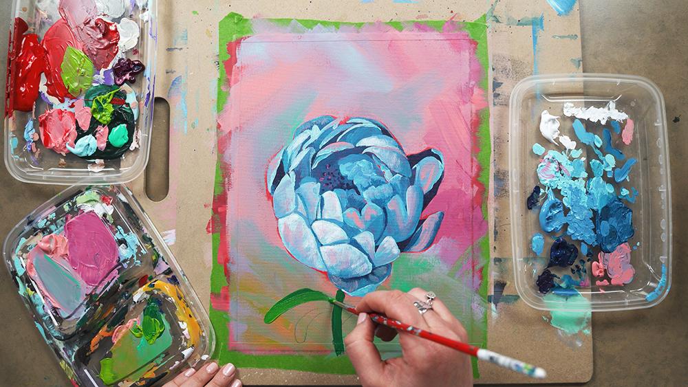
about today's piece. So today is all about
painting peonies. And we're going to paint
my favorite peony, which is this one right here. Now, I actually use this
reference photo before for one of my pieces and I just
fell in love with it so much. And when I went to look for a reference photo
for this video, I stumbled upon it again
and thought, Okay, I'm gonna use it again because
I just love it so much. And they're really
good thing about this reference photo is just one penny that
we're painting, but it has so many petals on it and it creates so
many values there. So super light
values and they're super dark values and
everything in between. So it makes it a
really good piece to learn how to mix values. And that's just what
we're gonna do today. Now, another part of this
project that I really love is using a full
color backgrounds. So in this case, we use red
for the background today. But what happens is we paint the background first and
then little bits of it shine through the painting
as we paint on top of it. So it's one of my
favorite techniques to use because I loved those little magical
bits of color that shine through and I just
think it's so beautiful. Now at the first part
of the lesson today, I'm gonna teach you how to use a monitor to trace
your image over top. So you can use a laptop monitor, you can use a CPU monitor, or in my case, you'll see I've
plugged my laptop into TV. I just did this
with an HDMI cable. So you'll have to make
sure that you have an HDMI cable if you
want to enlarge it. But it's a really good technique for getting your drawing
onto the canvas. And it's really, really
seamless and easy. So we're going to
start with that today. If you don't have an HDMI cable, you don't have to plug in
your computer to your TV. You can just do it right on
the screen of your computer and kinda scroll up and
down to get the full image. And so without further
ado, let's get into it.
2. Transferring your image: To start, you want
to grab a piece of tracing paper or a
see-through loose leaf, whatever you have, that's the same size as your
painting surface. So today I'm painting
on a nine by 12 inch piece of canvas paper. Then you want to hold it up to whatever monitor that you're using and adjust the size of the picture on your computer
so that it's closer to the size of your paper and the image fits
into the paper. For me, all I'm
concerned about is the size of the flower
for this piece. I don't really care
about the background because I'm going
to change that. Then you just want to grab
a piece of Painter's tape. I like using this painter's
tape because it's easy to take off and doesn't
damage the screen. And you want to center your piece or wherever
you want to have it, and then tape the piece
onto your monitor. Now, you want to be
light with the tape and light with your hands just like with
everything when you're touching them monitor
obviously you don't want to damage the monitor. Then you want to go
through and trace it. Now just like I said, when you're using your
pencil, you're tracing it. You want to make sure
that your light light handed with it so that you
don't dent your monitor. Then if you find that there's some areas that are
kinda hard to see, you can just up the brightness on your
screen or your program. So here I'm using Photoshop, so it's really easy for me
to make it a lot brighter. And that'll make it so it's
easier to see through. And then you can get
those last little details that you couldn't quite see if it's not bright enough. And it's important
here to turn all of the shapes into a
linear drawing. You don't want to add
any values to this. You just want to create an outline to fill
in with the paint.
3. Prepping Your Canvas: Next we're gonna go through
and grab your piece of canvas paper and tape it
down to your drawing board. I like to use painter's tape for this because it comes
off really easy and it stays on nice and I don't
have to worry about it being on for a couple of days
straight and not coming off. So you just go through and you put that down or you
just want to make sure that you layer the
painter's tape on the edge of the paper with the
same width all the way around
because this is going to create your border. Then just press it down so that none of the paint seeps under. Next, I'm going to
go through with this acrylic glazing medium. This is a gloss. It doesn't matter if
it's mad or gloss. You just want to get
an acrylic medium. And if you don't have
an acrylic medium, you can just use white paint. And you're just going to go
around the edges with this. And this just helps so
that when you peel off the tape after you have these nice, beautiful crisp edges. And this step is
totally optional. So if you want to
skip this step, you can totally skip it. But I always find that
it's really nice to be. The last thing I do, peel off that pain and see those beautiful crisp edges is just really,
really satisfying. So once you have that on, you just want to let it dry. And then I'm going to start
here with my background. So here I have three
colors that light pink, the purple, and the red. I'm going to mix them
all together to create a background with a
bit of varying color. But you don't need to even do that if you just
want to go ahead and paint the background all red or red with a little
bit of white in it. Maybe to make a nice pinky tone, you can go ahead and do that. I decided to vary the
color because I wanted the little parts that peak through at the end to
be varied in color, but you don't really notice
it that much, to be honest. You can just go ahead and
paint the whole thing red. And this is a technique where you lay down a color
that's really, really strong in the background. And then as you paint over it, little bits of it shine through in the most
beautiful ways. And I'm just really, really, really into
this technique, especially with my style where I use a lot of
really strong colors. It's really awesome
to see that effect. It's really high contrast. And it just looks so nice seeing little bits
of red peak through. Okay, so you want
to let that dry completely and then you're
going to bring over your drawing and find
where you want to place it and then tape it
down there at the top. Again, I'm using painter's tape. It's my favorites. And find your right position. And then tape it
down at the top. I like to only tape it down
with the top so that I can lift it up and see
how it's going. And if the drawing is
transferring properly, then I'm going to take this
charcoal transfer paper and place it down here. And I like to use a different color than the one that I did the
original drawing on. So I did the original
drawing with pencil. So I'm gonna grab this
orange pencil crayon and go over the drawing
here and make a transfer. The reason why I use
a different colors, I can see what
I've done and I'll just take a peek to make sure that it's transferring properly, which I always suggest
that everybody does. They'll let you know if
you need to push harder or softer when you're retracing it. And I really think
that tracing is scale. It's not as easy as it looks. So definitely take your time
with this and just go ahead and get those areas
nice and proportionate. Alright, and when you're done, you should have your peony transferred onto the background.
4. Painting the Shadows: Okay, So I'm going to paint this peony to be a blue peony. You can change the
color if you'd like. But what you wanna do is
you wanna get a dark blue, a medium blue, and light blue, or whatever version of color that you're
going with today. In addition, I also have white for the highlights that
I'm gonna do at the end. And I also have a
little bit of pink. And that's because
I want to add in some reflections
of my background into the piece as I work. So to start off, I'm just going to mix some
of this navy dark blue here. And I'm going to
start by filling in all the petals that are the
darkest around my piece. And the reason why
I'm doing that is because it'll be a good
frame of reference as I go and add different
values to know, okay, compared to
the darkest leaf, how dark do I want
to make this or how light do I want
to make this petal? So I'm gonna go and
start with the darkest. So I have that frame of
reference for the entire piece. And I like to use
a technique for the petals That's kind of a
mix as you go techniques. So I'll lay down some paints, and before that paint has
an opportunity to dry, I'll go in and grab
another color and mix that in so that they
can blend acrylics. A lot of people don't
like acrylics and oils because acrylics
dry so fast. I love acrylics for the possibilities of all the
layering that you can do. But because of that,
they do dry really fast. So you want to mix
and blend as you go so that they don't dry as you're trying to
lay the main color down. For a piece like
this where you're working a little
areas that's really, really easy to do
because you just have to focus on one little
area at a time. And you might think,
Oh, this painting has so many leaves are
so many petals. This is going to take
me a long time to do, but just take it one
petal at a time. You want to go and fill in
the darker petals first. If you lay down
some color and it doesn't lay down properly, just let it dry completely
and then go over it. These acrylic paints have
a pretty high opacity, which is really awesome. And the higher the or the
lighter the color gets, the better the opacity too. So you can always add
in a bit of white to your color if it's
not covering good enough and it'll cover
quite a bit better. I'm just going to go in here and do the details of this piece. The little part that's
folded over here. And you'll see
that I switched to a smaller brush for this part. So you always want to make
sure that you're painting with a brush that's appropriate for the area that you're
trying to fill in. If you're filling
in a smaller area, you want to make sure you
have a smaller brush on hand. And if you're filling
in a bigger area, you wanna make sure you
have a bigger brush so that you have to make
less brushstrokes and also so that less brushstrokes
show up on your piece. I'm just going to go through and finish up this petal here. Just by adding the highlights. Yeah, another thing
that you want to make sure that you do is make brush strokes in the direction of the image that you're
trying to portray. So e.g. this petal
has some details that follow certain lines
and you want to make the brush strokes
follow those lines. So after you finish the main part of the
petal and you let it dry, I'm going to go through with this pink tone and I'm going
to mix it a little bit into the blue just to tone it back a little bit so the
color is not so strong. And then I'm just going
to go through and add in a little bit of pink. And to me this is
the reflection of the background that I'm
working in onto the piece. When you're painting,
you always want to think about how the environment of the pieces interacting with the piece and how that
affects the colors. Then I'm just gonna do
a couple more leaves here for you guys to see. I keep calling them leave. So they're petals, a
couple more petals. Again, I'm going to start with the darkest areas and the
darkest petals first. So here you can see that
I'm going in just with this straight dark blue color, the street navy color here. And this is gonna be basically the darkest area of my piece. And I actually did not use any black for this piece at all. However, if you start
off and you're using a blue tone and it's just a mid-tone blue and
isn't dark enough, then you can just add
some black into it just a little bit at a time to
make this navy color here. So you want to lay the
darkest part first, and then I'll go ahead and start to do the areas
that lighten up a bit. And as you can see here, I'm grabbing that
color that I had in my brush, the darkest color, and going back to an area
I'd already done and just enhancing it by layering another layer of that
dark color on top. And that's really
important when you're painting to constantly work the whole piece so that it
looks unified and the same. And don't be afraid
to go back over other areas with another layer. Because the more layers
that you add to it, sometimes that creates
more dimension and it just makes the piece even that
much more beautiful. Then here you'll
see that I switch back to the thicker brush. What I like to do
is I like to lay down the main colors of the leaf altogether with only a few strokes
with a thicker brush. And that's what I'm doing here. So I have that mid tone and
then there's a little bit of an area that's a bit lighter. So I'm going to go through with the same brush and add that in. And this is a
really great way to do it because the
colors are still wet. So at this point they're really, really easy to blend. And a good tip for blending is to blend really light handed. So if you push too
hard on the canvas, you'll notice that
the paintbrushes just going to scoop
up all the paint. So you just want to be nice and light handed with
your strokes here. I'm putting very little pressure on the brush as I do this. Then once I have the
main colors down, then I'm going to go in and add some of the highlights on top. And it really
depends if you want a softer gradation from
one color to another, then you can do it
while it's still wet. Or if you want to wait
till the piece dries, That's when you can add in
some more harsher lines are harsher shadows are
harsher highlights depending on what
you're working on. Then here I'm just
going in and I added in a little bit of shadows
that are in the piece. You could wait until the
pieces to try to do this. Or if you wanted them
to be blended more, you just go in and do it
while it's still wet. Then here you can see I just noticed that
as I'm painting, I made a mistake drawing
on the reference image. So one of the pedals
didn't transfer properly and I didn't
draw it on properly. So this happens all the time, especially when you're
transferring an image. Sometimes you'll
realize that you forgot to transfer
a line or something doesn't look the same
as the reference photo because you miss
some darker areas. So just go through and fix it. Never be afraid to
go back and alter things second time
or rework them. That's just always
part of the process. Then I'm going to
continue to work on these darker areas
here to start. So this was a really
great way to attack this piece because
every time that I worked around this peony, there was different
areas that had different ranges and values. So some areas were really dark and then others
were really light. So working from dark
to light was really, really helpful
because I always had the darkest pieces done. So I could always
reference those, especially when you get
to those middle, sorry, mid tone pieces where
you're trying to decide how dark to make it or
how light to make it. You can reference the
darker areas and say, okay, well this area is this dark, so I need to make this
area a little bit lighter. And if you've ever lay
down paint to an area and you realize that you
didn't make it dark enough or you didn't
make it light enough. That's the beauty
of acrylic paint. You can just paint over it. So you don't have to worry
about getting things right or perfect because
you can always fix them. And another really
good thing about this project here is
it gives you a lot of opportunity to practice
doing the same type of techniques over and over
because it's quite detailed. And so you just want to
take your time with this. And the objective should
be to get it to look perfect or she get it look
exactly like mine more. So you just want to learn
about the different techniques and how they feel
when you paint them, and how much paint to
put on the brush and how little paint to put on the brushes are all
things that you learned when you go
through a class like this. So it's a really, really
good exercise and that's one of the reasons why I
love painting peonies, it's kind of repetitive, but in the most beautiful way, There's so many different
values and tones. And really identifying
them is part of the fun. Deciding which part is really, really dark in which parts live, and then translating
that with the paint. When you're painting each petal, There's two things that you
want to be thinking about. The first thing is the values. So what areas darker, what areas of
brighter, what areas? The mid tones, these
types of things. You want to establish that right away when you're
looking at the piece. But the second thing you want
to think about as working from back to front of the piece. So e.g. for this petal that
I'm working on right now, there's clearly an area
that's behind another area. So there's a pedal
behind a pedal. And that's really what you
want to think about too. So you'll want to start off
with the areas that are to the back first and then
work your way forward. For this entire piece. You'll notice that
when we're working, we're going to start with the
back and work our way up. Just like we started painting
the background first. And now I'm painting
the darkest colors. The darkest areas are
normally the areas that are set furthest back
or inset a bit. So when you work that way, It's best because
if you're trying to put an image in front
of another image, it's easier just
to paint it on top versus trying to paint an
image behind another image. And you have to paint
around the main part. And it's just really frustrating
and a lot harder to do. So whenever you're
working on this piece, you want to think, okay, every section you move around, you want to think which
area is to the back, which is the furthest
away from the viewer. And that's the area that
you want to start with. Because you can always
paint something on top. You can always paint
something in front, but to paint something
around that is behind is very, very difficult. And you want to
always attack a piece using strategy because
that's just the best way. So I'm going to go
through back to this that I'm painting now
and now I'm going to paint the petal in front. And you can see that
it's just so much easier now that I have the background to
paint it in front. And you can also have the meat, have the edges meet so
much more seamlessly because you can overlap
the front layer, the front, the front petal. So much easier and seamlessly
by going over the back one, even just a little
bit so that there's no kind of red peeking
through where they touch. If you wanted to leave
a little red peeking through where they
touched, that's okay too, because I think that's one of the most beautiful things about painting this red
background first is having a peek
through little areas, as you can see here. Now I'm just going over
with that pink again. Just to kinda pick up some
of the lightest areas of the piece where light would be reflected
from the background. So at the end of
the entire piece, I'll go through
with white and do a similar thing,
similar technique, but for now I'm going
to go through with this kind of pink tone to pick
up some of the background. And as I'm doing this, I'm using a dry brush technique. So I'm only going
through areas that are, for the most part completely
dry and just going really, really lightly over them.
5. Painting the Midtones: Next I'm going to move forward to working on some of
this mid tone areas. I'm going to work on the
area that's to the left and the top of the flower here. And so the petals that
I completed where all the darker petals that were on the
exterior of the piece. You want to go ahead
and finish that first. But next we're going to
talk about this area. So when you start to
move over to that area, There's so much going on, There's so much detail and
so many petals overlapping other petals in this
area might be hard to know where to start. So what I like to do is I
like to fill in what I like to call it the negative space between the petals that are
all overlapping each other. And this really goes back
to the same technique of working the darker areas first and working the
areas that are the furthest back or
the most recessed. So that's what I'm doing here. And it's easier I find when you're doing this
type of technique to look at the negative space
between the petals as opposed to painting
the petals themselves. So looking at the shape of the negative space will help
you paint it and fill it in more accurately than necessarily looking
at the petals around it and trying to do it that way. So I like to do that. And then also here
you'll already start to be looking around and referencing the
colors around to know how dark or how light to
make these areas here. Now these areas are
still pretty dark, but as you can see in
the photo reference, or not quite as dark as
the pure Navy itself. So I'm going to be working
more in those mid tone blues. Then of course, once
that area has dried, you can go in as I'm
doing here with the light blue and do the petals on top. For this whole area.
I'm just going to use this smaller brush here because there's so
much small detail. But you start off with
the darker areas and then fill in those
lighter areas on top. And also, it doesn't
have to be perfect. And that's another reason
why I chose this piece. It may seem like it's
pretty complicated, especially if you're
just new to painting. But it's broken off
into little sections that you can just focus
on one little section at a time and will really help
you to mix the proper values, the proper light
to dark ratios on each petal and to
learn about that. And also, if you make a mistake, you just keep going. You can either fix it
by painting over top of it or just keep on going. It doesn't have to be perfect. And that's something that
you really want to keep in mind when you're painting. Petals. Petals don't have
definitive shape. Like e.g. a. Heart has a very
definitive shape. And if your hearts all
squished or off to the side, people will know that it's
not proper, so to speak. But when you're
painting a flower, flowers vary so much. They have so many
different forums and shape and it's not
all so cut and dry. So it's a really great
piece to start off painting because it doesn't
have to be perfect. So you can just kinda go
and enjoy and not be so hard on yourself trying
to make it look exactly like my painting or exactly
like the reference photo. I just can't stress that
enough because it is really stressful or difficult. It can be when you're
starting to paint for the first time and
you really want to make something look
exactly right. And it's just about enjoying the process and getting
better each day. So there's a little
positivity for you for today. Alright? I'm gonna do a little bit
more of this area beside now. And I'm just going to
use the same technique. So what I'm gonna do
is paint the areas in between and then go back through and paint
the ones on top. Then I've just sped this up a bit because I still
wanted you to get the idea of what I'm doing without having
to sit through me, watching me do the
exact same thing over and over and over. Sometimes as you paint, you'll notice that you missed
a line in a certain area. And that's the beauty of
using a reference photo. You can keep referencing
the photo and checking, okay, this looks kinda
weird or this is rise. Oh, I missed a line here. Just keep moving back and forth and back and forth
between the photo. And also when you're going from a dark color
to a light color, you should always clean
off your brush because the dark colors grab onto
the light colors so easily. So you want to keep that in
mind as you're painting too. Okay. I finished filling in
the top part here. Now I'm going to move on to
this kind of clustering area in the middle because
I'm going to use a different painting
technique for this. So I'm going to use a bit
of a thicker brush here. And as I lay the colors
down in this area, you can see that in the reference photo the
colors vary quite a bit. They're not so cut and dry, they're not so clear. So they have lots of mixes of different colors all in one. And so what I'm gonna
do is I'm going to grab different colors on
my brush altogether. So I'll grab a
little bit of light here and put a stroke down, and then grab a little
bit of the mid tone. You can see I'm
doing here and then put a couple of stroke downs and I'm not mixing them all
the way in between. I'm just kind of
letting the colors go down onto the page
however they like. So I pick up a bunch
of little bit of this color and a little bit
of that color on my brush. And instead of mixing
them together, I kinda leave them
unmixed so that all the different
little variants fall down and create
form on their own. So this is a technique that
I like to use a lot and it basically lets the brush
do all the work for you. So you're just picking up
a little bit of color. Then the fact that you
haven't really mixed them, they kinda come off onto the
canvas in their own way. And it's really, really nice. I use this technique a lot
when I'm painting for two, I'll run my brush through a couple of different
colors and let kinda lines of that color
collect on the brush. And then when I place
the brush down, it lets the color down
in its own little way. It's a little bit
less predictable, but also creates a
little bit of this kind of beautiful random
color placement. So best way I can describe it. And then I'm just going
to go through and do a similar technique for
the rest of the petals here. Then I'm just going
to show you a couple more of these
petals down here. I just am doing sped up here. But I'll show you that here. I'm using a different
technique where it's more like wet blending. I'm picking up quite
a bit of color on my brush every time
I put it down. So e.g. starting from the light area here and then working
too dark here, I'm doing it a little bit
different just because it makes more sense to do it that way to catch that one
little highlight there. I'll put that down
first and then I can work the dark
area around it. Then here I'm
working pretty fast. Obviously it's sped up, but I'm actually working
pretty fast too because I want to blend
everything while it's still wet. So you just want to
kinda keep that in mind as you're going
through certain areas. If you want to make sure
that you blend them, make sure that you're blending them all while
they're still wives. Now if you have an area
that starts to dry too fast while you're
trying to blend it, just let it dry completely. And then once it dry completely, you can go back over it
with both colors again. Here too. You can also see that
I'm going back over certain areas where the
light hits to show that. And now here I'm going
to go through and add in some details with
this detail brush here. So any areas that
were kinda lost, as I was laying down
these main colors, I can go back over and add
in while it's still wet. Then for this last little
part of this area, I'm going to do the same
technique that I did before picking up
multiple colors and just laying them down altogether and just having that be kind
of random how they show up. I love this technique
because you never really know what
you're going to get. But it makes it really nice. Okay, now this area
is completely dried. I'm just going to
show you that one. Since the dry, I'm gonna go back over and redefine some of this shadow areas
that are created by the petals overlapping
on top of each other. A little bit in
the middle there. Now I'm doing this petal that's closer to
the bottom here. You can see in the reference
photo they have some of those harsh shadow lines. And these are easiest to do once it is completely
dry in some areas, like the areas that
I'm doing here. If you paint a section and
notice that it looks a little flat or needs a little
bit more definition. You can let it dry
completely and then go back over it and add
in that definition. As a second layer. Never be afraid to keep adding layers to keep creating
forum and a piece because that's really
what makes it really pop and lots of contrast. And then like I did before, I'm going to go through
with this pink and add in a little bit of
highlights so that the piece looks like it's
interacting a little bit with the background
and getting some of those reflections that the
light would have creative. Now, again, with this, I'm using that dry
brush technique, which is where I only take
a little bit of paint and then I kind of really
work it onto the piece. And you want to make sure that the underpainting is totally
dry when you do this. Because otherwise you'll pick up the paint underneath and
there'll be a bit of a mess. Yeah. Just adding little bits
of that pink all around.
6. Painting the Highlights: Next I'm going to go through and work on the lightest
area of the piece. So finally we've
gotten to this side, the left side of the piece. I'm just going to go through and fill in a lot of the petals
with the lightest blue. And some of these petals like these next couple of
petals I'm going to paint, I'm going to fill in the blue, but then also add the
mid-tone blue as I'm mixing. Again, you want to make sure
that you're thinking about the direction of your
strokes of your brush. Here, I'm going to add
in a little bit of white, light blue here. And then I'm going
to go in and add this mid tone as it's a drawing. I'm really paying attention to creating the petal forum and the way that those lines
through the petal are formed and trying to emulate that
with my brush strokes. And just mixing the colors together while
they're still wet. That's the best
opportunity that you have to make that main forum. And you can always go through after and adding highlights and low lights and shadows and
all that kind of thing. But you want to get the
main forum down with your first couple of
strokes and you want to use a bigger brush for that. Then you can see here, I'm going through with the
smaller brush and just adding little highlights
here and there to the piece. Now here I'm going to go
through with the deepest blue. So this is just the Navy
with nothing in it. And I'm gonna go and add in that darkest area of the
middle of the peony. I'm not going to add any of those little bits that come up. I'm not sure what
they're called, but the little bits
in the middle there, I'm just going to
add the darker area of the center of the
flower at this point. And then I'll add all
those little dots in after I complete the piece, kind of near the end. And I'll pull in some colors
from the piece to do that. Right now I'm just adding
in that darker center area. Then next I'm going
to go through you see I've completed the
bottom half here, then bottom left
half of the piece. I'm just gonna go through and I'm going to
add highlights to these pieces so you can always bring
something up further. So unless it's pure white, you can always add the, you can always bring
it up even lighter. And that's how I'm gonna
do with all these kind of more highlighted areas. I'm going to bring
in the white at this point and add
in an extra layer. This is just going to
create so much depth and the piece already you can
see without one pedal, it really, really kinda brings it up and
creates more contrast. And I love anything
super high contrast. It just gives it that
really nice visual impact. I'm going to go through
and add this in. And again, just like
I did with the pink, I'm going to go through and
use that dry brush technique. So in the beginning when I
was painting the petals, I was using quite
a bit of paint. But here when I'm painting
the petals, It's quite light, so I'm just taking a
little bit and you can see here I'm wiping
off my brush a bit. And I just want a small
amount of paint so that I can create that kind
of dry brush technique. What it does is basically it allows the paint to be a
little bit more see-through. And that kinda makes
it look more realistic As opposed to if I were to
just draw on straight white, you wouldn't be able to
see any of the painting underneath and it wouldn't
look, it wouldn't look real. So I really love
doing this technique. When you use this
dry brush technique. It also helps to create
more value ranges because in some areas you can see through
it a little bit. In other areas, it covers
a little bit more. And so it creates an
additional value range, which is really, really nice. Then just to complete
this little area, I'm just going to go
through again with my pink just over top of the
white really lightly, again, once the white has
completely dried and use the same dry brush
technique to add a little bit of pink
onto the petals as well. I'll just put a little
on the back petals to just what's left on my brush.
7. Painting the Background, Stem, and Finishing Touches: Okay, so now I'm going
to go and move on to working the background
of this piece. So for this, I'm using a
bunch of different colors and mixing them into the
pink to mute them down a little bit so that
they're not also intense. So here I'm using
a little bit of purple mixed into
this pink color. And I'm also going to grab
a little bit of blue to start from my other palette. And a little bit of
this teal color. If you don't have all these
colors, you can mix them. Or if you don't want to
mix them, that's okay too. You can use your own
colors on this area too. It doesn't have to be
exactly like this. But basically what you wanna do is mix a bunch of them together. And when I mix it, I'm not mixing it, so it's all incorporated. I'm leaving little bits
of each color together. And then what I'm gonna do is lay these strokes down
onto the background. And I'm going to
use quite a bit of paint here because I
want the paint to stay wet so that I can keep adding in different colors and
creating a soft background. This is going to be using
that wet blending technique where lay down the colors all while they're still wet
and blend them together. And that's going to create
a softer background. And we want a softer
background because we want the main image of the
peony to really stand out. And the peony has so much detail in it and has
a lot of really tight lines. So making this
soft background is a really nice contrast and
really nice background for it because it really lets the peony standout but still frames it in
a beautiful way. So I'm just gonna go
ahead and speed this up, but the technique for
it is still the same. So I'll take a little bit of color and I want
to vary the color. And also, as you can see here, I'm painting around the peony, but I'm not too worried
about the lines of the background or the background colors
that I'm laying down, come up right beside the
flower because I want some of that beautiful
red that we talked about at the beginning
to peek through. And this is why it
doesn't really matter if it's a unified color
in the background or not, because most of it is going
to be covered up here. But you can see that when you
leave little bits close to the edge or you can see
there's a little bit inside the puny where the
red speaking through. It just looks so nice. And it just creates
so much more depth in the piece as well. So the strokes and the direction that I'm going,
It's just random. There's no I'm not going in a specific area
when I'm doing this, but I am keeping the light, the top area of this
piece a bit more purply blue to match
the mood of the piece. I am adding in a little
bit of this teal. You can see some here just as a little bit of
splash of color. But for the most part
it's going to stay in that pinky purple, blue range. And that's because when
I get to the bottom, you'll see soon that
I'm going to add in a little bit of a green color to make it look like the
blurred background of a leaf, the leaves area, so the area, the bottom will be
more reminiscent of blurred leaves in the
background just a bit. So it helps to add
some variants. And then you can
just go back and forth like I'm doing here. I'm adding a bit more
color to the top in different
directions and this is a good time to just play. Relax. Let yourself kinda do whatever. It doesn't have to be perfect. And it's just really nice, especially if you put
on some music and kinda get lost in your music and translate that to doing a
nice abstracted background. It's just a really good
time to revive out. And also makes sure
that you're using quite a bit of paint when
you lay down the paint. Because the more paint that
you add at this point, the longer the thicker
will be and the longer it will take to dry
and I'll just make it easier to blend out. Okay, So next I'm
gonna go in with this. This is like an olive green
color, it's quite bright. You could mix this by using
quite a bit of yellow and a little bit of blue
and a little bit of white that will give
you a similar color. But I'm going to mute it
down here as you can see, I'll take a little
bit and then I muted down with that pink color. It'll still give off a
little bit of the green. But to start, I don't want
it to be too intense. You can always make
stuff more intense. You can always make
your color more intense of your
painting more intense, but to take intensity of ways
quite a bit more difficult. Now I'll go in with
a little bit more, as you can see, a little
bit of the teal here. And here I'm just
gonna kinda create, keep the green to the
bottom of the piece where all those beautiful leaves of the peonies would be meeting. They'd all be at the bottom. I'm just going to,
it's still abstracted, but I still give you a taste
of where that would be. As you can see also, I forgot to mention that
I'm just painting over the drawing of
where the stem is. And I'm gonna go
ahead and put that back in in a second here. It's just easier
to do it on top. And sometimes that
happens. Yeah. You just kinda wanna go with
the flow with your piece. If you decide that you've
drawn something down, but you decide that it would be better if you just covered it and did the detail on top, then just go ahead
and go with that. Okay, So next here, I'm gonna go ahead and create
those little bits that were inside the flower here that I said I'd come back to later. And I'm just going to mix a little bit of the Navy
and with the purple here and just start to
make little dots inside. Can do this kind of randomly. It doesn't have to be perfect, but I'm also going to
be twisting my brush, as you can see, to vary a little bit so that they're
not all the same shape. Then I'm also going
to go through and add a little bit
of a highlight on them once I'm done solely
down the main ones, and then I'll go in and
add a bit of a highlight. I'm going to take a little
bit of this color here, this purply color, and just
go through on top of them. Just really lightly. I've barely any
paint on my brush. And I'm just touching each
one really, really lightly. And that'll just give a
little bit of dimension. Okay, so now I'm going to take my same drawing from the beginning and
I'm going to lay it down here and just re-establish those leaves at the
bottom of the peony. Obviously, you want to
wait till your piece is completely dry here
before you do this. But you can just go
back in with a piece of carbon paper underneath
your transfer paper here, and just go in and
redraw that area. Now it would be smart to use a different color so you
knew where you were going. But I just decided to use the
same orange since this is just only a couple of leaves
that I'm drawing on here. And we'll get that
last one in there. And all you need is the outline. As you can see here. That's all I got. Okay, so now we're going to do the leaves and we're
almost done here. I like to keep all
the colors that I mixed in the painting
from the same family. So I'm taking some of
that green that I laid in the background and mixing
it with the navy blue. And then that will
give me a mid tone green to start off with. And I'm also going to be doing
the same technique where I let the colors mix
together for me. So I'll lay down the main
stem here in one solid color. But then for the petals, I'm going to pick up
a little bit more of that green color and not drying my brush
or change my brush. And you'll see that
it kinda gives different varied effects
of the color transferring. And also as you're doing this, you can roll your brush a bit
in your hand and it'll give different areas
of the brush will give different bits
of color coming down. So if your brush starts
to go a little dry, just kinda twirl it a
little bit in your hand, just like I did there. And you'll see that now I get a different view of the color. And for the little
tip of the here, I'm going to come
back from the other side and that'll make it easier to get more of
a defined edge there. I'm just going to go and do my last little one here by
picking up some of the blue. Adding that in,
twirling my brush, especially as I get onto
the finer areas here. Now I'm just going to add a
little bit of highlights. A little bit more green
down the stem here, a lighter color just to
make a bit of a highlight. And then I'm also going to
grab a little bit of the pink, just like we did for the petals. I'm going to add a little
bit of pink onto each of the leaves and the stem just to create a nice little highlight. Bring it up even further than the first highlight
that we landed. So lastly, I always
encourage everybody to sign their peace and date it. Even if it's just
a practice piece, It's always nice to
save it and come back to at a later date and
see how far you've come. And then you can go
ahead and take off your tape and see those nice, beautiful, crispy edges that are so satisfying
at the end here. And that's it. I really hope that this piece helped you guys and that you've
learned a lot through it. I know there are a lot
of challenging areas and so I'm so proud of
you for sticking with it. And I'm so happy that I
could be here to teach you. I hope you guys had an awesome rest of your day
and we'll see you soon.
8. Outro: Alright, well, that's
it for today's class. I really hope you
guys learned a lot. I hope that you enjoyed it. And I work too hard on
yourself because I know it can be a bit of a
stretch for someone who's just starting out, but I think it's really good to push yourselves
in these types of classes because it doesn't matter how good it
looks at the end, is really just about
learning new techniques and taking those with you into your practice
as you move forward. Thanks again. And if you want to tag me on
Instagram, I'm at Cory J. I always love to see your
process and otherwise, we'll see you next time.
 Cori Jaye Ettienne, Artist and Creator About Vivid Color