Transcripts
1. Intro to Expressionism: Hey guys, Welcome to
another painting class. My name is Cory J, and I'll
be your teacher today. So today's class is all
about expressionism. Expressionism is a style
of painting that is very expressive and it
surrounds expressing emotion. Here are a couple of
quick facts about expressionist art movement
and what it's all about. Expressionism was a
modernist movement initially in poetry and painting that originated
from Northern Europe. It began around the beginning
of the 20th century. And it's all about producing an emotional
effect in the viewer, focusing on the
emotional experience rather than physical reality. The term is also suggestive of angst and some suggests
that these types of paintings are reaction to more positive movements
such as impressionism. It's a movement that's
all about expressing emotion and conveying
that to the viewer. So I thought I'd show you some famous
expressionists works of art to start getting your mind to think
about the movement. The first one is the scream. Next we have explosion. Next we have a self portrait. Finally, we have the street. As you can see, these are all very expressive works and they have a varying
degree of subjects. So you have portraiture, you have some landscape, you have some city life. So it doesn't have to be
one type of subject work. It's really about the expression of what you're trying
to convey in the piece.
2. 6 Steps to Create Expressionism: For this class, everyone's
going to create a separate unique piece
that's different. But we can all follow the same guidelines to help us get to a finished products. We all want to create a
finished expressionists work. And so here I've developed
some steps to get us there. So I just wanted to
show you to start this, the piece that I'll be
painting in the video. First, I'm gonna go through
the different steps about how I arrived at this piece and how we're
going to get there. I'm going to show you
how I painted it. Now again, just to reiterate, the idea of this
class is to take the steps and action them
with your own outcome. So you're not trying to
get exactly what I got, which is basically impossible. So this is an expressionist
class and it's about expressing
something from within, but we're going to use the
same steps to get there. So here we go. Here are six steps to help you create an expressionist
work. Of course. Number one is to pick a theme or an emotion that you
would like to express. All successful works of
art started with an idea. So this theme or this emotion that we choose is going
to help guide us, is us for what other
decisions we're going to make to create the successful
painting at the end. Number two is to find a
reference photo that helps convey the emotion or theme that you're
trying to express. So for example, if
you were trying to express the emotion of sadness, you could choose
someone crying or an image of the rain
or dark clouds. Anything that's
going to help convey that sadness across
to the viewer. Now, I use this reference
photo here for my piece. So if you relate to that
and that relates to your theme and you want
to go ahead and use that. You can go ahead, It's linked. But also if you want to create your own
work that separate, feel free to find your
own reference photo. Number three is to decide on a color palette that helps
you convey your theme. So I'll just go ahead and
show my piece here again. I chose a dark color palette for this work because
of the piece is a little bit more somber and dark. And so that's the colors that
helped me to express that. But if you're going for
a more happy piece, you want to choose
more bright colors. You want to pick your
color palette based on trying to express the emotion or theme that you're
trying to express. But you also want to
make sure you still have a variation of darks and
lights in your piece, whatever the color palette is. For example, for my piece, I decided to use this turquoise
color as my highlights. Then the rest of my
colors were quite deep. I still had a color
that was a little bit lighter to give me a different variations of value and then the rest
were nice and dark. So just keep that
in mind as well when you're choosing
your color palette. Number four is to create
a full color background. Just start. We really want to cover the
entire piece with paint. And you want to use
your colors and just lay them out on the canvas whatever way feels good to you. You want to be kind
of intuitive with it, but you also want
to keep in mind expressing your theme
throughout the whole piece. You want to keep that
emotion in your mind and try and it out onto the
canvas through color. We want to cover the entire
background to start. And that's really going
to help us create this layering technique that
often expressionism has. And it's also going to help get us going and give us a
direction for our piece. You're going to keep layering
the colors on the Canvas, filling the entire background
until you're happy with it. For example, if you've laid all your colors down and the
background is full of color, there's no more whitespace, but you're still not quite
a 100% happy with it. You can either let it dry completely or keep
working at welds wet, but you want to keep going
until you get to a place where you feel like aids is going to help you to convey
what you're trying to, if a and B you like
visually how it looks. Now number five is going to be starting to draw in
your subject matter. If you're doing a portrait like mean this is where
you would start to bring your portrait over
and start to draw it onto the canvas or paint
it onto the canvas, whichever way that makes the
most sense for your piece. Now also when you're painting it and maybe it's only
partially seen, maybe that will help convey your emotion better or
maybe it's full-on. You can see every part
of the portrait and little bits of the
background color will shine through
here and there, whatever makes sense for
again, conveying your theme. That's how you want to lay
the image onto the canvas. Now for me you can
see that I left quite a bit of the background showing through in my piece. And I feel like
that kind of aids the mysterious
qualities of this work. So you want to keep
these options in mind. You can have the full image on, you can have it be see-through
or just parts of it seen, or just give the
viewer elements of the portrait or whatever
your subject matter is, and just trying to
express your piece in whichever way
makes the most sense. So number six is very
near brushstroke. For this piece,
we really want to try to use different
types of line work, different times of brushstroke. And this all helps us. I'll give a more creative
and interesting piece to the viewer to look at. For example, if all my
brushstrokes were thick, it wouldn't be as
interesting as if some are thick and
some are thin. In my piece, you see that I use some marker line work
into it as well. And that just really helps to add the interests
of the viewer. Again, you always want
to keep your theme in mind and what makes
sense for your theme. But overall, I think that if you try to add some different
types of brushstrokes, some different types
of brush sizes, some different ways
of making marks on your piece or strokes, that kind of thing. It will really add
interest to your piece. Okay, so now that we have
those six tips in mind, I'm gonna go ahead and
show you how I created my work and feel free to take any tips or tricks or
techniques with you when you go and move on
to start to create yours. So let's get into it.
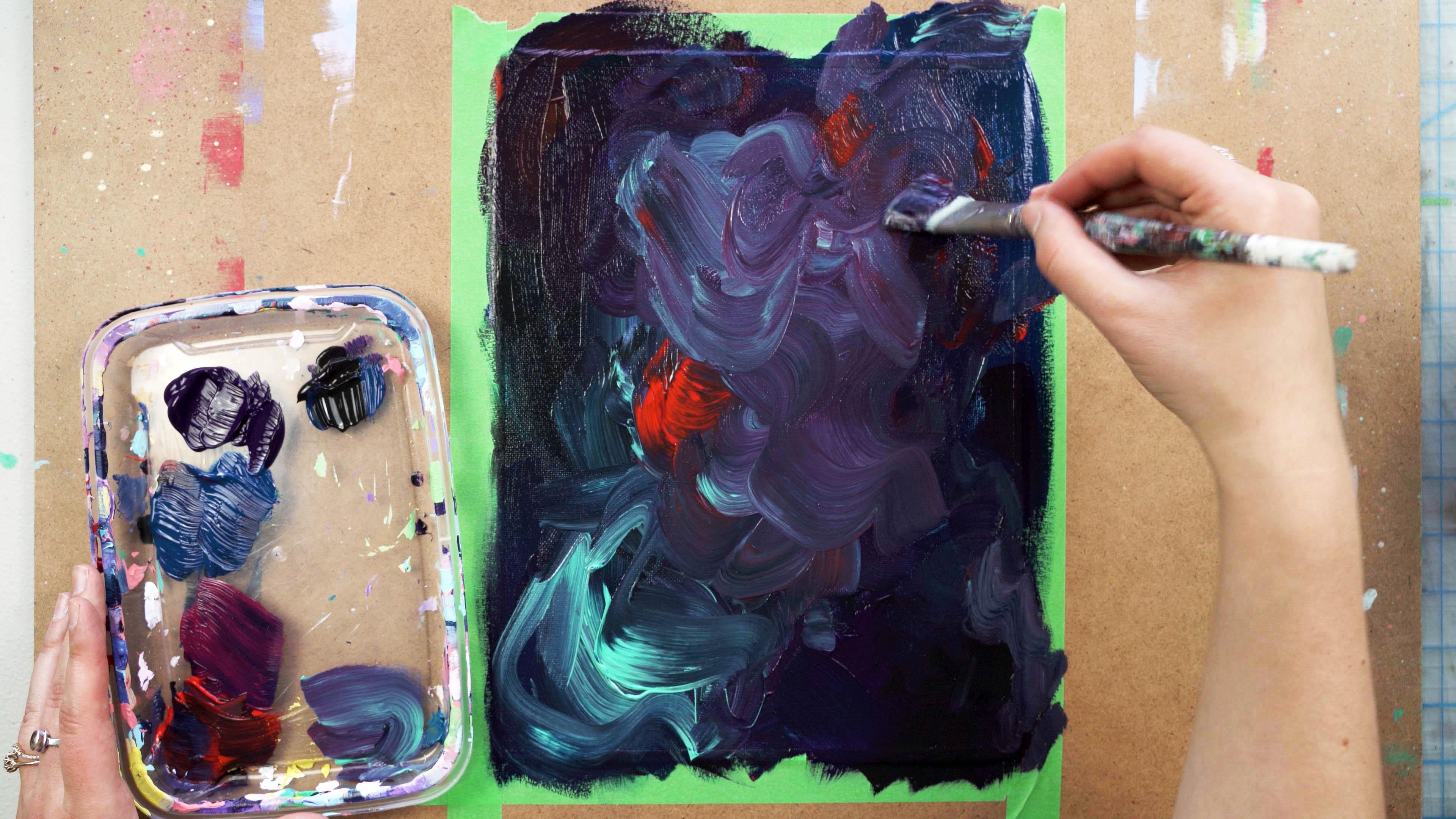
3. Creating the First Layer and Line Drawing: Okay, so to start, I'm going to show
the colors that I am going to use first
for the background here, I'm going to use a selection of mostly deeper dark colors. But I'm going to choose
a couple that do have a bit of white in them to
be my highlight colors. You can see I got that
turquoise and the red, which are quite light, and those are gonna be
my highlight colors. And then the rest of my colors
are going to be deep and dark and help to
convey that kind of moodiness that
this piece has. My first step is
to make sure that the entire canvas is
covered with paint. I'm creating my colorful
background here. And this step is really, really nice and really
freeing and just feels really good because you're not trying to make it
look like anything. You're just trying to get the
color onto the canvas and also make sure that you're using colors that are
gonna convey your message. Now you do want it to convey the emotion
you're trying to convey. So in that respect, you are trying to make
it convey something, but it's not anything
that you're trying to mimic or you're trying to get exactly to
look a certain way. So I'm going to use
this larger brush here because when you cover
larger areas of the canvas, you want to make sure you're
using a larger brush, just like when you're
doing detail work, you want to use a smaller brush. And I'm just spreading the paint and the color is all over. Now you can see
that I'm choosing darker colors here to start. Then once I have the
canvas full of paint, I'm going to go through with that turquoise color and start to in some highlights and
some different areas here. And I'm just moving my
hand back and forth and just laying on the paint
nice and thick here. Now I'm going to grab a bit of that turquoise color
and you can see that it starts to
show up really, really strongly
because all the rest of the colors are so dark. This turquoise has quite
a bit of white in it, so it shows up really, really bright and nice. I'm going to try and just go wherever my hand
feel like going with this and let it flow nicely
onto the canvas here. I'm going to start
to try and vary my brushstrokes and the way
that I'm moving my hand. Just to create some variants and some interests
IT background, and also to make the piece
a little bit more exciting. So here comes all those different
strokes that I'm using. And I'm going to
grab a little bit more and just keep working it. Now you want to work
this painting until you're really happy
with the way it looks. So I'm almost there, but I'm just going to
grab a little bit more of that turquoise color here, just so I can create some
really strong areas of that turquoise and a
little bit more red to. And then I'm gonna
go and put my brush in and just kind
of be a little bit lighter with when I add
the paint so I don't scoop into the paint that's
already on the canvas. If your paint is quite thick, you want to be really light
handed with the brush here. Then like I had mentioned, I'm going to grab a little bit more of this turquoise here, nice and thick on
the brush and just create some really
strong strokes here that are going to be very visible in the peace,
even in the end. As you can see here, there's already quite a bit of depth going on in this piece. Quite a bit of layering, quite a bit of interest. And I'm really quite happy with the way that it's
coming together here. Once you have all of
your strokes down, you want to make sure
that that dries a 100%. Once it's a 100% dry, you can go in and start
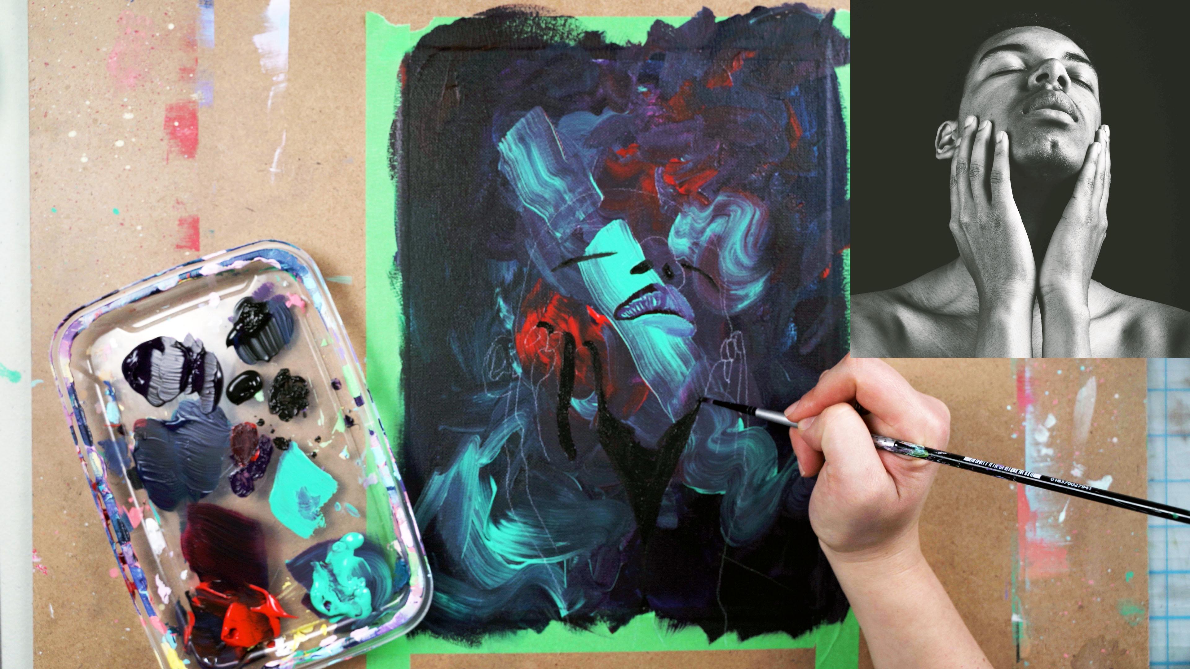
to add your subject. So here I'm using a tracing paper image that I had drawn on here of the
face that I'm using. I'm just deciding
where I want it. And you can see
the little bit of turquoise there is helping me decided lineup
where I want it. Then I'm gonna go ahead and use this white transfer paper. This is the opposite obviously of a charcoal transfer paper. My background is very dark. I want a white transfer
paper that I'll be able to see what I am tracing
onto the background here. And then I'm gonna go through, and I'm going to trace on a line drawing of my image here. I always check after the first couple of marks
just to make sure that it is transferring and
that my paper is the correct orientation because
if you put it backwards, it's not going to transfer end. That can be really frustrating if you go through
the whole thing. So always check at the
beginning and then go through and
transfer your drawing. Now if you don't
have tracing paper and transfer paper, that's okay. You can draw your image
right onto the canvas here. I just find this way quite
a bit easier and faster. And so I really like to use the tracing and
transfer paper. Then once everything
is drawn on here, then you can start
to make decisions about where else to
fill in the paint. Here I have my image drawn on. Just want to check to make
sure I didn't miss any lines. And I believe there are
just a couple of lines on the side that I'm still
gonna transfer over. So I'm going to go ahead and go back and then just
transfer the sides here. But always check before you
take off the tracing paper. Because again, it can be
really hard to line up. Then once you're happy with it, you can remove the tracing
and transfer paper.
4. Creating Details: Okay, So next I'm gonna
go back to my paint here. And I'm going to go in with a detailed brush and some
straight black paint. And to start, I'm gonna
start knocking in the darkest shadows of
this piece with black. And I'm going to grab
a little bit of water here and loosen up the black. So I typically don't add water
to my acrylic paint at all except for if I'm doing some detail work with
black paint and that case, I like to add a little
bit just to make the acrylic paint move a little bit more
fluid onto the canvas. I'm going to start here in the mouth region
and start to add in the deepest shadows
of the piece here. And it's a good way to start any acrylic painting by
starting with the dark areas. I'm not going to cover in everything fully
part of my piece. I wanted to be very
expressive and kind of mysterious and elusive. As you can see, when I start
to paint this face on, I'm not going to be
painting the full image. I'm not going to be painting the full shadow
areas and I'm not going to be painting
all the skin tone. I'm going to just be
painting a selection. Now, what selection
should you paint? Well, you should just paint
whatever feels right to you. You just want to start
off and go for it. And then if you feel like you need to add a
little bit more paint, you can go and add a little
bit by bit to your Canvas. Now I'm going to
use a little bit of red and purple here
mixed in with the black to lighten it up as I go through and paint
the mouth here. And you'll notice
that I switched to this medium-sized brush here. You always want to use
a brush that reflects the size of the section
that you're filling in. Because I'm starting to fill in a little bit of a
bigger section here, I switch to my
brush that'll just ensure that there's
less brushstrokes and the painting looks more kind
of concise and less streaky. Then as I go across these lips, I'm now going to start to
add in some lighter colors here and just kind
of develop the area. Now with the lips, I do want them to
look semi realistic. So I'm following my reference
photo here as to where there are shadows and highlights
and different values. And I'm trying to
reflect that here. But as I move through the piece, I'm going to break
away quite a bit from the reference in
the reference photo isn't to help me recreate
something that looks exact. It's more to give me the
essence of a face that I can transfer onto this
canvas and make it my own. So you'll see that the
finished piece doesn't look exactly the same as
the reference photo. And that's, I think exactly what you want
because you want to be making art that reflects
you and your style and your personality and not just replicating something
that you see online. But as with that being said, it is nice to have a
reference to follow. It's just very
helpful to be looking at something when you're trying to emulate
something else. I'm gonna move on to the
bottom lips here and again, trying to create a similar
more realistic lip shape, but with my own little
funky colors here. If you see. Next, I'm going to go through and start to create more of the details
with the black here. I'm gonna go in and add the nostrils and a couple
of different areas here. It's nice to work from dark
to light when painting, not just when painting on a
dark surface, but in general. I like to paint
the black to start and then work my way
up to the highlights. So you start with
the darkest tones, you knock those in, then you can go to medium
tones and at the very end, add the highlights on top. And this kind of follows
the layering process of paint when you're
using acrylic paints. So the bottom layer
would be darkest and the highlights
would be on top. You're not going to put low
lights on top of a highlight. It just is a bit
counter-intuitive. When you're painting with
acrylic paints specifically, you're gonna go in and add in all the dark areas to start. I'm just adding in some of the shadows and the hands here. I did under the
neck area there and just any areas that had the
blackest blacks in the US, as you can see in the
photo, the reference photo. Then next I'm going to
go through and take this magenta color and add
in some kind of mid tones. I'm going to take this on this nice little
square brush here, has nice strong strokes
when I use this brush. And I'm going to lay this color down just kind of in
the mid tone areas. So here there was like a
mid tone on the eyelid. So I'm going to add that in and then again on
the other side, just in any areas that have a little bit of
shadow but aren't quite as deep as the black. I'm going to also go through
and add it on top of the black here on the neck and just blend those two
together a little bit. This is going to help
me to create some form. Use it in all areas
that are gonna help me add in those dark areas. Now I'm also going to
do a little bit on the forehead and to define
the head shape area. This I added in a little bit of a darker purple here
as you can see. And again, I'm just following the shadow areas of my piece. I've already done the
deepest ones and these are kind of like the secondary ones. As you're painting, you're
gonna be making decisions on what makes sense for you to add and what you should admit. You want to just use
the enough paint to get your point across or
convey your image across. But you also don't want
to fill the whole piece. For example, if I was to
paint all the skin tone, it would really take away
from the beautiful background that we painted there with all the different colors
meshing together. By only painting
parts of this face. I tie in the background. So all the strokes and the
background with the face in the foreground and together
they seem like one piece. You want to make sure that all
the paint is integrated so it's not separated
and disjointed. And so sometimes when you
paint a subject on top of a background and you don't mix them or
integrate them together. It can seem very disjointed. That's kind of a pro to leaving the background in is it
meshes everything together. And then again, I'm
not really introducing any new colors that were
not in the piece already. The only new color that I'm
gonna be introducing here is what I move on to the
white paint marker. Now I'm just going to
go through again with this smaller brush here and I'm going to
it start to build up some form to the nose. So I'm just going to
speed up the video here, but you'll be able to see, I'm going to make sure
that there's a range of darks and lights and mid tones. Again, I'm using different
colors to do that. Instead of using light to dark, I'm going to be relying
on my turquoise as my highlight color and then that magenta color
as my mid tone. And just working
the piece this way. I do want the angle of the face to be very
clear to the viewer. I'm going to add in as
much detail as necessary to make that clear
to the viewer. So it is a bit of a
tilted head here. And so I need to have
a certain amount of detail for people to understand
what they're seeing. But also I want to leave
out as much detail as I can That's going to make it be a little bit more mysterious. Adding in features like
the nose and the lips, it's very important
because it really helps convey the face and the
face angle to the viewer. Now I'm just switching back
to my bigger brush here. And I'm going to add in the shoulder here as
a highlighted area. And just add in any extra
colors that I want to knock in, especially in color
blocking here. So this is kind of just
a flat area I'm going to do and then I'm going to
do some work on the hands. Now, when I do the hands here, especially on this one side, I'm going to be adding in a
bunch of color that I'm going to be adding in a bit more
loosely and less detailed. I'm going to just let it knock in there and I want to give the illusion of the hand
without it being so literal. In order to do that, I'm going to add in a couple of different colors together, but I'm going to leave it kind
of just blocked together. And I'm not going to knock out details as much
as I did on the face. That's going to give an
interesting impression and let the mind of the viewer
wander a little bit. I'm going to add in some
of that mystery too. I'm just going to go in a
little bit more with the purple here just to create a
little bit more dimension. But overall, I'm going to
leave it pretty elusive. Now I'm going to go in with this paint marker
here and draw out. The hand on the other side and do a couple of
details on the face. I really love using
these paint markers when you want to create thin
lines with acrylic paint. Because I do find it
very difficult to create these types of thin
lines with the paintbrush. And it is possible it's
just very time-consuming. So might as well use an acrylic
paint marker to do that. Instead, it'll be faster, it'll be more accurate, and your painting will
still be all acrylic. My favorite paint markers
are the Posca brand. So if you can get those in
your area highly recommend, then also using this
a thin white line here is going to add quite a bit of variation to my lines in my piece and
add a lot of interest. You want to make sure that
you're varying strokes, you're varying line whets, your very marking techniques, because that's all
what's going to make your piece look
very interesting. Next, I'm going to go back
to my thicker brush here. And I'm going to
create some hair. In the reference photo, you can't really see the hair, but I do like the idea of
having a little bit of black kind of takeover here and differentiate
between the hair, the back of the head, and the background of the piece. But I'm gonna keep
it fairly loose. And as you see here, I'm just doing little
twist in my wrist and I'm not filling in all the area, just gonna do a bit
of dry brush there. Next I'm going to go back
and now I'm going to add in some details
to the piece. So we're getting near the end here and I'm just
going to add in some fingernails and some
last minute details, as well as a little
bit of highlights to the hair area just to
add some interests here, so it's not all totally flat. Now is where you add in
all your last details that you want to bring
the piece really to life. I'm also going to fill
in the collarbone area here with that magenta
mid tone color. And just finish up all the details that I
need to finish to kind of get this piece to where I
want it to be and be done. I'm also adding in
some highlights to the nose here that
are just really small and slight like on the
inside of the nostril here on both sides
with my paint marker. Then I'm going to go through
with a little bit of this purple color and
add the clef and chin. Just all these last
minute tiny details here. I'm also going to add in
some extra highlights. So bring up any areas that aren't quite as bright that
I would like them to be. And then once I've done
adding all my details, make sure that you always
sign and date your paintings. You can look back and
see how far you've come. That's it. I hope that you enjoy this video and that you learned quite a bit about expressionism. And I can't wait to see
what you guys create. This is a really good
technique to paint intuitively and really express yourself using acrylic paint. And it's really
great for layering, so I hope you enjoy it.
5. Outro: Okay, so that's it
for today's video. I hope you enjoyed
the demonstration and learned a lot
about expressionism. And I can't wait to
see what you create. Feel free to tag me
on Instagram with your finished works
and otherwise, we'll see you in the next video. Have a good rest
of your day. Bye.
 Cori Jaye Ettienne, Artist and Creator About Vivid Color