Transcripts
1. Introduction: Hey guys, welcome back to another video. My name's Cory J, and I'll be your teachers today. Today we're going to work on this horse to cubism piece here. We're going to learn a couple of different tips and tricks on how to create this piece. We're also going to be using some flat shapes and creating gradients with the paint. And it's going to be a lot of fun. So there's just a couple of things that I want to go over before we get into the video. So the first one is a reference photo. So I have linked the horse reference photo that I use for this piece for you. But if you wanted to use your own reference photo, for example, a photo of your patch or an animal that you love. You can definitely go ahead and use that reference photo instead of the horse that I used. Because the tips and tricks that I'm going to show you are transferable. So just keep that in mind. You can either use the horse reference photo that I used are your own. Next thing we wanted to let you know that you will need a printout of the photo that you're using, blown up to a full page of 8.5 by 11. So when you go to print your reference photo, you want to make sure that it's full page at 8.5 by 11, which will transfer nicely to the nine by 12 inch canvas surface that we're working on. Now you don't need to print it in color. So here I'll just show you right here I printed mine in black and white and that'll be just fine for what we're using it for us today. Now, the second thing I wanted to go over before we begin is some additional supplies that you're going to need. So you're going to need your painting kids. So your acrylic paint, your back bore your drawing surface. You're taking everything that you normally use to paint with. But also you're going to need a ruler. You're also going to need a pencil, research, and also to different color pencils. So whatever colors you like, I recommend a red and a blue. But whatever colors work for you, as well as some painters tape your printed image, and then also you're going to need transfer paper. So if you don't have a transfer paper, something like this that spin and you can see through. You can also use loosely because it's very thin, so any thin translucent paper. And then also we're going to be using this carbon transfer paper today. So you want to get some of that? One other thing I wanted to note today it's on, I'm going to be using premixed colors, so not your primaries. I'm going to be using some purples and some turquoise and that kinda thing. So if you don't have those colors and you only have primary today, no problem at all. It's actually better for your learning process. But what I would suggest to get some little jars you can use condiment containers are old film containers and premix some colors before we begin, that way you can just get right into it. You have your premix colors, you can take more if you need, and it'll speed up the process when we get into the painting. I also use some colors that have lots. Colors strength and sometimes can be hard to mix, such as the turquoise. Turquoise can be a little bit hard to mix. So if you wanted to grab a couple extra colors for your painting kit, you can go ahead and do that, but is not necessary as I really hope you make this piece your own and it doesn't have to be exactly like mine. The last thing I wanted to talk about before we get into the video is that the part of the video at the beginning where we're going to start to build out shapes. That part is so important to the process of the painting because if your original drawing has flaws or doesn't make sense or isn't very strong. You get to the painting part. It just makes it that much harder to have a successful piece of the end. So I really want you to take some extra time and really knock out those shapes and really knock down that pre painting drawing. Before you start painting the drawing, make sure that you make it nice and strong and you're really happy with it before we move forward. Okay, so that's it. Let's get right into it.
2. Creating A Line Drawing: Okay, so the first thing you wanna do is grab a piece of nine by 12 canvas paper. And then you want to grab a piece of tracing paper that exact same size as your canvas paper. So you might have to cut it, but you want it to be exact same size. And then what you're gonna do is you're gonna take your picture of your horse so you print it off and put it on the window. And then you're going to put the tracing paper right on top of the horse, but you wanna make sure that wherever you place the tracing paper is going to be where the force is on your actual piece. So you want to have it fairly centered. And then what you wanna do is you wanna take your red pencil crayon and trace the outline of the horse. Now you want to trace just the outline of the major details of the whole wrist like the mouth and the nostrils, that kind of thing. You don't want to do any value at this point. You're just trying to create a line drawing that you can work from and create shapes from. And then once you have everything together, you can always lift up your tracing paper and see if you've missed any any details. I missed a couple here, so I'm just going to add that in there. And then we want to bring it back to our workspace.
3. Creating The Cubist Drawing Guide: So I'm going to put it on my canvas paper just so I can see the tracing paper better and I'm going to switch to using a pencil. Now, the reason why I'm going to use a pencil is because if I make a mistake or I don't like a shape I made, I can easily erase it and still be able to see most of the color pencil of the red outline underneath. So what I'm gonna do here is I'm going to create shapes. And the shapes I'm going to create are going to be guided by either the horses form or by shadows and highlights. And where I see that on the horse's mouth or on the horse's face in different areas of the horse. Now this part is going to be really, really important because this is going to set up your entire painting. So you wanna make sure to take some time doing this. And I would suggest trying to do it away from the video instead of copying exactly what I'm doing here. Because it'll help your mind be able to start to distinguish shapes and forms and how those are on the horse. So what I'm doing here is I'm just taking my ruler and I'm creating lines and circles and that kind of thing anywhere that I see a clear form. So as you can see, the mouth, the bottom part of the mouth that I started with is blocked off. It's very dark there, so I created a little shape for that. Now I'm doing the area above the nostril. And if you look in the image, you can see that it's a raised there. So there's a separate area that I'm going to create there. And then I'm gonna go through and just continue to do this process. You can see that I'm creating a line down from the eye and in the image you can see a line down from the eye. And so I'm just using the forces, form and shapes that I see in the horse to create shapes and forms and organic forms and really put the base of my drawing here. Now you want to make sure that you, you tackle all the areas that have a really dark shadow and make those shapes really clear because those are going to help you when you go to paint it to add some dimension. And same thing for the highlights. So the lightest areas that you can see on the horse, you want to make sure that you capture those in a shape so that in turn you can paint those. So when you have your darks and your highlights, it really gives a lot of form to what you're painting and we're going to continue to do that here, even though we're going to be using a mix of flat color as well as some gradients. We still want to create a bit of shape, even though it's a cube is peace. So that's how we're gonna do is we're going to be identifying the shape and the different forms that the horse has, as well as using the shadows and the highlights. So I hope that makes sense here. But what you wanna do is you can either pause the video and do this part right now or you can continue to watch and see what's coming ahead. But I think you should take some time to do that before you continue on just to make sure that you kinda get a good grasp of the process. And you really want to make your piece your own. So your piece should be different from my piece. Okay, So this is what I've come up with after I have done the process here, just a couple of things I want to show you. The background. You can see the lines going all the way around the horse from the background here. So I created those by taking my ruler and placing it in the center of the horses i, and just turning it around and around and around just to create a center point that all of these lines are coming from. And then also I wanted to talk to you about the hair. So the hair is very different from the image of the horse. Here I created all these organic forums to create the illusion of the hair there. And I'm really happy with how that turned out there.
4. Prepping The Canvas: Okay, so next what we're gonna do is we're going to move on to creating the underpainting for our piece. So you want to start by taking your nine by 12 piece of canvas paper and taping it down to your board. Now when you tape it down, you want to make sure that you overlap the tape on all four sides the same amounts. And that's so that at the end of the painting, when you remove the tape, you have a nice clean border that's the same amount of width all the way around. And also once you lay your tape down, you want to make sure that you press it down with your hand just to make sure that no tape slides underneath. Sometimes I do a little bit of acrylic glaze over top of the paint to get some crispy edges, but I decided to skip that today. So just wanna make sure that you put your tape down, move your finger on it. Make sure it's nice and tight towards the canvas. Next you want to grab your drawing. And here you want to make sure that you place it exactly how you wanted to transfer. Because now we're going to transfer the drawing onto the canvas. So you can see I'm being very specific as to where I place it and I only I'm going to tape the top. So this is important. So I'm going to put the tape of the, I'm going to push the tape down at the top there, but I'm actually going to grab another piece of tape here and add it just to make sure that it's very secure at the top. And that's because if I transfer and I missed a spot, I want to be able to lift it up and see and then put it back down in the exact same spot. So now I have grabbed my piece of charcoal transfer paper here. So I just want to make sure that I put it underneath the drawing. And as you can see, I can just lift it up, but it's still going to be adhered at the top. And I'm grabbing a different color now, so I have a blue pencil crayon to trace it. And that's because I want to be able to see where I have traced and where I haven't traced. And you can also use your ruler to get those nice straight lines on. And when you're transferring your drawing, you want to be kind of light handed. Because otherwise if you make really dark lines, it'll be hard for you to cover them with the paints if you don't erase them first. And so I'm doing quite, quite a dark under drawing here just so that you will be able to see. But I suggest that you use a light hand. Now you can lift up your paper here and see did you miss anything? I noticed that I missed a bit under the horse's mouth here. So I'm just going to put the paper down and the charcoal Paypal down again and just go ahead and knock in that little piece that I missed. And then that'll be it. Your drawing is ready to be painted. You can remove your your tracing paper and get ready for painting.
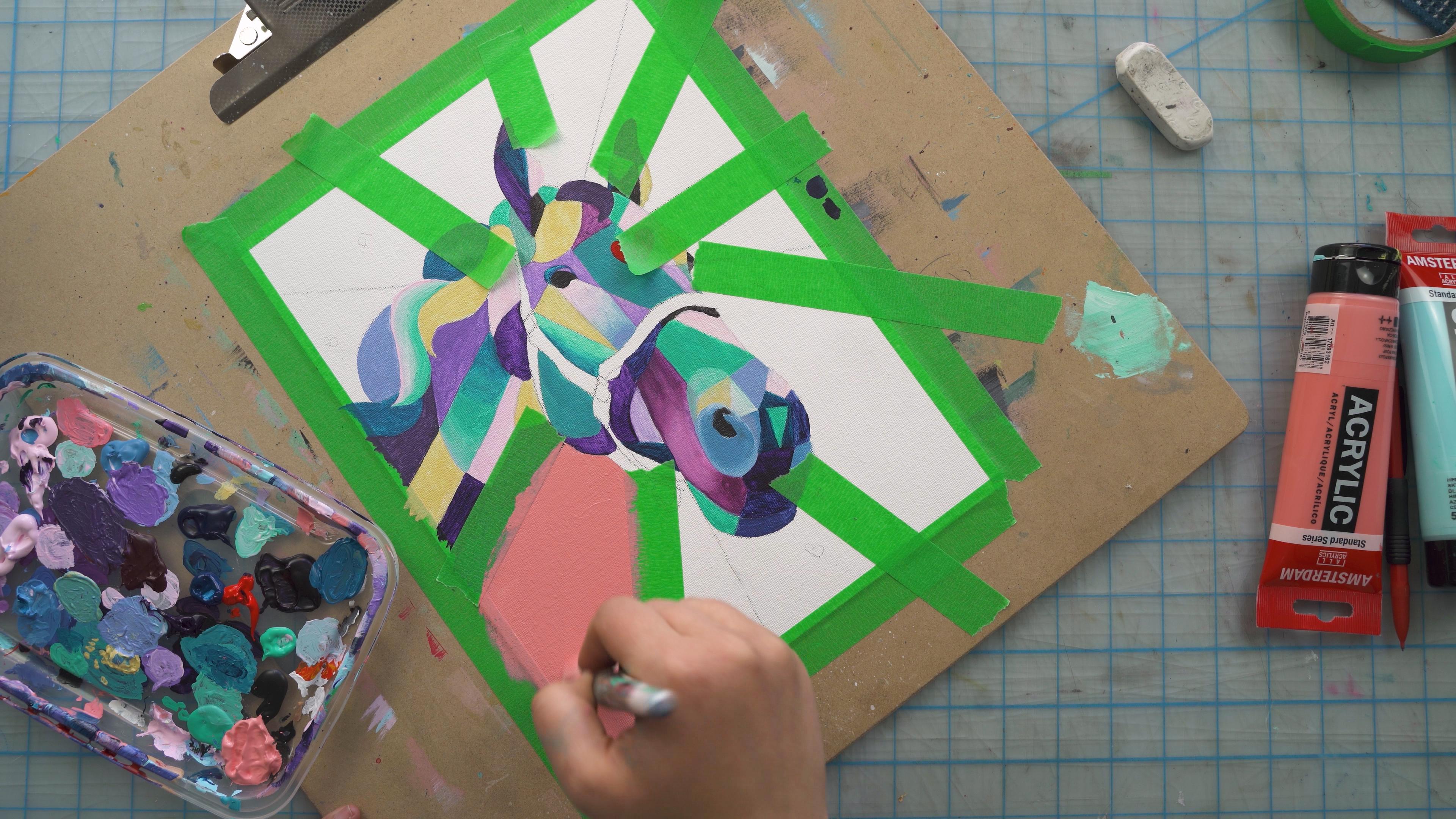
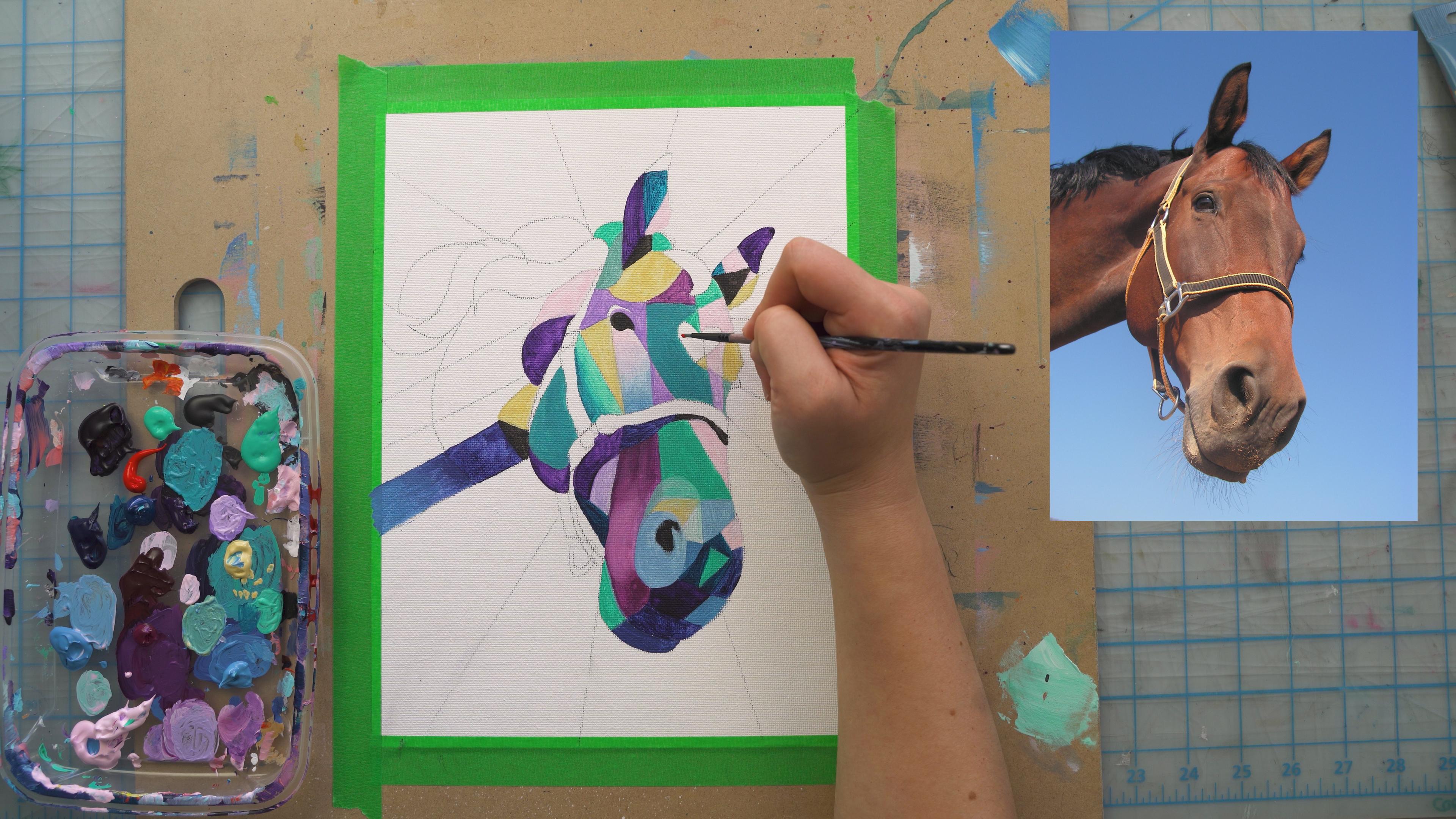
5. Painting the Subject: Okay, So next I'm going to grab some colors. So when you're grabbing your colors, if you don't have premixed colors, which I suggest if you're starting out painting for the first time, you don't use premix colors. But what you can do is you can mix a bunch of colors into little dram jars. And then you'll have them to use when you move onto your painting. I'm using premix colors because I'm very confident in my mixing skills at this point. But what you wanna do is make sure that you grab some lighter colors, some darker colors, and some midtones. And to start off here, I'm going to actually going to start off from dark. And oftentimes when I paint, I paint from the darkest area to the lightest area. And with this piece it's not going to be any different. So to start off, I'm going to start off filling in the shapes that are the blackest of black. So a 100 percent black. I'm going to start with these and fill these all in first. And you wanna make sure that you're using the right brush for the area that you're filling in. So the biggest brush for the area you can get away with. That's what I suggest because if you use a tiny brush in a large area, you'll be able to see lots of brushstrokes and we want to avoid those. But you'll find that in this piece you're going to be using a lot of tiny brushes because there's a lot of tiny areas, very detail oriented piece that we're working on. So next what I'm gonna do after I have all the black areas is I'm going to move on to the dark areas. So the areas that I've painted first where the blackest of black like a 100 percent black dark shadows. And now I'm going to move on to the darker areas of the pieces aren't a 100 percent black. You can always test your color like I just tested my color on the side of the paint there just to the tape there just to see what it looks like. And then I'm gonna go ahead and start filling those in. So our first step is the blackest of black and then our second step is the dark areas of the piece. Now if you create your under drawing correctly, you'll be able to see that there'll be some shapes that you can fill in right off the bat that are very, very or the dark areas of the piece. So if you captured your shadows in shapes, you'll be able to start with that. And so that's what we're gonna do first. And so you just want to fill in one shape at a time. And also, if you're mixing a color like I mix this color that I'm using right now from blue and purple. So I'm going to start filling in this shape, but then I'm going to continue to use that same color and another area that's also dark. So anytime that you mix the color during this piece, you want to make sure that you can use it in multiple areas. And that'll just help the painting process go a little bit faster and also help to conserve paint. So right under the horses, I'm not sure what it's called, but I guess we'll call it a color. So right under the horse's color, you can see that there is a dark shadow that the color has created. So I'm going to go through and paint in another section of that dark shadow with this pink color here. And so I not only use it in one area, but I'm going to continue to use it in as many areas as I can. That makes sense. And also I'm still using this thin tiny brush here. And you can see that as I fill in a small area, I'll actually twirl the brush in my hand and that'll be so that I can access the paint on the other side of the brush. So you'll see me do that and that's a good thing to start to learn how to do. So after I painted a couple more areas with the same color, I'm going to go in and add in a little bit of blue to the color. And then I'm going to do the bottom half of the mouth here. So in the reference photo you can see the top area of the mouth is a little bit darker than the bottom area. So I went to reflect that in my color choices and paint choices that I use. So when you're doing this, you want to be strategic about what color you fill in where. So I'm going to pair the darker colors. The darker areas are the shadow areas of my piece. And I'm going to pair the lighter colors so the lighter areas. And then for the mid-tone colors, I'm gonna kinda mix all my colors together. And you'll see me do that a little bit more as we continue on. And then I'm gonna take the same, the same color that I mixed and I'm going to add it in, in a couple more areas. Next, I'm going to show you how I do a gradient. So first we have seen some flat color here. And now for this next little square here, I'm going to show you how I do a gradient. So I turned my board here because it's easier for me to reach and for me to get the brush to hit the Canvas in the right way. So don't be afraid to turn your Canvas anytime you need to get an area a little bit closer. But to start I lay down one color and then I'm going to continue to add in a little bit. Blue and a little bit more blue and a little bit more blue as I move down the piece. So I started with the darker color, the darker blue. Then I added in a little bit more of this lighter blue and I created some lines across. And then I'm going to keep adding a little bit more lighter blue as I move across and down the piece. Now one thing to keep in mind when you're doing a gradient is make sure that your brush is very loaded. So I have lots of paint on my brush here. And that really helps me to be able to blend the light colors and dark colors together easily. If you don't have enough paint on your brush or on your canvas, it'll be really hard to mix the two together. So just make sure that you add in quite a bit of paint and also be very light handed when you're mixing them together. So that's our first gradient there. So we're going to be adding in gradients here, in there and the piece just to add more dimension. But for now, I'm going to go back and I'm going to add in my last of the darker shadow colors. So that's going to be this dark purple color. And I'm just going to mix it in and put it to the canvas nice and flat. So I'm not adding any color to it, just the plain purple. And I'm going to go through and add in my last darkest areas of the piece before we move on to mid tones and highlights. And also I just wanted to let you know that some paint colors are more opaque than others. So for example, this purple color is trite, quite transparent, and you'll be able to see a lot of brush strokes in it. So that means that I might have to add two coats to each purple area that I do so that I get more of a flat color. Now sometimes seeing the brush strokes is really nice. So it's really up to you whether you want that detail or not in your piece. I really, really enjoy it and some areas, and then in other areas it bothers me. So if it bothers you, you just make sure that you add in two coats the same color once the first coat has dried and you'll have more of an opaque look. Now I'm gonna do another gradient here, and I'm gonna do it with this Moroni purple color. So I've just added in a little bit of the light pink to this purpley maroon tone that I'm mixing. Because if I add an a lot, a lighter color which has more white in it, the color will turn out with a darker opacity. And this color I know is very transparent, so I wanted to add a little bit of the lighter color into it to make it a little bit more opaque. Now we'll lighten the color obviously if you're adding lighter paint into it, but it'll also make the color a little bit more opaque. So I'm going to start with this larger brush, but you'll see that I changed my brush here because it's too big for the area and I am not able to get the details. So I'm moving back to the smaller brush here so that I can get into all those little areas. But this little side part of the horse's mouth, I'm going to create another gradient here. So I'm going to start with dark at the top, but then I'm also going to do some dark at the bottom and the mid part is going to be the lightest. And the reason why I'm doing that is because if I look at the reference photo, that's more where the light is hitting. So I want it to be more realistic of the horses form and all these kind of decisions that you make, where to do a gradient and how to do the gradient. They're going to help create a more dynamic piece when you view the piece at the end. So I'm starting with that dark piece and then now I'm going to mix in this lighter pink color here. And you can see I have lots of paint on my brush and my hand is very light. So if you go too heavy with your hand here, you're going to end up denting the paint and kind of scooping it up. So you want to make sure that you're just mixing it lightly on the canvas. So I'm gonna do that here and then I'm gonna go back to that darker color and create it to be more dark here at the bottom. So that gives the illusion, this kind of shape bending around the horse and the lightest part being closest to us, which is kind of beside the horse's nostril area there. And then don't be afraid to go back over areas that you created a gradient with another gradient. So for example, if you do an area with a gradient and then you find that it looks very streaky and you're not happy with the way that it came out. Wait for it to dry a 100 percent and then go back over it with a second round of gradient on top, and you'll find that it becomes much, much smoother. So there will be lots of areas in this piece that you'll have to do two coats sign, and that's okay. You just do as many codes as you want to make it look the way that you're happy with. And so next here I'm going to go in and start doing my mid tones and my highlights. So I just use this nice pop of color here, this nice turquoise color. And I'm gonna go over that color twice because it's a little bit streaky here. But you'll also see that I've used it in multiple areas already. And what we're gonna do is we're going to use all the colors we have, but then we're going to start to mix them together. So now you can see these next parts I've knocked in have been a mix of the colors that I have on my palette. And so you wanna make sure that you're mixing all the colors together. And that will also create kind of a cohesive piece. So here the color I'm working with now is a mix of the blue and the turquoise together makes this nice soft blue here. And it's really, really nice. And then I'm gonna go in with this pink color, which will be my highlight. So I actually decided to do two highlights in this piece, pink as well as yellow. But you'll see that this pink I'm laying only in areas that are either going to be the lightest of the horses form. So the right side of the horse's face is the lightest. So that's where I added the pink and just two different shapes there. And then I'm gonna go in with the mid tones and add them to the end of the nostril here. So this green color and the center of that turquoise ways. And then it's surrounded by those darker areas and you can see that reflected to in the image. So I wanted to add one more highlight color. And it's going to be this yellow color. And you can see that I'm going to lay it over top of a shape that I've already filled in. So if you paint in a color and you decide that you don't like that color, just wait for it to dry completely and then cover it with a color that you do make. Just because you lay down a shape with a color doesn't mean that it has to stay that color. You can always paint over, and that's one of the things I really love about acrylic painting. And here also you can see that I ran off this triangle in the middle of the horse's face here just under the I I kinda went outside the lines. Well, I just waited for it to dry and then I'm going to go through and cover it with this pink. So no issue if you run out of the lines, no problem. You can always cover it with the color beside it and the next color over. And then here under the horses I'm gonna do another gradient. So I'm going to start with this pink color and I've loaded it on quite well here. And then I'm going to add in a little bit of blue at a time. So a little bit of blue with a little bit of the pink now and add that. And, and then I'm gonna just kinda give it the ombre effect of one color to another, a nice gradient from light to dark. And again, I kind of got this influence from the way the light is hitting the horse's face. And also I just thought, I'm not going to do a gradient everywhere in this piece, but I want to make sure that there's a couple different gradients in each of the areas of the horse. So the bottom of the horse's mouth, I have a gradient now near the forehead I have a gradient. And I'll do one in the hair as well, just so that there's a gradient in every single area. We also did one on the neck. So yeah, you just want to take a little bit of the blue and a little bit of the pink and then just keep going little strokes all the way down and blend it. Again, make sure you're using quite a bit of light hand here and lay the paint on thick, thick, thick so that you can and have some paint to blend. So now I'm just going to go through with almost the peer blue here and finish off the bottom part of the gradient here. And it's coming together nicely. Okay, so next I just wanted to show you filling in this heart. So I drew this heart on the horse's forehead and I'm going to have some light streaming from it. This is just one of those things that's creative preference. So you obviously don't have to draw a horse on the heart, on the horse's forehead. You could do something like a lightning bolt or just leave it how it is and not add any extra shape at all. But I also wanted to show you that the way that you can use color. So for example, this piece is made with mostly analogous colors, which are colors that are sitting adjacent to each other on the color wheel. But then I'm going to add in this red color, which is across from the green, for example, that it's beside there. And it really creates a strong pop of color here. So if there's any areas that you want to draw attention to in your piece, you can always use basic color theory to do that. So I'm using here a complementary colors with the green and the red. And then I'm just going to mix in a little bit of pink here because I want the shape to be still a heart, but not exactly read all throughout. So what I did there is just take the red and add in a little bit of light pink to it to change the color. So I have two shapes. And then next I'm going to add in my last gradient here. I'm going to do a gradient in the hair. And I'm going to keep my brush following the form. So it's like an S-shape. So I'm going to have the paint do a gradient in the way of an S-shape here. So I'm making sure that I have quite a bit of this pink on the canvas and just kinda loading it up. I don't want there to be too much because I tried to avoid extra texture on my painting, or at least for this painting that we're doing right here. But then I'm going to add in the other colors. So I'm going to take a little bit of the pink and mix it in with a little bit of the turquoise color that I'm going to do the gradient to. I'm going to add a little bit more pink there and then I'm going to pull it across. But again, I'm pulling it across in the shape of following the forum. This little organic shape here, this little S shape. And that's just going to give you the illusion of kind of hair flowing. That's what I'm going for here. And then when I pull my paintbrush off screen there for a sec, I'm just taking off any excess. So here I don't want to be adding any more paint now I'm just trying to blend them together so I'm gonna take off the excess of my paint there. And then I'm going to grab just the pure turquoise color, which you can't see because it's off-camera there. And then I'm going to pull in so you can see that that pure turquoise colors the darkest now, it's the purest. I'm going to grab a little bit more of that and just complete the gradient here. So this is going to be my last gradient for the piece. But you'll see that even just looking at the piece and now as it's coming together, the gradients really helped to add some interests to the piece. Some difference in form and shape. And it's nice because you have some flat areas and then some areas that have more dimension. So yeah.
6. Painting the Background: Okay, So next thing I'm going to go through and work on the background. So I am right now I've chosen these three colors. And what I'm gonna do is just put the first letter of each of these colors around and just make sure that none of the areas of the background are going to, you know, combat with the horse. So I'm just doing like a blue, a B for blue and see for coral and P for paint. And just making sure that where I'm going to lay them is going to be good. I just want to plan that out because you never know. You get into it and then you've laid the paint down and it's not the goal, right area can be kind of a mess. And then I'm going to go through and I just erase just the sea. So all the coral pieces I erase the seas from because I'm going to be painting those first. And then I'm going to use painter's tape as a guide. So I'm gonna go through and lay down the painter's tape on both sides of the area that I'm going to fill in. And I'm gonna do it right up to the other side. So right up to the horse's neck. I'm, you are even going to be able to see a little bit of the horse's neck shining through their little color underneath. And that's because I really don't want to leave any gaps between each color to the next. I'd rather overlap them slightly because if you leave a gap, you'll have a gap of a white line between the colors and it won't look that great. So anytime I'm doing one color on top of the next, I just make sure to set it up right up against an IV or overlap it slightly. And then here you can see that the taped and go all the way at the bottom. So I'm just grabbing a little piece extra and adding it on there and just making sure to push down on the insides of the tape there, just so that no paint seeps out from underneath. And then I'm gonna do the next one as well. So I'm just gonna do that for every little area that's going to be coral. Now that I have all my coral areas blocked out, I'm going to go through and I'm going to start to paint. So you'll see that I turn the canvas again. That's just to make it a better angle for my hand and the brush. So don't be afraid to rotate your Canvas anytime you need to, just to make it easier for yourself. And then you'll also notice that I switched to a larger brush here. So the bigger brush that you can get away with for the area, the better because the less amount of or the least amount brushstrokes you will see. So if I filled in this big area with a tiny brush, you'd see lots of little strokes and lines. But because I'm filling it in with a larger brush, it will create a nice flat shape with not a lot of lines here. And I'm just going to again, the technique is to be very light handed. So grab a bunch of paint, throw it on there and then just be light handed, mixing it, mixing it around and smoothing it out here. And then I'm gonna go to try and do some directional strokes all the way down. Start at the top and then pull the paint down. And same thing with this other side to just start at the top and pull the paint down so it's nice and flat. And then next I'm going to go on and do that for all the rest of my coral shapes here. And then another thing is when you're going to be going up against parts of the horse that are already painted. You wanna do those first and then fill in the remainder of the shape. So what I do is I take the excess off my brush and then I go and just very carefully outline the area that it's butting up against. So you want to go nice and slow with your brush. Nice and controlled. And just quick little strokes here just to get the paint in close. If you go too fast, you could paint over an area that you've already painted. So you just want to go nice and slow there. And then you can fill in the rest of the shape. Grabbing paint as you need. Okay, so now I'm just going to make sure that everything's a dry and then I'm going to take off the tape. Now I'm going to repeat this process for the next couple areas and I have taken off the tape. Well, it was still slightly wet as well as when it was dry and both of them worked out really well for this piece. So you can either wait just a little bit for your piece to dry slightly before you take off the tape or you can wait for it to dry completely. They both work really well. You just want to take off the tape slowly when you peel it off here. And then when you move on to the next area that you're going to fill in, you want to follow the same process, but you want to make sure that you wait for the coral section to completely dry before you move on to the other section. Because if it's not completely dry, you're going to rip off the paint and it's not going to be pretty. And also you lay down the tape, you can erase the pencil line if you'd like to as well. That'll just to help just make it helps so that the pencil line shows through the lease. So any areas that you want to erase before you paint, you can go ahead and do that. As long as you can still distinguish where you're filling in with the paint and where you're not. So here again, when I laid that piece down, I laid it just just beside the coral with a tiny, tiny bit of coral peeking through. So that when I move on to this pink here, I brought it up right up against it and then you won't be able to see any white line between the two shapes. Here. I'm also going to just cover that part of the horse there of the horses color. And then I will repaint that after I do the background. Okay, so now I have all my colors here and it's looking really, really nice. You can see that they all lined up really nicely and I just have left to do that little color area. So next thing we're going to use an eraser and just erase all the pencil lines left in the color area here. And then I'm just going to create the color line with some basic colors. And so I'm just going to do our basic technique rather. I'm just going to use a light blue and a dark blue and fill it in. I'm going to fill in the color pretty simple. So I'm not going to make it too realistic. I'm just going to kind of fill in the shapes. I am going to make sure that I distinguish the buckle areas just to give it some extra forums. So here you can see that I'm grabbing a little bit of the darker color just to create a bit of a buckle there. And I'll be doing that throughout the whole painting of the color here. But you can see that I'm not adding too much, not too much different shapes or too much different form to it. And I'm just sticking with one color, monochromatic with lights and darks. Then I'm going to go through with a lighter color here and just add it in on top. But you can see that I added that that darker navy underneath, which would be how the color, the light would hit. And as I go through and paint this top part on the top of the horse's nose here. You'll see that I keep grabbing a little bit of lighter blue and lighter blue as I go because even though I'm not making this area realistic, I still want it to follow the rules of light and how light hits an object. And so I'm gonna do that here. You've been adding in some white here to make it the lightest as it gets to the site of the face where the light is shining the brightest. And I'm just going to go through and do the same thing for the bottom area next here. Just filling out the little color area and adding in the buckles. Again, I'm doing the buckles nice and dark here so that they are distinguished but aren't kinda taking away from the piece. And the reason why I did this piece last is because I wanted to make sure that the color I chose for the color area here made sense for the entire piece. And as I'm choosing colors as I go, I decided to do it last. Okay, So this is optional, but I just wanted to show you this as well. So I'm going to use a little bit of this acrylic glazing gloss, which is a little bit shiny. I'm mixing it with a little bit of white. And then I'm going to add in a little bit of light kinda streaming out from the heart here on the horse is forehead. Again, this is just like creative, right? Just something that I thought would be interesting. So adding it in, and this is obviously totally optional, but this glazing medium, it adds a little bit of gloss color to this area, but it also adds some transparency. So here I wanted to paint to be transparent so you could see through to the colors underneath. So I used it with just a tiny bit of white and in turn that made the white a little bit looser in a little bit transparent. And then I take off the tape there and I'm ready to sign it. So I always suggest that you sign your peace with your name and the year at the bottom, because it's always nice to look back at your work and see how far you've come. And then that's it. So I hope that everybody enjoyed this piece today and that you've learned a little bit about creating a more cubist piece, using different shapes and form to create excitement in your work as well as shadows and highlights. And I really enjoyed painting this with you. I can't wait to see what you guys come up with and we'll see you soon.
7. Outro: Okay, so that's it for our piece today. I really hope that you guys enjoyed this process and you learned a lot. And I can't wait to see what you create. If you'd like, you can tag me on Instagram at Cory J. And otherwise, I look forward to seeing what you make and talking to you guys soon. Thanks for being here.
 Cori Jaye Ettienne, Artist and Creator About Vivid Color