Transcripts
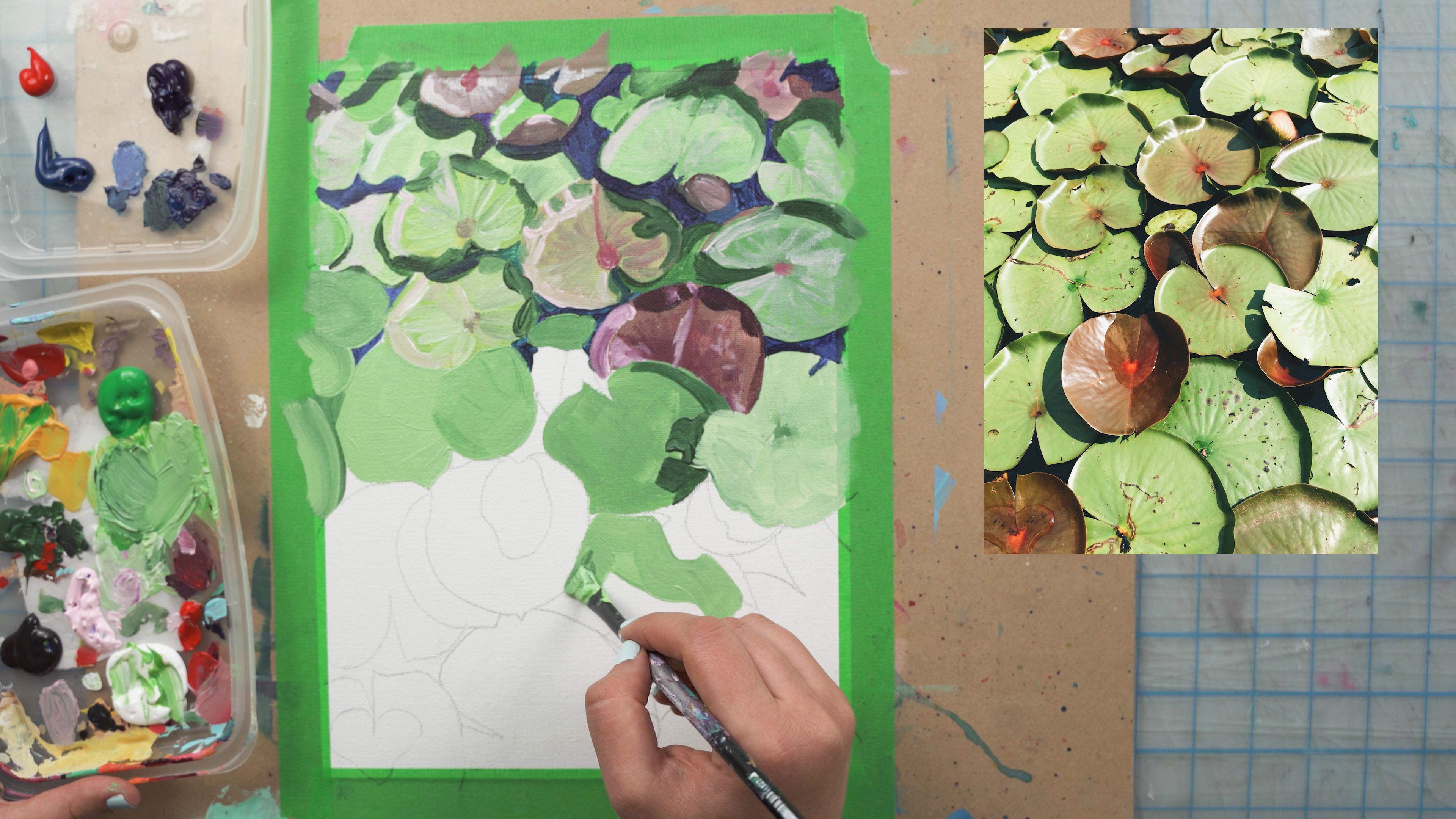
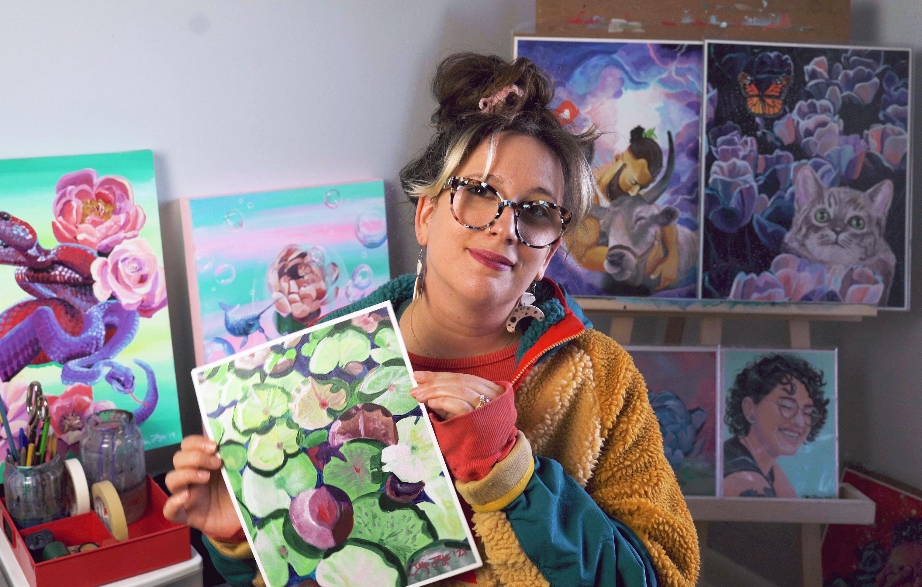
1. Introduction and Techniques: Hey everybody, welcome to another painting class. I'll be your teacher today, Cory J. And today's class is going to be all about impressionism. And more specifically, it's going to be kind of my modern take on impressionism. So impressionism is just that. It's when you use the paint to give an impression of the subject. So I have come up with three specific rules that I want you to keep in mind when we go through today's class and I'm going to go over them first now just to start to get you thinking about it. And then we'll talk more when we get into the video. So what are these three things? Well, the first one is optical blending. So when you lay the colors down, when you're painting in an impressionist style, you want to make sure that you're laying down color beside other strokes of color without blending them too much together. And optical blending is when the viewer there, I blends the colors and it all kind of blends together in beautiful unison and creates the object of the image. So one is optical blending. And what do we think about optical blending? We also want to think about creating strong brushstrokes that aren't blended. So when you lay down your brushstrokes, you want to make sure to lay down a couple of strokes beside each other and not blend them out too much. We really want to see the brush detail in the strokes and also using quite a bit of paint so that you can make some strong brushstrokes. So one is laying down colors so that they will optically blend. And the second is to make sure that brushstrokes are visible so that all comes into hand-in-hand with optical blending. The second is capturing the light source. So in the reference photo that I've chosen, there are very strong highlights and shadows, which will make it easier for you to create a dynamic painting that has lots of depth in it. So when you're laying down colors and when you're choosing where to put your strokes down, I want you to think about the light source as well as highlights and shadows. So where are the lightest areas of this piece, where the darkest areas and where are the midtones. And then kinda keep that in mind when you're painting. Now the third element of impressionist painting is relaxed and sometimes even inaccurate drawing. So by that I mean more of a free hand drawing. Roughing in where your pieces are, where your subjects are, that kind of thing, as opposed to trying to make it exactly perfect and exactly to the reference photo. So there's a couple of ways that you can achieve this. One is by not being so tight with the details that you're laying down. But the second is the preliminary drawing. So with a preliminary drawing, I did use a transfer. So I, I traced over the line work just to get the main elements of the image over to the canvas. And I did that using a technique where I use monitors. So I'm going to show you that next. But you can also choose to forego that and just start the project by just drawing on the elements that you see in the reference photo directly onto your canvas without using a guide. Now if you don't use this guy to get the elements over, your piece might have a little bit more of that impressionistic fives Huo ad, because it's going to be a little bit more organic and not so concrete. The elements will be exactly where they were in the photo. But at the same time, if you choose to use that transfer method that I'm going to show you by using my monitors. You'll really get a good base to just jump in and start painting. So I really like using this transfer method because when I paint, I really want to focus on the painting and not so much with my drawing. I'm very happy with my drawing skills and I don't feel like I need to work on them, so I like to just jump right into painting. So this technique will help you jump right into the painting by getting your main elements right down on the paper. But like I said, if you choose to forego that, it really goes along the lines of impressionism by just kind of drawing them on free hand yourself. And then we can jump into filling them in together next. So one thing before we get there, I just wanted to let you know that I love the fact if you're going to mix all your colors from primaries, that'll be so great. It helps develop mixing and is really important. But one thing is that sometimes it's hard to mix a nice green because a color bias. So this painting is really strong on the greens. I'm just saying that because you might want to add in a green if you're only using primary is a mixed green into your case. Just to make that a little bit easier. Now first I would go ahead and try and mixing green from your blue and your yellow and see what you get. Because you can really play around with mixing the right color. But sometimes if your blue and your yellow don't love each other, what happens is the chemical properties create a color bias and it can start to get a little mucky and be a hard color to mix. So if you're using just primaries today, maybe tryout mixing of green, green doesn't turn out that grade. I would add one into your kit before starting this video. It just might make it easier for you. I'm going to be using premixed colors today so you can follow along and see what I use when we get into the video. But I just wanted to let you know that because sometimes the chemical properties of the paint don't love each other and there's no possible way to get a non muddy green depending on your kit. So we're all using different paint today, so it would be up to you but just wanted to let you know that. Okay, so we're gonna get into the video. I'm going to start with explanation on how I use monitors to transfer my image to the canvas. And then after that we'll get into the video. So stick with me. I can't wait to see what you create.
2. Transferring Your Image Using a Monitor: To start, you want to grab a piece of tracing paper or a see-through loose leaf, whatever you have that's the same size as your painting service. So today I'm painting on a nine by 12 inch piece of canvas paper. And then you want to hold it up to whatever monitor that you're using and adjust the size of the picture on your computer so that it's closer to the size of your paper and the image fits into the paper. So for me, all I'm concerned about is the size of the flower for this piece. I don't really care about the background because I'm going to change that. And then you just want to grab a piece of Painter's tape. I like using this painter's tape because it's easy to take off and doesn't damage the screen. And you want to center your piece or wherever you want to have it, and then take the piece onto your monitor. Now you want to be light with the tape and light with your hands just like with everything when you're touching them monitor obviously you don't want to damage the monitor and then you want to go through and traces. Now just like I said, when you're using your pencil and you're tracing it, you want to make sure that your light light handed with us so don't get your monitor. And then if you find that there's some areas that are kind of hard to see, you can just up the brightness on your screen or your program. So here I'm using Photoshop, so it's really easy for me to make it a lot brighter. And that'll make it so it's easier to see through. And then you can get those last little details that you couldn't quite see if it's not bright enough. And it's important here to turn all of the shapes into a linear drawing. You don't want to add any values to this. You just want to create an outline to fill in with the paints.
3. Prepping Your Canvas For Painting: Okay, so to start, you want to grab your green painter's tape and you want to take down your canvas paper on all four sides. When you put the tape down, you want to make sure that you overlap just about a quarter of an inch all the way around and you want to do the exact same amount all the way around the border so that we remove the tape. You have a nice even border all the way around. And when you put your tape down, you just want to run your hand over it nice and smoothly to suppress it down to make sure that there are no little areas where the paint could possibly seep underneath the tape. So just make sure you do that all the way around on all four sides where the painter's tape meets the paper. And then the next thing we're gonna do is we're going to grab this acrylic glazing liquid gloss. You can use any acrylic medium for this, or you can even use plain white paint if you don't have an acrylic medium. But basically what we're gonna do is we're just gonna take a little bit on a brush and we're going to lay it down where the painter's tape meets the paper. And this helps to ensure that when we do our painting on top and we take the, the tape off at the end that we have some nice crisp edges where the tape has been laid down. So you want to put a nice thin code all the way around the border of the piece where the tape meets the paper. And make sure that you're not laying it on too thick. You just want a nice light coat of this. And if there are any areas where there are like blobs of it or a lot of paint gathering. You just want to take your brush, wipe it off and dry. Dry run your brush over that area to pick up the excess. So a nice even coat or doing all the way around the piece. This step is also optional. So if you don't wanna do this, that's totally fine too. It just creates for a nice border when you're done your piece. Okay, So next I'm gonna take my drawing on the transfer paper and lay it down on the surface. I want to make sure that I line it up exactly how I want the piece to transfer. And then I'm going to make sure that I press down the TPP, just the top. And then I'm going to grab a piece of charcoal transfer paper and lay it down in between and make sure that you put the charcoal side down. So you want the charcoal side touching your canvas so that you can transfer your piece on. And then I grab a red pencil crayon. You can use any pencil crayon here, but I like to use red because it, it shows me where I have drawn and where I haven't drawn. And you just want to make sure that you go around your whole line drawing and press the drawing through onto your canvas from the transfer paper. Now you just wanna do the lines. You don't want to make sure you don't add any value or anything. This is just to give yourself I've guide of where you need to paint. And then you can take a look underneath and if everything's transferred good, you can take away your tracing paper.
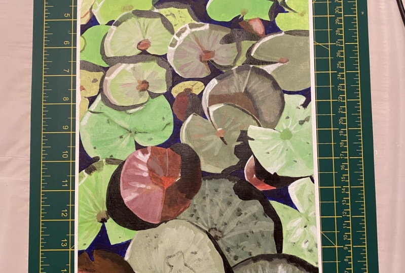
4. Painting Stage 1: Next what you wanna do is grab your paint. So I'm going to use a variety of different paint for this. So I'm going to use a base green color, a yellow color, a dark green color, a black, some white. And I'm also going to use some red. You just need a tiny, tiny bit of red. And then we're going to start and mix our first color. So for the most part, I'm using this green color and this yellow color to create the line color of most of the leaves or the majority of the leaves. And then I'll also add a little bit of white to this. So that's my main mixes, the green, the yellow, and the white. Now once you have your first color mixed, you can go ahead and start laying down the paint. So I use this and drawing because I really want you guys to be able to work this piece in little sections. So we're going to start off and we're going to lay down a base Coase on three of the leaves that we're going to start to work with. And you want to make sure that you don't blend the colors completely when you're laying them down here, you just want to basically get a base color onto the canvas that you can layer on top. So with acrylic painting, you layer the paint one code on top of another. Sometimes you wait for it to dry and sometimes you blend it all together while it's still wet. But the idea is to add layers upon layers and that's what really gives a piece dementia. So you want to lay down your first color on each of these leaves. Now you'll see that the color is not completely flat and it's not completely mix. And that's all going to help with the optical blending we want to achieve with the impressionistic painting. So we want to be laying down colors and not blending them completely. However, for these base codes, you can just lay down almost a flat color because we're going to be creating details on top of it that will give more of that surrealism luck. And you can see for this last lily pad here out of the three, I've mixed in a little bit of red. So when I mix a little bit of red into that color that I premix with the green, the yellow and the white. You'll see that I've starts to give it that kind of plum type of tone, a little bit more maroon. And all the lily pads in this piece are going to be a mix of these greens and then some of them will be, have a little bit of red and a little bit of purple added to them to. So we just wanna make sure that when we're laying down these first coats that were tinting the color so that it's correct. Next I'm going to go through and grab a little bit of this green and mix it into the green that I previously mixed and start to knock and some of the shadow areas. Now, with impressionism, you want to make sure that you're not blending the color is completely, you want to just lay down lines of the color and let optics blend them for you. So when I'm laying down this color, I'm not blending it into the green color base. I'm just leaving the flat line, the strong line of color there. And eventually that I will create an illusion for it. And then when I do the green on this kind of plum color, adding the green to mix it, the dark green into that plum color so that it's a little bit tinted. If I were to use the same dark green color that I used on the line lily pads, you'd be able to tell that it wasn't, right because the shadow on the plum leave is going to have a little bit of that plum color in it. So just make sure you're thinking about that as you're mixing different colors. Next, I'm going to grab this pink color and I'm going to start to do some of the highlight areas on the leaves. So first I'm going to knock in a little bit of the shadow, so the green and then I go to the highlights, and I'm just going to use this pink color. Now, the colors are not actually pink on the photo reference. However, in terms of color choices for this piece, I made a choice to use this pink color instead of white or instead of a lighter color. Just to give a nice visual and I just like playing off the colors that way. So if you want to make your own color choices that you go through this piece, please feel empowered and you want to make it your own, so use whatever colors you think will work best. So here I'm just adding a little bit of details. And then I'm going to go through with this wage. Now when I pulled this white on, I'm just going to add a little bit of the green in there. Mix it to get like a nice light highlight color. And then I'm gonna go through and do some details on this first leaf. So you can see that I'm just using the paint in light strokes and I'm not blending them. So this is where that optical blending comes in. I'm going to rely on the viewer's eye to blend these lines together once they view the piece from a little bit of a distance. That's what the technique is. I basically just lay down color on top of that base color and not to blend it, just leave it powerful and strong. Now also, when you're doing this technique, you want to use quite a bit of paint on your brush. So every time that I laid down a couple of strokes, I'm loading up my brush with paint here just to make sure that the paint flows smoothly and that I get that really crisp line that I want. And then even when the paint starts to run out of bed, you can still continue to use the brush and it creates a little bit of a dry brush technique. And it'll help to fade the lines a little bit into the background color. Another thing that you want to keep in mind is the type of brush you're using for what area? So when I lay down the first color, I was using a thicker brush. And now that I'm doing some detail work, my brush is a lot thinner. This is a rounded detail brush and the other one was a bit more of a flat brush. So just keep in mind that you're using the right brush for the right area that you're doing. And even here with these shadows, I'm adding in here, I'm using a smaller brush and again, loading up the paint on the brush so that it goes on nice and smooth. And that if I needed to blend any colors together or gravity colors, I could do that with the excess paint on a canvas. And it also makes for a nice, strong line, which is really nice when you're doing this technique because it's really about creating bold shapes. And you really want to focus on capturing the light sources. So that's what I'm doing here with these details. I'm creating the shadows that are between the leaves and also on the end of the leaves. And another element of impressionism is relaxed and sometimes inaccurate drawing. So that really makes this type of style very, very forgiving because you don't have to worry about everything being perfect. Like you would add realism, where you're trying to get something to look super, super accurate. This is more just like the name of it. You want to create an impression so it doesn't have to be perfect. And if it's a bit more looser fluid that will just add to the illusion of the piece. Next, I'm going to go back in with this pink color and add a little bit more details to this kind of off Green Plum shape here. And again, I'm using my thin brush. So again, making sure that I have the right brush. And then adding in a little bit of red to create a little bit more of the details on the Lilypad here. And then just bringing the colors through and being again kinda loose with that. Like I'm not trying to get all these lines to look perfect. I just want to create an impression so that when someone's viewing it from afar, all the colors blend together. Okay, so next I'm going to grab a little bit of blue, a tiny bit more red. And I'm going to work on the kind of background area of the piece, which is just the little bits of water that P through. Now in the image, they look very, very dark, but it's not often that are used black in Impressionistic paintings. So I decided to change it to be blue. But then as I started to do the blue, I thought it would be nice to have a couple different colors mixed in there. So I'm going to grab some purple and mix the blue and the purple together every time I make a stroke to do the background here. Here I'm just grabbing the purple and then you'll see that I grab a little bit of blue and I grab a little bit of purple, and I mix them together as I make these little strokes to create the background color. And again, this is a different technique than if I were to be painting this and wanting the color to be flash. You want to make sure that you can see as many brush lines as possible with this, this painting styles. So I'm just using a tiny brush here. Using a tiny brush on these types of areas will help me get into little areas that I need to get into. But it'll also create extra brushstrokes, which will add to the visuals of my piece. And next I'm going to grab a little bit of pink and finish off some of the details on these pieces here. So I'm gonna go back in and just highlight some areas that need to be brought up more. Some areas where the light hits and the more you do shadows and highlights, the more impact your piece will have, and the more you'll be able to see the form of what you're drawing. So really focus on trying to capture the dark areas and the light areas of the piece.
5. Painting Stage 2: Okay, So next I switch back over to my bigger brush here. And I'm going to go through and continue the same technique that we just started for these three. So the first thing we did was we laid down some flat colors. So I'm going to go ahead and continue to do that again as I branch out and start to knock and more of the piece. Now when you're doing this, you want to make sure that you're capturing the general value and tone of the area that you're knocking in. So for example, some of these leaves might be light green and some might be a mid tone green, might have a little bit of red in them. So you wanna make sure that you will honor that and change the values a little bit as you work around the canvas. This is just going to help to ensure that the piece looks a little bit more realistic and also gives some more interests to the piece. If you were to just leave all the lily pads to be all the same type of green. It wouldn't be as interesting and would also be kind of hard to differentiate where one leaf ands and where another one begins. So you wanna make sure that you are mixing in a little different bits of more white and little bits of red and, and changing up the colors as you go to match the lily pads that are there. So next I'm just going to create another one of these more maroon, any kind of reddish, greenish tone leaves. So I'm going to go through and I mix a little bit of white in as well. And you'll see that I have switched from the green to this color. And now I'm going to go and fill in these, in all different areas that I see them. And another thing is once you mix a color with acrylic paint, you want to make sure that you use that color in all areas of the canvas that you needed or that you can. And that's just a way to help conserve paint, but also work smarter and had the piece all in unison. If you have this red color in one area to move it around in a couple different areas of the piece. That'll just help the composition look appealing and more interesting. So I'm gonna go ahead and do that here. And then also for this leaf that I'm filling in now, I've added a little bit more red than the ones at the top. So you can see how just adding a tiny bit of red to a color or a tiny bit of green, or just adding a little bit of something changed the color dramatically. So when you're mixing and practicing, changing your colors, just start a little, little bits of at a time of introducing different tones, because a little bit goes quite far away. And then I'm just going to add in a little bit of pink actually. And that'll just going to give a little bit of dimension. So we have a dark wine now we have a little light one there. Okay, So next I'm gonna go back to the green and I'm going to add a couple more leaves in with the green. And as you can see here, I mix a green tone that's a little bit darker than some of the ones that I've been using in the past. So near the top of the piece, the colors are going to be a little bit lighter than near the bottom of the piece. And that's because the lily pads and get a little bit closer as we move to the bottom of the piece and a little bit bigger. So you'll be able to see a little bit more detail as we go through. And another thing with this is if you can do capture some of the form of the piece with the base tone, feel free to do that. So in some areas I might mix in a little bit of a lighter color as I'm laying down the background for just half of the piece or part of the piece. And that's going to give a little bit of dimension, even just on the background layer as well. And all of these things, they help when you're blending the background and the foreground. And then for this piece, I decided to mix in a bit of the shadow as I went right here because there was such a big shadow here on this leave that instead of painting it, the light green color underneath, I decided to go right to this little darker color and add that in. And then I did that for a couple of the other pieces while I had it on my brush. So again, I'm using that same technique of using what you have on your brush and moving it around the canvas where it makes sense. Now, I'm going to show you the same type of thing, but I'm going to use my tinier brush off switch back to my smaller brush. And I'm still using this dark green color and I'm making some shadows. So for the smaller leaves, it doesn't make sense for me to use that big brush to make these smaller leaves and make sense to use The smaller ones. So I went back and switched. And then I'm filling in this kind of maroon leaf that I have here and then adding some pink on the end to make it pop a little bit. Then after I've done a couple of different details here, I'm gonna go back to the background color that we, we purple tone and go and fill that in. So really using the same technique all throughout this canvas where I start off doing a background color that is similar to the color of what I'm trying to achieve for the entire leaf. I lay that down on the leaf and I do a couple of leaves at a time. And then I go back and Highlights and shadows on the leaf. And then I go through and do some of the background color and fill in some of the background color. So you want to use this process as you work around your painting. You want to use the same process here. And I'll just help you if you don't know what to do next. So you don't know where to do where to go next. Just make sure you use this kind of rule of thumb and it'll help you get through the piece. And here again, I just want to stress that I'm creating the background color here and I'm using a tiny brush. And in some areas, It's going to create a lot of little brush marks. And that's really, really great. That's just going to add to the interests of RPs. So I'm just filling in the background and you can also use this time to crisp up any lines that have gotten a little bit too loosey-goosey on you. So for example, if you painted outside the lines in one area, then you can go back in with the background color and kinda crisp it up a little bit. And paint over and bring back some of the details like I just did there with the center of that leaf. I reintroduced that with the paint because it got covered with the green. And then I'm going to add a little bit of pink here to the blue. And I'm going to add in a couple of strokes all around the background just to give again that optical blending illusions. So if I'm using a couple different colors, the eye is going to blend them for me. And that's really the idea with impressionism. So next I'm going to go through, and I'm using my smaller brush again here. And I'm going to mix some more of this green color. This time it's more of like a mid-tone green. And add in a little bit of the dark green here. As you can see, I'm totaling the brush in my hand as I blend. That really helps to get the brush loaded evenly all the way around. And then I'm just going to go in and fill in a couple of these little areas that kinda get overlooked that are underneath the lily pads that we're looking at. And then add in some details. So back to this dark green color to create some shadows. And I'm gonna do that in a couple different areas here too. And then I'm just taking excess paint off the side of my brush by using the side of the palate. So feel free to do that if you have too much on your brush, but don't want to clean it off completely. And then just continuing to add details to these lily pads that I just painted. So some have shadows and then here I'm adding the pink as a highlight. I just really like how the pink looks as opposed to using just white to highlight pink. Just add a little bit of extra color and I just think it looks really beautiful. And then using the same line technique where I'm laying down those lines and not blending them into much. I'm going to go through and do that on a couple of different pieces just to make sure that I have some nice details in there before I move on. And again, just make sure that you're using the right brush. And also if you twirl your brush in your hand when you run out of paint, there should be more brush, sorry, more paint on the other side. So that's another technique that I do as well. Okay, so next I'm going to create a deeper plum color. And this is to create the shadows on this, this plum leaf. So this is important that I'm not using the same green color as I'm creating shadows on a leaf where it doesn't make sense. So dark green makes sense on a leaf that's a green. Whereas if the leaf as plumb, it doesn't make sense to use dark green is the shadow for that leaf because that's not what the shadow would look like. So you want to make sure that you're making choices, that makes sense for what you're viewing. And also, this is where, uh, using your reference photo can really help make those decisions because it'll show you what it should look like and what the deep colors look like and what color your photo is. So you want to make sure to make the appropriate blending decision for the painting that makes sense. And then I'm going to go through with some pink here and do some highlights. So this piece, so I'm still using that same pink here because it makes sense for the piece. And then making sure that I don't blend it out too much. And same thing for the details that I'm going to paint in here. I'm going to try and keep my brushwork kind of loose so that it's not super blended. Because that's really going to help with our Elysian. And that's another way to show the relaxed and sometimes and accurate drawing style. And by inaccurate, it just mean that it is not perfect to how you would see a real life. So this forum and the shape or not exactly how you would see them. Maybe instead of a circle being perfect is a little bit of off, off circle. That's kinda like that. You just want to draw what you see. And that kind of creates a little bit of movement in the piece to when it's not perfectly drawn, are perfectly painted in. You get a nice kind of rhythm and movement to the piece that way as well. So, and then I'm just going to go back in with the pink and do similar lines time doing right now and even some stippling technique here. Or I'm just kinda creating some dots and some quick lines. People also use hatching and crosshatching in impressionism. So just little bits of line work or stippling is like little dots. So you can just add in little bits of paint where it makes sense. Like I'm adding a little bit of pink in here and a little bit of a red line here. And just using little bits of paint to express the peace and the form of what I'm trying to express.
6. Painting Stage 3: Okay, so here I'm going to go through and continue on with the same technique that we've been talking about. So I'm going to try and capture the main tone of each of these leaves. As I fill it in. Again, I switch to my larger brush here. But now that the shapes are getting a little bit bigger, you can see that I can do a little bit more of color changing as I move around the shapes. So you can see that this one that I just painted here, one side is little bit darker than the other side, and I'm doing that with the base color. So as you create larger shapes, it gives you more of an opportunity too. Change the base color to be more accurate to how the piece looks and leave less for the details on top. So we're still gonna do lots of details on top, but we can capture some of that form, changing the colors as we go when we paint. So we're just going to continue to do that and capture a bunch of these green shapes here. Just paying attention to where this piece is lighter and where it's darker. So in this side of this leaf it's lighter. So I'm making sure that I'm adding that in. And then also when I'm laying down the paint, I want to capture the form of the lily pad. So there's little lines in each of the lily pads. And when I lay down the paints, I want to make sure that I am making sure that I'm laying down those lines just like this piece here in the way that they would be forming on the actual lily pad. So you want to use always the form of something when you're painting it and to kinda influence your brush lines in your brush strokes and how you lay the paint down. And that's exactly what I'm doing here. And then you can just see that even using this like really light green color here that I just used. And then the contrast of the midtone greens and the dark greens. There's really a lot of excitement to this composition. And anytime you create variety, it creates interests. So you want to keep that in mind, you know, just make sure that your colors are different enough that it's interesting to look at. And then I'm going to go through with this large brush still because we're still working on these large areas and knock in the shadow areas. And again, try not to blend, just trying to lay down the color in the area that it makes sense. And trying to keep my movements a little bit more fluid and less OK and precise. So next I'm going to switch my brush here and my color, or switch my color on my brush here and start to create more of these plum tones as I move through the piece to finish off laying down all the background colors. So I'm going to mix us plum tone here. It's just made of the red and the purple, a little bit of the wage. And you can add a little bit of the pink as well. And it creates a nice, strong, kinda red color. And even at times I'm adding in a little bit of the green, like right now I'm adding a little bit of the green to it too. And that just helps to kind of Bring areas of the other other painting. Are there other areas that are painted into what I'm painting now? So you'll always want to try and vary your colors and use little bits of all the colors of the painting all around it to make it look unified. So next on this larger area, I'm going to instead of laying down one flat color and going on top of it, because this, this shape had a lot of unique colors in it. I'm going to try and capture them with my brush. So I'm not going to lay down the purple all the way across and then do details on top like I did in the other areas. I'm going to try and capture the form of this by using some kind stronger brush strokes with my brush loaded up and then see how I can capture. So one side is a little bit darker than the other. So I lay down the darker side first and then I'm going to grab a little bit of the pink here and mix it into the colors that I've been working with. And I'm gonna use this for the other side. And that already is going to give the illusion of this piece being a little bit folded. So the light will always help show you the form of the work. And so if you're always kinda confused or if you're feeling kinda not sure about where to lay down the color or what's light and what's dark. Look at the light, the highlights and the shadows, how the light interacts with the piece. So here you can see that 1.5 of the piece is illuminated and another half is more in shadow. And so that's really going to create form to this little piece that we're making, this lily pad. And then I'm gonna go through and create a bit of a darker shape in the middle. And that is going to give the illusion of the water or the way that the water is showing the light as well. This is a little bit of water in this piece kinda hanging out, so we're going to try and capture that as well. And then also you can see that there's lots of brushstrokes that you can still see. So I want to make sure that I'm doing that and working throughout these pieces because that's really what makes it look more impressionistic is just giving the impression of where the colors going and not completely blending each color out. And I'm going to add a little bit of red in the center to reflect the reference photo. And then I'm gonna go back with this lighter pink color again and mix in a little bit. And I'm going to try and move my brush to make the strokes that makes sense for how this piece would actually look. So I'm following the details of the piece with my brush lines. And then again, I have some leftover on my brush. So I'm going to bring it down to another area where it makes sense.
7. Creating The Final Details: Okay, So next I'm just going to go through and add some details in the piece now. So here I'm going to use this stippling technique or a just draw on little dots. And then I'm going to add in a little bit of ready Green and create that center point and a lot of these pieces. And then bring my brush out and create some details that are gonna give the illusion of the lily pads being bumpy. And you can always start with one color and then switch to another color and continue to build up the same spot. So here I started with the already green color and now I'm switching to more of a pinky red color and just continuing to center areas. So you wanna make sure that you're changing the colors up when it makes sense and using little bits of color to convey your message. And next I'll go back and do the background area. So mixing that blue and purple together here with little strokes and like little quick lines to help aid in the background. And you know, you can always do one color background like you don't have to do the pink and the blue together on your piece. But I do think it adds a little bit of extra excitement and a nice look to the background here. And again, being mindful not to completely blend out the colors together and just leave the lions. And then I'm gonna go in with some pink and really add in some highlights on this piece. So this is where I feel like the piece starts to really sing. This is my favorite part, is adding in the final details and really bringing up some of the colors. So I'm using pink as a highlight on some of these pieces that are still quite flat. And you can see that it really helps to create a strong tone and dimension in it. And using the pink just is visually, I think, very pleasing and beautiful and not necessarily It's not super accurate to the reference photo. But this is one of those times where you want to make decisions that express what you want to express. And this is how you use the paint to express yourself and why everybody's pieces are always different. Because everybody's going to be making different choices in this type of situation. And then I'm going to go through it a little bit of white as well and highlight just a couple areas with the widest of white. So I always leave the white to the because it's the highest highlight, so to speak, it's the lightest highlight. So I just go through and add in a little bit of white to different areas that I feel like it makes sense. And that I want to accentuate and kind of bring forward, but I want the light to hit more. And then I'm going to switch to my thin brush here and there's some areas and the shadows that I want to deepen a little bit more. So not all the shadows are the same color, some are a little bit darker. And so here's your chance in the PCB go through and deepen up a little areas of shadow that needs to be a bit darker or lighten areas that need to be a little bit lighter. This is when you go through and you do that work in the piece. So I am, I love the darkness that this color is adding is just creating such a nice color punch. And so you want to go through and adding these details in your piece. And you also want to look for areas where you forgot to add detail. So you can see right here, I forgot to add a shadow underneath this piece here. So I'm going to just go through and add that in and just make sure that you're checking out your reference photo for those areas where you may have forgot adding in those shadows before you complete your piece. Last but not least, I'm going to go through with some more of the highlight color again and try and bump out this piece here. It still wasn't quite light enough on the left-hand side here. So I'm going to go through and layer and another layer on top. And that's kinda the beauty of acrylic paints as being able to layer colors on top. So if there's an area that you don't like or, you know, you're not that end-to-end just to make sure that you wait for it to dry and you can always paint over. You can see I messed up a little dot outside here, but again, I could just cover it up with the dark color right on top there. Yeah. Just capture any little details that you may have missed. All right, so that's it for this painting. I really hope that you guys enjoyed and learned some techniques and tips about painting impressionism. I want to make sure that you guys sign the bottom and make sure to date it, because it's always nice to go back and see some of your earlier works and what year you did them, and then compare them to how far you've come as you continue along in your journey. And then here you can see we have some nice crisp edges that's from the initial technique of laying down that matte medium there or the gloss medium that we use. So it just really helps to create a nice fine edge here. And this is honestly one of the most satisfying parts of the pieces. Pulling off the tape at the end and seeing the final work. And yeah, I think that the colors blended really nice together. When you go close up to the piece, you can see all those different brushstrokes and all the little details. But when you're viewing it a little bit further away, it all kind of blends together. And that's kind of what you want with impressionism. So, yeah, Thanks so much.
8. Thank You and Outro: That's it for today's video. I hope that you guys learned a lot in this one and really enjoy trying out the impressionism style. And I can't wait to see what you create. So feel free as always, to tag me on Instagram or send me an image and I can't wait to see your paintings. Have a good rest of your day and we'll see you next time. Bye.
 Cori Jaye Ettienne, Artist and Creator About Vivid Color