Transcripts
1. ABOUT THE CLASS: How would you feel about taking a little trip to
Antarctica and meeting adorable penguins
along the way in their natural environment
and all that, too, while you are
sitting in your home. Today, we are going to capture that feeling with watercolurs. Hello. My name is the Meal, a watercolor artist, an art educator, and
Skillshare teacher. And I invite you to join me in painting this beautiful
Antarctica inspired scene, a world of snow, serenity, and charming little penguins. This class is all about having fun and is perfectly suited for beginners and all
those who love to experiment and enjoy
playing with watercolors. No pressure to be perfect and
no overwhelming challenges. A limited palette, playful
exploration with colors, and the joy of
creating something beautiful with our own hands. In this class, we will
celebrate the beauty of turquoise hues and create soft minimal and slightly
mystical backgrounds. You will learn how to
create snowy textures using dry brush techniques and how to bring light
into your paintings. We will then add contrast and life by painting
our little penguins and finally complete
the artwork with delicate reflections to
tie everything together. By the end of this class, you will feel more confident
with these techniques and walk away with a
beautiful painting you will truly be proud of. So let's dive in, explore different
moods of watercolor, and create something beautiful together. See you in the class.
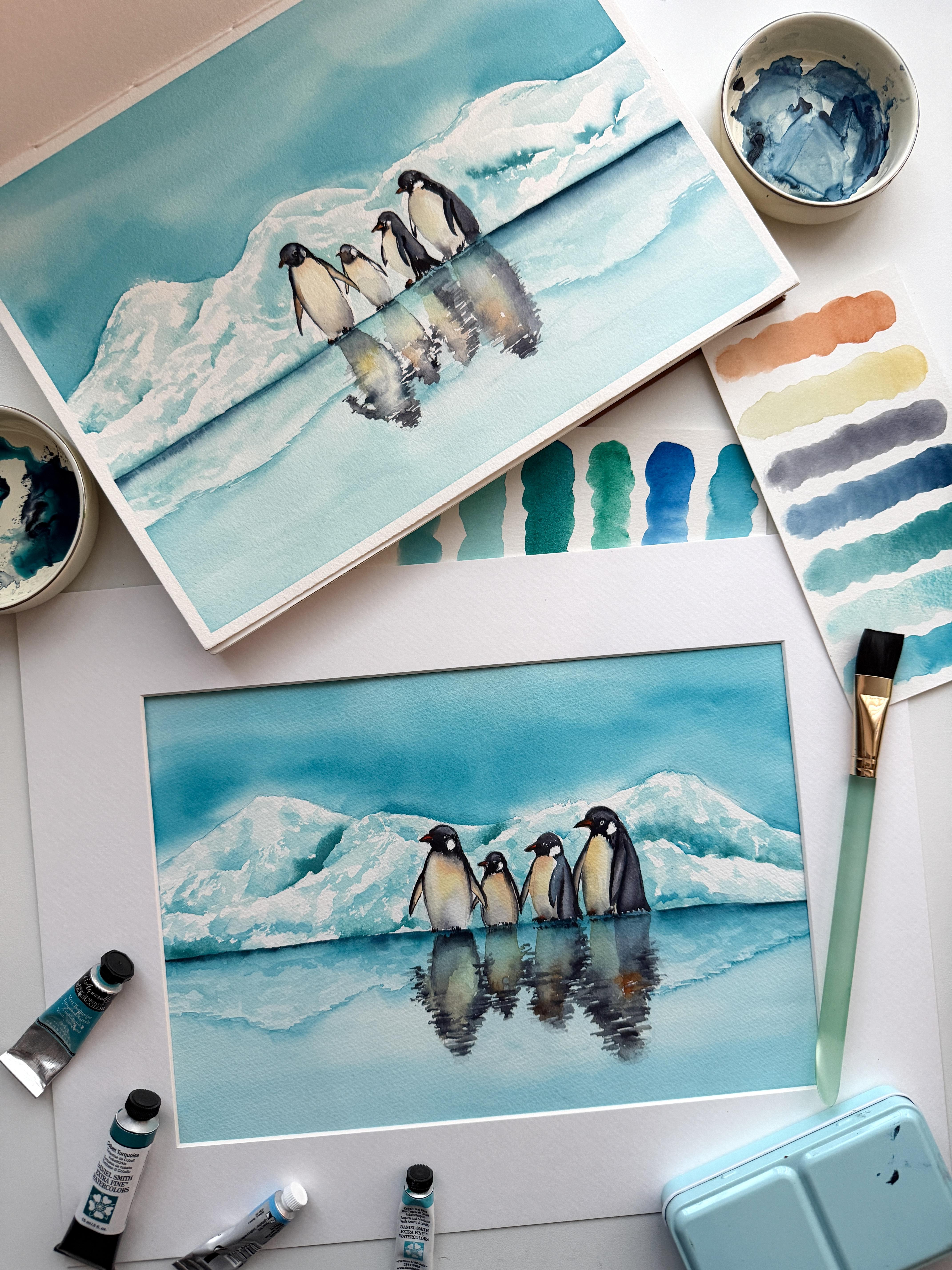
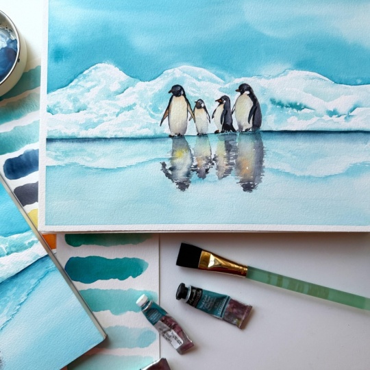
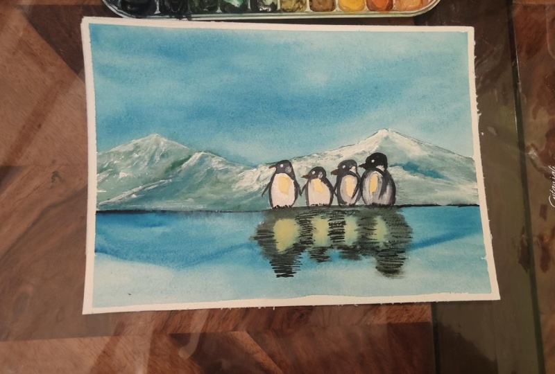
2. CLASS PROJECT & TECHNIQUES: For the class project,
you will paint this beautiful picture
with watercolors. We will divide our project
into three layers. Here, for the first layer, we will create a soft smooth background
along with the lake. For this, we will
mainly work all wet and wet so as to achieve
soft smooth transitions. Then for the second layer, we will work with the
dry brush technique along with some softening, so as to create these
beautiful shadows in the snow. Also, we will enhance
our shadows and create contrast between our
foreground and the background. And then we will work with
the reflections in the water. For the final, when
everything is dry, we will paint our main element that is penguins using wet on dry and then finish it up with these mirror
finished reflections. I will also guide you through all the materials to be
used for our project, and we will see how to work with our color palette too
in the next section.
3. MATERIALS & SUPPLIES: Welcome to the class. To
paint this snowy paradise, first and most important,
we will need paper. Today, I will be using this Windsor and Newton
professional series Cold Press Watercolor Paper. The size I'm using
is nine by 12 ", and it is 100% cotton, 300 GSM or 140 pounds. You don't have to use
the same as mine. Just keep in mind it should be 100% cotton and little texture. Today, I'm using a block, so I don't have
to tape my paper. In case you are
using blue sheets, then you have to tape it
down to a flat surface or a board using masking
tape to prevent buckling. Next, let's discuss
the watercolors that we are going to
use for this project. The main color we are going
to use is turquoise blue, which is a very beautiful mix
of blue and green pigment. I'm using this one from Holbein, as it is a non granulating one and it gives very smooth washes. Next is cobalt Tear
blue by Daniel Smith, which is pigment PB
50 and cobalt green, which is pigment PB 36. Different brands name
their colors differently, so we will go by the pigment
number for these colors. Next, we will use indigo, which is a very deep
bluish black pigment to enhance our values
in the background. So these are the colors for the background for
painting penguins. Our main color will
be Pains gray. Which is a very beautiful
blackish color. To paint the white
parts of penguins and to bring some
warmth to our painting, I will use naples yellow and transparent orange
in very dilute values. For the colors, we
will discuss more in depth in our next section where I will also tell you about their alternatives in
case you don't have any. Next is palette. As we are not using
many colors today, so I'm using this
ceramic palette. You can use any
palette you like. Just keep in mind it should be clean or our colors
will become muddy. Next for painting
background and washes, I will use this soft flat
three by four inch brush. You can use any
flat or round brush to paint big washes
and to apply water, whichever you are
comfortable using, it should be soft enough
to create softer washes. I will also be using this soft round sized brush to paint most of the
elements of our painting. And we will need some fine
tip synthetic brushes for dry brushing technique to paint the penguins and
for reflections. A merchantal pencil
for sketching. An elastic eraser. Some scrap papers to test
colors and practice techniques. So paper towels, And
two jars of water, one for cleaning our brush, and one for painting
and mixing colors. Also, I will suggest you check the pigments first and
create their value chart, so we will understand
what they are capable of and how to
use them. That's it. Now let's see the properties
of our color palette, and what are the options
if we don't have any, especially the turquoise, which is our main color
for this project.
4. UNDERSTANDING THE COLOR PALETTE: Let's see what our color palette looks like and how
different colors behave. Let's begin with our main
pigment, Turquoise blue. This is a very beautiful
combination of pigments, PG seven and PV 15, which leans towards blue. This pigment is a
non granulating one, which can be opaque when
used in full concentration. However, behaves transparently
in its lowest dilution. More or less, the tone
of color remains same, so we can't get many
values from the pigment. This will be our main color to paint sky, water, and snow. Next is cobalt teal blue, which is also a very
beautiful teal shade, which is granulating in nature. It contains pigment PG 50 and
hence leans towards green. We will be using it for creating the lightest
shadows of our snow. Next is cobalt green, which is pigment PB 36. Again, a granulating pigment, which leans towards blue. This is an opaque pigment, and hence we will use it to
create the darkest shadows. And the last pigment
which we will use for our
background is indigo, which is a bluish black pigment with a wide variety
of tonal values. We will be using this pigment to create the darkest
values in our painting. Next, to paint the penguins
and the reflections, our main pigment will be
pain screen, which again, can be darkest dark like black when used in its
full concentration, however, light and fully transparent in its
lightest value. Along with pain stray
to create some warm in the shadows and to paint
the whites in our penguins, we will use naples yellow. In case you don't
have naples yellow, you can use any cool yellow
in its lowest dilution. And the last one
transparent orange or any bright orange color. As again, we will use it in very small amount and
in very tiluted form. Okay, so as our main
pigment is torquois, which is mainly a combination
of blue and green pigment, let's see how we can
create torquois color. For this, I will use
pigment PG seven, which is our tho green
and pigment PB 15, which is tho blue, as
they are commonly known. However, names can vary
according to different brands. Et's swatch them first. Here is our theo blue, which is Windsor
blue in my case, a very bright blue color. And Theo green, which is a
cold green pigment, PG seven. As we can see both
the pigments are transparent and non granulating. Let's see what happens when
we mix them in equal ratios. Here's our blue. And green. As we can see, they create a very beautiful
pigment which is non granulating and
fully transparent, which looks quite similar to our po bool preen and can be
used to add darker shadows. Now when we use this mix in its diluted value and
it leans towards green, it looks like our teal color. Similarly, if we mix a
little more blue to it, then it leans towards blue
and gives a torquoise shade. This way, we can mix and create our colors using blue
and green pigments. In case you are
using these mixes, I will suggest you mix them in advance and in a good amount, so we don't have to worry about finishing them in the
middle of the process. Also, to check your color
mixes before starting to paint to make sure you have
achieved correct results.
5. LET'S SKETCH FIRST: Welcome to the class. Let's
begin with the sketch. So considering the
rule of third, I will divide our paper
into three sections. Top one being the sky. Bottom is for water, and there will be snow and our main subject in
the middle third. Not going into too many details, we will keep our
sketch very simple. Let's give them
some simple shapes to make it feel like snow domes. A little rounded. Let's try and make similar shapes
for the reflections, too. Not going into details,
keeping everything simple. Just following the basic shape. Okay, let's place our
penguins here in the middle. So for penguins,
I'm not going for a perfect sketch as we are not working
realistically here. Just some silhouettes
and basic shapes. Here are the arms. Okay. Here's the beak and eyes. And here will be
the white patch. Just try to make the
basic shape correct. As once we will start
working with the colors, then it will be
difficult to make any alterations in our sketch. A small one here like a family. Okay. That's good. Okay. Let's change the direction for the next one to keep
a variety of shapes. Let's make it sideways. The body here will be the arms. And one more. A
big one this time. Okay, here are the feet. The arm. Another one. Okay, I know. Similarly, let's draw
their reflections too. Now while making reflections, we have to be mindful about
the shape of our subject. Try to copy the image, at least the basic
shapes and sizes. The more time we will
spend on our sketch, earlier, the lesser it will
be a problem later on. Also for reflections, just
work on the outlines. We don't have to
sketch everything. Some wavy marks.
No details needed. Copy the shape and
size above. Oh. Okay. This one should
be a little bigger. Yes, that's better.
Okay, that's it. Let's begin with
the painting part.
6. FIRST LAYER - THE SKY & WATER: Et's start working
on our project. To paint both the sky and water, we will work with wet
in wet technique. We first, we will wet
the paper with water, and then we will start
putting our colors. This way, when we
work wet in wet, we get soft washes and smooth transitions
and no hard edges. For both sky and lake, our primary color
will be torquise, so I'm preparing my
color in a good amount. This way, I don't
have to worry about finishing the color in the
middle of the process, and hence, no worries
about drying of the paper. Similarly, I'm also mixing
some teal and cobalt cream, as we will them later to
enhance our reflections. Okay, let's begin with
wetting the paper. To begin, I'm wetting just the sky part,
nice and generously. Be gentle with the brush and don't rub the paper too harsh. Nice and shining. And
without further ado, I'm starting with the lowest
dilution of torquise colour, so as to keep everything
transparent for the very first wash. Be gentle. Going a little darker, but not everywhere, keeping my strokes in similar direction. Keeping lights in some places. Okay, that's good. And going a little darker
near the horizon, as it will help creating
contrast between the sky and the snow later on while
keeping everything soft. Remembering what always dry lighter than how they look
when they are wet. Similarly, let's
wet the water area. Nicely. A And here we will keep our color very
light in the lowest dilution, so as to give water a
mirror light finish. Keeping strokes in similar
direction and softly blending darker at the edge. Gently blending the color. Okay, as our wash is still wet, let's go a little darker
near the edges for this. I'm now using cobalt green and gently dropping some color near the edge so as to create
some reflections. A Please notice I have switched to size
eight round brush now. I'm gently dropping some colour and let the watercolor
do their thing. No hurry, no fiddling. Just let the colour blend
smoothly on the paper. Okay. Now, let's try this completely
before moving forward.
7. PAINTING SNOW: As our first layer
is fully dry by now, let's begin with
painting the snow. For this, I will be using
a synthetic round brush, and we will prepare a very
watery mix of cobalt teal. In case you are working with a mix of thalo blue and green, then to create a color teal, keep it a little on greener side and dilute
it with water nicely, as they both are very
strong colors and hence need to have a very low
concentration of the color. The final mix should be
something like this. Very dilute and
fully transparent. Okay, while working with
dry brush technique, always remember to work with the belly of the brush
and not the tip. If you want to brush
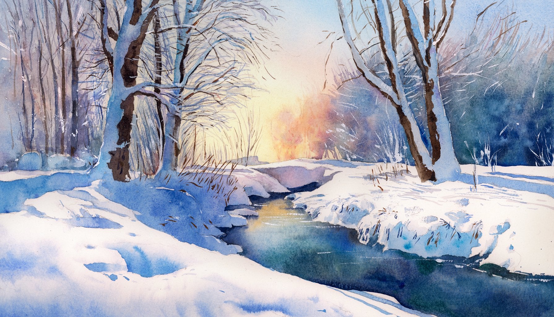
up on the techniques, then you can visit my class. Let's paint seasons
in watercolors, where I have explained
these techniques in detail, and there's a whole
section dedicated to all the techniques to be used while working
with watercolors. Coming to our snow, I have started with
a very dilute mix of teal and I'm working with
the belly of my brush. Notice how I'm keeping a variation in the
tone of the color. On the top parts,
the color is lighter while it appears darker
near the shadow areas. Leaving some areas white
and constantly shifting my brush and softening
a bit where needed. Adding darker pigments near the base to create a
feeling of shadow. And enhancing the tone of my color with a little
bit of torquise sometimes some more textures. Okay. That's good. Similarly, let's start
working on the front one too, keeping lights on the top and
darker tones in the bottom. Constantly switching
between teal and torquois sometimes using torquois for the darker areas and creating lights and shadows. O. Darker shadows in the bottom. And softening it a bit. Adding more colour in the back while being mindful about
keeping the shapes. And sometimes going back and adding more shadows to
the areas which are still wet working slowly, taking my time keeping white areas and every time changing the
direction of the brush, these are the things that we
have to keep in our mind. A keeping a variation in the tone of color and
movement of my brush. I want to bring
this more forward. Let's add little
shadows here too. Okay, that's better. And some darker tones. Okay, let's fill the gaps
in between the penguins. As these areas will
be in the background, we don't need to add
much details there. Adding co wal green
for shadows in the bottom while my
color is still wet. Be careful of wet paint. Okay, Let's build some
depth in the background. Oh some dry brushing. Just filling in the gaps. Okay, let's move
to the right side. I want to keep this area lighter hence using
diluted color. Keeping everything
loose natural. Building to Okay. That looks good. Let's enhance shadows
with some cobot green. Okay. That's better.
And softening. Let's add some depth
here in the back too. Okay, that's better. I want to create
more contrast here also. Okay, that's good. Okay. A little bit more shadows. I'm not worried about the
area around the penguins, as once when we will
paint penguins, then we can fix those
areas later on also. Okay. And now let's
finally work near the bottom area where
snow meets the lake. As there will be
strongest shadows because there is almost
no light below the land, so this will be the darkest
of all the shadows. And to create this darkness, we will use indigo. For this, let me take out some fresh indigo in my palette. And I will be using
two brushes here. With one thin synthetic
brush, I will add color. And with a soft temp brush, we will soften the
edges to let the colour flow and blend in
the shadows naturally. Carefully adding colors. And then softening
in the bottom. Okay, that's nice. Be careful. The color should not
spread too much. Under the penguins. And remember, I'm washing and cleaning my soft
brush every time I'm using it to blend the color and using
a damp brush here. And blend. Blend softly. Okay, that's good. And let's blend once everything using a very
dilute wash of torquoise. Okay. Okay, that's it.
8. ENHANCING SHADOWS: Okay, as now everything is dry, I want to work a little bit on the edges and the shadows in the snow so that everything
looks smooth and cohesive. For this, I will use a watery
mix of our turquoise color, and using a soft brush, I will start working
on dry paper, smoothening some edges,
so it will look cohesive. Please note this step is
completely optional as I don't want these hard edges and want to bring
everything together, your background might have
turned out great already. But if we want some corrections, then this is the perfect time. As once we will
start adding blats, then we should not mess
with the background. That's better. A little bit on this edge. Carefully melting everything in the sky. And softening. Okay. It's a little bit on this edge. I want to bring these
highlights more in front, too. Socking this one a little bit and a little adjustments in
the texture of the snow. Okay. Darkening a little bit. Carefully enhancing the shadow. And a little cobalt. Okay, that's better. Okay, that's it. Let's
move to the next part. Oh
9. PAINTING PENGUINS: As we are done with our
background for now, let's move to our main subject and bring some contrast
to our painting. To paint the penguins, our main color will
be paints gray. However, to paint
the white areas, we will use some diluted
orange and some yellow too. Here I'm preparing a watery mix of these colors for
the first wash. And I will be using
these fine tip round synthetic brushes to paint our subjects and
all the details. Okay, so let's begin. First, we will work with our lightest parts and
create some textures, and then we will move
to the darker areas, carefully working
with the white areas, starting with yellow and
dropping some orange right away. Blending in some shadows, a little pains gray. Carefully and softening
with a damp brush. Let's work with
these little arms. Carefully working
with the face area. I don't want to lose the
white highlights here, so I'm keeping my color diluted and using
almost a damp brush. Please notice I'm keeping a
paper towel handy and every time I'm patching my brush gently before applying
fresh colour. Little be And the eye. Keeping the white area. And the highlight and blend. Okay, that's good. Let's move to the next one. Similarly, I will work with all four slowly and carefully, creating shadows and then face. Here, please notice I'm using a very watery mix and
keeping in mind that watercolors always dry out a little lighter than what
they look when they are wet. Soc blending. I get an arms. Okay, so for the first wash, I'm keeping the blacks
lighter as I don't want our colour to bleed into
the wet lighter layer. Once everything will dry, then we will come back
and darken the blacks. This way, the contrast will look crispier and will stand
out more building depth. Okay, let's come back to this
one with black later on. For now, let's just paint the lights as they both are different angles so the contrast should look crisp and bright. H. Using a watery mix some orange and some yellow. And some shadows with pins grey. Okay, as the first
one is dry now, let's carefully add darker
colors, leaving whites. The eye Building layers and little softening. Let's add some more. And keeping the highlight. And crisp dark arms. Keeping my lines thin. And little blend. Adding dark color.
Okay. Let's do some tiny feet.
Just a suggestion. No fine details. Okay. I want to add a little
more dark near the eye area. Trying to create a feathered. Okay, that's good. Let's
move to the next one. Similarly, be careful
using a thin tape brush. Keeping the highlights,
the eye area. Darkening the shadows. And softening. Angle.com. Okay. And the little highlight on the top. Okay, that's good. And
10. FINISHING PENGUINS: So for the third
and the fourth one, as mostly black is visible. So we will first use a diluted black color and then drop more color while
our color is still wet. For this, now I will be using a mix of pains gray and indigo. The bluish tone of
indigo will create beautiful depth and
detail along with black. Carefully working on
this one, like before. A little indigo. And and a little liting melding depth, a little more dark. Carefully on the patch. Okay. That's good. A little feet. H Similarly, the last one. Notice how I'm keeping my
stroke small and simple and alternating between colour and water to smooth
out everything. Working with fine tip
brush all along the way. Building layer and depth And don't forget the arm, keeping the basic
structure in mind. Carefully around the face area, the patch, and the eye. And the arm. H Going a little darker.
Okay, that's better. Oops. Okay. Let's fill in some darker tones. Carefully enhancing
the neck area. And a little softening. And fit. The tail. W this one also. Okay. Defining the shape a
little bit. What else? Okay, I think it looks good. Let's move to the big part. For this, let me take out
some fresh bright orange. And with a thin tip
brush and a creamy mix, let's carefully add
some orange colour. Okay. That's good. And some in feet, too. To they are not visible. Okay, that's it. What else? Let's adjust some darker
shadows here in this one. Mm. Now it looks more natural. Okay, let's paint reflections
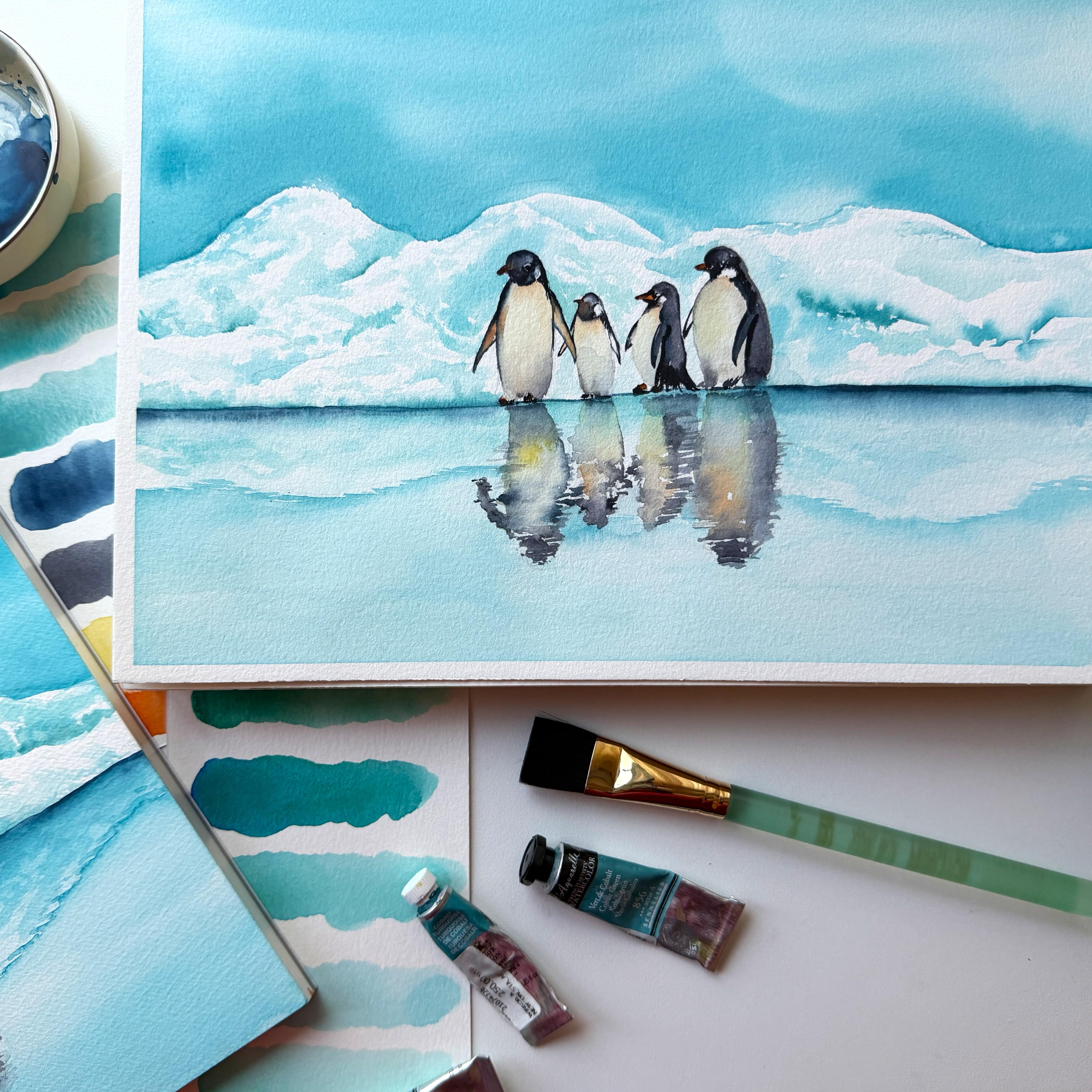
in the next part. Oh
11. PAINTING REFLECTIONS - SNOW: Okay. Now let's add reflections, which are very important
element of our painting. To paint reflections, we will divide the process
into two parts as there will be reflections of the snow and reflections
of the penguins too. First, we will create for the snow and when they
will be fully dry, then we will work with the penguin part on the top of that. So create snow. We will use a watery mix of torquois
which is our main pigment, and we used it for
painting the top part too. And we will use two
brushes for this, one synthetic round tip
brush to apply paint in, and one clean size
eight round soft bristle brush for
softening the reflections. And carefully, we will try
to imitate the top part. At least for the darker areas, something like this. So darker shadows. And then some softer lights
melting into the reflections. Now with the lighter
parts, however, I will not copy exactly
similar, just working loosely. So random strokes as a suggestion as reflections are way lighter than
the main subject. Similarly, on this side. Just some random strokes. Noticing the darker areas. Okay, that's okay for now. Now, let's work on
the silhouette of the snow which will bring
our picture together. And with these zigzag movements, we will create some textures. And then soften on the outside, so as to melt reflections
in the water. So darker areas. Try to keep strokes as
natural as possible. And then softening. That's better. Similarly here, too. So random zigzag strokes, keeping the shape in mind. And then softening. Okay. So as our snow is lighter in color
and the sky is darker, so the water here should
also appear darker. And now it's the perfect
time to adjust the tone of our water using a
soft flat brush and a watery mix of color. Don't fiddle around too much. Just a simple touch
and plain wash. Very softly and gently. We don't want to disturb
the bottom layer. Okay, that's good. Okay, let's try this
completely before painting the final
reflections of our penguins.
12. PAINTING REFLECTIONS - THE PENGUINS: Okay, so here comes
the final step where we will start painting
the main reflections. We will try to mirror
the image above, but in a much loose
and distorted way using the same colours as we
used to paint the penguins. However, remembering that there is water and snow underneath. So the colors should be mystical and not crystal clear and crisp, like in the main subject. As the reflections always repeat the essential shapes but
not at full intensity. So here I have begun with
a light wash of yellow and adding black right away as
our color is still wet. Please notice I'm not
exactly copying the sketch, just following the pencil
lines as a guideline. The lines should be sharper and darker at the top of
reflections where it connects to the main
subjects while they become more distorted and
lighter as we move away. And there is no distinction
between the blacks, the yellows and orange as everything feels like
an abstract art here. Adding our black color
in some zig zag manners, so as to create an
illusion of some movement. While painting reflections, we should always keep in mind that it should be done as a single piece where
everything is connected, and the wash should
not dry in between, or we will get hard edges
and hence no smoothness. Mixing and blending colors, keeping black almost
transparent in the basic shapes so the bottom
color doesn't disappear. Let me take out some
fresh Pains gray, which is our plaque
for the reflections. Please keep in mind,
whenever I'm saying black, I'm referring to pains gray here and darkening the
colour at some places. This way, it will look more
natural and less realistic. Please notice I'm
not going all in at once here and gradually
building the depth. This way, we will be
able to keep everything soft and layers will
stay transparent. Similarly, let's move
to the next one, starting with a
transparent layer of yellow and mixing
orange right away. Dropping some fresh,
transparent black and blending everything
wet and wet. Going back to the first one, adjusting some dots as the
color is not that wet by now, so this new color will not spread much and will stay dark. Okay, that's better. Now for the third
and fourth penguin, as they have different
orientation, so we will change our color
patterns accordingly. We have to be mindful about the shape and size of each one. That's the only thing we
have to take care of here. Adding some orange. And the blacks keeping everything abstract. And with this one. Keeping the top of reflections the same size and
similar in color tone as the bottom of our subject and then slowly
creating distortions, starting with nearly
transparent layers and then adding little details. The main idea is to keep a mirrored finish
and some more yellow and blending everything. Okay, that's good. Let's add some more
blacks to create depth. Adjusting some tones. And keeping the
bottom part lighter. So it will melt in water. Okay, and let's add the final details a
little darker tone near the top of reflections. And then soften. Little black. I Sotling. H. Let's add some more dots on this one. Okay, that's enough.
And we are done. I will see you in the next
section to wind up things. Oh
13. CONCLUSION: Congratulations. You just
finished this class. I'm so glad to see you
all made it through, and I hope you enjoyed the
process as much as I did. I will be eagerly waiting
to see your versions. Don't forget to upload your
beautiful paintings in the project section where I will be able to
give feedback to. I hope this class inspired you, and you learn how to
create beautiful paintings with a minimalistic approach
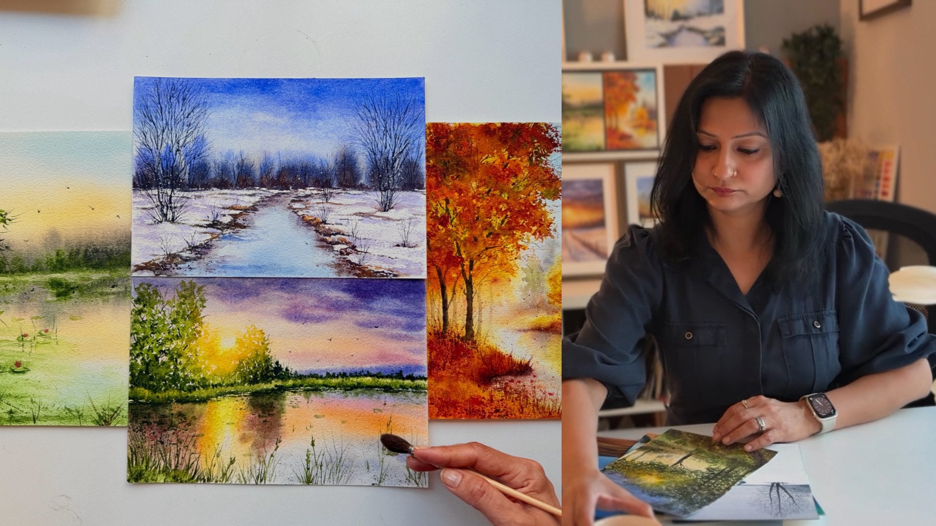
and color contrast. Learning watercolor takes time. If you love learning with me and love to paint landscapes, don't forget to check out my other class here
on Skillshare. Let's paint seasons
in watercolors, where I have a
complete section all about all the techniques to
be used for watercolors, along with the four gorgeous
seasonal landscapes. If you have any doubts, please feel free to
reach out and ask your questions in the
discussion section below. If you are sharing
your art on Instagram, don't forget to tag me. I'll be happy to share
them in my stories. Lastly, don't forget to give
a feedback about the class. I'll be happy to hear from you, and it motivates me to create
something new for you. Hope to see you soon
until next time, keep painting and take care.
 Deepti Mittal, Watercolor Artist