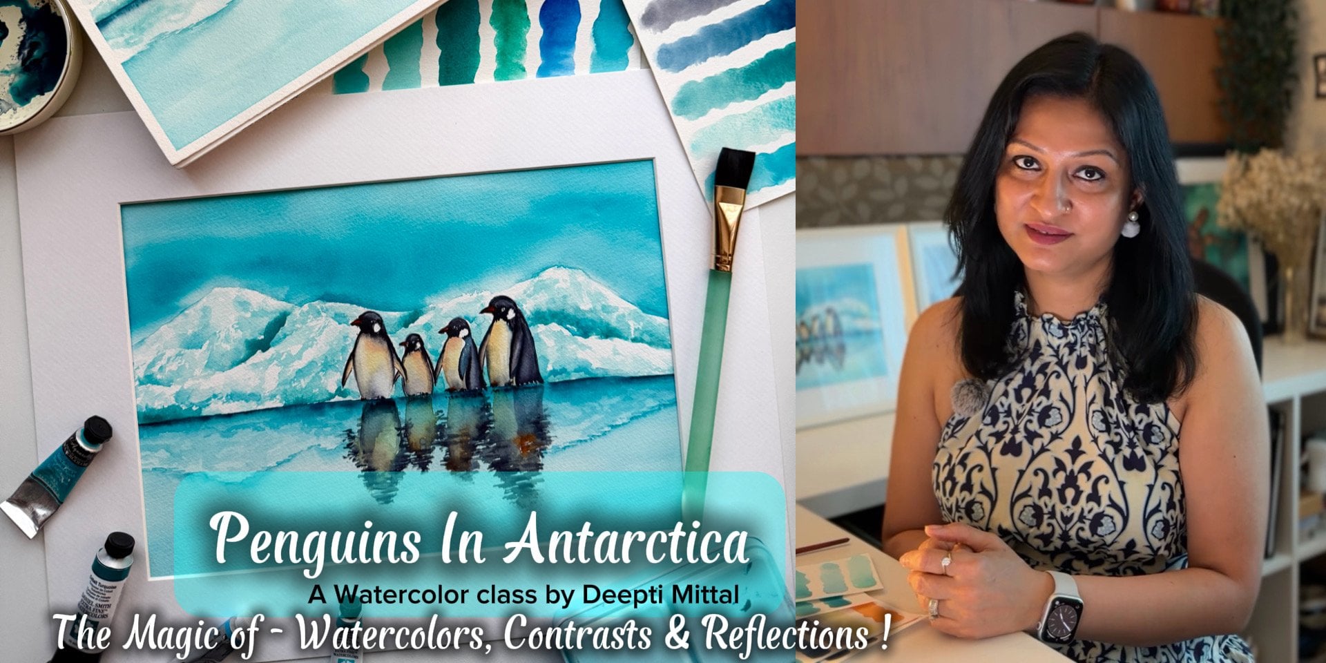
Transcripts
1. INTRODUCTION - CLASS OVERVIEW: Sometimes I feel that seasons are like
nature storytellers. Each one arrives with
its own colors, light, and emotion, changing not
only the landscape around us, but also how we feel. For a watercolor artist, these changing seasons can be an endless source
of inspiration, offering a fresh palette and perspective
throughout the year. Being a nature enthusiast, I find endless inspiration
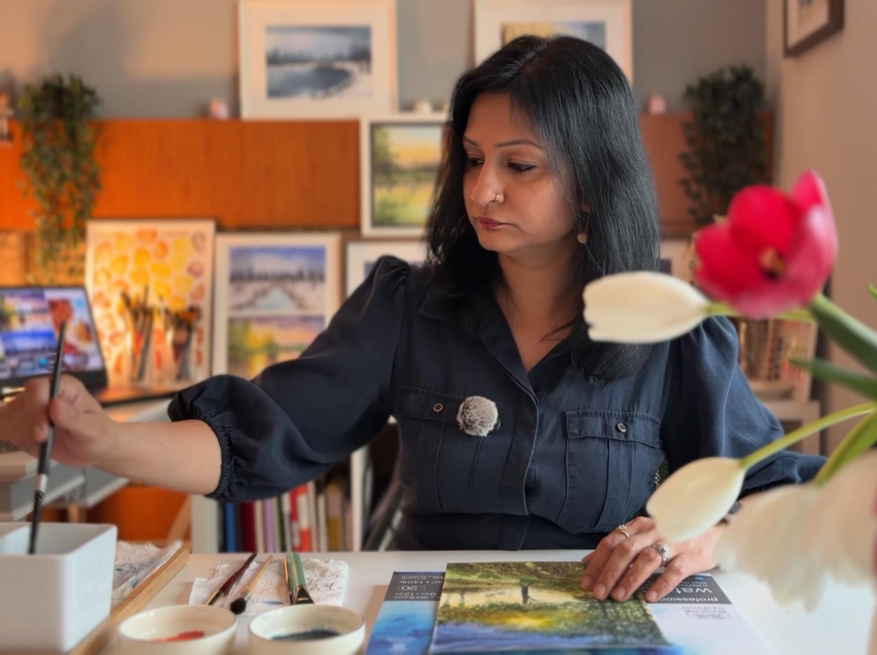
in these shifts. Hi. My name is Ditty Mitel, a watercolor artist, and an artist doctor.
Welcome to the class. I take my inspiration
from nature, whether it's flowers, animals, seasonal landscapes,
or theme sketchbooks. I've been painting
with watercolors for more than six years and nature, especially changing seasons, has always been a constant
source of my inspiration. You can see more of my
works on social media, where I go by the
name Ti Art World on both Instagram and YouTube. This is not just a class. It's a complete course where you will learn all the basics and techniques used
for watercolors. In this class, we will paint
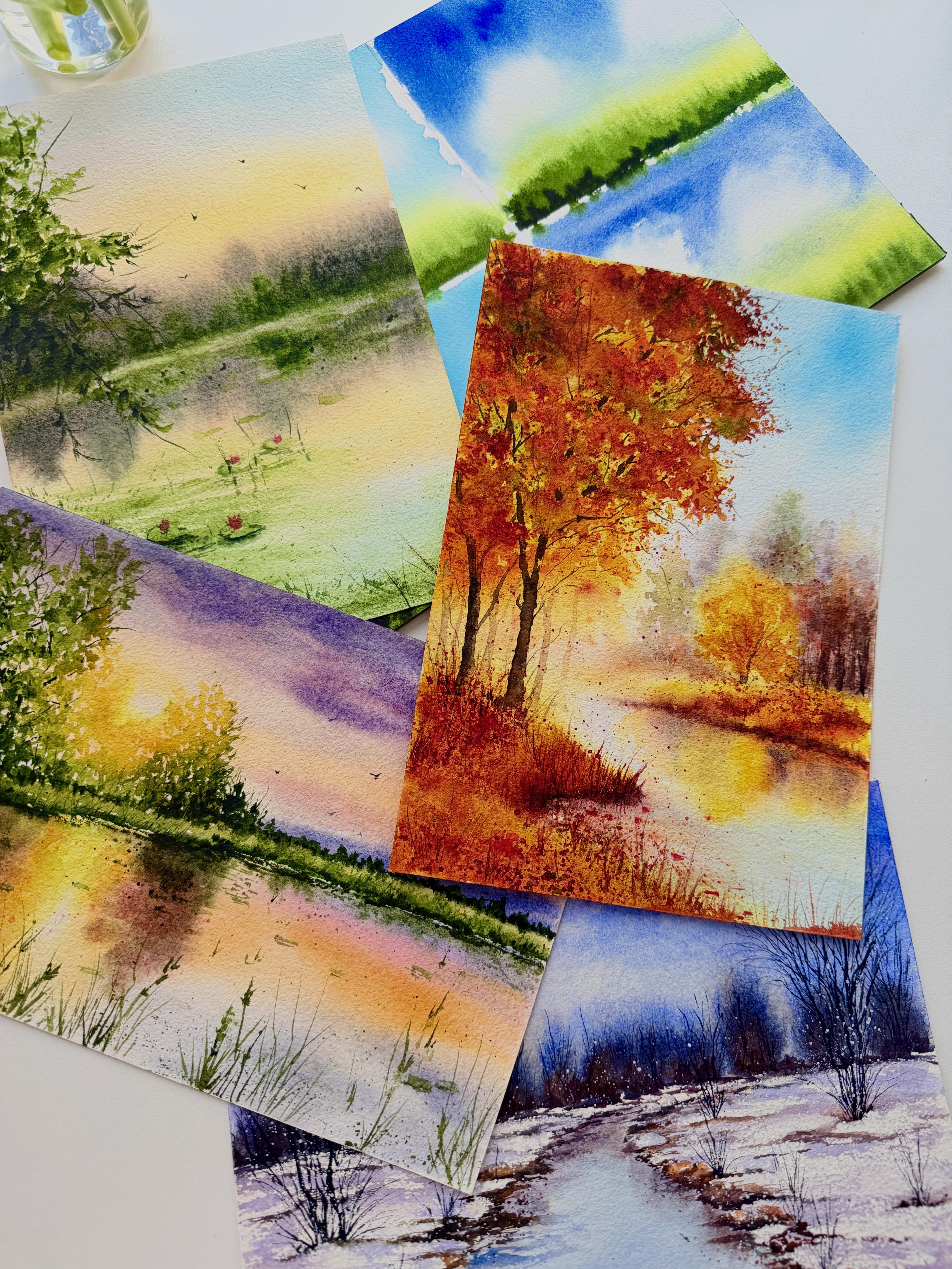
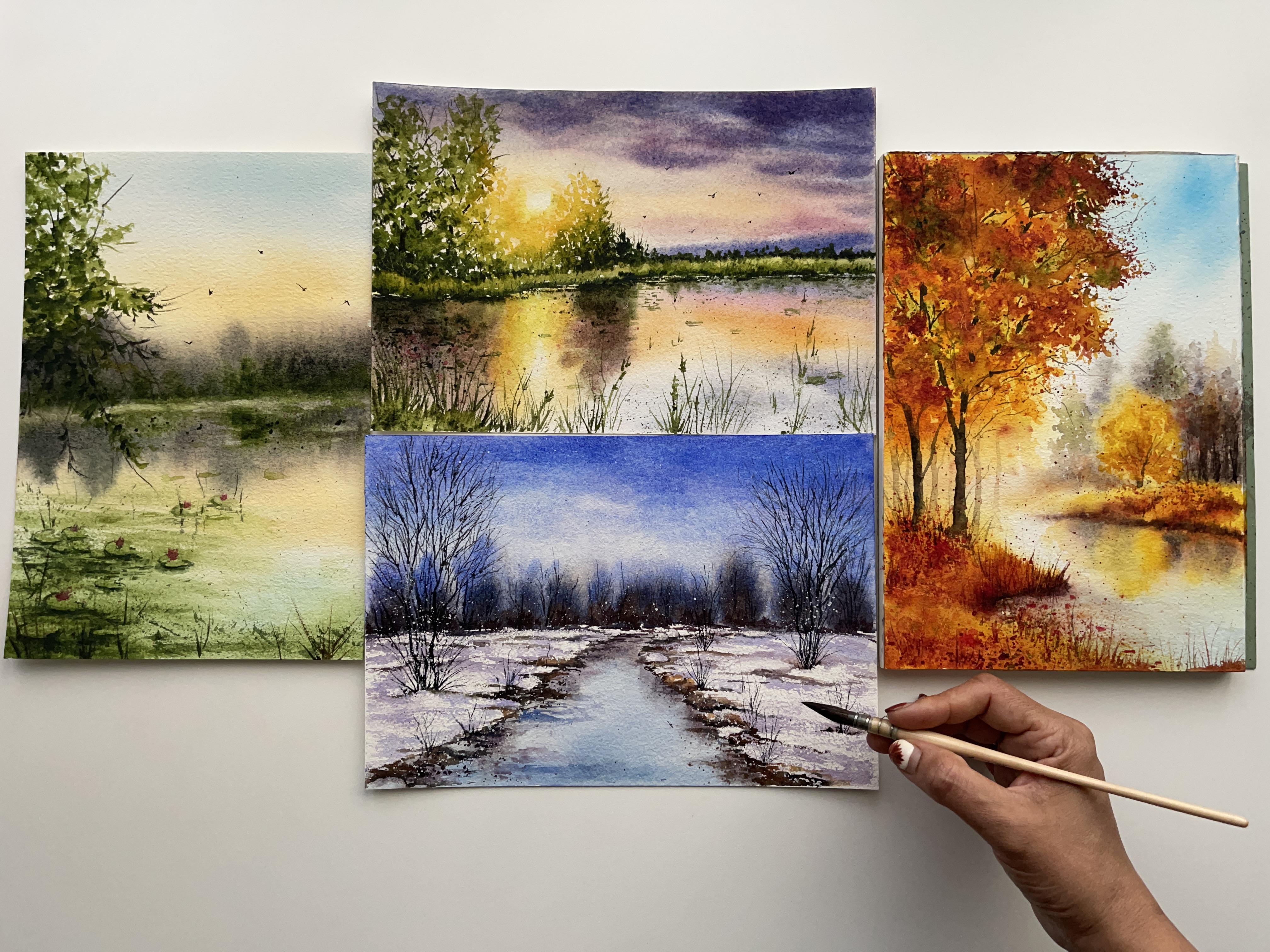
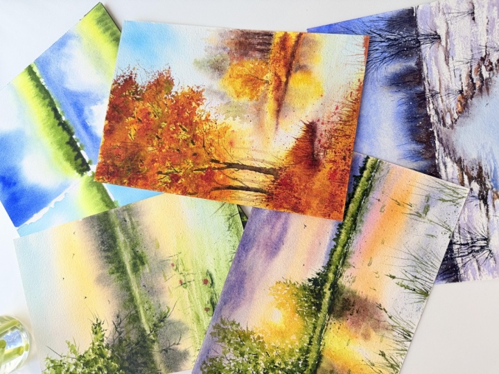
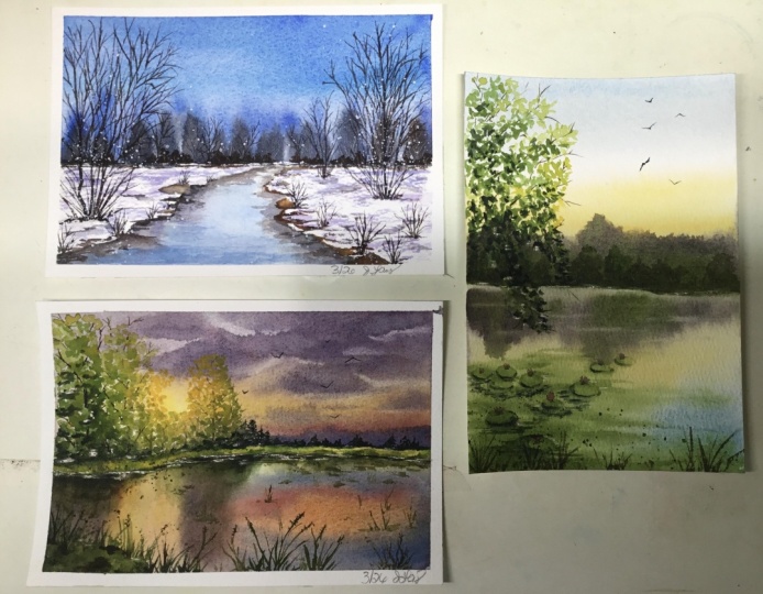
four beautiful landscapes, each one representing
one season. Here, you will learn
from the basic outline sketch to how to choose
colors for each season. We will study different modes of colors and how they
complement each other. How light and shadow work and methods to add layers and
depth to our landscapes. I will guide you with all the basic and advanced techniques to be used for painting
our landscapes, and we will discover the
beauty of granulating colors and how to use them
to add beautiful textures. By the end of this class, you will be able to create
four colorful landscapes, each one representing
different season. This class is designed
for all levels, whether you are an
advanced learner, who knows all the
basics or a beginner, who is just starting
with watercolors. So let's dive into the beautiful world of
watercolors, not to forget. The main idea is to have fun and love watercolors.
See you in the class.
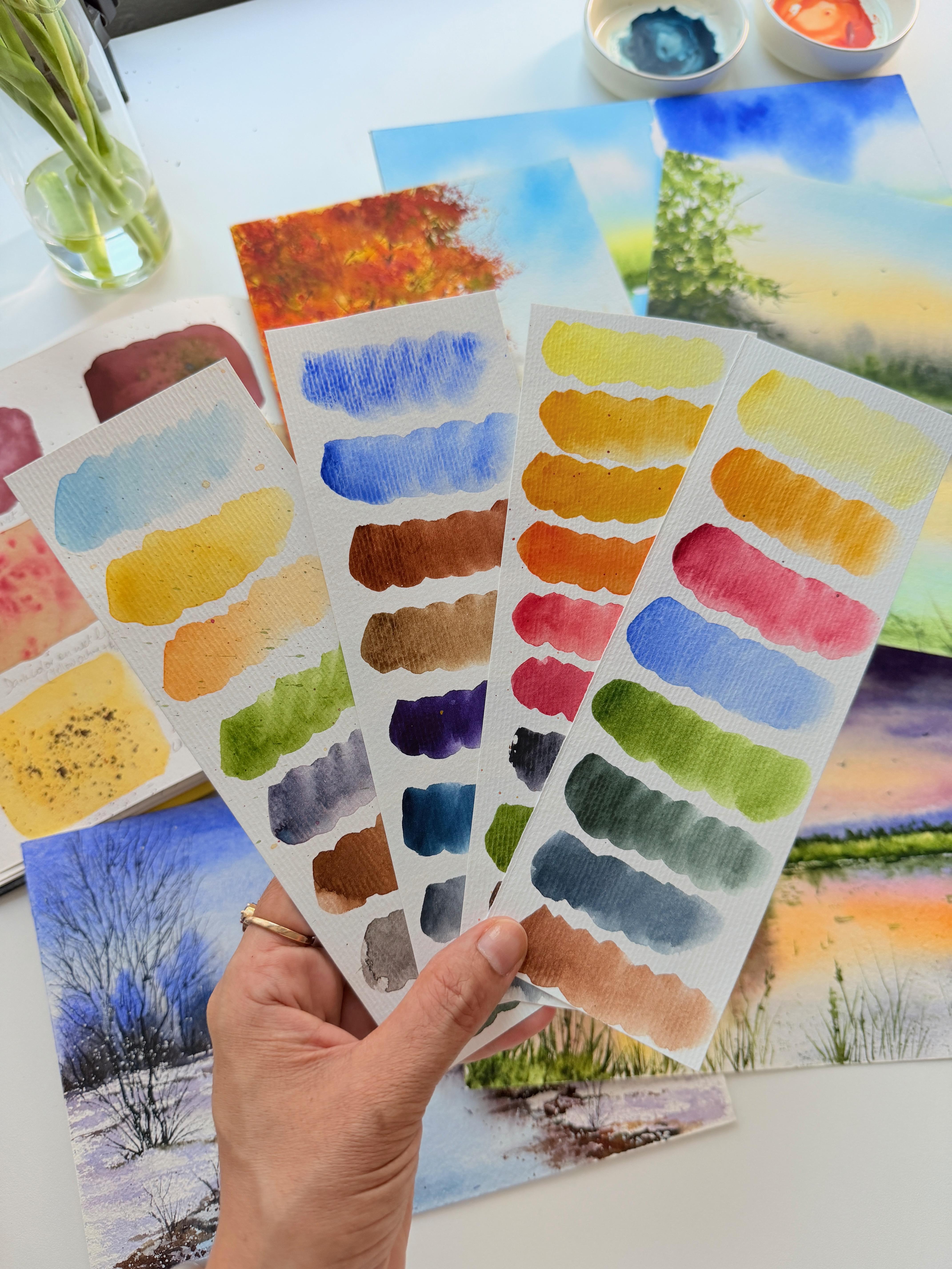
2. Materials Required: Welcome to the class. Let's have a look at the materials we
will need for this project. For this class, of course, the most important
thing is paper. Today, I'm using
Ba hung Cold press 100% cotton watercolor paper, as it has a very
beautiful texture which is perfect to
paint landscapes. Basically, you can use
any 100% cotton paper, but it should be 300
GSM and coal press are rough in texture. Next, I'll be using various shades of watercolors
from different brands, which we will discuss
before each lesson. You can use any brand of watercolors until
they are artist gray. A palette for color mixing. I'll be using my usual
plastic palette. Or any ceramic
palette like this, which has ample room for
color mixing will also work. For painting our landscapes, we will use various brushes, including some flat brush to
wet paper and paint skies, one small round sized brush to paint most of our elements. You can use any sizate brush which has good water
holding capacity. I'll also use this
soft pure hairbrush, one small fine tip brush, and some synthetic brushes for color mixing and dry
brushing techniques. For brushes, please
use whichever you feel comfortable with as far as they hold good
amount of water. A pencil for sketching. Elastic eraser. Some paper towels to wipe our
brushes, two jars of water. I'll suggest keeping one
small sketchbook like this to document colors and mixes and to practice some techniques, which we will be using a
lot for our future lessons, some scrap papers
to test our colors. In case you are
using loose sheet of watercolor paper instead
of a block like this, you will need to tape down
your paper to some board. This way, paper will not buckle as we will be using
lots of water, grab your materials and when you are ready, I'll
see you in the class. M.
3. Techniques : The basics: So before we start painting
our main projects, let's take a moment to
explore and brush up some basic techniques which will work as a foundation
for our class. These techniques are
absolutely helpful for the beginners and
beginner intermediates. And if you are an
advanced learner, you will definitely
gain some experience. So let's begin. First and the most important
one is wet in wet. As the name suggests
for this technique, we will first wet our
paper with water, and then we add fully
saturated color to it. So what happens when we add color on a previously wet paper? It flows naturally,
blends smoothly, and gives soft edges. Here, we can't exactly
control how the color flows, but we can adjust the
amount of water and dilution of the color according
to our specific needs. Also, we can soften the edges
by using a clean brush. This is the most
basic and useful part of our future projects, as we will be using
this technique for placing our initial washes, the base layer to paint the sky and whenever we need
smooth, soft transitions. Next, wet on dry. Here we use wet, fully saturated paint
on the dry paper, and we can see it doesn't go places and stays
where we put it. We get fine defined lines. This technique works mostly for fine details and
the darkest layers. Going back to our first one, when our layers are still wet, we can remove and control the color to some extent
using a clean damp brush. This is called lifting. Next is gradient wash. It is a little variation of wet in wet technique
where we will start painting from the top and slowly come down without
lifting our brush. Here, please notice I'm using a soft mop brush for
all these big washes, as it absorbs a lot
of water and color, so I don't have to lift
my brush too often, and it will not look streaky. Please notice the
movement of my strokes. This will gradually
decrease the intensity of the color as we
work our way down, like in the skies, where
we start from the top and we soften our color as we
come down near the horizon. In a similar way, we can paint a gradient using two
or more colors also. Let's try. So one thing we
should always keep in our mind while painting
wet in wet that our paper should be
nicely and evenly wet and there should not
be any pooling of water. Can you see the shine?
Nice and shiny. So for creating a gradient, let's start with our blue. Here we will start from the
top and come down halfway, slowly decreasing the
intensity of our color. Now for the second color, this time we will start from the bottom and slowly
go up in the same way, decreasing the
intensity of the color. One thing to keep in mind
here is the dilution of both the colors should be the
same or blooms will form. In this way, we create a smooth and soft plan
using two or more colors. Next, we will see how we create darker and lighter
colors in watercolor. For this, we will not mix white or black to lighten
or darken our color. However, we will use
different dilutions. Let's take, for example,
our blue color. Here, I will mix
water and color in different ratios to create
different values of the color. As I take more water and
very little pigment, let's say 80 20 ratio, the color remains very
transparent and light. As gradually I increase the amount of color
and change the ratio, to say 60 40, the intensity of
the pigment will increase and it becomes darker. As we keep on adding
more and more color, we will get variations in the
saturation of the pigment. And finally the darkest tom. In this way, we can use different dilutions to create
our light and dark values. Different colors can have
different grades of values. Here, practicing
this method will help you to understand
how the values work. So we know how to mix
colours on a palette. Next, we will see how to
blend colours on the paper. Let's take some yellow, and I will paint loosely
on the dry paper. For this technique,
we have to work a little faster before
our colour dries out. Now I will start adding more colors to the
previously painted one. When our first layer is still wet and we add
more colors to it, the colors blend smoothly
and create soft transitions. You can add as many pigments as you want until
they are still wet. Every time using
a darker pigment, this type of blending
will be helpful in creating effects like
trees or distant objects. And a little more da. So this type of blending
will be helpful in creating effects like trees
or distant objects. Next is dry brushing. Here, my brush is almost dry, and I will use
almost pure pigment with very little water in it. So when I rub the belly of
my brush against paper, it makes these type of broken lines with the
texture of the paper. Et's try with some
different color. Please notice I will
pat dry my brush. Every time I load it
with fresh colour so as to create this dry
broken lines effect. If the brush is not fully dry, then this effect
cannot be achieved. For this, I will suggest giving a paper towel in your hand. Also, any round synthetic
brush will work great for this technique
as they absorb less water. Notice how I'm using the side of my brush
and not the tip. We will be using
this technique to create foregroms
for our landscapes. Mostly the snow effect. Now, one more
variation of mixing colors on paper is
charging. Let's try that. As we paint our initial layers, whether it is wet and
wet or wet on dry, and it is still wet, we will add darker tones to it. Here, when I add indigo to
my previously painted blue, it darkens the color and creates an illusion of
depth and distance, mostly like in the oceans
or any water body.
4. Techniques : Spatter technique: The next technique
which I'm going to show you is spattering. This is a very important
technique for creating beautiful textures,
especially in landscapes. Spatters can be created with both colors and water itself, and on both wet
and dry surfaces. We will learn how different type of colours behave differently and how to use these properties of watercolor to our advantage. We will see the effects of both granulating and
non granulating colors. So let's begin. Spatters can
be created in various ways. The easiest and the
simplest way is with water. For this, first, I
will paint my base with a darker color in
an even smooth layer. Next, we will take a
smaller clean brush and load it with plain water. Then while our
paint is still wet, by making these
tapping movements, we will create spatters. Here, please notice how
the wet paint interacts with the water and create
these cauliflower effects. These are called plumes. The second one, similarly, we can also create spatters by using some different
color instead of water. For this, let's first paint
the pasteler nice and wet. Now I will use a
small synthetic brush and I will load it with
some color this time. Let's say yellow and then tap the brush in a similar way
to create these effects. However, not every color
behave in the same way. Let's try with some
different color. For example, I'm taking sap green, Wah. Did you see how it reacted? So some colors are
pushy in nature and they make space
for themselves. In this way, using different colors create
different results. Now let's see what
happens when we have a lighter
color as our base, and we use a darker
color to spatter on. Let's take some red. And see how on our
light pase layer it shines beautifully. Let's try a little variation
with granulating colors. The granulating colors
are the colors where pigment particles are heavy
and when mixed with poter, they separate and
settle in the alleys of paper to create
beautiful textures. Here I'm using moon glow, a very beautiful granulating
pigment by Daniel Smith. And see how it
splits and spreads and creates such beautiful,
interesting textures. This way granulating
color splits into beautiful colors and can be used to our advantage,
especially for landscapes. So spattering can be done on
a dry colour surface, too. For example, I will paint here with yellow color and we'll
let it dry completely. We will come back to this later. Now, can we control the size
and direction of spetters? The answer is yes. Let's see how to create
spetters in various sizes. For example, when we tap
our brush like this, we get bigger drops of color, and they kind of go everywhere. There are some factors
to keep in mind, like, first of all, the thickness of your
brush and second, and the most important is the
direction of the movement. For example, if we use
these type of movements, the spray stays more local
and the drops are also fine. You can see the difference. It's still wet. Okay, let's
go back to this area. As my color is still wet here, a little wet, let me show
you one more example. How simply by wearing
the wetness of paper, we can create multiple effects using same or different colours. When I spatter more color here on slightly less wet paper, see how we get soft textures, but the spatters don't
spread too much. Instead, they create
darker blinds. Now, here's an example how
using different colors and trying different
combinations can help creating
different patterns. Let's come to our yellow pine, which is dry by now. Here, I put some color on this, and as you can see, the color doesn't spread and
stays where it is. So on dry paint, the spatters behave the same as they do on dry plain paper. I will suggest you
practice these exercises, especially spatters before
going to the main project, as we will be using them a lot. Try different colours,
different combinations, and just play with some pigments to understand their nature. And when you are ready, let's move to our first project. But
5. Project 1 : Spring : The color palette: Oh let's discuss the color palette for our first project,
which is spring. Spring season is like
a quite awakening from a long cold winter. So everything appears
softer and calm, considering that the colors we are going to use
are cerulean blue, which is a cool sky
blue, cadmium yellow, cadmium orange, sap green. This is a bright,
fresh looking green. Next will be moon
glow. Burnt umber. Raw umber. Raw umber is a very beautiful
granulating color. So granulating
colors, some pigment because of their
heavier particle size, the separates and settles in
the texture of the paper. Next is perlin green indigo, and a very little
quinacrodon magenta.
6. Spring : Base layer: I'm so glad you have
decided to join the class. Hope you have practiced
the techniques, and you are ready
for the lesson. Let's jump straight to our first project, which is spring, as this one is a very
simple composition, so not going into sketching
details as of now, we will start with
our base layer. To paint any landscape, the first thing we
have to keep in our mind is the placement
of our elements. And the first layer
is always helpful to create an atmosphere and a rough sketch for what
we want to create. So here, we'll start with wetting our paper
nice and shiny. For this, I'm using
a soft flat brush. You can use any round brush too, whichever you prefer, and
I'm doing it very gently. As pressing hard can damage
the surface of our paper. When we start putting
color on the paper, the very first thing
we will keep in our mind is our horizon line, which is in the middle
of paper in our case. Here, I'm taking a
very soft mix of cadmium yellow and
cadmium orange to paint the glow in the sky. Similarly, we will also create the reflection in the
water with the same mix. As water is always a reflection
of its surroundings. Notice, I'm keeping
a little distance in the middle and not
blending them both. This is to mark
our horizon line. Next, I'm taking
a very light mix of cerulean blue for the sky, and we will gently place
it above the yellow mix. Here, I'll be careful not to touch the
yellow with my blue, as we don't want it to turn into any ugly green in the sky. And some blue in the water, too, and a little bit of
green in the shadow area. The green I'm using
here is sap green. While painting wet and wet, one thing we have to keep
in our mind is to work as quickly as possible before
our paper dries out. So this way, we will create a gradient for our first
wash or the base layer. The light will be coming
from this direction, so this area will be lighter. And here we will place our
future trees on the horizon. Be careful with the water
pooling on the edges. While our paper is still wet, let's start painting
the tree line in the background using
wet and wet technique. For this, I'll use a soft
hair round brush like this, and I'll grab a mix of
munglo and raw umber. Munglo being a super
granulating color spreads beautifully and gives that softer texture
of distant trees. And that's why I
love this color to create the smoky
tree line effects. And keeping our horizon line. I'll be working with
background trees and their reflection together. This way it becomes easier
to paint them similar. Next, I'm going a little darker, taking a little more
concentrated mix with less water and more
pigments this time. Here, notice the movements
of my hand and the brush. I'm creating these small longitudinal shapes
in one direction. This way, they give an
illusion of distant woods. Please don't make horizontal
movements here as it will look streaky and will
not create similar effects. Notice this glow
in the background. Let's add some fresh greenery with saprin here
to the tree line. And some reflections, too. I'm trying to keep
them similar in shape, both the background
and the reflection. That looks good. And some more green for the
distant trees. I have to stop working very soon as my paper is drying fast. By this moment, your paper
may not be wet enough. If this happens, then
I'll suggest you stop working and let the
paper dry completely. Please take care of
our horizon line. If the colour flows too much, then we can lift
some colors with a semi dry synthetic brush. Notice that I'm
wiping my brush every time I'm picking up the
colour from the paper. And some from the
reflections, too. This is perfect time to create some water movements in
the reflection area. This technique is
called lift in. Okay, that's it. I have to stop working now and let the
paper dry completely.
7. Spring : Second layer - The background: As our base layer is done and
it's completely dry by now, let's start adding details
in the foreground, some reflections
and some greens, starting with the water
surface here in the front. For this, I'll take
a softer brush and using a creamy mix
of sacre Oops. I'm sorry for that.
As the paper is dry, so we have to rewet
the surface lightly. Using our green color, we will create an effect
of some water grass on the surface of water to
show some lotus fields. Please notice my brush strokes here, controlled
horizontal lines. Almost like dry brushing, but this time, our
paper is a little wet. So when the paper is wet and we try our brush
on a paper towel, we get some control over
how the paint spreads, and we can get soft edges too. Here, notice I'm gently gliding
my brush over the paper. Very soft touch. And we can soften a little
bit by clean damp brush. Notice how my brush is
almost dry as I pat dry it with paper towel after every time I dip
it in clean water. As my paper is fully dry now, but I'm not happy
with this area, how it turned out, maybe we can use some more colour
to show some greenery. Let me take out some fresh
sap cream in my palette. I'll use a synthetic
round brush for this, and I'm preparing a creamy
mix of green using sap cream. As we will add more color
with wet on wet technique, so as to blend it smoothly
in the previous layer. So with a soft brush, we will gently wet the paper. Be careful not to disturb the base color that
is already there, so we have to do it very gently. This time, I'm keeping them shorter
to create an effect of, let's say, some
bushes in the front. And it creates a depth
in our background, too. This looks better. Adding a little more. And softening the edges. Let's try this completely, and I'll see you in
the next lesson.
8. Spring : Adding details - Foreground: Let's begin with the details. In the foreground, we will paint some lotus bags in the pond, and there will be our tree. Let's mark our details a bit. For this, I'll be using
a mechanical pencil, and I'm just positioning some
lily pads here and there. I'm not trying to copy the
reference picture exactly, keeping it simple and loose. That looks good to me. I'm using a number eight
round tip brush for this. First, I'll start with a very light wash of sapren
for these lily pads, and slowly, we'll
bring shadows in. I'm using a very watery mix to just mark the places
of these leaves. Carefully giving them shape. Let's start adding
some definitions. For this, I'm mixing a little perylene green and
indigo for darker shadows. If you don't have Perlin green, you can mix indigo
directly to our sapren. It will create a similar color. Be careful and gently keep
on defining the shapes. I'm using a fine tip brush for
this, and whenever needed, I'm carefully
softening the edges, again, using a clean damp brush. I'm using two brushes here, one for color, and
one for water. This way, I don't have to wash my color off every
time I have to soften. Adding shadows and
softening the edges. Try to keep a variety
of shapes and sizes. Always keep the rule of
perspective in mind. The thing that are far
from us are always less defined and feel smaller in shape than the
objects nearby. And some light ones
at the distance. A little softening.
And some shadows. Creating a few patterns
here and there, with some dry brushing
to create some effects. That looks good. Let's add some light ones here. And don't forget the shadows. Now, let's add some spatters. For this, again, I'm using
sap cream and Perlin green, and I'm using my finger
to guide the spatters, so they don't fly everywhere, especially in our scar. A little more. Okay, let's cover the
sky with a paper towel. And now you can play
as much as you want. Isn't this beautiful and fun? In the next lesson, let's
paint the tree. See you there.
9. Spring : Adding details - The tree: Now, as our background
and foreground are done, let's work on our main
element. That is the tree. Let's quickly sketch
a very rough outline so as to understand the
guidelines for this. We don't have to
draw everything, just a few branches, so we will understand
where to put the color. And using a synthetic
round brush, I will start with a very
light mix of sap cream. I'm not taking too
much paint and water. Just with a moist brush, I'm trying to add a few definitions that
look like leaves. Wiping my brush with a paper
towel every time I load it. Here we will be adding
a variety of tones. In the top, where the tree
is exposed to sunlight, the leaves will appear
brighter and lighter. Whereas in the shadow areas, the leaves will appear darker, always keeping in mind. Adding a touch of cadmium
yellow to our green to lighten the shade and using perlin green and indigo
alternatively to darken the tone. Please notice how
I'm using a tip of the brush to paint the leaves
and not the whole head. And my motion is small broken strokes of
various shapes and sizes. I'm making very small markings and lifting my brush every time. Alternatively, using
different mixes. A little bit of cadmium yellow. And some darker tones. Here, I'm keeping a
paper towel in my hand. And every time I'm petting my brush for excess
water or colour. Let's set the branches. Oops. Okay. No worries.
Accidents happen. So what will we do now? Let me try if I can soften it in the background with a soft
brush and clean water. Dab a little on a paper towel, and I'm trying to blend
this in the background. Okay, that works. Let's move on to the tree. Let's add some
more darker tones. So there should be a mix of both light and dark
greens as there is light, and there are shadows too. Using a variety of
mix creates depth. So darker tones in the bottom. Okay, at this stage, I think our tree looks good. As our little lily
pads are dry by now, let's add flowers to them. For this, I'm taking a little una croton
magenta in my palette. If you don't have una
croton magenta, it's okay. A variety of colors can be used instead like carmine
or maybe opera, anything pink, or maybe
permanent rose, so no rule. Here I'm using my thinnest
brush to make some clear, clean masks and giving
them shape of flowers. Oh keeping in mind the rule of perspective. Adding a touch of blue for
variation of the tone. Okay. That looks good. H. Alternating between
pink and blue. And some speters. Let's add some more details. I'm darkening the
shadows a little bit. That's better. Okay, let's add some grass blades. For this, I'm mixing
a little brown in our green burn tumbo. Notice my brush movements. Okay, that looks good. Maybe some more in the middle. Notice how painting in
multiple layers gives depth to our scene and the reflections Now let's move to
our final details. Let's add some branches to the tree using the
same color mix. Adding small branches in the gaps and keeping
a variation. There should be a variation
in shapes and length. Don't make them similar. Now the picture looks more
alive. Let's add some more. Okay, this looks good to me. Let's not overdo it.
10. Spring : Final touch - Birds: And now we are at
our last element. Let's add some tiny birds. I'm using indigo for this. Again, a variety of
shape and sizes. And a tiny one here. Congratulations. We just
finished our first project. I think it looks beautiful. Hope you enjoy it, too. I'm so eager to see your
versions and to hear from you. Let's move to our next project, which will be summer.
See you there.
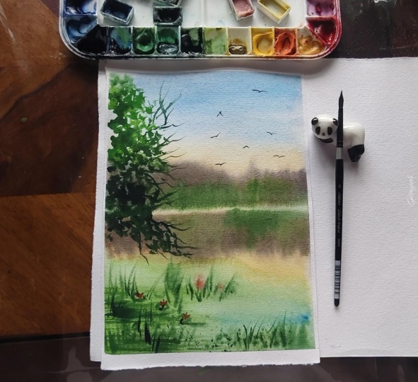
11. Project 2 : Summer : The color palette: Welcome to our second
project, which is summer. Let's discuss the palette. To bring out the
vibrancy of this season, we will use two yellows. One is aolin which will
be our cool yellow. And the second one will
be cadmium yellow deep. It is a very deep orange yellow. For red, Alizarin crimson lake, which is a pure pigment, PR 83, and it leans
towards pink. It is a non granulating pigment
and it makes pure mixes. Ultramarine blue. These four will be
our sky colors. Then sap green, perylin green. These will be our
main color spot trees and for some darker tones, indigo, and burn timber. How do I choose these
specific colors for summer? Mainly the sky colors. Let's analyze this biclor mixing and some play with the pigments. Let's take our crimson lake, which is pigment
PR 83 and I mix it with aolin which is our primary cool yellow
and platin blend. Similarly, for the second mix, let's try our red with
cadmium yellow deep, which is our warm yellow. When mixed together, they
both create a gradient of pure pigments and give
a very beautiful glue, as they all are non
granulating pigments, so they blend smoothly
as compared to laserin which is
granulating or cadmium red, which is an opaque pigment. Similarly, when we mix
crimson with our blue, which is ultramarine blue, it creates beautiful purple, which is perfect summer color. Let's try a little bit darker. As we can see, a transparent,
beautiful purple. Now let's see what happens when we mix them with
a little warm yellow. When mixed in with warm yellow, they make a very
beautiful gray which will work as a perfect shadow
color for our sky. This gray is transparent
and is not overpowering, so it blends smoothly. Why can't we use opaque colors? Here, I tried a few options using cadmium yellow
and cadmium red, which are opaque
colors. As we can see. Together, they create
very dark and bold gray, which will stand out and we
don't want that in our sky. Hope that makes sense. Now let's move to our project. See you there.
12. Summer : Base layer - The Sky: Welcome to our second project. We will begin with a
very simple sketch. Here, I'm roughly creating
our horizon. So trees. Here will be our sun and the reflection and a
little bit of foreground. Just a bit of guidelines. And some background treeline. Okay, that's it. Let's
move to the painting part. Again, the first thing is to prepare our paper
for the base layer. So this time, we
will wet half of the paper only
above the horizon, as we will be painting our
base layer in two parts. First, we'll work on our sky and later on
the reflection part. This way, we will get plenty of time without worrying
about paper drying. I have already prepared my shadow colors for
the sky using yellow, red and blue, as we have practiced in
the previous lesson. I suggest preparing your colors beforehand and always test
color mixes on a scrap paper. As discussed, we will mix
them in two different ratios. First mix leaning towards blue, so we will add more blue to it. And for the second mix, which will lean towards purple, we will mix more red
into our color mix. Now let's start
putting some colors. We'll begin with our yellow leaving some space
in the middle, this will be our sun. A little cadmium
yellow for the glow. This way, we will
create a gradient from warm to cool colors
around our sun. Try to work as
quickly as possible. Adding a little bit of red. So here I'm trying to
plant the colours on paper as to create a smooth
transition around the sun. Okay, distant sky, I will directly go with my shadow
mix as the base color. As we know, the closer we are to the sun, everything
appears warmer. So we use more of
yellow and red here. And as we move further, the things become
colder and darker. So the further we move from sun, we will blend in more blue, cooler at the distance and
warm colors near the sun. Try to create a gradient
by blending the colors. Okay. That looks good. Now I'm going a bit darker. Summer is a very vibrant and
bright time of the year, and it creates some of the
most beautiful sunsets. We will also try to create
some vibrant hues here. I'm using the same color mixes, just a bit of variations. And remember, I'm always keeping a paper towel
in my other hand. As every time we load
fresh color on our brush, we will dab a little
for excess color so as not to create any
patterns or plumes. Let's add some clouds. Here, please notice I'm not
using blue or red directly. Instead, to tone them down, I'm mixing them in
my shadow color. Sometimes a little bit more blue and sometimes
a little more red. Okay, right now, I'm not
worried about this part, as here will be our trees. Adding a little more
red near the sun. Slowly and gradually, we
will intensify our shadows. Okay, that looks good. And it's perfect time to
lift some light areas here. Remember, a clean damp brush and wiping it every time
with a paper towel. So as my paper is
still wet here, I will quickly add the
distant horizon colors. It can be some small trees or a far away field or
maybe a small hill, some blurry shadows, no details. M So more blue for the smoky effect. Okay, that's it.
13. Summer : Base layer - The Lake: Without any further delay, let's begin with our foreground. As we will be painting
this wet and wet. So first, we have
to wet our paper. While painting reflections, one thing we have
to keep in our mind is here we will be painting our future pushes and
their reflections. So we will keep this area
lighter accordingly. Wet the paper nice and shiny. Be careful not to
disturb the sky layer. And let's start with yellow. Warm and shiny right under the sun and some for
our future tree line. Et's start adding
shadows right away. As we know, water is always a reflection
of its surroundings. So I'm using the same shadow
make we used for the sky. Again, with some variations, sometimes adding
a touch of blue, and sometimes with a little red. And blending them a bit of orange. As here is our sun, so we will keep this area
brighter and lighter. Mm. Adding some movements
in the water. So today, the sun is playing hide and seek here at my place. Notice how the background
at my table is changing from the golden
glow to shadows in real. Did someone notice?
Okay, let's move here. As there will be
our future trees, so the reflections
here will be darker. I'm adding a little bit of burnt tumber to our
shadow color for this. Let's add the reflections
of our trees. I'm using the same shadow makes here with a few variations, sometimes adding a little brown, sometimes a little
more red to it. Just play with colors
and create a variety. Don't forget we have to keep
our reflections warmer near the sunlight and a little
colder as we move further. Same rule applies here too. Adding some yellow. And some more warmth
with a touch of red. Try to give them some shape
as they are trees after all. Adding more warmer shadows. The paper is still wet here, so we can work here too. Notice my brush movements
here, small broken strokes. So here I'm just making
our reflections darker, always remembering
watercolor dries much lighter than how they
look when they are wet. Keeping in mind to create
a variation of color by alternating between
red, blue, and brown. And, of course, a little
spattering. Be careful. This looks okay to
me for a base layer. Now let's try this completely.
14. Summer : Adding details - Trees and the background: Welcome back. Now it's time to add the details
to our landscape. Let's start with the trees. To paint trees, we will need any synthetic
fine tip brush, and we will mix
various color mixes, keeping sap green
as our paste color. I'm going to follow
the same principle to paint the trees as
for the background. The parts surrounding the sun will be more yellow and farmer. And as we move further away, they become darker and colder. So we will begin with a warmer yellow mix
of cadmium yellow, along with little lemon yellow, and carefully start working
with the area around the sun. Notice how I'm working
with a tip of the brush, and my strokes are small
and little scattered, leaving some areas in between. I'm not covering
everything with color. The idea is to give
a shape or feel like leaves as we have done
in our spring project also. To create glow around the sun, I'm also adding some warm
yellow to our lemon yellow. Carefully working
around the sun. As we move further, I'm
starting to add some green. Here, notice how I'm working
quickly and moving all around so my yellow doesn't get dry and green
blends in smoothly. Constantly keeping a
variation of the pigment, mixing more yellow near the glow and more
green as we move away. And dropping more
green in my wet color, the idea is to create
a smoother transition from the warmth of sunlight
to the colder areas. Okay. Next, I can even scratch my wet paint
to add some branches. Adding some more
color here and there, just keeping a variety. Similarly, I will work on this side before
the colour dries. Okay, that looks good. Now I'm going a little bit darker as this area is
quite far from the sun, so I'm adding more
colder green to our mix, perylene green in our case. Please notice how I'm constantly keeping a
variation of colors, sometimes adding more yellow and sometimes more
green to the mix. And also slightly changing
the direction of my brush. So there will be more variety. Similarly, in the top area. Be careful with the wet color. And a few more branches as
the paint is still wet. And and a little more yellow mix. Some more branches. Adding a touch of
orange for more warm. Okay. That looks good. Here will be our future
bushes or small trees. We have to make sure our trees are in alignment
with our shadows. Dropping in some more dark green this time a little more
pigment and less water. So a very creamy mix. This is a very big advantage of painting shadows
or reflections first, as when we paint
all wet and wet, sometimes we can't control
how the pigment moves. So while painting
trees on dry paper, we can make some adjustments. Isn't it nice? And
some more warm greens. And shadows. Okay. Let's add some bushes. Oh. Some yellow for
the base layer. And then a bit of sapren. This way, we will mix
colors on the paper. And some more dark pigment. I'm trying to create an illusion of distance and depth here, bringing these small
bushes forward. And some more
scratches to create a bushy texture while
the colour is still wet. And I will continue with the same process for
our distant trees. So green and darker shadows. And some dry brushing. Let's add some shadows here. Mixing a little bit of burn
tumber with sap cream. This will create an illusion of the ground above the water, and it will look more cohesive. And softening in some more dark greens. This way, working
in multiple layers create depth in our landscape. And slowly moving towards
our distant tree line. Some random strokes. That looks better. Darkening the shadows. And with a soft te brush, let's soften these reflections. Very, very gently, I'm pulling the pigment to blend it with
the rest of the reflections. Similarly, here. Please keep in mind not to
put pressure on the paper. Okay, that looks good. Let's create some
more texture in the foreground, some
more reflections. Okay, that's it. Now let's add some
more spatters. I want to add a little more
warm reflections here. For this, I'm taking a very watery mix of
sap green and yellow, and carefully, we will add some very transparent
reflections.
15. Summer : Adding details - Reflections and foreground: Okay, so I want to add one more layer of definitions
to these banks of the lake. The process is same.
We will work with a dry brush using a creamy mix
of sacren and burn dumber. Slowly creating the texture. And then blending a little bit. Now let's add some spatters. For this, I will
cover our sky first. I'm not worried about
the spatters going into our water as we still have
to add details there. Okay, let's add some
with a little red too. That's good. Now it's time
to work on the foreground. For this, let's start with a very light ph of
our green colour. Just blocking some areas. And I'm switching
to a thinner brush now to add some grass plates. Notice my brush movements, some upward random thin strokes to give a feel of grass
in the foreground. Some darker tones. And some texture. A little bit for tumbo. Now, this is fun and you can
play as much as you want. Just two things we should
always keep in mind, as I have mentioned
earlier also, variation in color and the
direction of the brush. And some spatters. So plant or water
grass in the water. And their reflections. Don't forget the
rule of perspective. Things that are far away, they look smaller, and things that are near,
they look bigger. Et's add a few floating ones. There can be some leaves
or some lily pads. Now for distant plants, as they will appear very light, so as to lighten them, I'm wiping extra color with
a soft tissue every time. Pressing very gently. In a few here and there. And some more grassblades. I'll love to add all
these details to my art. However, it is
completely optional. Let's add maybe some
leaves to them. Okay, that looks better. Now they really look like some grass plates
or small plants. So more texture near the edges. And some in this little corner. And some more spatters. Okay, I think I'm
done with this area. Let's add some more definitions
in the shadow area. Okay, this looks good. Let's not overdo this. We are almost at the
final set of the details. Let's add a few
branches to our tree. For this, I'm mixing a darker
shade using sap green, per timber and a
little bit of indigo until it's very dark,
almost like black. And using a thin tip brush, we will start adding branches to the little gaps in
between the leaves. Slowly and carefully. Be careful, as the paper is
still wet in some areas. Similarly to the second tree. Okay. Now to add some fine
branches and details, I'm switching to my liner brush, and for this, I will now
turn my paper upside down. This way, it feels easier
to add those details. And I'll start adding
some branches. So fine branches to increase the volume and to
create some texture. This weight looks more natural. And some fine plates here, too. Mm. Here, notice how I'm holding my brush
from a distance. This way, it stays flexible and we get more natural
looking strokes. Okay, that's it.
Isn't this beautiful? Now it's time to add our
final element, a few birds. And for this, I'm using indigo. And it's done. I'm so glad
we painted this together. Isn't this like a
vibrant summer evening? Adding those tiny details
really creates magic, and our picture becomes alive. I hope you enjoyed
it as much as I do. I will eagerly wait
to see your versions. See you in the next class.
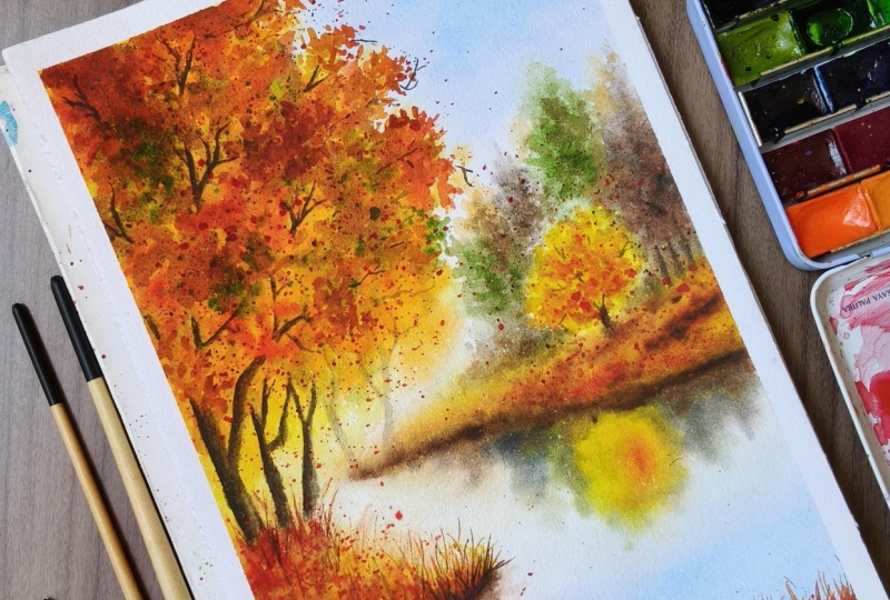
16. Project 3 : Autumn : The color palette: We are halfway
through our seasons, and now it's time
to paint autumn. So before we start our project, let's quickly have a look
at the color palette. As autumn is the most
vibrant of all the seasons, so we will be using
lots of colors like lemon yellow, cadmium yellow. Indian yellow, lots of yellows. Cadmium orange. Next is cadmium red. Being opaque, this
will help us create the top most beautiful
vibrant layer of the trees Alizarin crimson. Moon glow. By now, you must have known that this is my absolute favorite color for painting background washes. Some saprene burn tamber paints gray for
the darker tones. And for painting autumn sky, I will be using Winsor blue
or also known as thalo blue, a very beautiful
bright blue color. So grab your colors, and I'll see you in
the first lesson.
17. Autumn : Sketch , Sky and The base layer: Welcome to our third project. Let's start with a
little sketching. I always love to have a
loose sketch where I place my elements just as a guideline to understand
where to start. If you wish to start
with a detailed sketch, then it's completely okay. Work as you feel
comfortable with. So here will be our
foreground, the trees. Trees will be our main element
for the autumn landscape. You will be the sky. And
our little background. And a lek. Let's draw a little
tree in the background. More or less, I want
to keep the visual simple and similar to
our other projects, just increasing the
level of difficulty. This way, it will be easier to practice the techniques
and learn how to use them. Okay, straightaway, let's
begin to put some colors. This time we will try to paint
our first layer in one go, so we will wet the
paper completely. Unlike the summer landscape, we will keep our
autumn sky simple, so it will be easier
and quicker to paint, and we will get
ample time to put some colors in other areas too before the paper dries out, as our main focus
will be on the trees. Wet the paper gently and
let the water soak in. A quick check with the shine. It looks good. And
a final touch. Okay, straightaway, I'm
starting with Windsor blue. If you don't have
Windsor blue, it's okay. It is the same pigment PB 15, which is commonly
known as hello blue. It's just the difference
of the brand name. Let's put some
colors in the sky. Notice, this time, I didn't mix any other color to my blue, and I'm using it in pure form, as autumn sky is quite bright and is cooler
than the summer sky, and Hello blue is the most vibrant and cool blue
in its pure form. Here will be our future trees, so I will keep blue
colour away from this. Going a little darker. As the watercolors dry
lighter than how they look, so I'm keeping our sky
a little brighter. Okay, that's good. Let's put some reflection
of our sky into the water with a very light
touch of the same blue. And softening a bit. Okay, that's okay for now. Very quickly, let's move
to our main element. I'm taking a very
soft round brush for painting the trees, and we will start with
some lemon yellow. Let's put the base layer. I'm keeping the color
watery as our paper is wet, so the color will soften
in the background nicely. So Indian yellow and mixing
the colour on the paper. Indian yellow is a very
warm and bright color. Here, please notice my strokes. They are small and
little scattered. I'm almost gently
touching the paper and not covering the layer
of lemon yellow completely. Adding some more warm colors, cadmium yellow, cadmium orange. So here I'm trying to keep
a variation in the shades. Also, being careful about
the shape of the trees. Okay. And some soft terias
melting into the background. Looks good for now.
18. Autumn : Base layer - The background: Let's move to this part.
A quick rub with water. And right away, let's
start to create a smoky background
using moon glow. Very gently, I'm touching
the paper with a tip of my brush and trying to
create some tree shapes, not much details, and I'm
using a very light mix. A let's add a little
warmth with burned tumber. A very watery mix
with sap cream, alternating between the colors. So here I'm keeping a
little space for our tree. For these background trees, we have to keep our
pigment very light. Make sure there should not be too much water in the brush, or the paint will run very far. Creating a background
around the tree and using the same colours for the
background woods all along. Okay, let's add
some yellow here. So one thing to keep in mind, as my paper is still wet, I'm able to work here right now. Your paper may not be
as wet by this time. If the paper doesn't
feel wet anymore, we should stop right away. Wait until the paper is
completely dry and then re wet the paper with a very soft brush and continue working on
the background layer. To keep our background
smooth and softer, we need to work on a wet paper, or the color will appear
harsh with hard edges. A little more yellow along
the edges of the lake. Okay, let me switch to
a smaller brush now. Let's bring this tree
a little bit in front. For this, we need to paint
shadow colors around it. Darkening the shadow colors. Okay. That looks good. As this yellow is still wet, let me add some red to create more depth
into our background. Here I'm using both
cadmium orange and red for this alternatively. And now let's work
on the reflections. A quick rub with water. And again, using the same mix of burnt timber and sap
cream with moon glow, this time keeping
them more warm. Et the reflections
melt in the water. And here's some yellow. Okay, that looks good. A little warm yellow. And I will let them
blend on the paper. Let's work on the edges
of the background. Now I'm going a little
bit darker using the same mix of burnt tumber and moon glow all along
with some red. And some softer washes for
the distance, a little warm. A very watery mix, and then softening the edges. Okay, let's add some more depth
to the background boards. Here, I'm working with a size eight round
brush all along. If you don't feel comfortable, you can switch to
any smaller brush, whichever you are
comfortable using. It should be fine tip. Now my paper is
drying very fast. Okay, that's it. As of now, my paper is almost dry and
I should stop working on. Let's wait until it
dries completely.
19. Autumn : Base layer - The foreground : Welcome back. Let's begin
working on our foreground. As our paper is
completely dry now, so we will wet it gently with a soft flat brush without
disturbing the previous layer. And using a soft round brush, I will start putting
colours right away, starting with a watery
mix of lemon yellow, just a quick wash to
cover the foreground. And I will directly move
to the warmer tones, mixing a little bit
of Indian yellow. And a bit of cadmium yellow. Blending all wet in wet. A little bit of cadmium orange. This way, I'm alternating
with light and dark tones and trying to create a ground covered with
grass like effect. Softening the edges. Going a little darker
now and adding crimson with a touch
of burn dumber. Please notice the motion of my brush. And using a pointed edge tool, I will do a little bit of scratching while my
color is still wet. So they will look
like grass blades. Okay. Back to our foreground. So now I will strengthen
the colors by repeating the same process and
working all wet on wet, charging my lighter
colors with darker tones. A little softening
around the edges. And some more scratching. This way, puking in layers helps building
that grass effect, and everything
looks more natural. Okay, that's good.
20. Autumn : Adding details - The background: Welcome back. So I'm not very happy with how
this area looks right now. Let's strengthen the colors in the background
woods a little bit. For this, I'm using a
little watery mix of ungl and burn timber and
using a fine tip brush, I will start adding one more layer to darken
the shadows in the woods, creating a mix of soft and hard edges for
the distant trees, working on a dry
paper this time. Carefully creating the textures and blending everything
into the background. Okay, let me zoom a little
bit. That's better. I'm now following
the same process for the entire background
as we did before, using a watery mix of colour to add one more layer
to our background. The only difference is that this time I'm working
on a dry paper, so I will keep
softening my color at some places and
we'll be charging more pigment while
the color is still wet using different
concentrations of our color mix. Adding some more green. And charging some orange. And softening. Similarly, some oa tries
on the left side too. And blending everything
into the background. Okay, let's add some more
shadows to our ground. And blending it.
Okay, that's better. Similarly, let's
add some more depth in the ground here in front too. Let's wet the paper
with a little yellow. And I will add some
orange and some red while my yellow
is still wet. The idea is to create an edge
of the lake like effect. Going a little darker. I'm using the same
mix of moon glow and burn tamber along with
a little crimson. This color mix creates some very vibrantt
subtle textures. Little darker near the edges. And blend. That's good. Okay, let's
start on our reflections too. A quick wash with a damp brush. Be careful not to move
the previous layer. And gently adding
some warm tones on the left, too. And softening everything. Similarly, I will be building shadows in our little
background tree, alternating lights
and dark colors a little bit of cadmium yellow. So Indian yellow. And cadmium orange making
small brush strokes, this way, enhancing colors on the paper and keeping
everything softer. Okay, that looks better. And let's add some spatters. Be careful with the sky. And some more red
for the reflections. Okay. In the same way, we will
work with the foreground and because I'm repeating
the same process as it should not get boring, so I will fasten up
the video for this.
21. Autumn : Adding details - The trees: O Let's start working on the second layer
of our main element. As we are going to do a lot of spattering here
for the trees, so to protect our sky, I have prepared a little
cutout of the paper like this. Let's fix it nicely
with some masking tape. A little more just to make
sure it doesn't move. So to paint our trees, we will prepare some watery
mix of lemon yellow, and some with sapren. As we are going to work all
wet and wet to begin with, I will quickly wet the top
half of the paper with a very light wash
of lemon yellow this time instead
of plain water. I'm using a soft
round brush for this. And dropping some
sapren instantly, letting them mix and blend on the paper and
creating contras. Here, notice my brush movements. I'm trying to create
some textures like nice green leaves. Switching to a mix of
cadmium orange and red here notice how I'm gently
touching the paper with a tip of my brush and dropping some pigments
here and there, so as to give an
effect of foliage. As our first layer
is totally dry, putting more color on the top is not disturbing the
color underneath, and we are able to create
these layered effects. The red on the top of yellow is staying red and not
becoming orange, so the color stays more intense. That's why this
time we did work in layers so as to achieve
vibrancy of the pigments. He Remember, I'm constantly switching
between yellows, red, and greens, slowly giving
them a shape of the tree. Going a little darker with
pure red at some places. Keeping variety in
color and strokes, too. Going darker on the top and softer transitions
on the bottom. And just blending everything into the background. Okay. As we will begin to
add spatters now, lots and lots of spatters. So I have switched
to a smaller brush, and let's begin with the orange making these tapping
movements on our brush. Let's add some fresh sap green. Oh, I love these effects. Queen tartar on the top. And some dark reds. I'm using a azarin crimson
for this, pure and dark. Dropping some more. Here are two things we have to be
really careful about. One, the consistency of the colour and the
size of the spatters. I will suggest first try on a scrap paper as if the
color is too watery, it can spread a lot and
can create blooms, too. And if bigger spatters, then they will look
like blob of color, and we will not achieve
the desired results. Mixing a little moon
glow to darken our red. And a little orange on the top. And then cadmium yellow. Did you see? So now this is the reason I chose to go with cadmium
colours on the top. Cadmium yellow and cadmium
red are vibrant, opaque, and strong colours which create bright highlights
and give rich contrast. They are full of warmth
and are very intense, so they brighten
up our landscapes, especially when used
on the top layer. Be careful while working
on the branches. I really hope our cover
protects the sky. Okay, and very carefully, some more near the edges. The moment of truth. Let's see. Wow, that looks good. Let's work on the
branches a little bit more and make them
more natural looking. Here, please keep in mind, I'm constantly alternating
between the yellow, red and green to create a variety of shades
for the foliage. Okay, let's cover one more time and add some more spatters. So this time I'm keeping it a little further from
the edge of the tree, and we will add some
rich and juicy colors. So red, and some yellow. Okay, that's it.
22. Autumn : Adding details - The foreground: Welcome back. As we are with our second layer, now it's time to add the final
details to our landscape. Let's begin with the foreground. To add definitions
to our reflections, let's first wet the water
area with a soft tem brush. And using our dark shadow mix, we will add the darker
tones to the edge of the lake in a similar way as we did for the
background part. Be careful. Some reflections on the surface of the water. Let's add some richard tone. And softening the edges. I some texture on
the water surface, there can be some fallen leaves. Let's add some more
details on the ground too. This way, working in players, it helps us create
beautiful textures. And using our tool, let's pull the color to create some grass plades while
our color is still wet. Adding some more details. Okay. That looks good. Now it's start to add more setters here
in the foreground. Let's cover our landscape for
this with a paper. And, uh, So why are we adding spatters
when we can paint instead? There is one very beautiful
thing about watercolors. The less you disturb them, the more beautiful
they will look. And when we add spatters, we are not touching
the paper and hence not disturbing the
wet layer underneath. As the spatters fall
on the wet paper, they do their own
thing and blend and create beautiful
effects on their own. That's how they
create variety of effects and they
look more natural. So more with red. Rich reds in the foreground. Okay. Uh, Now, using a fine tip brush. Let's at more details
in the foreground. So more grass on the
edge of the water. And you can play as
much as you want.
23. Autumn : Enhancing details: We are done with our
foreground and reflections, and now it's time to add the final details here
in the background. For this, I will be using
our previous shadow mix. And let's tarpen the
tree trunks a little more and blend them with
the shadows and boods I'm using a very
transparent mix of colors along with
some crimson for this so that our
initial paste layer is visible from underneath, and the layers will
enhance the effects. Okay, let's cover sky again and add some
spatters for the texture. That looks good. Yeah Okay, that's good. Darkening the woods. Let's add some paints gray. Now they look like tense woods. Okay. Let's add some stems and branches to our little
tree in the background. I'm using a mix of pains gray with a little
burn timber for this. Pain gray is a black tone gray which sometimes
appears too strong. As we don't want
our little branches to stand out from
the background, so to tone it down a little bit, we will add burn timber to it. Very carefully. Looking for the gaps. Okay, that's it.
24. Autumn : Tree trunks and branches: Now it's time to work
on the final details of our third project that are
the tree trunks and branches. To paint these details, I'm going to use this pointed taped round synthetic brush. For colors, I'm
preparing a mix of paints gray and burn
timber in two ratios, one milky ratio with more concentrated color and one with more water
using the same mix. That we will use for
distant tree trunks. So as to make them
appear lighter, we will use a water down mix of our color. Something like this, Okay, let's begin with
the lighter parts. Carefully using the
tip of the brush. Please notice how my brush
strokes are in one direction, and I'm using a very watery mix and softly blending
it in the background. One here in the front. And some branches. Okay, one here in the front. Be careful with the
dilution of the color. And softening into
the background. Okay, some more light
ones, the distant trees. Okay. That looks good. Next
to our main trees, now I have switched to a little darker mix and will
paint in a similar way, first creating a lighter wash and then adding the shadows, softening the top and the bottom to blend it
with the surroundings. Adjusting the color accordingly. Enhancing some shadows. I Okay, that looks good. Let's make some branches. Oh Okay, for branches, try to fill in the lighter
areas with small fine lines. Notice how I'm keeping my
strokes clean and small. For more natural look, there
should be a variation in both shapes and sizes and the
direction of the branches. Trying to find the gaps and don't forget the continuity. Okay. Okay. That looks good. In a few spatters with
cadmium red on the top. Darkening the trunk a bit more. One thing to always keep
in mind while painting shadows as the light is
coming from the right side, so keeping the left side darker. Okay, that's good. Similarly, let's work on
the second tree also. Melting the bottom
in the surroundings. And the branches. Keeping a variety and sink. Let's make one here. Finding the gaps and
keeping the sink. So fine ones. Okay. That looks good. Let's start in the shadows. And some texture on the trunk. Okay. What else? Let's add a little more
spatters in the foreground. Cadmium red is a good choice for these final details as it's opaque and it
pops out nicely. Okay. That looks good. Okay, I will add a few more
details near the trees. So it will look more organ? Okay. Et's add a few thin
branches in the trees, some dry ones as it's fall time. I'm using my liner
brush for this. I know you coming
out of the tree. Okay, that's it.
Let's not overdo it. Okay. And some final details
with our opaque rate. That's it. So this
is our autumn. Wow, I really enjoyed
painting this one. All that spattering and working
in layers was fun, too. How about you? I will eagerly
wait for your feedback. See you soon in the next lesson.
25. Project 4 : Winter : The color palette: As we have reached our final
season, that is winter. So let's discuss the color
palette for our final project. Winter scene is full of
whites and grays and blues. So the colors we are going
to use are cobalt blue, which will be our
main sky color. Ultramarine blue, we will use
it mainly for mixing grays. So both of these blues have different undertones
and ultramarine is perfect for
mixing gray colors. Next will be burn tumber raw umber, or maybe
yellow ochre. I haven't decided yet. Dass in purple, which is a very strong colour for
painting winter shadows. Next, indigo. And a little pains gray. Apart from that,
maybe I will be using a little Tlloblue for
the lake. Let's see. Also, we will need some white
colour for little details. You can either use
white watercolor or white gog. It's up to you. That's it. So grab your colors and let's move
to our final project.
26. Winter : The sketch: Welcome back. I'm so
happy we have so far. Are you ready to paint
our final season? Let's begin with
sketching a few outlines. Our scene will be divided
into three parts, sky, the background,
and the foreground. So remembering rule of thirds, here should be our horizon line. Hand our background tree line. And the lake emerging
out of the woods. Okay, let's place our
foreground tree somewhere here. And a few dried trees
here and there. Okay, that's it.
Without any delay, let's dive into the
painting process. Oh.
27. Winter : Sky and the background: By now, you must have
understood the whole process. To paint our base layer, we have to wet our paper first. So let's begin with
wetting the top half of the paper this time,
nice and generously. Wetting the paper is
the most important part when we have to paint
where on where. The paper takes time
to soak water in, so we will not hurry. And let's start with the sky. To paint our sky,
I have prepared cobalt blue in two
concentrations. At first, I will start with a watery mix and create a
gradient while slowly coming down as the sky appears darker when closer and becomes
lighter near the horizon, and now going a little
richer in the concentration. Using more color and less water. Adding a touch of hello blue and let them blend on the paper. Okay. That looks good. A little darker
on the top. Okay. Let's move to our
background tree line. Now, winter trees, as
they barely have leaves, they appear cold and barren. To paint this effect of
the background trees, I'm preparing a creamy
mix of cobalt with a touch of purple and
with a small round brush, we will create our
tree line using the same longitudinal strokes as we have used in our
previous projects. A little dab on the paper towel. This way, when the
color spreads, it gives really
beautiful smoky colors and creates an
illusion of distance. As distant tree appear lighter. Also, not to forget
that watercolor dries a little lighter as they
appear when they are wet. A little tilt. Now for small trees
in the front, I'm creating a creamy
brownish gray mix using my ultramarine
and born jumber. When mixed, they both
create amazing grays. As our paper is still quite wet, these colors will spread out beautifully and create
lovely textures. Wearing the tone of color
by sometimes mixing a little more blue and sometimes
a little more brown. Please remember
the concentration of this color is creamy. If the color is too wet, it will run too far, and it can create blooms. If the color spreads too much, we can lift some colors
and bring back the light. Please remember, I'm
wiping my brush with a paper towel after every time
I'm picking up the colour. And I'm using a clean
damp brush for this. And some dry brushing for the snow on the ground, if fair. Okay, that's better. A little more brown
in the middle. Okay, now it's time to
start some scratching. I'm using my tool for this. You can also use the
edge of your brush. That's completely okay. While our paint is still wet, we will make some thin longitudinal lines
and pull the colour. This may not be
visible right away, but once the paint dries, the color will settle
in those markings, and it will create
beautiful textures of the distant barren trees. Okay, that's it. Now let's try it completely before we
move to our foreground.
28. Winter : Enhancing treeline: As our initial layer
is dry by now, and we can see all
those tiny branches popping up in our background. Now I'm using a round
synthetic brush, and we will add
one more layer of some small bushes
in our tree line, using a thicker mix of
blue and burn tamber, which leans towards a
little warmer shade, so I'm mixing a little more
burn tamber than blue. If we consider the
rule of perspective, things away from us
feel colder and dull, and things which are
near to us feel farmer. Notice how adding
these small trees push our background trees
further and bring our horizon line
much closer to us. Remember, now we are
working on a dry paper. And again, a little scratching
for the bushy texture. Okay, that's good. Let's
move to our foreground.
29. Winter : Initial layer - The foreground: Now it's time to work
on our foreground. For this, I'm preparing
a watery mix of cobalt with a little purple and using dry brush technique, we will add some snow effects. So how dry brush will work
with such a watery mix. Remember, the golden rule, every time we load our
brush with fresh colour, we will pat it nicely on our paper towel
until it feels dry. Here, please notice I'm using a round synthetic
brush for this, and we will use the
side of the brush and not the tip and softly
rub it against our paper. Paper being heavy in texture will do the rest of the work. Please notice my brush movements and how I'm holding the
brush from a distance. Doing so, the brush
will move lightly and it will not put too much
pressure on the surface. Similarly on this side. As we don't mix white
to lighten our color, to use a lighter
value of the color, we tone down it with water. White pink an opaque
color appears chalky and we lose transparency. I hope you remember this
from our technique lesson. Okay, now I will use
a clean tam brush and let's soften a few
shapes to create shadows. This way, creating some
soft and some hard edges helps create a visual
interest in our texture. Okay. That looks good. Let's move to our lake. Now for reflections in the lake, we will paint all wet and wet. For this, I'm gently giving
a quick wash to my paper, and I'm preparing a cool mix of cobalt and hello blue for this. The consistency of the
mixture will be watery. Here, please keep in mind
the color of the lake should appear very light as this
lake is nearly freezing. And very gently, we will
start working on the lake. Keeping a variation
in the color. The further we move, the
lighter the color will become. A little more darker in the front. Okay, that's good. For shadows on the edges, we will work with
the same mix we previously used for
our background trees. That is a mix of
ultramarine and bon tamber. By using similar colors, it creates a harmony
in our landscape. I'm using a softer
round brush for this. Notice how I'm using
just the tip of the brush and touching
a paper very lightly. Et's go a little
darker on the edges. Notice how while
working all wet in red, the things move smoothly. Creating some texture
in the background. Notice how I'm working
with a tip of the brush, and my brush is almost dry. Okay, it looks good. As now, the paper is drying, so that's it with the layers. Let's try it completely. Next, we will start with the details for our
final project. H
30. Winter : Details - Shadows and reflections: Okay, for working on
the edges of our lake, we will use a round
synthetic brush as they absorb less water. So if we observe closely during the winters,
there are some rocks, some snow and some land visible on the banks
of any water body, and we will create those
textures using multiple colors. For painting rocks, finally, I have decided to use some yellow ocher instead
of raw umber, as yellow ocher will add a little bit of warmth
to our cold winter. I have mixed with a
touch of burnt amber, and we will start putting
some rocks around the edges. Here I'm working
with a creamy mix, and without touching
white areas, I'm painting in the shadow
areas around the edges. As we already have
some white areas which is snow on the edges, so we will preserve
those whites. If you're not sure about that, then you can also mask those
areas using masking fluid. It is completely optional. Finding the shadow areas
and trying to create the contrast slowly
creating the texture a little more brown
in the front. Keeping a paper
towel in my hand. Make sure your brush
is not too wet. Alternating between the colors. Sometimes I'm using Okermw and sometimes I'm
using burn tamber. As we move further away, the masks become
lighter and smaller. Almost working with a dry brush, creating small broken lines. Okay, let's enhance
some reflections. For reflections, we will use our same shadow mix which we used for the
shadows in the lake. But this time, it will be thicker and of
darker consistency. And some spatters. Let's add some shadows in
the snow area also carefully creating texture with dry brush and then softening a little bit. Finding the gaps and
keeping in mind, we have to preserve our whites. And softening. Okay,
that looks good. Similarly, I'll be painting the right side too because
it's the same process, so I will fast forward
the video a little bit. A carefully working around the edges. Adding some details
in the foreground, using a watery mix of burn timber and a
little bit of purple. So snow, some reflections. Let's add a few shadows
in the background. Be careful not to
lose white areas. And some spatters
in the foreground. Okay, that looks good. Okay. That's it.
31. Winter : Details - The trees: Welcome to the final details
of our final project. Let's paint winter trees. To paint trees, I'm preparing some blackish color mix using ultramarine
blue and burn tumber. I will be using two mixes
of the same colors, one with more burn tumber, so it will lean towards
brown, something like this. And another one with more blue, so it will lean towards gray. To achieve similar shades, you need not to mix too
much of the color at once. Just keep on adding
both colors one by one until you have reached
your desired shade. And to paint trees, just keep on alternating
between both shades. Like this. Okay, let's begin with
our background trees. The consistency of
our color looks good. Let's turn our paper upside
down to work faster, and this way it
feels easier too. You can work either way as
you are comfortable with. I'll be using a thin tip brush
or a liner brush for this. These cold trees shed
their leaves and appear almost lifeless
during winters. Painting these thin branches
become easier with practice. So I will suggest you should
practice first before painting them here directly if you don't feel
comfortable with, and slowly, it
becomes so much fun. Try to give them a shape
so they look like trees. Let's add some here. Be mindful about
the perspective. Okay, and one here. Some small ones. Let's see how it looks. Okay, it looks good. Let's add some in
our background, too. I'm turning the
paper upside down again as it feel more
controlled like this. Please notice the
consistency of the color. It's like thick milk. It shouldn't be watery or runny. Otherwise, the branches
will not appear darker. And some here. Okay, let's make
this one a little taller as to bring forward
from the background. That looks good. And
a few small bunches. And some small ones
in the background. Just to give a
suggestion of the words. Okay. That looks good. Let's move to our main tree. For this, I'm turning
my paper back upright and preparing some creamy
consistency of the color. We will work in a similar way, creating some thicker
bottom trunks and then thinner branches. The creamy consistency
of our color gives us more control and appears
darker and so the nearest trying to make
some long trunks. Okay. And a few small ones. Okay, the ship looks
good. Let's make punches. Please keep a
variety of shape and thickness. Some tall ones. Now for very thin branches, I'm shifting to my
super thin tip brush, and we will create some thin intricate
branches on the edges. These super thin
intricate branches will create a beautiful
bushy appearance. Be careful about the wet color. Okay, that's good. Now, I have decided to add a few more to the
tree on the right. You can work as much as you can or stop right
away. It's up to you. Oh and a few here and there. Some final tats. Let's add one or two
here on the bank. Okay. That's it. Now
to the final step. Let's add some
fresh snow effect. I'm using white
watercolor for this, you can use squash too, and we will prepare a thick
milk like ratio like this. Using a small synthetic brush, we will add spatters. I will suggest trying
these patters on some scrap paper first as if
they are very big or flowy, white being an opaque
color can't be blended in the background and it
can ruin our landscape. So be careful. In a few around the lake. And that's it.
Congratulations. We have completed all four projects, and I'm so glad. Hope you enjoyed this as
much as I love to show you. See you next in
the bonus lesson.
32. BONUS LESSON: Oh So why I chose four different
blues for our landscapes? To understand this, let's
paint a simple landscape using all four different
blues which we use for our seasons that
are ultramarine, hello blue, cobalt,
and Cerulean blue. Here I have divided the
paper into four parts, and I will be painting
each block with one landscape using the
same palette for each one, except the blue
color of the sky, which will be different
in all four landscapes. The technique will be the same. First, we will wet the
paper nice and shiny. And let's begin with
our spring sky color, which is cerulean blue. So very loosely shaped clouds just to give a feel of the sky. A little darker. And a very bright foreground, some lemon yellow,
cadmium yellow. And some sap green. I'm not going into
any details here, putting some colors on the
paper to understand how the undertone of colour changes the mood
of our landscapes. A and a little more dark green. Okay. Similarly, I will
paint the rest of three also, starting
from summer, then autumn and lastly winter, and I will speed up the
process to make it easier. So what we observe, let's see spring
and autumn first. Cerulan blue and thalo blue both are the same pigment PB 15, and they both have a
cool yellow undertone. So why two different colors? Cerulan blue being a soft
pigment and here in spring, the whole landscape
looks kind of subtle, cool and softer shades of sky that blend smoothly
with our foregrounds, which is perfect to
paint our spring sky. Spring is like a quiet
awakening from cold, harsh winter representing
the beginning. Hence everything feels
softer, fresh and calm. However, for autumn, I choose
Tlloblue over cerulean, as it is more intense blue and gives a bright yet
cooler looking sky, which goes perfectly with the
vibrancy of autumn colors. The colors pops next
to bright oranges and yellows and create
vibrant atmosphere. However, ultramarine blue,
being a warm color with purple undertones
stand out against our foreground and brings
everything closer. Everything looks bright and
warm like a shiny summer day. For our winter sky, I wanted to use a blue which has
neutral undertone, which feels cold and can
create a perfect snow day. Kobalt blue is a cooler
color with pure undertone. It reflects crisp dry
air of the season, and that's why it's the idle
color to paint a winter sky. As the cold air of winter
holds less water and the sun being low at
angle during the winters, it intensifies the blue light
that our eyes perceive. And to suggest snow conditions, we mixed it with a touch
of doxsin violet as snow acts like tiny mirrors for the light and
reflect purple light. That's why to paint shadows of snow Dixsin violet is
always a great option. And hence, four blues. Hope that makes sense.
33. CONCLUSION: Here comes an end to our beautiful journey of
painting seasons. Hope you enjoyed this
as much as I do. I'm so glad to see you all
making it here until the end. Now it's your turn to
create something beautiful. Hope you have practiced
the techniques, and as by now you are very well familiar with the process, I will suggest don't be
scared to experiment. I'll be eagerly waiting to see your beautiful
works and versions. Share your creations in
the project section, so I'll be able
to give feedback. If you have any doubts,
please feel free to reach out and ask your questions in the
discussion section below. If you're sharing your
art on Instagram, don't forget to tag me. I'll be happy to share
them in my stories. Lastly, don't forget to give
feedback about the class. I'll be happy to hear from you, and it will also help us
in our future projects. Hope to see you next
time until then, take care and keep painting.
 Deepti Mittal, Watercolor Artist