Transcripts
1. What This Class Covers: Ever wished your
landscapes could glow with atmosphere without fussing
over every detail, or maybe you struggle with
trees that look lifeless. Hi, I'm Maria, artist, author, and your
waterco instructor. In this class, I'll guide
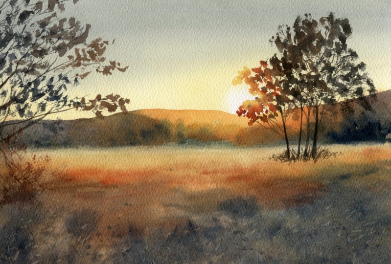
you through painting this liminous sunset scene from glowing skies to bold
silhouetted trees, using a beautiful
photo I took on a hike in the south
of France last year. Here, you will learn how to create depth through contrast, work wet and wet
with confidence. Use splattering and scratching
for expressive textures, paint lively
branches and leaves. And mix shadow colors
that feel alive. I will also walk you
through the materials. You'll only need a few
brushes and limited palette. We will even do a quick
splatter practice before starting a final piece. This class is perfect if you already know the
basics and want to feel more confident and intuitive in your
painting process. And if you're a brave beginner, you'll still discover
a wide range of watercour techniques
to grow your skills. Join the class and
enjoy watercolors.
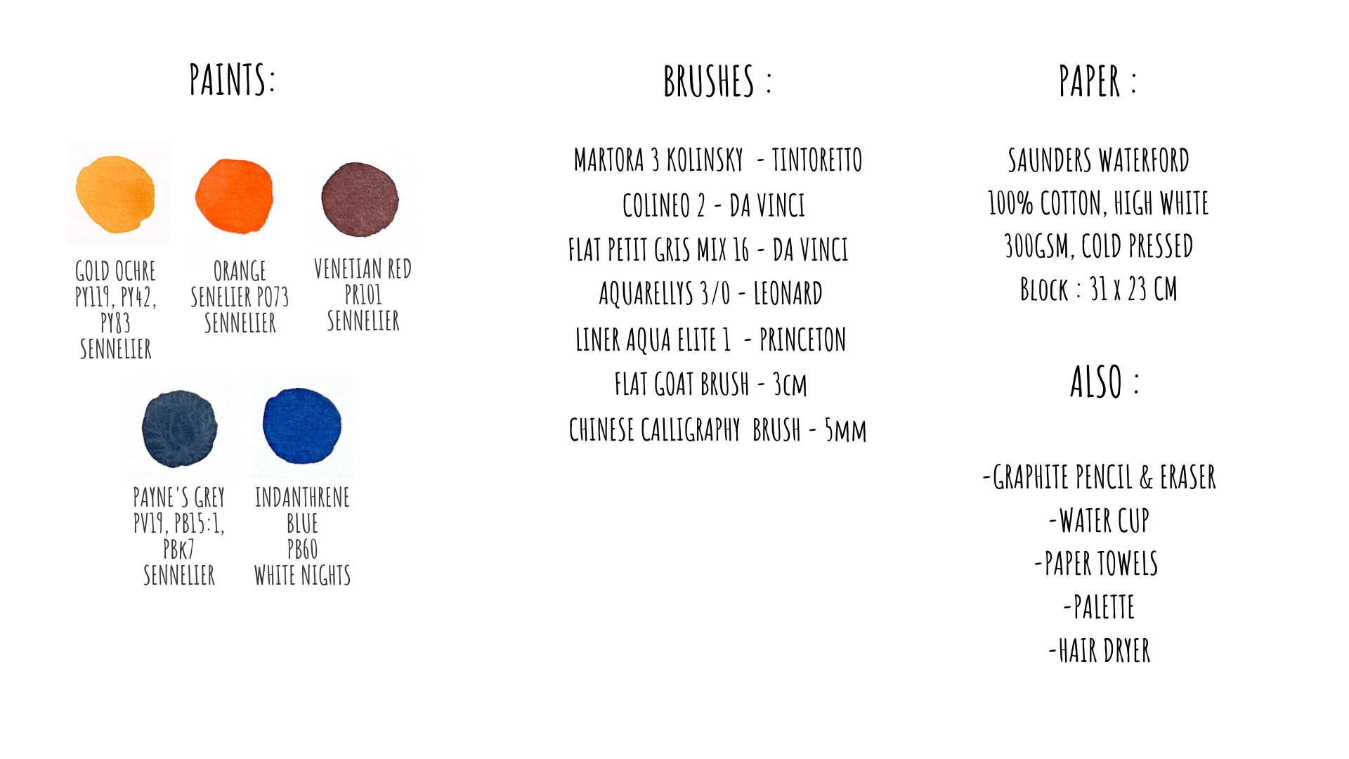
2. Materials Overview: Let's start by going over the materials we'll
need for this project. Keep in mind, you don't have to use the exact same
brands I'm using. Feel free to work with
your own favorites. For paper, I'll be using
Sandra's Waterford. It's 100% cotton, cold pressed, 300 grams paper, and also I have some scrap
sheet for testing colors. My paper comes in a block, glued on all four sides. If you're using loose sheets, just tape your paper down to a drawing board using
masking tape on all edges. I'll need the pencil and
eraser for the initial sketch. Since I'll be working
a lot on wet paper, I need to brush specifically
for moistening the surface, and my to go is a
natural gold hairbrush. The size depends on how
large your paper is. For painting the background, I'll use a smaller
flat squirrel brush, and it can also be a soft round squirrel
brush or a good imitation. A mid sized round
synthetic brush will help me adding darker
accents and details. Also, this Chinese
calligraphy brush is one of my favorites
for painting trees. Thanks to the unique
shape of its tip, it creates beautiful
natural looking forms. You can also use a
soft squirrel brush of similar size instead. I will also use a few
liner brushes for painting branches and find details
in the landscape. Plus, I've prepared a
small synthetic brush to create splatter effect. I will show it in the
technique section later on. Another tool I'll be using
is this plastic card, which I use to gently scrape the paint and create
texture details. And any plastic card will do just make sure it
has a rounded corner, and a painting knife
can also do this work. For paint, I'm using a
selection of tube colors. I'm placing some of them in the corners of my
plastic palette, since the red and yellow are not part of my usual palette. You don't have to use
the exact same shades. Just pick from the
paints you already have. Almost any primary triad, a yellow, red and blue
will work for this scene. And I will explain my color choices in the
next part of the video. And, of course, don't
forget clean water, paper towels and hair dryer. Once everything's set up,
we're ready to begin.
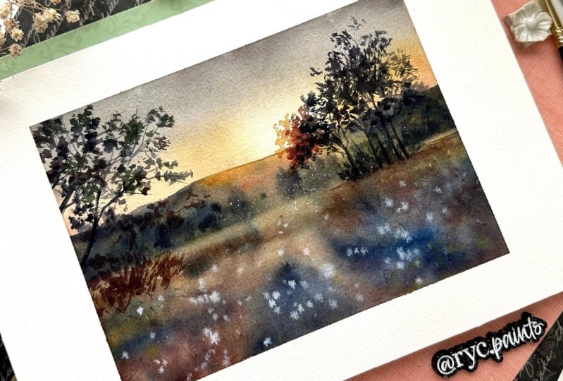
3. Choosing Colors: As I promised, let me
explain why I chose this particular set of
colors for today's painting. These paints have a more muted, earthy tone compared to
the ones I normally use. On the right, you can
see my usual palette. Those colors are brighter
and more transparent. And I actually
tested both sets of paints in a preliminary
sketch of the scene, and as you can see, the
result looks quite similar. So why bother to switch to new paints when the outcome
is nearly the same? Colors in my reference photo are more natural and subdued. So every time I wanted to match those natural tones
using my usual palette, I had to tone them down. To muted color, you generally
add it's complimentary. That's the one located opposite
it on the color wheel. But since I'm only using the primary colors
in this setup, I often had to mix
all the three yellow, red and blue just to neutralize
or tone down the hue. And as you can imagine, it takes quite a
time and effort, especially when you work
with colors like yellow. Because yellow is
very sensitive color. It not only shifts very quickly, but also darkens easily when
mixed with other pigments. Also, my regular paints
are quite transparent. In contrast, venetian red, which I'm using in
this set is more opaque and slightly granulating. That gives me a nice dense
layer when mixed with blue, which is perfect for creating
deep foreground shadows. Helps get a solid contrast to the transparent
sky and like this, emphasizes the
contrast in the scene. But as I said earlier, you can get good results with almost any set of
primary colors here. Just make sure to write down the name of the colors
that you use for your painting when you will share the result in
the project section. And let me know if it was easy or difficult
to mix your colors. Now let's go to
splatter Exercises.
4. Splatter Techniques Exercises: In this section, I want
to focus on one of my favorite
techniques for adding natural looking details
to watercolor painting. It's different types
of splashes and drops. I'll be using this
technique quite a lot in the foreground
of today's painting. If you're not very familiar
with watercolor splatter yet, I encourage you to try a
few practice exercises. It's really a fun and
expressive technique. To begin, I will place a bit
of paint here on the left. I'll come back to this area
later once it has dried. For making splitter, I love using the small
synthetic brush. I have had it since 2016, and it's still my favorite
tool for this purpose. And you can use any small
synthetic brush for that. Here's my usual way
to create drops. I love the brush with
quite watery paint and simply flick it by tapping the handle with my
finger like this. If it doesn't work well for you, you can try tapping the
brush with a pencil or even tapping the brush against the pencil.
Just be careful. In this case, the drops might
fly off in all directions. So cover the areas that you want to protect from
accidental splashes. You can also use a larger
brush to make drops, and they usually
contain more water, so you will get bigger drops. And it doesn't have
to be just paint. You can also use clean water. If you drop water onto a
still wet wash of color, you will get soft
light dots like this. And paint works, too, of course. On a very wet surface, drops will spread out a lot and blend into the background. And as the paper begins to dry, the drops will
become more defined. You can see that
with this method, the splatters spread quite
chaotically in all directions. Sometimes I prefer to have more control over
their direction. So for that, I will use
the following technique. I hold my brush in the direction I want the splatters to go, then pull the bristles back
with my finger and release. This creates small
controlled drops. So as you can see here, the droplets are smaller, that's for sure, but they also spread in the desired direction. Of course, you can
also use this method just to create finer splatters, even on wet paper. Why not? Obviously, you will need some sort of a
springy brush for this, and it won't work with a
soft squirrel hair brush. And once again, I want to emphasize how important the
paper's moisture level is. When the paper is very wet, the paint spreads a lot. You saw it here with
these blue splashes. But when the paper is getting
dry and looks almost mat, the droplets remain
sharp sometimes with clear dark pigment edges. Hopefully, you can see
the difference here. One more thing to keep in mind, the effect of drops will vary depending on what's underneath. If you're dropping
onto a clean paper, the drop might
appear almost white. But if there's already
painted layer underneath, like the orange one
that I have here, the drops will reveal
the base color instead. We'll be using this effect to
support the warm light and cool shadows in the grassy
foreground for our landscape. So take a bit of time
to practice this. It's a great way to add texture and interest
to your painting. And then move to
the main project.
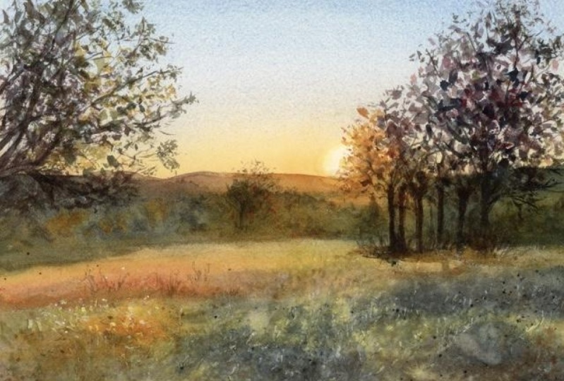
5. Drawing: I often use the rule of
thirds in my paintings. But here in the photo, you
can see that the image is divided almost in
half horizontally. The sky and the foreground take up most of the
space on the paper. But I also notice the
two vertical lines here. And the point of interest,
our light source, and the area of strongest contrast fall right along one of these
vertical lines. So it's like in a classic
balanced composition. I will keep this in
mind while painting. Now let's start the drawing. First, I'll sketch
the horizon line, the boundary between the
field and the distant forest. I probably won't need to draw the lines
inside the forest in detail because they will
be covered by paint later. Plus, I plan to paint the trees
in this area wet and wet, so the details will
naturally soften. Still, I think it can be
useful because I feel that this initial sketch process helps me better study
my photo reference. In the distance, there
are sort of hills. There is no need
to detail those. The most interesting part is, of course, the tree here. The sun will be somewhere
around this area. I like the outline the
basic shape of the tree, which I will fill in later
with leaves using the brush. It's also useful to place the trunks of the
trees right away. But you don't need to draw the
trees exactly as they are. Approximate shape
is really enough. Something like this
maybe a bit wider here. In this bright background area, you don't need to make your
lines very dense because the paint here will stay light and the details
will show through. But for these trees here, if you want to see
their outlines clearly, you can draw this area
with a darker pencil line, so it will remain
visible under the wash. Either way, you don't
need to draw much here. Maybe add a little grass, some bushes or a few branches. But this can also be painted
later with the brush. What else might be helpful? This tree here, for example. So I want to leave
some open space around it and also roughly mark
where the branches will go. And in general, I
think that the goal of the pencil sketch
is not to draw every detail but to give yourself a simple
guide for painting. It helps you know where to put
branches and leaves later, so you won't really have to
guess well doing watercolors. You can sketch the
largest branches, too. Notice how I hold my pencil. This way allows me to
make loose flowing lines. And if you hold it like a pen, your lines will be
tighter and shorter. It gives you more control
but less spontaneity. This tree will be
somewhere around here. I will add some
branches and leaves, of course, later with paint. I draw these lines here very loosely and light because I'll be working
white on white here, so the boundary between the field and forest
will be really soft, so I don't really
need those lines. Alright, I think that's
enough for the drawing. Let's move on to painting.
6. Preparing Paper and Colors: We can see that the entire sky has a smooth color gradient. That means we'll be
painting wet on wet, a technique that allows us to achieve soft,
seamless transitions. To do this, we need to
prepare and wet the paper. My goal for this
first stage is to cover the whole sheet
with a light wash, except for the area
where the sun will be. Even the lightest highlights on the grass will
have some color. But the sun, the light source, is the brightest part
of the painting, and the brightest
color that we get in watercolor is the white
of the paper itself. In fact, for contrast and light to really work
in the painting, we need to get very
bright highlights and very dark shadows
somewhere in the composition. While we can always add
darker shadows, later, the white highlights must be reserved right from the start. It's quite warm here
today where I am, so the paper will dry
relatively quickly. That's why I will
prepare the paint for the background wash right away. I find it handy to have
a paper towel under the cup and one in my
hand during the process. I mix the colors with the
same brush I will paint with. This way, the brush already holds the right
amount of pigment. I'm starting with my yellow. And a bit here as well. The sky isn't a
bright blue here. It's quite neutral with
a slightly grayish tone. And to get that, we still
add a little blue here. And this you see creates this
grayish shade that we need. Now I will moisten the
paper surface so it shines, but without excess
water pooling. And I'm not going
to wait too long. I will start painting right
away on this wet paper.
7. Paining Skies and Background Light: So I'm finished
wetting the paper and I'm starting to
work immediately. It's easier for me to paint
this part standing up. First, I'll begin with the
blue, not a pure blue, more of a grayish tone, and then we'll move
to the yellow. Here is where the sun will be. I need to keep that spot white, so I start outlining its shape much larger
than I wanted in the end. This way, I prevent the flowing paint from
bleeding into the sun area. Once I see the paint
isn't flowing too much, I can reduce the
size of the spot. I'll add a tiny bit of red here, maybe even a touch of orange from my usual palette
I mentioned earlier, but that's really optional. I think this part
of the sky near the horizon needs a
little highlight. If you look at the
father reference, it's a bit darker down here. The upper part of the sky is
still not completely dry, so I can add a bit
of darker blue here. It might look a little greenish,
but that's intentional. I'd want a bright blue sky. The light in this scene is very warm and I want this
warm atmosphere. Be careful at this stage when
the paper starts drying. I want to load more pigment and make the sky slightly darker. But your paper might
already be drying and it can be tricky to
get a soft edge now. Keep an eye on whether
the paper still shines. If it starts look mad, it's better not to add more paint and just
leave the sky as it is. I think for me, this
moment has already come. It's okay if the wash
isn't perfectly even. It's just the
background after all. I might want to adjust
something more, but since the paper is drying, I will leave the sky as
it is and move on down. Now I want to fill the whole
lower part with paint. I will continue
working wet on wet, but try to use less water so it does not run into the sky. I can add a little
bit of red or orange here for a warmer
kind of reddish tone. I won't touch the sky anymore. I will leave it as it is. Oops. Oh, that's a little drop. But, well, no worries. Sometimes it's better
not to interfere and just let it spread
gently on its own. I will see later if
I can do anything. A bit warm reddish color here, and over here, it's cooler because that's the
shadow from the trees. The colors are generally colder. Paint this area, I
really look carefully at the light tones
I see in the photo. If you look closely, you'll
see the hints of blue, some pink, some orange
in different spots. And so I try to layer
these colors accordingly. At this stage, also,
don't be afraid to put on quite saturated paint
because it will be covered by darker colors
in the next layer anyway. What else we can do? Here I think I can lightly
swipe this area with a dry fluffy brush
to help the pigment spread gently while the
paint is still a little wet. In that way, the spot will be
less noticeable, hopefully. Also, now I will take
my splatter brush, my small all synthetic one, and I add a few light
drops here and there. This step is not essential since we'll do a lot more
splattering in the next layer. So I think this concludes
the first wash. And the next step is to let
everything dry completely. Just wait enough amount of time or use a hair dryer for that.
8. Distant Hills and Trees: After the first layer
is done drying, I'll start painting this
distant background part. It will create a nice contrast
for our image right away. One important thing to notice
is that near the sun area, the background is
lighter and warmer. And as we move farther away, this horizon line gets
cooler and darker. And this distant background, we can basically
divide into two parts. First, the trees
that are closer, they look greener and darker, and behind them, the
more distant background is lighter and cooler. That's what I will
try to recreate. There's no need for
too many details here since it's far away, so I will work quickly
and wet and wet. For this, I will use a
synthetic brush about the size. I will also prepare a bit of yellow paint for the
part near the sun. My son ended up a bit more
to the left that I planted, so I'll probably shift
this tree a little left as well to keep the effect of light shining
through the leaves. So I'll just paint this branch further here, maybe, like that. But that's not a
big problem at all. Here, I will use
a greenish color based on my yellow and blue. I will paint the
forest with that. It's better to prepare
several colors now since I'll be working
quickly on dry paper, but still try to use
rather fluid paint. I will start with the lighter, warmer area under the sun. See the paint is quite liquid. This will help me blend the whole distant
background into one wash. And I will need a second
brush at this stage. I will wet this one with clean water and
you'll soon see why. Here at the bottom, I will
create a soft transition. So the distant background
gently merges into the field, but I won't do that just
yet a little later on. So now I add a bit of
reddish transition here and then move into
a bluish background. Yeah, here, there is some red in the background from the clouds, but in fact, the clouds won't
be very visible because it all went down,
but that's okay. This part can be made darker. It's important to work
really quickly here. No need to overthink or
mix the perfect color. Just lay down a
darker cooler tone here and move on
without hesitation. Now I take yellow with a drop of blue to paint the
foreground trees here. Some trees will have the light hitting them while others
will be more shaded. So on some trees, the shadows will be pretty dark. You see, everything
is still wet enough, so it blends into one big spot. I can add some more blue over
the yellow now, I think. Remember those outlines of
the trees we made earlier. They're invisible under the
paint now, but that's fine. I can even add a
few more trees in the fire background
with mostly blue. Here and there, I add
shadow with blue. I keep the illuminated parts
separate from the shadows. At some point, I need to
stop because at this stage, we only work while
the paint is still wet to keep these
smooth transitions. Another thing to do is the soft transition at the
bottom, we talked about. I want it to be smoother to create gentle atmosphere here. I didn't do it earlier to let the pigment settle on the
paper first a little bit. This way, it won't
round down too much. Maybe I will add a bit
more yellow here with a different brush to create that kind of
soft light transition. We'll see if it will work. Since it's all still wet, you can add some shadows
here and there if you want. But it's not really
necessary because this area is still
distant background, blurred and just meant to emphasize the light
in the landscape. In the end, I see I could have skipped adding
that yellow here because now I think I'm just washing it off with
this clean water brush. And by the way, I'm
working on cotton paper. So the first paint layer is already fixed in the
paper after drying, and so it won't wash off
easily when I do this. You can see that the paint when dry will get much lighter. So we can safely add some
shadows here and there. But it's not necessary, especially if the paper
is drying already. Oh, where I added
fresh paint recently, see how it's
spreading right away. I need to adjust it a little. And that's where I will
stop for this step.
9. Preparing Shadow Colors: The paint is completely dry out here and see how much lighter the distant
background has become. Now, let's move on to this
part in the foreground. This area is very contrasting
and rich in details, and I'm going to prepare
the paints for it. Adding some fresh yellow paint. We need a lot of
dark paint as well. So I will mix a thick blend of my red
and blue right away. We'll also work white and
wet on the foreground. So don't be afraid to mix a dense paint with
a lot of pigment. I will also use a second brush for some fiiner adjustments. And I also need my splatter
brush for adding droplets. Be ready too.
10. Painting the Foreground on Wet Paper: Before I start, I'll gently wet the paper surface with
this large brush. The first paint layer
is completely dry now, so the pigment is
firmly set into the paper and won't wash
off when I brush over it. Remember this effect only
works on cotton paper. On cellars paper,
the paint would wash off the surface
even after drying. I always keep the napkin nearby to control how much
water is on my brush. Now I will begin applying a
darker shadow color here. Something was a reddish tone. A bit of the same color
will go here as well. I want to keep this
illuminated area light and paint everything else
in a darker tone like this. And here you have to
work really quickly. Also, I want this
layer to be quite dark right away because
as you've seen, the paint lightens as it dries. If you notice the paint
spreading too much, it usually means your
brush is too wet, so keep an eye on
the water amount. I will even work here with a different brush
just like this. The color will be cooler here
because it's in the shade. Yeah, this part looks
very dark to me, but don't be afraid of
using such a dark paint. Right now, I'm not focusing on details, just large shapes. Wow. Everything looks
really dark so far. This part is already
dry, as you can see, so I will gently moisten it here to keep a
soft transition. But be careful that the paint
doesn't run too far upward. It's important to keep the paint wet because I will
add more shadow soon and then we'll add many details while the
paper is still wet. I'm matting some very dark
paint here and there. You see the paint layer is
getting a little lighter, but it's still wet, and I pay attention
to this all the time. Now what I'm doing is taking
a clean water brush and just putting these
little droplets horizontally over here. I make small drops and
watch how wet paper is, whether the drops dissolve
or keep their shape. It's still pretty
wet at the moment. And you see this creates a
glowing effect in the fields. I do this with clean water
because I want lots of light. Plus, under the droplets, you can see the first paint
layer shining through. So it's not just bare paper. I will do the same here
and in the center part. Maybe some smaller
droplets, too. All right, what else can I do? With the same brush, I will
take some darker paint. Maybe add a bit of pains gray
for a natural dark tone, and let's flick a few drops. We've already seen these
unexpected droplets before, so you know, that you can move
the pigment around a little bit with this
dry, fluffy brush. Now I will need to add
more water splitters here because I'll just smooth out some of the
lighter details here. Overall, I'll be working a
lot with these droplets. Notice, I use different
techniques for splatters on the foreground
and the background, depending on the size and direction I want
the drops to have. I can add a few yellow
drops here, too, for example, on the foreground,
just a couple here. But the main cluster of details will be here in
this bright part. Oh. You see there are some illuminated blades of grass have such interesting shapes, and I want to try scratching
them with this plastic card. But maybe the paper is
still too wet for this, so the effect might
not work well yet, so I'm going to wait. I really like the effect here. The red paint granulates a bit, creating some, like,
interesting texture here. I wait a little more
for the paper to dry so I can add sharper
details as it dries. And yeah, I think I'm happy
with how it looks now. Is as as a Is yeah, especially in the lighter spot, I want to see some
clearer details. Maybe I will try adding a bit of yellow to soften this
very bright white light. Your result will probably
look different from mine, and that's totally okay. It's the beauty of what and what techniques that each
painting is unique. Now I'm waiting for
this part to dry a little to become more made. Then I'll take a thin brush, wet it lightly with clean water. And I'm drawing a few lines here and there to imitate
the blades of grass. And you see that they
don't appear immediately. It takes time. But how come
we can draw with clean water? Because water pushes the
pigment on the paper surface, creating effects like this. It's like with droplets, but here the drop is
elongated into a line. And for this effect, it's
important not to overload the brush with water and
to draw the line quickly. And, of course, we can also
add some lines with paint. Maybe add some more
droplets here. I think now it's also
a good moment to scratch out some details
with a plastic card.
11. Scratching Details in the Foreground: Now I want to add some scratched in details with
sharper counters. The paper is almost mat by now, but the pigment isn't
completely dry yet. So I'm going to emphasize some
highlights here and there. I think it looks really
beautiful like that. Although right here,
it's still quite wet, and the paint is bleeding
back into the scratch areas, so I will need to wait
a little longer before working on details in this spot. And don't forget
about perspective. Have you noticed
how the droplets in the background are smaller
than those in the foreground? The same principle applies
to the scratch details. Elements up close will be
larger and more defined, while in the distance, we won't see such sharp shapes
just like in real life. And here, behind the scenes, I wipe the paint of my plastic card on the
napkin every time. I can even try scratching in some twigs or leaves
this way, for example. And also a few random
shapeless dots here and there. Well, the paper is
still a bit wet. It's a good moment to add
some small finals letters. As you can see, the
whole process really depends on how fast
your paper dries. Your result will be unique and I'm very curious to see it. If your paper dries very fast, don't hesitate to
add droplets and details on dry paper as well.
12. Tree on the Right : Light Area: Now it's time to
paint the trees. I'll be using this Chinese brush and also some liner brushes. I'm going to follow
the same principle for the tree as for the
distant landscape. The part around the sun will
be warmer and more yellow, and the tree will become
darker and cooler as it moves away
from the lead area. For this, I'm preparing
my paint right away. I mix red and blue and add some paints gray to get
a nice dark tone easily. Since the sun in the
background ended up slightly to the left of where
I originally planned, I will need to shift the tree
a bit to the left as well. I start with the
light part first and then quickly switch
to the darker paint. So the paint patches blend
softly into each other, creating this nice,
smooth, glowing effect. I can add some branches
right away using this brush. Sometimes I like to hold
it vertically like this. It helps make more spontaneous
and natural lines. And now I will just continue working on the tree
this way with the light, gentle touch. No.
13. Tree on the Right : Leaves and Trunks: So I continue working on the tree and painting
now this shadow part. To spin up the protest, I sometimes will be working with larger brush
strokes like this. I try to vary the shape
of my strokes constantly, often using the brush
imprint to create textures. I add some small details to give a sense of
distance from the tree. And from time to time, I add branches to structure it and clarify
where the trunk is. I change the pressure
on the brush to vary line thickness and also shift
the pain tone slightly. It remains dark but
not flat, you see. Everything starts with
small separate details, which then merge in some
areas into larger patches. With a slightly bigger brush, I add the almost black
trunks on the tree here. Down at the bottom, I will
add some grass or bushes, changing the stroke
direction a bit. Even though in the photo, those look more like small trees. Like really red ones. I might soften the
edge of this patch a bit so it blends
smoothly into the field. Overall, I like having more
air or openness in this part. So I think I will
leave it as it is. I will connect some leaves
with branches here, too. And that's probably
enough for this section. Let's move on to the next part.
14. Tree on the Left : Beginning: There's just one last
piece of the painting left to work on here, this tree. I'll try to begin with
the brighter part, maybe. Although this tree looks
quite dark overall, I can see some lighter
and warmer leaves along the edges here and there. So let's start with this
yellowish area, I think. It's important to slightly
change the direction of your brush strokes
to get more variety. So it looks more natural. I add a little bit of gray here. And it's important
not to rush and work slowly and gently,
really take your time. And at some point,
you'll need to start structuring
the mass of leaves, combining them
into larger groups and giving shape to the tree. And then we're going
to add some branches.
15. Tree on the Left : Branches: Now I will add some
branches here. They are really
dark in this spot. And also quite broad. So I press the brush more firmly here to get this bold line. Overall, you see that I keep
working in the same way. And here you can
either switch to a bigger brush or simply
vary the pressure and also the angle at which you hold the brush to keep this
natural effect going. M we see that the shape is already becoming
a bit more clear here. Let's add some more details now.
16. Tree on the Left : Final Details: I'll continue filling in
the tree in the same way. And also, it's not necessary to copy the
photo exactly, by the way. Here I like how it really gives this impression of more
air and more space, and I really prefer it this way. Now here I will add
some reddish paint with this gesture to get the
impression of the grass. This way, yeah, some bushes
appear at the bottom. Like, now I'm checking what might be missing
in the upper part. Maybe a few final
branches here and there. And I think that's it. I
think I can stop here. Once finished, let the
paper dry while stretched. It will keep it relatively flat.
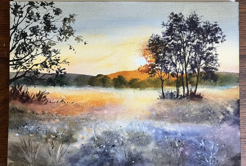
17. Conclusion: And here's the result. I hope that you enjoyed
following this step by step process and
found it helpful. Feel free to share
in the comments what was new for
you in this lesson, and don't hesitate to ask any questions about
the technique, materials, or anything
related to the class. I'm here to help.
You'll find a list of materials and the
reference photo in the project section below. I'm really looking forward to seeing your beautiful
sunset films, so please don't forget
to share your work here. If you post on Instagram, be sure to tag your
paintings with this hash tag so I could easily find them
and admire your creations. Thank you so much for watching this tutorial and spending
your time painting with me. See you in the next
class. Bye bye.
 Maria Smirnova, Watercolor artist and author