Transcripts
1. Introduction: Do you want to sketch
amazing drawings with pen? By entering the fascinating
world of pen sketching, all these possibilities
are available to you. Take your pen art and technique to a new
level in this class. From a metal clock texture
to a glass muck texture, from a book texture to
a candlestick texture. Here you will learn how to use each different textures and materials to create
your amazing drawing. My tutorials, we'll
not only teach you the skills needed to draw
artistically with a pen, but also allow you to create multiple
textures and materials that are truly unique and
amazing with just one pen. Get started now and
join this class. Your creativity
knows no boundaries. It all starts with a pen. In this chapter, we are going
to learn how we can sketch different sketches
and drawings with pen from the basics to levels. Before I want to start the chapter and we have
our classes with our pens, I have to tell you
about the tools and equipment that we need
for this tutorial. Of course, the
most important and the main important
object is our pen. It's just a simple pen. Then we have a jelly pen, a white jelly pen. We also need a pencil. It can be an Ted pencil
and an eraser, of course. To eraser, you should
also have a piece of white paper next to you that I will tell you how to use
it during our course. We also need a
tape, a paper tape. These are all the
equipments that we need in this chapter. Let's start.
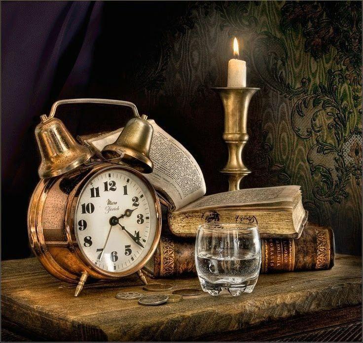
2. Primary Sketch: Hello and welcome
to a new chapter of this beautiful
sketching with me. Okay, in this chapter
of sketching with pen, we are going to work on this
beautiful metal that we have a combination of
textures of metal, glass and also paper. As usual, I'm doing the primary sketch
with copying method. I've darkened the back
of my models paper, then I'll fix my model on the paper or cardboard
that I want to work on. It would not move
while I want to go over it and copy
my primary sketch. I'll fix it with
some paper tape. I use one on the top and
another on the bottom. Okay. Now I'm going
to use a pencil. I'll start going over
all of my main parts. I start right here from
this bell on the clock. This is an alarm clock, and as you can see, it has
two bells on top of it. I'm going to go over
these two also. Some details are over here
that I also want to create. Then I move on and
create the clock itself a general way and a general shape of a
circle which makes my clock. All right, the last circle should also be traced from here. It's the most inner
circle of the clock. Then I also work on these
details for the numbers, the minutes of my clock
should be placed, the numbers on the
clock should be placed on their
own place as well. Later I can create them. Here it goes. So I am working on those
numbers so precisely. I also create the clock hands also, the other hand which shows the minutes and the other one which actually shows the hour. I go over all of them
because I need them when I want to do my own sketch. Okay, now I want to work on the other
parts of this clock. I want to go over all these
other parts on the side, on the bottom to create
the whole sketch. As I said before, my preference is to go over the main lines and
create the main shapes. But as well as I'm doing that, wherever I see details
that I think I might need in my own sketch, I go over them too
because some of them are easier to be placed. Right. Even from
the primary sketch. Okay. Also over here, the top part of the clock which connects
the two bells together. Here it is. Again, I say, wherever you see
some details that you might need in your work, go over them as well so you can have them in
your primary sketch, and your work would be easier
in the rest of your way. Then I want to work
on the book here. The book doesn't have
that much details. I just mainly go
over these lines. I will also consider this old and dingy
shape of the book. Therefore, on the sides
I also go a bit round. Not too sharp because
it's all and dingy. It's been damaged a bit. I also work on this
other book too, which is underneath
the first one. Okay. Then I will go over
the main lines of the glass. I create this glass
exactly over here, the place that it
is in my picture. I also create these
details inside of it. I can show the
water in the glass. There are also some
coins over here. Do not forget about
them as well, I just go around them. Here it is. As the last part of
my copying method, for my primary sketch, I am going to work
on this candlestick. I'm creating this candle, this beautiful candle
with its flame, this candlestick in
its own placement. Just going over the
lines so I can copy it completely like this. I just have to check my
work once in order to make sure that everything
was copied completely. What do you know?
As you can see, it's completely copied
and it's pretty good. Very easily, we could have
created our primary sketch. Now we're going to work on the shading and
start this sketch.
3. Drawing and shading of the first bell: Hello again and welcome to the first part of this
beautiful sketch with me. We're going to use
the pen technique, as you already know. Okay, let's start the
shading altogether. I'm going to start with
these bills on this clock. First of all, you should drag your pen on another paper so you can actually get
the extra ink off the tip of your pen
and also warm it up. Okay, now I will start
from this point, and then very slowly
I start shading. Now from here again, very slowly I start my shading and I apply my hatches now in order to create the
texture of the metal, because this clock that I'm
sketching over here is metal. For creating the
metal texture you do, similar to what you do for
the glass and water texture. It means that you should create a strong darkness right
next to the strong lights. We can have a very high
contrast and strong contrast, therefore you can get the
texture of the metal. Okay, then I will shade it. As you can see, I am shading in the direction of the curve
that I have on my own clock. You see because it's circle, it also has a curve. I remember to keep the direction correctly
as I'm shading. I'm doing it very slowly
and very patiently, and I'm dragging the darkness from the edges and
from the sides. I faded into the
center of my work. As you can see, my colors are much more darker on
the edges and sides. As they come toward the
center, they get lighter. Okay. Over here I would
apply more darkness. I also do it with
more confidence and clear that this darkness right next to this
strong light will give me the shine that I need
and I want for my work. I'll complete it just like this. Then slowly, little by little, I apply these
darkness next to each other by creating my hatches
right next to each other. I also create some dark
lines over here in order to show I have a linear
darkness in my whole work. Continuing this now I would
work on vertical lines. For example, over here I have a vertical shape that very slowly and with a
very low hand pressure, I bring this darkness
into my work. Just like this, See, I'll do it in
different directions. I apply the darkness in different directions that it would look more cohesive
and more beautiful. Okay, So I'll keep
repeating it in different directions until I get the darkness that
I want for here. It might take some time, but as I told you before, you should take
your time with it. I would also like to create several spots like
I'm doing right now. Okay. Then I faded a little toward the side of the bell over here. I try to keep that darkness. Okay. Just like that, with
a bit more emphasize, I'm going to show and create these parts
darker than they are. I have a very high
hand pressure. As you can see, I've
got dark colors. Okay? Now I also want a bit
of this darkness. And I'll faded toward this side, so it gets out of
that linear shape. Here we go, Just like that. Then, little by little, very slowly, I create
this fatness for my work. Now I want to
continue up to here. Just like that, I would
get this beautiful fade. Okay? Then very slowly, I fad my work in this area. And as I told you, you should do everything very
slowly and patiently. Okay? And in the center, I'll just drag this
darkness upwards. It means that I increase its intensity
and make it darker. Okay? And then slowly as I
come towards this side, darkness will be faded up to this central
part of my work. I'm just going to do a general background color and general background
shade like this one. Then again, I start applying
horizontal darkness. See, just like that. Then I come down with
a bit of distance. Again, I apply darkness. Then over here, I create this darkness
with more intensity. I create the darkness as the shape of a
pipe or a cylinder, just like that on the side. I'm going to fade a little. Then I leave a bit of my
paper with a bit of distance. I leave a narrow part
white and light. And then again, I start creating a very
strong dark shade. Because this high
contrast will actually show the shine that I
have on my material, which is metal here. It can show the metal
texture with this shade. And on these lower parts, I have some faintness. I create my work up
to this upper areas. I shade it all the way up again, I say I have a strong
darkness on one side. Then I have a very
narrow area at distance which stays
light and white. Then again, after that I
have a very strong darkness. Again, I'll do this
even several times. This can actually show
the texture of my work, the metal texture, and
the shine that it's got. Now over here, I will have cohesive shades and they would
be really faded. You see? It means that all of these vertical darkness that
I have already placed here, I will fade them downwards with my other shadings just like this See, Then I'll continue and
all around my bell, I just create a very
faded line toward inside. Okay. In these parts, these
lights are totally faded. I come here and I'll
repeat the same thing. It means that again, I will fade the darkness that
I have applied over here. I'll fade it downwards. Okay, Now I come up and over here I apply a very
general shade for my work. It means I have a very light
and cohesive shade here. Just like that, I'll create it, s, it's very easy. We just have to pay
attention to the placement of the darkness and
the lighter spots. When you do that, it's just
a matter of controlling your hand pressure and creating
this beautiful sketch. Now, I try to organize these random
darkness, random lights. I try to organize them. I try to emphasize on the darkness so I can
create a higher contrast. The shine that I want will
actually show itself. I'll do this shading
from all directions. I'll do it on this
side as well. You see? I also do some fading downwards. Okay. So I just work
like this very easily. Then the darkness that I have here should come from
the center of the darkness. I just drag it upwards
and up to here. I have it this way. See, so nicely done. Here it goes. Just
like that. It's done. Okay. So this was the first bill on the clock
that we've created together. Now let's continue to
the rest of the sketch.
4. Drawing and shading of the second bell: Hello again, and welcome to the next episode of
the tutorial with me. Okay, now let's work on the shading of the
second bell together. Of course, for the second, basically we are going to do the same thing,
exactly like that. I start from the edges, then very slowly with
a low hand pressure. In this way, very easily I'll do my shading. Okay? Now my hand pressure is low so that my shadings would
actually be created better. It's better to do the fading
on this side a bit more. Now, from the side of the bell, you see on the edges, I have almost a
high hand pressure. Then for fading it, I increase this hand pressure. See, just like that, I would have a very soft
shade for this area. Okay. My hand pressure for
the side area is also high and it
would be still dark. And I'll just continue and I'll fade it toward the center. Okay. Now also I'll do the same thing from this side on the edges. I apply the darkness over here, right on the edges, in this way. And then very slowly I'll fade it suddenly I should
change the color. Just slowly faded until
it gets brighter. Okay. I also repeat the same thing on this
part of the bell as well. Now the darkness
that I'm applying over here is more faded upwards. It means that little by little, I faded upwards, just like that, until I get to
these higher parts and I'll continue up to here. Okay. And then little by little, I fade this shade over here. Okay. This would be the
center of the darkness here. I would have the
strong dark shades. I should apply more
darkness to this area because this is the
center of my darkness. Just like that in
different directions. I just shade, now I'm shading vertically from top to bottom. I'm also showing this
beautiful texture and shine with the difference
that I have and I've created between
the colors and shades and made this
beautiful contrast. Okay, then I'll complete it. And I come to this side, toward the edges,
and little by little I get this darkness to light. I make it light. As you can see, my shades are actually getting
faded into one another. See also in here, I'll just continue
in the same way. Okay. Still the amount of darkness in this area should be,
should become more. Actually, the concentration of the darkness over here
should be definitely more. And then little by little
in the upper part, in these top parts of my bell, I'm going to fade them. Then just like that, I fade my shadings from
the sides as well. Okay, now on this
corner of the bell, on this edge I have a
really strong darkness. And I'll continue
with the same amount of darkness to the top. Now, from this edge,
from this corner, I try to just throw up the shade toward this
part of my contrast. You see, I'll do it very easily so I can keep the
shine in my work. I'm actually creating the
contrast just like that, based on the directions
I try to shade. I'm going to keep
the main direction, but I'm actually shading in
the opposite directions. So I can totally eliminate the trace of
my pen on the work. I don't want to see
any traces here. Okay, now I come here and again, I increase the darkness of
this place as one degree. Okay, in here I'll
also do the same. I increase the darkness as
the level of one degrees. One more color palette. Okay, now I want to work
on the bottom of my bill. I would start right
from the bottom. I have darkness here. I am creating this dark line. I start shading
the slower part as well because I have
a light over there. Even over here, I should
have the continuous of that. I should have the
rest of that light. It's not just suddenly cut off. I continue my work as I
have darkness over here. I rest of the darkness, whether you have the
light on the upper part, you should continue
that as well. Whether you have darkness
on the upper part, you should continue that too. Okay. When I get here, I should just create the
reflection for this area. Then little by little, I try to create the light, the darkness, and the contrast. Control your hand pressure in order to get the
colors that you want. The concentration
of the darkness would be here in the center. Okay, Now I would want to
work on the next part. Then again, from here, I apply the darkness. And then little by little, I try to fade it toward
the lighter areas, Okay? Now this fading is vitally important for
creating this texture. But at the same time, you should keep in
mind that we are not creating any hyperreal sketch. You see we are creating a
sketch, a normal sketch. You don't have to make
it so hyperrealistic. You just have to make your
shades very soft and nice. Nice to look at. Okay, now I come up to here. Over here is the
body of the clock. This is the clock, it
comes underneath this one. I do not want to work
on it right now, but I want to create the
darkness for this area. Just like that. I consider the absolute
darkness for here, it's bottom of the
bell or inside of it. Also, for here I
consider this darkness. Okay, so over here again, as I said, I have an
absolute darkness over here. All right. Now this is the inner
part of my bell. Therefore, there
is no light there. And I can darken it completely
because as I told you, it's the inner part of the bell. I repeat this darkening
layer by layer until I get the darkness that I want for this very dark area. Just like that. I also consider a very
general shade for over here that actually connects
these two bells together. Okay, now we should
step by step, move toward applicing the
darkness on the clock itself. This is also the rest of the darkness that I have
inside of the bell. I've got to darken
it as much as I can. I told you even layer by layer so I can get the
darkness that I want. Okay. I keep this trace of
light here as well. Do not forget about it. Okay, Now I can move
on to the next part. I want to start from the
surface of the clock. Before I do anything, I just start with
creating the numbers. First of all, I determine
the placement of each one of these numbers as the shape of a square, As you can see. Then I start working on
the numbers themselves. Be careful about respecting the distance between
each number. See, right now I'm just creating the squares for the
numbers of the hours. But you should do
it as well as this. It's really important
not to make it more or less as you can see. As I move up towards
this side of my clock, the squares cannot be seen completely because it's
not in the front view. Okay, I'm going to place number one as I
can see in my reference, try to create your numbers very the beauty of your work would
actually be increased. Okay, I've got 12 over here. I have number one, sorry, number two like this. Then I've got number three. As you can see, I'm just
placing the numbers one by one in front of the squares
that I had already created. Then I moved to
create number four that is actually placed behind the clock handle,
the clock hands. Therefore, I only created as much as I can
see in the picture. Then I go with number five. It comes down like this. It's also number six over here. And here it goes. We've got number seven here. Then we move to number eight and nine. Okay? And then of course, 10.11. And here goes, number 11, like this. Okay, well, let's
continue in next episode.
5. Drawing and shading of the clock surface: Hello again and
welcome to the rest of this beautiful
tutorial with me. Okay, now in this episode, we are going to complete
our clock little by little. First of all, I'm going to create these circles
around the numbers. I've got to create
several circles in order to complete
the whole clock. Just be careful to create
these circles very neat. Try to stay completely in line. It's very important
to get them neat enough. Here it goes. Now we can work on
creating the clock hits. Okay, here I have a dark spot. I've got it light the
middle and then again, made it darker. I come down. This is the clock hand which counts the seconds that slowly. I finish it over here in the end I also keep
the shine of it. Okay. Then I have the clock hand
which counts the hours and goes over the
hours. In this way, from the sides, I'm
going to go darker. And in the center, it would be lighter. I try to keep it light. See, I also create a line over my clock handle, which is for the hour. Then again, I move
to work on this one. To work on the clock hand which
which counts the minutes. Okay. I also have a square
shape over here for this. Okay. Now, even inside
of this clock surface, it's not that I don't
have any shade. I just create a light and
general shade for it. Just remember to take the
extra ink off your pen tip. You should do that
every time you want to create a very,
very light shade. Don't forget that and do it
each time little by little, I consider a very light shade
for my work in this way. Also from these parts, I'll do the same thing. And I come down here, it goes like
this. I'll complete it. Then little by little, I get the shade toward
the center of my work. See very slowly I bring it down. As you can see, I just
gave a very light and general shape to the whole
surface of the clock. Then over here, my shading should be done with a bit
more of my hand pressure. Therefore, it can show that this area is just a bit darker comparing to the other parts because of the direction
that it's placed in. Okay, As you can see, I'm just doing it in
different directions. I am trying to get the shading that I've
had here more cohesive. I'll just continue in this way. Even from these parts, from these edges, I'll
do the same thing. Okay, and then I complete
this area as well. You see now it looks
much more better. You shouldn't have
just lifted it white. You know, also I keep
a light over here. I keep this area light. But I shade around it so that light can
actually show itself. I'm going to shade
all around it, all over here, so that my light can show
itself better and more. I would also do it on the other side of
the light as well. I come completely up to here then I am trying to get
my shading as cohesive as possible and my clock would look just
great and pretty. I'll just continue like this until I get the shade
that I want over here. All right. I'm almost done here. After I have
completed this area, I'm going to work on
the body of the clock. Mean the metal area
of the surface. I'm going to shape
this area a bit more. Also, a little over here. Just one thing that I
forgot was actually applying these very small
lines for the minutes. For each part, I'm
going to create four lines for small lines
between each number. For each part, I'm
going to place four little lines in order
to show the minutes. Okay? Here it goes. As I move toward this side, it means that eight to nine, they cannot be seen. For example, over here, this much can be seen again, you can see that 11-12 Okay? I've already placed the minutes, now we are going to start
shading the frame of the clock. You see over here,
It goes like that. And then little by little, I'm creating and I'm
drawing the circle, therefore, I can shade
in between them. So I determine my
circles at first, and then I can just shade in
between them more easily. Okay, now I'm going to apply a shade which
is almost like, it should be one degree darker comparing to the center and
the surface of the clock. Only one degree
darker than that. But in general, over here, I should have a light shade. I'll continue then in
the opposite direction, I repeat this shade, my work would actually
be very soft. I will go in the
opposite direction of my previous layer of shades. See, I go like this. And then very slowly, they would look really cohesive. That's like it. Also, I've got a line over here. I will transfer it into shades. I don't want any separated
or specific lines. I'm actually fading this
shade toward inside as well. It shouldn't be as lines or
it would look very fake. Okay. Then I also fade this
line toward again, the inner part up
to some levels. I'll continue. Okay. Then I'm going to work on the next round of the
clock, which is here. I'll have another round,
another circle area. Just try to be very
neat and try to create exactly as the circle it is, okay? I come all the way
up and down again. Just like this one.
Here it goes. Okay. Now I will create a very soft
and light shade from here. And then as I get to this edge, my shade would even get lighter. It's just like it's
fading into the, into the light, not
into the darkness. So you see, it's just like that. Okay? I am trying to keep the white places because
these are very lights. And I try to keep them and place my darkness right
next to them in order to show the
shine of Y material. To create this
shine and keep it, I keep the white and I
darken right around it. Over here as you can see, I'm creating darker shades and I'm leaving some
parts next to them, totally white and light. Okay, here it goes. Now, very slowly, I drag this
darkness to the site. Okay.
6. Shading of the metal body of the clock: Hello again and welcome to the next part of this
tutorial with me. Okay, let's continue
from where we left off. I was dragging the darkness
very slowly upwards. Okay, from right over here, I start applying more darkness and I start fading them as well. I also create a linear
shape so I can show the shine of this metal in
the direction of that curve. Okay. In these parts, I'll
do it really light. And I lighten. This whole area you
see just like that. I'll do my fading over here. I come all the way over
here, faded slowly. I also continue this
darkness up to here. It goes like this. Also from the slower area. I'll do the same thing
right up to here. I completely make it circular. I'll continue my shading
very cohesively up to here. Okay, then I move toward
the left side of my clock. Over here, I should consider
a very thin area this way, that when it comes down, this distance will
actually just go away. Of course, little by little, but it will go away. I increase the darkness
of this area a bit. This light can
actually show itself. See, my dear friends, the lights and contrasts can actually show themselves when they are next
to the darkness. If there is no darkness, the light is not
going to show itself. Okay, Then over here I'll
just continue the same thing. Then again, I'm going to apply very dark
shades for some parts. Then with a bit of distance, I'll create a lighter shade. You see this darkness
that have appeared here is actually the reflection of this bell on top of it, which is actually showing
here As a reflection, I'll faded in this upper area like that, and here is how it
looks, just like that. Also in this area, I create this dark shade
and I mix it over here. I blend it over here, just as beautiful as this. Okay, Now also for
this lower area, I'll do my shading too. From here. Again, I consider another
darkness for my work. See. Just like that, so easy. Now I just make this whole area soft and smooth. Okay, Now we want to work on the other
parts of this clock. For example, in these
parts we start shading. First of all, I'm
going to work on these semicircles which I
have on my clock's body. I would know where it starts, where my shadings are start, and where they end. I do not want to work
with this area right now. This is the lower part of the clock in this shape. Again, over here it's
not really complete. I should complete it and then
I can do the rest. Okay? Then I apply the
next semicircle in its own placement in this way. Okay, Then little by little, I should start my shadings. See from here I should come down and
get the shadings. Over here I have a light
shade like this one up to the lower area. Then inside of this contrast, inside of this light and
darkness that I create, I should also apply some darkness just in this way. Then again, also
from these parts, I'll do the same thing with a bit of distance. I create a very strong contrast and a very strong darkness here. You see from this lower part, I just get it as
dark as possible. As it comes up, it gets lighter. Very slowly, I create this
shape very dark on the bottom. As it comes up, it gets lighter just like that. And here it goes. I also do it in this
direction as well. Just like that, I
fade the darkness from the bottom to the top. You see it's getting
shaped perfectly, very cautiously, and with a lot of patience,
you should do that. You can get this
beautiful tonality. All right. So here it goes. And just as beautiful
as this one. Okay, now you see, I told you the rest of this darkness should be
created because as I told you, this is the shadow of my bell, which is seen here. Create the rest of this shadow. I'll come and I'll shade it in a curved and
circular shape. I come all the way down to here. I have this hatching over here. It's very busy shades underneath this bell
with a lot of hatches. Then I also create
another darkness over here that the bell is
separated from this area. Okay? And then right from
here I get the darkness that I wanted here. I can create the absolute
darkness that I wanted. You see, little by little, this beautiful metal
texture is being created in our work because we keep the shine
and all the other stuff. Okay. Also from here, I work
on this darkness. And then again, I would
want to work on this area. Okay, Before we
work on this part, I should work on the
lower part as well. And a little bit of this is
I have a light shade again. From here I create a
very strong darkness. See, just like that. Here it goes, I create the shade. And I come down, I'll fade it just as easy, as beautifully as this one. Okay, now you see
in some techniques like pencil or colored pencil or crayon or anything like this
for creating the light. We need extra tools. But when you're
working with pen, it's just only a pen with
that you should create light, you should create textures. You cannot use an eraser. You want to say this is
a very easy technique. It doesn't need any tools. Therefore, it also doesn't need any extra costs for
getting these extra tools, because the only thing
that you need is a pen. It's a easy technique. Therefore, if you
practice and get the skill that you need
for this technique, this technique can be
really enjoyable for you. Here I fade this darkness
over here in this area, you see a fade this
shade over here. You see these
beautiful contrasts are actually the things that
gives me my metal texture, gives me the correct
material texture. I would also use some
dark spots over here. I can also show some kind of
a rust on my alarm clock. Okay, here it goes. Okay, now for the rest
of this tutorial, you can see the next
episode with me.
7. Completing the drawing of the clock and starting the shading of the glass: Hello again and welcome to the next episode of this
great tutorial with me. Okay, now let's complete this
beautiful clock altogether. So I come over here for the
next semicircle, and again, I create a very general shade
up to here, just like that. All right, And I'll continue that until the top. Just one thing you see, I shade circulary and
then I'll fade it. I create this shade
and I fade it. Okay. I would also create this
bottom part of it over here. The darkness that I can see here is also applied here. It goes again from
the upper parts. These upper areas, I fade the darkness and it
would look like this. Let's see, I've got some lines over here just
to show some shine in this, in this part of the clock. These are actually detailings
that can help me complete my work and it would look like this then. Okay, then I have the rest
of this darkness over here. I create a very dark shade. And then very slowly I faded
into these upper parts. In this way, I'll just make
my shadings more cohesive. Then for this upper area, I'm going to use this part from underneath the bell
and I create a darkness, a very strong darkness, which can also show the
shadow of the bell. I drag it downwards. I also keep the shape and the direction which
is curved like this. On over here, I
create another shade. Then I would also shade
this area beneath the bell. I try to do it very cohesively, It would just look like this. Then I come all the way down over here, it just say light, I just create some
textures for it. Therefore, it would
have some shine. I would also shade this
area for it, and that's it. Then I want to
work on this area. Below my clocks. Bottom part. That's
right from here. I should completely
darken my work. See, I've got a total
darkness up to here. Okay, I'll continue
the same way. I just keep the same process
all the way in these areas. And then I also want to
work on this area once more to make this darkness more circular, keeping the shape up. Okay, so just as easy as that, I also create the
shading for here for the clock's leg and it
would be really easy. Now for the other
leg of the clock, I'll do exactly the same as
I did for the other one. I just shade it like this. Okay. Now, from my clock, there is only this part left
over here above the bills. So I'm going to complete
it as well over here. I can also have another
one I also created here. And I come all the way up here. Okay, so I apply the darkness in their own
placement and then I consider a very general shade
for them and I created just as attractive as this. After going through
several steps, we have completed
our clocks sketch. Okay, now we are going to
work on the rest of the area. We don't only have a clock, we also have several other
objects that we should work on now for the next part. First of all, I want to work on the glass that I have here. The glass is actually
made of glass. In this sketches that I have different objects next to each other and I have
different textures. It's better to start with
the textures and with the things which
are more in front, then you can work on the
objects which are in the back for creating the. Be careful about the fact, or you should remember
the fact that the texture of the glass is very similar to the
texture of the metal. Wherever you can see a spot, you should actually
put it in place. Keep the lights, keep the darkness wherever
it's possible. Okay. I get the general
shape of my glass. Now I want to do its shading. See over here. I also have The water inside of it. Now from here, very slowly I start creating any
darker spots that I see. I created as the amount, as the exact same amount
as I can see in my model. I apply the darker
spots as well as that. Now with a bit of distance, this spot is actually
getting repeated. And repeated,
coming over here in this area, it goes like this. See, it's only enough that you create all these spots in
their own correct positions. It's not hard at all of some of the things
that are really important, especially in these
textures that you have to create a spot is that
you can look at your work. Because if you see
your work well, you can definitely
create better. You should try to learn how
to look at things well. You can actually look at it, not just see your model. Because if you can do that, if you can't do that, if you can't look at your work well, you cannot examine it. Therefore, you
might lose lots of precious details If you have this problem that you can't see your work really well. You should work on different
models as much as you can actually earn this skill so that you can
actually look good. I apply the strong darkness in all these parts as it goes. And I'll continue
all the way here. See I'm creating these spots
exactly as I see them. And I'll do them in
their own placement. I try to keep the
lights as I move on. And then with a bit of distance, again, I apply darkness. I am applying
darkness and light. Light and darkness. Now, let's see the rest of this tutorial in
the next episode.
8. Completing the shading of the glass and starting the drawing of the book: Hello again and welcome to the rest of the
tutorial with me. All right, now we are going
to continue our work. You see in the central part, I have more darkness that
I'm just going to create. Then like that, I come
all the way down. Then with a bit of distance, I have some spots, some darker spots like the
ones that I'm creating. Here we go, You've done
a part of our glass. Okay. Now, I would also shade
this area very lightly, horizontally, just to
create a very light shade. Then I create some darker parts in some areas, up to here, up to this upper
part of my oval, which would be
technically the top of my water or above the water. Just applying these
darkness as you can see in their own
placement as you know. I'm always keeping
an eye on my model. I come all the way up, it would look like this. I'll take it up to here. Okay. I try to keep the
dark spots in my work and I try not to lose any
of them as much as I can. Okay. I also shade
upwards very lightly, but as it comes down, it should definitely
get lighter. See, looking like this. I'll continue all the way down until I
hit the water area. From here, I bring
down this darkness. And then slowly I faded
in this lower area. Also can consider this darkness from the left side
toward the center. Also in here, I
should continue that. Okay, Right in this direction. I just apply my shade. As you can see, I'm doing it
very softly and smoothly. I should also pay attention
to the fact that I should keep this area as the
bottom of my glass. Then I come up again and down. I create these ups and downs. And the pattern that I can see for the bottom of my glass, don't forget to apply it. It's what gives your work more dimension and
more volume of, okay, we apply some of the spots and then fade them
and we continue. Now the darkness of here would be placed like
this as the shape of a light spots right next
to each other to create a great contrast to create the texture of glass and water. Just as I told you before, for these textures we
need real high contrasts, strong darkness next
to strong light. We'll create that for us also. It's the same over here. I just shape the bottom of my glass exactly as I
can see it in my model. I'm not just creating it
out of my imagination. As you can see, I'm doing
it based on my model. Then I would also create
these shapes here. Then I will fade
this area as well. See this is actually the rest of this strong darkness
that I've already had on the top of my glass. I should continue the
rest of darkness. It wouldn't just stop,
It's a reflection. I should have that
in here either. And I would fade it at
the bottom of my glass, try to keep it on
the same track. But the color is a bit different because it's
in the water now. It would get a little lighter. Then again, I'll do the
same thing for the rest of the darkness that I had on
the upper part of the glass. I'll just continue them on the
lower part of the glass to complete my whole shape. You should be able to control
your hand pressure as well. Then you should have a
high hand pressure in the beginning of your line as you're moving downward toward
the bottom of the glass. Slowly and step by step, you should reduce
your hand pressure. This way you're going to get these beautiful shades
strong in the beginning, really weak and low in the end. That should be the procedure of your hand pressure in creating the darkness that you need for this lower
part of the glass. Some people might think that creating glass
texture is too hard, but it actually is not. It's actually one of the
easiest things to do. It doesn't have any
special tricks. The only trick is that
you see each spot, you place it in
its own position, in the right position, and you just created a light
together next to each other. You should create
strong darkness and strong light right
next to each other to create a higher contrast that would give you the
texture that you want. I'll continue all the way down. I will shade this area also
in different directions, therefore, it can get
totally faded in my work. So here it goes. Over here, I've got another dark spot and I
come all the way down. Okay, I would also shade this central part
of the water as well, but I try to keep
some parts darker. Okay, here it goes this way. I got both the textures
of my water and my glass, they look pretty well. And also a darkness for here, which is curved like
this over here. I've got another one, then I just create this cohesive shape for my
shades all over the glass, because I want them
to be cohesive. I don't want just a stains
of color all around my work. Okay, then I complete this area, the open part of the glass, which needs a
general shading and also several curved
darker spots. But as you can see, it's a very thin area. I do my shadings thin
and light as well. It looks pretty Okay. Now that we've done that, we can work on the
next part which is creating the two books
and the candlesticks. I would start from
the lower book first. Let me determine its area. I can do a frameworking for it to see what areas it covers. It comes right toward the clock. From here, it looks like this. And it'll continue this way. As you can see, most of
my corners are around. Try to do the same thing, because as I told you
in the beginning, it also shows that your books
are a bit old and dingy. I'll continue the rest of this line to also
framework the upper book. We know the territory and the area which
contains the book. This can really help us
in doing the shadings. It will be like this and these are the rest
of my book pages. Okay, Then from here I'll create several lines coming down which kind of looked like some
designs on my books cover. And I also do it on this
upper area from here. Okay, now for the
rest of the Sutorial, follow me next episode.
9. Drawing and shading of the first book: Hello again and welcome to
the rest of the tutoria. Okay, now let's start again, and this time we want
to work on the books. I'm going to start
right from the center here, the corner here. I'm just going to start
with a very light shade, right over here
next to the clock. As you can see,
I'm doing it very faintly and bringing
it down to my work. Okay. Now, slowly I try to place the concentration
of the darkness on the top. And as I move down, I'll fade it like this one here it goes. In this part, I also have another
light shade. Okay. I consider darkness
for over here. And then I create a lighter shade right
next to it for this area. For the cover of the book, I just darken this
line a bit more. I can show the difference
between my colors in this area. They won't just get mixed up. Then I'll shade this
area completely. Okay. Now I am applying
the shade over here, and it's darker
next to my clock. And as it goes toward
the book itself, it gets lighter and faded. When you darken this area
right next to the clock, it actually shows
that the book is behind the clock and the
clock is more in front. That's why we darken this
area next to the clock. And then we faded a
toward the book itself. Okay. Then I also create some very light lines and
very close to each other. Now I want to create the designs and the
patterns on the book cover. See, I'm just creating them easier than it is in the model. You can do it as well, creating some easier
patterns on the books cover. See, I like this one. Here it goes. And
working over here. Okay. Now I would also consider some
more beautiful details for these areas just to make
it a bit more pretty. I'll do this also over here. I'll do the same thing, saying that it looks pretty. But in some places I want
to add more darkness. I can just get that too
wide shape out of it. I don't want any areas to
stay too white or too light. I just generally went over the whole area to give
it a very light shade, making them more
cohesive and realistic. As you can see, I am
going over some parts. Making them darker. Much darker. Okay. Now, I increase the
darkness for this part. I can show that this area
is lighter basically. I'm darkening around it, so I can show this
part is lighter. I will create darkness toward the right side and you should definitely be careful
about the glass area. Do not cross the line of the
glass and go inside of it, making any more shades. Right from the top, I start
with a strong darkness. And as I come down,
I try to fade it. And I'll do the same
thing from the bottom. On the bottom, I go
strong with the darkness. As I move up, I fade it, making it a bit more lighter, you see while at the
same time I'm doing some frameworking on
the sides and edges. I won't cross any lines
and I'll make sure that the shades are faded
toward the correct direction. Actually, I'm hatching
this area and I'm shading with continuous
shades and hatches, and they are really close
to each other as well. I want to make it a bit soft. Okay, Here it is. Then from behind the glass, I would also consider a bit
of darkness for my work. As you can see, I'm applying
these shades very faded. Not all of them. I mean, the ones that are in the middle. Then I'll continue my shading and then from the top, very slowly, I
fade the darkness. See how easy it is. Okay. Then I move to the
next part of my work, which is the other
side of the book. Actually, I start shading right from here,
next to the glass. Then cohesively, I start shading in several
different directions. Then right from
behind the glass, I create the
darkness and I faded toward the rest of
the books cover. Basically, it would be dark
on this side, on the edge. The border between the glass
and book should be darker. It can show the glasses
in front of it, and at the same time, a two separate things. I'll continue. I also complete the shade over here in this area and making
it all more cohesive. Okay, here it goes. You should have control
on your hand pressure. Your shadings would actually be created softly and
very beautifully. I'll continue the same process. I'll complete my shades totally. Then from this lower
part of the book, from the bottom of the book, I try to create some more
darker shades toward up. As it goes up, I
make it lighter. It's basically a dark
shade which came up and got faded in
the lighter areas, just like that. Okay. I should increase the darkness
around here, which should actually show it's in the continuus
of the book. Also over here, I
have different lines which I shade and create
at the same time. Then again, right
from the bottom, I consider a shade for it. Basically, I'm
considering dark shades from the bottom
and from the top. In the center, in the middle, they would be lighter. I'll do the same thing
on this part two, from this bottom part
of the upper book. I'm going to go darker
as I move down. I faded. It should be really dark. It should have very
strong darkness right around the edges of the book, which is above it or on it. Better say this is
under another book. It should be darker, especially showing for the part that is showing the border
between the two books. Okay, I'll continue
this part as well. Seeing your sh should
look more cohesive. You cannot just put some stains or create any borders
between your shades. The dark light, you should just fade them
into one another. I just continue shading in so
many different directions. Therefore, I can erase
all the traces of my pen. And at the same time, I would actually blend
all these colors together and get a
great cohesive shade. Okay, right from the bottom, I try to do my work with
a higher hand pressure. Now in this area, with a bit of distance, again, I would
apply this shading. See, I'm going really
dark over here. Here it goes. I totally
darken it all the way down. I also have to shade
on the edges as well. I continue this darkness the
same way in this white area. I should create the
exact same pattern that I've done for the
other end of the book. Very slowly, I try to
follow the pattern that I had already
created there. This time I'm going
to create them over here on this
end of the book. Should try to get the pattern exactly as I did
for the other side. You should pay a
lot of attention to your own design if
you've changed it, If not, you can
attention to the model. Okay, so here it goes. I'll continue until
my pattern and my design would look exact same as I have
on the other end. Okay. I will consider some parts darker and I'll consider
some other parts later. Okay? So basically I try to
do the same thing. I also create the
lines over here and create this pattern
in between these lines. Okay? I'll just
pattern it and design it this way. Okay? Now in some parts I'll
consider stronger darkness. And then I go over it generally
once to get it a cohesive shape and making it
all blend together, I just shade it, generally to make it cohesive. And then I work on some
parts and make them darker. That's it. We are going to
continue in the next episode.
10. Drawing and shading of the second book: Hello again and welcome to the rest of the
tutorial with me. Okay, now we are going to continue the
tutorial altogether. Okay, I start from
the corner of my work again to work on my second book. Right from here I apply
a very strong darkness. As I move up, I try to decrease this
darkness just a little, not too much, just a bit darker. It means that here in the
bottom, it's absolute darkness. But as it goes up, it gets one degree lighter.
Only one degree. Again, I emphasize on the
darkness of these areas, so I can show that this
book is on the other book. Therefore, it also has a
shadow on the book beneath it. Okay, then I start
shading my books cover. First, I just create a general
shade here from this side. I'll do the same thing. I shade it, generally, not focusing on any
specific parts. And then right behind my glass, I try to bring some kind of
darkness into my shades. Okay. Then over here I'll continue the rest of my shading. See. Okay. Now I would want to work
on the books pages first. I should start again on
the corner of the pages, then I'll give it a
very light shade. I can show that there
are pages on top of each other and it has a
volume and dimension. As you can see, it's
darker on the corner. As I move toward the center, it gets a bit lighter. Then I go generally over all
of this area, I can show it. Then I should emphasize on some other lines so
I can show there are actual papers on top of each other that have
created my pages. Okay. Just like that. Then from behind the glass, I try to even increase the
darkness upwards a bit more. And that's it. Over here, I have another, another page. Now over here, again, I'll try to show the same
shades that I've used for this other side to indicate
they are book pages. Okay. Then I consider a darker
shade for this area. Then also I create
a shade over here. I should create
even the shadow of this first page on the
page underneath it. That's why I darken that area right in the
center of the book, I should have a very
strong darkness because that's the part where the pages are
actually glued together. After creating the strong
darkness right in the center, I'll faded through dragging it out toward the
center of the book. Toward the center of the page, I mean. Okay. Now again, I start shading in the opposite direction, you see. Here it goes. And I'll
complete it really easily. I also try to fade this shade upwards toward the other
side of the pages as well. Then from here, I try to create some lines and
shades in order to show that we also have pages standing up on
this side of the book. I'll continue in this way. I also want to shade
all this area. Just be careful that this page is actually the page
which is in the front. Therefore, it should be much more lighter comparing
to the pages behind it. Therefore, I just give it a very general light shade
with a very low hand pressure. And please control your
hand pressure over here. It doesn't get
actually very rough. Your shading over here should not look rough. It's a page. It should be really
soft and smooth. Try to control
your hand pressure and do it lightly and smooth. Now I should work on
these pages behind it. As I told you, these
pages should be darker, and from each page
to the next one, I start creating a darker shade, just as you can see here. I'll continue. Then again, from this paper, from this page, I go toward the
one underneath it, or in this case you can
also say behind it, just like this, Very easily I'll do my work. I'm almost done with
shading the pages here. As I said, I'm almost done. I just have to give
it some more shade. As you can see, it also has
a shape of writing in it. You don't have to
actually write in it, you just have to
create some zig, zig, zag, darker spots. Of course, to show that
there is some writing here, the only thing that you should
worry about is that all of them are on the same level
and on the same track. You can show that they are
written on the same line. You shouldn't just
create one higher and the other one lower respect the distance in between them. You can show these are words written next to each
other with a good space. In some, especially
toward the end, you can only just add some
dots and that would be enough. That would be the
detailing that you want. Okay. In some parts I'll go darker and in some
parts I'll go lighter. It doesn't matter too
much, but it's good. If you can do it this way, I can show that there is
some writing in this book. Then with a bit of space, I try to create even
the title of the book. That's it. See how
betifully it's done. So don't worry too
much about it. Just let your hand does its job. And sometimes even go easy, just have to create
some touch ups over here creating some more darkness on this side of the book. I also create some lines
on this side of the book, on this page, so
I can show there are some very faded writings. I'll continue the same way I'll finish my
books right here. Then I want to work
on my candlestick. I've got to create
that too right now. I'm going to start
working on that. Just like the other parts, I'm sure it's going
to come out great. I go over all the parts
and all the areas. This would be the bottom
of my candlestick. I am determining all
these parts around it, as you can see from
here, it comes down. This is the top part
of my candlestick. I'll continue it so I can get
the basic framework of it. The last part is obviously
the candle itself. Now, when I want
to do the shading, I would definitely
start right from the bottom exactly as
I worked on my clock. I would work on my candlestick because they have
the same texture and they have the same material. Therefore, I should create some very strong
darkness in some parts. In some other parts, I should
go really light in order to get that a metal texture. For my candlestick, for example, right in the corner, I
create absolute darkness. Right next to it, I have
a very strong light area. See, the procedure
is basically the same as my clock shading. Then with a bit of distance, I come a bit more higher, then I create a very mellow
shade here, a very light one. I'll cover this area darker. I also consider some
horizontal shades for my work as well. It should shade in
different directions. If you remember, then I
come for this area here, which is wider on the
top and the bottom, and it's thinner, more
narrow in the center. Again, I apply, my
darkness faded downward. That should be
faded on both ends. For continuing and
finishing this tutorial, let's follow us in
the next episode.
11. Candlestick shading: Hello and welcome to the last part of this
tutorial with me. Okay, in this episode, we are going to complete
the candlestick together as we were
working in the previous. As you can see, I am creating these shadows in a
really high contrast, but I'm placing them in
their own correct position. Slowly, I bring them down, it looks like this. I'll fade it in these parts. The direction of your shading
is very important as well. Because you should
show that there is a curve right in the
middle of this area. Your directions should
be in the same way. I place a strong
darkness at the top. I bring it down, I make it in the middle again. On the bottom, I'll make
it dark again and thicker. Now very slowly, I am doing
the fading for this area. And then on the sides I try
to create a very fine line. And then I'll fade it a little. See, okay, here it goes. Now, from here, from
the bottom part, I'll continue this way, and then slowly I'll do my
fading at the same time. See I also create some
lines like this so I can show more
shine in my work. Just as this one I come down and right
here in the middle, I want to make it darker
a little bit more. Then I place a bit
of space here. Again, I'll try to do the
same thing on this area. And I start shading
right from here. I'm going to shade
this area circular, just like the one
I'm doing right now. In this area it
would be darker and then slowly lighten it. Okay. So just like that, I place the strong
darkness and then I can move to the next
part of my candlestick. Again with a bit of
space from the top. I start shading downward. See I left the part
right on the top, and then I'm doing the
rest of the shading. Moving down, I go on the top. And as I move, I try to lighten it a
little and faded right on the sides and edges see like this one. So I also shade from the
sides and the edges. And I come all the way
down, right over here. Okay. Now I'll do the same
thing from this corner, similar to the parts that
we've worked before. I'm going to shade in different directions
on these upper areas. My shadings are darker, just as you can see them. The corners are darker as well. When I come more
toward the center, I decrease the darkness. Here it goes. Now, I'll place a
bit of space here. Again, lightly again, I bring a very soft
darkness into my work. As you can see, I'm placing these lights next
to the darkness. I can have a higher contrast
and better material. Or better say better texture. Okay, so here it goes. Then I will shade from the top, toward the bottom,
and vice versa, so I can get that
cohesiveness in my work. Because if you don't shade
in different directions, they look all the
same and you can see the traces of the pen and they are separated and
we don't want that. Then at last, I'm going to shade the candle lightly because, you know it's a
very light thing. I just shade it very
lightly, like this one. As you can see, I am creating my hatches very close
to one another. Then I will actually try to shade the flame now
from a strong darkness. I'm going to shade over here
where the flame has started. And as I go toward the
upper parts of the flame, they would be really light. Just as easy as that
created a flame. Okay, just as easy as you could see. We've finished this beautiful
sketch with the pen. As you can see, we've
done all the materials, we've got all the textures. I hope you've enjoyed
it as much as I did. And till the next time, take care and enjoy sketching.
 Amelie Braun, Artist & Cartoonist