Transcripts
1. Introduction: Hello friends. Welcome to the elementary to Intermediate
Pen Sketching course. Pen is one of the most attractive tools
for drawing and sketching. And due to the
cheapness, availability, and also high permanence
of sketches with pen, it has many fans. In this course, I
will first teach you the basics of drawing and
sketching with a pen. Then you learn how to
sketch the water texture. In the next chapter, you will learn the
sketch of a wooden boat, and obviously the
texture of wood. Then I'll teach you how to sketch the texture of the rope, and in the last chapter, how to sketch a
beautiful flower. Don't hesitate to join us, and I hope you enjoy this
course. Hello, everyone. Welcome to the tutorial of a
Sketching with Pen with me. In this chapter, we are going
to learn how we can sketch different sketches
and drawings with pen from the basics
to advanced levels. Before I want to start the chapter and we have
our classes with our pens, I have to tell you about the tools and equipment
that we need for this tutorial of the Mott, and the main important
object is our pen. It's just a simple pen. Then we have a jelly, a white jelly pen. We also need a pencil. It can be an Ted pencil
and as an eraser, you should also have a piece of white paper next to you
that I will tell you how to use it during our course
as a tape, a paper tape. So, these are all the
equipments that we need in this chapter.
Let's start.
2. Tonality and Hashing: Hello again and welcome
to the first episode of Pen Sketching
Tutorial with me. Now for the starters, I should tell you how you should work with
pens in general, how we should shade with it, how we can create
hatches with it, and how easily you can take it in your hand and start
sketching and drawing. For your first
exercise and practice. It's very important that
you can actually create a tonality of colors with
your pen. How can we do that? First, you start shading and coloring with a lot
of hand pressure. With a very strong
hand pressure, you should do it slowly, but with a high pressure. As you move toward the
other side of your work, you should actually decrease
your hand pressure. If you can see the
movement of my hand, it's going back and forth. Well, during creating
this tonality, you should not stop
at all and you should not take your
hand off your work. Because actually the purpose of this tonality creation is for you to control your hand
pressure while you're shading, without stopping your movement. You should actually
continue this till the end, until the lights
color, just like that. I've created a very
beautiful tonality from the darkest shades
to the lightest ones. With my pen in the first part, the lines are too close
to each other and my hand pressure was high and
it gave me a good darkness. But as I came towards this side, the lines have a bit of
distance from each other. My hand pressure also decreased. Therefore, the
tonality that I've applied went to the
lightest shades. It's also very important that during your applying
this tonality, you should not actually place your hand stable on the work. Because if you place
it on the work stable, it just get a stops in a place
and it cannot move again. You should let your hand
move freely back and forth, so it can move till
the end of your paper. The next thing I want you
to do is to create hatches. See, I am creating
light hatches. The hatches which are
too close to each other. Hatching is actually one of the practices that can improve your skills in pen
sketching technique. It's very important to create
the hatches and shavings. One of the most
important things in creating the hatches is that you can rotate your hand easily and create these hatches in
different directions. As you can see, I am
creating them from up to the bottom and left to
right, and even sideways. Okay? Then I try to keep all of the hatches that I
create more cohesive and they won't be too
spattered in this way. See, I'm just continuously adding these hatches
and next to each other, I repeat them as much as the whole thing that I've
created looks like a shade. See when the hatches
come over each other. More importantly, they come
from different directions. It actually transforms
into a beautiful shade. I'm adding these hatches and layer on top of each other
and making them darker. I make them dark as much
as I want in this way. There is another way
to hatch as well, which we call big hatches. These are the big hatches you see in some parts of our work. We might do it this way for the light parts and then we
go in the opposite direction. Again, for parts which
are one degree darker, again, I go from the opposite direction that
I had in my previous layer. In this type of hatching. The beauty of my work is actually to show off
these hatches in my work, Not would be a faded shape like the previous
one that I created. You should practice both
types of hatchings. In the next practice, I'm going to create
a geometrical shape. For example, a square. Now I want to shape
this cohesively, the shade that I want to create. I don't want it to be
too dark or too light. It would be almost in this area. Okay. Now if I want to apply
this palette of my color, I would not have start with
this dark color from here. I would start from the
lightest degrees of the color, the lightest palette
of my color. Then, little by little, slowly, I drag my shades to become
the palette I want. And making them darker
level by level. Right from the
corner of my square, with a very light hand pressure, I start the point that I
should tell you over here is that as much as you take your pen from the
beginning of your work, the hand pressure would
be more on your work. As much as you go
toward the end of the pen and keep it in
your hand from the end, your hand pressure would
be less on your pen. Therefore, it gives
you lighter shades. For example, here
that I'm working, if you wanted to
work a light shade, you should definitely
consider that if you should take your pen in your hand from near
to the end of it, just like that, With a
very light hand pressure, I have created a light
palate of color like this. Then very slowly, I develop this work from
all different directions. You see just continuously, I am repeating this
shading and this hatching from
different directions, layer by layer, I add to them until I get to the
palette of color that I want. This time I am doing it horizontally from the
top to the bottom. And next time I will do it vertically from the
right to the left, and then sideways from the right lower corner toward the left
upper corner. Okay. Then again, I continue the same process just in
different directions. And I repeat it
over and over again until my hatchings
would become a shade. It would be more cohesive and
very softly and smoothly, it will get to the palette
of color that I want. Just as easy as that. I'll continue layer by layer. You will increase your
hand pressure as well. You'll have, of course, a darker layer of the shades. Now, why do we do it
in all directions? Why? Opposite of so
many of our works, we shouldn't just work
in one direction. When you actually
apply your hatches in different directions comparing
to the previous layers, it actually feels the emptiest
spots between the hatches. It totally fill the whites
spots and the empty, uncolored parts of
your previous layers. Therefore, it actually
makes your shadings and hatching more cohesive. And it makes it look
softer and smoother. That's why we are hatching
in all different directions. Here we go. Okay. Now I want to be more
precise on the parts that I think are a little bit lighter than I
want them to be. I go over them and I fix them
with a light hand pressure. I try to keep it up with the
rest of the color palette. Here it is. Little by little,
my hand pressure is increasing and moving up, the tonality that I'm
applying would be darker. Of course, here it goes. Then I will clean
all around my work. Something that is very
important in this practice and this exercise is the fact that you can actually control
your hand pressure. And if you can't, you will be able to control your hand pressure
after this practices. I'm just giving you
an example right now. And then you should practice
it more and more at home. For example, from this
corner of the square, I want to apply more darkness. Therefore, the hand pressure
on this corner would be more as I move toward
the opposite side. See, I just let go of my
line and let go of my hand. Basically, I'm
making it lighter. I continue until it will
look like this. Okay. Now I guide this shade. I drag this shade until
the bottom parts. And then I'm actually
trying to create a very shaded and faded
shape for my hats. They are going to
transform into a shade which is also faded
and cohesive. As you can see, my
work is in two colors. From the dark side, it went into a lighter one. This was the first and
the first episode of your practices and exercises
for sketching with pen. In the next episode, I'm going to tell
you how you can create circles and globes. Don't forget to follow.
3. Creating a Volume Of a Sphere: Hello again, and
welcome to a new part of a sketching with pen with me. Okay, In this part together, we are going to learn how we can shade this ball in the circle. The first thing that I should consider is the
source of the light. My source of the light
will be in here. This would be my light source
as it shines onto my work. This part would be
the lightest area and this part would be the
darkest area of my work. It's basically an
absolute shade. Now for shading ball, I'm going to use this method which is actually
hatching continuously, which would look
like the last shade. Just one thing that I should
tell you is that when you want to do the primary
sketch of your circle, you should do it very lightly. Because in sketching, we do
not have a specific lines. I will explain it to you
later in, next part as well. But do it light so
when you shade, it doesn't look like you're
framed. You have worked. I start from here slowly. I'll do this. Okay? You should consider the
fact that for this you should spend enough amount of time and you should
not rush through it. And you should just do it
very patiently and slowly. Your outcome will look good. Okay, I also shade from this
bottom part of my work. As I told you before, I've chosen this method of shading in all
different directions. It means that I should
definitely shade in different directions and hatch in different directions. You can actually cover
the trace of your pen, which is placed in the
previous layers very slowly. I just do this shading, it gives me a light tonality. As you can see, I'm using
my other index finger. My shading would not
actually get my work. I don't want it to
get out of the line. I use my finger to prevent it. Because one of the problems
using pen in your sketching, actually, all drawings and sketching with pen has
a very big problem. The point is that if you just mess up a line or if
you make a mistake, you cannot easily
erase it or fix it. It's better for you to pay more attention and be more careful right from
the beginning. You won't have to
fix them later. Sketching with a pen
needs lots and lots of practices because you're not allowed to make mistakes
in this technique. Because as I told you before, we cannot fix it as
much as we want. It's a pen and it
would not get erased. You should get enough skills, and a skill comes with continuous and
permanent practices. Do not forget that very slowly. I'm starting from the
sides, the edges, and I am shading with Y small hatches which are
placed so close to each other. The hatches are small
and right next to each other to create
this shade for us. Then, I guide these shades
toward the center of my ball, toward the center
of this circle. As I move toward the
light of my work, I will decrease
my hand pressure. Therefore, I have a
lighter palette of color. Here I go and continue. Then I give a generally light
shade for all of my circle. Just remember to
keep the movement of your hand fast, yet light. It means that your hand
pressure should be light, but your hand should move
really fast, as you can see. Should be as fast as mine. Then of course, I will shade
in the other direction. In the lighter areas, I try to decrease my
hand pressure even more wherever I think
it's too light. Wherever I think it should be darker than it is right now. I try to keep it up and work on it again and again
so I can get the shade, that darkness that I want. Then obviously, for
this shade area, I will consider more darkness. With a stronger hand pressure, I will apply this darkness very cohesively, right from the bottom parts
and also from the sides. I will work on it. Here it goes. I'll just make the
edges of my circle more clean so I can actually apply the shadings and hatches
neater and cleaner. I want it to be neat and
clean slowly, continuously. I continue my work on this shading just as
easy as you can see. Here it goes. Okay. Now I would also work on
these edges on this side too. Of course, they won't be as
dark as the other parts, but I'm just doing frameworking
with shades really. You should be careful here because even when you're
doing the frameworking, you should not leave
any specific lines. It should be all as a
shade and as hatching, you should be really
careful about that. Do not leave any
traces of your pen. Then again, I start from
the darker parts and I continue hatching in
different directions. Just like that, I'll continue
my hatching and shading upwards. Here it is. Your hand pressure
should not get increased or decreased while
you are shading an area. Because if it happens, there will be a stains created
on your work, basically, in sketching and pen
drawing technique, one of the most important things is the control that you
have on your hand pure. Should practice a lot so you
can master this controlling. You should be able to control your hand
pressure perfectly. Because as I said before, if you decrease it or increase it unconsciously while
you're shading an area, it will create a stains and unwanted spots for you
that you don't need. All right. I'll do this from all different
sides and angles. I just leave the light
shade of my ball. I just leave that
part lighter again. I'll do a frame working, and then I'll shade this
area darker as you can see. But of course I'm going
to fade the line of the frameworking that I've
just did with these shades. Okay. And then again, shading and fading. Then also from the
bottom of the work, I'll do the same thing. I shade and I fade. I'll do the same
thing on these parts. Okay? I'll just continue this way until I come
to these upper parts. And then very slowly, I bring the darkness from the darker areas toward
the lighter areas. And I fade them as I do. So you can see the colors
fading into one another. Start from the darkest parts of my shades and I move
toward the lighter areas. I also don't want any borders between my dark side
and the light side. That's why I said try to
fade it as much as you can. And I'll just repeat it on
the sides of my work as well. So here it is. Okay. I also do it for here, just as you can see. All right, here it is. Now, if you want to be with us, follow us in the next episode for the rest of this tutorial.
4. Completing the Volume Of a Sphere: Hello, welcome to the rest
of the tutorial with me. All right, for the rest
of the tutorial, again, I'll do the same thing that
I was doing all during the previous episode and the previous part,
layer by layer. I'm adding the shades with my hatching very slowly. I just give it time. Now, if you've paid attention for the parts that are
lighter in shades, I try to keep my pen in my hand from
almost the end of it, wherever I want to apply
more darkness Again, I change the position
of my hand on the pen. I get my hand to the tip of actually I get my hands
to the tip of my pen. Because the placement of
your hand on the pen is very important on your hand pressure and on the color
that it gives you. Okay? I also work on these parts which are absolute darkness
and absolute shade. Yet I will fade them as
well into the other colors. It is very important and vital that you can
actually get your shadings cohesively and the way
that they all look like the same color and
different tonality. Just try to do it very
slowly and patiently. Do not rush through it, because again, I insist, Don't forget that this
time you're working with a pen and if you make a mistake, it would be really
hard to fix it. It's better not
to. And be careful and be on the spot and prevent any mistakes
from happening. All right, here it goes. I also make the shades on the lighter areas
more cohesive. I should not forget about them. And just as easy as
that, I'll continue. It's really easy to do. You just have to pay enough attention to it. Okay? Just be careful
that you should not cover the lightest area of your work with dark
shades and dark hatches, trying to keep the
lighter areas light. And be careful not to cover
them with your darker shades. All right, here we go. As you can see, I'm using long hatches and I'm
applying them continuously. And the distance
between the hatches and shades are really, really small, almost nothing. That's how close I'm
applying them to each other. Okay. Here it goes. This is how we're doing it. It doesn't matter if it
takes so much of your time. You should just really
spend your time on it to add the colors and the
shades layer by layer. You cannot get this
shading all at once. That's the price
you've got to pay. I also apply a bit of darkness
on the top area because I want to show that this
ball has a volume. It's not two dimensional, it has a volume
and it has a back. The other side would be darker. That's why I went a
bit dark on the edge of the upper part. Okay, here it goes. As you can see, I am
hatching and shading, very neat and very lightly
and softly actually. Then again, I change the
position of my hand on the pen. I'm getting it near the
end in my hand in order to create shading with it or try to create
lighter shadings with it. Just keeping it in my
hand near to the end. Then again, when I want to work on this parts which are dark, I'll move my hand closer to
the tip to get darker shades. Of course, here it is so smooth and so nice. I add to the
darkness that I have here from this absolute darkness. Again, I apply more shades
and I drag it toward the lighter areas in order to fade these
areas a bit more. As well as I'm giving this area more color
and more darkness. You can see my new hatchings, but they're going to be faded. I honestly believe
that working with pen is much more challenging comparing
to working with pencil. Because here, you
know, you cannot make any mistakes while you're
doing your actual work. It's okay to make mistakes
on your practices, that's how you learn
the work shouldn't. Again, with the shades and the hatches in
different directions. I try to fade all of my
shadings more and more, especially when I have the darker parts coming and engaging with
the lighter areas. Here it goes, okay. You should lower
your hand pressure. You should apply lighter
shades and lighter hatches. For these parts that we
have darkened over here, you can actually the lines that have been
created over here, the line of darkness. And these traces should
be definitely faded, because we want our work
to look way more cohesive. All right, here it goes. So I'll just continue and I work on the slower
part of the work as well. Just doing it the same way we are getting close
to the end of our work. Just try to make your
shadings better. Improving them and fading them, they would look more cohesive and they should
also be very neat. We don't want messy, messy shadings of
in the light area. You should make your shadings lighter just sustaining
the obvious. Yet sometimes you know, but it's all about repeating and doing these
things over and over again until you can get the scale right and
use it the way you want. All right. I'll just continue this shade here it goes. As you can see,
little by little, our ball is done and we're finishing
our circle. Our ball. It just some touch ups and then we want to move
on the next sketches. Again, be careful that
you shouldn't have gone out of the line
of your frameworking. It's very important, check them. You shouldn't have
any specific lines or borders in your work. Try to check all of them
while you're shading again and then you
can finish your work. Your shadings and your
hedging should be done very softly and smoothly. Try to do that right
from the beginning. As far as it goes,
it's looking good. I'm actually happy with it. Just have to do some last touch on it and it would
be totally ready. Just as easy as that
we could actually, we did create a beautiful ball with a great volume
and a perfect shading. Again, I know it might
look challenging at first, but with enough practice, you can get there too. All right, so we finished
the shading on this work. I hope you've enjoyed it and you got the things that you
needed for your practices.
5. Creating The Volume Of a Rectangular Cube: Hello again and welcome to a new part of sketching and drawing with pen
with me. All right. Now in this, in this episode, we are going to
work on rectangle, why this sketch and
why this shape. Because in rectangle cube, I want to actually explain
to you how, I mean, when I say we don't have any lines in sketching
and drawing this way, first of all, I consider
a square on the top. Then from these three
corners, again on the top, I drag lines down,
create these lines. Then I create parallel lines to the ones that I have on top. I can close these
endings of the lines. You can do this with a ruler. I've done it so many times,
I've got used to it. But if you want to
get a better shape, it's better for you to
do it with the ruler. At first, I've got
my rectangle cube. Now, as always, and as usual, we should consider
a light source If my light source is
shining from here, which is the most important
thing, this top part, this top surface of y
cube would be actually almost the lightest
area of work. The front side would be lighter. This area would be a light
between the dark and light. Back surface would be
the darkest surface. It would be absolute
shade and darkness. This is exactly where I'm
going to start my shadings and work very slowly with
hatching and shading. I started and I start
coloring this area. This time I want to use big hatches in order to shade
this surface of my work. I'm using big hatches for here just like that easily. I'm just going to do
it layer by layer. I add to the
darkness of my work. I do not get too dark at once. Layer by layer, I have
to add the darkness. Well, as you can see, I am darkening the
surface of my work. The back surface of I also apply the hatches and shadings in the opposite
direction like this. So here it is. Okay. Again, I apply the
hatching in the dark shade. Again, you can use your
finger to keep it in line. I also do it for this
part and of course, going in opposite directions, I'll do it over and over again until I get it in the color and in the darkness that
I really want here. It is very easy like that. Okay, then I will make this ending of my work. More cohesive. And
just like that, I've actually completed one
of the surfaces of my work, which was the absolute shade
and absolute darkness. All right, then I have
to work on this surface. The shading of this surface. The front surface would be
in a color which is not as dark as the other side that I've just
finished working on. It shouldn't be too light. Should use a white
paper in order to get the extra ink off
the tip of your pen. When you got that, you can start your work after working
with your pen for a while, especially when you work on
darker surfaces and sites. You should do this,
you should get the extra ink off your pens tip. It would not create any unwanted spot source
things in your work. First, I'll do a cohesive
shading here like this. As I told you before, this front side
is not as dark as the backside and it's not
as light as the top side, it's something in between. It's an average darkness
that we've got here. Of course, layer by layer, I add to its darkness
and bringing it up, then I'll do it with repetitive
hatches and shadings. And also I'll do the same
thing even from this corner. Just repeat it and I'll do it until the
bottom of the work, I start shading from
the top to the bottom. Straight shading, okay. Now very slowly, I do it in the
opposite direction, shading vertically
and horizontally. After that, very slowly, you're not in a hurry, you shouldn't be either. Again, in the opposite
direction that I've had my previous layer
of hatching and shading. I'll continue the new one. Again, also from this angle, I will work on its shades. It is very important that
you place your hand in different positions
and angles and you can actually rotate your
hand in different angles. You can apply your shadings in your hatches in all
different directions so you can cover your work, You can cover your layers
and get a good shade. All right, here it is. Okay. Now we've also worked on this side
and this surface. And then we are going to
work on the third surface, which is actually the
lightest surface of our work. We should just create a very
light shade for this area. Therefore, you should keep
your pen in your hand, near to the end of it, and then very slowly to shade. I just a pencil line. I keep it just as
as I can only see it and not get out of the line. That's how light I'll make it just like that,
I start shading. You should control
your hand perfectly. Again, I insist on the fact that in pen
sketching and pen drawing, the most difficult and the most challenging part is actually
creating light shades, which can only be happening if you can control your hand
pressure perfectly. It's all about the control. Just like that very easily. You can do it. It's
a bit challenging. But when you get a handle of
it and you can do it easy, as I told you once in a while, you should get the extra
ink off your pen tip. Then again, you can work on
the rest of your shading. See, even in my lightest area, I'm moving in
opposite directions to make my shading
more cohesive. All right. It's
enough. Up to now. Now I want to do the
editings of my sketch. What are the editings? Well, I start from the first
surface that I've done. As you can see, I'm
getting the spots and blending them and
moving them upwards. And I'll do the same thing
for the second surface, making the shades a bit
more order than in line. And I'll continue that until I get to the
bottom of my work, bottom of my sketch, Here it is. I also work on this
light on the work. The lightest part should be done the same way with some
edits and some fixings. Okay. Now, the most
important explanation that I wanted to give you
for this part is that you see my dear friends, in sketching this model, I have not used any lines. I mean that I haven't created
any specific lines for all these corners
and edges in order to divide and separate the
surfaces from each other. The only thing
that has separated these three surfaces
from each other, or in another words us. This beautiful volume and dimension is the
difference of color. The difference of the color
palette in each side and each surface is actually what gives us a volume, a dimension. Without even creating a line, we can separate the
surfaces from one another. With all this difference
in the color palette, I do not need any
separation lines in my sketchings at all. My last sentence would be that
in sketching and drawing, we do not use any specific lines for separating
the surfaces or sites. The only thing that we
use is the difference and the contrast among the shadings and the color
palette of our work. I hope you've enjoyed this as much as the
other tutorials. I hope I can see you in the next part of our
tutorial as well.
6. Basic Water Sketch: Hello and welcome
to a new episode of Sketching with Pen With Me. All right, in this episode, we are going to work on
the sketch of water. Basically, I want to show
you how you can create a very translucent
and clear shape like the drops of the water. I also want to teach you
the texture of the liquid. Okay, This is a model that I have chosen for this episode. For this part, I have two different examples of water and we're going to
work on both of them. As you know, the
fastest way to get your primary sketch very precisely is to blacken
the back of your model. And then you can copy
it and transfer it on your own cardboard completely. I darken all these parts where
my examples my models are. I have to say sorry
because of my voice. I just caught a cold. But I hope it wouldn't be too uncomfortable
for you. All right. Now I'm going to work on my
main Ted and my own work. I turn over my paper and then I go over all
the main parts on my model so I can copy them and transfer them to my
own cardboard paper. Here it goes. I should also create
these oval shapes, the rings of water. So it goes okay. You should consider
the fact that as you move toward the sides, the ovals will
actually get bigger and somehow a
little bit faded on the very edges in the sides. Now I want to work
on this other one, which is actually
more developed and a big model of the previous
one, of the first one. I also go over this model
so I can copy it as well. Okay, now the textures of here and also the drops
over here in the back here, it goes over here. I'm going to copy
exactly like my model. I need all of these
lines and these rings. I copy them. Here we go. It's an easy job to do, copying your models into, on paper, but it's very fast. So that's why I do it right now. I just check for once to see if the models have been
transferred completely. And when it's done I
take over my model. And the next episode we are
going to start the shading.
7. Water Drop Drawing and Shading: Hello again and welcome to the beginning of this
sketch with me. All right. Now we are going to work on
these water drops together. First of all, if your sketch, your primary sketch
is as dark as mine, you should use a
normal eraser or a do eraser to
lighten it because we don't want the extra
color of it in our shading. Okay, first of all, take the extra in off
the tip of your pen. In liquids, In
executing liquids, especially something like water, you should create
very soft shades. You can get them very smooth and you can
get that clear shape. For example, if you
create rough shades and rough hatches like we've
done in the rope area. In the rope part, it
doesn't read water. Okay. First of all, I'm going to shade some parts darker and
some parts lighter. Of course, something that can
actually make the texture of the water is the
very high contrast of the shades In a place, we have a very dark shade and right next to
it, it's very light. That's why it gives
us that shine and that translucency that
we can see in the water. Clear, shiny water. Okay, I've zoomed
in so you can see better right from
here on the edges. With a low hand pressure, I start working on these drops. I am applying the
darkness exactly as the reference that I'm
looking at as my model. Doing them according to that. If they are faded, so be there. I'll fade them too.
As I come down, my hand pressure is very low. If you cannot control your
hand pressure properly, it's better to take
your pen inside of your hands and between your fingers near
to the end of it. Don't get your fingers
too close to the tip. That will increase
your hand pressure. Okay. I'm just creating these opposite shades
right next to each other. I move a bit more
down also in here. I'll do this fading and shading at the same time as I'm applying the darkness in
their own placement. We just tapping my pen, I'm not dragging it too much, especially in the dark places. Then I come down and
I move to the sites. I am applying the darkness that I see exactly in my model. Okay, now I'm going to create and shade the spots that I
need for this water texture. I apply them where
they need to be. Again, I emphasize on
the fact that I am going and applying the darkness
according to my model. Just with the control
of my hand pressure, decreasing it and increasing it. I'm taking it really
slow because I need to place some in
their right position. Don't rush through it at
all. Be patient with it. Continue until I get to this
bottom part of the drop. As you can see, I am
creating this area very lightly and very slowly
with low hand pressure. Okay. Now there are some details for this area
that I should apply them with. Just creating spots with
tapping my pen on the paper. Of course, check
the tip of your pen so it won't have any extra ink on it and it won't
get any problem. For you in the contrast. But slowly I'm adding these
spots that I need in my work. Step by step and little by
little I fade the spot. And part of my work, I'll do the same from
the other side as well. Just as this a very light shade. Again, I'll tell
you if you cannot control your hand
pressure very well, you should definitely take
the pen inside of your hands and between your fingers
near to the end of it. So you can actually apply
these contrasts very well. Okay, then we have very
strong darkness here, and we get the contrast. And the opposite shade
that we need for creating the water texture to
show its translucency, its clearness, and its shine. Okay, we also have some horizontal spots
over here that I'm going to work on them with my pen, of course, with controlling
my hand pressure, I put them in their
correct position. I am creating these
darker spots. It's done. Okay. Now I want to work on the
rest of our area. I want to work on this
ripple and these rings that it had created around
this water drop. I start from the very inner one. I'll continue softly
and smoothly. I create these rings, just surround them
from its sides. I give it the darkness
that it needs. In some parts it's very dark and in some parts
it's very light. That's as I told you, is actually one of the features of the
water or any liquids, basically, when you want
to create a water like texture or a liquid texture
that is clear, shiny, and or translucent, it's
one of the features that a strong darkness goes
right next to a strong light. You should be able to transfer
these as you see them. Should place dark
spots like here, right next to the lighter spots. And then I place
even smaller spots, smaller darker
spots around here. Okay? Okay. Now I can move to the parts. Again, as I told you, these ripples are actually
going to the outer parts. These all walls are
getting bigger. It's very important
that you can create these curves very
soft and smoothly. If you create them like this, like these ups and downs will actually take it out of
its smooth and soft shape. Your work is based
on water and liquid, so your lines should be
very smooth and soft. If you even create
lines like that, it will also show
that how nervous you are creating these sketches. Just very softly. Create your lines very calmly and then apply
the darker spots like I've did here now from
the right side, I have. Very absolute darkness that I drag it to the left, basically. In this model, the darkness is in this direction,
the center, and the concentration of
the darkness should be in that direction very easily. With so much caution, I work on the darkness. Basically. As I said, this area of each ring
should be darker. I come down slowly and I fade
this darkness again slowly. I do not want to
leave any darkness like liner shapes
anywhere in the work. Because if you leave
them as lines, it can actually even make
your work more rough. Your work should be faded, so it will get soft and smooth. It won't get rough. Okay. In here, in between
these two ovals, I have to apply a
light shade like this. Over here I have another
strong darkness. In addition to that, I also
need a bit of darkness for this part above it with
the sense of one millimeters. I repeat some lines like this. As dark as the other
part, it is dark. I, of course, try to fade it. Now, I'm going to continue and expand these ovals step by step. I create the main ovals Again, I say you should work on these ovals very
easily and softly. In the beginning, they won't
have any ups and downs. There won't be any ups
and downs in your line. Then when you shade it with a nice and controlled
hand pressure, it would look really nice. Like this. Again, I created one line between
these two ovals over here. I created just like
it's two or three lines right next to each other or
even a stuck together. Okay. Now for here, I shade
toward outside, I leave the inner part white, that the created contrast will actually give its water like shape and gives me
the water texture, the liquid texture
that I wanted. Of course, bigger ovals
with some lines in between them just to make
them more interesting, I'll continue moving on. Okay, it's enough up to here. Let's follow in the next part.
8. Completion of the First Design and Start Of The Second Design: Hello again and welcome to the rest of this
tutorial with me. Of course, I'm going to pick
up where I've left off and I start creating very light shades from the surroundings
of my work. Just like that. As it goes, I'll continue. Okay. As I told you before, as my all walls are expanding
and getting bigger, as they move to the sides, they also get lighter. I should work on them. Lighter again. Over here I apply another darkness in this way, and it's really easy. And also in these ending parts, I am going to consider
a very light shade in here. Again, as
I want to work on some dark spots where
I may have left out, I just work on them like this. I also have to create the reflection of this
water drop on this part, on this lower part of
the water surface. Because water
reflects over here, I create this shape with
my shadings to create the reflection of the water
drop on the water surface. Of course now on
this lower part, I continue the rest
of the reflections of these water drops above them. I also create a very small drop for the hint of the
top drop on my water. Okay, then I consider very strong darkness for
this part and I apply them here as it is the last oval. Create the last oval
of this sketch. Okay, And I'll just do the same thing for this
upper part as well. All right, now I'm going to consider some very
straw darkness for my work. In some parts I need
a high contrast. I'm going to create some stronger darkness
also from this side. I'm just continuing
what I was doing. A very cohesive shade
would be placed here. And it's also light, as you can see, just
applied for here. Not to leave it very untouched. Also in here, I have to create another darkness with a controlled hand pressure. I'll do it very simply
as you could see. Then I also create some strong
darker spots over here, it can actually show
the water dropping. It also gives me that reflective feature of the water and also
give it a good shine. And just as easy as that, we could actually create this
type of our water shape. Now I'm going to move on to
the next water drop shape or to the more advanced
one in this model. I'm also going to
start from the top. You should always keep
one of your eyes on your model and the other
one on your own work. Because if you
don't continuously constantly compare your
work to your model, you might make some mistakes. Therefore, you should keep an
eye on the model and create the darkness wherever you
see them in your model. Wherever you see
stronger darkness, you should increase
your hand pressure as much as you can see. Wherever you see it's light, of course, you should
decrease your hand pressure. Okay. So from here we also
go a bit more up. Over here we'll have
another water drop. It's also very similar
to creating a candle. Just drops look like that. I come down and again, in some parts I'm
going to shade darker, and in some others lighter. I'll continue like this. Now I come up in some parts, I try
to create a spot. I let the ink spread a little. In some parts I do not let it, I just create some dashes. In some parts, I want my pen
to go more and shade more. In some parts, avoid doing that, actually. Okay. Now I want to work
on the rest of the parts you see over here. First I work on these
little drops of the water which are on top. And then I work on the
lower part of the, which are bigger. Of course, here they go again. Very easily in these parts, with actually using
more darkness, I create better shades. Now from the sides, I try to apply more darkness
with tapping my pen on them. Creating spots. Then I'm going to leave these lights inside of my water as the shape
of these circles. Then, from their surroundings, I'm going to shade. We also have another
water drop over here. But again, I insist if you
have a very strong light, which is actually representer of the reflection of a
light on your work, try to reserve them and keep them as the
shape of a circle, and then shade all around them. Okay, now I can move
on to the next drop. As you can see, the process
is basically the same. But something that you should
really pay attention to is, as I told you before, your model, and you
should see how it goes. Now in this lower part, I'm going to increase
my hand pressure a bit more to get them darker. But as I move up again, I decrease my hand pressure. And then again, right after that I increase
my hand pressure. When you just
increase and decrease your hand pressure continuously
one after another, even vice versa, it can create the beautiful
contrast that you're looking for
even on the line. Okay. Now I also shade this area very lightly and another very
small water drop on top. Okay. Now, from here I
have to shade in this way. And I'll continue in
order to create the part which are behind these ones because it actually
looks like a hole. It's like a hole of
water because has been dropped into the
water, it made a hole. It has a front and
it has a back. Now I want to work
on the back side, the parts which are behind these that we have just created. Then I also do the same
thing for this side, but just be careful, these parts should be definitely lighter than the parts
which are in front. As you can see, I am creating them lightly just as some waves. Okay, now what we should do is to also create the shades of these parts
under lower parts as well. Now, with a controlled
hand pressure, I'm going to create any shade or reflections that
I can see here. I am basically applying
the shadings in this area. I also shade very lightly from these lines
themselves downward, It will get out of
its fake shape. I want it to look. Also, we don't have any
specific lines in water. That's why I told you it's
better to fade lines. Actually, you should fade your lines if you want
a better outcome. Now I want to work on some more details
in the lower parts, but I'm going to tell
you in the next episode.
9. Creating Shine On The Second Design: Hello and welcome to the rest
of the tutorial with me. All right, let's
continue together. As you can see in
the previous parts, we've actually made
a framework for all these water drops and
did some shades as well. But now we want to do
some details here. From here I'm going
to calm down. Linary, get to here a very important part of
my work for over here. I have to shade in a curve
and in a wavy shape. You should create these textures and these shapes in waves. This texture that
you're going to create for here is
very important. That can actually give
the water texture as the wave just as easy as that. Now, before you would want to work on this part of the sketch, definitely you should
practice these kinds of waves on another,
on another paper. Then after that, you can apply
it to your work from here. As I come down, it looks more like a triangle. Here it is, okay? Then I come a little
bit lower over here. Again, I should
create another wave, but this time it should
be even stronger. Just like that. I come over here and come towards
this side as well, again with the pattern of waves. That's the pattern
of my shading. As you can see, I am
applying the darkness, but I'm also fading
the darkness Again, I apply the darkness in the
center. I will fade it. Okay, here it goes. I also do the same thing
for over here as well. And I come to here, I keep the wavy shape
in this corner. I'll make it lighter. I increase the contrast
of this area a bit more because I want
more contrast here. The difference between the
shades should be more. Okay, then I will come to here, also from here, I will
create some of these waves. I'll create some of the waves in this shape. Just like that. It will be done. Okay. Now I would want to again, work on the lower part of
here with a bit of distance of I'll continue this wave. Now in the left side of my work, I should also create
this water texture and create these
waves, of course. Okay, so if it's a little hard for you to
control your hand pressure. While working on
these lighter areas, you should definitely take the pen inside of your hand
from near the end of it. When you do that,
the hand pressure will be automatically decreased. Therefore, you will have a lighter and softer and
smoother shade on your work. I should create some
shades like this, create some lines
and spots over here. So here it is. So very easily I've just done that. Okay. I'll continue my darkness
in this area till the end. I keep some of the parts as a strong lights as
you can see here. Then I would work on these parts a little with a
bit of distance from the top as it is. And here it goes. Okay. Very well. I am shading all over
this place in this way. I also shade in the
opposite direction on. I will have this cohesive
shape in my work. Okay. Now I also have to create
some of these spots randomly in these areas just
as easy as that. Okay, Now for the lower parts, basically for the rings, again, I'm going to first determine the concentration
of the darkness. That where direction it goes, it's the same over here. The concentration of the
darkness is actually here. I will darken it
as much as I can. I'm doing them as
the shape of waves, of course, because I should shade it and texturzes
at the same time. I also keep some
lines as lights. Then I move to work
on the first ring. On the first oval, I've shaded this area
very dark but with waves. All right, now this
is very dark here from its beneath here, it goes over here. I have another oval shape. Okay, never forget to
take the extra ink off of the tip of your pen
because it's very important, especially when you
want to work on the light shades
and lighter areas. For example, here you
should just do them cohesively and
slowly and softly. Okay, I'm going to move
on to this side as well. In here, I will
apply more darkness. Here it goes. I will also get the
darkness that I had on the above to connect them with the darkness that
I have in the luling. Because these darkness
should not be separated. They shouldn't look like they
are two different things. They should be connected
to each other. Again, I keep a light over
and drag the darkness down here it is. Just in this way, you should control
your hand pressure as you move down again,
Don't forget that. Then I continue my work as well with applying light shades. Now I should also continue the darkness even in
this part of my oval. Then slowly I create its fans faded shape
with my own pen. It will go like that
and with a bit of distance, we're good to go. Okay, now I should also add a bit of
darkness to this area. Just a bit over here. I would have to fade
my shades as always. You know, whatever
shades you create, you should fade them. Okay. Then with a bit
of distance again, I'll continue the same lines here. As you see, I am following the
lines and doing that, I'll come all the way down. I say this area completely. We are really near
to the end of this, so just trying to keep up. All right, then in here, what I do is that I should work on this ending part of
this water drop. Now, let's continue
in the last part.
10. Completion Of Water Drawing: Hello, welcome to the last
part of the tutorial with me. And this would be the
end of this tutorial. The ending part
of this tutorial. Okay, now because we want to finish this
beautiful sketch, we are going to
start right away. Let's continue together. You should control
your hand pressure, which is going downward. You should just make the shades
over here looking better. All right? Then with
a bit of distance, you can even have a bit
of how can I put it, some separated parties in between them should
cut them in between. Then you can work on doing
the next darkness here, I'll come over here. And then again, I would apply the darkness and I
would faint them downwards here as you can see. Okay, even in here, I should have a
bit of distance as well between this
ring and the other. Then I start shading
in a faded way. See, I'll continue my work and I keep these white
spots in my work, try to keep them, because as I told you right from the beginning, it's
very important. Okay, then also I'll continue
it to the left side. But I'll do it fatally. I don't want it, you know, to get too clear
and I'll let it go. Okay, so here we go again. I'm going to keep one
part white and light, and then I start with a bit of distance
from its lower part. I'll continue the darkness. Okay, so here it is, and we are almost
near the end of it. Okay. Just remember to keep the contrast as much
as you can follow the process and you can get your sketch like this
as easy as I did. There are just some more details left that I am applying
right now in the work. Darker spots,
especially over here. I'm just creating small darker
spots like just the dot. I can also work on the
fading a bit more. When we fade it, it
will look more smooth. If it gets softer and smoother, it will look a lot
more like water, as this can really help
on the texturizing. Okay, that's how it is. Again, I increase the
darkness for these parts that they will be reading. Well, comparing to the
lower darkness of my work, they shouldn't look separated. This beautiful
sketch is also over. I hope you've enjoyed
it as much as I did. I'll see you in next.
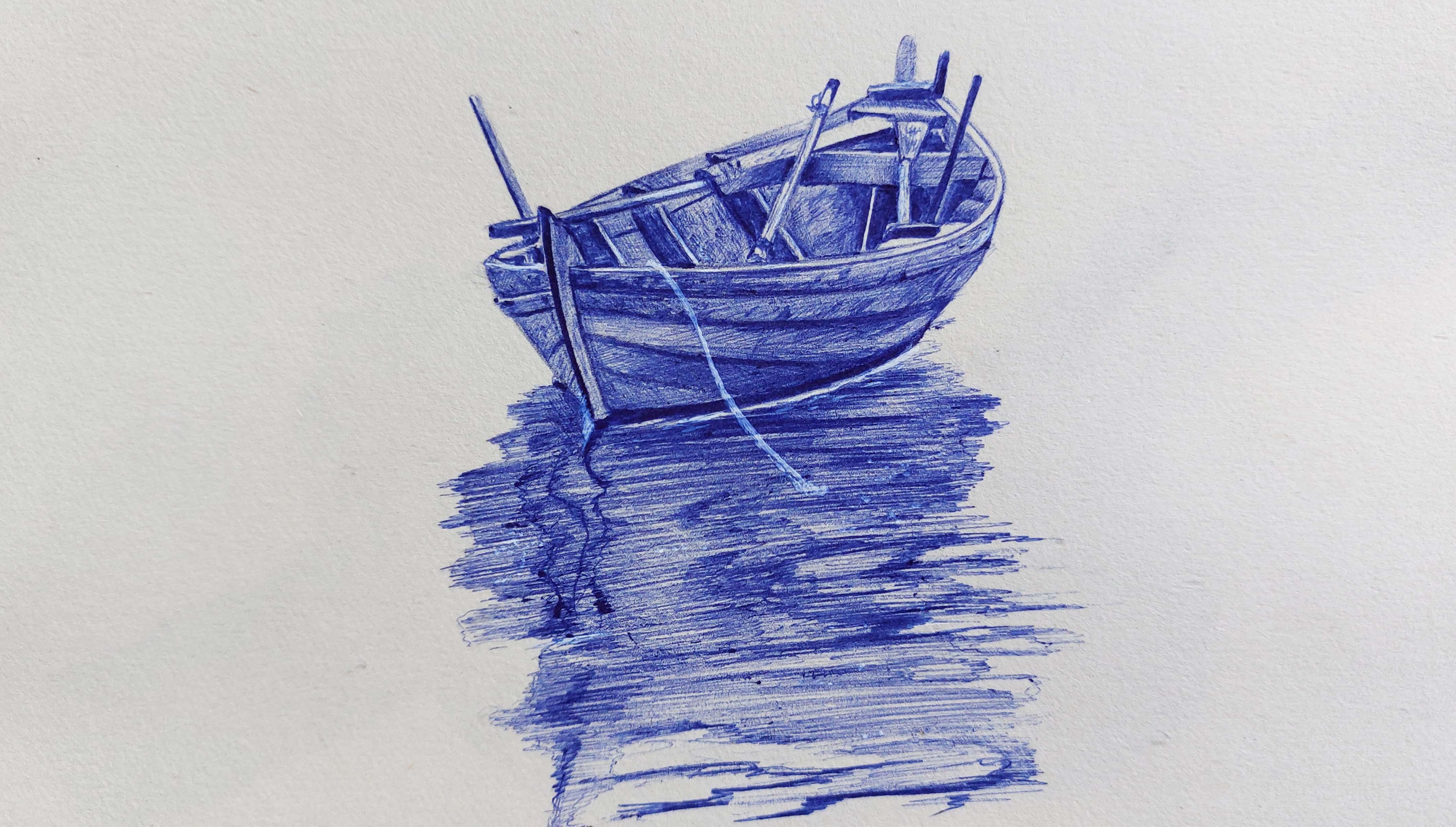
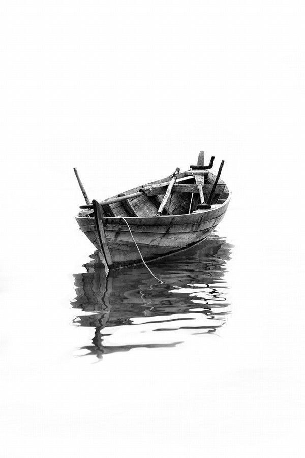
11. Basic Wooden Boat Sketch: Hello and welcome
to a new chapter of Sketching with Pen With Me. Okay, in this chapter we
are going to learn how we can create and sketch different types of
textures together. Of course, with pen techniques. All right, I should tell
you how you can actually texturize and make shadows and shadings for these kind
of different textures. The first thing that we want
to create is wood texture. It's a wooden boat, of course. One of the most comfortable
and easiest and fastest techniques and
methods of creating your primary sketch
is copying it. As I told you before, you can use your basic
pencil, your normal pencil, or any pencil that
you have near you to make the back of your
copy completely black, then you can copy
your original shape. Okay. With this method, of course, you can easily create any image or any
model that you have. I try to darken the back of my work as much as I can
in different directions. And then I turn over my
paper, my models paper. I place it over here because I don't
want my model to move. I will actually fix it on my cardboard or on my
paper with some paper tape. I use one tape on the top
and one tape on the bottom. My work will not move
and it would be fixed because you don't want your work to move while you're
copying your model. Okay, then you should
use a very sharp pencil. You should make sure the
tip of it is sharp enough. Then I start working
on my model. With my sharp pencil, I start going over
my main lines. First of all, I go over all the main lines
I have in my model. Then I can go on some of the details
as well if I want to. But as you can see, I am moving on each line very precisely because
I know it will be totally copied on my cardboard or the paper that I want
to create my sketching on. All right, here it is. Just as easy as that. Okay, I work on the
sides of the boat, and until the end of this part, I should also work on the lower
part of the boat as well. Exactly like the previous part. I work on the main lines. Okay. Now I also want to work
on some of the details inside of the boat because
if I create them right now, it would be much easier for me. While I want to work on it, I want to put my main focus on texturizing
and shading this work. I don't want to spend
too much time only on the primary sketch
and very simple lines. Therefore, I prefer to copy
these, even the details. I can have more time on creating
the texture and shading. I should also work on
this side as well, and here it is now it's over. Of course. I should also determine this area
for the water. I go all around
this area this way. It would be much easier for me to create these
shapes more precisely. Okay, here we go. Just as easy as that. I also have a rope over here
that I also create this. And of course the shadow
and the reflection, it has the water. Okay. I check my work once I see all parts of my work
is copied or not. As you can see very lightly, my work has been copied
onto my cardboard. And that's enough because your primary sketch
should not be too dark because it will mess up your work and
it will make it dirty. We'll continue in next part.
12. Start Drawing and Shading The Interior Of The Boat: Hello, welcome to the first part of this tutorial with Pen. With me, of course. Okay, we're going to start
sketching this model. First of all, I'm going to start shading from
the bottom part of my boat before you
start your work, I always tell you, be
careful that you get the extra ink from around
the tip of your pen, because if you don't get that, it will create wanted
spots in your work. Take a piece of paper
and just clean, clean the tip of your pencil. Clean the tip of your
pen on that paper. You get the extra ink off it. I start from the end of my boat. I just go over some lines in
order to make them darker. I will not lose my sketch. I will not lose my
primary sketch. While I want to shade, I just make it a
bit more darker, not too much the same way from this side. I'll continue up to here. And this way mostly I'm moving on the main lines and also a bit of details
as I move on. Very easily I determine
my primary sketch. Therefore, I can have a
precise shading on my work. Well, very nicely and elegantly, I go over the lines
that I have created, my primary sketch, and
making them one degree D, so I will not lose them
while shading Again, I insist, do not do it too much. Do not darken your lines
too much in this step. Okay, here it is. And just as easy as that, I will apply most of the details while I
want to shade my work. Right now. It's just a basics, not too many details. Here it goes. And I'll do the same thing for these parts as well. Okay. Now, I also have to
work on the end of this paddle and this
wooden part here, the blanks that I have
here on the boat. It's enough up to here. I also work on this
lower part as well, as much as I can. Okay, now let's
sketch my whole work. I start from the top of my boat, from the top of this area. Based on my model, I apply a light shade here. I work very slowly, I apply some shadings over here. As I move down here, I have an L shape, which is actually
placed sideways. I apply this shade
over here so I can give this area a
bit of volume as well. Then I continue to the
rest of the areas. Okay, Of course, one of the
easier ways that you can complete your work is to first apply the darkest
parts in your work. The dark parts, for example. First I start with
applying this darkness, and I'll continue it up to here. Below this area, I will also shade the
end of here like this. Then for the lighter areas, I try to control my hand
pressure and keep them lighter. The lighter parts. So kept lighter because
we're working with Pen now, you can actually make
a lot of mistakes. Again, for this side, we need an average shade, not too dark to light. Just be very careful that your hand pressure
for the light areas should be really light.
How you should do that? We, of course, as
I told you before, if controlling the pressure in your hand is
very hard for you, for having a lighter shade, you should keep your pen in your hand near to the end of it. As you move your hands
to the tip of the pen, well, the shade that
you get will be darker. Definitely try to do that. If it's hard for you to
control your hand pressure, wherever your pen is, that will make your
work easier to do. Here it goes. I keep this area a bit light. And again, from here, I apply the darkness to my work. Over here, I'll make
it lighter. Okay. Again, over here, I consider
a general and light shade. Then from the bottom parts of them toward the
top part of them, I'll try to create a faded shade from the
bottom to the top. I also have to consider
this area as well and apply the spots that represent a
wooden texture like this. Then from the sides of it, I apply the darkness
that I see in my work. Okay, now the pen technique is basically playing
with your hand pressure. The most important thing
that you should learn in this technique is the control
of your hand pressure. As, as you have control
in your hand pressure, you can create better shades of. And it only needs a bit
of focus and practice. Of course, I apply dark shade here with the lightest spot in
the middle of it. Then from this top I come
down bringing dark shades, also some knots and shapes here. Okay, now from its sides, I should work darker. I should apply darker color here. It is just like that. I'll continue my work wherever I see any
darkness in my work. I apply it in my sketch with the control
of my hand pressure. That is the most
important thing. Again, as I said a then I come down on this side of this pipe, I'll do the same thing
from the dark shades. I move my shading toward
the lighter ones. See as I start from the
side and the edges, I start dark with high pressure. As I move on, I'll make him
lighter just as easy as that. Once I do the shading in the opposite direction
that I have already done. So I'll make my
shades more faded. Here it is. And wait as long
as you can and try to keep some parts of your paper white and light. You shouldn't actually feel
all the white spots and all the white dots
on your cardboard. Because as much as you can keep them in the amount
that you want, you can keep your
work more natural. If you feel all of them, it would look fake. Okay, we're going to
continue next part.
13. Details Of The Boat: Hello again and welcome to the rest of the
tutorial with me. All right, let's continue
our work together. Well, from here I start a very strong darkness that is actually in a strong
contrast with this part. I try to apply this darkness, this strong darkness very
cohesively over here. Again, from here,
based on our sketch, we'll continue up to here. Based on our model, I mean that this area
should be totally dark. The darkness that
I want to apply over here is that I start from the darkest part as I slowly
move to the other side. So my hands, I start with a very high hand pressure on this side, on the right side. As I move forward and
to the other side, I should decrease the hand
pressure and lighten it. Okay. Wherever I feel that some shades are not
matching the others, I start shading in a different direction so I
can make them more cohesive. Just like that. I also create some spots to share the wood texture
like that very easily. I'm applying these, the spots and stains
for the wood texture. Okay. This shade also
continues up to here. And I also want to
work on this area, the edges of the boat. I do them totally dark
now in P technique, because we have a
limit of mistakes and we should not make
mistakes as much as we can. You should be really
careful while you want to shade areas, especially
small areas. It's better if you have a background of shading
with pencil and other materials because it will actually make your
hand more ready for it. But if you want to
start with pens, you should have a lot of
practices and exercises you can get scale of shading
with pen without mistakes. Okay. I also apply a faded shade
here and over here I have a bar which I think is actually the
handle of my pedal. I'll just continue up to here. The end of my work, I'll shade it in this way. If you have paid attention, you can see that I've left
an area above it, uncolored. I also work on this
wooden bar over here. And I'll shade it like this. Then again, I work on
this part of the boat, the side of the boat. All right. It has two colors inside of it. Some parts are darker and
some parts are lighter. And this actually makes the
sketch even more realistic. So I apply it. Okay. I make some parts darker and I just leave some parts
lighter as they are. I also need a mild shade over here with a low hand
pressure, very lightly. And generally then for
making it more cohesive, I definitely shade in
the opposite direction. Then I'll do it even
sideways. Okay. Now, of course, again, I want to apply some of the spots which are
for the wood texture. So here it is. And I
come over here and shade this area as well. Okay. As you can see, I've worked on this absolute darkness
over here and I lightened, actually I shade it a bit
lighter in between each of them just as easy as that it's done. I'm just on the working on some of these white
parts a little. It would be actually, they wouldn't be too white and
they wouldn't pop so much. Okay. Now I want to work on
this side area from here, I'll continue in this way. Then I apply the darkness
that I want over here. With a bit of distance again, I apply the darkness
in its own placement. Okay. Then I want
to also work on this wooden bar over here. Of course, from one
side I start dark. As I move forward, I'll make it lighter
and lighter. Okay. Now, up to here, this part of our work is done. Now, I'm going to start and shade the
lower part of the boat. Okay, I start from here, I'll start shading
it without any fear. I start shading this
area very dark, because you shouldn't
be feared as well if you don't face it. If you're always afraid
of applying the darkness, you cannot get the
contrast that you want. You should do it. I close the bottom and the
top part of it as well, and then I apply a very
general shade for it. Okay. Just like
that. Here it is. I also apply some
of the spots in the work, and here it is. Then I start from this
part of the boat, from the front part of the boat, and I start shading. Of course, because this
part is more prominent, it would get a lighter shade, just some darker
spots in some place. I should work on this area
with a light hand pressure. One of the most
important things to know about pent is that you should actually master the skill of controlling
your hand pressure. Because when you actually decide to use what pressure you
want to have over here, you're actually deciding
the color of your shade. You can create masterpieces. With that, you should just learn how to control your
hand pressure. From the bottom part of here, I bring another shade. The prominent part will actually pop out
and it would look good for the bottom part of
it in different directions. I start applying light shades just to make the
shades of this area cohesive. One line over here and
another over here. I apply them both in my work of I apply some spots for
showing the wood texture. Okay, Now I want to work
on this part of the boat. Obviously I start from this top area and I start and determine the
white part of my work. Very organized neatly, I get it. Here it is, okay. Now I also want to work on
the lower line as well. So be very careful to create
these lines very bravely. Without any fear, you should
create very smooth lines. See, this is a brave
line, that's what I mean. This is a feared line if you want to create
your line like this. This is actually
working with fear. These ups and downs, actually the parts that
your hand was afraid to do. It was shaking.
You were nervous. Or anyways, if you want your work to look more beautiful and you don't get
a feeling of fear out of it, try to practice creating
a smooth and soft lines. As you can see, I'm applying
a very light shade for here. Keep the pressure of your
hand in control if you can. If you just get the tip
of your pen in your hand, try to change it and get
your pen from near the end, it will give you
a lighter shade. Okay. So up to year is enough. Let's continue in next episode.
14. Completing The Drawing and Shading Of The Boat: Hello again and welcome to the rest of this
tutorial with me. Okay, let's start
together again. As you can see from the
lower parts of this area, I have more darkness and I
increase my hand pressure. But as I move up, I decrease my hand
pressure and I try to create lighter shades
in order to fade it. See on the lower parts, I have a higher hand pressure. As I move up, my hand
pressure decreases because I want to fade my dark
colors into lighter ones. See, I also consider some of the darker spots as
the texture of the wood, especially for this
front part of my work. Okay, here it is. Again, I'll do the same
thing for this area. Just be careful that this line should end across from this one. This time, I take the darkness from the lower
part and as I move down, I make it lighter. Why? Because this area
is more prominent. And as you know,
the prominent area should be darker on its surroundings and it
should be lighter itself. You should have a
low hand pressure and the hatches that you make should be continuously
and one after another. Okay, here we go. These parts should be
definitely darker. From this corner, I apply the darkness for
the wood texture and also the parts which
I can see are more deep. As I told you before, prominent part should
be lighter itself, but its surroundings
should be darker. It can show itself better. Okay. I also consider a very general and light shade for this prominent area as well. I just don't leave it white. It doesn't look good. Just like that from
the front part. With more hand pressure, I'll continue my movement here it is. Just like that. As you can see, I am also creating the spots for
the texture of the wood. All right. This area should be a
little bit lighter. Here. Again, we should
apply that darkness. See. Just like that very easily. With a stable hand pressure, I apply the darkness over here. Okay, here it goes. I can clearly see the
darkness I have here. And I apply it
exactly as I see it. I get a bit of this darkness that I've
already applied here. I faded upwards so it wouldn't look like a
specific border line. The ending part of this
boat would be here. I just make my shadings
cohesive as much as I can. Just like that very easily. Okay, now my boat
is almost done. I should just work
on the water area. Now I determine the area
for the water right now. Here as it is. You don't have to create this
area exactly as your model. You don't have to copy
one by one, line by line. It's just enough to get the
general shape of this area. If you want, you can copy it exactly as it
is in the model. But I'm telling you if you made any mistakes or you missed
some of the lines, shapes, it's okay just to get
the shape of this area, the general shape
of it is enough. But if you'd like to do more, well, you can always do more. Here it is. Now, what should we do here? From the top, I
consider a distance. First I do this
absolute darkness for this part of the boat. There is an absolute darkness here at the bottom of the boat. It shows actually the
bottom part of the boat, the part which
touches the water. And then I keep a white
area here like this. And then horizontally, I start shading and
hatching, see like this. Okay, from the surroundings I create the shadings. And as you can see, I'm creating hatches which
are so close to each other. I start from the edges
and from the sides and toward the middle and the
center of the water area. Again, I'll do the same process. I'll repeat the same
process from the top. Here it goes. Okay. Here it is. And I'll continue all the
way up to these parts. All right. Just like that for some parts I can use even darker shades. I shade some areas darker
comparing to the others. See like that. Well, I'll try to keep the
lines as close to each other. You can see that
shaded way in my work. I try to create my hatches and my sha close to each
other as much as I can. You can see that
they are going to be fainted and the shade is
going to show itself. I work on the sides, on the edges, and here it is. I'll continue till
the lowest areas. Okay. Now from this side I'll
do the same thing. So the process is basically the same and I'll just do it. Even some parts can be darker. Now, foresee the rest
of the tutorial. Let's do it in next episode. Let's finish this
beautiful sketch together.
15. Completing The Water Part and Finishing The Design: Hello and welcome to the rest of the Sutorial and the last part
of the Sutorial. Okay, let's complete
this sketch altogether. I start from those
parts below the boat and I apply darkness
into my work, into the water ripples, which is actually showing the reflection of the
boat on the water. Just like that. I'm applying
these dark shades to show the reflection of the
boat on the water below it. I also do it on these parts
which are more behind. I'll continue downward. As you can see, I am changing
the shades a bit too. I'm doing them in zigzag. Some parts are darker, other parts are lighter. Here it goes. Okay. So just like the previous
line that I've created, I have some more
darkness in some parts and some light in
some other parts, and here it is. Okay. Also in these parts, I try to create this zig zag shape, okay? And here it is. In here, I create the darkness, just some lines and
shapes over here. After that, I make them all more cohesive with a general
shade on top of all of them. I take this area out of
its very light shade. I make it darker. In other words, here it is, It goes like this. Some dark shades,
some light ones. The contrasts of
this water can show its most of the darkness
are a bit random, except for these very dark spots which are the
reflection of the boat. They can actually help you a in getting your works volume
correctly and perfectly. All of your shading
should be horizontally, you would not lose that shape. The texture of the
water should be kept to actually try not to do
any vertical shades. And all of your shading
should be horizontal. I also apply some more shades just on the edges of these
that I have created here. I just get it out
of its messy way. As you can see, I am applying
a very general shade to get all of these colors and shadings
cohesive altogether. Okay, I also work on these
very strong reflections here. Okay, Now, for the last step, I get my white pen. Well, first I heat
it up on my hand. My white pen. I heat my
white pen on my hand. When you want to
use your white pen, you should heat it
up on your hand. You should do that
before you use it. Then I work on the parts, which I need very strong
lights in my work. Wherever I have a very
strong light in the work, I use my white pen to
get them correctly. For example, here I had
a rope or a string, which came all the
way down up to here I created
with my white pen. And then I also create a shine for this bottom
part of the boat, which is the place that the
boat actually hits the water. And I also create some more lighter
spots below it so I can give it more shine, even over here where you couldn't keep the light with the whiteness of your
cardboard or your paper. For those areas, you can
also use your white pen. Try not to over use it. Use it as much as you need
on the parts that you need. Again, I drag it over
here, here it is. These parts should be light. I use my white pen. As you can see, I'm getting
the lights that I need. Wherever you are
using your white pen, you should use it twice or three times so it can give you a
strong light that you want. Because drag your
white pen only once on an area probably doesn't
give you the color, the whiteness that you want because you have a
background color beneath it, and it's obviously
darker than white. You have to drag
it several times, maybe twice or three times, to get the shine and the
whiteness that you like. All right, here it goes. Should also apply some
more dots and spots. You can show also the shine and the glitter shape on
the surface of the water. Okay, this sketch also done, and I hope you've enjoyed it. I'll see you in next tutorial.
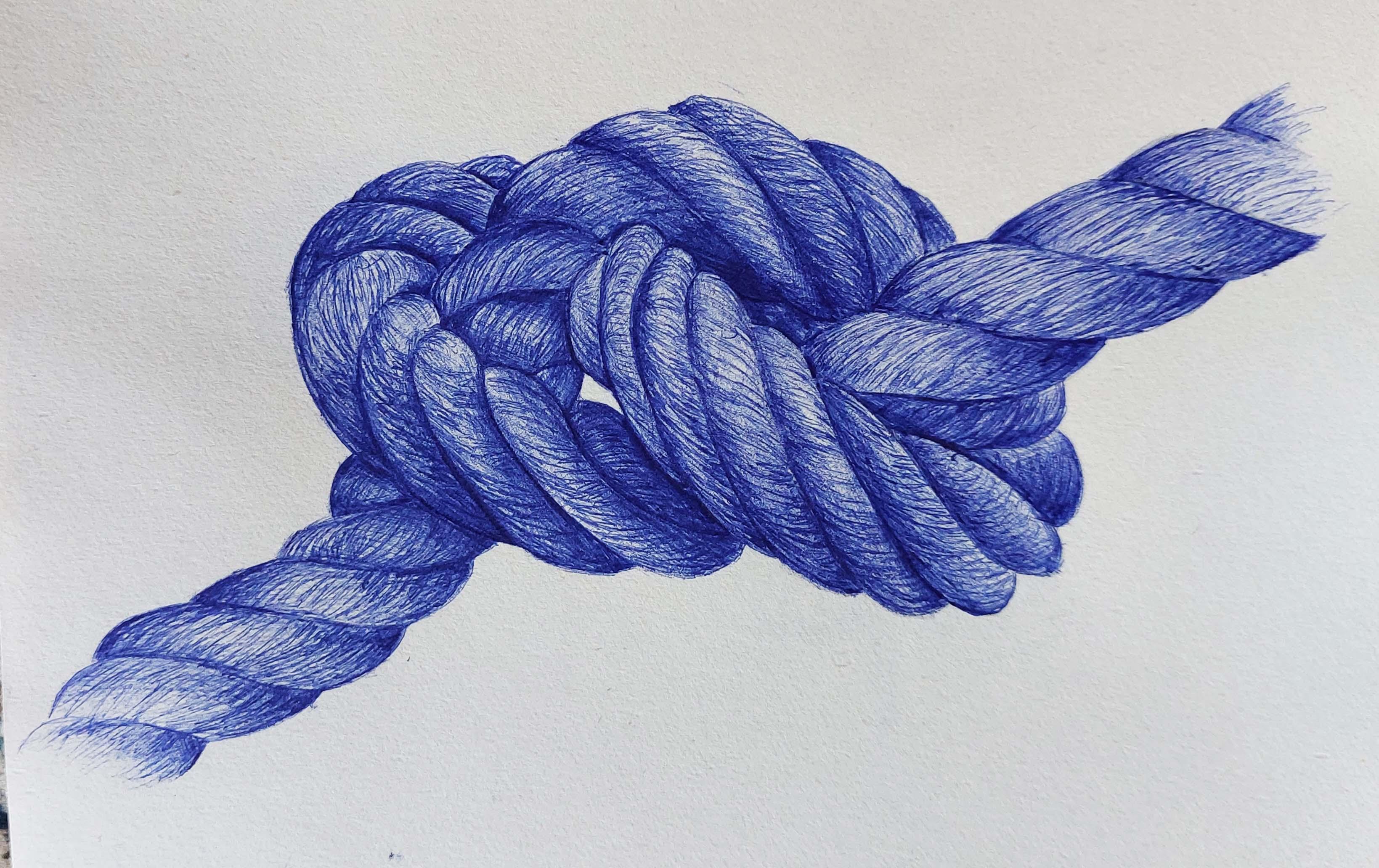
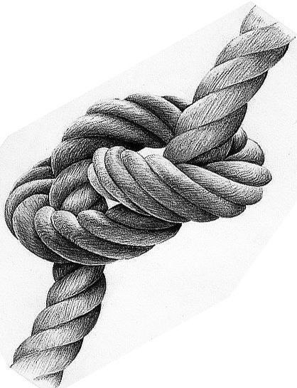
16. Basic Rope Sketch: Hello everyone and welcome to a new episode of this
tutorial with me. In this episode we are going to create this beautiful
rope together. I want to teach you how easily you can create
the texture of the rope. That definitely in
sketching with pen creating textures is one of the most
important things that can make problem for so
many of our students. As much as you practice, you can do them better and get a better skill
in pen technique. Okay, Just like my previous one. I just do this with coping. I do the primary
sketch with copying by darkening the back
of my printed model. Then, of course, I fix it on
my paper, it would not move. Okay. Now, from this corner, I start going over
the main lines to create the main lines of the
rope and my primary sketch. Okay, so just like
that I'll do it and I'll do it over
and over again until I can copy my model completely
into my work. Okay, so just like
that I'll do it. I go over all the main lines over here very easily. I get the main sketch and the main primary
sketch of my work. Just as easy as that. I've created the main
edit of my work. I just check one so I can see is it clear or not, which it is. As you can see, my main and basically my primary sketch have been transferred into my paper. Now, let's work on
it in next episode.
17. Primary Rope Drawing and Shading: Hello again and welcome to a new episode of the
tutorial with me. All right, in this episode
we are going to work on this primary sketch that
we've already created. Now, I want to start
from the corner. As I move to the other
side, I want to finish it. First of all, I place this line in its own placement,
but very lightly. Then again, very lightly, I apply a very mellow
and light shade for it. And I'll do the same thing
in opposite direction as well, like this. Okay. Now, for this middle part, that is actually between two prominent parts and obviously has darkness
inside of it. From here, I try to apply
a darker shade. I faded. As I move toward
the center again, I see this middle
part is dark because it's been placed between
two prominent parts. There should be dark. Then obviously I'm going
to make my shadings more cohesive like that. And then from here, exactly like the previous part, I'll just repeat the same thing like this. And I also apply this darkness a little
in the previous part. Here it goes. Okay, now I want to
create the third layer, and I'll do it very softly. I'll shade very softly, especially from these
edges and sides. And wherever I know it's
deeper and the darkness is more like this. You should pay attention. The things that we are
doing right now is actually the foundation of our work is just a
background color. We are actually
just preparing it to create the actual texture. We're just preparing
it right now, this is background color
and just a foundation. That's it, okay, here it goes. And then very beautifully
I apply this. Dark shade by throwing them off and in different directions
in lighter areas. Okay. Then I can move on
to the third part. The same way, of course, from here, which is
considered the lower part, the part below the main part. I try to apply the darkness
as I move toward the center. I make my shades lighter. The process is basically
the same for each part. You just have to pay
a little attention to the directions that you're to the parts that
you're shading. Either you want them
to be dark or light. Here it is. And very beautifully I
fade this darkness here. Okay. Then I work on this area again and completely.
I'll fade it, okay. So I apply a general shade so my work will look nice and look
cohesive up to some level. You see what is this
happening over here? This happens when you don't get the extra ink off
the tip of your pen. So if I have done that,
this wouldn't happen. Now, I have unwanted spot here, but I'll later tell you how you can fix it during your work. Try not to make it by taking off the extra ink from your pen tip. If this happened like that, like it happened for me, I'll tell you how
you can fix it. Okay. This area is totally dark, so I apply a general
shade for it again. No, it will look like this. And then very slowly, I drag this darkness to
the right side of my work, and I'll fade it at the
same time, very slowly. And step by step I'll follow
and I'll continue my work. Well, I also have a strong
darkness on this side. On this corner, I'll have
it from this side as well. I apply it here as well, just as easy as that. Okay. I'll do the same thing for
the other parts as well. As I told you, the
process is the same. Basically, you only need
to understand where is the deepest part of your work and the center
of your darkness. When you find that
the rest is too easy, that's the most important
thing for you to know. Understand and find
the deepest area and the darkest
part of your work, which is the center of
your darkness from there. When you move to
the other parts, you try to fade darkness
into lighter shades. Okay? In this deep area, I have a stronger hand pressure. And as I move up, as I move to other parts, I decrease my hand pressure. Okay. The next part that I
can actually tell you, it's dark totally, but don't forget to get the
extra ink off your pen tip. This area because it's
inside of the knot. Totally strongly dark. Because it's inside of this knot that we
have in our rope. I just apply this darkness exactly as my
reference, as my model. Okay. And of course I spread this darkness into
this upper area. See, it's highly darker than the other parts
because again, I insist it's inside of the not. Okay. And I'll do the
same thing for here. Has the same position. So I'll do the
same thing for it. You should work
on it very slowly with hatching in shades. And just like that, we've
created this darkness, the strong darkness
over here as well. We also have some more
stronger darkness. Even they should be darker than this that I've
created right now. But remember, this is just
a foundation of the work. I am going to apply some of my shades or some of
my darkness while I want to take it to the next step and create
the textures of the rope, just like that, I can work on
the next part of the rope, which starts from here. Again, I start applying
very general shades, general and light like this. And just like that
in the upper parts, I'll fade it totally. So here it goes. You shouldn't lose these
lower parts as well. I mean, do not
forget about them. We have to work on
these lower parts as well as we do on
the upper parts. They are just as important. Okay, just like that, I went over the
lines very smoothly. Let's continue in next episode.
18. Create a Rope Texture: Hello again and welcome to the rest of this
tutorial with me. All right, in this part we are going to move
one step forward. And after we've created
this beautiful foundation, I want to start creating the texture for the several
parts that we've done. First, you should take off the
extra ink of your pen tip, then you should start right from this corner and start
and create the texture, see in the rope texture. The directions are really vital. Just like that, I
create a texture for my robe in this
sideway direction, in this curved shape. Now in the darker parts, I'm going to actually create my shades
darker of wherever. It's light shade, light overall. I have my texture in the
direction that I want, as easy as this. Okay, I create actually not
very organized textures. This is a texture
that I'm creating. See, it's not very straight, it's like zigzag lines and zigzag small wines
going into one another. This is a texture that I'm
going to create for the rope, but again I say the
direction is very important. Okay, I do the same thing
for this next area, and then very easily I move toward the direction of me and I create the
textures for it. Then I wait as much as I can, I can actually fade these
lines in between the parts. With creating my textures, I'm going to fade these lines in between these
different parts. With creating the textures, I try to do it slowly. I don't want to rush through it just as beautiful as that. As you can see, my texture
is showing itself. I'm going to do the same thing
for the next part as well. You should have a lot
of focus and a lot of pressure on the dark
parts and darker areas. As you move toward
the lighter areas, you should decrease
your hand pressure. Other than that, keep your focus just as easy as that. I also create some zig
zag shapes inside of it. Just like that I get the
texture and the shape of rope. It can clearly be seen now. All right, Now for
the next part, I'll do the same thing. The process is totally the same. I just have to repeat
it on different areas, just have to pay attention about the textures and about the
direction of the textures. Because again, I emphasize on the fact that the direction
of the textures that we are creating is
very important in the per sketch and create
hatches next to each other. They will look more continuous and they will look more cohesive and they're stay
connected to each other. You shouldn't create
them separately. I mean that it shouldn't
be in a way that you can actually count the lines
or separate the lines. They should look very cohesive
and tangled together. Okay. So I've texturized
my work up to here, See if you're paying
enough attention. It's a really easy job to do. Okay, then I'll repeat
the same thing from here in this way very beautifully. I get the textures of the rope. Again, I'll do this
for the next part. One thing that is
very important in this texturizing is the fact of the direction of
the texturizing. Again, I say, for example, if I have this direction, I shouldn't shade in
the opposite direction. That is the problem
with so many of the textures that they
don't show themselves. It doesn't matter
what the material is. It could be a metal paper rope because each one of them have their own method
of texturizing. But sometimes when you can't create the
texture that you want, the problem is actually the
direction of your shading. If you don't apply your shadings
in the correct direction that you have to do
for that type of texture and that
type of material, it doesn't matter how
correctly you apply them. If the direction is wrong, it doesn't give you that
texture and that material. It is vitally
important. All right. As I told you before, this area is I should create
a dark textures here. This is the darkest
area of this work. I have to create very strong
textures without any fear, with a lot of confidence. I give this area a
lot of darkness. Here it goes. Well, now I emphasize on the
darkness a bit more so I can get the volumes correctly. Actually, one of
the things that can create great volumes for you is the contrast that you create in your work
and in your shades. It's the same way from here. All right, now I start again to create a foundation and a background shade
for the lower part. Now I start from the darkest area as I did
in all the previous parts. And as I move toward
the lighter area, I decrease my hand
pressure in order to get a more normal
and lighter shade. The hand pressure is high. As I move toward the light, with controlling my hand
pressure, I decrease it. I'll do the same thing
for the next part. Again, I start from
the darkest area. I fade my dark shade
toward the center. And the lighter
shades, of course, I consider a very general and
light shade for this area. Again, I say after
texturizing the upper part, now I'm doing a foundation and a background
shade and color. For the lower part.
In each part, I'm going to shade in
different directions to get a nice foundation. All right. Now as I am applying the shades, I'm also applying the textures just like that. I have more hand pressure in darker parts and deeper parts
which have also gone in, so I can get the volume
that I want here. Okay, now I want to
work on the next part. I apply a very general
shade for here, general and light, in order to increase the control
of your hand pressure. If you want to improve your control on
your hand pressure, especially in technic, you can actually understand how you can texturize
each model. What you need to
do is to work on different sketches with different
textures and materials. It can be a fabric, metal velvet, or
anything that you like. It can actually help you a lot. Your eye will get more
comfortable actually. Your eyes will sink
with your brain. You know what kind of texture and what kind
of material it is. You can apply it and
work it the way it is. If you can practice
on different textures and different materials,
that would be great. You should practice them
over and over again until you master the technique. So you can work on a lot
of different models. King and I will have some
more darkness over here. Just like that. So now I move to the next part. I create a very general shade as you can see. All right. So it's a very easy thing to do, to create a base
for here as well. And wherever I can
see more darkness, I apply more darkness. And wherever I have
less darkness, control my hand pressure and decrease it in order
to get lighter shades. And again, I emphasize
on the fact that one of the most important things in pent technique is to
control your hand pressure. That's actually a re scale key. Okay, again, I start texturizing
especially from here. So here it goes. And very slowly I create
these textures here. All right, here we go. I keep this part of my
work which is light. There's a strong light
in my work that I try to keep and don't go
inside of it too much. Okay. It's enough up to now. And let's do the rest
of it in next part.
19. Continue the Drawing Of The Rope: Hello again and welcome to
the rest of this tutorial. Okay, in this part
of our tutorials, we want to work on the
rest of this rope. Now we are in the beginning
of this, not again, I want to work on the
upper part first, I want to start here. Going down to here, and I consider a very
general shade for my work. Okay. Layer by layer and in
different directions, I create a very light
shade over the surface. So it's very easy. It's basically the same way. You should just be able to spot the correct placement
of the darkness there. Okay. Now, wherever I found the darkness with a
controlled hand pressure, I apply dark shades on my work. And as I move toward the
center or the lighter areas, I decrease the hand
pressure K. Now, because the darkness actually
makes a shadow over here, I should also darken this area
more because it's a knot. This part and it's
a twisted knot. This part lapse over
the previous part. Therefore, this side of
it would be of course, and I'm going to
create this darkness with constant hatches and with controlling
my hand pressure. I've created the shade in different directions, just like that. Okay. We should work on the shades of 2.3 parts and then we can
texturize them afterwards. I'm going to create a foundation first for several parts
and then texturize them. This lower part
will definitely be darker and it's going to
fade away as it moves up. Okay, now also for the next parts, I'm going to do the same. I'm going to apply my shades considering these
two more parts. I'm going to create the
foundation for all these three and then text
them afterwards. Now I'm going to create a general and complete shade
with a stable hand pressure. Do not forget that
while you're working, you should definitely check
your pen tip and take, take the extra ink off of it, you won't create
any unwanted spots. This way. Now I try to drag the darkness
as that much into my work. From the dark parts, I have to shade darker. Obviously, I'm working on these edges on the
sides which they have more darkness without any fear. I apply this darkness on the edges and the
sides of my work. Many of the students are very afraid of
placing the darkness, especially in pen
method, pent technique. They have a lot of
stress for placing them. Because in pen technique and the technique of
sketching with pen, it's a bit difficult to fix, create darkness by mistake. But something that is very
important for you is to know. Unless you don't create
any darkness in your work, you cannot get the great
and enough contrast in your work that you want. Your result will not get
the quality that you want. Therefore, the
outcome of your work, it's not the outcome
that should be. Do not be afraid of
placing the darkness, but be careful of
where you place them. Because as much as the darker spots are
important in the work, placing the light in the
work is also important. We should get both darkness
and light in our work. You should consider them and apply them based
on your model. Not less than that. Do not be afraid of
ruining your work because the worst case scenario is that you'll
start another work. Don't worry about
it. This is art. If you fail more, well, the next time you'll
actually work on that stronger and better. If you don't make any mistakes, how are you ever going to learn? So don't worry about ruining
your work and starting over, especially in sketching and painting and these
kinds of arts, because it's actually one of the steps of the
process of learning. Okay, then I look at
my reference and I see ever it's darker and ever it's lighter and I apply
the same thing for these. I'm continuously checking
my work with my model. Okay. Again, I say constantly check the tip of your pen so it wouldn't get any
extra ink off it. Okay. I shade this area
generally and completely, so it can make the whole
area more cohesive. Okay. I really enjoy of shading this type of models and
this type of sketches, because as it moves on, it is actually showing
itself more and better. I really enjoy it. I also shade this area
generally and lightly again, as you can see, of course, darker on the edges in this way. And just like that. Okay, now I start from the first part that I, that I had created and I start creating the
darkness and the textures here. Now I'm creating these textures based on the curve that
I can see on my rope, and the direction
would be the same way. Be really careful about the direction and the
way that it's curved. All right, I try to organize the
shades a bit more. I also apply the
textures very lightly in the lighter
areas, in this way. Now I work on the other part, and based on the
curve of my rope, I am applying my textures. All right. Okay. And then I'm going to work in the dark parts with
higher hand pressure and in the lighter parts with the lower hand
pressure, of course. But I'm creating
the textures here, should keep in mind the
direction, the hand pressure, and the curve of the rope, because it's a bit twisted, I come down and for
this lower part, again, based on the curve of my work, I create my textures in
the correct direction. See how I'm doing them, just this way. Okay, now in these lower
parts where I have darkness, I should have higher
hand pressure. I also fade the specific
lines between the parts. They shouldn't be left as lines, they should be faded
into all the shades. I also do the same thing
from the other side, the opposite side as well. Wherever I hit the line area, I just let them go. Let the texture lines go. Now, let's continue
in next part.
20. Drawing and Hatching The Knot Part Of The Rope: Hello again and welcome to
the rest of the tutorial. All right, let's
continue all together, we had actually created
the foundation of this in the previous episode. I just have to apply
some more darkness and then I can texturize it. See, now I'm just
applying the darkness. Here we go. Just in this way, al right, now after I have
created the textures, I should also apply some small lines in
between the textures, it would look more natural. All right, now I'm going to work on the last
part of this area. Again, I apply a very general
shade and the light one in this way, and here it goes. Okay. Now I'll continue, and from here we move to the
other part to complete this. Okay. I should also work on this area which
has been left out. We can move to the next part. This area is very
strong dark area because all of these parts
have actually elapsed over this area which is
underneath all of them. The shadow of all of these parts above it are actually on here. Therefore, this area is dark. That's why I do the darkness
over here, as you can see. Okay. Very confidently, I
apply these shades and these hatches right next to
each other, just like that. Okay. From this curve I
have my darkness. And as I move toward
the opposite side, I'll decrease my hand pressure. This area would be lighter, which is obviously
more prominent. I cover this area with hatches which are
so close together, and they gave me a very
smooth and beautiful shade. Here it goes and here it is. Okay. Now, I should apply
the darkness more. Wherever I can see
stronger darkness, I work on it more. All right. Here it goes. I would also work
on the darkness of the previous parts
once more so I can get its general color and shade. Okay, now I'm going to this area which I completed,
its background color. It's time for the
textures, and here it is. Now we are going to work on the next part of the
end of the rope. Before I start shading, even for the foundation, I'd have to do this frameworking for the different
parts of the rope. I won't lose them. And I would know what kind of shades I should
use for each part. For example, which
parts should be darker, which parts should be lighter. So just like that, okay, I want to have the
general shape of my work. And with this frameworking, I know where everything goes, just makes your work easier. Just remember when you're
creating these lines, you should remember not
to leave them like them. I mean, while you're shading, you should make sure that you will fade these
lines into shades. We shouldn't leave any
specific lines in our work. Okay? And it doesn't look well. I determine all these parts, so my work will be a complete. Okay. Now let's do the shading
for these areas. I want to start from
here and I want to do this exact same process as I
did in the previous parts. That means first I have to
create a general shade, a foundation and
background color. Then on top of that, I'm going to do my texturizing just as easy as that. You should be very
careful because this area is actually
on top of this part. Therefore, there
is a shadow made by this area on my new part. Therefore, this part would be, these points should be
dark because they have the shadow of these
upper parts above them. Okay, here it is. And with a very
controlled hand pressure, I'm going to drag these shades and fade them from the darkness
toward the light. Okay? Now I want to work on the
texture for this area. That again, based
on its darkness, it will have a dark
texture, obviously. Now, for the next part, for example here, this
part right next to it, the same thing happens, okay? Now from here, I apply
the darkness that I want. I apply them here with a general shade in this way. And then again, I move
in opposite direction. Here it goes. Now, I would also create my
darkness with my shades. Just as that I'll
have these shades. Okay, I'll fade the darkness completely as the
shape of the shade. And also from here, I'll do the same thing. I apply my darkness, and then I'll fade it. All right. Now I want to start texturizing it exactly in the direction of the curve that I can see here on the rope for this area. I'll do the same thing. I apply the darkness
and then I faded through the rest of the
area as you can see. Now again, I can start texturizing this part of the rope in this way. Okay, now I drag the
darkness from here upwards. I can also get the volume of my work in this way now for watching the rest of the tutorial with
us in next episode.
21. Continue Drawing The Right Side Of The Rope: Hello again and welcome to
the rest of the tutorial. All right, now we
are going to work on the shades for the
new parts as usual. First check the tip of your
pen to get the extra ink off, then you can start shading. Of course, for the foundation, I get the shade I actually
guided through here. This part is light, upper part is light, and it's of course dark on
the sides and the edges. As I move toward
the lighter areas, I decrease my hand pressure
so I can have lighter shades. Okay. Also a little I want to work on this area and the darkness down. Well, the darkness
that I have is here. This is actually the
center of the darkness. And I work it based on my model. See, now, after I've done the foundation, I can start texturizing
my rope on this area. Very organized and
patiently I try to work on this texture here. Okay, now again, from here, from this part below
the previous part, I start with a very
strong darkness. I am going to shade
all over here. I will also fade all of my
shades into one another, because at last I want
a cohesive shade. They have to be faded like this. Okay. Now I'm going to fade
this darkness from the darker areas toward the lighter areas with
decreasing my hand pressure. Now I want to texturize. After creating the
background color and after applying
the foundation, I'd like to texturize the area. Actually, I have to do that again based on the direction
and the curve of this area. I start by text. In this way, I will also
keep the light area. Okay. Then again, I'm going to
start from this part, the part right below or
underneath the previous part. So I start very dark over here and I move toward
the lighter areas. Okay. Then I apply another
general shade over here. And here we go. I would also fade the darkness that I have applied over here. And I control my hand pressure from a high hand
pressure to a low one. I completed it in this way. I do the fading
till the end of it. Okay. Now I'm going to
work on its texture. That again, I should pay attention the twist and
the curve of the rope, because it's middle of the knot. As you can see, it has a
strong twist. Consider it. When you want to textize
this part or any other part, the direction is very important. Okay, now I move
to the next part. I start creating a
very general shade for all these three
parts altogether. You see you can get the general shade first for all these three
parts altogether. But later when you
want to create the volume and textures, you should do them separately. This is a very easy way you actually shade all
of them together. So generally then you can work on them separately. I apply my shadings. Generally, wherever it's darker, of course, I use
more hand pressure. Wherever it's lighter, lighter hand pressure
or lower hand pressure. Okay. Then I will continue
my shade like this. Now, for each one of them, I'm going to create the
contrast that is needed. Of course, the lower
parts would have more darkness like this. And just like that
I come over here and I create the texture for it like this. And just as easy as that. Okay. Now I want to
work on the next part. Now for this part, again, I am going to text and shade based on the
curve of my work. Okay, here it is. Over and over again, you should just practice
the same method, the same skills,
until you can get a handle of it and you
can master it actually. Okay. After that, it would be
easy for you to determine what are deeper, darker, what parts are lighter, what's the direction, how you can get the right
texture, and so on. Okay. Now I make
it more organized. It was too random
and a bit messy. Now I'm going to work
almost on the last part. Again, from this part I have a very strong
darkness and I apply it now I texturize it very easily. And of course, the last part, this small part, should
be done as well. Do not forget about it. Okay, now let's work
on the next part. And this is actually the
ending part of our work. Just like the previous parts, I'm going to start shading. This is the last part of
my work, as I told you, for the background shade, for the foundation for
this general shade. You can do several
of them together, but for creating the volume
and shaping the texture, you should do them separately. Okay, then I have considered a very general shade
for the whole area looking like this. Now we want to work on the volume of our work on the
volume of each part. Actually, I start
from over here, start from the dark areas and then get the
shades to create the contrast like this. Again, I'll repeat the same
thing for the next part. Now be with us for the last
part of this tutorial.
22. The End Of The Rope Drawing: Hello and welcome to the last part of this
tutorial with me. Okay, now we're going to finish this beautiful and greater
sketch altogether. Now, like the previous
parts, again, I start from the darker areas because this darkness
shows the deepness, depth, and well, a
deeper area in my work. First, I shade this
area generally, then I start from the darker
parts I want to shade first. I want to shade all of
these areas generally, and create their foundation and create a good
contrast for them. And then I want to work
on their textures again. For the next part, I'll do
the same thing from here. I start with more darkness. I apply this shade
for here and also for here, like this. Then I also organize
my shades a bit more, getting from darkness to light. And then I move on
to the next part, exactly like the previous parts. I'm going to do the same
thing for here too. I work on him. And also from here, I want to create some
darkness for my work. I actually consider
it for my work. Okay? And just like that, I move up very organized, very neat, with a controlled hand pressure. I'm applying all these
beautiful shades in their own places, and I fade all of these
darkness into the lights. I want to have cohesive shades. Okay, for here again, I start with dark colors. And then very patiently, I apply the darkness first. And then I faded into
the lighter areas, give it its faded shape. The last part of my work is here now all the
foundation is finished. Of course. In the next
step I'm going to t this last part of the work, let's do it now. It's again, exactly
like the previous part. Based on the curve, the twist, and the direction of each part, I will create its texture. While I am texturizing, I should definitely
consider the direction, which is the most
important thing, and the curve and the twist
of that part of the rope. Okay. And just like this, I'm moving part by part and
I'm texturizing them again. From here, even my
textures are darker. As I get to the light, my textures would
also be lighter. Here it is, okay. Now I have moved on to the third part in this way. Okay. As I told you before, so many times,
wherever it's darker, you should use higher
hand pressure, even in creating the textures. Wherever it's lighter, you should have a lower
hand pressure, even the textures
would be lighter. Okay, moving on
to the next part. As you can see, I have also faded all the
lines in between each part because I don't want them to look
like actual lines. They should be definitely
faded like this. Okay, Now I want to work on the last part of the
work after here. Okay? Just like that, I finished my beautiful sketch. See, it was very easy. Should just pay attention to the details of your
work, like the direction, the twist, and the rest of the things that we've
said during the course. Okay, I hope you've enjoyed creating this
beautiful sketch with me as much as I did. This is a beautiful rope. Just be careful, work on the shades and the
textures correctly. Okay, I hope to see you
again in the next tutorials.
23. Basic Flower Sketch: Hello everyone, and welcome
to the first episode, and the new episode of creating another beautiful sketch
together with pens with me. Okay. Now, in this episode, in this part, in this chapter, we are going to create this
beautiful roast flower. This time I want to show you how you can
create a texture, a very soft texture of petals and other
parts of the flower, and how you can actually create this beautiful contrast for it. Now for creating the primary
sketch of this model, again, I'm going to use
the copying technique. Let's do it together. As you can see, I
have blackened and darkened the back
of my work from before so that we can do the primary
sketch by copying it. Therefore, I'll
sketch right here. I fix my model actually on the paper
that I want to work on. One on the top,
one on the bottom. Then with a very sharp pencil, I start from the central part of my model and I
start copying it. See, just this way, I am copying these
petals one by one, very carefully. Okay? You should put each one of
them in their own placement. Here it goes. You should
go over all of these. Pay attention to be careful about the
direction of the petals. You should know in which
direction they are placed. And you should also create or go over the water drops in
their own positions. Very important.
Okay. I'll continue. I try to create the
details of my work as much as I can in this way. Here it goes. I also have
another pedal here and so on. If it's hard for
you to know which parts should be dark and
which parts should be light, you should also go
over those parts too, so you can determine
the area that you want to get the darkness
or finish one. Okay, Here I have also some kind of a
shadow on the pedal. I go over that too, basically. First I go over the main
parts of my model and then of course I go over the
details like water drops, like shadows and
stuff like that. The ending part of
my toe is like this. Okay. You can also check
it once to see if all of your work
is copied or not. I'll check it and I'll see, yes, all of my model
is copied here. Okay. Now we are going
to do the next step to start sketching this
beautiful rose flower.
24. Beginning Of Petal Shading: Hello and welcome
to a new episode of Sketching with Pen with me. Okay, in this episode, we are going to work on this beautiful rose
flower together. Okay, which part
should we start? We should start from the center as we
started the copying. But before you start, it's better if your
primary sketch is dark as much as mine, it's better for you to
use your eraser and lighten it a bit and
then start your shading. Okay, You should start
from the center. You should start your
shadings from there. Don't forget to get the
extra ink off the top of your pen so you don't
have any unwanted spots. Okay. Then we determine the
areas and therefore, we can understand the direction
in which we should shade. Okay. Now that I've determined what I want for
my work, I start shading. I do not want to work on
the very small water drops, but I would work on the
big ones that I have here. Because I'm not working
in a hyperreal style. Therefore, I just have to create the general things in
the general shapes. And mainly want to teach you how you can create the
texture of the petals. Okay, let's start
together. Right from here. Right from the center, I start with creating a
very strong darkness. As I can clearly see in my work, it starts shading there. Okay. Just like that, with
controlling my hand pressure, I drag this shade toward inside. Okay. Just as easy as this, be careful for
these soft textures like for example, petals. You should be very
patient and you should spend a lot more time
for your sketching, because as much time
as you spend on it, the result would be
much more better. Because while you're
shading the smoothness and the softness of your
sketch is important because you've got to get
the textures right here, it is like this. I'll just continue, I'll do the same
for here as well. Now, again from the stark part, I'll continue with a
high hand pressure. Little by little, I try
to make it lighter again, I say, little by little, you shouldn't do that,
all of a sudden, Okay. Then I apply a very
cohesive shade for this area, and then I come up
for this upper area. I'll do the same thing. I start very dark
and step by step, I'll make it lighter again. Very, little by
little, very slowly. I lighten it, okay? I keep it like that,
therefore it can show the bend and the turnover
of the pedal for me. Again from here I
apply the darkness. Then by little I lighten it. The hardest part of
creating these areas, it's really easy to do
the rest of the work. I'll just continue like that. And then I have a very
white area over here. I leave a white area over here. And then again, I start applying the darkness from this side, from the left side, based on my reference. As I move up, I make it lighter. But I should do it very
slowly and step by step. I shouldn't just suddenly change the color with creating a shade in the
opposite direction. I'll just do it, okay. For all of this place. I create a very cohesive shade. Some parts are darker,
as you can see. Some parts would
be lighter because this contrast is exactly what
can make the volume for us. Even on this darkness that
I've worked over here. I do some fading, practically fade this darkness
here, just like that. I just apply a mellow shade on the parts that
I've kept white. I create a very light shade
all over them like that. I also create this water
drop that I have here. And again, similar as to my
reference, I work on it. I give it a shade. All right, Just like that. Now from here, I come over here from its lower part
with a very strong darkness. I drag it and I come up, and then very slowly
I faded again, a very strong darkness here. As I come up, very slowly faded. Just like that. Really easy. Okay. Now, again, I go over all the darkness that I
had worked on before. Just enough to get the color
that I want in those areas. Now I'm going to work on
the bigger areas here. We have to create
the bigger petals as well, just like that. First, I separate this area from the outer parts and from
the sides and the edges. I start doing dark colors. Also on the parts, which we can see there is
a depth and it's deep. We should also use dark
colors and make them darker. As I move up, I should
actually make it lighter. This beautiful shade can only be created by the control
of your hand pressure. This is vital for you. This is really essential
that you can control your hand pressure perfectly so you can get a beautiful
shape like this. I also create a bit of
darkness on the top, so I can show that
my petal has been folded over and has
been bent over again. I say it's very important to be able to
control your hand pressure, creating dark shades in some parts and light
shades on some others. In here, you should have a very strong hand pressure to create. Much more darker shades. And also in this lower area, that is basically the
depth of your work. Where very deep, where it's
on the edge and on the side, we should start dark Also from here you see from this inner
area because it's a deeper, I start with my dark colors and I start applying
the darkness. I come up, as I move up more, the darkness should
be more faded. Should get more faded. Actually, it's dark
on the bottom, in the deep areas. But as I move up going
toward the prominent areas, my shade should
also get lighter. You can see that very easily. As I move up, I try
to lighten my shades. And at the same time as
I'm lightening my shades, I am also fading the darkness. I will not create
any borders between the light shades and
the dark shades. They should be faded and
blended into one another. That's why I am dragging the shades toward
other areas as well, because I don't want them to be separated from each other. This is actually one of
the things that can really help you in the softness
of the texture. Okay, I'll continue like that. And your shading should be
also in several directions, therefore you can show the
faded shape of your work. See here it goes. Okay, In here I have a petal in this shape, and another one over
here, also over here. I'm just trying to
follow the shapes that I had in my primary sketch. Therefore, I create the
general shape of my petal and then I can
work on its shading. Okay, now from this lower area, I start very dark. As I move up, I lighten
it to continue with this. Follow us in the next episode.
25. Continue shading the petals: Hello and welcome to the rest
of the tutorial with me. Okay, let's do the rest of the shading of this
beautiful flower. I was working on this
new petal over here. I keep this light over here. And then with a
high hand pressure, I drag this strong darkness toward the upper
parts of my work. Just as you can see now, without any fear and
with complete work, you can actually bring this
darkness into your work. Then you should shade over
here very cohesively and continue this
fatness up to here. I'll create a shaded
shade, faded shade. Then I do the fading
of these parts slowly. Now, I'll continue the
same thing from over here. Very lightly, I don't want the darkness as much
as I have over here. So I would have the contrast, and the petals would not
actually mix into one another. But slowly, I create
this shade in this way. See? Very slowly, I'll continue
until the top part of my work. Okay. Now from here again, I apply the darkness upwards with throwing
them off at the end. I'm also very careful that the darkness of here
should not be as much as the darkness
of the upper part. Very slowly. With
a lot of patience, I am applying these shades. You should do them in
different directions. Therefore, the trace of
your pen would actually disappears in this way. See? And just like that until the top of my
work I'll continue. Okay, so I'm just dragging
and shading over here. Then I make the shading on my pedal cohesive and
make them cohesive, then you should take the extra
extra ink off your work. Then very slowly apply
the darkness over here. You should create the darkness
in their own placement. As easy as that. From the slower area, I apply more darkness, and as I move up, obviously it gets more
faded and lighter. Okay. So just like that and just easy as that. Then with a bit of distance, I also work on the
pedal behind this one. See in the very strong darkness. Little by little, I decrease my hand pressure and it
turns into a lighter color. I start of hand
pressure darker shades. As I move, I make it lighter. Okay. So I'll continue and then I apply the
darkness over here. You should have a very good
control on your hand and then you can actually
control your hand pressure. Definitely the beauty
of your work would be much more because of the pen technique actually depends on
your hand pressure. If you have a good if you have a good control
on your hand pressure, your outcome would actually look great with less hand
pressure and less darkness. I should work over
here on this area. I continued and that's it. Okay. Now I would want to work
on this other part. I should have this over here. You see, I am keeping this very thin
area light and white. Now from here I'd like
to apply the darkness. See, I kept that part light and now over here I can
apply my darkness again. As I told you before on the
edges and on the deep parts, we have a strong darkness. I am applying this darkness
with a high hand pressure. As I move up very
slowly, I fade, it hatches should be continuous, and one after another, you should also create
your hatches and shades in opposite directions as
well, for two reasons. First of all, you
should actually cover the whole area that you're
shading and second of all, you shouldn't leave any traces of your pen shading
and hatching. It can do the both for you See? Just like that. I'll continue. I create the shade in
different directions. Therefore I can see the shape of fading and becoming cohesive. For this part of my pedal, I want it to be faded. Now, I'm going to do
more hand pressure for this part of my
pedal, also here. Okay, then I consider a shade
for this water drop here. It would be faded like this. The water drop should be
shaped but not very clearly. Then I'm going to move on
and work on the next part. I'll continue my
shade over here, but because here it's a white
area, I should keep it. See, be careful when you are creating this shade as it gets
to the edge of the petal. On this one, as it gets
to the edge of the petal, it should be lighter. I'll just continue like that. I create a very soft
and smooth shade for this petal over here. Just as beautiful as this, the more number of petals
that you're working on, the better contrast
you can see here. For creating this
beautiful sketch, you should spend a lot of time, because you should do
these petals one by one. Therefore, you can get a great outcome and
a beautiful result. We also create the shades
in different directions. Therefore, it can be soft, smooth wherever you think it's lighter comparing
to the other parts. And it needs more darkening. Therefore, you should
go over it with another higher hand
pressure and get the darkness as much
as the other parts. Okay, now I would want to work on the next
part which is this. Okay? Again, right from here, I want to do a light shade
and then I keep this area, I keep the edge of the pedal lighter as it is here. Very slowly, I'll continue. Okay. Then I move for
the next part and then I create a distance. I create a very thin
area over here. And I keep a thin area between
here for a strong light, and I try to keep it white. Then I consider darkness
for this other petal, again, as I told you, I try to keep this area a very
thin area, light in here. And then I can continue
with the rest. Okay. Just as beautiful
as this, it will be made. Okay, now for watching the rest of this tutorial
be with us in next episode.
26. Petal Folding Drawing and Shading: Hello and welcome to a new part of this
sketching with pen with me. Okay, let's do the rest of this beautiful
sketching together. Okay, I'm going to work on
this bigger petal here. First of all, I'm going to determine the area
around the petal. Basically, I'm frameworking
it with my shades, and based on that,
I start my shading. Now I go all around this area with my pen and I'll do
my linings very lightly. Then I start from this area, which is basically
the darkest area. I start with a high hand
pressure and I start shading it. As I move up, I'll
decrease my hand pressure, therefore, I would have a
lighter shade for my work. Okay, now as you can see, I'm shading in
different directions and in opposite directions, layer by layer with my pen. I'll continue the same way
until this upper part, and I'll just continue the shading from the bottom to top. And from the top to bottom, I apply these shadings
like this layer by layer, just as you can see. I'll continue that in this way, even from here. I'll just
continue the same thing. I'm also keeping an area white in this area because
it's been bended backwards. It's totally white. But underneath this area that
has been bent backwards, I'm going to do my shading. But as I told you, really careful not
to shade that area. Then little by
little I come down. I'll do the same thing
in these parts as well. My shading process is
the same as I come down. Okay. You see again, I'm going to shade this
area from this side, from the right side. And these edges, in order
to get a better color, I need a stronger color. I will continue this shading in all different
positions and directions. Therefore, I can get the
tonnage of shading that I need. I'm just adding the layers of the shades until I
can get what I want. I'll also from here, and I have a water drop here, so we'll consider that as well. Then I go totally dark
in their surroundings. Okay. Therefore, I'll apply this darkness. Okay. These parts should be
definitely dark as well. Therefore I have to make them D. Then I can move
toward the center. Okay, Then I've got some shades thrown off from the
darkness toward the light. Just the same procedure by repeating several
layers on one another. So I'll continue. I'm pretty much
done with this one. You just have to do the
layers enough and with a controlled hand pressure
then it would be easy for you. And slowly I get my shades very soft and I'll darken
them at the same time. Okay, here we go.
Goes like this. Then I'll use my shadings in an opposite direction in
order to make my whole work, my whole pedal look
more cohesive. The shades of. Okay, I'll continue over one another. I mean, I'll continue this layer by layer over one another until whole of my shade
would be very cohesive. Just like that. And then I'm going to use
this bend underneath the underneath St part again. I will work on this other side
of my pedal which is dark. And I'll do the same. I'll continue this way. Okay. Now I work on all of these
shades in this light area, but I'm going to
do them lightly. I'm going to have and apply these shades in
the light area but they would be lighter
of I'll do less layers. Just like that. You see? The thing that is
important is that my friends, you should spend lots of time
on this beautiful sketch. You see, I worked a
lot on only one pedal. You should definitely work
on it more than I right now. Because now I'm actually
giving you a tutorial. I'm going to do it fast
so you can learn more. But if you want to work
on something like that, you should definitely spend
much more time on it. Don't rush it and
be patient with it. Spend as much time
as needed on it. The more time you spend, the slower you work on it, you can get a better outcome, trust me, especially when you're working with
pen technique. Actually, necessity of
it is spending time on it se then I move to the next pedal, but before that let me just
get this water drop as well. I just need a very, very mellow shade for
it like that, you know. So here it goes, just a mellow shade
would be enough here. But in this area, which is basically the edge
and definitely it's deeper, I'm going to have a darker one. Okay. So I'll continue, I work on the rest of my work. I'm going to start
the next pedal. I want to work on this one. I'll keep this, we'll
keep the shape again. I do a light framework
for my work, a very light one,
just like that, okay. Then I start shading from the light
toward the dark. I just keep these
water drops here. I do not go inside
them, definitely. I won't shade them because they should stay as light as
possible, even white maybe. Then I start shading from this line that I've created
for this petal so I can get it out of
its Linar shape and it would be faded and it will blend in as you
can see like this. Then I would have a
very slowly shade here. Okay. As you can see, I'm working with a very light hatches and they are also
very close together. So just like that and it would be the
same from this side. I'll just continue my work. I'm getting these shades layer by layer on top of each other. I place these shades on one another layer by layer until I get the
color that I want.
27. Petal Hatching and Water Drop Drawing: Hello again and welcome to the rest of the
tutorial with me. Okay, let's do the rest
of our work together. Let's just continue then
again, as I told you, by layer I'm going to apply these light
shades on top of another. At last I can get the
shade that I need. As you can see, I'm just
doing them layer by layer. I'll continue also from here. Again, I just emphasize that. Remember to keep the water drops light, it goes like this. As you can see, the
layers are being perfectly matched on top of
each other. They're blending. I'll just continue my
work and I'll do this shading in different directions. Therefore, I have this
shading for my pedal. Just as this I come
all the way down, all the way down to
this point. Okay. Now right from here, I should give some
darkness to my work. And then little by little I should darkness in upper areas. Then very slowly I'm
going to do this. I am going to fade
it very slowly. See, then I'll shade it in so many different
directions as I told you before, Here it goes. And then
little by little I go up and I'll just take
this darkness with me. See, just like that. So I'll just have my shadings and I'll faded so cohesively even with the
darkness that I have here. All right. Now, if you keep the distance between these hatches in
this kind of shading, all of these shadings are
created by the hatches. Basically, we are using
very thin, narrow, and constant hatches, and we are creating
the shades with them. Therefore, as much as these hatches are
closer to one another, and the distance
between them would be less in each tonnage,
dark tonnage, or the light colors,
the lighter shades, it actually gives your work
more smoothness and softness. It's better that
you try to create your hatches with shades. It's better for you
to actually create these hatches so close to each other to get softer shades. As I told you, it doesn't matter what color you're shading in. It can be dark, it can be light, it can be in any
tonnage that you like. As I move up, I am doing it more
faded then I'm going to drag it like this from the edges of the petals and then
I'll fade it downwards. So just like that,
I'll fade it. Okay? I'll do the same thing
for this petal as well. Okay. Then little by little, I'll bring it down in this way. Okay, my dear friends, you should be
really careful that this part of these petals
are actually lighter. I create some shades like
this, which are curved. I can show that the
direction of my pedal, that in which direction
it's been bent over or basically in which
direction it goes. As for these areas, I need these directed and
say directed darkness. Okay. Also from here
I'll just apply these. Now I want to work on these water drops based
on what I can see here. I'll create these water
drops so beautifully, you just have to match the shadings around
your water drop to the shadings of the
rest of your pedal. It's very important to do that. See right in this way. Again, in here, I'll do the same now with a bit of distance. I can also create this
reflection inside of the drop. Then I'll have a
light shade over here and some dots and spots as well. Okay, then for this area, I'll do the same thing. Okay. Now we want to work on
the rest of these areas. I should apply
darkness on it once, and then I can
continue to the rest. Now I want to take my
white pen in this step and create several spots
and strong lights. I'll do it for all
these parts just like that very easily. Okay, then I'm going to work on this other pedal that came
all the way down here. Then I determined a place
around my pedal as I told you, I framework it and then
I can start shading now, because I want my pedal to
be separated from here. I should create a contrast. Now, how is it done? The contrast is created by placing a dark shade right
next to the light one. A light color palette would
be placed next to a dark one. Therefore, I'm actually
going to create this area darker than the rest of it, like that. And here it goes. So I'll just continue completely then I'll fade this dark
area into the light area. I will not just place it separated like dashes
and cut out over here. I'm going to use some more
darkness on the edge so I can show the prominent
parts of pedal. Also the parts. Okay. Now, like that, very
easily and slowly, step by step, I am applying the darkness wherever
they are needed. Okay. So I'll continue from all these parts and
also from here on the sides. Then very slowly I'll do the shading in this way. Okay, just like that. I'll do the shading over
here, right on the edges. Then very slowly,
little by little, I also work on the parts behind the petals
that I've placed these lines. I should fade these lines into shades inside
of this petal. Therefore, they wouldn't
look like lines, they would look like shades. I don't want any specific
lines in my work. Just does this. Here it goes. Okay. Now I'll continue, then I'll go once in the opposite direction
of the shades that I've already created and so on. So I would also clean
around my work, therefore, it doesn't
look separated. Okay, And that's it now for
the rest of this tutorial. Let's follow in
the next episode.
28. Shading The Larger Petal: Hello again. Welcome to a new
part of the Storia with me. Okay? Now, I want to make some of
these parts more natural. Therefore, I would
want to increase, or I'm sorry, I'm going to
decrease their thickness in some parts in order to make
them look more natural. They should be
thinner than this. Okay, So I'll just
continue this way. I can just show it more natural. And then I would increase the darkness of
some parts like this one. Okay, now we move to the next
pedal which is this one. From here I'll just take it like this and I'll
continue up to here. Okay, I do have a
water drop here. Then from this corner I'll
just apply darkness for it. Also from the sides it
would look like this. Okay. Then I'll create a very thin
shape in the center of it. Okay. Then I'd like to work
on shaving this pedal here. Now, in order to separate
this pedal from here, I should darken this
area more or I should lighten this one more than this. Either I should darken one side or lighten
the other side. Okay. Now, very slowly from
here I start shading. See, just very slowly,
I start shading, then I'll just create this petal darker than
the other one because I want to get the volume of my work correctly
because I want to show the shape which is
underneath or beneath this pedal. I've got to create this
contrast here very slowly. I just create a very
light color palette. In this way, I'll come all the way down. Over here I can
see a water drop. I'll continue up
to the lower part. Over here again I have
three water drops. Then I come all the way to here. Again, I start shading in the opposite of the
previous direction. This time, of course, I'll do it lighter than
the previous layer. I'll go in darker shades comparing to the one
that I've already created. It would be in the opposite
direction of my previous one. I actually shade the other one, shade the previous
one horizontally, but I'm going to shade this one, not totally vertical,
but sideways. Now, the climax of the darkness for this
area is over here. Therefore, as you come down, this pedal should actually
be in a lighter shade K. Here it goes. And I'll continue until
this middle part. From here I'll create of shading until this upper area. Okay. Now I start making this
shading more cohesive. Then very slowly,
little by little, I'll do this cohesive thing, I'll just make it cohesive in this way. Little by little,
and step by step, you don't have to
rush through it. Over here, I have a
very strong darkness right right beneath this petal, so I can get its
volume correctly. See over here, you can see complete darkness. That's the shade or basically
the shadow that has been created from the upper
pedal on the lower one, it comes up to here. From here goes this way, okay. Slowly, I create this darkness that I needed into my work. Now something that I do is
that with a bit of distance, I start shading dark, and then I start
fading it upwards. In this way I can show this
petal actually bending downward, facing down here. It goes in that way. Also, I can even shade these parts in the direction of Y pedal being folded and bit. Also from here I create a very strong
darkness towards this side. And then again, I'll fade this darkness
in this upper area. Okay, here it goes. Then also in this ending area, very slowly, I apply
the darkness and apply the shade and I
faded at the same time. I don't want the
darkness to look like some specific
and separated lines. When you just blend your
shades into one another, the whole thing looks softer, smoother, and of course better. So just the same way I'll just do it. Okay. Then I'll do the same for
the rest of the area, especially on the edges. So here we go. All right, then here it is. Now I want to apply the
darkness that it's needed for this place because
it's much more lighter than it should be,
I'll just give it to it. I work even on this middle part and the
central part of the pedal. Okay? Now you can clearly see this cohesiveness
in my whole work. I want them to
look all the same. I want them to,
they are all from the same thing and
the same world. I'll just shade it like
that, making it cohesive. Blending all of these
colors into one another, not an easy thing to do. All right. Now from
here, from this side, I bring a darkness
so that I can show. This side of my petal is more prominent
than the other side. See my dear friends. Placing the darkness and the light in their own
correct position in your work can clearly show the depth and prominence
of your work. Therefore, you should
apply in the darkness and the light in their
own correct position as you can see in
your reference, in your model or whatever it is, in order to get the
volumes correctly, to show the depth and
the prominent parts. Okay, then I'm going to shade
this one, the outer petal, then after frame working
it very lightly, I start shading it in the
opposite direction, like this, very slowly from one
corner to the others. And here it goes. Okay. Now, also from the top area, I apply this darkness
into my work. Okay? Also from the outer
parts of this petal, I will go more dark as
it is dark on the edges. When I move toward the
center, it would be lighter. Now I'll do it in the
opposite direction. It's as easy as
you can see here, so don't worry about it. You just have to
understand where exactly are the shades
and the contrasts. It can help you really well. Here it is, okay. Then I also apply a very general shade
from this side again. And I'll come all the way up. All the way up to here. Okay. Now for
watching the rest of this tutorial follow
us in next episode.
29. Continue Shading Large Petals: Hello again and welcome to the rest of this
tutorial with me. Okay, now let's continue
this beautiful sketch. And we are almost getting
to the end of our work. We're going to apply this
rose flower so beautifully. Okay, first I want to work on this middle line on this petal. Then I come down and
I go up over here. I also have a line here. I can also see a turn and
a bend on this petal, which looks like this. It goes up to here. I'll continue it like
this and goes down. Okay, Now this lower part, the bottom part of this
petal is very dark. And of course, as it moves up, it gets a bit lighter. But in general, this
petal doesn't have light areas
comfortably and relax. Apply your darkness
even strongly. This is generally a dark petal, but as I told you, some parts have less darkness
than the other parts, but in total, it's dark. Okay, also from here,
do the same thing. I just continue until
this lower area. Now underneath the petals, the parts that they bent
over is definitely darker. I also create this very
dark shade for my work. See, it's really dark. And then very slowly, little by little in the center, I have less shade. So just like that, I moved to the end of my work. Okay, here it goes. I'll try to make the shadings
on this area more cohesive, so it wouldn't just
look like hatches and lines being created
next to one another. So it goes like this and that's it, totally easy. Okay. Then I'll continue all the way. Then over here in the
layers that I'm creating, I try to create a very
soft shade for this area. You should control
your hand pressure, you should decrease it. The hatches that you're making should be very close
to one another, because as I told you before
in the previous episodes. When you create your hatches
closer to each other, it gives you a very soft shade. I also have stronger darkness for these lower
parts of the petal, or say these parts of the
petal that are underneath. Then I also create
a shade for here. I don't want them to be totally white because that
wouldn't look natural. I just give it a
very light shade, just going over it once with a pen in order to
make it more natural. Okay. Okay, here we go. As you can see, this
is a dark petal, but it has a very soft shade. I should also remember to apply strong darkness right
from here on the bottom, because in these lower parts, we need a stronger darkness sometimes for creating
strong darkness, you should actually
color that area once with a very
high hand pressure to make it totally dark. But then after a while, for example, after several
minutes that you've, that you've done that place, you should go over it again and create a second
layer on your work. Then it can give you the
darkness that you wanted. For example, for here, this inner part of
the pedal here, I have a very strong darkness. And then little by little, you do it lighter, You gradually make a light. Okay, Then I work for this other petal as well. But before doing it, before creating the other petal, I have to create the water
drops that exist here. And also the ones
which are here, you see just like
the rest of them, I should darken its
surroundings and I should go around it and
create a dark shade and leave it lighter so it can show actually strong contrast, can show the shine and
the texture of the water. Okay, let me just darken this area a bit
because it needs some more. Now, I can move on to do the other pedal right
when I finish this one. Let me just complete here. Okay, now we're good to go. Here it is. Okay. Now for creating this
other water drop. Again, I am going to create
several spots like this. Then of course, the water drops will be
made in the center of them. As usual, I keep it dark
on the surroundings. I start applying
the strong darkness over here after I've
separated this water drop. Okay, now I'm going to start here and
little by little as. We move upwards. We are going to decrease the darkness and take
it toward the light. Okay. Then just like that, I go up over here still. I've got another water drop. I'll work on it too. Okay. Now you can see the shadow
of this petal above it. So it should be created
over here as well. This area is totally dark because it's got the shadow
of the petal over it. And also from its surroundings, I will fade it, but I'm going
to do all around this edge, you see very slowly I shade these parts and
then I will fade them. Okay. Now I start shading a
very soft color here. And from the darkness
that I had over here, very slowly I move up. Okay, here it is. Now I share this area completely and cohesively
with one color. You see, I am controlling
my hand pressure. I am creating hatches
which are so close to each other because I want a
very soft shade over here. I shade this area as well. I'll do it in the opposite direction of my
previous layer of shading. But again, I'll do this
one cohesively as well. I can only do that
because I've learned a skill of how to control
my hand pressure. As I told you before, this is a key skill in
pen sketching technique. Okay. Got to add a bit
more darkness on the edge, on the border between this
pedal and the pedal over it. Because as I told you, it's got a shadow on it. Creates more darkness over
here to show that this one is underneath or beneath
the other one that we had already created. I'll darken this area and
I'll faded toward the center. Okay. Then I completed up to here, and now I go on the opposite direction that
I've been in the past. Then again, I'll go in
the opposite direction. So I make sure to go
almost in all directions. Therefore, I wouldn't leave
any wider spots in my work and I would not leave any traces of my
pen on the shading. It's very important can totally ruin your work
or make it pretty. By paying attention
to these details. I'll try to make them more
cohesive, more organized. So they wouldn't just look like lines created
next to one another. Okay, be with us
in next episode.
30. Soft Hatching On Large Petals: Hello again and welcome to the next part
of this tutorial. Okay, let's continue
our work together. Right from here, I bring
some darkness in my work. In these parts, I'll fade it. I should do the failing for
it because I don't want to leave any separated
parts or spots. But my hand pressure
should be average too low. It shouldn't be really high. Okay. Now for this third petal, I'm going to start
right from here, over here, it's triangle. It's shape of a triangle. I give a very light shade to
this triangle shape here. I just give it a
very light shade, just enough to get
it some color, not to leave it white then, because the petal
is again bended over and turned and folded
and create a shadow on it. I should also consider a dark shade right
around its edges. I work on the edges
shading them darker. Therefore, I can also faded
into the rest of the work. Okay. See very slowly and in
different directions. I create this shade. And on this sharp edge, on the sharp end, I'll just darken the
shading a bit more. Okay, now I want to work
over here as usual. First, I'm going to
separate this water drop. I'm going to do that with
shading its surroundings. Really dark, here it goes. Now, I should also leave a very light spot in the center and then
darken its surroundings. Then I also create a
darker spot over here. Now I can shade the
rest of the area. Again, be careful not to go
inside of the water drop. I shade the rest of the area to give it
a background color. Then shade it again
and make it fader. I just create a
very general shade. You should just
be really careful that when you're
applying this shade, you should leave the edge
of this petal really light. It can show that
this part is more prominent and it's
got more light. When you're shading this petal, remember to leave the edges, the lower edges to
the right lighter. Try to keep it light. Okay. But this part should be dark. As you can see, I'm
darkening this edge. Okay. I'm actually going in the opposite direction of my
previous layer of shading. I start shading in
another direction. I'm going to create my hatches really close to one another, end in the opposite direction. This can actually help
us to create the shade that we want without leaving
any parts uncolored. I worked the darkness of
this area as much as I want. As I told you, don't forget to leave a lighter area
on the right edge. It's just as beautiful
as this. Okay. I'll just continue
my shading and I just be careful to keep
the light on the right edge. I should keep that in my mind while I shade the
rest of the area. I want to say this again, that the lights are actually
showing the prominent parts and the darkness
and the dark parts are actually showing the
depth and the shadows. Therefore, if you want to get the volume of your
work correctly and okay, you should definitely
pay attention to the precise creation of the
light and the darkness. It doesn't matter what
tool you're using. It can be pen, pencil, colored pencil or anything else. Whatever technique
that you're using, you should be really
paying attention to the precise position of
the light and darkness in order to get a great volume by a great contrast
through that. Actually, you see, I'm getting this shade to the
darkness that I want. As you can see, I'm using
my pen just to touch this area, circulary, shade it. Of course, it would
look like this. And it goes like this. Okay. Now, little by little, I increase my hand
pressure for my shading. Therefore I can get the darkness
that I want in my work. See, just like that. I'll do the same thing
on this side too. You see the climax of our
contrast is in this area. And as I move downwards, the darkness will get lighter. Okay, Just like that, right on the edges I
create of darkness. As I get to the
center, I'll faded. I can show the pedal actually folded over and
bend over this way. This is actually, you can say, inside of the petal that
has been turned out. Okay. Now I should also create some shades in
the direction of this pedal. We can also make our work
looking more attractive. Okay? And as you can see. I am considering this contrast for this petal to make it more beautiful and get
the right volume. Okay, now I want to move on
and work on the next petal, which is actually the rest of this petal but on this side. Okay, again, I'll
do a framework. I know which parts I should shade as I have kept
light in this area. I should also keep the
light in this side as well. Very slowly, I start
from the center of the darkness and I
start my shading there. I'll do it towards the
light that as I move on, I can actually lighten
it and fade it. Okay. So I'll continue my work. And I have a very soft, smooth, and also cohesive
shading for my work. Okay, here it goes. This would be the
center of the darkness. And very slowly I
come toward outside, toward the center after that. And then I totally fade it. Okay? So I can easily fade it through here. Okay. Then I create my shades very generally and in
different directions, so my petal would actually
look very cohesive. I don't want any parts to be
separated from the others. Here it goes. Now, the darkest area of this petal is this
here in the center. Not totally the center, but here toward the center is
actually the darkest area. With a low hand pressure and
with a very light shading, I consider this
darkness and I create this darkness for the middle and the center of this petal. Don't forget to get the
extra ink off the tip of your pen so you don't
get any unwanted spots. Then you can shade in all
different directions, you can spread the darkness. It's not too dark
as the other parts, but it's still darker than
the lower side of this petal. Okay. It's all going well. As you can see, we are really close to
the end of our work. Again, I emphasize on the fact that you
shouldn't rush through it, especially if you are working on some textures as soft as this. Because you've got to spend so much time on it to get the details and the
textures correctly. Also get all the shapes and
the volumes with creating the useful contrast which are not separated
from one another. With a border, it's very important that all your colors should blend into one another. Okay, let's continue
in the next episode.
31. Continue Shading The Largest Petal: Hello again. Welcome to the rest of this
tutorial with me. All right, now we are
all going to work on the last part of our
beautiful rose flower. Now this time I want to work
on this big petal over here. First I'm going to do a
very light frameworkinge. I'm going to do it.
Light, very light. It would go like this. Then from the center, I'm going to start shading. But the shading that
I'm creating over here is actually hatches which are so close
to each other, but the light, I'm doing it
with a low hand pressure, as you can see a creating
these shadings lightly. My hatches are
light but close to each other so I can
get the softness. But you should be very careful with your hand pressure
and not to increase it. Okay. I am completing
my work here. Here they go. Just as this. Then very slowly
I do the fainting for this area and then I repeat the same
process for this lower area. First I shade with my hat ching, so close to each other. Okay. Then after that, again, I'll go in the opposite
direction of my previous layer. So I shade this layer the
exact opposite direction. You shouldn't rush
through it at all. And I'll do it slowly. Okay? The most important thing here is for you to
be able to control your hand pressure
just as it is. Okay? So here it goes. Oh, all right. And very slowly, I am shading in all different directions,
continuously and constantly. I am totally making my
shadings more cohesive. And I'm doing them
in all directions. I'm doing them actually in so
many different directions, therefore the shadings would
actually come out. Great. Okay. Now in this corner, in the side, I'll
do the same thing. And then again in the
opposite direction. Okay? So again like this, I'll just continue. I continue in
different directions. When I'm doing the shading and the hatching in all
different directions, I try to E and the
trace of my pen. I do not want to
leave any traces of pen in my whole
work and in my shades. Then from its surroundings, very organized and very neat, I fade my frame working
which was also very light. I'll fade it toward the center. You see now I start shading from the outer part of pedal
toward the inner part of it. As I did it for the
edges of the pele, for the bottom part
of the pedal that I started a bit
darker on the edges, I made it lighter
toward the center. I should do the same thing
for this side as well, which is below the other petals. But as you can see, I am shading this area with hatchings so close
to each other. It's very important
that you would have a strong control on your
hand pressure in this step. Therefore, your shadings would actually be created cohesively. Okay, now again, I repeat this shading in
the opposite direction, and then I'll do it in
the opposite direction. Again, going round and round
in all different directions. Now in this central areas, the focus of the darkness
is only in here. Therefore, I try to use
more hand pressure in order to place the
dark hatches and the dark shadings of this
area in their own placement. With the use of shading in different
directions technique, I am actually creating this darkness very
softly in these parts. Again, don't forget to take the extra ink off
the tip of your pen, especially when you're working in some light areas
like this one. Okay, from this part that the petals have met each
other and they're collided, should apply more darkness. Of course, as you move toward
the center of the petal, you should make them lighter. Okay, I'll continue this work as much as I get the darkness
that I want over here. Just by adding
layers and layers of the shading layer by layer, I increase my hand
pressure now from the lower part of
this pedal that has actually created a
shadow on this pedal. Underneath it, I will
fade a darkness here. So I can create a shadow, but it should be faded by
considering that darkness. I also Work on the rest of the darkness at creating
all these dark shades here. Slowly, I'll do the job. I bring it to the ending part of my pedal and I fade the shade. Now I should move
toward the upside of the pedal Like this, I would also create
the darkness for this area in the
opposite direction of the previous layers. Again, I shade to create
another layer and increase the darkness as well as I'm blending the
colors into one another, then I try to fade and create the darkness of this
area very slowly in my work. Now, when you are creating
hatches with your pen, it is very important to have a very strong control
on your hand pressure. As I told you before, do not rush through it the more time you
spend on your sketch. Definitely it gives you
a much better result, especially in pen technique that we you can edit it very easily, even if you make a mistake, we can fix it up to some levels. We cannot edit it
completely because we are more limited in
sketching with Pen. Therefore, it's
better for you to be patient and take your time with it so it
wouldn't get ruined. It doesn't need any fixing
or editing At last, You are satisfied with
the shades that you've created because they are so smooth and beautiful and nice. Okay, then I'll continue
from here as well. See, okay, now I can also consider a stronger darkness comparing
to that part over here. You see, well it's showing the curve over
here that it went in right underneath
the other pedals. It came out and
it goes in again. It's like a wave on our pedal. I create this
darkness over here, very slowly here as you can see. Okay, it goes like this. I increase this darkness
in the center of my pedal, but as you can see, I've done it very
tastefully and very nicely. I didn't actually or bear say I haven't created
any separated lines there or any
separated areas Now, very slowly, step by step, I apply my shadings over here, darker of course, and I'll face this area
totally and completely. Okay, so here it
goes, just like that. I shade all over this area and I also shade
in the opposite direction. Again, here it goes very easily, I'm just creating this shade. I'll continue and I faded into my beautiful pedal. Okay, so here it goes. And on the edge of my petal apply ness to some
level, not too much. Then I change the direction
of my shading Again, I can blend these shadings
into one another to get a very cohesive shade
at the end in one color. Okay, so here it
goes very slowly. I'll continue that. Okay. We're almost getting so close
to the end of our work, but don't think
it's finished yet. I should also apply some
more darkness here to show also the placement
of this pedal, on the pedal which is behind it, and then I fade the
darkness toward inside of my pedal very slowly. As you can see, you should even do it slower
than I do here. As I told you before, you should do it more slowly than I am
doing in the video. Okay, let's continue
in the next episode.
32. Creating Darkness On The Depth Of The Petal: Hello again and welcome to the rest of this
tutorial with me. Okay, now let's do the
rest of the darkness. I'm just going to complete
darkness wherever I need it. So I'm doing the findings of these dark shades on their
own placement as well. So constantly I'm
shading, you know, all these different directions continuously and constantly. I shade until I get this
darkness that I want here. Okay. Just like that. I am shading and I'm moving all the way
up up to this place. Okay. Now, I am dressed, making the darkness over
here where cohesive. Slowly. Because if I want
them to be a really cohesive, I have to go through
them very slowly. Okay. And as you can see, I'm both moving toward
the root of my pedal, to the end of my pedal, and also I'm fading it
toward the edge of my pedal, which has turned outwards. See, because if you have
a darkness like this, you should fade it both ways. And it can show that
beautiful depth in the center of your pedal. And the wavy shape of your
pedal is shown perfectly now. So here it goes. You see with this
beautiful contrast that I've created here, you can clearly even
see it right now. You can see this part
looks more deep. And this part after it. I mean, the lighter
part looks much more prominent towards the edge. Okay. Here it goes. I'll continue right
from these parts. And I'll continue downwards
all the way down. Just in this way. Then I'll try to fade my shadings
very cohesively. Even the fading
should be cohesively. Now, I should also drank this
darkness of words, Alito. So these colors can
actually blend together. Okay. I am shading in the
opposite direction as well. So our shading is actually
done more cohesively. That's why I shade in all
different directions. Now to leave a trace, not to leave any white
spots or on shaders spots, and to making it more cohesive. Okay. Here it is. And this is how it looks. Just be very careful, you know, you shouldn't just shade without any cautious
or very quickly, especially in the light areas because as I told you before, there is almost no
room for error. So try to be more careful and
not to make any mistakes. So after I'll continue,
as you can see, my shapes are all
cohesive and blended. I also do it ones
from this side, and I'll drag the
darkness downward. Okay. Now in here, Mary's small. I create a light
shade of this pedal, a light shadow of this petal
over on this outer one. C. There should be
a shadow over here. Now to dark enough, but not too light either. Over here. I also have
another water drops. I've got to create that as well. I'll create it exactly as I
see it in my models picture. So with a very high contrast, I place it over
here just as usual, just as the previous ones. I dark and its
surroundings strongly. And I'll keep the
center white and light. C. Now, here it is. Okay. Can easily see it here. That's all the shades are
going into one another from the darker parts
to the lighter parts. Okay. So here it goes. This part is also finished. Now we want to work
on the next petal. And for this one, I'm going to do exactly the same because it's big and it
has lots of contrast, which is spend much
more time on it. So I start dark from
these deep areas and the shadow parts clearly
apply the darkness here. And I'll fade it toward
the prominent part. So ranked from here, very slowly and mellow. I dressed, create darkness and then I'll faded
toward the center. So I've got a strong
darkness over here on this edge beneath
the other petal. Because of course it
should be darker. It's got a shadow
and all the stuff. But as I move toward the
other parts, very slowly, I faded and I create this
tonality of the shapes. Okay? Okay. Here we go. Right from the beginning. I started working part by part and layer by layer in
opposite directions. So first I shade and create my hatches in
opposite directions. And then I'll do the fading. Okay? So just as you can see, I am completing
this petal as well. I'll go all the way over here
toward the ending parts. Okay? So here it is, shading all the way through. And as you can see, as I'm moving on these parts, I am creating lighter
shades, of course. Okay. Then I also go
around the edges. And right on the
edges of the petal. Very softly. You should start shading
softly and lightly. Of course, it
shouldn't be too dark. You should take your pen in
your hand near to the end. Therefore, with even
a low hand pressure, you can create much
more normal shades. And also they would
be more cohesive. And it would be easier for you to control your hand pressure, especially because you're
going to work on light areas. So you should create that
faded shape into it as well. And also in here, I would do this. Okay. Now, I create the whole thing with a low hand pressure here. As you can see, my hatches and my shadings
are very aligned. So you can actually
conclude that I am using the left-hand pressure
emphasized on it as well. So let's do the last part
in the next episode.
33. Final Shading and Design Completion: Hello and welcome to a new episode and the last
part of this tutorial with me. All right, now let's do the shading for our last petal of this beautiful rose flower. As you can see,
I'm doing it very cohesively and very beautifully. And I told you how from the
surroundings of this pedal, I should also add more darkness in order to create a better contrast
and a better volume. I apply my darkness in this way and shading on the edges as I move toward
the outer parts of my pal, I just let it go and faded
into much more lighter shades. Okay, just like that. I'll do the fading completely
as well as I'm shading it. This is our last petal. Clearly you shouldn't
rush through it because you
don't want to work a whole thing and then mess
it up at the last minute. The last part of your work, actually these parts
are even more important because if you make a mistake in the
beginning of your work, you can change it, start over. But if you make a mistake
here, it would be a loss. Okay? Now these parts are too light, therefore I just
go over than once to get the color as dark
as the other light parts, just to get the matching
color for the whole area. Then I'm working on these shades from several
different directions. Here we go. And also in the opposite
direction of the previous layer. Just like the other ones, I'm going layer by layer, adding these shades in
different directions to get the correct
color that I want. For this petal, I am making it more cohesive and I am also creating a very soft shade. I also create a shadow of
this petal on top of it. I should shade this area. This is the shadow
of this upper pedal, which has gone over this one. The shadow should
be totally dark. Here we've got
absolute darkness. Because it's a shadow. Actually,
this absolute darkness gives us even a better contrast. A better shade at
last, better volume. But on the lower parts, I created a bit more F again, I'll fade the whole thing into my work because
I don't want any border lines or
any separated shades. You see, I can fade it with
these shades around it. And towards it, here it goes. See, I also increase the
darkness of here slowly, little by little, step by step, and I'll fade it upwards. Okay, like this. I make the shading of this
area totally cohesive. And I would also eliminate the spots that
have been created over here. See, it's coming together all well as you can
clearly see that. Just as beautiful as that, we've finished our
beautiful rose flower. I hope you've enjoyed this tutorial as much as you
could. As much as I did. You should practice a
friends, my dear students. Because these tutorials can
help you up to some levels. The thing that can take
you from a student to a professional painter is
practicing continuously, constantly, over and
over again. This is it. This is our beautiful rose
flower sketch. I loved it. I hope you did the same thing. Okay, so see you
in next courses.
 Amelie Braun, Artist & Cartoonist