Transcripts
1. Introduction: Are you interested in learning
the art of drawing and shading as a professional
artist enroll in our basic drawing
and shading course to grasp the fundamental
principles of this art and acquire essential skills to embark
on an artistic journey? Learning drawing will
enable you to transform your creative ideas into beautiful and
executable visuals? Additionally, through
shading techniques, you'll master the
art of creating dimensions and depth
in your drawings. In this course,
you will begin by familiarizing yourself with
the principles of shading. Subsequently, you'll learn how to draw and shade
fabric textures, followed by the glass texture drawing and shading techniques. Finally, you'll explore metal texture drawing and shading it. Joining this course
makes your first step towards a deep understanding of the art of
drawing and shading. Register now to commence this artistic journey and welcome to the
fascinating world of art.
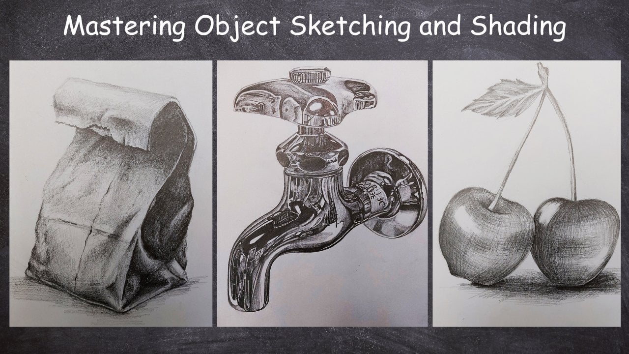
2. Introducing the tools and shading principles: Hello, everyone, and welcome to a new chapter of sketching
and drawing tutorial with me. In this chapter, we are going to learn how we can create
different textures. It means that I'm
going to let you know how you can create
each of texture. For example, objects like
text textures like fabric, metallic, blurry, and
so many other things. But before all of this, I want to tell you
that what tools you need for this
chapter of texturizing. Tools that we need
are very limited. I just need a normal pencil
sketching B six pencil, and ted eraser, and that's all. That's all the
tools that you need for this chapter
and nothing more. Let's move on together and
work on the first chapter, which is actually
one of the bases of the texturizing and
texture creating. First of all, I create
a circle and now Okay. Altogether, we want
to do the shading for this circle in a way
that from one side, the light is shining
on this object, and one side of my object is totally in the shadows
and it would be shaded. So if my source of light
would be placed on here, and it would actually just
shine on this normal object. It's just a solid object. It's not fabric or
it's not metallic. It can be something
like pottery or wood. So if that would be
my light source, this would be my
darkest area and would be the shadow shaded area. First of all, I want to
start with my normal pencil. I mean, my HB pencil. And then with the use of that, I start shading here, I start from the edges
and sides, very slowly. With a very steel and
normal hand pressure. I'll try to shade. In this step, it's very important that your hand
pressure would be stable. In each part, you
do not increase or decrease your hand pressure
because if you do that, it actually disrupts
the shade and the work. It means that your shade would
not be cohesive anymore. Try to keep your
hand pressure stable and the same amount. Then at last, as I told you, you start with a light pencil, which can be your normal pencil and you'll start with that. The hand pressure is still
as stable and the same. I have complete control on my
hand and my hand pressure. I'm being very careful that
in the middle of my work, I do not just increase or decrease my hand
pressure suddenly. I would not do that.
Just as you can see. I'm just giving a
whole shade and a background color
to all of my work. It's a light one. Giving a light background
color light shade to all of my work. Just like that. I'll just continue. All the way through
here. As you can see, I've got a very cohesive
shade over here. Again, I emphasize that it's texture is something like clay, pottery, wood or something that doesn't have any special
texture or reflection. Then I shade from the
edges of my work and then basically I'm fading the line that was
creating my circle. I'll fading it with shading it. I do not want to leave any specific lines in
my work, not at all. That's why I am fading the framework
with shading, of course. Sounds like some kind of
song fading with shading. That's what we want to do
exactly what we want to do. Consequat shades in different
directions would be made. Just be very careful,
my dear friends. Pay a lot of attention. That all the shadings that I've created up to now were not
in only one direction. I am creating all of my shading in all
different directions. Therefore, the trace of my pencil would not
be left on my work. Okay. Okay. And the whole colors and shades would blend
into each other as one. And then, very slowly, I start from the
darkness of my work now, and I'll increase the
darkness and I bring it out. Obviously, as I move on
to the lighter area, I decrease my hand pressure
and decrease my shades, but I try to get this
area, very dark. Just like that, I
come all the way up, and then I go all the way down. The important thing is to find the placement
of your shade. See, I apply to darkness. I have a strong hand pressure, and then very slowly, I move up and I decrease my hand
pressure little by little. I do not just drop
the hand pressure to create any borders in between my different
parts of shadings. I do not want that.
I do not want any specific lines or borders
in the middle of my work. That happens when you suddenly
change your hand pressure, decreasing or increasing
it both ways. I work from the edges and the sides of my work and I move toward the center of
my work and I fade it. One of the most important
basics of t is actually this. It might be a little
difficult for you when you want to apply
it yourself on your work. But don't worry. With a lot of practices. It would be so easy for you and you'll just
get a hand of it. I'd be so comfortable with it
just with enough practice. That's how I continue
it up to this area. See, my dear friends, I'm still working
with my HB pencil. I haven't brought my sketching
pencil into my work yet. Okay. So it's all a
normal HB pencil. That's it. As you can see, I'm
keeping my pencil a bit more horizontally
so I can use the side of my pencil tip in order to create
these shades over here. Just to create some
of the shades. Just like that. And then as I move
toward the light, I decrease my hand pressure. So that my shadings would actually get faded in the light. See? That's exactly
what I'm talking about. If there's any extra
lines around my work, I fix it, so don't worry. And then I'll continue
the rest of my work. Now, little by little, I want to add some more
darkness into my work. That's why I'm going to add some more layers of
shades on some parts. Now, I'm adding another
layer over here, but at the same time, I'm
increasing my hand pressure. I have more hand pressure in order to bring more
darkness into the work. Just like that. Okay. And then again, I'll continue the darkness until the center of firework
and then I'll fade it. Just like that. I'll continue And from here, from these parts. I bring a slight
darkness into my work. And then in the light area. I would also bring some color, not too much, but it
needs a bit color. So, just like this. In this stage that
we've actually applied all of our HB
pencil on our work, we switch to our B six pencil, and then with our B
six pencil, again, we'll start applying the
last darkness of our work, the last touch ups because we've actually we used all of our HP, we've got all that
we could out of it. Now we switch to this
one and as you can see, I am bringing the darkness
and as I get to the middle, As I get to the light, I easily fade it. All right. Here we go. Okay. I've got a very
strong darkness here. I've got an absolute darkness. Pallet one tonality one. So it would look like
this. Here we go. Now, all the way up, I should sketch it and shade it and I'll do the same thing
for the bottom as well. S. That's it. So as you can see, I'm framewing my work again. I'm making it cleaner,
but be careful. I'm doing it with shading. So be careful not to create any specific
lines or borders, even if you want to
renew your frameworking. Now, from the bottom
of our work from the bottom of my work with
1 millimeter distance, I create another shade
and I'll continue it as the shadow of my circle. It gets really dark
from the beginning. But as I come out, I faded into lighter colors. This would be the
shadow of this object. Just like that. It's very easy. So don't worry too
much about it. Be careful about the shape of your shadow and the
length of your shadow. I mean, better to say
the size of your shadow. It should be relatable to your object, so
don't forget it. And then I finish the end of my shadow
in 11 or 12 tonality. Color Palette. That's it. Here we go. I'm just completing
some more details here. But the whole thing
is almost done. Okay. Then again, I switch
to my HB pencil. And I work on the lighter
shades of the shadow. Just making them, you
know, so and smoother. Here we go. See how easy it is, you just have to practice
over and over again, pay attention to the courses. And you'll definitely can get it as easy as I
did. Don't worry. It's a simple thing, it's okay, even if you don't get it very well for the first
time or the second time. Maybe applying it would be a little bit challenging for you, especially if you're a beginner, but don't worry about it. It's only about practice. The only thing that can be
challenging for students is that while applying
these shades, they have trouble controlling
their hand pressure. But obviously, if
you practice enough and practice more effective, you can get it in a perfect
way that you see right now. I hope you've enjoyed
this episode, and let's follow
in the next one. Okay.
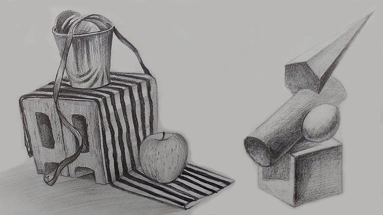
3. An important rule in shading objects: Hello, and welcome
to a new episode of texturizing and sketching
with me. All right. This time, I want to tell you the rules and principles that you have to know for creating the objects
and their textures. For example, over here, I just create a que
a normal queue. If you just create
a square cube. Also from here. That goes a long way. It doesn't matter
if you can create any other shape that
you like as well, but I'm just going to show
it to you on this cube, so you'd understand
some parts easier. Then I bring my lines down and then parallel
to my top lines. I connect these lines together
the lines on the bottom. Okay. Here it goes. Now, this is my cube here. And I just want to
create a line over here and another one right in
front of it across from it. And as you can see, I'm turning it into a cylinder. And then this would be the
ending part of my cylinder. Then I erase all the
extra lines from my work, just leaving the main
shapes over here. Then I start shading. Now, this primary sketch of your work should
be very lightly. Again, I say if I'm doing
it darker here right now, it's only because I want it
to be more visible for you. My light source would
be on top of my object, the top surfaces of my
objects would be light. One surface, and one
side would be the light. Of my work and this
side and the other side next to it would be
comparing to the top side. This side that I'm
shading right now, it's not too dark and
it's not too light. So it's something in the
middle and I'm using my sketching pencil in
order to shade this area. As you can see,
cohesively at first. Then again, I say,
very cohesively. I do it in all directions. I'll have this
cohesive shade here. Now, my dear friends. Something that is one of the most important rules in
our shading is that we so' have any specific
lines left in our work and we shouldn't have any
trace of pencil in our work. So the contrast between
our shadings just solely can separate our surfaces and our parts from each other. So we do not need
specific lines and borders in order to separate
parts of our sketch at all. We don't need it. No way. So you should just
practice it over and over again to remove these border airlines
from your work and just try to show the difference with the contrast
of your shading. Otherwise, your works
would look not real. They wouldn't look real, and they wouldn't look good. Okay. I'll continue a
very cohesive shade and fading the edges lines. Then I'm going to use a
bit of my B six pencil, especially for the side edges. Just like this. Here it goes. All the way. And start from the slower part. Continue. Now, the top surface
should also get shaded, but the shade that I'm using
here is just, very light. It wouldn't be white. In order not to leave it white, I just shaded, but
I did it lightly. Because this side is directly
under the light source. It should be really light. And as much as you keep your pencil in your hand
near to the end of it, your shadings would be lighter. You see? As you can see, I still have some lines on the edges of my light
surface especially. But later, I'll tell you how you can fade them so your
work would not get lost in the background and
still be separated from it without any specific lines. Now, I'm going to shape
this side as well. So Okay. Now. This way, I
just move it up. Then on the side
part on this edge, I'll do the same thing, and with the darkness, I try to fade this line and
bring it toward the light. I'm doing it with
the shading here. Okay. Then I consider darker shades for my work. There it is. Now, I switch
to my B six pencil, and with that, I try to apply
more darkness into my work. Let me just sharpen
my pencil enough. See? For example,
from these parts very slowly, I start shading. And on the edges and on the
corners, it would be darker. But as I move toward the center
of my side and my square, I try to create
lighter shades there. From here I come down and also from this edge,
I start shading. And this part would be the
climax of my darkness. I mean, this is the darkest
part in my work because the cylinder is also attaching
the cube in this area. Therefore, there is a
shadow of the cylinder on this side and on
this part of my cube. So That's why it's
the darkest part. And again, for making my shades
even softer and smoother. With my HB pencil, I cover all the shades that I've just already created, you know. This blends my colors together and overall make them
more soft and smooth. A.
4. Completing the important rule in shading objects: Now. Let's move to the next part and for shading this cylinder, I start from this
circle surface of it, which would basically be the
bottom or the top of it. I start from the circle. Then, very slowly. I keep the light in my work, but at the same time, I'm adding some more shades into it. See, my dear friends. For shading, I do not work with my B six pencil
right from the beginning. First, I use my normal
pencil as much as I can, and I get the shadings out of
it again, as much as I can. And then I need a
stronger darkness. I use my B six or B eight pencil or whatever
number that you use. I mean, I switch to
a darker pencil. For example, right now, I move to my B six pencil
and right from here, I start dragging the darkness, I start creating it into
my work and then dragging it toward the lighter side. So here we go. Okay. This area would be
my works light. This side would be lighter. Then I use my normal
pencil in order to create a very light shade and a very light background
for all of my work. Again, I emphasize on
the fact that even on the lighter area of this model, you shouldn't just
leave it white. You should shade it,
but it so light, so it's almost white. So very slowly. From here, I start applying the
darkness into my work. And I bring it to this side. I try to fade it. And this side, I mean, the right side is definitely
darker because it's going to the bottom and it's connecting the surface
at the same time. So this side of my cylinder
would be definitely. That's what I'm showing
here right now. Okay. Again, I switch to my
sketching pencil and I use it to apply even
more darkness over here. But I'm also using layers of shadings on top of each other to increase my darkness here. Okay. Here it goes. I'll just continue. And I move on. Now. This was the shading
of my cylinder. Now, let's start creating the shadows of these two
objects on the surface. See, this surface is very dark. Therefore, the shadow
of it which is placed on the surface be
definitely more darker. This itself is dark. But this area, which is basically
the shadow of this side on the floor or on the surface would be the absolute darkness. This would be the shadow
of my cube here. Okay. And the shadow of the cylinder
is exactly the same way. And this shadow should be
in the same direction. For example, my cylinder shadow cannot just come down from here. The direction of the
shadows should be exactly the same because we have
only one light source. So the direction of the shadows should be the same.
I start from here. Again, there's just an
absolute darkness here. It's just thicker in the beginning as it moves
toward the end of the cylinder, it would be thinner and also as it comes a bit
outer from my work, it would get lighter. Just like this that you're
watching now. Okay. Now, let's switch to the normal pencil and
create the shades and cover the shades which
I've already created with my BSc pencil in order to soften them and do not
leave them rough shades. This covering the
shades one more with a normal pencil would
make your shades and shadows whatever you're
doing softer and smooer which is good for you because you're creating
different textures, and at the same time, you
don't want to leave any lines. Now, as I mentioned lines, for this area in order to
create a background for my work and also fade
the lines of my cube. I bring some shadings out of these lines toward
the background of the work. And I try to just spread the shadings
toward the background. These are the lines
that I told you how you should fade, you see? This is a light area, I cannot do much about it, but I can actually
fade them toward the background with
my shading again. Because as I told you, the contrasts are the
things that should separate your work and each part of
your work from the other one. Here it goes. And now. You can actually hatch it here. Or you can do it more cohesively
like our previous work. It depends on you.
The background is not that important how kind of shaving you want to do for it or the method it's on you. Just be careful that you
fade your objects into it so you can show they're part of them and they
are separated from them. Very easily and very softly, we could create our main shades. If you general
look at your work, you can see no
specific lines there, as I said, just the contrast of the colors would actually
separate the different parts. So here it is. Also.
At the same time, you can see the
difference between the surface of the cylinder
and the side of the cube. Again, with a contrast,
they are separated. This is one of the most
important principles in our shading, I hope you've enjoyed it, and you can use it as much.
5. Primary sketch of fabric : Hello, and welcome to a new episode of
texturizing course with me. Now in this part, we are going to learn how we can sketch and shade
the Textro fabrics. First of all, I'm going to
create the primary sketch for our model and you can start like me and
working on your tot first. Before everything,
and first of all, I want to have a rectangle
que So I created. Silly, huh? Okay. Just like that. So I come down. And my dear friends, your edit and your primary
sketch should be very light. And also from this
side, I come down. And I create the other lines
parallel to my first one. They should be parallel. And also I create two parallel lines to the
ones that I have on the top. This way, I'd be just
creating my work. All right. Now, on this surface
and on this side, we want to place a circular
shape a globe maybe. And I just place it
on my rectangle cube. Now, on the surface
of this cube, there is a fabric. That's why I'm going to
sketch it like this. The fabric should
come down up to here. It has a wrinkle on it as well. And over here, I also have
kind of a folded shape. So here it goes. And it also went to this
lower part of here. It actually is dripping down. And there's another fold over
here or say a curved area. I also erase this line, so it wouldn't be visible here. And it wouldn't misguide
me during my work. So the rest of our
fabric would be here and also I can bring a part
of it down from here. Okay. Then over here again, I have another fold, another curve and wrinkle. All of them exist
in fabric texture. So it's better to create
them and then you can clearly texturize
it with your shading. All right. So just like that. This is behind my fabric. It's actually the
back of the fabric. Over here, I have another part coming
down and hanging down. Okay. I also raise this
upper line as well. From here, I move on and I create the
wrinkles for this part. Just like that. All right. Now, I move on to create the next
part of my work. I bring down apart from here. Another one starts from
here and comes down. My fabric will be turned over. Here it goes. Again, I
erase the extra lines, so my sketch and my main drawing would
show itself better. I would also need a part
of fabric in this area. I have it over
here. Here it goes. All right, my dear friends, the primary and
the primary sketch of your work is very important. So make sure that
you work on it well, and it should be
very light as well. If I'm doing it a bit here, it's just because I want you to see it and it would be
visible for you in the video. Otherwise, you should
make them light.
6. Start shading fabric: All right. So I start from
the top from the top of my circle and then I'm shading
circular area as well, exactly like what I told
you in the previous part. So this time, I start working from the
light toward the shade. These parts should be
lighter because it's, you know, my light area. I apply the light
shade, obviously. Then from the slower part, from the bottom part, I
make it a bit darker. And then I'll continue
that all the way up, and I'll just continue
this process. I'm increasing my hand
pressure little by little. And at the same time, I'm fading it into
the lighter areas. So exactly like the episode of the circle that we
worked on it before, the wooden or clay
circle object. Okay. We move on together
like this all the way up to these
parts, like that. Now, in the next step, I get my sketching pencil, and then with that, I start shading and working
on the darker parts. Then from the dark
part of our work, I apply my shades. I bring it into my work. And then I just fade into
the light part of my work. Very slowly and very
Patiently I'm doing this. You should not rush at all when you want to work on
your shades and create them. Do not do that at all. Just take your time with
them and be patient and do it slowly so you can
get the most out of it. Even if I'm doing it a
little bit faster right now, it's because I just
want to teach you more in this limited
time that I have. But anyways, you should really take your time
even more than this. Okay. Now I want to move
on to the next part, which would be the surface
underneath my circle. My circle would definitely have a very dark shadow
underneath it, so that's why I'm going to
shade this area totally dark. It would be really dark. This is an absolute
darkness shade and it's basically a shadow. Therefore, I'm using
the same amount of darkness in order to create
this absolute darkness here. I'm just doing it over and over again to make
sure it is dark enough. Okay. Now, let's move on and
work on shading the fabric. Again, I work with
my normal pencil, and I start from this
part of my fabric. And with a very stable hand
pressure, I start shading. Then little by
little, very slowly. You should control
your hand pressure. So there won't be any unwanted spots or
borders in your work. So just like that, I'll continue And then after I finished the first layer
in the second layer, I search shading in the
opposite direction that I was doing just before. And then in this area, I should darken this area
in between the sides. Therefore, the ups and downs on the fabric would
actually show perfectly. That's the thing that
we want. Here it goes. And as you can see, I'm considering a very
strong darkness for here. And then, obviously, I faded toward the lighter
surroundings of it. Then again, from here, I want to play some
darkness into my work. I just make the shadings
to be more cohesive. The fabric behind here, you see? Because this part of the fabric is on top
of this other one. Definitely, it will make a shadow for this part
which is behind it. So I'm basically creating this darkness in this
shadow with my shadings. One part is in
front of the other. The one which is in
behind gets darker. Is so the same for these folded
areas or wrinkled areas. Just by shading, we can
show them which part is more in front and which
part is more in the back. Which is really important
for your volume. Now I'm going to
use my ted eraser to create the
needed lights here, and then I'll start shading. Then for the next part, there is another fabric
over here as well. So with a normal pencil, I apply a light shade. And another one
right next to it. And then with my B six pencil, I can bring more
darkness into my work. And then from here, which is
the bottom part of my work, the part which is underneath, I would have more darkness, which I bring into my work. As you can see it also has
a softness in it, you know, when I'm shading and
while I am shading, my shades are not
getting really rough. They're more soft and
smooth because I'm going to just show
the fabric texture. Then I use my to
lighten this part. And then I consider it for here. Then I make the shadings for here better
and more in order. And then I bring
all the lines down. So from here behind this
fabric that has came down, I should bring a
darkness on this light. So I'm using my normal
pencil in order to create this darkness on
this light. Okay. And then I apply even
more darkness for here. I also bring a very light
shade for this area. It shod be really light. Don't work on it too much. And now, I want to move
on to this other side. And on this other side, I'm starting with
my lighter pencil, and I'm starting right
here in the middle and I try to shade this
way in this direction. And I come all the way down
toward the bottom of my work. And then I do it one more time in the opposite direction in order to fill all
the whites spots. Just like that. It would go on. And then I fade this
area completely. Okay. Something that I
need here now is darkness. Therefore, I switch to my B six pencil and I get into here, and I start applying
the darkness. Then again, I switch
to my normal pencil. I cover the shade
which I've just had with my B six
pencil in order to blend it to the rest
of the work and also making it
softer and smoother. Also can apply
some more darkness over here, that's normal. I'll do it as well. There is kind of a wrinkled area here. Okay. And then the next part. I mean, the border lines or the difference between the colors would be
totally blended. Then I get the eraser
and then very slowly, from the side, I create
this very fine light line. Also in these parts, I just go over them to make
it one degree lighter. Now let's continue
in the next part.
7. Completion of shading the fabric: Okay. Hello again. Welcome to the rest of the
Sutoria with me. All right. Let's continue together. Now in the next step, We should work on this
lower part of our fabric, and I'm going to use
my P six pencil. And I'm going to start
the darkness from here. Because this area
has gone actually underneath and beneath
the other parts, therefore, it's kind of
an absolute darkness and it's right next to the line. And then little by little, as I come toward outside,
I try to fade it. Okay. I'll do the
same exact thing for this part which
has been folded. Now I come to my normal pencil
and with my normal pencil, I move over these parts
which I've got dark shades. I cover these shades and again, I move toward the
light of this area. Therefore, it would be faded and the colors would
actually blend together, so there won't be any
specific borders. Okay. You see, very slowly, I create a very soft and
smooth shape into my work. Just like that. Okay. Okay. Then from here, I create
a light shade upwards. And then again, from this part of this
piece of the fabric, I should apply darkness? Because this part is
more in the back, it so be definitely. That's what I'm doing here. Okay. And then I create a very
cohesive shade with my HB pencil as you can see just to give it
a good background color. And then I come down to
these parts, even here. Okay. Okay. Then after that again, after my B six pencil, I switch to my HB again, and I work on these parts again. So it will get some
kind of a velvet shape, velvet and the fabric texture
can actually show itself. Okay. And then I start shading these parts. Then the shades which
I've created here, you just have to do them the
same way in the same place. From each wrinkle that
has been created here, there would be one darkness underneath and a
light shade above it. Then I also bring the
darkness to here. All right. Okay. Then I come down to this
ending part of the fabric. Then also, I should apply
more darkness over here. Again, the parts
which are underneath the other parts or behind them should
definitely be darker, so don't worry about creating them and don't be scared
of applying your darkness. Also, this part of the
fabric should be shaded to Then I again work on this back
part of the fabric. Again, I have a wrinkle
here and it has a part curved in
and deeper part, so it would be darker and its surroundings
would be lighter. I also shave this
area behind here. Then from here, I
come all the way up and fill this area within. Then I'll use my B six pencil. I bring it into my
work a bit more. I bring more darkness
into my work basically with my B six pencil. I'm actually applying the
last touch ups of my work, the last darkness
which I need here. Okay. Then I move to my a
eraser and with that, I tried to add some
more lights to my work. And like this. Okay, now I want to create a background for my
work with my HB pencil, so I just consider
some shape like this. And then, cohesively, I start shading with a stable and pressure.
Don't forget that. I start from here
behind my fabric. Okay. Then I continue this
shading even in here. Okay. Okay. Then on this side, on the left side, I'll
do the exact same thing. The same cohesive shade with
a stable hand pressure. And then I'll go in the
opposite direction as well, just to fill up some more parts. So here it goes. I just continue this way to
fill out the background. Now, with the same pencil, I try to work a bit of shadow underneath the fabrics toward the surface, you see? I'm just trying to show that
the shadow of my object, the shadow of my fabric is placed on the ground or
whatever the surface it is. I should not forget
about the shadow of this rectangle cube right
underneath my fabric. But even if you look
at it right now, the textures are
pretty much obvious, then I just give it more
darkness with my B six, and I switch to my
normal pencil again. I'll do the same thing a
little for here on this side. I create a bit darkness
on the surface. I create the shadow basically. Now again, I'm going to use my editor eraser to do
some last chart chops, and in order to do that, I'm actually creating
the sharp lights which I have in my work. Even if you think that some
of your darkness needs some more editing,
you should do them, so don't be afraid to edit
your work at any time, especially at the end when
your work is almost done. Okay. Let's work on the
circle a bit too and make its shadings
more cohesive. Just as easy as
that. Here we are. We're finished with shading
and texturing the fabric, and let's continue in the next episode
with more textures.
8. Primary sketch of glass texture: Hello, and welcome
to a new episode of this texturizing and
sketching tutorial with me. This time, we are going
to see how we can texturize a glass and
how we can shade it. First of all, I'm going to
create a primary sketch for it and we are going to create
a wine glass together. First of all, we are going to create a very general
shape for our wine glass. First, I just sketch
it like this. First of all, I create a circle. And then from this site, I bring a line here. I take it up and also do the
same thing from this site. All the way up. Okay. So here it goes. Now, I want to create the
bottom part of the wine glass. So it should be like this. Here we go. And it should be the same
way from this direction. They should be toy, totally. Sorry, symmetrical. And then I bring
it down straight. I bring all the way down. So be careful that your work should be
totally symmetrical, and it should also be straight. Then from here would be the ending part of the wine glass and the
bottom part of it. Okay. Here it goes. It should also look
like a circle here too. It's more like a rounded shape, not much of a circle. It actually it's
closer to an oval. Now, we want to complete
the top of our wine glass. So this is how I do it. It's like a very
stretched oval on top to connect the
two lines together. Here we go. And There's also something like a wine or water
in this wine glass. So I just erase all
the extra lines from my work from my primary sketch so I can start the shading. This is good for for finishing our primary sketch
and beginning our shading. I
9. Shading of glass texture: Okay. Now, I start from the top
part of the wine glass, which is mostly the glass, and something that you should consider is that in
the glass texture, we have strong,
strong contrasts. So I start shading cohesively. And as I was saying,
In some parts, you can even see a darkest tonality of color
next to the lightest one. We've got some really
strong and sharp contrasts in the glass texture. This is actually what makes it look shiny and translucent. Then I get a paper tissue. You can also use something
else, whatever you like. But I'm actually fading this
area with my paper tissue. The glass is a very soft
and smooth texture. Therefore, it should
be created like that. Now, from some parts, I should bring some
more darker shades. Just as it is. Very linar in a liner shape. Now, the amount of fading in this area based on the other
parts is, you know, less. I mean, the amount of
fading for the darkness and the lights because I told you we should have sharp contrasts. Okay. And then also, I would
darken this area even more. Okay. Just like that. Now I'm going to use my adder in order to apply
the lights into my work. As I told you, even the lights
so be created very sharp. See? Just that in here in this area. And here we go. I'll do the same
thing over here, creating strong lights there. Okay. Then I'm going to use
my normal pencil, and then I start applying some darkness
next to the lights that I've just created so that the lighter areas can
show themselves better. When you place a dark
line next to a light one, the light one would actually pop out more and it
would show itself. That's why I'm doing it here. As much as we want the
contrast to be sharp, we should pay attention
to the fact that we should create them beautifully and in their own placement, so. Here it goes. And also from here,
it would be the same. Now, in some parts, I give more darkness to my work. Just like that. And the same way that
you can see right now, the process is
basically the same. Now I move on to the next part, which is the water or the wine or whatever liquid
it is in this glass. I just apply it lineary the
texture of the glass is the only texture that creating specific lines in it and
not only is not a problem, but also it's very okay and
it's a part of the texture. So if you pay attention,
you can actually And clearly see these lines. Again, I say, because we need a strong and sharp
contrast here, we should also show the borders to help
with the contrast in. This is one of the
exceptional textures that if you use the specific lines
in it, that's very okay. Now, I come down a little
and from these parts, I start shading again and Each one of the reflections that I
can see in my glass, I should create it. You know. And in order to
create the glass texture, you can also use a live
model because, you know, then the understanding
of the fact that it has sharp contrasts and creating it would be easier and
much better for you. Okay. Then I create this reflection over here inside of the glass. Here it is. So just like that. I easily work in here. Okay. Here we go. So I just shaded
beautifully and easily. And you see, up to
this step of my work, I'm just using my normal
pencil and I haven't got my B six pencil
into my work yet. So no problems there. And also from here, I bring some darkness
into my work. Okay. And I have it here. And from here also. I bring the darkness into
my work. Again, I say. Here it goes. Then there are some
lights for these parts, which I'm going to
create for you. Okay. Now I switch to my B six pencil, and with my B six pencil, I start applying the very
strong darkness in my work. So I can show the reflection
in my work beautifully. So I come all the way up. And then from here, I create the reflection of the glass one
by one in my work. S one by one. Creating all the reflections. You see, my dear friends, the reflections can be in any
way that you can see them. So you should place them in your work the
way you see them. Now. In order to work the
glass texture better, I actually advise
you that you create your glass texture based
on a live model as well. I mean, for example, you just put something
glass in front of you. I put something with the texture of glass
in front of you, look at it and create each one of the reflections that
you can see in your work. So here it is. That's how it's done. And then I get to the
bottom of my work. Okay. Then again, I switch
to my normal pencil. Then very slowly. I work on here. Then I also create
the dark reflections, which are also
lineary and straight. But I'll create all of them. Now, with my psi
pencil for some parts, I apply even darkness. Here it goes. And also from here, I'll do the same thing. I come all the way down with my dark straight lines as the
reflections of the glass. You see, it's
already looking shy. I also erase the extra lines, and I erase the
parts which I have strong lights there to
make my work better. Then I also apply these
shadings for this lower area. Okay. So just like that. Easily. Take it really easy. Also from these parts, I'll be doing the same. Then I'll create the
reflections one by one, the same way that I see them. I again, say I can just keep that glassy
shape of my work. It would be shiny, translucent. That's how it is done, as you can clearly
see in my work. Okay. Now with my simple pencil, with my normal pencil. I start covering these shapes, which I've used my B
six pencil on them. All right. Doing it, basically, the rest of the process
is the same as this one. You just have to pay more
attention to the details in order to get a better shape
and a better result at last. I mean that you can even
finish your work here. But if you pay more
to the details, if you pay more attention to the details, that
would be better. This would be the background
of my wine glass. So here it is. Then I'm going to
use my a durtor in order to create some
strong lights here. Sharp lights. In between my dark spots and
my dark areas, of. Yes. Okay. Here it goes. I move up and work on here. Again, I increase the light and the intensity of light in my work for the last
touch ups here. Just as easy as that, we actually were able to create the glass texture with some
nice liquid inside of it. I hope you've enjoyed
this tutorial as much as the others see you
in the next part. Okay.
10. Primary sketch of the metal can: Hello again, and welcome
to a new episode of the sketching and
texturizing tutorial with me. In this episode, we are going
to work on metal texture. Well, in order to do that, I've considered a coca. Can co can. It's very interesting. It's a bit complex, but it's very sweet and
good for metal texture. Now, for these kind of complex models that your
primary sketch might be a little time consuming
and a bit challenging, you can just copy your
model on your paper. You just print a picture, then. Then you blacken behind of your model with
your sketching pencil. You darken the all
parts behind it, and then you should fixate your paper or your model on your paper. So
it wouldn't move. Then when I move on it
with a pencil or a pen, it would leave tracers for me on my paper and my primary
sketch will be copied. With a very light pencil
or with pens which do not have any
ink or any color, I start moving on the
main lines of my sketch. That if I were used to
create it manually, I would have done
these parts as well. So I'm just moving
on my main lines to copy my primary
sketch on my own paper. Very easily. You can get the main and primary sketch of your work in a
very shorter time. This is very time saving, and as I said before, it's better for a bit more
complex or challenging shapes. I'm doing it right now in order to save some time for you. Here we have a soda can, a coca cola can, we are going to
shade it and show the metal texture that is
integrated in the can. Then we can move on to create
the details of our work. Even the writings on the? I think can be considered as some main lines
and main parts. Here it is. That's it. Okay. Then I try to even
create the details of my work. So my work would
be totally easier. Try to make it more precise. And you know, you can
use this method in order to create any different
kind of primary sketches. As I told you before, when it's complex or
you want to save time. And you're in a hurry. Sometimes it happens that someone hasn't even
hasn't even passed the sketching courses and they cannot draw anything like this or they cannot
sketch very well. It doesn't matter
in this method, you can just get
your primary sketch, and then the rest
would be your shading, which can develop your work. Okay. Okay. I work on every detail of my can right now because
I've got the main lines, and now it's time to go over some details and make
them more visible. When I'm working with it, my primary sketch would
be almost complete, again, that can make my
work go faster and easier. So it goes. Okay. Okay. All right. Let's take a look at
the copied sketch, so I can see have I missed any parts or is
it totally transferred. Now that I've looked at it, I see that I should go over this part one
more time, you see? Now, it's totally
copied in my work. So I could actually
copy the whole model on my paper so easily
without any difficulties. All right. Then I
take off my model. I put it next to me so I can always keep an eye on
it like right here, and then I can start
my shading. Okay.
11. Start shading the metal can: I am personally very excited in order to create this model. It's because I like
coca cola honestly, and at the same time, it's a nice model to show the
metal texture with it. First of all, I start with
my normal and simple pencil. I start from the top of my
work and I start shading. Just be careful. The tip of your pencil should be
definitely sharp because detailing in this model is very much and you need a sharp tip for your pencil in
order to create those details in
the right placement and in the right order. Here it goes. I start from the corners and wherever I see the
darkness or the light. I would move on the work. Then I also continue from here. And I get to these parts. And I work on it. The way I see it, I am actually shading as much as I can see. Okay. I also apply the
darkness for this area. And as you can see, I'm also creating some soft
and smooth shades on my work. Well, basically,
texturizing metal is very, very similar to
texturizing a glass. I mean, the texture of the metal is also made by strong and sharp contrasts
next to each other, dark and light contrast
next to each other. But the only point is that
even the contrast between the dark and light colors over here is much more
comparing to the glass. Because when we were
working on the glass, we use even a paper tissue or shades to fade some
parts even a little bit. But when we are working
on a metal texture, this will happen much more less. I mean, we do not fade
any parts particularly. Therefore, the texture
of the glass and the metal would be much
similar to each other. They are so similar. We have a stronger and
contrast in the metal and we use less fading or sometimes
no fading in our colors. That's the thing that
actually makes it or unique. Now I make this part. Darker here it should be
darker because it's a hole. And I also shade
this area lightly. All right. Just like that. It's easy to do. Then again, I switch to
my normal pencil again, and I just give it a
very light shaving here. I just try to make
the curved parts. Oh. All right. As we continue all around here, we can see our shape
is being formed. Now, very slowly, I'm coming
to the body of my can, starting from the
top, but, you know, it's going to the body. So it would look like this. I just give it a
light shade here. I'll continue it down like
that. As you can see. Then in these parts, I'll do the rest of the shading. Okay. You see. You should just
work on this area totally dark, very
dark, obviously. But first, I apply my
darkness with this pencil. I just give it a background
color, something like that. Then for increasing
its darkness, I'm going to use my
sketching pencil. For now for the background and determining the placement
of the darkness in light, it's okay if you work
with your normal pencil. Actually, you should do that. Okay. But then later you
can change it. Okay. Okay. And I'm being really careful that not go into the parts
which are too light. So I continue and I'll bring
the light to the next part. Just like that. Okay. And now I move to work with my sketching
pencil and with that, I start applying
my darkness right from here on this side
and on this edge. But as you can see, I'm doing it very slowly. And just the way I move. And then very cohesively, I improve my darkness,
as you can see. Here we go. And then from here, from the side part, I bring also another shade
into my work. See my friends. Very can I in the lightest
part of the work, you can see just a
sudden darkness. That's how we are showing
our metal texture. That's one of its features. Then again, I switch
to my normal pencil, and I make this shade
a bit more softer. Okay. Because if you even
look it in the model, look in the model, it's a
bit faded here in this area, but not the other parts. Okay. Now, we want to
move on to the next part. And for the next part, again, with my normal pencil, I start applying
the basic shades, the primary background color, and then we can move on.
12. Continue shading the metal can: So I start from here that
my hand would not be dragged on my work because if I start from the right side, when I'm working
on the left side, my hand would be dragged on
the work and it might just cause unwanted shades and
spots and it would look dirty. So when you're working, pay attention to that as well. Start from the side,
which is easier for your hand and
further from it, and then you can move toward
the opposite side of it. Okay. So that's how it is? You can also place another paper underneath your hand that
would even make your work easier and you'd be more
comfortable and you'll be sure that there are no
unwanted dirtiness or spots on your work. As you can see in this area, I'm just placing the shades wherever I can see
in my model because we've got some letters over here as the
word of coca cola. You should be a bit careful
not to get inside of the letter and just shade around them and we
are frameworking here. Okay. And I shade all the parts which I can see the
dark as actually. Here we go. My dear friends, as much as you work on the
details of your work. You work would be more natural
and it would look better. That's what we are
aiming for here. Okay. Here it is. Again, I say, be very careful
that do not go into the white spots and
I mean, not yet. It's better not to do that. I'm using my basic pencil in some very special
parts over here that are darker than usual. Okay. So I work on the contrasts
and I'll change my work. Then when I finish one part, I can move on to the next part. Now, pay attention
to this as well. It's better if you
do your work and if you shade your
work part by part. Because if you just want to
do it whole at the same time, it will be harder for
you and you might miss some important
details in your work. The best thing to do is
what I'm doing right here. Move on your work part by part
first start shading part, adding the details,
adding the darkness, and keeping the lights, and then you can move
to the next part. This would be better and easier. Then very generally,
I start shading. My dear friends. And as you can see, I'm
placing my model next to me, so you can compare it
better and as I told you, it's better to keep
your model next to you so you can keep an
eye on it all the time and compare your
work to your model. This side is more prominent
so that will be lighter and the part that I'm shading
right now is behind it. Definitely, it would be darker. With my shading,
I'm also showing which parts are more
prominent and which are not. Uh huh. Okay. Okay. I get so lost in
working sometimes that it's hard for me to talk at the same time because
it's like I'm just moving with the flow of my work and sometimes
I just get lost in it. But I try to talk as much as I can to make it easier for you in order to create
your work as well. Okay. Here it goes. First over here, I just
give it a general shade, and then I work on
its details more. So in order to do that, I shod switch to my
P six pencil for applying the darkness
wherever I can see them. Okay. So wherever I feel like I need a stronger darkness, I apply it. Here we go. These parts
need more darkness. And some parts are even
absolute darkness. If you even pay
attention to your model, they are too dark, so. That's how I'm
trying to make them. And now I start applying the strong darkness
in my work even more. See, for example, here, I've got a darker spot. And from here, my
strong darkness starts. There is a very
sharp contrast here. It goes up, it comes
from here to this side. It goes down a bit. I'm not moving into the letters. I come down here in this area, we have a strong darkness. We're going to work on that. Okay, we move for
darkening this area. We are actually
darkening this area. As I told you, some parts
are totally dark and some parts are dark
but not as much. But they're not light either. Okay. Then from surroundings
of this part. I apply even more
darkness into my work. There we go. I'll just continue like that. And when I look at the center of my work,
it's a bit lighter. It's not as dark as the
edges in the sides. But it's still dark. Then again, I switch to my normal pencil and I cover
all of my shadings here. Even increasing the darkness in some parts and making
it a bit smoother. Here it is. And we can continue the rest of this tutorial
in the next part, so don't worry and follow us. Okay.
13. The end of the shading of the metal can: Hello again, and welcome to the last and complimentary
episode of this tutorial. Okay. Let's do the rest
of our work together. I start with my P six pencil. From here, I apply the
darkness in my work, all the shadings there. And here it goes. Well, we can clearly see
where everything is, where all the shades
are, and all the lights. And then slowly, I go down. I pay a lot of attention
to the details, and I try not to
lose any of them. And of course, as I
did on the other side, I consider the placement
of the letters, and preferably, I do
not go inside of them. As you can see, I'm shading
around them or inside I mean, inside the holes that are
created in between them. Okay. Here it is. And here we go. All right. I've covered
all of these parts here. But there's still
some more to go to. I even move a bit more further, and I start shading them too. And do not forget to sharpen
the tip of your pencil specifically for these parts because some of these
parts are very narrow, especially between the letters. So because we don't want to
go inside of the letters, it's important that
the tip of your pencil is sharp enough
so you can create very fine lines and
small parts of darkness. So that's how it's done. And then I even continue all
the way down to here. Okay. Just like that, I apply the darkness in my
work over here. And then I'll continue
that And then I also do not forget about these parts left
between the letters, as I told you before. Because we've got some
really dark spots there and shouldn't
forget about them. All right. Now we want to do the
rest of our work, we are going to continue
the darkness here. In between the letters, and I also continue this area. There is also a small darkness
over here, so we created. And then little by little, we are getting to finishing
this sketch as well. As you can see, we were able
to show the metal texture. Of our soda can. It's very important
that you learn how to create different
textures because when there is a more complete sketch where you want to
create a landscape, a view or anything, and you've got some objects
next to each other, you should be able
to differ from them with your shading
showing their textures. Then I get my
normal pencil again and I just shade very lightly on these areas and with
the same pencil, I make some parts even darker
comparing to other parts, the other parts of my work. Okay. Also in these parts, I'm going to do the same thing. You should do it as well. Okay. And I'll do the same for here. And then again, I
move around between the letters with my
simple and normal pencil. I mean, when I say
normal pencil, it's an H or an HB pencil. Just a reminder. Because I use this phrase a lot and
don't forget what I mean. Okay. Here we go. Okay. And in here. In this area, I should add
some more to the shades, increasing the darkness of here, but softly over here, I've got a light shade, even if you pay
attention to the model, you can easily see that. That's what I'm doing it here. There is a very light shade over here all the way
toward the left, which I'm going to
continue. Okay. I'll do it cohesively.
There it is. Okay, now I want to work on
the ending part of my work, the bottom part of the soda can. And over here as well. Just like this. Here it goes and we're almost
finished with this part. I just switched to my B six
pencil, the sketching pencil, creating this very
dark line over here, increasing the contrast
in the whole work. That would be it Then I clean around my
work using my eraser, just as easy as that, we were able to create the metal texture in
a beautiful sketch. I hope you've enjoyed
it, and you've used it. See you next time. Okay.
 Amelie Braun, Artist & Cartoonist