Transcripts
1. Introduction: Hi and welcome to the thrilling
and captivating world of pen and wash. As a beginner, mastering the Art of creating a loose yet accurate painting can feel overwhelming
and daunting. Where do you start? What techniques do you use? How do you bring your
vision to life on paper, in Pen and Wash Essentials, Old Car and Building Scene, you'll discover all the
essential processes and techniques that
you need to turn any photograph into a stunning and impressionistic
pen and wash painting. With my guidance, you'll
learn how to create a masterpiece that not only captures the
essence of the scene, but also showcases your
unique creative style. I'll demonstrate my entire
process in real time, from the initial drawing
and composition of the scene to the careful
layering of light and shadows, as well as the final addition
of details and highlights. Join me on this
exhilarating adventure into the world of watercolors. And you'll learn how to create awe-inspiring pen and wash scenes with ease and precision. Whether you're an
experienced artist or a curious beginner. This class will equip
you with the tools and techniques to unlock your
full creative potential. I'm excited to get started. So let's unleash your
inner artist together
2. Materials Required: What I'm using here is 100%
cotton, watercolor paper. It's in medium texture. So cold press slash
medium texture. And you can tell because
you run your finger across it and it's
kind of rough. Rough paper also works as well. I just prefer cold
press because you can still get in a lot of
details with ease. This is the best type of paper I recommend 499 per cent of beginner Watercolors out their environment big
sheets and tear them down. If you don't have this stuff, any other cotton
watercolor paper is fine. But just remember that
it's gonna be a little bit more harder to
layer colors over. The colors may not appear
more vibrant as well. It may lift off when you're
adding a second Wash. So this is, I think the most important material
that you can invest in. So here are some more materials. So I've got some brushes, and these are mainly mop
brushes, these three here. And the mop brushes
work great for getting in large
sections of paint. If you're talking
about the sky wash here, some of the grass, that sort of background
color of the grass, even the side of the car, roof, that kinda thing,
side of the building. These brushes can pick
up a lot of paint. They've got a large belly but still have a small
tip so you can cut around other
details. Very important. So make sure you
have a few of those. I also have myself a bunch
of these other brushes. These are detailing
brushes and for, I guess painting smaller things because these ones carry
too much water at times. So for painting the trees, but at the details
and tire, the Car, little speckles and bits
and pieces, the shadows. These brushes are fantastic. I've got a, a round brush and they're synthetic
runs, synthetic round brush. I've also got a synthetic
flat brush here, small sort of
synthetic fat brush. And here I've got a fan brush. And this allows me to get in smaller little blades of
grass and things like that. Even smaller trees out the back. Important to have some of
those brushes for detailing, but there are only
applicable right at the end. So let's go ahead and talk a bit about paints now for this scene, I'm using quite limited
number of paints really. I've got some gray
here on the House, and the gray is just a mixture
of the three primaries. If you've got a blue, a red, and a yellow mixed together, diluted down and you get a nice gray sky is
a cerulean blue. And I need to squeeze some
more out of my palette. But typical sky color, I use a little bit of
that on the cart as well. Tiny bit of turquoise to, and I'm using a kind
of an orangey color. This is a Quinacridone,
orange color. Quinacridone, burnt orange
color that I used to create the rusty color. And you can see here as well, got a little bit of brown
and the trees, the ground. I've got essentially a
couple of colors in here. I've got a bit of, I've got
a bit of this yellow ocher, and I've also got a
bit of buff titanium. And that color works really
well to get in a subdued, yellowy, sort of grassy area. And the green I'm using
is a green color, undersea green, you can just use any dark green you can even mix, you're in green with the
blue and a yellow together, just to pop that in their olive green hookers
green as well. But of white gouache. And
the gouache, as you can see, just create some final
highlights right at the end, which I used for the grass and a lot of bits of
area and the grass. But that's pretty
much it for materials
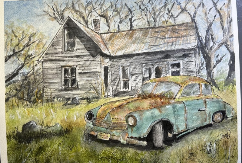
3. Drawing: So we've got quite a complex
looking scene over here. And we've got the
car in the front, in the lower right-hand
side of the frame, we've got the house round
the back and some trees. And essentially we also
want to separate the sky. And the easiest thing to do is separate
the sky, the earth. And I'm using a pencil first because this is gonna be making, making it a lot easier,
especially if you're a beginner and
learning how to draw. I think it's always best to just start off with the pencil first, just to outline
the main elements. So just separating out
the sky and the Earth. And if we look on the,
on the reference photo, you'll see that it's roughly about halfway through the scene. Okay. The bottom of the house
starts about here. And I'm not trying
to get this hundred percent perfect as well. Okay. Roughly about here. So I'm just making these
little guiding lines just to get indication of everything in before we actually
start with the pen work. We've also got the car
here and we can see it actually runs all the
way into the house. But I will put in a little
indication of just the house first and noticed I'm putting
in these little dots. The dots just serve to
create this little Guarding, guarding points for when I
draw in the actual full lines. They may change a little
bit later as well. Look just a bit of the roof. They're coming down like that. And what else do we have got
the side of the building as well here running down the page. This is kind of 3D, roof
coming out like that. Trying to separate all
these out into the shapes. Triangle, square,
rectangle on the bottom. But you can see the side
of the building here. There's actually a
door or something like that of their side. Okay. Something went that okay. Let's have a look here. Just going to put in
this side of the roof. There's actually a chimney
running over the top as well. Let me just connect
this up like that. Okay. Good, good. It doesn't have to be
the exact proportions. But I do find it
helps if you can keep it similar to the reference, but it doesn't have to
be perfect. There we go. We've got chimney here. This will be important later on down the track
when we get into pen work. To just make sure you've got a little bit more
detail in with the Pencil. Okay. I don't want to do all of it, but just a movie indications
here is a window. Now the window here
beneath like this. Just the frame of it. Not trying to detail too much. And the sides of the house, you can see it actually. You can see actually the
car just runs through it. I'll have to put in
more of the cars, the detail of the car later. That's really going to
be the trickiest bit. But for the time being,
we can actually work on this house all the way to the
side like this roof here. Um, it's kind of a
wonky looking roof because it's all dilapidated. But it's got a nice
rustic feel to it. Okay. That's where the roof
roughly ends here. And a lot of this stuff
we're going to be able to rub out anyway once the once we start getting
in the actual pen work. But this is this is it
house there in the back? Okay. See a bit of this
side of it to here. There. I liked that they are
these darker bits as well in the house you see these windows and stuff,
doorways and things. These are gonna be important to emphasize later on
and that again, they're not really apparent because they're
falling apart for one. You also don't want to
make them too detailed because in the background, maybe have it in another window. They can also be a little
bit wonky given that they house is essentially
falling apart. So that's another doorway or whatever on the
side like that. So we have some basics
in for the house now I think everything else we can work on with the
pen and stuff later. Let's work on this car. This is gonna be tricky. The top of the cars, just kinda this round like more fluid
shape coming across. Notice how I was
drawing that Car in a little bit as well
while I was doing the house because it actually
cuts in front of it, we don't have to get this
perfect first on the first go, but I just want to put in
some of the windows here. The front of the car. Just quick indication I have
to erase some of it later. Maybe sides of the chi you've got this shape
there for the windows. Maybe have it sought windows and some little details
there as well. This Windows for a
little bit large and you just reduce that down It's really hold the
Old Car and you can see like leaves and debris and things just gathered
up on that Car. Here's the hood. And we can put in some
little details of the car, the front of it like that. And just this bit
where it starts turning blue underneath
the windows, can see that just
this little blue, the blue section in
back of the car. So it just dips down like
this until the ground and this is where you get
the heirs of the wheels. More sharper looking here, there's a wheel in here. Just going to draw in
rough indication of that wheel like this. Like that. I mean, you've got
it's all just grass and things just growing
around the car anyway, so we don't need to
detail too much. But just the edge of that
car where it hits the grass. Just want to add in a bit more
little bit more in there. Okay. And I'm continue on and we'll
start putting in the door. You can see the door of this
car comes down like this. And then you've got
another section here where the second
part of the door also stops around here and
separates that Car there. We can just draw and I just
look at them as shapes. You can see just the shapes. Square. Another square that
the wheel is like this round is shaped like that. Here it's gonna be a
little bit trickier. But it's good that we've done
a bit of the work already on the front of the car, but it does need to be
extended out tiny bit more. Let me just put
that headlamp here. Headlight, Sorry,
another headlight here. Okay. Third of Pencil in
roughly where it is. And it's putting more of the front part of that card or joins together like this. And again, it's, this is probably not looking
exactly lot. The reference. We want it to resemble it. This front side of the
car just underneath. We've got this interesting
looking patterns like this diamond pattern here. Diamond shapes, diamond shape, and it comes down like that. It's kinda like the brand of the car or
something like that. They're adds a nice detail,
something different. Knew the headlamps,
headlights keeps going. Headlamps with the headlights. Can see here I've just
indicated the to another. These grills near the
front of the car with a radiator is like that because it's really big bumper
down the bottom as well with a number plate
sticking out. Do that just a moment. But I'll get in this bottom
part where the blue part of this car is just sort of carve out an area where the whether the front wheel can
live, something like that. Okay. Now I'm just going to
connect this up there. Okay. So we've got coming through.
It's coming through. I mean, this car is
really falling apart. You've got the bottom
part of it just starting to disconnect as well. There's lots of debris and
stuff here, but the wheel, I like how the wheel is turned, facing us, facing the viewer. Like that. Almost like
it was park there in a big hurry and the person
just left it. So weak. I think it looks kinda cool
this way, just a bit more. Tell us a bit of a
story, I suppose. So you've got the wheel turn
to the side, like that. It's all where the dark and
they're really, really dark. You've got grass and things, you've got stuff
underneath here. It's all just it's all just
dark under there anyhow. The tie of course. I'm just going to indicate
that tire a little bit more. And of course, when we going
with the pen work as well, we can redefine everything and make it look a bit
more detailed. Let's have a look
underneath this car. We've got this cool
little number plate. The Bumppo also runs
right next to this. We'll Qia rusty, rusty old bumper is gonna be
an interesting one to paint. You've got this part
of it here that just connects over really
large rusty bumper. It's almost disconnected
from the actual car itself. We can connect that up, make sense of it like this. Connected up with the
number plate as well here right in the center. Let me just draw that
on a bit better. Kinda like this. Whoops. Should probably be a bit further down, like they're Dot connecting up the
bumper as well here? Yeah. A and this part of
the bumper just connecting upwards onto
the frame of the vehicle? Like that? Yeah. Do you need to do
a bit more here with the slight make it more round. Little bit more roundness
in this light like this. And start putting in connecting it onto the actual
Car like that as well. Like that. I have to redefine it a little bit with the
pen work afterwards, but I do like this side there. This light is nice as well. It does have a, another
ring around it. If you can see like this
other less defined ring and it's darker as well. So we will just
darken it a touch. It's just filled with rust
and stuff around the light, but it helps bring out
the actual light itself. This one, I just
redo it quickly. This I think I can just do
this one a little better. Okay. Just get it to
stick out more sort of a bulbous look
to it like that, much better shape
and definition. Sometimes you need
to do these things. You don't get it
right the first time. Don't be afraid to go back
into it and correct it. Especially at this stage where we are only just getting in the little smaller details
in there is no issue at all. It's best to iron out some of these small details
before you get in the the pen work or the
painting afterwards because you can't really you can't
really change it afterwards. Okay. I think that's
looking pretty good. Still going to look
what else we can do. Enlarge this a bit, and extend this little
line that runs up the front of the
car up until here. That started to look
more three-dimensional. This may be better actually. Move, shifted to
the left like this. I'm just shifting
this this shape here, this little diamond shape
because they actually, the left side of this is
actually little shorter, little bit shorter than
the right-hand side. Right? Let's have a look.
What do we have here? So we've got this other part
of the front of the car. I'm going to move this shift that over like this as
well, connect that up. Okay, so we've got a car. Certainly go to Car in there. I think. I can probably
work the rest of his rest of this
easily with the pen. Tidy it up better. We've also got some trees. I love these trees
coming through. They just give the painting, the scene a lot more character. So why not just
putting some here? I'm going to make these, some of these trunks a
bit thicker as well. Okay. And I'm going to also
follow the rough guide of the reference photo
with the limbs of the trees and things like that. Like that. You can see that
tree coming down here. I also think maybe another one coming in from the
side could be nice. Change up that reference
a little bit like that. Little ones, little branches coming off on the
edges like this. What do we got as
well as a here, we can probably, I think
we could do another one. I can just get it to kinda connect with the
house a little bit as well. Like here. Things that would
be good because the house is going
to be all full of. It's gonna be more light on
the house, but this dark, darkness would have branches
and things that I'm doing. And paint drawing in here. It's going to help create
extra contrast in the sky. Okay, so, yeah, something last minute
thing I wanted to do, just leave this branch kind of heartbroken off or
something like that. Even behind the
house you can see these little branches all
coming out and I'm not going to draw them on
much because it's more just an indication that
they're there for afterwards. Remind myself when I'm
painting to leave them in, to draw them in or whatever, paint them in right at the end. Here's another tree coming
in from the left-hand side. And these ones look
like they have been stunted or just a lot of wind. Don't really see too many
trees around just a few trees. And the wind is blowing in
from the, from left to right. So they're growing in this direction like
this. I kinda like that. So just put that in
a little indication. Okay. I mean, there's all kinds
of stuff here as well. The grass and that. But we're ready to get
in the pen work now
4. Pen Drawing: Time to go in with some of
the pen work and I've got a 0.6 liner and a 0.8 liner. You can only if you want, you can just use
any line I like a 0.5 liner for this entire scene. But if you do have
a thicker liner, work on that for some of
the details in the front. So the lines, you want to
make them a little bit thicker in the front
than in the back. And that will help bring
forwards details in this Car. And for some reason I'm just
drawn to this car first. And I'm going to just hold that thought and start
working on this part. So you can see there,
we'll go round and start drawing in this side. And this is where that
Pencil work really is so handy because as you can see, I can really just
go over the top of that pencil work
and not worry at all about whether I'm in
the right spot or not. You've already done that
pre-work that allows you to have more confidence
in your drawing. I like that. I liked that the car
and everything in here, it's all pretty bad
it up and everything, which means that
complete accuracy, especially when you look at new cars or just cars and
to maintain on the road, they have a lot of symmetry
that have a lot of small details that
if you make errors, it's actually quite visible. But with the scene like this, where the car is kinda
dilapidated and it's been aged and there's
nature sort of grown in. Bits and pieces are falling off. So if there are elements
of asymmetry in here, it's really not a big
deal and make sense given the context of the scene and it's the same
thing as the house. So this makes it a little
bit easier for you. And let's do the front
of the car here, where we have it connecting
up to the side of the car. Like that. That's where this little
bumper is as well. So I'm going to just go in and
start with the light here. It's just getting
that light the way, the way you draw the light
as well as important to make it look like it's
facing to the left. So it's this oval shape
that I'm trying to get in. Again, helps to have that in pencil beforehand so
that you can have more confidence like with
what I'm doing here, going over the top and knowing that it's going to be in the roughly the right spot
when you go over it in Pen. More detail the scene, I think the more it pays to actually plan out
what you're doing. And he'll go, Here's
the bumper right here, nice little bumper underneath. I've already drawn this all in. So as you can see, it's much easier
for me to go over the top of it and figure
it out from there. We've just want to get
in the basic line work. There are some shadows and
softer things in there, but we want to use the
Watercolors to take advantage of all those softer areas
and where we've got sharper lines and bits and pieces like what
I'm drawing in here. This is where the
pen work really shines through and creates detail and contrast that pairs very well with the watercolors. Here is that it's this
old license plate here. Trying not to do it
too detailed as well. I don't even know
what to put in here. Just a few little maybe a few little indications
of some letters or something like that can't even really tell K. So let's start bringing
this part over, this part of the bumper. The other part of
the bumper here that then connects up with this top part of the car and the side
of the bumper there. Like that. Good. We'll is looking pretty
pretty decent already. I will go in with some
little details in a moment to just to get in some darkness around the
sides of the wheels, maybe inside the wheels as well. But I start, for example, picking up around
here These little bit to detail around the opening of where that wheel is. Okay? And let's just go in. I think the hardest thing is actually the front of the car. There's just so much
going on in here. And it's put in this diamond Shaped kind of logo
there as well. This there we go. We've placed it. And I'll just put in this detail of the front part of
the car here near the radiator is just
connecting it all up nicely. Underneath. There's actually
some little grills. And see these little grills that run just a horizontal grills. Just take a bit of
time there to draw them in straight underneath. You've got this like a
thicker connection here. And then the part of the
bottom part of the radiator. Whoops, that's not perfect, but you've got it in anyhow. Let's work a bit on that. And something here, I
don't know what this is. Some another shape like that. This light to the
left-hand side. Let's work computer
on this light. And I always spend a bit more time on the lights
because they indicate, again the direction of
where the car is facing. And so you do want
to take extra care, a little, little extra
care here, like that. K is that little darker spot
inside the light like that. Okay, good. Let's connect this
on the body of the car and work on
this side as well. There is a section that runs up, goes into the front light, just connects on all
sorts of the body. The car. That can
just follow this up. Now, he's put in this
section as well, running upwards into the section that joins up the windscreen, the two sides of the windscreen. There is all this debris
and stuff all over the car. I'm just thinking
how am I going to put the scene and we
can actually do that. I think anywhere we can do that with the Watercolors laid. I'd, I don't want to, I don't want to detail too
much with the pen work. Just have enough of the
structure of the car. That would be enough. Because surprisingly,
you'll find that you can detail a lot of these leaves and stuff
like that later on. And they'll just look
more organic and fit in. Whereas if you try
to draw too many, some more details with the pen and it becomes overwhelming. If you're not
careful, if you add in too much and then you miss the point of it and you've ended up with more
of a line drawing, then then a combination,
wine and Wash. It's finding that balance coming across to the back of the car
now just bringing it down, I'm focusing a lot
on this card is a central subject in this scene. And there's the wheel is, you just have a look at,
we'll kind of comes out. I'm gonna shifted a little
bit more towards the back. We just plan this out. A *****. Hey, maybe running down
in some way like this. I mean, this wheel
is just covered up with just covered up really with all the the shrubs
and things just running through this
section and it's not even too visible
in there as well. So I might just
leave it like that. And don't want too much
of a focus in that area, but I do want some
darkness under there to imply what's going on. Okay, let's work on the
top of the car now. And some first glance. I've made the roof a
little bit too high. So we can reduce that
roof down just a touch, but let's get in these windows. First. Side windows here it is, just start drawing
in this side there. Finished it off for this one actually runs all the
way towards the back. You can really see that before the separator
is roughly about here. This other one is
probably, again like this, is not exactly 100% accurate
as per the reference, but it looks close enough that the back of the
car you can see just sort of comes and joins
onto the like that. Okay? And the roof of the car. Let's get in this let's
get in this window. If we've got the window, Yeah. Arch up a little bit. Maybe guidance window. Bring this down here, connect up that window, the side of the car. Let's get into
these ones as well. Remember the height
of them should roughly be quite similar. The windscreen and
the side side ones that the side windows. Let's getting this Psi
part of the car now, a little bit like that. Not the same time I'll
work on this window here. Screen. It's really Old Car. Never seen a
windscreen like this. Modern cars. Sure. There we go. Coming down a bit more of a curved angle around that side and then
this coming down here. And the bottom of the
windscreen like here. And there's all kinds of
stuff in here as well. You can see just all the debris and Mark I'm running through. And I can just indicate
a little bit of this stuff here in the pen. But again, like I was
mentioning before, you do want to just be careful
with this so that you're not detailing too
much in the pen. Tiny a little bit, maybe
just of an indication of leaves and things
gathered up in there. But we can indicate a lot of this later on with
the Watercolors. This pili paint
stuff here as well. Whether patches on
the sides of the car, the rust, all that stuff
we can actually indicate with Watercolors a lot better. And the roof, again, this is kind of what I was
mentioning before in terms of want to reduce
it down a touch, maybe like bring it to here. It's bring this across. Its have a look. Can we make this
look a bit better? Definitely needs to be reduced
down a touch like here, maybe maybe are It's the roof and we just
join this part out. Now, just like this. Here we have it. That is mostly in terms of
the car that's mostly done. Should really be a wheel under
their can't see it. Okay. Time to get in some of
the background details. I'm going to work on the side
of this house like this. Just bring that down
the page there, the side of this house as well. We can just put in
emphasized a bit more. Of course, UV light catching on that side of the house as well,
which is interesting. Then we've got this
rooftop like that. And drawing the general
shape of that roof. And again, it's a bit of
a dilapidated building. It's just falling apart. So even some
inconsistencies and things, windows that look off, angle. This one here, I've done
that on purpose really. That's kinda help. And
also another thing we might want to swap
to a thinner pen. I've got a 0.6 liner and
this is going to help me to just detail and push those shapes into the
background a bit more. There's some dark spots
here and it doesn't make much sense exactly what's, what's in here at the moment. But once we get the paint in some details and it's
going to look good. Here is, well, we've
got this other window. Bring that down. These ones actually
quite straight. There's not much damage in
some parts of the building. Okay. There's one
that's getting these, this part here as well. Maybe try to draw a little
tiny bit quicker as well so that I'm not getting too precious
with everything. Here's another
window here as well. Long window with a wooden frame. That I think what's
important is also to getting the wooden the wooden planks that on the house will do that in a moment
right at the end actually. And I'll use another
line of For that. I'm thinking about
how to do that. Since the start,
this door here is Quite potent as well. Got darkness in there. And if you want to color that in to make it really
dark, Go ahead. Because I'm going to do
this at the end with another pen that just
makes it a lot easier. But you can see here frames the door in there. There's bits. Who knows up the
top, the rooftop, the separation of the rooftop in the buildings
really important. Really, really important. What is going on in here? It's just a triangle
shape like that. Let's get into this part
of the building here. The roof like this. And this part of the
building just coming up. Me go and we can go in
and do the left side. Now. They've side going up,
connecting up here. You just draw a line. It's just, let's just get it in. Draw that line up
connected up left side. There. You can see it just connecting
up with the side of the roof and forming a darker spot and the left
side of the building, lots of spots, sorry that we've got that side
of the building in. Let's bring this
left side downwards. Okay, nice and sharp
downward line here. Let's put in some
of the windows. So we've got a window
here to Window. Go to Window here of the top. Some details and the
windows as well. You can see there's like
a little separator. There's this one even has
a couple kinda like this. Oops. Side of the roof as well. Just get that in to join up with the rest of the house
like that and the chimney. So this is where it
was important to draw that chimney and before, which just gives us
a bit more leeway to just relax here because
I just need to go over the top of those
lines really like that. Okay. Good. Top of the roof. Just get this one in. Get this done,
something like this. I'm gonna put in some
line work for the house. The boards, these little
like what she called them, these little wooden
boards. Planks. Okay. Megan going to
come across there, run across the house. They actually a lot
more detailed and more numerous in the reference, but again, I'm wary of over detailing the front
of the house. I think we just look a bit more interesting if we had some more of these little bits
here running through it. And this just checking the thickness of
those lines to make sure that they are not
too thick as well. See how thin they are
and they helped create a sense of essence of detail and pushes the detail backwards as well so that it
does not connect on too much with the the vehicle
which has thicker lines. Here, is continuing
on like that. Let's just continue
with this one. Okay. The house is just falling apart. So you can see that
some of the lines just run off in odd directions
and that kind of thing. There. I like that there's all these shrubs shrubs and things just running into the house from
the bottom part here as well. Okay. Let's work on these lines on
the front of the building. Now, just again, looking around, putting the frame
of this window, let's put in this little
bit of a frame for this or forgotten
to do that before. Let me say something like that. This one as well,
just getting a bit of that frame so I
can cut around it. Take your time with
this stuff as well. I'll probably
thinking of the roof. I'm not sure if I want to actually put too much
line work in there. I might put in a few
little stray lines here and there just to indicate the direction of direction
of the material on the roof. But apart from that, So just some more
horizontal lines. I'm trying to make him a little jagged and in there as
well just to create. And then I create a
bit more interests. So that's not just
a straight line. I mean, you can do them
straight like this. But I do find that can
sometimes be a little bit boring like I just
as a pattern interrupt, I'll just add a little bird
or something in there. Okay? We don't have to do that. Just a stylistic choice. I want to just taking
quite a while to do. We should have a
very solid drawing. By the end of this, you can work on and
start painting. I don't know what
this is. Some rocks over here on the
side of the house. I'll will just draw a bunch
of these in like this. Yeah. Look there just rocks or something the size of house. Want to put another one here and I'll think I'll put
another one here is as well. Just, just to create
a new interests. And also this helps to lead
the viewer into the scene. If we have some, For example, we see how the rocks and I'm
just making these rocks, they're getting a
little bit bigger and things like that as
we come forwards. So it helps to draw the
eye into the scenes. There's something
on an honest right then actually it could be debris or leftover bits and pieces that could be
like a log or who knows, Just things, junk and things
leftover on the ground. Even little shrubs. You can just combine
them on like this. Tiny little shrubs on the sides of the
vehicle here as well. A lot of this stuff you can
just indicate afterwards. Bits and pieces. Okay, let's put in horizon
line actually add the back, I'm gonna put it in about here, rejoining the trees anyhow, so like that, trees switch
back to the 0.6 liner. And I'm going to work
a bit on these trees and take too long doing
this, but just a little. Just get them in
quickly at the back. And this is
interesting actually, there's one tree
that comes quite close to the front of the
scene like right here. See that before I didn't notice that it was actually closer, but that's good because I can bring this one
a bit closer so that it looks more
three-dimensional, gives the scene a bit more
depth if I do it this way. And we got here in the ground, this tweaks and things and
bushes and cons of stuff. Let me just, just
simplify that to something like that will
make, make do with it. For now. This way, I kinda had drawn
in this other tree coming in from
this side as well. Like that. Let's do this when first, one thing at a time that a
lot of this stuff as well, we're going to just re-emphasize
with the Watercolors. We reemphasize a bit more. And, and look at how we make those branches splay off in
different directions. They actually go into
different directions like a Y shape right down here. Let me connect this
one up like that. They overlap with
each other nicely. Okay? Work on this one here. And how this kinda just
interacts as you can see with the building as well. But we can just rejig this
one a touch like that. There. This one
coming up like this. They're so much detail really. I mean, I don't want
to want to overdo it. I think the other ones are
getting with watercolors. I'm just putting this one here. Little tree coming in
from the side like that. Another branch or something. Another these trees just
with these blown in, uploading to the
right, like that, like that it gives it feels like it has
a sense of motion. Makes it more
exciting like that. Okay. So we are nearing the finishing
point of the drawing. I'm going to because I'm getting a bit tired
of actually drawing. I'm going to pick up some
pens that are thicker. Pick a liners and if you
don't have these, it's okay, just use your smaller pen and you can actually
just color it in. Basically, I've got a
three millimeter nib. It's kinda like a thicker nib. And I can just Go ahead and put in
some darker spots. And of course you can do this with the Watercolors
afterwards as well. But I find that this
can be helpful to already create a sense of contrast in your, in your scene. But I also don't
want to overdo it, so I'm just being careful. Because this is only one tone. It's really dark and
with the Watercolors, I'm going to be able to get
in a few other tones here. So it's not just all
black underneath the car, there's something there's
some grays and things as well, but this helps, as you can see, to bring
out a bit of depth, a little bit of contrast
with everything here. And for me anyway, it gives me, it gives me a bit of hope at this stage and lets
me see the glimpse of what the final scene
could look like in a more simplified sense with the shadow is putting
its what I mean. It's why I like
doing it this way. And what else can we
do under the bumper? You can see this like little
bits of darkness and things. And like I said, you just pick out little areas that
you can just darken but not need to color everything in really
bits like that. And this will draw
it out of the, draw it out of the background. Give it more like it
stick out better. That's really it in the car. There's a lot of docs underneath the car which we can
continually work on. But you see, look
at these windows, dark a window back here. I can go in and color this in, for example, like that. But a couple of pins
like that one I've got this other one to store, have these two similar pens. Wants just a bit thinner. Do the same thing for some of these windows up there as well. Even these little planks
of wood and stuff, some may be darker and have
cracks in them like that one, this one's coming apart
from the building. These darker pens are so good
for indicating this stuff. I remember to leave the, a lot of that previous line
work in place as well. Don't automatically go over it. And forget the thinner lines. That's I think really
important to leave in. Just wanted to detail. But over the top
of the windows and underneath the years well, a bit of extra
detailing like that. Okay. Good. Side of the car as well. There's sometimes these
nooks and crannies will have a little bit of extra shadow or
something in there. You can imply In areas. Okay, Here we go. We've got another window
here and I'm just going to just color that in darkness in that area. Is this dark, so let me know. And what do you finding as well, is that doing it
this way you create negatively shape and
bring out the car. Because all the darkness and
stuff you in the background, you'll notice that actually
cuts around the white. That's not really
white, but like the lighter color on the car. So that it comes forwards. You can even outline
that Car a little more. When I'm doing here,
just adding a bit more of a stronger outline. So that again, will
come out better. Some people, I do this as well. Sometimes I'll draw all
the stuff in the front first and then do everything
afterwards in the back. I kinda did it both at the same time I was
drawing the house and then I carve the car around. I like what that did, what I did just then. So I'm carrying that on to
shape the Car bit more. This will help to bring
it forward to touch. Cool, Let's have a look at this side door or
whatever here as well. Let's put that in like
that doorway like that. Some of this stuff in here
underneath the roof top, you've got just a
lot of darkness. And again, this is
an interesting point because I want to
darken underneath, but I also want to get a lighter shadow and I
can't do it with this pen. That's going to have to come
in with the Watercolors. So with the darker
spots, I'll just jordan. We'll do the rest
of it afterwards. The rest of it afterwards. Windows. Let's go ahead and Get the dark spots in
the windows again, because that just nice
spots to coloring. Square, another square
here like that. This one has kinda like
for section then 1234. That underneath
the house as well, you've got some darker spots like for these darker
planks or whatever. So I'm just going to
darken a B to that. Something here right around
the rocks and stuff as well. Maybe a bit of extra darkness here around the extra the side of the building. Okay. The last thing I
did mention as well is we're going to work a bit
on the roof of the house. And I'll use that same
just a smaller nib pen. The smallest nib one I can find. And I want to indicate a bit of the directionality of the roof. Let's try see how we go. I do notice it's kinda funny. It's going off in this straight and then it
starts to go a bit more of an angle like on this end and stuff it up if
I'm not careful. There's some stuff like a
pen that I could use that as more of a this one here, perhaps just a
little bit thinner. 0.005. Maybe this
could be better. This is experiment first and put some here so that they start kinda like flaying
out more on the edges. You can see. Okay, like that just helps with the perception of depth as well
on this building, the perspective of it, or having a little some of these lines running
across the roof. But I can't I don't want
it to be too obvious. Alright. Rusty sort of stuff running
through there as well. Okay. I think that looks
pretty all right. I mean, for beginning
drawing that we can start to paint and already resembles what
we want to put in there. So I'm gonna erase off
all the pencil and then we will get started
with the painting
5. First Wash: Okay, time to start
with the painting. And the first thing I'm
going to do is apply a thin wash over the entire scene with
some of the base colors, most of the light
colors actually. So when you look at me mixing up the paints
here on the right, the Essentially it's
just going to be 10% paint and the
rest of it water. So very light paint. And yet to get that light color, you need to make sure
you use less paint. So let's actually go into
the grass and stuff here. So I'm using a bit
of yellow ocher, a little bit of yellow
ocher and a little bit of buff titanium. And I'm just going to drop
in some of this color here. That's very nice. Light yellow. I might actually go over the
rocks as well. Why not? Something like that? And the
buff titanium just helps to make it look more
creamy white in color. That There we go. And cut around the car. Now the interesting thing is that they Car probably has like a really yellow tinge to
it actually behind it. So I'm actually going to
paint a little bit of that yellow just coming up
into the car as well. Thinking with the the
actual windows of the car, I will add in. I'm actually adding a bit of
blue or something up there. So as you can see, really a lot of lighter colors. But I'm taking care
to just cut around. So they're not getting
any of that blue part underneath the car as well. So just let section up there over the top
of the car as well. And there is a lot
of rust in there, but we're going to get
that in afterwards. Okay. Just get that nice, very desaturated
yellow coloring there. That tip of the Brushes important and
these little mop brushes is so good at picking up
a large amount of paint, but still preserving still preserving other areas because
you can cut around them. So bit more yellow, Buff Titanium stuff around here. It doesn't have to be perfect. Carrying that through using the yellow is trying to get
in these yellows first. The reason why is chest so that I don't accidentally
mixing mix of green in. Its often it's quite easy
to make screen until this, if you're not careful, probably have a bit
of green lighter. But the time being, just want to create
some lighter mixes. Bit of wet and wet later
on down the base as well. I'm just going to re-wet
this area down the base. Just wet this area
down the front here. That bit more yellow. And I think having a combination of yellows and colors
in here really helps. Just makes it more interesting. Sharing this all
the way down page. Lots of water. As I said, it's mostly just water. Hey, there we are. Good. Let's have a look.
What else can we do? Probably a little
bit of yellow here for the bumper because it is it has been
corroded a little. And we're adding some
kind of reddish paint, orangey colored, rusty
color afterwards. So let's have a look. What else can we do in the car? I think I'm going to
just put on the blue. I've got a bit of this
turquoise color is, and then I'm gonna get anybody
to bluish turquoise see color cerulean mixed
with turquoise. Let's drop it and that's nice. That's what we want. Lots of water in here. And you'd lots of water. And if for some of these mixes
in with the yellow, okay. I don't mind the edges or they
might blend a little bit. Me, yeah. What else have
we got down the side here? More blue. Cerulean blue color, turquoise color ran
here. Look at that. Or that blue been under the car is
probably a little bit bluish as well in here. So I'm going to assign
a color that into you can see it just start to
slowly mixed together. Okay, Let's have a look. What else do we wanna do here? I think we can probably go ahead and work on the sky since we've
got some blue anyway, I'm just going to pick
up some cerulean blue, probably in a larger brush, larger brush here somewhere, just a really big brush and I'm picking up cerulean
straight off the palette, putting a lot of water in there. And I'm just gonna
put in a quick To get this in as quick as
possible because I don't want to spend too
much time up there. Just a bit of that blue and cut around the buildings.
Look at this one. I can use the tip of the
brush to cut this here. Across there. Okay. Bring this wash down
the page and if it's just the flat wash,
that's completely fine. I mean, I'm not looking
for anything to the sky. Just keep it simple for
the scene. Look at that. It's starting to kind of come together in
terms of the sky. I'm just going to bring
this further down, connected on the ground a bit and we'll do the
same here as well. Just connected on like that. Okay. Good, good, good. It might be good as well. Just to add in a touch of touch of darker
blue on the top, like this, I find that it helps
trade more of a gradient. Okay, So something like that. And I'll let that sit
and do its thing. Let's have a look at the house. Now. What we wanna do is have a gray and I've
already got some gray here in the palette is just
some previous mixed paint. You just use a bit of blue, red, and yellow mixed together. Or if you've got
some neutral tint. That also works pretty well. But I want it to be a bit
more of a warmer gray. So I'm putting in a
bit of brown in there. Let's try this. Let's see what this turns out. That's too dark. That cross bit more. I'll give you more
brown in there. Maybe more brown. And you just want this really light
still ten per cent paint. Okay, We've unless I get that just feathering in feathery in this light wash of gray,
I'm leaving the roof. They're like what might go into a dark and lighter
at some extra colors. But really for the size
of these buildings, we just want to get in a
light wash of gray 10% paint, but it's still still
very, very light. It's go to the right-hand side. Yeah. Just a backing color. Some of it may
mixing other colors below just three edges,
that kinda thing. Hey, but just because that just gets rid of that
white on the paper. Right? Okay, so we've got a
nice basic wash here. Just a nice basic sort of wash. Let's go into the windows. I'm thinking they do
look pretty dirty. I've actually use a tiny bit of gray with some blue
mixed into it. I'm just going smaller brush. Just dirty it up a
little bit there. This car is actually
quite tricky because there's a lot
of details in it. Just popping a bit more. This stuff. I'm just dotting up
the window is really and adding in some
darkness there. It doesn't have to be perfect. Something like that. Tiny bit
of light blue or something. I can just reflect some of the sky or just the coolness in the sky up in here, but that, what else do we ever,
I mean, there's little darker spots
even inside the windows to put in a bit more
this gray at the base? Yeah. Yeah. Okay. So it kinda looks like
it's reflected a bit and I'm going to apply the stuff inside there as well
and just a moment. But things like just a softer
line like that in there. Just spread. It implies
some little details. While the paint is drying. Don't want to overdo it,
but something like that. Years well, Okay. Good. Right now the roof
of the house That's going is pretty light. To say the roof of the
house is pretty light. Maybe a little wash of gray, slight little wash of gray
up there would be good. In some areas. I'll just leave that one to the left side of
the roof to left. A little bit lighter, maybe to Peter that
gray out the top. Now I'm mixing up
a video of this. Quinacridone, burnt
orange, and this is a granulating kind
of orange and I'm mixing it with a
little cerulean blue. And this is how I make
my kind of rusty color Okay, bit of red
in there as well. It is more of that blue, tiny Buddhists cerulean blue. And it creates because both of those colors are granulating. So when it dries, it actually looks interesting. Granulating, so shouldn't
drop if you do that in here into the hood of the car. And this actually
might be a good time, just use the spray bottle. Let's just give it a
little spritz like that. It moves around a little more because I want to preserve that previous
wash as well, parts of that previous wash. So if I can get some of it to just shift around a bit more, that's gonna be great. Look at the roof. This roof is really in bad condition,
completely rusted out. So just touch a bit more of
that orangey paint up there. That blue in there as well. Notice I'm using more paint. I'm using a lot more
paint than I was before. So you've got darker
orangey paint up here. Just blending into everything. Sleeve that see what it does. You can see even some of these rusty color just moving
down the page like here. Like down the town, the size of the blue light, just these tiny bits like that. And this is going to help
to create this weathered. Look. There's lots
of blue in here, but tiny bits of the bottom part which I can
just tap in here as well. We've got them about this bid,
but the autonomy to brown, I'm going to be the
brown ocher as well. Turn it down a touch here just
in the bumper of the car. Just tap that little
bit of that and there it looks rusty. Let it spread out
and do its thing. You can continue to just do this layer over and over
until you're happy with it. But I find wet and
wet works the best when you are trying to
layer this type of effect. Because the paint just granulocytes a lot nicer
if you do it this way. Get more random effects. And it looks, in my opinion, looks more like rust
in the rooftop here. For example, look
at all these stuff. There is some rusty stuff here. And I can go in, indicate a bit of this that
it's coming to the sky. Didn't really want that,
but it doesn't matter. We're gonna put some trees in there in the
background anyway. But some of that
rusty color up there, some tiny bit of spirulina
and blue mixed in. And look at that as soft. Doesn't look too, doesn't
look to miss out of place. There's even some like
really lighter bits Eros there as well, some here too, like that. Okay. And to have a look, what else
have we got in the grass? I think what will be nice as if we if we add in some wet and
wet effects for the grass, I'm going to pick up
this little fan brush and grab myself. Some yellows, some,
some darker yellows, brown maybe as
well here a bit of brown and just
drop some of that. Ian, I want to make a distinction
between the background. The foreground area here, where there's like some
darker shrubs and things. This is just a little bit of
brown bit of brown ocher. Spray that spray
that bottom part of the paper down as well. First, give it a bit more
water in there to work. Work through all sorts of
stuff here, just simplify it. It also works since we're
getting down the base of the car here and it's
actually a lot darker. So I can just imply
some of these stuff, but also if you can leave in a bit of the yellows as well. The yellow is just
create more interest. Hey bit more interest. That bit a darker
color in there. Okay, the fan brushes
described for this stuff, you just can't beat it
in terms of efficiency. That all around the car, you can get in a few more
little brush strokes like this up into
the background. So wet into wet, mind
you so everything's still drawing and if it isn't, then you just can re-wet it
and continue work on it. Okay. But look at that. It's getting there,
starting to look more More like something
here in the foreground. Bit more of that
darker, darker colors. Well, can just pick up a
bit of that and feather that through underneath the car. There's actually more
darkness and things here that we can imply. Use a smaller round
brush for this. I want it to blend with the car, to blend a bit with the
ground at touch here, softer shadow underneath it. In areas that, Hey, good. The wheel There's also got
over grayish tinge to it. I'm just going to
color that we'll in lightly bit of gray,
something like that. Even in that area
there, they're good. The paper downward so the
water runs down the page a little orangey color and that just more of this rusty color I can
drop in while it's drying. To re-emphasize this
rusted the periods. Okay. Even get a bit
running through there, but I don't want to get rid of all this beautiful bluish color. So remembering to
preserve some of it, preserves some of it as well. You've gotta be that rust on the roof already coming through. This is starting to
dry off a little and see what we can do in
terms of feathering in a little bit more color and
detail in here, more in here. So she did it near the
front of the scene. We can really getting some
nice nice little marks like these to indicate grass
growing around and softness. Bring back some of
these buff titanium or below this yellow, yellowish color in here perhaps. Let me go a little bit more of that yellow making
its way through. Just feather a bit
of it here as well. Constantly just moving
and adjusting everything. Okay. Continuing on, I'm going to start working on the shadows on these back buildings
and I've already got myself a bit of
this dark color, neutral tint again, you can
use any gray that you've got. You can even use a dark
blue mixed with the brown. And let's put in this shadow. It's quite a dark shadow. 50 per cent paint, 50% water is the mix I'm
going to be using. And I'm just going to use this little flat brush to indicate the shadow running over to the left-hand side
of the building here. Comes out like that. That and it's just a sharp
a shape like that. Okay. It'll be underneath there. And I'm trying to do
this all at once. I mean, you can
see here as well, we kinda runs across the
right-hand side of the building. Light sources coming from
the right-hand side, top right area and K. So just to be to that darkness under
here is gonna be good. That's not really
perfect as well. You do have tree branches
that interfering. So you've got these weird
little bits running through tree branches and things which I'm going
to try to imply. Just use the edge of your
brush while you're doing this to create these
little effects, these little conjoining lines
that join onto the shadow. The whole shadow
shape. Look at that. You've got some coming
cross the window like that. As long as it all just
joins up all into one, you're gonna be completely fine. Okay, into one large
shape is what I'm saying. That Hey Look here. Well, you still want to keep these shadows
looking quite transparent. And not only that, but you see it also
coming across the roof. Can you see these
little tree branches running across the
roof like that? He wanted to indicate
some of these as well. Just running across the rooftop and interacting with the roof. This tree here in the, in the foreground there
getting in the way. Just making those shapes. I've actually got a
little fan brush. Maybe this might
be easier to do. Yeah, this is actually a little bit easy with these brush. I don't want it to
be to put together. They're just more random. It is probably the better. I'm just shadows
and they join on. Can you see I would
just joins onto the bottom part of
the roof as well. Maybe spray a bit
of it to soften. Part of those shadows. Still have some sharper ones. Also running through. Some running across that side
of the rooftop to the left. You as well. It's important to combine
both sharpened soft shadows. When your painting it makes you paint your painting look
a lot more interesting. And soft and a bit of this touch that hormones come back to that bit a little
bit later as well. And forgotten to get
in this top part of the chimney which
is warmer color. This color in a bit of that, they're thinking I should want not just a bit more of
that rusty color in here, top of the building. Rooftop here. Just a little bit more tiny bit more rusty
color up there. Yeah. You also want to leave
on some of the white. Just thought it might
look more consistent. This way. The shadows on the buildings are
more or less in. We do have, of course, some little little shadows running across for
some of the planks. Even the window
actually could do with a bit of a shadow here
to the left like that. This one here just
exaggerate that more. Shadow to the left. And underneath it. That nice as well here. Good. Alright. Bit more darkness perhaps in the
crevices up the top. There. Premises, they do need
to be darkened to touch. Just using more darker paint. While everything
is still drawing. This will allow me to get it to blend together nicely,
more seamlessly. Gone too far into the
roof. Redo that bit. Here and here. Dark. Yeah. Like I was mentioning
there, these little parts of the building that have like sticking out
and stuff like that. I'm just going to just outline a few areas on all of them, but just dropping a
touch of detail here are there because actually some of these planks it darker
if you look at them. Some of them have a slightly
darker appearance as well. That this is going to help. But you want to leave those, some of the previous
ones in there as well. You don't want to color all
of them in the same color. This is just again, creating some variation in these planks of wood and you've
got it Also over this side to a
lesser degree. Okay? Rely a little brush strokes to emphasize some
of the details. Just thinking I want you
to be more darkness up. They're still does run down
quickly and disappeared. Working a bit on these
little tree shadows, these branches, the
shadows of these branches. Again, running through
the roof top like that. But of course
you've got a lot of those sharp ones as well, softer ones in the back. Thank a few little marks
running through there as well.
6. Second Wash: Work on some of this
stuff you in the ground, I'm going to dock and
Annette and small brands and earth and colors
for the foreground, especially some sharp
upbeats here as well. It's just some little
darker bits and pieces. I'm just using some
brown and a bit of neutral tint mixed together. And I want to create a
bit more of a division, a bit more of a barrier
here between the foreground and the yellow grassy
area down at the back. So it's just a
grayish brown color of yellow mixed
in there as well. And this is also creating some
shapes, textures as well. Nice little sharper textures. This the trick is, is just going and
drawing, painting. And then just continue on. Continue on and don't
spend too much time one area, if anything, it will just dry and then if
you've not happy with it, just go back into it
and redo it afterwards. But this is to create some
textures in the ground. There are some, maybe
some little green bits. I'll just pick up
a bit of green. Okay, because I
don't think I have some proper greens
in here at all. So just a little bit of
green here in the ground. I think I'll actually use
some gouache later as well to bring out some extra
highlights and all this. But especially around here you can see some of these
clovers near the wheel. Yeah, Just nice little movements through here to indicate
textures and things. Yeah. Gray perhaps here. Some more brown. Brown over here. Okay. Some darker color. But a black, neutral tint. And I'm going to edit
underneath the car again. Be good to just spray this
underneath the carpet here. Just to re emphasize the shadow. Emphasize the
darkness under there. That yeah. Okay, I'm going to work a bit on these trees out in
the background. Pick up some brown and
a bit of neutral tint mixed together and
go straight into it, really just adding
this darker color. Now these need to
be pretty dark. I might actually
bring this one down a little further like here, so that it makes sense that
these with a shadows are being cast a bit more brown
in there, perhaps like this. There we go. We're just
using a little brush. We can use round
brush or we can use a flat brush to do this. Switch to the flat brush. Get some more interesting
shapes in here and bring this down to the
ground like that here as well. That just some of these more other branches
running around like this cutting across
parts of the scene. There? Yeah. Of course. Like I
mentioned before, we actually had some branches and things coming out
from the roof just of trees and things will use perhaps a
smaller brush for this. That and continue on. This. Just kinda make some
branches least brush shapes, I guess coming out
from behind the house. Darker, need some darker
brush strokes and some sharper brush strokes as well as let this quite a nice Sharpness behind some of
these other trees need that. Almost just putting in the really dark spots
of the painting. The final, I'm not going to
touch this stuff afterwards. These little branches. You can do stuff like just
to see what I'm doing here, just adding more branches and
things down to the edges of them and they will appear
to be more detailed. Branch off some distant trees. Making this up using
the reference photo. Basic sort of sense. But really it's not, I'm not really following
it completely. You might get a bit over hues. Well, just some trees
in the background. I'm trying to remind
myself not to keep that make them
all look the same. You've got to change
them around a little bit so that
they look different. This tree coming in
from the side as well because I had just a
bit of color there. Yeah. Yeah. Another another branch
coming in there. Like that. Good. Okay. I'm going to continue
detailing a little bit further down in the car. Let's put in some darker colors. So for the tiny details, like over here just
underneath the grill, these little radiator parts probably would be good to put
some paint in here as well, just for the front
part of the car. And the bottom part
just let it looks rusty even mix it in a
touch like that. Even around there,
this heavily rusted, I'm going to use some brown and a bit of this Quinacridone, orange and brown to
just create a really dark, rusty color here. Maybe some neutral
tint in there as well. Darker rust color. Okay. There. Okay. Soften that up a bit. I'm good. Can see like also there's these tiny little little leaves and things that have
fallen onto the car. I'm going to just indicate
them a bit of yellow, a bit with this color on here. That kind of just
dropping that coloring. Dropping it in with the brush. And the blue drops should
hopefully look like leaves. You can see him just on the on the windows
and things as well. Tiny little dots. It takes a lot of patients to adding these small details
and you gotta have the time to just sit
around and wait for it to dry and go back into it again
later and just continuing, continuing to add details and layers and
layers upon layers. Each of these little
leaves as well have funny shadows
on them as well. Difficult to do it all at once. Some little clumps
of stuff here, I'm actually using a bit of
white gouache at this stage, tiny bit of whitewash
to help bring back some of the lighter
colors that we have on here. And it's really just
squash and mixed in with some yellow. And I can actually just draw the brush off and
use this gouache in some areas to create
some lighter spots. The brush across the paper Like this is drag
it across and then you've got some little
inconsistencies, tiny little
inconsistencies, textures, even here in the actual
bottom part of the car. And work on that a bit. Textures. Darken this wheel. Well, needs to be darker in a bit more. A little bit more of this
darker paint as well. So I have some
additional details and things down the
base layer of darkness. Still using this fan brush. Money this up a
little bit where we have these leaves and
things on top of the GAR. Bring back a little
bit of this light. Little highlights
around the the windows. Yeah. Little bits of tiny bits light. That's all you want in there. Okay, Good. And getting me getting there started to
slowly come together. I'd actually just work on this, maybe connecting a shadow on the trees as
well on the ground. Gotten to get that
shadow in here for these trees will get them in, sort of running to
the left like that. Just connect that on, looks better that way. We're just makes more sense. There is a shadow. I'm not only that we can put
in some shadows and stuff, will these rocks as well. Left-hand side of the rocks. Here and here. You just the left-hand side. These rocks and
bushes and things. I don't know what whatever
they might be running towards the left and I keep having
to go over this, this part, but I want to make sure
that this shadow on the underneath the car
is also accurate. I'm kinda comes out to
the front like that. You can see. But it's quite dark underneath. Need to work on this more. Dark in here as well. Just pick up some darker color. Really putting in,
trying to put in the darkest parts of the
painting at the moment. Underneath the wheel. What else do we have
actually underneath here is pretty dark as well. I can just do that part. Bits of darkness
underneath here, the Bumper and things really
bring it together. Yet. This wielded really
dark there at the back. Sharp contrast as well. Once you very sharp contrasts, do we have you've
got a hole in there. The light's been
banged up, banged out more underneath the
radiator of the car there. I'm want to connect this up, this shadow connected up a
little bit with this bumper. So I'm just going soften some of the colors
on the bumper. Get it to blend a little
bit with the shadow. Maybe I just blend a little
bit with the shutter. Down. Even this wheel
here in the front, I could just dark
and a bit around the edges of it, please. Yeah. Okay. Here as well. You really dark details will create the
contrast that's needed. Going around the light. Here also on the
front of the car, you might get a little
bit of darkness. You can see it just a
little shadows running around the sides of
the car like that. The edges of the vehicle here. Look, it's just a little section there and then you've got all these leaves
and things there. So I'm not going to
bother with that. Huge well, Okay. Bit more of this here. Yeah. Around these little
windscreen areas as well. We can just dark
enough. I'm spots. Lot of this paintings, just finishing touches of areas and touch shops and adding in extra details
here and there you, for example, in here
even now realize we need some more
detail inside the car. So I can just adding a shadowy shape
or something in there. As you can see, that
little shadowy shape running inside the car. This one here as well, of a shadowy shape
there. Like that. Um, in terms of this one, there's not a whole lot to do. I mean, I can just
dial it down a touch, I suppose in areas
like here There. Bit of water on shadows, softer than some of
this stuff here. Dan, a little softer
than the shapes down. I'm going to add in
another layer of blue around the car just
to darken off that, that darken off the
bottom of the car and lead to be just
another quick layer of this cerulean blue up. But to be careful
as well, because I've actually mixed the
day with some other color. I'm Just give this to try, drop that in heavier. And hopefully it's going to make it a little bit
more three-dimensional. But here, yeah. Especially near the back. You've got just darker color
out there and it's even just mixed in with some gray
or something like that. It's quite dull down and actually near
the back of the car. And you can see it's just a downward brush
strokes like this could potentially help to
make it a bit darker. That could do with a bit
more blue here as well. This left side of the car, just dragging some of these
darker blue color downwards at and where you've got
this line up there, I'm just actually going to
soften that off a little bit. Another round brush
to help it to blend a little some parts that leave it to a
bit later actually, when it's completely dried. Either way is fine. That's actually fine
if it starts loose, look a little bit dirty. Looking at is actually
good because you've got you've really got all these colors and
combinations running together. Yeah, Good. One more dark and off this
part of that car here as well. Beautiful grayish pick up
with a gray color here. Just use this bit
of gray to create a highlight around this wheel. Tiny bit of a highlight there. So gouache, white gouache, but it's turned gray. Like that. Maybe a little bit here as well. Side of the wheel. I'm going to darken some of these windows as well
here in the back. Really bring out
more of the car. So just adding in a bit
more of this contrast. See just some of these
windows a touch darker. So I can play around with that. This is just pure black paint. This will help to bring
out the car in touch, hopefully darken these
ones as well. That window. I mean, this one
could have a bit more something in their door. This door definitely
you could do with a bit extra like that. Perhaps even underneath the
rooftops and this sort of corner sections like I tried to get it in
wet into wet before, but it's still
sort of evaded me. You can go in and add
darkness underneath there You've want Wash and yellow
again to mix myself up, lighter color to add in maybe
some shrubs and things here is just some lighter
ones running through. I also want to get them to just blend a little bit with the darkness on the
bottom of the car. I'm just something here is well, you actually see some
really light bits of yellow and things in here. It's running through as well. So why not just
change it up a bit? Bring somebody back in
the background as well, some to grass and stuff, outlining and the car and
the detailing I suppose, before we finish off, you in the window sills, little bit of orange, some more scratchy, sort of
rusty stuff coming across. I'll just draw it. This
is just dry brushing, so I'm picking up
some of that paint, drying the brush and
a bit of paper and just rubbing brush across
the surface of the, of the paper using
the side of it. And that will create a
textured like effect. Use that in a few different
areas, like here. We want it to be
with dark though, so just in a bit more paint, neutral tint in there as well. You just can't some dry brush
strokes running in this. Alright, and we're finished.
 Watercolour Mentor (Darren Yeo Artist), Art Classes, Mentoring & Inspiration!