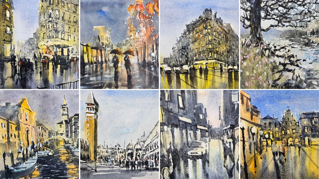
Transcripts
1. Introduction: Welcome. In this class, we'll
be painting to lose streetscapes in watercolor. Learning how to capture
streetscapes in a quick, fun and loose manner is an essential skill at every artist should
learn to master. Watercolour is the perfect
medium that allows you to produce spontaneous and
expressive paintings on the go. Streetscapes can be
confusing to paint. With so much going on in
an overload of detail, we can often get lost
in our painting. In this class, I'll
show you how to paint any streetscape easily by
using layering techniques. Understanding light and shadow. Planning is crucial. I'll show you how to
simplify buildings, figures, cars, and shadows
into basic shapes. Getting those large
components and accurately beforehand is essential for
your painting to make sense. So join me in this class. You'll see just how
easy it is to create these amazing street
scenes in no time at all.
2. Materials Required: In terms of the paper I'm using, I'm using a medium
textured paper. You can also use
rough textured paper. The reason why I'm using it
is because with landscapes, if you've got a bit of
texture on the paper, you get these nice wet
and wet effects easily. The papers and dry
too quickly as well. You can allow these nice kinda sporadic areas
where the brush skips over paper I find it's
just a lot easier to work into rough or
medium textured paper. So if you managed to
get some of that, go ahead and pick it up. I've also used 100% cotton
paper for this demonstration. Recommend that as well. And the reason being is
that it gives you a lot more time to actually get
in a lot of these effects. And pepper takes a
bit longer to dry, so you can drop in other
colors such as here, you can see I've done it
in a few different places and get some nice
different mixes as well. So you've also find with hundred percent cotton paper
when you go over a region, again, it doesn't lift
off that previous color. There is if you
use something like cellulose paper or
unidentified paper. So in terms of brushes, I'm just going to talk a
bit about what I'm using. So I've got a few mop
brushes and these ones, as you can see, they are
sort of declining in size. This one I used for the larger regions and really depends on how
large your painting. This is an A3 sheet of paper. I always like to
use a large brush to get in these bigger shapes. And then as I start to
work on smaller shapes, things like the shade
here are swapped down to a smaller brush. Now these mop brushes
are really good in terms of getting in
those initial washes, getting enlarged shadow
shapes cutting around because you can see you've got a fine tip on the end as well. So does let you cut around and also be able to
paint a large area. So these are a few
additional brushes that I use for this
particular painting. I've got this one here, which is like a little round brush. Synthetic, really good
for getting in figures in smaller details where
you need some more control. It doesn't hold much
water as you can see. But again, that's not the use of these brushes to get in
small details in the legs. You can see there this figure,
couple of brushstrokes. They're also use this
little flat brush. And the flat brush can be
good at outlining areas, say of the windows,
something like that. Here. Here. Makes it
just a lot easier because that brush is kind of shaped in that square sense. And so you get sharper edges and it's just a little
bit easier too. Imply details. So that's about it
for the brushes. And as you can see here, I've got my palette and
lot of paints here. A lot of paints,
but not gonna need all these for these
particular scene. I've just got one of
my primaries here. This is perylene red. I've got some yellow ocher, used a little bit of that
for the background wash to, I've got some burnt sienna. And burnt sienna is great for getting in some
of these buildings. I have some purples in there
as well, a bit of black. So this here is just a bit of Luna or lamp black,
which granulocytes. And here you can see I've
got little bits of red. I've just useful the figures. There's not really
many colors in here. I think I've got a
bit of purple back there or blue back
there as well. So it's limited palette. You seen the sky, I've got
a bit of cerulean blue, which is this one here. So really if you've got
your three primary colors, if you've got a red, you've got a blue, and you've got a yellow, even a brown on the side there. You can paint this all
in very, very easily. So that's about
it for materials. I sometimes go in with a bit
of white gouache at the end. I haven't done it
here, but a bit of white gouache can be good if you want to bring out some
highlights of the figures
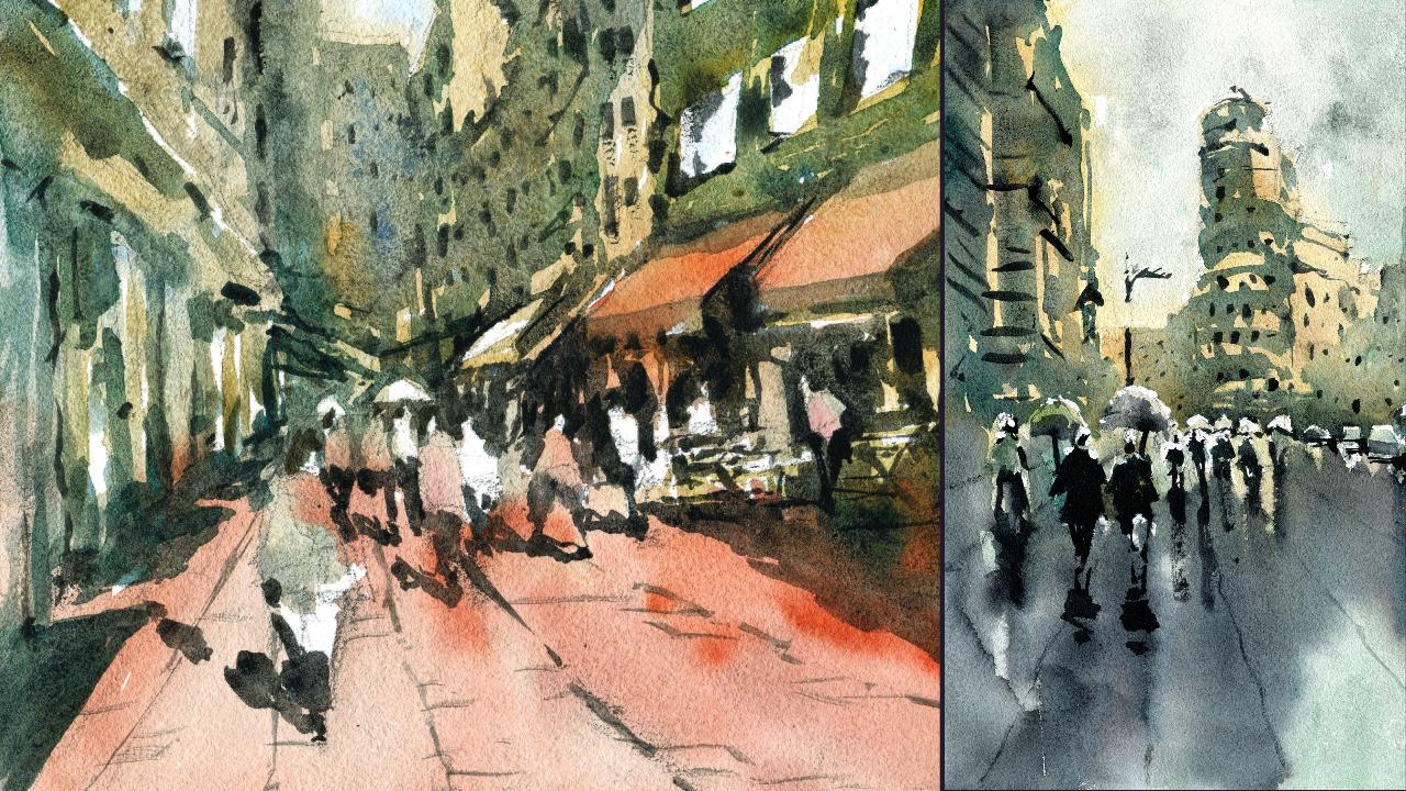
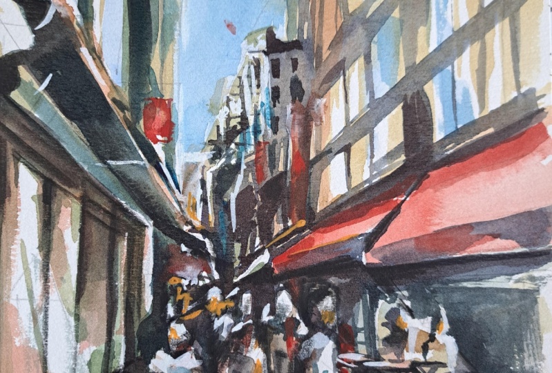
3. Melbourne - Drawing: Today we're gonna be doing this street scene
here in Melbourne. This is a street
called hardware lane, and it's quite a popular Street. All bunch of
restaurants down there, mainly Mediterranean
Italian restaurants. This is during the day
time and I thought I'd do a street scene during
the day time so that we can get some sharper
sort of shadows. You can see the light source
is coming from behind the camera and the shadows of the figure is going
towards the back. And I'm really
considering whether to keep him like that
or to change it, to move it a little bit more on an angle to the left-hand side. But we'll see how we go. The first thing I'm gonna do is to put in the horizon line. And really I'm just trying
to separate out where the sky starts and
the ground begins. Looking right out the
back of the scene. You can see those really
small buildings out here. And you can really
just mark in little, little guiding line about
roughly whether e is, I'm saying, reckon it's
about a quarter of the way through the page about here. So I'm just going to put in a rough indication
of a line like this. Roughly the indication. Alright, and that's
where there's buildings at the
back going to be. And I'm going to
follow this kind of, I don't know how you call this, but basically just the
little silhouette of the buildings all
the way in the back. And one of the most important
things to remember with these scenes is that you're just trying to
getting an impression. You don't want to, especially with the
buildings at the back, pay too much attention to
all the little details. But I do want to make it
look boxy as I'm here. That's a sod oven in
a building like that. Coming down there. Yeah. Okay. Go to building here in the back. You've got this
really large building that kind of comes up just, just a little bit past the
center point of the page. Maybe here. You can see it all the
way in the distance. And I really want to, I'm thinking to myself
whether I wish we'd just just create a bit
of a silhouette for these buildings
so that they're not too predominant here
in the foreground. Okay, so just the side
of this building now that we're trying
to get in, okay. Like that. And just a larger sort
of building coming in. Alright, let's see the
slope of it as well. One of the most important
things to remember is trying to get that
perspective right and imagining a kind of
a dot around here and all a bunch of lines just
emanating from this dot. And I'm using that, for example, to get in this little edge here, this one here as
well, this building. I'm just using that point. They're simple
one-point perspective. There's some more a
largest building here. Whole bunch of stuff on it. I'm not concerned as to getting
into many of the details, but I know it finishes actually about halfway
through the page. So I've gone a bit too far. I reckon though it
doesn't quite matter. We will change it up anyway. Good. If I can reduce down these buildings and
the side of touch. Okay. Again, we just
changing things up a little and not getting too bogged down in all
the little details you can actually see here. There are all these windows, facade of this building. And a little shade as well. As you can see, just a little shade of some sort like that. This will be great because
it sort of helps you catch a bit of sunlight on those
buildings in the back. You get more of them as you go closer than just
a bit more visible. Of course, now we've got
this enormous building that goes out of the scene
all the way out there. And we'll bring this
down forward a bit more. This is the side of
the building here, of this building in front. You notice how they just all
overlap with each other. A touch. Here, we've got again another one of these
shades roughly about here. And I'm just following
the the patent, the general pattern here.
Okay, look at that. Quite similar, but this one's larger as we get closer to
the front of the scene, we want to make everything Look a little bit larger. I'm going to emphasize that
gap in-between as well. So we can get some more emphasis on like some shadows in here. There we go. There's even little bits of this bottom part of it coming
down here of this shade. So you can see it a little bit off in
the background there, but not too much. You can even see some umbrellas, some kind of cream colored umbrellas of
here in the distance. And you see these often
in Europe as well. And look at this large shape. I'm just wanting to get in this large shape
here on the left, hopefully, with not
too much trouble. There's so much going in here, but you've got to remember. This is just one gigantic
shape that just goes up like that and disappears
off to the left. Somewhere like this. Somewhere like this. Of course you've got this
signage here as well. Not only that, but we've got a building here in
the background. I nearly forgot about that. So this can be part
of the silhouette. And I'll get in afterwards, just off in the background. Something over there. Let's try to make this side of this building more
realistic here. I'm going to just bring that up. And you can also
see that there are windows will come this
side of that building. Larger sort of
windows like that. They're here as well. That the lamp here, just to simplify it
down, once again, little lamp that's coming in
from the side of the scene. You can just see it, but it's not so apparent. Again, these windows I'm just following as we were
putting in before, just this general line that
we have coming up here. And it helps guide. I mean, these these
windows are slightly off. I mean, it should
be further down, but it's not a huge deal. Okay. There's actually
a shade here as well, some little shade or whatever, something
underneath there. I'm not so concerned
on the little details, but you definitely
can see windows. And not only that, the it comes
into the scene like this. And then it gets
smaller as we move off into the into the
background as well. Okay. But that's a large dog
or something like that here. The large door and a
few little lines to indicate that is
definitely a door. Here. Is this little
square of something. It's a little heat
is up there as well. But again, we're not getting
bogged down and everything would just trying to get an, a general feel of this. Photo minus will just try to add in some little shadows here, even see what it looks
like around this time. It's good also to play
around with some figures. And you can see here I'm just adding a bunch of them and getting them to overlap a touch. Might be some just
kind of walking into the scene or some standing okay. Around. And the big thing
is to try keep them varied in different poses. Not getting too precious with with their legs and
things like that as well, but making sure that there's enough variation, for example, might have someone here walking in to the
right-hand side like that. Okay. So the legs are further apart. There might be this girl here standing on the
side with the arms. Here. It looks like she's
holding some kind of bag, just really roughly indicating that she's standing and facing towards the
right. A touch. You can also indicate the hair and the direction where you put the hair and also helps to shape where the head is facing. You can see here is
more on the left, head facing towards the right. These ones are straight
in front of me. So we're just putting a bit
of hair on the top like that. There's all kinds of things here that you just have to indicate. I don't want to draw on
that too specifically, but that's like a little sign. You can see here there's like some little tables
and things like that. So we'll have to indicate
that later There's a waiter all the way
in the back there. Just standing maybe with the arm out and someone
seated at the table. So we're going to
have to just indicate some tables or
something here as well. Okay. People standing up, that someone else may be
standing up here as well. Maybe it's another
way to like that. Okay. So we're indicating we're not trying to get in a huge
amount of detail there, but trying to get a bit of an indication of what we might have happening in this area. Okay. Bits and pieces off in
the background like that. Just come down. That's like a separation
of the building. Okay. Having a look around now, that's a good amount of figures, but I want to add another
one here just closer. And the reason why
is that it helps to actually draw the
eye into the scene. If you've got a few
different figures, different distances from
the front of the scene. This is a large head look at that large head of
the figure here. I've just made this one up. Could be carrying
a bag like that. It's a little bit, actually, I'll reduce
that down a touch. But we have a figure that's walking into the
scene like this. This leg, right leg
forward, left leg. Left leg kinda tucked behind. In front of the right leg. Okay, so you've got this sense of decreasing, decreasing size. That little dot that
I've drawn there before, I'm just extending out
some lines from that dot. And you can get these little perspective lines
that stem from that area. Okay, give it a bit more. Dimension. Starts looking more
three-dimensional. I don't like how
this building is, so I could have
put it modernized. Don't want to just maybe
separate out the floors. But at the same
time I'm going to perhaps change up some of
these windows at touch. Make them look a bit
more interesting. And perhaps similar to
that one over there. Just change things up a little bit because I don't like those. It looks a bit like an
office building and it probably the top
of that building is probably an office
building, I'm not sure. But something like these just makes it look a bit
better in my opinion. So again, you don't have
to worry about getting in the exact details making loop just like
that reference photo. Often that reference photo
needs to actually be changed around depending on
what your vision is. And that's why I
like talking about what mine planning
and how I'm planning. You can understand that as well. And how to change things up. So that's more or less here, I think I'm quite happy
with how this scene looks right now in
terms of the sketch. So let's go ahead and get
started on the painting.
4. Melbourne - First Wash: Now I've got a large brush here. You can use a really
big mop brush. This is a goat hair
brush that I got as a gift from a company. So I'm just going
to be using this. And I think what
I'll do is actually, I'm going to start
with the sky first. Bit of cerulean. Let's get rid of that
spirulina in the sky and very, very light wash of it. Okay, great thing about this
brush is that you can get in a very light wash of color and pick up a lot
of paint as well with it. So try to find yourself a, a, a large brush to do this, I'm working quite large as well. This is an A3 size
sheet of paper. And I'm going to lift, just leave a few bits of white near the
buildings as well. Just bring that across that
we have it at the sky. That's all we need in there. These buildings. Also, I would like to put in maybe a little touch of blue in there indicating
the reflections of the sky as well
in this building. Like this, like this. This. What I'll do now is
mix up a little bit of say, orangey, warm pallor. I want to drop some of this yellow ocher
into the buildings. I don't really want it to
be too vibrant though, so I've gotta be careful. Okay, so a little bit of this. Now, remembering that
all this is going to probably I'm gonna go over
the top of it after anyway. But the trick is
really just getting in a little indication of the details of the windows
and stuff like that. A bit of merging. But at the same time, I'm going to cut around
some of the windows and getting some small details. As you can see, this is
just a bit of yellow. I might pick up some
of these other yellow here as well, That's better. A bit more brown. I've got a little bit of
little bit of brown here. Just drop in some gray
leftover on the palette. So I'm going to just
work on these buildings, the windows and in a cut around the mid touch,
as you can see. The great thing about this
brush is that you tend to, because it's quite large, It's hard to actually get
in everything accurately. And as a consequence, you have to just get
everything in quite quickly and deal
with how it looks. So what I'm doing at the moment, just getting in this
side of this building, it's just a warm, warm color for now. Okay. Like that. And a bit of this orange color maybe for the top
of this shade here. Alright, little drop
of that in like this. The one to the right-hand side, I'll pick up a bit of red, bit of a warmer colored red
or something like that. Okay. I'm keeping these
pretty pretty light Here. Here. Good. Coming down. Again, just still
adding in light colors. We don't want to get in any
darkness in here just yet. Now, let's work on these
booting off in the background, a little bit of brown and
a bit of neutral tint. Just want to mix a bit of
grayish color and merge, merge this building
in a touch like that. And some more yellow. It's getting some more yellow into this background section And don't be afraid to leave in a bit of white
in there as well. Okay? And the big thing to
remember is like at this stage we're not even
trying to get in any details, would just getting in the
light, painting the light. Okay. Going a bit more subdued
in the background, and also dulling some
of the colors down. I love to mix colors
as well so that we've got nice variation of, of, of what's happening over
there in the background. I'm gonna get over
into the sky there, but it doesn't matter. No problem. This brush just forces
me to work a bit looser and sort of touch that paper less
as well mind you, which I think is a good thing. So that I don't get overly occupied on things
that aren't important. Around this window
and this window here. These light washes are
so crucial because they really bring together the
essence of the scene. And then all you do opt,
which is just adding the the dark bits. I'm going to cut around
that lighter touch, leave a bit of something
in there to indicate it. Alright. Notice how
I'm just indicating. I'm not getting in
all little details, getting too fast
over everything. Here. We've got
that window again. So cutting around that
window a touch even here. Do it here. Here as well, like that. I'm just merging that
all look at it and just merging it into
that background. Okay, Let's leave a bit
of white like that. Maybe. Come down some
more yellow like this. Here. Here, bring that down, bring this one down. Here. He bid of darkness off
here in the distance. As you can see, it's all slowly starting to come together. Thinking, what should I
put here for the window? I might cool it down with
a little bit of blue. I'm just under here. Not all of it, but just
maybe some of it too. Yeah. Just a bit of blue or
something or another in here. Okay. And then for the ground, its work around
the figures first. So I've got, still got a
lot of this grayish paint. I'm going to just pick up a smaller little mop
brush like this. And this is perfect
so that I can cut around the figure's
a little, okay? And these little umbrellas
off in the background, it's kinda tricky
to see him now, but I'm going to just
leave them as is. Okay. But this gray that
I've got figure, I'm just going to use that
to cut around and LDL, the underneath part
of this building. There's also a
little bit of purple that I've got in here as well. I'm putting some
of that in there. Probably suggest if you're
gonna do the same thing to go very lightly on the little bit of purple
I've dropped in there. But because afterwards
we're gonna go and do it in quite a dark color, cutting and cutting around the figures and
that kinda thing. But for the figures, you can really bring out
a bit of life in them by coloring in putting
in touch of colors. For them see just very
light colors because you want to indicate that
they are in the sunlight. So this one's just a bit of red or pink or
something like that. I've got a bit of this
creamy color I'd found. This can be something
for this figure, but of this creamy
color mixed with blue. Here we go. Bit of
color for that figure. This lady here, so
standing by the side, she's got white shirt on, actually saw not fast about
just leaving that one white, same with these other ones. Maybe this figure here
we could put in a bit, a bit of reddish color for them. Bluish color for this one
here in the background. That'd be afraid to just leave
some of them as they are, as they are lighter
or even just white. Now I'm going to
continue all the way down and keep working on this and a bit more gray here Alright, yellowy, sort of
gray color just to warm gray. These are all like some
indications perhaps of tables and stuff
like that here. Stuff running through this could be part of that
song or whatever. As we get further down, I'm going to pick up the red, mix it in with
gray and more red, maybe some of this
carboxyl carbon. So it's quinacridone orange, but it can acridine
orange for the ground. It's quite a warm,
really warm color. Fibrin warm color, a bit
of red and quinacridone, red, orange here for the
ground I think would be great. Trying to find that right mix of it and between orange and red. And also don't want it to be too overpowering, which is tricky. I'm going to pick up
this larger brush again, this is going to
probably make it easier. Doll that down a touch as well so that we don't have
too much vibrancy. And remember this ground
is very, very light. So we need essence. We just want to make
sure that we've got an indication of that color. But we don't want to over do it with the
color saturation, running backwards and
back-and-forth and grabbing some of these greyish coloured paint and dropping a little
bit in there as well. Okay. Cutting around
that figure there, the legs for that figure. Bring that across. Here. There we go. Just going around,
just don't warm color. That's already is just a nice
warm color for the ground. And making sure it's
not too vibrant. But again, in the
reference picture, it is fairly vibrant. Depends on what you
want. For myself. I think. Just want to
tread carefully here. Maybe have touches of
vibrant seen in some areas, but I don't want
it to overwhelm. What is happening. This scene. We get that it's slowly happening,
slowly coming together. Sometimes you get
a bit as spread. So you can pick up a tissue
and just dab off some of those areas that have
made a run into the sky. I'm not too fast though. Okay, good. Now I'll give it. Alright, so
let's give this a quick dry
5. Melbourne - Second Wash: Alright, so we're gonna
go in now and get in little details and
mainly the shadows. Figure out what we're gonna
do with this light source. So I really liked the light source and tons of it going slightly to the left, but I want to make it a
bit more exaggerated. So I'm going to actually
create a little bit more of those shadows running mortal left-hand side rather
than towards the back. But let's see how we go. Now. Firstly, for the buildings, I want to pick up
bit of purply color. Then I'm going to use bit of purple mixed with some brown, maybe a bit of black here. Okay, I just wanna
make a cooler color, cooler gray color. Playing around and
seeing what we can do. And I'm gonna go straight
into this building. Let's just see how
we go with it. I'm tempted to actually use
this larger, this larger one. Get the job done faster. Let's just see what we can
we can get out of this. That pretty dark. About, I'll say about 30% of this darker paint to 70% water. You don't need to mix as much. Painting when the color
is so dark already. But all I want to
do is just dark in this building a touch
and leaving if possible, some of the previous
wash as well. This nice sort of warmer color for the building off in the distance and
often the distance. But, you know what I
mean? Behind behind this wash. Don't
be afraid to leave in some of those little
specks of magic. And the main thing here is just cutting
around those windows. It's tricky. This larger brush in a weird way makes
it, makes it easier. Even though you've
got less control. You're not tempted to foss. You just get it in. And it leaves some of
that previous washing, as I was mentioning
before, is so crucial. But there is a point where
I have to stop using it because it's just
becomes too difficult. And you sort of struggle. And actually on this
side of the building, there's a lot more There's certainly a
lot more light on it. So I don't need to
imply that as much. Brown, purple, black
mixed together. What else have we got here? Okay, better. The top part like that. See if I can get in some of
these buildings as well. I'm going to leave that side, that right-hand side
of that building in C, that, that'd be, they're just going to
imply that there's just some light crossing over
that edge of the building. And there's little bits and
pieces touching the sky. Not touching the
sky, but connecting up a touch there as well. And I'm just putting a bit
of that gray like that. I'm going to swap over to
the smaller round brushes is going to make it easier. You can see already. It makes my life easier. Okay, remembering
that light source is coming from that
right-hand side. I'm changing it up a little bit. The light source is
more obvious, stronger. You could say. What I'm trying to do is find
a solid shadow color. A solid shadow color and shape that just runs all
the way across. Can you see it starts
from here, comes down. Okay. Drop in some more color in
here if you want as well. Okay. Comes down in here. Just that comes down and joins up with this back-end and shadows in the
back like that. Okay. Coming down. This is
all just one big shape. Just want to connect this up
a touch as well like that. Maybe we could get
a bit of shadow like thing coming across the back of that building
one or something like that? They're coming down and
cutting across this here. I'm just going a bit
darker as I come down to the bottom area because I want some extra contrast for
these lovely shaded, these little shaded areas here. So cutting around
these little shades. That kinda taking my time
with this guy and blood darker you make it around
the edges of them the More More they sort of stand
out due to the contrast. I'm really wanting to
make them quite dark, but at the same time, making sure that I've
still got some of that background color
in the background. Wash and bits and
pieces in here. I'm using just swapped over
now to a smaller brush. This is a little too flat brush. One thing I'm really
trying to do is get the silhouette of those
figures in nicely. And someone who is sitting
down at the table as well. It's very hard to tell
exactly what's going on. But you can imply that you can have little bits and pieces. So that's a little sign
or something here. Okay. That that okay. And then down like this. Okay. Just cutting around this
little figure here. I'm just going to cut
around that figure and create extra contrast. Trying my best to vary these tones so that
we've got some darker ones. The darker ones, you notice
they create sharpness around the figures and details. Just bring out details. Okay, Let's do the
same thing here. See this figure there. Look, I'm just cutting around that figure. It's just quite, quite
dark in the background. But I'm skipping
bits and pieces. Skipping here in there. Over the shoulders
and stuff like that. Okay. There's the table, there's little bits and
pieces here as well. I'm going to have to
indicate what this is. It's difficult, but
just some verticals map perhaps running across in here. We indicate some of those
tables or what have you. Okay. That some little
verticals in there. Good. In these figures, you can
just do the same thing. Cut, cut around them. I'm trying to just get this
all in with one big wash. This is, in my opinion, I think this is the
best way to do it. Watercolors. When you do a scene like this
with too many washes, you lose track of
the big picture. It becomes difficult to, difficult to create this
fresh looking painting. The more you add color
and layers over the top. There is the shadow that
I'm going to just play around with now we can
see the shadows of the figures kinda go
towards the back. And I'm gonna just shifted a little bit to the
left like this. So you've got the legs of these figures here
because that can just create a bit of
darkness here for the legs. That figure anyway. Maybe use a smaller round
brush there and then have this carry over to the
left-hand side like that. Just a bit of that leg there. I'll just soft enough
sometimes with the paintbrush as you
can see in my finger. Again, just working
on that figure to get more more of a silhouette. By darkening the background. You've got this figure here
just kind of walking and that again is another
shadow shape here. Here. I'm just more angles
on those shadows. Don't think of them. That's so well. That's better. Like that The legs, you can just join up. Notice how it's just the
same color that I'm using, this same dark color to join everything up
in the background. There's even a figure
here that I put in. Maybe just standing here. Could be a waiter or who knows. That's also going to be a
shadow or a large shadow. Okay. But as you can see, I'm being careful to not go
over the top of that figure. In the foreground here. Cutting around the light. Okay. It's another one here. Legs together like that. Here's, Well, look, we can
now get the same shadow shape kinda coming up like this
and going up to the legs. There may be a bit more of
an angle because that okay. Great. Now again, there is
some type of shadow running through here
for the buildings. I'm going to the buildings. It's basically the shade here on the ground and I'm going to, I'm going to attempt to put
it in something like this. This is a shade that's
outside of the scene, by the way, it's kinda
towards that right-hand side. Okay, and I'm going to
put that in like that. Just having a loop making
sure that shadow run, runs in a similar way and fashionistas to the
other shadows as well. Okay. You've got bits of light
that are caught as well. So you just implying
the darkness in there. Some more some more of that. Maybe the yellow and the orange. Mainly. If I can just extra darkness. Even underneath here should
be a bit darker like that. So what I mean by just
trying to make sure you're not putting too many
layers in here. This stuff is all still wet
so you can get away with it. That will look,
seeing how that P is, whether I want to lengthen
that out a bit more, make it more obvious. Shadow a bit more obvious. I think. I think we
can be okay with that. I like that angle on it. Working away at
some of this stuff. Now here in the background, I'm going to pick
up a cooler color, just some, again, just that
same old purply color. And that's really
just a purplish gray. I'm dropping that into
these background buildings. Here. I can leave in a
little bit of light, could be a side of a
building or something. It all in one wash
off in the distance. So it just looks like
a silhouette in there. Maybe some more blue, just a tiny bit of this
cerulean in there. Okay. Kinda like a cool gray color. Darken that one as
well here because that one line and you're done. I'm just going to
add in a little. This could be like the
side of the building. Those little balconies
and stuff like that, that some of these apartments have just a little,
something like that. Not much at all, but
hopefully does the trick. As we move downwards, we're going to start
again with some of these darker colors,
purple, black, and brown. There we go. Little tiny bit of
this, these shades, you can see them just
come out a little bit and interact with the light
in the background. Simplifying that down. I don't want to spend
too much time there, but you can see some
of them actually come out quite obviously. This forms a weird connection with the right-hand
side of the scene. Can you see that connects
both of them together? It's really important. This year is a little umbrella again that I hadn't realized, but it is there little
white umbrella? There? Did you know it could
be an umbrella? Anyway? Here we are working
on this building now. And tricky thing
is now making sure we've got a sense of
shadow in these buildings. So underneath the shade, I'm going to grab some
of that grayish color and line at the touch like that. And again, just darken
it a bit underneath. We want to leave in a lot
of the light on the side of this building because it is technically in facing the sun. The light source on the top
right-hand side of the scene, just behind the camera. So I am taking special care here to make sure I've gotten
some of these details. So for these windows, I can just drop in a bit
or something like that. Not too big of a deal. Okay. I think that it's
actually quite dark. Some of these shadows, I'm worried to go too dark. But we need to further down. And I don't want it
to suddenly go dark, so I'm going to add in. So you can see just extra areas
of contrast and darkness. And as we move down
to the bottom, light source is still coming from that top right-hand corner. So again, these little bits
of shadow are going to form on the ground here and connect up with
the buildings. Just fussing about as to the how all views I
want to make these, okay, but they need
to be in here. They just have to be in here. That one's good. That but downplaying it a bit. Okay. That's one. And then we've got another
one here, another one here. And running across the
scene here as well, towards that
right-hand side there, like that. And
then look at that. And because we've left in the light on those
figures, you can see them. Just pop out that light. Now we've got to
join the shadows a bit onto the buildings. So this is what I'm doing. I'm just kinda
dragging up a bit like this from the bottom
of the shadows upwards to create some kind of some kind of impression that it's
joining onto the building. Can't just exist there and not connect with the buildings. This isn't the only
opportunity as well. Afterwards we're
actually getting some further details
too good. Here. We've actually got some kind
of sign that's sticking out. It's tough to really
see it, but like that. Now, these are just these
things that you can indicate again on the buildings. These windows, for
example there, this lamp as well. I'm just forgotten
about that lamp here. Like that. Look just a simple
simple little lamp. Probably can't even
tell that it's a lamp in the first place. Okay. Again, just wanted to just get in a loose indication
these windows, I don't want to sit here
and get them all in. It's not gonna be
to find it all. I might drag in some
of these as well, like the, like that just emerge
that building a bit more. There's a hard edge
there that I want to just get rid of that. Okay. Okay. Let's give it a quick dry
6. Melbourne - Final Touches: Finishing touches,
little flat brush. And I'm gonna go straight
in and start putting in. Here there's a little
bit of shadow, for example, here, just
a light wash of color. They're light wash
of color here. He's just the finishing touches. Little bits and pieces, really. A little bit of darkness, shattered forming on the top
of that shade like that. Here. Might want to put that in that simplified
down. Of course. There's other things as
well, like the windows. I'm just really going to
pick up quite a dark color. And this is just
pure black and I'm also dabbing it on my palette. None of my palette and
the tau as well. Okay. I'm just trying to get in extra contrast is bit of
hair or something like that, or even in the background, you can start emphasizing
extra bits of darkness. Extra little bits
of darkness around the figures and what
have you as well. Okay, let's have a
look around here. I thought a little bit of
extra darkness would be good. Okay, So just
trying to bring out those final contrasts that
will make up that scene. Okay. Blend them a bit more. Is the legs of this figure here. Thought I'd just
finish that off. Attached like that. These tables and things, they're really, these are the, the dark sections of the scene. I'm putting in a bit
of little bit of shadow around the
windows as well. And even perhaps wonder if I can add some details to some
of these windows as well. Let's try, for example, with little line coming
down, loops like this. Just little marker I
suppose for the edges of the window sills like
this is a good idea. In my opinion too. It helps to just bring out
the details and notice I'm skipping over the
page, the paper a bit. I'm not getting in all the little bits
and pieces in here, especially as we get to
the edges of the page, because I don't
want, I don't want the eye of the viewer to
be too focused up there. I want, I want it to
be more down here. And wherever you think, you could gain some extra
contrast and detailing, drop a bit of that
paint in here, there's something better,
something in here already. That's a shade in there. The edge of these
buildings as well. You notice just a
touch of detail. From time to time. Look a little bit of
building the side of that building just
contrasting better. I can get into some details
of like some windows here. Okay. Just off in the distance. I know they're not really there, but I'm going to put
them in any way. And of course, the side of
the building comes out here. And you can do this, repeat
this pattern on the sides of the buildings to get in and indication of some
windows like that. And working on a bit
of that perspective by drawing some of those
lines in running on the side of the
building indicating the floors and
what have you like that the trick is
not to overdo it. You've got to be very careful. Here. I'm just touching go. And because you can
see some of this in the reference photo already, just these little
windows that pop out the sides of the buildings. You want to be spontaneous with them and dry your
brush off a bit as well. While you do this. Essentially what i'm, I'm
just dabbing it in there, letting the shape of
that brush form window. So it does a lot of
that work for me. This stuff in the
background as well. You've got a bit of that for these little buildings
and what have you. So You can do the same
thing there. Okay. So have a look at this. One. Same thing goes. I'm actually going
to have to put in a bit of extra detailing
for these windows. They feel like they
just don't look as detailed as the ones on the
right. But look at that. I'm just going over
the edges of it. Some of this stuff here as well, these little shaded areas underneath their touch a detail. The window or the
doors here as well. Look at that just
a little bit of this door frame or something coming down into
the ground like that. Simplified of course. Simplified down here, here. Here, here. Okay, good. Extra stuff around here
as well, like this, these little shades that
crossover and I want to really emphasize that better. I've don't think I've done
that as well as I could have. So I can go over that
just one more time. Helps to draw that connection. And also bring forth spring forth the
buildings here. Okay. Looking at the shadows and thinking they probably
could do with the extra little bit of
extra darkness in them. Don't normally do this, but
I'm gonna go over the top of those shadows once more to dark and then a little bit again, just trying to bring
some of that up into the building so that
it makes sense. And some perspective
lines that we had before, like running through the scene. This is what's going to help. I'm just going to grab a bit
of paint and just dab it on to the ground
in areas to create a little bit of this
perspective like that. Running into the scene, just a bit of color. Not overdoing it of course, but something like that. Okay, look at that. Oh,
these lines emanating from a center point that we specified earlier,
roughly around here. You've got all these
little breaks and stuff that pop out
here and there, you can, of course indicates some of this better
than how I have. Or you can just leave it
really, it's no big deal. Okay. Connect some of this up as well. You really just drawing
with that brush. Straighten out this
brooding a bit. Just by adding in some
darkness on the edge of it. In some areas, hair and stuff on this figures. Just dropping in some color. The top of their heads
off on this helps. Alright, just turn these
into some little birds because I've tripped
some paint on here. So this is just a little
trick that I usually do to disguise the
drips and things, just turn them into birds. Nice sunny day in Melbourne. And that's it. I'll
call that one done
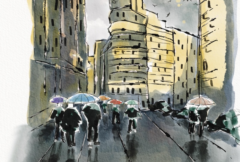
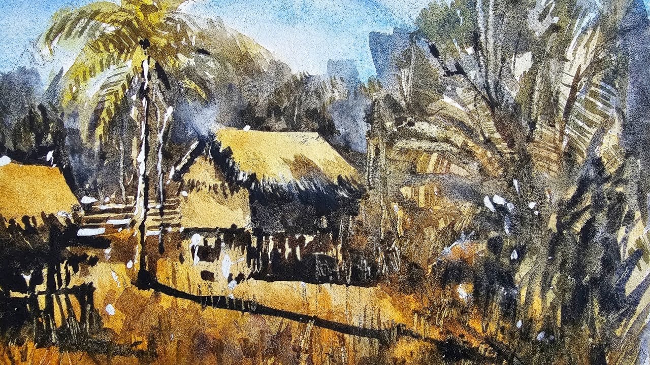
7. Rainy Day - First Wash: Alrighty, So we're gonna
get started on the drawing. And I've got this beautiful
rainy day is seen. And I want to simplify
this down to basic shapes. And first thing I wanna do
is divide this paper wrap now round about the
center of the page, I would say is weird. This building in the
background finishes off probably a little
bit further down, not just exactly halfway, but slightly further
than halfway. So I can just go ahead and
draw a little guiding line, as you can see like that. Cross the sheet of paper. And it doesn't have to be
perfect, just get it in. And you can always
readjust later. It's not set in stone. So now what we'll do
is I'm going to have a look roughly at where this
building in the back begins. And I think we can
safely say it's a little bit to the center left. So if we divide
the page in half, like this again, okay, so put the center point of
the page and then just add a little bit here and
little mark here. So there's the center here. And then mark here. That's about where I'd say this building in the
background finishes off. And I can go ahead and start penciling in
some small details. But again, I don't want to add
in too much here just yet, just getting started to get a hang of where
everything is. One of the things you want to
keep in mind as well as to keep a bit of space at the top. You don't want these buildings
to take up too much room. Between the top of the page
and the top of this building. You want there to
be a bit of sky peeking through the background. Over here you can see some Background Buildings like that. Just a simple background
building Macau a lot I'm going and you
can see this building to the left really start to
come in on a sharp angle. You see Buddha, the
rooftop like that, but it comes in
roughly like this. Then it comes down. Let's have a look
comes down like that. And we might extend this one out a bit
further, like that, that building bits and pieces of this larger
building there, the pillow. Okay. I'm not concerned of
the little details, just trying to get in a basic
sketch up these buildings, mainly a silhouette
of these buildings, uninteresting Building here
in the center as well. I'm just trying to
get these shaping the side of that
building like that. You've got this little
billboard there, which I'm not going to
emphasize too much. Okay. Comes down. You've got a bit of this side of the building running off
to the right-hand side. This whole block just disappears off to the distance like that. And over here we've got a
large building just coming up and touching the
sky like that. Okay. There we go. We've
got bits and pieces. Here is the bottom part
of the building there. Then it just carries on all
the way down like that. Little bits and pieces
of the building. You've got some poles and
pillars and things like that. Okay, so we've got a general indication of these buildings here
in the background. I'm going to go ahead
and start putting, penciling in this side of
the building a bit more. Obviously like this. Following the
perspective as well. This can be the side of
the building like that. And we've got another one. Just coming in here in front. Doesn't matter. Not a huge deal. I think the big thing is
just getting in some of these figures and
especially these two here, which a walking you've
got the head here, K of one of the figures. And I'm going to put
in this rain jacket. They kind of puffy jackets. You can see like that
pops out the bottom like a triangular shape
like that lady there. And you can see the
two little legs just sticking out at
the base like that. Okay. Exist sticking out of the basin. I'll connect this up
like that and just give a little indication of this kind of reflection here on the ground doesn't
have to be perfect, but just something like that. I want to just use that to guide guide my way
forwards later. Here's another one there. There. I think I've actually
done the legs are lit to two tiny bit too long there. So I'm going to just redo
that a bit like this. This looks a bit better Hey, that's shadow. I'm good. A lot of this,
we're going to have to make sense of it later. Okay. These are roughly
around the same height. I'm around there, so I just want that reflection to
come off nicely. Okay. Yeah. We've got a few bits and pieces, but we could put in, for example, an umbrella here. No, it's not there actually, but I can just make one up. I get the umbrella
stem coming down this maybe there's an umbrella
here in front as well. There's figures,
smaller figures that are just in distance
and keeping, keeping them loose, nice
and loose like this. And again, these
will form little, little downwards
reflections later. Okay, Go ahead of a figure. They're just putting
it in this figure. There's a leg is
another leg here. I get something going
on later on. Okay. We've got some more figures. These Another Umbrella. Umbrella is just all
all in distance. This one I thought
I'd do heavier. There's another one there. Just umbrellas and you've got people underneath them
and just walking. As you can see, just
simple figures like that. I always draw the
heads in first. Then I'll get the legs in afterwards and make
sure their heads line up roughly in the same spots
on the horizon line there. You've got all bits and
pieces running through here. You've even got, even
got a road here. And on the road you've
cut, cause, of course. So now I can get myself in a few cars
and just make it up. I know this car here is
it's really hear the front, but I'm going to just
put it in any way. Okay. That's a car. Looks
like a car, doesn't it? There? In the back of them,
they just start becoming squarish sort of
shapes like that. That can be erode off
there in the distance. And more umbrellas
and perhaps figures. Now you can get another
figure in here, just in the foreground. Like the school coming near
to the foreground anyway. And umbrella like
that over the top. Simplify that umbrella or
a little bit like that. These are bus stops or
something like that. It doesn't matter, just
little squares of something. And you can see like
these traffic poles and things just rising up in, disappearing off the side and
having a few of these are actually really good in there. Okay? Now my main thing I want to focus on at the moment
is now these buildings, especially this one
on the distance. So I'm going to just detail
this out a little bit more. Okay? That give it a bit more of a more shape and
accurate accuracy. Okay. Really, again, it's
not a huge deal. It's just trying to get
in an indication of that, that building here
in the background, because this is all just
gonna be mostly a silhouette. Anyway, I'm going to color
this all in the same, same wash or so. But little bits and
pieces are going to help. This little bit of the building kind of pops off like that. And then you've got
a little one that comes down like that. Even here you've got like a
part of the building that comes out here, there and there. Part of that building. Something interesting
because the shadows again, It's very, it's not so apparent. You can just see the light
in the sky, essentially. The light in the sky and
reflected down into the ground. So let's go ahead and
start with the painting. I'm going to firstly pick up this larger brush,
goat hair brush. And let's start with
some warm colors. Go with touch of
little bit of yellow. Want to make it too vibrant. So I'm using yellow ocher. Yellow ocher for
this building here. We can loose. I'm
keeping this as well. Yeah. We want to make sure this
wash is mostly just water. I'm using probably
ten per cent paint, ten to 20% paint maximum in
here is popping that through. I'm having a look, see
what else we've got. We've got a bit of brown here, so we can pick up a tiny bit of this brown and drop
that in there. Unfortunately, I think there's
a tiny bit of green in there that I've accidentally
mixed into that brown. But mostly it's that
brownish color. And I'm going through and
just adding in that just that little bit of warmth into the buildings,
into the background. Look at that cutting
around the figures and keeping it nice and wet. Look how quickly you can get in those buildings just with
a few little brushstrokes. Don't need much in there at all. And don't be afraid to leave. Some areas of white. Just helps create
some highlights where you might need
extra attention. Later on. Here we go. There's a bit more vibrancy
here on that right-hand side, I'm just dropping
in a bit of color, a little bit more of
that, they're okay. And I love this brush. It just forces me to get all those details in
with the least amount of PFOS and without
overthinking things because this initial wash is just a simple wash of colors. We're not getting in
any details at all, just quite abstract, I suppose. At the moment, this whole row set of buildings
here on the left as well as you can see,
very, very subtle. We're gonna get an another
wash off the widths and I want this lovely warm color in
the back to show through. Okay, let's have a look here. Then. It's just a large building and I put a bit of brown
in here to brown ocher. Yellow ocher, brown ocher. It's just some warm color
really cutting around. There's umbrellas and
the figures as well. Okay. Like that. I'm going to go into the sky little and I'm going to get in a wash of hopefully some gray, grayish color, maybe a little
purple mixed in there. To have a look at that. There we go. That's a nice grayish
color like that. And I'm dropping some
more of that gray and sometimes helps to actually
wet the area a little first. I'm not too worried
really about how these mixes round and
that kind of thing. But keep keep a little bit of space between the buildings. See tiny little bit of white on near the
buildings that helps. This is just a bit of gray
that I've gotten the palette. You can mix this up
yourself from using the leftover paints
on the palette. So often I've got a bit
of of my primaries, yellow, blue, and red, and not just mix
them together. Okay. I got that. Just
dropping that water, let it do its thing. And that at points I'll let
it blend with the building, but at other points I'll just
let it do its own thing. Here. Bit more of this dark cloud. I'm making the sky
look at probably more moody than it actually is
in the reference photo. But I want to make sure I'm
not touching it too much. Just a few subtle
brushstrokes like that trick. Okay. Okay. That should be good for the sky. I'm quite happy with that. I'm gonna go ahead and
carry this wash down. Now I'm going to
use a larger brush and really just make the
bottom of the pavement. It kinda grayish color, maybe with a touch of
yellow in there as well. Okay. Just to mirror the sky, the building, sorry,
a little bit. So cutting around some of the
figures and what have you and look at that and just
dropping in this color, which is really just gray. Again, that I've picked
up from the palette. And dropping that in a bit of purple and put
that in there as well. Because that just cut
around the umbrellas, cut around the figures. The heads of the figure
is like that. The body. Okay. Maybe coloring the legs, it's no big deal. And here we have
it just starting to move downwards,
this grayish color. I think that in drag
this all the way down, I'm using quite a
large mop brush. And that helps certainly to get in this wash without
too much faster at all. Okay. It's important to keep this
wash pretty light as well. Light that. Maybe we can get some
yellow in there as well. Just something. Can we get into this? Just flicking a
bit of this paint, just dab a bit of that off. Some of it's gone into the sky. I just wanted to create some little inconsistencies in areas. Well, I can I'm good. Okay. So what I'll
do now is we are going to start working a bit on basically the buildings
in the background. We're gonna get pretty much that large wash of
the buildings there. And then we're gonna go
back in and do the shadows of the figures and a bit of
the detail on the figures. But I think what
works well firstly, is just to get in
a light wash of some sort of color for the
figure is just a bit of, a bit of darkness. And these figures do need
to be fairly dark as well. So I'm getting a bit of
purple here for this one. The left and then the
one on the right, I'm just getting in a
bit of that green color. Just a bit of this purple
for the one on the left. Let's go for the
one on the right, some more brown maybe here. Like that. Something like that. Little color, a
little dab of color. You get these ones here walking around in the
background as well. A little splash of color there. It doesn't matter so much
what color you add in there, but what I want to
do is just make sure that it's a bit of darkness
for those figures. You've got a bit of
these cars as well. Maybe the wind screens, dark, dark and like that. Just a little bit of that. Windscreen. Afterwards all get in the bottom of it better. The umbrellas, putting a bit
of color for the umbrellas to light wash of something. Right? Great. So I'll give
this a quick dry
8. Rainy Day - Second Wash: Now for the final step, we are going to get into
buildings in the background. The details on the buildings to I'm going to work on these
nice little reflections. So firstly, we need to make some color for the
buildings in the back. I'm going to change
it up and just use some neutral
tint and a bit of purple in there to create
a kind of a cooler color, cooler gray color to black and then a bit of
blue, a cooler gray. And you notice it's probably
about 50%, 50% water. I'm going to drop this in. Let's just see how we go. Oops, something that's gone
into the sky, but be okay. And I like to also use smaller brushes at the
same time if there's little details that I might
have to indicate like this. Okay. Try to leave
in as you can see, I've been trying to leave in
a little bit of that yellow on the back of some of the
areas of the buildings. But I'm also just trying
my best to make sure I do this with as few
brushstrokes as possible. Okay? Just a large silhouette,
the building. You can see here also
there's little bits of the windows and things which are covering
parts of the buildings. So I'm just indicating
bits and pieces of that. And you can see here in that
right-hand side as well. And doing the same thing. Tiny bit of darkness and line work for that building
there, as you can see. That drag that down and enter these little little bits of the windows that
I'm doing here. So, so subtle, subtle, they're just drag that down. You know. The main thing for me is just creating this kind of darker silhouette
in the background. As we move into the further back as well into the distance, it just becomes more lighter. So I've just started to blend that together a
bit more like that. Okay. So we've got a bit
of a lighter gray. They're all in the distance. You've got a few more of these little little
windows and things. Over on the right-hand side. That's a little
bit more darkness I find behind the
figures might help. Okay. That dark area behind the cause. And you're just
cutting around them. This you know, you're blending
together at times, these wet and wet work and the
bit of the dry brush work. Okay. I'm just adding in
like a nice bit of a softer, watery shape of a shadow
here or something. Okay. I can redo some of
those window areas later, but I just wanted to have
something like this here. I'm just soften off a
bit of that part of the building it looking
just to to live there. Okay. Remember this is all one big shape that I'm
trying to paint this big area in the background. There we go. Just a little
bit darker at the base. And then here we've got the building to the
right-hand side. Just get that in. If I can get it in and just a quick little
brushstroke like that. I should do the trick. We've got this one here as well, so simplify it down. I'm making this one
darker as well so that it brings it forwards. Okay. To have a look, bring
it down more like that. The little bits
touching the ground If I can just get it to bleed in a bit to this
area, that's nice. Yeah. Just like that. Just that background areas. Just wanted it to
blend in better. You just, again, getting
into some more of these side would heirs of the building or the
dimensionality of the building. Okay. If I can get it in with a few little bits and
pieces like this, makes things so much easier. Okay. It more blue, purple. Okay. Good. Large, large sort of
shape here to the left. Or is this just part of this
building shape coming down? Okay, good. Alright, so we've got the building's off
in the background. General silhouette
of those buildings. And I want to bring
some of this down to the foreground to get the
shadows and the figures. And so I'm going to just spray, spray this bottom part of
the scene with some water. And here I'm going to grab
myself again, this mop brush. And I'm going to pick
up some darker paint, just purple and a bit
of neutral tint again. And we'll just experiment. I'm going to drop in the legs
of this figure like that. Really thick paint,
very, very thick paint. And look at that. Got this kinda coming down and a bit of this reflection here. And a bit of the
reflection there. This one here,
downwards like that. These ones here. And if you find that it's not
sort of spreading enough, just give it a bit
of a spray again. Should dissipate, move downwards a little
bit down the page. Just exaggerate that a bit more. That they come up into the legs. Got to just make sure I've got the legs in darker like that. Right. There we go and some darker
ones then the legs. Okay. This is a little flat
brush that I'm using. It's helping to just getting the general shape
of the reflections. And you've got also
these other reflections off the buildings
as you can see the good that just this kind of darker reflections from
the building up the top. So having some of those
in as well as very well, I think it's quite crucial. Soften. And having some sharp bits in there is important too guys. So don't get rid of all the, all these sharp details. Of course, you've got these kind of reflection of this
building up the top. So I'm going to just get a
bit of that color in there. Shift this around here. Yeah. This larger building
here to the right
9. Rainy Day - Final Touches: Let's go ahead and add some more detail and it's
in pieces on the figures. Just mixing myself
up a dark color. And again, just going to
work on some of the details, all these figures and create
more darkness especially. And the legs. If I can just get in better indication of
the legs like this. This figure here, walking. And this is all dry
brush now because that painted the previous
washes dried off. Okay. There's a couple of lakes that this is a couple of
legs here, like this. Okay, Here's another figure
that just walking up here. We will have to
bring some of this detailed back and work on. Again, just bringing
back some of this, a little bit of a shadow here. The reflection, Sorry. Hey there another
head of the figure. That then they're just putting in indications
of details. Really. Some more figures
out in the distance. Just getting a
little indication of their bodies and joining
it onto the legs here. And the distance and little something for
their heads as well. A little just a little
dot at the top there. Some of these umbrellas,
if I can just, I can offer bit of a little bit of darkness on it like that. Softer touch. Here is another
umbrella potentially. K holding onto it
may be like that. Like that. She's just slowly bringing
out some of these details. I'm putting some of the car like underneath the car because the shutter for
the bottom of it, we use like that. We'll that car there. That car, they're good. Small little details for
the buildings in the back. I'm just going to pick
up some darker paint and just dab it in there like this. Get an a few little windows or something running
through the back. Detailing on top
of the building. Some more of these windows. Now the paper is dry and I can
go in and get some of this in these buildings here
to the right-hand side, just indicate a few windows here that just getting these kind of traffic or whatever That street lamp. One here. This building, we can just rejig it, just put in a few little, little kind of guiding
lines running through and just sort of to indicate the details
on the buildings. We something like that. Alright, we're gonna do
some finishing touches now. And I'm going to
show you something interesting that I picked
up a little while back. And essentially you just use
a little blade like this. This is just one of those
exacto knives that you can get from the sharps box cutter,
anything like that. Even a little pocket
knife works fine. What you can do is
actually use that to scratch over the
top of some areas. For example, if I
want to bring out a highlight on top of this car, I can use that knife to just scratch off a bit
of the paper like this. Okay? Go over the top like that. And you can actually bring back a bit of the highlight there, not only there,
but you can do it on top of the figures as well. So for example here. So let's just go back and
forth and scratch off a bit of tiny bit of that paper. It does reveal,
does actually lift, scratch off the
top of that paper. But it just allows you to get in really crisp highlight news. That's one way you can do it. Another way you can
do it is just by using a bit of white gouache. So for example here we've got
just a tube of white wash, put it, pick up a little bit
of that off the palette. I'm using a straight,
straight over. You can do this sort of thing. Okay? This allows you essentially just to get in a little highlight. And I'd like to mix it with
a touch of water as well, so it's not too not too thick. But you can get an over the
top of areas like that. Let's put it in a bit
more water through their little bit thinner. Here. The shoulders of
these figures there, even on top of the
the umbrellas, sometimes you will
find a little bit of highlight here in this so
I can just bring that out, kinda get the shape of that umbrella to come through a bit more
even on the cars. Look at that just a bit of
that white on top. Okay. I'm gonna tend to use this
fairly sparingly as well. Okay. Then what I'll do is just pick up a little
bit of darker paint. I thought what I could you
do to finish this one off? It's just put in a
few little lines running through the
page like this. These directional
lines that will just help creates sort
of perspective. I'm imagining a point all the way there
in the background. And with that point
in time then creating a whole bunch of
lines that run away. Or towards that point,
that imaginary point. And it just gives the scene
a bit more dimensionality, makes it look a bit
more three-dimensional. Suppose something
I do all the time, and I'm using some dry
brush, pick up that paint, but I am drawing that brush
off a little bit as well so that it doesn't overwhelm. Just skips over the page, gives you a little indication
rather than anything. That's it. We're finished
 Watercolour Mentor (Darren Yeo Artist), Art Classes, Mentoring & Inspiration!