Transcripts
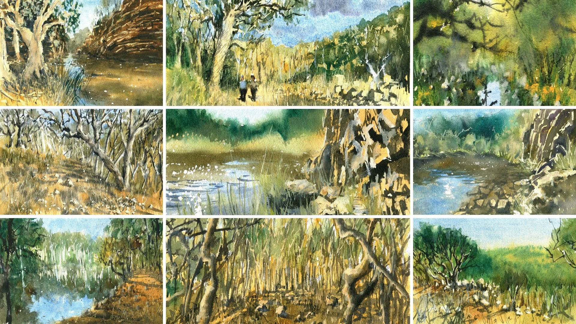
1. Introduction: Welcome to the thrilling
and captivating world of watercolor painting. As a beginner, mastering
the art of creating a loose yet accurate landscape can feel overwhelming
and daunting. What do you start? What techniques do you use? How do you bring your
vision to life on paper? In this class, you discover all the essential processes
and techniques to transform any photograph into a stunning and
impressionistic landscape. With my expert guidance, you learn how to create a masterpiece that
captures the essence of the scene and showcases
your unique creative style. I'll show you how
to imply time and context through painting
both day and night scenes. Together, we will explore a breathtaking landscapes
from around the world. And I'll take you
on a journey to recreate each one step-by-step. You witness my entire
process in real time. From the initial drawing
and composition of the scene to the careful
layering of light and shadows. Finally, to the addition
of details and highlights. With each lesson, your
skills will improve. And you'll watch your
paintings come to life. Whether you're an experienced
artist or curious beginner. This class will equip you with the tools and techniques to create or inspiring landscapes
with ease and precision. To join me on this
exhilarating adventure into the world of watercolors. And let's unleash your
inner artist together. I can't wait to get started.
2. Materials Required: Alrighty, before we get
started in this class, I want to go through the
materials that I'll be using. And you wouldn't necessarily
need all of these materials. I do have repeat colors and
colors that are very similar, but I'll go through the ones
that you need the most. So if we start over here
and look at my palette, my palette is arranged in such a way that I've got
all my warmer colors here. And it slowly transitions
to the cooler colors. So basically all these
yellows, oranges, and reds, slowly going towards the blues, goes to a couple of
the browns here, and then overall to
my darkest colors. So basically the purples and black or neutral
tint over there. I'll use a variety of
colors and these two here, this is a bit of
quinacridone, yellow, and a bit of yellow ocher. These are pretty nice
colors in terms of getting in that nice bright light
coming through the scene. Often use this near
the horizon line. Also use it in the buildings to imply bit of light
coming through the windows, got a little bit of
Hansa yellow as well. Kanzi yellow is a
very vibrant yellow, whereas quinacridone
yellow is still vibrant, but it's more of a golden color. And the yellow ocher is
more of a muted down, more of an Earth
and sort of yellow, couple of oranges their
power or orange or red. I've got myself a Quinacridone, orange there, which is
nice granulating orange. This color here
is Buff Titanium, which is an off-white color, not 100% necessary to
use it sometimes though, I also have a bit
of cerulean blue. These two colors,
not too important, but basically lavender
and turquoise, which I use sometimes
but not very often. This here is a bit
of ultramarine blue, quite an important staple. And if you only have n
only able to get one blue, I'll suggest getting
the ultramarine blue. I've got a couple
of grounds here. This one here is burnt sienna, and this one here
is burnt umber. Burnt amber is just
a little bit darker. Moving through towards
the back here, this is a dark green. So if you use an emerald
green or an olive green, hookers green, completely fine. I've got a whole bunch of
purples and neutral tint. Neutral tint is just
basically a premix black. And you can mix that up by using all your three primaries. So if you've got the
ultramarine blue, you've got a bit of red
and a bit of yellow. If you mix them all together,
you're going to get a nice dark color anyway. Okay. So that's pretty
much my entire palate. You can see I've got
two large wells here. That one I used to mix
up all my cooler colors. This one I use to mix up all my lighter and
warmer colors. Don't often clean it too much. When I start a new painting, perhaps I'll just
clean off the edges, but as long as I don't have
anything That's greenish on this side or just two out
of the ordinary over here, too much green there perhaps. I'll just more or
less leave it like this every time I
start painting. And like I said, I've got a lot of colors here. And for this class, if you only have three
colors, basically, if you've got a nice yellow is something like
a yellow ocher, you've got apparel red
and ultramarine blue. Those three colors will really get you buy in this
entire course. You can see this
particular scene here. I've got the sky at the top, which is a dark blue, goes down to a lighter blue. You can just dilute
that blue down here. And a lot of these
buildings anyway, I kind of a grayish color
which you can achieve by mixing all three of your
primaries together. A bonus little color I have as well when
you can't see it, but it's basically a
bit of white gouache. And it's a separate
tube of paint which is opaque
watercolor paint. I use that, mix it in with
some of my other watercolors. Ink sometimes create
little highlights, as you can see on the
edge of those figures, top of the cars,
things like that, right at the end of the scene. In terms of paper, what I'm using is 100%
cotton watercolor paper. It's in a medium texture. You can use medium or rough
textured watercolor paper. And this is really important
because with textured paper, basically the paint will
settle in and spread a lot more in a
uniform manner rather than sink into little
dips and rivets in the paper to farm
when you're using smooth watercolor on
paper or hot press paper. So something important
to make sure your paper does have some texture to it. It's not a big deal
if it doesn't, but just remember it's going to dry a little bit
in puddles if you do use paper that doesn't have
a texture to it like this. So finally, here are
some of my brushes, and there's not all too
many brushes that you need. Again, these are your
watercolor mop brushes. These ones here they pick up a lot of water. As you can see. They have a large
belly and a small tip. And the small tip is important because when you're
cutting around shapes or you're trying
to imply details, you can still hold a lot
of water without having to reload your brush
and go back constantly. That creates a fresher look and creates more continuity so that you can basically get in large shapes with as few
brush strokes as possible. That's really
important to achieving a loose look rather than
going in, starting off, adding a little bit of paint
in here for picking it up, continuing and continuing,
going back to the same area, it's just going to offset
the different layers. It's not going to
look as organic. So three different sizes
really just depends on what you're painting
for the sky, e.g. I'll probably use this
larger brush, okay, but for the buildings, I'll use the medium-sized mop brush here. Finally, these two brushes
here are synthetic brushes. I've got a synthetic
round brush and I've also got a synthetic flat brush. These brushes are really
good for getting in small details such
as car headlamps. If you're looking at a
figure, getting the figures, these little light poles here, details of the windows, anything that
requires detailing. These are fantastic
then not for painting large areas and getting
into nice smooth wash. And sometimes I can use it as these downward strokes as well to create
these reflections. Here in the ground,
we even a larger, slightly larger brush of
this synthetic quality.
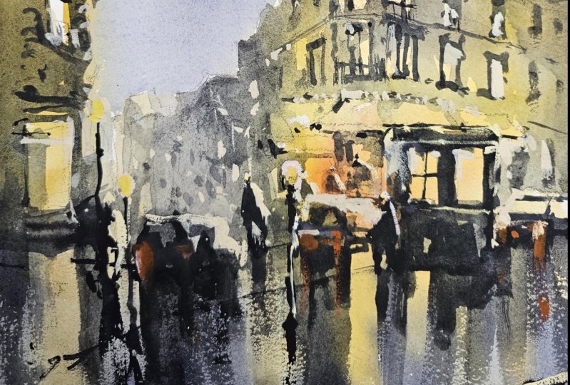
3. Street - Drawing, Light: Alright, we've got an
interesting scene here. I really like this one and it's unusual because it's
a nighttime scene. It's also the perspective
is a bit different. It's coming from a more
top-down aerial perspective. Looks like the photographer
standing on some, a flight of stairs or
something like that. But I want to add
some figures in, and I really liked this reflection of the
light on the ground is sort of Nocturne
type of scene. So let's go ahead and get
in a bit of indication. Firstly, of where the
buildings touched the ground. I'd say it's roughly here, about a quarter of the
way through the page. Okay. Just a quick
indication like that. And what I wanna do here is just kinda be pretty loose
with the pencil work. There looks like
there's some type of not sure what it is, like a billboard or
something here could be a bus stop or something
near the side of the road. And there are some bits
of light reflected off from these bits
and pieces here. Okay, you can just see them. These little billboards
or something just being reflected
here on the ground. So I'm going to keep just a
quick mental note of that. But to me it's just
another object, just another interesting object
that we can Placing here. Actually behind you can see
this car running behind. It's a bit tricky
to see, but yeah, it's just the car, perhaps the back of a car
or something there as well. Just going over to
the right-hand side, um, of the scene. But I actually just move this back a
little bit like this. Maybe it looks better. To me, it's just really
a shape at this stage. Let's go ahead and I'm
going to start putting you in a bit of Scribble
here for the building, this large building here, and look out Council of
loose ongoing as well. For the time being, I'm just
wanting to get indication of where to put the roof of it. Something like this. There's another
building here coming in from the edge at the side. Okay. Like this may be like that. Now we know that it starts not in the center but
left of the center part. So that's why I'm
drawing it in like that. There's all these
other buildings here out in the back
like this one here. There's another building here. So I'm gonna just
add that one in. There's a few more. I mean, it's hard to see them all the way off in
the background. We will fair, fairly far off into the
distance as you can see. But the great thing is that we don't
really need to put in much details for these
buildings here at the back there just gonna
be quick indications. And over here there's
like a footpath. And This building here to the right is the
main attraction. Okay. Let's put it in this
building here on the left. I'm just look, just indicate
quickly roughly where it is, but it's coming down like this. Okay. And look how loosely I'm just sort of penciling this
stuff in as well. This is some sort
of shock front. I can see here, just the front here, the display cabinets,
the window here. Okay. Just coming down and
it's a rainy day. And we're gonna get some
reflections on the road, which I'm looking
forward to doing. Okay? Yeah, it's an interesting
sort of perspective. It's always good to
challenge yourself, do something a little bit
different every now and then. That road comes in all the
way at the back like that. And then you've got the
other part of the road that just runs out here perhaps. Oops, let me just bring
that one in a bit more. Here. Might bring this down further, like he may be. Okay, that's better. So there's cuts
behind like that. The off like that. Alright, good, good. Yeah, very interesting
perspective. It's not something not
a usual sort of seen. But I want to really getting
a bit of indication of this. Everything is sort
of perspective. Maybe this get rid of this line. Will leave some of these maybe
running across like that. Okay. A lot of this stuff
here on the ground, I'm going to just use four
reflections later on. But that's a reflection. I mean, that is kind of a bit running across
the ground like that. There is also some
amine over here. You can see there's a couple of cars or scooters or something
like that running over. I will actually just work on this side, this
side of the scene. They started seeing first. Now these buildings,
we're going to need to just detail the touch. Okay, top part of it like that. Running across, gone
off into the back and then some windows is
a window at the top. He's another one. Another floor. Another floor we can put in like this. Here's another one. If I'm if I don't get the
exact number of floors, I'm also not concerned as well. We just one of the
big things is just trying to get an
indication of all this. There are these repeating
structures of windows which I like that coming down
look, there's another one. I like how some of them
are lit up as well. You can see the insides, this nice warmth in the
insides of the windows. So we can indicate a
bit of them afterwards. You can also see
there's some details of the railing and stuff
like that as well. As you can make out like this, just kinda these railings. These windows are not so
visible on the left-hand side. But you can still put in a
bit of that like this here. Like that. A lot of that, a lot
of this will be just painted in a big Silhouette. But I'm mindful that
this building is, it's fairly detailed and so
I just want to roughly put in where some of
these windows are but not try to overdo it as well. Okay. So how many rows have
windows that we got? 1 234-512-3451 more here, coming down a bit further. And this is the front side of the building, as you can see, it's like a year the front side. So I'm just going to
roughly bring this bring this line work down like that. May have to read shape some
of these windows later or just move them around
to touch there. And underneath
here, look at that. You've also got these
like nice shades. And you've got reflected
light on them as well. This is really important too. In some of these
beautiful looking shades, I might just get them in
red actually afterwards. I'll extend a few of them off
here into the back as well. Why not? Good. Maybe have this one a
bit, little bit lower. And then underneath you can see this things like these tables. Who knows what
we've got in here? There's a whole lot of
stuff running in there. We might have a person, couple of people in there. Just simplify this down. It could be someone sitting
at a table here inside, just keep it looking a bit busy. But outside this restaurant
or whatever I thought, why not have a few people? There's a person just walking
around up there as well. Okay. And it might actually be
easier just to make it look slightly elevated
but not to elevated. We could ever figure here and going up the
stairs or something. That's why they're a little
bit maybe a little bit shorter here in the back. Okay. Oops. That maybe have someone here as well just to be closer to the front
of the scene. Like that. They're just maybe
crossing the road. Crossing the road. There. We do have some cars like all that car anyway,
over on that side. But whether you want to put
any other ones in here, that's up to you as well. I think maybe another one
might be good to add in here, just to give a sense of a sense of scale to those fingers so that they don't
look all the same. And this will give a bit
of a reflection as well. For that car. We can have another
one perhaps around. Look another one here. Just a simplified car. Alright. Just going, going across
into the scene like that. The figure here that's roughly a little bit taller
than that cars you can see. Good. Okay. Go back to this building, some more of these little
windows and stuff like that, we can do all that later. But what I like is
these the floors of this building as well. You can see it's quite, quite an interesting
looking building, but the windows having
a little bit more light and especially
this building is closer to us as well. It would be good to get in a little more detail in some
of these windows later. But I don't want to
do too much of it. As you. I really like to let the brush, brushwork show through
more than the pencil. So we've got some figures there. We'll be able to get
some nice reflections here on the ground. We might even be able to get another figure just
standing here. You going into the
scene like that. I'm kinda thinking this
one is a bit too big now. So I'll just reduce the size
of this figure at touch. Okay? That's better. Reduce the size of that figure. It lead to bit from last time. This will be some nice, a little reflection
here as well. Okay, I've got some
figures walking through. And there's also some like a lamppost here you can see it's a nice little
lamp post here. Just, simply, just simplify
that down like that. Okay. You might even want to put in another one here if you'd like, over on this side. Okay. Simplify this down. There is this sort of, you can see here these kind of railing go up here as well. Something to potentially
keep in mind. I don't know what that is. Fire hydrant or something
on the side of the road. Okay. But just a little bit
of something up here. Maybe we can edit
in near the end to make it look like they are stairs or something that's
closer to the foreground. But I think that's
a good jarring to go ahead and
get started with. So what I'm gonna do first
is I'm going to pick up a lot of these
lighter colors. Okay. Let's go ahead and get in. Going ahead and
getting a little bit of light into the scene. So I've got myself
some yellow ocher, but near the root Hall, really vibrant ears here I'm
going to use just pretty much lightest yellow
that I can find as well. So just dropping that
in, I'm saving my, my my strongest highlights
for these sections here, where we've got more light on the actual
buildings themselves, the windows like that. Another good thing
is like the orange, like get a bit of
orange in here as well. Just a really light
sort of pyrrole orange running through it, more strength down here as well. But really what I'm
doing, as you can see, I'm just getting in
the lighter parts of the painting and I'm not
fussing about too much. Yeah, I'm just letting
it do its thing. And I can tell these
windows are sort of, they're definitely not too warm, but I'm going to make
them a bit warmer anyway. Okay. But I'm just adding
in this nice, lovely, warmer color
running through there. And this is going to be a
focal point for our painting. And something that the viewers view as I will be attracted towards straightaway and k. And you can see how some of
this light just emanates up, emanates through the other
parts of the building here, coming through the back
of the car here as well. So that's kind of vowel
lot source in a sense. And a little bit of that light also showing
off in the ground. A bit of that reflected light
off in the ground here. Just bringing that down
exaggerated really. I'm gonna do it for this window
here on the left as well. Okay, bit more, maybe yellow ocher or
something like that, gets some of these
downward action. Okay. Just as long as I've got a bit of warmth running down the page, this is going to be great. Okay. Good. In the background. There's not a whole
lot to put on there. I'm just going to get in some of these lighter colored white. It's just buff titanium. Okay, for those buildings
off in the background, maybe a touch of purple or
something or grayish color just dropped in
at the back there to dial it down a touch. I don't want that to be
too much of a focus. And the rest of it, I'm just going to
coat with some of this yellow ocher and a little bit of this
other color as well, a bit of this burnt sienna. It's pretty warm
colors as you can see. Just to give it a bit
of a backing color. And then what we'll do, we'll
go over it afterwards with some with some darker
colors as well. Okay. Look how quick that's done. I've forgotten some
of this window here is a bit of
light in that window. Let's put in some of that. And the rest of the
building again, just I'm using a bit
of burnt sienna, yellow ocher like that. Here. The good, Good. Alrighty. Be some more light on this car, just a bit more warmth
in there as well. And a bit on the ground, just a bit of grayish color maybe on the ground like this to contrast with all the rest
of the yellows and things. Now I really think that
the background, the sky, and also this pod needs
to be pretty dark, especially near the base here. But I will spray it down quickly because I want to
do the sky first. I will spray down
the bottom to keep it wet for afterwards. But for the sky,
I'm going to mix up myself a bit of a bluish color, purply color, and touch
of blue with it as well. A bit more blue. I want to make the top
of the sky darker. It's just going like that. Let's see, just
test, test it out. Ultra marine and
a bit of purple, bit of it of that, use a larger brush, this will be better. Okay? Blue and purple k. So it is darker at the top. And I want to get this, make
sure I get this in right. Like that. As we move down the page, you move down the page, we're
going to make this lighter. But you don't want to cut around those shapes a
little bit as well. That okay. Just a little bit
of that building. But as we move down, Look, I'm just adding more
water into this mix here. If it mixes, That's no big deal. I don't want to leave
a bit of white on some of the edges
that helps too. Separate app, separate the sky out in a little bit like that. Okay. If you do feel the sky at the top is just not dark enough, you can while the
paint's still wet, just dropping a bit
more like this. Nice little, nice little
stroke up the top like this. And that should darken it a bit. Encourage that to blend as well. Okay. Move the paper down a little bit
to let it blend. Charge it to blend using thicker paint
at the top so that it doesn't create too much
water coming down. Okay. Thicker paint at the top. Okay. Might shift some of it
down the page as well here, just just let it
shift down a little. Okay. Let it do its thing. As you can see. You get only get
one chance to do this while the
paper is still wet. So I try to make sure I've got it got it in quite accurately. Bit of neutral tint as
well off the top just to darken it a touch, a little bit more
darker and make it less bluish as well. Okay. All right. Let that all seep in
and do its thing. Now down the base
of the painting, Let's go pick up a
bit of blue color. Again, this sort of darker blue and a bit of neutral
tint as well. I'm gonna do this, I'm just
going to feather some of this darker color through the yellow that we had
previously painted. Mean to do that. Some of that up a little
tissue paper will help that. Really the aim here is just to encourage this to blend on a bit with the darker
parts of the ground. Okay. Neutral tint and a bit of bluish color that
just come on down, just mix it, mix it in. Like this. That were blue here. Swell. Good. Still pretty watery
as you can see. That everything should sort of mixed together nicely. Okay. So let's leave this to dry.
4. Street - Shadows: Alrighty, everything is all. Dry it off now and he comes the fun part we're putting
in the shadows, just some of the
remaining shadows and the details into the same good to make buildings standout come forth
from the background. And a little bit. I'm gonna be using a combination of Russia's
really just two brushes. Either a flat brush, small flat brush or a small round brush
will do fine if you, if you are painting
this as well, then also a larger
brush like this, a larger mop brush. Okay. Probably one of these
ones like that. Just so that I can just
having a look here. These two mop brushes
small and what brushes get the largest shape of the building and the case. So I can, I'll go for the smaller one for now
just to be cautious. And also I've got myself a
small flat brush somewhere. Flat brush is just
going to help helped me to detail around some areas where the
other brushes too large. So let's go ahead and firstly, we are going to decide
what kind of color were painting the buildings. I'm going to mix up a
blend of this brown. Yeah, I've got a bit of brown. I've got a bit a neutral tint, got a bit of blue color here. And just trying to get myself a nice balanced dark
here, lots of water. Still talking about 50% paint in this whole mix and 50% water. So it's still quite watery, but because the paint is darker, we don't need to
add too much water, whereas the lighter colors, it doesn't really
matter so much, but this needs to be diluted
down so it's not too dark. I want to get it a tiny bit more warmer to
start off with. And then we can add some more
corners here on the side. So we would just like to have
different types of grays, grays that are cooler and just a little bit warmer like here on the
right-hand side. And to do that, I
just add in some more little bit more brown
on the right hand side. And on the left-hand side here, I've just got more bluish color. Let's give this a try. Okay. Start off the top here
and test that out. Okay, not bad. Maybe a bit more darkness. Look good. I wanna do this hopefully
in one quick go. I don't want to spend
too much time fiddling around with the
details like that. That's the top of the building. Like that. Really more water as well. A lot more water coming
across like that. You can leave some
of these windows illuminated like this as well. The whole building doesn't
have to be dark like that. And here's another window here. Touch that window. Yeah. Leaving in a bit of that light
as well as so important. This is coming down the page and here you see the
windows and I'm just again leaving out some yellow
windows, windows. Okay. To just exaggerate
the appearance of lights in these some
of these areas. Okay? Okay. Of course will detail
more as time goes by. But for the time
being, I'm just going to get in the main
gist of what I see. Sides of these buildings. As you move down closer here, you'll notice that
it becomes a lot warmer and the
shadow is a lighter. Because when getting closer
to the light source, much closest to
the light source. So I'm just turning things
down a little bit here. Adding more water
into this gray. See that just a lot more
water into this gray. And I'm coming down. I'm still getting the outline
of this whole building in, but I'm toning down the
gray a little bit so that it doesn't overwhelm everything. Okay. Good. Just spray it a little bit. This okay. Good. Side of this building
does need to be touched darker here. Just get it to stick out of
the background of touch. Also these buildings
here in the background. I'm going to just I'm going to just darken
them off a little bit, but only a touch out
in the background. So more of a silhouette,
as you can see, just more of a silhouette back there and leaving some of
that previous wash as well. Okay, good. The base of the building
just underneath here can be done with a small flat brush. Again, we're just figuring
this out as we go. Now underneath the
shades is probably gonna be a little bit of
darkness and areas. Okay. Still lots of lights on the
insides of the buildings, so I don't want to overdo it. What's over here? Some more pieces
over here as well. Just some more. It's here. Okay. This is actually, again, this building or whatever
here in the front, as you can see which
kind of pops out. So I'm going to darken
this actually to make it come forward a bit
more like this. Give it a bit more. Presence. Is figures in there
somewhere as well. Alright. But notice how all, everything is just sort
of joining on nicely. And I'm not really getting too bogged down
in the details. Okay. That's a car there. We've got another
car here as well. In the background. This is going to be
a bit of and you get some reflections here and
on the ground as well. For these cars. Let's just
put in some details for them. First. Just bring this grayish color down a touch as well there. Okay. And for this building
here as well, I'm just going to adding a
bit of darkness up the top. And really just doing the same thing as we did on
the right-hand side building, just make sure that it's
darker than the background. But for this one, I'm
really going to make sure that it's darker than what we've got for the the
right-hand side and buildings because this building
is technically closer. Okay? But I'm gonna do this in one
go without too much fos. Write like this. Let's bring this down. That's shop front
here, like that. Front area of that sharp
just over this side. Good. And then you've got
this reflection stuff on the ground as well,
which is important. I will just get rid
of that quickly. You have gone over it too much, but more the edges
of the building. And I'll do this actually
with a flat brush. Flat brush here. Pick up some darker paint, dry off that paintbrush. Maybe I'll do it here first. Something like this. Hey, like that, Just
kidding a bit of this downward brushstroke action and K For these bits and pieces. But I don't want to eliminate
all that light as well. So you've got to be careful. Car here as well. This one is going to be
touched more detailed. This another car or something like that. Okay. I'm here. Let's get into the
side of that building. The reflection of it running
down and also the side. Just a quick downward
stroke of paint like this. Alright, just got some nice,
nice little reflections. Okay, let me just do
this car up a bit. Get a bit darker around
some parts of it. Okay. Fantastic. Just really trying to
create a bit more shape. These nice I like the
downward reflections as well. They do help bring
everything together. Okay. There's some way for me to connect up these buildings
on the back like that. Some of them reflecting
as well downwards. Okay. So we're really just
doing the shadows of the buildings and also the
reflections at the same time. We do have some
figures in there, but I want to get the shadows and stuff of the
figures later on. With the final the final wash. I think I think this is pretty
good for our second wash. I'm going to give
this a quick dry.
5. Street - Finishing Touches: Alrighty. So now what
we have to do is put it in the final finishing
touches of the painting. And this is one of my
most favorite parts where what we do is just basically
use a small brush. I've got a couple of
small brushes really, but I'll focus on a small synthetic
round brush and also a small
synthetic flat brush. And I'm going to pick out
some details when I'm getting some fun little
details. Neutral tint. Okay. Neutral tint, bit of
brown butter blue. Just mixed myself up
a nice grayish color. Now where should we start first? I think for some reason I
just want to start here. This rooftop or wherever
of this building here. Just want to darken
this down a touch. And at the same time, I'm also being mindful not to get rid of the previous wash because you want parts of these different layers to
show through in watercolors. Alright, look at that.
It's looking to, looking a bit more interesting, bit more textured, but it's also bringing forwards
this structure. Just need to pin it to the
ground a bit more as well, just like that'd be more
darkness near the ground area. At times you might
need to even redo some of these little
reflections like that, okay, you can just
quickly redo it. A touch. Is top part of that
structure like that. There we go. It's kinda looking
like it's coming forth into the foreground more. Okay. Good. We have this car here in
the background as well. Let's just I'm going to just darken it off the
touch like that. And we can do things
like just put in more signifiers of detail
like the windows and stuff. See, just start to look a
little bit more like a car. And I'll also add in some maybe some darker some darker
but some highlights there for the tail
lights afterwards. Okay. Something like this first, there's a figure here, some a person just walking in front and a couple
of legs like that. Simple sort of figure
here. Like this. The head in as well. And perhaps getting a
reflection on the ground of figure just down to just one little
downward stroke like that won't help, I believe. I think to connect the feet up. Legs up. Okay. Let me just make sure my anchor this structure bit more to
the ground as well like this. Okay? So that's kinda looks
like this person may be going into the scene. Maybe an arm
outstretched like this. I did have I believe
another car here forgot to put put in some
of the details for it, but we can add in a little bit of the back end of the car. Okay. Just a little bit of that
back-end of the car and also the wheels underneath like this. And join it up with that figure. A touch. Okay. And again, just some
downward brushstroke to further just carry
this down the page a bit. This reflection could be a car, could be anything there
at the end of the day but something like that. Okay. Let's have a look. What else do we have here? We do have another car here, so let's get this one in first. This is again, just another
one I'd made up earlier. But creating a bit
more darkness as well to sort of bring out
a sense of light, especially on the
right-hand side of the car. You don't need too much detail in there at all, just enough to. To jump imagination. And the viewer can
figure it out. Darken that reflection
just to touch like these. It's important to dry brush
these reflections on as well. So it doesn't look too detailed. And we'll get some
nice highlights on the back of those
cars as well later on. Here's another figure. Okay. Okay. Downward brushstroke for the reflection. I always try not to
make it too detailed. Just a quick joined on
at the base or good. Okay. Let me work on this
building a touch as well. Just put in a little bit
of grayish color in there to bring just sort of change the tone of
some of these objects, especially the cars, are a little bit of grain
there does help. I'm just mix it around
a little bit like that. Okay. I'm good. Now the figure here
off in the distance. Okay. Just putting
in a bit of color. And the legs, like this, legs are so important to help indicate that
they are figures. Okay, and move downward action as well for this one
bit of reflection, that one, that one
turned out really well. That just make sure they
connect onto the legs. You can make the
body a little bit, the legs a little
bit darker as well. Okay. Like this and then
they just drawn onto that shadow better. Okay. Good. So we've got a few
things going on, a few different figures and people running around
in the background. That's another figure in there. That might be another person in the restaurant or
something like that. People sitting
down at the table. A lot of this stuff is just
indicating what may or may not be there in
the first place. And leaving it up to the
imagination in a sense as well. Okay, let me get the top of this little section that building in like that.
What else can we do? We can separate
out some of these, these little bits and pieces. The windows as well. You'll notice this some little
details and the windows, it's picking up the same color. You can see down here is actually enough
detail up there as well. But look, at some point, you have to have two. Separate this from the
reference photo would be it, especially when you're drawing, it's not gonna be as accurate. And so when you start painting, you'll find that just don't
line up exactly as they, as they do in the
actual reference. And so you have to just improvise
on the go and give your scene its own sense. Okay. Let, let just this
same building. And of course, just using
the same grayish color, I've got windows separated out that window a
little bit like that. This one as well. I could perhaps put in a little bit as
something like this. The more here. Another one here. Line running down the
center of the window. This row of windows
here down the center, I think quite important. This is like the front
end of the building, in front of the buildings. So just put in a little
bit more detail. Guys, look at the Windows, you've got a few of them that
we can just improvise and put in another window. Sometimes I just
purposely make them, some of them look
a little messy, and some of the others
I'll do more detailed. Okay, so that we've got a
bit of variation in here. So you get near
the top. It's kind of everything just seems
to blend together. A bit more difficult to see what exactly is
going on up there. But some of these
lines, as you can see, I've just moving the
brush across and creating these little lines running down the side of the buildings. They are gold that help to bring out the details
of the buildings. But make sure you
dry brushing it on to have a look this section
above the window here. Sorry about these shades. Think a little bit of tiny bit of darkness
up here could be good. Just what darkness but
just a bit of something, a bit of watery mixture
of gray in some areas to join it up a little. Right? I don't
want to get rid of this beautiful lot emanating
from that section. So we have to be careful. I reckon, just little touch ups here and there
would be good, like little bits of darkness running through
in some areas and that as we sort of get onto the
edges of the scene as well, one of the things
you'll notice is that I tend to make things less detailed
off in the edges. And that's basically
so the viewer, viewers eyes drawn to the
edges too much that we're more focused on the center or the focal points
of the painting. But see how those little bits of yellow that we
left out before really become quite an asset
later on down the track. And the create the illusion
of these windows that are lit up with a bit of life people when they're
doing something or another. Okay. And look at that
just little bits and pieces of detail
I'm adding in. Alright, so I'm looking
on the left-hand side. Left-hand side. I'm going
to put you in a bit of detail here for the windows, these little bits and pieces there like that
for the balconies. Okay. You've got to do this
quickly as well. Otherwise, it looks to put
on something like that. The front of that
building there. That little detailing for
these these would you call it? Um, pillar or something here. Okay. How far does it run down? So different here, doesn't it? Yeah. Again, the other bottom
part of the window and some the details
again here as well, just little details of the
architecture hinting at it really not not trying
too hard there. I do like the fact that in the insides are
suddenly Windows. You've got these frames, darker sort of frames. So I'm just trying to
indicate some of these but not draw too much
attention to it. Tricky because I
want to put them in. But I know from experience that sometimes when you
identify things too much, it just loses its loses the
magic of the entire scene. So you've got to
be, you've got to be sparing with some of
these marks that you add on. Okay. I actually got rid of some of the stuff here in
the left-hand side. That doesn't matter. I don't care. Just
wanted this to look a bit more reflective. You put in a bit of
darkness on the inside like that as well. That everything
needs to reflect. Rid of darkness and
then that also has to reflect downwards the touch. Okay, I think maybe some indication of the roads
might be good as well, just so that I can
imply what's happening. So let's try to do this here. Here. That kind of goes off
around the back end. We got maybe something here. Maybe there. I had a little bit of a road. Okay. I want to put in
some little windows and things for the buildings
off in the background. Just some little
quick indications. And perhaps dark and
off this building a little bit here as well to
help that one in the front. The one on the right hand side here just stand
out a bit better. Darken it marginally. Okay. Just a little like that. Okay. Tiny windows are indications of
details off there. It doesn't matter too
much because it's so far off in the distance. Some little details like for the balconies and
things like that. I can just put in little bit of this
stuff here like that. Not for all of them, but
some of them. Perhaps. There might be a few windows
that you want to draw our attention to or just darken a bit around the edges too. So as you can see here, little bit of extra, little bit of tiny, extra
darkness and areas. It's important in watercolors
to have that full range. The full range of tones in here. There is lampposts,
I'll put in as well, just starting about here, bring it down to the pavement. Like there were roughly finishes off that as well and then there's actually a
reflection underneath. But I remember putting one in
perhaps over here as well. Maybe I can just make one
up behind this figure, putting it somewhere here. Okay. There's some verticals
would be good. Lamppost. And bring the bring a bit of that reflection
downwards like that. Bits and pieces on the sides
of the road like this, what that is like a pole or
something there as well. Not only that, you don't do notice some of the stuff
here in the foreground, like I was tossing out whether to actually
put it in and out. But I think I will just
for the sake of it, this railing that
just goes up makes it look like the photographer is standing on a slightly
higher vantage point. As you can see, they're
put in another, Let's put another poll here. Okay? And reflection like that. I'm thinking I might just shorten this building
a bit like here. Lengthen it, sorry. Like this. Otherwise
it doesn't make sense. So that's still got the
reflection coming down, but it's a bit
because that could be steps or something
meeting up like this. Alright. We put in a few bits on top of the building. I
wonder just some. Little touches of
detail here and there, like chimneys, little chimney detail or
something like that here. Let's put in a little
bit of white gouache to finish this off in detail. Some small other
bits and pieces. Bit of white gouache, K. And we'll actually mixing
a bit of orange as well, orange and white wash. Have you been getting
some tail lights, reflection of tail lights here. Like that? For the cars like this. Have some just come
downwards like that as well. Oops. A little bit of a
reflection down. Whitewash to put on a little
highlights for the figures. So you can see here there's
another figure here. That lamp outline that lab
a little bit more mount, put in, put another one here. Just a little indication of a lamp. Bit of yellow in there. Actually just touch
the yellow in there. Maybe one here as well. I was putting in four. Let's have a look.
What else can we do? Just warm up. This is the squash
and the figures. Maybe a bit more here on
top of that building. Sometimes when you lose a bit of that light off the
buildings as well, you can kind of bring bits of it back
as you can see like I'm doing here with the gouache
details and stuff like that. Okay. Use a figure here as well. Inside the buildings here. It'd be too light on
top of this rail link. Okay. They're just on the
front of that car c. We want some light just
reflecting off it. Hitting the top of it may be from the source of that comes from the
buildings. Of course. Just put some little dots of color up here to indicate the lights or
something on the building. You sometimes do get bids coming through
the buildings as well. But here's another thing you can do if you've missed out a bit of light and you want to put it
back in to the buildings. You can do it. You
can do it like this just with a bit of touch, a gouache as well through
some of the windows and kinda bring not recover it, but certainly just
bring it back. I'm just mindful to make sure I'm using a little
bit of it down here as well. That it says spread
out more evenly on top of this car. I think just a bit more like this car That's
looking quite alright. Finishing touches. A good fun to do. And yeah, I mean, I spend a little bit
of time on this. Okay. So now I'll put a bit more
here on this building, just a touch of little
highlights stuff as well. And I think we're done.
6. Paris - Drawing: Okay, let's go ahead
and get started. We're going to turn this
one into a nocturnal scene, but for the time being, we don't have to worry
about pretty much anything else, just the drink. And I want to put in the
base of the buildings. And it's probably about a quarter of the
way through the page. So if we imagine the
center of the page, measure the center of
the page about here, we wish to want to separate
that into half and draw a quick little line across
the page like this, just to mock it out roughly. Now, what I wanna do is
work on these buildings. And what we going
to try to do is basically just start with
a very loose sketch. We know we've got a whole
bunch of these buildings and things here on
the left-hand side. But of course we've got
this larger building here in the center and we can see it just sort of
go all the way up here. That's the center part
of the building there. And you've got this top part
sticking out like that. What else do we have? We've
got all these bits and pieces coming off the
side of the building. It doesn't matter all too much. There's chimneys and
stuff like that as well. Just want to get in a
quick indication of it. Okay. Like that. They're the sides of the
building there as well. So symmetrical like this. Okay. Maybe I'm just
going to bring that down roughly around here. Okay. And there's so many
windows on this building, it can get overwhelming. Alright, but we want to
just reduce this all down to some simple shapes once we actually get
in with the painting. And you can see here, I'm just trying to indicate in really
basic sort of details. You can see here on the sides
of the the rooftop areas, there's bits sticking
out, that kind of thing. It doesn't matter. Let's count how many
floors is 1, 234-561-2312, 3456, 1234, 5612, 3456. So we've got roughly
those six floors in here. Now. All these windows
so much going on. And the great thing about
this scene is that we can actually choose what we want to do with
all these windows. I don't have to put them all in, but I certainly want to put
in these ones out the front, at least the front, the
base of the building. You've also got all these
little, little details here, like this shade that is just running across the
base of the building. They're kinda comes all the
way somewhere like here. Okay, There's bits underneath
that's going to make some, create some lights at the base
of the buildings as well. These buildings are, but you
can see here there's little, little windows that
we can indicate and some of them we might want to draw out a little further. But for the most part, there's not much of a need to. I'd just like to put a few on each side so that
we can mark out each floor so I don't forget. Don't really forget afterwards. Let's have a look. Here's another building
here in the back. And it's all just turns into very much Hodge section
like this off the side, we've got more
buildings out here. And not only that, we've got this bigger one here on
the right-hand side, which almost comes out
the top of the scene. But we can just simplify
it down like this. And probably something on
top of the building. Okay. Let's bring this down like that. Like that. This is like the side
of the building. And again, I think this
is how many floors? 123-42-3456, floors. 123456. Like that? Oops. Kinda like that. Maybe. We can just draw it in again, some more of these windows, what we had, what we had
here and the other one. Okay, this is gonna be
great to put in some light. Nothing alike as well
as this nice shade, this blue shade here, that I will quickly
draw in this light and bits and pieces underneath
this building as well. All these buildings
here in the background don't really matter too much. Just get the side of
this building in. Okay, so it looks more
three-dimensional. And then we can just join
it up a bit more like that. The rooftops in
rest of this stuff, we can just kind
of make up later. I think the most
important thing is just this building
here in the front. It's much more difficult
to get this even if we don't work on it now
and plan it out. Okay? Now, left-hand side here we have got What have we got here? We've got another building here running down a
couple of buildings. This is all just gonna
be a large shape really. But there is a side
part of the building like they're like that. But of course we have these
cars, some little cars. And the one I like about
them is that you've got this light that's reflected
off on the road as well, which is going to be excellent. Sort of implying this wet road scenario
that we have here. The cars running
through this scene, as we can see here on the side. They kind of lined
up behind each other like that. Like that. Just cause lined up at the
traffic lights waiting to go. Another larger one
behind here as well. Now the car behind there, this one is sort of
just facing forward. So there's not much we need
to put in there like that. But of course we've got
some smaller ones off, way off in the distance as well. If you go to boxes
or shapes like that. But for the most part, I mean, if you look at all
these buildings here, it doesn't matter. They just go off into the, off into the distance and putting the side
of the building, at least sides of these
buildings like that. This can be also some buildings
here in the distance. Great. They can also maybe be some
cars here, just get in, some cars just maybe coming towards this
intersection or whatever. They're not here
in the reference, but I want to put them in. Another thing that
we haven't really gotten here is
perhaps some figures will not have a person have
a person standing there. Probably be peak that
personnel that standing there, maybe waiting to
cross the road or something here like that. You'd have a person actually
crossing the road there. Okay. The further back
in the distance, this looks like a restaurant or something like
that here as well. So we can put some tables are indications of something
back in there. Okay, good. Fantastic. Alright, I think that's good. Let's get started with painting. So I'm going to actually
go in with a large brush.
7. Paris - Light: So I'm gonna go in with a
really large brushes as a watercolor mop
brush this size. And we're gonna go in just
to the buildings first. And because it's a
nocturnal scene, I want to exaggerate this feeling of light and
especially near the windows, these windows, I'm
just dropping in a little bit of yellow
for the Windows. Not for all of them, but a good number of them. I think it would be good to have a vibrant yellow
in parts of them. That what else do we have? Not just that, but in
the ground as well. You will notice
that there is also some light coming
off these cars. Okay. Let me pick up a smaller brush, maybe like this one. The rest of the building
is really like a brownish, yellow or green color. So just a quick light wash of that color will
essentially do. I'm not I'm not trying to I'm trying to get
in really any details. But I'm going to cut around, see how I'm just cutting around some parts of the buildings, leaving a little bit of lots
of color on there as well. That really helps to just
create a bit of sparkle in spots that I want to portray as having extra light here at the base of the
building here as well. See, I'm just getting some little bit more vibrant
yellow for this part. The more that vibrant yellow
actually run out a bit, but I've got some other
yellows to some more. I've got some of
these milky color. This is called buff titanium. And I'll drop some of
that in there just to change it up a little. Here's the rest of the scene. Just bitter that Buff
Titanium Hughes, while this shade is actually that color wash
in there as well. Okay, Good. Rest of these buildings, Let's drop in some color. And it's all just this this warmer color
that we've got already. Nothing special. Nothing special at all. Okay. Yeah. Yeah. Maybe a little bit
of yellow as well or for these windows. Okay. Bit more of this
vibrant yellow here. The building underneath
there as well. We've also got these headlamps, these these lights
coming from the car. So just some of
this yellow color running down the page
is also going to be excellent in a moment. Okay, so now the thing
I would like to maybe exaggerate some of these light coming off the center building. It's bring, let's bring some of this light downwards like this. Okay. Also on this one like that. Cow quick, I've done that. Okay. Back to that building,
these buildings, and I'm going to start putting
in some more yellow ocher. Remember that in this
wash we are only just trying to get in
some lighter colors. We'd not trying to putting any any darker washes just yet. Okay. Cutting around those
cars and things all back there and look, that's another building there as well off in the distance. Some of this stuff on top
of the roof areas as well, just needs a bit of coloring in. Okay, good. Now, what I wanna do is work on the ground a bit because I want it
to be a little darker. But what I think
might be better to do just get the sky and
first saw spray this down, spray the bottom part down, and go to pick up cerulean blue. And a bit of ultramarine. Ultramarine straight
up the top first. And I'm going thicker, darker up the top if
it's too vibrant, unlike to SG adding a little bit of neutral tint in there. So it's not too to
bluish bit more, more of that
ultramarine up there. Okay. And as we go down the page, I'm going to add
in some of these. Cerulean blue. And we'll cut around
parts of the building, around parts of the building, but I'll also leave
some white so that all it doesn't all
just mixing downwards. Okay? The goal here is I want to
make the bottom bit lighter, just some kind of lighter
bluish color at the base. So here, slowly in here. But as we move up,
it gets darker. Just call that in like that. Some of it is going
to mix as well. Don't worry about that. Little Guassian
there can't hurt. Just this connected bit here. Looking at the larger
brush allows you to blend much faster, more seamlessly as well. Alright, oops, I didn't want too much of that yellow
in the sky actually, but we're going to
have to deal with it. Some more ultramarine maybe up the top and bring this little
bit of it down perhaps. Okay, Just want to feather it in and I'll tilt
the page a little bit, hopefully encouraging this
to blend down a bit more. See that we've got some darker bits of color
running down the page. And hopefully this
will blend nicely. Blend downwards. Some more blue again up the top. Maybe some purple
or neutral tint. Again, increase that
sense of darkness at the top because it just
tends to move down the page. This color when you place it
straight on like this. Okay. Good. So the sky is looking
pretty decent. It's smooth. It's actually a bit more of a gradient through
there, but doesn't matter. It basically I just want to
create a darker darker area, blew up the top here. I'm just adjusting
it continually. Okay. Good, good, good. Now I want to get the bottom to look pretty similar as well. Some blue ultramarine
and some cerulean. So cerulean and ultramarine
just mix them together. And I'm going to do this thing. Just mix, just encourage
the colors to mix together. The yellow and the blue
running down the page. She uses smaller mop brush. It'll be easier. Just move some of this stuff running
down the page like this. Get it to join on together. Blue and neutral tint
running down like this. Encourage everything just
to go together like that. Okay? So we're almost, in a sense, just mirroring the sky. It's difficult in this case, we, it's easy to mix up a green
color if you're not careful. There we are. Good. Okay. Okay. Good. Car could have like some down
with brushstrokes as well. We'll go figure it out later on. We'll figure it out a
little bit more later on. I'm quite happy with how this has turned out
for the time being. Some more darkness here as well. Okay, good. Let's give this a quick try.
8. Paris - Darks: Let's work on the building
and I'm going to pick up a brown and mix it
in with some blue. To create myself, I kinda
grayish, bluish, color. Neutral tint to a bit of
black can help as well. To darken it further. I still want to
make sure I've got in a fair bit of water here. I want this mix to
still be quite watery. Maybe a bit of brown and
the touch of brown as well, burnt sienna as well. Okay, look at that. Just a nice grayish color. Alright, now, let's go ahead and start off
with this building. I'm going to test it off. First. Let's test that off
like that. It's pretty dark. Maybe a bit more water
like that. Okay. Good. So I'm going to cut
around these windows, just little windows
as you can see, little bits and pieces. But I want to make sure
this whole building is basically dark and we'll
start really at the top here. And this is where we want
to also a bit of attention to how the details as
well, okay, like that. We can also leave a bit of light on some of the
areas like that. Look at this. This is these little bits and pieces here on the roof top. Really just runs down the side there and it's down the
sides of these buildings. And the trick really is you trying to leave you
trying to leave out enough light for the Windows and bits and
pieces on the building. Okay. I like that. Yeah. This left-hand
side of the building, we've got more and more details. And when you using a
large brush like this, you are really forced to, to find the most efficient
way to paint things. That, again, here's that side of the building and I can just
again indicate some of these windows just
showing through 3456. Little windows and
things just showing through maybe a bit more blue. Just want a bit more blue in
this mix. A bit more blue. Just cool it down a touch. The mix of this color is that 50 per cent paying
50 per cent water. As you go down the sides
of these buildings, you can see little or you
can just cut around and find some areas that you want
to leave out to indicate the windows and that
kind of thing here. Okay. Then there's
one other one here. You know, you kinda
just make them up as you go like that. And we will detail them a
bit more later as well, so no need to worry. Okay, Just some more. They're cutting around, dab off a little bit of
paint because I feel like it's a bit darken areas. Can you on this? Yeah. Okay. And the buildings here in the back then
become quite dark. I'm don't really need to
bother too much with them just for these back
buildings, I think. Simplify them down there. Look there. Here. Larger one here. They're just trying to find myself a large shape
that I can paint. Large shadow shape
as you can see. Maybe popping a
bit more blue into the as we go further back
like these ones here, just dropping a bit more blue, help push them back further. I don't want to overdo
it, just simplify them. The remaining
buildings back there. Ones here as well. Buildings to the left-hand side. Here. Cutting around these
cars and the front. We get to the
right-hand side again. I'm actually a little bit softer here and lighter as we move
towards that back area. So I'm just lifting
off a bit of paint. As we move towards
the front again, right back with
some darker paint. Especially with this building, which is quite close
to the foreground. I'm just cutting
around the windows. You can see like that. Okay. Good. Notice how everything just sort of blends nicely together. That's really what
you're looking for. This little shade here, I'll just emphasize that a
bit like that cut around. We do have a bit of that going
on here as well actually, but in a bit of paint there, there are some darker
spots near as well. We can just see underneath
just a little smaller. Dark, darker bits. Good, good. Little flat brush. I'm going to indicate
some details on top of the building like this part, for instance, some
literal chimneys or whatever gear as well. While the paint is still wet, you can do stuff like this
and it works out quite well. Good. Some of these reflections and stuff on the ground as well. I'm going to just
see if we can do create some sharpness like that. These cars, the reflections of them running down
the street like this. Like that. It's a figure here,
there's a person here. Something like this. Simplify this stuff down. Okay? Of course I'm going to
preserve this bit of light here as well for the building. We do need to break pretty break this up a
little bit as well. I'm just thinking what we
can do maybe like section that just runs through
like that. Okay. Cutler figure here, legs. Legs of that figure. Underneath here. There's usually some pillows and things are
running down the building. Okay. Just connect the
legs up more legs. And again, getting that
downward brushstroke quickly. Some more here for
the cars on the left. Just a bit of darkness
underneath and just bring that straight down like that. Simplify this down. Of course, I don't want there to be
too much going on in here. Okay. He's back, ones in the
back somewhere like that. This building here as well. Maybe some reflections
coming down the page. Dry brush, something
like this here. Okay, good. So far we've got some decent
looking little reflections and stuff in the ground. Um, we're gonna give it a quick dry and adding some
finishing touches.
9. Paris - Finishing Touches: Some small details. I'm gonna be using
some black paint. Or if you've got neutral tint, you can use that as well. A bit of neutral
tint or black paint. And I'm gonna go and find myself some details
on this building so we get closer to it like this and use some frames
like that of the windows. I'm basically just
picking up the paint with a little bit of little bit of water to activate
it like that. And this is to give an
indication of those windows. That but the floors as well, I think would be good to
imply just even if we've got some broken lines running down the sides of the
buildings like these. Just something like that would be very helpful to give
it more structure. We'd lost some of that
structure before. Yeah. Run down that right-hand
side of the building. The top part of the
building as well. You can just indicates
some small details there. Just dry brush work, remember? Pits in the top part of the
buildings there as well. Okay. Chimneys that I really put
in all of them before, but just further add-on to them. Okay, Let's have a look
some more windows, note some more windows here
that just drop them in. This is just a little flat
brush that I'm using. Flat brushes are great
for this type of detailing because they already, by the time you drop
in that brushstroke, it already looks kinda like a window because
the brush takes on this squarish like sort of shape, rectangular
shape anyway. Notice when I'm
doing the windows, I'm not I'm not being too
precious with them as well. I'm trying to keep these ones in the
center more detailed, but the rest of them, it
doesn't matter all too much, especially these
ones on the side. I don't want to spend too
much time doing them. Okay. Depends what you like. I mean, if you'd
like a more detailed these windows to
be more detailed, just putting a bit
more time into them. Okay. Maybe I want the vertical
running around here. Vertical like this. Some kind of vertical like that. Good. And slowly. But surely this starts to come together and
look like a building. If we keep on working on it. This building is a
bit odd looking. It's got these little
what they are and these little bits running
across there like that. Let me just separate it
out in a touch there. It's kinda darker on the
roof as well, like there. And you got smaller windows. See look at that. Just I'm just simplifying
these windows down like that. Not to be just literally adding on some
little dark details and areas. You find around here as well. You might have some
darker sort of Windows. Maybe here. We want some extra darkness
in these spots as well just to help bring out the light that not only that underneath
the building as well, you will find, see just
these little bits and pieces that you can indicate the insides of the
restaurant or whatever. And it helps to gain, bring out the details
of it. There. Good. These buildings
here on the side, they get more and more difficult to discern what's
actually happening in them. But some of these, you've got these
little do you call them balconies and
things here as well. You don't have to do them
all but just an indication, just draw them in with the brush quickly at the mean so that
they don't look out of place. Oops, too dark, doesn't matter. Some of them like e.g. here you can see just
a little bit of this, these brush strokes like that. It's amazing what
you can imply with just a few simple brushstrokes. As we get off into the
distance you see here that everything
just becomes more murky and difficult
to really discern exactly what is
going on in there. And this is where I sort
of take advantage of that. And k and indicates some
small darker details. But really for the most part
I just leave it as it is. Okay, but see how that see
I'm just flicking together little bits of color
running through here, but I'm making it
lighter so that it doesn't stand out
too much compared to the stuff in front of the building there because I
want that to be the focus. Okay. You've got these buildings
here as well that you can just imply a rooftop or something like
that there and things that normally things that normally you would detail a lot more just in the front and everything
in the background. You leave it so that it appears to just recede
into the distance. But you might want to pick out a few little features like
to see these windows here. I've just gone a
little bit darker. Like that. Maybe at the base of
the building as well. You could just darken off
a little bit extra there. Okay. More blue. Blue and black and
brown just mixed together. Now I'm going to go
through do this building. Now, we've got this window here. Draw that brush off a bit more. So I've got some extra
control over these. And see this balustrade. Whenever you call it
the, sorry, the balcony. They look some more windows, just drawing them out. Of course. The top part of this
building as well, which is quite tricky, but we can get a window
in here as well. Like that. When enough. Just darken the top
of it a bit more. Good. I'm going to just getting a few little indications
of this going backwards, like this actually
in heaven and have enough paint them
for that. Okay. We got here, we've got some
little balcony area is again just feathering a bit
of this stuff in here to indicate some details that
may or may not be there. I like this. Some of the
architectural details, e.g. you've got these like little, see these little bits running up the side
of the building, these little stones or whatever rigs running up the side of the
building like that. And we can separate the
floors out as well. A bit more. I don't want to overdo it. I feel like I'm actually
over detailing. Now. We get down to the
bottom of the painting. You can just feel a little, little bits and
pieces like that. I reckon with the figures, we can detail them a
touch more as well. The head, little bit
of darker color here. Some of the figures,
but also for the the cars have a bit of extra color. The base of them. Like this, the front side, they're
just bringing it down. Bringing them down a
bit further, like this. Detailing them more easily. More cars and stuff
out the back, just dark and the
base of them touches. As long as I'm doing here, will be amazed just
how little detail you really need in here to pull together or something
that looks like a car. So these are some
more buildings, I just want to indicate
them and putting a bit of darkness and year as
well because it's just separate separate it
out a little bit. So it's not all the same color. Might even want to do something
like that here as well. Just to change it
up a little bit. Okay. Yeah. Bring it across,
something like that. We go and put in some more
of these little windows, these little quick impressions in the background like that. Some chimneys and stuff
on the rooftops as well does help to indicate
indicate them more. This building here
is kind of gone. Doesn't matter. Now what I would like to do
and maybe some guiding lines here on the ground as well. So if I just just a
quick couple of things like these here, okay. Give it a bit of directionality. Really just picking out some
fine details that you want to just want to indicate
in this section. I think behind the cars as well, to find that can help to bring
out the cars and detail. The contrast of
the cars. People. Again, I'm going to redo some of these
figures a bit like that. Just bring them out and touch. The barely noticeable
even through this, this whole scene. Hey, go for some darker
reflections just in some parts. Bring it together. Okay, now for some final
touches and more darkness and areas like this here, this section here. Pick a few extra
bits and pieces, darken more behind the cars. Just want to add a bit
more contrast back. They're difficult to difficult to just bring out more of
the contrast of the car. So I'm just going to have
to darken a bit behind. Hopefully that will help. Okay. Let's give it a quick dry some extra details. I'm going to put in a traffic
pole or something here. Okay. The traffic pole, maybe we can turn this into this into some kind of
lamp like this. Like that. Simple he is simple
lamp like that. Pretty dark. This. Anything that is
really in the forefront. I'm just add-on to
add onto the scene. More of these figures. Again,
they have just been lost. So extra detail and a bit of little bit of extra
darkness there can help. Maybe another one here. Yeah. Just kinda put in C the traffic light here or
something, pole or whatever. There. Could have another
one running up here. That really dark paint. Not much water in here
at all. Really dark. Because we're putting in the final finishing touches of the painting,
including the gouache. Once we have that Guassian
there, that's it. It's done. Okay. But I tend to find like putting a bit of extra
darkness on the bottom of the cars can help to anchor
them more to the ground. So that's what I'm doing. Yeah, that's what I'm
doing here and making them more boxy looking as well. I think we'd lost
some of that before, so that's what I want. I just bring them out a touch. Yeah. It could have a
figure here as well. Just anything. You any final touches really? There we go. That figure here, the legs just pulled
out those legs back, back out of that area. Another figure here,
the links as well. Excellent. Maybe a few little specks of darker colors in
the background like they're these cars are starting to come together a bit more now, little bit more. Some kind of light, traffic light there as well. And the background, oops. Something else there. Some verticals. Help. Just give it
a sense of depth. Let me just bring
in some funnel. It's a wash, white gouache, a little bit of white gouache
mixed with some yellow. To bring out some highlights,
some final highlights. Like on this car, K can just bring them back
out again of the darkness. Knowing that you
can use them on, on some of the
windows and areas as well that you might
have missed out on all you perhaps wanted to
indicate a sense of light, but you weren't able to before. This is amazing. It creates this little sparkle. Remember to use it sparingly. And I always like to dry
brush this stuff on as well. I don't like to use
it on straight. Just a little bit
of highlights on the shoulders of this figure,
the silhouette there. This one as well. Nice little silhouette here. A couple of figures
back there as well. When this car windscreen maybe getting hit by the light
from the right hand side. Like that helps
really just to bring back some of that light
that we had lost before. This looks kinda funny. This one here, just want
to darken that off. Actually. I can not off better. Else can we do
sharpen up already? Just sharpen up
this shade a bit. Some areas of it, a little bit too light or whatever coming off some
of the background buildings. Some in here is also
would be a good idea because it kinda lost a
lot of that stuff before. You can even just mix
it up and created almost a grayish color too. If you want, just bring back a little gray or something on top. I don't I don't
want to overdo it, just little
indications like this. The main thing I want
to preserve with this light in the center. Everything else on the
peripherals is not a big deal for me and just gotta be
careful not to overdo it. But that just a few
little bits and pieces. Sharpen this. I can sharpen this up. Some of these windows. Sharp in some of
these up a little. Just allows you to create
a bit more definition. These windows, I will just add in a little bit
of the gouache as well for the side. Okay. Quick little bits running
through the windows like that. Then we're done.
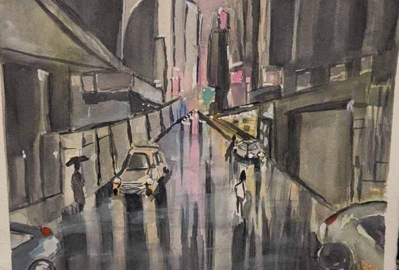
10. Rainy Street - Drawing: Alright, we're gonna start
off with the drawing here. And there's not a whole lot
to actually drawing here. It's more just, I'd
say to mark out some of the interesting aspects, interesting objects like
these lanterns up the top. And also general, just getting that general perspective and
an idea of those buildings. So I'm going to separate
this scene roughly into halfway around here is roughly roughly
where the buildings and just in the
center of the scene. Still keeping it
pretty, pretty loose. Now that buildings
in the background, they are really quite abstract. And you've got a few of the shop France with the lines and
things running down the front. I won't have to make them
more detailed later on. But it's very hard to see
exactly what's going on here. You've got a building
that's roughly around here, and then you've got
another shop front or something here as well. Lots of light in there too. Not only that, but
you've also got this. Now what it is, It's like the top of the shop or
something like that. There lots of buildings and bits and pieces all
going off into the distance. Okay, what's going on? But what I really liked
here are these sort of indications of
these lanterns. You've got them, these
lenses which are just going up into
this into the scene. And I'm actually then
not so visible in the in the reference
photo of themselves. But just when I draw them in, we'll want to, I think I
just want to make them a little bit more detailed. It's tricky because
in the scene there is already a lack of
detail in a sense. And so when we go ahead and add in our little
bits and pieces, it can be quite tricky
because there's, there's not a whole
lot of detail in here. I'll do like the two
figures walking. You can see them just
walking in the front here. One of them is carrying a bag. Let's put in the
little silhouette of the figure here like that. And you can just see some
legs underneath like that. Okay. Something like that. Walking in the rain. And here's the, here's the
interesting thing is, well, you've got this umbrella, which you can
indicate like this. Just little umbrella like that. Walking in the rain, kind of an arm here with maybe the umbrella
stem going upwards. It will hand here. Difficult to do. But you've got a lot
of these reflections as well from the, from the red and the
lanthanides up, up there. So there's one figure. Okay, probably thinking I might just reduce the size
of this umbrella as well. It takes a bit to be too big, something like that,
just a bit smaller. And then we've got
another figure here. Roughly the same height as well. I'm standing next to
this other figure, but the legs are
more separated out. Maybe they're walking
into this scene. And again, umbrella, umbrella
over the head like that. And see a hand here
going up with. So there's a couple of
little figures here. There is a poll. It looks like some kind
of know what it is, some type of pole here
in the background, I will indicate that, and this is actually a
nice little gonna be a nice little reflection
here in the ground. You see that little,
little reflection here. Let's mirroring the top because this is the
ground right here. Everything up the top
has to be somewhat reflected in the the
bottom of the sea. Now, I mean, you can't
really see these issues. You can't quite see
these, these lanterns, but you can see a bit of the reflection with
them in the ground. The ones in the distance anyway, and the specs of red in there, which I'll get into later. I really want to find
a way to maybe detail, add some details in for
this building here. Maybe a couple of windows
or something here. And what else could we
have over on this side? Maybe some perspective lines. I'm just fumbling around
for details that I can use for this scene because there's not a whole lot of details in here, to
be honest with you. You know, a lot of this stuff
just fades off into the, into the night sky. But of course, you've got all these lanterns all over
the place in the background, which I really love. That's why, that's
what kinda drew, drew me to this scene in the
first place, these lanterns. And of course, how much is left? That's up to you. I think
I will get started on the painting though. Kay?
11. Rainy Street - Light: Okay, so first things first, I've got a couple of
smaller mop brushes here. We're going to go in
and getting some nice, nice details and light areas they need to be what
we're doing here. We're really getting in all the lightest
areas of the scene. This vibrant orange and mix it in with a
bit of red as well. Kind of orangey
red color will be excellent for these
these lengthens. And I'm keeping them
pretty light as well. I'm only putting in about
ten per cent paint, but most of it is just water. Okay, Let's drop that
in and Indiecade out. Some of these Langton's, you've got some of them that just overlap with each other. Like that. You've got some over here
in the dark as well. So we can put in a lot of the a lot of the the
darker bits later on. But we have to make sure
we've got enough of an indication of these Langton's here before we
actually start getting in any of the dark areas because it
can be quickly removed. Once you start putting
in the the darker color, all of this stuff
just disappears. And sometimes if
you're not careful, you could be left
with not much at all, gonna be the hansa yellow I've mixed in with the
orange as well. Just want to just
lighten up this part. The touch is also this
reflection here in the ground of that,
that poll, okay. That you do have reflections of the other ones running
through as well. Let me I'm just dropping
in a bit more of this, a little bit of yellow in there. Because I want to
I want to make it more vibrant in some parts. And you can see there's
actually lots of these little land
and light shapes and things off in the distance. Plb, some of them just
connected up a bit. Another one here actually
to the left there. Some of them have this stuff
coming off the bottom, like little throws off
the bottom as well. That could be another one up
there that's in the center. I'll kinda thinking to
myself perhaps another one. Something here as well. Could be closer to the
front of the scene. Like that. Good. Then of course
you've got all this orangey reflection stuff
here in the ground, bits and pieces of it anyway. I wanted to actually spray
this down a little bit, give it a quick
misting over so that the paper stays wet.
In the buildings. You know, you've got all
these warmth as well. Let me mix in a bit of this. It's a kind of like a
white gouache paint. It's called buff titanium, so it's not super vibrant. It's more of like an off-white
color because I find that if you mix that in with just
any of the other colors, just tend to subdue the
yellows down a little bit. Because there's a temptation in this particular scenes to make
everything super vibrant. And in the process while
you're doing that, you can actually create something that just
looks too overpowering. You're balancing it out. And really, you know,
I've got a bit more yellow here, vibrant yellow. So I'm putting it in a
bit of vibrant yellow. There may be a bit of vibrant
yellow over this side, but it's intermixed with
this other stuff as well. Quite light colors. Again, just lots of
water in this mix. Okay. Don't get to don't don't start putting
in too much paint in here. It just cutting around
some bits and pieces. You can see here
that's pretty light. Even near this. Near this figure here is just
cut around the shoulders. But that doesn't mean it's
like a white section there. I might leave that actually. Why not just that? Just leave that bit. There. Here in the right-hand side. We've got a luxury,
a lot of this, some more of this
light there as well, but simplify, amplify down. A lot of this orangey color. Lots of spraying down
as you can see as well, to encourage it to blend
and move down the page. A lot of this stuff that
we're doing here at the base is just reflections
of the buildings. Okay, moving down the page
and it's actually great if you've got a spray
bottle like this, please check that out. This is a quick little
hack which saves you time. Moves this color down the page. Like that. Hello runs down my
pot, that bottom. Touch. Okay. Alright. Now this stuff we'll take a
little bit of time to dry. While that's happening.
We're gonna go into the sky. I'll mix myself up a
bit of purple paint. I've already got a
premixed purple anyhow. Bit of purple paint
and also a bit of blue, ultramarine blue. And I want to make
the sky pretty dark. Let's have a look how that some more neutral
tint in there. It's just a little
bit to balloon. So a bit of the other neutral tint in
there has a duty to touch. Okay. Good. What I'm doing here is I'm just trying to cut around
these buildings. But also in some places
will let it mix. Okay, so check this out. Buildings is still wet so you can cut around
them like that. Or you can also leave a little little edge
near them as well. Okay. So here on the left-hand side, a bit of this stuff like that, just letting it and
mix it touch together, like here, e.g. I. Might want to leave in that top part of the
building there or not. It's up to you. You
might come back to that later and decide then, oops, that's sort of
blood down a bit. And you're going to have these little
mixtures of the sky. And going around these
little Langton's as well. Using this flat brush, I can also use just a small, small round brush as well. That does the trick. Little, little round brush. Just darken this a touch more with some
more neutral tint. And look, I'm just
cutting around some of these lanterns to imply
the shape of them better. And I'm leaving a little bit of white around some
of them as well, so that it doesn't
completely mix. These two here in the corner. They have more or less
dried off quite well. So I don't need to do much here. Just cut around them
really like this. Yeah. They're not just dab off
some of this paint in areas that has drained into
the into the plantains. It's always happens when
you're painting wet into wet. You're going to get a
little bit of that color, just mixing and mixing it and potentially causing a bit of a mess if you're not careful. But at the same
time I do want it to mix in as well with possible to create a sense of and now
a sense of connectivity. So far, if I lift out a bit here and there,
that's all right. But I don't want to overdo that. I want it to do want
it to mix purposely. Okay. But some of this lifting
out could help with the buildings there just to
make them touch lighter. These Langton's most likely will have to retouch
them as well afterwards. Put in a bit of a lighter color, lots of warmth running through them again to get them looking a little
bit like that one. Okay, I'm going to grab
a small flat brush. And let's go ahead and do
some work down the base here. I'm dropping a bit of paint. I reckon what we
can do is just give it a quick dry first. I've given it a quick dry, but it's still slightly damp. Paper is still slightly damp. And what I'll do now is pick up the same paint that
I've mixed up before. This purplish, grayish paint. Gonna go through and put in some details for the
buildings and stuff in the background to just start to bring bring
everything together. But I don't want to
get rid of all of the, all the warmth and
interesting here. So we'll just have to
be mindful of that. So here are some little bits of some little bits
of brushwork here. They could imply buildings, that kind of thing. There. There's so much darkness
running through here. In the background. Even over here you see these little indications
as well of the plantains, the smaller ones
just below here. Especially a little
cutting around. Why not just get some of these slightly darker shape behind some of these lanterns? Use that also to cut around this pole or this stem
of some sort. Here. I got Okay. Here. We are. More, maybe like
another vertical over here. At some later stage, I will try and detail these
buildings a little more. But really for the
background ones, it's not a huge deal. Like if you see them, they're just simple,
basic shapes. And you've got
these sharper ones, like some sharper
shapes as well. I'm just drawing them up a bit. Some parts some parts will be dried and some
parts will not. Okay. Just trying to indicate a bit of
detail in the distance. Okay. Especially underneath around
the umbrellas as well. The rupee to the buildings and stuff here in the distance. But the interesting thing is
really the ground part where we're going to pick up
some more of that paint. And I'm going to
really just try to mimic the reflections and things that are running through these buildings and
going into the ground. And I'm really wanting
to do this quiet deliberately and use
some more darker paint. Neutral tint. Lets put in a bit of
blue in there as well. Okay, blue and
neutral tint, brown. Let's try this. I want to get it around the same consistency as
well as the sky wash. If I can put in just
enough water in here to drag that through. Okay. That would be good. Remember this stuff will
dry a little bit lighter. It's interesting you got these
kind of connecting bits. I just connect up. I'm really a lot of it is just a lot of it just joins together, creating a large,
darker sort of shape. Here at the base. I'm gonna see if I can just put in a bit more
of this paint here. Yeah. Yeah. She cut around this reflection
here on the ground. Some more reflections here, just some lighter looking
ones running down the page. Just joining up with everything. Okay. Base of these buildings
are just need to imply a better sort
of around here. Just another line in line work. Okay, I'll give
this a quick dry.
12. Rainy Street - Dark: Now time for some
finishing touches and just the final darker bits of
this entire, entire scene. And I've got neutral
tint here again. And if you don't
have neutral tint, just mix up any sort of grayish color from
your primaries. And I'm gonna go a little
bit darker for this. 11 of the things we wanna do is, well, we want to get
into the figure as well. So I'm just going to
use this little brush. Of course you get a
smaller round brush, this will be better. I'm just going to indicate with three girls didn't see
the hand or the figure here. Okay. Holding on almost just holding onto the umbrella
or something like that. But the whole body
of this figure, besides the face and the hand, can be pretty much colored in. And same with the bottom part of the figures dress in
this hand here as well. When this hand also has a bit of a reflection of the red on it. It's putting the legs
has to be something simple like this figure. And the umbrella. Of course we didn't have to
just join this umbrella, Ron. Try to be quick with it. Accurate. Maybe got a
bit of an umbrella. We go. That's a quick
little umbrella. This figure on the right. Let's do the same thing. So you can see there's
a couple of hands, one here, maybe one here. Just leave out a
bit of that color. And I'm going to cut
around everything else. Okay. Indicate pants
or whatever here. Let's put in a couple
of legs as well. Thicker paint. The legs. I just find that makes it easier to stand
out from all this. When it starts looking like a
person, I'll just leave it. We run the risk of putting in too much and
making a mess of that. If you're not careful.
Oops, there we go. There's another umbrella of a
person just walking around. I may have to put
in another stem of the umbrellas later on as well, just sort of running
through like that. A couple of people,
let's have a look. What else is we need to do here? Maybe some details
on the buildings. You notice some of these
buildings have windows or just some extra little details
on it in the background. And you can indicate
these on like this. Just bring some of the
some of the details back strengthening and just some of the shapes and
things off in the distance. Maybe we could put on some
windows or something here. They're not really there, but window or
something like that. Reflection for these figures
in the ground as well. Join up the legs and I
do something like that. These two figures will work on just touch of darkness as well
for some parts of it, I do think the do you think
we could do we could add in a little bit more
darkness around the edges. Here. Just another layer of years, just another, just
another layer. Really make it look like a
bit of a dry brush technique. So just pick up the brush
and pick up the paint, dry the brush off, and then continue on. And you will get a nice kind of this technique
as you can see. Because I don't
want to get rid of that previous wash actually. I want to keep it and still have some of this
stuff running through. Okay. But just sporadic
little brush strokes like that to make
the ground look more more reflections and they're just make it look like it's it's better like that. I like to join the reflections. I'd like to join
them on with each other as well so that
they're not just separate from one another. Okay? You got the reflections
of the figures, but then you've got
the reflections of everything else as well, just kinda running
through the ground and I'm doing its thing. Okay. Good. I'm going to put in a bit of
color for this, these little details
with a Langton's, a little dry brush or
not even dry brush. Just quick little indicators
like that for the lanterns just gives it some
just a little bit, little bit more detail. Look at that. Just something
running around like that, create a sense of shape better. Because it's difficult once the paint has dried and
everything's mixed together, sometimes you lose the lose
the actual object in there. So another quick little layer
like this. It's not much. But we just sent us some of these lanterns again makes it look like they
are actually there. Then they are actually
land tons of some sort. They're lucky. You've got a few running
through here as well. Tiny, tiny ones of course there. The paint I'm using is really, really lot pain as well. It's not not much
going on in there. Just a few little
windows or something. Again, these are
tricky because they kinda like shop fronts as well. Shop France display
areas at the front, front of them that could be a doorway or
something like that. They care for all
sit around here not to make it too dark so
that the figure is kind of disappear because the figures need to be a little
darker. Okay. That can that paid
off their touch. High-end stuff. A lot of this is, you know, we just implying what we think is they're employing details. Just seeing what else we
can do with these figures to just a detail
bit extra the legs. Because play such
an integral role as important subjects in this scene that it makes sense to work in the
more, a little bit. Lift off a little
bit of that color. Right side of the umbrella. Good. Few more brushstrokes running through this area, maybe some darker ones as well, some sharper, sort
of sharper ones. They could add a little
bit of interest here in the dam with
brushstrokes as well. For some other reflections, maybe like just some sharper
ones and dry brushing. Okay. Let's put in some
finishing touches, some gouache. I'm going to use a flat brush. And one thing that I
figured we've lost is some of the whites and really, really, really, really
light yellows in here. Reflections of the white and the light yellows,
stuff like that. So I want to add some of it
and we'll experiment around. It's just pure white gouache. One thing I have
noticed as well, there are these
tiny little, small, little speckles almost
like fairy lights or something running
around there as well. And the top, we'll play around
with that a touch as well. I don't want to
overdo it though. Okay? Sometimes, sometimes
things are best left, left out of the reference. Even though they're
technically in there. Quite a bit of white gouache. Let's have a look. Maybe
we'll have some here. Okay. Pick out some bits and pieces
in the scene. Dry off. I want to just dry off
the brush a little bit so that this
gouache goes on. More and a little
bit more dry air. Okay. We can just get a bit of dam would reflections for some of these bits of white and stuff like that
running through the scene, do notice a bit of it
back there as well. Now in here, what
else have we got? On top is some kind of riding. I don't know what that is, but quick little scribble like
that might do you good. I'm really careful to be
sparing with this stuff. You can really go
overboard with it if you're not careful. Just re-wet this
section at touch. Even here in the bottom, you do have a little
bit of white as well. Just, it's just like
reflections from above. This area here. Even this shop up the back. There may be a little bit here. Okay, he bring
that down a touch. A little bit of wind
here and then some here. Give it a spray down to just, just want to loosen
that up a bit. Especially that goulash. Make it more watery. Just blend in a bit
better as well. I prep that pocket knife. I think we could also just bring out some of the white
of the paper by scratching, scratching off in areas as well. Not just here and
there will be two. The background of the paper. We'd like to get some of those perspective
lines perhaps back, just wet a section of the paper
and see if I can lift off some little bit of water and lift off a
bit of this paint. Some water like this. Yeah, Maybe as well. Like that. This other brush, this little scrubbing
little brush here I could use to lift
off touch of paint. Trying to get these lines to run and run towards the
center of the scene. This is going to just
help also break up the darkness here too. Just picking up, really do
clean water and lifting. For this technique. Some final touches. I'm going to put
in a bit of orange on maybe the edges of the
umbrellas and things. Just to get in this sense of reflection from the lanterns
in the face here as well. It really just picking
up the paint straight, dropping it in right-hand
side of the figures. Like that. Okay. Kind of creating them as like orange silhouette
around, around them. Softening it down as well. Touch of white. For the little
highlights and things. Realistic. Coming
up here. Perhaps. Shoulders. Bring out the shoulders of
these figures a bit more. Okay, We're finished.
13. Night Scene - Drawing: We're going to get started
with this one now. First thing you notice
is that there's not much foreground at all. So I'm going to change this up so that the foreground
is roughly about here. Okay, So the buildings, I'm going to just
raise up a little bit. Photographers taking a shot just a little bit
lower to the ground. And the reason for this
is that I want to get some reflections running
downwards and the scene. Let's start across with the
buildings and we'll work on this one just getting
the general shape. Just general shape for
this building here, on the side there. And then you've got the bottom
part of the building here. Alright, that's part of it. You've got this other
building here in the back. You want to take a little bit of time
with these ones as well. Don't get too rushed
with these buildings. But keep them loose
at the same time. Okay. A little bit of that
building there. And how much how many
more do we have? We've got another two.
So we've got this one maybe coming out here. Okay. Like this. Yeah. Then if there's
another one similar to this building here, I'm going to say is
these like little steps or whatever that
go up to the top. They're okay. Just simplify this down. Something like that. And we have, what
do we have here? It's kinda looks
like another roof, roof of another
building or something. They're just trying to get
something like that in. Okay. Just a quick little estimate. You do have some
trees in the front of this building as well. And here we've got this triangular top of
that building like that. Then another building
in the background. And this one just
comes all the way down to the ground about here. Okay? Now the interesting thing is
that you've got these lamps. I will maybe make
emphasizes a bit more, maybe a larger one here, there. And you can just see
them gets smaller and smaller off into the distance. This is more just
an indicator of where a few of them are. Maybe here, another one here, just, just as you can see
there in the reference. Alright, little indication. Now the thing we need
to do as well as indicates the areas
of the windows. So here e.g. we know we've got some windows. And this stuff is
going to be important. These are kinda
like shop France, as you can see, nice
little shop fronts. There's gonna be, I'm not little reflections there
and on the ground. Okay. Maybe I'll just move this one down a little bit
and create a side. Will be the sidewards
angle, something like that. So just bring it
a little closer. Some windows and stuff up
the top there as well. Okay. Like that. Coming down towards the ground. We've got couple of windows or something
for this one here. For 1234. Windows there. Here we've got a few
little archways, nice little archways,
as you can see, there's light coming
from them as well. So indications of those windows. Let's do these ones as well. Again, you've got a
lot of detail in here, but I don't want to
spend all day drawing. Just want to indicate some of the windows
and things in here. Here, the base as well. This shop front is open and
you can see just like that, There's more windows up
the top here as well. This year is going to
be a lot of light. Especially in this building. There'll be a lot of light here and nice reflections
running down the page. A couple of trees here as well. Our indicate later
on down the track. I think where we could
do with a figure. I figured maybe just walking
into the scene here. Maybe have a smaller one here
in the distance as well. What you really want to do
is make sure that you've got some smaller figures
because they help to give this scene a
sense of a sense of depth. This could just be a person
standing right here, okay. Two people. Put another one here, just walking into
the scene like that. Okay. And then some maybe some loops, perspective lines or something here on the ground like this. Here we go. It'll perspective lines
and there we have it. We've got a nice little
drawing to get started with.
14. Night Scene - Light: Okay, I've got a little
mop brush here and I will start by getting in some of the warmth in these buildings and very
light colors as well. So I've got some yellow, and I've also got this
other yellow which is a warmer yellow
quinacridone yellow. I'm going to mix some
of this Quinacridone yellowing in there as well, just to move this golden color, a little bit of orange
in there as well, just to, just to
change it up a touch. Because actually on
the top there it is kind of more orangey. And k The other side
of the building. Well, we're trying to do
here is getting the light, all of the lights, the warmth, warm
colors and the light. And you will find
certainly that there's going to be some areas that you would leave
white as well. Okay. This building here, we're
gonna go over the top of it. I'm going to cut around some of these little lamps is
warming these lamps. Doesn't matter. I'll maybe changed
them around later on. What we can also do is lift
off a touch of paint in them. Just kick back up into
that white of the paper. You can also just cut around. I try not to do that too much. Otherwise, I find that it then you lose that
beautiful wash. At times. Some more yellow here, a bit more yellow, there we go. Maybe some yellow
ocher up here as well. For all of this stuff, I'm just trying to get in
really brief indication of the warmth in these buildings and we'll
go back into it later on. Bring some of it back, bring some of the shadows and things out and cut
around the warmth. So we are some of it's gone
into the sky. No big deal. Let me just pick up more of these orange color here and it's dropping some
of that orange here at the base of
those base area here. Like that. Notice that the color
that I'm using as well is really thinned out. So there's mostly just
water in this mix. Probably 10% paint, if anything. And this is going to allow me to really preserve
those beautiful lights, light colors in there, some more orangey
color here as well. Just drop some of
that orange inside. Here. There's more of this yellowy
tinge that the base there. This is hansa yellow,
which is a very, very bright yellow color. Okay, but I've printed out
with a lot of water as well. Maybe I'll just go in over
the top of these buildings. Don't have to get
it all in as well. We can just leave
some of it white. K. What I'll do now, just going
to get the sky in quickly, but also spray down spray
down the base a little bit. Because I don't want
this area to dry. I want that to dry just yet. I'm going to pick up
some ultramarine blue. It's pure ultramarine blue. But what I'm going to do is
actually dial it down with some of these grayish
color over to the left. Okay. Let's see up the top of the sky. I will use probably a small, a small, a slightly
larger mop brush, I mean, like this. Yeah. Alright. Because the sky is
actually quite, if you look at it in
the reference photo, is quite vibrant. But I'm also careful
not to overdo it. Okay, Let's go in there. And you can do this sort
of thing where you cut around parts of the
buildings like that. Okay. Leave a little bit of
white on the top of it. Or you can let part
of it also mixed through our sort of
let part of it mix. And at the same time create
some sharp edges of white. As you can see on the buildings. And this allows you to get
the best of both worlds. Really, some sharpness and some beautiful, beautiful
wet-in-wet effects. Okay, So what I'm doing, little bits of paint that
I'm cutting around leaving the white available as well. Okay. I get that. So that is pretty much the sky. You mean you can
go in and I might add in a little bit
of darker paint just to the top of
the sky like that. Just marginally drop touch
of that in like that. But apart from
that, I don't want to don't want to muck
around with it too much. This will dissipate and mix
into the rest of the scene. Okay. And Destic. And let's have a look at the
ground now I want to get some little reflections of the yellow and things
here, yellow and orange. So let's pick up a bit of this yellowy color,
yellowy orange color. Let's reflect some of that
down to the ground like this. Like that. Okay. Mainly
from the shop fronts where there's a bit of orange or whatever coming
downwards like this, yellow or something,
just bring that down into the ground. Some more here. In a bit more yellow if
you feel you've lost some of that vibrancy. I'm really, as you can see, I'm exaggerating this a fair bit to some of this building as
well down to the ground. The more water like this. Okay. Pretty vibrant looking colors just being reflected
down the page. And while this is happening, we can pick up a little bit of the same blue color
that we saw before, okay, that we've
used up in the sky. And we can fill in the remaining pieces
here with that blue. Okay, so a bit of ultramarine, just picking up a
little bit more of it to mix it up nicely and dull it down a touch as well with some of
these other colors. One thing you'll find
is at the bottom of the scene where you've
got all these shadows, reflections of these
darker blues and stuff. It's going to be darker
than the sky wash. Okay, if you look
at the sky wash, it's actually lighter
than the the ground. So I want to make sure
that we we replicate that. I'll pick up a
smaller flat brush and just try this bit first. Okay, good. This one that it kind of
mixing to everything. That There we go. There. Sometimes it helps to slant the paper downwards
like this as well. Creates a bit more of
that downward movement. Okay. More blue here, just slide this
surround, this color. Let it blend in nicely
with everything. Let's get a bit in here. Okay. In here. Some more. That the there yeah. Here. The stuff on the right hand or left hand side starting to
dry off the touch as well. So you're going to have
to be mindful of that. So just bringing in some more
of this color through here. I mean, you've got a lot
of this stuff anyway, this the reflections of
the buildings, the left. But it's looking pretty
decent at the moment. I will potentially add in
a little bit of purple, little bit of this purply color
and black mixed together. Only because I'm
concerned we don't have enough dark paint in this
bottom part of the painting. Yeah. Good. Let's give this a
quick dry off now.
15. Night Scene - Shadows: Alright, moving on
to the next step. Now I want to get some of that blue again bit
of the ultramarine blue. But I also want to add in a bit of purple that I
have here in the mix. And play around with this color
because I am going to use this as the backing color for the buildings to cut around. Now these buildings have to
be darker as you can see, they jump, they pop out
of the sky a little bit. And I'll be using two
different brushes. I'll be using a
little mop brush, and I'll also be using a little flat brush
in order to get in. He's darker little details. Now the paint
mixture I'm using is about 50 per cent paint
and 50 per cent water. Makes sure that
just just to make sure that I've got enough
strength in there. Okay, so let's have a go. Let's have a go with this
one and this building here. Now I forgot to
actually add on this a little bit touch of detail
here on top of the building, you see this little
triangle section there? Yeah, I can get
that in like that. Maybe something coming
up like that as well. I'm going to bring this down. Don't be afraid to leave
out some little bits of yellow in there if you
feel That's going to help. Okay. I am going to leave
out the yellow for this, these windows. You can see this bunch
of windows here, couple here, and then also here. And behind this little lamp here as well, there's a window. But you've also got this
building here to the left that we're going to need to
cut around at the same time. A little bit more blue and
a bit more purple in here. Okay. Um, and then the base
of the building as well, you notice there
is there are these three do you call them? He's three little
doorways or whatever. Just at the base of the
buildings like that. Okay. Let's go ahead and
do the one on the right. Now, I will add in a little bit of brown into this mix to just double this color down
a touch like this. And maybe I can just darken it a little.
That might be good. You'll notice also that
some of these buildings, like this one here, um, I mean, it doesn't have any lighter
parts of the windows, but I can still put
them in if you want to. Okay. They're just a
silhouette of the building. That's all you're
concerned with. Adding in for this particular
part of the scene. Then we're cutting around, cutting around the windows
like this, so the doorways. Okay. There's another
one to the right. Okay. Looking good. And you want to match
them up so that they marry up with the
reflections below. Using this flat brush. Now just as a change,
see how we go. Oops, I get rid of
some of that white. Maybe, yeah. Now the
window or something, they're there. Again. If you want. Few windows that have
some light in them, still, some more blue and
a bit more of this purple. I just want to increase the vibrancy of
this area or touch. Okay. There we go into this
building to the right now. More brown or something in here. Okay. This is all just joining on. Okay, with everything else. Notice all the cutting around
that we're doing as well. That's something you really
need to pay attention to. So that you're not eliminating. You're not eliminating the light on this scene because it can
be very easy to do that. You're not careful. This rooftop needs
to be darkened. These kinda just made blew
up there and downwards. It's kind of a mixture really. It's just a lot of soft. Oops. What a softness, but there's a little bit of warmth
underneath as well. So just simplify
that down there. Let's get into some more details with this building to the right. That there we go. Bring that down. You can see here, play around with this building
here to the left as well. I will put in, there is actually a little
shadow just running down. He sees is this darker shadow running down the side
of this building. I can soften this outer, join that up with the
shadow on the ground. Just soften that offer touch. Some darker spots like these little doors
or windows up there. And even in these
buildings here, you have some darker
spots in there as well. Some some of these almost dry enough to see to indicate
better like that. Okay. Let's have a look. What else do we have here? And a whole lot really. I like to put in some final finishing
touches for everything. But let's put in, let's just work on these
figures for a little bit because while I wait for
the rest of it's dry. Okay. Here's a couple of figures. The legs. The legs are these figures. I'm going to darken
them a touch. As you can see, there's another figure here
in the distance. Another one here as well. Another figure here. Couple of legs
outstretched like that. Okay. Maybe a bit of a downward reflection
as well for this one, like this, simplified
like that here. Okay. Oops, a little
one like that. All this tends to dry
off pretty quickly. Anyhow. Little, little
paint for this one. I've used just a
little bit of gouache. Opaque gouache in
some warm color mixed together like this. Bring, just to bring out
that figure a bit more, some orange or something. There, there we go. Just to be a little bit of
dulled down orange news. Well, just to bring Abby
to color in these figures, do have some cerulean
blue as well. A little bit of cerulean blue. I'm just mixing a touch of that. They're able to coloring
for those figures. Another one here, k. Quick dry.
16. Night Scene - Finishing: Now I'm gonna be using
a small round brush to add in some little details. And I'm picking up really just black color and I've got
some neutral tint as well. Both of these work fine. Just activate it with
a touch of water. And let's go ahead and
indicates some of this stuff. So here, e.g. you've got these little
downward strokes, some of these windows and
stuff through the building, you can just slowly bring out frames and things like that. Darken them often. And if you just dry brush them
on, it's even better. In fact, it's preferred. Doesn't doesn't look
too put together. Is another one. You know, these these windows up here, there's like these
four little windows for little darker spots of the windows up the top as well. We can just leave it in as one darker brush
stroke like that. On the top. Just simplify down
like that even. Okay, here's some more
windows here as well. The buildings in the background. Okay, just a little bit of darkness at the base
as well to anchor the buildings to the ground. Indicate this. What are some of the floors of
the buildings as well? Just a few more
of these windows. It's just touching
go figuring out, figuring out some of the
darker bits and pieces on the building and what
you want to imply, then certainly you can just basically just
carrying along. This one here has got a few bits and pieces in here as well. I don't have to copy it exactly. Just imply that's the frame of that top part of
the window there. There. You can see they're separating out these
buildings as well, just to touch here and there. And there is also this tree
has a couple of trees here. So why not just imply some of these branches
coming up like that. The pretty dark the
trunks and what have you. I can scribble
myself in a bit of detail for these these
trees out in the corner. We didn't a bit of brown in
here perhaps around in black. It just indicates some of these potential trees running
through that section. Darken a little bit
up the top here. Okay, Let's have a
look at this one. This one doing k. Few, a few little bits come in through the
side like this. The top, so the rooftops, you'll see some darken areas near the size of the building. They're more of these windows. So you can see good, good. Some bottom parts of the
building there as well. Simplify down. Did like these little some of these little lines here
in the ground as well, just to mark out the
perspective of the scene, give it a bit more. Something like that. Okay. Now I want to add in these lamps and I'm using a really
dark just black, straight. Really just straight
with a tiny bit of water to activate it. But I'm wondering how I
can make them all lamp. Like if that makes sense. Yeah. Just we need to darken the mall and carry this down. I'll make this one come maybe
out of the scene and touch. This one can stop
right at roughly here. This one here. Maybe just get it
to stop there and there is little lamps. Other one off, maybe the hips. I'm here, Here. A few more of them. Up in the distance. Strengthened, just darken
the legs a little bit more of these figures as well. That bit of red or something for the faces. Okay? And just a little, little finishing touches
where we want to add in some final bits of
darkness and details. Tiny bit of white gouache
that I have leftover from my previous
painting because just re-wet some of this stuff. And you use this with the bit of the yellow
that I have left on the palette to create
some little highlights. Hey, maybe that can
bring back these lamp. I was trying to paint their
little bits in pieces. Even on the shoulders and
the heads of these figures, you might get a little
highlight like that. Here. Just bringing things
together slowly. Touch of color here and there. For the gouache, I find can really help to bring,
bring things together. I don't want to
overdo it, of course. You just just want
to do in some areas, a bit of highlight on
the tree branches. They're like that's maybe okay. And we're finished.
17. Streetscape - Drawing: Alright, we're gonna go
ahead and get started. Now, this reference
photo is cropped almost cinematic style with
these 2 bar over the top. So I'm going to have to
extend this out a little bit and use your
imagination here, I guess just to bring
these buildings app in the background
a bit further. But let's go ahead
and get started. I'm going to put the horizon line roughly
in the center of the page. Okay. I'm just making sure that I've got enough room for the buildings
out in the back, as well as just having enough of this area in the foreground
here that we can use. We can use these little
perspective lines like this. Simple one point perspective. We're imagining a point all the way back in
the horizon line. Then we're connecting
up these lines to it. Kinda basic. Like that's just one point. And a lot of the stuff in this scene is actually
pretty abstract. I mean, you've got a lot
of colors and I'm just penciling in it in some
buildings here in the back. And of course some of them are actually a little bit smaller, lot smaller at the back anyway. And there's a lot of
smokiness back there as well. So it can be tricky seeing exactly what's going
on back there, but you have a lot of the signs, as you can see, these
colorful signs. This looks like some
kind of building here, this side, side of the building. I'm just going to
put in an indication of this side of a building
or something like that here. I just select this and going
down, let's have a look. Here's a couple of
doors or something, or another door here. Darker sort of doorway. This is nice little guide
to help me get going. And this is what I was
saying before in terms of just using your
imagination a little bit. These buildings at
the top here, they, they actually go further now that I've extended
out the scene more. So I'm just making
it up a bit here. And of course we've got
this sort of left side of the building here which is
illuminated in the light. And again, pretty abstract. And reason for that is I want to just leave a lot of this in for the actual
brushwork later on. So I'm not drawing
everything in with pencil. You can see over here e.g. this little square
or something like that with a sign or
something there. You can use that to
have a look over here. You've also got cars, and I love putting cars into
these particular scenes. And it's rainy day
scenes as well. You can see just the side of the car like that,
rid of the wheel. The the bottom of the car here, and the light coming from the headlamps of these cars are gonna be so
crucial to preserve. So make sure that you indicate
those cars effectively. Like what I'm doing here. I'm just drawing them
in as if the box is really kind of
boxes with this shape. It doesn't have to
be doesn't have to be detailed or
anything like that. But you're going to
have some of this stuff just reflecting off the ground. Bit of that light
reflecting off the ground. You've even got here on the side some little bits and pieces like a bean
or something there. I'm going to just
see if I can pop in another indication there of something as well that
you've got these. There's another archway.
Look at that as a nice little archway here. Alright? And in the distance that I
can pencil line indicate, this is like the side
of the sidewalk there. And as you get closer, you get these larger. As you can see,
these larger shapes indicate doors and windows
and stuff like that there. And let's have a look over here. There's another vertical. There's well, really cool is that there's these
little stairwells that run down the side
of the buildings. I don't know how exactly
going to indicate that, but we can of course
put in little bits of the windows and things that are running down the
side of this building. It's all pretty dark in
there. It's hard to see. Just getting that part
side of the door. There's a little
light here as well, which we can indicate later. Now in terms of the top
of this section, again, it's another, another part
that we can just improvise. A couple of windows or something like that
off the top like this. Something like that. We can also put in, like I said, this there's some kind of been or postbox or
something like that. They're behind the car. This is even more of these rectangular shapes just keeps the same
looking interesting. Even here there's a couple of these two yellow poles
that just sticking out. I can put at an indication
of that in this is the bottom of the buildings
and this is the sidewalk. You've even got another car here that is dipping
out of the scene. It's just disappearing off. And k. But we can put in indication
of the wheel here. Like that. Something like that. The car just off going
off into the distance, walked closer to us anyway. Like that helps
increase their sense of sense of depth in your scene. Of course, behind the car you've got a few more bits and pieces. You've got like these
overlapping shapes like that. These really just smaller
car-like shapes behind. I'm simplifying them down. All them lined up
in the distance. And as you get really far
off into the distance, It's kinda hard to
see what's going on. But you do have a whole
bunch of cars there. And I like how these
ones sort of line up as well with each other. Like that. Whoops. My ended off on that one. And that one off
like about here. Maybe. We've also got this larger car that
is right about here. I'm going to just put it in like this windscreen
first, like that. That will get the top of
it in side of the car, back of the car, the front wheel, the back wheel, perhaps front of the car. And the a head headlamps, headlights here of the car like this and
connect it together. I also really like how
it's catching a bit of the easiest indication
of the rain coming down. Just a little little bits of rain coming
down from the sky. Now, I'm probably going
to use some gouache to emphasize that further
later on as well. But this is a nice car that we have here in the foreground. And let's have a look. What else can we do? I think I'll make it maybe
a little bit higher. Like this. Something like that. Okay. Good, good, good. Pull it in another
one perhaps here. Just get rid of this part there. So it kinda looks like
the cars or maybe coming down a hill because
the ones in the back, the top of the cars
are just a little bit higher up as you can see. Okay. And test stick a bit
of headlamp there. We can reflect off
the ground as well. We do have another car
here in the foreground, somewhere off in the corner. Okay. Back-end of the car
and the wheel here as well. We'll just sort of going
out of the scene like this. Just disappearing off the
front side of the scene. Okay. What I really like as
well was that we do have sort of figures and structures running along
the left-hand side. This is going to be
quite interesting. We've actually got, let's, let's do, let's do some indications of the
buildings on the left. So you can see here
there's a rectangle. So rectangle something here. The light is coming from the
center of the scene as well. So it's kind of just
rebounding because almost like rebounding off each other. The center of the scene. So e.g. this here side of the building, this is completely
this pinkish color. And as you can see. Creates a nice contrast with
everything else. In here. There's all these bits, a scaffolding and things
running along here as well. Little bits of scaffolding
and on top you've got more buildings and things is actually a larger
building here. We can just play off. Here at the edges, the sides of the buildings. There's a side of
a building here. Just putting in there
like that. Here. There's another one like this. And it's kind of
going all the way up into the top of the scene, but we've also got you, we've also got some larger
buildings off in the distance. And they are also quite
light like this one here. I'm going to get that
one in some way. Just making it look like
there are more bits, smaller bits and pieces off in the back and leaving the
edge of the buildings. This sort of
three-dimensional side of the buildings
showing as well too, just create a sense of
depth in the scene. And also gives us an area
for the light to bounce off. These little areas here, sides of the buildings
and that kind of thing. The sum all verticals like this. And another one here, just another part of this type of building a
guess the side of it here. Okay. That what I really like as well as that some of these windows you
can actually like, you don't see them in the scene, but I can actually make
them a bit more larger and create a sense of
light coming through. So maybe these two, I will leave the light coming through because I just got the idea from this
one over here, which has a bit of light running through
this window here, you can just, just
kind of see it peeking out from the
edge of the scene. But it's hard to, to make makeup make exactly
what's going on in there. There's even another bit
of darkness over here, like a window or
something there as well. We can we can put in this can even be like here's
the bottom of the walkway. Like there. There is actually usually even a person just walking here. I can just indicate it can indicate a person
as well here. Okay. Carrying a bag or something, a bag of shopping
or who knows what. So that's a simple
figure like that. Okay. I really think it helps to
add these figures in here. Makes a, creates a sort
of a sense of life and makes it look like there's
a bit of a story going on. Okay, So that's one figure. I also had a you've just perhaps putting in a
second one somewhere here. Like walking across. Walking across like
this, maybe that okay. There's the head, front leg and the back leg. Here. We redo this. Let
me redo that one. Could maybe get it
coming out more like that actually
towards the front. That's a bit better. Back leg like this. Okay. There we go. Another figure. Then it's just going to scribble in another one
somewhere like maybe here even This one looks too similar to the other one. I'm gonna make this
figure maybe walk towards the right-hand
side like here, or just something like this. We haven't another figure. Still not liking the look
of this one. Too much. Redo it quickly. Simplify that figure down like this might be
better off like that. Okay, there we go. That
looks a bit better. So there are a few figures coming across in the
back end of the scene. You just produce
this down a bit. Footpath here. Okay. Another person
here further back. Maybe forgot figure
further back. Smaller they get as
you move further. So there's really a
lot for us to work on here and windows and
stuff like that. Like I said, here's
another window I thought, why not just put it in another
one and keep them a little bit separated out with a
bit of a different pattern, but still following the
perspective of the building. Okay, I think we've got a good enough drawing
to get started.
18. Streetscape - Light: Alrighty, So to begin
with this painting, the first thing I'm
going to do is pick up, pick up a mop brush, a larger mop brush, or just any type
of larger brush. I'm just using this one here. It's a calligraphy brush will
probably switch to others. And I'm going to start
off firstly by thinking, where are we going to put in
some of these lighter color? I've got a bit of
red and I'm mixing this down to about 90% water. So it's very, very light. You can see here. I solve over to this
other normal mop brush. There we go. Just as just a little bit of this pinkish color in
here, pinkish red color. And I'm going to start
off very carefully just cutting around some of these
cars with the cars anyway, I'm going to put in some
more colors in there. A little bit of that pink. But I also want to get
in some yellows and things like that too.
So just a little bit. And you remember you
keeping this very light, extremely light. It's interesting because
in the sky You actually see quite a bit of this
pinkish color as well. But always remember
what we wanna do is with this first wash, we don't really want to
get in any dark colors. Maybe a bit up in
the sky In a moment, just to make it look like
it's darker at the top. But we're focusing on
all the lighter colors. So this is just a bit
of blue or something I thought I'm dropping
here at the top. Bit of blue, ultramarine blue. We'll mix down with the mixdown
with that pink as well. But this is going to
create this night sky. Look something I wanted to
change up a little bit and just re-emphasize bit more. And while the paint is wet, this is where you have a lot of freedom to do this
type of stuff, otherwise, you lose
all that later on. Some more pink. Yeah, just a bit
more pink color. Mix some more of the sap. And we've also got some yellow. I'm going to grab
a bit of yellow, just drop some of
that in, in parts. But we're keeping it very light. Just remember that
super light colors. But I don't want it to
all be that same pink. So that's why I'm mixing in a few other bits
and pieces here. Keep it alive, keep it
interesting looking. Lot of other colors in here, pinks and reds, yellows, bit of Hansa yellow
in here. Okay. Even this sign as like a light almost like a
light bluish color to it. Something you can do as well, just pick up a bit of
turquoise or something, e.g. when. See if we can, this is a bit of lavender color, actually just pop that in there. The big goal here is just
getting in a nice wash, cohesive wash that
covers everything. More yellow. Some Hansa yellow, more
of that pink here. And here. You almost just, for me, I just sort of
squint my eyes and just locate some areas of
the light in this scene. It's also good to keep yourself a little spray bottle
near by like this one. Keep one of these handy so that you can just re-wet if you think it's going to be dry. Hey, more yellow
and things here. And a lot of this
stuff is going to be muted down a lot later
with the other colors. But yeah, I want to get
in some lighter colors, especially near the doorways and things like that as well. For indications of indications of the light that's
coming through. This is a very tricky
thing to do because you're playing around with all
these lighter colors, which is all in good, but you'll also planning
to keep them to the end. Some of them anyway. So you have to be, you have to be
thinking of the end product at the same time. There we go and look
this some more here. I'm just kinda hurry
this up a bit. So I don't overthink it. If there's a bit of
white in there as well, don't be too fast about it. I mean, if you look
at it, it's really just a little warm colors in there. Lots of warmth. Some more here over the
figure maybe as well. Okay, let's have a look
at the road and the cars. Think to ourselves
what we want to do. So the big thing like I was mentioning before
is making sure we have some of this
light in the scene and having that a
lot in the road is really important as
well as you can see, there's a lot of, a
lot of light going on, a lot of reflections
from the rainy road. I'm just going to spray
that top part down a bit again because I'll probably go into that a bit
lighter as well. So what I'm gonna do
is I'm going to pick up bit of yellow, light yellow. Just dilute it down a lot, probably 95 per cent paint. You can see there
are just parts where I can potentially getting some really light
reflections and these are the reflections of the
car head lamps and stuff. Okay. Here it's just I mean, it's it's pretty much
almost a white color, but I'm keeping it. I want to keep it a bit
warmer. Running down. Can you see that just
a bit of this white. And it's also coming from the
buildings like from here. There's some light coming off these parts of the
buildings there as well. So I want to get some of
that running down the page. But also down the back
end of the page two, we have these pinkish, light pink colors
running through here, which I want to
emphasize as well. So, yeah, just same red
pyrrole, red color. And I'm going to just
drop that through the center along with
the Hansa yellow. And this is really light, as I was mentioning
before, really liked that. You've almost got no
paint in there at all. Move this reflects the stuff
here running down the page. More pinky colors running down. Okay. Just verticals, lots of
these verticals, okay. They will run all the
way down to the front. Even these verticals is running all the way down and
spray it a little as well. Okay. Some more. This pink. Nothing, nothing. Like I said, I noticed
before is a bit of coolness. Maybe some tissue or lavender
color that I have already. You can just drop some of
this down here like that. Just let it spread a touch. Because we've got some some sort of lavender color actually
back there as well, like a lilac color in in areas. Again, just dulling
that down a lot. Let's get some more of that
yellow for this car as well. Okay. Good, good, good. So now what I'm gonna do is just pick up a bit
more darker color. I have got some neutral
tint and ultramarine blue. I'm going to mix up neutral
tint and ultramarine blue to get myself a nice
sort of darker color. Let's put that plot some
of these through touching onto the edges of the light so that it creates a soft edge in areas so
that it blends with the, the warmth in here as well. You see that it just
blends with it. You can only do this while
the paint is still wet. Okay. It's probably pretty
dark here in the foreground, so I need to make sure I've got enough
strength in there too. So she's down at
the base like this. Okay. This between this car, this is going to
be tricky as well. The car headlamp reflection, so just a downward
brushstroke like this. Like that. That neutral tint and
blue, It's all good. It's neutral tint and blue. More of it here. Okay. Yeah. Yeah. Yeah. Okay. Here as well. Getting it to just blend in, create some nice soft, wet and wet effects. The car is here as well, just a bit more their cars could do with a light wash
of some warm color as well. Let's just put a bit
of that in there. Not just the Buddha warmth. This one here, a bit
of warmth and probably turn kind of grayish as
well, but it doesn't matter. Yeah, there we go. Just just
to dull it down a touch. Get rid of the white paper. Good, good, good. Ready? Some more darker bits. Well, running down this
bottom bit more darkness. Thinking I want to just
re-emphasize the light from this light from these headlamps just running down the page. I'm just dropping a
bit of clean water. Yeah. And that spread
down the page to touch. Okay. Clean water and a bit
of yellow like that. Well, I can do this. Paper is still wet. It's a perfect time to do it. Really. Do it for these
ones here as well. This car here. You can even do it here. Okay. It's gold. These little bits of
reflections and stuff here in the run down the page. Paper and just drop in. Just dropping a bit
of watery color. And you can see it just can you see just the
color running through? Okay. I'm being careful not
to overdo it as well. I'm flicking of painters maybe could help. Yeah. Good. Little bit of darkness in some of
these buildings while I can get in some
nice wet and wet, a little wet and weird effects. I really liked the mid
tones of some areas. I can also just spray
down the buildings or touch as well. Because of course I have not colored them in
and I will put in a bit of pink and orange color
as a base color as well. For all this
beautiful base color. We can get rid of it later and make it darker in areas too. If you miss out on some
parts of it, don't worry, just in terms of leaving
white or whatever. We can change that up later on. And also same with the figures. I think I'll just get in a bit. Same pinkish color
running through as well. Good. More bluish, bluish tint
to color up the top here. I'm running through this
mixture, doing its thing. Paper is slightly, ever
so slightly damp to enable just more
softer brush strokes as well as you can see. I'm just getting a bit of darkness here
for this building. And this building as well. You've actually got some light
showing through this one. There's not much
need to do for that. But you can just, you can still while the
paper is wet like this, putting some very light
details and the soft, wet and wet details that
allow you to create a sense of depth between all this stuff in the front and then in
the background as well. So we have some sharper
watercolors afterwards. Once all this has dried, this will help to, I guess, bring parts
of the scene forwards. Bit more spray over that side. It's just it's just like
grayish color mixed with a bit of purple or cooler color
left on the palette. I also have some brown in
here so I can mix up a more warmer gray like that. Pop into the warmer
gray to in some areas. Okay. And you being quite deliberate in terms
of what you're doing, you're going through
and you're making sure you're you're
also leaving out enough of the yellowy
color as well. The prior wash. Okay, So you've got a few
different colors in here. Cutting around these windows again, like I was saying before, we want to I want anyway put some nice warmth coming
through these windows, like a sense of light. And you do have lights here on parts of
the buildings like these areas which you
want to cut around. I'm just leaving leave some
imaginary lot I suppose here, the base of those buildings. Well underneath here anyway, the therapy bit
darker like that. But notice how everything
kind of just blends together. What you want. Alright, let's give
this a little dry.
19. Streetscape - Dark: Alright, time to get in all the darker areas and make these buildings
really start to pop out. So I'm going to be
using a flat brush and a mop brush to getting the details of all these buildings and also
some of the reflections. And I'm just going to pick
up some neutral tint, as well as ultramarine
blue and mix these up. Here's some ultramarine
got a bit of neutral tint here
on the side also got a bit of brown here as well. To warm up, warm it up a
little bit if I need to. But we're just basically looking at a cooler gray I think
to start off with, let's test this out. I will just see if I
pop in a bit here, that building yet, that's
okay, That's alright. I can solve for
that building in. I want to really try to
get this all in one go. This is what you call it this building and everything
in here, this large shape. Rather than have too much going on in here and
having to go back and forth. I'm just going to pick out some shapes that I
want to indicate. That could be the side of a
building or something here. Just strategically
looking over in e.g. this part here, I'm going
to darken this down here, leave part of that, expose that side of it there. What else have we got? This actually this squarish
looking shape there, which I wasn't sure
what it was before, but it is a sign or
something like that. They're okay. But also here what you
find is that you do get these on a Windows
coming through. So again, just using this
paint to cut around, cut around and create
a bit of contrast. The paint I'm using is still
about 50% water in here. Okay. There's not much. I'm not using a really
thick paint because again, it is quite a dark color that I'm using so you
can dilute it down a lot without without it to
appearing to week. Okay. Now the buildings in
the background here, I'm just going to just
indicates some out in the back. Like that. We'll just add in a bit of water at the
edge like that so that they kind of blend into the
sky or something there. Okay. Base of the buildings. This is where it
gets a bit tricky because we want to leave out some of these warmth
showing through. Okay. Just cut that off. Like there. Maybe a bit darker as well. Some areas, just a little
bit extra darkness. And also remember that we will
be going through, I think, one more layer afterwards
to continually dark and this add some details as well. So this is just to get in your mid tones and the
silhouette of these buildings. And look at this as what I'm talking about when we leaving out that previous wash their
can't get rid of that one, but there's a
couple of windows I wanted to include like that. And these little bars
or whatever here, running through, creating
a bit of a shadow here. I'm like that Just some of this doorway or whatever
there as well. Okay. Good. I want to create these
reflections in the ground for stuff like the windows and the door is open
doorways and things as well. Okay. So that's why I'm just
leaving some open like that. I'm going to just
spray this side down a little bit so I can come
back to it in a moment. More neutral tint, more blue. Blue, some gray
as well in there. Let's have a look. All right, so we got this building here, that just the backend of
this building. And k. We have this building here
in the foreground as well. To just sort of showing through underneath
these buildings, we're going to have
some darkness. This side of the sides
of these as well. Here. Okay. More of these buildings, indications of these buildings. And I can I'm just trying to keep some of that
light showing through. It's important. But still have enough
darkness there to join up, join up all these buildings
to have this large shape. You've got this
window there as well. And a lot of this stuff becomes pretty pretty dark anyhow. But I can cut around and
create a window like that. Like that perhaps is another
one here in the foreground. That just this larger window shape I can cut out like that. Okay. The underneath side of the
building there as well. Okay. What else have we got? Again, just some more of these little reflections
from the buildings, I guess running down the page. I mean, it's still pretty
dark in here, I have to say, but you do find that there is a little bit of these
reflections running down the page and running down
into the ground as well. Okay. Good. Little bit more darkness, especially near the
base areas of some of these buildings because
I'm going to put in some shadows just connecting everything
up on the ground. And we'll do the details of the cars at the
same time as well. Figure here, but we don't have to bother too much with
the figure just yet. Okay. So flat brush, good. Old flat brush. Pick up some darker paint. Same neutral tint color. Neutral tint. Pretty dark. I'm going to dry
that brush off and let's, let's see what we can do here. I will draw that brush off and just getting some large
brush strokes like this, like that running through that. Just these bits running
down the page like that. I'm not only that, but we've also got areas
like all the cars, e.g. this car here. Now I can just getting that sort of reflection as well
underneath the car, the darker bit underneath there. More black, I think would
be good just to more paint. General. We'll hear I know will there and the area underneath
the car like that, they're just the sides of the car and the dark reflection of
parts of it like that. But making sure we're still
cutting around the headlamps. Okay. With that, just a
bit of darkness. This is going to
help to separate out separate out the light
running from the headlamps. Okay. Let's get some more here. Really dark color. Trying to be quick
with it as well, not over thinking it. That's a sort of base of the car and it is darkness here as well. It's always good to find
ways to join up your scene. Join, join your
subjects together. Okay. You should be darker
and the wind screens. So I'll just darken
this windscreen and literal right-hand side of the car is actually got
a fair bit of light on. It still looks decent. To have a look at
this one, this car here in the front of,
forgotten about it, but it does need to have a
bit of darkness or something, their tail light sticking
out the back as well. And dark circle for the wheel. Just going out to
the scene, really. Just darkness running
down the page. Color as well. Seemingly loose,
something like that. So making sure that it
comes forwards a bit. Whatever you put in there. A smaller flat brush might be good for some of
these other shadows. I'm thinking, you know, even with some of these
other shadows, a little bit too weak in
areas. Let's have a look. This one here, I
can probably get in a down brushstroke like that. Well, just join
that up and touch. The main thing I want to
do is really preserve that the sense of light coming through the
center of the scene. So even though I do have some of these darker bits of
color running through it, I don't want it to overwhelm. Get rid of the beautiful wash that we had there previously. We look at this car, bit of darkness through the
window like that, that you are using a
larger brush for this. And this we'll put
in here as well. So that looks like a car off in the back background or whatever. Just some more color on the
pavement perhaps as well. But as you can see, it's just this reflection
running down the page, which marries up with the windows and stuff
like that up the top. And a smaller brush and
see if I can indicate more details of the cars and
bits and pieces like that. Some darker color. Okay. If possible, I'd like to join all this up while
the paint is still wet. That's a windscreen. Some sort. They're just the
connective connecting bit behind the car and
they're there. Underneath the car as well. They're there. Okay. Can I do for this one? I can darken off this
windscreen a bit here in the back to help bring
out the car in front. Okay. To be very careful with
this stage when it starts looking good to remember to just leave it and to preserve the preserved the
details in here as well. At the back, you can see tiny cars and bits and
pieces like you don't want to over do any of this stuff. At the back. It's
just enough detail to indicate what's there. We'll hear darkness
underneath the car that just a quick little
line like that. Darkness underneath
this one as well. Okay. Let's give it a quick dry.
20. Streetscape - Final Touches: Alright, now for the
finishing touches and all the little details
that we want to add on. I'm gonna be using a
really dark color. It's just neutral tint. I've also got some
black here as well, maybe some purple, blue, and brown just mixed
together that can create a really nice dark
color as well. Okay, and we're going
to we're going to put on the finishing touches little details that I wasn't
able to imply before. I'm just thinking where
exactly to start. I've got a few things we can do. I think Let's start with
some of the windows, maybe like something
like here I just put in the window frames or
something like that. Could be a window here. I don't want to be too neat
and tidy with this as well. It's also good to
indicate the sides of the buildings like that. Here I can put on a little
bit more indication of this door opening like that. And some more of these bits and pieces of
this gate or whatever here. Um, it's really just drawing
the final bits and pieces in little details that
you want to include in this scene and even the
car here, this wheel. I can pop in some
details of the, of the car like that. Let's have a look. What
else do we want to do? Part of the sidewalk even like the indication of where it starts and where
it finishes here. Okay. Some darker bits in here as well. And I also find that it helps if you want to
add in another layer, doesn't have to be a full layer, but another layer in
some areas like e.g. here I might want to just go over the top again
and dark and this building here in the
back and it's like a, another part of the window
or something as well. This creates another
layer of complexity that we've also got a lot of these darker
bits running through, like this is some kind of
handrail or whatever there. And here we might have a bit of darkness
on top of the doorway. I'm just picking up picking
out some details that I wouldn't want to say Miss
been left out initially. And we can bring back some of that complexity and use it also to cut
around the fingers. Downward brushstroke. I also like these fingers
here in the foreground and they're gonna be
pretty dark as well. So I can just get
heads of them here and just put on an indication
of the body's like that. Okay. And legs he
is one leg here, the other way here. Like that. Someone just walking
across the road. And of course these
figures are going to have reflections as well. I'm going to use this flat
brush to create that. And let's see that these legs joined together
a beaten run down the page like this. Here we go. Let's have a look. We
had another figure here, leave or another one out
in the back actually here. Trachea need to separate
this one out a bit, but something like this maybe. Okay. Okay. We have one here. Walking cross the road. Darker paint. Front leg here. Back leg here. Again, the same deal
with the reflections. I'm going to pick
up that flat brush joined the legs up a
little bit like this and just get that downward
reflection like that. Good. Now the figure here, the heads are
sticking out and leg. Let's kinda walking, almost
going to walk across the street on that
side of the road. Can detailed bits
of this car now. More of these buildings
and just keep going in and finding parts of the buildings that you
want to imply further. Okay. In color with
dark and off this one, a touch in the back. More dry brush strokes on these, this one to the left anyway, create a bit of sense of
dimensionality to the buildings. Do you want the buildings
to join up a little bit? The ground here as well, just to complete everything. This is again, just a bit of improvisation
which I'm using for the Windows indication of
these windows like that. Another one here,
perhaps. This one. Deny this could be a
window or something. This car here, it's
gonna get that. Look a bit darker. We'll darken more on
the edges as well here. Little bit more than usual. See if I can create
some extra contrast and bring out the
light better as well. Important to train a
blend with everything. And even these buildings at
the back of our eye can move almost lost some of
that magic out there. I'll use a bit of gouache
to bring some of it back. In a moment. I'll just darken
off a touch here there. Now. More detail here. Picking out a few
bits and pieces. Okay, a little bit
of white gouache. To bring out some highlights. Start just here
with the headlamps, headlights of the car there, and see if I can get
myself in a bit of this. A little bit of that white. Just bring back some of
that light like this. This is the interesting
thing we did talk about this rain or whatever, I think maybe if I could just
flick a bit of paint on. There we go. This will make it look like
potentially it's raining. Flick a bit of
gouache on that area. Like that. Here as well. Kinda looks like it's catching catching
bit of that rain. If I can potentially just exaggerate a few
of them like that. So you can see. Okay, so have a look. What else do we want to do? A bit of light here? On the shoulders of this
figure here is we'll just have one less shoulders
from the background. Here. These two headlamps as well. Oops, downward
brushstrokes here. Now the figure here can bring that figure
out what's more, more of that Gouache. This car here as
well could do with just a few little strokes
of gouache as well. This one. Good. Every bit of yellow running through this would
be good as well. Just a bit if you'd
like yellowish, pale, yellowish light. That there's things you can also do in the background
if you've missed out a bit of light you wanted to bring back or
something like that. You can go in and drop in some gouache in areas,
that kind of thing. And we are finished.
21. Trees & River - Drawing: Alright, let's start
with the drawing. And the first thing
I'm gonna do is put in the horizon line. And if we look at roughly where the horizon line lies
in the painting, it's about, it's just
above the halfway point. So we want to give
enough sky here. So I'm just putting
in a little line of line where that is. Okay. It doesn't
have to be perfect but quick loo
indication like that. I want that line to be
pretty soft as well. Now, what you can see in the background we're
going to go through and just quickly do
the background is some hills coming
in from the left. Hey, goes up again. You can just
improvise and change around some of these
heels a bit as well. But we do have some of those
hills in the background, as well as some hues closer towards the
foreground that just go up. Okay, disappear off to the
right-hand side of the scene. This one just comes
out like that. Okay, so we've got two
sets of mountains, one closest to the front. Okay? Kinda let this larger one
here, then one in the back. This is even over here. You notice there the grassy plains or
whatever to the right. I'm going to indicate going to just indicate where
they are. Okay. Right right here. And make sure it comes out. Where does it finish off
on the side of the page. Say roughly about here. Okay. So we want to make
sure there's enough space, I guess at the bottom
for the water. So just bit of that grass
there on the right-hand side. I'll just get rid of
this, just make it a bit more cutoff, more like that. There's also, you can see these
little looks like there's a little fence or
something just running around in the distance. Hard to say. There's there's like a wall. Just kinda see a
little wall there. I'll just indicate that
as well, more trees here. But really that's about it. Now we've got this, this, this lake and then the river or the water just running down
towards the page. And I'm going to just
put in a little area where this tree is and where
the rocks are as well. I'm sort of coming out that just putting a few indications of the rocks that they finish off roughly in the
center of the page like here, you can see this large rock. And I'm going to put in some little bit of
detailing for the rocks. I'll just pick out a few
that are like you don't have to copy the rocks exactly, but I like that. Okay. There's even ones here. So just like in closer to the water like that
touching the water, there is another one, looks like in the water as well. About here. The
k, This one here, just the rock there and then again bit
of the darkness and the light source is coming
right from the back. Okay. I tend to just pick
out a few of them and start to repeat the
structures of the rock. There's another one here. Look, there's another one here. And this is part of
this larger rocker. Suppose here. And another one just coming out towards the
front of the scene. Always make the
rocks a bit bigger as we go to the front
of the scene as well. It just helps increase
that sense of depth. Okay, so I've got a few
bits and pieces here. And have a look. The darkness inside here. And this rock here
pretty dark, of course. Missing where there's
rocks forbid, I just wanted to start
putting you in a bit of this tree shape now putting
in the trunk of the tree and I'll hold my pencil
right at the back to keep these fairly loose
coming up like this. Hopefully, this tree just disappears off the top
of the scene like that. And again, just getting in
a few of these branches. And if you hold the
pencil right at the end, you can do a great job
of just getting in these screws looser
style branches, but they actually look more realistic if you do it this way. Here's some more coming out
to the right that like that. In fact, it's actually, the branches are
actually a little bit higher for this right-hand side. So I'm just going to rub that
one out and redo that sick. So the probably
just around here, that here I just
want to make sure that the mountains is
more or less visible. But again, you don't have to put the limbs out and
the exact same way as they appear in
the reference photo. You can change them
up a bit as well. The great thing about
branches and trees, it does not have to look exactly like as you see in the
reference lot of wiggle room. To make them look how you
like the trunk of this tree. And this tree is actually, I think it's one of the most important
parts of the scene. And the shadow of the
tree running down towards the front as
well is pretty crucial. I just want to indicate
a little bit like that. I'm still trying to figure
out the light source exactly, but towards the right. Sorry, towards the
left tree shadow coming over to the
left like that. And we can start
putting in a few of these smaller rocks
here as well. Just think of them
as just shapes, a little boxy shapes that look just figure
them out as you going. Okay. They're there, they just overlap with each
other and I just draw them kind of overlapping and interacting
with one another. The most important thing to do so that there's a
sense of this continuity. The continuity shapes here. A lot of this stuff. I think I'll be using some
gouache over the top as well later to just make it look, bring out some of
these highlights. But a few of these rocks that as long as you have a few of
these smaller rocks in here, that's gonna be great. I don't live. My, I do lift the
pencil off the paper, but I try not to for a large part of it so
that I can get in more of these little shapes of
the rocks and stuff and quickly indicate a few
of them here and there. K Let's look like just go
off near to the water. Like that. The water itself is very light. You've got to remember that
apart from the shadow of this mountain that runs
underneath like that, most of the water
is actually pretty, pretty light running down here. It's interesting. I'm
going to have to get in some sharper reflections
and things in there, but just marking out a bit of this dark bit underneath
the mountains. Okay. What else have we
got? So still trying to figure out this
shadow nicely as well. I know one thing I wanna do is maybe put in some
flowers or something just growing some scrub
growing around that area. And some rocks also underneath the tree you can see pick out another shape of
a rock like that. They're sharp edged rocks out
that there's lots of them. And it's interesting because the shadow also
interacts with the rock. The tree has some details and
you can see that the roots, what do you call the
buttress, the trees. The tree just sinking into the ground and you
can again just scribble away a bit
here to indicate some darkness and shadow at the bottom of the tree,
the base of the tree. Notice also I go quite dark
on some parts of the tree to really make sure
that it sticks out. More. Sticking out more like that. The more time you
spend on the drawing, the more I think, more detailed and precise your painting will
end up looking. And I find even if you go
pretty dark with the pencil, the pencil marks, they start to dissolve a
little bit in the water. And that's why often people just don't see those
pencil marks running through. So really it's just that tree. You've got that shadow
running like that. Little indication of that shadow running towards the left. I mean, I'm still yet to work
out all of those shadows, but especially all these
grass and stuff here, we can figure that
out as time goes on. But I think we are ready to get started with the painting.
22. Trees & River - Light: Little mop brush. And what I'm gonna
do is firstly, getting a bit of yellow and why, why am I getting in yellow? I mean, there's not really too much yellows and year anyway. But I think it's
important because we have lots of light greens here on the right-hand
side in the grass. Kind of yellowy bits
as well in the grass. And if we start with the green, it's gonna be very
hard to lighten it, especially if we're
using a darker green. So we want to mix up, want to make sure this
wash very light colors. So 10% water. You want this wash to be
just lots of water in there. So I'm just picking up water. I'm putting that
here on my palette. And I'm going to pick up bit
of yellow ocher you can also use you can also use yourself a bit of other
yellow color as well. I do have some of the
quinacridone gold color. As long as you've got
a nice warm color. I might use a bit
of this more that quinacridone yellow
color also in the corner I've got some
of this hansa yellow. I like to vary my yellows and just have a
few bits in here, just keeps things interesting. But the most important thing
is to keep this water. This bit of paint here,
about ten per cent paint, 20%, 90% water. Just going in here
now and look how lifetime I'm going
into this section. That's just the yellow really. It's just a bit of
yellow like that. All through that section. Yellow up in the corner. Even in the mountains. Funny enough. I'll just put in some
yellow back then. It might look funny
at the moment. But what we can easily do
is start to actually mix in some other greens and turn this whole green
area green later on. Okay, but it creates an extra layer of
depth and interests. By doing that, I'm also gonna go over to
the left-hand side. We've got all these rocks. Let's just drop in a
touch of yellow here. Okay, even on the trunks, the trunk of the tree, I might put in a
little bit of brown, tiny bit of brown in there. Or just a grayish color, grayish brown color in the trunk of the tree
like that. Very light. Remember, you're talking
about again, just, it's so light, you can
barely see the color. It should look weak. You look at it and you think
to yourself it doesn't, it doesn't really
look like anything. But once we get into the rest of the details, you'll
see what I mean. So seeing how I'm just going over all these little branches, I have not drawn all the
branches in the tree. I've just drawn in some of them. The big trick here is to make
sure that everything this, all this wash, this color
blends in with each other. And if you notice on the
right-hand side of the painting, you should still
have a little bit of wetness at the bottom of the yellow that you've added
in on the right-hand side. Little bit wetness so that right-hand side of the
painting is still alive. It's still you're still able to alter and
add in some color. Can you kinda got to work
quite quickly in this section? Let's have a look. Now what do we do next? I think what we'll do is start
to put in some of the sky. I'm going to pick up
some cerulean blue. Cerulean blue, or if
you've got a dark blue, just dilute it down a lot and drop a light wash of blue
in the sky like this. Okay. Nice wash of that light blue. And try to use just
a few brush strokes. You'll see some of it start
to blend a touch into the, into the trees and into
the rest of it as well. But just try to cut
around it a touch. Okay. If you get some blending
into the mountains, don't worry because remember, we're trying to make a green color in the mountains anyway, but this guy needs
to be really liked. I mean, same as what
I was saying for that same 90% water, 20% paint. And you just want to get such a light indication of that blue in there
and then move on. Really just move on afterwards. Okay. Now, I'm going to
carry this blue further down here
into the water. Okay. And you'll notice some
of the mountain area like seeping into the water. That's okay. Just leave it. All of this should just
be wet. Pretty much. Okay. And we have a decision here to make in terms of the water. I am thinking I will actually make it a tiny bit
more green in the water. And it's great that we have
some of these yellow here. See, I'm just touching
onto that yellow. Just touching onto that
yellow and it seeps downwards into the blue. Seeps downwards into the
blue, let it do its thing. And working from
top-down and pick up, pick up a little bit
of green as well, drop that green into
the blue like that. So we've got to really just want to make a
sort of turquoise see bluish color
here in the water. Green and the water. There's even, it's kind of
like brownie greens here, like the rocks at the
bottom of the water. So we're not trying to
put in the details of it, but we'd all we're doing is just making this all joined
together in one big wash. Okay. That right, Great, great. So we're getting there. Okay. If you've done this the
way that I've done it, everything should
look like pets joined together in terms of the water, the
mountains, everything. It might look a bit messy, but it should all
join together nicely. Okay. Sometimes I carry around a
little spray bottle just to help me to keep the
paper a little damp. Because for this next
step we're gonna be doing something really fun. I'm gonna be picking
up a little fan brush. And if you've got a fan brush, you can use the
little rigger brush, tiny little brush that doesn't make many strokes on the paper. And what we're gonna
do is we're going to pick up a bit of green, a little bit of green
on the palette. Just pick it up and
we're using again, a really lot mix of this green. And I'm going to go
into the background, these mountains and just
drop that in there. Okay, Now, this is
probably around to say, but I reckon it's
roughly 20% paint. Now it's quite a dark
paint, this green. When you drop it in, you're
gonna get these nice little, as you can see, nice little sections where
the paint spreads out, okay? And the big goal here
really is to just get in a darker green
section here for the trees and things off in the background
often like to mix in some blues and purples there as well as you can see it a
little bit of blue or purple, just dropping that in here. Also, I'm skipping over
parts of the page, tiny little parts of the
page to which allows me to leave in a bit of that
yellow from that previous wash. There's so many different
colors running through here. Just little touches. Getting it, mix and blend in, doing its thing that you
also want to make sure you picking up the paint and you dry off the brush a
little bit as well. And that will allow
you to control that these brush strokes so that it doesn't have
too much water in your brush and cause that
paint to spread too much. Can you still want
it to look like a mountain shape here
in the background? And the aim is to of course, make sure that this mountain or whatever here in
the background is darker than this area here
where we've got to say, but lighter sections
of grass as well. And while the paper
is still wet, I just keep on going into this area and adding
an extra contrast, extra little sharper bits. Notice I'm picking up
darker paints as well. Now I'm going to be more
confident to drop in some darker paints the
bottom of the trees, can you see here there's
just all this darker section in here that you can pick up some
darker paint and just drop in at the base, let it figure it out. Okay. Just do its thing like that. Anywhere. You wanted to just find
some darker bits of error, darker bits of paint. Contrast is dropping
that little bit of extra darker paint in there. It might look a bit funny at the moment in terms of
the paint spreading, but just leave it with just remember we're only getting
in soft details here. So I just like to take a
bit of my time for these. And again, if the paint
starts to dry too quickly, you can also spray the
page down to touch. Here if we look at the
little reeds, reeds, but I guess near the edge
of the water we've got some darker sections here. So I'm going to just
outline a bit here. Look a little bit of
these darker spots like this indicating the
edge of the water. So this is just going
to melt in like that. Here. Here. Extra darkness there. Okay. The grassy areas as well. I'm just going to flick
in a bit of this. Tiny little bit of
this paint in here, getting a few little
indications of this stuff. It is white and yellow
mixed together. Some green. Okay. Just some new
little brushstrokes running through in here. Okay. Okay. More of that darkness there in the background as you can see. Good. Fantastic. Time to work a bit on
the left-hand side, I'm going to drop
in a bit of green, some darker green in here, and just flick a
bit of that around. But the main thing we
also want to do is just indicates some of
these glossiness here. So I'm just picking
up into that, a little bit of yellow and
green mixed together and flicking in a bit of it
through here near the rocks, especially on top of
the rocks as well. Some of these rocks
little bit greenish to this mossy like look on them. So I'll darken them a
nice also around here. They're pretty dark
near the foreground. There like that. And the trick as well as try to leave some of that light
coming off the rocks. That light. The rocks also have
this grayish tinge to them in some of them as well. So I'm just dropping in a
little bit of that gray. And like I said, the detailing is not
really a thing in this. We're just putting
in the light colors and trying to make it
look more interesting. In terms of shifting the
color variations around. You shouldn't really have
much detail in here. We can do that a bit later. I tend to just wait for the wet on dry effects
light off for that. Okay, this is all just
wait and weird effects. And here we go. Now, let's have a look. What else do we want to do? I think this little shadow
here is really good. But I'm going to continue
to just work on spraying this area down a touch and adding in a little bit
of this darker green here, little bit of darker green here. And layering the greens over
the top of each other to create some little
bits of contrast. Okay, We're spraying it down. It actually keeps the
paper wet so you can continue working into
it wet into wet. And you don't have to
you don't have to rush. Okay. So continuing,
we can get around stuff and this is also a
great opportunity for me to get in this little
shadow of the mountains. Downward. Little reflection in the
water does look sharp or actually in the reference photo and I may change
it around later. But I'll just drag a bit of that color downwards for the time being and just see what happens. Yeah, But again, I might
change it later. In the water. You can see there's also a
little rocks in there which we will indicate later on. You want all of this to look
like it's blended together, kind of cohesive, but there are still some soft separations. Okay. Left-hand side. Really want to keep
that left-hand side pretty pretty light
for the most part. Okay. More yellow in here. Green, just flicking, flicking
some bits and pieces. And as you're doing this, you have to make sure
as well that you're leaving some of
that yellow behind. It might look sharp
and a bit odd, but you have to leave some of
that yellow behind as well. Otherwise you're
going to eliminate that light source and it's going to look a bit funny for letter. Okay? So this is looking
decent at the moment. A little trick that
I like to employ is I use a little knife, blade. I can actually scratch
off a bit of paint. Might not be time yet. Got to wait round about here. And I can get in indications of these trees or something like
that off in the distance. Yeah. I mean, look too obvious but just some little marks and scratches out
in the back-end. This is, this could definitely
be a little tree or something that another one here. A little bit like that. Once this bit here on
the left dries off, you're gonna be fine. But you should have nice bits
of blue in the water mixed in with the green just
all joining together. And really, I mean, ideally I like to leave these to dry more or less naturally. Then start working on some
of the darker bits in here. Okay? And we'll give this a quick little quick
glue dry off though. Quick little dry off.
23. Trees & River - Shadows: And what you can do
here as well if you've tried the paper slightly, again, just scratch off a few
little indications of some grass texture. Okay. Little bits of grass here, especially around the rocks. I find really great to just
indicate some of this stuff. Because when you scratch it off, what it does is that
it creates a bit of this lighter green. Okay. You can also use a credit card or something like this as well. I just use this pocket
knife because it is creators the sharper
edge on some areas. I'm not going to get
it in all parts, but you're near the tree, especially I do like to have a bit more stuff
going on in there. You'd be surprised how
much of a difference as few little sharp marks
can make to create this. I don't know this
sense of texture. Not only that, but you can do this sort of thing
where you lift off, scratch off little
highlights on the rocks. Okay, I'm not gonna do
it really in mind one, i'll I'll use some
gouache for that later, but mainly as you can see, just these little bits of grass. You can just scratch off
the surface of the paper. This bit here is also a bit still hasn't
completely dried. So I can go in there
and scratch off a few little indications of
bits and pieces as well. That near the, near the bank as
well of this river. You can just scratch away at
the base of it a touch too. Okay, good. Alright, so now what we wanna do is just
start putting in, start putting in some of the
dark bits of the painting. I'm using this brush here, just this little flat brush. First thing I want to start, we thought arc anyways, the tree, if we start right at the top of
the tree, will pick up. Looking at the same
has got quite a dark, quiet, dark tree. And it's kind of like
a brownish color. I'm going to pick a
bit of brown, ocher, bit of burnt umber. Mix that around with a bit of yellow and a bit
of neutral tint, and you can just use brown, but I like to mix in a few
different colors in here so that we get some
interesting blends. And look at that.
I'm just going to go straight into the
tree like that. And remember, this
tree is pretty dark. It's pretty much
the darkest thing in the painting
besides the rocks. So I'm using pretty much 50
per cent paint, 50% water. And because the
paint is quite dark, there's really no need to use
any more paint than that. We're still want it to
appear transparent. But we do want it to be
dark enough to stand out. And this is what I mean by using multiple colors in this tree. I've got some lighter bit of brown color there or a bit
of yellowy brown color. I'll just let that intermix
with everything like that so that we've
got a darker tree. Now as it goes into the, you can see the sky, these little branches using
this small flat brush, I'm going to hold it by the edge and dry off the brush and just start indicating
some of the branches, like these little branches. Also make another
one coming out here. Okay. There is this one here as well. Quantity dark tree. And just display
those branches out. You actually come
all the way towards the other side of
the scene. Okay. Little sporadic
movements like that with the brush that you skip on
the paper a little bit, it's fine, but it's
just important to make sure that this is quite dark. These branches, you doing them fairly dark so that they stand out
against the background. Okay. I'm coming little bit
further down here as well. Let's just get this one in here. Just another branch
that you can also use a small rigger brush if it's easier for you to detail
the small branches. For me, I just use the flat
brush like the look of it. Actually. I'll go with
that. Stick with that. Okay. There we go. Moving
down the page, moving down into the trunk, further down the
trunk of the tree. Here, we have a situation
where we want to get in the this little bit of
shadow here as well. It's a slightly sharp shadow, but this does have some
softness in it as well. So I'm just going to spray
that area down slightly. And I'm going to pick up a bit of really just going to pick
up a little bit of green, dark green color for the shadow because the shadow
is like a darker green, slightly darker green color. Okay. I'm going to connect that
shadow up with the tree. As we move down the page. Can make that shadow up the tree and the shadow
is joined together. But the shadow is
lighter than the tree. So we just have to be careful. You don't go too dark There. It comes down like this and move it to the side
there or something. It's almost like the branches of the trees also form a bit of a shadow that it just disappears off to the
bottom of the scene. Yeah. Okay. There we are. Good. And believing in some of
that previous wash as well. Now, while we are in this area, I'm going to pick up bit of
black and a bit of brown. And let's start putting in
details of these rocks. Okay, I'm just using this same
same sort of round brush. You can see flat brush and going through an indicating
the darkness on some of these rocks. And the way you do this is just remember where the light
source is coming from, right in the back.
Right in the back. So you're going to
get a bit of light touching the tip of
some of these rocks. Top of the rocks,
but the bottom of them and the front of the
rocks where we are looking at, it's going to be darker. So just pick up that darker
paint, drops some of it in. Okay. And I'm gonna do my best to
detail some of these rocks. We get closer to the front, the rocks actually become
more and more detailed. This one here, there's one
larger one here as well. Catching onto the light. Brown here. Here. This one here, shadow behind
that rock as well there. You try to just join it all up, the shadows so that they
appear as one big shape. Just one big shape. Good. It's actually a
bit of darkness in between this rock
or something here. So I'll just emphasize
that again like this. Some of this stuff you have to, you just have to make up. There's so much detail
in here that you can only get in so much, especially because we're
working fairly quickly. So the way I do it again
is, as you can see, just joining up bits and pieces. And if you've lost some
of those highlights, don't worry because
we've still got some gouache and we can
bring them back later. I think it's more
important that you've got nice cohesive wash running
through all this scene. I want some more beautiful
gray color or something. Maybe running down here as well, the sada that rock here. Okay. Good. And again, little
opportunity I think anyway, just to pick up some more yellow and just flick some
of this color in here just to get some grass and
some indications of grass. Individual strands of grass maybe going near to the rocks. And I've lost a lot of
that vibrant green color actually for the
moss on the rocks, but it doesn't matter to me.
Look at that just a bit of Be the color running
through there. And texture, a little
bit of texture. Now whenever the
right-hand side, I'm gonna do the same
up the top here, just a few little brush
strokes to indicate some grass and
things running into this area because
we actually had, I think we've just
lost a bit of detail. And then just flick
a few little, few, little quick little
strands of paint, little brushstrokes
running through their dry off the
brush does help. Okay. Good, good, good. I will continue doing this
as we go because that part, I mean, all the paints pretty
much started to dry off. So you get these sharp looking
shapes running through, creating a bit of interaction. Okay. Let me work
a little bit more. Actually pick up smaller brush, a little rigger brush. And I'll figure out some of these branches as well here for the trees you can see
just a little bit of that, like that little tree
branch like that. Holding that brush right
at the end makes it so much easier as well. To get in some tiny
little indications of the the branches, this small branches which can
be just such a pain to do. But when you're using a little
rigger brush like this, it just makes it easier
for you so you don't need to overthink things. Okay. Good, good, good. While this
is also doing its thing, I'll pick up a
little bit of green, a touch of green paint. I'm going to flick a bit
of it into the branches, like up here just to
get in an indication. Sometimes also I pick
up an old brush, mangled old brush like this one. And this just
allows me to get in some little little messy
tree leaves and things running through here without without upsetting too
much of the branches. Because we do want some, want some bits and
pieces going on in here. That just little
indications of the leaves and stuff running through
here and look at that Okay. Bit here. Of course we can
go through and do the branches again and just add more details afterwards.
This is good. Just to get in a little bit
of tiny little bit of color. And make sure that
these branches also come into the
foreground a little bit. So in front of these hills. This will actually
bring the tree forward to touch. Like this. Some more. Not too obvious, but sometimes the
fewer brushstrokes works better as well. So you might do
something like that. Okay. Good. Okay. Alright, so we are
slowly getting there. Really, the last part
of this scene is to put in the finishing touches, some little highlights
and just extra details. So could it be to black
and a little bit of brown? Mix them together and
dry off that brush. And I'm just going
through here and picking out some areas that I want to further darken here near the bottom of
the tree like that. Yeah. Around the basis of these rocks. You really just using
the darkest colors that the dock is color that
you can make really just a bit of black and brown
mix together for this. Okay. Here. I'm also going to bring out some gouache and stuff
later on as well. So this is just to further detail, touch
underneath here. Here. Noticed in the water as well. I'm just going to pick up
a bit of a bluish paint, bit of ultramarine blue and
just mix that in there. So I've got a blue-green sort of fellow, phthalo, blue color. And I will get in a little
bit of this reflection, sharp a reflection or something in the water
because I do want some little bit of
sharpness in the water. And up here as well, perhaps touch of that
underneath the mountains, just a bit of reflection of the distant mountains
here in the water. Here like that. Running down here. You've got some tiny little, little waves in
the water as well. We can see this, these little. You can see the direction of the stream running
down like that. And sharper, sharper looking. Bits like this. Okay, Just quick little
indications there. Here. Good, good, good. I'm just going to mix this up, bring it up into the mountains a touch so that it just joins onto those
background mountains. Bit of darker, darker
bits as well up here. Just more brown and
black mixed together or brown and green mixed
together like that. We get some sharp as
sort of dark shapes running into the distance. This just around
the trees there. Because all this
area is pretty much just dropped off anyhow, so you can get extra darkness. Sharpness in this
section up like that, of course is leaving
in some of these nice, nice light areas
as well does help. Here. Let's have a look at this tree. Good. Brings some dark, dark spots
up into the tree as well. And again, I'm just
trying to join it on with the ground to touch a
little bit more areas. Okay. Darker here. Smudge that a bit like that. Okay. Just detailing the tree bit more and just
detailing in a touch that there's just a bit of sharpness here at the base where the Kinects on with
the water as well. Just redo some of this, bid, more of these few
little brushstrokes for the for the grass things
running up there. Okay. Just darken parts of
the tree as well. I want to really make sure
that parts of this tree appear darker and more set
against the background. One thing I've forgotten
to do with actually getting these
mountains in the back. So just put in a quick
indication of them now, pick up a bit of bluish paint, bluish purplish paint for this. And I'm going to just do it in a little indication of that mountain or something
in the distance, really light color background. Then just carry some of it
on like that. Join it up. There we go. So we need like that. It's also a bit of reflection of it in the water like that. Like this. Quick dry.
24. Trees & River - Highlights: What I'll just quickly do, I'm just giving
everything a dry off. I again will pick up
this darker paints. And because everything's dried, you can actually
go in and put in some tiny little dark spots just with the darkest
paint that you can find. To create details,
small details in here. Okay, near the
base of the rocks. Again. And try to use as few
brush strokes as you can, even in the water you can see
there's actually a bit of dark rocks and things just
floating around in the water, which make a great,
great little subject. Tiny little breaks here in
the water as you can see. I'm just going to
draw in the brush just a few quick little shapes. They're in the water.
There's might be another one here and it's going to be another rock or
something there or here. Okay. Like that. This other color as well. And again, I'm just going to get a few little restaurants
indicating some of these ripples or waves
running through the water. A bit. Simple, simple
little. It's there. On top of this sharpness, sort of lighter
sections of the water. The gouache is really
good opportunities. Really good thing
to do at the end, just picking up bit
of white gouache. And I'll mix that in with
a little bit of yellow, white gouache and
a bit of yellow. And what I'm gonna
do is just bring back some of the
lights on these rocks, just in some areas
of it, like here, here, here on the top
section like that. Just bringing back a little bit of the small highlights
near the black. You got to be quick
with it as well. Just touch, Touch and Go really. Even near the trees, you can actually put in a bit of yellow on the
edges of the trees. And that to me that
indicates a bit of a sunlit side of
the tree like that. This codon, the bit of the light just catching
onto the rock. And inevitably because we've
got greens in here as well, some of these yellow
will actually turn a bit greenish as well. Now a biggie. Alright. Some more here. Little Rock Sioux, who
knows what they are? Just little rocks and things. These tiny little highlights. I think this is just the most
fun part of the painting. Just putting in these
little sporadic bits and pieces in here can
even use the gouache to indicate some tiny,
some little flowers. I'll share to deal
with that in a moment. But as you can see, I'm going around the edges
of the trees just like that. And putting in a little bit of highlights and things
here and there. Here as well. Just a bit in the corner. I'm even dry brush a little
bit down the side of the tree to indicate some texture
or something in there. Okay. Here we go with light. Back in the distance. We're doing is
just bringing back a little bit of that light. That light the water. There. Some more here. Because that paint hasn't
completely dried yet. You can get some really
nice interesting effects running through here as well. Really wash, just melts, melts a bit into
what we're doing. Brown would think, gosh, look at that and I'm
just getting some of these grayish color that you see on the
bottom of that rock. So you just bringing
root incorporating a bit of that to create
some of that grayish color. Don't want too
much of it though. Let me just darken
it off attach here. Okay. Here, a great thing
you can do as well. And to a smaller degree is mixing a tiny bit of the gouache with a vibrant green. And you can get these
little mossy like effects. You can bring them in slowly, bring them back into
the scene. Okay. I'm just putting a little
fence here in the background. I want to just indicate little
fence off in the distance. More white gouache. White quash here in the
back fence or something? Yeah. Just drawing in. I don't know. It just little
fence of some sort. I mean, you don't
have to do this. But decided I'll do it. Mine. Something like that. Okay. More lighter gouache
in here as well. Cautious. A great way to bring back
the highlights to go over some of your mistakes. The main thing though is
just don't overdo it. You have to use it
quite sparingly. And make sure you've got a distributed a bit
around the painting as well. So it's not just on one
part of the painting. These little, tiny
little flowers, I had an idea to put in some little flowers
into the painting. And what I do that Basically that I just spray an area
of the painting down, say here, little bit of water. I'll pick up some of the squash and perhaps I want
the flowers to be some, some yellow flowers. It'll be yellow in with
the white gouache. And all I'm doing is
just going to drop in a few little bits like this. Okay? And this could be maybe some flowers or
something just on here. I'm trying to make it
too vibrant as well, but just a few little
bits like that. Just drop it in with
little round brush. And you can really make it look like there's
something here. Some little stems of some
sort of these flowers. As you actually move
into the foreground, flowers become a
little bit larger. So you can just have that
brush a little bit more. Don't create all of them
the same color as well. Notice how some of the flowers, I've made them more vibrant and I've made some of
them less vibrant. That makes things look more
interesting and it makes the view as I move around
as well, creates balance. If you've got all vibrancy, you too much vibrancy, sometimes it can just
be overwhelming. So notice the flowers and
everything you've gotten here. Sharp shapes, sharpness, and combined with all the
softness in the scene, you can really get some
interesting contrasts. Contrast. I just want to reduce
some of these branches. I thought they, some of
them look a little shabby. While I'm here. I will just have a play around with some of these
branches up at the top of the scene connecting
onto the tree as well. I'm just using some
darker paint really for this darker black paint. Yeah. This tree is really important to me because it's
such a important. I mean, it's so
prominent in this scene, you can really see it just take up a lot of real estate in here, especially with the rocks. So that's why I'm
actually trying to detail a bit
more in the tree. The branches like that as well. Make this branch go off more
like another sign like that. Balance is important. And ensuring that you have a balance of detail
is actually quite crucial. I do think this, I should put another
branch here as well, just to the left hand
side of the tree. Like they're just notice perhaps it might look better
seeing is there's one there. To make it look
more symmetrical. Like that, but the branches
are still going upwards. And notice how when I'm
painting the branches as well, I'm using some dry
brush strokes. I'm not just using I'm just
using really light colors. And I'm not picking
up too much paint, letting that brush feather across the paper so that you've got some texture and sporadic
sort of looked to the, to the painting and also this little texture that I'm getting onto the
side of the trunk. It makes it look
like the texture, Bach as well, the dry brush technique
that I'm using here, it just looks a bit
more like the Bach and I probably should put some more brown or something into
your forgotten about, forgotten about some of that brown that I've forgotten about. I mean, even the brown and the tree branches and stuff
it could do with a bit of extra in their brown and
black hole the branches. Notice how I'm also just holding that brush right at
the end as well. And that creates create some more sporadic
looking branches, natural looking branches.
Here's another one. Another one coming
out here on top. All those leaves that we
were painting before. Yeah. Yeah, the branches
just branched into these other two shapes to limbs. Too little tweaks like that. Getting to the point
now where we've got a fair bit of
detail in here. And I might want to play around with the teeny bit
more of that gouache. It'd be more of this
Guassian whitewash. Again, getting some
white colored flowers as well in the foreground. Just pick a bit of that
lighter white gouache. And C, Notice I can just
do this sort of thing. And also that may be getting
in some of the stems, stems using a dark color. Something like this
little stem of some sort. Like for these flowers. You don't have to do
it for all of them, but you can just
flicking a few of these, like these few
little quick stems, I guess a quick and
easy stems just to connect it up with the colors
of flowers or whatever. Here's one. Here's one. Here. They're put into a bit of yellow to create a bit of a more yellowy
flower here, maybe. I'll do have a bit of
this pinkish color. I can just drop in for a
bit of a pink one as well. Light pink or whatever. Yeah. These are just a quick
little addition. I mean, they're not really something that you see
in the reference photo, but I just wanted to add
some of this stuff in here. And the pink is, well, I think it was good because
you're nearing to a kind of complimentary color with
all the green stuff here on the rocks. Just dropping in a few
little indications of this, remembering that near the
front of the scene as well, you've got more larger
shapes and things so you can go get larger with the
flowers and things like that. Okay. Gosh is fantastic. It just brings
back some details. Some more. White. You're trying to create a bit more continuity
with everything here. Get it to just join on a few little lines of sharp a white just running through some
of these bits as well. Gouache running
through the water, just dislike sparkle
of the water. I guess that sometimes
comes out and you can see bits of it like foam
and things as well. So just over the top, I thought I would do
this in some parts. I mean, even in this tree I thought
why not just getting a bit of the highlight
on the tree, then just a bit of the branches going up with as
well, not too much yellow and a bit of white. Again, just on the side of
these branches and tree here gives me this sunlit
looking like effect like this. Nearly there. I think we're done.
25. Venice - Drawing: Okay, let's get started
with the drawing. And I do want to make a big modification to
this particular CNI. Actually want to make it taller and improvise getting a bit more of that tower and
also show some more sky. So I will actually
raise the buildings. So let's just put in the base of the
building monopoly here. Roughly about maybe here. And this is going
to be interesting. Okay? So I'm just drawing in a bit
of the base of the building, roughly where the buildings
touch the ground. And over here I'm just doing
a little bit of scribble in terms of the building's
off in the background. But we of course, have this one that's running
around the center of the scene or the palace itself, right in the center, and then
disappears off like this. But I actually want to get
in a bit more of the sky. That's one of my
aims here, just to, just to make it look more, just to shorten it
down a little bit. Okay. Let's get into it a bit more of the backend of it like this. Remember, this is just the box. If you think about it,
it's really just a box. Something like that. And what else do we have
here in the background? We've got this kind of
dome-like shape out there. This, I think this is
a cathedral actually, there's a couple
of bits over here. Then I'm just going to
simplify down like that. Okay? Like this here and
bottom parts here, like that. The thing that a bit across
to the left, this tower. And the case is going to
be tricky one we want to make it go further up. But I want to make it
also a little shorter. So that I've got a bit of the top part of it
in here as well. Something like that. Let's just improvise. Yeah. Okay. Let's just put this in. The just thinking of it as a triangle and the bottom part
is like a long rectangle. Okay. Got it. Sort of in there. They're just bring that
down to the ground off, straighten it up a
little bit as well. Because really take photos. Sometimes the edges of
the photos get warped. And so that's why this
building kinda looks like it's coming in on
a funny sort of angle. That we've got a building that's running in front of it
as well, roughly here. So I will add something
in like that, right? A lot of this stuff we can, we can continue to add more details and bits and
pieces as we go afterwards. Okay, but I just want
to get into the basics of this this tower. There we are. That's a tower here
over in this side. It gets a little bit tricky, but there's the
smaller buildings. And I just want actually
comes up a beer. It doesn't matter so much. I'm going to just simplify a lot of these buildings
off in the distance. The main attraction here, basically the palace on
the right-hand side, is a window of some
sort like that. They're just getting a bit
of the loops like that. Yeah. This part as well, like this. Then here as well, this is roughly where the, the, um, he's a little archways
are underneath. Okay. It's gonna be an
interesting one. There's one, yeah. Try to simplify as well. Down like this. There. We've got another bit that just curves up until
this part here. So that's one archway like this can bring that down
into another column. Like that. Comes up again like this. Okay, then comes down to yet
another column like this. Straight down. Comes up again and
down out of the scene. Okay, so we've got some
nice little columns here. And the great thing is
that we've got people and all kinds of bits and
pieces happening in here, keeping it nice and busy. This is y. I'm just going to put in some little indications of figures because the legs aren't a huge deal
at the moment. But I just want
something going on in here because the
background is actually going to be pretty dark
inside this section. Okay? Maybe that's another one. And I get that pole
coming down like this. Okay? This one. And this, and this is one of the trickier
parts to draw, I suppose, because you're
getting everything to get smaller as we go
into the background. Look at how small it gets. A little pause. You can
barely see what's going on, off into the distance like that. Okay. Some people Let's
get some more people in running through or
moving through this scene. There could be someone
just walking here, another person walking
into the scene. It's a busy day and there's
a lot going on in here. But we have in quite
a few details. What I wanna do is just put in this second layer.
Now this is tricky. You've got like these circular, like if we just
simplify it down, we've really got these little
archways up the top here. Okay, come in. We can shape these up better with the watercolors afterwards. But they're kind of
these, as you can see, just these little
arch archways. Okay. That it's down like this. Oops, another one here. Another one down, up,
down again, here, up and down here, again, and up and
down again here. Okay. Like that. The rest of it,
I'm pretty sure we can just improvise later on, just get it get it in
with the watercolors. We're going to be this Mark, few of these marks
up there here. And of course, we
can just put in some of the some of the fence here. The railing. Okay. Thanks. That's quite important. On this side as well. We've got the same
sort of deal where you've got these
little archways, but they come up like this on
the side of this building. That it's kinda just a
bit repetitive pattern as you did get on
the bottom part as well as smaller and smaller until you
can't really see what's, what's going on. Here. There's a window as well, the side of that building. Another one here. Another one, another one there. And test stick here. We've got a quite a
bit going on in here. Actually raised the heart
of this roof a little bit, just trying to
redraw it on there. There's a crowd of
people I like calloc, sort of formed, joined on
in this section like this. So just putting some
little indications of that crowd of people, there is some kind of
barricade or whatever here. Look at that. It's like a gate and started the gate actually in
there's a statue. Yeah, this looks like a
statue and then you've got the shadow of the statue. And I'm going to put in
a shadow of something else here as well
in the foreground, just to keep it interesting. But everything else
here you can see just the people
figures moving around, just going to improvise. Some here and there. So many people, so many like figures and people
all over this scene. So we've really got to, really got to pay attention
to the sum of those details. I want to draw them all in. Good. But I also want
to let the brush, brush knew most of the work. So there we go. There's a nice
little drawing that we can get started with.
26. Venice - Light: The first thing I want to do
is go in with some color, some really light colors. And the point of this
is just to get in, just to get an order. The white especially of the paper and leave the white out and then also getting some of
these creaminess, as you can see here, the building, it's kinda
this creamy color. Just up the top here. So really just mostly water and a bit of this buff titanium, which is an off-white
color that I'm using here. But as you move down, you can see actually a
lot of the building is actually pretty
almost like stock. What the top part isn't, just this part here, so I'm going to just
color that top bit in and down the base. I'll just dial it down a little bit with
a bit of this color. But really the
rest of it is kind of almost just fully white. But I don't want it
to just end suddenly. So that's why I'm just doing
a bit of this blending. Blending bit of it on
as you can see as well. But also try my best
to preserve that white in there underneath
these archways. I could do a bit of
just a little bit color in there as well to get rid of warmth behind behind those
archways and things. Okay. Something in there. But I'll
leave the leaf that in, leave that pretty much in white. Buildings back here as well. They have a bit more
of a yellowy tinge, a warmer tint to them. So this will be a bit of
color just dropping in there. Little bit of bluish color. Just a touch of
these cooler color. This is just ultramarine. Just something
because I know this. What do you call it?
This dome here is actually a little bit cooler. As we move down, we've got some more
of this color, warmer color just in the base. Like that's carrying
that I'll cross k. Remember we're just using
really light colors, okay? Not much paint at all. Probably ten per cent paint, the rest of it is just water. Then this building, of course, it's a really nice
what does this color? It's burnt sienna and
quiet light as well again, with a lot of water
mixed into it. Alright. This is just getting out of the mix into everything
else as you can see. Maybe beat up here as well. Okay. The top of the
building has more of a grayish tinge to
it in some parts, I'll just use this
leftover bit of gray paint and just putting a touch of that up at
the top, like that. It's actually some of it down the right-hand side
as well like that. Yeah. Something like that. Just move this across as well. Okay. More gray in there as well. In fact, the right-hand
side is pretty dark, but I'll get that in a second. Wash. I don't want to do
everything all at once. Okay. Good. So what we wanna
do here is again, just not picking up
into this warmer color, drop that in here for this
building in the front. Okay. Kinda like this warmer
colored building. Good, good, good. I will spray off the
bottom to keep it dry because I want to
do the sky as well. So I want to keep the sky sharp against some
parts of the building, but I don't mind it blending
actually in other parts. I'm just going to be
using a Serbian blue, lots of water in this
cerulean blue lots of water. And let's drop
that in like that. Okay. Good. I've only actually
probably make it a bit darker at the top
just a bit more. This is a, a touch
of ultramarine. Then I'm going to drag
through the top part. Okay, fine. It just looks better
if I do it this way. And I'll use a larger
brush as well. This is just a larger mop brush. And just move this through. Okay. It's already got some
darker paint in there. Actually. I want to lighten that up, make sure that it's
just really light cerulean in here.
As I move down. That just cut around, you see all this. Some of it's going to
blend, doesn't matter. Some of it is going to blend that down. Cut around that tower here. Like that. Moved further down again. Some of it starts to mix
into the sky as well. I'm not fast with that. Now. I'm just going to add
water down the base. In some areas, I
don't mind it mixing. Just let it mix. And some parts just leave a
bit of white on the paper, especially when you get near
the buildings like that. I do like to live
in a bit of white. In parts like this. You want to let it mostly
mixed mixed together. What's the beauty of that
darker blue up the top? I'm just going to reject that. Okay. Just a little bit of
darker blue up the top. Especially while it's still wet. I want to do this. Okay. That looks nicer. Okay. So moving down the
page over here, I'm going to mix myself
up a bit of gray. I've got some white
and also I've got some neutral tint
that I can just pick up, mix them together and
we get a nice gray. It's titanium white. It's all mix together. Look at that. Okay. Moving further down. More neutral tint. Remember to keep this
really light here so that it doesn't overwhelm
the rest of the scene. And we preserve the
light in here as well. Super important. Okay. Because that's just, I mean, I didn't even take
much work at all. Just drag the brush
through there. Okay. Remember to keep
it really light. Okay, So that's pretty good. Let's give it a quick dry.
27. Venice - Shadows: Alrighty. So what we wanna do now is
getting the darker colors, the figures,
everything like that. But I want to start off firstly, just up the top here and mix
up a bit of neutral tint, just a dark color. You can mix up any sort of gray with which you have even
just got a bit of black, a bit of I've got some brown hue and I'm mixed
up with some blue as well. Whatever dark color
that you've got. Pick that up. And we really want to work on I want to work
on really the dock, some of these dark
areas like e.g. here, you can see just
the darkness show through some parts of the this little
opening, this archway. And you can use this color and just cut around and to drive that
brush a little bit. But you can see here
I'm just using it. Rush to just cut around the Y. We're maintaining
the white as well. But we're also using it to do some negative
painting like that. That's one this, these little four sided parts
like that. Okay. That's another one. Is can be part of another side
as well like this. I actually extend
that out a bit more. Here. Let's just do the
same sort of thing. Darker more here. I'm doing this pretty quickly
as well because I don't want to get don't spend too
much time in this area. This is, and then
you've got this. As you can see,
these little bits of the railing there as
well That's sorted. Join on. And in the process you also painting this pillar
here as well. It's interesting looking pillar. Good. We got up the top here
and also a bit of darker color running around the edge of this this window. And some details inside
it as well like that. Little bit of squiggle
in there and also little details to indicate
the different floors as well. Okay. Let's just work on this now. Further down. I'm continuing the
same structure, especially down the base here. I'm just putting in a
bit more neutral tint and keeping it fairly dark. And I'm cutting around
some of the figures. You can see inside here. Taking my time to just cut around and leaving enough
white inside as well. There. Alright. So some of that previous
wash is still there as you can see, previous. Okay. It's pretty dark under here
and I'm just exaggerating it. Even though it doesn't
appear as dark. I'm cutting around these
figures as well just to make sure I've left some
sunlight in there for them. Some colors and stuff like that. Okay, good. These little details are running through
the top like this. You can see little details. I'm just using the tip of
my brush to paint these in. Forgotten to get in this
top bits as well here. Let's get into the top
bits of these. Yeah. Like that. I'm going to reshape
just continue reshape these little openings
or touch as well. Good. Maybe a little bit and
running down this edge of this building here like
this, left-hand side. Less is more, especially on these some of these
sections here on the left. Just some, a few maybe smaller dry brush strokes or running down the
side like that. Of course underneath
here as well, you do have some darker. It's in pieces. Just these little archways. I'm carving them out using a
touch of this neutral tint, darker color all the way
out to the back, like this. Like that. Okay. In a bit more of this
color in there like that. Okay, good. I'm just indicating some more of these little details on
the arch ways as well. It'll round these little bits
that circle the archways, even if you dry brush them on. Okay, good. So pretty dark colors. I'm going to just get
in a bit of that. On this building,
this tower to get the indication of the
shadow on the right side. As you can see, just
that shadow shape there. Um, you know, you get a bit underneath parts of the
buildings I here as well, you can see these
four darker bits, darker spots or whatever. Doesn't look perfect,
but definitely in there. It's just darken off that right hand side
of the building. Like this. Okay. Good. This building here is
also going to be pretty dark. Some more. Just quick, sporadic work like that. Look at these buildings
here in the back. I want to emphasize some small details like these little windows
and things here. But not too much. Just to indicate that
there is something there. And the rooftops as well
indicating some details, maybe a bit of a shadow
or something like that. Cast on some of them. Okay. Just do it all in
one go as well, please. Some of these archways, a pretty dark like
this one here, another one here like that. Now there's actually quite
a bit of detail in here, but if I can simplify this down, that's going to save me time. And also not draw attention away from the other bits and
pieces in this scene. This is the kinda tower or
whatever off in the distance. So you can see there. Right? I use this bit of
darkness here to create a b. What should I say? Like separation as well. This part of the building
does have some dark. It's here. And I would presume that
would be sum here as well on the right-hand side. So just a little
thing like that. Okay. Then we've got everything joined up
and when we've got all the shadow is really in
the darks of all the scene. Okay. I doing it this way. So we've got this
whole cohesive shadow that just sort of joins on, as you can see to everything
left, Left and Right. Okay. All lot of this stuff he
can be further exaggerated, can be can be that
can be more details. Certainly put on there with the shadows and
stuff like that as well, but I'm just trying to
keep it more simplified. Okay. Good. Being careful not to
do too much as well because you can
find enough over. Detail and all of a sudden lose the magic of the watercolors
that you had there before. Okay. Good. Okay. Let's put in some
of this stuff here in the hopes that let me just firstly see if I can add
in some shadows in here. Probably hard to
these little windows or parts of the
building like that. Just some quick ones like that. There. Maybe some verticals
running down this building. Okay. Just indicating these
markings on the buildings. Okay. Simple. Nothing to thing too detailed. Radome. So this is this like
I was saying before this, what it is the statue
that's here to the left, it's kind of protected or
guarded or something by this this gate that's just
in the front of it there. So I'm just putting
something here, some sort of gate or
whatever behind it. Of course, you've got bits of the steps or things like that. I just don't I'm not interested
in detailing all of that. Just something simple like this. Like I was mentioning before. I want to put in some shadows as well running
across that side. But let's just let's just try. There's even some kind of bench. Can you see that there's
like a wooden bench or something like that here? I'm going to put in a few
little lines of detail. I think it's a
bench of some sort. They're hard to,
hard to say exactly, but little details, some little details
I think should help. And you can even see some of these vertical poles or
whatever just off in the distance that I'm trying
to put in a few of these, not only that on top of
the buildings like these, little towels and
things as well. Okay. Just make them look a bit more detailed even though
they're probably not. I'm not in our painting anyway, doesn't they don't
look detailed, but it helps to create the illusion of
those little details. Okay. It's on the top
of this building. We've got some
something here as well. Okay. Good. K. Now in the foreground
I'm going to pick up a cooler color. Let's put in that shadow that
I was talking about before, that just runs across here. This is like the shadow of the tower or whatever that
is there that the statue. And then of course, perhaps another
one, just something else coming out into
the foreground there. Like that. Alright. That looks decent. To join a little
bit in some parts. You're probably gonna
get some just thinking. You're probably gonna
get some shadows running through here as well. But I'm going to extend this bench or whatever
that thing is. They're just extend that
over to the left-hand side. There's also some shadow
underneath it. So you can see. Sometimes it's not so important
to draw the actual paint, the actual thing, but
to paint its shape. And the mind will figure
out the rest automatically. Okay, let's, let's get into some little
bits of color for the figures. Okay, Got a little round brush. And we can just put in a bit of color for the clothing
and things like that. It doesn't really matter exactly what color
you're using for them. Even. I tried to use
some lighter ones. Okay. Color. Even if you're using grey bits of gray colors
and stuff like that, that's going to work. Two people walking around
and stuff in the distance. Just chronic create
these little blobs for that parties to
make it look like there are people out there. You can do some that are a
bit darker as well like this. Okay. Not too dark. It's getting some legs. Some of them are
just join some C, you can join them up
with the shadow here in the ground as well if
you're lucky here, because the shadow
hasn't completely dried. So this will run in
and I think will make it look more interesting so that we've got the shadows. Are these figures just
joined up a bit more here? Like that. Okay. Lips. These two can be there. Got some figures off in the
distance right here as well. Okay. Just underneath
the what do you call it? I'm underneath
underneath these arches. Okay. People just walking around. And the other ones you probably need to put
in a bit of a shadow, a bit more of a shadow
there, like this. There could be a person here, shadow running to
that right-hand side. Like that's just join them
up a touch like that. Okay. Let's get a couple of
legs in there as well. Smaller figure. When
you dress or something. Someone here really trying to get a few more
in here while the, while the paint finishes
off drawing more figures. And number two there, no more here in the back. Whoops, this could
be maybe one closer. Sometimes if you
stuff up the figure, if you make it too
large or too small, you can turn it into a
figure that's further out, out in the distance or
something like that. It's not set in stone. Yeah. Here's another figure
here off in the distance. Maybe get rid of shadow
underneath as well. At UBS. Trying to use as few
brush strokes as I can to imply what is happening
in the distance. Anyway, then I can just join on these people to each other. I'm going to put in just
some more dark areas as well while I'm waiting
for stuff to dry. And here it looked just
retouching some parts of it. Just retouching areas that
you think might look better. I mean, e.g. just
under these archways, I was thinking perhaps you find just dark
in a bit more in some parts it will
help the figures to also come through better. Like that. Give it a bit more contrast as well because I think
we've lost some of that. Here. This needs more, a little bit more contrast for this doorway, archway here. Some of these little windows or whatever at the
top, like that too. Like that. You don't wanna
do it everywhere, but just in some parts, we've got the full range
of tones running through. You want light and dark, everything in the
middle as well. Okay. Bit of darkness underneath
there and here as well. It is pretty dark on this
right-hand side of the building just due to the shadows. Some more some more little
details that I can put in. Just a few little brush
strokes like that. And there we have it. We can indicate that building there. Some more here at the base. Good. Now let's give this a quick dry.
28. Venice - Highlights: A little tidy up of the shadows
underneath those figures. A touch here as well. Kay? Some quash, little bit of Bosch, love having some
of that to put in some of the final details. Okay, but before I do, I want to further darken some paths and work on
some other parts, e.g. some of these figures, I
do think that if I can just darken the legs a
little bit in some of them, create a bit more interest. And also here in the background, we've got other figures
and things running around. People running around. I do feel this building
here just needs a touch, just a touch, more
detail in there. Okay, good, good, good. Let's see if I can bring
out some maybe you put just see if I
can bring a bit of blue or something on
some of the figures, blue and mixed in with
some white gouache. Perhaps this one. Let's try tiny bit
of blue like that. Because we've got so little
colors. In this scene. When you add in a little bit of blue or something like that, it really, really sticks out and gives it a
little bit of character. Makes them look, it makes the figures look a
little bit different. Here we go. Just a little bit of
gouache with that one. Maybe some pink or something
for the faces bit of reddish color like that. I'm helping to kind of bring
them bring them to life. Especially because they just look like they all
join together. To some extent. It is people just in
here as well that I've invented or put
them in earlier. So I'm a little bit
of color there. Can't hurt him. Now, this gouache I'm going to use to bring
out the highlights. It's just white gouache. And we can do this just
put in a bit here. Here on the heads
and the shoulders of the figures like that. Just bring them out in
a couple of shoulders. This could be a
person here as well. Here. I'm here. More importantly, the
ones here in the front, I think just need a bit more. It will be this something that kind of getting this hint of the light
on their shoulders. Our economic to go back in and darken some of them
had touched as well. I think some of them
are just looking a bit too probably touched too light. So I can continue adding
on the gouache for now. Okay. But they're
another good thing. The gouache is good for, as well as adding, bringing back some of the highlights that
you might have lost. So e.g. these polls, if you think that
they just need to be straightened out a bit more
or something like that. You can just dab that in and get in a little bit more
of that detail. Like that. Building as well. Perhaps a bit of white in here would be good. Oops. Not too much on the
right-hand side, but just underneath
like here, here, in-between these bits like
that up here as well. And also in the top part of the the tower like that. Bring bit of it into
the buildings as well. Just to touch something in
here to join it all up. You'd have highlight here. Here. Maybe gouache is great
for this type of stuff. It just brings
everything together. If you've made any mistakes,
it doesn't matter. It's actually a bit of
lighter colored stuff here on the roof
of this building. Touch it that on
this fence as well, maybe top part of the fence
in this in short over here. Okay. Yeah. I think I will darken
some of the figures have been just dark color. If I can just do
something like this, maybe a couple of them. A bit more black, darker color. Okay. She the ones that are closer
to the front of the scene, I think extra bit
of darkness can help create more interest. Split them up as
well when you've got ones that are sort
of half, half. I'm standing around the same
distance from the camera. Right? We are finished.
29. Venice Night - Drawing: Alright, so let's go ahead and get started
with the drawing. And this is quite an
unusual scene of Venice. You've got really a
lot of dark areas, but we've also got a significant
amount of light which seems to be emanating from
the center of the scene. You've got some other bits of light down here on the
left-hand side as well, there's a little lamp
and you can also see the light reflected
in the water. Now this is really
important that we take note of where
the light years, because we don't want
to get rid of it. When you first look at
the reference picture, that's the first thing I think, especially in a nocturne,
not seem like this. You really want to just keeping
the front of your mind. So let's go ahead and
start with the drawing. I'm going to draw a line. So let's have a look. We're going to look roughly
where the horizon line is. It's not in the center, but it's almost, almost halfway through
the page, but not really. So I'd give it about here. And I'm marking
little a little line, I guess just around
the center of the page and it doesn't
have to be 100 per cent, but you do have
to get it more or less accurate because
everything else is going to be drawn in
relative to this line. Okay? So it's not even
continuous line really. I've just, I tend to draw a longer lines like that
just makes it easier. In the center of the scene, you have got this bridge, but really around
everything else. We have so much details in
terms of all these buildings. I mean, I think I would actually start going in and
getting in the pathway, I suppose, going to the
center of the scene. So roughly here, running out, you can see the path
just around here. Okay. This is just on
the edge of the canal. Nice little edge like that. And now you can actually
see it come down into the water slightly
as well. Okay. How significant I
want to make that. I'll decide later on. You've got another part
of it as well here. Just coming in roughly to
the center, like that again. There we go. Okay. Let's go ahead and I'm just going to
put it in a bit of the bottom part of the
canal like that as well. The edge of the what
do you call it, the edge of this little walkway. Really simplified at this stage. So many little boats and
things like that here, but I don't want to bother
too much with that just yet. I want to get in the bottom of these buildings, roughly here. There's a bit of pathway. They care, they're over here. I think we'll start
working in this war. And there's actually
a bridge that runs right cross the center. It's really important just to outline roughly where
it is like that. I'm going to go in
and change it up later because I
actually think that's probably a bit to change
that up and modify it later, but just a little, little indication of where
you think it might be. Okay. Bridge in the center. And we've got now on the right-hand
side of the bridge, we can sort of put
in this building, know that it goes up
roughly about it. It's like a wall. Roughly about here, maybe a quarter of the
way into the page. So one-quarter or
something like that. Okay. And we know that the wall goes all the way
down here like this. And there is actually a doorway. Can see here, a little doorway. Alright. So you can put in
small features like this. As you go. There's not only
that, but there's a nice little lamp here. I will just outline it. And you can see it
just go straight into the wall as you can
see, like this. Okay. Just sticking out into the wall and detailed it a
bit more later, but small indication of that there while I'm
in this section, I'd like to be efficient. I'm also wondering whether
we should put some, a person here figure in here. And we'll leave that
for a bit later. I do want to put some figures in here actually because there's nothing very hard to see them. Small ones out in the
back does increase, and it just makes them look a
bit more lively, I suppose. Is that bridge again? Let me just outline
it a touch more. Okay? And just what to do
with sort of draw things in smaller
sections at a time. Okay, here we are. Bid that breach comes down
actually a bit of a vertical. Vertical like that. Like it doesn't
really matter at all, joins up together anyhow. But the bridge is important. The general shape of that bridge you want to pay
some attention to. Let's have a look
behind this building. War. We have another
building which actually, surprisingly enough actually
forms part of that building. Let's just firstly figure
out where the top of this higher building comes
in roughly here, like that. And this then joins onto this, which you may call
it this building. Then I'm drawing here like that. And you've got a bit
of an edge to it. They're sort of a side part of the building like
this coming down. Okay, That's important
because we're going to get some light on this
edge of the building. Just coming through,
outline this wall a bit more, make it more. And of course, there's a window
here, nice little window. Some details on the building. It doesn't matter a whole lot. Another cool thing you can do is you can see all
these windows here on the sides of the
building in the background. And if you want, you can even put in one that has some light coming
through later on and I'll show you
how to do that. But for the time
being, as you can see, I am just drawing the
windows in and keeping them trying to keep them a
bit smaller in the back. Okay. But I'm not really
drawing all the main. I'm just indicating where
they're where they're at. Good. I'm aren't actually
lengthen this one a touch. Let's have a look. Yeah. That's all right. That will make that will do. We've also got some other buildings out in the background. Is this a triangular rooftop
building here to see, but it's something like
this triangular rooftop. Okay, Let's see, let off
like that and bring it down. The needs of the bridge. The bridge like this, good and the edge of that building as well,
super-important like that. And sort of gets in a bit of a side part of the buildings so we can get in that light
source really important. There's also some kind of door, window or something like
that there as well. Sort of outline these
areas a bit more so that I remember to add them all and I miss them out later
can be tricky. And especially when you go in with all the
paints afterwards, you tend to forget
bits and pieces. So here we go. Another one, this
is kind of like a, another rooftop or whatever, just behind as well. We've got another kind
of rooftop here as well. And just because the
reference picture has them in certain places does not mean that you have to
copy it exactly. Okay. As long as you've got
a brief indication. And what I really like
about this scene is this clock tower in the
background is booming cocktail. I don't want to
exaggerate that a bit. Let's put that in here. We can even see, kinda can see the right-hand side
of the detach. You've got to sort of
stories like this. And k, two stories
goes in behind. And what else have you got
years of sticks out the side, these little bits in the center? Then you've got the
top part of the tower. I'm I'm actually going to reduce that down and
I'm glad that I've made the buildings a little
smaller because if we have this too far up, I find any way. It just looks funny, a bit disjointed and too close
to the top of the scene. So I'm just going
to do it like this. Okay, that's quite enough. I'd say in the top of
the building as well, this cocktail, you've got some lighting areas and year as well. Quite interesting light
which we'll get in. There, is well, a lot of the stuff we're
just going to have to preserve and make it
make it come through. In the final wash
when we're just cutting around all the light. Again, just reminding myself
to make sure I've got in this 3D right-hand side of
the building like that. Just to be to that 3D section. Yeah, Look, I mean,
it's not say it's not the most perfect
looking tower, but it does the job. Does the job. Okay. We can always tidy it up. A touch lighter here underneath. We've got yet another
roof top here. And I'm bringing this down. This is like a large
house or something. Then look, you've got more
buildings underneath here. Here as well. Near to the bridge. Underneath as well. In the background you've
got all these buildings. And this is a great
opportunity to just put in some of these
boxy like shapes. It's just a box.
You think about it. Alright? These boxy shapes. We've got a bigger one here. There's actually this
one is just closest to the bridge so we can get that box you're looking
shape coming in like this. Here. Here. The ones in the
back are actually little, a little smaller. Reduce the size of them
down a touch like that. We've got the boxy looking
shape here like that, and the roof top peeking out
from behind as well there. And then we've got this
large building here. I'm going to split this into half so that I know
where to stop with it. Where does it go up
to? Let's have a look. That's the pathway. And this is probably going to
be up roughly around here. So it comes down here. I don't know what
this building is, but really it looks
quite majestic. You've got this also
the top part of it. Can you see this kind
of triangular section? They're trying to make it look a bit more
three-dimensional, coming down like that. They're okay. Look at that. It's sort of comes out a little bit like this. And of course there's
so much going on here. I could spend all day with it, but I want to just simplify
this structure down. Make it look a bit looser. Okay? That something
like these pillars of columns or whatever
coming down here as well. There's a doorway here, is another window up top there, few bits and pieces in there. Okay. And we've got a line
just running across the back that's like the top
of the roof or whatever. Or even on top you've got like another section there that
catches a touch of light. All lot of darkness behind. And then of course you've got these two smaller buildings, too little to little buildings running down about to hear. Spring that one
down a little bit. And you've even got some
of the shop fronts, these smaller
looking shades that you can see just sticking out
of the building like that. It's got a lamp here as well, connected into the wall
that's creating a bit of light and casting, casting some of that light
to the right hand side of the buildings and onto the
boats and stuff as well. That's mark out some of the rooftops and
things here as well. Be the darkness behind there. We know all this stuff here
is all quite dark as well. A lot of this detail we
can get in afterwards. It's putting a few of these little wooden poles
in the water. I think they look a bit
too neat actually in the reference photo to need
if that's even possible. Is all these boat
shapes and things here. And I want to do my best
to simplify them down. They actually come on all
different angles as well. I mean, this one
here, for instance, you can see it just
sticks out of the water, but it's the back of
it's facing here. And then you've
got this motor at the back in the water as well. Like this. You can see the inside
of the boat here. Okay. Then you've got I don't
know what this one is. It almost looks like a
gondola or something. I'm not really, but yeah, let's put this one in. It kinda overlaps there and comes out to the
front like this. Okay? It's true tricky one
to sort of draw that. Okay. I just get the bottom of
it in a touch like this. I mean, a lot of this
is still kind of made up because it's hard to see exactly what is
going on down there, but that definitely looks like a boat or whatever
down the base. I can probably do better and make it more detailed. Later on. That's okay. I've got some all
these wooden pylons here just running
out of the water. Let's put some on a
odd angle as well. Okay. We are larger one here. I've exaggerated that one a bit. Would be good. Maybe if I put one in
the water as well, I'll maybe at least
the reflection of one here and the water
running through there. Okay. Lots of them in the
background and they are just like quiet, sharp looking and dark, especially off in the distance. Okay, underneath the bridges
a little bit of details. While this bridge, we need to preserve the lot and
that breach very well. It's really important
focal point. That I want to preserve in
here just to rub out some of those pencil marks
in that bridge. And I think it's a
really, I love bridges. I really do and just give it a bit more presence of
suppose, bit more presence. Just do that by darkening
down the edges. Touch like you can see here. Okay, Some more boats
and I'm going to just copy these ones here, the boat facing towards us
and that's all you need, just something like that. They overlap with
each other as well. So you can just go ahead and do this kinda like a
repeating structure. This one here in the front is a little bit larger and you've got more detail in there. But apart from that, I mean, they're quite
similar in how they appear. Whether I want to put one down there or not, I'm not sure. I mean, it's I think
I will leave it. I think I'll leave it. But in order to
balance things out, I still have to make
sure I've got some of these wooden pylons and whatever sticking
out of the water. Okay. Like this. Just draw a few of the
mean is another one. And it looks a little bit
wonky, doesn't matter. Another one here, I'm just
making them look a little bit bigger as we move
down into the foreground. Okay, What else do we have here? We also do have some additional figures I
thought I want to add in. So that's the bottom of the wall and some bricks
and things in here. Not too important. Okay, let's put in
as putting a person, maybe he just distance. Maybe walking simplified figure. Now that we can put
another figure here. So just walking into the scene, it's probably,
probably a bit large. Let me just reduce the
size down a touch. Just a quick little figure walking into the
scene like that. We can also put another
larger one here. What you wanna do when you
drawing faces that you want to make sure that
the ones closer to us, like this figure here,
He's actually larger. That's going to
create this sense of this sense of
depth in the scene. I'm trying to keep their heads roughly at the same height as well to make it look
like this is a flat, a flat, same flat soda
seen here as well. You're taking note, taking
note of the right-hand side. We can also put in some figures, like another one here, maybe figure here on the right
that just sort of standing around a bit too large
there like that. So I figure this just here. Sometimes I get a bit
scribbly if I'm not careful. There. Another one here, maybe just walking into the
scene like that. Why not put a few more little
ones here in the back? Generally speaking, I
mean, it's not seen, so I wouldn't expect there to be too many people in there. Yeah. Interesting sort
of shadow patterns because what you find
here is that you've got a lot of the reflections of these buildings coming
into the water. And then you've got these dark areas of shadow
running through it. Again, like just trying to pencil in rough indication
of where I'm going to put this dark area of the
buildings are because actually there are
some darker buildings and things in the
background as well, like this one here is a
bit of a darker shade of color in the water like that. Just emphasizing
what's going on. And keeping in mind, thinking to myself constantly, Where are the areas,
where the dark areas? So we're done with the drawing.
Let's stop the painting.
30. Venice Night - Light: Okay, time to get started
with the painting. And the first thing
I really want to do is make sure that we've got in significant amounts
of light in the scene. And we're gonna do
the lot and some of the wet and wet bits and pieces
in here at the same time. Okay, so first things first, let's have a look where the
light we've got light here, we've got light
here on the tower. I'm going to use different
sort of yellows. I've got myself
some yellow ocher, which is a really
subdued sort of yellow. And I'll put that in
here in the background. I want to also keep
make sure I've got this pretty light as well. I don't have it wide
enough for only 10% water. And a lot of it just most
of it just just water. If you think about
it, don't want any thick paints in
here and you don't want really any dark bits at
the top, just yet anyway. Top part there like that. Okay. And we can go down. And, you know, I
always like to carry myself a little spray bottle. And the spray bottle that I use here just helps to
keep things wet, especially when they
start drawing up later on down the track
because I'm just again, just going through here
with a fair bit of care. You know, more like
this on this window. I do think a little bit of more vibrant yellow could be good in there,
something like that. Just revealing more of the paper behind the law to you
do it with less paint. You do it the darker, sorry, the, the more vibrant
it's going to appear. Especially if you're using
quite vibrant colors, like yellow, hansa, yellow. But a lot of what I'm
using at the moment is just yellow ocher around here. You've got this lamp. I'm going to put in a bit of
this really golden yellow. It's like Quinacridone
yellow around the lamp. Like that. So I can preserve bit more of the preserve just a bit more of that vibrancy
coming around here. A bit of a tiny bit
of brown as well. I want I'll just drop a
touch of that in there. The bridge. Okay. Can we do that?
It's putting some yellow or just a bit of yellow, vibrant yellow in that
breach like that. Okay. Nice. The background,
I'm going to just drop in some more yellow ocher. And I'm using Chinese using the most vibrant
colors in areas that I'm interested to draw out some more highlights
and things like that. I'm going to pull
up putting a bit of red or something in here just to mix things up
and touch even the, I mean, if you look
at this building, it's kind of like
an orangey color, whatever lighting that
they're using in there. It's like orangey and
with some yellow as well. Let's just drops in job in a
touch of that to mix it up a touch that's a bit more
yellow in there as well. That notice how loose
I am doing this. Because I'm not worrying about not worrying
about accuracy. Only thing here. What I want to
achieve is a nice, beautiful, cohesive
wash over everything. Okay? Alright, can, with
these I'm going to have to just getting a bit of gouache for some of the lighting
effects there afterwards. Yeah. Let's go behind. Just put in a bit of
color here as well. Okay, little bit of color there. More of the yellow.
This yellow ocher. Let's bring this further
down the page like this. And you can actually see some
of the light just coming off the foot path as
well. This is important. Just go over the top of the foot path with
all that light. Okay. A bit more yellow ocher. It's really just
a combination of yellow ocher and Hansa yellow. Some more here. I'm moved down and
actually this area is a little bit cooler. It's almost like a
cooler gray color. Let me just pick up a touch of grayish color and
drop that in here. And a little bit of blue
or something in there. Can you just bring that down? But I still want to
keep it fairly light. Okay. Maybe the purple,
maybe touch of purple. Just a touch of that in there. And bringing all
this down further. We can into this point
here where we've got darkness in the water and also some of the light,
reflected light. So I like to do this first, let's just pick up but a yellow, whatever, whatever
yellow you want to use. And I'm going to
drop the yellowing. Okay. Strapped I didn't
underneath like this. And it can also leave some bits of white
in there as well. We don't need to,
but I'm copying, cutting around the bird, so I'll do the
boats a bit later. What's going on at the moment. But you can see there's all this light running
through the scene. It becomes a bit darker, darker yellows and more of like an orangey
yellow, I suppose. As we move further
down the page here. But you can see some of these little reflections from the buildings and
things going into the water and creating
beautiful effect. And I actually want to, actually want to exaggerate
this a touch as well. And that's why I've
put it in before. The outline of where
the shadow is, dark area of the water is. You can see here this
is the reflection of that building here. Alright? So the reflections of the larger buildings
are in the water. And maybe a bit
more here, perhaps. Okay. Now, what do we want
to do at this stage? Well, we have to
put in some dogs. When I say Docs, I
don't mean that really, really dark, but
sort of mid-tones. Stuff up the top here, cutting around the buildings. But I want to actually see if we can get the
water in as well. Let's have a look and see
which parts are most dry foot. First thing we need
to do is actually mix up a color for the sky. And I think purplish color
will be good for this scene. And you pick up a
medium-sized mop brush. I've got some purple,
some pre-mixed purple, but you can use, of course, whatever purple you'd like. I do want to dial
this down by putting you in a bit of
neutral tint as well, but a brown so that it's not
such a vibrant purply color. Okay. So have a look. Test that out in the sky. Good. Like that. You have some other purples as well that I can
play around with. But look at that Just nice
watery touch of purple. I'm just checking. Having a look at if it's
going to melt into that. I don't want it to go too
far into the buildings. But we have to make
sure that we've got enough light left on
top of the buildings. And if in doubt, just leave a little white line
next to some of the areas of the building
that you don't want to oh, I should have done that. That you don't want
to get darker. So even here we're going
to add just left a bit of white line or a little edge
there on the building. And I'll go through and mix it a bit bigger that you just kinda
touching the edge of it. Letting some of it makes more. Yeah. Alright. This becomes a bit
easier when things start to dry off as well. Okay, bit more purple, it starts thinking and it
gets a bit more messy or two to vibrant purple. I'll just add some more brown or neutral tint
in there as well. Okay. I like the fact that some of it does mix into the buildings, especially here because
I think I'm gonna have to get get that to mixing
anyhow later on down the track. But all we're doing is
just creating making sure the sky is darker and
the consistency of paint, I mean, it's still,
let's say it's maybe 20% paint the end, 80% water because it is
a really dark paints. So there's no need to know, need to really bother with mixing too much in
there. With the yellow. It doesn't matter, but
if you mix too much, it's going to go way too dark. Let's do want it to
appear transparent. Just a smaller mop brush
that I'm using here. Okay? That just let me
cross cut around some of these smaller
bits because it's tricky to do it without
a larger mop brush. But notice how everything's blending together.
That's what you want. But you still of course, got a little bit of
the light leftover. Don't want all that
purple to go into that tower and just
obliterate what's happening. Okay, I think that fewer brushstrokes I can use,
hopefully the better. Some of this is going
up into the sky. Don't really want too
much of that out there. So I'm just going to try
to subdue that a bit. It's tempting really to put
in some areas of the sky, like some clouds
and things as well. I will have some darker spots, little inconsistent areas
where it is darker, but I don't want
it to look pretty smooth the sky actually. So I'm just being
mindful of that. Look at how it's all
mixing together. We're creating some,
some bit of magic here. This stuff is starting to dry
off a little bit as well. You've got an opportunity
to do this sort of thing. Dropping a bit of that
purple, the darker color, and want to use larger brushes. Actually maybe these are overboard but this
larger one here. Okay, Just so there are not hard and I just
not overthinking things with the
shadows on the walls. Especially these larger
parts like that. Flat brushes work
pretty well too. Okay. Bit of bit of this. Just drop it in because
this area is still wet. Yeah. So you've got
a good opportunity to just play around with this. And I'm working this nice, beautiful wet-in-wet
technique as we got here and you kind of just
making everything blend. But we're keeping the
light as well when areas so that we're not
just obliterating it all. Let's see little bit here. And it's all the
paper is still wet. So I'm going to actually
go through later on in as well and just further detail in darken some of these
wet and dry technique. But this is really
the only time that you can get in softer
looking shadows into this, into this area and have
it still make sense. Even on the ground here, You've got some light and dark mingling and mixing
together like that here as well. Look at that bit
here on this wall, further down into the ground. Okay. That's cost
by this this lamp. As you can see, you just spray this area down a
touch in the water as well. I want some of this stuff
to mix in with the water. Later on. Let's have a look at
this building here. I do want some dark bits here, just a bit of
darkness on the left of that building like that. So very purple and bit of neutral tint and a bit of brown. The brown just helps to neutralize, neutralize
the coolness. A touch like that's, there's a separation that
building there for instance, I'm the top of that roof, it's a bit darker. We do have some
darker bits running into some of the buildings
in the background. I'm being careful as well, just when it runs
into that bridge, I'll just lift off a bit
of the paint so that it doesn't completely
go into the bridge. Because like I said before, we want to preserve want to
preserve some of the lot and that breach some more here. What else have we
got some darkness underneath the bridge as well. Like this. They're really just at this point
we're mirroring. Mirroring what's
happening up the top. You've got darker sort of shadows and things
here in the water. Let me just pick up a
smaller flat brush. Flat brushes are
fantastic for doing these little reflections
and stuff in the water because you can still retain
a good amount of control. Now I'm just dropping in some of the darks
running through here. I'm actually going to
have to redo this sharp, get it more sharper
later on down the track. But this will help set the
stage for the darker parts, the sharpest areas later on. With the sharper shapes, this will be great fun, but this is where
all the magic is at. Really. Look at that and these
beautiful reflections of the boats in the water haven't got the details
of the boats yet. But we can certainly getting so much of the
remaining details through here. Pick up a larger mop
brush, just be quicker. Yeah, look at that. Blend. Blend. Blend. Here again near the water. I will darken it a
bit more like this. Again near this building, just a touch of this
reflection here and the water joining it onto
that right-hand side. Okay. Good. Some darkness here
on the left as well. Okay. She used that darkness to shape the boat at touch as well. So you look at that just
a little bit of give it a bit more shape like that. And join it on a touch more. You get little bits
of white in here. Don't panic as
well, just leave it darkening bit more here. You do get some small ripples and things like that
running through. We'll have some softer ones, but I want to save,
save it for later. Get some darker, sharper sort of brushstrokes running through there as well. It's probably gonna
be a bit darker underneath this
boat like they're just get that in like that. Okay. Good. So I think this is a really good first wash and everything is
blending nicely together. So let's give it a bit
too dry and come back.
31. Venice Night - Finishing: Okay, everything
has dried off now. And what I wanna do is go in with some darker shadows
and some outlines, bits and pieces for
the buildings. Okay. This is really just going
to bring everything together and just make
it look more cohesive. So let's start off. I'm going to pick
up my flat brush, smaller flat brush if I can, of course find it. Okay. What I wanna do is
mixed myself up a color sort of similar to what we've
got down the back here. I'm going to grab a
bit of neutral tint. I've also got a bit of brown, brown and neutral tint here. I do have some do have some
of these purple as well. Okay, So just mixing together a few of these different
colors, as you can see. It K, fantastic, a bit
more water in there. And I really just
want to create a bit of a grayish color, maybe slightly warmer gray
to start off with anyway. A little bit thicker, I'd
say maybe 30 per cent paint, the present paint and the
remainder just water. Now, I'm just gonna
go test this out. Let's test this out
on our first-place. Actually want to start out with this on top of this building. Hold the brush further
down and you can actually get extra detail. Draw off that brush for this. I think it's too wet before creating too
much color in there. Look, I'm just really
feathering in some bits and pieces into this
building, this tower. And firstly, just
underneath that tower like that little bit of detail
on top of it as well. There's a kind of
know what it is, a figure or something
at the top of statue, up the top there. And taking a bit of
extra care with this. But there are some e.g. details on the insides of the
buildings, as you can see, just a tiny bit of
detail in there. The right-hand side
of the building, It's like just darker
on the inside here. So I'm just going to
add in extra darkness and right-hand side. The smaller flat
brush like this, it makes it so much easier
to get in these details. So some of that in like that. Try your best to just
do this pretty lightly. And my goal here is to
really bring this trait, create a bit of
darkness up here, and bring it also
into the building. So e.g. here, look, you've got this rooftop
that's really quite dark. I can darken this
rooftop down a touch. Yeah. Okay. With that same brush, this joins onto this part of
the building here as well, which I can maybe get
innovative light like that. Just slither of light
to the left there. Okay? You, you adjust essentially getting in some
darkness all in one go. That just another side
of the building there. That's done. I can just go in now and get in this side of the building here. I didn't even know
exactly where it starts. Here it is. We can get that top part
of that in like that. Okay. There any law or something down the
bottom? Don't think so. Yeah. Sort of cutting near the bridge. We've got also this
building here which has kinds of details and
things near that side of it. But we can of course
do this sort of thing. Put in a bit of the rooftop there for the building as well. Just a bit darker. And we've got some darkness
on this side of the building. But of course I'm going
to just cut around this cut around this
window like this. Yeah. Okay. Good. Bring this down. Here. There's also some
other bits of lights and stuff running through which
I don't know too much about, but I will try to perhaps
give it a quick spray here. Just get part of it to
blend the touch down the bottom and do something. And then actually a little bit more light on the right-hand
side of this building. This wall here are
building or what have you. There's actually
more light there. I'm going to pick
up a smaller flat. Smaller mop brush and go
over some of this stuff. Touch. Just to get it darker. Let's bring it, bring
that darkness through. Okay, Here, look at that. You've also got,
again this again this part of the wall that has some lights and things here. So I can just feathering some dry brush strokes because I want to
preserve the lot. Definitely want to
preserve the light coming off this lamp. I don't want it to just
disappear and turn into nothing. So a little bit of
feathering in work with this paint I have left on the
palate can help with that. Okay. Here he is. Just bring some of
this down like this. With that a little bit
more here as well. Just give it a quick spray, coverage it to shift
around and touch. That. Just got some of this
light melting in in areas. She pepper can help
as well just to help blend and soften
some parts of it. So we'll look here
on this other side, you've got more buildings
and bits and pieces here that we can just mark out. Darken here. Okay, there we go. Good. What else do we have? Here is a little doorway or
something in there as well. Some of this stuff here. We've also got some windows
and bits here as well. I can just, you don't have
to do it for all of them, but just a few of them. I actually go through later in, mock them out fully and
get some more details. Remember, this is just a
quick little wash to get in the tones running
through here. Okay? That it doesn't even
need to be so accurate. I do find those if you I guess play around with some of these dark areas near
the bridge like e.g. these dark areas and
some of the buildings, it will actually make it appear like the bridge
kind of pops out more. So that's what I'm trying
to do just in areas, I'll just darken a bit of
these buildings out the back and they will bring
that bridge forward a bit. Underneath here,
see a little bit of darkness underneath that bridge. Again. Same same reason. This rooftop of this house. Now here it gets pretty dark. So just darken that off there. Notice how I'm just
getting all the shadows to blend in and join together. It's quick thing that
you can just do. I can even do some
of the windows here at the same time
while I'm at it. Okay, 1 min. To have a look. Here, there's a little
window or something, bits and pieces here. This top part of the building, I can just dark enough
attached like this. And again, just
detail bit more of the side part of that building and these little pillows
or what have you, is a doorway here. And thinking about the beauty of this arch way there as well. Yeah. I'm good. And this is like part of
the building to just again, detailing and finding some bits and pieces of the building, architectural details
of the building that you can paint in. Okay, it's not certainly not all or too much detail in there, but enough to imply there's
something going on. Okay, I'm going to join this up here at the back and
create a bit of darkness. Darkness behind these buildings. It's just with the
same flat brush like this, join it all up. In fact, often not extended that building enough, but
it doesn't matter. But a darkness behind
that building. Okay. The separation on that
building as well. Maybe to the rooftop,
perhaps showing through. And then we've also got some
of these windows again. Then I can just slowly put
in a few marks here there. I don't know what
this is, some kind of doorway or whatever there, but I'll just quickly put in a few more of these
little windows. While I'm in this section. Of course, underneath is shade
is actually pretty dark. You've got this and
I've just picked up some neutral tint and
darken that area down. There is also here, which is a kind of
a darker section of the bottom part
of the building. I'm not really looking
much of details, rather just that the the shapes and the tones and
the dark areas. Looking at what
slight, what's dark. And just going with that. Notice how everything
I'm painting really just blends together
here as well. This side of the
building I believe, is just I don't think I need to just put in a bit of
darkness on that side. To emphasize this building here to the left,
we call the white. Go crazy, too much
sharper edge there. So I can make out
that building better. Okay. So have a look. What
else do we have? Okay, here. Actually this doorway,
probably have to get some of this stuff in here
on the right while the paper is more dried, lighter on k. Bit of
this stuff is good. Let's get in. It might be a bit early for it, but I'm keen to get
in some reflections, some smaller reflections
here in the water. Okay. But before I do that,
I'll just quickly spray this section,
the footpath down. I do want some of this darker paint to perhaps
enter part of the foot path. Okay. And yeah, just mingle downwards to touch a
little bit here and there. We've got some here,
doesn't matter. Some of it mingling
down the page. I'm going to pick up again
some of these darker paints, just neutral tint and
got really two brushes. I've got these two flat brushes and I want to do
this rather quickly. The smaller one first
can be helpful. Kinda think of paints
definitely thicker, neutral tint, brown
mix through it, dry off that brush. This is gonna be pretty sharp. These bits and pieces, little reflections as you
can see here, like that. Just running through the water. You only get one chance really to do this and
you don't want to go over it again after,
after you've done it. Just some of the reflections of the boats running down the page. Simplify them down,
just have this one just running
downwards like that. I mean, here as well where we have a bit of
the building here, this reflection in the water. And a bit of it moving, as you can see
here to the right, just sort of joining up to the right-hand side with these other reflections
here in the water. Here. Here. Here. I'm just keeping some
of that previous wash through there as well.
Take your time with this. I tend to just want to
say this to myself often, but I tend to just get too excited and rush
this bit at times. But remember when as soon as you get rid of that previous wash, You can't bring it back. So trick is leaving a few different things
going on here and the water should be pretty
dark here in the front. Like that. Not much required. Of course we have some of
these polls is wooden poles. I'm gonna pick up a bit
of brown and a bit of this neutral tint myself in a nice darker color for
some of these poles, like see running through here and just having them stick
out a bit more darker, I guess, indications of them. And this is gonna be
good because I'll get some reflections in the
water from them as well. Brown. And you can always redo
these later if they tend to melt in with some of the wet and wet work that we've done later. Before. Sorry. So that some more of these
bits here in the background, these wooden polls, It's getting some
sharp reflections for these here in
the water like that. Just carry them down like this. One here as well. Carried down down
here, here. Downward. That this boat as well probably keep some of that yellow or that
warmth in there, but I just want to put a bit of darkness underneath the boat. Good. Let's carry on some of these, some of these little waves and things here into the background
and touch like here. Just a few bits of darkness
and what have you. And some bits here as well. This little building
here in the background. Yeah. Here at building there. Underneath the bridge as well. Just a bit of
darkness under there. And I'm really just
feathering in some, some of these
connecting brushstrokes supposed to create a sense of movement and depth in the water around the boats and just underneath the
bottom of them as well. I find it helps to darken
them attach because it will journalists anchors
them to the water better. Some of these don't have
much of a reflection. I'll just figure that out here. Do this one as well,
this building maybe downward brushstroke
like that. Distance. It's important to make sure that we're not getting
rid of all that light though. So even though I'm putting some sharper
brush strokes running through the water, I don't want it to obliterate this beautiful warmth
coming through. Okay, here's some more like larger waves on
that right-hand side, especially as you can see, some of these larger sort of
chunkier looking waves here. And the path as well, just get that in like that sort of beat that joins
up here near the water. Just, I'm going to emphasize that we will like that and
the water coming up to it. The k here is, well probably should
emphasize that path here in the back there. See similar to that
right-hand side and just darken underneath it. We will just look darkness
underneath it like that. Not to be too obvious, but it helps us for sure. Comes all the way up there,
doesn't it? Up there? Good little bit of sharpness
underneath the bridge for the light coming
off the bridge. Right? I'm going to put
in some colors for the boats and made sure we
subdue them down a little bit. I've got a bit of blue, tiny bit of blue, and I
thought I'd put it in here. Maybe we have a larger brush
that will just do this faster and lighter blue
running through there. But look at the end of the day, it doesn't matter all too much. Just trying to imply a boat
shape here in the water. I mean, really this one is quite dark in some areas as well. So here It's just really
adding in some colors, adding in some
colors to the boat. And somebody just appears
grayish in color anyway, a bit of warmth
floating through them. There's some blue,
maybe blue. Okay. The figures as
well, we can put in some darkness in some of them, just bring bring
them out a touch. Okay. Good, good, good. Detailing on these
buildings in the back. Just a little bit of
something in there. Let's give this a quick
dry finishing touches. I'm going to put in really the darkest bits and
pieces of this scene. And I'm using more or
less almost pure black, neutral tint mixed
with a bit of water. Okay. Let's have a look firstly, I think these windows probably
need some extra work. And you're just using a small, a fine tip brush
like this one here, just this little flat brush that you've seen
me use before, but You know, picking
up darker paint, dropping it in this
touching go type stuff here that you see me doing. I'm just going put
it in and then just go into another area. There's another bit of darkness here are to dry off this
brush a little bit and this creates some sharp of brushstrokes and makes it look a bit more
spontaneous as well. There's actually
this, you've lost it, but there is this war, the barrier of the
wall here somewhere. Just put it back in just a
quick, something like that. This is your opportunity to getting all these little details that we've missed out before. Darker colors of
course, like that. And this is like
little lab here. Simplify down of course, little lamp like that. You've got little bits on the, on the wall like these windows that we
had in the backgrounds. So just a touch of detail
there for those windows. Like that. There's a door here
that we were painting. Now the door here or
something like that. What else do we have? Just picking out some
small little details, windows and stuff like that. And the rooftops as well. Perhaps if you want to darken
down some of the rooftops and beats in the
background does help. Okay. Okay. Top part of that building here. Small little details
on this tower. Oh, sharpened details, I guess. Still want too much
of that in there. Okay. Extra darkness in some parts. Okay. Some more windows
and indications of details and these background
buildings as well does help. The figure is, let's put
in some little details. I want to put in some legs, just make the legs more visible. Maybe you're a shadow coming
to the ride or something. Another figure here
soften this shadow down. Actually this too much, too much sharpness and they're not really
to define shadows. Bit more. Darkness there. So have a look. A couple of figures will bunch of them here
to the right anyway. So here just putting a touch of color and detail
for these figures. This one is just sort of
standing here as well. Again, just indicating
that light source a bit by using the
shadow of the figures. There's like the general
shadow of the wall as well. Running towards that left to some little bit of color
in there should help. Okay. Smaller brushes to get in. This tiny pylons and wooden poles and things
here in the background. Sharpen things up. More little details
for the boats. Details this boat as well. Bringing back some of
the outline of the year, the detail of it, I guess, could have whitewash
left to put in some final highlights on top of the figures
and things like that. Yeah. White highlight. Touch of it on top
of the bridge. It'd be like that here. That helps to bring it out. More. Figures. And the poles as well,
just running through, just a little bit of white
running through there. Some of the boats as well, just they sometimes pick up the bill highlight
here and there. Maybe a little bit in the
water, tiny little, few, little lighter bits of white
running through the water. Not too much. Just to break up this
larger shape here at the base. And we're done.
 Watercolour Mentor (Darren Yeo Artist), Art Classes, Mentoring & Inspiration!