Transcripts
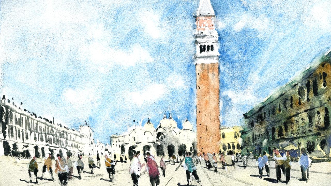
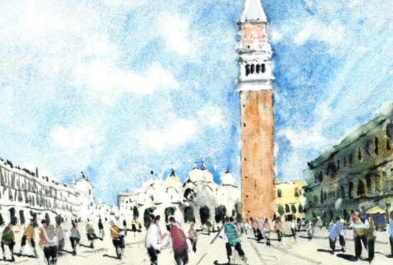
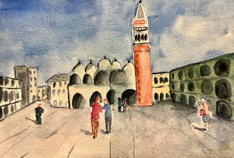
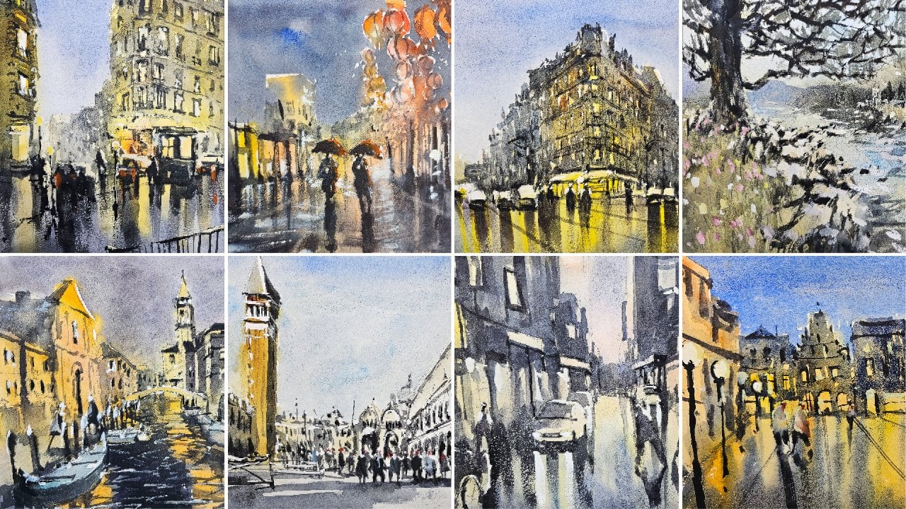
1. Introduction: Welcome. In this class we'll be painting an urban landscape of Venice, St. Mark's Square
in watercolour. Learning how to capture
urban landscapes in a quick, Fun and loose manner is an essential skill that every artist should
learn to master. Watercolour is the perfect
medium that allows you to produce spontaneous and
expressive paintings on the go. Urban landscapes can
be confusing to paint. The so much going on and
an overload of detail. We can often get lost
in their paintings. In this class are
going to show you how to paint any urban landscape easily by using
layering techniques and understanding
light and shadow. Planning is crucial. I'll show you how to simplify buildings, figures, and shadows
into basic shapes. Getting those large
components in accurately beforehand is essential for
your painting to make sense. So join me in this class.
You'll see just how easy it is to create this amazing
scene in no time at all.
2. Materials Required: So I want to talk a
bit about materials. And you can see here, I've got my actual painting. I've got some brushes
and palate as well. And let's talk a bit about
the paper I'm using. Hundred percent cotton
watercolor paper in medium or rough texture. Great for washers and getting in these nice
wet wood affects a Fine. It's very difficult
when you using smooth hot press
paper because there's just not enough texture
in there for you to be able to add in clouds
and things like that, especially when that
paper dries so quickly. So that's what I'm
using and I do recommend you getting cotton
paper if it's possible. If not, you can use
normal cellulose paper. Only issue with that
is that it tends to, when you go over that second
Wash with the dark colors, you may actually pick up
some of that previous Wash. So just keep that in mind. Now in touch brushes
you can see here, I don't really use a
whole lot of them. I've got some of these ones. Here's the left, and
these are the main ones really that I use in this scene. We've got three mop brushes. Large mop I use for
most of the sky of also even this one here to get in some darker
parts of the sky, maybe lift out clouds. Sometimes I switch
to this one as well, especially when
we're talking about these smaller shapes here. Or I guess this
large shadow shape. And I've got a
little round brush here to get in small details. So you can see just up
here on top of the tower, some of the windows, some of
the figures here as well. The round brush just allows
you to get in those details and not have too much water in the brush and you have
too much water in the brush, especially meetings,
more details, it just runs and lose what
you're trying to detail. So those are the main
brushes that I'm using in this particular scene. And here's my palette. And you can see I've got lots
of colors on this palette. I tried to pick apart that
has large mixing bowl. So that way, especially
when I'm trying to mix up a large area of
paint like this, you want to make sure
you've got enough area to just mix it up so you don't
have to keep going back, mixing more and more in and getting confused at the
concentrations so large and mixing wells make
it easier for you to get the consistency
in your paintings. So a few colors that
I'm using in the sky. I've got the cerulean
blue over here. I've got some burnt sienna
and I've got some black here, basically some lamp black. This is some gray
that I've mixed up. If you've got a yellow
or blue and red, if you mix them together,
you get a really nice gray. So I do have my own
neutral tint here, which is a convenience color. It's basically a gray, a premix
gray. Here on the ground. I've used a bit of
that gray in a bit of yellow ocher as well. So just this color here. Yellow ocher stood nice. Nice, sort of muted down yellow. And I use a bit of it here
on the buildings with a bit of buff titanium
and buff titanium is just this one in
the corner here. And it's off-white color. So that's about it. For this scene, I also use a
tiny bit of white gouache, sometimes as you can see, to just draw in
some highlights or some additional details
on some of the figures. So it's another thing
to keep in mind. It just comes in
a tube like this, and it's basically
opaque watercolor
3. Drawing: Alright, I've got this
amazing photograph of St. Mark's Square
here in Venice. And as complicated as it looks, we're going to simplify
it down and also try to get in all these figures. Few. There's quite a
few in here and I think we're going to
use them as a guide. I love the colors on some
of their clothing as well. So first thing I wanna do is look at the base
of the buildings and figure out roughly
how much space we want for the ground. And I'm going to just pencil in tentatively line
around about here. You'll notice that
this scene is mostly, you've really got a lot of the sky and the buildings
and not much of the ground. And I think the reason
for that is we've got this gigantic tower on the right-hand side and it
doesn't leave much room, do need to make a
bit of space for that tower just
between the top of the tower and the
edge of the scene. So let's go ahead. I'm going to figure out roughly where everything
lies and scene. So we know roughly here, I think this is a cathedral, some sort whatsoever
events a few years back. And I didn't end
up going in there. There was a huge line. I'm gonna just, again
tentatively just pencil it in rough
location of where it is. Now, we know the tower isn't it isn't right
in the center. It's a little bit right. Okay, so I'm going to
start penciling it in. And relatively, you're just looking around to see where
it might finish as well. So say about he starts here. You've got it going
all the way up. You might be tempted to
use a ruler at this stage, but try your best not to. You can build those
motor skills by drawing. And I don't always,
as you can see, I don't always draw
just one straight line. I'll draw it in little parts
like this and reassess it. We know the tower
ends about here. There's a bit of space
on top of the scene and we need to leave
a bit of space there. So I'm going to just
roughly ended about here and get that point in. I think this tower is quite crucial in terms of just
making it, making inaccurate. Here's the bottom of it. And you'll notice that the
bottom there is this kind of rectangular
section like that. Rectangular section. Okay? And just getting in a little bit of
the edges like that. And some more here. Just a little bit of the top
part of the the point is, well, there's some
details in there. Notice underneath is a few of these little bits in
pieces like that. Let's one area. They're a bit of
darkness under there. As you start moving down, you've got this
whole area that's kind of all whites anyway. Okay. And you've got these four
kind of How should I put it, these four little
viewing areas here? And I'm just gonna go again, pencil these in roughly
where they are. I'm taking a bit more time
here because this tower is quite a quite a
prominent landmark. And we have to in
a bit more effort, I think with the detailing. Apart from that, I don't see too much else that we might want
to add in these pillars. They just run downwards. You can see that they're running across
like that. Good. And you've got these four
kinds of know what they are. 1234, these four bits that
just run down the building, the tower. I mean, this. And I'm just implying
it at the moment. I don't think I want to draw
it all into accurately. Just have a indication there
like that and I can go ahead and detail it more as
I move through it later. Sides of the tower though I
will just work on a bit more, just make them
straighter done here. If some reason I had a bit
of something in that corner, get rid of that and
bring this one down. I try not to use a ruler because sometimes when you're
doing some drawing, are you doing some
Painting outdoors, he may not have a ruler with you and being
able to actually estimate shapes and
accurately get the mean by, I think is really important
skill to have as an artist. If you miss out on that, I think at times
your paintings can be a little bit too
stiff. I suppose. Some level of imperfection, I think is really important. Strangely enough.
So here we've got, I mean, there's all
these little windows here in this 123. Who knows? All bunch. I'm just running down
fast about that. More. Trying to look at this
bit here in the back, and this is the palace here. And of course, coming up here. We have got a part of this set of buildings
running to the right and estimating where it finishes on this right-hand side
of the pages important to and it's not exactly
in terms of patterns. Sometimes they finished about
halfway through the page. So I can match, match the
halfway point of the page, but this one actually
finishes roughly about here. So I take a general starting
point because we can pencil put a mark at the halfway point between the top and the
bottom of the page. And then just sort of
estimate roughly where these this building
will go out to. Roughly here. Straighten that up a
bit more like this. Okay. There's a couple of
floors Actually, there's three floors is one. There's one there. You go to third floor
of the bottom. Okay. Isn't little umbrellas and
things also running across? As you can see, they
overlap with each other a bit like that nicely. Okay. That hue, you just gotta be less
section like that. Picture, that rooftop. And a lot of this
stuff we can actually indicate later in Watercolors. But I think the
important thing also just to pencil in some
of these like these, these are just these windows
that are sticking out there. And I'm really
trying to simplify them down because
I wanted to leave all this heavy lifting for the Watercolors
later on, I think. Always have to remind myself
I'm doing a painting, I'm not doing a drawing. But keeping making sure that that drawing
is representative. The drawing reflects the
actual scene out there as well as it has to be really good guide so that
you know what you're doing. When you come in
with the paints. Just separate this building
in half roughly here. The one all the way
in the background. You can just see a few little, if these darker bits of the
building there as well. That bits and pieces
in front umbrellas, all kinds of things you often
find over and Venice this, this whole year and the side
and near the touristy areas, they're just filled with restaurants and people
sitting at tables. Okay, so alright, so we've kinda halfway done with the buildings. Now we're just going to
have to put in a bit of effort here with
this center part. And there is this
is the cathedral. And having a look at roughly how far I've
got it beginning, I'm thinking this is roughly the right spot that I've got an I want to make sure
I've got enough room. Firstly, it across like that. Now, some patterns. We have one main areas that
are darkened area in here, like a doorway, like that. You can see. Then we've got two on
the sides that smaller, so 12, maybe even a third one
here, something like that. But mainly you've got
the 212 like that. Little bit. Another one here on the side. And then here you've got
another one here like that. And of course you've got these This top part there. Important to make it symmetrical because it is
symmetrical, of course. You've got these other two
parts that just run up. So you got one or same sort of replicating onto 12 like that. Now simplifying it down, not too much in there at
all, just simplification. And on the top we've got, oh, there's all these gets
quite tricky, doesn't it? There's all these
domes and things. I mean, there's one back here, there's a larger sorted
dome and you can see it just going up like that. There you've got a
larger dome here. You just kinda just picking out some another term that overlaps with it there
and the top of the dome, you've got these little bits
that stick up into the sky. This one's got a more
prominent point like that. There. You've even got one over here. Just almost overlaps
with the tower itself. Again. Little top of it coming off. You've got all these
little bits and pieces. I don't even know
what these are, just these little bits
of the left-hand side. I'm not going to bother too
much with the detailing. We've got a little
building here. Look at that. Just
a small building that runs off the side. May have gone too far
with that doesn't matter. And you can actually see
the roof top like this. Just comes, joins on
with the cathedral. Good. Starting off here in the back, we have some more buildings. I'm just going to
draw them in general. Quick little blocks. Having a look at where it
finishes on the page as well. And here it actually is a bit
lower than halfway point, so we can mark roughly the
halfway point and just take the point slightly
below, like here. I'm going to just go
through and join this, come down roughly
like that. Okay. We know that there
is some kind of a tower here or taller
than this building, but it's roughly about here. Okay. That side of this little
elevated part of that building, It's runs through it. Make this a little bit
taller, perhaps like this. Or I can make this building a bit shorter actually,
that might be better. Like we somehow got a few more buildings
you in the back, it's tricky to see what's
going on the way up here. Just make some separations
in between the buildings. This larger one here again, a repetition of the
one on the right. So you kinda get
three floors, 123. Just like that. Easy and just like that. And we've got some
little I don't know, I think they're umbrellas or something that sometimes it was some construction work going on in here so you get bits
and pieces covered up. I don't want to getting
whatever that is. There, maybe a bit of darkness
here, something like that. But I don't want it to be just all I want it to be kind of
maybe looking like this, some tables and
things like that, people just dining there. Again, this whole section is quite similar to the
one on the right way, just because that
just getting in these two floors
simplify it like that. Now we've got most
of the buildings, in all the buildings really. What I wanna do, just realized I missed a
couple of windows here, but what I wanna do now is start putting in some detailing
for the figures. And the figures are quite
important, I think. Bring a sense of life to this
whole scene without people. I think it's gonna
look a bit strange. So let's go ahead and work
on some of the figures. What I'm doing now,
I'm just outlining the tower a bit more
so it's easier to see. A little bit easier
to see you on camera. But we've got some figures here on the left,
some on the right. You don't have to
put them all in. You just have to pick
a few and change them around a bit until you're
happy with how they look. For example, without
one here, That's it. That's a figure. And just put in maybe the top, that person's wearing a
dress or something and Leg is another leg
coming out the back. That's a figure there. Of course you've got
a bit of a shadow running towards the
left-hand side. It's kinda like left and up. Little bit left and
go into the front. And all these buildings are
just all in shadow here. The right-hand side,
very stark contrasts. Even here you got, I
don't know what they are. Umbrellas of some sort. Maybe they're also just maybe some restaurants
and things there, but you've got figures just walking around here in the
background doing their thing. And your job is just
to put in a few and tell that story of a busy
for anywhere from me anyway, a busy day out and in Venice. And you might want, you might not want
so many people, you might be happy just
having a few here and there. It could be a different
scene for you. Could be maybe a quiet
morning or something. But for me, I do
want to just get in this busy few of everything
going on in here. That's what I'm trying to do. I'm just trying to add in
different figures and bits and pieces in here to make
it look more realistic. And you can also put
a larger figures. So this is larger figure
maybe here in the foreground, similar to that one there. Backpack on perhaps
just like this, like a sidewards sort of figure. Coming out like that. Shot, maybe wearing some shorts. Leg forwards, one leg forwards, and the other leg going
backwards like that. Okay. Get that shadow to connect
up a bit like that. Okay. There you have it.
You've got another another figure here
walking through the scene. The head is probably
a little big. I'm going to just
shorten it down a bit. That could be 0s
here on top or a cap or something like that. We've got some more couple
of people here just going to change the stance
of them a touch. Maybe they just
talking to each other. These 2.1 of them's got my
hands up and down like that. Just talking and having
a good good time. It's getting some
legs like this one. Maybe the other one
here, they're just standing up, right? K. Just making it quite
a simplified scene. Okay, there we go. And shadows again,
just running towards that left hand side helps to just make things
look more consistent. You know, you didn't
go to smaller boy here that's just
wondering around. Maybe it looks like he's lost his parents or
something like that. You've got small figures here in the background that
counts how many they are. There's really not much
to indicate there, but the little ones in
the back or give the big ones a proper sense of
perspective and proportion. And then what does
he keep adding these smaller figures in? You realize, it
actually makes sense, makes these, these figures
appear larger and closer. Something you really have to
remember to do when you are. Drawing is making sure that you create figures that
are smaller in the front, jaw, figures that are
smaller in front, the back. Otherwise you're going to
look like you've got giants walking around in
the backgrounds. Really important to do that. Good, a few more figures
just walking around. I'm going to simplify
these ones down, so I'm not doing this all day. I think a few a few
figures there to the left. I'll probably detail them
a bit more later as well. I can even get a larger
figure like this, just walking into the scene. Too big. Shoulders in around
the same level. Shoulders like here,
hit here. There we go. That's better. And leg and leg. Walking into the scene, helping to direct
the eye forward. Someone just figured
just standing here doing something or another, holding onto something there. It's all really up to you. What you put in here. Make this one a bit
tiny, bit larger. K, looking good. I think that's going to do
the trick for the drawing. Okay, so let's get started.
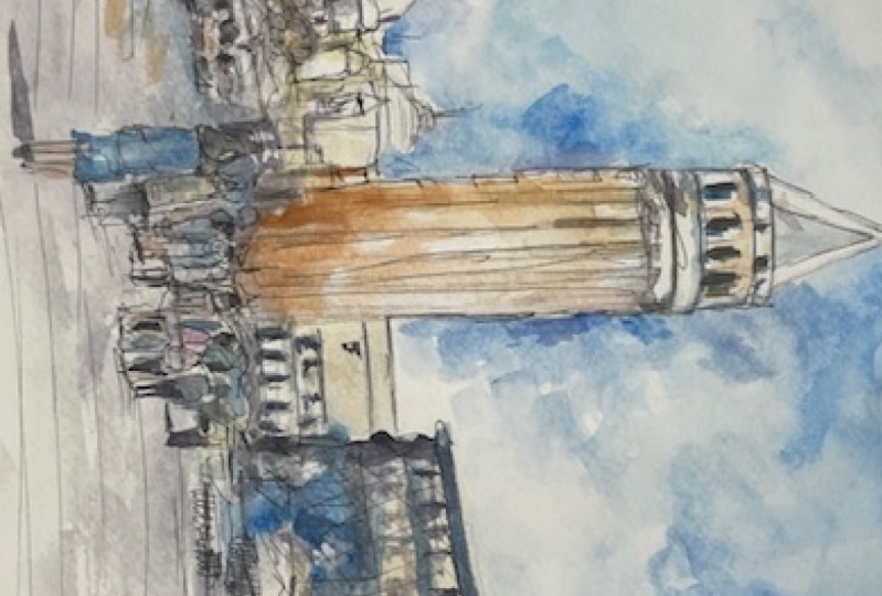
4. First Wash: Let's go ahead and
get started in the first thing that
I want to do is work a little bit on the details of the
buildings themselves. Mainly this one here I
think to start off with, I'm going to be use some brown. Now it doesn't matter
what brand you have, but try to keep it light, so just water, water it down. I've got some brown ocher here. And what I'm going to do as
well is I'm going to mix it up with a bit of orange
or a tiny bit of red. Okay, to just get in a
bit of have you've got, if you've got burnt
sienna as well, a fantastic color to use, that's probably
gonna be perfect, but I'm just going
to use a bit of this makeshift
reddish brown color. Can maybe tiny bit
of orange in there. Remember to keep this Wash
soup bowl light as well. Okay, That's almost
too dark. I'm Jonah. Better. Suggest water it down a touch more and put a bit
more red in there. Like that. And I'm just going to come down, but I like this. Okay, just cutting around
that white section as well. That a beautiful orange, more engineer like
that, That's better. Okay. Just wanted
it more warmer. There we go. I'm just going to
bring this down nicely to roughly the base of where
these figures are. Not. Touch anything else really
just get to that base. Tricky. Okay, good. Something like that. Goes right to the edges
as well as missed out and some of this left-hand
side part of the building. And here's, we'll just, It's quite important, I think, to this tower to make things
as accurate as possible. I'm going a little bit of
that orangey color in there. If it's granulate out
or it doesn't look as perfect, doesn't matter. I'm happy with how it appears, even if it does have
a little bit of a splotch genus to it and makes it look more realistic
if you asked me. Okay, good. Let's put it beautifully
it up the top. Red brown, red, orange
brown, red orange. The top here. A little
bit of color there. It's all you need. That white border. That good. Alright, I'm going to
work on these buildings or touch while I'm here. What I will do is
mix-up bit of yellow. I've got a vibrant yellow here. I've also got some
other hansa yellow. I'm going to mix up a little, a little bit of that with some of this white bit of buff titanium white
color really, and an off-white color. And I'm going to use
that to paint these. It wouldn't see off to the side. And a lot of water going
through the load of water. Just wanted gentle Wash going over the top of these buildings. And it looks a bit
like Naples yellow. I don't have any Naples yellow, but it's basically just
an off-white color, slightly yellowish color. And you can make that very easily to have to
buy it separately. Maybe. Just a little wash of color on those buildings like a tiny bit and dilute it down a bit more and start
working on this one. I'm going to have to go over
it again afterwards anyway. But a bit of a back background wash for those buildings
is really important. I've chosen to go a
little bit more yellowy. You don't have to do that. You can just leave them white
as well if you if you like. Okay, when I'm adding in a tiny bit of that
yellow in there, even for this these buildings to the left-hand side like that, just a touch of touch
of white in there. Like that Yellowy, white will dry off and it will look a lot more subdued. Think on top of this building,
I'm going to leave it. What we can do is work a little bit on
some of the details. I've just got some gray on this smaller brush,
smaller round brush. These little round brushes
are fantastic for detailing. And I'm just going to go over the top in some
of these areas to get a little bit of gray. Do the darkness in here. Mostly just water. Even some little bits here. Just quickly get in
a few these windows. It's not going to
be the final color, but just an indication
of where they are or what have we got up here? We've got bits of
the the railing and stuff as well like here. You just using this
little round brush to indicate some some
small details. It really just drawing with it. Okay. And you have to be careful because this is
mostly just white. Why did you say you really trying your best to
leave in most of that previous wash in there. You've got these
little circular thing demos here as well. Running down the page. I can do them later as well. Just start them off
like that kinda thing. Bit more. Yeah. Some vertical strokes like that. Gray like that here. The top section
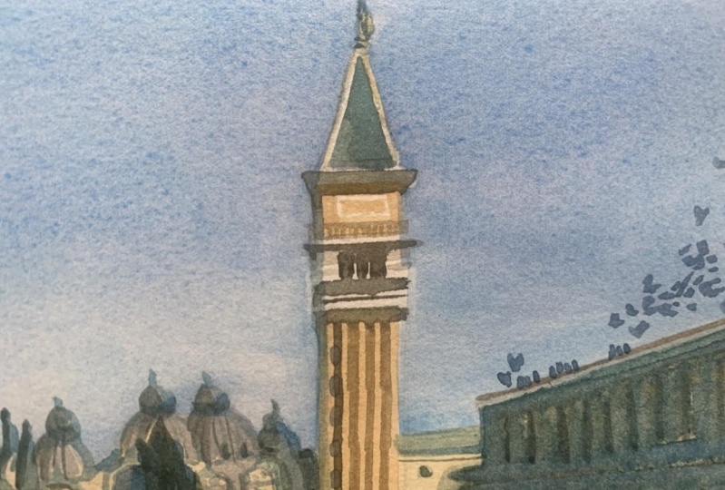
near to the white. Okay. Alrighty. So now what I'm
gonna do is start getting in some
background color, this beautiful blue color. I'm going to use flat brush as well as all these kinda mop brushes
that I have as well, these larger mop brushes. And we're gonna get it all in. And I've actually got a tube of cerulean that I've mixed
up over here on the side. This will just make
it a lot easier. Squeeze out a bunch of that. So cerulean on the palette. I've already got a bit
of that cerulean there. And I'm going to
just add some water. Okay? Let's lot of cerulean
actually need that much water and
straight in there. Now, I am going fairly dark. And with this cerulean as well. And especially as we get near
to the top of this scene, that's where I'm
going to go darker. But also around the edges
of this tower is really important because it helps
to kinda cut around and give that impression of that white
sticking out through there. So I'm really trying to get in more of that more of
that color through there. Tricky. Okay. Move down the page that maybe you need
more cerulean actually. Continue on this side as well. In some more this trying not to take too
long to do it as well. I think I can get
really suck it into spending too much time
on something like this. When sometimes the
faster you do it. I mean, within reason, the better it looks. Okay. We'll have to
probably extend this out a little bit further later. Bit more blue. Cerulean Okay, now that that is done, I can just relax a bit and
get the rest of the scene. I think we'll will have
to extend this out a touch though later. Almost soften it off.
We'll see how we go. More blue cerulean, spread
out some of this stuff, started to around
a bit like that. Okay. The this side
as well, the tower. Pick up my flat brush again and just quickly get
it in that side. Darker there. Okay. Good. Stick. Work our way through the
end bit more on the top. Might just get some of the
more of that page is coming up more and more cerulean rather
than having a wet pre-vet. My other stuff. Cerulean is very very light color anyway, it's difficult to get in. Make it dark at all or
almost impossible really. Create some little
inconsistencies in areas. Okay. Okay. Cotton around these two dimes. Someone that small blue here. Like I need a bigger brush. There we go. Shown to smooth this out a bit and I might even add a cloud or something and
then some clouds. We'll see how we go. Just want to cut around
those buildings, get that, add the way first and have a
look at it from a distance. Some reason this
cerulean I have create this weird kind of
bubbles on the surface of the paper and I want
to just smooth out some of those bits and pieces. The paper is still wet. So you can see just causes a bit of a mess
if I'm not careful. K, This gets a bit dark. But I don't mind too much. Like a nice little thing I
tend to do as well as that. I'd like to blend bits
and pieces together. So might look at,
say, for instance, like a bit here and just add a little bit
of water in there. We've been bit of water up here to indicate that the
towel goes out further, which it does go up further. I'm just a little bit
of water up the top. Tissue helps for sure. Soften that edge a bit. Just scrubbing a touch also have a filbert brush which probably is better for
these sort of thing. Scrub off a bit like that. It strangely just joins it
onto the background of touch, but still creates
enough sharp edges in most of these
areas to imply that the building is there. But it pushes it back and blends it nicely
with the background. I like this effect. But again, you don't
need to do this. It's just a personal thing. More than likely I'm gonna go
back in it afterwards with some gouache as well when I
bring out some highlights. So you can see here I'm doing the same thing with
this filbert brush. I'm just finding bits
that I can scrub and lift I've done away with that
idea of having some, some clouds and there, you can do this thing
like for example, if you wanted to cloud here, just scrub, scrub a touch, then lift off like that with
the with the tissue. Okay. You've got an
indication of a cloud. You can do it here as well. Just put in a bit of water
and just dab and liftoff. It looks like there's
a cloud there. Creates a bit more interest
in the background. You don't have to do this. Okay? I think I'll put
another one here. Even near to the top
of the tower itself. You could play around like that. Be more sharpness. Okay. Notice how I just joined it onto the
background a little bit. Effort. Sharp edges are important, but also so as soft edges
make things would move, join together and the PMO, peaceful as soothing on the eye rather than having
too many sharp areas, it just creates some relief to the eye when you've got some softness running
through in here. And these clouds are a
great example as well. They really helped to
bring out some softness. You've got these sharp
as shapes over here. But I've gotta be careful
not to over do it. So just knowing when to call it quits and I
think I'll stop with that. There. Now the ground,
we want to get in some little bit of
color for the ground. I'm going to pick up
that same mop brush that I've had
medium-sized mop brush. I'm going to pick up a bit of gray and yellow
mixed together. Like a warm gray I suppose. Let's try that. Really graze. It needs to be really light, still in the ground. This is some yellow ocher,
something like that. It is grouped more gray that let me just pick up some of these. The go, this is
just neutral tint. Okay. If some of this color from the top can blend
down a little bit, I think that'll be good, but pretty sure that area
has already mostly dried all this stuff up there that
I painted it in before. Little trick is you can just
spray it down a touch to spray bottle like that. Okay. I'm just remembering to keep this Wash real light as well. Probably even got it
too dark at the moment. It doesn't matter. It will dry off a
bit lighter. Anyhow. You go trying to cut
around the figures as well so I can getting some
colors for them. Okay. That just bringing
this Wash downwards. Okay. It's also good to just have a bit of extra
darkness down the base. So adding a little bit of gray, darker gray down at the bottom, I should've done this
to the sky just to make the sky a little bit
darker at the top. It's a good technique
to to carry out. I'm not just spray down
the top a little bit. Okay. Just like a
little bit of spray. Re-wet that top
area of the page. And I'm going to drop in
and loose through and not cerulean blue little bit
of ultramarine up the top. Mixed with some cerulean. I want to just darken the
top of it a little bit. K helps create some
mixture of extra contrast. Just a touch of that color. Then let it sort of blending. I will just spray the
beat here as well. Helps to naturally let
it blend because I don't want to go over those very
clouds further down the page. Water, content, the
spread a bit round
5. Second Wash: Alrighty, So now for
the next step of the painting and
what we're gonna do is essentially getting all the little
details so the windows, doors, really dark areas
that figures the shadows. And I'm going to keep it simple and just use a
bit of neutral tint. I do every bit of
black here as well. And some purple.
The purple I use, mix that with neutral
tint to create a cooler. Gray. Alright? One of the big things I
wanna do first is just getting this building here. It's just a large sort
of shadow that runs over the top here and this
large dark shadows. So these way to do it is
just threw a big Wash, going to use some purpley color and there's
only one way to do it. Straight into it. Okay. I can just make sure that
I've got enough space here as well to get in
this side of the building. Like this, sort of sticks
out like that. Comes down. Then this part just comes
down again like this there. Okay, good. Now we have to soften this out a little bit later with
that filbert brush, but worry about it for now. I'm just getting that in. I want to try leave some of that previous wash
in there as well. So it's yellow to imply, add an ID umbrella or
something in that section. Brown mike, be good
in here as well. Just a bit of warmth. Running through this
block of buildings. You can see here there's like these little parts
of the buildings in the background that
you can just getting some small little
details with like that. Okay. Darken up some of
these areas in here. Taka sort of shadow here, running over the top
of this building. And this is caused
by that tower. Like that. Something like this. Imply it. In there. Lift off a bit of paint from here at finding
some areas of darkness to to really, really just draw
underneath the domes. You'll notice there's a bit
of darkness, the curvature, some of these little
areas like that, little bits and pieces
dark underneath there. You've gotta be a darkness here. You got it some here. Trying to simplify
it down, of course. So just a soul, just
a bit of black. But I've picked up okay? In bit of darkness in here to indicate the floors
of the building. Go back to that later. Windows. Any darker bits? I want to add in? Filbert brush again and soften off the top
of this building. Some of these areas
again where it joins on with the sky
and unlike to just soften it a bit so that it just blends in areas like that. Okay. It's actually got a bit of a shadow running on the ground. Like that. It'd be to the left to see, but it'll bit of a shadow. Just to the left. Buildings to the
left. Small black. And again, I'm just going
to simplify this down. I don't want it to take all day, but look at these little
little dots and things that I'm putting their just
indicating the windows. And you can actually see the
top of this area as well. The rows. Yeah. Of course you've got some
of these windows, doors. As you get towards the back, they become smaller, closer
together, like that. They start out pretty big. Little bits and pieces
on top of the building. How the sea, but they kinda
like stick up, touch that. Getting some black in here just to get in
some of the windows. Now, these areas mostly dried so I can actually just
go straight into it. And indicates bits and
pieces of the details. Hopefully, some of it
actually just melts in nicely where it's
where it's wet. I don't want there to be too much sharp
details like that. Let's see how the
floor again that we were putting in before. But of course, we've got these like just one brush stroke really to get in
these little windows. Whatever you like that. Simplified. Welcome to figures a bit. Some colors. I
trust them yellow. For this one. Move to something here. We see color lavender. There. There. Maybe be more reddish
color for this one here. Pink or something like that. Keep them light as well. You didn't need to really put a thick layer of
color through there. Good. Just picking up
random colors off the page. Palette, sorry. Doesn't matter really. What color the
shirts or anything. I just liked to eat a variation, few different colors
running through there. I'd also don't want it
to be too colorful. I can start to make
things look funny. I'm gonna get black. And putting the legs of some
of these figures now is one, this one, I'm trying
to just get them to blend in a bit more
with the clothing. Smaller, round brush I
think will work better. And this back leg
there like that. I'm just dry brush this off the touch and get
that occasion legs in. Skip over areas as well. If you need to. Find this helps just sort of even just dry brushing
them on at times. It's getting this figure, this one here trying
to get them all that. The color is still wet. That way. It's blends in nicer. Just standing up, right? No problem. Like that. Here. Your one here
sustaining, walking. Blue ones on the distance
to get the mean, but do the same thing, really. Just make them smaller. Even add ones that
weren't there before. You didn't put in before
just something like this. Shadows are quite
important as well. So I'm going to get in
a bit of that shadow, some purple when a bit of darker color that I
don't want to overdo it. Just be careful and
just get it in. Hopefully with one stroke
like this if possible. Make sure the shadows all
running in the same direction. Two really important. Otherwise it's not
going to look, right. Look at the general angle which all the other shadows are
running and match them. Match them up. The era we've got some decent
looking shadows in now. I will work on perhaps some dry brush
stuff on the grounds. We'll look to some
perspective lines. Okay. Just running through the scene that just imagine a
point here, right in there. And then draw a line going out outward from
there. Like that. Repeat, for example, down here. Be very careful. We're just going
to dark as well. Just it's almost like a bit
of dry brush, if anything, just coming through and helps to create a bit
of dimensionality. Okay? And you get little breaks
and things as well. You don't have to
get them all in, but why not put in a few here and there? Like that. That helps. Just gives the ground some
texture and interests, but not too much so
that it draws away from the scene itself
just enough in there. Enough little bit of reading for the faces
of these figures is just a drop of red diluted out. Also these ones in the front, I think it will just make more sense and kinda
look like they have their arms out as well
talking to each other. That this one just looks like
they're facing GMB, right? This one's facing left and
just talking to each other. White shirt on bootlegs on that one behind. But of white gouache. You can do things like Indicate just a bit of detail on the shirt
or, or whatever. You do it to all
of them that just extra little touch of detail. Sometimes they, you
have figures that hold Bags and things like that. So you can just imply
something going cross like a sling. Like that. It makes them look
more animated. And really stick.
I find when you've got a little prompts, I suppose, I'm trying to just
lighten part of that figure because
I accidentally put in some color before. Tiny details. Colorful the hair or
something just dark here. To have to do it. And
we're really done here is just finding perhaps some additional
bits and pieces you want to want to potentially
add in little details. Filbert brush, again. Just soften off some
of these edges. Can do this with any brush. You can do this with the
round brush or even less. I just love having some of
these soft contrasts in there. Helping to join
things up nicely. Blending to notice there's also no darkness running underneath the buildings into the back and
stuff like that. So you can play on
that and should have. I'm dark and often
areas like these. Extra darkness in here. Okay. I'll call
that one finished
 Watercolour Mentor (Darren Yeo Artist), Art Classes, Mentoring & Inspiration!