Transcripts
1. Introduction: Welcome. In this class we'll be painting a loose country
scene in watercolor. Natural landscapes are
simple and beautiful, providing the perfect subject for a beginner
watercolor artist. Adding a manmade object
such as a hut or barn can create an
interesting contrast and help to tell the story. Learning how to capture a
landscape in a quick, fun, and loose manner is an essential skill that every artist should
learn to master. Watercolor is the perfect
medium that allows you to produce spontaneous
and expressive paintings. On the go, planning is crucial. I'll show you how to simplify shapes and sketch in large ones, such as foliage, trees,
grass, and land. Getting those large
components in accurate beforehand is
essential for your painting. To make sense, you
learn the essentials of wet and wet and wet and
dry painting in order to create a perfect blend
of hard and soft edges. I'm excited to get started. Join me in this
class in painting this beautiful natural
landscape in no time at all.
2. Materials Required: All right, before
we get started, I want to talk a
bit about materials that you're going to
need for this class. Let's talk a bit about the
paper that I'm using first. Now I'm using 100%
cotton watercolor paper. Now the paper has
a texture on it. I'm using cold pressed to
medium textured paper. This allows the colors to blend together a lot more seamlessly. You get areas that dry
consistently as well, just due to the
texture of the paper I find when you're
using hot press paper, you just get areas of water that pool in spots, dries
inconsistently. And for landscape paintings, any type of natural landscape
paintings like these, I just find the colors blend and look a lot better when you're using paper with some texture, 100% cotton is preferred. If you do have non
cotton watercolor paper, as long as it's got texture,
you're going to be fine. But do keep in mind if it's
not 100% cotton paper, that previous layer is
probably going to lift up. If you go in and fiddle
around too much. I always recommend not to go into the paper with the brush. Too often, go in there and paint an object or a subject with as few brush
tricks as possible. It's always going to look
a lot cleaner and you're going to make sure
that you don't lift off those previous layers. So some of the brushes
that I'm using here, you can see I've got
these mop brushes and these ones have
a large belly. They pick up a lot of water. They're great for things
like the sky large areas. And in the first wash, especially when we're getting
in just the basic colors, yellow there, I'm just
dropping in a lot of that yellow, very watery mix. Blending that in, you know,
with the blue at the top, bit of green and
yellow down here makes it very easy to get in
those large shapes. I've got three different sizes. I probably think I've used mostly just these
two in the painting just to make sure that I can still cut around
bits and pieces. That's a great thing about
mop brushes as well. They also come with a very
fine tip allowing you to cut around different objects, which is super important. So that thing just doesn't blend together and
there's no borders. So here is a little brush, this is a synthetic round brush. And I use this at times
to create small details. Like for example, this shadow on the right hand side of the tree running
across the ground. Maybe a bit of this stuff here, the side of the side
of the building. I've also got this brush
which is a flat brush, exactly the same thing, it's just a different shape. I actually tend to go to the flat brush these
days, I'm not sure why. But you can, again, get in nice sharp minimal brush strokes with
the tip of that brush. But also be able to get in
sharper shadow shapes there for the side of that building a little bit underneath as
well. It's really up to you. As long as you have a
small synthetic brush, you're going to be
absolutely fine with those bits and pieces. I've also got this
little brush here, this is a rigger brush. And rigger brushes are great for getting in small details. If you want to put
in longer trees at the back or little branches
and things like that, really good because it just specializes in getting
in little thin lines. This is a fan brush. You can see fan brush as has these little splayed bristles. I use that here to get in some impressions
of the palm trees and leaves and things like that. Makes it a little bit more
messy and more abstract. Okay. You've noticed as well, in areas I'm actually used a bit of the
scratching out technique. It's tricky to see, but here, near the bottom of the building, just these little lines. Okay? I wait for the
paper to dry slightly, and then I'll go
in and scratch it out with a bit of
a pocket knife. And that just creates
some contrast and brings back some of
the light into the scene. Another thing I
should mention as well is I do use a bottle of Gush and Guash is a
finishing touch thing. I'll put that in at the end to create some tiny contrasts here. A bit of light, maybe on
the left side of the tree, the rooftops bit in here,
just to even it out. So it just brings out
those final highlights. Okay, In terms of
the actual colors, I'm using a lot of
greens in here. I've got a color
called undersea green, which is granulating green. If you've got a Hookers
green, olive green, or if you've got your own
green that you've mixed up, maybe for a bit of
Hansa yellow and also a bit of Cerulean,
Absolutely fine. Okay, one thing to remember, if you put more blue into
the blue and yellow mix, you're going to get a
darker green and you want to have a combination
of different greens. You don't want it to
be the same color, the same type of green. You don't want it to also
be the same value as well. So you want some light green, dark greens and just some
overall even cooler greens in some aspects like
here where it's, you know, starting to
get very, very dark. Okay. What else do
I have in here? I've got yellow ochre. So this color here, it's like a muted down yellow bit
of cornacridone yellow, which I've dropped
in there as well, just to increase
the saturation in some areas of the painting. Okay, I've got a bit of
cerulean blue here for the sky. Also use a bit of
this stuff here, which is called neutral tint. Neutral tint is just
a pre mixed gray. Okay? And I use that
to darken off areas of the painting a little bit of
this lunar black as well. Just to get in these
really dark shadows there. Okay? If you don't have
any of these colors, you can always mix your in gray. Just mix in your three primaries,
red, blue, and yellow, and you're going
to be able to get something of that color. Okay? That's pretty much it for the materials and
let's get started.
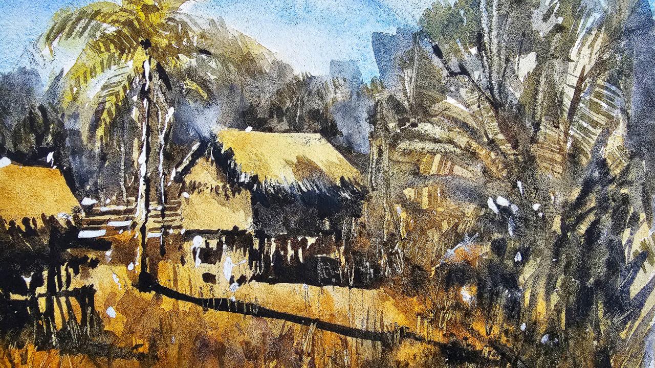
3. Drawing and First Wash: Let's get started
with the drawing now, there's a whole
bunch of huts here, and this one is
right in the center. I think what I'm going
to do is actually just start placing
this hut first. Okay. Roughly around the
center of the scene, really is right in the middle. Almost center to the left. Okay, I'm going to put in
the rooftop of it like that. Okay. We've also got, it goes out to the
left a bit like that. There's all this thatching, leafy material as you can see. I'm going to just indicate
that a bit like that. Can see it come down and you don't have to get in
too much detail for that. The main thing is
just the structure of this T the front of
it like this, okay? And it's like a square shape
or whatever like that. Probably goes down
a bit further. Actually, let me just
redo this quickly. I think I should make this
slightly wider line here. We'll just connect that up. Very important to get
these manmade objects in fairly accurately. There's actually a shrub or a bush or something
there as well. I'll just move this over to
the right hand side like that right hand side of that hut. There's
bits and pieces. You see the wooden I
don't know what they are, like a wooden fence or
something in front there. But behind that wooden fence, we've got the actual buildings. And these buildings are
on these little stilts as you can see there. Logs or stilts switch is, you've got this nice shadow
directly underneath it. Just a little bit like that. There's area here, just the entrance of the
hut at the back there. What else do we have in here? We've also got this tree to the left just going up like
a palm tree or something. They just getting a few of these bits and
pieces of the tree. Okay, That you can see even trees off in the
background behind the hut. Outline that a bit better here. Here. That's another hut
closer in the foreground. And of course you've got some
stilts underneath as well, like that bit of darkness
there here in the front, you've got all shrubs and
all kinds of things here. I do want to actually
get some shadow for this tree as well here. I think this would be nice
just to carry that across to the foreground to see if I
can extend this out further. Increase the size
of this actually. Something like that. Okay, tree here. There's another, these little
leaves that just pop out. Okay? A lot of details and things here which
I'll have to simplify down. Okay? Posts and little
tree line behind the tree line behind all the heights as
well is important. There's bits and
pieces here we can indicate, let's get started. And I'm going to pick up a
little round brush closely and work in yellow ochre. Lit bit of yellow ochre
just to the roof top of this roof top. Like that, very
light, 10% paint on. Okay, bit more yellow. I can pick up a bit
of golden colored, yellow, Nacridone, yellow
dropping a bit there like that. All I want to do is just get in a little indication of the
hut colors of the hut. This one here to the
left is important too. Just pop in a bit of
this yellow och here. That's nice. A bit of yellow Oka
granulating color as well. Then see just where it connects. On the top of this heart
is actually not dark. I was putting a tiny bit of yellow in here and maybe a bit of this other color
which is buff titanium. Just to dull it down a
touch, something like that. Do the trick. Okay, let's have a look. Moving over to the
rest of the scene, I've got a bit of green,
a bit of this green. I got different types
of greens as well. I've got a bit of hookers green. What you can do is mix it down
with a bit of the yellow. Before I do that though, let's put in some
yellow and warmer areas near the front of the scene. Okay? Because I want to
make sure we've got in most of the yellows and first, so that we don't
accidentally mix green into those
areas if possible. Because we can get in green
very easily afterwards. But to get in the
yellows will be tricky because it will all mixed together if
you're not careful. Okay, there we go, can leave a bit of white there, that's no problem at all. A bit more yellow
back there often, even if you go up
there and you put in some yellow off in
the background, it's no big deal because
we're using green. Putting green in there anyhow. Okay, fantastic, let's get a bit of that green
and drop some of this in. I also like to use a
small brush like this, tiny little flat brush. I can use this to mix up
a bit of lighter green, put in the indications of trees, the shrubs here, trying to
replicate the leaves a bit, but it's not a big deal. Just get in the green like that, merge it onto the
yellows, keep it light, 10% paint, 90% water. And look at how it's just
merging onto that yellow. And we're creating
these soft details which is really
important important, putting a bit more yellow
here on the edges. Okay, some more green. Let's mix up a bit more of this green bit of Hookers
green and a bit of yellow. Doesn't matter what
yellow I'm using, Ronacrodone yellow, that
we've got a bit more of a go, golden green running
through here. See near to the hut as well, there are some greens
and shrubs here. I'm going to just
paint a bit that, that even here in the foreground there's
actually bits and pieces, the background as well
to wet the sky touch. Okay. We're not trying
to get in details, we're trying to get in some
of these lighter colors. Okay? Of course, we've got some white space in areas,
but it doesn't matter. Just leave them peeking
through every now and then. Okay. What you want is a nice mixing of
these lighter greens. Softer and lighter greens. We'll go through afterwards
and actually get in some darker bits and pieces. Here's another bit of the tree just coming
over like that. This tree up here. All right, simple, quick
little brush strokes. You're mixing a bit of
Hansa yellow as well. And you can get in more of a vibrant green color
as well, like this. Depending on how vibrant
you want your green to be, Pick a yellow that's more
saturated or even less saturated if you
just want to more subdued green like
this one to the right. Okay. So yeah, here
I'm just putting in some lighter colors for the
foliage in the background. Okay. Near the hut. Trying not to get it
too close to the hut as well just to make sure
that it is separation. Okay. And also here we've got just a bit more
green in the background. You can leave a little
unpainted edge like that to separate out
some of these huts. That works fairly well. Okay. Some more. Here. Here, get out. Just blends nicely together
without much work at all. Okay, here while I'm at it, let's put in the sky, I'm going to pick
up cerulean blue. Just drop that into
the sky like this. A nice light wash of blue. Okay, I want it to be
quite smooth as well. Try not to go over an area
again if I don't need to. A lot of water in this as well. You'll see how I
just get it to blend downwards into some of this
foliage and stuff as well. Doesn't matter. You just want it to indicate that there's a sky, nice, lighter blue sky in there. And that's all you need to do. Okay? Something like that. Here, a bit to the
left the there. Just dry that off
a touch and put a, I might put a bit more
darker blue at the top. This is a touch of ultramarine just to create extra darkness
at the top of the scene. It helps to imply
a sense of depth. Touch there like that whenever we work on some
of these bottom bits, spray down some parts of the
bottom here just to touch. Let's do a bit of
feathering in work. Fan brush and a bit of green. Okay, also some of
this yellow ocher, we can pick up and fan some
of it in sparingly like this. Okay? It's like a
thicker yellow color, but it creates some
additional details which I think are important
in the bottom here. We're going to put
some more green and stuff in there anyhow, but just an extra bit of
darkness down the bottom. That bit of green as well, just mix in a bit of green in. Okay. Got quite a bit
of darkness here, actually some of these
shrubs here on the right.
4. Second Wash: Get onto the shadows. A little flat brush, I'm going to pick up some of
this black on the palette. I've also got some
purple, black and purple. These are great
colors or shadows. The darkest point
really is here. I'm going to pick up the fan brush and see
if I can get myself in a bit of feathering in here. Some of these. The edge, anyway of this, that
just a bit more of a edge. Okay, I'll just go in afterwards
straight with this one. It's in here just trying to
vary this purple bit there. The light just catches on the left hand side, so
we want to leave that. It's something like that. Okay bit here as well. Underneath this part of the hut. Maybe a bit of
yellow mixed in it, just to warm up that
color of touch there, There we go, touch and here. Okay, so I'm going to work on these buildings, not the buildings, but the
trees out in the back. Just a little bit of green to bring out the shape of this
hut off the top like that. Just look at that, just
a little line there and suddenly you've got
this nice top part of the hut exposed. Looks a bit more in the
sunlight from this. Have to shape it a
bit more like this. Okay, good. Put in a few little brush strokes and
things around there. The palm trees and these
trees to the left, which I'll cut around here. That, okay, let's have
a look down here bit. Cutting around
this tree as well. Leave a little light
there and work my way into the
background of this scene. Okay. Like that darkening it a touch. Okay? And I'm just going to cut around some of these shrubs. This large tree here
here at the foreground, leaving some bits of it
exposed in the sunlight. Okay. The rest of it's just like bits of this coming
through like that, could be trees in
the background. Nay, that that's better. You can get a glimpse
of the sunlight hitting this tree again. It's just an indication of it. I don't want to spend
too much time on it. That maybe I'll get a bit bit of this darker brown
and green mixed together. If I can get myself some of these make the stem that
runs through it here, just to increase the detail. Just put in a few of
these sort of almost like off branches glutch. Good work. A bit on the bottom
of this building. And cut around some of the
bits and pieces here as well. Lots of water and purple
and black mixed together. Bit of brown maybe here as well. Just to warm up, touch put in little details of the bottom part
of this building. It's in areas, but the important thing
is to try to connect it to the building. A touch this here, darker that section
there is the, these little bits of twigs and things here like the fence, which I will indicate
just cutting around again using this darker paint. Okay. That see if I can work back
into the roof as well. Put some more indications of this Sharper brush
strokes anyway, for the thatching that
of the roof rooftop. Okay? Darker that there is a tree or something going
up in the background there. You can just sort of see
it up in the distance. Okay. But this is the shadow that the building is casting over to the right before it's cut
out by the tree over here. I want to indicate extra
darkness there though. Merge it on that there and maybe bring
it downwards like that. Okay, it looks better when
things are just joined. Merged that these
shadows anyway. I find they look
better that way. Okay, let's have a look.
What have we got here? There's like a fence in
the distance and I can just go ahead and
indicate that fence. The fence brings out the
house a little bit as well. Brings out the house.
Not only that, there's this tree or
whatever it is there. Just just going to dab a
bit of that paint in there. Okay, there we go. That fence, let's get
the other side of it. And it does go further that I want to make it too
obvious, something like this. There's actually a
bit of shadow here as well behind which I'll use to, again shape the house to
touch light shadow like that. This tree has a bit of extra darkness in it running down the right
hand side, perhaps like that. I'll do the rest of it later, but you've got a bit of
that running down there. I can actually put in shadow, pull this tree here as well. Running across the scene, across the ground like that. Probably get a bit of these bits to the sides as
that Spray it down. Spray quickly, get shadow for the leaves at the top
branches, that thing. The rest of it I want sharp, let's work on this
little t to the left. We've got darkness
underneath mainly but there's little
spokes or whatever they are to the roof sticking out. Okay. I'll just try to
indicate some of that, Not in the most detailed
way but something like this, pretty dark. Okay. There we are even a part of the roof that goes towards
the right hand side there, like the house to the right. In the shade, you can see a
wooden area as well here, which I will try to imply
a bit of hitting the sun. These little bits of wood
the house is leaning on. It could be a fence as
well here at the front, underneath it. Just
darkness this. Okay? Maybe a bit
of shadow. Why not? Let's put in a bit
of this shadow there running towards the right. Okay. A bit of darkness here. There's a entrance
to the hut that I just want to draw
attention to better. And even here, there's, it's, there need to be darkened, just like pure black
paint that I'm picking up for this. Okay. There's even some trees or
whatever here in the distance. And I can just imply, I don't know, there's
like one tree here. Anyway, some branches like
that or simplified anyhow, Rigger brush, I can do
some of these as well. Just little branches, green paint here. Just a little bit more of this, an extra layer of foliage here. I'm just picking up
some extra green. I've found on the palette that to make these a bit
more varied as well, leaving in as well the
green from the background. I'm thinking this little
pattern here creates these textures in the leaves, makes it look like these
larger leaves, leaves. I can just do this
with the fan brush, get in some effect like that. Okay, let's see if I can get in a few
little scratches of marks and stuff
on the rooftop. Just quick little,
whatever you call it, bits of yellow that I
can just drop quickly in the roof top here so that it
doesn't look all the same. Noting that there is
like a little shadow here on the roof that I can just blend that onto here. Um, here. Here, yeah, like that. Okay. I put in some of these little green
shrubs and things here. I'm just going to drop in
with a little flat brush. Some green in here. Light green. Okay. That's just,
bring it down just to touch, I reckon. I'll darken this a little bit. Yeah. With the previous layer
sort of showing through. Okay. But you can create
these nice effects and maybe scratch out some
grass and things as well. Here, there we go. Just some bits of high lights
running through the scene. Just a little pocket
knife I'm using for this scratching away, and this creates tiny highlights to indicate things like bits
of grass running through. This section does help. You've got to only do
it while the paper is just about dried. When you've got a dampness in
the paper and look at that, bring out these
little highlights to make them bigger
in the foreground. These bits of grass, okay? Really should be
a larger bush or tree here in the center.
But it doesn't matter. I'm happy to go without a
huge amount of detail there. Then there's these errors here. Like I might have lost, for example, bit of
light from there. Or here I can just
scratch out the touch of that tree and put in some details for
that part of the tree. Okay. Can do this while while
the paper is still damp, scratch out sometimes a
little, it's too late here, but sometimes a lighter
tree in the distance. Okay. Done it with
this one like that. Okay, Got it. There really just depends on
the wetness of the paper, whether you can get
away with it or not. See here, I can
do it just there. And it creates a
sense of detail. Makes it look like
there's trees and things off in the background.
Really, there's not. If you miss this stage,
don't worry because we've still got time to put in some extra ones while the
paint is still drying, okay. And also at the end
of the painting where we can use some guash, some little fan brush
strokes would be good. I think for some of
these trees like that, just to simplify them down. Yeah, looks a bit
more texture now. These large leaves and branches, even here in the background
bit of texture here, could do us some good. Just make it look like it's
the shrubs and things off in the distance as flicking in a bit of paint on top
here can be helpful. Okay, some of these black See if I can. That's some extra extra
contrasts in here. Hey, extra contrast. Yeah. It's also darkness and shadows in
between these trees, which I am trying
to just indicate. Quickly. Spray that down a bit. Okay, just in the distance,
in the background here, just to indicate
the shadows of it. And I'm finding bits and
pieces in between to darken, okay. And a bit more color
to this bit of darkness. To this one and to
the right side of this tree that hey, bits and pieces here in
the background as well. Just feather in a touch
of darkness and parts. Hey, I'm trying to make a
little bit more contrast down the back end of these trees behind
the huts especially, I can just draw out some extra shrubs and things growing behind and that
will bring out the details, the lights of the
rooftops as well by darkening some areas behind. Okay, it's a quick little trick shot there. We're almost there. I think the last thing I want to do is just add in some final
highlights and bits. A lot of this stuff is
done wet on to wet so that it's not too harsh. Looks more like
foliage this way. This shadow has
disappeared in here. Where I put it, should be going here like that green
something in here. Okay, good. Okay, I'm going to
play around with a bit of gush and a bit
of yellow to bring out just some final
highlights of this bit of white, quash, Hansa yellow. I'd say a bit of
Hansa yellow for some really bright contrasts. Okay, let's have a look around. Dry this off first, okay? And a little bit
here on the rooftop and little bit of this sorting or whatever
coming downwards. So if you got, where is it? My little fan brush, it's probably easier
to work with this, that work just like this coming downwards like that. Kind of caught by the sun, the sunlight and uh, yeah, that black. Just bring that get
back in there again. Just a feather, a bit into
the background as well. Like this. A bit of
a smoky feel to it. A bit over here, Uh,
maybe a bit here. A bit of that white
wash. And just feather it in some areas. Tree, you're white there. And the fence even just bring back a little bit
of sparkle to that fence. Oh, there's another
tree here that could probably do with
a little highlight. It's of white highlights.
 Watercolour Mentor (Darren Yeo Artist), Art Classes, Mentoring & Inspiration!