Transcripts
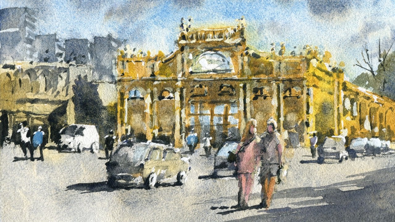
1. Introduction: Welcome to the thrilling
and captivating world of watercolor painting. As a beginner, mastering
the Art of creating a loose yet accurate
urban landscape can feel overwhelming and daunting.
Where do you start? What techniques do you use? Where do you bring your
vision to life on paper? In Watercolor, Urban
Landscape Essentials, Brunswick, Melbourne, you'll discover all the
essential processes and techniques you need to turn any photograph into a stunning and impressionistic
urban landscape. With my guidance, you'll
learn how to create a masterpiece that not only captures the essence
of the scene, but also showcases your
unique creative style. I'll demonstrate my entire
process in real time, from the initial drawing
and composition of the scene to the careful
layering of light and shadows. And the final addition of
details and highlights. Join me on this
exhilarating adventure into the world of watercolors. And you'll learn how to create awe-inspiring urban landscapes
with ease and precision. Whether you're an
experienced artist or a curious beginner, this class will equip
you with the tools and techniques to unlock your
full creative potential. I'm excited to get started. So let's unleash your
inner artist together
2. Materials Required: Alright, so I want to talk a
bit about and materials to help you decide what
to get or what to use. I'm using a 100% cotton
watercolor paper here. So hundred percent cotton is important if you can
get your hands on it, because you end up with more
vibrant looking paintings, the papers prepared
properly, It's sized. And also you can layer
over the top without eliminating or rubbing
out the previous layer. So super important,
I'm actually using a piece of hot press
watercolor paper here. I recommend if you're
just starting out to use a cold press, medium texture or
even a rough paper, probably medium textures
the best For Beginners. Hot press paper can be a
little bit tricky to control, but you can get a
similar effect, but just with more vibrancy. So that's it for papers. I want to talk a bit
about Brushes now. So as you can see, I don't really have
too many brushes. I don't use too many
in my paintings. And this one here,
the ones to the left, these are basically
watercolor mop brushes. They have a large belly. As you can see, hold a lot
of paint and a fine tip. Very useful when
your painting skies. Large areas of the buildings. For example, bits of the ground, large areas of the
ground as well. So just allows you to cut
around everything and even the sky as
well and get that in a large sort of Wash. So three different sizes depending on the size of
paper that you're using. One or two, maybe
more appropriate. I've got some smaller
brushes here. These are detailing brushes. So you see here
I've got Windows, I've got figures, cause
highlights and things everywhere. You're going to need some of
these to get those details. I've got a small
synthetic flat brush, and I've also got a round brush, that's a round brush
number six and I think that's I think that's about a number four
in a flat brush. There's also some other
brushes that bonus brushes, I like to call this
as a fan brush. And you can use that to
get in bits of, I guess, messier details like tree
leaves and that don't have a defined edge
that and detailed edge. So if you just want a
bit more randomness, some of these brushes
are actually quite good. Now you notice I also put on some highlights as
mentioned in highlights before, and the heads of the figures, bits and pieces like on top of the cars bit so
that yellow there. One I'm actually using
is some white gouache is opaque watercolor paint and
I mix it in a bit of yellow, hansa yellow or any
other yellow in there. And that allows me to get in
this nice little highlight, highlighted effects right
at the end of the painting. In terms of other paints, I'm using cerulean blue. I've also got some
turquoise blue that works quite well nicely
for the sky as well. And I've added in some little bits of gray
here and fought for some larger clouds and the gray essentially it's just blue, red and yellow mixed together and just
dropped in wet into wet. Now I've got myself
some neutral tint, which is basically a premix
gray on the buildings. I'm using some quinacridone, gold and also a little
bit of this color here, which is yellow ocher, kind of a more
subdued yellow color. And I've got bits and pieces, mainly just lots of grays
in the bottom here. I've got some green and
dark green that you can mix up with a bit of blue, ultramarine blue,
and a bit of yellow. You can have mixed
premix green as well. I've got one called
undersea green, but there's obviously Huggies is also Hooker's green and
there's olive green as well, which are quite common ones would be to read for
that traffic light. But yeah, apart from that, the older dogs are really just a gray color
that you just mix up with the three primaries
with very little paint. So that's about it
for the materials
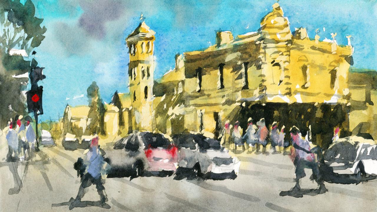
3. Drawing: Alrighty, Let's go ahead and get started with the drawing. And I'm going to put in the horizon line roughly a
third through the scene. So about here, third of
the way through the scene, you leave enough
of the foot path so we can put in
the cars as well. Okay. That this is where all the buildings are
gonna be roughly. The center of the scene.
We have this tower. This is kinda center-left
of the scene. And I'm going to use this
as a kind of the marker. Draw this in first. Then I will know that
I've got enough space on the right-hand side to
put in the main building, then some of the auxiliary
buildings to left. And I'm going to make it,
let's have a look here. How told we want this building? Finish it off,
maybe about there. Roughly about there. Okay. And triangle, I'm
just using a few dots to indicate where I'm going to draw in the top
of the building like that. And this side here, there we go. That's the top of the tower. And we've got a bit more, a little bit more detail
running down the sides as well. That shouldn't get it
more slanted upwards. Here we are, that's better. And coming down the
side of the building. And notice how I'm just
drawing in segments. I'm putting some dots here and they I'm just
drawing in segments. This helps to, helps me to plan out how many have any
lines I've gotta get in. Instead of as drawing
the entire line, I'll just draw a couple of dots indicating the start and end of that line and it
just makes it easier. So that's the top.
There's a couple of these windows here.
Year as well. Couple of windows
that how many more? There's 1233 more
sort of links floors. One there. When here. And of course the
one at the base. And it's obscured as well
because there is some kind of something else in front of that like a bus
stop or something here. Just going to draw it in. Foster. There'll
be darker here and then a bit of light on the
right-hand side like that. Simplify that down. We've also got some cars, is a car just going
into the scene here. Let's get in that detail of
the car front part there. We'll then you've
got a wheel here. And of course the back
part of the car there. This is gonna be
important later. Just creating a
sense of depth and the scene and a
bit more interest. Okay, that's the
bottom of the car. There we go. A little
bit of detail. You don't need a
getting a whole lot of detail for the car. Just a bit of the boot, and make sure that it comes in front of
all the other stuff. There is another car
here that's just kinda passing through on
the right-hand side. Let's get that one in. Is the window overlapping
with that car? And we can get into
wind screen as well. Okay, just facing
forwards like this. And of course, the
front part of the car, their lips and that the
bonnet and the lights here. That car coupled the
lights number plate. Apart from that, That's
just the base of it. That the wheel running
down the side, left-hand side of the car here. And a bit of that shadow underneath that costs
super important piece, that shadow joining it up. Okay? The side. More of that shadow
underneath couple of cars going past one another. That's a good start. There is actually a another car. They're thinking whether
I should put it in on what can probably just skip it. And I will place in a few more up ahead here maybe
coming in from the distance. Just boxy like shapes and maybe another one
that's driving off. Driving off in this direction. There is a path comes out here. It's little path and
there's people standing on the path left like that. Just draw it in. Traffic light. Yeah. Like that large pole
going up like that. Whether I actually
put them in or not, we'll see later, but there is a large tree here which I like. It's gonna be nice just
to get in a bit of darkness and use that to cut around some of these signs and poles and things as well. Also got some people
there's a person here standing maybe waiting
for the lights to change. I'll have another
person here even okay. Put in another person maybe
walking into the scene here. Walking cross the road there. The shadow for
that person later. But we did in the middle
of drawing this car. I'm going to draw that car
in the back, like this. Could be a car just in
front of this one here. Okay. Follows that
perspective. Okay? That perspective lines
are very important. Okay? So let's go ahead and
draw this larger building. I know it starts off on this
second portion of the tower. Use the towers reference. Kinda more like that. An angle. There is a chimney here. Just get that in. Something like that going up. And it just really just
cuts off around about here. We've got the couple
of these windows like this, the building. And of course you've got kind of like a shade
here or something like that. Sort of light. And then a fair bit of
darkness and underneath here. And some shadows running, running to the left. The building.
Interesting pattern. I'm just going to get it in quick little
pattern like that. Okay. We can change this up later, but this is just to give me just to remind me to
get that in afterwards. Even on the left
side of this tower, you find that it's a
little bit darker. Can you see that? Slightly darker light sources
coming from the right? And we've got this big building. It's gonna be tricky
to get this one in, but it comes out like this, is a front section sticking
out round about here, maybe front part of the building destroyed in roughly first before
I commit to the line. That good. That should do the trick. Bring this down further. We've got two floors. There's a sort of starts
around about here. One part of the floor,
but there's some of these rectangular bits here that at another building in bits and pieces to
the right-hand side. Not important at all. Mind you just That's the curb running to the right. And we've
got another car here. Let's get this car
in. But then why not? Backside of the car like this. Try to exaggerate it off, exaggerated a bit more. I'm making things up here. I can't see that side of the
car actually. There. Yeah. Something like that.
Back-end of the car, their Windows, their cargo into the right
in front of that building. And let's work on this
and a little more. There's actually
see some structures on top of the
building like this. One here. And another bit
on top like that. This is, I'm breathing negatively
painting this building. But we're getting this little
error of the chimney here. And there's a darker
spot behind it like this Get more of that angle,
angled like that. Me a little bits of this ornamental stuff
on top of the building. It's like this. There was
another chimney here as well. Let's put it in. I don't
know if it's chimney. It's like a part of
the building, I guess. Yeah. That darkness
on the left as usual. So much detail really
on here and you have to learn to pick and
choose your battles. Here's another window. We scribble some of
these windows in. Another window here.
Another window here. When hear. That. Very complicated,
but again, I'm simplifying them down to just rectangular
shapes does the trick. Okay. Another one
down the bottom here. That the least posters and
things everywhere on the wars. This is gonna be
interesting to get in. But of course we've got
some other figures, some other people
that are just hanging around at the base of the building waiting for
the lights to change. Okay. So crowds of people, really whole bunch of them. I'm just putting in the
bodies and the legs quickly like this or not wanting to. Just details too much. Busy day, didn't know
quite a busy day. Danger of making it
look too crowded. But that's okay. We have it. Fella here just in
the foreground. I don't think I want to
get that person in the, I'm gonna put in someone
just a bit closer here. Someone like walking
into traffic, perhaps. They're a bit of the shadow cast to
the left as well. This figure. So I just want to put in a
figure that's a bit closer. Whether we want to put
in another one here. So we'll look, maybe hear someone walking,
walking forwards, perhaps a little bit of shadow again going
to the left-hand side. Okay? And the shadow pattern on this building is
quite interesting. Just getting some more details. I don't want to spend all day just drawing all
these things in. I can get it in with
the Watercolors. It's gonna be best that way. Very dark under here. The cross underneath
that section like that. I'm part of that building. You do get a section of darkness here caused
by the the building, the shadow of the building. Rooftop there to the right bit of this angle as well
there. Same angle. The inlet should be
enough for the buildings. I don't want to spend
too much time in their some of this
stuff here as well. You've got some of these
buildings often the distance. Let's work on this one. Rooftop. And there's another one that just overlaps
like this method. Then other roof top
of another building. And I just drawing shapes. I love to drawing the shapes. Don't worry about the the
actual object itself. If you can separate it out, separate it out into
the actual shapes, you're gonna be fine. Okay. There we go. Just draw this one. And even though
there's not really, can't really see it in the reference front
part of that building. There is a kind of tree, a shrub here as well in front. In another building
here in the distance. Interesting looking roof. Lower it down a little
hooks to high, high up. Maybe bring it down
to here. Okay. Well, to start back here, I'm not going to bother
with all that detail. So we are ready to get
started with that painting
4. First Wash: Alright, first things first, we're going to put in these lovely yellowy colors
that we've gone into, these warmer colors,
I'm going to use yellow ocher at 20 per cent. Yellow ocher tend
to 20 per cent. I do have some lighter yellows
as well on the palette, which I can pick up
and just alter the Q. And especially on the right
side of this building here, I've noticed that it is touch more saturated
and you see like the buildings and everything is just a little
more saturated on the right-hand side because the sunlight is
hitting directly. So I'm going to just, I had a
little bit of quinacridone, gold on the right side. Signs. Some of them are kind
of like whitish in color. I'll leave some white there. Quinacridone, yellow and gold. And I'm going to
cut around some of these figures here as well. And remember, we're using
very light colors here as well because we don't want
to get any darkness yet. Just the light pinpoint
where that light is. Okay. Nice. Punch it. Yellowy, orange, yellowy colors, bit of brown. Some grayish, neutral color somewhere on the right
side there as well, just mixing with the yellow. Mainly yellows,
something like that. Okay. I'm not too fast with these figures because
I'm probably would probably go over the top of them afterwards anyway with
some other color. Okay. Let's keep painting that
left side of the building, bit of bit of this
yellow yellow ocher. Okay. Give me a fairly light, as I mentioned, just a
lot of water in here, ten to 20 per cent paint, that's all you need. Over here. I'm gonna put in some
more quinacridone, yellowy color to just
further emphasize the light. On the right side
of these buildings. Notice this roof is kinda like a brownie color as well
because burnt sienna color. So I'll just put it in a bit of that
burnt sienna up the top. Drag that down to touch, actually mop it up. This whole left side of
the building also needs to be colored in lots of light. In here, lots of light.
There are some costs here. And notice I'm just
cutting around the cars. I don't want to get too
involved with them just yet. Okay. We've got most of the URI
yellowy colors in here. Really what I wanna do now is just getting some gray color. So I've got some brown and
a bit of neutral tint here. Just mix that together
to create myself a warmer color. Neutral tint. The base. Drag some of that yellow downwards
as well like that. And just again, cutting
around those cars a little will get some details of the cars and
in just a moment, but I wanted to get the
road in quick as I can. Cutting around
those wind screens as well in the back
as you can see. And it's also good to just
tilt the paper a little bit. Some of that paint may run
down, that doesn't matter. I'll just let it do its thing that you can you on. So we've got a warmer
definitely a warmer gray color. Just gonna be nice. I could just put
in a little bit of extra darker color here
at the base as well. They could indicate
a softer shadow or something like that coming out from the outside
of the scene. But sometimes,
yeah, a little bit of a little bit of
stuff in there. Helpful makes it look a
bit more interesting. Alright. I'm gonna put in some gray here for the
left side of the car, remembering that
the light source is coming from the right. A little bit of that
gray I can get in. Same with this car
here. Little bit. The backend of that car. Okay? So already you can start putting in some
very light shadows, I suppose in this sense,
and it connects it all up very nicely like this. Okay? Now the sky. You use a bit of unused
some turquoise see color with some
ultramarine blue. It's have a look,
have that peer. Okay, good. I want the sky to be light, but at the same time, it has to be darker than some of these yellows to
really cut around. So you look at what
I'm doing here, using the tip of my brush to kind of round these buildings. Might want to just get
in a bit more at the top first we'll have a
larger mop brush. It's one of the larger mop
brush for some of this stuff. That's easier. As you
move down the page. You don't have to
use as much paint. But certainly in some spots
like here near the buildings, it does help to adding
a touch more color. Oops, trying to tell, let it blend as
well. It's tricky. I'll just go on the
right-hand side. First. This part of
the building hasn't. I'm completely dried but
it's still drier than that. The building on the
left cutting around. As long as you leaving most
of that yellow in there, you're gonna be fine. Okay. Good. Very good. Work on this side now. The signs and traffic
poles and stuff like that. Right? K little bit of tissue
paper to mop up some of this yellowy color, this blue that's seeped
into the building in areas. Okay, it's not a
huge deal, really. Probably want to add in a bit
of color up there as well. Also gives you a chance
to add in clouds. If you want to get in
a darker shaped cloud or some something in there. You could do that. Right now, hey, this pickup bit of that little bit of
purple on the palette, just feathering some of
the scene like that. I want to overdo
it though. Okay. Okay. Good. Good, good. So let's give this a little dry
5. Second Wash: Now that everything's dry, we can start getting
in some details. And probably the obvious
thing I want to work on his just darken
off very slightly, very, very slightly rebuilding the left side of these
buildings and touch. So I mean, it's really just barely noticeable
but something like this. Okay. Because you getting a little bit more darkness on the left side of
these buildings. Okay. So over the top, just giving it a little bit
of color like that. Okay. I want to make that side
of the building stand out more the light on
the right-hand side. Okay. So it's just darkening
it off in touch. Even these ones here. Here, I'm just picking up
a bit of yellow ocher, mixing it in with
a bit of gray on the palette. That's
all I'm doing. Okay, here on the left side
as well of this tower. Little bit there.
It's so subtle, but I tell you what it
makes a big difference. Mid, another midtone, mid value. Even these ones here, these buildings here,
they're a little bit darker. So that's going to format
helped to form a bit of a shadow will cut around the
yellow of that building. That to touch. Okay, good, good, good. Let's have a look. What
else do we have in here? We've got some green
bits of green. And I will to switch over
now to this flat brush. And I've got a bit of
green here on the palette. And I can just get
this tree quickly. Indication of this tree. Bit of black in there as well. But it's mainly just a large
clump of leaves up the top. Sharper, sort of
clumped because it hits the sky and forms a sharp
shape as you can see there. Hey, cutting around
this sign as well. Using the cut around the sign. Back to that green color, green and neutral tint
mixed together to get a nice juicy dark color. This could be another
sign here, for example, I'll just do my thing,
cut around that. And this is really
just going to be a good opportunity to use it
to cut around these figures, the bit of darkness, people just walking
around them the distance. What's this thing? Well, that's a traffic
traffic light. Whole thing. Good. I think
I'll leave that for now. We can put in some more
details afterwards. Now this stuff is
starting to draft, but I'll give it a quick dry. Okay. I want to get
in a large shadow, the large shadow shape now, purple, bit of neutral
tint, bit of brown. And I'm going to miss mix
up the general shadow, color. Blue in here as well. Good. To purplish, brown. Good. Let's have a look. We want to kind of you see this. There are these little shadows
that come off the roof and cast a shadow on the
bottom parts of the buildings. We can start off
here even experiment needs to be a bit
tiny bit darker. Maybe like that. See
something like that. Little flat brush as well. And this one actually just
comes down roughly about here. And this is why the
pencil drawing is important because
I can still see the pencil mark where
I've placed that. Place the shadow in previously. So something like that. Okay. Shadows a little
bit up here as well. Can you see just on the left side of the building
There's a bit of downward shadow just
coming down like this. Yeah. There but on the right
side there as well. The roof, you start seeing
dark bits in there once you've Once you begin it like that, here, again, another darkest shadow running down the side of
the building there. Nothing much going on here, but just a few little strokes and you try to get these
in at the same time. Even these little,
little windows, if you can pop in some of
these windows here as well, while you're at, it just
saves you the work. Afterwards. You can just
tidy them up later. Down here there's a little
doorway and some darkness. I'll put that in. Here. You can see there's
a bit of darkness for this building as well. This flat brushes just fantastic
for these type of work, makes it much easier. We have these interesting
shadow shapes that just come down like this. Oops, that lost a bit of that light there,
but it doesn't matter. And extra darkness here could put some more purple in there. It's looking a bit too brown. And then we've got
this building here, of course, the top, you've got a little
darkness there. And it stops here. And I'll get in. So this shadow again,
they're running across. Okay. I've got some of this shadow here
underneath the building. And you can even
see some shadows like them that side underneath
the windows. Like here. You picking out some bits
and pieces of detail now. But the main thing is
that you want to look at that general shadow shape coming cross the building
and join it all up underneath the building. That shadow shape continues and I'm probably going
need to darken this small because it's not really it's really dark
underneath this building, but yeah, just getting that
general shadow shape first, we can darken it afterwards. Harder to lighten it. So just paint it all in quickly. You will probably have
to readjust later on. Good. Bit of shadow underneath that part
of the roof here. Look what else do we have
a window here on building. This building here has a bit of darkness on the roof here. There's no not really. Gary much about the details. This is just to help the color, the yellow stand out more there. There's even some shadow running down there for
some kind of shape or joining up there as well. Okay, let's go back to this side and knowing that there's more, a little bit more
darkness that needs to be put in for these buildings. Like that. Sort of
triangular shape. Like there. That's probably too dark. Let me just like NAD to touch a little bit of something underneath the sides of the
buildings here as well. Little shadows just catching
their suburban areas. So a bit of green. Just put innovative
green for some of these shrubs growing
near, near the buildings. This was one as well. Yeah. Quite a sharp looking one. That After dark and shadows a bit
later, but doesn't matter, we've got a good a
good indication. I'm going to work on
the cars a little bit. Then first thing I'll do is
probably work on the Windows. Same shadow color. And we can definitely see
that the windows are darker. That this side of
the car as well. However, there are some
lighter bits in the window, so I'm not going to
color it all in. But it is pretty dark, right? Just further darken that
down, some neutral tint. It's almost as dark as
that stuff which I need to reach eat afterwards. That left-hand side of this car could do with some extra darkness as well. You're constantly just
adjusting and readjusting. Bring a bit of that gray across like to the right of that car. It's not so that's not so much light on
there as it looks. This windscreen again, the
darkness from the windscreen. And on the backside of the car, bit more darkness there too. Okay. Good. Tiny bit. Now for the wheels, it's getting some of this
indication of the wheels. Yeah. Yeah. It's really kind of darker at the bottom of this
car as well there. We just edited bit more color. Leave that for a second
and I'll come back to it just to let it
dry off attached. So let's work on this car here. Darkness for the wheel. Going to get a little bit
of a shadow underneath. Let's just see how
that appears at okay. Looking okay. We'll of course, the windscreen here as well needs
to be painted in. Bit. I can come forwards. Good. I'm a bit more for the wheels that again, I've
left these ones, these these cars out to the left to drive a
touch him trying to just getting more of an indication of the wheels
underneath like that. But I also want them to
melt into the car bit. So that's why I'm letting it. That's one learning
it just partially dry them and coming back to it. Okay. But of course
underneath the car, you've got really
quite a dark shadow. Look at that. It's just
the darkest color. I'm using pure neutral
tint here for this. Okay? This one here as well just
has some darkness underneath. I want to do my best to get a sharp, really sharp contrast. This car hits the ground,
creates that shadow. And the light is
coming from the top. Top right. Okay. I'm just trying to
get it to make it look, kinda make it look like the more angular than the reference. Even. Okay. Looking alright. Just a bit of detail in
the inside of the car, the grill at the front. We got here at the back, tidying up a little more Multiple layers is
what really brings together your Watercolors
makes it look more detailed. It's the layering of the different darks even here like that as I'm doing
with the windows. Because in the windows
you can see there's actually some areas that
we know is that I'd lighter and darker
need to apply that. Okay. I think those cars have I've got those
cars and quiet. Well, I will put in the windows now for some of these
buildings and it's the same old neutral tint, darker color, neutral tint. These windows are so dark, it just really at the
drop them in like that. It can be a bit more careful
now that we're using the brush for this as well. This is like a door or
something, I think. Yeah. This one doesn't really
have much on there. It's just like some
little marks and things. And you can do this
sort of thing as we'll see how I'm
just indicating the sides of this building, this little pillow
or whatever areas that even the top part here just use the edge of
that brush to detail very, very slightly, but you want to leave in most of
that yellow paints. So you've just notice how I'm
just so careful with this. Make sure I'm not overdoing it. Okay. Shadow here that
we have to get in there. That chimney
forgotten about that. Not a chimney, whatever it is, top part of the building there. I've really exaggerated it. It's not as dark really here as well.
Something like that. Going and the window, window here as well. Getting some more
details of the building. Ease, semicircular arches,
things on top of the windows that you can just
draw them in a little bit more line work over the top. I'm going to darken this
sine of touch as well. Okay? And really we just
had this point. We're putting in the
darkest parts of the painting. Underneath here. There's actually a lot
of darker spots that I want to get in. So just indication
of this is nice. Still have that figure standing here in the
middle of the road. So I went to detail out
more in just a moment. I think it's important.
We have some extra dots. On this side of the
scene where the bottom, the base of the
building is great. Some excellent contrast also for the figures which will
work on in a moment as well. Oops, didn't want that. Let's have a look. What
else do we need to do? This really, there's, if
you want to be nit-picky, you can go in and
darken off some of these shadows as well, but no 100% necessary. Couple of windows and things here for the size of that tower. If I can just get
that brush in there, couple of little
marks like that. There we go. That I'm going to darken these
windows a little bit as well here until I
paint it into four parts. Working on these
figures a bit now, I'm gonna put in some
extra color for them. Maybe a bit of
turquoise see color or bluish color here
for this figure. Something like
that. Here as well. Bit of blue. We can go maybe some yellow or
something for this one. Not a big deal. Even for
these other ones over here. We'd have white. White gouache helps get the body's to stick
out a bit more. Work. Some of these cars here and the distances
difficult to see him, but they are they
just need a bit of shadow underneath like that. Okay. And the legs. So these figures, Let's just put in some of the legs. Do it. Let's get out the
way. There's one leg is another lake here, like here. Okay. And the shadow, of course, running to the left a little, just a little bit of a shadow. Another figure, they're
good thing is also just to work on the perspective
of the scene. Some of these perspective
lines that I had just drawn in painting
in a bit earlier. I will join him with the pencil, but I can just get that
brush running through. In some areas like this. To further emphasize that
that's looking a bit better, more three-dimensional
when you do that. Okay. Good. Good. A bit of darker, neutral tint here
and I'm going to get in this traffic light. Yeah. Whatever,
something like that. Make it come down off
the ground is touch. Some figures sort of
standing off here as well. This the legs bit of shadow underneath these
people will be good. Outline the wheels of touch. While I'm at it.
Or circular kinda looking the legs as well. These figures want to make sure that they're
standing out bit more
6. Finishing Touches: I'll just quickly
put in the legs of these forgotten to put in
the legs of these figures here as well, underneath
the background. Building. Little shadow
underneath the figures. This, what I wanna do is start using some
gouache, pink wash. I'm just mixing up some
red and a little bit of red and a little
bit of white. And I'm just going to put some food coloring
for the faces. You can also use a
bit of brown color. You'd like to just
bring out some color. It helps to helps to just helps to just pinpoint
where these people are. Arms as well if you want. I'm not going to bother. Actually. The head
should be fine. But I want to get
in some sparkle, some nice yellowy
sparkle on the scene. Bit of white Wash mixed in with some yellow and white gouache and yellow makes a
nice golden color. Just pick out some of these
quinacridone, gold as well. Okay. Wash and white. Just picking up, making
sure I've got enough on their my flat brush.
Let's have a look. We can start off perhaps
on a few little regions. Here. It's really just
a little dot here and there for just bringing
out some highlights. There. Tips for the edges of these windows,
even like that. I've noticed even here
there's some little bits of the building which
goes up like that. I could also just bring out that light a little
bit more there. There. So it's really just
a bit of opaque, opaque paint to finish this off. And I really mean in terms
of finishing and off, you don't want this
to be too excessive. Little catches of light. You'd be able to see on the
right-hand side of things, they're even there. There. On the tops of these figures. You might get a bit of light catching on their heads and
the shoulders like this. Well, for these figures, people just walking
around our work to change them up a
little bit as well. They do look a bit similar. Even the cars, you
get a little bit of a little bit of light catching off on the
right-hand side of the cars. This even this tower. Let's put in a bit
of detail up here. I really find the gouache
is just an amazing, amazing of finishing touch
if you can use it sparingly. Windows here you can see
a bit of light where it's just catches onto the
left side of the window. That allows you to bring back a little bit
of something in there. I don't want to overdo it. That's a little bit more. Wash. Top of these cup on top of the car
like that as well. Golden ease, sort of light. Maybe it's some
of these windows, just a touch of that Like that. Little finishing Touches. Softer off the face is a little there's a
few other things that we probably want to do. So mainly, mainly going to put some different colors on
these figures looking a bit too similar to
me like that one. Just put it in this
yellowy color, whatever. Go make this one a bit
more red or something. And some others you can just put in a bit
of darkness, even. Also some darkness
in the left side if you want to
indicate some shadow. Tiny bits of detail
which can add up extra darkness on this figure here. Yeah. Think of paint that figure. It blue in here,
maybe for these ones. And get happy to hear these figures just a little
bit of something. The head darken the shadow a bit. This, this Liz little
finishing touches that you want to correct and fix up. Having a look around. I
don't see a whole lot more that I want to indicate. There are little
details here and there, but for the most part, we've got pretty much
everything we want in there. This is just some extra bits
and pieces that you can. But again, sometimes you can overdo it if
you're not careful. Just wanted to get that right side of the building showing through a bit better. That tower or
something like that. Some red for that traffic light. It's going to show through. You go little glob of read
their tail lights as well. Some of these cars, you
get a bit of red there. That loops too much. Okay. Put a bit like a bag or something coming
across the shoulder of this person. And we're finished.
 Watercolour Mentor (Darren Yeo Artist), Art Classes, Mentoring & Inspiration!