Transcripts
1. Introduction: Welcome to the thrilling
and captivating world of watercolor painting. As a beginner, mastering
the Art of creating a loose yet accurate
painting can feel overwhelming and daunting. Where do you start? What techniques do you use? How do you bring your
vision to life on paper? In Loose Watercolor Essentials,
Busy Beach, Landscape, you'll discover all the
essential processes and techniques you need to turn any photograph into a stunning and
impressionistic scene. With my guidance, you'll
learn how to create a masterpiece that not only captures the essence
of the scene, but also showcases your
unique creative style. I'll demonstrate my entire
process in real time, from the initial drawing
and composition of the scene to the careful
layering of light, shadows and the final addition
of details and highlights. Together we'll go through how to paint water, sand, rocks, people, sky, and also
some trees and shrubs. Join me on this
exhilarating adventure into the world of watercolors. And you'll learn how to create awe-inspiring beach landscapes
with ease and precision. Whether you're an
experienced artist or a curious beginner, this class will equip
you with the tools and techniques to unlock your
full creative potential. I'm excited to get started. So let's unleash your
inner artist together
2. Materials Required: Before we get started, I want to go through some materials to
help me decide what to purchase or if you've got materials at
home, what to choose. So here I've, I'm
actually using a piece of 100% cotton watercolor paper. And this isn't hot press, but I do recommend if
you're starting out, use cold press medium
textured paper. It's just a little bit
easier than using hot press. You've use hot press pretty
much similar techniques, but you have to work faster. And it's just a little bit more difficult to get in flat washes. Okay? So if you don't have 100%
cotton watercolor paper, just use any other watercolor paper that
you have available. Just can be a little bit
tricky in terms of layering. Sometimes it picks
up previous layers. So let's talk about
Brushes and overhear some Watercolor mop brushes
really important to have. I think there are
a staple to get in large areas like the
sky and the sand. And as you can see, they have a large bellies that
they hold lots of paint, but they also have a
sharp tip so you can cut around other objects
in there as well. Okay, you can see here I'll even use a smaller mop brush to paint in some of those rocks. Now, if we look in
at other bits and pieces here you see that
there are some figures. You've got some boats,
bits of foliage, shrubs and things and things on the ground,
rocks and stuff like that. So smaller brushes like this, really important in
order to detail. Over here, I've got myself a, a round brush,
synthetic round brush, and I've got a
synthetic flat brush. You also can get in highlights. So those are detailing
brushes really important. In terms of paints. I've got a tube of
white gouache here and this squash is great for getting
in some more highlights. As you can see, boats
on top of the rocks, on top of the figures as well. Just a finishing touch. But really for the
rest of the scene, we've got here in the sky
a bit of cerulean blue, you can also use it,
kinda turquoise. See blue here in the ground. I've got some buff titanium and also a little
bit of yellow ocher. Yellow ocher, more soil on that side to get in
this sort of Sandy, nice sort of light sandy color. I've got some little bits
and pieces of color here. So go to hansa, yellow, I've got a little
bit of pyrrole, red, little bit of turquoise there
as well for the umbrellas, just a little touch of color
using that same power or red for some of the skin
tones over there as well. The rest of it is really
just some browns that I flipped into the sand here. I've got some grays
that I've mixed up and you can you can
mix it up yourself. You can get a pre-mixed
gray like a neutral tint. Got some greens here
out in the back as well for some of those
shrubs and hills. And that's pretty
much it for materials
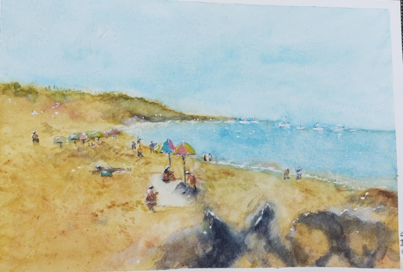
3. Drawing: Let's go ahead and get
started with the drawing. And probably the
easiest thing to put in first as
the horizon line. I'm going to put
this a little bit further up from the
center of the page. So round about here. And this is all the
water that goes off into the distance there.
Round about here. This is where you've got
that headland. Kinda please. Overhanging cliffs, even
that just come off all the way down to the distance. So you can see here all
the way to the back there. I mean, there's a little bit
of detail on there as well. You can see the bottom
part of the cliff, so a little darker. Some segments here and there. This okay. Good. And what I'll do is
also just drawing the general location
of the water. And we know it comes all the way in here and exits
around about here. Okay. Just below the
center of the page. Rough indication of
where it is, like that. Okay. Often the distance
here you can see a little bit where it starts
connecting up with the sand. Interestingly, there's a to
almost two layers of sand, not layers but
different colors here. There's more of like
a yellowish sand. They'll just quickly
mark that out. Nor on the back there is just sand that's got a
darker yellow color, slightly wet, and is also footprints and things like
that in there as well. Okay. And you've got, of course, got
this headland at the back, which is a bit darker. There's browns and more colors, even some greens up
the top there as well. But this is all mostly just yellowish
colors out the back. Okay. So don't need to mark it out too much, something like that. Okay, now the rest
of this is really the figures and some
of these rocks. Let's put in some of
the rocks I'm going to work this one in
first it comes in here, it's difficult to see, but section there,
it comes to that, to the center of the scene. Just drawing that side of the
rock down the base as well. Can see. And this is important
because the, this part of the
rock is going to help indicate the shadow, the light source
coming from behind. Okay, and you've got
another rock here, kind of triangular shaped. It's interesting,
rocket doesn't have to be enough to make them look exactly as they are in
the reference photo, but some resemblance is good. Okay, so again here, just a bit of shading and it's actually a lot
darker this rock here. I can just shade it
in a little darker. Okay, just keep it a
bit more jagged and organic looking like that. And then other rock there, a few other rocks in here or just putting some details like this at an another bit of that darkness behind
this rock like that, you've got another rock
coming over the back like this and coming down another one just sort
of darker behind, but this one has a
darker spot around here. Helps to just make it look
more three-dimensional. We do have a larger
one in front as well, right about here. And you've got to make a
judgment call as to whether you want to put all these
Roxanne as well. I'm doing it because I
just liked throwing rocks. But you don't have to
have all these in. So you can change them around as well as
you can see here. Just doesn't have
to be exactly okay. Hold down the behind
the rock like here, it's all just dark as well. This helps to create a bit of contrast as well for these
other rocks. Interestingly so. Okay. And getting this outline
of this one here a bit better there. And it's kinda like
a lighter shadow. I don't need to call
that one in too much. These ones on the right. We want to indicate bits
and pieces of them, but they're not too important. I'm let me just get in
that side of it there. It's kinda like a pointed rock. And it's be the
shadow behind it. Then you've of course, now got a few more of these other rocks. One here that touches that
shadow and now the rock here. But you've got these larger, these larger ones,
as you can see. All these are just they have some shadows running
through parts of the rock. Okay. But they're not really don't have all too
much color me here. I can just put in a larger, more exaggerated shadow actually for the back of the rock. There. She comes down and
out of the scene. Like this. This larger, jagged looking rock out
the back there as well. Just get that one in. It's darker here. And on the top you've
got just more of these bits sticking out over
the top part of the rock. Is even one kinda coming
up here near the water. Cracks showing
through some of them. Larger shadow here as well
just formed this rock. Another bit of a
shadow forming here. Darker shadow.
Rest of it is just quite light in the edge
and the corners there. These are, I'd say
they're pretty decent looking rocks are
quite detailed in terms of the drawing and now you
just have to think anyway, helped to lead the eye into
the scene and you could even just stop it like goose and don't worry
about the figures. But let's, I want
to add in some of these figures and bid of
interests going on down here. So interesting perspective is it's kinda like a
bird's eye perspective. And you've got this blanket
towel here on the ground, penciling it out roughly
where it is here. Okay. Bunch of people just
sitting closer by. There's a looks like there's a girl here just want to sit in. There is an umbrella,
bunch of umbrellas. This one here. It's an umbrella. Here we go. One umbrella there. I'm just like you can see
the top of it a little. This one here just cuts over
the top of that umbrella. Gives you something like this. That might actually
move it a bit further down here. This. So we've got a
couple of umbrellas, couple of little umbrellas here. I'm putting the figures as the girls sitting here
just with the head, kindness. A little bit forward, placed a little bit
more forward here, running down the back. Get the body and the legs. Just sitting here on the beach. And She's got to just extend it out in
front of her like that. They're running down the back. That's a figure that's a person need too much
to indicate that. It is a person sitting there, which is also under shadow
from this umbrella. So this umbrella that's
casting a shadow and only that there's this one here casting little shadow as well. It's coming from the back. As you can see. Light coming from the back. Good. Another person here
just sort of bent over I'm doing something or another could be just leaning
over doing something. Just getting the shorts and legs like that here. Because of that back a bit more, make it look a bit more smaller. Okay. There you go. There's a person shorts
on maybe like that. Is also someone just
sort of be high, but I think I'll just
simplify her this figure down to just be looking,
standing up, right? There's just a bit
of a difference in how the figures are standing. So there's one person, you just sort of overlapping. Horse is gonna be a
bit of a shadow for these two figures as well
coming up around here. This is also going
to help to create a negative shape for this rock. Just bring it out the
light on this rock here. Okay. What else do we
I've got another person. You just sit in a bit closer
heads about here actually. Let me just see yeah. About their slanted forward a
little bit in the shoulder. Here just doing
something or another I think I think he's looking at is a phone or whatever there. And some shorts on and legs. Just sort of
Scotland a bit here, I guess on the sand. Just and some shadows as well. In front. Like that. We haven't we've got a
bit of a scene going on. It looks like there's a group of friends just enjoying a
nice day on the beach. And of course we do need a
few other things in here, or if you want them
in here anyway. But I like these, these little boats that
are running through here. I'm going to simplify
these down as well, just to have some
kind of resemblance. The boat there. There's also a couple more, this smaller ones here, just simplify the shapes
of them down like that. Another one here as well. And have to be much just
a little indication. Speed boats. Often the distance. Maybe like a small one here. Well, often the distance
in the background. I could put another
one there as well. Help build the scene up. I'm also some smaller fingers, like we might have someone
just walking through there. Someone in the water. Some smaller figures
often the distance. Look at that just
tiny little figures. You can barely see
what's, what's going on, but they're walking off, coupons, walking off
in the distance. There's more stuff
going on here as well. I mean, you can see some people just lying
down on the beach. Just kinda lying down. Maybe reading law, Sunday thing, that kinda thing on a blanket. Not a blanket to tell the um, I don't want to detail the
ones in the back too much, but they do have to make sense. This could be like
a bag here as well. Okay. Up a little bit more. Okay. Something like that. Person just lying
there on the beach. There's actually some more
little umbrellas and things. You can just see him
off in the distance. That not very detailed. But you just putting in some little bits and
pieces of people potentially sit in there
and doing their thing. I'd like to always reduce the complexity as we
go in the distance. That helps me to focus in
on these figures more. Yeah, the foreground
to tell that story. Better. But yeah, I think
some people just in-between to help
connect the scene up. It really does help. Some smaller figures. Often the distance like this does help to create
that sense of depth. But I want this to focus more on these figures
here in the front. I'm okay. I think this is good. I think we can get
started on the painting.
4. First Wash: First things first I want
to get in a wash of color. The sky, light wash of color. I'm going to pick up
a larger mop brush. And we're going to use
some of this color. This is a turquoise blue color and we want it very, very light. So I'm talking about 90% water, ten per cent paint. Extremely light. And I'm just sliding the paper downwards a
little bit as well. And bringing this all
the way down page. Hey, nice smooth wash and near the water
or just stop it off around about there. Okay. So that's basically sky. Let's work on have a look. Let's work on the
colors of the headland. Smaller, smaller mop brushes
can really help out here. And I'm gonna put in, start with some yellows, actually, bit of yellow ocher. And also got some buff titanium, mainly just yellow ocher. And I'm going to drop
some of this stuff here into the background,
that headland area. It is a bit vibrant, but you can mute it down again
with some of this color, this buff titanium,
or you've got some whites or something
like that. Right? But the idea is I want to
join it on to the sky touch. I mean, I want it to blend
all the way through, but just I'm create a bit of a seamless looking blend here. And it looks same thing
down here and this side, what about the top is actually
a bit of green up there. I don't know if I want
to bother with that. We can do what? We can just pick
up a little bit of green, just drop that in. I'm just mixing a bit of yellow with tiny bit of yellow
as well in there and yellow and green. To get myself in a
lime green color. Too much, just a
little bit like that. They'll do the trick.
Come back to it later. And I want to also work on the water at the same time
because we want this all to blend together nicely. It just mop off this touch
of water there for a second. I'm gonna pick up some
ultramarine blue here, mix it in with some of these turquoise blue to
create a darker blue to dark, but dark enough to
differentiate the sky. The sky Wash from the water. Just like this. It might bleed upwards a
little bit, but don't worry. Just want it to be darker. This area of the water. Testing it as well just
to see if it's too dark. More and more of
that turquoise in there rather than the
ultramarine blue. The ultramarine blue is just to help darken it a touch, okay. Still want it to be
that turquoise color. There we are. Start to
slowly come together. Renal reinforce that back edge. Make it a little darker
in some areas like that. Okay. Come down. Yeah. Near where
we've got the water. Whether the water is
in the foreground, I'm going to just
cut around the, these little umbrellas
and figures as well. Remember to cut
around the figures. The legs don't matter
or too much like this. Bring that washed down. Good. So we've got the ordering. Now. We have to do is blend
it in with the yellows. So some of these yellow
ocher that I've got, again, the buff, titanium,
and yellow ocher. We're going to get
this all in one go. We're going to try
here first near the the the water because I don't want the water to
dry and for us to miss out Where I can create
a nice soft blend. I think that's really important, especially for smooth ER, papers like the one I'm using. Good. That Buff Titanium. If you've noticed
it run too much, just pick up your
brush and lift off, dry off the brush and just
lift off a bit of paint. You can lift off a
tiny bit of paint without causing a fuss. Okay, Here we go. And of course I've got all these rocks and
things and we can just go a bit nuts. And putting in different
colors for the rocks. I'm using different yellows and some muted yellows as well. Okay. But we can drag this
part down again, just, it's all the same
buff titanium color mixed in with the
touch of yellow ocher. There we go. Just cut
around this town as well. I want to make it
a different color. And also the figures closer by. We do need to cut around
them so we can get into some different values and
tones for their skin. Yeah, Good. Get some graininess and
bits of funny mixing. Don't worry about
it because this is kinda what we almost want. Some of these foreground stuff. Just to imply that there's some textures and bits
and pieces in there. Yeah, look that pretty
straightforward. Need to worry much about
the colors of these rocks. Sort of a yellowish
color you Fine. Okay. Good. While I'm at it, one-off, just pick up some little rounds of
something, darker browns. And if I can just indicated believe this stuff,
I don't know, just some some details and stuff in the sand.
While I'm at it. I'll just pick up
the brush and notice I just flip that brush. Brush there on the
paper and you can get some little details and things. It's not much, but it does help, makes it easy as well. So you're not really having to paint all these
little details anymore. So just imply them. And not only that, but
on the rocks as well. I find it really helps just to get in some of these
are the color. Create some textures
and details. You might even have
some more darker blues and running through
in some sections. Because the paper
isn't dried yet, so we don't have to really worry about it causing
too much of a mess. This will blend
through and Fine. Now let's look at the Wash for the figures and things like
that in there as well. I have a small round
brush somewhere. Small round brush
is going to help. And we can do things
like with the umbrella. I can pick up some really
vibrant yellow and potentially just paint part of that umbrella Rin like that. It could be like
a yellow umbrella with a bit of blue in it. Whereas a bit of ultramarine, I can pick up little bit
of light ultramarine here. Okay? And then we can
have a bit of red. The right-hand side
like this, okay? With that, red. So we've got some interesting
looking umbrella there. This umbrella here to the front. We can again just use some of our imagination and add
some different colors. I can go a little bit
of red here. Darker. Back to the yellow. Yellow back on
this side as well. There'll be gathered,
we've got some beach umbrellas with some bit of color and I've saved the, the, the most saturated
colors for that section. Now this little tail is
actually really, really light. Just going to mix in a light, wash up this yellow, yellowy towel and just Wash added a little bit of
color over the top of it, but I'm going to also leave
some bits of white in there. Okay? So we need Santa rounded
is actually a bit darker. And the little umbrellas
here in the back as well, you can just, again, just pick up some other colors. I've got some blue
leftover on the palette. Blue, they're a bit of
blue for that one there. Blue for that one. We can
go back to that yellow and some bits and pieces and then they
can have some orange, even some orange or some sort. Okay. So long as they
look like umbrellas, the beach, the figures, I'm going to just
get innovative, colorful their skin and I'm
mixing up a bit of red, tiny bit of a spiral red, and some yellow ocher to
create a general skin color. Warmer skin color. You can use some browns in
there as well if you want. And I'm just going to go over, I'll just go over the
top simplified down. Let's make them all like that. Just call them in. Put
the clothes on later. This one here and sitting
down, needs a bit. Laying down. These people
potentially bid for the legs. Well, they're more darkness, darker color in
there, more the base. And you can see also
with these people, there is a shadow that's
formed underneath them. And from the from the umbrella, I'm going to use a
bit of dark color, just a bit of neutral tint here, and a smaller round brush. I could use a flat
brush as well. That doesn't matter. Same thing. Smaller flat brush. And pick up some of
this darker color. The base of that. I'm really
the stem of the umbrella. Like coming down like this. Okay. Good chance also
to put in some of the little shadows potentially underneath the
umbrella like that. You can't seem all too much, but can make them up as well. Emphasize it, but
something like that. You can see that stem
of the umbrella coming down and it forms a
shadow on the ground. And I'm just going to
put a bit of blue into this shadow to dose a
little bit too dark. So I'm just lightening
up a bit like this bluish gray shadow going around the legs and things
of this, of these figures. Do it here as well. For this figure, this
person sitting down here, you have that shadow
by the Caspar, the umbrella that be
a bit more neutral, darker color in there
to just grayish color. What I mean, a shadow has a bit of a same shape
as the umbrella as well. So just want to imply that
not have to be perfect. Okay. Good. The figures also, they cast
a shadow underneath them. You can see this one, he is a bit darker. Underneath that figure. There. The head we are detailing. These figures are
just also casting a slightly darker
shadow underneath. Yeah, difficult to see, but there is extra
darkness under here. Just darkening that
shadow on this side more. Like I said, it's car. It's helping me to create a bit of shadow
around those rocks. While we're here. Why not? Let's just put on a bit of shadow for some
of these rocks, I'm going to use a bit of more brownish color as well in here. But you can see, for example, this rock has got a
really dark shadow. So I want to emphasize
that more difficult, I've lost, lost
touch with some of these other bits and
pieces in here as well. Doesn't matter that this part has got a little bit of
color in it as well. Bit of a shadow there. This rock. Join them up a touch. Okay, good. I might actually see if I can just darken this
side of the rock a little bit so that
it comes out more. The moment it's kinda
difficult to see it the same color as the sand. But I might put
on a highlight or something on on it later on. Okay, there we go.
That's similar shadows. That's have a look that's
work on these ones here, this shadow here of
this rock behind it. Here anyway, It's quite dark. This one. The neutral tint, really
brings out this color as well. Doesn't have to be perfect. Following the pencil marks
that I put in there before. Very loosely. There we go. Even these rocks have a bit
of shadow behind it there and we'll separation on
some of these other rocks. This one here is just darker. In general, this rock
is to get that in. And they all become sort
of abstract looking shapes that need much work. And all more yellow. And a little bit of darkness
underneath this rock. It's quite dark back here. The darkness under that rock. Some smaller areas of darkness
on the top of that rock, and some of the ones in
the distance as well. But it'll be due. But
you want to make some of them light, little bit darker. Flick a bit of water in there as well to encourage some of it to just bloom and just create
a bit of multiple effect, I guess for the rocks
and the shadows. You can pick up paint and just
spray some of it through. Okay. Dry brush, some of this dry brush on some
areas of the rocks to just indicates some
bits in pieces. Just a little trick I've
figured out over time. This little flicking effect. As long as we got the only about the shadows in here
for these rocks, we good stuff later
we can bring out. We've lost any highlights or darker segments in
here. No big deal. And always bring
them back out again. A lot of segments. The darkness is what we
want to put in some parts. In enough contrast in here is
an important thing as well. And this is sense of joining
all the shapes together, all the rocks together
so that they're one larger mass rather than a big collection of
a whole bunch of different objects joining them together that they this look
more fluid and natural. Okay? We can also come back at some more darks in there
if we, if we need to. Okay, so let's have a
look at the figures. Again. I'm going to just put on a
bit of other color for the The clothing that
these have dried off, just a little bit of
darkness for these persons, bike shorts that he's
wearing their dark enough. Let me just double-check. Here we go. Someone like that, clothing on that
person's sitting down. And you notice how how quick
I'm doing this as well. I'm not really concerned with
a huge amount of detail, just implying what's
going on in here. That's a hair. Okay. This person here
of hair as well. Looking down looking down
at the phone or whatever. Here. I'm yellow,
more yellow in there. And it's all done with
the all done with this is just the
same flat brush. How easy it is. Some
little variations in the body as well like the, the turns in the body. Like you can go in and just add a bit more darkness
back into the skin. And what you wanna do
is implied sense of light that's hitting the
shoulders and the back. Okay, so too dark
and the rest of the body will
achieve that. Okay? Like this, It's quite
subtle and you've got to really be careful. Once a startup starts actually
looking like a person, I don't bother too much, I just leave it. Leave it as is. Okay. Right. Let's have a look
at this background section where we've got the headland and things as well. I'm going to put in some
brown bit of darker brown. This is brown ocher. You can also use other
types of Brown's doesn't matter even though the lighter brown mixing with
a darker color. Because I can see here there are some segments of darkness
we need to get in. And the easiest way
I think is to use the brush that I have here, but remembering to keep the
light on the background, some of the background sections
here like on the beach, you can see it's just a
just a few little strokes running down like that. Even these ones
often the distance. So I'm just going to
maybe make them a little bluish as well. Bluish-gray disappear, recede
off into the distance. Can't really see
what's going on there. And it doesn't matter.
At the end of the day. It's just so far back. I'm going to pick
up some more of this yellowy color,
this yellow ocher. And I'm going to join it up, join some of this up here with the darkness of
those rocks below. Like that. Because one thing
we need to make sure is that these hills and
bits and pieces of the back really do stand
out against the sky. The need to be painted on. Let's continue on. We're going to put
some more in here. I really like how this is so
sharp and all these areas. I'm just softening off some segments that I
don't like like here. Yeah. Okay. He's do I mean, it's
still a nice contrast, but it's not completely sharp. That looks better.
Okay, so I'm just adding a little bit of water and and just removing
some paints, scratching out a
bit of paint there. You can even do
that for like areas where you see some white in water or you can
wait till later for the year to use some
gouache as well. Some white gouache. But suddenly softer. Looking effects can
actually be very, very effective because they're
more subtle than the Wash This is like a little
wave or something? Yeah. Running through. Just scratching out
with the brush. Scrubbing a little bit. And the Brushes like it's
a little bit damp as well. Just some parts. It also helps, this technique helps
to join up and make the background look more
misty in some areas. This in a way joins things up, that joins the scene up, makes it look more
together. Area. Some more of this stuff, need to separate it
out from the sand. There's also some
trees out on top and I'm wanting to
simplify them down a little just to just
to put something. He used some little
trees maybe on top, but it's not really necessary, just indications
more than anything. Great. Back to some of
these darker parts. I'm just going to drop in
some darker paint to indicate these kind of cliff areas
and in some spots like this in trees and things. Often the distance. And what I'll do as well as start working a
bit on the other figures. So I don't need much. But just a little darker paint. The legs in for say,
this figure here. The distance in a bit of
a shadow on the ground. Maybe have it to figure
there the water. These two here. No legs. I'm this figure here. The darkness with the legs and join up the shadow
on the ground. The figure there. The figure here. They all just
further on the back, you're just almost can't
see what's happening. People sitting down here
on the beach looking out. Stems of the umbrella is just getting some
resemblance of that. Shadow. Would be do tempted to put in a person here. Maybe walking like
another figure, just walking here as well. Just let me just try something. Someone in here. Quick, lighter, just see what it looks like. There we go. I think that looks
better because then yeah, just feel that
there was a bit of detail missing off there and in the back bit of color for the hair that I'm
whoops, speed like that. And shadows with a shadow
on the ground as well. Front, of course, the figure. Join it all. Challenges. Join it all up a bit. Let this person that
is dry off a touch and I'll put some
clothing on that figure. This one I can already just
work on touch the clothing. I'm maybe some hair
as well, like that. Little containers and then darkness
and the base of it. A little bit of darkness underneath the
figure you use well, some shorts on this person. This person is well behind. Clothing. Tiny bit more darkness at the base underneath
the figures too. Might shadows underneath this. Some close with this
person as well. This other one that
I just invented and put an added in there. You can put some moms moms
in or something like that. I can look a bit more realistic. I'm still think a bit of darkness for the
hair would be good. Good. Okay. Time for some finishing touches.
5. Second Wash: Okay, finished this often gonna be using some white gouache. I'm just squeezed a
bit, added the tube, and I'm using a flat brush as well and dry it off a touch. Let's have a look. For example, we've got to things
like this umbrella of at the top of
the umbrella that might be bit of light just hit, hitting the top of
it here and there. For example, their edges of it, this top of this person's
head and the back, and also this person head
and part of the arm. Years. Well, just connecting
on getting a bit of light. Let's have a look. This person is a bit of maybe better light
and the back of the head here and the back here. Shoulder. Again, just the head. Maybe getting a bit of light. Okay. You've got figures
off in the back, so just emphasizing a
bit of that as well, just the heads and the shoulders marking
out where they are. Okay. You do have a bit of
this, like I said before, this wavy, it's water. I'm going to get
in a bit of that. Not too much. Dry brush, a little
bit of this on but doesn't matter
too much to me. Just helps to outline the water
where the water comes in. And this some of these boats I do like that. I've left them white as well. I'm going to just emphasize
some of them more like this. The mast here as well. You can even just turn
the whole thing into of the micelles up for ones, that one out in the back there. Bring back a bit of color
for that one bit of the white sail in. This could be just
a normal boat here. This one could have a mast. Also like to mix in
a bit of yellow, tiny bit of yellow into the
gouache to create myself some warmer values and
the warm of values are gonna be excellent
for just getting in some of the bits of
light or whatever that I've missed out previously
here in the background. So I can actually do
you see that just sort of get it in quickly,
dry brush it in. And the trick to doing
it is really not, don't want to make it look
too obvious just enough in there as to nothing there to imply potentially
bit of light running through. Okay. But you don't
want it to overwhelm. Start looking like
a gouache painting. Finishing Technique. If bit more bit of
light on this figure, the head of this figure, just pick up some white, yeah. Shoulders. This figure here, back as well in this
little thing in front. Good. Even some of these umbrellas
and things out in the back. You can just bring out a bit of the highlight on top of
them as well, like that. And just little sparkles
here and there can be nice. It just kind of evens things
out a bit so that it's not all sections of highlights or
white that are too obvious. That figure there. Now, here we go, this stuff
here in the foreground. I really want to work
on this a bit more. So this here just going to bring out some gouache
and some yellow, some lighter areas of this rock that we'd
lost out before. See that we can
just bring it back. And it's contrasts a little
bit more with the sand And at the same time keeps the
rock a bit more character. Maybe some more yellow in there as well to
darkening off a bit. Go over the whole thing just in some parts where you might
have lost some light, where you want to emphasize light on parts of
the rock layer here. This is a great way to do it. Here. I need to do it
and all we areas, just some parts like this. I find the combination of
gouache and watercolor in this sort of style really
create something special. And it's worthwhile
incorporating where you see a bit of sharpness and you want
to get rid of it, just pick up water, dry your brush off, and just do this thing you just in a bit more color if you need to get more
darkness and areas. Even you can flick in a
bit of something there for like the textures
of the rock while, while the gouache is still slightly dropped, slightly wet. See, we got that
just a little bit of texture for that rock. Maybe. Darkness with
this one still. In, read more darkness there. Darken this one down a
little bit more as well. That rock. Just being mindful not to
overdo it as well. And perhaps a few little
bits and pieces here. Darker bits for the ground. Some little dry brush strokes. Who knows like
footprints and things, inconsistencies and
that sort of thing. Running through there. Just a bit of brown
paint, nothing special. You do notice also
here there's like a it's actually got some darker brown and
stuff running through. Just rejig this a bit
bit of that brown paint, go over the top and
bring that through. Kinda goes all the
way to the back. Even some here at
the front view, this brown paint San the
wet sand or whatever. Here, even over here. Patch, a patch there
and inconsistencies. It makes it look more
realistic. If you do this. I'm around this one a bit more. So we've got a fair bit of a fair few colors and tones
as well running through here. So it looks quite
varied and interesting. Darken the shadow a bit
more of this figure. The foreground. In some really light, really white gouache just
remaining of the palette. I'll just pick this up final bit to add in a few little
sparkles on these rocks, like the top of tip of the
rocks and things here. You can see little,
little sparkles. Can even do it in the water
and sort of parts in here. And this will help to separate the rocks out
a bit from the the sand. I believe I looked too obvious. We're finished.
 Watercolour Mentor (Darren Yeo Artist), Art Classes, Mentoring & Inspiration!