Transcripts
1. Introduction: In this class, we'll be painting a beautiful coastal landscape
of Normandy in France. Will be learning a
variety of wet-on-wet techniques and wet
and dry techniques. Combining and creating
soft and sharp edges can be tricky when you're
learning watercolors. Painting wet and wet is often associated with the
loss of control. Without an understanding
of timing, you can definitely
create a mess. But I'm going to show
you the importance of timing and painting wet in wet. This will help you gain control
and layer effectively to create some soft textures
such as shrubs and grasses, or painting sharp highlights,
rocks, boats, water. It's easier than you think. Wet-in-wet technique brings
out the natural strengths of watercolor is essential for
your watercolor journey. Creating fine details to
finish off your painting, a crucial for painting
things like trees, rocks, grass, create some nice
contrast and interests. But understanding when to
add the mean is crucial. Before we start
with the painting, I'm going to show
you how to simplify the shapes and sketching
large ones to sky, water, shadows, trees and grass. Getting in those large
components accurately beforehand is essential for
your painting to make sense. So join me in this class. I'm looking forward
to showing you the secrets of coastal
landscape painting
2. Materials Required: Before we get started,
I want to go through some materials that I'm using. And over here we start
firstly with the paper. I'm using 100% cotton
watercolor paper. It's a medium texture. You can also use
a rough texture. And I find with textured
papers fantastic. You mainly get the advantage of all these
wet-in-wet Work here. The paint, when you
painting want to wet-in-wet spreads
nicely and evenly when you're using paper that's just a little flat
or hot press paper. The paper dries very
quickly and also unevenly. So really recommend getting some textured paper even in
the background here you can see nice little
slight blending of the water there in the
background texture. So you can often find a textured cellulose paper as well if you don't
have access to cotton watercolor paper and the textured cellulose paper will allow you can
accomplish the same thing. Only issue that you
can sometimes liftoff previous layers so
you can get cotton, watercolor paper in the
medium to rough texture. Recommend that brushes. You can see I've just got a bunch of these
Watercolor mop brushes. They're great for getting areas, large areas of the sky, bits of the land, the
back slashes large clump of bushes and things here in the front, that
background layer. Anyway, I like to use
these larger brushes. They hold more paint. Later on down the track
when I'm getting in details of the shrubs and branches
and individually leaves, like to use these
two brushes here. This is a small flat brush and this is a small round brush. And even use them to create some shapes here with these tweaks, things coming up. I've added in some
indications of some flowers here on
the side as well. And that's also just by
using this smaller brush. These are some
specialty brushes that I use from time-to-time. And basically this, Here's a little rigger brush and I think I might have used it to get in some of these
branches here, but it can definitely
use them to get in smaller, tiny details. The sales of these
boats as well, find that it's a
perfect size to get an, a thin white line
doesn't hold much paint. And I think that's an advantage as well because then
it just doesn't, doesn't spread everywhere
and create a mess. This is little field, but this is a little fan
brush and it's great for getting details like
tiny areas of grass. You can see here,
here, very subtle, but it's good so
you don't have to join individually
getting each strand, it's just more convenient. Often more natural
looking as well. I don't use as much
as filbert brush, which is used for
a bit of blending. Now, a lot of these
highlights here, you can see especially on the sales bits of the
rock and the background, these branches and tweaks
here, even some of the yellow. I've got those in by using this tube of white
quash right at the end. Beautiful, opaque
watercolor allows you to go over everything else and getting a lot of
color over darker colors. So I tried to use this sparingly as possible in this scene. I've used it quite, quite a bit, especially out in the back on the trees here in
the front as well. It's up to you how
much you use it. I try not to over do it. That's the main thing. And in
terms of the other colors, we've got a lot of green going
on here in the foreground. I've just used a dark green and diluted that down to get
these larger regions, use more concentration of that dark green hair
in the back as well. Sometimes you can add
in a bit of black. Your greens can be
premixed like a hookers green where you
can make you earn by mixing a bit of blue, ultramarine blue, and a bit
of yellow, for instance. And that's going
to get you pretty much most of these
bits in the front. I use also a little bit of yellow ocher in the background. And the yellow ocher
just creates a sense of light running through parts of the painting you see
here in the back as well, in the heirs of lands of use, the beauty that yellow ocher. There are two contrasts
really well with the water, which is basically be
just cerulean blue mixed in with a bit of
ultramarine blue skies. Just a little light
mixture of cerulean blue. At times you might
want to get into some really dark
colors like that. So sometimes I use bit of
black or neutral tint, neutral tensors to
pre-mixed gray, you can mix up your in
grace if you've got a blue, red, and a yellow, mix
them in equal proportions. Pets with a little bit of
blue to darken it more. And you can get in these
dark contrasts out the back
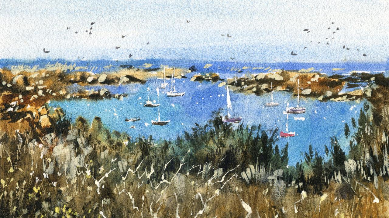
3. Drawing: We're going to start off
with the drawing here. And what I wanna do is find
ways to simplify this scene. It's very tricky scene in terms of all the
different elements, we've got a very
predominant foreground here with a lot of
these trees and bushes. And I think were possible
if you try to work with reference photos that do have
a bit of extra complexity, that way, you can
actually choose, decide which bits you
want to simplify down. Sometimes when you
have a reference photo that is too simple, it doesn't give you
much to work with. In a scene like this.
What we're gonna do is look at the basics. So where does the
sky meet the ocean? So we'll go right back. They just have a look. It's about a third
of the way through. A third of this scene, or perhaps even a little
less of the scene. But I'll say about a
third of the scene. Just sky. Really important to get that in. I'm going to roughly
pencil that in here. Okay. May change that
around afterwards, you know, feeling it would
probably just stay that way. There's something like
that. Sky up the top there. And we're going to move, work my way down
to the foreground because it's another sort
of simple beat to put in. You can see this bush
here in the corner of the scene also comes in about a third of the way up from
the bottom of the page. So I'm going to just putting a little
indication of where it is. Some twigs, branches and
things down the bottom. Don't even bother trying to draw in all those
branches and things like that because we will
get them in later. The scene is actually a little bit wider than the bit
of paper that I'm using. So I'm compressing
it down a little. Actually. You don't have
to use all of it as well. I mean, you can cut out bits and pieces or you might want
to shorten it as well, but I'm just going to do the demonstration with
everything in here. So I've had to almost compress
it down a little bit. There are some rocks and
things like that here. There's a large whole bunch of these rocks and it's putting a little indication of few those just floating around in
the background like that. You can see they actually
like a rocky beach. This is in Normandy, France. Like that. Just putting that in this area here is
kinda like the beach. You can see the water actually come in slightly like that. You've got some sharper
contrast here with a rocks just meet along the
water like this. Okay. Just a few more rocks over here. And I just have a bit
of a play around, add what you you think
would look nice in here. There's so many rocks and try to get them
all in exactly is. The reference picture shows
is almost impossible. I wouldn't try. It. Says it's the few rocks, more of a guide for later, so I'm not thinking too much having to figure
out where to place them. Okay, there. I'm just going to
create beautiful this land going in like that. You can just see
tiny bit better. The other bit here in the
background like this, where that land connects a
bit onto the water. Yeah. The back as well. To simplify it down. And here bit of this kind of violent or
something there as well. And also here, the one here as well. Then these are just
little bits of land. I suppose. We can change it
around later as well. I just wanted to get
in a bit more of an indication there like that. Okay. Bits and pieces is
often the background. But apart from that,
last thing I wanna do is just getting
some small boats, keep them to roughly
to size as well. So here's one just over here. Just gonna be simplified down. This is the sale there. Lots of stuff going on in there, but I'm just going to
simplify it down like that. Here's another little boat. That tiny little boat there. Another one here. The sale, the mass
going up here as well. That there. Maybe another one here. At here. A lot of these we can just add in extra details afterwards. More so just placing
the rough location, indicating the rough location. Another one here, keep them around at
different sizes as well. You find that as
you move backwards, the birds just becomes smaller. So just reduce down the
size of some of them. But I think that's it. We should be ready to
start with the painting
4. First Wash: We've got a small
mop brush here, and I'm going to begin with this part and getting
in some of the warm colors, got a bit of yellow ocher. I'm going to just
getting a little bit of that sand at the back there, that golden yellow colored sand. It's just a warm color. There's even some of it
on these rocks here. So just putting a bit there. You can see I am really just scumbling that brush
across surface. Not paying too much
attention to details. We want to aim for
here is just to get in a light Wash over the
top and give us some, I guess a bit of a
background color could have background warmth. Before we get in
the darker colors, we've really cause some
browns running through. Here. There's even it's
mostly just browns here that most of
this is just water. I'm talking about
ten per cent paint, the rest of it just water. You're going to bring some
of it down here as well. Just to get down to the front. I've already got some brown
mixed up here on the side. I can just drop in a
touch of this brown. And this is just kinda
weird of wet-in-wet work. Of course, go over
the top of it later, but being able to just
utilize some of these while that previous
wash is still wet makes it more interesting. I'm trying to just
leave in some bits of whites and tiny highlights
in there as well. Some more of this brown if it doesn't matter
what kind of brown, I'm just using a
brown ocher here. You can also use something
like burnt umber, like that. Darker brown. Touch over here. Some green here in
the foreground, just stupid with this light
wash of undersea green, dropped some of
that through here. Again, a lot of water. Most of this is just water. 90% water. Try getting a nice
little Wash like that. Notice just how quick
I'm doing this as well. In the way of detailing. The first Wash has
always just getting in some little areas of light and noise cohesive Wash that joins everything together. We're gonna go in and just
start mixing a bit of blue. Now I've got some
tiny bit of cerulean. And I'm gonna go into the
sky and just work to get in a very light washes
to really pick up the larger mop brush for this. And I just wanted
to get in a very, very light wash of blue. Bring that all the way down. This bit more darker blue at the base here. Okay. Like that. But still soft enough
so that it kind of blends nicely upwards. Okay. Good. And I'm going to start working on the water as well. And this surface think
about this might actually, and in that dark area here
of the water or the back. Still with that same old brush like I got here, this mop brush. It's quite a dark, much
darker than the sky. So sometimes what I like to do is I'll mix a bit as cerulean, mix a little bit of
ultramarine together. And you get Wash that's a
little bit more little darker. And I'm gonna go
through and just create this edge like that. I want it to stick out and not from the sky Wash as well. So I'm actually going
significantly darker. Okay. I'm looking at kinda blends
up a little bit, that's fine. I'm just going to be the softness there in the
background, I don't mind. But this same wash of color,
cerulean and ultramarine. I'm going to bring this down. Sometimes I do like to grab
out that spray bottle. Today's a pretty hot
day in Melbourne. So spray down some of this stuff here so that it joins
together a little nicer. A little bit of that blue
coming down like this. Yeah. There we go. Cutting around some of
these boats as well. Like that. Okay. I just leaving a touch of that. Whites on the page. Don't worry if you go over
the boats and you end up getting rid of them
because we can always bring bring them
back afterwards. Water is more of
this actually gotten a bit more turquoise
color in it. So I'm just picked up
a little turquoise. You can also mix in a
little green in there. If you don't have turquoise. Okay. Whoops, there's another boat. I thought I'll just mark
them out quickly like this. Okay. Doesn't look like
much at the moment. But remember, we're
not detailing, we're just getting in
the main elements. Basically the water,
the sand, the rocks. Even some of the water you'll notice actually comes in here. And doing this wearing
to where it actually looks much more interesting. To see these kinda nice blend
between the sand and water. You can only do
this by Painting, went into wet, and you have
a loss of control in a way. But in the sense you also again, nice fluidity and magic. Really. Well, I think it is. Cut around that a bit
and just bring some of that water down. I'm just leaving a bit of
white there as well to indicate me some highlights
of something later on. Tricky is to not paint over absolutely everything me
while to figure this one out. Learn to live in highlights. Bit of extra blue in there. That some of it's just
mixing down to the trees. I problem. More here. Here. Here. The right-hand side. Well here. And Destic. Good. Looking, great. Now I'm
looking is still wet. Good news because we now put in some more details
for the Wet-in-wet Work. I think I'll start with
a bit of the brown. The rocks maybe on the
left-hand side we'll see how we can touch of darkness in here. Do have some black as well. Black and brown mix them together and I can
actually getting some nice dark spots underneath. Shadows actually running a
little bit towards the right. So I wanted to just
indicate some darkness. Maybe on the right side
of some of these rocks. Tricky to do this. But we can give it a go. I like that. See that shadow
running to the right there. They might be some rocks here on the back just sort of bring out some touch of darkness on
the right-hand side of them. Okay. And also you see here where
I left in a bit of white. Notice that's also an
opportunity to get in another shadow or something running towards the
right-hand side. You've got to use your
imagination a little bit here. It can be tricky For Beginners. Just remember that
you're leaving in the highlights on the left. And trying to get in that
shadow to the right-hand side. More of that shadows. Just, I mean, at some point I stopped looking at the reference and I just start putting in my own take on this thing because it makes more sense for me just to focus on what I have in
front of me once I've got an idea of everything else. So the general light source, each individual
rock doesn't really need to be specified and Editing exactly how it
appears in the reference. That beats a little bit
wet, actually too much. So I'm just going to
wait for that to dry and I'll play around and beat up their first small
brown as I move up. And here, I've actually, they've gotta beat
with this brown color. I'm going to spray
spray that there. The brown just spreads
around a bit more. There's just too sharp. Okay. One of the big
things you want to remember is this area is quite I'm quite dark
compared to the water. It's significantly
darker than the water. You want to make
sure that you've got you've got that
in dark enough. Some of these, the
color as well. You can just draw out
tiny highlights. Again. Maybe just a bit touching
the water, they're here. There's like a more
of this stuff. Okay. I'm going to join up. But of course leaving
highlights see that's just to an indication. Often what you leave out and watercolours is
just so important. And these little rocks here
are a good example of that. And I'm just not the
end-all, do more later. Here's a bit more
something here. The background,
sometimes you got bits and pieces of
who knows what. Some of this stuff in
the background will all have to bring that out
with some gouache. Afterwards, Let's put in
a bit of something here. That bit of darkness. Here is, well, just
the main thing is just making sure that
there's a boundary between the water and the land. And it doesn't take
much, as you can see, it's just a continuation
of this land mess. Going over to the
right-hand side. Here we go, that middle
one in there somewhere. That's good. Okay. It's getting some more greens. Sweetie. Needs to be wet. Touch with that bottom
part of the paper. Some of these water
seeping there that we are. To use this little fan brush is great for this type
of effect as well. Drop some of them in here. It's just a bit of darker green. And you don't want to
make sure that this green is a little bit more concentrated than the layer previous to it so that
this lighter green, they're adding any
more additional water, you're adding more actual color. And that's going to
make sure that you don't get any funny bloom affix. Mean it's not hundred percent
green is all you've done. It was like desaturated greens running through in
here. Some here. You can even just pick
up viridis yellow ocher, drop some of that yellow ocher
in to log, yellow ocher. One of my favorite colors. It's kinda like a
desaturated yellow and it doesn't really turn into
a green if you careful. Whereas if you have
more vibrant greens, It's just easy for it
to be contaminated. Turn to in green if you use
a bit of blue in there. Darker color in here, I'm just going to pick
up a bit of black, have actually put a
bit of blue in there, but bit of black car
something in here as well. As you can see, there's
actually some darker spots. And That's what I want to imply, just some darker bits even in here there's some darker spots. So a bit of black or brown,
both mixed together. Sometimes I mix up a bit of purple and a bit of brown
as well, like that. Just to add a hint of
coolness through this, you'll notice this layer
start to dry up top here. And this is good because you got the point here where
you can then start to put in little sharp edges of these trees and
things like that. See just quick,
quick indications. I'm not wanting to spend
all day with this. But as you can see,
looks more interesting that way because we've got
a lot of softness in here. And we want to just
counter balance that with some more darker
sharp looking shapes running through all this. Especially because we're dealing with things in the
foreground as well. Some more here. Lot of these magical effects just happened while
the paper's wet. You never know
exactly what's going to what it's going to look like. But it's always a FUN. One of the most
pleasing things that I find about using watercolours, wet-in-wet effect.
It's just magical. Just get really drawn
into it somehow. Okay, so let's doing
its own thing now. This will dry off in time
and look a lot better. But what I wanted to do is kinda look in here
and think to myself as anything that I can
potentially add in some additional bits
and pieces that would benefit my composition before I let everything dry off as
a bit of yellow here that I, that hasn't dissolved fully. I picked up a chunk
of it before. I'm liking generally how
it looks at the moment. I think perhaps maybe be the scratching
out could be nice. Little trick I do. I've got a knife here. And you can find just spits. Wait to see, but there
are some parts that I, for example, here, let me see. If you wait for it to dry, you can actually scratch
out a little bit more of the paint here. Okay, see that's
created a bit of this white sharp edge like that where you've got areas
that aren't dried yet. If you scratch into them, you get these darker
looking bits like that. But I'm looking for
more of those contrast. So I'm going to draw the paper
5. Second Wash: Let's see how we get
these little effects. And I'm trying to mimic some of these
branches as you can see, running through the foreground. Because the paint is mostly dry. Just got these white lines that stick out when
you scratch the paper. Okay. Some of them come off
from odd angles as well. Just try to be more random. In some areas like even
here, for example, you can see a touch of that scratching there
helps to just merge the Boucher little bit
here onto the background. Here's some more. There's not really
much in there anyway in terms of highlights, but it's something
I wanted to add in. You can see more of these little branches and things coming off here is even something
that just comes off on a tangent or
something there. I'm actually wanting
to put in these, some of these little
flowers here and I want to get some of those
in afterwards. So I am just putting
in a few more of these little strokes like this so that when I put in
the flowers afterwards, they look a bit like they're connected to
a stem or some sort. Pick up that a fan brush again, I'm gonna get a bit more green. And I'm going to add another
little layer. Over the top. I can just a little bit
of brushwork like this. Just texture, make
it look a bit more dense because we've only
got one layer in there. So these little bits of these little brushstrokes here helped to
make a difference. And you don't have to use a fan brush if you
don't have one, just use little round
brush and we even a rigger brush and that helps to create these effects as well. But because the paper
is still slightly wet, you get these kind of
in-between effect. It's not hundred percent sharp, but it does not oh, just wet-in-wet work as well. So it's a good go-between from because layer or getting some proper wet on dry effects. Okay. Let's try this one off. Okay, everything's dried off now and I wanted to go
ahead and adding some final touches a
little bit to details and find this is a stage that just brings
everything together. I've got that fan brush again, I'm going to pick up below
this black and a bit of green that I've
had on the brush. And let's just kidding. For example, this
little indication, this shrubs, these kind
of darker bits in here. Rather than look at the shape, or I guess the general
shape of the Bush. I'm also looking at the shadows that are contained
within there as well. And working to get in really
the darkest colors possible. Because this is the
final step really. And this is just some
darkness in there. You can see there's even
some darkness here. And of course we had put
in some of that with that previous Wash before, but this is another
exaggeration really. And here we creating 3D sharpness between this
dark area in the background with the foreground
here where we've got all this kind of
lighter bush here. And try and also create
this sense of shadow on the right-hand side of
these bits and pieces, these bushes and stuff. So a little bit of that
shadow or something there. In here. There's a bit
of darkness in there. That it's actually a lot easier with this fan
brush because you've got this feathering effect. This looks a lot smoother. Stick with that
actually, like there. Let's have a look a
bit here as well, just to separate out
some of this stuff here. So you've got a two
layered foreground. You've got the stuff here and
then you've got a bit here. Unless I guess it's
in the mid ground. But it connects them together. Also creates enough
of a distinction. Down here. There's
not really much, It's not really
much distinction, but I suppose you've got like a bush or something
growing like here. I can just put in A bit of darkness like that. Green. That yeah. More here. Using just swapping
back to my flat brush. Now, just putting a bit
of darkness in here, exaggerate that previous Wash. Swell. You want to try to feather if you can just feather This painting nicely. Here in the foreground. A little trick that I
learned is try to create a little extra darkness in some parts and it's
looking a bit too dry. I made I just spray here just a few little quick sprays paint to encourage it to
move around and touch. But just helps to bring that foreground
closer to the viewer. But you don't have to
do all over the place there on the
left-hand side here. Because if you do it too much, you're gonna get rid of this
amazing kinda highlight that you see everywhere. Okay? If you find that it starts overwhelming as well and
there's just too much going on. Too much sharpness. You can just give it a
misting over the top like that and helps to
disperse that color. Here there is little
push or something here, just going to get in this, sometimes I do too much as well and a smaller brush,
something like this. This is an old mangled brush that I have old
mangled round brush. And this again stops me
from thinking too much. It's just, as you can see, this, this harsh shape. But because it makes such
a harsh looking shape, it forces me to make sure I I don't touch
the paper too much. Maybe coming in from
the side there. Like that. We have some more. Okay. Let me just make some
part of this a bit taller. Make the bushes and
things look too perfect. That what have we got
here a little bit here. And then you can
go on and you can do this really forever. Now, back to that flat brush. One of my favorite
brushes, this of course. And I'm going to work a bit more on maybe some of these areas
in the background there. Especially where it might
connect on with the water. Just extra sharpness. Going to use some more black as well to create a bit
more of a contrast to where it touches the water
or what have you. Okay. In some parts, not all parts, but just in some areas. Bit of white gouache
of squeezed out on the page and on the
page on the palette. I mean, to get ready to put
in the final highlights. Just want to see if I can maybe scratch out a few
more bits here. Yeah, that's better. It's kinda like this. Break it up a touch and make
it look a bit more messier, suppose in some parts. And I think what I'll
do first is look, alright, can now do
the boats first. Just get these
boats out the way. A bit of whitewash
and the brush. And maybe you've already, you can already
see a fair bit of this detail on the boats, just on the bottom of them. But I've also got a
little rigger brush. And I can hold that brush
further down and draw. You can see these little A little masks that connect on the bottom of
the boat like that. Okay. Here's another one here. Like that. Another one here. This one's actually
pretty large mass and you actually see part
of it come down like that. Catch onto the light and top of the boat catch onto
the light as well like that. Here's another one like that. And sometimes using these
method where you a kiss, I'm putting, execute that
brushstroke quicker, creates this kind of sunlit
effect there you can see. It's important just to imply
again that light source. These boats or
chest so small and there's only need
a little detail to indicate that they are, in fact boats or some sort. I don't want to spend all day when using the in the water. You can see these little bullets or what have you just
floating in there. And I'm just going to indicate a few of them like that. Okay. Putting the bottom of
this book better as well. This is potentially one there have not indicated it so well. It could be one even
here like that. If you've missed it
out in the first go, There's always a chance
to add it in again, as you can see, with a
bit of that gouache. More here, just these little, again, these are all
odds in the water. I suppose I might change some
of the colors of them as well to make it
more interesting. Something here and then
what it is like on the flag or something,
I'm not sure, but it sticks out from that part of the rock
in the background. Okay. Here we can just start to play around a little bit
with some different colors. For example, I'm going to
put in a little bit of white for some of
these like flowers or just to try to connect, create an indication
of these flowers or something like that on the stems of those bits and pieces and come in
different colors as well. We've actually got some
warmer colored ones are very light
yellow colored ones. So just like add
a bit of yellow, bit of warmth in there and you can just
do something like that. That and that sort of
seep in and do its thing. I'm exaggerating these
flowers a little bit as well. Again, to increase that sense of depth and the
scene, the foreground. I'm trying to connect
them up with these imaginary stems that I
had scratched out before. You see here some of them
larger at the front like this. And the melting in more due to the paint still being
wet in some sections. Notice how we can put
in more yellow and get more saturation for some
of the flowers like this, it'd be more
saturation like that. It's important to try
to keep them random in terms of the way
that they grow, as sometimes in clusters. And they're not just all in a particular row
or in a pattern. So I keep that in mind and make sure that the angles of these flowers as well, we're a bit more varied. Always try to do that. You've even got
little flowers here, like just in the
center, little ones, you can barely see them, but just these
little indications of them like that here, here. Here. And I'm going to add in some of these like twigs or
whatever here as well, just in more darker sort
of gouache or darker gosh, bit more lighter colored ones. Yeah. Just just redrawing
them in the paintbrush And you find that these little branches and
things just break up the, the darkness, especially
here in the background. The way that you draw
these branches is that you start off with the larger
section and the bottom, and then you just slowly create these segments
where they break off into to these rigger brush
I'm using is perfect for this because you don't
have much paint on that brush. Kinda skips over areas as well. Some more here. Just to be the
balancing out really. But being careful as
well not to overdo it. Especially here, notice how
it just carrying it on, but also skipping over
the paper a bit so that it's not too obvious. Okay. Some of the boats, you get
different colors as well when I'm tempted to just adding
a touch of color for them. In sports like a beauty, this is red here. Red maybe for something there. Basic than some of
them are more bluey, purple color or something in their spirit darkness like this. To mark out the
base of the boats. From this angle,
you can't really see the reflections
in the water as well. Just adding a few birds
flying around the sky. This maybe some flying through here. I also like it too. If I can pick up some highlights to again emphasize
that light source, I'm just gonna be that yellow, yellow week colored gouache. I'm there. For example, I might pick up
a bit and just add it here. More water, actually,
more water. Here. Here. Here is these little bits that stick out like that. Little outcrops of rocks and
things that we might've lost out previously or just
not added the mean. This allows an
opportunity for you to add in a few more like that. Just basically putting in
little rock some small shapes. But I'm not taking too much time here with
this memory to try to keep that hi light more towards the left of these rocks rather
than the right-hand side. Because we got that light
source from the left. Being careful not to overdo
it as well, It's just tricky. There'll be the light in
here are some lighter sort of shrubs in parts. Another not really there, but just something
I want to put in. Too much. There doesn't matter. A little bit out of the back. You can see this
almost these tiny little outcrops of
rocks and things there. So the gouache is again, very useful for this. Some more bits and pieces here. Just simplify that down. And we're finished.
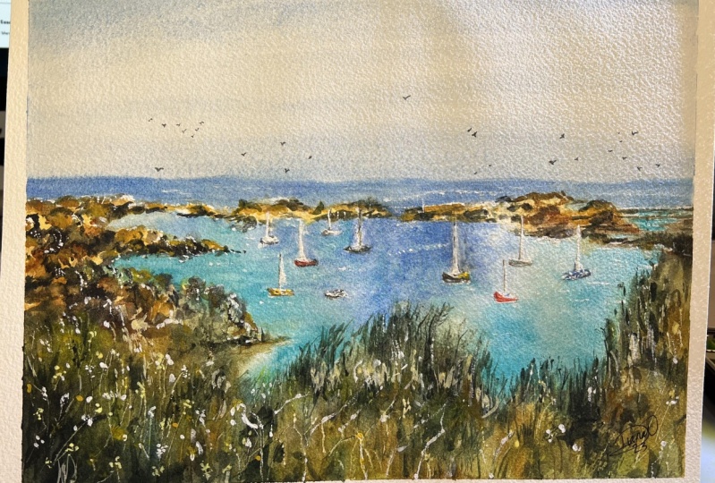
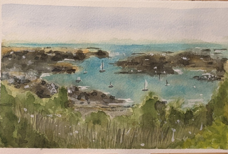
 Watercolour Mentor (Darren Yeo Artist), Art Classes, Mentoring & Inspiration!