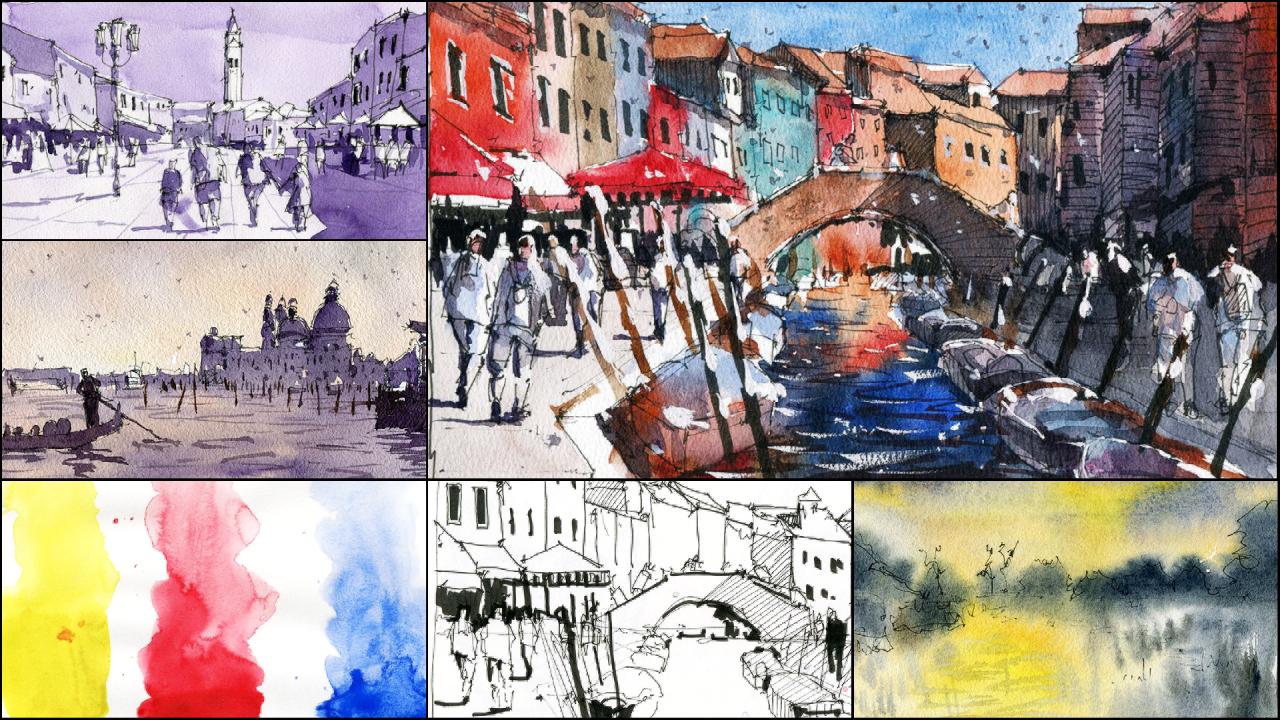
Transcripts
1. Introduction: Welcome to the Lawn
and Walsh essentials, planning and composing
your painting. In this class, we'll
be going through the essentials of what
underpins a beautiful painting. Without knowing
how to design and plan your painting,
you're flying blind. Walk you through all the
techniques you have at your disposal and went to
know which ones to use. Understanding the
steps and processes required to paste together
a painting is crucial. Believed or not, painting begins even before you put
your brush to paper. We do a variety of exercises that will boost
your confidence in knowing what colors to use and what time to use
specific techniques. Also go through my
seven-step process that would show you end up with a painting that
you're proud of. I'm excited to get started. So let's get painting.
We're gonna be going through a couple
of different topics. So we're gonna be talking
about color versus value. We're gonna be talking
about drawing techniques and we're going to be
doing a lot in wash scene.
2. Materials: Colours: Basically, this is
my palette here. And I use, I usually use
a much smaller palette. I don't know if I've
got an example here. Kept it, kept it away. I might have one just goes away. So when you would've
seen them before, they're basically
smaller, open up little tin pellets and they have perhaps two or three
little wells in there. Those pellets are good. But I drew fine. Having a larger
one like this has been great for me in terms
of just mixing paints. You get a lot more space, less chance of other paints and things running
into each other. But if you're painting
small, you don't really need something like this, but this is just, this is
basically just what I use. But if you don't have, you don't have a
palette like this. Or if you've just got the pans and maybe like a
really small area, you can use that
or another thing I used to use was
just a white plate. So I'll just grab something
out of the cupboard. It might be an OTA plate
or something like that. That works really well too. So what I recommend just
having enough room to mix, it's probably best to clean them off if you're a beginner. And the reason why is
I can get away with it because I can just know the amount of
paint and mixing here. Normally when I start
off when I'm painting, I'll use something like a
yellow or something really, really like a lot of blue
to get those in first. And so normally I'll
mix up a little area. And then later on when
we get a little dots, all the little bits of
mixed up paint there, it doesn't really matter
as long as you've got in a darker, cool color. In the beginning, it
can get difficult for beginners because when you
learning to mix colors, if you've got stuff on
the palette satellites, it's a little bit more tricky. But you will notice some of the more experienced painters. The pellets are just
completely messy. It's all over the place. I tend to go more by
rather than color, I tried to look at the value of whether
it's light or dark. I think that's the most
important thing in whether it's cool or whether it's warm. But we'll talk about that
in a bit more detail. The user few colors in
a lot of my paintings. And prior to this workshop, I sent out a list of
materials in my palette. And most people are
always surprised that I use eight to ten colors. Even in this palette here, I go back to the same ones as
there's three purples here. Can you believe with this
three purples, that's nuts. Unnecessary, but I really
like the color purple. So I got three there. I've got a couple of
brown colors here. So this is a brown, burnt, burnt umber, this
is burnt sienna over here. This is dark green
called undersea green. I've sort of tried to. Again, we're looking
at whether we have lighter colors and values. Y's, which i'll, I'll
do some exercises with you for a moment
so that you can understand what's
a color that has a lighter value versus a color
that has a darker value. That's how I separate
it out here. So it goes from warm and
warm colors to slightly cool to just really
cool down the end here. So it kind of like warm to cool, light to dark colors. And that really helps me. So that I didn't have to think too much when I'm painting. And that's how I
structure my palette. So whether you use these
individual colors and not, I mean, you might have a yellow, you might have two yellows like a more vibrant yellow
like this one here, Hansa yellow medium, then you might use a yellow
like this one here, which is just a yellow ocher. Go over to this side, maybe one of these light
blues, That's cerulean blue. And whenever an ultramarine, you might have a brown. I've got a neutral tint here. And neutral tint, that's
the color that a lot of people were asking
me about because sometimes I do mention that
during my sessions I say, Okay, I'm just using a bit a neutral tint or I'm going to, I tried to add up a bit more green there to
neutralize that color. Bid. Neutral tint is basically great. It's just, it's just gray. And it comes in a tube that
you can buy from the shops, from any paint
manufacturer, essentially, since it actually is labeled as neutral tint to
convenience color. And I say it's not a 100%
necessary when you're starting because you can
actually use other paints. You can use blue and
a bit of raw umber, burnt umber mixed them
together and you can get a really nice, really nice gray for that. Definitely. Like I said, I only use a small amount
like the other ones are more just convenience colors
that when there's lavender, that one there is
turquoise and turquoise. You can already mixture
and be a bit of ultramarine blue
and maybe a bit of yellow just mixing
name and a bit of yellow ocher that produces
something similar. Even a little bit
of gouache in this. Lot of them are not
100% necessary guys. I think fewer colors you use
when you start the better. I don't use that. You put a huge amount
of importance on color, but there are times where
the context of the place might demand more
color accuracy. So when you are painting
that certain building, maybe the Taj Mahal where it has more of a creamy white color. And if you go in there
with maybe, I don't know, some blue and light blue or maybe even a sandstone yellow,
it can look a bit odd. So those are the times where
I think color matters most. Also when you're thinking about implying the time of the day. So if you're looking at perhaps morning,
afternoon, or evening, certainly as in the morning, you're gonna get more
of that orangey, warm as sort of color
in the horizon line. And of course on top
you can have a bit of maybe a little bit of
dark blue, what have you? So I think colors important
for context in many ways, but mainly for those two ways
to indicate the location. A specific landmark where
it has featured color, something that's
recognizable in color. And the other reason is to
imply the mood of the scene. So basically the
time of the day, I think that's probably
the most important. So if you can see, for example, we did this quick little
beach scene last time. Really bright colors here. Not much water at all. You can tell. It's
definitely a daytime here. I'll go to another what
else do I have in here? I think here's another
one that I did recently. Just a quick little sketch. Again. The brightness here of the
ward objects just left that white and you can
see it's daytime. It's clearly daytime. So that's I think really one of the most important
things to keep in mind.
3. Colour Theory Essentials: So let's go ahead and I'm going to want to do some
exercises with you. And we'll talk a
little bit about the color wheel as well
so I can bring that up. I might actually bring up a quick photo of
the color wheel. I don't want to spend too much
time going over these guys because I know
that you guys have all probably discuss
color wheel charts and seeing it hundreds
and hundreds of times. But this is, this is
one that I picked out, just downloaded off the net. And you can see they're
basically three primary colors. You've got a yellow, you've
got your red and blue. And I always I
always say if you've got those three colors, if you've got a
yellow, red, and blue, especially if you go to a few different combinations
of those yellows, yellows and reds and blues. We've got to have two of each. You can mix almost any color. Sometimes I add a tone
in earth tones are some brown or basically a
burnt umber or raw amber. That really helps as well. When you're doing some landscape scenes
that require that. Otherwise it's not, not
really poorly because you mix anything else
with it essentially. Use also a palette sometimes
with just my secondary, so a bit of orange,
violet, and green. But mostly, mostly, I tried to use a combination
of warm and cool colors. So on the right-hand side
of this color wheel, you can see all the
colors from yellow up until basically red,
violet, red violet. Anything with that sort
of yellow, reddish, orange hue in the coloring there were referring to that
basically as a warm color. And as we move towards
the blue area, the blue green, maybe
the blue violet area. We're going to refer to that
as basically a cool color. And I like to have a combination of cool colors and warm
colors in my scene. And getting them to contrast against each
other as well as so is so important
because if you have that, that contrast, you can
have a bit of vibrancy. You're going to use
that to your advantage. But you have to be
careful as well. For example, I'm not
going to go ahead and use yellow and violet in
my whole painting. I might just use
a bit of yellow, yellow, orange, and violet. So it doesn't have
to be directly opposite the color wheel. When you're looking at, when you're looking at
complementaries, red and green, for example, you can use a red
and perhaps a little blue-green or bit of
yellow green in there. If you use colors that are
just directly opposite, they can look good as well. But sometimes can look
into it a bit gaudy. Just got to go to keep
keep an eye on that.
4. Colour Vs. Value: All right, so a bit of yellow
and I'm picking it up, almost, just got a little bit of water and then activate it. But I'm really, really
going quite heavy and, and I'm gonna drop
that straight in. Obviously with this yellow, you're not going to get, even if you use it
straight from the tube, it's only going to
be your only going to get it as dark as it looks. Okay, you're not going to
get any darker than that. Even views it straight. Since you straight
from the tube. I can add a bit of
water to that yellow. Then just bring it
across like this. I can just actually bring
that down, maybe like that. Bring it down. It dilutes down. This often sunny yellow
color up up here. But if I go back in there
and drop in that yellow, It's very little difference between between the top
and the bottom area. You can see maybe it's a
little bit dark there, but down there it's
very, very light. So when we're talking
about colors, firstly, we want to look at whether it's warm
weather, it's cool. We also want to look at
its tonal range values, basically, how dark and how light can that color
basically be presented? We look at perhaps his color. You can decide yourself,
put it in the chat as well. Do you think, I mean yellow? Is it a warm color? And in terms of its range of values that you
can get from yellow, do you think you can
get a lot of values? We only get a few, a few values basically. Putting the chats and
what I'll do as well, Let's try bit of red, so I'm going to pick
up a bit of red now. Red is a slightly a bit darker, darker than the yellow, but you can use it as a
straight from the palette. This is a bit of scarlet
red or purely in red. Basically. That's straight
from the palette. You can see it just dark
as you can get it rarely. Then I might drop a bit of
water underneath here and just soften it down until we get almost a pure water
down the base here. But you can already see that
there is a larger range, values, range of values that
you can get from this red. So you can go from
almost a pink, pink color here to a
very dark red there. Whereas with the yellow, He's certainly not going
to get as many values. Let's put a bit of blue in here. I've got a bit of
ultramarine blue. Just picking up as much as I
can off the palette really, really sort of ultramarine. Drop that in here on
the left-hand side. That's really dark.
It's really dark. Straight from the palette. Really only a little
bit of paint on there. And I'm going to
dilute that down. Let's put a bit of water here. Dilute it down even more. Let's bring it further
down that more water. And that's what
you do when you're working with watercolors. When you want to
lighten a color, you just need to add more water. People who have experienced
in acrylics and oils, you know that you
basically white, black shades of gray
into your initial color. But in watercolors,
you just add water. You play around with how much water in there
and you can figure out the combination that you
need. It's trial and error. Especially with water. There's so many different levels of values that you can
get in watercolors. You can get a huge
range of values. I think watercolors,
compared to other mediums, even the slightest amount
of water can change that value quite considerably. So you can see here
out of these three, which color do you think has
the most range of values? We just say it's blue. Would you say it's red? Or would you say
it's the yellow? The answer, the answer
is basically blue. If you look at the blue, you can go from a really, really dark color, this
ultramarine blue all the way down to almost
a sky mix here. Really important to understand
because for example, if you're doing shadows, I can't be doing shadows of
a building or you're doing shadows with a figure or a
person, something like that. You're going to
have to make sure that the shadow is fairly dark. Definitely blue. If
you Thank you, Peggy. Basically if you try to
make a shadow from mood of red and a bit of yellow mixed together or maybe just use
it like a red shadow one. It's not going to look It's
not going to look like. Realistic to life and me, if we look at most shadows, they combined a lot of colors. They're gonna be blue,
basically a really dark tone. The color will be look a
little bit odd for the shadow. And you're also not
going to be able to get a very dark shadow. When doing a shadow. What I like to do is just mix up basically a bit of blue or red and a bit of yellow if you don't
have neutral tint, otherwise I just used
a bit of neutral tint. You can use a bit of ultramarine
blue mixed with some, let's say for example, a bit of mix, a bit of ultramarine
here with a bit of raw umber or burnt umber. We're going to Tanga and
you can get these kind of darker mix like this. That's a great grayish color. You can just mix you
three primaries together. So again, I'll grab, say, a bit of this blue, we'll
get a grand bit of that red. Grab a bit of the yellow. There we go. Again, we have a kind of
a grayish color here. This one looks a bit
more cool compared to that one because I might
have put a bit more, little bit more blue in there. Daka, daka Pell has the
greater, the greater range. It's difficult at times to sort of get your
head around that. And also, you got to realize that each color has its own
limited range essentially. I mean, I've got this
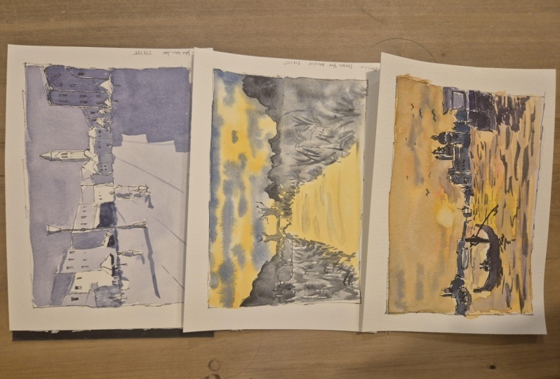
purple here which is like, I don't know, what is it? It's this one, sorry. Absorbs violet and
it's almost black. Huge amount of tonal range. When I do little sketches, sometimes tonal sketches,
which is the value sketch. Same thing. Probably more accurate
to just use, use value. You would value. But basically what I just do a value sketch, which is one color, I focused on the lights
and darks of a scene. I'll use a color like
this that has really, really the ability to go
from this black color. And when you pick a stretch for the palette to a
very light color, think we, we've
covered a little bit. It's done some quick
exercises on choosing colors, understanding the relationship
between color and value. One thing I always, I keep telling everyone this
but making sure that you're focusing on value a lot more than you're
focusing on color. Because value is
essentially what gives your painting a sense
of dimensionality. It identifies shapes, putting
in shadows, what have you, It's what pulls everything together and makes it
look like a painting. If you've seen some of the black and white
paintings where people just use black and just diluted down
to different levels. Some of them look incredible if you look at pencil sketches. Pencil sketching is also a fantastic way to
understand tone, chance to evaluate turn. So basically, you know,
because it's one, you've got a bit of lead and
you can go from like really, really dark all the way
to light like this. If you imagine, you
only had one color, you can get so much done
with just one color. Color is just an
additional tool, additional thing that you
add to your toolkit to make your painting
more interesting. To imply a place at imply a
specific time of the day. To just give it a
bit more character. But always remember that value is should be in the forefront.
5. Graded Washes: Basically with the
gradient sky wash, wet the paper, and then
dropping, dropping the paint. Or you can just basically
pick up that paint itself, the darker color and go
straight into the top. This is all just dry. Then as you go down, just mix a bit of
water into that blue. Bit more water into that blue. And carry that down. A bit difficult on this paper. But just carry that down at
a little bit more water. As you move further
down the page, you'll see you basically see it getting lighter and lighter. You can also go in and pick
up bits of paint if you feel like it's just looks a
bit choppy in some areas. That's one way where you go on, it's like dry paper. And then the other way,
like you suggested is just wet the paper like this. I actually do this a lot with some of the landscapes
and I'll show you, I'll go through an
exercise with that later. But we can pick up a bit of
blue and drop that in there. Dot blew up the top. You can see it's already kind of spreading through the paper. But then you can just pick up
a bit of that lots of blue, a bit more water into that
into that balloon mixture. And just feather it in
further down like this. Just a little bit different,
tricky on this paper, but usually on cotton paper you're gonna get a
lot better results. So I tend to, I tend to do this one if I basically want a
more even gradients. So if I really wanted to
go from dark to light, this one here where I wet
the entire sheet of paper. I find that this is great when I'm doing loose landscapes. And I want to have
a bit of very, I want to have it go
from dark to light, but I also want to drop in maybe a bit of orange in
here or something, you know, and make sure that it
just sort of blends together nicely because I
find times when you blend, you're going to blend a
bit of orange or something in through here with this graded wash. You can get sharper edge
where it blends. You just got to pay more
attention to where you blend it. Whereas here because
the paper is still wet, it tends to just don't
merge together better, but you do get more
control with that.
6. Line & Wash: Simple Landscape: Let's go and I want
to try something. Would you a bit of
wet in wet first? Okay. This is kind of an
advanced color mixing. And something that
people asked me a lot. I constantly get asked
is how do I create all these softness
in my paintings? This is the reference photo
here on the right Guys. Let's have a go with this one. And to get you guys to get you used to using pens as well, I'm just going to sketch in pen. A pen and wash is something interesting because
you're combining the, basically you combining
a sharper lines with the softness
of watercolors. Because we're gonna
be using pens later. You can use a pen
now I can draw some of these little scenes
and if you'd like, or you can use pencil if that's
more comfortable for you. Yet, the bourgeoisie, and
this will literally take probably a minute,
really quick sketch. So I'm going to just go square. The aim of this exercise
is I want you guys to focus on the cool and
warm characteristics of color in the scene. And I want you to also
focus on the values, the different range
of values in here. Now if we look at the photo
and we squint a little bit, you'll notice there's
basically just two colors. So you're gonna get just
the top sky bit here, which is basically warm, warmer color with a bit of
coolness mixed into it. And the water here, which is also a little bit warm with the sun
reflecting in there. And then on the inside here with the trees and we're having
more of a cooler color. Let's draw this and
I'm going to put the horizon line right
down the center like this. And it's certainly
that's just the area, the line at the back
where everything disappears off into the distance and you can't see anything. Let's put in a few trees. Okay, I'm just going to
drawing, scribbling some trees. You can see him. Stone. Just have a bit of fun, and if you want to change
it up, that's fine. This is just a way for me to get a bit more context
about what's going on. Know your sky around. What are the kind of thing. Here's a bit of this heel, little heel coming
in from the side. And it's a bit of softness
here on the edge as well. Here in the ward. I'll just mark out a bit too. We've got kind of like a
shrub here or something. That's another shrub,
smallest shrub here. You can see little bits of
shrubs and I don't know, it looks like this things
growing cross the water. If it's a grass coming up here, another bit of grass here.
Let's not overdo it. Let's just get in a
few bits and pieces. Remember, we're just
focusing mostly on the color and the values. So the quick little sketch
like base, it's, again, it's not gonna be, gonna be framed and putting
in an art gallery. But let's pick up some brushes. I'm going to grab
a number eight, number eight round brush. And before we even
start putting color in, we could ask ourselves look
at that reference picture. If we're trying to get the
similar color scheme to this, I guess in terms of
like the warmth of the sky and the water. And then compare it. Sort of contrast it
with the coolness. Okay, what are we gonna do? Well, I would say getting the warm colors first
because they tend to, tend to just sort of
putting the blues first. I always find that it's a bit of blue
leftover on the brush. And if you put a bit
of yellow on later, it just mixed into a
kind of a yellow green. So I always try to get in
the warm colors first, That's just my suggestion. And do the sky in two ways. I think we'll do it in the way that it was talking
about before, which is basically wet the
entire sheet of paper. So I'm gonna go grab a
larger brush for this. I'm just gonna go
over this section is actually a little bit
of blue in this war. It doesn't matter just
what that bit of paper. And give it a little bit of
time to kind of soak in. Don't drench it completely, but make sure that it's
completely saturated with water. What you don't want when
you're doing this is to have a huge puddle of
water in here and here, you look at it from an angle and you'll be able
to see that the water, and, um, since Okay,
There's no big puddles. If you see a puddle, just
shift that puddle around, moving around or lived
off a bit of that water. And that will solve
that issue for you. I kind of get it
to the point where it's fairly saturated. But I don't have any
weird puddles or anything like that because
when you have these puddles, you're just gonna get
an uncontrolled mixes going all over the place. Let's go in with
a bit of warmth. So this guy is kind of
a yellowy orange color, so it might pick up
in a yellow that's mixed up beautiful Ponzi yellow because it is quite a vibrant yellow
and I'm mixing it a tiny bit of orange here. It would have been of orange. I might just drop
it in like that. Let's just go in like that. And you can see that the
orange and yellow just sort of already just mixed
into the sky like that. See how efficient you can do this with a few brushstrokes, something like this
in different areas. The nickname, while we're there, while we've got this color, Let's put some in the water. But here, we've got a bit here. Let's just drop
something like this. Do that reflection. Watercolors will paint
itself a lot of the time if you just let it mix
and do its thing. As I as I am here. When you're using wet-in-wet, especially it's like a
magic thing that just happens and sometimes
just end up with something quite
beautiful when you and something that you
can't really even re-create if you tried
to do it manually. Sometimes when you have this
uncontrolled sense in there, it actually comes up
with something better. We evolve into something better. I'm going to go and mix up a
bit of a cooler color now. So I've got some
ultramarine blue here, a little bit of ultramarine,
tiny bit of that. And I'm going to drop in
to make things simple. Probably the we'll
go with just add your primary skeletal eyes
so a bit of blue, red, and yellow and mix them
up so that you get a grayish color, grayish color. And then after that, just
mixing some more blue. So we can get in a kind of a bluish grayish blue
gray color like this. And then we're going to
drop that into the sky. Notice notice already
how dark it is compared to the
yellows and what have you is pretty pretty dark. We're using probably
do about 30% paint. But I've used actually a
lot to mix for the yellow. But because that yellow
has such a limited range, limited value range, don't, even if you're using it
straight off the palette, like going indicating before, you don't really get too
much of it showing through. So let me go a
little bit of that. We can drop in a bit of
blue in some areas as well. For some of the clouds, you can see some of them actually
a little bit darker, so we can drop in a little
bit more blue in there. To further concentrate
that paint. We can drop in a bit here. This is what we're doing here, is we are mixing
paints on our paper, rather than mixing them
all in the palette, we're allowing them
to mix on the paper. Form, basically just form
shapes and transitions. And of course we have
less control at times. But we also can produce some very interesting
combinations, color combinations, the sky. Remember, we're still keeping the sky relatively
light compared to all these mountains and
things like that in the back. Something like that. Got to get it light and
that's preserved in there. We've got some clouds and
things like that over the side. And what we can do now is we can just go in and
put in the mountains. We can put in the
ear of the ground. If we look at these, we
look at these mountains and the hills compared to the sky. Would you say that the
mountains and I guess this area of shrubs and
things growing on the water. It's a grass. Would you say that that's DACA and you say that's darker
or lie to them the sky. Let me know. Just have a think about it. I'll give you the
answer in a moment, but really try to focus
when you're looking at that reference picture
and ask yourself, is it this lighter than everything else was a
dark and everything else. Look at everything in the
context of other elements. Basically. Yes, it's DACA. We want to make sure
that we are going in. We want to go darker. I'm going to go pick up a little bit of
neutral tint here. It's just a shortcut, but again, you can just mix
in all your blues and Blue's Clues and blue, red and yellow to create this. And I'm dropping that in, stopping this in
here, look at that. You're going to get some soft edges, these little mountains. But we're using a fairly
thick mix of this paint. Not there's still
water in there. Is it thicker mix? And what this is
going to do is that It's going to create some softer dark shapes
here in the distance. And darker shapes, something like this drop that in there. Let's go here and on this one. And then there's
this mountain lions here on that left-hand side. The hills, the trees that, oh, standing out against the
sky when we are doing this. Let's go in here until
the foreground a bit. So this stuff has
started to dry off, but we can pick up a bit
more a bit more color. It's still wet enough for
me to just feather in a few bits of this bits
and pieces using a little, just a little brush like this, you can indicate some shrubs. Remember to cut around
and preserve the lights, that yellowish light
that's coming through. What we're doing is
that we're basically, again, you're practicing,
you're mixing on the paper. You're keeping in mind the
tones that you're using, the values you're using, whether they're light or dark. Keeping in mind also the the colors that
we're using to make sure that we've got a combination of warm and
cool colors in this mix. More coolness in here for
some of these little shots. Like I said, it's just a
quick little exercise. Doesn't have to take all day. But you've already got a little indication
of what's going on. I mean, I tend to spend a bit
of time in here and later. If I've got more time,
actually go in and just detail additional
bits and pieces. But for example, I might
go in and think, okay, I just want to darken
this bit of heal a bit dark in this shrub here, a bit dark and that one. Have a look really
closely at some of the variations in here and see if you can change things up. Pretty, pretty basic scene. But you like I was saying for you've got this warmth in the sky reflected
into the water here. You can actually
pick up some yellow. Let me have a look. Not some yellow button. You get a bit of a warmer color and try to get in some ripples, some sharp little
ripples in the water. Let me just pick up a bit
of a flat brush here, a bit of orange. We can do something like this, just put in little reports
and things in the water. Another option. Water has an areas
like that as well. But this is the kind
of mental process that I go through
when I'm looking at a reference, reference photo. The sky, of course, the clouds in the sky. If we compare the clouds, if we squint, just
look at the clouds. The clouds, even though the darker than the yellow
that actually not darker than these trees rotten back here the
trees rot in the back, touch darker than the
clouds and the sky. When we do that, we make these trees in the
background darker. It's going to make everything in the sky be pushed back
into the distance. A little technique that's one to do and to try out with a few different
reference references. And what we going to do now, I want to actually go through
and do another exercise where we go through
just a tonal sketch. So we're going to get a
pen out, sketch another. This one will be more of
a stress-related seen. What we'll do is that we will actually try to
simplify it down. And one color only paint
it in just one color. Does anyone have any questions? I can see that there's quite
a few people watching still. So if you have any questions, just write them in the chat because I don't want
to continue on lists. Sure, you guys already, but otherwise I'll assume that you're done with this exercise. And just keep in mind the
steps that I'm taking, the mental steps that I'm
taking even before I put the brush to paper or even yeah, basically start mixing colors. I'm already thinking about the scheme and how I'm
going to put it together. Aci, pause the audio and
I'll dry this off so I can turn the page over. When you get good at this. This sort of technique is
wet and wet technique. You can whip out the sketches in literally five to ten minutes and they're great for practice. The great for you might
be like a friends, but then you thought you
can get them a president. Just make a little card for them and do a little
sketch like that, adds a nice personal touch. It doesn't take you all day. The advantages using
the inherent advantages of watercolors in
this wet and wet. Wetting the paper and letting, letting the watercolors
paint itself, you just basically
facilitate what's going on. You add the colors,
add the values. You mix around, maybe have
few sharp strokes here, but a lot of it is
just indicated.
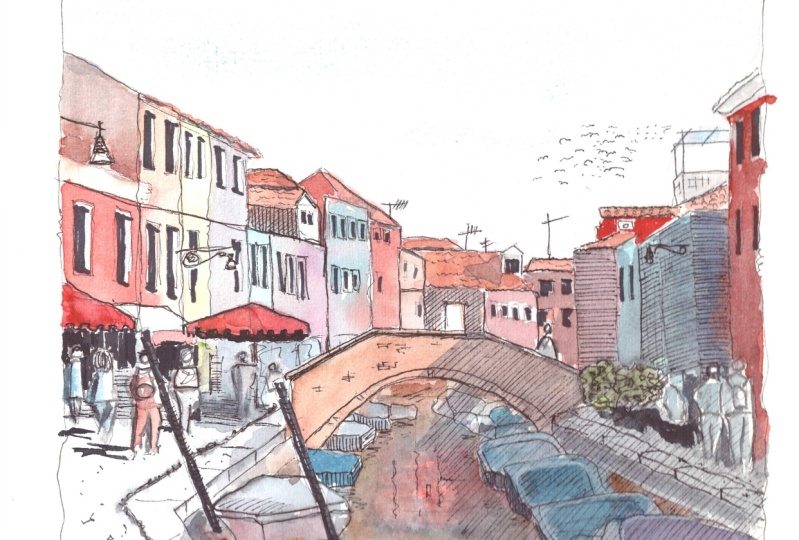
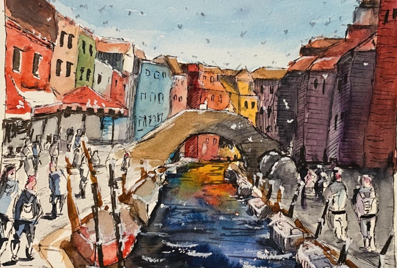
7. Line & Wash: Murano: This one here is seen a boronic, a lot of detail in the scene. But what I really want you
guys to focus on is again, we're going to
look at the colors that are present in the scene. We're going to look at, we're going to look
at the values. We'll do a little quick
little review of this photo. Let me zoom into it on the screen so you can
have a look at it. You've got all this warmth on the left-hand side
on the ground. You can see the light. Just from coming in from
the right-hand side. You see the shadows cast by the buildings on the
right here on the ground. The buildings on the
right-hand side, then not as vibrant and pretty dark compared
to the ones on the left, even in the middle of the scene. He is some of the large
tower in the background. That's pretty that's pretty
lot is welcomed pizza, the what's on the
right-hand side. So keep that in mind. The set V, the saturation and the warmth of
all those colors. I mean, there's
actually some blues, some little pink in there as well in the
buildings to the left. But mostly it's just quite
warm and some darkness underneath well into the shades and the umbrellas
and stuff like that. But we're going to
attempt this one. Again, just a really quick
sketch of this so that we have some practice identifying colors and identifying
identifying values. So grab a pen again, just any old pen, I'm going to actually use the same 0.5 pin
that I had before. And again, you can use you can use a pencil
if you'd like to. If that helps. I'm going to go in and I've got the reference
picture in front of me. And don't worry too much about form in terms of the actual structures of the buildings and
stuff like that. We'll go through how to
actually draw a bit more later. But the focus of this is we want to look at color and
we'll want to look at time. I'm going to go in, Let's
get to the Sioux square. Going on the outside like this. Little squiggly on the
outside. That across here. Great. I'm going to draw a line
for the horizon line just below the middle
section of the scene. Something like middle section because the basically the
bottom of the buildings, It's yeah, it's roughly just below the middle,
something like that. And I'm going to go in and
I'm just going to sketch in a little silhouette
of these buildings. Okay. I'm not even really trying to get in
any accuracy or anything, but just a little sketch of the edges of these
buildings like that. You can see them come out
when you drawing buildings. Look at them as shapes. This is just a big
bulks on its side. Today box on this side. Something like that. More you do it, the
easier it becomes. A little shade, just
something quick. In there. You might have some
umbrellas here. It doesn't matter. Remember just a little
bit of form in there. But we want to focus
more on the colors. You might have bits and
pieces, as you can see, all kinds of shapes and things. He was umbrella here. What have you, this
building comes down. We've got smaller Building here in the background as well. So just a little one. Just another square. Let's get in the tower
and some of the buildings below these ones start roughly
in the center of the page. If we look at the tower, it's roughly in the center
of the page, the scene. So again, let's join a few little box-like
shapes like that. Like that. I'm going to go to
another building there that's kind of in
front like that. Couple here. Pretty quick sort of deal. That of course, these buildings
to the right-hand side, we're going to just
make them make them go get taller like this. Don't worry too much
about the form guys. Dock. These umbrellas are
going to be dark. Got a bit of form here
for these buildings. Even if you can just
get the silhouette of the buildings without any
of the lines down them. Just looking at
Wally cotton from the sky and just getting
a line like that. We're all good. You find. Um, I also thought doing things. Sometimes you can add
in like windows and stuff like just with Mark, just with any kind of pin, really a bunch of these dropping a few little bits and
pieces for the Windows. Once you have a bunch
of windows in here, you'd be amazed at how
it starts to take form. Whereas before, it can be
difficult to see what's, what it is in there. But the window is really
scream out building that. Again with these little
umbrellas and things, all kinds of stuff in here. Look if you've got
some people and I have a person walking
in From this end. Just have a play around. Let's put in some, some, some more windows you, and remember, we're
gonna be using one color to color
this in later on. Just one color, essentially, there's some kind
of gonna pull here. Can you see it? There's
a little poll here. Palms, you might
want to change it. I might make it go
higher like this. And then I'll put
in maybe some kind of a lamp type sign like this. Some indication of a lamp. They look can be a lamp. Quick little scribbling
there for that lamp. That would be good because
we can get a shadowing. Got four people, four
figures walking down. This is also a good opportunity to practice your
figure sketching. We've got a guy here kind
of just walking like that. So the vacuum, It's kind of
like a rectangular shape, the head smaller
little rectangle or oval shaped like that. Here. Worry too much about it. Just, again, just
a little sketch. I want to focus light are
just showing you how to use one color to get in
all the shadows. You can even just use
that color to get in the shadows and leave
the rest of it white. But we won't use a
few different values so that we can practice mixing. And if you can mix one color and paint in one color
fairly accurately, then adding more colors
in becomes easier. One of the things I find
beginners struggle with ease. All these choices,
all these colors. And then you're trying to basically combine all those
colors and mix something up. But you're not really even just using one color
is hot enough at the start. So let me go look
some more figures. Is another lady here walking along coding goes hand seems. So you can see this
is not accurate, but walking just kind of family just walking
into the same seems. Okay. All right. Pretty basic. You can even add
in the background. You can add a few
more, just scribbling a few figures,
overlap the distance. Sometimes you get someone to hear that the head is just like a rectangular shape and
bodies are rectangular shape and a couple of longer
triangles for the legs. Like that. There's a thing you
can do as well. You just don't lift the pen off the paper and just draw them in. Again. If you're using
pencil, same deal. We can do the exact same thing. Alright? Really basic drawing here. Really, really basic drawings.
How are you guys going? Let me know. Let me know in the
chat how you're doing. If you need any additional
help or have some questions, I'll go through and answer those questions for you as well. So long as you go to a little
indication of some of these little sense
in these buildings, these buildings in Marano, Borodino era, they have this quite
unique look about them. But I think the main
thing is the colors, the vibrant colors
that you get on them. And these windows with
the suddenly they have this white frame surrounding
some of them like that. You can see with sonar wide
frame or what have you, but even that's not
a 100% necessary. You can get away with
just putting a few simple lines running through underneath umbrella that
wasn't really there, but I'll put it in any way. You know what, I
forgotten the tower. Let's get that in. The longer rectangular shaped like that. Look inside the tower and look at what shapes are in there. There's a little
triangular shape there, and then on top of that there's
a square like this, okay, Then on top of that you've got a large triangle like that. And simplify that
down a little bit of 3D left-hand side to make that a couple of little
lines going on down there. But apart from that, does the trick. Great. So I heard that you have
a little sketch in Qia. Quick little sketch. At this point. Shove a little bit of
silhouette of the buildings, maybe a couple of windows, some figures walking and you didn't have to
use these figures, but I've just use
these things because now I want you to pick up a color that has a
naturally dark value. For this one, I'm going to
go pick up a bit of purple, I think when we use
a bit of my purple. But you can also
use neutral tint. So you can go to blue, you can use a really
dark blue or you can use a dark brown as well. And that works quite well. But for this one I think
I'm just going to be using a just gonna be using a
bit of this purple mix. All right. Let me go to that purply mix. Then. We want to have a look
at what's in this scene. Looking at the lighter sections, we've got all this
light on the ground, the buildings, and
what have you. But how are we going to
do this all in one color? Well, firstly, we want to
dilute down that color. Really, really, really, really. To the point where
you've got 90% of water, maybe 10% paint. I'm going to go into
firstly the sky like this. Pretty dark at the moment compared to the older the
watts on the paper anyway. So I'm gonna go around. The sky actually has
a darker tone than some of these darker value in some of these
buildings on the left. I'm just getting
a light wash for the sky. In this purple. Using one color you, it doesn't have to
be publicly against. You use whatever
you want for that. But you'd want to make sure
that whatever that color is, it has a good range. Be able to get in all the
light and the dark areas. Maybe that sky. I'm just going to leave
it. There we go. Good. That's going. Next step. We're going to look at what's, what other areas of light
and we have in the painting. So we've got perhaps the size of these buildings and the ground which
are pretty, pretty. The light, I'm gonna even lies
in that purple even more. So that it's almost just water. Drop that in sort
of that voting. But a bit here on the
rooftop of that building. These two here as well. The edges, Good, good
goods across the ground. We're going to join
this up. Let's put in this little light wash of
purple into the ground. Notice that this
washer purple is also lighter than the sky wash. Wider than the sky wash because it is
actually larger than the sky. You get
these little bits. Can I just leave that off
if it starts to pool in areas and we can lift off a
bit of color with the brush, dry the brush, and then just
mop up that bit of area. This point I'm using almost
completely just a 100% water. Again, these buildings here in the background, it pretty light. You can even just
leave them white. So I'll just add
in a little bit of color like that on them. Okay. The figures, we can
drop in a little bit of that purple onto the
figures like that as well. Just to get into a lot of wash, you will find most of them have a lot of
lighter highlights in them. And then the clothes that
they wear actually where the docs docs or the hair and stuff like
that as well. Okay. Good. Okay. So let's give this a dry if you've got
a hairdryer with you, give you a quick
dry and I'll pause the audio so you don't
have to hear this. Okay. All done. Now. We will want to put in the
darker tones and values now. So just picking up some of that purple that I hadn't
mixed up earlier. And we're going to use a higher concentration
of the paint mix. I would say about
40 to 50% paint. We're going to go through
and you will know that the buildings
here on the right are actually a lot darker
because they are in shadow. So I'm just going
over the top of these buildings and getting
in a bit of a shadowy area. I'm just using a mop brush. Nothing special, just
a little mult brush. I'm bring that down
and you can actually leave out some of the
umbrellas to make them. Lotsa can see just a
little bit of that. Sometimes they, they kinda
catch some light and having a break from all
the darkness as well. It helps. There we go, we go, we'll just
bring that down. Interestingly, the ground
connects on as well, the shadow on the ground. So you can kind of go through and just do this
kind of thing and putting data link on the ground. There's a shadow that
just kinda goes straight in to the scene like that. Some edges look a bit more. Papa. But apart from that,
kind of like this, isn't it. That joins on with the building. Cutting around the
figures again a little. Remember I'm just
using one color, name, color. All
the way through. Just adding in varying
levels of water. You might think to yourself, I want the shadow to
be a little bit more. Going in a bit more,
you can change it up. Does anybody want to do
too much else with it? That looks pretty. Pretty okay. Not just that. We do have the people got this person
here and then maybe like a bit of a darkness
on the left side. Because we've got the light
coming in from the right. So we've got perhaps some
little dark indications. The left side of the
clothing, then the legs. Here's whoa, you
see sometimes we'd had darkness, left side. And let's have a look. This little girl, she's
got like a bit of darkness on the other
side of a dress, on the left side of a hit. And the legs as well. Look at this guy.
Darkness on the head. Shorts are pretty dark so I can just getting more purple
in there like that. Just the edges of the legs. Quick little bit
of darkness there. Same thing for the boy. Here we go. Just some
color on the left side. Let me so we're looking at the ceiling and it
looks like there's some light coming off the right-hand side of
that. These figures, right? Same with these ones a bit. And of course let us
get in some shadow for the legs so we can
actually mix up, this is the same mix, perhaps a little darker,
roughly the same mix. And we can connect up the links. I'm getting a little
shadow here on the ground for these,
for these figures. One for the Go, one for these bigger
here and this lady. Legs. Good. Simple shadow
there on the ground like that. And of course we've got
the what you call it, lamp, some darkness on it on the left-hand
side of the lab. But you can see already that something is starting
to come out of this. All these buildings here in the back darkness,
the left-hand side. But we're leaving the roof. So we can cut around
the rooftops, just leave that so that
it's still catching some lat top lift. And of course, that's going to be probably gonna be
some lots here as well. Cutting across the building may leave the
rooftops like that. This tower near this cocktail, we might put in darkness down the left-hand
side like that. Just like that to show that the light is coming
from the rats again, at least trying to keep in mind where the light
is coming from. Little bit of darkness here
underneath that building. Look at the sides of
these buildings as well. You're going to have areas where you can have a bit
of shadow at cost. There. The light coming in and maybe
I just catching on the edge of that building and forming
a shadow here as well. We've got a bit
of darkness here. In this building. When do you practice these
tonal value sketches, total assess value sketches, and just focus on the basically the main
elements of light and dark. You'll be amazed at
how much you can do with just one color. To finish this off, we will add in the
final darkest values. Right here. We've got basically all our mid meet values and which is basically
the shadowy dark areas. And we've got our
lightest values of the sky and the ground. For example, underneath
the buildings, you'll notice there are
some really dark areas. I'm going to pick up some
more of this purple. I'm going to use, I don't know, maybe like 60, 70% because I
don't have to go too dark, too much with this
document itself. That up. And let's have a
look in the scene. Where would you say
the darkest areas? Let me know in the chats where the darkest areas of
this entire scene. We'll have to think about it. We don't have a
look at everything. Essentially. If you look underneath
the buildings, you do have some
here, for example, underneath this sharp thoughts of this person gets
in pieces there. I'm just going to imply some little bits of
darkness inside. So we can go, for example, over here underneath
the umbrella, I can pick up more of this
purple, really dark purple. And I tend to use a smaller
round brush for this. I didn't go overboard. Cut around that
darkness in there. Perhaps in here. Just to indicate on the sides
of some of these buildings. Here's well underneath this
is like a little umbrella. I don't really like
a little shade. Again, you've got
darkness in here and this is a clothing
rack or something. And some shadows
here on the ground. We know is what it
is, what it is, but just looking at the light and how dark
it is in that area, trying to make sure that I indicate that
a little bit of that. Let's have a look on
that right-hand side. You might have bits
of darkness in here. Beneath these buildings. Tables and chairs
and stuff like that. And often hear as well. Some of the doorways
in the background like this. Something like that. Doorways. Especially if sometimes
there's little bits of shadow for these figures here in the dock. Be good as well. Some little
perspective lines and little lines running towards
the center of the scene, which I've now realized
I forgotten to put in these shadows of the
figures right here. So a little bit of darkness running towards the
left for these ones. That darkness, darkness
underneath running to the left. Not really TO
something like that. It's all consistent. But that's basically it. I've already gone into
those windows with a bit of before, but you can go into them again. You can do something like this. Really just dark in the mouth, finish off these windows but
draw them out a bit more. You learn a lot from these,
from these sketches. Even in the background,
you can see this such a stark
contrast at times. Dot contrast. Getting this shade in areas underneath this building is
probably a little darker. Just talking underneath here. Good. The things you can do is a bit, sometimes you can pick up
a bit of paint and just do some shadow underneath some
of these areas like this. Shutter here and here. Not necessary, but just
another finishing off, finishing off technique
that you can do. You just kind of just pick out little tones that remain cost. Little shadows
that are caused by the window is the window
frames and stuff like that. But really, this is a
good little exercise. And as you can see, even with one color and a
simplified sketch like this, you can tell, you can
tell what's going on. Let me zoom in a
little bit more so you can see what I've done. Might be better for you. Okay? 33 basic tones at three
basic values in here. This child who has a bit more
of darkness they looked at, there is actually
a bit more here. Every time you go back into it, you realize I could, I could dock and that
bit a little bit more. And you just realize there
are some things that you can better to separate. But the issue is, of course, knowing how
much you interpret. Because if you, again, if you do too much, identifying, lose
that in magic and you lose that looseness
of what's happening. That's something that comes
with a bit more practice. Obviously with as you can, paint the shapes, figures
with fewer brushstrokes, it becomes a lot easier to
basically identify something, but still leave enough
for the imagination. I think that's one of the
beauties of watercolor, is that it just has this spontaneous spontaneity in watercolors that I find you don't really get
with other mediums. Always really sitting down
and taking a long time. With this, you can really, really get something
out there that looks quite fresh and beautiful. Gold amount of time. That's all. I've
drawn this all off. And I'll just show you some quick little things that you can do to finish it off. Again when you're using pen, can pick up you can just
pick up a pen and just go go into it again afterwards.
Once it's dried. Work on it again. But the
main thing is keep in mind the value that you're using in different dilutions
of your paint. If you have if you
have just one color. Because often people
start with too many, too many colors, That's why I always suggest three colors. If you've got three colors, your primaries, maybe a brown
when you're starting out. If you can master using those. If we pick up any others. That will really go a long
way because that forces you then to work
with less variables. And you might have to mix it up and makes you
read in your blue. But if you can manage
using different colors and focus on the values at
the same time, That's great. I found that I really struggled with that in the beginning. So definitely try
this new exercise is great and it's great fun
than there's no pressure. And you just sort of getting a quick impression and understand where the
light comes from.
8. Line & Wash: Venice: I'm going to bring up this
next reference photo. And this here is a really, I guess an iconic
scene of Venice. It's like we've got there the Santa Maria Gillis
fluid in the background. We've got we've got this
gondola in the foreground. Here. Let me just zoom
back out a little bit like this. That's better. Again, the photograph is available under the description.
You can download it. Little analysis of
this reference. Let's have a look
again, following the same steps like
we've used before. Let's identify what
are the areas, what are the dark areas? What are the lightest areas
and what are the dark series? Basically, the lighter
areas in this scene. I'd say the sky scars from the lightest and you've
got a bit of the water. The water is probably a
little darker than the sky. But mainly I'd say the sky
water that a lot of sections, you've got little ripples and things like
that in the water. In the background you have basically just
mid-tones of the silhouette, the silhouette of the buildings, and then there's a larger
building in the foreground. So let's grab that pin out. Let's do a quick little
gesture drawing of this. I'm going to go and get
the borders like this. Getting the board is,
by the way, this is just a stylistic thing that I do because it creates a
kind of framing effect. And I don't know, I just like it also prevents me from getting paints
on the other side of the page because of my paint to the edges of the page at tend to It's not going over mixing. You'll notice also that in the midground you've got
some smaller barges. On the top left here, There's a botch then it's like a fairy or
something like that. Those also pretty dark. Mainly that one there. But apart from that,
the rest of them are just midtones and light areas. So line down roughly just below the middle
section of the Saints, below the middle
area, like this. Quick little line like that. We're going to look
what's far the easiest thing to get in on it. I would say this building
here on that right-hand side, I'm just going to reduce
it down into square. I guess square there
with something coming off the roof like this. And then there's kind
of like a bit of the rectangular thing area here. It's just a silhouette. Just a little
silhouette is a window that we just imply like this, you edge of that window. Like that little bit
of detail there. Look at it in terms of shapes. This is just, it's kind of
a square inside a skirmish. I didn't know this square and
this is what you call it, just the bottom part of it. Literally technique as well. When you want to
add a value pin, you can hatch lines in one direction and you
can already see by that, the darkness of this area just below is a lot more
than what's on top. Okay. But I don't want
to do it all over. I just want to get
into a bit of it. We can get the resting with
the watercolors afterwards. You can also see some of
these reports underneath. Again, I'm not gonna touch that. Let's go ahead. I'm
going to just try to put in this gondola here. It gives me just getting
this little shape of it. Remember, look at the, look at the basic shape of it's kind of like totally
kind of banana. It doesn't stop as well. Stops roughly here. Just shy from the middle
point of the scene. That touches the
water roughly here. This side here it kind of
comes down to the water. Again, just meets
with water like that. Pretty nothing tricky. Here's a, here's a couple
of figures that's just drawing a few little
people sitting in that, sitting in there like that. There's a couple of people. There's all kinds of stuff in
here as well as you can see this kind of bits
and pieces in there, which I'll old drawing. But not so important. The person is
standing like here. Only horizon line like this. Look coming down. Just join up as one. Kind of sticking out their
heads, probably too big. Let me just reduce that down. Holding the most are here. I went to the water
like little petal. A bit more like that. Rule. All this area is
gonna be pretty dark, so just gonna be a silhouette. I'm just gonna be quick
little silhouette. A badge here in
the background or little fairy starts out with a rectangular
back, like that. It's thought it's kind of like a rectangular shaped
as well like this. I'm just going to hatch
in the back of it. Won't even really going
to put in much detail, just a quick little
indications like that. Sometimes you're
gonna get boats and perhaps bits and pieces
in here. Normally. I don't know why, but in Venice, you didn't really see
too many of these boats with stuff sticking off them. They're just more rafting, just a lot of blank people, carriers, fairies
and stuff like that. This silhouette of the
buildings in the background. Yeah, just look at
how we can simplify. I'm going to get this
kind of the bottom of it is rectangular, base, rectangular with
little triangle, triangular bits on top, you can see new
triangular sort of bits. The main thing that these domes, those kind of shape here, it's just a semicircle,
little semicircle. If you can draw a semicircle, half a circle is equal to. Let's look at the top of
the diamonds are kind of another sort of
sticks out like that. And on top of that
there's another little semicircle control
that in like that. Close this morning in there. But it's just quick
simplification of what we got. Another one. Let's do another dome. Just a semicircle for
the dome like that. We go up and we can do another little dome
on top middle there. This tower here. Kind of just a
rectangular shape. Coming down. Please see me dimensional
aspect of it, which just put it in. Again, another little semicircular
type structure on top. In fact, I've done
this one here. A little too small. As you can see, it's too small. I've done this one
probably too big actually, but I think I'll
just stick with it. If you want to make
this one bigger. Again, you can do something like just kind of just
draw over the top. So I might, for example, draw that little dome up here, enlarge and this base speed
at the bottom like that. You can barely tell. You
can barely tell, right? And still slightly too
tall but little tower in the background overlapping,
something like that. There's all these little,
these little kind of it's in pieces there. This little windows and doors and all that
kinda stuff in there. Don't worry about it. Just drop it in,
just drop it in. Actually, continue this on here. The speed that
sort of sticks up, up the top here. You've got just kind of run down and go into
the distance like that. What else do we have here? We've got another
section like this. Just the silhouette of
these buildings that are running in the background so hard to tell what's
actually there. But I know there's some kind
of dome there and this just like I don't know, I don't think that's just
a bit something like that. Essentially, we
pretty much done for the drawing these few little boats and
things that you can put in. These little wooden pylons
that stick up scenarios. But something quick. It good. Let's go ahead and work on the
painting when his Zoom in, touch into the drawing
so you can see better. Let's grab some yellow. I'm going to use a
small middle brush, just a little mop brush. Aka same following
that step, taking, trying to get into yellowy
sort of bits, the warmer bits, I'm going to use a bit of yellow and orange mixed together. You can see here I'm just
mixing it little bit here. I'm mixing on the
side of the palette. I'd say the mix is about
20 per cent paint, ten to 20% paint, 90% water. There is a kind of a sudden
lighter sun air over here, but I'm not too fast. I don't really want
to get that in. Um, I wanted to use a bit
of red in here as well. There's a pinkish sort
of feel in the sky, slightly pinkish sort of fuel. So drop that in a little bit of neutral tint as well. This makes me want to keep this area of
the sky super light, but I'm just cutting
around the buildings. In fact, we don't need
to worry about that. We can actually go over
the entire building like that. Red in there. And over everything.
Just getting a nice little wash
here for the sky. Getting a bit of shininess. I'm just moving the
lot so you can see this othering the
sky with paint. I like to always add a
bit of variation but a tonal variation to the sky. But before I do that and
we want to mirror this, mirror this in the ground a bit. So I'm going to mix
up the same kind of paint and it's move it
down to the ground. The ground but the water. Okay. Yeah. Don't worry too much
about these books. I mean, this is all going to be in a dark color
afterwards anyway. So even if you go
wherever and it's not a big deal, bring that down. Like warmth running through pinky orange color,
running through it. Good. Little bit
of neutral tint. Just drop that in for
some areas of the sky, mixed up some neutral
tint with warmth. Dropping a bit, a
little bit like that. You can get some little
cloud-like effects and inconsistencies. In some areas like that since not all the same color
and tone as well. Even if you want to cool
it down a bit more, putting a bit of
purple in there. You can also do that. Some areas little bit
of coolness in there. Like I said, when you're using, when you're using complimentary
colors or colors on the opposite sides
of the color wheel. So this is kind of a purplish color and then there's a wall, my yellowy red, orange color. It actually, if you see Joy's out a little bit
of interest in the sky. This will mix down
and it will look less obvious once
we're finished. But it's just a
bit of Witton wit, fun bit of wet and wet. The sky. Individual that
good, good, good. Ready? Let's put some in the water. Just a little, little. Bits and pieces here. Let me kind of
indications of waves. And this pair of the water
will be fairly dry by now. So you can kind of just
feather in some of these bits quickly while you have a bit of
time on your hands, tend to make the waves at
the front a little bit softer so I can
just Lazada, sorry. Like these seeking it, big ones. And then as we go
towards the back, I just want to
make them smaller. If you use a softness in
the end, that's about it. I don't really want
to do anything else. But as you can see, we've got this warmth
and contrasted with the coolness of the waves which like kind of
a purplish color, at least a cooler color. I'm gonna draw this one off, and we'll put in the rest of the final bits and pieces
to bring it together. Witton with ways of kind
of just disappeared on me. I was I was thinking that
they would hang over health. But you're getting a sort of
little bits and pieces here. There's not really all
that much in this. I'm going to actually redo that and just re-wet this
area one more time. Just re-wet it like
this bit of water. We can go in there and drop
in more of that paint, a little bit more of
that darker paint. And this time I'm really going
to go a bit more darker. Middle ones as we go
towards the back. Bits and pieces. What I'll do is while this water is doing
its thing and drawing later, i'll, I'll just work on the. The buildings in the back, save, save some time and then
it will just dry as well. These little dark here. The buildings. We're going
to put in just a little bit of B using basically a bit
of blue mixed in with brown. But I do want it
to be more cooler, cooler mix and we want it to be darker than the sky
so that it sticks out. But notice DOD has
these two here. Go in there. Let's give this one wash in
the background like that. Smaller brush helps. So you can see really cut around things and detail better. The domes are probably
the most important parts. These domes, some of these
little tau is as well. Then you can see it. I can also get it to blend a
bit more on with the water. More here. Just combine this up depending on
the right-hand side. We got bit here, booting
here towards the left. Move this across. It's just, it's basically just
the midterm running across the background
for these buildings. There's one here as well. Just a little bit of
sharpness in this area. Trying to find brushstrokes
to paint it in. Like that. Let's get in a little
bit of sky mix. Scamming somebody, just a bit of darkness for the
top of these domes. Something like that to dropping their dock and off the top of the dome is a little
this is a great way to just add in extra details in there while it's still width, I actually laid out, I want to actually drop in some darker bits and pieces for the which you may call it
Windows and stuff like that. Just doing that bocage, they own that left-hand side. I'd say this is looking
pretty good already. I just want to draw it off. Get back to it,
putting the final dot, final bits of darkness. And here, again, we
just going to be mixing up the darkest to the docs really
that we can get in. So I've got this purplish
color which I like. I'm going to mix a bit
of rounding with it. Brown and purple
or brown and blue. Here on the side.
We've got this, again, this blue building that's right in front and we need
that to be pretty dark. I'm using this dark paint
and then I've just mixed up the frame of this
window as well. You can see it's in there, but also I forgot to put in a
bit of work in that window, just a bit of background
that's showing through. I can go ahead and do that. And it just getting
that window better, the roof of the building, they just identify
that a bit better. The rest of it is not
even really wide. It's just like a
slightly darker color. There we go. And I'm going to drop
that in a bit of darkness into the base here. Like that. Good, good, good. Little, little reflections are just almost as dark as
the building itself. So you can just pick up paint and start to
do this kind of thing. Move your arm
backwards and forth. You move it, rather than
using your fingers. You use your arm. This way. Getting straight kind of
reflections that the surface of the water kind of just
combine on with the building, join on with the building,
which is what we want. That bit more, be more
color in the window itself. But that's basically the idea. I mean, even with these
little boats and stuff here, you'll notice that it may touch of darkness underneath
them like that. But the reflections,
you won't be able to see the reflections
in the distance. You see them mostly in
the objects in the front. Here, for example, you can start going in using a bit of
this darker paint and start ignoring out little bits
and pieces on the domes in the background and
just making it up at some point because I
don't want to over do it. But because we've got all this darkness
here in the front, I think for some reason
by bringing it over, little elements of it
over it doesn't look so isolated thereby itself. And then it brings balance
to the rest of the scene. If you've got a little
bit of darkness, even just for these
windows as you can see, dropping a bit of
paint in there. Oops, that's a bit too
much of a bigger line, but just a bit of detail for the buildings out
in the background. A little touch of darkness, hero day. Um, I don't know. But just a little
touch like that, define you've been in
the root topic sheets, darker at the top there as well. So you see really
this last step is a lot of detailing and just playing around
with all the docs. Essentially. Let's go and move over to this left-hand side
here where we've got these these gondola going away, going across, it's
all the same color. Sunlit silhouette. I'm just going to
cover most of it in this same dark color
that I've mixed up. This is the final dot
bit scene really. You can see the figure here
just standing into the scene. I just put a bit more, a
bit more of that paint up, kind of connected
up with the boat. The Gonzaga that it's holding this kind
of in the water. You've got bits in the boat. You've got two figures
in here which are just a silhouette
again, like that. These bottom of that batch is a little more of
a shadow underneath, a little bit more
kind of reflections and stuff because it's closer. But it's basically the
reflections of this one here where we've got
a person in here. The reflection of God at
steering the gondola. Interesting reflection of
him like that difference. A little bit of something here on the water where he's got the paddle in the water. The areas here
underneath the butt. Little more reflections
here as well. Okay. Good. We can also look at putting in some sharp
reflections in the water. I think these little
sticks as well, we're pretty good
in the background. These little wooden pylons here, the background like that. But of course, yeah. I mean, you can put some closer. I mean, you can do
some here as well. Not really there, but
Something like that. Distance just brings a bit more activity
into the midground. But really what I was trying
to do is just getting in some little sharp reflections
on the water. Report. So little things like this. Again, move your across
the water like this. Just the entire arm
just good enough. Right in the front lift, right? At some points it was skipped some points it won't just make those ripples in the background trying to make them smaller than the ones in the foreground. And as you go into
the foreground, um, you also want to darken the
paint a little as well. Again, what do you do it
but just here and there. I mean, you can just
some of them are large. Some of them adjust
these kind of shopper ones running
across the edge of the surface of
the water like that. We've got some soft wet
and wet ones and we've got some stop a wet and wet ones. What we're doing here, we go out to the back and
it's becomes quite. Selections repose in the water. How about we put in some birds, little birds in the sky as well. Just a few little v shapes are running through
the scar like this. The brush closer down
to the tip if you want to get more yeah. If you want to get a bit
more, control like that. Can I redo that guy bit
later? The gondola? I feel like I could perhaps indicate and things
like that better, but I'm okay with
it at the moment. But sometimes you spot bits and pieces that you might
want to pick up. An auteur. Re-emphasize, rework on later. These birds are great. I love adding the mean
because they help to bring me seeing together,
join everything up. What we've covered
in this exercise. In these exercises so far. These we've talked about colors. So we're using combinations
of warm and cool colors. Normally with the silhouettes of the buildings, the shadows, the darker bits I'll use, I'll use a cooler color
because that will bring out the warmth and the sky. I'm using combinations
of cool and warm colors. We're also using a
range of values. So having the full
range of values is so important in your paintings
to give it a sense of depth, that's what a lot
of people wonder. How are you able to make objects appear closer or further away? This is darker, these two
bits are darker and so they appear a little
bit more forward. Whereas if you look at this, the background is
pretty lighter, considerably lighter
compared to these two. Here. In case
they're gonna look, it's going to push it back. And similarly with the sky, it's the lightest area there, so it's going to push it back. These are, these are some, some good tips in
terms of the colors. The color mixing. We've talked a bit about how much the concentration
of color that we're using. We've done some exercises
with finding out the relationship between
specific colors and values. So you often have a
lot of warmer colors. They tend to have
lower range of values and cooler colors tend to have
a higher range of values. So warmer colors tend to lend themselves better to
things like skies, sand, even water when you
get reflections here. So the warmth of the sky
reflected in the water. But of course, I mean, you can dilute down
something like an ultramarine blue
so that it gets very, very light and you can paint
the sky with that as well. So it just again, it just, it just depends, but I do find with
the warmer colors, I tend to paint similar things with
them mainly stand sky, rocks, little shrubs in the
foreground, stuff like that. I think it's the process whether you do something
simple like this or whether you do something that
has a lot of detail in it, the process is still the same. It's just that you spend
more time on each step. So you spend more time detailing at the
end when you spend more time drawing it, the stat, we spend more time working at the mid tones and putting in all those midtone
areas and variations. And that's the difference between doing a
sketch and a more, a more detailed piece, you just spending more time. But if you can do
little ones like this and understand the process, basically it's once you, once you end up doing the proper logic painting
or anything like that, you're going to know
where to go in. You're going to do a lot more
comfortable in the moment. Because you've done
smaller paintings, pretty much the same
subject matter. And Ellen says,
you learn so much because you don't care
about the outcome. Yeah, that's the
great thing about these about these sketches. It's funny because like sometimes these turn out
better than actual paintings. Because when you're, when you're sitting
down and you're doing an enormous painting, you often feel a lot of pressure to get things
right and this, and that, and I think try
to try to look at it as when you get
onto a bigger, bigger painting that, that
you reassure yourself. You've done lots
of these sketches, you know the process. So give it a go, give it a go, and don't
overthink things.
9. Pen Drawing: Murano Sketch: Okay, so let's do a quick little rectangle
here of our scene. Quick little rectangle
of the scene. And I love to do small
sketches like this before actually attempt a
bigger project just with a pin and the coloring
in or anything like that. Because I find that if you sort of start going and practicing
some of these shapes, you feel a lot more confident
in the final piece, and this really makes a
difference for beginners as well. The thing we gotta do is
just simplify things down. I want to show you just a, a quick example of
how to draw figures. So I'm gonna put in a bit of a horizon line here,
sorry. Yeah, yeah. Okay. Just the bottom
of the buildings. But of course we have
a bit of a path here. Path going in that sort
of exits out like that. But if we put in
some figures here, let's have a look at how do
we draw and we draw figures. Well, what I always try to look at photos
where to put the head. Here. It's basically the, this is basically
the vanishing point. And here it could be here, but it's basically
the horizon line. We're all objects get
smaller and disappear. Because the scene here is
quite close to everything. You can see people walking
around in the buildings. Don't go that far back. We just kinda have to
estimate where the buildings, the bottom of the
building starts. So roughly about here. I tend to put the heads around the height of
the horizon line. So I'll go in and say
I'm gonna get this, these two people's heads in so I can put in the headspace. I always start with the heads because that way you can really gauge how big you need to make their bodies if you put the heads in like that. This is a male figure here. We can have like
welcome to do is simplify that body
down. Rectangle. The rectangle like that, it's lop-sided and maybe to indicate that this leg
is coming forward. The leg we can go in wearing
some genes like that. But basically it's two parts. You've got the top part
of the leg or thigh, and then you've
got the cop here. But you can simplify
that down by making it a triangular shape. Another lake here. Go to lakes. Will get in this
other figure here, she's got longer hair. Kind of rectangular portion
of the body like that. Kind of goes a bit wider
down the bottom like that. Then you want to look
at the legs again. Link here that might
be going back, facing back, back like that. And then this leg here
which may be going forward, the front like that. We've got a couple of figures. The arms as well. I kind of just
sticking this side. Then. Just two little triangular bits sticking out on the
edges like that. And you'd be able to get in. An indication,
might just zoom in quickly so you can see
the drawing better. I think that's going to simple. It's gonna make it easier. Lucas, good. There's a couple of,
a couple of figures. If you look in the
background, you can also see some of the figures. They get quite small. Very difficult to just sort of see them past a certain point. But he is the canal and of
course maybe some boats. So we can draw some
of these boats in. Let's look at the shape
of the boats as well. One of the things you have to do is try to find ways to simplify. Here I can sort of see a almost like a triangular bit here for the front of the boat, comes down like that
and then it just curves back side of the boat like that. That can be just a
simple one there. These ones are just like kind of almost a rectangular like that. And this one kind of overlaps. It's like a spade or
something like that there. But this one you
can see like a box. So much like a box. Simplify that one down. This one here almost
looks like a box. A little bit of
this box-like shape because it's kind of
round or at the front, but box-like. It's people. People
have to sit in it. Another one here. There's another box
lock is sort of shape the back and then the side like that and give them
to kind of overlap. There's another one
there. Someone and so on. Here are a few
little quick little. And areas where we've got boats. Like the wall is a wall there. There's a kind of bridge
that goes all the way across that that joins
over on the other side. But the main thing with this
is just trying to simplify. So this is like a little odd, like a semicircle there. Then we're going to
go up like that. Straight, flat,
straight coming down. Notice I don't really refer to things like I'm drawing a
bridge or anything like that. A lot of the time. I don't even try
not to even focus on exactly what I'm
drawing rather than the actual shape itself. Uh, find that more important to imply what
is going on in there. Do we have some
figures in talking about figures in the background? You make the head
small, smaller, but the same point
on the horizon line. Thank you. As we go towards the back, they become less
and less detailed. So you can really see
much detail in them. There's a few more. I
think these ones are probably a touch too small. Let me just read jig them a bit. A couple of maybe walking
across this one here, that's just like good his arm out like that walking
across the bridge. The reason why I'm doing all
this stuff in the foreground first is because then we can get in the buildings
in the background. So it kinda overlaps. It's just gonna be a little bit easier that way than having to potentially risk drawing buildings and drawing over the top of the buildings
with the figures. This is just the way that
I'm choosing to do it. Some more figures. And just
as long as you make them, the heads a little smaller in the background and the body obviously a little
bit smaller as well. You're going to be fine. Here's a figure here
in the foreground. Here, kind of like holding
onto something there. And then a couple of links here. Just standing standing near
the boots, someone here, the backpack that just walking
into the scene like this. Maybe a bit closer. Still on the same point
on the horizon line. They just, people
just get smaller. We go in. And again, the body's depending
on where they're moving. See, this person here is kind of moving
towards the right. So I'm trying to
put their head more towards the front
and slanted forward. Same with this one here. The direction of the body
and the direction of the head implies basically
where they're going. Maybe someone they told him to, these two people could be
talking to each other. It almost looks like they
think they stopped talking. Sometimes the hands
coming up and stop people signal with
the hands when they speak. So that can also
be an indicator. Little, little sketch like this. Then we'll go in
with the buildings. So firstly, just go with a quick little silhouette of all the background buildings
like that somewhere. Little silhouette of all
the buildings and look at, look at the shapes
in the buildings. I think that's the
most important thing to look at the shapes. That's just a box building here. It's just a box
with a curved roof, a slanted roof like that. A bit more in here. But it's just the box. This one here in the
background as well. That's trapezoid
shape, comes down. And then again, a little
triangular roof here, another box and other box. Another box here. That's trying to
simplify these down. And really, a lot of these
buildings are really just rectangular, boxy, boxy shaped. These are just lightly shade
covers and stuff, right? That is an umbrella here. It's a triangle. It's a triangle. And you've got these
bits underneath which are kind of like little squares. They're going a bit further
out, but that's okay. Two buildings here of a triangle
for the roof like that. But that one, just
transforming these into smaller shapes
that you can draw. It makes it so much more easy you mentally to
actually process. And Robin, look at it as
this enormous tricky, complicated thing to do. Suddenly it becomes manageable and starts looking
like something. I mean, there's not
really much in here. To begin with at the moment. But as you can see, it started to take
a bit of form. You can pick up a pen
and you can even start doing some shading bit
of a tonal sketch. Here you can see
there's actually shadow on this building.
So I can Hatch. Hatching is just moving your
pen in one direction like this and keeping the
lines spaced apart. Spaced apart. And then this is just going to imply the curvature
of the object. And most importantly
here, to imply darkness. Darker value. We know the light's going to hit the side of that building. But pretty much all of
these ones. Just old dark. So we can go in there
and dock in them down. Oops. Document that
you already have a little brief sketch. So we can go in just
dock and it will be good because you can plan for what you're gonna do with your actual painting. Often people find growing
quite tedious and stuff, but it's so important
for drawing is the foundation for
your painting. If you practice. And you should use these tunnel sketches and
stuff like that often. You can improve quite dramatically over a
short period of time. Underneath this little bridge that look this Windows is where we can just put
a bit of a play around, drop a few little
indications of windows here. Not already starts looking
like something, right? But it keeps you
kind of planning, planning out what your steps are when you actually
get into the painting. For example,
underneath the bridge, I'm thinking, oh, a bit of, a bit of darkness in there
actually looks good. Like just underneath
brings out the bridge. I want my emphasize
that a bit more. All these reflections
and stuff in the water, but can I simplify them? Maybe, Yeah, maybe I'll
just get this in in a quick wash of
warmer color and then I'll go around the
back of it with some cooler, cooler color. A bit of darkness
here on this boat, you know, just thinking,
how does that look? If I put in a put anybody adopt this there is
that kind of makes sense. It looks like
there's some kind of something casting a
shadow on that boat. I'm not sure what they're
just having a look to be the top of the building or something like that
kind of coming over, coming over to that side The around with these
little sketches. You can even go in and put
in a few figures like these. The shadows as well. Why not just dropping a few shadows and just
see how does it look? Does that makes sense? Does
that, should I include that? I hope that's helped. I hope that's helped you just
sort of by going through my process of sketching
these little bits, these little practice sketches. Okay? But this hopefully will give you a little bit of
confidence now to continue to the next
step and so that you have practiced it. We've done a bit of practice. You've drawn a few
of these buildings in just no pressure. No pressure. It doesn't have to be,
doesn't have to be perfect. A couple of windows. Window the window there, another window here and here. Window here and here
being one here and here. Which I might go
around the edges and just indicate some
of that whites. Fantastic. If there are no other questions, I'm actually going
to continue on and start with the with the
actual CNOT few quiet, confident now to do this and adding some colors
and stuff like that. I think. Decent clan. So let's just zoom
back out again. And I'm going to grab
out another bit of paper and we're going
to start from scratch. Let us took a bit
longer than I thought that quick quick drawing, Let's turn out to
be longer drawing.
10. Project: Murano Drawing: Let's go ahead and again, I'm going to start off
just by and I have that, I have that little practice
sketch setup on the side of my table just to refer to at times when I when I
start getting a bit too, looking into too much of the details are
overdoing things. I look back at that
sketch and I think that's what I wanted to imply. So let's go ahead and
getting the edges like a bit of a border. Again. Border. We'll bring this one. Again. We place
that horizon line. Fine. It was kind of like
just below the midpoint. So I can just let's just go ahead and replicate
that roundabout here. It will look somewhere around
here, I'd say, fantastic. Now what we're
gonna do is again, I'm going to start looking at probably the easiest
bits to put in. And the other one, the other one that
I started with actually went in and started doing this area that is branched out from
the bridge first, I kind of like it
went out to here. It comes in, it
comes out like that, and comes in around about here. And then we've got a
bit of this area of the pavement there. Quick look. Good. Just this out all
the way towards the back. For that. Let's have a look at
that right-hand side. Let's go extend this out to the edge of the
page, the corner. That's the area on the
edge of the canal. The canal. Course. I can add in more
details afterwards. I'm just trying to get in
the basic structure of it. Now, we've drawn
this book before, going back and we're going
to revisit it again. So it forms a bit into this
triangular shape here. Here comes to a point and then the bottom of
the boat out like this, that goes out towards the back, front of it comes
down like that. And we've got this top
kind of covering it here, the full ground there is
actually a reflection of the boat for the down as well. But something like that. Fantastic. We can go and
perhaps get this 12. It looks like we've got
it kind of coming in like this off the edge of the page. This kind of rounded
shape there like that. Then we've got a box, just this kind of boxy looking
boat that comes out there. We can draw a box.
Would be fine. Just something like that. Just like what we did before. Good. Line up this one
in front as well. This other box you
like shaped, shape. Drawing that box. Rounded off at the front. But it's a little bit
at the front like that. Good, Good three boats That's getting this
other book here. Like this. The better the engine or the
motor in the back like that. But again, it's just
the same shape. These three pretty
much the same shape. This one is kind of similar. They get smaller and
smaller as you go out the back and they become less. Listen potent really in terms of like structure and
what have you. And more important for
just the feeling of depth and the final
painting and drawing. To make it look like things are receding
off into the distance. I kind of just turn them into small little rectangular shapes
all the way in the back. That let me just zoom in a little bit in the drawing
so you can just see better. Actually, zoom in
slightly. Good. I want to actually start putting
in some of these figures and I liked the ones that
I did before actually. I'm going to go ahead
and do these ones. This person here just
in the foreground. Again, the head
rectangular, the body. Let's get in that sort of
rectangular shape for the body. And we'll get in one of
his legs, like this. Comes down a bit more like that. I don't have to
draw chars really. I just sort of draw the legs. Here we go. The other, the secondary leg, sick and right leg
coming down like that. Cough. Lift it up. And you can see the back
of his shirt like that, kind of just walking
into the scene. Again, just rectangular shape. The arms I can just put in little indication
of an arm like that. He's looks like he's
good at backpack on. Actually, I didn't
see that before. We just got a
backpack on so we can just drawing
something like that. It's not necessary. But now the nice little
detail that you can add on. And then this lady
to the left of him. And again, I'm ****, thinned out the bony a bit
more and we're gonna make them appear to be closer to like this or something
coming down the back there. Let's get into this leg. Then. These coming down more likely than the upper
lake, just the front. It looks like she's walking
with that leg in the front. Wherever we do the
other just appear sort of lake can just be
disappeared back somewhere. We've got a couple
of figures here. And not only that, there are a few more
often the distance, so I didn't put some
of them in the sketch. I'll just add a few more
that may be walking or standing around
doing doing things. At least one in this
person here can just be standing next to the water, needed the boats and
just hanging there. They really work well
for like the shadows, getting nice little shadows in. I think that went a
bit too small so I can extend link increases size
of int and a little bit. There's even people
sitting down here eating. Whether you want to do, whether you want to actually put them in here or
not, it's up to you. I might just go coaches indicate something he has
something going on. But I don't want to I don't want to kind of
detail in there too much. Let's have a look on
this right-hand side. Again, we've got
these two figures. There's one figure
that's closer here. Looks like he's got two arms, like coming in here, holding onto something there and just walking
through the scene. Legs. Just joined these
legs up a bit more. But some shoes. But here's a figure closer, standing by the water. And there's a person
here as well, kind of walking into the scene that I've
tried to draw before. Backpack that look at the
shapes that we're drawing. Look at the head, which is kind of like
a rectangular shape, the body rectangular shape, the backpack which
is kind of like a teardrop shape kind
of thing and legs. We can get in these kind
of like like like that. It could be one leg
and the other one could just be in the front mole. It looks like these
persons just walking through walking
through the scene. Let's have a look. What else can we add in here? Just getting maybe a
few horizontal lines as well on this scene. Just running through background, just having a look to
see how that looks kind of implied the economy imply these breaks and
things. The ground. Notice how I sort of drag that pen across quite
quickly as well and largely so that
it doesn't create too much of a strong
lawn in there. Got all these figures in here. There's so much going on. What do we do next? Well, we had this bridge, so let's go in and draw
this bridging like this. We know it comes with connects up the two sides like this. We can draw a semicircle here
on top of the semicircle. Let's put in flat
edge like that. Got it, just a flat edge. Then we will join that
downwards to go here. Let's do it here on the
left-hand side as well. This flat edge like that joins up the two sides of the sides of the canal. There's even like little
shrubs and things. He looked at it. There's a couple
of little shrubs and table or something
there as well. Great. Because then
we can sort of like getting some figures
walking around here, maybe obscured by some of the
shrubs and stuff as well. So you kind of see like part of their bodies but maybe you
didn't see all of them. Let me just putting
a few more here. The people on the
bridge as well, just sort of looking
their bodies like to whichever direction you want them to look
like they're walking. That one's going towards
the right-hand side. We have this one here that's kind of just
walking through. So we'll just put
in something here. Maybe it's coming forwards. Like that. Person can just be standing
out and maybe just looking out from the
top of the bridge. Like that semicircle. It's just a semicircle
at the bottom. Notice how I draw as well. I usually go in very lightly and very tentatively and
then I'll go and then I'll actually joined
on the wrist fit off towards the good
doc or afterwards once I'm certain
that's where I want the line to be going. But I often go in quite
tentatively at first. And if you do, you end up with a lot of little
lines here and there, but it actually
looks good. Good. Probably the only other
thing that we need to put in here is like some, some of these wooden
pylons as well. So I will draw in some of these. But United, you can see here I'm just detailing out
these books are a little more because obviously we now have some bit of structure, better understanding
where all the shapes are. So we can, the main shapes
of the boats is what I mean. We can actually start
adding in a bit of detail. They've shade here and not be worried that the shape
is not in the right place. Once you get the big
shapes in place, the small shapes
become a breathes because the small shapes just to fit into the big
shapes in general, it all comes down to placing
that horizon line in. That's the separation between
the sky and the ground. Essentially here
it's hard to see, but it's basically
you're going to put it roughly where the bottom
of the buildings are. I'm actually in this scene of, I think I've placed that horizon line a little
bit too far up. I probably should have gone more like a third of the way up. So this is more like yeah, it's definitely more
than a third of the way up. It's a
little bit more. Which means it's
going to be perhaps more of a focus on these boats. We place the horizon
line does make a slight difference
in this circumstance. Let's try putting in a basic silhouette for
the buildings now. So I kind of like what I
did before I came in from the side and you
get this kind of reddish booting
running in like that. And I know it kind
of goes up and disappears off the other
side of a building. Just rectangles, just look
at them as rectangles. Underneath them. You might get these
little shade like this. Big rich shade here. Just runs through the scene. You got to go to get
these shades and look iconic out of business. There we go. A little bit more of this kind of look at this as a
large umbrella here, goes all the way across. I'm going onto the bridge in
front of the bridge itself. That there we go. Just a bit of that
side part of it. It's a triangle. It's just the triangle day. And of course we can in this one because I got to
spending a bit more time. We can just detail a
little bit more like that. Okay. Back to the buildings. There's the side of that
building is just a rectangle. Just a rectangle on the side. We're going to go these other two which are just a
lot, just sort of, again, logic kind of rectangular
shape down the middle. And I'm going pretty
light as well. That's just one way to do
it so that you can you can, you can basically
be a bit more sure once you put in the final lines, look at how I draw the shapes in relation
to the others as well. So I'll look at the umbrella
and I'll say, okay, these two buildings finish at the tip of the umbrella here. And then we've got four more of these little houses or whatever. And that finishes at the
end of that umbrella. What I'm sort of going on about
when we talk about making sure the shapes drawn in
relation to other ones. That little building
here in the background. Actually these buildings and protect perhaps a bit taller, these ones to the left. I can just like drawing
and make sure make it MacLeod best. So
much detail here. Again, you can pick and
choose what you want. Inky guys, you don't have
to draw this all in. This is the side of a building, but I'll just get
that in like that. Okay. What else do we have? We have another one. He has smaller red
colored building. Often the distance and I'm just drawing the top
of its roof like that. And then they go bit of a top of a building
in the background. Let's do another one here. Rectangle, little rectangle. That the top of its
roof like that. This building here gets
a little bit tricky. But look at the base, the base where the
warmer reddish salaries, orangey reddish color. It's just a box. It's just it's just this
reddish kind of box. Okay, So I'm going to go ahead and get this warning like that. Of course there's actually the roof kinda
comes up like this. And then let's have a look. Is a kind of structure here. Triangle on top,
square and a triangle. Really simplifying
this down in my mind. And it's the only
way I can do it because there's so
much in here, right. And this is kind of like part of that building there as well. I've actually drawn it
a little bit funny. I should have had the building here in the back that
was a bit taller, but it doesn't matter. We'll just I'll just
have to make one up somewhere here
in the distance. Something like this. Let me just see how can I just imply the age of a
booting, something like that. Good shadow etch away at some of the shadows
as well like that. I mean, here that kind of looks like the edge of
the side of the building. So we can catch a bit here to that middle bit of a shadow. Let's go in and do this building all the way in
the background like this. Top of the kind of disappears
into the distance. Now connects on with
all the buildings to the right-hand side. Let's draw in these buildings. Go with this dark hist1. That's just in shadow. It's kinda like a pinkish color. It's just a rectangular shape. Bring that rectangle
down to the ground. That rectangle down to the ground top part of
the building like this. We've got another building
that sort of reviews side the side of it here. That look, it's going to
have a roofs will kind of look at all these smaller kind of building all the way
in the background. And it just disappears off and you can't
really see much of it. Fantastic. This building here, there's one that just comes in
front of this one. Notice off the time
repeating structures. Repeating structures
of buildings. I think it's probably
something in nature as well. We just like predictability
and orderliness. Cds and now places that we live, the kind of structure to
everything and they just repeat. There's another one. Another rectangle just draws
all the way to the ground. That we think, what do I
do with this bit here? Let me get a bit that
sort of mixes up just kind of building up
a little bit further. Drawing a bit of something
at the top here. There's kind of a balcony you, something of the topic, really see exactly what it is, but it kind of just joins up. There. There'll be a little bit
of sky because I had drawn the horizon line lower. But really at this point, this is all the basics
of the drawing. We have a lot in. We really have a lot
of detail in here. It's just a meta of
implying a bit of darkness, adding a bit of color, creating a little
coloring in book. I'd like to change
the directions of the hatching as well. This is the edge of the building
facade of the building. I mean, and so you
kind of put that on a bit of an angle like that to follow the lines of the building running
in that direction. And then this one, I
might just put straight, some straight lines like this. Same thing for this one. Just draw some of these
lines running down the side of the building
in the same direction. And then assemblies
that are just flat and straight like this. This one here. I can
just make them straight. Whatnot. Illustrate
quick little things. Of course, we've got
some here as well. There's like darkness and these are just
hatching techniques. You can always just do a lot
of the dark areas later. In watercolors. This is just another way. It's just another way
to add in a bit of detail in a line sketch. Especially because there's
no other way really to get into different
values in a pen drawing. But just basically, basically doing this
hatching technique. We'll do a bit on
this bridge as well. Like that. That kind of looks like a shadow
covering that breach. Of course, the boats as well. You can get a bit of
darkness on the boats, not to mention the
ground here as well, but I want to leave a
lot of that to light up the actual watercolors. Few more figures. And probably the last
thing I want to do is sometimes you've got
to lodge a mock-up, kinda like the ones
that I used before. Like a lot just sort
of flat marker or a just even a larger round
one that you can use. You can actually putting some final highlights
in bits and pieces. And also one of the things that I think is
important here is these little wooden pylons that stick out of
the ground so I can just make I can just put
something like this. We see some of them are really
dark like this one here. There's one that just runs
straight through the bots. Run strength through
the entire scene like that might seem scary to put
it in at first like that, but it's important to
have overlapping shapes. What else have we got? We've
got a few more back here. They kind of like coming up. You can do this not just in pen, but later as well, like I said in
watercolors. Just one way. Again, this is one
way of doing things. Little windows as well. When these houses, like
what we were doing before. Few little indications of some windows,
something like that. That really helps. I think I might have
gone a bit overboard with the hatching on that side, but it doesn't matter. It will look better
once we get some color, a bit of color in there. Let me get lots of darkness and bits and pieces in here as well. So you can kind of like
what we were doing before with the title exercises, getting in the values
of certain areas. We can do the same thing
here. Just in the pin. Here around the figure
is just putting in some indications of darkness
underneath this shade. Like that. Swung more. Take a bit more time here. There we go. Connect it up still
with the pieces below. Some figures in here as well. A little bit of darkness
running through here. Age of a window. Another window here like that. Sometimes you get
the most shadows are running across the
shape close as well, like that is another window. There's another window. Loci is another one like that, following the direction of
the lines of the buildings. So you can see that building is running in that direction. The window also
has to run in that same in the same
direction as well. There's another one there. There's one here. There's another one there. Some more in the background. Here. Took a look. Smaller ones off
in the background. More angle going
through with some of these because its area is
going to be pretty dark. I'm not so concerned about
all the details in here. But we get into Stewart a baseline level
of detail as well. I wanted to just outline this bridge a bit
more, bring it in, bring it out slightly because
I'm worried to lose it to what's Let me see what's around the darkness and everything like that around. Put a bit of darkness underneath to indicate just to bring it out more little shadow underneath the handrail area or
whatever you call it. That again, will help
to bring it out. This bridge just really helps connect
everything up from one. Really quite important
for this composition. That bit of air at
bottom of the bridge. Let's have a look. Let's have a look
at the tops here. These buildings. Again, we've got small windows that just come across the ages of the
buildings like this. You can kind of play around with and
change if you'd like. Just simplify them down. You want to simplify
this down a bit. You have things,
roll them all in. Get away with creating more loose the
details in the back. Just further back. Generally speaking,
there's gonna be lists. Lists, detail areas that
are out-of-focus, even. Let's have a look, maybe
getting a few windows here, just a quick little. Spots like that. That darkness bit of
darkness there as well. Perhaps a bit of
darkness here. Okay. Just thinking what, what
else we need to put in here. I think it actually looks decent to continue on
with the painting. Let's go ahead and get
cracking with the painting.
11. Project: Murano (Light): If you have any questions again, just let me know in the chat. I'm going to zoom
out so that you can see my palette better. Here it is. Pellet refocus. Sorry. I think I think
we're good to go. I think we're good to go. So one of the big things, I think basically one of the things we
should add in here, some of the lighter
sections older, the beautiful colors of the buildings are
lumped these problems, how they all just seems to cheer for these warmer
buildings there on the left. Let's go ahead. Let's start off with some of the
buildings in the sky for smaller, smaller mop brush. Let's mix up some warm colors. I've got a bit of red. This is a bit of partial powerline road trip
that in there. This is just for the
shade of this this area, just a bit of shade that it's
like a kind of white shape. Their separately
won't touch that. You could all kinds of
oranges and reds and stuff. So just play around
with them and find, basically just try to find a bit of combination of them
that you can use together. Like a bit of this
red and orange, perhaps he had joined
them together. Always try to join. This is again, a
funny thing because I sometimes just we
get to drawing bits. You realize after in
the painting that is actually getting missing. So this is actually a
top of the roof here. Draw that in. Lucky this dries real
quick bit of brown. This is just some burnt sienna. And this area is, we'll have to do that
later in another wash, but I'll put it in a bit
of this is just a bit of buff titanium
in this section. Buff titanium for this building, which is kind of
like a creamy color. Looks looks like it
needs another paint job. This one here, maybe
I'll go with some green, just a desaturated green here. I think they actually
want a bit of a lie, too. Saturated green or
something like that. And I can pump in really light. We're using mostly just
water in this mix. About ten to 15, 20% paint, except for maybe some of the really warm air
is here where you've got you've obviously
got more warmer tones. You're going to
have to go darker. Look a bit washed out. Let's go ahead. Let's pick up having
a bit of fun guys, look at what colors
you interested in. Like, I mean, this is
just a bit of lavender. Just a kind of a
valid kind of color. I'll go back and let's
pick up a bit more red. Red here again. Effect. We sum this. Really hear the font is very vibrant red member
to get these scene and leave maybe a little sliver of light on top like
that to separate it out from the rest of
the some areas anyway, and just separate
it out slightly. Going to now have to
use a bit of blue here, maybe just a bit of cerulean. Took voice. That, there we go. Good. You can also leave
some just white, just leave some whites and just continue on with
this one like that. Let's have a look. The one in the back, it's
kinda like a bluish color, like a turquoise color. It looks like that anyway, so I can just drop that in there. The rooftops suggest always the same kind of burnt
sienna type of color. Reddish brown color,
which I use quite a lot. You can just drop that in. You can actually mix
a bit of orange, orange and burnt sienna, get that kind of get that
makes that works for you. There's a bit here as well. Just drop them in
to the rooftops. That pretty light as you
can see, very light mix. Especially with a lot kind of catches on top of the roofs. You want to leave that
as light as you can. Coming down. This, this is a bit
read this building. So kind of like a
reddish orange color. Putting him in orange as well. Some took voice that stroke
in some turquoise here. Okay. I'm just letting
everything blends together because it's not necessary. Not necessary to have each
shape completely identified. You just have to make sure. Especially with lawn and wash, where we've got so much line and describing things already quite literally
at times I think. You just have to
make sure you get a little nice little
wash in there. And then forgotten
to put in a couple of these middle windows. They're updating quickly.
Let's have a look. Where else can we
just sort of put in some color on top of
this roof is again, kind of like this,
kind of more of the burnt sienna
taught color in here. This building is pretty red, but I'll use some orange just to change it
up as affiliate. It's just too much reading some of the areas
of his paintings. So I will just change it up, make it more kind of
orangey like that. Let's have a look on
this right-hand side. The colors here
are more subdued. I don't worry too much about it. Let's just put in some, let's put anybody
blue for this one. This is a bit of
ultramarine blue building. And we can go like maybe some
red to warm it up again. Yeah. Bit more orange or something
like that, will be swung. A bit more blue, like a turquoise
color here perhaps. It says Actually
some kind of took, we see a little thing
there was I took the bluish pieces, pink. We can get a bit of white
and mix it in with some red. Notice how everything
is just kind of mixing and blending together
nicely. That's what we want. We want continuity
in the painting. I've forgotten to do is get in the bottom of some of
these buildings as well as some darkness
and the darkness. But like pot of the buildings, I'll just try to replicate
that top color there. A bit of the pink
bit of the SREB, the red or the blue
bit of the green. Maybe he likes something
like that just to get some color and
sometimes you forget. The bridge I will drop in. I've been a burnt sienna. Burnt sienna light. Keep it very light. We can indicate a higher
contrast section, especially for the light
coming across the bridge. Just going to pick up some remaining color
on the palette. This is just gray. And just doll some of these, some of this stuff down. Course, there's figures and what have you in here as well. But I just wanted to
double this section down. Get rid of some of the water
on the paper and all of it, but some of it. Good. Left-hand side of the
painting also has a bit of it's kind of like a
grayish ground area here. I'm just picking up a
little bit of this. What's almost pure water? Percent paint or something
like that in there. I can't say exactly how much. I'd say about 5% paint
just to get rid of the, the whites of the ground. So we can have like leave
that edge so that it's kind of y to edge for the
for the edge of the canal. Have you but look at
that just a really quick wash running
through there. What we've done here, but
I've haven't had to worry too much about preserving
light in this slide. Let's put in some
colors for the boats. This is just a bit of blue, a bit of cerulean,
tiny bit here. What else do we have? Oops, just trying to pick
up some of these myths. Got a bit of this,
put a bit of red here for example, and
I'll mix it in with, I'll get some purple, little bit of purple running
through there. Then it dry and do something,
do something interesting. A bit more than just
picking up cooler colors. Remember all these
errors in, in the shade, but at the same time, we will have little
highlights in here. If I miss some of them, can go back into them later
with some gouache. But notice how I'm leaving
little bits of light, little bits of whites
on the paper for the tops of the boat. It's just where they might get a little bit of color here. And for this one, orange
for the base of the boat. Also, let's get in a
bit of indication of orange in the water
for some of these. These buildings out and back, you're going to notice
just a little bit of orange reflected in the water. That just in the background. It doesn't have to
be didn't have to be too much like that. See, it's just the
reflections of the buildings over
in the backgrounds. They're also good thing to do
is perhaps adding a bit of warmth in the background
for those buildings as they continue down the scene. I always forget to do
this as they come down, you just sort of bring them
need the bridge as well. Like that. Might be something like adding
lighter with the pin. Well, just to redefine
that section, going in there, Let's
put in a bit more. Let's put it in a bit
of turquoise color. Usually if you meet
a bit of cerulean, even a bit of ultramarine
with a touch of yellow, you can get the scene. So water is pretty dark. It's not that vibrant as well, so I'm just mixing in
a bit of neutral tint. Dial it down round
these boats as well. But let it touch where it goes to
the way you've got all these warm area and
they just let it touch mix. And you gonna have to also get rid of all the
white of the paper. You can leave little
speckles of white in there. Oops, let's see.
What do we got here? It's kind of like
steel the bottom of the reflections of the book. Really, this should be a bit of warmth underneath this boat. Slide, an area like that. Just cover the
rest of the scene. Bit of white, just leave it a bit of burnt sienna or kind of
like a reddish color to this area around the imply bit of that coming through there. That kind of running
through that canal. Good. Good. So we've got
some reflections. You've got bits and pieces here. I think we're off to
a pretty good start. Let's, let's get the sky and a bit of cerulean
blue. Do the trick. Let's drop that, Sir William
blue in and say we're using I'm using about maybe 50, 50% percent paint and 50% water. I want to get this wash
in a very smooth fashion. I don't want any clouds or anything, anything
like that in there. I like how the reference
picture looks, so I don't want to I don't want to change that
part of the reference. Just over the top and just cutting around
these buildings, you'll notice that the value of this blue is often actually quite a bit darker than the actual yellow and the
warm a bits on the houses. This cerulean, it has
a slightly darker. So we're almost doing
a bit of cutting around with negative painting. If you think about
it. Fairly smooth. Er, the smooth in
there, I don't have too much variation in turn. Variation in color,
it's just the same. Running through the top. We can stop putting
in perhaps little bit of color the figures. I'm going to zoom in a little bit so you can
see better actually. A little bit of color
for the figures. I'm gonna be using a small
round brush, round brush. And we'll go through
maybe with a bit of blue to blue for some
of these figures here, that figure there, light, keep it really light. And don't be worried to also leave some of the
figures the same color, just leave them whites
as well, That's fine. They will come in. This figure here. Could
be wearing a white shirt, for example. We just
leave that one. Takes so much self-control at times I find to
just leave things. He had just leave
things basically. That's putting beautiful color for those background figures. Maybe a bit of warmth here. If it is figure, touch of color. This little bit of white
will help indicate perhaps some sunlight coming in
from the right-hand side. But what we're gonna do, I'm
gonna draw this one off. Some quiet happy with, quite happy with how
it looks this washing. You've got to remember
there's only so much detail that you can get in one wash so you're going
to have to dry it off. We'll let it dry
off at some stage and then we can get an old
the shadows afterwards. So let's draw it off. All right, looking good. Really the final step here, before we are done, just putting in
those final shadows, like I was saying before. So I will show you
how to do this and we're gonna be going through
in using a small brush, I think probably be
better if we use a number four or
number six separately, number six brush,
I'm painting on an A4 size paper as well. Just gonna get me a
little more control. But of course we have some areas like these larger buildings, which if I actually use a bit of a mop brush,
that's gonna be fun. So I might use the mop
brush first and then we'll go in with the details of the figures and stuff
with the smaller brush. So let's, let's do this. I'm going to go
through and let's just dock in this building first. Could've mixture of neutral
tint and a bit of purple. A little bit of purple
in neutral tint. I'm just going over the top of these buildings once
more. You can get. But of course, if you live in a bit of that light in
the back of the building, it's no big deal as
well if you sort of get that lost that leave them in
a bit of that previous wash. That's okay. You just want to make sure it's
dark enough so that it P is that there's a
shadow on this building, kind of darkness then. And following along
with the same, we did it a loose
sketch before Verona. We're going to go in and
we're going to carry that shadow into the ground. This bring that shadow down. We're still, we're still cutting around some of
these figures as well. I didn't want them
all to disappear. Putting around bringing
that down to the ground. It looks like constantly
assessing and looking whether this is dark enough. I'm not just readjust
just in areas. It's pretty dark. Cutting across here. I swapped to the
smaller round brush. Now you can see there
is a sharp edge here. We have that shadow
is on the breech, going to draw in that bridge up. This just join that bridge up. This building here
in the distance is slightly darker as well. I'm just going to dock
in this building. Leave a bit of that orange
color in here as well. That's why I say you said
it's sort of touching, go in and leaving bits of the
previous wash so that you can see the beauty of it sort of show through this
area here as well. There's a little darkness
on this building up here. We can just call it
that bidding like that. Go a little darkness. Even up here,
there's potentially a little darkness there as well. Drop that in like that. We're getting distracted.
We're just going to go into this area and dark
and this whole bit. Let's pick up this larger
brush, aka mop brush. Bring that across like
this. As we get new. Soften off that edge. Not actually widened,
give slink down. Why? Because it's
still in shadow. The buildings, the
buildings, sorry. The boats here also
needs to be dark and slightly just adding
neutral tint. Now, I want to do this carefully as well
because I hope to preserve some of this some of the
previous washes in here where I can go and read
her that blue there, I might have to go back in
there with some gouache. Just a little bit of
darkness and here's good. Let me just see if I can lift
off some of these color. That's good. Here and this side of the building that's kind
of like doctor as well. Smaller round brush
comes to the rescue. These darker shadow here. Just picking up some shadows in areas that you have
identified here. That's good, doctor in there. That is a bit of darkness
and they're just dropping a bit of color at the top for this one side of that
building like that. That's another shadow
area like that. Let me, last thing I'll
do is put in some of the shadows for these figures
as well at the same time. Let me mix up, I'll
mix up a bit of, maybe a bit of purple
in here with some, with some neutral tint, Brown. Perhaps. You've
got these shadows of the fitness that had
just running towards the left-hand side because the light sources
from that right side. Sharp shadow like that. Interestingly as well, they
asked some of these pylons, these wooden pylons that we It's getting a
bit more detail. I'm just putting in,
as you can see here, just a bit of darkness
and legs also of the figures so that it
draws them out further. So we can connect that
darkness onto the legs. Like that. Something like that. Dog is going into
the left-hand side. There are some of these holes just running
through on day. So maybe a pickup, a bit of brown color. See we can get a lot brown, a bit of light brown in here. Something like Greece. And I'll actually probably use some gouache later to
just bring up the, the lighter side of these polls. But like having some of
these and you would be good. I was missing some
of them running through because they
actually still a bit too dark actually, but they need to be
a little lighter. Something I've used a slightly
darker tone for that. I would probably I'll probably use some
gouache and just bring it back out again later. The highlights on
the right-hand side. There's more of these polls and things here on the
left-hand side as well. You can just sort
of put the mean. They big run all the
way towards the back. As you can see, pullover, Venice will live or to
put all over the place. Of course, this bridge. It's got lots of breaks and things like
that in there as well. You can use a pen to
draw in the details, or you can use the
side of your brush, pick up a bit of paint. Scratching a bit
of texture here. That scratch intubated texture. Maybe with some
darker paint areas. I think I'll do this
one now and we'll go back to it later
and we see how is. One thing I've not
done is putting some ripples in the water. I always like to put in
some ripples in there. So I'm going to pick up a bit of dark paint, neutral tint TEA, and see if I can just get
myself in a few ripples, especially underneath
some of these boats, to just make the water look a bit more live
widely as suppose. Near the base I tend to put largest repos as you go up
and just make them smaller. Little report was even running
across these warm area. I couldn't be so careful years. I don't want it to I don't want to just be to
just use a PDS, tiny little repos
here like that. And that should do it. You just got such a
cumulative process is building up detail. I'm nearly done. The final bits, I would say just putting in some
really dark shadows. After that, the shadows
will go in with some some white,
some white gouache. I will give this a quick trial.
12. Project: Murano (Shadows): Final bits and pieces,
final dock areas. I'm just going to go in with really just basically some neutral tint in the background. And I'm just going to
start coloring in areas surrounding especially some of these figures here
that we've got. This, we'll draw
them out better. Just create a logic
element of darkness and some areas of the painting. More contrasting areas
feel that's what's needed right now to just
bring everything together. Especially maybe on this side, you might be missing
some Doc of figures or some just some extra darkness in the background like this. So I'm going to just cut
around those figures and create a bit of
little bit more drama and mystery as oppose
here in the distance. You can go out like these. Bits and pieces running
across the buildings like the shades that just
run across like this. They can also form out
of this dark shapes, balconies and things
like that here. Of course, underneath the
buildings sometimes you get these Joppa regions
of darkness that he is just adding in those funnel, real dark areas. Figures, a little figures on the breach barely see them Now. Bit of darkness underneath
this bridge like that. You can do this forever. You can spend all day
just detailing this, adding in additional darkness see underneath the rooftops
of these buildings. But that's what you want to do. Just putting a little edge, a little line that creates the impression of a shadow running underneath the rooftop. It's amazing how
much difference that makes sort of about
implying what's going on. Just the little
shadow that's cost. We got here as well. I think I would've
shadow underneath these. It's just one line. We need just one
little line there. Suddenly things start
making a bit more sense. Like some of these polls, I will just want to, we do
some of them a bit as well. Maybe add in some brown cerulean, blue because some of these
figures to the right, at a touch of red. The bases and hits felt that in I know this session is going on for quite
some time as well. Get there. They won't get there. I think that's looking really
started to come together. Probably the last. It's just looking
at these little shadows and little areas of contrast that are remaining
and bring it all together. Which includes obviously
the really dark areas, but also can include
the really light areas and as well as some of these mid tones that you
might have missed out. And before when you
were doing the shadows, kind of just touching
up in areas. Number all the layers
that you put in, they just add up, add up. And then at the end he starts
looking like something. Maybe some more darkness. And this figure just making
sure to be dark or something. Redo that shadow underneath. The legs and just add some more, little bit more darkness. I think that's obvious enough. The shadow is well, what more contrast basically is another figure off
in the background. Oh, I forgot to put the legs
of this one in here as well. We want the mean
to the best one. It could be something else like a stand or something drastic. How about we put in some, some good old birds in the sky, just a few in V-shaped, clean through the sky like this. Simply fly through
buildings as well. So you can get some that sort of go through the
rules and stuff that I want to put some hair
onto some of these figures. I always tend to forget
to put the hair in. It brings things together. It makes them kind
of more like people. When you sort of signal out where the tops
of their heads are. So whether that be with
a bit of gouache or by putting some heroin or highlights
or something like that. It does really help. That's okay. Set that mistake and move on. Could be they could just be like a flock of birds or something. I'll fix it up later. Coming through the bat
just little bits and things can even have a little bit there or
something like that. Great. So let's get into gouache. Forgotten, I didn't say I
was going to put the hair and it's putting a bit of brown. Top of some of these
fees hits this diagonal. You can actually use the covenants later
became mixed the gouache with some other colors to get in some different hair colors
and stuff like that. They're good. Let's give this a go. Squeeze out some,
wash on the palette. Dry off the brush, pick up some of these squash. It's kind of it's kind of
turned a bit grayish in color. It's hard to hear, but initial color
of the gouache, especially when you've got so much other colors
on the palette. I've brought down Guassian here. Let's perhaps putting in, um, some water into this
******** needs to be a bit more liquid. Water. Quash is a great little treat
basically that allows you to recover some little
areas of highlights. But the trick is
to not overdo it. So when you're using it, you
see what I'm doing here. I'm just kind of like
feathering it into some areas. Maybe to just bring out the
impression of the boat. Sort of areas inside
the book perhaps, but I'm not using it to
really color anything in. Dry this off quickly. This okay, I'll draw
it it off a little bit and indicating the
heads of the figures here like that and a bit of light bouncing off
the shoulders like that. Perhaps we can do the same
with some of the figures. Perhaps often distance there. Something like that. I mean, there's a
person here as well. Liked the color there. Sometimes on these wooden
pylons and things, you might get a bit of light coming off or reflected on the right side of them as well. So that can be good to indicate just a little
bit there as well. Any area that you think you
could indicate some light. Contrast. Give it a
go, give it a go. I mean, look at these, especially these wooden pylons though this is what
I wanted to do. Just to make sure that
they more sunlit. Like that. Figures, we've got one here, shoulder and then one here. Shoulder of that
figure like that. One here. Distance,
another one here. Just ignoring the little
details on the heads, little highlight on
the, on the hits. A little bit of wash on
the side of the boat to want to put a little water, just some little, sometimes you get sharp little reflections, lots of reflections
in the water. So again, don't overdo it, but just some areas. Why not? Just give it a try? Maybe some birds and white birds that had just been a sun. Sunlight that sometimes
running through the buildings. Kind of a bird here. We call this one, call this one. Pretty much done. The vibrancy
is tricky and I tend to, I tend to pick
with these colors, especially here that's a
bit of orange, bit of red. I'm using almost that pure
color just mixed with a bit of water and dropping
in on as well. Sometimes also when you compare your reference photo with
what you have painted, it looks it's very hard to You shouldn't do that
basically because the reference photo is
always being corrected. It's always been changed around to look like it's brighter, more vibrant, that
kind of thing. But actually in the absence
of, if you go back to you, if you're seeing it
will always look a bit better already can away
from the reference photos. So in terms of getting vibrancy, a combination of using, I'm assuming you're talking
a lot about the sort of lighter colors here, even the blues and stuff
like that in the water. I'm trying to use more
pure pigments like just one color that the
red mixed with some water, wash that in keeping it light, especially on this side, it's the contrast that also
draws attention to vibrancy. So the pureness of
pureness of the pigments. So making sure you just
using that one pigment. So if this is a blue, just use blue or in orange, I've just dropped
in some orange in here, that kind of thing. And I've put dropped in
the balloon next to it. And so it contrasts and
mixed together and it looks more vibrant
than it actually. It actually is. I'm having trouble
with the shadows. The shadows, with the shadows. And just remember that
the light sources to the right side. So somewhere over here there's
a lot and we're going to have shadows running towards left on everything
that you can see here, the figures, the buildings here on the left side of
these buildings, you're going to get
a bit of shadow. So that side of the building is exposed to the light
that's emitted. That's the shadow behind it. Okay, So really I just mix
up a kind of neutral tint, which is basically a combination of all your primary colors, red, blue, and yellow
mixed together. Basically adding that
darkness underneath them and the contrast between
the dark and the light of the ground. Because we've got all these like super light colors over here. It really brings out those, really brings out those shadows. A little bit of darkness there
in the background as well. That's helped quite
significantly as well, increase that sense of feeling of lights running
through the scene. There's a lot of things, there's
a lot of things in play. Now the thing is that you
might add the shadows and then you might think that's
actually not dark enough. Now I want to add
another layer of darkness to that right-hand
side, which I can do. I mean, I'll just demonstrate
now for grab a bit of just a light wash of paint. Just a light wash
of neutral tint or something. This is all dried. Remember, you can only
works when it's dried. You also got to be
careful about going over those bits and gouache. You can then further
dark in this. This takes, when you're
learning to do shadows. In the beginning. It's difficult because
you don't know exactly how much paint to use, how dark you need to go. And so sometimes you go too dark and sometimes
you go too light. I still do this. To this
day. I still do that. I still have moments where I'm mixed the wrong
color, the wrong value. And it's to know enough darkness
they are known a flight. Just go over it
again, just add in. You see how I'm
using the side of the brush for larger
areas of shadow. I mean, this works well
when you're talking about small areas of
shadow, it can be tricky. Just a quick little glaze. This is what the technique
is calling, just glaze, glazing and basically
just adding a thin layer of
paint over the top. And glazing can
be used to create different colors
or it can be used to certainly stock in an area. Again, what we're doing here that will create
a strongest shadow. Which means also
you're going to have to go into these boats and shadow them as well. Little bit. This a
little bit more shadow. But if that means that you end up with a painting that
you're more satisfied with. All that is. That has I guess, more contrast in the shadows if that's what
you're looking for. Definitely give it give it a try and get it to that point
where you're happy with it. I think a lot of, a lot of artists you
see actually online, they don't include the
whole process when they're doing when they're
doing a painting, they actually can take hours and hours to
do one painting, but those speed it up a little
cut-out bits and pieces. Cut out bits and
pieces. But often, when I'm doing a larger piece of something and take
a really long, really long time as well. It's quite normal
to be going back again, changing things up. Doc and in here, having
a look and thinking, okay, that's not, that's
not what I wanted. Let me just read redo that
beta or something like that. Let me just add in a bit
more darkness in that area. I wouldn't do any major changes in there unless it's
a 100% necessary. I'm talking about things. Things like darkening
a certain area or for adding a little bit
of detail here or there. Here's another thing
that I might do. I might pick up a bit
of white gouache. And I might go and add a bit of white gouache into some
edges of the windows. Let me show you
cc of the window, some of these windows of
economy wide frame tool. I can go in and just do this. Where do we go to pick
up a little bit of detailing in this upon a little wireframe pay,
something like that. Again, that does add a
little bit more interest. I'm not gonna do it too often, but perhaps I might go back in there when that
gets dried and then add some whites in there for the windows
in the darkness. It's up to you what you do. But this is the kind of finishing touches and
they can last for their removal if stump. Doing this very long time, but as long as you are
enjoying yourself, that worried about how
long you spending on it. White acrylic works
just as well. Only thing with
white acrylic is I think once you put it down, it's very hard to yeah, I didn't think he
can re-wet acrylic. Acrylic. So think clearly is
a water-based that you can, but I think most
of them just dry. So if once you put down that what you got to be prepared
to just deal with it. You can see the sketch, the two sketches here. That's the first one, quick little value sketch. And then we've got
the final one. The final one here.
13. Project Summary: Today we have covered
a lot of information. But the big thing that I
wanted you to understand is the relationship
between color and value. Because often you see things, you see tutorials about
color or how to use color, but they don't really
integrate value and how to simplify it all down
in an actual painting. So we've actually done a
whole bunch of exercises. We did a value sketch
here just with one color. What else have we done? We've done another nice
soft and soft mixing, color mixing sketch
here where we've talked about using the light
colors and dark colors, as well as combining complimentary colors
from maximum vibrancy. So we've done that. We've done another scene here, quick little scene of
Venice of a value, value sketch with some
basic complementaries. Complimentary so
much to colors here. I think just trying to get you guys to
understand that color. Color is important. But if you notice, I've barely used many colors
at all in this painting. I used very few couples, but I used them to the maximum. The maximum potential. When you use too many colors, it starts looking overwhelming. You don't want someone
to sort of look. And it looks like it's just there's no rest
for the eye at times. And when you use limited colors, it becomes a lot easier for one for you to know how
to balance it out. So you might have
orange, yellow here, a bit of, a bit of red here. And then you might have
ducts that just have a similar kind of color scheme, like kind of purples, purples and grays
and stuff like that. Rather than having
brown, purple, gray, a bit of dark red, it becomes too overwhelming
to figure out. And then you can go back
to your belt and say, Hey, can you do a shadow? I'm going to use this color. You're going to remember that
gray is also a combination of every color grade. I think one of the
most versatile colors. I guess we've talked a
lot about color, value. The palette I use
warm and cool colors. Combinations. We talked about things
like color combinations, like mixing your primaries. Using Combinations, complimentary
colors of your primer, of your things like yellow
and purple, blue and orange. As you can see, it's
mainly just warm and cool. Look at it that way. I touched a bit. I didn't really talk too much on using other combinations, like just using maybe secondary. So sometimes in some paintings I'll use green,
purple, and orange. But you can have a look at it. You can search this online. You can try out There's
analogous Mitch mixes. When he caught split
complimentary, split complementary where you have say like yellow and purple, which are complimentary colors. But you're going to, instead
of going yellow and purple, you might go yellow and then the mixes just to the
left and right of the purple. Just so it doesn't look too. Gordy. There's many
different types of combinations people use. And if you look at even Manet, he uses like users like
analogous mixes where they're all quite close on the color on the same
side of the spectrum. So you've got, he doesn't have too many darks in his schemes. It's very like with the Haystacks and stuff that he paints and fields and stuff. Very hi key sort
of compositions. And high key just means like
using really light colors. In all of his
paintings with some, with some violet
type of shadows, which is still on
the reddish end. It's very interesting. But I think for you guys, simplifying it down
to warm and cool. Main theme, the exact Kelly you're using doesn't
matter all that much. If you look here,
we can imply so much with few colors even when we use just
one color before. So the wet and wet techniques, but definitely try this
one again. Where is it? I'm a try, try mixing your colors on
the palette, on the paper. It's kind of like an
advanced mixing technique, but it can be very
difficult to control. But when it works, you get these lovely
variations in color that you can't really get even if you
mixed on the palate, the granulation,
some interesting granulated clouds and
stuff like that as well. And depending on
what you're using, a lot of what to what
to try for later. But if you can get
your wedding wet, you get comfortable with
painting wet and wet. You can speed up. You're
painting by so much because just the amount of matter stuff that you can paint wet into wet and then later once it's dried indicates some little
details in there. You can really just
painting most, most anything in two layers. What else did we go through? Went through different agree
with all those exercises. We went through some
line and wash IT staff. So in the second section, so drawing figures, we
talked a bit about these. How to compose and draw figures, how to reduce shapes down, how to reduce buildings
down into shapes and any kind of structure. Rather than looking at the
structure and being like, Hey, this is a boat,
this is a bridge. Look at really observe what that bridge is composed of is
a semicircle at the bottom. And then there's like a
flat line at the top, like a horizontal line. How far does that
horizontal line go? It kind of goes
from here to here, maybe like a third of the way, the third of the bridge
in the middle here. So then draw it there and
then look at the angle lines. You know. If you look at shapes like that, really will improve your drawing and painting schools
considerably. Talked a bit about
perspective placing heads, talked about patching as well. Of course, we finished off
with this project here. So here's a little Zoom. Meeting one. What I've done today, I'm really excited to see what you guys have come
up with as well.
14. Class Project: Your class project is to sketch and paint a scene of Venice. This can be the same featured in the final class project video. Well, based on one of your
own photographs or saints, you can also refer
to the attached scanned drawing and
painting templates. I recommend joining
HCN freehand. Drawing is an important step in improving your painting skills. Provides you with
an opportunity to compose and plan your painting. Once you finish the drawing, use the watercolor
steps and processes included in the class to
complete your painting. Finally, upload your project.
 Watercolour Mentor (Darren Yeo Artist), Art Classes, Mentoring & Inspiration!