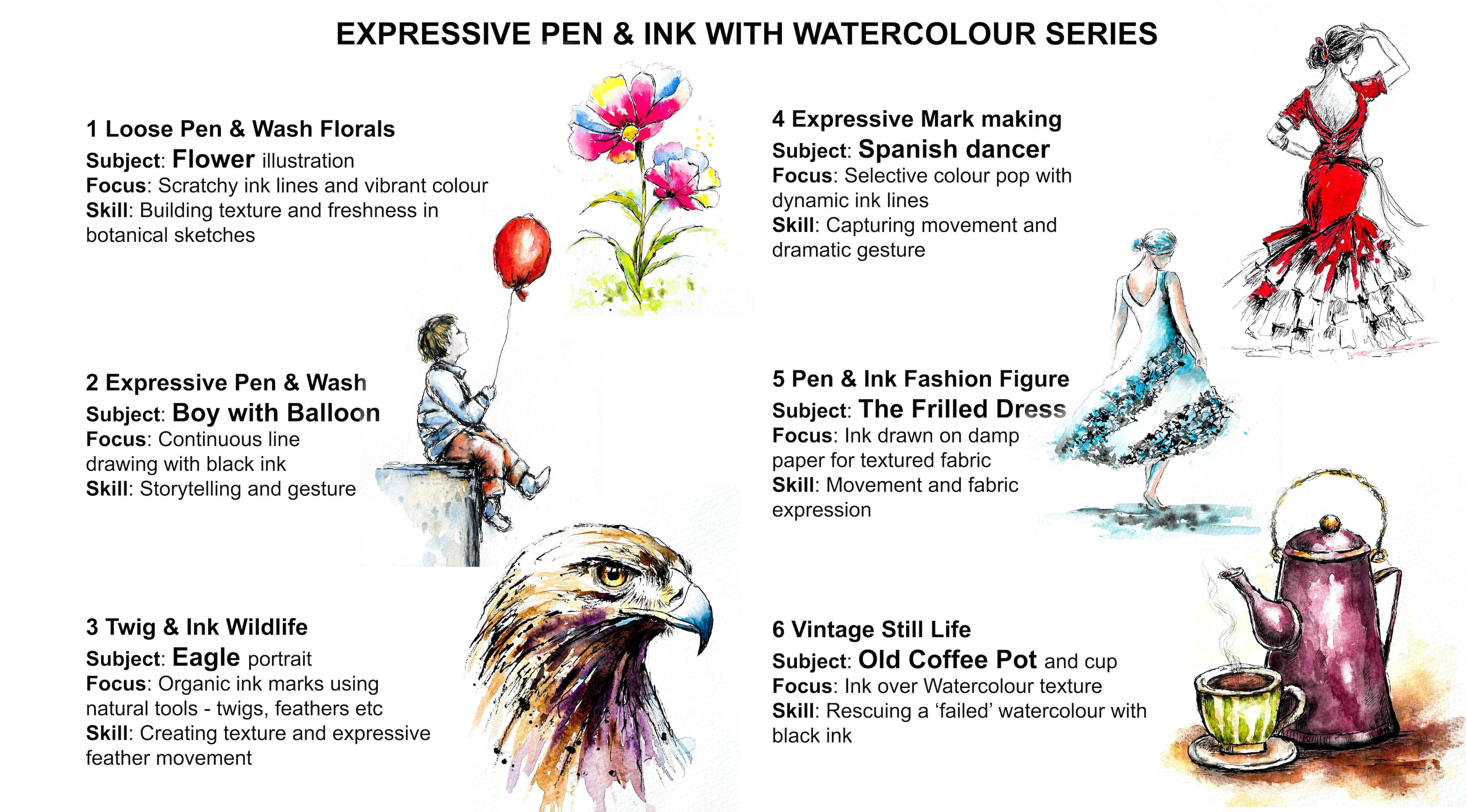
Transcripts
1. INTRODUCTION: Hello, and welcome.
In this class, we're going to create
a lively illustration of an old coffee pot and cup using a simple three
stage technique pencil, watercolor, and ink. We'll apply fresh
watercolour wash to build color and atmosphere, and we'll use black
waterproof pens to add expressive linework,
texture, and definition. As well as a charming
pen and wash painting, you'll have a
versatile technique that you can apply to
many other subjects. It's suitable for all levels, including beginners because I'm going to be guiding you
every step of the way. And I'll be sharing all
the techniques, tips, and tricks that I use in
my own professional work. Last is part of
my expressive pen and ink with watercolor series. And each lesson
contains a new subject, some different techniques, and a few unusual cheap
tools you can use. You don't need a lot to start
with, a few watercolors, two or three black
waterproof pens with different size nibs and
some watercolor paper. There's a copy of the drawing in the project
resources section, which you can choose to
draw free hand or to trace. I am a professional artist, author, and tutor,
and over the years, I've sold a lot of work
across the world and helped hundreds of people to
learn more about watercolor. You can see examples of
my work on my website. My style leans towards
impressionistic and contemporary rather
than photorealistic. I like to explore loose approaches that bring
out the colour, light, and essence
of my subjects. I've tried to
replicate this across all the many other videos
that I have on Skillshare. I'd love to see your
own finished painting, which you can upload through the project and resources tab, and I'll be sure to give you some personal
feedback on it. At the end of the class, you'll have your own beautiful artwork to be very proud of. So let's swizzle our brushes and get on with the painting.
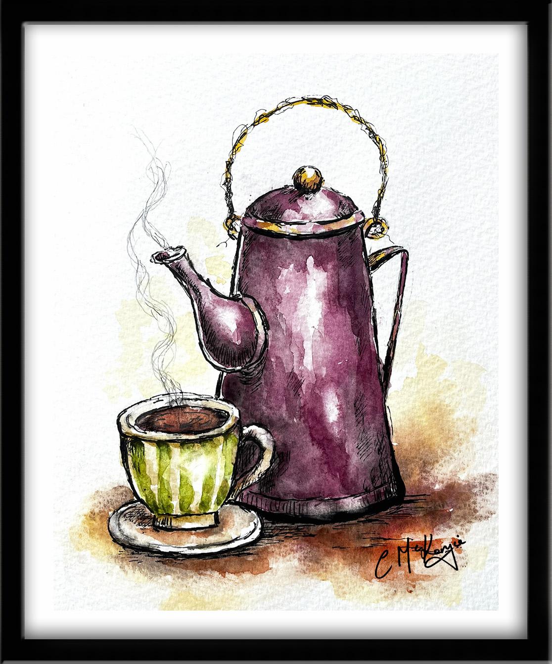
2. Use loose, sketchy pencil lines for the drawing, either freehand or by tracing.: We're going to paint this
lovely old coffee pot using the color wash
first, then pen style. Unlike the usual pen and
ink style, for this method, the watercolor is applied first, and then the pen is
used to bring out all the shapes and areas
which need enhancing. These are the colors and
materials that I'm using, but do feel free to use
any that you already have. I've got a selection of
black waterproof pens, varying in nib size from not 0.1 up to 0.8 or one point not. You can see from
the scribbles in the attached example how they vary in terms
of light, tone, dark tone, and linewidth
your faber Castel pit pens, which are in sepia, go small, fine, medium, and black. It's exactly the same principle
in that all you want is a couple of pens that vary
in tone and line weight. Regarding the
watercolor materials, I've provided lots
more information about brushes,
paints, and paper, et cetera, in a
document that you can download from the
resources section. You'll also find a copy
of the drawing there, which you can choose to
draw freehand or to trace. The drawing needs to be just
a very light pencil sketch. We're not aiming for
perfect accuracy here. Think of this as a guide for the painting rather than
a finished drawing. Keep the lines
light and relaxed. At this stage, the drawing should remain simple
and uncluttered. And once the basic
shapes are in place, we're ready to move
on to the watercolor.
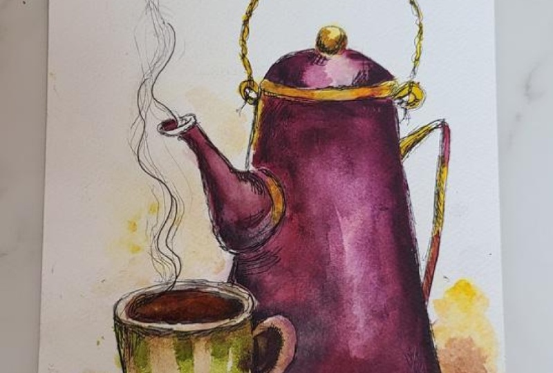
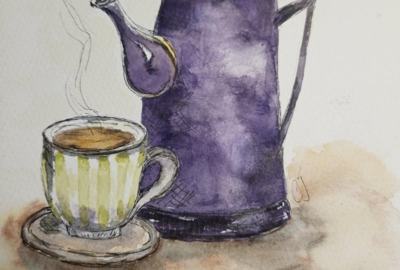
3. Add loose, transparent and expressive washes of watercolour to the coffee pot, cup and foreground.: And I like to begin with loose,
transparent washers. For the coffee pot, I've
mixed a rich warm color. It's a deep reddish violet. It's a color that
I've mixed by adding some purple to a zarine crimson. I'm starting off with
my lightest color, which is handsome yellow medium. That's a warm yellow. And I'm using that to
add a little bit of a gold color to the
knob on top of the lid, the rim just around the lid, and also this wire handle
that goes over the top. Then a couple of small touches on this handle at the back, and also there's a bit of a gilded rim around the
bottom of the spout. So just little touches where the light will be picking
up some shine on them. As I said earlier, you don't have to follow my
colors exactly. You can choose any colors that you actually
prefer or have to hand. For the coffee, inside
the coffee cup, I'm using a mix of colours, some yellow, some of the
reddish violet, and some brown. Placing the darker color around the edges where it will be
more in shadow and intense. I'm going for a
strong black coffee, but if your taste is a latte or a cappuccino or
even a cup of tea, then just paint whatever
liquid you fancy. For the coffee cup itself, I'm using some soft green
because that will be a nice contrasting color
to the reddish violet. Now, I'm going to be painting the coffee pot in
a single color. So I've decided to add a little bit of a pattern
to the coffee cup, again, for a bit of a contrast. So I'm painting it in stripes. Feel free to experiment with stars or polka dots or hearts, whatever you fancy, really. The overall aim is to give this little set still life
a quirky vintage look. Notice that I'm adding
a little extra colour at the top and bottom
of each stripe, and that's to add a bit of a darker tone as the
cup curves round. So we're trying to give it
a three D rounded form. Help that, I've
just used a bit of paper towel to dad some of the paint off in the center of each stripe,
so it's lighter there. I can't do anymore
now on the cup. I need to leave that to dry, so I'm moving over
to the coffee pot. I should have mentioned that I'm actually using the
wet on dry technique. The wet on dry
technique is simply painting wet paint
onto dry paper. It allows for more control, stronger color, and crisp hard edges
where the paint ends. The paint will only go
where the brush takes it. Just like the cup, the pot
is also a rounded form. So we need to think about
adding darker tones and lighter tones to give it a
three D rounded appearance. I'll do that by adding extra color and darker tones at the right and left sides of the pot and keeping
some mid tones towards the center and also a couple
of really strong highlights. Method of getting that
transition from dark to medium to light is to use the blending and
softening technique. To blend and soften a hard edge, you need to use a clean
damp brush to pull the paint away from the hard
edge and blend it softly until the colour disappears into the white of the paper or the underlying wash.
You may need to clean and dry your
brush and repeat the process several
times in order to get that gradual gradation of color until it disappears
into nothingness. As you can see, I'm blending and softening all the paint
in this central area, and as well as softening
it with my brush, I'm also using a bit of paper towel to dab and lift
the paint off here and there. Notice that I'm trying to leave quite a strong highlight
right in the middle. Whilst that first wash
of paint is still wet, I'm going to switch now to
the wet on wet technique. First of all, you
wet the paper with clean water and then
apply wet paint on top of the wet
paper and let it spread into the wet wash. Now, this results in a lovely
diffused effect with soft edges. And because the paint mixes into the wetness of the paper, the color is diluted, and the tone is paler. If several different colours
are used in this way, they will intermix and
blend with each other. In this situation, I didn't actually need to pre
wet the paper with clean water because it was already wet with that
first wash of color. But dropping in all
that extra color around the left and far right
sides and allowing it to mingle with that lighter
underwash has created more definition and tonal value in the overall appearance. Peting that process
now on the spout. So first of all, adding the light underwh using
the wet on dry technique. That's wet paint on dry paper, leaving some little
gaps for highlights, and then adding in another layer of the same color over the top, so wet paint on wet paper. And that's giving me
that nice soft blended, rounded three D appearance. And I can emphasize or intensify that appearance even more
by adding some darker tone, darker color into that wet wash. It is still very wet. If it was drying by now, I'd have to wait until it
completely dried and then rewet it again before doing this because I do
want everything too. I want all these colors to
mingle and blend together. So I'm now dropping in
some black color from my palette quite a
watery consistency because I don't want it
to have black streaks. I just want to add some more shading to
the underlying color. To mention that I
wouldn't normally use a black color on
its own like this. It's only because
I'm trying to give the coffee pot an aged and
vintage old appearance. If I was painting a brand new one straight out of the box, I'd actually mix a
bit of black in with my reddish violet color to
darken it and apply that. So I wouldn't go quite so dark. And if you're at all
nervous about adding the black color or it doesn't
look right when you do it, then maybe use a mixture of the reddish violet
with a darker tone in it. The black that I'm using
is called Mars black, and it's one of the few
granulating blacks, so it does give you a
mottled dappled appearance, and that's helping to
create some texture and, again, some agedness on the pot. I leave the pot now and
go back to the cup, and I'm adding
some dark brown to the inside of the
cup for the coffee, making it a little
bit more coffee like. And then a touch of very
watery brown number on the saucer might look like coffee stains from
years and years of use. A couple of little
touches of black just at the outer edges there where
the saucer is further away, and a little bit of
darker colour just underneath the cup itself
where it's in shadow. And around the inner and outer
rim of the saucer itself. The green stripes that I put on the cup earlier have dried now, so I'm going to add some
very light brown over the top to tie the color of
the cup in with the saucer. Great thing about painting this particular still life image is because it is an old set, we don't have to be too precise. These expressive washers
are helping to anchor the objects and give the painting a relaxed
sketchbook feel. And remember, we are
going to be adding pen and black ink after
the watercolor has dried, where we can redefine shapes, strengthen shadows, and
add some lively texture. There are no set rules about whether you
add the pen first and then the color or the color first and use the pen
over the dry painting. It's a matter of choice and often depends on
the subject matter. I do tend to use
the pen first in most cases and add the
color over the pen drawing. But there are occasions when the color painting is
enhanced with a pen, whether it's just a few marks here and there to help define the shapes or a full line
drawing applied over the color. Starting to add some color over the background
and foreground now. I've added a little
bit of yellow orca to my light yellow to
darken it a little bit. And I'm also using some burnt
sienna, some burnt umber, and I'm going to
add some brown into my reddish violet to darken that into a sort
of a brownish red. Now, the toe needs to be quite
light in the background. As you can see, behind the
coffee pot, it's very pale, because that's further away, so the eye won't be able to register strong colors
at that distance. The foreground,
which is the table that the potting
cup is sitting on, is nearer to us, so the color
here needs to be stronger. I started off with the
wet on dry technique, so applying this foreground
and background paint straight onto dry paper. But now I'm going in wet and wet again, adding the shadows, the darker tones that will be underneath below the cup
and saucer and the pot. And I'm letting those colours mingle and blend on the paper. So we're getting
some nice transition of tone from dark to light, particularly the shadows
underneath the objects. I can add these colors, particularly the
brownish red color that I've mixed to the little
knob on top of the lid, the rim that's going
around the lid, and also this wire handle
that's going over the top. Even with very small shapes, we need to suggest that there is some depth and structure. So just leaving them with one flat color would
not enable that. To intensify the shadows
beneath the pot and the saucer, I'm going in with some
of my watery black paint again and darkening just
the areas below them. If this painting were going
to be completed entirely with watercolor only and I wasn't going to be
using the black pen, then I would leave it
all to dry now and come back and add the definition
with some more watercolor. I am going to leave it
to dry completely now. I probably leave it an
hour or two because even though the paper can
feel dry to the touch, the fibers can still be
quite damp underneath. And that would
prevent the black ink from doing its job properly.
4. Use waterproof black pens to add broken expressive lines, short hatch marks & cross-hatching, to giv: I Now that the painting is dry, we can begin the
most enjoyable part, adding the ink lines. I'm starting off with my fine nibbed no 0.3 black
waterproof pen. I'm using some very scribbly
wibbly wobbly lines going over this wired handle. You don't want to trace
the pencil lines exactly, by using these broken
and expressive lines, we get a lot more energy and character in the illustration. I'm switching to slightly
thicker pens, not 0.5, not 0.8 to reinforce some of the darker
edges and shadows. And particularly
emphasizing the shadow under the little round
knob on top of the lid, and also around the rim. And then to emphasize the
roundedness of the rim, I'm also using some
short hatch marks and cross-hatching to
suggest shadow and form. And you can see already how
much these ink marks help to define the shape of the pot and bring the
illustration to life. I mentioned earlier that I
would normally use the pen and ink first and then add the
watercolor over the top of it. But this method of
using the pen after the watercolor is also very
useful as a rescue technique. Not every painting goes to plan, and it can be really
frustrating when you've spent a lot of time on painting a piece and ended up with something that you're
really not fully happy with either because
you've overworked the layers or you tried something that just didn't work
out successfully, or it sometimes can be just the tricky
nature of watercolor. And very often, we just toss these paintings to one side
and forget about them. But if that happens again
to you in the future, just try using a pen
like we are doing now over the painting
to kind of reinvent it, add the missing details, or just have some fun with the lines and create a
more abstract piece. With both methods,
you can go back into the paintings at any time with the pen or with more color, add more details,
vary the lines, or highlight areas
which might have become a little lost
with the color. And your washers can be tight and controlled or
they can be loose, or they can have big splashes of color or wet into wet color. I think that's the great
thing with pen and ink that there are so many different ways
that you can use it, none of which are
right or wrong, and you just really need to find the one that
works best for you. I do prefer to use sketchy broken lines rather than very smooth
continuous ones. I like to focus on energy
rather than precision. They give a more messy
or organic appearance. And the lines can consist
of dots or dashes, rough textured strokes,
some strokes overlapping, some going outside of the pencil line or short skipping pen strokes to
create a sense of movement. There is a style called
the continuous line, and that is a very
interesting line because it's a style where the pen stays on the paper
for the whole time. So you're actually
drawing without lifting the pen from the paper. And it does create a lovely
spontaneous flowing image that captures contours
rather than exact details. It's often referred to as
taking a line for a walk, and it's worth practicing a bit because it does give
you a certain amount of freedom when you're
concentrating on looking rather than the
results and perspective. I do have a lesson here on Skillshare that focuses
on that particular style, the continuous line style. It's called The Boy
in the balloon. It's a lovely little image. So you might want to take a
peek at that if you want to try out a completely different method of applying the ink. Getting back to this painting, you can see that I'm
applying quite a lot of cross-hatching and hatching on the lower part of
the coffee pot. I've moved on to add some more definition
to the coffee cup. Don't forget to keep switching between your different
nibbed pens. So if you want just
some mild shading, just a light
application of shade, then use the not 0.3 with the finer and slightly
fainter lines. Then 0.5 will give you a
good sort of mid range, and then a 0.8 or a
one point naught, that'll give you the really
dark shading and dark lines. In the same way that we develop
tonal values with paint, we also need to develop that light and dark appearance with our black
pens or black ink. Because we're applying
the black ink over the top of the watercolor
in this situation, it's not absolutely essential
that it's waterproof. But I still think it's desirable
because for one thing, you would get more
longevity from it. And for another, you might
decide after you've put all your black lines on and black ink on that you want to add a little bit
more watercolor. So you definitely
would want it to be waterproof in that situation. Although you can use
your black pens on many, many different types of paper, such as very smooth
cartridge paper. I do still prefer to use watercolor paper with
its various textures. Watercolor comes in
three different types. There is rough,
which as it sounds, is a very rough textured,
dimpled surface. It's a great texture for
subjects like landscapes. And if I was using pen and ink, I'd probably not use pens, which would be
difficult to glide across the rough surface. I'd probably use a small
bottle of black ink and a twig or a dipping pen or
some other such instrument. Hot pressed watercolor paper is very similar to
cartridge paper. It's very smooth, but it does allow for various
watercolor techniques. Hot Pressed watercolor paper is similar to cartridge paper
in that it's very smooth. So I found that a difficult
one to use with watercolor. So I tend to go for what
is called knot NOT, and that simply means that
it's not rough and not smooth. I've tried lots of
different manufacturers, but I tend to stick most of the time with Bockingford knot, watercolor paper for my pen
and inkwork because it's textured surface handles both pen and watercolour
wash extremely well. I've built up quite a lot of definition on this painting now. A few more dots,
dashes and squiggles, and I think I will be
finished with the black pen. But I am going to switch to a graphite pencil to draw the steam coming
from the pot and cup. We're trying to
capture that fluid wispy movement of hot air condensing into visible
droplets and to create soft, irregular lines
that suggest heat and motion rather
than a solid object. So avoid columns of lines. We don't want the steam to
look like a solid pillar. Vary the space in between
you wave your lines, making them closer together near the cup where the heat is most concentrated and spread
them out as they rise. Also, gradually lighten
your pencil pressure as you move upwards so that the steam looks
as though it's dissipating and eventually
disappearing into the air.
5. Add stronger washes of watercolour where needed to intensify depth and form.: Your painting might look
absolutely fine just as it is, but mine is looking
still a bit wishy washy. So I'm going to show you two
methods to address that. First of all, I'm using some magic sponge to lift the
color from the coffee cup, which I don't feel is
quite the right hue. Then once that color is lifted, I can go back in with some nice, rich brown coffee colour. Now, because this
is a new color, I need to add it somewhere
else in the painting, otherwise it will look a
little bit out of kilter. So I'm adding a little bit of that rich brown color to the shadow beneath
the coffee pot. The color, by the
way, is burnt sienna. It's a much warmer brown
than the burnt umber. And I'm adding this on with
a technique called glazing. Glazing is simply adding
multiple layers of thin, transparent washers of
paint on top of each other, allowing the layers
below to shine through. Glazing is used to add
richness, visual interest, or depth of color,
and your layer of glaze may cover all or just
a portion of the subject. The important thing is that
each layer of paint must be completely dry before
applying the next one. Otherwise, you will get
the pigments coming together and creating
the dreaded mud effect. I'm applying exactly the
same reddish violet color that I painted on
the pot previously. But you can see how
this additional glaze or layer of paint is
adding richness and depth. So you don't always
need to put on a darker color to
enhance the tone. Just another layer of the same color will
often do the job. When you're glazing, try to use soft gentle strokes so that you don't disturb the
underlying layers of paint with too much pressure. And you can apply a glaze at any point in the
painting process or as a final adjustment to increase color
harmony or mood. You can just run a
clean damp brush along the edge of the
glaze to soften it. And watercolor
glazers can be soft and subtle or strong
and dramatic, depending on the effect
you want to create. To avoid the cup
looking a little bit more washed out than the pot, I'm also glazing over the green stripes with a little bit more of
exactly the same green, and that, again, is
strengthening the tone and just giving it a
little bit more vibrancy. I want to recover a
few tiny highlights, so I'm using my little piece
of magic sponge again. I've dipped it into some
clean water, squeezed it out, dried my fingertips
on some paper towel, and then just rubbing a little
bit of that paint away, particularly on this pot. If you don't have
some magic sponge, you can do it with
a thirsty brush. So just scrub into the
paint where you want to lift a highlight with
a clean damp brush, leave it a tecond
or two and then dab off the paint with
your paper towel. But this is where you need
to make an assessment of your own painting
and decide what final details are
needed and what is not, what's best left alone. If you can't quite decide, leave it be for a
couple of hours and look at it again with
a fresh pair of eyes. The danger, of course, is fiddling too much
and overworking, so I'm going to call
my painting finished. Now, don't forget to upload your own painting through the
project and resources tab. After all your hard work,
I'd really love to see it, and I'll be sure to give
you some personal feedback. This class is part of my expressive pen and ink
with watercolor series. Each lesson focuses on
a different subject, introduces some new techniques, and even a few unusual
tools you can use. You can follow me on Skillshare to get to hear
about new classes. And if you could leave
me a short review, that would be really great. If you've enjoyed this class, it might encourage you to look at some of my other videos. I've got lots of lovely
subjects loaded with more tips and techniques to help you with your own
exciting art journey. In the meantime, thank
you for joining me, and I look forward to seeing you next time, Happy painting.
6. FINAL THOUGHTS: Well done on completing the
old coffee pot with pen and wash. We began with a light pencil sketch to
establish the main shapes. Then we added loose
watercolour wash for color and atmosphere. And finally, we finished the piece with black
waterproof ink using different nib sizes to add detailed shadows and
expressive linework. As well as using the scratchy
and broken line technique, we also use black ink to add some shading for tonal
value and texture. And we switch back to
using a graphite pencil to draw the steam emerging from the cup and the
coffee pot spout, so it would look more misty. But forget that
using pen and ink at the final stage
is a great way to revive watercolor paintings that may feel unfinished
or unsuccessful. I'm really looking forward to
seeing your interpretation. The class is part of
my expressive pen and ink with watercolor series. And each lesson
contains a new subject, some different techniques, and a few unusual cheap
tools you can use. Now, don't forget to upload your own painting through the
project and resources tab. After all your hard work,
I'd really love to see it, and I'll be sure to give
you some personal feedback. And if you've
enjoyed this video, do have a look at my other
classes on Skillshare, which are packed
with more tips and techniques to help you
on your own art journey. If you click the follow button, you'll be able to follow me, and then you'll be the first
to know when you upload a new video or any
exciting updates. And if you could
just take a moment to leave me a short review, that also would be really great. In the meantime, thank
you for joining me, and I look forward to seeing you next time, Happy painting.
 Carrie McKenzie, creating painted visions