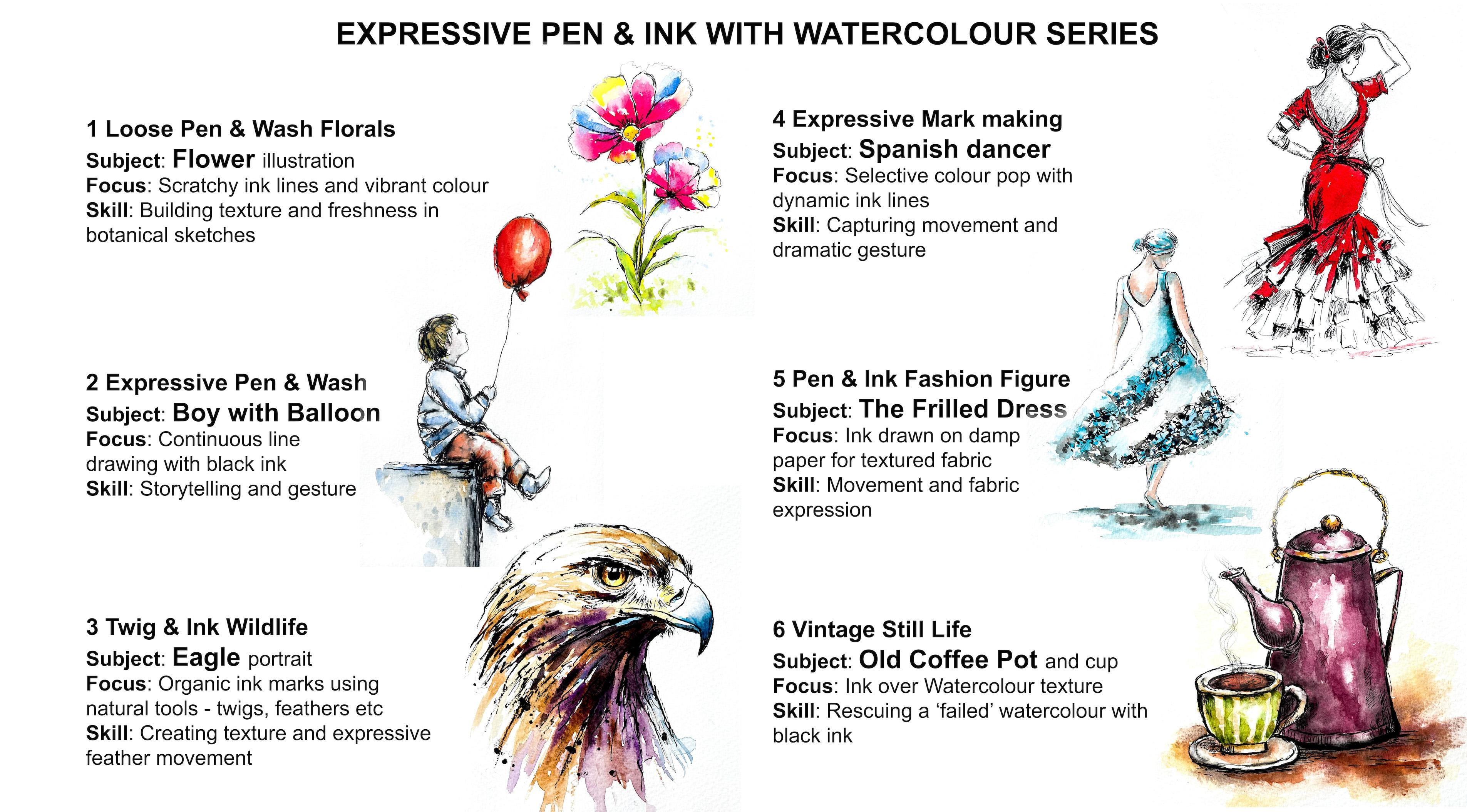
Transcripts
1. INTRODUCTION: Hello, and welcome.
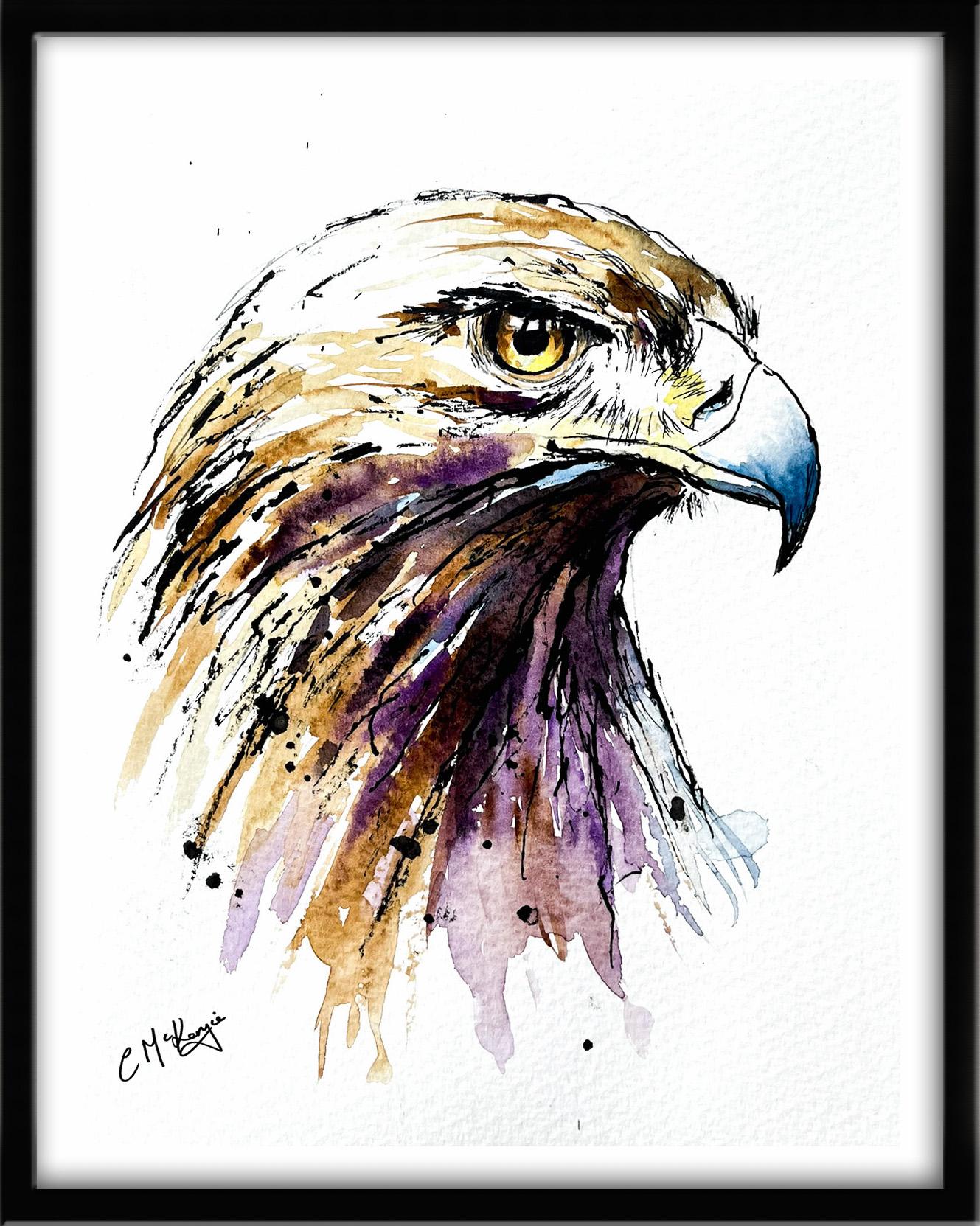
In this lesson, we're going to create a bold and expressive eagle portrait using a slightly
unconventional drawing tool, a twig or a feather. The technique
produces beautiful, irregular marks that feel
natural and energetic, which makes it perfect for
painting birds and wildlife. And we'll bring the
whole piece to life with loose watercolour wash that enhance the movement
of the feathers. The goal isn't precision, it's character and energy. It's suitable for all levels, including beginners because I'm going to be guiding you
every step of the way. And I'll be sharing all
the techniques, tips, and tricks that I use in
my own professional work. Last is part of
my expressive pen and ink with watercolor series. And each lesson
contains a new subject, some different techniques, and a few unusual cheap
tools you can use. You don't need a lot to start with just a few watercolors, two or three black
waterproof pens with different size nibs and
some watercolor paper. And I'll show you
how you can use some really cheap
and unusual tools like a twig or a feather
with some black ink. There's a copy of the drawing in the project resources section, which you can choose to
draw free hand or to trace. I am a professional artist, author, and tutor,
and over the years, I've sold a lot of work
across the world and helped hundreds of people to
learn more about watercolor. You can see examples of
my work on my website. My style leans towards
impressionistic and contemporary rather
than photorealistic. I like to explore loose approaches that bring
out the colour, light, and essence
of my subjects. I've tried to
replicate this across all the many other videos
that I have on Skillshare. I'd love to see your
own finished painting, which you can upload through the project and resources tab, and I'll be sure to give you some personal
feedback on it. At the end of the class, you'll have your own
beautiful artwork to be very proud of. So let's swizzle our brushes and get on with the painting.
2. Start with a loose pencil outline to establish the main structure: We're going to use black ink and watercolor to create this
rather handsome eagle. I'm going to guide you
through the whole process, starting with the light
pencil outline and then a very fun way of applying the dark ink and
finally the watercolor. These are the colors and
materials that I'm using, but do feel free to use
any that you already have. Now, you can use your
black waterproof pens, if that's all you have to hand, but I wanted to show you
some different tools you can use to create a much
more energetic appearance. I've got a bottle of
Black Indian ink, and I can use all
manner of tools to dip into that ink to
create the lines. It's a very organic
style that lends itself beautifully to subjects like this impressive Eagle. I've got a bottle of
Black Indian ink, and I can use all sorts
of different tools to dip into that to create
the black ink lines. As well as using a
standard dipping pin, which comes with
different size nibs, you could use an old twig, a feather, a bamboo stick, anything really
that will dip into the ink and make
scratchy organic marks. I've provided lots
more information about brushes,
paints, and paper, et cetera, in a
document that you can download from the
resources section. You'll also find a copy
of the drawing there, which you can choose to
draw freehand or to trace. I'm starting with a
light pencil sketch. I've focused only on the major shapes of
the eagle's head, the curve of the skull, the
strong line of the beak, the position of the eye. The neck feathers are suggested with very loose
downward strokes, and you'll notice I've
not drawn every feather. I've just indicated the
direction that they flow. Simple structure gives
us the guide for the ink stage without locking us into tight
detail too early.
3. Apply ink using a twig, feather or bamboo stick in an organic, textured way. : Now comes the most
expressive part. Instead of a traditional pin, I'm dipping a twig that
you could use a feather or a bamboo stick into the
waterproof black ink. And because these
tools have rough, uneven edges, they create wonderfully unpredictable marks. I've started with the feathers at the back of his
head and neck, and you'll notice the lines naturally break and
vary in thickness. And that's exactly what we want. It creates a lively
organic texture. Some strokes are dry and
some are heavier with ink. That variation
suggests layers of feathers without needing to
draw them all individually. Unlike using a black waterproof
pen, I do, of course, have to pause and reload the twig with ink
every now and again. Occasionally, you'll find that the twig will rub
against the paper, and you might get
little splatters. But that all adds
to the spontaneity, so don't worry
about that, either. I've worked my way
around the top of the head and just coming
on to the beak area now. There's a few little
feathers just sprouting up behind the beak on the other side of his head. The nostril, of course,
will be very dark, so I'm painting that
t of that black, but leaving a little bit of a white sliver
towards the front. And now that I'm
doing the feathers going up the front of his
head here over the eye, these will be shorter, so
I'm using shorter strokes. If there's any areas
that you're not comfortable using the twig, such as when we come
on to do the eye, you can switch over to using the waterproof
pen in between. How you arrive at the end result is a matter of personal
choice, really. For the moment, I'm
sticking with the twig because it's actually got quite
a good point on this end. And if I twist it and turn it, I can either get a very fine
line or a thicker line, depending on which
way I'm holding it. As you can see, just to the right side of my
little bottle of ink, I have actually got another twig there just in case I need
to replace this one. Sometimes the ends
do go a little bit soggy with repeated
use of the fluid ink. So it's always good to
have a couple of backups. This one is doing quite well, and I'm still getting a
nice little point on it, which I can use for these very
fine feathers on his face. I do find this part of the process quite
meditative, really. There's something about making repetitive marks over and over, but in slightly different ways that's quite restful
for the soul. One of the key
characteristics of this style is spontaneity. The primary goal is
actually to escape perfection by using tools that are more
difficult to control. It's much more about mark making because it
focuses on varied marks, dots, splatters, and
organic strokes, than just clean lines. The style is actually
a modern version of ancient folk arts, such as India's Madabani
or Matil painting, which traditionally use twigs, matchsticks, and fingers
instead of brushes. You can, of course,
use a knife to cut the twig end
and make it into a flat italic like nib or a very narrow end
for narrower lines. And some artists who are
dedicated to this style of inkwork actually have
a full set of twigs, which they've sharpened or flattened to many
different sizes, so they have a twig
toolkit, really. When you've completed
this little exercise, I would bet my bottom dollar that next time you
go out on a walk, you'll be looking all over for little dried twigs that you can pop in your
bag and take home. I'm twisting and turning this little twig in my hand
and using the flat end, it's got a broad flat end. And that's really useful for creating some really dark lines. All I have to do is
twist it sideways, and I've got quite
a nice point for these little narrow lines
that keep popping up. There isn't really a
precise science for this. It's more intuitive, really. And the only way
to get along with it is to pick up your twigs, pick up your ink, and have a really good
practice with it. Having said all that, there are a few little areas that I do want a little bit
more control over. So I've switched to a dip pen. Unlike the standard
waterproof pens, which have a constant flow
of ink with a dip pen, you do have to do exactly
what it says in its title and dip it into the ink to
transfer the ink to the paper. So in that sense, it's not much different
to the twig style. And because it has
a metal nib rather than the felt tip in a
commercial waterproof pen, you are still getting quite
a scratchy organic effect. But, of course, you've
got that little bit more control with the dip pen than you have over a twig or a feather or even
a bamboo stick. And because the focal point
of this composition is the eagle's eye and also there's some quite small
shapes in this area, I do want to make
sure that I get this particular part of the eagle as right
as I possibly can. There's a few tricky
little highlights going across the
iris and the pupil. So I've just added a little bit of black
in and around them. The pupil, of course,
is very black, and there's also a very black
line going around the iris. Immediately underneath
the eyebrow, the brow bone, that is, of course, more in
shadow because of that overhanging brow bone. So I've added some quite
dark lines in there as well. And hopefully you can see from the video close up that although I've got a little bit
more control and I'm getting the lines in
the right places, I'm still not going
for perfection or trying to make
them extremely neat. Once you start going
with this style, you don't want to mix
it up and make it look different in different
parts of the composition. I'm going to apply a
bit of spatter now to break up some of these lines and add a little
bit more texture. Now, some people like
spatter, some people don't, it's always your choice what you want to use and what
you want to discard. I think we're almost done now, but I want to just tidy up
the eye a little bit more. I've not got quite the right
shape of the dark pupil. Although we are using
a very loose approach, there is a difference between
looseness and carelessness. So it's just worth standing
back, taking a bit of time, and assessing, are there any details that do need a
little bit of fine tuning. Of course, you've got to balance that with not
overworking the subject. So let's move on to
the watercolour wash.
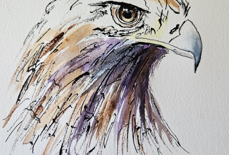
4. Add loose watercolour washes that enhance the movement of the feathers.: And beginning with the eye, using my warm yellow to capture
that piercing eagle gaze. Just touched it in at the
lower part of the iris. And because I want
the same color to appear elsewhere in
the composition, and I'm adding a few
little touches of that light yellow to
the side of the beak. Addition to the yellow, I've got some yellow ochre, which is a more earthy yellow. So I've just added
a little touch of that to the side of
the beak, as well. And then for the top
part of the iris, which is in shadow from
the brow bone above it, I'm adding in a little
touch of n sienna. I'm using a small brush with a very good point because I
want to make sure that where I place the paint in this small eye area is as
accurate as it can be. The rest of it, I'm going
to be painting much looser. Moment I'm using the
wet on dry technique, that's wet paint on dry paper because it does
allow for more control, stronger color and crisp
edges where the paint ends. The paint will only go
where the brush takes it, so I've no danger of the eye color blending or
seeping out elsewhere. Then moving on to the beak, I'm applying a soft
wash of blue gray. Paine's gray is a good gray because it is more
on the blue side. And that will
suggest this smooth, more shiny surface that
we've got on the beak. And I do need to soften the paint as it moves
further up the beak. Otherwise, I'll be left with a hard edge between color
and white unpainted paper, which won't look natural. To blend and soften a hard edge, you need to use a clean
damp brush to pull the paint away from the hard
edge and blend it softly until the color disappears
into the white of the paper or the underlying wash.
You may need to clean and dry your
brush and repeat the process several
times in order to get that gradual gradation of color until it disappears
into nothingness. It may sound like quite
a simple technique, but in fact, it is quite a
difficult one to master. So do practice it
because it will make a massive difference
to all your paintings. To get back to this painting, I've added a touch of cerulean
blue to my paints gray, and I've just added
a few strokes of that to the underneath
of his neck. Then moving on to
the top of his head, I'm using my yellowOca. If you don't have yellow Ochre, you could use raw sienna. The important thing
is not to fill it in completely like a
children's coloring book. I'm leaving little bits of unpainted paper in
between my strokes. When it comes to the feathers at the back of the
head and neck, now this is where we can
be really expressive. It's in warm, earthy tones like the Burts Ia that I've got, also the yellow Ochre, and I'm allowing those strokes to flow loosely
down the neck area. The tone is still quite light. My paints are about the
consistency of tea or milk. So I don't want anything
too dark at this stage. There's quite a lot
of dark tone on the paper from when we
applied the black ink. And that is going to remain the darkest tone in the
whole of the painting. While the paint is still wet, I'm introducing some darker
browns into the shadow areas, and I'm letting the
colors mix naturally on the paper rather than
brushing them too much. I'm actually just
using the tip of my brush and kind of
drizzling the paint in, letting the wetness
that's already on the paper soak up the color
from the tip of my brush. And I'm switching between
different brushes, so I've got my quite
large size ten or 12 and my very fine
pointed rigor brush. Actually, it's a Chinese brush. They have great points. This throat area below the beak, is going to be in
a lot of shadow, not catching the
light hardly at all. So I've added some strong
purple to my burnt umber, so I've got a brownie purple, and I'm stroking that in again, again, sweeping strokes,
nothing too precious. You can see how the ink lines kind of guide the watercolor, but don't restrict it. And the thing is with
this kind of style, is that you can actually
stop at any point. Obviously, I'm carrying on adding some more
watercolor here. But if you like the way that
it looks right as it is now, then there's no reason
why that won't make a perfectly acceptable
finished painting. I've stroked a little bit of
that purply brown color that I've used for the throat area onto the bottom of
his face, as well. If I introduce a different color part way
through a painting, I do like to put it in
more than one place so that we get sort
of a harmonious, more unified look in
the color palette. I've zoomed in the camera
so that you can see the additional detail that
I'm adding now to the eye. I'm actually using
a beauty brush. It's a nail brush that
can be used to put small patterns on people's
fingernails and very cheap, but I have found a really
useful little brush for this very fine detail. I particularly want to add a little bit more dark color
to the top of the iris, where it's in shadow from
the brow bone above. And adding this darker
color will actually make the lighter color
at the bottom of the iris glow out even more, which means that we really do start to get that
glassy eyed stair. I'm just going to add a
couple of tiny touches using some black paint
to the top part of the eye and just
around the iris rim, and then I'll stop fiddling. I don't quite like
it just as it is, but I'm going to
take a deep breath and add a little bit more drama with some purply black paint just underneath
this throat area. I think it needs a
little bit more contrast and zing in the tonal values. Now that I've added
this dark tone to the throat and neck area, I am mindful that the tip of the beak is looking a
little bit insipid. So I've picked up a
little more of that pains gray that I used earlier with
the cerulean blue mixed in, and I'm adding another layer of that to the tip of the beak, using the blending and
softening technique that we used earlier
to soften that in. It's important to stop before the painting becomes overworked. So leave it to dry, then pop it into a
mountain a frame, and you'll be amazed
how good it looks. Now, don't forget to upload your own painting through the
project and resources tab. After all your hard work,
I'd really love to see it, and I'll be sure to give
you some personal feedback. This class is part of my expressive pen and ink
with watercolor series. Each lesson focuses on
a different subject, introduces some new techniques, and even a few unusual
tools you can use. You can follow me on Skillshare to get to hear
about new classes. And if you could leave
me a short review, that would be really great. If you've enjoyed this class, it might encourage you to look at some of my other videos. I've got lots of lovely
subjects loaded with more tips and techniques to help you with your own
exciting art journey. In the meantime, thank
you for joining me, and I look forward to seeing you next time. Happy painting.
5. FINAL THOUGHTS: Well done on painting our bold and expressive
eagle with pen and wash. The pencil gave us
the foundation. The ink created the
organic texture, and the watercolor added
atmosphere and life. How did you get on with using
the twig and ink technique? It's a great tool for
energetic mark making. You can use bamboo sticks, feathers, or even
dried plant stems. They all produce unique marks and have a slightly
different personality. We used a few different
watercolor techniques, especially painting
is glassy eye. I'm looking forward
to seeing your Eagle, and do let me know if you
use any other unusual tools. The class is part of
my expressive pen and ink with watercolor series. And each lesson
contains a new subject, some different techniques, and a few unusual cheap
tools you can use. Now, don't forget to upload your own painting through the
project and resources tab. After all your hard work,
I'd really love to see it, and I'll be sure to give
you some personal feedback. And if you've
enjoyed this video, do have a look at my other
classes on Skillshare, which are packed
with more tips and techniques to help you
on your own art journey. If you click the follow button, you'll be able to follow me, and then you'll be the first
to know when you upload a new video or any
exciting updates. And if you could
just take a moment to leave me a short review, that also would be really great. In the meantime, thank
you for joining me, and I look forward to seeing you next time, Happy painting.
 Carrie McKenzie, creating painted visions