Transcripts
1. INTRODUCTION: Hello, and welcome.
In this lesson, we're going to create a light and expressive
figure illustration using pen, ink and watercolor. We'll be using
waterproof black pens to build variation and
character in the lines. We'll use a slightly
different technique for the flowing
frills of the dress, using the humble paper
clip on damp paper. We'll complete the piece with loose watercolor
washers to bring softness, color, and atmosphere. And our focus will be on keeping everything
fresh and fluid. It's suitable for all levels, including beginners because I'm going to be guiding you
every step of the way. And I'll be sharing all
the techniques, tips, and tricks that I use in
my own professional work. The class is part of
my expressive pen and ink with watercolor series. And each lesson
contains a new subject, some different techniques, and a few unusual cheap
tools you can use. You don't need a lot to start
with, a few watercolors, two or three black
waterproof pens with different sized nibs and
some watercolor paper. But I'll show you a
magical technique with a paper clip
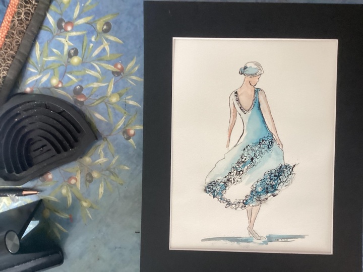
and a water sprayer. There's a copy of the drawing in the project resources section, which you can choose to
draw free hand or to trace. I am a professional artist, author, and tutor,
and over the years, I've sold a lot of work
across the world and helped hundreds of people to
learn more about watercolor. You can see examples of
my work on my website. My style leans towards
impressionistic and contemporary rather
than photorealistic. I like to explore loose approaches that
bring out the color, light, and essence
of my subjects. I've tried to
replicate this across all the many other videos
that I have on Skillshare. I'd love to see your
own finished painting, which you can upload through the project and resources tab, and I'll be sure to give you some personal
feedback on it. At the end of the class, you'll have your own beautiful artwork to be very proud of. So let's swizzle our brushes and get on with the painting.
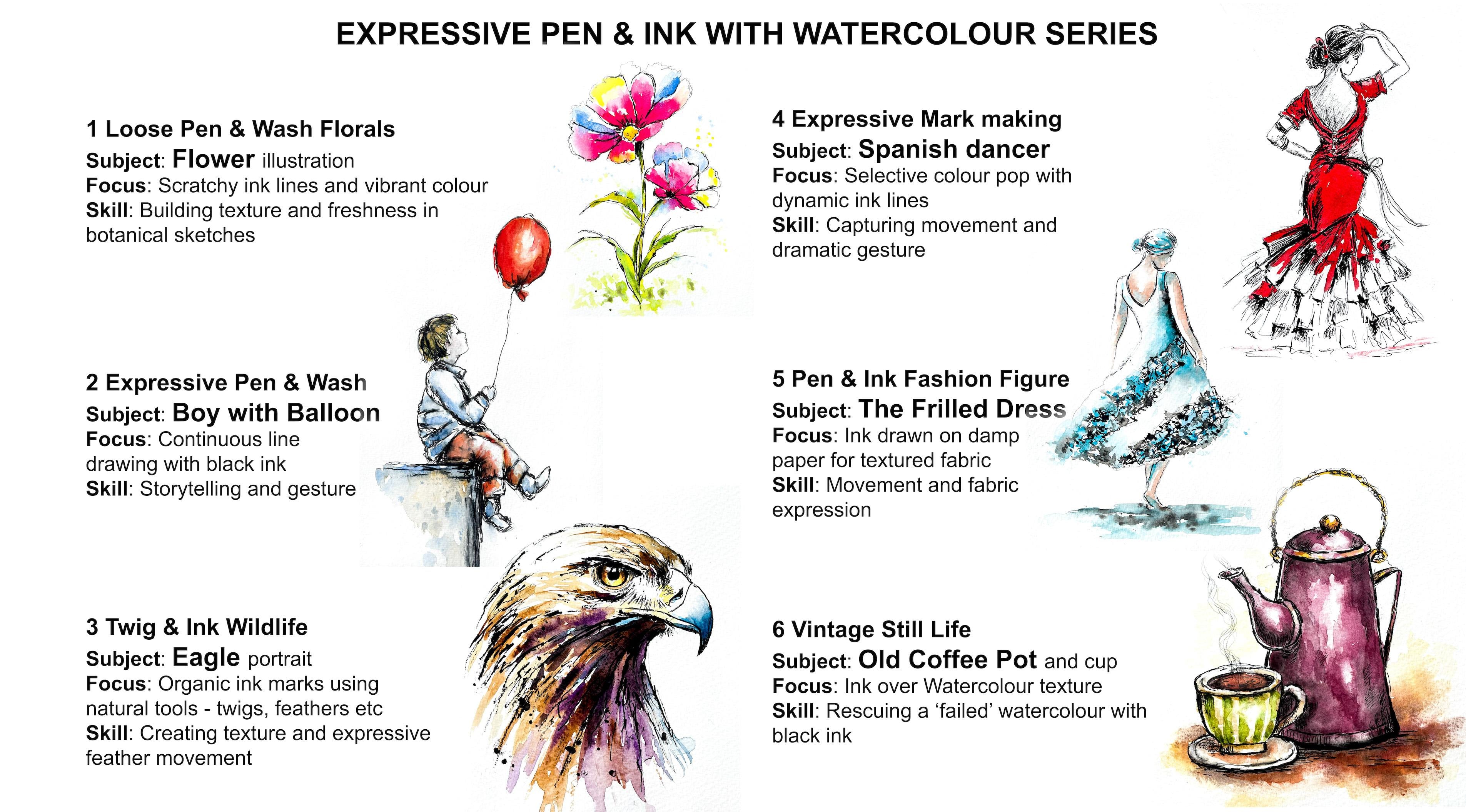
2. Lightly sketch the figure with pencil - don't overdraw.: We're going to create
this light and expressive fashion
figure illustration in three stages pencil,
ink and watercolor. These are the colors and
materials that I'm using, but do feel free to use
any that you already have. I've got a selection of
black waterproof pens, varying in nib size from not 0.1 up to 0.8 or one point note. You can see from
the scribbles in the attached example how they vary in terms
of light, tone, dark tone, and linewidth
your faber castle pit pins, which are in sepia, go small, fine,
medium and black. It's exactly the same principle
in that all you want is a couple of pens that vary
in tone and line weight. You'll also need a small bottle
of black waterproof ink, a paper clip, and a small water spray with
an adjustable nozzle. Regarding the
watercolor materials, I've provided lots
more information about brushes,
paints, and paper, et cetera, in a
document that you can download from the
resources section. You'll also find a copy
of the drawing there, which you can choose to
draw freehand or to trace. The drawing focuses
mainly on gesture, the curve of the back, the
tilt of the shoulders, and the flow of the dress. The figure is drawn from behind, which allows the
sweeping movement of the skirt to become the main
feature of the composition. The lower edge of the skirt
is drawn very loosely because this area will later
become textured with ink. The key here is not to overdraw. The pencil sketch should
simply guide the ink stage. And once the movement of
the figure feels balanced, the sketch is finished.
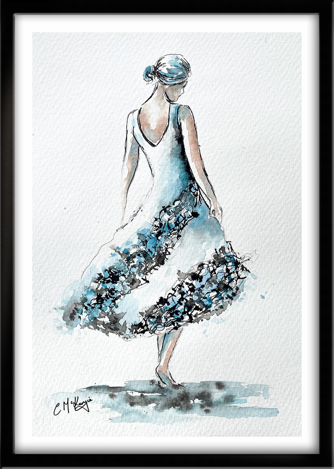
3. Use black waterproof ink pens with different sized nibs, and an unwound paper clip for special effec: Now I've switched to
waterproof black pens with different size nibs. Using a fineer nib, I begin around the upper figure, outlining the head,
hair, shoulders, and arms with light
confident lines. These areas need a
little more control to maintain the
elegance of the figure. I'm varying the pressure
slightly so that the lines feel natural
rather than mechanical. It's important to be
sure that the pens you're using are
labeled as waterproof and not water resistant
because the latter will still have some smudge ability when you apply the wash of
watercolor over it. And in that situation, you'll get a lot of
gray color bleeding in to your nice
fresh watercolors. Even when using waterproof pens, you still need to
leave a little bit of time for that black ink to dry completely before you add your wash of
watercolor over it. Once it is dry, the
blacking will remain visible crisp black
dark lines underneath the colorful wash. Now that I've got my
light outlined down, I've switched to a thicker nib. I think it's a 0.5 this one. I'm mindful of
where I need to add stronger black color
where the shadows are. So here at the back of the
head and the hairline, where it goes into a
little bun at the back, and some of the lines at the furthermost
part of the figure. I like to build the
dark tones up in stages rather than going
for it all at once, because once you've got the black waterproof ink
on, it's on for good. I'm using small scratchy
strokes because the focus is on energy
rather than precision. I'm not drawing it in one
smooth continuous line. I'm leaving little breaks
in between here and there, because that also helps to create a sense of
movement and energy. I'm adding some dark color where the dress is in shadow from
the right arm above it. I also want to emphasize the curve on the left
hand side of her back. Regarding the legs and feet
at the bottom of the figure, I don't really want those
to stand out too much, so I'm going to apply very
minimal ink to this area. I'm going to show you now
a different technique for adding the frilliness in the bottom half of the dress. First of all, I'm
masking the areas of the figure that I don't want to be affected by this technique. So the top half of the body and the lower part
where the legs are. And then I'm using a water
sprayer to just give a quick sprit over this
bottom half of the dress. You need to just
check the nozzle that it is spritzing
and not spurting. What you want is a
very fine mist of little bobbly wet drops
falling onto the paper. So little bits of paper
are going to be wet or damp and other bits of the
paper are going to be dry. And then I'm using an
unwound paper clip, dipping it into a
little bottle of black waterproof Indian ink and scribbling that color around in this
mottled damp wash. I did try it a minute ago with
the waterproof black pen, but I found that it
just made the end of the nib soggy and
it stopped working. So that's why I've
switched to this method, which seems to be
working really well. The ink begins to spread and soften as it touches the
small water droplets, and it creates beautifully
irregular marks that suggest layers of fabric. Small clusters of lines and marks begin to form
the decorative frills, and the result is a
mix of crisp lines and soft ink blooms that give
the dress energy and depth. You haven't tried this
technique before. It might be an idea to practice it on a bit of
spare paper first. But who would have thought
the humble paper clip could give us such
a lovely result? Unlike a brush, it doesn't
hold a lot of ink or paint, so you do have to
keep dipping it into your ink well quite a few times. But I really like this sort of more scratchy
effect that you get with the paper clip than
you would with a brush. But if there are any
little areas that aren't quite behaving
as you want them to do, you can always switch to a rigor brush and
just use the tip to kind of trickle some of that black ink into
the missing spots. The paper's still wet, so I can now move on to doing exactly the same process on this lower frill at
the bottom of the dress. If you do get a blob of black
ink that you don't want, you can do what I've
just done now and dab it off while it's still wet
with some paper towel. Because the papers had chance to dry a little bit, actually, the black ink isn't spreading quite as much as it did
on the previous frill, so maybe I should have given
it an extra spurt there, but what I can do is use my rigor brush again
to just tease some of those areas so it
becomes a little bit more uniform
like the top frill. I'm not actually adding any
more black ink at the moment. I'm just smudging what's already there with
my damp brush, so I'm getting more of those mid gray tones in and amongst. I'll add a little bit of mid
gray light gray shading to the bottom part of the dress
just along the edge there. And that'll help to just tie these two frills in together and give this depth really
to the material. When you discover
these techniques and they work out well for you, it's always tempting to
carry on and overwork them. So I'll stop now
and let it all dry completely before moving on
to add the watercolor wash.
4. Mix skin-tones with watercolour for the figure, and light & dark tones for the dress to create depth: I've mixed up a
flesh colour using some permanent rose and yellow ochre and a tiny
touch of cobalt blue. I'm adding that color to the skin areas using the
wet on dry technique. The wet on dry
technique is simply painting wet paint
onto dry paper. It allows for more control, stronger color, and crisp hard edges
where the paint ends. The paint will only go
where the brush takes it. I'm mixing a slightly
darker skin tone, same colors, but slightly
thicker consistency. And I'm using this
darker color to add some shading where
the skin is in shadow. First of all, you
wet the paper with clean water and then
apply wet paint on top of the wet
paper and let it spread into the wet wash. Now, this results in a lovely
diffused effect with soft edges. And because the paint mixes into the wetness of the paper, the color is diluted. In this case, of course, I didn't actually need to pre wet the paper because it was already wet from the first skin tone layer,
the light skin tone. Adding some tonal variation to any shape gives
it a three D effect, and more rounded form, and that's especially important when we're creating
a rounded figure. Notice that I'm not filling in this right arm or the left
arm completely with color. I am leaving slivers of unpainted paper at the far
left sides of each arm. As well as adding
the darker tones, we need to make sure that
we've got some light tones as well in order to make that
roundedness convincing. Now, I'm going to be using
turquoise for the dress color, and I've mixed a tiny touch
of it in with my flesh color. And I'm using that to add a little bit more
shadow color to the areas at the
back of the neck, back of the arms, and just
above the dress line. The previous skin colors that are painted
are still moist, so the pale turquoise is
blending in nicely and just giving us that very subtle
variation in tone and color. I've mixed my turquoise color from cobalt blue and emerald, which are two colors that I just happen to have in
my paint palette. If you've got already
mixed turquoise, then that's absolutely fine. Then it's quite a
thin consistency about the thickness
of milk or tea. I'm also going to
mix a mid gray color that will act as
the shadow color for the turquoise in places. And I'll be hopping between
these two colors to kind of sculpt or shape
the hair and the dress. I'll be using the gray
for the dark tone, the turquoise for the mid tone, and unpainted paper
for the light tone. The great thing now
is that I can go over my black frills with absolutely no problem of the ink bleeding into the
colour and dulling it. Which is exactly what would
have happened if I had painted the frills with
black watercolor paint. So this is one of the
great advantages of using black waterproof ink
instead of black watercolor. I'm applying the
paint quite loosely, allowing it to drift through
the textured ink marks, and some areas will remain
very light while others deepen slightly where the
pigment gathers around the ink. In the same way that I built up the tones of the
black ink gradually, I also like to do
that with watercolor. So I have mixed a
slightly stronger mix now of the turquoise, and I'm dotting
that in and among, so not covering over all my
lighter colour of turquoise, but adding some depth with
this slightly thicker mix. And finally, I'm
adding a loose wash beneath the feet to ground the figure and hinter a surface. I'm using the same
colors the turquoise and gray to give the painting
some harmony and unity. I'm letting these two colors just mingle and
blend on the paper, whilst leaving some
areas open and light in order to preserve the freshness of
the illustration. Whilst the ground
paint is still wet, I'm just splathing
a little bit of dark gray color into it that won't look
too strong because it will just mingle into
that underwah don't want anything too strong
along the ground because it would end up competing
with the figure, and it's the figure that I
want to be the focal point, not the ground beneath it. I'm not too happy
with this dark edge, so I'm using a clean,
thirsty brush, that's a damp brush
to just scrub into the color and then blot it
away with some paper toll. And that's just achieving a softer blend from
dark to light. So it's not quite
as dark as it was. And to add a little bit
more movement to the dress, I'm adding a little bit
of turquoise spatter. You don't want a lot, you
don't want to overwork this and just dab it with some paper towel
so it's not too strong. In fact, I think I
might be starting to fiddle too much and
overwork the painting, so I'm going to
call it finished. Now, don't forget to upload your own painting through the
project and resources tab. After all your hard work,
I'd really love to see it, and I'll be sure to give
you some personal feedback. This class is part of my expressive pen and ink
with watercolor series. Each lesson focuses on
a different subject, introduces some new techniques, and even a few unusual
tools you can use. You can follow me on Skillshare to get to hear
about new classes. And if you could leave
me a short review, that would be really great. If you've enjoyed this class, it might encourage you to look at some of my other videos. I've got lots of lovely
subjects loaded with more tips and techniques to help you with your own
exciting art journey. In the meantime, thank
you for joining me, and I look forward to seeing you next time Happy painting.
5. FINAL THOUGHTS: Well done on completing our
lovely pen and wash painting. The techniques have worked
beautifully because they've combined different
qualities of mark making. The pencil established
the movement, and then the ink added
structure and texture. How did you get on with using the paper clip to add
ink to damp paper? It can be a little bit tricky if you haven't practiced
it beforehand, but we added some lovely frills
to the fabric using that. And we added soft skin
tones to the shoulders, arms and legs, keeping the
washers very transparent. And finally, we added a splash
of turquoise to the dress, befitting of our elegant figure. I'm really looking forward to seeing the figures
that you create. The class is part of
my expressive pen and ink with watercolor series. And each lesson
contains a new subject, some different techniques, and a few unusual cheap
tools you can use. Now, don't forget to upload your own painting through the
project and resources tab. After all your hard work,
I'd really love to see it, and I'll be sure to give
you some personal feedback. And if you've
enjoyed this video, do have a look at my other
classes on Skillshare, which are packed
with more tips and techniques to help you
on your own art journey. If you click the follow button, you'll be able to follow me, and then you'll be the first
to know when you upload a new video or any
exciting updates. And if you could
just take a moment to leave me a short review, that also would be really great. In the meantime, thank
you for joining me, and I look forward to seeing you next time, Happy painting.
 Carrie McKenzie, creating painted visions