Transcripts
1. INTRODUCTION: Hello, and welcome. We're going to create
this flamboyant Spanish dancer with pencil, pen and ink and watercolor. Our pencil sketch will capture the posture and
movement of the dancer. Then we'll use
black ink to create lively linework and
texture in the dress. And finally, a pop of single watercolor will bring energy and focus
to the painting. This combination of simple drawing and minimal color allows the dramatic movement of the dancer to become the
main focus of the piece. It's suitable for all levels, including beginners because I'm going to be guiding you
every step of the way. And I'll be sharing all
the techniques, tips, and tricks that I use in
my own professional work. The class is part of my expressive pen and ink
with watercolor series. And each lesson
contains a new subject, some different techniques, and a few unusual cheap
tools you can use. You don't need a lot to start
with, a few watercolors, two or three black
waterproof pens with different size nibs and
some watercolor paper. There's a copy of the drawing in the project resources section, which you can choose to
draw free hand or to trace. I am a professional artist, author, and tutor,
and over the years, I've sold a lot of work
across the world and helped hundreds of people to
learn more about watercolor. You can see examples of
my work on my website. My style leans towards
impressionistic and contemporary rather
than photorealistic. I like to explore loose approaches that
bring out the color, light, and essence
of my subjects. I've tried to
replicate this across all the many other videos
that I have on Skillshare. I'd love to see your
own finished painting, which you can upload through the project and resources tab. And I'll be sure to give you some personal
feedback on it. At the end of the class, you'll have your own beautiful artwork to be very proud of. So let's swizzle our brushes and get on with the painting.
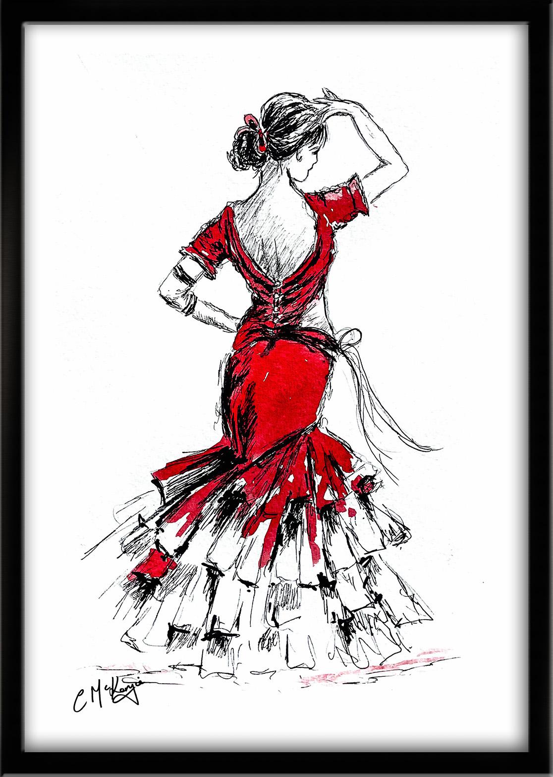
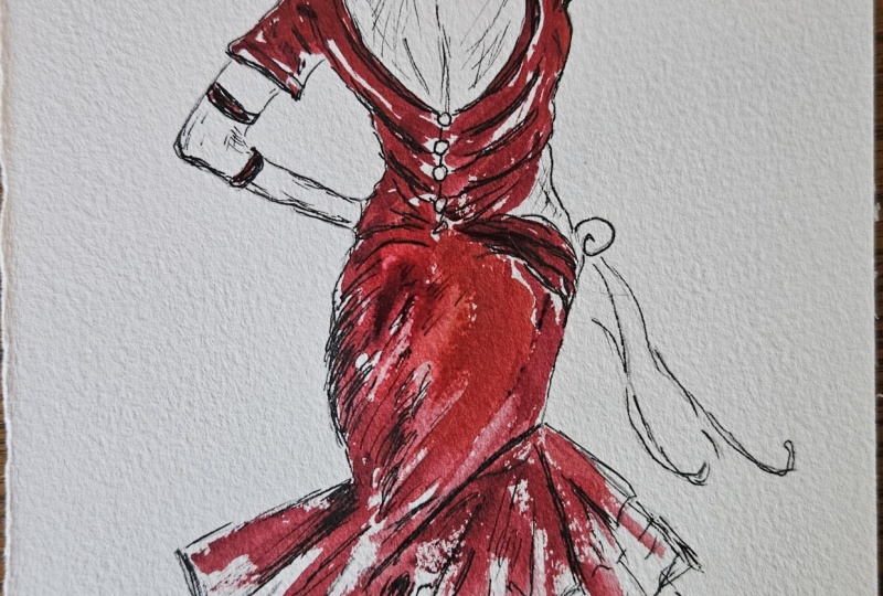
2. Start with a light, loose pencil drawing - don't overdo it.: For this fabulous
Spanish dancer, we're going to use the selective color style in pen and wash. It's a high contrast
style that combines detailed black and
white inkwork with a pop of strategically
placed vibrant color. These are the colors and
materials that I'm using, but do feel free to use
any that you already have. I've got a selection of
black waterproof pens, varying in nib size from not 0.1 up to 0.8 or one point not. You can see from
the scribbles in the attached example how
they vary in terms of light, tone, dark tone, and line width. Your faber castle pit pins, which are in sepia, go small, fine,
medium, and black. It's exactly the same principle
in that all you want is a couple of pens that vary
in tone and line weight. You'll also need a small bottle
of black waterproof ink, a paper clip, and a small water spray with
an adjustable nozzle. Regarding the
watercolor materials, I've provided lots
more information about brushes, paint, and paper, et cetera, in a
document that you can download from the
resources section. You'll also find a copy
of the drawing there, which you can choose to
draw freehand or to trace. The goal with the
pencil drawing is to capture the gesture and
elegance of the dancer, rather than worrying
about small details. The arm that is
lifted on the right creates a strong shape that
adds movement to the figure. I've used loose scratchy lines to draw the form of the dress, allowing the skirt to flare outwards in soft flowing shapes. The layered ruffles at the
bottom are suggested with even looser lines because these will be refined
later with ink. Once the overall
posture feels balanced, the sketch is completed.
3. Use black waterproof pens with different sized nibs to apply the black ink. Use different shading an: And now we can move on to using our waterproof black pens
with the different nib sizes. And beginning with
a fine nib and not 0.3 to start outlining the
upper part of the figure, the head, the hair, the
shoulders, and arms. I like to build up the tones in stages rather than going
for it all at once. And I also like a
mixture of light, medium, and dark ink tones. If every line was the same
thickness and tonal density, it wouldn't make for an
interesting composition. And also, because the
black ink is waterproof, once it's on, it's on for good. So it's a lot easier
to build up slowly and lightly than try to
eradicate mistakes later on. Because we're looking at the
figure from the back view and putting a lot more detail into the hair than
I normally would. And when we come to put
the watercolor on later, I'm not going to be putting any flesh tones on
the skin areas. I'm only going to
be using colour on the dress so that that
color really pops. And that's another reason why
I'm adding more detail with the black pen than I normally
would do in these areas. A to add some darker tones of black, I'm now switching to my
thicker nib, the not 0.8. And then just to give a bit
more emphasis to the face, I'm using my in between
nib, the not 0.5, so it's a little bit thicker
and darker than the not 0.3, but not quite as dark or
thick as the not 0.8. Don't worry if you don't
have these exact sizes. It's not a precise science,
so you just do need, you know, some lighter strokes in between and darker ones. I've gone back to using
my fine nibbed pin, my note 0.3 for the arms. But again, I am varying
the pressure even on this small nib so that even the fine lines have a little bit of
variation in them. I'm also not sticking
completely to the pencil lines. I'm adding little bits of
shading here and there. I've even put a couple
of bracelets on her arm. Some of the lines are broken, and some of the lines
are overlapping. What we don't want is continuous smooth
lines that look like the black outlines in a
child's coloring book. I've switched up to a
thicker nib now for this line at the back of the neck because I want
that to be more defined. It's quite a strong line
in the overall body shape. Then sticking with
this thicker nib to start drawing the dress. I'm also adding a little
bit more definition to the bracelets that
I mentioned earlier. And also a little bit
of shading or hatching, as they call it on
that lower arm at the bottom of the lower
arm where it's in shadow. I'm thinking about where
there might be creases or folds in the material and
adding those as I go. The back of the dress, that needs to be a strong line, so it stands out
against the skin and a little bit of shading there just down the spine
and the back area. I've gone round the row, have tiny buttons, and then I'm working my way
around the dress. I've decided to add a bit of a collar on the
back of this dress. Now, I don't think that
was on the pencil sketch, but do feel free to add any other details that you
think might suit as well. Your drawing doesn't have
to be exactly like mine. It's absolutely fine to use your own interpretation
if you want to. It's kind of art,
quite meditative. It really does demand your
full engagement with the task, which helps to reduce stress, and it sort of encourages
a state of flow. And I do think that
regular use of pen and ink helps us to master
line weight and understand light
and shadow a lot faster than if we were
constantly using erasers. In fact, instead of trying
to achieve perfection, penoning methods
encourage people to incorporate errors
into the final artwork, which makes the whole
process a lot more organic, expressive, and less stressful. It's extremely portable. A pen and sketchbook
can be taken anywhere, so it's the perfect
tool for going outside, traveling or even
creating art on the fly. Another bonus point
is its affordability. You don't actually need a lot of expensive tools
to start with. In fact, you could
create a lot of sketches just with a simple ballpoint
pen or a fine liner. But if you do use the waterproof
and light fast ink pens, then your artwork is permanent. It won't fade or
smudge over time, so it's ideal for creating
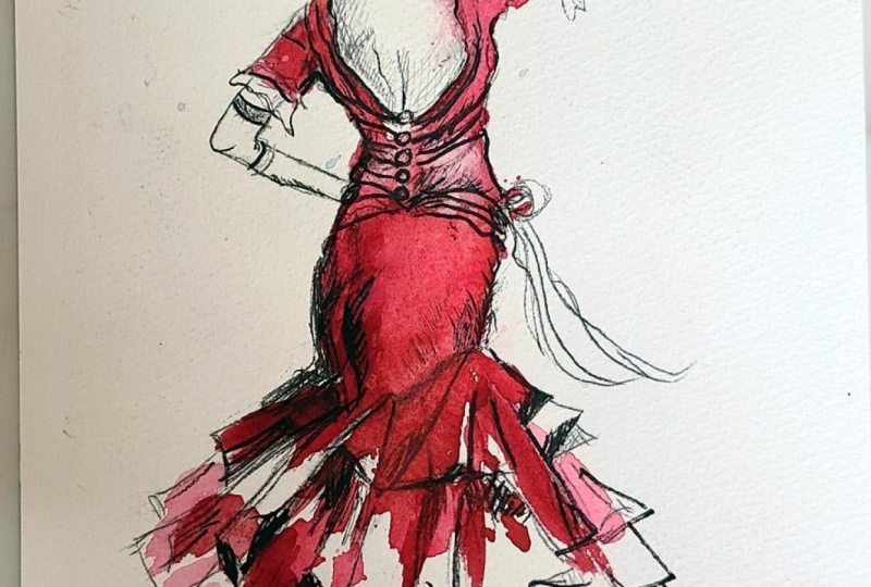
lasting journals, portfolios, or full artworks. I've worked my way down
to the ruffles now, and this is where
I can be really expressive and just
sort of go for it. Although I am being quite
loose in my approach, particularly with this
bottom part of the dress, I am being mindful of the direction that these
ruffles are flowing in. You do need to have an
accuracy of form underneath. There is a little
bit of a difference between looseness
and carelessness. The ruffles are spiraling out almost like the
hands of a clock. I'm adding more definition and color to some of
them than others. So it's still varying
what's going on here rather than painting every single ruffle exactly the same. If there is too much unity, the viewer's eye will
quickly become bored. However, if there's
too much variety, it can become
confusing and messy. So what you need is a balance
somewhere between the two. And if you're not sure whether you've arrived at that balance, it can be helpful to just walk away for a
few minutes or have a cup of tea and go back to the painting with a
fresh pair of eyes. Another method that
some people use is to hold the image up
in front of a mirror, so you look at the
reverse image, and sometimes that actually
gives you more clarity. And a lot of the time, it's based purely on
your own intuition, and I think that does
develop with practice. And also look at other people's
styles of pen and ink. Think about what it
is that you like about one particular style or what you don't
like about another. Art is very subjective. It's certainly not
one size fits all. Like everything else,
it's just about practice. And the more you practice
this pen and ink style, the more confident you'll become and develop your
own way of working. Another point that's
probably worth mentioning is that you can
always add some more pen and ink later on
after you've applied the watercolor wash. As long as the watercolor
is completely dry, there's nothing
to stop you going over any areas that
you think need a little bit more definition or dark black ink on it afterwards. Adding some quite scribbly cross-hatching on some
of these ruffles. Again, not all of them. Picking out the odd
one here and there to vary the tone and also add
that little bit more interest. I've just switched to my
thickest black waterproof pen, and now I'm really going
to go for some dark darks. In case you've forgotten, I'll just reiterate why
I'm actually putting a lot more tonal contrast on with the pens than
I would normally. When we come on to apply the watercolor in
the next stage, I'm going to be using the selective color
and pop technique. So I won't be using the watercolor in the
way that I normally do, applying various tones
and shade into it. I'll be using one
minimalist color, and so we do need to have this background of
strong contrast, black and white in
the under drawing. You've probably seen
other artists work where they've done a street or city
scene in black and white, and the only pop
of color has been a red phone box
or a yellow taxi. Other examples that I've
seen has been with portraits where the portrait has been
done in black and white, with only the eyes
or the lips colored. A bright red ladybird on a monochrome leaf or some
colorful red berries on a twig, there would be other examples in nature that would lend
themselves to this style. Going back to this painting, I think I'm just about there, really, with all the penwork. So I'm going to let
all this black ink completely dry and then
move on to the next stage.
4. Add a single-colour-pop of bright red watercolour for a vibrant, striking look.. : Now we add the color. And for this painting, I'm using just a single bold color, a strong red, which suits the dramatic character of the
flamboyant Spanish dancer. I've used cadmium
red because it is a very strong pillar
box shade of red. However, it is an opaque
or semi opaque color, which means it's got
good covering power, but I don't really want it to cover over all of
my black lines. So I've mixed it with
some Alyzarin crimson, and that's highly prized
for its transparent nature, making it ideal for layering and creating luminous glazes
in watercolor painting. It's a deep, cool, slightly bluish red that creates clean, dark and rich mixtures. Because of its transparency, it's excellent for
building up depth in paintings without
becoming muddy. I did test it beforehand, and the mixture seemed to
give me the right balance. So whichever red you're using, just make sure that it does
give you this nice balance of transparency and also
a strong color pop. I've started applying the wash to the upper part of the dress, allowing the pigment to just flow naturally across the paper. I'm not actually trying to
do any shading with it, but some areas will
appear lighter and others will deepen as the paint
gathers around the ink lines. And I'm continuing to add
color to parts of the skirt, leaving some areas unpainted, so the ink drawing
remains visible and airy. This selective use of color
keeps the illustration lively and prevents the painting
from becoming too heavy. As I've said previously, we don't want it to look like a colored in children's book. And actually, leaving some of
the paper unpainted creates an even more dramatic effect because you've got
this strong red, strong black, but
a restful white, which all work together to
create this energetic look. As I've been painting
the red dress, it's occurred to me that
perhaps I should have put a little bit more
shading on her back. I've just picked up
my no 0.3 fine pin, and I'm adding a little bit of cross-hatching to one side of her back and also the
left side of her neck. I'm not adding any watercolor
to the skin areas, it just needed a little
bit more structure there. But I am keeping it very, very light and airy. Don't any big thick black lines here that just wouldn't
look natural at all. And all I need to do now is add a little bit of
color to the ground. I don't want this to be as strong a color
as the dress color. Otherwise, it would
just distract the eye down to the bottom
of the painting, which is not what we want. So I'm keeping it very light, very pale, and just a sort
of hardly there look. A few more squiggles
of black ink, and I think we're
just about done. We've used pencil, pen, and single colour watercolor, and together, they've
really captured the energy and drama
of the dancer. I hope you enjoy
exploring this technique, and I'm really looking forward to seeing the dancers
that you create. Now, don't forget to upload your own painting through the
project and resources tab. After all your hard work,
I'd really love to see it, and I'll be sure to give
you some personal feedback. This class is part of my expressive pen and ink
with watercolor series. Each lesson focuses on
a different subject, introduces some new techniques, and even a few unusual
tools you can use. You can follow me on Skillshare to get to hear
about new classes. And if you could leave
me a short review, that would be really great. If you've enjoyed this class, it might encourage you to look at some of my other videos. I've got lots of lovely
subjects loaded with more tips and techniques to help you with your own
exciting art journey. In the meantime, thank
you for joining me, and I look forward to seeing you next time Happy painting.
5. FINAL THOUGHTS: All done on completing our flamboyant Spanish
dancer with pen and ink. We sketched a loose
pencil outline to capture the posture and
movement of the dancer, and then we applied using
waterproof black pens with different nib sizes to create lively linework and
texture in the dress. Did you enjoy using the selective color technique
and adding just a pop of one single color to the dress to bring energy and
focus to the painting? Combination of simple drawing
and minimal color allowed the dramatic movement of the dancer to be our
main focus of the piece. I can't wait to see
your interpretation. The class is part of
my expressive pen and ink with watercolor series. And each lesson
contains a new subject, some different techniques, and a few unusual cheap
tools you can use. Now, don't forget to upload your own painting through the
project and resources tab. After all your hard work,
I'd really love to see it, and I'll be sure to give
you some personal feedback. And if you've
enjoyed this video, do have a look at my other
classes on Skillshare, which are packed
with more tips and techniques to help you
on your own art journey. If you click the follow button, you'll be able to follow me, and then you'll be the first
to know when you upload a new video or any
exciting updates. And if you could
just take a moment to leave me a short review, that also would be really great. In the meantime, thank
you for joining me, and I look forward to seeing you next time, Happy painting.
 Carrie McKenzie, creating painted visions