Transcripts
1. Class Preview: Welcome to painting
with water-based media, acrylic, watercolor and gouache. I'm Nina wise. In this class, I'm
going to teach you how to work with water-based media, including acrylics
or watercolors, gouache and water-based
colored pencils will see how these mediums
differ from each other, discovered their
unique properties, and learn to use them
in exciting new ways. I've been painting and
drawing since I was 11 and haven't
stopped since now. I'm based in Chicago, Illinois and teach
out of my studio. But I also teach at colleges
and art leaves around the country and traveled to Europe with students
each summer. I'm a professional fine artists, like paintings and
drawings are in galleries and corporate collections
throughout the US. We'll start you out with
some basics that you need to know about water-based
media in general, I'll show you why
gouache is one of my favorite mediums with its versatility and
velvety finish, you'll see how to
use watercolor to achieve a nuanced
and delicate look. Then we use watercolor pencils to create a beautiful landscape. And finally, I'll show you how to work with a
limited palette of six colors plus white
acrylic paint to make lively and
rich works of art. Alright, let's get started.
2. Introduction: I'm so excited that you've
chosen to begin painting. And I'm here to make it as easy and fulfilling as possible by giving you information and taking obstacles
out of your way. So in this lesson, I'm going to give you
a quick introduction to the various media. I'm going to help you set up your workspace to
maximize success. We'll go through some
basic color theory. A little bit about me. Throughout my career, I've
used many different mediums. I began as an oil painter, I transitioned into pastel work. I did colored pencils. I've worked with
acrylic and watercolor. And I want to tell you
that you don't have to choose just one medium
as your specialty. As a student, you should
feel free to experiment and learn about all the different
media available to you. So the types of media
we're going to use in this class, our watercolor, colored pencils, gouache paint, watercolor paint,
and acrylic paint. Remember, you don't
have to pick just one. So let me talk to you about what's behind the mediums and how they differ
from each other. We'll start with
the acrylic paint. So in general, when you
have a paint medium, you have three elements. You have a binder,
pigment, and filler. And what really differentiates water-based media from
each other is the binder. So water-based media comes under the umbrella of tempera
or in Italian to tamper. You use tempera when you
were in grade school, it was that dry pigment, the stuff you added
water to pigment. We have pigmented acrylic, but the binder is a polymer, and that makes the
acrylic shiny. Then we have the watercolor. The watercolor, again,
water-based medium, pigment. Your binder is a little
bit of gum arabic. And the pigment is
milled a little bit finer because we
want transparency. Then with your gouache. Again, pigment, the filler really
differentiates the gouache. It's a white chalk which
aids to the opacity. So whereas watercolor
can be used and is generally used transparently, the gouache is used
opaque layer and again, a little bit of gum arabic. And over here, lastly are my
watercolor colored pencils, which are marvelous
things because it's a drawing tool
that also acts like a painting medium
because we can hit the colored pencils with
water and create washes, or we can use them as line. So if you think about the use of water-based paint in history, the very first paintings that we know of were cave paintings. The pigments were things
generally found in a cave. We had the rock, we had
carbon from the fire. We had white suit from the fire. And how do we get the
paint on the wall? We mix it with water. We can also talk
about early frescoes, Persian miniatures, and
illuminated manuscripts, rather than showing
you all samples. This would be a great time to take a look in
the class materials. Well, I'm gonna give you a
list for you to research, look at some fabulous examples
and you'll be able to see as far back again as the
cave paintings and frescoes. We've all been using
water-based paints. Okay, so remember I talked about removing obstacles to
your painting practice. One of the big ones
is your work area. Let's talk about
arranging your workspace. So are you left-handed
or right-handed? We could use the
word ergonomic here. I've had students who are left-handed put their palates on their right side
and vice versa. I've had students put their palates all
the way back there, so they had to kinda jog
over and then jog back. So you want to make
things easy for yourself? I'm right-handed here on
my palette, my brushes, my water source, my paints, my reference, everything
is within easy reach. Sometimes an obstacle can
be hair in your eyes. So I'm going to put mine up. Okay. So in talking about
arranging your studio space, we need to talk about how you're actually going to
paint on your canvas. I keep mine prop up as
opposed to completely flat. When your canvas is
completely flat, you might run into a
foreshortening problem, which is when the image
appears to be condensed. This way I can see my work and I don't get any distortion. But if I'm working bigger
than eight by ten, I might go over to
my easel and work vertically that way
I get no distortion. However, if you're
working with watercolor, unless you like the
dripping effect, you do not want to
work vertical because the water will follow gravity
and drip all over it. So I've got it prepped
up just a little bit. You'll surely have something
in your studio that you can tuck underneath the canvas
and work with it that way. Alright, let's talk
about palettes. I know it's a very romantic
to want to stand there with that classical round palette with your thumb
through the hole. And you can use that
when you're painting outside because it's a
long way to the ground, but I don't have to hold
my palette in the studio. My needs are a little different. What I want is
adequate mixing room. I want wells for my paint. I have additional mixing area in the cover and I use the cover when I'm done with
my studio work, I'm going to missed the paint covered up and I'm all ready to go for the next day. And that is a big bonus if you can find a
space in your home to set up your studio and not have to take it down
at the end of each night, then you have no excuse
when you wake up the next morning,
you're ready to go. Let's talk about brushes. You'll notice that
I have a variety of brushes and a
number of brushes. And we have some
basic differences that I would love
to explain to you. You'll notice I have
short handled brushes. I have long handled brushes. I have what's known
as a flat brush. It's a variety of a
bright is a shorter one. A flat is a longer one. I like to use the
brights more control. The round comes to a point
which is very, very useful. I like to use short handled
brushes for control. I like to use longer handled
brushes for more gesture. These are synthetic brushes. You do not have to
use bristle brushes. These are softer. They don't leave streaks. They're easily cleavable and
a little more economical. So we don't mind that I have
a number of brushes because I don't want to pick a brush and have to continually clean it. Typically, I will end up with about five or six brushes in one hand and I will paint
with the other like this. You don't need
this many brushes. We've got a good variety going. Another thing that I
would like to talk about is the fact
that I'm standing. Why am I not sitting? So I mentioned using long
handled brush for gesture. When you sit, you tend to grab your brush and what I like to
call the death grip. And you use a very small
gesture when you stand, you tend to move your hand from your shoulder and you get the gesture of your entire arm. You can also stand back from
your work and see things. So it just gives me more
variety and more gesture. And you could sit down
if you get tired. But for work, I always stand
for talking about painting. We need to talk about
basic color theory. You'll notice I only have
seven tubes of paint here. You may be wondering why. Let me explain. There are three primary colors in paint pigment,
red, yellow, blue. However, I have a warm and
a cool of blue, of yellow. I've read with these
six colors plus white, I can mix absolutely everything. However, if I tried
to make a violet using my warm red
and my cool blue, I would probably get mud as many of you may have experienced. Let me explain about
warm and cool colors. If you look at a color wheel, you'll notice there's a portion
in the color wheel that appears to be moving into light. And we call those
the warm colors. Those ranged from about
read through yellow. Then we have a
range of colors on the color wheel that
we call cool colors. They appear to be
moving into shadow. Those are somewhat
smaller range. They move from about blue-violet through maybe blue-green. We have some swing colors, what I call relative or
swing colors that can be made to look either
warm or cool. But for our purposes, what I want you to see, if I take the cap off of my paint tubes and you can
look at them together. You'll notice one appears to
have a little blue in it. You might even say it's darker. This is your cool red. It's the quinacridone. The crimson or the ultramarine, excuse me, the Alizarin crimson. And your warm is going
to be your cad, red. So we have a recipe to mix your secondaries
from your primaries, which warm and which cool. And I will have those
all listed out for you so that you can accurately
mix your secondaries. So if you look at
the color wheel, what you're going
to notice is that in-between the red
and the yellow, we have guess what? Orange. And in-between the yellow. And the blue, we have the green. And in-between. The blue and the
red is your violet. Those are your secondaries. It's that simple. Then in-between your
primaries and secondaries, We have your tertiaries. Red, orange, yellow,
orange, blue green, yellow green, blue,
violet, red, violet. And there's your color wheel. I can mix absolutely
every color here. I can mix my browns. A brown is actually
neutralized complements. What are complements? Again, let's look
at the color wheel. When you look at a read, if you go directly
through the color wheel, you'll see its
opposite is a green. If you've ever stared at
something red for too long, say thirty-seconds, look
away, you see green. What's happened is the cones in your eye have gotten fatigue. To relieve that fatigue. You see the complement
they complete each other. They neutralize each other. So when we mix from red to green through the
center of the color wheel, if you could picture
a big N for neutral, those are your browns. We don't always want
to mix a brown. Sometimes we just
want to double a red. We mix a little green. So in this way,
I've mixed Brown's, neutrals, secondaries, tertiaries, and I
change the value. So I have white. So the pure colors are called
Spectrum value colors. There they are. We can also say these
colors are intense or saturated to D saturate a color. I want to change the value, I'm going to add white. You'll also notice I
don't have black here. Because we're
painting with color. We don't use black. Black
is the absence of color. How do I make a dark In pigment? Color is reductive and you've probably experienced this when you were in elementary school. What happened? When you mix too
much paint together? You got mud. So the more color you put in, the less ability the
light has to come out. So those darks, those
blackish colors are just layered primaries. So if you can see it
in your still-life, in your landscape,
it isn't black, It's a color including
your shadows. So with my seven tubes of paint, I can mix absolutely
any color I want. The exception, however, will be when we get to
our colored pencils, because we don't physically mix the colored pencils together. We layer them. We actually need
a bigger set with different colors that reduce
the chromatic intensity. Again, that means colors that already have
white mixed into them. Alright, so we're ready. Let's put together your studio. Remember, it's really
beneficial to try and find a place where you don't have to clean up every single time. Okay, so let's gather up your
paint and get ready to go. In our next lesson, we are going to begin
painting in something called
3. Gouache: This lesson is about wash. You're probably
thinking gouache. That's a funny word to say. So GRU a CHA. It is the water-based medium
that is most like tempera. It's got a binder that's a
little bit of gum arabic, and it will feel
most familiar to what you might have used
in elementary school. It feels most like
the tempera medium. I love using gouache. It dries, velvety, you get
a very subtle, deep color. It's one of my favorite mediums because of that velvety texture, it doesn't reflect light, it absorbs it, which lends
to that velvety texture. So in this lesson, we're going to work
with preparing a board to paint with gouache. We're going to talk
about how to achieve an even and flat surface for a more graphic
look with the gouache. And we're also going to
create a variety of textures using thinner line work and a
technique called scumbling. So again, gouache is like a more sophisticated
temperature. It will give you deeper colors. You can layer with it because
it is used opaque layer. The white chalk filler is what allows the gouache to
be used opaque layer. And again, there is a binder in it that is not in
your school grade, tempera paint, That's
the gum arabic. It is water-soluble
and typically used for opaque coverage
in earlier stages, it can be thinned down with
water to be used as a wash. But you have to be careful with the gouache
because if you put down a layer and you kinda what I call scrub back and
forth with your brush. The work surface will not
seal and you'll bring up those other layers
resulting in mud. So remember that gouache
is always water permeable. That means as you're
working with it, you have to watch
your brushstrokes. And when you want to frame your beautiful finished project, you have to protect it. You'd want to put it
under glass or under plexi to avoid on a no throwing
a cup of coffee on it. You can paint with
gouache on paper. I am using bored because if your paper
isn't thick enough, it will ripple soon as you start hitting that
board, excuse me, that paper with water,
it will ripple. We're going to talk
about how to prepare this board for using
gouache on it with Jess. So the first thing that
we really need to talk about is getting the
board this size. So you may purchase a
board that is typically, say 18 by 24. You're going to need to cut it. I've chosen a thicker board to avoid that ripple and
has a wonderful surface. It's very satisfying
to paint on, but it's a little tough to cut. So we're going to
talk about that. What's a really, really
important is that you are using a nice heavy
utility blade, not a thin exacto knife. Blade will wobble and you
won't get a straight cut. So the secret is patients, you must cut using a metal ruler and very slowly
repeat your line. I like to get down on the
floor because I can get all of my weight
into both the board, the ruler, and repeat
that cut several times. Don't get impatient and rip, you'll get a jagged edge. So if you want to get a
nice clean edge, ruler, weight, fresh blade, nice
heavy utility blade. And now we're going to hit
the board with some Jess. So let me explain what
Jericho is to you. So this is my naked board. If I just paint on this
directly with the gouache, the board is going to soak in the water in my paint
will feel really stiff. So the gesso is used to create a barrier that helps the paint adhere and not to
the board but to the Jess. Oh, so it's a barrier between
your paint and the board. So I have a small jar of Jeff. So here, you do not need
to mix this with water. The consistency is absolutely
perfect the way it is. I have a dedicated, larger, flat Gesso brush. This does not have to be
a very expensive brush, but it's important
that it's bigger and flatter and that
the bristles aren't really stiff because
we don't want to be leaving really big
marks on the board. And the way to avoid leaving
those big marks is two in one layer because I'm
going to do too in one layer to go
in one direction. Just keep loading up your brush. You can see when I run out
it gets a little scumbling. There's that word again, we also have a trick to
keep this board from warping as soon as
you wet one side, it wants to start curling up. So when I'm done with this, I'm going to make a sloppy wet x on the
backside of my board. Okay? So I'm going to smooth this out and going in
all one direction. That's fabulous. And I am going to make a wet
x on the back of the board. So here's my water bucket. X marks the spot and this
will keep IT or sort of counteract its
natural inclination to warp and then I
have to let it dry. Okay, So I've switched boards on U to show you a perfectly dry, smooth board on which
I've done a second layer. Now I have some
students who like to use a perfectly smooth board. So they might do a layer and then sand and then
do a second layer. But really the trick to getting
it reasonably smooth as just going in one direction as I did second layer,
other direction. Here's my board, perfectly flat. I'm ready to go. We're going to
start painting some swatches k. The trick
to laying out flat, beautiful, consistent
color is, as I say, you want your gouache to flow off your brush like mayonnaise
on a hot summer day. Okay. So that means I'm always
fussing with the water. I'm not going to paint
directly out of the tube. As you see, I'm going
to start mixing to swatch colors that are going to end up looking a
little bit like this. Okay, so we have warm swatch with cool
brushstroke over it. We need contrast, Otherwise you can't see what we're doing. So we have warm,
cool, cool, warm, dark, light, and light, dark. And then we have some
complimentary line work. The line work has to be opaque and you want your
swatch opaque as well. So let's start mixing. So as I said, we always want to use
a little bit of water. I've squeezed out my
palette so that I can pull the paint and not contaminate
the major part of the blob. And I'm using a warm cad
yellow and some red. Another trick is a Mr. I have two Misters here. This is my tried and true. Traveled everywhere with me, Mr. And it is just a used clean,
emptied hairspray bottle. You can also buy a nice, perfectly clean Mr. in the art store that
looks a lot like this. Okay. And that's just a
really good way of getting some
water happening on your palette without having to continually dip your brush. Another trick is you've
got to use enough paint. If you don't use enough paint, your coverage will be not
opaque and not consistent. So it's not just getting
the paint on the board, it's how you get the
paint on the board. Mixing is really important. I want the mixing to happen on my palette, not on my board. You've got to watch
out for surprises, what I call surprises
on your brush. So kinda try and clean up
those edges a little bit. And I'm going to hit the board. The fewer strokes the better. But while it's still wet, I can work into it. Just going to start
laying that paint down, see how it flows so nicely. Now, you'll notice I'm doing
long strokes and I can also try and hit my edges with a nice long stroke this way
that cleans up that edge. Another thing that helps with opacity is mixing a tiny bit
of white into your paint. Even if I don't want
a lighter value, the white is just more of that chalk filler that aids in the opacity so I could hit it
with a little bit of that. So here is my warmish red, orange swatch, and I'm going
to rinse my brush off. The great thing about
water-based media is cleanup is really easy. And it also means that I
can keep my brush pretty clean pretty easily than a nice big bucket of
water going on here. And now I'm going to mix a
cool color for my cool swatch. So let's start with
primary blue or excuse me, ultramarine blue, a
little bit of water. And let's make this a
bit of a blue violet. So now I'm going for my cool
red, that's the Alizarin. And you know what, in this one, I will show you the white because violet tends
to be super dark, so little bit of white. And we bring that value up. And I don't have enough
pain happening here. I'm going to take a
little more mixed, mixed mix, a little more
blue, little more white. I think we're good. There's that beautiful
velvet equality. We're talking about
little more water. So because it's a
water-based media, the minute you start
squeezing it out, it wants to start drying. And that is the, again, always fussing
with the water. So here we go with some
nice even strokes. And again, make sure
you have enough paint. And we get a nice
even coverage there. And what's really important
about keeping your colors clean is waiting for the paint to dry before you go over it. So you want to
work wet into dry. Otherwise, you
will get your mud. That's it. I'm going to
give this a moment to dry. It's water-based ink,
will dry super quickly. And then I can work on
the line, work over it. I can do hatching. You'll see me do some
curvilinear work and some scumbling which is using a dryer
brush less water. It's almost like the brushes stuttering over the surface and lending you see-through
to that other color. But wait for your work to try. Okay, we're going to start
doing some line work. I made a humorous
want is remember that there are several different
ways to create contrast. We're gonna do a warm
with a cool work over it, a cool with a warm work. I'm being tricky on these two and then I'm
going to do light, dark, and I'm also gonna do
complimentary contrasts. So let's start mixing
for some line work. We'll do some cool
work over this one. Please remember that you
want to use enough paint so that the line is opaque. And sometimes I have to
fight with my watercolors because watercolor wants
to be transparent. When you move to gouache. If you're working with gouache, most of the time you
want to be opaque. So I'm always telling
them to use more paint. So use more paint. And I'm going to go cool, but also a little bit lighter. Remember that the white
really helps aid in opacity. It's also reducing the
value a little bit. So we have a light over dark. Now, a lot of
students think that if they hold on really
tight and really carefully, then we'll make
the perfect line. But the truth is, if I'm
standing and I can use gesture, if I move my hand
faster from here, I'll get a better, more flowing even line. This is a round brush, small, thin with a point. If I press hard, I will splay out. So I want to keep
my touch light and moving and I will
get a thinner line. This is also a good
synthetic brush. You don't want to use. The bristle brushes are the squirrel hair
brushes because they do not keep a point. You'll be very frustrated. Alright, so I'm going to make my line keep that hand moving. I can do crosshatching. I can do loose curvilinear
work like that. Then I'm going to
rinse my brush off. We're going to do a warm
light over the violet. Is, the violet is kinda cool. So let's do a warm
cad red over this. And we're going to always
phosphate the water. It's too sticky right
out of the tube. Remember that mayonnaise on a hot summer day, maybe August. And again, thoroughly
mixed on the palette. You don't want any
surprises on your brush. It's also a good idea not to spread your blob out too big. It is hard to gather
your paint up. It makes you look like
you actually have less paint to work
with then you do. I think I'm gonna go a
little bit lighter here. Mixed, mixed mix. You have
to enjoy the mixing process. No streaks and we're
ready to go again. So I'm gonna do some crosshatching and that
can be a little lighter. Let's kill them are
white happening in their little lighter value
will also again help, aid in the past today. And let's do some
curvilinear work over that. Maybe some fancy dots. The gouache will dry
a little bit darker. So you may think you have a really light value and as it dries, it
gets a bit darker. So you may want to
push your colors a little lighter than
you originally think. Do a little more with a
pink because it's fun. And then we'll move on. Okay, so we've got
a light green here, the complement of green. Oh, look, it is pink, but we have light. So let's do a read
over the green. Again. I'm pulling my color
from the corner. And people often wonder how it is to work with
these little tubes. I've done huge paintings with just the little
tubes because you do so much mixing
and you add white. So they do last a
very long time. Also because you're always
mixing a little bit of water into them in a
little bit of white. Alright, so let's
do some work over the light green
swatch right here. And I get that cross hatch. You can really see that. See, the faster I move my hand, the smaller I can
make those strokes. If you look at early frescoes, it's all of this line
work and this hatching. And let's do some fun
curvilinear stuff. Fun stuff, I don't
know, maybe some dots. So you can see we've got a nice contrast of dark
red over the green, cool over the warm
light, over the dark. Here I've got a cool blue. The complement of
blue is orange, so it's a secondary color. We have to mix a secondary. So we're gonna
start with the warm yellow because it's
heading towards warm, That's your cad yellow
and your warm red. Now, when you're mixing
your secondaries, you always want to start with the lighter color and
drop the darker color in. It could take a whole tube
of yellow to change the red. It only takes a drop of the
red to change the yellow. I think we're going to add a little bit of white
to this as well, so we don't have dark
saturated over dark saturated. Again, I always like
to add a little bit of white because it helps
with the opacity. A little bit of water. Here we go. So we're,
we're doing some hatching. Ooh, nice. This is a little bit more
of a yellow, orange. And let's make that a
little more orangey. And some fun stuff. No more hatching. Um, you can, once this is
dry, continue to layer. I could take this orange
and go back in here. Nice. So I love layering and doing the interaction
of the color. You can just keep going. Crashes pretty
wonderful for that. The one thing we're going to do last is show you
what scumbling is. It's a fun word, right? Okay. So scumbling is a dryer
brush that sort of stutters its way across
your surface so that you can see through
to the other colors. Let's do a little bit
of scumbling on the green with kind of
like a light blue. Where would you use this? Well, you could use this
may be in your sky. Maybe one, you want to get an optical mixture
of two colors. You'll notice when I'm not doing is mixing colors on the surface, I'm not blending here. All the mixing happens here. You really don't want to
be working wet into wet. I also have no blended edges. For the swatches. We're keeping everything
kinda flat and graphic. We've got a blue happening here. And I need, as I said, to keep my brush dry so
I'm actually going to work with a towel in one hand. It's a bigger brush. I switched back to
a bigger brush. And I'm going to
start to sort of, you know, it's not dry enough. We're gonna dry that
off, put the paint on, and it should start stuttering. There goes. That's it. So you have a texture that lets you see
through to the paint underneath creating kind of an optical mixture and
that is scumbling. Alright, so now that you have an understanding
of the basics, in the next lesson, we'll use what we know to paint
a lemon with our gouache.
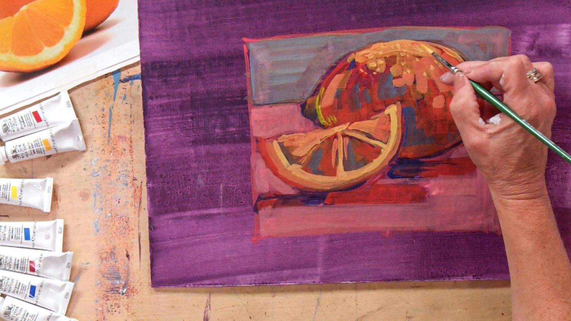
4. A Lemon in Gouache: Now we're ready to
work with our gouache to paint a still-life
of a lemon. In this lesson, we'll be creating depth by
layering colors. We are going to create a realistic shape by thinking about
directional mark-making. We're going to emphasize
value over local color. I'm beginning here with a
board that has been just so twice and it's got
a wash over it. So I've been asking you to work with gouache opaque layer. However, the ground
this is called the ground has been used
a little bit more washy. I didn't want it to be
super thick because I don't want the paint
to come back up. So we did a nice thin wash. You'll notice that it is a violet color
because I want it to contrast and
highlight as we come up to the yellowy lemon. So this is my reference photo. You've got one in
your class material. We've got two photos of lemons. We've got one with three and I, today we'll be painting
for you the lemon, a section cut in half. So we're gonna get going. The first thing I'm going to do is basically draw with my paint. I have a thin round brush
that's got a point on it. And you'll notice
that I am not taking a pencil and drawing
out my lemon. I tell my students that all the marks that they make
become part of the painting, including the marks that
you use to draw this out. So I'm not gonna be
shy and use a color that I can hide or
make mistakes with. I'm going to use a color. I can see if you make a mistake, you can just wash it out
with a bigger brush. So there really are no mistakes because we're working in layers. Anything that you want
to cover up you can. So I'm going to
establish a format. You'll notice that I'm not filling up the space
of this board. The board is cut
to a random size. But for my composition, I think I want to
work in a square. So again, I've mixed up a
color that I can actually see. And I don't really care
if my lines are straight. I haven't used a ruler
and they're not too bad. So it's a very
simple composition, but it can be a
little deceptive. So I'm going to hold
my reference material. Also notice that the
photograph is mounted. You can mount the photo on
a board piece of cardboard, cut open a carton that keeps
it from flopping around. It keeps my fingers
actually off the photo. And I am going to begin by
just drawing out my lemon. There's my drawing. Again, making corrections
is easily done. If I did make a mistake, I would take a fatter brush some water and just
kinda scrub it out. It would be gone. What we're going to
do to actually paint this lemon is work from thin to thick to thin
will be more like a wash. The thick will come
over towards the top. And you'll notice that
I am not going to use yellow in my underpainting. It is a lemon. Yellow is the local color. It actually takes very
little yellow for you to understand
that this is a lemon. What's a little bit more
important is that I interpret this object as it
sits in the light, as it moves from dark to light. And we're going to
interpret the darks, the shadows as cools. Remember we talked about warms
and cools and the lights. As warm, my lighter
value will sit on top. So that whole underpinning will be a little bit more saturated. I'm not trying to make a
carbon copy of the photo. I want you to
understand it's a lemon sitting in space with
light falling across it. But the warm and cool, the dark and light will be more important than hitting this
with a whole lot of yellow. In fact, if I did hit this with a ton of
yellow, it would be flat. So let's get going. So I'm going to mix up cool violet for my
darkest shadows, which are under the lemon. And I'm just gonna
kinda lay those in. I don't want to scrub back
and forth because that will bring up the previous paint. And you know, as I look at this, I see that I have created a really good educational
learning point. I want to correct something. So I don't love the
positioning of my lemon. I can see too much
negative space. So I'm going to make
a correction in a slightly darker color so
I can see my new lines. And remember that
with the gouache, because we're layering
and it's opaque. Corrections that you make
will just get eaten up by your painting and no
one will ever know. You. And I know that I am making this lemon a
little bit bigger, so it sort of overlaps
a little bit more. And you can see the new
red lines of my new piece. No problem. And there we go. So now I have a
bigger lemon wedge. Okay. So I've mixed violet
for my shadow areas, my darkest ones that
sit underneath. Okay, remember these
are kinda washy. And then I am going
actually into the lemon. Remember I'm using a bigger, I like to use the
word splotchy brush. It's a little blue chair. And I think I'll use
just a straight-up blue for some of the darker
areas of shadow. Remember, we're going to just
kinda like flood those on. Now, when you look at shadows, you'll notice that they
don't end geometrically. They sort of move
into each other. So I don't have a harsh edge. I am looking for areas of
dark and light and contrast. So the darker shadows sit behind the lemon kinda in there. And now I'm going to move to maybe like a warm blue for
my next area of shadow. See how different that is. There's the cool,
there's the warm. And that's kinda like my
interim area of value. Kinda flood that on there. And if I see a similar
value elsewhere, I can kinda flood
that on as well, sort of in here as well. So I'm not using a small brush. I'm not being real detailed, not being real exact. What I'm doing is
building form with color. And you'll notice I haven't
used any yellow yet. So those are my shadowy colors. I want to move to
some interim values. I'm gonna go back to that red. Cleaning your brush was as
simple as swish, swish, swish. I'm always using a
paper towel to wipe. And here's my interim value. Kind of get a little
bit and they're still haven't used yellow, I think from my lightest value, I'll mix a secondary orange. Remember I want to start with the yellow, the lighter one, drop a little bit of that
red into their member, keeping it pretty watery and we're gonna
kinda flood that in. So I'm always looking
at my reference. And where else should that go? How about here?
Little bit there. Alright, now, I haven't
used any local color yet. Remember that local color
is the overall color. Let's have some fun with the background and
the foreground. That is a place to have fun. What do you think? How about a green? Let's flood some green. And so again, I'm starting with my lighter color,
which is yellow. And let's use a little
bit of that warm blue, make a nice green. I'm going to mix a little bit
of white in here as well. If your palate seems
to get too crowded, you can clean it off. I can do that yet, It's
really important that you use enough paint to come right up
to the edge of your object. Don't leave like
a halo around it because you're afraid
to smack into it. So I would almost rather
kinda overlap than Mrs. spot. So here's my background. And then I'm going to choose
a color for the foreground. I think I'm gonna go with the warm red with a little
bit of white in it. So we want the
foreground to advance, warm colors advance, and we want the
background to recede. And we'll do that by making
it a very light value. If your palate starts to dry up and you want to
reuse a color you can. That's when I'm going to
use my Mr missed it down. Also, your paints might start getting a little
hard and crunchy. To avoid that, you just hit them with a
little bit of mist. It's important to find a Mr.
that really miss not like globs that way you can control what's
coming out of there. So let's do the pinky
red for the foreground. I'm going to flood that on. So you'll notice that
I haven't really been using any opaque colors so far. The lemons are built with washes of darks and
lights, keeping it light. And what you see is a
lemon niche painting. The form is there. They're not the right color. We're gonna get to that, but we need to let this dry
because it's water-based, it's going to dry
pretty quickly. If you have access
to the outside, you can pop it into the sun. You could certainly
also use a hairdryer, or you could just
go have a cup of coffee and come
back, come on back. So that's it. I'm going to
let this dry for a minute. Okay, now that my first
washy layer has dried, I'm going to continue painting some things
to keep in mind. I'm going to use thicker paint. I'm going to use my
strokes directionally so I can catch the movement of this lemon, make
it look round. I am going to keep some
of the cool shadows, but I need to warm
it up a little bit. I'm going to start mixing
a little bit of white into my colors and let that
underpainting show through. So I am going to switch brushes. You'll notice that I put down my big round splotchy round one and I've picked up
some smaller flats. So I'm going to work with those. I'm going to start using some more opaque paint and
working on the layers, not scrubbing, not bringing
up the previous layer. And eventually we'll get to some fun line work
that goes on top. Okay, so as you can see, I have begun to
use thicker paint. I'm moving my paint in the
direction of the lemon. And I can continue to make changes because remember you
can go over the gouache. Again. You don't want to
scrub back and forth. What I want to
change right now is the contrast of the
lemon to the foreground. I need to do a
little bit lighter and maybe we can actually get some scumbling going on here. So I'm going to change the
value and see how simple it is to do a layer and change
in this case the value. Then you can see the
lemon much better. Now because we can keep
layering up with the gouache. How far you want to
take this towards. Realism is entirely up to you. You can continue working with the color till you start
approaching local color. What I'm gonna do
now is push values. Values are pretty important
to make this thing look lively and round. But I've also switched
to a thinner brush. So I'm going to do a little
bit of line work now, which is really fun. Remember we talked about that thinner brush
keeping up on the point and keeping the keeping
the paint opaque. And I'm going to just sort
of maybe clarify some edges. I don't want to completely outline that will
flatten my object. I can even kinda
hatch in some marks. Those are my darkest marks
where the shadows are. And that helps to set the
lemon down on the table there. Again, clarifying
an edge that works. And I'm going to mix
up some lighter paint. One fun thing about
the lemon is texture. Texture can be done with darks and lights or
with your mark making. So in this case we have a stippling that
happens in the lemon. So I'm going to mix up a lighter yellow for the
lighter areas of the lemon. And try and go for
that lemony texture. And you see how beautifully the white and the lighter
values wanna sit on top. Okay, So I'm going to put
in a couple of more marks. You can go as far as you
want with the detail. Remember that is
really up to you. One thing you do want
to keep in mind though, is that wash doesn't
really lend itself to blending on the support. That's why I have sort of like a broken brushstroke that
allows you to begin. Mixing visually. Knowing when to stop is
also really important. I'm going to do that and we're going to
talk about clean up. Clean up with water
is really easy, but you do want to take care of your investment, which
is your brushes. So what I like to do is get most of the
paint off in the water. Maybe wipe my brushes
down and then just go to the sink and use some
regular old soap and water. But what's really important
is that you do not leave them face down in your water
source overnight. Or really for any
length of time, you're going to lose
those beautiful points and your flats, your brights, we'll
start splaying out. So once you've cleaned them, I like to re-form the point. And then we're going to store
the brush just like that, so it's ready and fresh
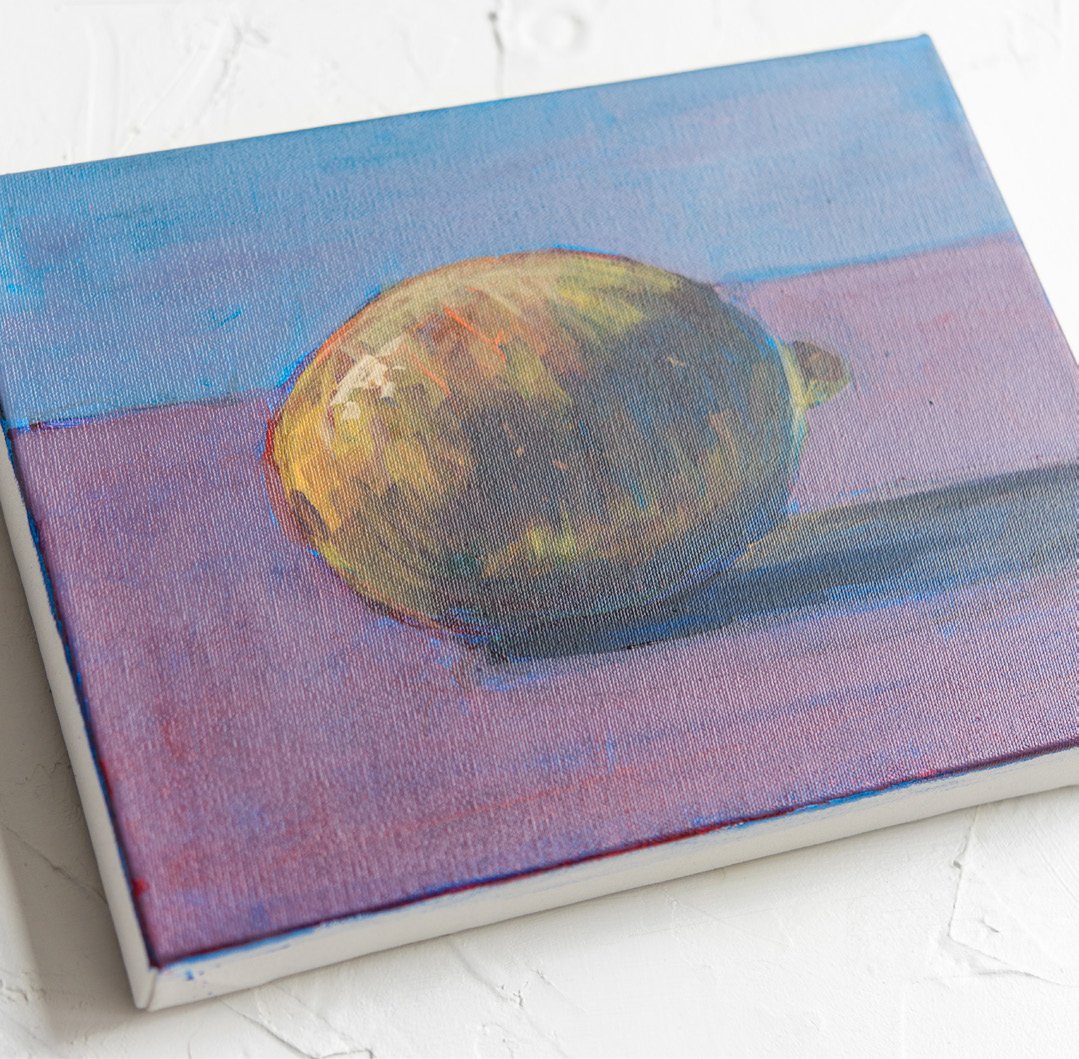
for us to go next time. And that is my lemon in
gouache water-based paint.
5. Watercolor: Alright, now let's
talk about watercolor. This is probably the medium you most identify with
water-based media. Many people have
the perception that watercolor can be really easy, but actually a good watercolor
can have its challenges. And the reason it's
challenging is because watercolor
is transparent. So when we work in opaque mediums so we
can cover up things, we can make corrections. However, when you want
to work with watercolor, mistakes become really obvious. What you put down
is what you get, but we're going to
learn to work with it so it isn't frustrating. Alright? So some of the things
we're going to talk about today are selecting the
best brush for the job. We are going to work
on a custom surface by stretching paper on a
drawing board using tape, will also work with
a watercolor block. We'll explore a variety of
brushstrokes to understand the different behaviors of the medium wet into
wet, wet into dry. We'll play with
those a little bit. So in general, watercolor differs from all of
our other mediums because the pigment
in watercolor is mil to be suspended finer, and use transparent light. Also, the watercolor
doesn't seal. So if you want to
squish back and forth, you're going to bring
up previous layers. So the kind of brush
stroke is very important. The layers will show through again because
it's transparent. The watercolor, you can
again, as I was saying, you could do it on
a stretched paper, you could do it
on a water block. We'll talk about
when to use each. And again, remember
that watercolor differs from other mediums because
of its transparency, we have to preserve the lights. In other mediums. We might work from saturated
to light or dark to light. But in the watercolor, we can put lights in on top. We have to preserve the lights. So my advice to you
with watercolors, as with many of
the other mediums. By the best watercolors you can. I know that it's
really tempting to use something that's really
pretty and colorful. You might find this in your local five and
dime or drugstore. I would ask you not to buy your art supplies
in the drugstore. And the reason is that they're inexpensive
because they lack pigment. So we're not going to use
the watercolors in the pan. There are some
better quality ones. My preference is to use tubes of good quality watercolor paint. But the good news is, you
don't need that many tubes. We've got a warm and a cool
of each primary once again, so six or seven
tubes and your gut. Okay, Now let's start
talking about your supports. So if you are working bigger
than your watercolor block, let's say you want
to work on a board, it's going to be
really important to keep that paper from rippling. And the way that we do that is we're going to tape it down. However, first, I'm
going to teach you a really easy effective way of cutting or making
your paper smaller without using a
razor or scissors, it's really hard to make
a perfectly straight line sometimes with a scissor. So this is a full
foolproof way that will also give you
a decode edge. So what I'm gonna do is
carefully fold my paper in half. And it's all about scoring and breaking down
the fibers of your paper. So I've pressed down one
way. I'm going to turn it. And now I'm actually
going to grab a tool. It's just my painting spatula. And I'm really going
to be aggressive in breaking down the edge, breaking down the
fibers in the paper. Turn it over one more time. Do it again. This is 140 pound weight, which is a really, really
good weight of paper. If you go any heavier, it's gonna be hard
to score and rip. It will basically crack on you. So 140 pound weight is
really your sweet spot. That's where I am.
Okay, Let's give it one more aggressive nudge
and we're going to rip. Now when you rip, you
want to keep the back end up in the bottom here. And like a nice quick tag and we have almost
a perfect RIP. So the quicker you do that rip the straight or
it will be the more aggressive you are with
scoring, the better it will be. We've got a couple of
little things here. It's not going to matter because when I use my tape
will create a border. So those little things
will be on the border. So the next thing I wanna do
before I start messing with my water is cut my gummed paper. So this is brown
craft paper then has a gum adhesive on one side. And the reason I want to
start messing with it before. Before I start with the water is because it will
stick to everything. So let's do this while
the surface is still dry and it doesn't
have to be exact, it just has to be big
enough to cover each side. You can buy the brown paper in craft store or any place that sells watercolors supplies. Again, I'm not being exact. Just making sure it's
big enough to cover and it's okay to have
overlaps as you go. The other thing I've got here on the table are sponges,
watercolors, sponges. One of them I will dedicate to the gummy tape and the other one I will use to smooth paper and I really don't want
to mix the two. So I'm going to move
these out of the way. And there's a couple of different ways you
can wet your paper. If you have a receptacle
large enough, you can soak through this paper. You want to use hot water, but not too hot. What can happen is on paper
is sized with a chemical. If you soak it for too
long into hot water, you break down the sizing. Instead of soaking it. We're going to take a Mr.
again, here's my favorite MR. And we're just going to spray
both sides of the paper. And we're going to
wet it down this way. I'm going to turn it also. There will be a right-sided on the wrong side to your
watercolor paper. The right side has a
little bit more texture. Again, that's your cold press. You can see that the
minute I wet one side it wants to
curl the other way, but if I went both
sides, it isn't. So in wedding it I'm
breaking the fibers down just enough so that
when it dries, it'll kinda curl back up
and be tight as a drum. And when you paint on it, it will not ripple. Now, to wet my strips
little different process. Little bit of water
on your sponge. Not too much. And I'm just going to take
that down the strip of paper. You don't want it soaking wet. You just want to kind of tacky. And I'm just going
to lay that down. It's kind of a fun process. And if I felt like my paper
was buckling a little bit, you can take your other
sponge or Clean sponge and kind of pass
it over the paper. And now all we
have to let it dry and it will tighten right up. Your other option for your
support is watercolor block. And these are a little bit easier to use and that obviously you don't have
to stretch the paper. They're portable, but they
tend to be limited in size. Again, if I thought I
wanted to work bigger, I have the option of making a custom size
paid or stretching. Alright, now here's
the trick to these. First of all, you want to
remove the black piece and what you want to
look for is a notch. So if you can see I have a little interruption
in the gummed edge. That is where I want to take a sharp but not
too sharp object. This is a palette knife. You could use a butter knife, don't use a razor blade. You might end up actually
cutting your pages. And I'm just going to gently
run that along the edge. Again, you must
start at your notch. If you don't know
the notch secret, you're going to have
trouble doing this. But once you know, it's pretty easy and
we're just passing that all the way through and
we're going to reveal. And actually now I can just rip. There is my first
beautifully stretched ready to go first
piece of paper. This is 140 pounds
and it's cold press. So what I like to say about
remembering Cold Press versus hot press is that cold press has bumps and when you're
cold, you get goosebumps. So this paper has
goose bumps and you want the bumps because
it holds the water, it holds the paint. You can get paper that's
even more cold press. But I think then you end up
with hills and valleys and you might have trouble getting the paint
down into the hills. So I think this is a
nice surface to work on, so we are ready to paint. I don't have anything
else to this paper. It is perfectly flat.
It's not going to rip. Let's not going anywhere. I am ready to go. Okay, Let's talk about
techniques for watercolor. And we're going to be dealing with all the
different variables. But there's one really
important trick that you have to know right away and you're probably
already thinking about it. And that is that how do
I preserve my whites? Well, sometimes it's easy, you can just paint around
things if you want, like a softer edge. But sometimes there
are many small areas. There are reflections or highlights that you
need to preserve, and it's just too hard
to paint around them. So we use something that's
called brisket, fun word. And the brisket, it's sort of like your rubber cement that you used to use
when you were little. We would paint it on
using a very small brush. And then as it dries, we can paint right over it. We don't have to
worry about it again. When the painting is finished, you can either use
your finger or some special eraser is just
to pick that right up. There's also something
called a brisket pen, which will give you even
finer lines if you want to. And it is really a lifesaver
for preserving your whites. We're going to use this when we get to our landscape demo. So think about the brisket. Alright, let's start looking
at some of the variables. And the variables are very
much about wet paper, dry paper, and the kinds
of brushes that you use. What's really important is
going to be thinking about a gradient in watercolor
because we don't add in white. We can use the gradient to let the white of the
paper show through. So let's say we had
a sky that we wanted to move from dark to light. That's a good place
to use a gradient. So watercolor is
all about water. The amount of water
on your brush, how much, how much
water your brush holds? And also, do you put water
on your ground or not? So let's start with
a dry gradient. And I'm going to pick
a nice cool blue. This is your ultramarine blue. The palate is, again, are warm and cool of each, but look how little
paint I have to use. And I get this
explosion of color. We don't have to
load the brush with pigment the way we
did with the gouache. Here, it's really
all about the water. So I'm just going to make one stroke from top to
bottom and you're going to see this gradient. Nice, huh? Okay, So that was wet into dry. Now I'm going to wet the paper first and
you're going to see the somewhat softened effect of the gradient
on the wet paper. So I'm going to just
wet the paper first. If it was a bigger area, I can actually take my
bottle and spray this down. Here is the difference. You'll also notice
I'm working flat. If I raise this, this drip here is
really going to be a drip and it will
flow with the gravity. So you want to work
flat for this. And here is my wet
into wet gradient. And it's just a much softer, more delicate, misty
or kind of a field. We have a lot of options. These are separate strokes. Let's talk about edges. We can do a wet paper with wet into wet
That's going to mix and get real splotchy. Splotchy is not a word, but I think it works
very well here. So let's wet the paper and we're going to work wet
into wet with wet edges. So this is when you want
that gradual mixing. You don't need a hard edge. We'll stick with the blue again. Very little pigment
goes a long way. Now you can leave the
watercolors in your palette. You don't even
have to miss them. You can just close them up and then re-wet them the next
day and you're good to go. So here is a nice splotchy
color, very spooky. Let's move now to a
read and see what happens to that edge
as we start mixing. And we get surprises too, because what you're
going to notice is that the pigment follows the water. So if I had like sort
of blobs of water and they start bleeding
into each other. Another way I can work this is a wet edge bleed I'm
going to do to dry ones, but almost purposefully
mix the two. So I get that very
gradual merging. Look what's happening
here, still happening. So as the water flows, the pigment flows with it. And you could take advantage
of that in your paintings. So I've got red on my brush. Let's continue with the read. The papers dry. Look how different that acts. Kinda stays where I put it. But I can do an overlap and
get that wet edge going. And we're getting that little
bit of overlap happening. And it merges very nicely, but it's very different
than the wet into wet. The next thing I'm
going to show you is, let's say you want
to be precise. You want a hard edge. How do I do that? You've got to work. Wet, wet, hard edge, don't mix. So you want to have a little
control over your brush. I'm going to stick
with the blue. Let's get a little
more pigment on there. And we're going to
do that hard edge. Okay, here we go. So I was saying it's all
about loading up your brush. You need to load up your brush didn't have enough paint there. So I'm gonna get a
little more paint here, a little more water. Better. And now we're gonna
go for hard edge five to be a little more
careful about my stroke. And we're just going
to butt right up to that but not mingle. Hopefully. There we go. We got a little
mingling happening. Let's talk about
a few other ways we can use the watercolor. I have some swatches here. And when you buy your
watercolor paints, you need to pay attention
to not just the color, but other properties that can
get a little complicated. We're not going to deal
with them too much, but there are two major things that you need to watch for. I am showing you a paint here that has a staining quality. And so what that
means is, in general, when you work with
watercolor, you can lift. And lifting means I've put
too much pigment down. I can take either a sponge or a paper towel and I can
actually remove that color, but this color which is
labeled on the tube, staining will not lift and it is a little more
saturated and we can get beautiful effects with it. You have to decide if
you want that or not. The other option would
be a granulating color. Got a color here that
is a shadow, violet. And you're going to want
to read the tube or do some research about which
colors are granulating or not. This is not the effect you want. You will be disappointed, but it gives you a
little bit of a texture, a little bit of a bumpiness, and it's a nice effect
if that's what you want. So we have staining
which doesn't lift. We have granulating
which gives a texture. These swatches show the layering and the transparency with something we've already
talked about and that is neutralizing
complements. So a swatch of violet with a large stroke of yellow in
this area of transparency, you can see it's
dulled, the violet. Same thing with red and green. If you look at this area here, we've got a dull red and
orange and primary blue. Complimentary
neutralization. Same thing, but the effects of
the transparencies can be absolutely beautiful. You have to learn
to control them. And one thing that will
help you do that is always having a
swatch sheet by you. So you can say, oh yeah, that's what that
color looks like. Here's what the color
looks like on top of that, watercolors can create
beautiful effects. You'll get a better
result if you do some experimentation before
you hit the main event, our main event is
going to be coming up quite soon as we work on a full landscape
in watercolor, you can see a finished
one behind me. We'll also learn how to use the first-cut to preserve
the whites of the colon.
6. A Watercolor Landscape: Now you're ready to get started with a
watercolor painting. We're going to start
you out with landscape. So in this lesson, you will learn how to create
atmosphere with washes. We will successfully mask out these clouds with frisk
gets so they stay nice and white and fluffy will work on getting the edge
that you want as we move into some of these harder shapes out
here in the foliage. So the first thing that we want to think about is
our reference photo. I've mounted a portion of the photo that I've
cropped off onto a board. And what I'm going to do is
very lightly sketch this out. I've used a hard
pencil, it's a five h. And the reason I use such a hard lead is
because I wanted to deposit as little
graphite as possible. Heavy graphite
will show through. Sometimes you can erase
it, sometimes you can't, you don't want the graphite
to bleed into your painting. Okay, so I've got this already sketched out and we
are ready to go. I am going to work with
the frisk at first. So this is also water-soluble, so I don't really need to switch my brushes as long as I get it into the water right
away, I'm good. So I'm going to mask out my clouds that
I've drawn out here. I'm starting with the top because I'm going
to start painting on the bottom so they
will not interfere. You'll notice it is a different
color, which is great. So I know where I've been and I don't have to
load it up too much. It's going to dry just fine. Remember that we will peel it
off later using an eraser. It just rubs write-off. That's it. I've worked with my brisket. We're going to start working
on the water down here. And as we talked about
in our color swatches, I'm going to wet the paper
first because I want the water to bleed from dark to light and be a little
bit atmospheric. So I'm going to wet my paper down with
some my bigger brush. And I'm going to then load
the brush up with some paint. If you look closely
in the water, you'll see that it is
both warm and cool, darker towards the
bottom and a little bit pinkish as we get
up towards the top. So I'm going to
start with a blue. And I don't want to do just
a straight up primary blue. I'm going to put a little
bit of the Alizarin crimson, which is your cool red. And remember that
with the watercolors, It's not so much about loading
the brush up with paint, controlling the amount
of water on your brush. So it's much darker
towards the bottom. And that's where I'm going to
start now with watercolor. Remember that you can
always make it darker. It's a little bit harder
to make it lighter. So it's going to be
easier to darken the area than to lighten
it then to go too dark, too quickly can't
make it lighter. So I've done a wash from
bottom to top and I'm going to continue to
darken the bottom. And I'm going to move
into some pinks as well. And I'm going to
switch my brush. I'm going to move away from
that really large one. I've switched to a just
like a medium flat brush. And I'm going to
introduce some of this alizarin know in any
other medium to make my pink, I'd be mixing widened. But remember, the
white is our paper. So if I want a pinky wash, I'm just going very
lightly with it. And that's working out really nicely down
here on the bottom. And as I work, my
brisket is drying. I also want to get the streaky
movement of the water. So I'm going to add in some
blue towards the bottom. I'm working with my cool blue. That's my warm once I'm doing some work with the cool blue. And again, you can see how building up the darks
is really effective. A lot of landscapes you'll notice are weighted
on the bottom. So this dark water is
going to work wonderfully for us now I am working
wet into wet still, which is nice because
it's really flowing. And I'm turning my brush
and using flats and sides. And I would want to wait for this to dry
before I continue with it. So now I can move into other areas and you really
have to plan what areas you're working into because
I don't want my water bleeding
into my land masses. A good thing to
hang your hat on in terms of where you are is to establish darks
and larger areas. So I am going to
continue working and mixing some other colors. So as I continue working
on the painting, remember that I can
make my darks darker, but once I put them down,
I can't make them lighter. So you need to approach
your darks very cautiously. You can do some lifting, but once it's dry, it is there. So I've got two
different fluids. Remember I have my cool
blue, my ultramarine, and my warm blue, which
is the cyan or civilian. So as I was in the water as working with
the cool blue and then as I switch into the
grass which is really warm, I switched to my warm blue. So remember that
this whole painting doesn't get accomplished
with one brush. You need to switch brushes. So for a larger flatter area, larger flatter brush,
smaller areas, I might switch to a round brush. So think about not just
putting the paint on, but how you're putting it
on and also your tools. Sometimes with
watercolor painting, you have to be patient
and let things dry. You can walk away, you can grab a hairdryer. But if you're
interested in having an edge to edge hard line, you really have to wait
for the colors to drive. So remember if you can't
make an area lighter, what you can do to combat it
is make another area darker. So by contrast, the darker area will make
your lights look lighter. Okay, let's take a look
at what I've got so far. We've done the water graded from dark to that sort
of lighter pink. I've worked in some
details of the landscape, being very careful
to build up the dark slowly and our brisket is dry. So we get to have some fun now by putting in some
layers for the sky. So I'm not going to go
straight up blue in the sky. To me, it looks rather pinkie. So I'm gonna do a very, very, very light layer of blue. So when I say light, I mean, I'm not going to use a
lot of paint at all. I'm just keeping it
very, very watery. But the fun stuff is
I can just ignore those clouds and
go right over them and get that very light
wash. And I don't have to worry about preserving
the whites of my clouds. That work will be done for me. So very light if I
feel like I've gotten too much pigment
while it's still wet. I can take my wet rag, my wet paper towel, and I can lift. And you can also get some
nice effects that way. So the sky is nice and light. And now I want to do a light alizarin
crimson wash over that. Remember the alizarin
crimson is your cool red. Again, very little
pigment on the brush. And we're going to
get you a pink sky. So here we go. In a nice pink sky. Now, I can always
go back in and fix other areas if I feel
like some things are too dark, I'm kinda sunk. But if I feel like
things are too light, I can certainly dark in them. Once that color is dry, it's pretty much dry. I can introduce
maybe a little bit of line work if I feel like
I need to define an edge. So it's really up to you if
you want to make it very misty and blobby and
running into each other. Or if you want to define
edges and do some line work, It's really up to you the degree of realism or detail
that you want to go for. I'm waiting for the sky to
dry and then we'll have some fun picking up the brisket and revealing
our white clouds. Alright, so we put in the sky, we put in some line work. Everything is dry for skits, dry sky is dry. Now comes the fun
part, the big reveal. Here we go. We are, yeah, look,
it's coming up. So it will kind of give you
these little knobby things. You can just brush them away if you don't want
to use your hand. Take a clean dry brush,
not a wet brush. And you can just
whisk those away. Here we go on our next one. And again, it's really
just a lot like that rubber cement that you
used when you were little. But it's leaving
us exactly what we painted on for our clouds. Remember that you can get more detailed with a first-cut pen. But for now, we've got
leftover white clouds. So there is my completed
watercolor landscape. An important part of your
process is going to be stepping back to see
what you've done. And I can't wait to
see what you've done, but don't forget to take a
moment and really look at it.
7. Water Based Colored Pencils: So I always like to say that a good painting is based
on a good drawing. The water-based
colored pencils marry the two disciplines
because we're drawing and redrawing in color. So in this lesson, we're going to teach
you to create unity in your work using washes
with the colored pencils. We're going to learn
how to mix colors without necessarily having
to use local color. But instead, we're going to
create optical mixtures. We're going to gain control and creativity with
our color usage. And another thing I like to say, remember, It's never
a one color solution. So we're going to help you to get comfortable
with these materials. And the great thing about
the colored pencils is that they're easy
to use on the fly, on location, on your travels. Okay, So let's just talk
about colored pencils. The medium itself
is a little bit different from the paint mediums we've been talking about. We've got a gum binder,
binding the pigment. There is a clay filler. But what so fabulous
about the pencils, the watercolor pencils
can be used in two ways. We can hit them with water,
creating transparent washes. And we can use them
like a regular pencil to create linear drawings and
optical mixtures in layers. Remember though, like all
of our watercolor medium, with the exception of acrylic, your surface will not seal. It always remains water-soluble. So you're going to want to put your finished drawings
under glass or plexiglass. We're going to draw on paper. This is a thicker
paper and we'll talk a little bit more about different kinds of
paper you can use. It is like watercolor in that we have to
preserve our whites. We can't use a white pencil on top to bring up our lights. We have to save them. And because we can't
physically mix the colors, we can't mix white end
like we would with pain. It's really beneficial
if you can, to spring for the
biggest set possible. And what that will do for you
is it gives you a range of colors with reduced saturations. In other words, colors with white already mixed into them. And what you might want to
do when you get your set is take a look at the primaries and secondaries and match those up to your color wheel
so that you know, if you layer a primary
red and a primary yellow, you're going to create
your secondary. Then also take a look at some pencils with
a reductive value, meaning it's got
white mixed into it as opposed to a saturated color. So here we've got a violet that saturated and a violet with
white mixed into them. So the biggest set possible
is always advised, I'm gonna just jump right
in and start showing you to the major differences in the ways that we can use
our colored pencils. I'm going to use the
word tonal and linear. So in a tonal usage
of the pencil, I'm not showing you any line. It's just a continuous
veil of color in a way that's a tonal usage as opposed to and watch I even hold the
pencil differently. A linear usage, which we're
going to do quite a bit of because I love working
linearly as line. Now, here's the magic. Watch. What happens when I hit both the tonal and
the linear with water. Just a word about
my water source. This is the world's smallest
Tupperware container. It's really good for travel. It's seals perfectly
and it never leaks. So it's been all over
the world with me. Watch when I hit
this with water. Wow. So it becomes sort of bright and saturated and the lines
completely disappear. But when I hit the
linear with water, I don't completely
use the lines. And you may often want
that kind of effect again, so tonal and linear, hitting it with a wash. The next thing we're
going to do is talk about creating secondaries
and also neutralizing. So let's talk about orange. You know that orange is a
mixture of yellow and red. So we're going to
put down a block of yellow here and here. But we're going to treat them. Let's do three swatches and I'll show you
three different ways. We're going to treat
them differently. So the first swatch, I'm going to hit with
water and I'm gonna get that beautiful tonal
wash cup, right? That gets, okay. I'm going to hit the
second one as well, and I'm going to leave
the third one alone. So we're waiting for
the first two to dry. I'm going to lightly
hatch over the red. And hopefully what begins
to happen is you get an optical mixture of the red and yellow creating an orange. Now, on these two swatches, I'm going to do two
different things. I'm going to take the red. And again, if it's
wet it makes a nice, There's that word again,
splotchy line, love that word. And I'm going to hit
these two with water. So that's going to
effectively mix to an orange. But on this swatch, I'm going to just again hatch the read end and
not hit it with water. So three different ways and lots of ways
to create a line. This guy is still wet. Look what happens. Hey, you know what? I'm going to dip
my pencil in here, it makes it even fatter. Look at that gorgeous fat line. I can make lots of different ways to use
the watercolor pencils. They're really versatile. Alright, let's talk
about neutralizing. So, you know that compliments are opposite each other on
the color wheel, right? And they are used in
two different ways. They make each other
look brighter. If you put them right
next to each other, There's your red and green. So as they cross over,
they look brighter. But the way that
we're going to use them mostly is neutralizing. Let's put down a
swatch of green. I'm going to make two
swatches of green. We're going to neutralize them. One, I will hit with
water in one. I won't. Actually, again,
Let's go for three. I'll show you three
different ways. Okay, so we are hitting
the first one with water. See how brilliant it gets
when you hit it with water, nice and bright. And I will also hit the second one with water,
but not the third one. The brush I'm using is a little bit smaller
and short handle than the one that I
would use for painting. And I like this brush
because I travel with it and you don't
need a huge brush. You want it to be again, a synthetic, softer bristle. Okay, so now I'm going to neutralize the
green with red here. By physically mixing. Now a word about mixing. We talked about color, being reductive in pigment, meaning the more
colors you put in, the less light comes out. So although I can hit the
two colors with water, I wouldn't do my drawing and
then hit the whole thing with water because I guarantee
you will end up with mud. So now I've doubled the
green and the red and mix them to a neutralized
brown in this one, which we hit with water. So we have a tonal field. I'm just going to
hatch my red end. And you can see that dullness
beginning to happen. So it's not like I've
made a new color, I'm neutralizing the green. This could be used when you have the Green Tree way
off in the distance. I don't want it to
be bright green because it will come forward. I might do avail of red
or even pink over it. In this last one, I'm not
hitting it with water at all. And you can really see
the neutralization. So remember that your
neutralized complimentary pairs, there are three, red, green, orange, blue, violet, yellow. And you could play and do those exercises with all of them and just have some
fun experiment with dipping your pen, pencil. And another thing to think about is your gesture and your
line when I'm on the phone, I doodle and get
that risk going. So you can experiment with
your mark making as well. We are going to really get into it next and
create a landscape. Going to use all of these different techniques,
the washes, the line and the mixing to create a colored pencil,
watercolor pencil landscape.
8. Water Based Colored Pencil Landscape: Let's get started
on our landscape. So in this lesson, we're
going to learn how to merge the tunnel work that we
did in our swatches. The tonal washes with
the linear work. We're going to
learn how to build optical color mixtures
by layering up lines, again as we did in our swatches. And we're also
going to talk about building form with that line by implementing
directional mark-making. Before we get started
with our drawing, Let's talk a little bit
about paper considerations. So I work in a sketchbook
that you see behind me. And it's got a little bit of a tooth that's the cold press. I've got to finish
drawings here. If you look at the
one on my left, you'll see it has somewhat
of a speckled appearance. And the one on the right
looks a little bit smoother. So if the paper is very cold press it will have
those hills and valleys. And the colored pencil
doesn't really go down into the valleys and that's what
gives it that speckled book. So I actually
prefer working with the colors more on the
right-hand side, paper. It's a little bit smoother. Let's talk about our drawing. So the first stage is what
I've started for you. You'll notice that I'm
drawing with red again, it's not a color I want to hide because the drawing becomes
part of your entire drawing. Again, if you think
you've made a mistake, those marks will just get
eaten up by your drawing. So I have gesturally
drawn out my composition. Here is my subject matter. It's a beautiful landscape from New Zealand that I've cropped out and I'm ready to go with. What we're gonna do is we're
going to start with washes. Remember, we're not
treating this like a coloring book that I
now have to color in. But we're going to approach
it as we build up colors. And a good way to do
that is to start with cool colors in the shadows. Before we start, I also want to talk a little bit
about my pencils. I think you're going to notice
some blank spaces here. I've pulled out a
couple of pencils. I've pulled out blacks
and grays and browns. So we're going to
talk in a little bit about building up darks and why I've pulled out
the blacks and grays. So remember that our first
layer is going to be washy. So I'm going to lay in
colors for shadows. So I'm picking
those cool colors, the violet and the blues. Now, as in with the watercolors, we aren't going to be able
to put whites on top. So I really have to
think about where my lightest values are. I don't think I'm going to have any pure white
areas here to keep, but I am going to want some
areas to be much lighter, for instance, here in the sky. So I have to lay down
far less pigment there, starting with the shadows and looking at directional
mark making. I'm going to just start
laying in some color here. So my marks are gestural and that they sort of flow
with the form of the tree. And I'm going to move
my hand around so that I'm looking at all areas
of the picture at once. So it's a loose gestural. Remember that when we
hit things with water, that color splotches out, There's that word again,
that it really does. So I don't need to put down as much color as
you might think. And as I move towards
the front, in front, I'm going to use
a warmer blue for those shadows and
change the direction. This is the reflection. So I don't have to put in
a ton of color right now. It's popping around
here. Let's see. I think I'm gonna go back to my ultramarine blue in the front. We want to weight the color so heavier colors
can go in the front. And some of the
colors that I pick, maybe a little bit surprising because I'm not grabbing green. Remember we said that we
were building up color. Moving my hand in
the direction of the landmass and I've got an
orangey color under here. And wherever I see some
of those lighter colors, I'm going to throw that in. And just keep looking through the picture and
throwing those in. The color, then I'm going to use for the water
will not be a blue. Remember we want to
build the colors up. So I actually am going to make a drawing correction
and you can do that at any time. I want to. Leave spaces where my
clouds are going to be. That will be the Cloud
reflection in the water. It needs to be just a
little bit lighter. I did not put that in yet. So moving through
the drawing again, here's my bottom, and
I've got some darks. The fun part will come when I start hitting this with water. We'll do that in a minute. So now that I have kinda like a first layer
of color everywhere, we will make the magic happen. We're going to hit
it with water. You'll notice that
in some areas I have more than one color
in this under wash. And the reason I did
that is because I know that those areas are
going to be really dark. So to build up the darks, you're just going to
layer up primary colors. So we have some blues and
reds happening in some areas. Again, I'm using
my smaller brush, but I'm still thinking
about directional mark making and trying not
to do too much mixing. Remember that when you
mix more than two colors, you're going to
start getting mud. And we don't want the mud, but look how that
covers the area. It's getting rid of your white. And it gives you a great
base to continue with your line work in areas that I want really, really
light values. I'm just going to pull some color from the other areas I didn't actually draw there. Those will be the
clouds later on. So it makes very nice base. Also think about that
in your drawing. You don't have to complete all areas you can
leave some washy are probably the sky
won't have a lot of line work and some areas, maybe the areas in front,
maybe more detailed. And they will have
more line work. As you move through
your drawing, you can make decisions about what needs to
be dark and heavy, hopefully the things
towards the front and what needs to be
lighter and cooler. Probably the things in the
back of your landscape. For instance, the sky is a
very light wash of pink. So when I hit it with water at you can just barely see it. Because remember we can't
make the sky lighter later. It's got to remain that way. So there is our very,
very light sky. Here are the shadows
in the tree. Remember, we want to think
about directional mark making. Which way is this
tree moving, growing? How does it sit there in space? And as we go back
in the landscape, I've used less pencil so
that it is less saturated. So somewhat of a lighter
touch with those pencils. So the base colors again, or warms and cools. I did cools in the
shadows and warms. Later on, if those warms
are too warm will cool them off and or neutralize them. So I'm going to just keep adding the water to all of these areas. And an important step, we'll be letting them dry. Remember that if you go over
wet areas with line work, that line will get
really, really fat. So unless that's the
effect you want, you really have to be patient
and let the work drive. Similar to watercolor. If I feel like maybe an area got to saturate or is too wet, I can always pick it up a little bit of a
paper towel or tissue. So you might notice
when you hit your paper with water that it might
start to buckle a little bit, but as it dries, it straightens right out and
we are done with the water. Remember you don't want to
keep hitting it with water. So now we're going to
continue to try and create some spatial depth by bringing the front forward warmer
and more saturated, keeping the back light. We might think about redrawing
edges and line work. A good place to look for shadow and light, ease and edges. As the bushes kinda stack up, you're going to see
dark, light, dark, light, warm, cool, warm, cool. So we're going to
think about that. And surprisingly, a
really good color to build up darks width
is going to be a read, especially as you come towards
the front of your drawing. And it's not that I want
to make my grasses red. It's that it's a great color
to create a dark width. Remember I can always make my darks darker just like
with the watercolor. Cannot go backwards though. So now we have a
large orange hill. So instead of leaving
that Hill orange, I'm going to put a almost like a veil of color
over it and do the blue. It's neutralizing the orange. And it's going to start
referencing the Green Hill. I did not pick green up. And I may never pick the
green up in this drawing. We're going to move
through the drawing and build up those colors. We have a very pink water. I'm going to, well cool
it off a little bit. I've got a sort of a
cooler lilac color here. And we're going to cool that
water off a little bit. And I'm going to
pick up a green, not to make anything green, but it's also a really good
color to build up a dark. Remember we build
up our darks by layering colors with
the colored pencils. You can just keep going
with those layers. They will just go right
on top of each other. And remember, it's
wonderful because it's not a physical
mixture of the paint. It's more of an
optical mixture of all the different
lines and colors. So I'm moving
through the drawing, I'm building up darks. And you see I end up with
a handful of pencils. You'll also notice that one color isn't
isolated to one area. We're integrating the color
throughout the drawing by using it in various places. So remember as I move
through the drawing, my goal is to create
spatial depth. And the way that we're going
to do that is by bringing the front into sharper
focus of detail. Saturation of color, meaning it's going to
be brighter, heavier, darker, pushing the back by
letting it stay lighter. So I am almost finished
with the drawing. As you can see, what we've
done here is build-up areas of dark and
light and detail. More in the front. As we go back in the landscape, we've kept things very light. What I think the drawing
needs and what's really fun to do
is some line work. And I've sharpen my
pencil, I'm ready to go. And what I wanna do is just clarify some form
with some edges. You don't want a
harshly outlined things that will flatten them. But I do think that we need some clarification of edges and line work and
that's sort of just re-establishes form
that might've gotten a little fuzzy in your drawing. And we can sort of bring
that back into focus with some nice
contrasting line work. And because this is a drawing, you want to see some line work. So it's not remember we talked
about tonal and linear. So the tonal usage, you can see more in the sky. There's no line work.
It's very quiet and flat so as the water. But then we get into a lot more detail and
action in the front. And I think that I
will stop there. And that is our completed
color pencil, watercolor.
9. Acrylics: Now we're going to mix
things up a bit and work at the easel and
exploring acrylics. So in this lesson
you're going to learn basic techniques such
as layering, scumbling. As they pertain to acrylics. There are some differences and
we'll explain that to you. We'll also be looking for
optical color mixtures and how to work with the
acrylics so you can achieve optimal
paint consistency. So let's just talk about acrylics in general and
their characteristics. So what really differs acrylics
from the other mediums, the other water-based
mediums we've been talking about is the binder. So the binder and acrylics is a polymer and the
polymer is a plastic. And the great thing about this polymer is as
the acrylic dries, it's going to seal. And what that means for
us is that we can layer over color and it's not going to mix up the previous layer. It also means that the light is going to react differently
off of the surface. So whereas in a gouache you have that flat light in the acrylic, you're going to have
more of a shine to it. It does dry a little bit
darker than you think it will. And what we're
looking for still is most of the time and
opaque coverage. Now, it can be diluted. We will work wants
you to begin with. But the clue here
is that we're not going to dilute it
solely with water. We're going to use something
which is a GAAC or GAAC. I know it's funny to say it
is another polymer additive. If you add too much
water to the acrylics, you're sort of
losing their ability to adhere and to seal. So you don't have to
be scientifically mathematical about it, but really you don't want to go more than half dilute with water and you don't want
to just work with water. Make sure you have some
of this wonderful GAAC. And as the paint dries, you have a sealed
protected surface and you don't have to
put it under glass, which people really like. Alright, so let's
talk about supports. You can work on a board, but I like to work
acrylic on canvas, so we're going to
work on Canvas today. These are store-bought canvases. They're already stretched,
which is wonderful. But I always recommend to my students that they
just saw the canvas. Another, actually two times. When you buy the
canvas from the store, it will be just so I don't like the rough surface of the canvas. So I just do it two more times. And let's talk about the paint. Of course, a little bit more. Again, I only have six
colors plus white. I've got a warm and cool of
each primary plus the white. And as in other mediums, my suggestion would be to buy the best quality
that you can. There are student
grade acrylic paints in what you're missing in
the student grade paint, which you're not
paying for is pigment. Pigment is going to
give you the color. Pigment is going to
give you the coverage. So again, if you can, you're want to buy the
best level that you can, but remember it's
only seven tubes, so that's where you
make up for it. Alright, let's talk about
our easel setup here. We want to keep it ergonomic. You are standing. Some things to think about the easel height that
I'm painting it. I don't want to be
painting down or up. I'm about Nice Reach arm level. You'll notice I'm not
standing right on top. I want to get a
little bit of gesture and that is a huge
benefit to standing, is that my stroke is going to be looser and more gestural. You'll notice I still am not using that wouldn't palette with the whole thumb
hole through it. My palette is on
the table, flat. Lots of mixing surface. I've actually got the paint in a stay wet palette in that
I can lay my paints out, paint, mist, cover, and be
ready for the next day. What I don't want to do though, is leave my mixing area dirty. If I do that, the acrylic plastic and the pellet plastic will
fuse nicely together. And I will have a heck of a time trying to get
that paint up. So I do wipe out the middle
of my palette at the end. The paint is all
squeezed out and ready to go wherever you
will see that as I paint, I'm always again fussing
with a little bit of water. It's a little stiff to paint
with right out of the tube. Okay. So as you look at my canvases, you'll see that one
is violet and one has a beautiful Alizarin
crimson ground. So we have a canvas on top
of which we put a ground. The reason I do this is so
that when I'm painting, I don't have to
concentrate on getting rid of the white canvas. It's already gone because
I love colors so much. If I have a ground, I'm already reacting
to the color. You'll notice one is
cool, one is warm. If I have subject matter
that is mostly warm, I want to paint it
over a cool ground. If I have subject matter
that is mostly cool, maybe like a landscape. I want to use it over a warm
ground to lay the ground. I'm going to mix a
more watery paint so that the coverage
is not opaque. You'll see that it is a
little bit more transparent. I'm going to brush it
on in one direction. It doesn't have to
be perfectly even. And remember, you don't
want a real thick coverage, you just want a nice, almost like a glaze
over your white canvas. I'm going to use a
bigger brush for this. If you are the
brushstrokes, the better. And again, it's my
softer synthetic brushes so they don't leave a
lot of stroke marks. So my ground is dry and
now I'm going to show you some brushwork as we
create some swatches. Then you can see me do some over painting after the
swatches are dry. You'll notice that I'm
waiting for the paint to dry before I put
the next layer on. This will avoid
unintended surprises of colors mixing or dragging, or getting muddy where
you didn't want them to. So over the violet
or cool canvas, I'm going to mix up
some warmer swatches. I'm going to do one that's
darker and one that's lighter. So you'll notice I've
dipped in water and in the GAAC for my consistency. And the trick again is to use enough paint so you
can get it to flow. You don't want it to be too thin because I do want
an opaque coverage. So let's see what
we have here. Nice. The good news about acrylic
is that if it is streaky, I can go back in and correct
it by doing another layer. But I think that we're good. I think we've got enough
pink going on here. So I chose a nice
big flat brush. All I'm going to do now for my second swatch is mixed
some more white into it. So I can show you some
contrasting over painting. And here we go with
some lighter colors. It's really important
to mix thoroughly, again, on the palate. Get rid of the surprises that lurk at the
top of your brush. So you don't get a
streaky color when you meant to have a flat one. There we go. I can actually get some
more paint happening here. Okay, So while we're
letting that dry, I'm going to rinse
my brush out and go over to the warm canvas. And to get some
contrasting swatches, I am going to mix
some cool colors. Let's do a warm blue that is the cyan blue
that's over here. And again, I'm using the GAAC. I'm using some water. I'm going to mix a little white. And as with some of
your other mediums, a little bit of white does help aid in the 0, the opacity. And just make sure we
have enough paint here. So there's nothing worse than thinking you've got
enough paint for a swatch and then having to re-mix the color
because you didn't. So don't be stingy
with your paint. Ok, got all the
surprises of my brush. And look how that warm,
cool contrast pops. That's nice. That went on pretty easily. Okay, now we're gonna do
a lighter swatch as well. So we're changing the value. Paint, water, GAAC. There we go. Let's see how that looks. So remember we
have three ways of creating contrast,
warm and cool, and value changes and
complimentary what we have here are warm
and cool contrast. Alright, so I've got my swatches painted out and I'm
going to let them dry. Remember that you
want to work wet into dry this way you have
more control over your colors. You won't get mud and
you won't get streaks. Alright, let's mix
some paint and do some line work on
top of the swatches. I'm going to use two
different brushes. I'm going to use. One of my brights and
one of my rounds. So the rounds will
make that sort of finer lines and the flat, we'll do some flat work. Okay, So remember, we're
going for contrast. So first I'm going to mix a
green to go over the pink. So I've got my primary
blue and my cool yellow, which makes a lovely green. And I am going to put a little bit of
white in that as well. It will help aid in the opacity. Remember, you want
to use enough paint is got to flow off the brush. So the great thing
about standing, as I mentioned, is gesture. So notice that I'm
not holding my brush here and leaning and close
and working this way, but I'm actually standing back and holding the brush back. So then I can move my whole
arm and get that line going. I feel like I didn't
mix up enough paint, so I'm going to hit that again. Going to mix up some more paint. We can go over things
with the acrylic. It will not bring up
the previous layer. So it's a big benefit to the acrylic is that
it's seals itself. So let's see if we
can't make that line a little bit better with a
little bit more paint. And there we go. Yep. Yep, that's working better. Okay, Let's move
into a fatter brush. This is my flat, and keep mixing up more paint. I'd say it's better to
mix more than less. That way you can control it and get your intended results. So we're mixing, we're
putting the Jack in. I've changed the color up a bit. I rather like that
color. Let's use it. So we can do some flat work and get some
contrast going there. Nice. Over the red swatch. I'm gonna go a
little bit cooler. So clean up with your brushes. It's really easy in-between. I'm going to grab a paper towel. You always want to be controlling the
water on your brush. You're going to need to wipe it as it comes out
of the bucket. You have no surprises. It's really enough to clean
them for the next color. That's all I need.
Alright, so we're gonna do some cool
work over the red. So I think this time
I'll go to my cool blue. That's your ultramarine. Always be mindful of
mixing in your GAAC. It'll take a little
of that green to go a bit blue-green here. And you need to have the patients
to really do the mixing well on your palette. You'll also notice that I
cleaned the palate in-between. I like to have
enough clean room on my palette to really mix
and see what I'm doing. Alright, let's do some
line work over here. I think this should
flow pretty well. Oh yeah, that's nice. Let's try some flat
work on that as well. And again, mixing to get
rid of the surprises. And you can see that
as the paint dries, it will get a little bit
darker and you'll be able to judge if it's the
opacity that you want. If it's not, you
can go for it and reinforce or kinda juice up that color and look
up perfectly opaque. That is. Okay. So let's move on. Again, wiping the brush down. So I've got that paper
towel in my hand. I'm always wiping and
managing the colors. We're going to go for a
warm color over the blue. Let's mix up a violet. So remember that violet is
going to be your cool blue. Andrew cool red, which is your in Acrylic, a quinacridone. The names will sometimes change as you move from media to media. Here we have a Quinacridone that's like your
Alizarin crimson. Let's get some white
happening in here. Because that blue swatch
is a little bit dark. And I'm rolling
the brushes again, getting those surprises off. Also, I don't want
to mix my paint with a huge brush even if I'm
on a cover, a large area, because you don't want all of your paint as you're trying to mix it to be eaten
up by your brush. You know what? I think we could do, a lighter value can hardly
see that over the blue. So I will wait for that to dry and mix a lighter
color and go over it. But now I'm going to turn to my lighter blue swatch over which I would
want a darker color. Actually. Let's do something
in the warm tones. Let's do a primary red. That is your cad red. And again, these colors are
colors from your color wheel. This is actual primary red, the closest on your color wheel. Let's do some hatching. You know, you're always fussing
with the amount of water, the amount of paint,
and that's okay. That way you know
what you've got. So you see it isn't
straight out of the tube. Nice. Covered better, right? And then let's try a little bit of the flat brush
work with that. And you'll be able
to see when I move on to painting our lemon, where I might want a flat brush and where I might
want a round brush. And it's nice to remember that it isn't just gonna be one brush for the
entire painting. It's not just about getting
paint on the canvas. It's how you put the
paint on the canvas. We were gonna go back to
our violet, Let's do that. Another thing you might
wanna do is missed the paint on your palette
so it doesn't dry. I can also missed the blobs
of paint in my palette. Again, it's water-based. It's
going to start drawing as soon as you squeeze it out. Okay. So we said that that
violet was too dark. We couldn't see
it over the blue. So we're going to
change the value. We're going to give
it a lighter value by mixing more white into it. And I think we'll
get a better effect. Let's see how that
does. Is nice. That's almost like a white, but you can still see the
violet happening in there. And let's try some flat brush
work with that as well. Yep, we're good. Again, as this dries, if I don't have the
opacity that I want, I can go right over it. So let's go ahead and
set up your station. Remember, there are certain
things that are going to make the painting process
much easier for you. For instance, if
you're right-handed, let's put your palette
on the right hand side. And if you're left-handed, let's put it on the left. We've already talked
about getting the easel at the right height, putting your pallet flat, and having all of
your materials, your water, your GAAC
within easy reach. Alright.
10. A Lemon in Acrylic: So let's create an acrylic
painting of a lemon. In this lesson, we are going
to work from dark to light, building up the
body of the lemon from our dark washed
the lightest lights. We're going to learn how
to successfully handle those transition areas where the lemon moves
from dark to light. To help make this
lemon look more realistic and rounded
and three-dimensional. We're also going
to try to create some spatial depth in the
composition by having the foreground advance
in the background recede in colors that will allow us to really focus
on your main event, which is the lemon. We're going to paint a shape
out first with our lines and loosely fill it in with a washy paint layer indicating cools for shadows
and warms for light. So first we're going to
draw it out with the paint and then we'll move to
the wash. Let's do that. Remember that you want to draw with a color that you can
see over your ground. Again, don't be afraid to make
mistakes with this medium. In particular, we can wash out any mistakes
that you make. So let's actually mix up
kind of like a lighter blue and sketch out our
painting with that. Okay, here we go. So I've got these
three lemons here. And I'm going to start with
the forward biggest one. And I want to
continue to look at the relationships of the
lemons to each other. And this is a really good
place to think about gesture to get that roundness. And you can always
make corrections. Let's bring that body
down a little bit. Okay. Going to indicate where some of the
cast shadows are. Again, put in the horizon
line because that will, let me have a foreground and background and
change up those colors. Make a couple of
corrections here. I think we're good to
go to start painting. So as I start painting, I'm going to switch brushes. So I'm gonna put that
tiny little flat one down and pick up like
more splotchy round one. And remember, I'm looking
for areas of dark and light, so I'm gonna do color
changes for those areas. Sometimes squinting at
your subject matter is really useful because
you can block out details and just see those
transitional areas of darks and lights in this lemon. The darkest area
is in the middle. Remember, I am not going
to yellow local color. Yellow is not enough to describe the darks and lights
in this lemon, I will use yellow. Eventually, lemons are yellow
and it is a primary color. So I'm going to have to do that. But for now, I'm not going
to be terribly worried about the local color or
the yellow color of the 11. Okay, So the darkest areas. I said it's kinda through
the middle of this lemon. And I'm moving my brush along
with the form of the lemon. I'm looking at edges
of dark and light. My darkest dark is really here, but my shadows are
also pretty dark. Dark shadow under the lemon will attach the lemon
to the tabletop. Without those shadows, my lemons would be
floating in space. And wherever I think I
see that darkest dark, I can use that violet
little bit right there too. Okay, so I'm going to
switch brushes now I'm going to grab a round brush and use it to loosely fill
in washy areas of value, choosing different colors for the different areas of value, but not actually using
white at this point, all the colors will
remain saturated. So I finished my first layer. It is a washy, loose underpainting in
which I've indicated the different areas
of shadow and light. Not actually using
any light colors, but actually changing colors, trying to follow the
form of the lemon so that even though there's
no yellow in our lemon, it will still read as
a dimensional object. I've thrown in some
color in the foreground, the background indicated
where the shadows are. So as soon as this is dry, the next thing I'm gonna do
is continue with my paint, making it a little more opaque, but using a broken
brushstroke and letting some of these
colors show through, I'm going to start
warming the lemons up. I'm not going to use a
real light just yet. I want to work from
dark to light. So some areas of the lemons
may have several layers. Okay, So we're at the
stage where we need to take a look at what
I've done here. I've built the lemons up with directional mark-making,
warms and cools. But now I want to push
the lights and the darks, both in the lemons and
in the background. So you'll notice that
in this painting, as opposed to the
painting behind me, the finished painting
of the lemons. I have a dark background
and not a light background. So contrast can either be dark against light or
light against dark. To make this light against dark, I want to push the light
edges of the lemon. I want to bring out some
shadows in the lemon. To do that, I'm
going to neutralize the yellow with some violet. And remember, they are lemons. Yellow is a primary color. I will have to use some yellow. So let's get to work on that. I think the first
thing I'm gonna do is establish some lights on the top edges of the
lemons with a flat brush. I'm going to push that
and jump a little bit here on this lemon as well, so that we have a nice
light against the dark. And there's a couple
of other areas where I have those lights as well. So I can push those. I see a couple of more areas. I've also sprayed
my palette because the paint will start
drawing on your palette. So you want to keep
your Mr. Handy. Not a bad idea. I'm always using brush stroke to help create this round lemon. In for this painting, I
can use both the warm and the cool yellow depending
on where I want to go. And as I said before, remember it's never a
one molar solution. Actually, the more yellow I use, the flatter this
lemon will become. Because I will lose my shadows. I don't wanna do that. I need to bring the front of the table
up a little bit lighter. So I'm going to grab a
larger brush and go for a lighter value of I kinda
like that, violet, the color. Do that again. I'm going to keep it more
towards a warm violet because a warm
color will advance. I'm just going to lighten
the value a little bit. So I've mixed a warmer violet, more like a red violet. Let's see how that works. You can also do a little
bit of dry brush work. Again, there's that
scumbling word again, so that not all areas
of this foreground need to be the same and
perfectly flat and thick. I can sort of, um. Show through to that darker one. You want your foreground
to be able to hold up the lemons. So it's got to have those darks underneath and the lights on top will hold it up. Nice. Let's neutralize
some yellows and get some more shadows happening
through the lemons. And a pickup, like
a medium flat. For the neutralization I'm
using the cool yellow are the primary yellow mixed
into some violet? It makes kinda like just $1, $1 violet, you could say
it's almost a bit grayish. And that way I can create some shadows where I need
them and it's working nicely. Can eat some more
transitional areas. And you really want to
squint so you can see where the brightest
part of the lemon is. It's not actually up at the top, it's kinda more
in through there. So I'm going to dial that
back edge just a little bit. Yep. And in my background, it doesn't have to
be a flat color. You can work it so you have darker areas against
your lighter areas. For contrast. That's a beautiful dark. Here we go. That way. What's in front looks
brighter and lighter. Because of the contrast. They don't have to go over
the entire background. Just where I want to show
contrast from dark to light. We are very close to finishing the painting and
wrapping up this lesson. At this point, what I
would do is probably grab a smaller brush and put in some highlights and some
smaller detail that you can see in the finished
painting behind me.
 Ninna Weiss