Transcripts
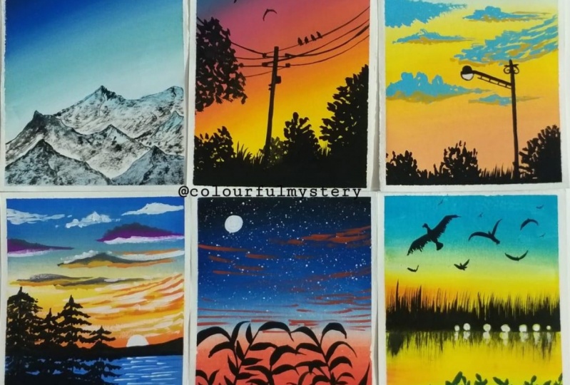
1. Hello & Welcome Back: Hello everyone and welcome to my new Skillshare class on painting landscapes. I am a machine, an artist, and an art educator from India. You can find me on Instagram under the handle, creating from the heart. I love painting with quash and watercolors. And today I have come up with this new Skillshare class of six. Big, no friendly, many landscape with wash. I will be guiding you every detail of painting. All these 6 million landscapes. We will discuss all the techniques in detail by helping things. Each of these, they are all easy landscapes in just under 10 to 15 minutes each. And this grid looks so beautiful with all the six paintings together. Initially, I will discuss all the materials that you'll need for painting all these six landscapes. I will discuss with you the color combinations for each beam thing. The brushes that I will be using for each class project guiding you through the rules of the brushes and everything in detail by painting these and landscape. I will also be guiding you about taping down the paper for these 6 million landscape onto an IPO size sheet altogether. And then we would paint all of it together one by one. I hope all of you will enjoy this class and I hope to see you all join me into this class and pain, these beautiful landscapes with me. Join me in this fun class and let's be easy. Many landscapes together. I hope to see you all join me into the next lesson.
2. Material Required: So glad that you're joining me in this six mini painting class. Let's have a look at the details that you will be needing for this class. I will be using this equal sign is people buy from the Blanchett theropod. This is 270 GSM and rough green. I would recommend you to use any people which is Bonnie, DG, SMN about. Then I will be using these two masking tape to tape down the paper and to get those six blocks for painting the minibus endings. Next, the pins that I will be using is this saved of naval pilot masterclass squash set of 16 sheets. And I will be using this setting in blue color from the brand routes through. Next, I will be needing a jar of clean water for each exercise. Next, I will be using a pallet to mix down my colors or get the colors out from my body. Now let's have a look at the brushes. I will be using these five brushes. So I have a flat brush, a liner brush or angular brush, and a rake brush. So the rate brushes just to add some shadow effect into the last painting, I will be using this Princeton heritage down brush, which has a pointed tip. This proves true. Rigger brush. This Princeton velvet dutch angular brush for some shading effect. That a brush for some shadow effect. Don't worry, if you do not have this big brush, you can do so with the help of a flat brush tool. And lastly, this flat brush for some background blend. Apart from that, you will be needing a white gel pen and pencil. Also, you will be needing a rough slaughter ordered the shoe. So that at all the materials that you will require for this six mini painting. So grab all the materials. And I will see you in the next lesson where we deep down up paypal. So let's begin painting.
3. Taping the Paper for the Grid: So first let's take down up people. I will be taping down my people using two different sizes of the masking tape. And I will be taping it down onto this block directly and then remove it at the end of the painting. First, I'm using this half-inch masking tape to tape down all the forward edges. So I'm applying it at one of the edges and then I will formally present throughout so that there is no gaps left for the beans to flow. And I will tape it down onto the block completely. Now, I will tape it down onto the second side that is directly opposite to the fourth side that I have taped down. Now, after this, you can take down any of the two edges that are remaining, whichever one you prefer, one-by-one, deep down. Make sure by taping down, you formally run your fingers after taping down so that there is no space left for the paint to flow. You know, that you are clean edges get to win. Now, I've just taped down the last side and then I will shift to the smallest size masking tape. So you can see I'm running my fingers for me so that there is no space left. Now, either shift to this 148 inch size masking tape to tape down in the center area. Okay, if you do not have this, you can use the same half-inch masking tape, but I prefer using this, but be careful if you're using this, you will have to be very careful while painting because you will need to restrict the movement of your brush. So I'll be forced or deeper down in the center horizontally. And then I will add two vertical lines too, all distributed into six equal blocks. If you want, you can foster, have some pencil markings for the sizes. I am roughly putting it into six equal blocks. And that's it. We're done masking down, up people into six equal blocks. And you can just adjust if you feel anywhere that you know, it's a little more or a little less. So then we are done. Now let's begin painting the first-class project into the next lesson.
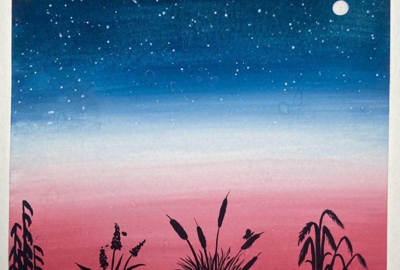
4. Class Project 1- Mountains: So let's begin with the first painting of this six mini paintings. So I will first take down the colors onto my palette so that it's easier while painting. So far, the first one for the background, I will be using these three followers type is white, bright green, and blue. And mixing these three colors, I will first form of bluish green color, which I will be using into my background. So I will just remove the three colors little by little onto my palette and, you know, form the color sheet that I want. So first, I have taken down some white color. Now next, I will add in a little bit of the green. You can use any light green tone that is available in your ballot. Now, do this, I will add in a tint of the pollution group Palo, very little effect. Now adding little water, I will try to blend it with the brush and get a greenish blue tone for my sky. So let's blend the color and see whether we are getting the right tone or we need to add any other color to get the perfect or tonal variation. Always make sure to get your colors and towards mood consistency before applying so that it spreads evenly and helps and clean blending. I feel I need to add a little bit of the green and blue color. So just to finish off the green and attention of the blue color, I will add up again. So I guess I've almost got the perfect shade that I need. And apart from this, I will be using the Prussian blue color directly and some black and white color to paint the sky area for the first printing. So either quickly take out the remaining colors also onto my palette that is depletion blue color. And I haven't been using the black and the white color directly from my birthday. I'm just blending in the blue color autopilot the perfect consistency of what also Dad, I have a smoothed, creamy consistency of my beans bi-layer, apply it onto my background. So now let's begin painting the false class project. We already have our people deep down. I will just quickly do a small rough pencil sketch off the snow escaped mountain. You're so quickly or very simple pencil sketch for this one. So at the bottom media I'm forced marking down the forest mountain range. And then underneath that, I'm just adding some smaller mountain ranges and trying to read them all from the first mountain range that I've added. So that is it for the pencil sketch, just some simple pretty mountains. Now let's begin painting the sky area forced. So for the sky area, I will first begin with white quash, New York to the mountain range. So very gently, I'm applying in the white quash near to the mountain range. And all you know, I'm trying to leave the mountain edges clean. So I have divided quash also in the right consistency that it spreads evenly. Since I'm using a rough, clean people, it may be a little difficult for me to spread the paint, but it gives a good effect. Tends I like using this paper for my simple quash books also, I am using angular brush this time you can use a flat brush. Now the green color mix that we had formed, I will apply it Next New York to the white color and try to blend both of it very gently. So you need to be very careful that you do not run into the next block. Otherwise. If in the next block you are using different colors, it will be difficult to your own, blend the color there and not get effect of these colors. So that is a reason when I said if you are using these 10 masking tape, It's a little tricky because you need to restrict your hand movement. Though, even I may ruin it and, you know, corrected later on. But just a suggestion and O are detailed information that I wanted to give you about being careful. Now, near to the green, I have applied depletion blue color. And then at the top, I will just apply a little of the black color and get a good gradient and try to blend all of it using a damp brush. So you can see just very easily using a damp brush, you can get the clean blend between the colors. And also if you want at places instead of using a damp brush. So that's the best thing about gorge that accordingly you can, you know, all older, what do you want to use for the blending corpus? And there we are ready with the blending of sky. And that is it for a simple produce guy for this one. Now let's begin painting the mountains. So for the mountains where I'm going to do is I'll mix both the blue sheets that is there onto my palate. The greenish blue that we found inclusion glue. And do this, I will add a lot of photo and try to use this as watercolor for the mountain. Because we will be painting some slew scape mountain Lou. I'm using it in a very diluted consistency. So more of water and less pigment triangle use it as watercolor. And now just filling some areas darker. So first, this mountain range, I'm filling it completely. So didn't places I'll try to show some darker shadows. So I did a little bit more of blue and I will use it this time also in all watercolor consistency. And just add some darker patches onto this little mountain you're now in the remaining mountains. I will not fill them completely with this diluted don't. I will just be giving in some random shapes with this darker Boone. So I feel I need to dilute the color. So I will add modal photos so that I get much lighter bone. And I will use that lighter tone and now add patches onto my mountain to reflect as the snow shadow because of the sky effect. So very randomly, I'm adding patches and leaving some white gaps because later on on do this we will be adding dry brush to reflect the snow effect. And since we already have the white gaps, so that will begin to act as this new naturally. Now you can surely 3D the placement of the mountain and even these darker patches may not be the same exactly where I am placing them. So feel free to just, you know, please them variable you want and however you want to play some darker patches. But just make sure that you don't fill all of it. Otherwise, it will not get that snow look. And then you will have to use whitewash to get this no effect. Now onto this mountain Also, I'm just giving it some darker, or you know, Bach's be totally didn't darker tone on do this lighter tone that we already had. So you can see it's all beginning to give in so much debt. Now onto the Clinch Mountain also, I will just add some darker patches very randomly. So for the darker tone I just started or danger of the ocean blue again, do that diluted tool. So I automatically God or Docker diluted to one. So then I'm done with these patches on the mountain. Now, build a mountain range trays either just add a moon quickly and do my sky. Because after that or, you know, after the badge try is I can give the diversity. So far the moon, I will first please also cool into the sky. And I will try to blend it into the sky and, you know, try to get a very lighter and unsettled bone. Then after that layer also dries. I will oh, you know, I didn't the moon in the center trying to reflect the light besides the moon. So first, I've been blended into the sky and just have a little white, but sure. So I'm just using a damp brush around the white goulash and trying to get all, you know, diluted or light patch there. So you can see it's not a vibrant white there. It's completely blended with the sky. And this will act as the shadow of the moon light for the moon. Now after this will dry, I will add though moon in the center of this circle. So around that I even have this lighter like to give the shadow effect. Now my mountain ranges completely dried. So let us begin painting the dry brush strokes with the black color. I'm keeping of probability besides, so that I can dab off the excess water as in when I'm picking up the beam. Because for the dry brush strokes, It's very important to remove all the excess water from your brush. Otherwise you will not get this dry brush strokes. And it will just begin to look a batch of colors just as the blue color that lever adding. So always remember while doing the dry brush technique, It's always important to dab off all the excess water from your brush so that all you get is just pigment and, you know, you get that rough texture. Now since my people is roughly so adding these dry brush texture is becoming much easier and the people is helping me to get more of a. Hence for watercolors, it's always recommended to go in for either rough green or cold place because they have a little texture. Hence adding these textures with beans then becomes much better. Because of the paper texture also, now undo this bottom mountain range also, I have just added some dry brush and to the edges, I am giving a very night or, you know, dry brush technique of water only. Not all distinct Blackboard or other definite Blackboard. I'm just using my brush very lightly and inner dry brushstroke only I added that borders. Now similarly on to the rest of the mountains also, I will quickly add some dry brush and in-between, I'm also adding some definite black lines to show distinction and movement of the mountain and the snow. Now the same thing, I'm just adding some borders and some dry brush onto the remaining two mountains you're on the left. Also, be very patient by learning the dry brush and always, always remember to remove off any excess water from your brush while adding these dry brush or else you will not get the dry brush technique right, and you will lose the snow cave look of the mountain. So I'm almost done with the dry brush drew, just undo this last Mountain your, and then I will paint the actual moon or in that circle that we pay intake. And then just some light effect around the moon. And we'll be done with this first mini painting. Now, let's be in the mountain. I will just, oh, you know, give a little white shine to the edges of this so called because it looked a little too light. Now picking white gouache in the thickest consistency in the center of this, I will just add a very small so-called to reflect as the moon. I'm not covering up the entire larger circle that we have been dead. So you can see the bottom. So a was bigger and the actual mootness Malo, hence the background is looking as the moonlight effect. Now just around us moon, I will give little curvy half C strokes to reflect as, you know, some.com Moonlight. So very small strokes leaving gaps in between the strokes also. So just these two to five strokes that I added. And you can see it's giving so much depth to the moon also. So we are done with the first painting. We will remove all the masking tape to get 0 once we are done with the oldest six paintings of this series, I hope you guys enjoyed painting this force painting. I will see you guys in to the next painting where we will paint a sunset together.
5. Class Project 2- Sunset: So let's begin with the second class project. Let's have a look at the colors. I will be using. A shade of yellow, orange, saving in blue. And Medallia read the city Lynn blue color is from the brand and the red color is from the brand naval pilot bedding. I have mixed in a tinge of yellow to make it more of an orange tone. Now, I'll begin with a yellow color first. So at the bottom, I will apply or yellow color first, and then I will pick up some orange color and blend it with a yellow color. Now again, you have to be very careful that you do not run into the other two blocks of besides the center block. So either you can keep a rough paper or place a tick or masking tape, or be very careful. Or you know, use our ticker masking tape, as I said earlier. So now I even use a damp brush and pick up some yellow color and try to blend the orange and the yellow. So you can even directly just use a damp brush or pick up some color. But I prefer to pick up some condos because I needed a little bit more yellow tint to this. Now onto top of this, I am picking up sound bite, and I will apply by it and try to be good, a little lighter, orange shade. And then I will pick up the other two colors for the sky because I want a very smooth gradation and oh, you know, transformation from the orange to the pink. So for that radiation purpose, I am laying down some vital to the orange. Now I'm picking up the madder lake red color mixed with a little tint of white. And so basically I did just not washed my brush and I directly dip some white into the madder lake red. Using this also in a little piece, still don't near to the audience. So now you can see I have got such as more transition from the orange to the pinkish tone just by using vitamin between. So that is the reason I had used a white color dare to get a smooth transition between the colors and not make it look rough transition. Now at the top just laying down some blue and blending it well with doping. Don't body the blue and the pink mix together may begin to form a little published tool and that is perfectly fine. Just tried to get a smooth blend Anna transition. So that is it for this simple, pretty sky. You can see such a simple sky in just like under two to three minutes if your color palette is JD. Now, I will begin adding the foreground. We need to read for the sky to dry before adding the elements of the sky. But till then at the bottom area, I can add the details with the black wash. So I'm just picking up some black color onto my palette and I will just get it into the right consistency and then begin placing the black color in the foreground area. So first, I'm just painting a very rough area with the black color at the bottom. So that is the reason I hadn't applied the yellow color there because I knew VR going to use the black color and fill it any which way. Do not worry if you have applied the yellow color, wait for it to dry completely. And then you can add the black color. Since squash is a forgiving medium, or you can see loading is easy. So it's very easy to load it over any color lighter or darker. Now very roughly using the tip of my brush, I'm just adding some bush detail at the top. So some very small somewhere be very randomly. Just add some bush details like this. Now onto this right side, I will first add some branches. And then one that I will add in the bush detail. So very randomly I'm just pulling out some branches. After I pin the bush details, the branches are still visible somewhere. So now just dabbing the tip of my brush, I'm giving in the bush detail. So you can see how all the branches are being visible from the bush also. So at the top, the dabbing technique and the rest of it, I will just fill it with black. And I even applied some of the dabbing gosh, look onto the branches so that it all looks out match. Now the same thing on the left side also, I will just add a little bush. So very randomly I tried to be redone height and all of this bush data added, which is just visible a little towards site. And you can see it's looking so pretty. Now the only thing left is to add a power line into this painting. So my sky area is almost dried and now I can add the power line. So I'm using the rigger brush for this purpose. And just using the tip of that brush, I have added a slant line forced to depict as the powerline pool. So in a little slanted manner, I'm adding this power line. Now, few violins into the sky or disappearing in between the bush idea. If you want, you can use a technical pen or a fine liner pen for adding this. Or you can add it with black wash using a fine liner brush whichever way you are comfortable with. Now, even at the top, I will just add a few lines or, you know, somewhere coming in from the top connected to this power line. Now just, I will add a few boards or into the sky after adding this last value. So at the top right area, I will add one or two boards depending on how they are looking after adding one of it. So just using the same rigor brush, I'm adding in the board. For adding this board also, if you want, you can use append if that makes your task easier. Just a very simple flying bird. So this last one your, and then we are done with this second mini painting. Also, such an easy painting in just like almost seven to eight minutes. And isn't it so simple yet? So I hope you guys enjoyed painting this beautiful, easy sunset with me. I will see you guys in to the third class project now.
6. Class Project 3- Pastel Sky: So let's begin with the third class project. Let's have a look at the colors. I will be using. This shade of yellow, orange. I have mixed in orange, red, white, and blue, but a lot of white. So basically it's like, oh, 70% white and just 30 percent of the blue color. So this is going to be a pretty simple sky. So at the bottom, I am using this base tone of orange color. Now, after the orange color, I will just add a little tent of the yellow, yellow. And then I will use whitewash to lightest tone and get a good transition from the yellow to the blue color. Because remember when yellow and blue we'll mix together, they will begin to form a greenish tone, which I don't want. Hence, I'm trying to use white in-between to get a good transition. And even if orange and blue we'll mix together, they will begin to form some muddy color, which I don't want. Hence, again, I will, in that case also I would have used in white-collar to get a good transition. Now I'm even lightning the orange tone because I feel it's a little too dark. So if you want, you can lighten it in the palette first only, or like this, you can just apply an O allele of the white color and get a transition. So this is much better because it helps you get a smooth blend between the colors. Also. Now, at the top, I'm applying the paint still blue color that I have found. I have mixed density Lynn blue color with a lot of white. And again in-between both of it, I have left some gap because there again, I will pick up white quash and blend it all together. So there I'm done with the blending of the sky. Now let's wait for this to dry and then add the element to this. So now my background is dry. Now I am mixing in a little bit of Prussian blue to this base, still blue that I have. And I will just add some Cloud details. So very randomly, I'm forced adding a big patch of cloud at the bottom media. And then into the rest of this guy, I will add in some smaller clouds. So in-between you can see I'm even using the lighter shade in all effect of this cloud so that I just don't have been darkly or cloud. So automatically using the lighter tone gives it depth and some shadow effect. Now, onto the top side, I will just be the ordering some very small clouds, not too much also, and not too much detail also. So simply using in this darker tone. So I'm just placing some clouds by moving my brush in Edo circular motion or just using the tip of my brush to give in some straight line enzyme graph edges to form our cloud-like structure. So you see I'm slowly building my sky. Do not please all the clouds together at one place, only build them at different places so that you come to know where you need to add more of the clouds. Now your, I'm just using the half C strokes to add in all good flock of cloud looks. So you can see just a little simple Cloud and there I'm just adding a little hint of yellow. Now, even to those little blue clouds, I added a tinge of yellow. Now I will switch to my black wash and add the final element, that is us g plague and some bush effect into the bottom area. So first let's add the street light. So a simple straight line, just using black color, no light details or, you know, any further details. Just a very simple solution. So first line and then a little slant line to show the hand of the light. So my brush has a pointed tip pens. I'm able to add in all these details with the same brush in case if your brush does not have a pointed tip shift to a detailer brush for adding these small details. So you can see just a simple straight line without the light effect there. I have covered the entire lamp black color. Now just adding some details to make it look a little more detail. And now underneath this light hand, I will add another line to show some connection and make it look more natural like a street light. So we're done painting the street light. Now at the bottom, I will just add some bush effect by using the tip of my brush. Very small, not too much. So I'm just using the tip of your brush quickly. You can just add in some bush effect so that it gives a little more detail to this symbol painting. So I'm using the same technique that at the top I'm just dabbing my brush. That is the tip of my brush to get some bush detail. And at the bottom, I'm just simply filling it with black color. Now neo the dotCloud, you can see I have our data line of this bush and not too much because I wanted to let that cloud be there. So it's like a low lying cloud actually. Now just filling in your and adding some more bush detail. And then we will be done with this painting too. So I feel like adding a small moon, which is about to pop out. So at the top-left corner using buy it, gosh, I will just add a very small moon. So make sure that you use the white gouache in its thickest consistency for adding this moon. Otherwise you will not get the opaque and the bright look of the moon. So that is it for our third paintings. Such an easy sky painting with just very limited elements. And it looks so pretty despite being so simple. Does it take so I hope you guys enjoyed painting this with me. I will see you guys into the next project.
7. Class Project 4- Evening View: So let's begin the default class project and let's have a look at the colors that I will be using. I will be using the shade of yellow, orange, blue, and violet color this time. If you do not have violet color, you can mix in a shade of red and blue or pink and blue to get a violet tone. Now, I can just begin with a very simple pencil sketch that is the horizon line. Nothing much. So approximately at around 40 percent, I will just place or not even 40 percent. You can see just 0, 1 inch area that I left from below. So just to a very small sea area. And the top is going to be my sky area. So I'm beginning with a yellow color first and applying or little layer of the yellow color. Now onto this yellow, I am applying the orange because I did not want much of the yellow to be visible. I just applied that. So diet, I have a yellow effect, that is a literal sunset effect to this. So that is the reason I am using in the yellow color. But I want more of orange over bubbling the yellow. So now just trying to blend the two, I didn't want it to blend them into the palette and then use it your, because then I would not get those different tunes in between. So some very few can see I have more of the yellow effects on where more of the orange effect, which I wouldn't get if I had mixed it directly in the palette. Now using some white quash, I'm trying to get a good transition to the next color. So whenever you want a transition to the next color, and you know that those two colors mixing together may form of muddy color or a color that you don't want. So you can use invite for a smooth transition. So now I applied some violet color and now some pollution blue at the top. So I know when the violet and the orange mixed together, they may again form or medical law. Hence, I had used a white color there. Now using a damp brush, I'm just trying to get a very smooth blend and transition amongst all the colors. So my purple color is almost lost because of the blue color over powering gate, but that's okay. I will be adding in some poeple clouds and that may look better. So it's perfectly okay if you know any color overpowers, but I can still see some violet effect that I added. That is what I needed and I am satisfied with it. Now into the sea area, I will just paint it simply with the Prussian blue color. Nothing much detail. And then we will just add some leaves later on, but first layer of the ocean blue color. So now let's meet for this entire thing. And then we will add in all the father DDS. So now my background is completely dry it and I'm mixing in some orange and some pollution blue color to get a muddy tones. Because this time using this muddy to one, I will be adding in the clouds. Now this time to add the clouds, I'm using my angular brush and I will just use the tip of my brush to add in some lines to depict as the clouds. Do not worry if you do not have such a brush, you can use a smaller size flat brush, and just use the tip of that brush to add details like this. Or you could simply use a smaller sized round brush you and using the tip of a tip off your brush, you can add these details just like we had done in the third class project. Now using the purple color underneath these muddy clouds that we have added, I'll just add some purple highlights of the clouds. Now, same deal. I will just add some yellow highlights at the bottom media. So at the top I added some purple highlights and at the bottom I'm giving in some yellow highlights. Very simply the same way I am adding in some yellow clouds. Now to these clouds, I even want to add some white highlight that there's some shining effect to these clouds. Having awesome shop or white borders. So just adding little white clouds in-between all of these using the same method. You can add these tools with the help of a round brush or a flat brush. Now you're at the bottom also, let's add some clouds. I'm not adding clouds in the bottom left side because they're all of it will get covered with the pine tree. So it doesn't make sense to add it there. But you're at the right side. I'm adding in using the yellow and the white quash. So you can see some there I formed a little or round clouds and somewhere just those straight lines. Now let's begin painting the details in the remaining ADR. So first for the CDR, same way using the angular brush, I will just add some CVs. So just some simple CVs using the tip of my brush. You can again add this using a fine liner brush, just some lines with the black color into the sea to depict as the sea waves. So you see just simple CBF using the tip of the brush. And all of it looks so much detail. Now when we will add the pine G's, all of it will look much detail. And then some dry brush strokes with the white color will make it look much better. Now, let's begin painting the pine trees. So using the black color, I am shifting to my round brush size three, which has a pointed tip. In case if your brush does not have a pointed tip shift to a detailer brush for painting these pine trees. So now using the black wash, I will just lay down all muddy area, kind of look into the sea. And from there I will show all the pine tree standing. So simply pick up some black wash and first a mock rock kind of idea. Okay, So before that I will just add a mountain range on my horizon line, or very weak small mountain range. And later on I will show a sun rising from behind this mountain range. And now let's begin painting the rock ADR. So you're in the middle somewhere a little about the middle area. I'm just adding in this ROC area first. And from your eye will show all the pine trees. Now very simple buying Greece's what I'm adding. So beginning with those stem and just adding some foliage. Very simple pine trees, not detailed one, just trying to get some curvy strokes out. Just make sure that the bind the ensured the OB somewhat in a triangular shape so that it looks natural. And just simply pull out these or leaves from the stem to make it look like a pine tree. Now the next pine tree I will paint will be a little more high debt than the first one, but I will try to overlap it on the first one so that all of it looks natural. But make sure while painting this also you be careful of funding that as you are moving downwards, the length of the foliage has to increase so that at the end you'll get a triangular loop for this G also, despite it overlapping the first one, you still need to try to maintain all triangular because all you know, with guage or at times even that becomes visible. So it's very important to maintain the shape of the tree. Now quickly add the remaining pine trees into the entire area to the left side. And then we will be almost done with this painting. We'll just be left to add in the sun and some dry brush into the sea area. So you can see I have tried believe the high dose dopamine Jesus everywhere. So let's shift to wash. And using the white gouache, I will first place or a setting sun behind the mountain range that we have been. So just to have sun, which is about to set now to reflect the effect of the sunlight into the sea area. I will just be adding some dry brush with the same white quash into the sea ADL or just below the sun. I'm just adding some more white highlights into the sky. Now let's just add these dry brush and do the CAD I just underneath the sun. I will not be adding it into the entire see. I'm just adding it New York or to the sun area. Now make sure when you are adding this, you dab off all the excess water and use the pigment. And even if you have a lot of pigment, make sure you dab off the excess pigment so that you get these dry brush strokes. Otherwise you will just get a patch of two colors and not these dry brush look. So there I'm done adding the dry brush into the sea and it's reflecting the sunlight so perfectly, isn't it? Now one last thing, using the black wash itself, I will just add a very small shore area at the bottom of the sea. So quickly pick up some black wash and just add a short area at the bottom. So there we are done with this easy sunset or seascape view. I hope you guys enjoyed painting this foot class project with me in this mini format. Now, we are left with two more class projects for this class. So I will see you guys in to the fifth class project. And I hope you guys are enjoying painting all of this with me.
8. Class Project 5- Meadow: So let's begin with the fifth class project and let's have a look at the colors that we will be needing for this one. We will just be needing a shade of orange, blue, and white and then some black wash. So this time we will be painting a very simple field kind of look and evening feed look basically. So let's begin with the orange color. I'm directly using the colors from my bottle itself because I don't have to mix in any other color with them. So at the bottom, I'm beginning in the door, red tone, which is almost like an orange tone from this set. Now be careful of fun thing that you do not run into the left painting or into the right whitespace that you have for the last painting. Because if you run into the left one, you will ruin the left one. And if you run into the right one, all we can still collected there. But try avoiding it because the kalos there are going to be lighter. Now I'm picking up some white gouache and I will try to get a transition because again, the blue and the orange mixing together forms muddy color, which I want to avoid right now. So for transition I'm using in the white quash. Now I'll shift to my Prussian blue color. And from the top I'll begin to apply the Prussian blue color. But first, I'll just quickly have a clean blend between the white and the orange to get this smooth transition. Now from the top, I'm applying the pollution blue color. And after applying little of the pollution blue color, I will pick up a white color to get a good blend of, you know, between the blue and the orange again. Now I just use a damp brush and Dido gate does blend between all the colors. So please make sure your brush menu are trying to blend because every time that you would run your brush on, your will happen. Go pick up some color on the brush. And if you accidentally done with the same brush, it may ruin your Adobe color sheets. Now picking up some violet here to add in a little more transition because they feel the blue is too dark and I'm not getting a smooth transition between the colors. Now at the top either just add a little bit of black to even darken the sky for though. And now the final blending between all the colors from either top to bottom or bottom to top. However you prefer, I am suffering from top to bottom because I want more of an evening look. So now you can see I have got such a clean blend between the kalos and such a smooth transition without having any muddy dawn or sharp edges. So that is how you can use either white goulash or damp brush and get a cleans mood blend. Now let's wait for this to dry and then we will add in the foreground feel kind of looked at we wish to add. Now either just add in some clouds before adding the field ADR. So I've just been using the orange color this time to add in the Cloud effects into the sky. So I'm again using my angular brush and just using the tip of this brush, I'm adding these cloud strokes. You can use a round brush with a pointed tip and adding these details. So very simply you can see I'm just adding in some orange clouds very lightly and not applying too much pressure. And just simple or rough lines to depict dotCloud. So just a few more clouds, you're at the bottom side also. I will be done with the Cloud, but Now let's shift to the black cohosh and begin adding the field detail. It's going to be a solo hit kind of a field using the black color. So first, I will add some grass strokes with the black color. I will try to be read the height of this grass strokes that I'm adding some that are low Sunday short-term. And I will add it into the entire bottom area first. So you can see I have tried to vary the height of these grass, the lens throughout. I'm almost done adding in all of these grass details. Now from these, I will try to pop out some leaves or branches of leaves with detail. So just some long branch and then add some leaves to it. So you will have to add them one by one to give them a detail look. If you want, you can just add some taller grasses or, you know, some field grain looks and not add in these details. But I will be adding in these detail leaves a little so that it looks a little more detailed here. Now you can see at places I added it just using the one stroke leaf adding method and just added some bigger leaves. Also, that is how you need to VD the leaves also somebody very small, some way bigger like DES and somewhere I will just be adding some bigger grass talks directly. So the most important thing while painting this is you need to remember that do not add all the details of one kind altogether. I didn't part so that you do not overdo any one kind of detail. So saying if I painted these smaller leaves throughout, and then I feel like okay, I added too much of these leaves. It may look a little reward, so it's always better to add little of them, then add the other variation of it, the leaves or other details that you want to add. And then you can add in further or you know, these smaller leaves more if you want. So that is the best thing about guage that you can add the details later on also, so that, you know, is actually helping aid to decide what you need to add more to make the composition look set, David. Now, I will just add some thicker grass strokes and from there I will try to show some more grass strokes popping out. Now, do this grass. I am just adding some bigger leaves popping out. So adding these needs I have taught in my pattern painting class. So if in case you want to learn how to add in these leaves using this one's 20. You watch my patent pending class unknown to being these leaves. Now just a little more grass detail here. Then we will almost be done with this painting. So it's just a simple, easy field kind of look. But doesn't it look so pretty with the colors that we have used for the background. And then adding in these simple leaves, nothing or difficult or, you know, nothing complicated, just simple, easy things. But it's all about how you try to include all of it into your composition. So I'm done adding all the details into the field. Now one last thing left is to add a moon into the sky because it's an evening sky and I feel amine will complete this loop. So using my white gouache, I will quickly add more onto the top left. So I'm done adding this simple. Now, I will quickly shift to my white gel pen and even add some stars into the sky. I'm not using the splattering technique your because I don't want to watch of this task. Just a few office so quickly with my white gel pen, I will add in these stars. So then I'm done adding all the details and we are done with our class project five of this six mini painting CDs. I hope you guys enjoyed painting this simple, easy evening middle look with me. I will see you guys in to the last class project of this series.
9. Class Project 6- Seascape: So welcome to Class Projects 6. This is the final class project in this six mini painting series. Now we will be painting or evening or seascape blue. So let's have a look at the colors. I will be using. The shade of lemon yellow tinge of orange and this setting in blue color. So this time it is like 75 percent wide and just 15 percent of the blue color. And then I will be using white quash green color and the black color. Now for the pencil sketch in the center area, I'm forced marking the horizon line. And that is it for the pencil sketch. Nothing more to add. So let's begin painting the sky first. I'm using the lemon yellow color and I will begin naming it near to the horizon line first. Now, again, be careful that you do not run into the masking tape off onto your left side because you can see there I have some blue color. So if I will run my brush onto that masking tape, the blue color will again get activated and run into my painting, which I don't want right now. So that is all you know, one thing about these mini paintings that you need to be very careful about the masking tape. So now I use them a little bit of the white quash in between. And now at the top, I'm applying in this mix of the blue color that we had. And again, 0 when the blue and the yellow mixes together, it begins to form a greenish tone. Hence, for the transition I used in white gouache so that I don't get a greenish tone there. Now, I will just add a little tinge of the orange color and near to my horizon line. So I just added a little tense and now I'm trying to blend it into the yellow color such that on the right side medially the yellow is visible, and on the left side it's a little more orange that is visible. So in-between whenever for blending, if you want, you can always pick up the color. And that's the best thing about gouache again, that, you know, it's easier to blend using the kalos order damn brush again. Now into the sea area also, I'm forced beginning in with the yellow wash and newer to the horizon line, I'm applying this yellow color. And then at the bottom, I will use in a little bit of orange and the blue color again. So now the orange color a bit, just a little to blend and try to reflect the sky into the sea area also. Now lastly, I will just add a touch of this blue color also into the sea. Very little, not too much. And just have a clean blend between all the colors. Now my sky area is dry it so I will just tilt my paper because my CATIA still wet and using the black wash, I will quickly add a small mountain range onto my horizon line. So at this time, either be adding a spiky mountain range. Just as we added the grasses last time. With those spikes, either be adding the mountain and not a simple mountain range. So you can see I have tried to vary the height of this antibiotic. Somebody's Malo some weight or low. Okay, so we're done painting this mountain range. Either just add some more darker highlights at places. And underneath this I am adding in a layer of the black color. And now using the rig brush that I had talked about in the material section, using this rake brush, you know, I'm not all dipping it into water. I will just dump it into a little of the black color. And now the bottom line that I painted from there using this big brush, I will try to add the reflection. So I will just pull out that black color with the help of the league brush. So you can see I'm getting the reflection and do the sea area. It's not a definite look like the top range that I have added. But it's perfect for the reflection or because the deflections are a little blower and you know, a little less defined 0 then what your actual element is. Hence, the snake brush works perfectly for adding in this reflection. Now if you did not have a lake brush, you can use a damp of flat brush, not even a damp actually, just a dry flat brush and pull out the, all the strokes to act as the deflection. Now you're at the bottom media. I will fill this area that we have left to buy it with the black color completely. Now, again, I will just add some black highlights on the mountain range that I have been dead. Because at places I feel that it is a little light. So, you know, again with quash, you can overdo onto the walk that variable you feel the color is not perfect. You can just recolor it and get the right effect that you need. Now let's quickly add the foreground. So I just add this. But, you know, it is a detailed board, so forth. I do an oval and then I just drew a so-called to depict as the head. And now these veins and do the wings also, I have pointed out though Fido's to give more detailed feather effect. Okay. Just a simple board and maybe just another one You're over the smaller one. Okay, So I feel like adding a few more birds because the sky is a little plane and does not have much of the element. So I'll add another few buds. So you can see the boards that are far from disclosed. Now, I will quickly shift to my dark green color. And using the tip of this brush, I will just add some grass strokes into this bottom area that we have painted with black Kano. So the reason why I painted with black color first is that it will begin to add some darker shadow defacto, kind of a lope into this grass field. And now using the tip of my brush, I'm adding in these simple grass to make sure if your brush does not have a pointed tip, you shift to a detailer brush which has a pointed tip and then add these grass strokes. So I'm done adding in these grassroots. And now at the top of some of these grassroots, I will just give it a little more detail leaf look. So just simple leaves and some there I will just dab the tip of my brush to give him some leaf look. And somewhere I will just pull out some leaf so that it looks a little more natural. So you can see I tried to add different elements. That is somewhere dabbing somewhere adding those tiny means and some very just pulling out some grass strokes again. So all this is making it look so natural and giving it so much detail and look, OK. Now I will just make these reflections are little more darker. And make sure about one thing that the deflections BD in the height just as the top mountain range. Now into this mountain range, I will just try to show some lights. Oh, that is there are some distinct or houses kind of look. So I'm forced using the yellow color and just leaving some dots using the yellow color. And then once this dries, I will add in some light effect with the white color. So I have 0 please, these dots of different sizes. Now exactly underneath these dots I'm adding in the reflection of these lights also into the black area that we have been today's reflection. So just a very simple reflection by adding a line of the seam on at the same place meant. Now I'm shifting to my white gouache and using the white quash intake consistency, I will just add it and do the center of these circles. So at the edges are little yellow will be visible. And in the center you add in this white dots. So this reflects as those distant houses or, you know, hats into this mountain range and the lights popping out from these hearts is what I'm trying to depict. Now CMV in the reflection also, I will just add a little touch of the white color. So there we are done with our last class project of this six mini painting. And now in the next lesson, we will remove the masking tape altogether.
10. Removing the Tape for the Final Grid: So your final grade of all the six mini paintings that we did in this class. Now, it's time to remove the masking tape. Now while removing the masking tape, remove the masking tape that you apply it last so that you will have to remove first. And be very careful while removing these masking tapes from the center because it may tear off on either sides of your painting. So you have to be very careful and try to maintain a balanced angular while removing this masking be from the central ideas. Now, also make sure that you remove the masking tape only once you're painting is conduct percent dried. Otherwise, it may again ruin your painting. Now after removing the masking tape from the center area, begin to remove the masking tape from the edges one by one. So again, the last date that you applied, it will move out first and then in the reverse order, you will just keep removing all the masking tape. So isn't it looking so beautiful after removing the masking tape with those clean edges, all the six mini being things of these series. So I hope you guys enjoyed painting all of these six paintings with me and I would love to see your class projects and hope to see you all recreate these paintings. So your final grade of the six paintings all together.
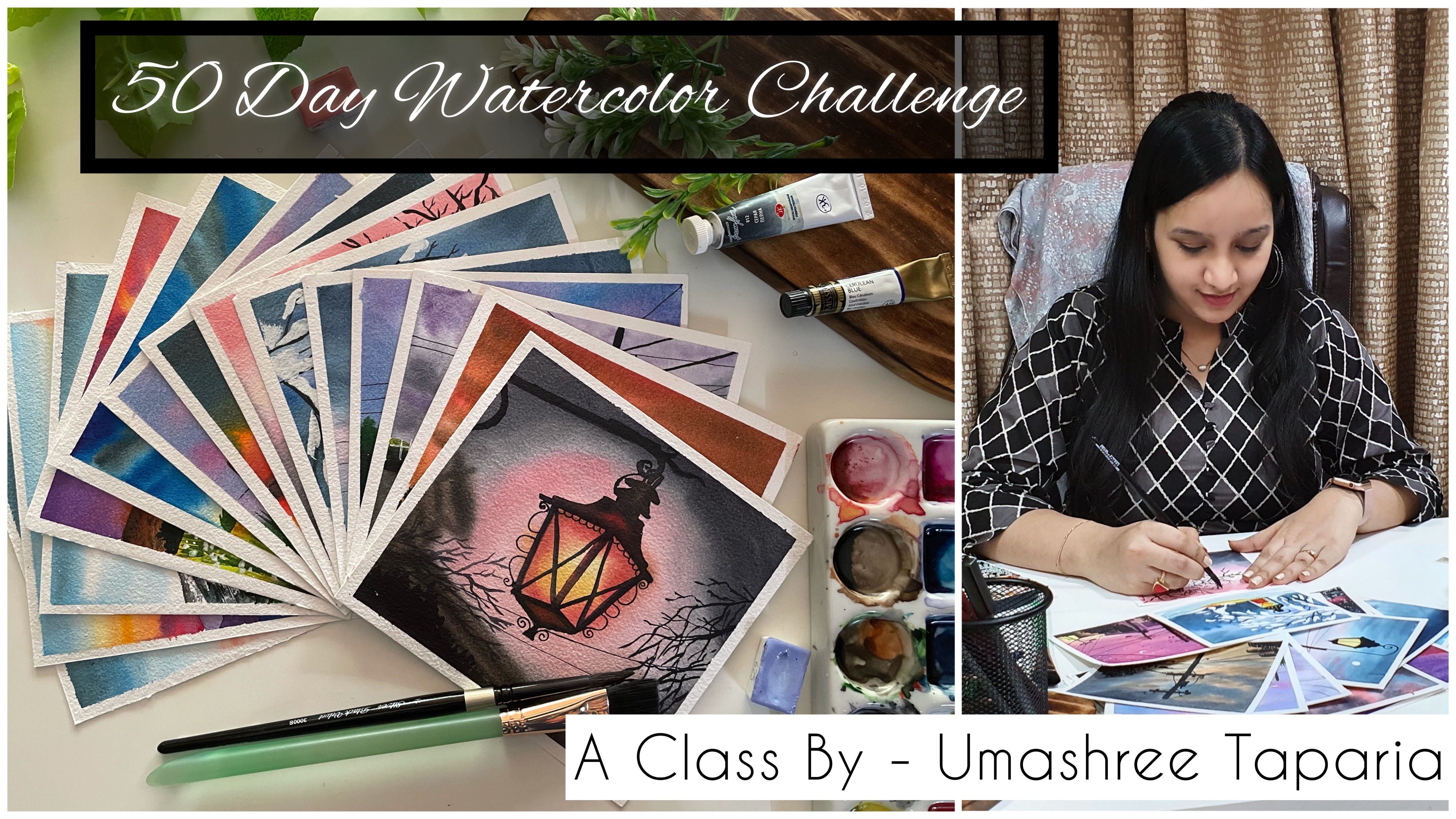
11. Thank you : Thank you so much to each one of you for joining me in this next mini painting class. I hope you guys enjoy painting each of these easy, simple 6 mini landscapes with quash. I would love to see all of your class projects into the project section of this class. And if you like this class, do dropper review into the review section of this class. Or in case if you have any suggestions, you can drop them into the review section. And I would love to read them all. Thank you so much once again, do each one of you for joining me in this easy mini landscape painting class. I will see you guys soon into my next class. Till then, I would love to see you all join me in my 50 day watercolor challenge class. Thank you so much once again for joining me.
 Umashree Taparia, Artist, Art Instructor, Entrepreneur