Transcripts
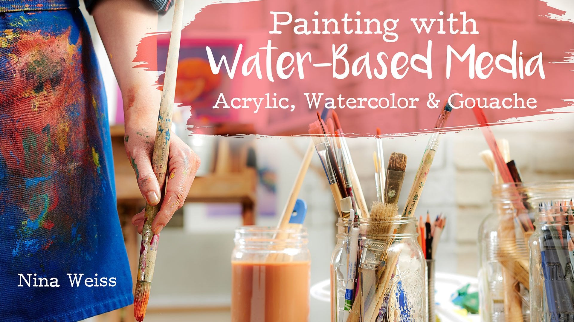
1. Class Preview: If you want to start painting, you are in the right place. Acrylic is the
perfect paint medium for beginners and
even professionals like myself love the flexibility and ease of using acrylic. I'm Nina Weiss, and this is
startup library painting with acrylic painting
is my absolute passion. And I'm here to get you as excited about painting as I am. I've been painting since I was 11 years old and I
still learn new things. This class is filled
with all the things I wish I knew right
at the beginning. It's the perfect place to start. I've used all sorts of
paints from oil and gouache, and I just keep coming
back to acrylic. Now, let's talk about
how to use your time. Get the most out of this class. We'll start by going
over the tools and supplies you'll
need to be successful, including what paint,
brushes and supports to buy. Then we'll dig in and do some exercises to get you
comfortable using the paints. I'll be teaching your color
mixing and brush techniques. Throughout these
lessons, we'll start working with just two
panes, white and black. And as the lessons progress, we'll add in more
and more colors. Will finish the class by
doing a full-color painting, a lemon still life, where you'll put all of your
new skills to the test. You've made it all
the way here and it's the first step to your
acrylic painting journey. Painting is meant to
be fun, not scary. So remember, it's
just a painting. No more excuses. Just press.
2. What You Need Paint & Palette: Let's start at the very
beginning and talk about what we mean when we talk
about acrylic paint. In this first
lesson, we'll cover everything you need to
know to get started. I'll show you how to
confidently navigate the art store and I'll
show you how to buy pain, pick a paint palette
and choose your colors. When you think about
art materials, the commonality that all of
them have is the pigment. But where they differ is the binder which gives the
paints its consistency. And all paints also
have a filler. So the binder in
acrylic is a polymer, which is what gives the
acrylic the ability to dry quickly and to seal itself. The filler in the
acrylic is water, which makes the
paint water-soluble. And this is why it is
such a clean paint. You don't need to
use turpentine, you don't need to use solvents. You've just got a water source
and you're in business. So ultimately, what this
means is acrylics dry fast. You can layer them easily. You can use them on a
wide variety of surfaces. And they're really versatile. They clean up easily because
they're water-soluble. And so that's why they're
so user-friendly. But you're walking into an art store and
you're likely to see an aisle of paint that is
ginormous and overwhelming. You're going to see a
lot of different brands. You're going to see
different packaging. You'll see tubes of paint, you'll see bottles of paint, you'll see tubs of paints, you'll see jars of paint, and more colors
and you can count. So where do you start? First of all, let's break
all of these paints down into two different
types or qualities. We're going to call them
artists grade or professional paint versus student
grade paint. So when we look at an
artist grade paint, we're looking at a wonderful
buttery consistency and an opacity and a color that
is exactly where you want it. So let's see in comparison what the student
grade paint looks like. So I'm gonna give you
a swatch of that. And there's a couple of things
you'll notice right away. So you can see that as we swapped out the
professional grade quality, It's a rich, buttery read. It's a primary red. It's opaque. When we swapped out the
student grade paint, it's transparent and it's a
completely different color. I would not use this to
mix as a primary red. So two very different paints, professional grade,
student grade. Other ways that you can
tell that you're getting a student grade paint is you're
going to see words like, of course student
or basic or studio. And what you're not going to see is an extensive labeling system. When we look at our
professional grade paint, we're going to see a
lot of information on the back of the tube
that tells you things like opacity or thickness
or tinting properties. One of the most important things that you'll notice as you by professional grade quality is that they're sold in series. So on this tube of
your primary yellow, you'll notice it's a series to pigment is
priced differently. Some pigments are
much more expensive. So for instance, if we
look at the pyrrole red, you'll see that that is a series eight and this tube of paint
is going to cost you more. So in the student grade paint, we don't have series number two. It's really not
about the pigment. The labels will give
you some information. It isn't the kind of
professional grade paint that I want you to use
for your projects. The other thing
about this set of paints Is it looks
really tempting. There's a lot of colors here, but let's see what actually
happens when we think about what colors we
need for our projects. What do we have? We have
a white, we have a black. Fabulous. You're going to
need those. What's next? It's a brown. I'm going to teach
you how to use your paint to create
a neutralized color, which is a brown.
We don't need that. What's next? Look? It's another brown. We don't need that. What's next? Agreeing? A lime green. We can mix this ourselves. We won't be using this. A blue-green, same thing. We're going to mix it. Yellow. Great. This is a primary yellow. I'm happy with this. Let's leave it. Violet is a secondary color, will be mixing that. We have a single blue. That's fabulous. We do need that. The red was wrong. I'll leave it in the set, but I don't know. This orange is kinda neon. I'm not sure what
it's doing here. You'll be mixing your own
and it will not be neon. And last but not least, I think this is supposed to
be your Alizarin crimson. The color is way off. So we'll get rid of it. Let's see what we've got. Black and white, fabulous, and basically only
three usable colors. So though you think
maybe you were saving money by getting
a whole set of ten. There was a lot of paint
we don't even want. So let's not by a set and let's stay away
from the student grade paint. We're going to concentrate on the professional
artist quality paint. And you're still going to see a lot of options in
terms of colors. But I'm going to give
you a list of colors that I specifically
would like you to buy. And it's really important
that you stick to these exact color names. As you read the labels, you're going to see
words like light or hue, or shade, or dark or medium. So for instance, if we
look at your yellow, this tube of paint says
cadmium yellow dark. And it's really
important that you buy exactly cadmium yellow
dark because what you'll also see is cadmium yellow light and cadmium yellow medium, and they are completely
different colors. So let's stick with the
exact name of the color. The paint that I
think we're gonna do a fabulous job with is going to be good professional grade
paint like Liquitex, golden. You will get the
exact colors and the exact coverage
that you need. So you'll find that good-quality
pain is more expensive. But remember, you're gonna
get the color that you need. You're going to use less of it because it has better coverage. And it's gonna give you
the results that we want. So with all of those
options in the store, now you know exactly what
kind of paint to buy, and I'm going to tell
you exactly what colors you're going to need
to buy in a little bit. And remember, there
are only eight. So another thing that you're going to want
to buy while you're at the store is a
palette for your paint. There are so many
different options. Let's narrow those down for you. So you're in the art store and you're looking
for a palette, you are going to see
a lot of palettes. Let's begin by looking at the ones I don't
want you to get. So right in front of me here I have what looks like
a fabulous palette, has some of the things we want. It has little wells that we can squeeze our pain into an
an a nice big mixing area. It's nice and white and shiny. Yay. Okay, now, this is what happened to that palette
after I used it one time. What happens is the
polymer and the pain adheres to the plastic tray
and the moment it dries, you can get it clean. I like to start with
a nice white surface to mix my color on. So this is no longer
a very good option. Let me show you what else
you're going to see. You may be tempted by this sweet little
flower shape pallet. What it has that
we'd like again are the little wells
and it has a cover, but that is a
miniscule mixing area. It's just not big enough. Let's get rid of it. What else? You're also going to see
what's called a wet palette. The way that these work is
you have a sponge underneath and wet that and then you keep replacing the paper palettes. I've had students use
these palettes before. What tends to happen
is the paint sinks in the color quality,
the pink quality. I don't love it. You're constantly running out of or replacing the
paper palettes. And it's sort of like mechanically
allowed to fuss with. We could make your
lives a lot easier. There are so expensive, so let's get rid of
that one as well. Another option that you will see are disposable paper palettes. And I find these
really unsatisfying. They're not that
great to mix on. They're very thin, they
warp and you're throwing away a lot of paper that
you have to keep replacing. So not my favorite
option either. The palettes that I do
like that you're going to find in the art store are a white coated
Mesa night palette that is very artsy
because we can hold it. So if holding your palate and standing is something
you're interested in doing, I would really
suggest this palette. It fits very snugly into
your arm and your thumb, and it's easily cleavable, has a nice big mixing surface. Again, we can hold it. Another palette that
I absolutely love for acrylics is what's called
an enamel butcher tray. You're not going to
hold this, you're going to work with it flat. It is metal and it does have an enormous mixing surface
and it's super easy cleanup. The plastic acrylic just basically washes off and lifts
right up and it's white. So important, my absolute My favorite palette
you're not going to actually find in the art store, but you're going to easily
make is a glass palette. And what's really important
about this glass palette, It's safely edge with duct tape and it is backed with a white, either foam core
or in this case an illustration board
because you always want to be mixing on white. And what I love about
this palette is it's got a large area for mixing and we will scrape
it to clean it. The glass is easily purchased
at any hardware store. You just need a scrap
of illustration board. And of course everybody
has duck tape. This is really my favorite
palette to work on. It's what I use all the time. You can't hold it, you're
going to work with it flat. And for size, all of these
pallets were about 12 by 16 " and that's a good
size for you to work on. So we use the word palette
in two different ways. One is for this, which you're already
familiar with, the palette, what you
put your paint on. However, another use for
the word palate is to describe the array of colors that you're
choosing to work from. And I'm going to
introduce you to what we would call a limited
palette of colors. This palette of colors is
wonderful to work with. From these colors. We're going to help you mix any color you need
and will help you avoid muddy or dirty colors when you're doing your mixing. Now, we call it a limited
palette because you're only going to use six
colors plus white. But the colors you can mix from this palette are limitless. You can mix just about
any color you need. So limiting the colors
that you start with only means that we have
fewer tubes of paint. You're spending less money. But the best thing about
it is you actually have more control
over your mixing. So here are the six colors that we're going
to use plus white. And as we squeeze
out our palette, We're going to pay attention to the order from light to dark. And pay attention to
where we put our paint. This is our light yellow
or our primary yellow. We also call it our cool yellow. So our palate is made up of the primary colors,
red, yellow, blue. However, we're going to have a warm and cool of each primary. So we've got our cool yellow and now we're going to squeeze
out our cadmium yellow, dark, this is our warm yellow. Next we have our reds. The warm red is
your pyrrole red. This is also your primary red. And next we have our cool red. If you are purchasing golden, you're going to be looking
at an alizarin crimson. If you're purchasing Liquitex, it might be called quinacridone. Either one is fine. They are both your cool reds. Look how gorgeous these are. Next we move into our blues. We have a warm blue that is
your primary or cyan blue. And last on your palette will
be your ultramarine blue, which is your cool blue. It may also be called French ultramarine and that is fine. So there's our palette. And you'll notice
that I squeezed the colors out very close to the rim because we want all
of this area here for mixing. So you'll notice that I didn't squeeze blackout
onto my palette. You're limited palette is
the six colors plus white. I did ask you to buy
black and we will be using it for our value studies. But for now I'm not going to
put it out on the palette. So let's talk about
pallet management. Again. Colors squeezed
out along the rim. I have seen students very
haphazardly squeezed, paying out all over
their palate and then they don't
have room to mix. Another big question is, how do I work with my paints so that I can keep the
blobs fairly clean. So this is called pulling paint. And if I'm going to
mix, say an orange, what I want to do is pull
the paint in one direction. Always it leaves the
rest of the block clean. And in this way, I have the rest of the blob is not getting
any other paint on it. You'll notice that
I am mixing with a brush and not a palette knife. I have had students mix
with palette knives. They tend to mix a lot
more paint than they need and you have a little
less control or I of, I feel like I have a
little less control with the knife than I
do with the brush. And actually I love
the feel of the brush. For me. It's kind of like a
touching experience, so I love mixing with the brush. You'll notice that when
I mix with the brush. I'm also always using a little bit of water
That's important. You rarely if ever, are going to work with paint
straight out of the tube. It always needs to be thinned
with a little bit of water. The other thing about
your mixing area, if you're mixing a paint, try not to geographically cover your entire palette
because you're going to have trouble like hurting
it back into a blob. It'll just get thinner
and center and center. You'll also notice that to
maximize my paint usage, I started with the
lighter color, which is the yellow. It takes a very little bit
of red to affect the yellow. I would use half a tube of
yellow to change the red. So you always want to
work with dark to light. Another question that
students frequently have is, how do I squeeze my tubes? How do I get that last bit
of yellow out of my tube? So we have a wonderful
little device. It's called a paint key. And we thread the end of the paint onto it and we
just squeezed as we go up. When we get to the
very top of the tube. Sometimes what I like to do is use a pair of pliers
to crimp that down. So I don't puncture the tube. I'm gonna put a
little rag over it because this will only
roll up just so far. Another product that
I like to use that's really effective for getting
the very last bit of paint out of your paint
tube can be found in a hardware store and
it's a heavy-duty metal, pink cream per thing. I love them, but these
will work for you as well. And you can find these in
various sizes in the art store. So regarding your pink tube, another thing that's
really important to do and you might
not think about it, is let's keep that
paint cap clean. Because what happens is
the pink cashes out, the acrylic dries and hardens. Eventually that tops not
going on and you end up using masking tape for a cap. So instead just give
it a quick wipe. You can even wipe out like
along the inside of the cap and then securely fastened that back on and you're good to go. So pink tube management, The other thing I want to talk to you guys about
is something really important when you're
working with acrylic paint. Acrylic paint is water-based, but remember that the binder is a polymer, That's a plastic. So imagine that
we wanted to thin down the paint and we
keep adding in water. That water is diluting the
paints ability to cover, and it's diluting it's
acrylic properties. So the gag is an acrylic
primer and extend her and basically it's like we're putting the plastic
back into the paint. We're putting body
back into the paint. When you just use water, you are reducing its
acrylic qualities. And the rule is kind of like
no more than 50% water. So you're using water
and gas all the time. So it is keeping the viscosity, the body and the flow. So the way that I use this is I would put my GAAC
into a receptacle. I don't like to squeeze
it down onto the palette because then it just kinda
gashes all over the place. And the way that I
would use it to mix is I would dip a little water, then dip into my GAAC. I'm not a very
mathematical person. I'm just saying a
little bit 50%. Another way to control
the water flow would be with a spray bottle to add
some water in a fine mist. So remember that you're never using paint
directly out of the tube. You're adding a little water. You're adding a little gag. So we're almost all set
up and ready to paint. But we also have to talk about keeping the
pallet itself clean. And I happen to really
like this part. So this is a scraper. It's from the
hardware store again, but I think that
you can probably find this in the art store. It's got a blade on it, so be really careful with it. It does retract. And what we're gonna do is I'm just scrape that
paying off our palette. Even when it's dry, it comes off
absolutely perfectly. And then we can very carefully
wipe that blade off. And when it gets ridiculously
thick and full of paint, you can view very carefully
changed the blade. Most of these scrapers will
come with additional blades. So we're all set up, our palette is ready to go. We've talked about the gap,
we've talked about the water, but we haven't talked about
something really important, this tool that we've used, but we haven't discussed. So let's talk about
your brushes.
3. What You Need Brushes: Brushes are another
one of those tools that can be really overwhelming. When you walk into an art store, you will see literally hundreds of brushes to choose from. So where do you start? Let's start breaking down
your options so that you can successfully pick the perfect
brushes for your projects. The first distinction that
we're going to make is a synthetic brush
versus a natural brush. So one would say that these are natural bristle brushes
and you would think, Oh, natural bristles,
those must be fabulous. Not so much. Let's look at why. So a typical inexpensive
brush that you might find would be like
a squirrel hair brush. This is a brush that
will not hold its shape. It's hard to control and it
just completely smashes out. We don't love this one. Bye-bye. Another one that you might find is what's called
a bristle brush. And these would be
boars head bristles. And what you'll see is
they are really stiff. They frequently will break
off and you will find little brush filaments
throughout your paint. We don't want that. So we're going to say
bye-bye to that as well. This synthetic brushes
are where you wanna be. Obviously, we haven't harmed any animals to make
these brushes. That's always a bonus. But also the responsiveness and the longevity of these
brushes I think is optimal. You aren't going to
get those broken filaments in your paint. Very, very responsive. And the technology has come so far that they actually have synthetic brushes that can
mimic the best quality of the, quote, unquote, natural brushes. So I'd say just go 100% synthetic brushes and
you're going to be very happy. The next big distinction
that we have, and I think that you'll see
right here is that I have some long handled brushes versus some short
handled brushes. Most of the time you're going
to be painting vertically. You're gonna be standing. And you're going to
want to get a kind of a gestural distance
from your painting. So a longer handled
brush allows you to hold that brush further back. You have a looser gesture. We don't usually paint, like we hold a pencil with a tiny little gesture and holding them all
the way tight in. So I absolutely recommend
the long handled brushes. You can do everything
you want with them. And it's better than stocking up on the
short handled brushes. So I am recommending
that as a beginner, you get long handled
synthetic brushes. Even though we have now narrowed it down to
just synthetic brushes, you still have a lot of options. There are a lot of brushes, they're in the art store. So let's break that down
a little bit further. We're going to talk about
the shape of your brushes. So this is a flat bright brush. And although it is flat, it is specifically called the bright because it is shorter. If you just ask
for a flat brush, they might tell you
something that's almost twice as long and that's really hard to control
and it tends to split. This is called a bright
and this is a round brush. This is the other shape
that you're going to want. The shapes that you do not
need to buy our daggers. And that has that sort
of angled shape to it. But there's nothing
that we can't do with our flats that you would
need a dagger for. So you don't need to buy it. We're going to get
rid of that one. The next brush that you may be looking at would be a fan brush. It looks like it's
gonna be a lot of fun. I've never used
one. I'm not really sure what you're
going to need it for. So don't waste your money. We're going to get
rid of that one. Then the last shape that you might see is called a filbert. Of filbert has kinda
like a rounded tip. And again, we don't
really need it. I am able to do
everything I need to do with my brights
and my rounds. And I will show you how
to do that as well. So we're gonna get
rid of the filbert. Alright, so we have now
narrowed our brushes down. We know we want long handles, we know we went
synthetic brushes. There's still a lot
to choose from. Let's get you on the
right track here we have different sizes stamped on every brush you're
going to see a number. Typically you will see 246810. That number corresponds
small to big. So two is going to be small, ten is going to be
your biggest one. What you also want to
keep in mind is that much like a gene's manufacturer, these numbers across the brands unfortunately aren't
completely standardized. So you might find an eight. A certain brand might
be a little bit bigger than an eight
and another brand, much as you might
with your genes. So let's talk about your
sizes in your brights. What I have here is a 46810. Don't worry if your numbers
don't correspond exactly. Think more like I want small to medium, medium,
bigger, biggest. It's going to be a range. And that range will
give you a lot of flexibility with both your
flats and your rounds. In your rounds,
you've got the 246.8. It's going to give you
a lot of flexibility. Remember the numbers don't
need to correspond exactly. However, with these
eight brushes, you're going to have a huge range of ability
for your painting. And let's see what these
brushes actually do for you. They make different kinds of marks and I'm going to choose a flat brush for certain areas and a
round brush for others. So I'm going to take a number six bright brush and show you what kind of
marks we can make with that. So we're gonna get some
pink going here for you. And let's have some fun. So flats are really good
for continuous coverage. And the more coverage you want, the fatter brush
you're going to pick. But I can make a nice straight
flat stroke with my flat. I can also use the edge of my flat to make a thinner line. So flats can be very
versatile that way. But again, remember that
you might want to pick up a bigger brush if you
want a fat or shape, Let's do that as well. So let's say I needed
to cover a wide area. I always like to pick the
biggest brush for that area. So I have smoother,
more continuous marks. I can also go ahead and
use the edge of this brush as well to do a
linear treatment. And if I needed to
paint in a shape, I could use the corner
of the brush and then turn it to make a flat. But it's really important
to think about, as I do, pick the biggest brush
you can for that area, so you have fewer marks. So those are my flats. Let's see what the
round brushes do. So I mentioned that
for the round brush, I like to buy a
somewhat smaller one. This is the two. And what I like to do
with this smaller brush, It's almost like drawing. I can get really
expressive with it. And I can stay up on the tip and do hatching
marks with it. The other great thing about rounds is if I stay
up on the tip, I make a very fine line, right? But if I splay it out, I can make a much fatter mark. So they're very
versatile that way. I can also work in
much smaller areas. Let's try a larger round brush and see what that does as well. The beauty of this
synthetic brushes is that they will
keep their tips. Remember I mentioned
the brushes not to get like the
squirrel hair brush. The worst thing about them is they never keep their points. So keeping a point on a
round is really preferable. So even though this is
a number eight brush, I can still make a pretty small, delicate line if I
stay up on the tip. But then I can start splaying that out
and go nice and fat. That's a beautiful line to
make with a single brush. So I have a great
deal of versatility between my brights
and my round brushes. The last brush I'm going
to ask you to buy is gonna be a two inch
synthetic brush. You will actually
need two of these. One, you're going to
dedicate for Jess. So this is when your
Jessica Canvas, and we'll talk more
about that later. The second brush is going
to be used for putting a ground or a colored
wash on your Canvas. So you don't need expensive
brushes for that function, but you do need wider brushes. Let's stick with this
synthetic and you could go anywhere from inch
and a half to 2 ", both for your Jethro
and for your ground. So the brushes that you want, our individual brushes
that you've picked out, maybe you've handled
them, tested the point. Do they have a nice
responsiveness? The brushes I'm going to
ask you to stay away from, are the brushes that
you might find, for instance, in a multi-pack. They might throw in a DAG or
they might throw in a fan. They might have short handles. The quality may
not be very good. And you may be ending
up with brushes in shapes and sizes that
you really don't need. So again, when
selecting your brush, why don't you enjoy it? Pick it up, hold it
doesn't make a nice point. How's that flexibility? For me? A lot of painting is
tactile and responsive. So that's gonna be
really important. It's nice to be able
to see what you're getting and feel the
quality of the brush. You can't really do that
also when you buy sets. So you've spent all this
time and care and money. You've bought your
wonderful brushes, you're in love with them. You need to take care of them. How do we make them last? So let's talk about that. I am not going to leave these brushes face
down in the water. Okay? What I am going to do instead
is after I've used them, I'm going to wipe them, get most of the paint off. Okay. And then I would use a little bit of soap and water to get the rest
of the pain off. There are many
options for soaps. You can actually buy a brush cleaner in the art store if you don't
want to get all fancy, what I do is keep a piece of Tupperware with all
of my soap ends. And I just keep dumping
them in and wedding them. And that's how I
clean my brushes. So we're going to clean
the brush with the soap. And at the very end, it's really important that you form or re-form
your brushes, whether it's a flat or around. And then you're going to
put them in a receptacle, bottoms down or
just lay them flat. And again, reforming the
point or reforming the flat, it's going to be
really important. A good brush will keep its
shape for pretty long time. A bad brush is going to snap
and fragment and splay out. Now, all good brushes
eventually go bad on you, but let's keep them in good shape for as
long as we possible, possibly can, especially if you've made that
investment in them. So a little more money
for a better brush that's going to last you longer is really good way
to think about it. So let's now talk
about supports. What are we painting on?
4. What You Need Supports: When you're at the art store, you're going to see a lot
of options for supports, anything from wood panels
to a pre-stretch Canvas. You'll see Canvas boards, you'll see roles of raw
canvas. Where do you start? Overall, you want to be painting on something
with a bit of tooth or roughness for
the paint to catch on to. So the smooth wood panels that you might be looking
at in the art store, or not great for acrylic
because the pain is going to tend to slip around and can be a little frustrating. A step up then would
be a board like this. The difference is it
has a coat of Jessup, so just so provides a barrier between your
paint and the board. Most importantly,
it also is going to give you a little
bit of texture. It doesn't have though, is a responsiveness
and the solidity that I'm looking for
when I'm painting. So let's look at
what comes next. Let's get some canvas
happening here. You could find a canvas
board in the art store. This is canvas stretched
over cardboard. So it does have the tooth
that we're looking for. It does have the
Jess oh, covering. But what it doesn't
have is any good or solidity or responsive next. So it can also even work. So I am not in love with the
Canvas wrapped board either. Let me show you what
I am in love with. I like something that has
a nice solid support, some flexibility that
grabs the paint. So I recommend that you paint
on something like this. This is a pre stretched canvas. If you look at the back,
you'll see that it has the wooden supports,
its stapled. It's nice and tight. It's all ready to go. We might put another couple
of coats of Jesse, I want it, but for now we have a nice, tight, finished gestured Canvas. This particular canvas is
called a spline Canvas. What you'll notice is there
are very few staples. It's just like a little rope of plastic that sets
this canvas in. I'm not absolutely in
love with this because in the event that you might
want to unstretched Canvas, you can't really stretch it. It just doesn't give you enough
of an overlap or an edge, but it is fabulous to paint on if you think you'll never have to move
the canvas again. Another kind of canvas
that you're going to find pre-stretch again is a
fact stapled Canvas. Here you can see it's kinda
like wrapping a present. They have stapled
it on the back. You've got your
wouldn't support. It is tight as a drum, it is just sewed. You might also find these
with a side staple. I don't love the
side Staples they might get in the way of framing. Sometimes we don't frame our canvases and you
want a nice clean edge. So I would look for either
the spline canvases or the back stapled canvases. And we're also going to do something pretty
cool in this class. And that is teach you how
to stretch your own canvas. So same as with the pre-stretch. I've got my wooden
stretcher bars. It's back stapled. It is just sewed on the front
and it is typed as a drum. And the benefit to
stretching your own Canvas, and we'll get into
this more later, is that I can pick the size. So this is a fabulous
option for Canvas. The last support that we're
going to talk about is paper. We're going to want
to use the paper when we're doing exercises, when we're making a painting that you don't think you
want to hang on the wall and you need to be able to move through your exercises a little bit quicker without committing
to a full on Canvas. So what we're looking at here is called a watercolor block. And the reason I liked
this so much is because the paper is stretched
already for you. It isn't going to warp
and it's nice and solid. However, you'll notice
that when I opened it up, it looks a little bit weird. Where is my paper? So let me show you how to
use a watercolor block. The first thing that you're
going to see when you open your watercolor block is this
weird piece of black paper. Where's my paper, right? So we've gotta get rid of it. To do that, what you need to
do is identify the notch. It's a little mysterious. It's up here at the top. And that notch is
going to allow us to remove the gummed edge
of our black paper. So I am going to use my
handy palette knife. I don't recommend you use anything sharper
because anything like an exact one life is going to actually cut and
damage your paper. So if you can find some
thin non-lethal blade. You'll be in good shape. So we're going to run
this around the edges. We're breaking that
gummed barrier. And we can free your paper and get rid
of this piece of black. And there is my beautiful pre stretched white
watercolor paper. As you do your paintings,
you're going to paint. It's all attached, right? Then once again, as you
finish your painting, we're going to find that
notch again and just keep removing as needed. They work fabulously. And you don't need to do
any kind of stretching. You don't even need to
just show this because this paper has a
wonderful tooth on it. So when you work on
a painting exercise, will probably want to keep
that on a paper support. But when we're working on a
full-on painting project, you're going to want
to use a canvas. So there are still a lot of
options to talk about here. Let's see what we've got. We have various
grades of canvases. And the way you're going to
see them divided, again, much like your paint, is your studio versus
your professional. And I think the
biggest difference that you're going to see is the sturdy
thickness of the bars. And they're going to feel
a little bit different. So for instance,
here in this canvas, we have a nice thick
stretcher bar. It's very sturdy. And as that canvas gets bigger, you're going to want that
big, fat Canvas bar. This one has a much lighter
and thinner stretcher bar, so it's still good. But let's say we start
working much bigger. That thin stretcher bar
might start warping for you. So if you're going to
work bigger than this, let's say 36 by 48, 24 by 18. You're going to want that
heavier, sturdy stretcher bar. And you also want to think about a canvas with what's
called a back brace. So this is an 18
by 24 inch canvas. It's back stabled, we love that. And it has a brace so that this canvas doesn't
torque and warp on. You. Remember that if you're
going bigger than 18 by 24, 36 by 48, you're
going to look for heavier stretcher bars
and or a back brace. Now there is something
else that you're going to find that comes with not all but some
of your canvases. And that's going to be
what's called a canvas key. And we just slot it into the
corner, into the notches. And what it does
is it tightens up those 90 degree angles for
you on a smaller canvas. There's probably very little
chance of this warping, but it's just another
layer of solidity and security that you can
put on your canvas. So when you're
shopping for Canvas, I also want you to think
that we want cotton, not linen for our canvas. The linen is going to be more
expensive and it gives us somewhat tighter weave,
therefore, smoother surface. That isn't necessarily what we want with our acrylic paintings. So remember, cotton
or linen looking for student grade is fine
if you're smaller canvas, as you get bigger, we want to think about heavier
stretcher bars and braces. When you buy a pre-stretch
Canvas at the store, you'll notice that the Canvas doesn't look like rock Canvas. It's already white. This is because it
has a layer of gesso on it already and it's
called the Code Canvas. What is gesso? Gesso as translated into
Italian means chalk. The base of Jericho was chock. In old-world Italy, they used a little bit of water
and a little bit of binder, and we're using an acrylic
polymer as our binder, so it's perfect for
acrylic paints. What Jess does is it acts as a barrier and a protectant
for your support. You're not painting
directly onto the canvas. If we were going to do that, it would suck up all of our paint in the college would
actually look different. So this barrier is
really important. You always want to
paint on a canvas. And sometimes when
you open your jar, you'll find it very thick. And sometimes not so much. This actually looks pretty good. I'm not going to add
any water to it. I'm going to paint straight out of the jar with my two inch. It seems like a house
painters brush. We don't have to get top
quality brush for this. So what we're gonna do
as we start painting. Is put one layer down. Now, this is actually
my second coat, as it would be on your
store-bought Canvas. If this was your rock Canvas or your own stretched canvas, you'd have to work a lot
harder to sort of like grind that Jessup
down into the Canvas. Right now. It is pretty much gliding along. Okay? So it's a perfect consistency. And if you're going to
think about direction, I wouldn't worry
about it too much. So as we put that just so on, I don't want a glob it on. I don't want huge
ridges of texture. So I'm kind of going in all different directions and
we can smooth it out later. And I'll show you
how if you do lose any brush filaments in
your Gesso or cat hairs, which happens in my studio. You're going to
want to pick those out while the gesso
is still wet. And I'm still working
pretty hard to drive the gesso down
in to the canvas. You'll notice of course,
that I'm using white Jess. So because we want to
paint on a white surface, you'll also see black just so let's just stick
with white for now. So I'm almost done. I love gesturing. It's sort of a precursor to
painting, your painting, but you're not really painting, you're just doing the motions. And I love doing it feels great. So you'll notice that I have is in a pint char that I
can dip my brush into. That's really important. You will see other kinds of
receptacles for your Gesso. You'll see like a
squeeze bottle, I do not recommend it. In something new
on the market is ace pray on just so I am going to ask you
to stay nice and traditional with the DIP Jessup. So as we have worked our JSON, again, I went in a bunch
of different directions, but let's now smooth this out. And so to smooth it out, I usually just go in one direction lightly
with the brush. And this is getting rid
of all of my ridges. There's a little filament. Let's get rid of that. If I made a thumb Mark, don't worry, just
smooth it right over. So this is now pretty smooth. If this is a rock Canvas, I would need a second layer. It's important that
you let the jets so dry in-between layers depending on the humidity
or where you are, could take up to 20 min. I'd like to take my
canvas outside and let it kinda bake in the sun and
dries really quickly. And also you noticed
that I'm working flat. You don't want to work vertically and have
gravity pulling it. You're just so you want
a nice flat surface. So I've smoothed it
out in one direction. I'm now smoothing it out
in another direction is pretty much perfectly smooth. I would let this dry now. And then I would go
in for a second coat. So remember you also have
sites to your Canvas. This could be
important if you were interested in not
framing your canvas, but doing a nice neutral gray. And that would be a nice way to present
an unframed Canvas. So again, you don't want to do your acrylic strain
on the rock Canvas. So let's go ahead and just
so those sides as well. So our Canvas, once it's dry, is gonna be all
ready for painting. Now, you have a lot
of great options for buying pre-stretch
campus at the store. But if you want a unique size or just want to stretch your own Canvas because
it feels so good. I'm going to show you
just how to do that next.
5. Method Stretching Canvas: So as a beginner, you may find that you are buying pre-stretch canvases and
that's absolutely fine. Maybe they're on sale, maybe
you've bought a six pack. But at some point as an artist, learning to stretch
your own Canvas is a great thing
to know how to do. It'll give you a lot of
flexibility in choosing sizes. And sometimes it even can be cheaper than buying the
pre-stretch Canvas. But hey, if you're not
ready to do this just yet, feel free to skip
to the next lesson. Go ahead and paint. Come back and find
me when you're ready and we'll learn
how to stretch a canvas. So I really love to stretch my own canvases
because I find that it immerses you in the entire
process from the get-go, it makes you feel more
like an artist. It's fun. It's like a real
hands-on project. I think about my painting. I use it as an
incubation period. And it's a great activity. But most of all, it's going
to give you options for customizing the size
of your Canvas. I totally suggest
that you try it. It's a lot of fun. It's a great experience. So how do we decide on
the size of the canvas? We have some decisions to make. And I hope that
you will make them because that's part of being an artist is taking control
over your creative space. So the first thing you wanna do is think about what
am I going to paint? Is it a still life? Am I going to paint a landscape? Is it a portrait? So let's say that we
want to paint a tree. We have a lot of options because we're going to
think about composition. That's going to
translate into what kind of Canvas we stretch. So the two big things that we're going to think
about when we think about composition is scale and placement within what could be several different
kinds of formats. So a format is a square, a rectangle horizontally, or a rectangle
vertically, right? So let's say we're going
to draw that tree. And so this might be like
your preliminary sketch. So that tree in a square
might look really different. Then that tree in a rectangle, the space around it
is really different. And that's going to
look really different again in a vertical. So that's your first
decision. What do I need? A square, a vertical rectangle, or a horizontal rectangle. Okay? How is my subject matter
going to look best? Then we think about
scale and placement. In other words,
composition is really about where do I put my stuff? How big is my stuff, and where am I going
to put it right? So let's say I make a really high horizon line and a really small tree back here that says something
very different. It says this tree
is very far away. There's a big foreground. And it just feels
very different than a really low horizon with
a really, really big tree. Maybe it's even
crapped a little bit. This is much closer to you. This is much further away. So how big is my stuff
and where did I put it? Another thought about,
where do I put my things? You'll notice that
artists don't always put subject matter right in the
middle of the composition. So there's a wonderful
law about composition. It's called the rule of thirds. And what that says is, let's take our composition, our focal point, and take
it away from the center. And let's move it over. So maybe the tree is now over here and the horizon line
isn't in the middle, but we drop it. So the rule of thirds is both for horizontal and vertical. Okay? So now we've had a lot
of decision-making. We've really thought
about composition. We're going to say,
I think I would like to compose in a square, right? Or I think I want a rectangle, but I'm going to
turn it vertically. Okay? You've made your sketch. How big is your painting
going to be? Okay? So I like to say, how big does it need to be? For instance, if I'm
just painting a lemon, I don't need to
make it enormous. Sorry, I'm going to maybe
do my sketch first. And then the way that I do it, very simple math is just
multiply by five or six. And then I have each side
in the correct ratio. Because sometimes you find that, that painting needed
to be a little bit bigger and it needed
to be horizontal. And maybe you only had pre-stretch squares
in your studio. It's kinda hard to stuff the composition onto a size
that doesn't really fit. But the most important
thing is make the decision. How big does it want to be? What's the format? Okay, so now we've
made our decisions. It's time to stretch a canvas. Very exciting. Okay? So you're in the art
store and you're going to buy some
stretcher bars. You're going to see
these strips of wood in varying sizes. You already know what size canvas that
you're looking for. So for instance, I've decided
I need to stretch 16 by 20. Keep in mind you need two
of each size to 16.2, 20s k. You will find them in both odd and
even increments. So you can get really
creative with your sizes. You only need to
get two of each. When you pick out
your stretcher bar, you will notice you can get the heavier ones or
the thinner ones. So for a smaller canvas, you're okay with
the thinner ones. And as you go bigger, maybe go for the fatter ones. As these stretcher bars
get bigger, they can warp. Or even a small one in production could have
been made a little wonky. So what I like to
do is just draw a bead down it and make sure that it's perfectly straight. Okay. So did you pick for really
good stretcher bars? Excellent. Your eyeball test
will tell you so. And you are not going to start with a warped
stretcher bar. Okay? So we've got two of each size. And what we're gonna
do is assemble the bars by building two l's. So what you're
gonna notice about your stretcher bars
is that you have a notch and kind of like a
dub dovetail apparatus here. So what you're going
to do is fit both into each other and slide them together until you can
approximate a 90 degree angle. But don't worry because we
will check that right now. We're just kinda
putting them together. What's also important to notice
is that there is a lip on one side of the stretcher bar and that needs to be facing up. That's what we're
stretching the canvas over. Okay? So we're gonna do
one l that we're gonna do our second
L. Right now, remember, this is all by
hand and both sides lip up. You don't want one
facing the wrong way. So dovetail. And sometimes you need to
use a little muscle. Okay. So they're not perfectly angled, but that doesn't
matter just yet. So here are your two L's. And now we're going to
join the two L's together. Same thing with the
dovetail in this corner. It's okay if it's
not perfect again. And then we're going to join
the last corner together. And it's a little stiff, but don't worry, that's
what hammers are before. Okay. So before we permanently
commit to the adjoining here, we need to use a hammer and a right angle to make sure that this is going to
be perfectly square. So I'm going to use a hammer to ensure that these have
a nice tight fit. I'm gonna do that on each corner and adjust as needed. If necessary. You might want to raise this up and get yourself
a better angle. That worked better. But am I square? So I have a right
angle in my studio. I also use the
floor and the wall. You might want to
do that as well. Check and see if
everything is lining up. Pretty easy to do. We
look pretty good here. Not so much here. I do not have a right angle, so I need to adjust. And I find this easier to do a little bit vertically because you need something
to press against. Alright, let's check it again. I think maybe we've got it. So let's nugget up against the right angle and
it looks great. We did it. Perfect. So now I can get rid
of my right angle. And I'm going to flip the entire frame over because
remember this is our front. So we don't want a staple
on the front. Flip it over. And to make sure that that
perfect right angle that we worked so hard to create
is not going to move. We're going to put two
staples in each corner. And that's going to fix this. So I have my staple gun. It's loaded with
staples and we're going to hit each corner
with two staples. So a good way to do
this is to rotate. Remember you want to
staples in each corner. You can, if you need to, gently tap those in, they don't always go
in on the first try, so I've got to rotate
one more time. Give each one a little tap. And we're good. Let's
talk about Canvas. You know, generally
what size you need because you know what size stretcher bars you bought. The canvas usually
comes in a yard. It's gonna be the raw canvas. It looks like this. If you can buy smaller
quantities than a yard, if you need that,
that's great as well. What you need to
remember is that you need to leave
yourself a generous 3 " all around your stretcher bars to grab onto and wrap
around the bars. Remember, or lip is what we stretched the canvas
around so that goes down. And you can either
measure your 3 ". What I like to do, I
don't always trust math. Is do I have enough do I physically have
enough to pull over? Is that about 3? "? Check yourself. Indeed it is. Okay. So I'm gonna give
it a little more so you need that 3 "
all the way around. Okay? And the beauty of Canvas is that you don't have
to cut the whole thing. You can actually rip a straighter
line than you can cut. So the only thing I'm
going to use the scissors for is to just cut a
little notch, right? So remember, the canvas
is unprimed rock. You may have bought
it off a roll right? Now we need to cut it down. So I've left my three
inch margin all around and I'm going to give
it just a little notch. And then I'm going to rip. Which is a lot of fun. Here we go. Okay? I've got one dimension, now I need the other dimension. So before I cut and rip, measure twice, rip once, right? Here we go. Do I have my 3 "
over here as well? And then I can put my notch
in and we'll rip again. Alright, so I have
my second notch and I'm going to let her rip. Here we go. That's it. I've got my canvas. It's cut to the right size. You can save your scraps
for something else. But we're in good shape. Okay, so we've now rip the
canvas to the correct size. And we are going to
stretch the canvas. And to get it nice and tight. There's a very
specific way to do it. It involves one staple
first on all four sides. So we're going to
keep rotating it. And we're going to use
this wonderful tool. It's a stretcher supplier. You don't have to have it. It's very useful. And the way that it works is I'm going to grab the canvas. And it has this
little fulcrum here. We don't really need it
for the very first one, and we'll pull and stretch. But for the first one, I think I can do this by hand. So we have one stipple
going in here, and we're going to rotate
to the other side. Now I can use my pliers as soon as I've got
that one staple in. Okay. I want to give it a tug. This just gives
me more strength. I have to say that the pliers are much
stronger than my hand. And there's my one staple. Don't worry if they
don't go all the way in as mine or not because we're going to use
our hammer to give it a little whack later.
So let's rotate. And so really the
important thing is that you're not just doing
one side and then the other, but that we keep rotating. So here we go again. So I'm going to grab the lip
again, use that fulcrum. The fulcrum kinda pulls against the the wood stretcher bar. Just gives you more strength. So keep rotating too. You've got one on
all four sides. And here's my fourth side. I'm going to grab the
players once again fulcrum side down
and give it a yank. So every time I give it a yank, it's getting tighter
and tighter and staple. So we have all four sides now, the pattern is a
little bit different. I'm going to go opposite
on these two sides. So I'm gonna go this
way and then this way. So I'm going to start
at the edge closest to me because that's where
I have the most strength. And I'm going to pull, this is a cotton duck canvas. That's what you
want to look for. The weight is a 10.5. That's a nice sturdy weight. So one side and then rotate. This side's going this way. This side is going to
go the opposite way. Here we go. Pull. And you can
just feel it getting tighter and rotate again. So you can see we're
pulling on the diagonal. I really liked the pliers. I just can't seem to get it
quite as tight by my hands. And we're rotating. So you don't want to
staple all the way up to the corners because
we're going to need a little room to fold. So let's leave that one. And I think we're
good on this one. So now let's go the other way. I'll start down here. Going to the left. On a bigger Canvas, you will need obviously
more staples. On a bigger Canvas, I stretch on the floor
and that works as well. It's a lot of deep knee bends. Smaller Canvases. You can stretch on a
tabletop as I'm doing here. And we def keep rotating
until we finish these sides. Remember you don't
want to staple all the way up to the corner? And every tug makes
it taught her. We're looking good. Okay. I've
got one more on this side. So now I'm going to start on the short ends of the
canvas. Same thing. We're going to rotate. So you may find that not all of your staples hit
home perfectly. They may be sticking up
and maybe a little wonky. So go ahead. Take your hammer. Give them a whack. So we've done all four sides. We've hammered our
errant staples in and we just have
to do the corners. He's kinda like
wrapping a present. We're gonna do what we
call the pinch method. So I'm going to take
this corner and sort of pinch it and then pull it real tight towards the interior
and then flatten it out. And then each side
will get a staple. That's pretty good. So what I was trying for there is to pull the fabric as tight as I can to make it
a real thin corner. And I need to do
that on each corner. So remember, we are sort of
pinching and pulling over flat and it naturally wants
to just relax and fold over. And then we get a
staple in each side. So pinch, pull real hard, flap it over, staple. So remember pinching, always
pulling nice and taut. All the staples go on the
back and watch your fingers. So right there I had a little
too much fabric going on. And I think we're good. Let's flip it over. Let's see what we got. Tight as a drum. And the beauty is as
tight as this is. It will get even tighter when we just saw it
because there'll be moisture and as suggest so drives the fibers
will contract again. And we're going to have a
perfectly smooth, tight, stretched canvas that
you did all by yourself. Okay, So we're almost
ready to start painting. Let's set up our painting
space first and get going.
6. Method Workspace: There can be a lot of things that get in your
way of painting. You might have to man in kids a hectic life, even
need the pets. So we want to make your
painting space as easy, inviting, and
comfortable as possible. We want this to be a
place for you to escape. It should be comfortable so that you want to be
there and you want to spend as much time
as possible painting, believe me, it really
does make a difference. So I'm going to
show you how to set up your workspace
or your work table, how to arrange your lighting and your supplies so that you're really comfortable
while you paint. So I really recommend that you stand while you
paint if you can. If you're comfortable that
way, if you're standing, you're likely to want
to use an easel, not a tabletop easel. The easel itself
could be a metal one. It could be wood, it could be a super fancy one. Anything that will work for
you as long as it's sturdy and you can raise and lower the part that holds the canvas. The height of your canvas
is going to be important. You always want to keep
it around I level. You don't want to
be painting up or painting all the way down there. And what's really important
here is that your support is vertical k. So some other considerations
while you're standing, of course, that's going
to be the location of your work table in
relationship to the easel. We want to keep
things ergonomic, easy for you to reach me. I don't want you to have
to do a little dance every time you reach
for the palate. So if you're right-handed, you're going to want
all of your supplies on your right-hand side
within easy reach. And of course, if
you're left-handed, we're going to put them within easy reach of your left hand. We want to be able to
get to the water source, the brushes, the palette, without having to travel. Another great thing about
this vertical setup at the easel is that it's really easy for me to step back from my work and I do recommend
that you do that, leave yourself a little bit
of room to get that view. We might also have a
reference material that we're working from or
possibly even a still-life. Let's think about how
we set that up again, so everything is
easy and ergonomic. Another really important
factor in setting up your workspace is obviously
going to be your light. You need to have the brightest, most consistent light
that you possibly can. So some suggestions for
lighting would be to set up your easel or your workspace
with a natural light, and that is going
to be your window. We want the window and the light source at
your back, if possible. That way you'll have a
nice even consistent light on your canvas. If you don't have
the option of using the natural light of a window, maybe you're in a basement or you just don't have a window, it is really effective to light your workspace using something called a daylight balanced bulb. And this is going
to allow you to see a full spectrum of color. You can either clip that
light to the easel. You can use a desk
or a floor lamp. So although daylight is best, we don't always
have that option. We can use the daylight
balanced bulbs. So you may not have the
space to set up an easel. You may be more
comfortable sitting. So let me talk you
through how to set up a table as an
alternative workspace. So if you're working on a
small canvas about this size, no problem leaving it flat. But look what
happens when we move to one of our larger canvases. If I work flat on this canvas, two things are gonna happen. The imagery as it moves up the canvas may become
foreshortened. And I've got to stretch my arm across my painting
to work at the top. So this way you can reach up
to the top of your Canvas. You don't have to deal with
the foreshortening and you're not dragging your
arm through your image. And again, good light
is really important. I still want to make sure that
the light is too my back. But now, because the
canvas is a bit more flat, you may also want to augment
your light by putting maybe a desk lamp
to give yourself just a little bit
more illumination. And we do want to
be comfortable. So what are you wearing? Are you comfortable with
getting pain on your clothing? If not, why don't
you give yourself a designated painting
uniform that you are comfortable
getting paint on? It could be a smack, it could be an entire
outfit that you put on. And that becomes almost
like your work clothing. You are now in creativity mode. You can get paint all over it and you're very comfortable. If we're thinking about comfort, what else is going to
bug you are sort of take you out of
your painting mood. Is it too hot or too cold? Do you like to listen to music? I like to sing along. So I want to control what kind of music
I've got going on. Shut the door if you can
keep out the distractions. Try and create. If only for that hour, the ideal space so that you're comfortable painting
and that you can lose yourself in it because that's
what we really want to do. Turn your space into
your happy place so that you want to
escape and paint. So we've got all
of our supplies. We've set up our space now, we're comfortable and
we are ready to paint.
8. Exercise Value Painting of Eggs: So hopefully you're feeling comfortable mixing
with black and white because we're gonna be doing another value painting. But this time it will be a representational
painting of an egg. We're going to
continue to practice skills from our
previous project, but this time we'll focus on how to make the egg look round. And I'll show you
how to blend values to create smooth transitions. So because we are
no longer creating a flat composition and we're trying to make
something look round. We have some different concerns. Our brains track the
movement of light over a round object as we see the light transitioning
from dark to light. And that's how we know that
that is a round object. Without those value changes, the object will look flat. So we're going to use value to understand that the
object is round. Turning a two-dimensional
object into something that looks three-dimensional
is called creating form. And again, I'm on the
watercolor paper, so it's nice and flat
for this exercise. And we're going to
tackle and egg. We're going to compose a
painting with a single egg. We're looking for
a loose painting. Don't be afraid to let
your paint strokes show as you apply the paint. We're not trying to make this look like a
perfect photograph that is completely smooth
because it's a painting. This is gonna be
really great practice for using your values to create the look of the
egg becoming round. There are some new
vocabulary words I'd like to draw
your attention to. In this particular composition. We have already spoken about
foreground and background. But in this case, the foreground is the tabletop on which the egg is sitting
as it comes towards you. And then the background is
the wall behind the egg. So another thing I'd like to
draw to your attention is what's going to be a line not
quite through the middle, but that goes across your composition and you'll see that in the reference photo. So I already have a medium gray grounds
Square painted on my page. And I have done that with
my nice big flat brush. Remember, big space,
biggest brush, There's your number ten. And the reason we're painting on the gray ground is because it gives you something to react off of instead of just
painting on white. So white is too much of a
high contrast to everything, and gray gives us
a middle ground. This way we start from a
middle ground and we go both darker and lighter as
we create our composition. So in a painting, with the exception of watercolor where you
preserve your lights, we're going to work from dark to light so that the
lights sit on top. If you start with white, there's no place to go. Again. There's our middle
gray and we're going to build the egg up with
an underpainting. But the first thing
we're gonna do is draw out the composition. And to do that, I'm going to grab a
thinner brush that almost serves like
a drawing utensil. And I need a nice thin
paint that will flow. But I also need a value that I can see over the middle gray. So I'm going to go darker
and mix up my gag, my water, get that flow going. And I'm going to draw
out my composition. I would draw it as
big as you can within your space because you really need to see what you're doing. You don't want to
make it too small, then you have no room. So the first thing I'm
gonna do is draw the egg. Now just a word
about the drawing. Basically the egg is an ellipse. Look at this gesture I'm making. This is from the shoulder and the natural
inclination is to make something nice and round so
you don't want to be here. You don't want to be
sketching out the ED. Let's get that arm going
and see if we can make a nice round, big eclipsed egg. Don't worry about
any lines that are mistakes because
they will go away. Remember, we're
working in layers. So you can make
mistakes, that's okay. Those mistakes will get
corrected in your layers. The horizon that we spoke about. Remember the rule of thirds? I don't want to put it
right in the middle. I'm going to move it up a
little bit because I need room for my shadow
that's cast by the egg. And let's indicate
where that shadow is. Without the shadow, you
have a floating egg, right? The shadow anchors
the egg to our space. So it's a very simple drawing. I have a little bit
of extra lines. I am not worried
about it at all. I used my arm to make a
nice gestural motion. And we're ready to do our
underpainting now. Okay. So always put your
brush in water. Swish, swish, swish. I'm not going to leave
it in the water. The less time those
brushes spend down, the better this pressure
is going to be. So I'm going to
leave that out here. And to do my underpinning, I'm picking a round brush. The biggest one, it's an
eight. And it's nice. And the word I have to use
here is split sheath, okay? And I'm going to ask you
to look for this time, not graze, but sort of like extreme values of
either dark or light. So everything that you look at will either be darker light, just have to make a
lot of decisions. So the first thing
I'm gonna do is put in my darks
wherever I see them. And I can make this
underpinning watery. And when you look at your egg, you'll notice that there's no geometric harsh line where the darks and
the lights begin. So it's okay if the blacks and whites kinda squished
into each other. Okay? So remember, I want to create something round here somewhere. I want to move my
paint with the egg. And everything is either
dark or light right now. Don't worry about in-betweens. So just making a
bunch of decisions. And I'm going to throw in
some darks and lights. I'm continually adding water into the mix so that
the paint flows. And make sure you
have enough paint on your brush also so that
you get that flow. And then let's make some
more decisions here. And I'm going to
switch to my white. So swish, swish,
swish in the water. And remember, I'm never working with the paint
straight out of the tube. I'm always pulling it out, putting it on my
palette and mixing it with a little bit of GAAC
and a little bit of water. Now remember if I had
just left the page white, you wouldn't be able to
see the highlights at all. But because I have
a medium gray, we can really work with this. The values. What helps is to squint
at your subject matter. And that will help
you lose detail and see the kind of fuzziness as the values
move into each other. So I'm gonna throw in
those darks, Excuse me. Now we're on our lights. And this light underneath is something that's
called reflected light. As the egg turns, it's catching a
little bit of light reflecting up from
the table top. So you want to throw
that in as well. You'll notice that I
didn't make the background solid black because we do
something called contrast here, the dark end of
the egg will look darker if I have a lighter
background back here. Conversely, where
the egg is lighter, I'm going to have
a black background that will make that
look lighter as well. I don't want to leave an
outline around the egg. If I do my job, I'm going to have
contrast edges, so I don't need to
have an outline. In fact, if I have an outline, it will flatten my egg. Okay, so I'm putting a lighter value here
in the background. Remember, a light against dark is going to help
that edge to pop. And then I'm going to put light down in the
foreground as well. Need more paint. So working with a
water-based paint is a constant dance of fussing with flow
and water and GAAC. Because the minute
you squeeze it out and wants to start drawing. But we need a flow,
a consistent flow. So that's where your water
and your gap come in. And I'm going to
bring that up here. So I'm putting white down here in the foreground
because again, I'm looking for
contrasting edges. Now remember this is an extreme contrast of black and white. This is not going to
stay white, but for now, because the shadow is so dark, I need a light edge here. Same thing as I
continue up through the tabletop around my
egg in the foreground, then is going to be
my underpainting. Remember, I really
have no grace. I've made a decision about every area as being
either dark or light. This is our underpinning and
you're going to want to let that dry before we go
on to our next layer. It's not looking that much like an egg just yet,
but that's okay. Don't worry about it. We're going to continue to
build up areas of dark and light and we'll look for
areas of transition. Alright, so I've
got my blacks and whites and now I
need to think about transitional areas of gray. So I'm going to start grabbing brushes, rounds, and flats. I probably will
use mostly flats. And I'm going to start
mixing up some grays and looking at those really
important transitional areas. So you're going to do
a lot of mixing here. And a lot of looking
and a lot of squinting. Really important. Okay, So my darkest
darks through here, but they're certainly not black. So that's where I'm gonna
start with some grays. And remember that my strokes
want to form the egg. And those strokes are called
contour or cross contour, going across the
contour of the egg. And remember we made
extreme lights, but the lightest light is on
the edge in through here. And if it's not white, that means it's a gray. So you have to keep mixing. The darkest darks and lightest lights are
the easiest to see. What's harder to see are
those transitional areas. That's where you're
squinting comes in. Remember you're working
in layers so you can make corrections as you go. It's okay if you don't get
it right the first time. And you don't have to go
in any one direction. As long as we make
this egg look round. I'm going both this
way and this way to create the illusion
of my rounded eg. I'm doing a little blending as I get wet edge, too wet edge. And that's going to help merge
those areas of transition. I'm thinking about
my value scale, trying to get all of those
different values in here. The more values you get, the smooth ER, those
transitions will be. So it's not real jumpy. And remember that area of reflected light
down in through here. So remember we talked about
value being relative. So it's gonna be really
important as I work on my egg to also work
on the background. I don't want to leave
this stark white. I don't want to
leave this black. So I'm going to switch to a larger flat brush because this is a
pretty big area here. So I just grabbed my number eight bright brush and I'm going to start getting some grays in the background. Remember we want contrast. So this darker end
of the egg can get a gray that maybe
we'll transition into some darker values
against the light of the egg. You don't have to make that
background a flat value. Then as I move over towards
the light end of the egg, I want some darker
values, not black. So black and white is the highest contrast
you could possibly do. And I don't think I
want any straight up black or white in
the background. My widest white
would be probably the edge of the egg right here. Let's work on the
foreground here. And let's also talk
about the shadow. Take a note where
the darkest dark is. It's usually where your object, in this case an egg, actually
sits on the tabletop. There's my black black. The rest of the shadow
isn't really that dark, so let's get a gray
going on there. And I think I will switch back
to more of a medium brush. And I can alter my
pre-existing blobs of paint. I don t have to keep
creating new ones. If your pain starts drying
out on the palette, you can grab your Mr. and just keep all of
those blobs going. The shadow is laying
on the table top. So it's good to go in the
direction of the tabletop, which is horizontal rather
than making it round. And as I work on that, I'm also going to work
on the background. Excuse me, not the background, but right in back of
the shadow there. It's still our foreground, but it's slightly more in back. So I want to get kinda like
a gray happening there. Okay, So I'm working
here on the midground. And I have a dark
edge of the egg, so I need a contrast. I don't want it to
go too dark here. Bring that down. And I don't want to leave
the tabletop white. So that is also going to
get a gray treatment. Back to the big brush. See how I'm always
switching brushes. So again, I'd like to use
the biggest brush I can for the area and still have control. What do we think of that? Great, that is too
dark, no worries. Let's mix up a lighter gray
little gag, little water. Mixing the paint is one of
my favorite things to do. And what do we got? I think that's okay.
Let's do that. So the table top
is a horizontal. The egg is round. So again, think about not just putting
paint on the paper, but how are you putting
paint on the paper? Because that's
really going to help the illusion of what
we're painting. As we go back into that
middle ground here, I could actually go a
little bit darker because that edge of the egg gets light. It's not like yet,
but it's going to be. So I'm going to grab a
little darker value. And as I bring the
edge of the egg up, you'll see that beautiful
contrast there. So I'm going to define
the edge of the egg. And as I'm doing that,
I noticed I must have dropped my brush
down into these grays. Absolutely no worries. I can adjust that. I probably would do that anyway, because as I
adjusted value here, I adjusted value here. Remember it's all relative. So let's get that white
edge going and then see what that
midground wants to be. That's why it's also
really good to work on all parts of the painting
because it is relative. Adjusting one area means
you adjust the next area. You just have to keep looking. So I've got my lightest
value happening now. And I want a nice flow. I've got that round brush
going and I'm in here. So the question in my mind is, where is my lightest light? And I want to finesse
the transition, some sort of smoothing
that edge out. Now I have this white
edge down here and I need to change a value on the tip
of the edge right there. So you may find is
perfectly normal. I put one value down. Oops, I need to
change the next one. Just keep looking
at that relativity. And let's fix that
area right there, which can actually
go a little lighter. Now that I've grayed
that tip of the egg out, I'm going to push
that value a little bit lighter and get rid
of some of my loop sees. And they just, they disappear. That's the beauty
of the acrylic. You can make the changes
instantaneously. So you never have to panic
about making a mistake. This is looking pretty good. I think that the value in
the shadow is too dark. So I'm going to lighten that up. That's just like a boring, kinda like manhole
cover right now. So let's make that a
little more exciting. So I'm going to make that value a little
more interesting there. And I see some areas where I can push my areas of contrast Could be lighter
in here, dark here. I want a little bit of
lightness right here. So I will grab another
brush and do that. It's a smaller brush. Sometimes you can have better control with
a smaller brush. Our eye focuses on edges. So it's really important
that areas where you have edges are a little
bit crisper and that contrast is a
little bit clearer. Because we will notice it. The i just goes right there. So I'm kinda tightening
up that edge. And then sort of
blending that in. I'm not thrilled with this transition here
in the background, so we're going to
work on that too. And let's get a
little more solidity here in the foreground. Switching back to the
number ten brush again. And we're going to get a
little more paint here. It's a little bit washy
and a little too dark. So you're always
making decisions. So I'm changing the value in
the foreground a little bit. And you've noticed I haven't had to sit and
wait for anything to dry because I'm working on the entire painting
by the time I get back to the
background, it's dry. So let's address my
background issues. And the issue was I don't
love this transition, so I'm going to finesse that. You could do like
a veil of color. In this case, value that
will smooth that transition over by sort of almost
like feathering it in. I need to go a
little bit darker, remember as I go to my left, so let's go back to
that dark value. But again, as soon as
you see something, you can make that correction. And it is certainly okay to
jump around the composition. In fact, it's, it's,
it's a good thing to do. So I'm actually
doing wet into wet, which makes it a
little bit blended, which makes a really
smooth transition. And one thing I'm also noticing, maybe you are too, is that these two values
are very similar. And I want some contrast there. So I asked myself, which is darker
background or foreground? I've got a lighter foreground. So I'm gonna hit this edge
one more time with a light. So remember you adjust one thing and it affects
what's next to it. Let's hit that. Then I do it. And I'm feathering
the paint down. So it has a nice transition. It's really important
to sort of get a little bit back from
your work and look at it. This is actually
looking pretty good. I'm going to ask myself, do I have my darkest darks? Do I have my lightest lights in? I think I can hit my lightest
lights one more time. Remember that was
my round brush. And I'm just going to push the lightest light one more time because my darkest darks will only look as dark
as my lightest light. So let and also have a
bit of an outline here, and I don't like that, I'm
gonna get rid of that. I would rather have edge
to edge than outlines. So we're just going to
clean up the lightest edge. In now I have to make that
transition a little smoother. So I'm just going
to feather that in so that you don't see
any abrupt changes there. And Here we go. We've got an egg. I think
that looks nice and round. The strokes are going
with the contour. We've got contrast, foreground, middle
ground, background. In the next lesson, we're going to do
something so fun. We're going to take
one color and add it into our black and white. And that's going to be
called a monochromatic work. We're going to stick
with the eggs, but we're going to start
working with color.
9. Exercise Monochromatic Painting of Eggs: So you're probably feeling
pretty comfortable now using black and
white for values. But let's just throw a little
bit of color into the mix. Will use a similar subject, but this time we're going
to paint it using black, white, and a color blue. This is also known as a
monochromatic painting. So remember when we did
our monochromatic scales, you had your black plus white. But now look at these
beautiful scales, starting with white and
a little bit of blue. And I've used your cool blue, which is your ultramarine,
gradually adding blue. And then we kinda curve
over this way until we end up with a saturated blue. So this was a tint blue
plus white is a tent. In this line here we have the
ultramarine blue plus gray. And remember that's a tone. And you'll notice that this
scale is much shorter. Things tend to get darker
quicker than they get lighter. And this last shorter range here is the blue plus black,
which is the shade. And it got dark very quickly
and we really couldn't see any more transitions
because once it gets dark, it just gets dark. Okay? So if you have the time, I would recommend
doing these as well. They're fun to do and
it's just like when you did your
monochromatic gray one. Alright, so let's look
at our new composition. We have three eggs and what
that is gonna do for us, It's going to give
us more practice. Arranging the objects in space. Three eggs means we have more
edges to pay attention to, more places where we
can create contrast. You've got a good photo of the three eggs and
your class materials. You're going to work
from that and I'm going to work from that as well. So I've prepared
another ground on the watercolor pad this time
using a blue midtone ground. Remember that the tone is
the color blue plus gray. And it is about mid-range on your value scale if you
want to refer to that. And the process is going to
be very similar to what we did with the single
monochromatic egg. The very first thing we're
going to do is draw out our composition
with, again around. So I am back to my number two or even a number four round. I think I'm gonna go thin. Let's do number two. And we need a thinner paint for this because
it needs to flow. Let's do it in a dark value
so that you can see it. So I'm grabbing some black and I'm just going to throw a little bit of
blue in there as well. Not too much. Again, let's
work as big as you can in the space while still getting all three eggs
into the composition. And I'm going to
encourage you to work big because you need room
to see what you're doing. So remember, we
want to get some of that gesture going because
the eggs are round. And it's okay if you get some overlaps happening
in here because it's easier to draw out
a full egg than half an egg because your hand just wants to
complete that circle. And I have an overlap here. Needs to be a
little more watery. So we're looking for the
unique gesture of each egg, believe it or not, each one
is a little bit different. One of them is a
little bit turned, its kinda foreshortened, so
it's a little bit shorter. It's smaller. Then
there's one that's kinda placed behind and a
little bit above as well. Remember, mistakes are okay. All those lines
are gonna go away. As we work into our layers. We do need the horizon line. It kind of locks your
composition into place. So let's put that in. Coming through here
little bit there. And the cast shadows should be part of your drawing because I really want you to
think about them. So where are those cast shadows? There kind of in through
here, aren't they? And remember, I'm trying to hold the brush fairly loosely, get my hand going to create
those rounded forms. This shadow is going
to go right off the composition and
that's absolutely fine. That is our drawing. Feel free to make corrections. Remember it doesn't matter. There's, those are
gonna go away. So there's our drawing. After the drawing, we want to think about
our underpainting. Remember what the
underpinning is. We are establishing the lights and the darks throughout
the entire painting, using a bigger brush around your brush and keeping
the paint fairly loose. So let's go back to one
of our big round brushes, going to take a softer one. Now, this is a six round. And the way I'm going to work my darks and
lights is I'm going to mix a little bit of blue
into the black for the dark, so I don't want
straight up black. So from now on, every value that you use will have
blue mixed into it. And that is the
monochromatic one color plus black and white. So again, black, a
little bit of your ultramarine blue is gonna
be your darkest dark. And it's a little more complicated now because
we have the three eggs. So it's gonna be so important to focus on where those edges are. And I'm going to clarify that just a little
bit so you can clearly see where
I am. Right here. We have an overlap
and I want you to see that right there. Perfect. This goes behind this. This is here. Okay. Where am I darks
throughout the egg. Going to keep it a
little bit loose, a little bit watery, and move throughout
the composition, making your decisions. And I think what
you're gonna notice is like a pattern of dark,
light, dark light, so dark edges against light edges and that's how
we build our contrast. Moving my brush with
the eggs, so contour. And then decisions about
cast shadows as well. So what's really
cool about around, as you can remember,
go up on the tip. But if you need to
cover more ground, you can apply pressure with your hand and kinda splurge it out and cover a wider area. Remember we talked about contrast in the
background as well. So let's put in darks against where we know our light edges
are going to be. Remember that your
background doesn't need to be consistently
one value or flat. In fact, it's really rather
more interesting if it isn't. So this dark, I'm going
to take up all along the top where the
lights of the eggs are. Then as we come over to the right-hand side
where the dark egg is, we're going to switch when
we switch to the lights. And I think we're about
ready to do that now. So swish, swish, and let's
move on to our life values. So just like we put a
little blue and the black, Let's put some blue in our
white for our lightest value. Just so we don't
have any pure black or pure white going on. So I am creating a
tint of blue and make sure you mix enough paint so you can keep that consistent. So water GAAC blue,
and we're good. So where are my lights? See? Follow your form. Remember it's extreme,
we have no grace now. We will alter them later. And we talked about
the background. We're going to get a light
value here against the dark. And maybe lighter
at the top as well. And we can bring that
down into the darks. In the foreground. I'm going to use
the lights as well. And just like with our
monochromatic egg, will get some other
darks in there later on. So around the shadows and
down into your foreground. And this is also a good
way to make corrections. You can sort of almost
redraw the exit Anytime if you see something
that isn't quite right. So I am never shy about
making corrections. So your underpainting again, extreme lights, extreme darks. Having the strokes
move with your eggs, and making decisions about
all areas of your painting. Even if you know there'll
be gray later for now, it's either dark or light. And we are done with
our underpinning, which we're going to
let dry before we move on to the next layer. We need to talk
about the fact that I know that eggs aren't blue. So what is it I'm
asking you to do here? Eggs are white and
that's called a local color that I'm asking you to ignore the local color
white and just look at values. So in a way, we're
assigning these eggs to have a blue color and blue
monochromatic values. So we just have to suspend
our thoughts about the real color of eggs and look at the
value. Let's do that. So we're heading now
into our grays, right? Only this time we've
got three eggs to think about and
their relative value. And it may be that overall, one egg is indeed lighter
than all the other ones. It looks to me like our back egg is overall
just a little bit lighter. But right now I'm going to
start with a medium gray. So remember, no straight
up black or white, everything should
have a little bit of blue mixed into it. And that is going to give you
your monochromatic color. The grayed-out areas,
those are your tones. And straight up blue
is gonna be really saturated and that will be almost like a
mid tone for you. Alright, let's get to work here. That's probably a
little too light. So to darken it, both blue and black. Good mixing is important. It takes a little bit longer, but then you don't
get any surprises. Get those surprises
on your palette and not on your painting, right? Okay, that works. So wherever you see that value, you can go ahead
and plug that in. It will probably alter
and change eventually, but for now, let's
go ahead and use it. Okay, So remember if
you're seeing a value, it's not bright white. So I've got to treat it
with some kind of a gray. So I'm also
remembering to look at transitional values
that don't want to do a big jump from
dark to light. That's going to
kinda throw us off the illusion of the roundness
of these eggs, right? So transitional areas always really important unless I'm
seeing straight up white. And remember even our straight-up
white is going to have just a little bit of
blue hanging out in it. Okay? So really important to look
at your contrasting edges. This egg is in
front of this egg. So I've got to make sure
I've got a light and then a dark and get some more
grays in through here. And light down in through here. The dark does not come all the
way through here, does it? Okay, So again, notice that my brush strokes are creating
the form of the egg. I think it's really useful to have a couple of
brushes going at once. For instance, I might have a brush for the darks and
a brush for the lights. So I'm not constantly having
to clean or wipe my brushes. Sometimes even have
more than one of my favorite brush that I really like to use a
lot and usually a bright. So I'm re-establishing
some darks and clarifying some edges. My darkest dark is
kinda in through here. This has got to be a
little bit darker. And there's that beautiful
dark right behind the light of this egg as it overlaps and then it kind
of goes up this way. So don't forget to squint. And in your head,
you're asking yourself, where are those darkest darks and where are those
lightest lights? So the dark is Stark, is in this middle egg
through the center. And I want to re-establish that. Hey, let's get some
more grays in here. So I'm constantly
mixing and readjusting. And actually that's
why we don't premix our colors because it's
much more expedient to alter as we go then to premix the values and feel
locked into using them. Because if you picture
a ten step value scale, there could be another
five shades in between each one of those ten steps that you're going to need. In this way, I can
mix as I need them. Get some darks back in here. So you'll notice too that I'm jumping around from egg to egg. As I alter one thing, I have to alter another. And right now, some of the
difficulty we're having seeing the exits because of
background interference. So let's take care
of that as well. I do want to clarify this
top edge of the egg. Remember no straight out white's always get a little bit of
blue happening in them. So as I work with my darks, I also need to work
with my lights. And it's here on those back edges where
we're catching the light. And let's look at
our background. Right now. It's too dark. I'm going to go into a tone and make it
a little bit dark, but not as dark as
what we have here in. Always get that blue in there. It's really fun to be
working with color, even if it's just one. What do we think about that? Nice, Okay, go with that. And remember, the background doesn't have
to be completely flat. We can alter it as we move
to get contrasting values. See how the egg changes as we put that background in
there, it's pretty cool. You get a little bit
of the back edge of the table is
showing through there. So I'm going to leave
that little notch. And then as we come to
the right-hand side, we want more of a
light against dark. So I am going to work with that value to
make it a little bit lighter and do kind
of a transition here. Right now it's much too light. And in doing this, I'm also redrawing the egg because I have to get
to the edge of it. I've got some really
annoying black. That's what happens
when you don't mix your paint really well. Did you see those black
streaks? Let's get rid of them. So again, with the acrylic, we can easily get
rid of mistakes. That's kinda nice. Little smudgy right there. Alright, let's come down into
for ground and the shadows. The shadows right now, our overall just too dark and we want them to be
a little bit grayer. Darkest right
underneath the egg. The grayer parts or as the shadows move
away from the egg. So let's establish that. Then we'll go back in and give our darkest dark right under the egg where it
sits on the table. And I'll switch brushes to
do that to a smaller brush. Not pure black. Remember we
went a little bit of blue. Always happen in there. Where my darkest
darks, let's see. Right under here. Yeah. And that's going to set that
egg down on the table top. In each egg has its
own special shadow. Let's go back in there
with a medium gray. And I'm always redefining edges. And looking at contrast
and making corrections, I want to redefine the
edge of our egg here. Let's do that. That's better. Let's deal with the
tabletop, bigger brush. We've got a big expense to go. I'm thinking we're going
to brighten this up. Let's go four. More of a saturated blue. Saturated colors
tend to advance. So instead of grain
this blue out, I'm going to let it be a
little bit more saturated. I don't think I'm going to add
much black to this at all. And I'm going to mix enough
of it so we don't run out. As I do my work. So let's get a little
more paint in there. Sometimes the urge to thin, to extend the paint
can get you in trouble because then you
just end up with transparent, watery paint. So just use more, even more than you
think you need. And then you won't
have to worry about extending that particular color. And a little bit of white. Let's see. What we've got is kinda pretty. So that looks a lot bluer, but it's still within our rules. It's still monochromatic. That was our blue with some
white and very little, if any black in
that really makes the foreground come forward
just like we want it to. And I'm pretty good
with the paint. So notice that I'm taking
these strokes horizontal to set up the direction
of the table. And hopefully we've got some
good contrast to our eggs. Yes, we do. But we're not done. And a lot more to go. Okay, So let's come
back up to this egg here and I'm thinking
I'm going to extend the white kind of lost that
back edge a little bit. Let's go back into that. That was one of our
lighter values. Remember, a little bit of white, a little bit of blue.
And were there. Alright, so I'm
fixing this top edge. And as I do that, I see that I have forgotten this top right corner
of the tabletop. That was our sort of
more saturated blue. So let's pop that in there and establish
the back edge. Okay. I like my flat brush for
feathering the paint down. So we had this
lighter edge here. Let's make it move
down into the egg. There we go. Okay, so I'm going to
keep moving through all three eggs and the kind
of things I'm thinking about. Our where's my darkest dark? Where's my lightest light? How are my transitional areas? How does this edge look
against this edge? And I'm constantly going back and just kinda shifting
everything a tiny bit. I haven't spent too
much time over here, so let's go back. Top edge is lightest, but I don't have any
transitional areas yet, so let's do that. Ideally as you work, you move through
the whole painting. So you don't want to just
finish one egg and then move to the next one because you know
now that it's all relative. So if I did that, I moved on to the next egg. That first egg
that I thought was finished, it's going
to look different. It's really good to get in
the habit of thinking about the whole painting and
all if it's moving parts, we're looking pretty good. There is some kind
of rough areas where their transitions
aren't real smooth. I'm gonna go back into
those and look for my reflected light underneath this area of
reflected light here. Let's go back in and get that. And what's kinda cool. There was some brights
here, some brights here. And it's looking pretty good. I think I want to make this corner again just
a little bit lighter. So we have contrast
from light to dark. So I'm going to go back to my flat in sort of clarify. That's better. Lighter corner here. And I can sort of
feather that value in. So kinda disappears. I think I'm gonna get some
grays back in through here. We want it darker so we can
go light, dark, light dark. But as we come up through here, it could actually be
a little lighter. Perfect. And I'm going
to feather that down. So I keep talking
about directional mark making it can really
help your painting feel more realistic by
establishing different planes. This goes this way. These are round,
this is horizontal. I see one area that I'm not very happy with and it doesn't
have a good transition. It's from the dark to
the light right here. So I'm gonna go back
in and hit that with a gray sort of smooth out that bumpy
transition there. And edge right there. It's looking a
little ragged array. So I'm going to clarify that. We are looking pretty good. I'm just seeing one more area. I do not love. So let's fix that. It is the dark right
under the egg here. Needs to be a little
bit more of a shadow. Okay, That is much better. So I think we're done here. This was a little more
complicated adding in the blue. But remember, really what
we're looking for is the same as with a black
and white painting. Now we've just added
in a single color to create a
monochromatic painting, we are still looking
for the values. Now, it's time to say
goodbye to our black. In the next lesson, we'll start exploring color, beginning with a color wheel.
10. Exercise The Color Wheel: So now we are ready to start
incorporating the rest of our colors on our
palate and figuring out just how those
colors work together. This is a little bit of a jump because you've just used blue, black, and white
up to this point, but stick with me. We'll start by creating
a color wheel together. I'll teach you some
basic color theory from triadic to
temperature mixtures. And I'll show you how
to mix colors just using the paints on
our limited palette. Let's begin with
the color wheel. What is a color wheel? And why is it useful? So you'll see here that I
have three color wheels. They are different in age. They were printed
at different times. The inks are different. They've
been in the sun or not. And what you probably
notice is that the three colors
that are supposed to be blue-green are
each very different. So how would you know which
the correct blue-green is? That's why we're going
to make our own. So the color wheel represents what we call the
visual spectrum. It's organized in order
of Roy G Biv or red, orange, yellow, green,
blue, indigo, violet. Which is really fun to say. It's in this visual orientation
to show both the order and also the relationships of the colors within
the color wheels, such as, for instance,
complimentary colors. We do have a handout and a worksheet on how to
construct the color wheel. But we'll work together
to do it as well. We're going to do this
on our watercolor paper. And here we go. To begin, you're going to grab a compass and open it
as wide as you can. You want to work fairly large to get a pretty decent
size, diameter. And you're just going to spin yourself a circle
like I have here. Okay? What happens next
is pretty cool. So I'm going to keep that
open to the same radius. And I'm going to show you
a very simple way to get 12 even spaces because there are 12 colors
on the color wheel. So here we go. We haven't moved the compass. You can start anywhere
on your circle. You're going to
place the point on the perimeter and
make a very small x. Next, take the same
measurement, don't change it. The point goes on that X. There's your second mark. We're walking the compass
around until we get what amounts to six
different divisions. All the way around. Just think about
as you're taking a walk around the perimeter. Fabulous. We only have six. How
do we get our 12th? Here's what you do. Now we're going to split
one of those in half. I'm just going to eyeball it. And starting midway, I take that same walk
outside my compass, excuse me, inside the wheel. And I get hash mark,
just a little x's. And each one of those six
spaces is now cut in half. Pretty cool. And we have a
perfect division of, well, okay, so we're
gonna put that down and we're going to pick
up a pencil and a ruler. The pencil I'm using is a Tooby. And the reason I'm
using a to-be pencil is it's kind of a
harder graphite. You don't want to leave
a lot of graphite on your color wheel pie shapes, because certain colors like yellow will show the
carbon underneath. Alright, so here's what we do. I have a center dot. It's pretty light if
you can't see it, just go ahead and
make yourself a little carbon dot right there. And I'm gonna take my
ruler and draw from that dot to the
center of each X. Again, keep that
line pretty light. So again, from the
center to my x, you may be tempted to draw
that line all the way through, but you'll find it
doesn't meet up. So make sure you're going from the center dot to the
center of each x. And you can just sort
of pivot your ruler. And you're going to go
all the way around. So you just want to
clean up with an eraser. If you've made, any
group sees no big. This is a kneaded
eraser which just tends to pick up the graphite. And I like it because
it doesn't leave those little kinda
eraser shavings that you sometimes get. So I didn't press real hard on the graphite
because they didn't want to deposit a ton of black stuff on my color wheel,
but we are ready to go. So you should have
12 even divisions. And the first thing
we're gonna do is place our three primary colors, which is also known as
your primary triad. I like to start with
red at the top. And to paint this, I'm going to use, as I have suggested before, the biggest brush possible to mix with fewer brushstrokes, actually a little
bit more control. So your primary red is the
red on the color wheel, and that looks a lot like this. So remember, we never paint
straight out of the tube. It's always a little
bit of water. A little bit of GAAC,
mixed, mixed mix. Gotta get that flow going. And I'm going to paint
using sort of like the long end of my brush to make the straighter lines
and then fill in. So I'm going to choose
to be right here. And then move that straight
down as I come into the pie, I can switch my brush. Remember we talked about
the beauty of flat brushes. You can use that
straight edge and get some thinner lines as well. So that is my primary red. So we're moving on to our second color and we
want to clean our brush off really well because
we don't want any of the red mixed
into the yellow. Let's talk about placement of the second leg of
our primary triad. What you wanna do is count
over four clockwise. So we go 1234 and there's our
placement for our yellow. If it's helpful, you can make notations on the outside of your color wheel so
you don't get lost. So now we know where our
primary yellow goes. In the primary yellow is often called primary yellow
makes it easy for us. And here we go. A little bit of GAAC,
a bit of water, little bit of yellow. Let's go ahead and
paint that in. So here's my straight edge. So you see the flat
brushes, super versatile. I can even get into that
tiniest little edge there. The color wheel does
not have to be perfect. Don't worry if, if
things are overlapping, I'd rather you just think about
getting the colors right, okay, So this was
our primary yellow. Sometimes it's
called lemon yellow, it's a cool yellow. And it is not so great at
covering the graphite, but no big deal. So that was the second color. And also, as I painted, I was thinking about keeping a nice thick or
opaque consistency. And you're going to want
that for all of your colors. Because it's not just about
getting the right color, it's also the quality of
the color as you apply it. So let's clean off the brush again to move on to the third
leg of our primary triad, which is your bleu. And often people want to
use ultramarine blue, which is your cool
blue right here. For primary blue, it's
actually cyan blue, which is your warm
blow count over 41 more time from the yellow. And that's gonna
get us to the blue. So here we go, 1234. And that's where
the third leg of our primary triad ends up. Cyan blue. Well water, little GAAC. And we're in business. As you notice, the
relationship of the primary triad
is pretty extreme. None of these colors have
anything to do with each other. They are the basis from
which we mix everything. Let's get that blue on here. So if I mix too much
water into this, you'll see it'll immediately
start going transparent. So I want to get enough paint on the brush to keep that opacity. So you cannot create a
red or yellow or a blue. They just kind of are. So there you have it. We've got our primary triad. We're going to move on
to secondary colors. Secondary colors
are pretty cool. We've got a great visual here. They're actually the
colors that are created by mixing halfway between
our two primaries. So the first one that
we're going to do is right here between red
and yellow, orange. So let's go for that. Clean off your
brush really well. And we're going
to stick with the warm red and the warm yellow. So right here on my palette, I have everything I need to
make an orange. Here we go. So here's my warm red and here's my warm yellow
thing about orange. You want to actually start with the yellow and drop
the red into it. Because it takes an awful lot of yellow to change the red, but a very little bit of
red to change the yellow. So remember, always try and mix your darker color
into your lighter color. When you think about
secondary orange, think about an orange
or even a carrot. Students frequently wanna make that orange just a
little bit too red. So that's a pretty
good orange. Okay. Moving on. In-between, yellow and
blue are mixture is green and that is
our secondary green. And we have everything
on the palate. We need to mix that as well. So we're going to
start with that yellow and drop a little bit of that
primary blue into it. And boy, that immediately
goes green on you. However, we want a
secondary green. Right now this looks
a little bit more like a yellow greens. So let's get some
more blue in there. And we can even grab for this some of
the ultramarine blue, which is your cool blue and then helps calm this green down. Works like a term. There we go. So we have a really good
secondary green going on here. And we're going
to paint that in. Just getting all the
surprises off my brush here. Okay, so between
blue and yellow, we've got secondary green. Let's go for it. Okay, Good. Our last secondary
color, or as we say, the secondary triad
is our violet. So in-between blue and red, we have a violet, but the colors that I have out here are not going
to make a violet, they will make mud. So I want to instead
switch over to my cool red and my cool blue. You're cool red is
your Alizarin crimson. And you're cool. Blue is your ultramarine. So in this case, I'm going to start with the ultramarine and drop
some Alizarin into it. Or it may be quinacridone on your tube depending
on which brand you have. And I've got a
really good violet straight away. Here we go. Again, going on there. And here's our violet. Violet tends to be really dark. It's not your fault. If it's super dark, that's just the nature of it. You'll notice that there's no white on the palette
for this lesson because these colors
are all what's called Spectrum value colors, these are all equally intense, or we could use the
word saturated. And the way I like to think
about the word saturated is you cannot make these
colors any louder. You cannot turn up the volume. These are as saturated
as you're going to get. Alright, so we have our primary triad and
our secondary triad. And now we're going to go
into our tertiary colors. Tertiary colors are the colors in-between each
primary and secondary. And by the way, if you make
a mistake with placement, you don't have to start over. There's a really easy fix. So let's say maybe I put the
green in the wrong place. I would just go ahead
and just so that over, let it dry and then put the
correct color in there. So no need to start over. So I'm just going to
walk you through here and then we'll make the colors
because this is kinda fun. So in-between red and orange, red, orange in between orange
and yellow, yellow, orange, yellow, green, yellow green, blue, excuse me, green and blue, blue-green, blue and violet. Blue-violet. And last between violet
and red is a red violet. Those are your tertiary colors. And they're kind of fun. And they actually make
two tertiary triads. Okay, so to make the red orange, I could actually go
back to my orange and alter it by just throwing a
little more red in there. So we're nearly there. So it's not super red and
it's not super orange. It's just right in
between the two. Get a little more
red going on there. Okay? So remember it's
a lot of mixing, lot of fussing with the flow. And let's get that
right orange in there. And it's pretty good. The reason I want you to make your own color wheel is because first of all, it's super fun. And it's going to teach
you a lot about mixing the colors and why they
are where they are. It really helps you understand the relationships
of these colors. Okay, so I've got my
I've got my red orange. I don't have to go
crazy cleaning my brush because yellow orange has
all the same colors in it. It's just a wee bit yellower. I could actually
jump over now to my warm yellow and use that. It is pretty close to a yellow, orange, and yellow more red. If I go too far and
back to orange. But I think I've got us a pretty decent
yellow orange here. So let's throw that down. Okay, yellow, orange here
become know little more yellow. Okay. Sometimes you don't
know until you get that relativity, again, on the palette looked okay, next to orange, it
looked kind of orange. So remember the gag
is putting body back into your acrylics in
them down too much. That is much better. Okay, Nice. Now we're gonna move on to our next tertiary
color in-between the yellow and the green
is a yellow green. I do want to clean my brush this time because I don't want any red getting
into my yellow green. Okay. So remember that you want to drop your darker color
into your lighter color. So I'm gonna start
with a yellow. And I might have to do
some squeeze in here. And I could steal a
little green from here and a little bit of
gas and we're good to go. Okay. So our next tertiary color between the green and the
blue is a blue-green. Remember, that's the color
we had so much trouble with looking at the
store-bought color wheels. When you look at a blue-green, it's really just slightly
bluer than green. That's the best way
to think about it. So let's start with coming back to a green and then let's just turn it
slightly bluer. So cool, yellow, not
the warm this time. And its relatives. So when you look
at yellow, green, green, blue green,
this looks warmer. This looks cooler. Let's get just a little more
blue happening in there. I grabbed the ultramarine because that is
just a little bit deeper because
there's actually some yellow already in
your warm blue. And I want it to cool this off. That is good. Okay, let's keep that on there. So it's just, it's just slightly
deeper, slightly cooler. Okay, so now we get into the violets and
those are super fun. All we have left is a blue
violet and a red violet. Red violet is sometimes
called magenta. And the blue violet is
sometimes also called indigo. So let's mix up a blue violet. We've got a lot of
violet happening here. And what we can do
is just grab some of it and make it bluer. And I'm going to do that with my ultramarine color,
light, ultramarine blue. So it's not straight up blue. You still need a
little alizarin in it. Again, just like
with the greens. It is bluer when you look at
it next to a real violet. So it's very helpful to have that other color
right next to it. And we're good. Let's throw that on there. And we've got one last color, the red violet or the magenta. So to mix the red violet, I could grab my violet and try and make it
a little bit redder. I'm gonna do that
with my cool red and that is the
Alizarin crimson. And that is such a yummy color. Wow, look at that. Just need a little more paint. So let me go back
to the Alizarin. And I think we've got
a good red violet. Let's throw that down. And it's our last piece of pie. Here we go. Okay, so we've now created
our own color wheel. And you have a really
good understanding of how we mix the secondaries, where their placement is, and where the tertiaries are. Each of these colors remember, is known as spectrum value. They are all equally
saturated, okay? And we can talk a little bit about why the colors are in
the order that they're in. These colors are what's known as the
electromagnetic spectrum. They are basically lightwaves. So if we start at red, what we're looking at is the
slowest moving light wave. And then we become
progressively faster as we move through the Roy G Biv
until we reach violet, which is your fastest
moving light wave, when you see a rainbow, or the next time
you see a rainbow, notice the order of the colors. They will never vary from
this, it's super cool. Another thing to
think about is that if I asked you to pick
the lightest color, you might say it was yellow. And then if I asked you to
pick the darkest color, you might say it was violet. However, we know
that these are all equally saturated and
all equally intense. These are the spectrum
value colors. There's no white mixed in
any of these colors. Okay? So when we speak about
vocabulary words, we wouldn't necessarily
use yellow as a light color or Violet's
as a dark color. They are equally saturated. Yellow is not a light color. It's a weaker color. Yeah, absolutely. Violet is a much stronger color, but they are equally saturated. So saturating a color means
it's as bright as it can go. Changing the value
is adding white. And we did that with
our value scales. Remember when we did,
those were talking about bright versus light. Okay? So the next thing that
we're going to talk about are some really
interesting relationships in the color wheel that divide the color wheel into something we call color temperatures. Okay? So if you look at this
side of the color wheel, it feels like we're moving into light k. And these are
called the warm colors. We have red, red, orange, orange, yellow,
orangey yellow. They feel warm like
you're in the sun. And warm colors also tend
to feel closer to us. We also react to warm colors
slightly differently than we tend to react to some of the other colors on
the color wheel. Okay, so here is our warm range. Then we look at some of the other colors on
the color wheel, ranging from about red,
violet through blue. And these colors feel cooler, like we're moving into shadow. These colors tend to
also feel further away. So in a composition, we might use warmer
colors towards the front and cooler
colors towards the back. So we have kind of like
an advance retreat. Okay, another super cool thing about light
waves and color. The example of four purple
mountains, Majesty. So for instance, you're driving
and you see a mountain, it's way in the distance. Now I've never actually
walked on a purple mountain, but I've seen a lot of them. So remember we talked about
the strength of lightwaves. So for mountain is
really far away, the light wave has
to hit the mountain, bounce back and hit your eyes. So the weaker or slower
colors, like red, red, orange, orange, yellow, all
the way through the greens, they drop out there. Lightwaves, what is left are the strongest, most
risky lightwaves. The Violet's bright. So things in the distance
tend to look cooler or bluer, and all those other
colors have dropped out. So our experience of the
world and how we see color really informs how we understand color when we
translate it into art. Okay, so there's a couple of
colors I did not mention. We call those the swing colors
or the relative colors. Those colors have both
warm and cool in them, and they can be made to
look either warm or cool. So I can make this green
look really, really hot. By putting something really, really cool next to it. I can make it look really, really cool by putting
something really, really warm next to it. So just like with our values
we talked about relativity, color is also always relative. What is it relative to? Its relative to what's next
to them or their contexts. That's really important. Okay, So another interesting
color relationship to look at is the
analogous color range. So analogous colors
are colors that are next to each other
on the color wheel. And they move sequentially. And in moving sequentially, they can sometimes
suggest movement, right? But if we were working
on a composition, we need to build in contrast. So if I concentrate on two
colors next to each other, very little contrast, right? But if I move from
red to yellow, orange, I might get
a lot of contrast. So keep in mind that an analogous color
scheme is a primary, a secondary and two tertiaries. Okay? So they're kind of like a
very chill group of colors. There's not a lot
going on with that, but the most
exciting grouping of colors are what's known as
the complimentary colors. The complimentary colors are located opposite each
other on the color wheel. So we have a red, green, and orange, blue and
the yellow, violet. And complimentary colors do
some really amazing things. If we take, for instance, yellow and violet, I'm going to show you
something pretty crazy. We're going to experience
what's known as eye fatigue. So what happens when we put the yellow and the violet
next to each other, these two complimentary
colors at the edge, you're going to start
to see almost like a vibration and it
can hurt your eyes. If you tend to get sea sick, you might start
feeling a little bit. See sick, there starts
to be like a vibration. So what is happening? Okay. We're going to show you. So I want you to stare at this red square for about
as long as you can stand, which I hope is about 30 s. That's all you need. When the red square disappears, something crazy is
going to happen. You're going to
probably see green. What happened? You're not actually
seeing green. So the cones in your eyes
that are responsible for seeing colors have experienced
what we call a fatigue. And to relieve the fatigue, your eye actually sees the opposite color,
which is green. So it's like your eyes are
trying to neutralize the red with the green and just kinda
give you a break. Okay? The same thing would
happen if you stare at any of the other
secondary colors. But if I don't give you a
chance to relieve the fatigue, like when you looked at the edge of the yellow
and the violet, that's when you get your
seasickness happening. Now in your art work, you probably don't want people
to get nauseous, right? So how do we use the yellow and the violet to brighten
your painting? For instance, let's say
you're trying to paint a very yellow sunflower. I like to say you can press on that yellow crayon as
hard as you possibly can. It isn't going to
get any more yellow. How can I make this
sunflower look brighter? Okay, So if you look at
the two-halves here, I've got yellow, just changing the value and it looks
a little bit dull. But look what happens when
I introduce violet and some values of violet
in amongst the yellow? That yellow now looks
so much brighter. We're not experiencing fatigue. It's just enough to make that
yellow really, really pop. So in order to make
colors brighter, we're going to include the proximity of their
complimentary color. So another really
cool thing that complimentary colors
do is when we mix them together across
the color wheel from say, violet through to yellow, they do what we call
neutralize each other. So you can see on
this string of colors that we are moving from yellow with a
little bit of white, progressively dropping in violet until we move through
a neutralize zone. They're kinda like brown
in, through the violet. You can do that
neutralization with any of the three pairs of
complimentary colors. We can do that with the red and green, the blue and orange. And as you see here,
the lovely results with the yellow and violet. And we're going
to explore all of these neutralization
in the next lesson.
11. Exercise Neutralization Scales: In this lesson,
we'll dive into my favorite or the world of
complementary colors. I love working with
compliments because for me, this is the best
and easiest way to shift colors for
subtle variations. So I use compliments a lot. In this lesson, we'll work with all three sets of compliments and create
colored scales with each. So you can see just
how magical they are. Remember that first lesson
where I had the set of paints here and I through
the paints over my shoulder. Those were the browns. We're going to create our own browns which are really
neutralized complements. So while we still have that color wheel fresh in
our mind and the workshop, let's take another look back at those
complimentary colors. Remember, you've
got yellow, violet, blue, orange, and red green. Let's see what those
three pairs can do. To start with, we're going
to work with yellow, violet. And what's gonna be
important here is that we mix the correct violet, that we mix a lot of it. So let's just jump
right in and do that. Remember that we're going to use a cool blue that's
your ultramarine. And you're cool red, which is your Alizarin, to mix a violet. And I need a fair amount of paint because I've got
to make it all the way to the end of my
complimentary scale. So let's make sure we get
enough mixed on the palette. And then I'm not flirting
with blue-violet or violet. And right now I'm
to blue-violet. So let's correct that
with a little bit more alizarin storing and look good
because Violet is so dark. Again, sometimes it's
a bit hard to see. So when I like to do sometimes is do like a little swatch
test where I dislike, dig in and pick up some violet and take a look at what I've got there and it's just
a little blue stoke. So I'm going to hit it with
a tiny bit more Alizarin, good Lamar gap there. And I think that's
looking better. We can swatch test that again. Yeah, that's looking good. I'm thinking that's perfect. Okay. So we've mixed up pretty
sizable blob of violet. And what we're gonna do is drop the violet into the yellow. Remember, we are going to change the lighter color
with the darker color. So I'm going to scoop out some yellow and I need a pretty
big blob of that as well. So I've picked up
a clean brush so I don't start
neutralizing right away. And let's kinda work that in with a little
GAAC in some water. And as before, I'm not going to make separate
neutralized blobs. I'm going to work
off of one blonde. So it is a nice
cohesive progression. In there. You have it. I think I'll put down my
purple mixing brush and let's do this exercise
with the smaller brush. So you can start with a pure yellow and that way you know where
you're coming from. And again, I haven't
ruled out my scale if that feels
uncomfortable for you, go ahead and grab your ruler. And we're usually like
about 1 " squares. So starting with
straight up yellow. Again, it's a pacing issue where you don't want your
first jumped to be huge. So I'm going to
grab some violet. And you'll see that immediately the yellow
has gotten a bit dull. And that's where we want to go. So make sure that
you grab all of your paints and make sure that blob doesn't start
traveling across your palette. You'll have trouble
crawling all of your paint. And it's nice to kinda
keep it in one spot. So our first neutralization
jump right next to it, you can immediately see it's
getting somewhat dollar. Okay? Okay, so we're going to continue
with our neutralization by dropping the violet
into the yellow. Grab a little more of this time. And you can see it
begin to change. The color, starts to
go slightly greenish, are almost what we
would call like an umbrella or a color. So do some real
good mixing there. And let's see where we are. So remember, it's also
an issue of pacing. They don't want
to jump too fast. And we're off. So just keep
dropping that violet in and looking for
those changes. So the yellow violet
begins to develop a range of colors that I've often used instead
of using greens. Especially when I'm working
on a landscape where I might want the trees to be
receding in the distance. So it is just a really
lovely range of colors. We haven't yet reached
full neutralization. That's going to take
a little while. So let's keep going. It is not necessary to push
all the way through violet. And remember, again,
it's a matter of pacing. If you do bigger jumps,
you'll get there quicker. If you do slower jumps, I think you can really
explore the range of the neutralization and you'll just get there a lot slower. But if you don't
think about going all the way to violet,
then you won't rush. Because really what
we're interested in exploring as the
neutralization like these super yummy colors
that are happening here. So the cool thing also
about working with complimentary colors is
you can do as we will later and entire composition with just two colors
with an enormous range. And it doesn't feel like you're only using the two colors. Look how wonderful
this is going. So it looks very much
almost like my sweater. It's a neutralized, kinda like softer green.
Let's keep going. So here we go with
our next step. So this range of color also
kinda reminds you have maybe like mustard the colors
and avocado colors. They're just really, really rich without getting
super dull just yet. We're not there yet. But we're gonna keep going
a little bit longer. And you'll see it as it
starts shifting more towards the violet and away
from the yellow. We're getting darker and darker. But it's still pretty yummy. See where we are. Nice. So what I'm hoping for
is that each jump, the intervals are
about the same. I haven't made any huge leap, so look how dark that's getting. Let's just push it a
little, a little further. So there's nothing
on the page that you would call purple or violet. We just haven't
gotten there yet. We're just kinda still
flirting with that. Ambari, almost just like
soft green territory. Nice. I think I gotta kinda up
my violet intake here. Let's give it a nice shot. I think we're good
for about two more. Yeah. Here we are. It should be a nice jump. Wow, cut dark. That is, this color is
actually something we would almost call a raw umber. These colors here almost like a yellow ocher
moving into umber, moving into a raw umber. And now it's really neutralizes almost like
it's not quite a brown, but it's kind of brownish. So I'm gonna give you
just one more poke. And then we're going
to call it a day where most out of
our violet too. Here's our last jump. Again, you don't have to
go all the way through to violet. Can if you want to. We're not gonna do that
here. No more gas. And we are good. So this is the darkest
in them yet because it has the most violet in it. Wow, really dark, really yummy. Okay, so let's talk about when you might use this
range of colors, right? There's a picture of me, I'm standing in a
sunflower field. If I want the sunflowers in front of you to
be nice and bright, I would use a lot of
saturated yellow. And we also talked about using some straight up violet around the sunflowers
to make them bright. But we want the back of the field to recede
in the distance. How are we going to do that? We're going to take that yellow, neutralize it with a
little bit of violet. And that's going to
make the sunflowers feel further away. In a little bit, duller
and duller colors recede and saturated
bright colors advance. So we are done with our
yellow violet neutralization. Let's move on to blue, orange. So for our blue orange
complimentary pair, we want to make sure we
use the correct colors, and that would be
cyan and an orange. So once again, let's be sure
we mix a secondary orange. Because we're heading
towards orange, we can use the warm
yellow and we're going to drop read into it. Remember you can affect
change much quicker when you drop the dark color
into the light color. So we started with the warm yellow and we're going to just slowly hit it with some red. Doesn't take a whole lot of
red to change the yellow into an orange so we don't go too far with it will move slowly. And we're not there
yet right now we have about a yellow, orange. Let's keep hitting
that with some red. Remember it's your warm red. Not sure. Cool red. Primary red. Get into orange territory. Get all the surprises off your brush to some
really good mixing. This is looking pretty orange. So eventually, you'll always
think of orange this way. Secondary orange will be firmly there and you'll never
think of it any other way. There's a brilliant secondary
orange with the blue. We don't actually
have to mix it. We just have to move it
out into the palette. So let's do that. I'll just grab another
smaller brush. And we're going to take
that blob and kind of hit it with some GAAC
smooth sheet out. You start getting that
complimentary contrasts, right? When they're pure and unmixed. How bright they look. Really beautiful. And now we're going to
change all of that. Here we go. Okay, so let's start with a straight
up orange square. So we know where we're going. And what color do you
think this is going to turn as we start
neutralizing, Let's find out. So that first jump is starting
to give you a clue, right? It looks a little greenish. Alright, let's get that
first square on there. It's a really nice
kinda mustard, Oh, Curry color, big difference. And little more. Blue. Just a little blue really
changes this blob. So it's moving a little faster
than with a yellow violet. So with this much paint, it tends to creep up your brush. So do some just kinda
smash it down in there, get it off the feral. Actually that feral is the
middle part of your brush. And what do we have here? Very nice. Okay, let's keep going. So it's not like we have
a totally new color. It's just that the orange
is getting dollar. Eventually it'll look like
a completely new color, but we're not there yet. If you're like me,
you will end up with a favorite complimentary
neutralization between the yellow violet, which we've done, the blue, orange which we're doing. And eventually we'll also
get to the red green. So that the complimentary
neutralization is starting to shift a little
bit greener and greener. Let's see what happens
with this next jump. And when I say jump, I mean maybe more
like hop because you don't want a huge jump going on. You're going to miss the fun. Alright, let's see
what we have here. That's nice. Okay. I like that. That is a beautiful olive green. Now you know how you get that. Neutralize blue and orange. That color looks so
different than that color. That's fun. Alright, here we go. Take her next little hop. Greener and greener, but
not like a straight up, bright secondary Green's got a very subtle
neutralized flavor. I like that. Okay, here we go. Next step. I need to pull some
more paint in there. And remember always fussing
with the consistency, how it flows off your brush and your coverage on the page. Wow, that's what we call a sap, green. That is lovely. So the more blue we get in here, the green or it gets, again, we don't have to mix
all the way through. Let's give it a
couple more steps and see where we end up. I really liked this
range of colors. So that's nice. Okay, I'm gonna give it two
more, and then we're done. I got a little blob of
blue there I don't want. So it's getting
cooler and cooler. That's another wonderful
thing about it. Look at the shift from
warm on this side, too cool on this side, the more blue that
we throw in here. So this is now just like a
nice kinda darkish green. Let's give it one more nudge. That's kinda like a
nice blue-green there. Okay, Here's our last square. We're not going all the
way through to the blue, but hopefully, Hope you're
having as much fun as I am. I really enjoy this. And just love mixing colors. Alright, that is where
we are ending up. That's quite a journey from this beautiful warm orange to this rich, neutralized green. So where would you use
these kinds of colors? Well, I always go to creating a neutralized green instead
of squeezing out that tube of secondary green that
we threw away because the interests is in the variation and the
subtleties that you can create. So maybe it's in a landscape, maybe it's when you're
painting a still life, but this range will make your visual so
much more interesting. So let's move on to our last complimentary
pair of red and green. So to begin our red, green complimentary
neutralization, I have to mix up a whole
bunch of green. So remember when
we mix our green, we want our cool yellow. So let's pull that out and get some GAAC
going on in there. Remember that we always want to mix the darker into the lighter. This time we're going
to grab some warm blue. And that immediately goes
greenish, yellow, green. So I think we've
done this before. When we were mixing green, we took a little bit of
the cool blue as well, and that just kinda calms
the whole thing down. So let's grab some
of your cool blue. So both blues in this, this is your ultramarine and it just gets a little more mellow. Kinda. Right now, what I've got
is our raucous yellow, green, not what I want. Let's get a little
more blue in here. So we want to get as close
as we can to the secondary. Otherwise we're not really going to get complimentary
neutralization. It is still quite yellow. And one more push, I guess I'm going slowly because it's kinda easy
to creep up on it. And that's better than just going immediately way overboard. So I'm okay with
getting there slowly. I think we're good. That's a nice secondary green. Okay, so as before, we're going to start
with a first square of secondary green
right about here. And I'm going to warn you that the red green
neutralization goes a little bit faster. You'll see what I mean. Dropping a little bit of red. And I'm really begins
to turn quickly. If my pink gets too thick. Remember, little bit of GAAC, little bit of water. Here's our first jump. And it's pretty subtle.
Maybe too subtle. Let's take a bigger jump this
time, a little more red. Each complimentary, neutralized pair has a
real different flavor. And the beauty to actually doing these scales is then
you know what they do. And you know, when you want to grab that particular color. In as this scale develops, you can start thinking
about where you might use this particular range. Where I use this
particular range quite a bit is in my landscapes. I paint a lot of landscapes. And one thing that
you think about is creating spatial depth. So let's say you had a line of trees along the back edge of a field and I wanted them
to go back and recede. I would DO the green just like I'm doing
here with some red. And it's really
going to help that back line of trees
recede in the distance. There's a big old
blob of something. Let's get that out of there. Okay. So you see it's darling. Oh, okay. That was a whole mess of
red. Let's get rid of that. It's a very rich green. It's really lovely. Okay, let's keep going. Trapping in the primary red. And again, it's a
range of greens, but real different than the
ones we've seen before. Okay, that red is
pretty persistent. You really have to work it in. Let's see what we've got. Nice, like it. We see we're turning into the red pretty quickly
now it's going to, it's going to speed up for you. And again, we would call
these colors kind of Ambari. So if you have mixed
an awful lot of pain, It's also going to
take an awful lot of paint to start changing it. But as we tip over into the red, it's kind of going into like
I'm just like a rust color. And soon we're going
to probably hit something more
like a brick color and we haven't done that yet. So it's getting red, red, red. Let's keep going. Well,
that may be too much. Okay. So you see how quickly
it tips over into red? Wow, I kinda like that. Just like I'm like a MOV. Brick red. I'm thinking, let's
give it one more push. See where we end up. Again, not going all the
way through to the red. But we have
definitely gone warm. This went much quicker,
didn't it? Okay. Let's give this
just one more hit. Nice. That is a beautiful
brick red color. Okay, so that's our last
neutralization scale. They get doll maybe a little bit duller than some of the
other neutralization, but don't be afraid
to use these colors. So with these scales in mind, we're going to
approach our eggs, but a little bit differently
this time we're going to use a complimentary
neutralization color scheme to create the eggs with
just the addition of white.
12. Exercise Complementary Color Painting of Eggs: We've spent a lot of time
painting eggs already, but this time we're going to use our new understanding of
color theory and color mixing to create the
painting while using the complimentary colors
of violet and yellow. And we'll also be
able to add in white. But for this exercise we
will not be using black. We're going to throw that out. Instead, I will show
you how to create a dark just using our
violet and yellow. I'll also show you how to make these colors pop by using
compliments to our advantage. So here's the Saturation scale that we used in our last lesson. Now, you would think
that this would also work for our value scale. But you remember that we said that yellow is not
a light value. It just appears to be light, a whole lot lighter in
value than the violet. But to really change the
value of the yellow, what we have to do is add white. So these values to our
left will be our lights. Then we move into our mid tones, and then we move into our darks, which will be more
like the violet. So another thing that
you probably will notice is happening here is that our lights on the left are
warm with our yellows. And then we move
through to our cools, which are the violet. So remember when we did that monochromatic painting
of the eggs in blue, we were looking at
values and trying to make the egg round and
using lights and darks. We're going to do a
very similar thing, this time with yellow and violet and
complementary neutralization. And it's going to look a
little bit more like this. So let's get painting. The very first thing
I'm going to do is mix up a whole lot of violet. You remember how to
do that as well? I'm not going to use
my biggest brush to mix paint. Remember that? When we do that, the
brush tends to suck up all the paint to mix our violet, we're using the two cools. We have your Alizarin crimson. That's your cool red. And you're cool. Blue. Let's make sure we
get enough paint because we don't want to get halfway through the
painting and have to alter or re-mix our violet. So right now I'm looking a
little red violet and I want to hit violet right on the nose. Otherwise my neutralization
will be off. So that looks like a
pretty good violet. Remember if you want to, you
can kinda swatch that out, see how it looks on
the white paper. I'm going to go with this
and to neutralize it, I'm going to drop
in a little bit of yellow, the cool yellow. And I'm going to do that over here so I don't compromise my entire
blob of violet. And I'm going to add a little bit of white and
that's gonna be my ground. So remember when we
painted our blue eggs, we had kinda like
a mid gray ground. That's what I'm
approximating and I'm doing it by
neutralizing the violet with yellow and then adding a little bit of white
to that as well. We're about there. And then I'm gonna go ahead
and paint out my ground. Make sure you have enough paint so that you can cover
the whole ground. And that is what I'm
doing right now. Just giving it a little
more and we're good. So this is not my biggest brush. I'm gonna grab that real quick. Number ten and draw out a
square and fill in my ground. Actually, format wise, I think this wants to be a
rectangle, not a square. So that is a nice
grayed out violet. I am not using a ruler. You certainly can. It doesn't have to be
perfectly straight, whatever you are
comfortable with. And then I'm going
to paint that in. It doesn't have to
be super thick, but I do want to cover
all the, all the white. Remember, we want to
get rid of the white. It's really great to have
color to react to immediately, especially like a medium value in white is
certainly not that. So I'm putting the paint down, kinda spreading it
out a little bit. It's not quite as thick as we've been doing
and that's okay. It will also dry a
little bit faster. I think we're good. We got enough. Remember we always want
to let the previous color dry. Right now. Okay, my ground is dry. I'm going to grab that smaller number two brush because it feels almost
like a pencil for drawing. And I'm going to
go ahead and draw out the composition of my eggs. And you are familiar with
this composition because you did it before with our
blue monochromatic eggs. I'm choosing straight up
violet so you can see it. So always important to be
able to see your drawing. Remember, keep your hand flowing in a little
bit gestural. And you can think
about composition, having enough room
for all three eggs, but still pretty big because we need to
see what we're doing. So let's start with
that center egg. And don't worry if it is
not perfect straight away, we can certainly
make corrections. Look at the relationship of
the three eggs together. One is behind, one is
a little bit in front, we have some overlaps. So think about their placement. And then we have one that's
kinda tucked in behind. So a little bit like that. Then we have the horizon line and the placement
is above halfway. Remember that's our
rule of thirds. And our cast shadows
really important as well. That attaches your
eggs to the tabletop. So I'm just indicating
where those are. And it's a simple line drawing, but it sets everything
where it's supposed to be. And you're going to
wait for that to dry, which shouldn't
take long at all. Let's talk about what happens
with our underpainting. So this time I'm going to assign the shadows or
the darks as cool. Violet is your cool color. In the complimentary pair, the lights are warmer, so they're going
to be the yellow, the cool yellow of your
complimentary pair. Then also think about mid
tones or the grayed areas. Those are going to be
neutralized violets. So we've got a bunch of
violet mixed already. Hopefully that's going to
see us through to the end. Remember when we did, our monochromatic eggs were overstepping the
darks and the lights. So I'm going to take that
big round brush again and look at where the darks are and they're
flowing into the lights. So my dark is a violet. I'm going to make that
watery little bit of GAAC and move throughout the composition,
identifying my darks. I'm moving my brush gesturally with the
shape of the eggs, looking at the contours, and identifying where I
see my darkest darks. Those will include
the cast shadows. So let's throw those in as well. So underpinnings don't
have to be real tight. The paint is a little
bit more washy. I'm really moving through
it pretty quickly. And I'm observing the eggs, maybe even squinting, looking at those extreme
darks and lights. So our darks, we're cool, Violet, my lights are
going to be my yellow. So you can either clean
this brush really well or Swift switch brushes to
hit your yellow paint. Remember, cool yellow, no white. We want our underpinning
to be saturated. By saturated, we mean these colors are as loud
as they're gonna get. We have turned up the volume. Okay. So where am I lights
the tops of the eggs? In through here. It's okay if you
get a little bit of mixture going on,
don't worry about it. Remember, because we work
in layers with the acrylic, we can always make
our corrections. And let's get some yellow
in the tabletop foreground. And when I need
to switch back to put some darks in
the background, I will clean my
brush one more time. I find that a wiping your
brushes really useful in addition to doing the swish, it gets a lot of the
excess paint off and gets you going where you need to go
a little bit faster. Okay, so here's our tabletop. And we see that this part of the background
can go a little bit lighter because the backend
of the egg is darker. And then I'm going to transition into my darks on
the left-hand side. So here I'm going to
switch back to my violet. We're going to throw some
violet into that background and that will be our underpainting. Alright, so we've got our
underpainting done here. Remember it's extreme
darks and lights. We don't have any
transitional areas. I'm going to wait
for that to dry. Then we'll go back in and start pushing the grayish
transitional areas, the darks, and the lights. Okay, So our underpinning is dry and we're going
to start layering. Remember that the
lights are going to be your warmer yellows and the darks are going to
tend towards the violet. The mid tones are going
to be more neutralized. So let's start painting. I am going to grab some
different brushes. I'm going to think about maybe having one brush that might be more warms and one brush
that might be more cools. So I don't have to
keep switching. Another wonderful thing about working with neutralized colors in a composition is that the
entire painting is cohesive. Think about it. You only
have yellow and violet. All of the values, all of the colors are mixed
from just yellow and violet. So we're gonna have
a lot of variation. And yet everything
will be visually, as I said, really cohesive. So I'm making a beautiful, kinda grayed out mid tone that I'm going
to start applying and adjusting and going to dedicate this
brush to my cools. I just love these tones really
is what we're mixing here. So let's start looking at
the eggs for mid tones. And remember, I'll
have to go back in for my darks and lights as well. And remember that as we paint, we move around the
whole painting. So if I see a similar mid
tone in the other eggs, so I'm going to pop
that in as well. I'm actually adding
in one more brush. This brush will be darks
and the darks or violet. So I don't have to keep
cleaning my brushes. I do have a lot of brushes and I have duplicates are
the ones that I like. So that's not a bad idea. When you find the
ones that you love. Let's put those darks back
in wherever we see them. So there's a couple of ways to think about creating these eggs. We've talked about
blended edges. And I'm also doing
something which is called a broken brushstroke, which kind of dovetails
the two strokes together. As I make my broken
brushstrokes, I'm also thinking about contour. And these, again are called
cross contour lines. So that's kind of a
stylistic decision. The blended edges will
give you a smoother egg. The dovetailed are broken brushstroke also will
give you a rounded egg, but a more active surface. So it's really kind of a choice. It's a stylistic choice. So as I have my dark brush, I'm also popping back in
the darkest darks that sit under the egg and attach
the egg to the surface. You just keep looking. The more you look,
the more you see. Don't forget to squint. That's not a bad
thing to do either. Then I'm always
adjusting the values. So just keep mixing. Remember the more
values we have, the smoother the transitions are in the round or
your eggs will be. Now, we talked a lot
about reflective light that happens right
here as the egg turns. So I've gotta get some
warm growing in there. Haven't done that yet. So I'm going to head a little
bit more towards yellow. Let's see what that looks like. Now grab a little violet. And there's that
great neutralization. And I also have to
add in some white. So remember, we are essentially still doing
a value painting. Only this time. We're just
using yellow and violet. And we have the added bonus of these beautiful
neutralized colors. So where do I see those? That's nice. Remember, if it isn't
right the first time, don't worry about it. You're going to let
that paint dry and just go back in and
make your corrections. So as I head up into the light, I'm also going to use that value because it has a lot
more yellow in it. And remember to pay a lot of
attention to those edges. So I am still looking at the reflected light that
happens right under here. And I'm always
cleaning up my edges. So you want to alter
the direction. You don't want the
entire egg to be painted with the same
directional stroke. Sometimes if you do that, it kinda breaks the egg because all we see are the strokes. So it's okay to
switch directions. And I think what's going to
really help us when we get up here into our light lights where we're heading
towards yellow. So let's go there. Remember I had one brush
that it was a little bit more dedicated to the
warm or the yellow. So I'm gonna switch
back to that one. And try not to use
straight up white. Let's keep it a little bit
warmed up with a cool yellow. So where do we see
those lighter lights up here at the top of
the egg, right? And kind of feather
down this way. Then in, through here in, we'll work on those transitions. For now, I want to just
kinda suck some of these lights and so
you can see the edges. That is very helpful. Look how this dark edge of the egg butts up against
this lighter egg over here. And that's a really
good place to focus. So make sure that you are making decisions about
dark and light edges. Because that's where we're
going to register it the most. So it looks like right now what I've got going
as a light brush, a dark brush, and a
neutralized brush. And that way I
don't have to keep mixing and cleaning them. I just love this range of color. It is just so
versatile and yummy. I know I keep using that word, but I don't have a better one. They are yummy. Okay. So think about what kind
of strokes make you happy? Do you like using those
a little bit more sort of like vigorous
strokes and letting them show what works for you. There's no right
or wrong as long as these eggs look round, however you get there
is absolutely fine. And I need to define the bottom of this egg
a little bit better. Let's do that. And let's go head towards
the warm, neutralized, warm. Wow, look at this
range of colors, so beautiful. Here we go. Here's that Barnum. And going to finesse
this transition, Let's go a little
bit lighter here. In lighter still. Hopefully what you're
getting excited about as I am is the range of color
from just yellow and violet. It really is limitless. Here we go. So transitions. Now remember that what I
do in the foreground and the background has a lot of bearing on the eggs themselves. So I don't want to wait too
long before I attack those. Let's do a little more
work here and then let's talk about foreground
and background. Okay, We're going to have
to come back to this egg. He's a little help. So always a little bit of water, a little bit of GAAC
that, Oh, that's better. Let the paint flow. Let's get that light
value backup in there. Nice. Okay, so in general, you want the foreground to advance and you want the
background to recede. So we know that violet is
essentially a cooler color. If we add white to it and we
grayed out, it will recede. If we warm up the foreground and
make it a little more saturated, it will advance. So let's do that. I'm going to switch
to a bigger brush and start mixing a color
for the background. Again, we said cooler. Yeah. So cooler and
a little bit duller. Okay. So that means I have to neutralize and a
little bit lighter. So we've done two things to it. So I'm planning for
our background to do another technique that's pretty cool after I do this one. So we're going to
put in this sort of neutralized grayish,
coolish color. And that's kind of nice
because then you get the violet against the
yellow as it moves back. And after that dries, I'm going to show
you a new technique. It's gonna be a lot of fun. Let's just throw this in here. And the foreground, we're going to head
more towards yellow. So I'm going to wipe
that brush off. That's my big brush. And let's head warmer
in the foreground. So we have a sort of a neutralized but warmer
and darker ground. And we're going to put
that in the front. Let's warm that up even more. So instead of heading
towards violet, I'm going to head
towards yellow. That's nice. We still have to
work on the shadows. We're not done with that. And remember I'm using the biggest brush I
can for the area. I'm in. That way I have
actually more control. I'm not fussing
with a small brush. So that foreground is
looking really nice. And I was talking about doing something cool
here in the background. So let's do that.
So the technique I'm going to do now
is called scumbling. How great is that word? And what scumbling
refers to is almost like a stuttering over the
surface of your brush. And what that allows
you to do is see the previous color without
completely covering it. And to achieve that stator, you have to work dryer. So I'm gonna put
my brushes down. You need to wipe your brush and get a lot
of the moisture off. Because we've been
talking about flow. Now I want you to
stutter or stumble, and we don't want flow. So first I'm going to mix, I think I want a little bit of a lighter value, a lighter cool. That's still a little dark. I still want it neutralized. And I want to make sure this is almost like stiff would be a good
word for it as well. And actually the
biggest brush possible. So let's go back to our ten. I'll put this baby down. Wipe your brush and yet most
of the moisture off of it, we want to dry. And I have to keep
resisting tipping this because I'm so
used to doing it. It's pretty dry so that when I let's make this lighter
so you can see it. When I pass my brush through, it is stuttering. Might work. Let's try that. Yeah, there it is. So it's an incomplete coverage. And it's it's almost
like it's speckled. And it gives just a really
nice subtle texture to the area that
you're working on. Okay? I think I'm going to play with the foreground
a little bit more. To me, it looks a
little bit dark, so let's keep it warm, but a little bit lighter value. So I'm going to go back
to a bigger brush. We'll put this one down and
attack the foreground again. I'd like to go a little
bit lighter there. Alright, so I'm going to
make the back edge a little bit lighter and sort of funnel that down as we've done before. So that we have a nice contrast between the foreground
and the background. And it is pretty typical to actually wait the
bottom of your painting. So if the bottom is
darker than the top, that will work to
your advantage. The very last thing
I want to do is push the lights at
the top of the eggs. And then we're
going to talk about how you know when you're
painting is finished, right? Because you could
just keep working. Let's just give it
that one last push and crisp up these
lighter edges. And we'll see if we're finished. Just want to clean
these up a little bit. So there's still some yellow
mixed into the white. So hopefully it's not like blinding white all of a sudden. And I'm looking at where
my lightest lights are. And a little bit more
transitional work to finesse that
light into the egg, which I think we just did. Okay. So how do you know
when you are done? Okay. Let's talk about that. So what I like to do
is step back from my work and almost
like pretend I haven't done it and I'm
just looking at it and I'm evaluating it in terms of what? In terms of contrast, for instance, can I see my
eggs against the background? Does the background recede? Does the foreground advance? Do I have contrast
between my eggs? Can I see one from the other? Is my egg sitting on the table. Have I incurred
it with a shadow? Does my egg have the darkest
darks and lightest lights? In other words,
contrast is push, pull. Your lights will only look as
light as your darkest dark. Okay. And how about my
areas of transition? Do they flow into each other? Do I have a rounded egg? Another thing that
can sometimes happen, and it started to happen when
I put in my last lights. If you don't build up to them
and transition into them, they can float on top of
your egg and be detached. So are my lights
resting on the egg? Are they staying where
they're supposed to be or did I jumped
to them too fast. So remember, when you step
back and look at your work, it's like you get both a physical and an
emotional distance. Pretend you didn't
do it and say, hey, what's up with that
painting? How did I do? Does something bug you? Is something kind of catching
your eye that isn't right. If it's not right, see
if you can fix it. For our last lesson, we're going to take
everything we've learned and put
it into practice, will bring in all
of the colors on our palate to paint a
still-life of a lemon.
13. Make It Lemon Painting: So you've built your
limited palette awhile ago and we've been
dabbling in mixing colors, adjusting values, and
working with complements. Now we're ready to bring
in our full palette and do a painting of a lemon still-life using
everything we've learned. You know, how to use complements
to neutralize how to work from dark to light
and thin to thick. You know how to look for
the full range of values. And you've used your
pain application to make an egg look round, but this time it'll be a lemon. So with all of these color
possibilities in the mix, it can be a little
overwhelming at first, but just lean on what
you've learned up to now. And we're going to have fun. First, let's talk
about the canvas. So we're going to
use a canvas for this painting and you
can either take one that you've already built and stretch yourself or you can work on a pre-stretch
store-bought Canvas if that's easier for you. If you are working on a
pre stretched canvas, you're going to want to
put on a second coat of Jesse to smooth out that
texture of the wheat. Let's talk about a yellow lemon. When you look at a lemon, you're going to see what's
called a local color. You're going to see a
whole lot of yellow. How is it that we can pull in the entire spectrum to
make a yellow lemon? So if we just use yellow
to create our lemon, we're going to end up with
something that might look like a symbol of a lemon using
the local color of yellow. But it isn't going
to look round. It's not going to have darks and lights and warms and cools. It's going to look rather flat. But if we incorporate a
full spectrum of colors, we're going to end
up with a lemon that has a three-dimensional
quality to it. We're going to get
interesting shadows. We're going to get
neutralization. And a much more
realistic lemon than if we only used yellow
to create the lemon. So the first thing
that we're going to do is create a ground
on which to paint, as we did in all of
our other paintings. Only this time on the canvas. We're going to treat it a
little bit differently, that it'll be just a
little bit more watery and this ground is going
to be a cool color. So when you think about
a lemon being yellow, you think about it
being very warm. So we want that to
contrast on a cool ground. For instance, when I paint landscapes that are very green, I often use a red ground to
contrast up to that green. We're just thinking
color, temperature, warm and cool contrast. Let's get a ground
on this canvas. And the ground is going to be, as I said, a little bit thinner. So what we're going to do is water down some
ultramarine blue. And as we water that blue down, we also want to put some gaskin. Remember what we're
doing is putting that body back into it. And I need probably a little bit more
blue happening here. I'm using my big brush and I am going to get rather
a thin layer of paint. Let's just squeeze out
some more blue here. I'll just do it
directly on here. Okay. So we would call this
kind of more of a wash. So it's important that
we put our ground on a flat surface so
gravity doesn't fight us and give
us a drippy ground. We want it to be pretty
even and pretty flat. So take your canvas
and lay it flat. And again, I've got that
number ten brush going. That's your biggest brush. And I'm just gonna do a nice
even stroke through here. Doesn't have to be
perfectly even. What I'm doing is I'm sort of working the paint
into the canvas. There's still a little bit of
we've left and that's okay. And I'm spreading the
paint out because it does not need to be
particularly thick. We just want to cover
that white canvas. We have our ground and it's dry. I did not do it, but you can also take
that ground along the sides of your canvas
and paint that as well. Okay, so the first
thing we're gonna do is draw out our composition, which in this case is
one single object. So again, I'm going to go
for my thin round brush. That's my number two. And I'm going to choose a color that I can see against the blue, warm and cool always contrast because I have a cool ground. I'm going to do a warm drawing and I'm going to go for
the alizarin crimson. Remember that you want this drawing line to run
and be nice and fluid. So I've got to get the water
and the gas back in it. As I mentioned before, the benefit to standing is
getting that gesture going. So now I can really move my arm because I
am standing and I can get that nice round
lemon shape going. Also holding my brush a
little further back because I just have a lot more
distance from the Canvas. So it's really kind of easier to get that lemon shape going. Your hand just kinda wants
to make that ellipse. And I need my cast shadow to
set the lemon on the table. It's just going to run
off the canvas there. I made the lemon pretty big. I want room to move. And that's great. Just cut that down
a tiny bit here. And then your horizon line, remember not halfway
rule of thirds, right? So I'm going to pick
that up in through here. And it's a very simple drawing because it's just
the one object. But boy, are we going
to have fun with this one object, right? So let's talk about
the underpinning. That's what comes next. In the underpinning,
we're going to look for areas of warm and cool, cool in the shadows and warm where the light
is hitting it. We aren't going to use yellow. This is not about local color. This is about laying down saturated color as a
structure for your lemon at, to hang the lighter colors on. So we're going to use
fully saturated colors. What does that mean? No white mixed in and I'm not neutralizing the
different colors are almost standing in for the different areas of
value in your lemon. The underpinning may
look a little crazy. Again, it's not
about local color. The lemon will look round. It just won't be
the right color. Okay, So we're done with a rather simple drawing
of our still-life, but we are going to have so
much fun with the colors. Let's begin our underpainting. I'm gonna grab my larger
brushes for this underpinning. I've got some rounds going
to use some flats as well. And what we're doing is choosing colors for warms and cools. As we move through the lemon, it will be more than two colors because there's a lot
of different values. And the lemon, and
it's kind of like these colors are stand-ins for the different
areas of value. So I'm going to start
by mixing violet. And I'm going to use
that in my shadow area, on my darkest shadow area, you're going to pull out your reference lemon
that's in your handouts. Take a look at that. Same one I'm working from. And look at where your
warms and cools our k. And I want a different color for different areas of value, so it's not all the same. So the underpinning
should still look round even though it
isn't the correct colors. So you'll notice that all of these colors are
completely saturated. Remember there's no
white mixed into them. I'm even going to use a
green as one of my values. So we're not actually changing the values in terms
of adding white to them. We're just switching colors. And the green that I'm mixing is for one of my mid
tones in the lemon. It's kind of like
down in through here. So the strokes are still working with the contours of the lemon. And as I move up into the
area where the light hits, I'm going to switch to some warmer colors and just grab a different
brush for that. So by warmer colors, because we're staying
away from yellow, right? We're gonna do reds,
red, oranges, oranges. Yellow is actually kind of a weak color to use
for your underpinning. It's the color that
is most like white. So it doesn't work so great
for an underpainting. And remember, we're
keeping in this watery. And then for my lightest area, I think I will mix up a
little bit of orange. And I can just change the red blob of
already got out here. So I like to work with
the paint already on my palette and just kinda
alter what I've got. And this is why we like
a big mixing area. So you always have a fresh
place to do your mixing. So notice how I'm merging the different areas into
each other so there's no harsh demarcation of where
the lights and darks fall. Let's take a look at our shadow. I think I'm going to
use some of that. Alizarin crimson in the shadow. Alizarin crimson is your cool red and it's really versatile
because it has blue in it, making it a little bit cool. So that will be nice as
a base for our shadow. And we're going
to throw that in, right? And through here. We can have fun with our
background and our foreground. Let's put in an
underpinning there. And let's do a warm foreground. Now go back to the red. Get it a little bit watery. This is the warm red. Your primary red. And throw this in. The confusing thing
sometimes about that underpinning is all
the values are the same. You're used to looking
at value contrast. It's not here yet. It will be because we're working from saturated to lights. We have no lights yet. So we're working in layers and the process will
lead us to our lights. We're just not there yet. I think for fun in
the background, I'll do a blue green. And I'm going for blue-green because that's a
little bit cooler. Yellow green is too hot. So remember this
is kind of thin. And as we build our
layers will go thicker. It is good to wipe your brush before you
try and clean it, you'll get a whole lot of that excess paint
out right here. So blue-green, we're just going to alter
the green we already have and just kinda push it
more towards that blue-green. Keeping it loose and a bit watery. And let's throw that back here. So that's our underpinning. We need to let it
dry before we go on. This looks pretty crazy, right? We haven't used any yellow. This is not about
the local color. The lemon looks round. It's just not the
right color yet. Let's see where we're
going with this. I promise you will have a lemon. Okay, so our underpinning
is dry and now we're going to begin
working on the Layers. And remember that your
challenge is to use all 12 colors from the color wheel to
paint a yellow lemon. Alright, we haven't
used white yet. Now we can start using it, but remember we
don't want to jump too quickly to the
lightest values, so we'll approach them
a little more slowly. We're also going to
start incorporating some of those
neutralized Violet's that you learned how to do to get some of those mid tones. I've picked up some
smaller brushes. I'm going to use a thicker
paint as well now. So a little more pink going on. And I'm going to continue to look for
my darks and lights. Very important. You will find that I don't
need to use a whole lot of yellow for you to understand
that this is a lemon. Here we go. So these are my
shadowy areas here is still and they
weren't deep enough, so I'm kinda making them
a little bit darker. And as I transition into
some lighter values. I can go back to that neutralized color that add a little more yellow to it. And they think, Oh, even warm it up with a little bit of red. So a great thing about keeping your paint wet on your
palette is that you can go back to it and grab from your different areas of mixture. That's going to have to go
little more yellow there. Okay. I'm going to switch brushes and think about using some
warmer colors now. Alright, so I can start using
a little bit of white to make some lighter values
where I need them. Remember, we're
working in layers, so it's okay to approach it slowly and build
up those colors. You don't want to just
get there in one layer. Let's bust down
another brush here. Let's too light. So I don't want to jump
too quickly to my lights. That's a little bit too light. So I'm going to dial that back a bit and look for my
areas of transition. For instance, right in here. And I want to go back to my areas of neutralization
there too dark. So let's go back in there. Actually want to grab a little
green for that as well. I'm grabbing green here because of the
violet was too dark. That is more of a mid-tone
shadow or dark, dark, dark shadow is
actually right under the lemon and as the
lemon sits on the table, so I don't want that
kind of dark up here. And the lemon, we are
working around the lemon. Let's go back up
here to our lights. And I think I want one of my
bigger brushes back again. So grab and white. And let's take some of
those warmer colors, not quite as light, and go back up into
the lemon in the top. A slightly more saturated color. That means it's
bright, it's intense. The volume has been
turned up, right? So we're kinda like in here, a little bit in
here, button here. The acrylic dries so quickly I can just move through
those layers. Lot of fun. So if you've put a color down, you don't love it, you
want to adjust it. It, it can happen
pretty quickly. I'm putting a little more
green up through here. I didn't like that transition in this is too dark as well. So enlightening this up. Let's establish the shadow. Remember everything is relative. So if I just hung
out here working on the lemon and didn't work on the background
and the foreground, I may get in trouble later. So remember, try and work on the entire painting all at once. We are getting a nice
dark under the lemon, set it there on the tabletop, grabbing another
brush about that one. Okay, so we said that that
was our darkest dark, right? So we're gonna go back
and mix another violet. Now the GAAC. And we're going to set
that lemon right down. It's right here. Nice, beautiful dark. But the whole shadow
isn't that dark, right? So in fact, there's some, what we call reflected light. Just a little bit of that shadow that is yellow we almost. So I'm going to
get some warmth as well into my shadow. Not much. Just a little hint of it. It's kinda like right here. Then I'm going to
pull that shadow out towards the end of the canvas. And working on that shadow, it's mostly cool
to little lighter. I haven't used the
warm blue yet. Can do that. It's going to work really
well for our shadow. I'm actually going
to get a little white into that shadow as well. And directionally
we're going to sort of pull it out this way. Starting to look nice. We are going to be
able to see the lemon better if I give you a different color here
for the foreground. So let's do that. We want the foreground
to advance, so a warm color would
definitely work. It has to be a strong enough
color to hold up the lemon. So it's good that we
have the red underneath. We can certainly go lighter. We don't want it to be
saturated because we don't want saturated and unsaturated. They're going to
fight each other. So I have to get some
white into this. So why don't we mix up almost
like a warm red, violet, red because it will
advance and that's the warm color and
violet because it's tempered by a
little bit of blue. So remember our tertiaries, red violet was one of your tertiaries and
I'm just going to alter a violet I already had
down here on the palette. Little bit of the cool blue. Are still there, re-read. So another great thing about
the red violet foreground. Remember we have a yellow lemon. So this is really going to
help make that lemon pop. But again, not too saturated. They will fight. And I want the focus
on the lemon, ooh, nice color k. Let's see
if this is light enough. You know what, I think maybe not to give it one more hit a white. Yummy. Is that okay? Let's paint that in. Yeah, too dark.
If it's too dark, change the value, I'm
tinting it, remember? So I'm going to add
some white to that. And let's see if we've got it. And as I do the background, I can also kind of
redefine the edges or the contours of the lemon as well because I'm kinda
cutting it with my brush. Hopefully as I paint this lemon is really
going to come into focus. You can start seeing it
a little bit better. I love the feeling
of this acrylic. It is like butter. Also, mayonnaise on
a hot summer day. That just the texture on
the quality and the glide of it is so much fun. You see how that lemon is
really starting to pop now, we can see it so much clearer. Let's alter the background as well so you can really see it. We want the
background to recede. So we know that that
involves some cooler colors. But we can also
make it lighter in value and we can make it dollar. We can do all three
things to a color. So why don't we start with a blue and you
have two blues, right? So what should we get? U2 is not the warm blue
because that might advance, but the cool blue
that's your ultramarine and it is saturated. Any saturated color will
advance, so we don't want that. So now I've added white to it. Better. What happens if I double it? Just a tiny bit? So I'm gonna grab some
orange from a previous blob. And what I'm going to
get now is kinda like a grayed out, lightest blue. And that's going to really
fall back behind the lemon. Cool color. We'll contrast up
to the warm lemon. It's always about
highlighting figure ground. What do I want to stand out? Not my background,
but my foreground. So let's see how that works. I think I like it. I'm going to push
it one more time. Lighter, lighter
value, more white. Were tinting the blue. Let's try that again. Much better. And you see how easy it is to cover that background in there. When you start painting, you start reacting to the color. And you think about
color theory, but you also have your own
sort of intuitive jumps. And you'll start learning what
looks good and what works. And if you don't get
there right away, just use your color theory. So as I bring that cool background in
against the warm lemon, you can see how it
is beginning to pop. Let's grab a little more
clean up that background. Okay, so we have work to do on the lemon
still, what do I need? I want to warm this
up a little bit. Yellow is a primary color. I have to use some yellow
for you to understand. Lemon. So I'm going to use some yellow and a little bit of white happening in that. It's neutralized a tiny bit. I'm grabbing some yellow here
and a little bit of white. And just a tad of
neutralization, not too much. Here's where I want to, I want to get that
yellow working for us. And the great thing
about working in layers is I let some of those layers show through by using that broken brushstrokes
that we talked about, right? As they come over this way, it's actually more saturated, meaning it's a brighter yellow. So I'm going to grab
that brighter yellow. I don't think I'll ever use the straight up saturated yellow
right out of the tube. It's always neutralized
just a little bit. Actually just grab some of our red violet
that we use there. That will also work to do
a little dulling for us. To get that right there. That is too light. Go a little darker there. So now I'm really looking at my values and how they
move across the lemon. Still too light over
there. Let's go back. Let's really neutralize
a little bit more. As I add in that red violet, I am getting darker, just where I need to write here. Not dark enough. Alright, let's go back, probably because that
was a red violet. Let's go back here and do
some more neutralization. Some of our darker colors. That'll work better. Yep. Was to light. Again. We can feather in colors, we can blend wet edges. We can use broken brushstroke, getting a little bit more
violet happening in here. It was a little too green as we came down
in through here, Let's get a little
more violet happening. I think that's working
better for our dark. It's nice to have that
green under there. Anything we need to push
the violet parts of it. So I've been working on some
of the shadows and remember, it's good to work on the whole
painting as I'm working, I'm seeing that this little lemon nodule
thing here is too big. So I'm going to cut in
with the background and make that shape a
little more lemony. Yeah, that's better.
Sort of cut that down. Okay. I need some lights and I think this is probably too straight up, yellow down here. So I'm going to
neutralize that a little bit and sort of
calm that bit down. That might work better. So I'm always thinking about
directional mark making and how the form of the
lemon is nice and round. And it gets some Violet's
happening in the shadows. I think I just need to
mix some more violet. Cool off this darkest dark here, which is now just a
little bit green. Let's get a nice violet, nice violet shadow under there. That works. And I want to push my
lighter values on top of the lemon so that you can
really focus on the lights. Also want to tighten up where
the shadow meets the lemon. So I'm going to ask
myself, which is darker, the lemon or the cast shadow
and it's actually the lemon. So I'm going to
lighten up the shadow, right, as it sneaks
underneath the lemon there, it's actually that
kinda like reflected light because we need
a light against dark. Other words, we're going to
lose the edge of our lemon. We don't want to do that. I'm going to pull that out. Who's kinda nice. Let's mix some whites in and get our lightest
lights going on. Up at the top of that
lemon, I'm grabbing white. I'm going to change the value. I don't wanna go too light. In usually in a rounded object, There's what we call a hotspot. That's where the light is
really glinting. That's there. Well, that's the
hotspot betting. Going to save that for
a little bit still. I see it. I see where it is. But let's do that last. It's definitely lighter up here. And I'm going to kind
of feather that down into the rest of the lemon. So it's not just
like a solid blob. So you always want to look
at those transitional areas. And I am a little bit
of that right there. Maybe to like
sternum look round. I need a little more saturated yellow on this end, the lemon. So I'm going to grab
some more yellow. See, I'm using yellow and a little bit of
orange to warm it up. And we're here at the
back end of the lemon. Like that was a little light mimicking a little
more saturated. Okay. And here is to light as well. I'm going to make that a
little more saturated. I'm going to step back
and take another look. Let's get some yellow into this little bit that
sticks out here. Because it's darker on top and a little bit
lighter on the bottom. And let's go back into that. A little bit of
neutralize violet. I think it's just too
dark, can't really see it. That's better. And actually there's a little
bit right there as well. Starting to look really good. I want to clarify
some of my edges. I actually think
that the foreground, as it comes up to the
lemon can be lighter. I really want that limit to pop. So I'm gonna go back
to that red violet, but I'm going to mix a
little more white into it. You'll see the contrast
from light to dark. I'm not going to take it all
the way down to the bottom. I'm just going to keep
it up here on the top. Nice. And again, I can use
that to redraw as I need. So it's never too late to
make corrections as needed. I think that works better. This might be a
good place if you wanted to do a little
scumbling to remember, that's when we get the pink, get a little drier as we pull it down, it's really effective. I'm just kinda scumbling that down and making it disappear. So much better having that
lighter value be there. I am not in love with my shadow. It's not juicy enough yet. Let's make that
shadow a little juicy or it isn't that dark. The darkest place, remember,
is right underneath. So I think we need some
more paint happening here. I'm gonna go back
to that red violet, but I'm going to cool it off. I'm going to hit it more
towards blue-violet. There are your tertiaries again. And let's establish
that shadow a little bit better. Okay. It's coming through this way. I think also making corrections, I'm going to cut up into that shadow just a
little bit more. I made it a little wide. I'm not that happy with it, so we're going to
cut up into it. So you see how I can
integrate my strokes, make corrections, as I
said, never too late. And watch your edges. Let's tighten that up. Much better. I promised you a highlight. Let's do that highlight. I'm going to take
a smaller brush and grab some of
my lighter values. Already have a light yellow
here on the, on the palette. So where is that
highlight here? Nice. And that helps a lot. I'm not 100% thrilled with the
shadow as the lemons sits. So let's go back in
and punch up the dark. That's very often the
thing I do the most at the end is punched the
lights and the darks. Just one more time.
We're gonna do that. And we're closing
in on the finish. Here's that shadow
we're looking for. Right underneath. I think that works better. So we're stepping back to look. I think things are actually
looking pretty good. I am going to lighten
up as we bring the shadow across the lemon
right in through here, seeing a lot richer
warms and I've got some gonna go back to
some of my warmer colors. Get some yellow in there. In brighten up. This kind of back-end here. Okay, So just some
last adjustments from stepping back
and looking at it. And we are almost there. I think I'm going to
lighten up the shadow back here as well
just a little bit. So I'm back to some
of my violet here. Lightening up this shadow
chess where it needs to be. So remember we talked about how do you know when
you're finished right? Punched my lights and darks. Is there anything bugging me to I need to make any
further corrections. I just redefine that edge there so I can get a
step back and look. And I think everything
is looking good. I want to do just one
more thing and that is lightened the background
just one more time. I feel like maybe it's just
still fighting me a bit. So lightening means
adding white. I'm going to do that, get a little bit of water
happening in there. That was our cooler
blue, remember? And I've just pushed
that value one more time so that I can
really see the lemon. And there we go. The lighter value. I don't want any saturation
fighting my lemon to y. Okay? I think that looks real good. And I don't have to make the whole background
like a solid blue. It's okay to let some of your other colors show through which I think I've just done. I think we are finished. Now. We just let it dry. Look at all the colors we've used to make our yellow lemon. If you look at the palette, you see that I've used all of our six warm
and cool colors. I did use yellow, but we didn't need that
much of it to give the illusion of this lemon. We've got warms and cools
and shadows and neutralized. We have gone over so
much in this class. You've just learned some
wonderful building blocks that will help you tremendously
on your painting journey. Try and paint every day. Be patient with yourself. The more you work, the
better you'll get, and the more confident
you will be. I'm Nina Weiss,
and this has been startup library
painting with acrylic.
 Ninna Weiss