Transcripts
1. Trailer: briefly about this class: Hi, my name is Anna. I'm watercolor artist, tutor and bloger. I'm fond of watercolor and mountains. And I want to share my love with you. In this video tutorial. We are going to paint this plot, I will explain everything from the beginning to the end. How to build a composition, how to select and mix colours, how to analyze the photo before the actual drawing. How to do the watercolor washes properly How to use various watercolor techniques, how to act when something goes wrong. And of course, I will explain how to paint snowy mountains and skiing areas. How to use tone values, and how to create contrast by tone and color. Watercolor is thought to be the most difficult painting technique. But I hope that after my class, you'll understand that it is not so scarring as it's thought. And of course you'll have fun. So let's begin.
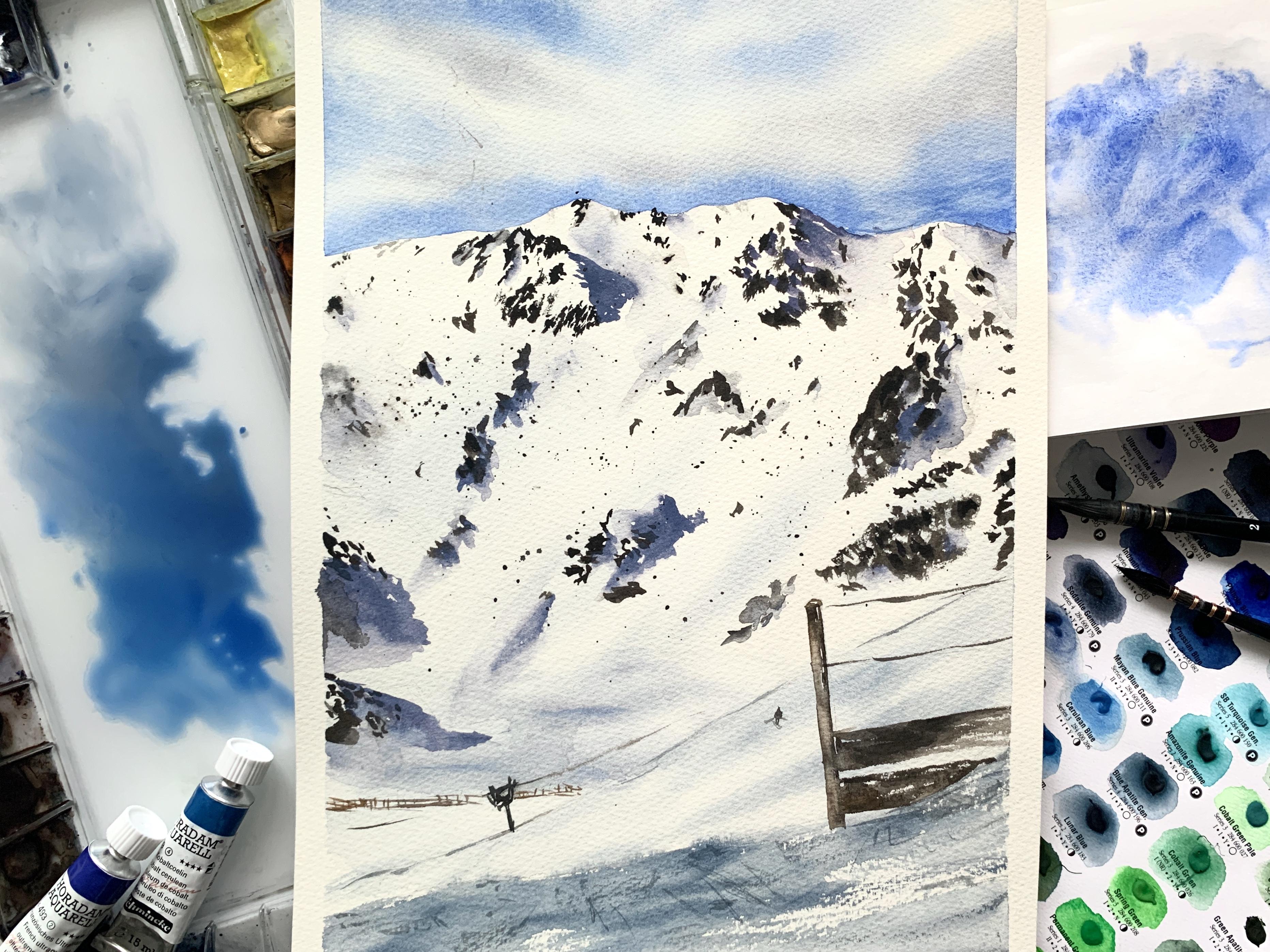
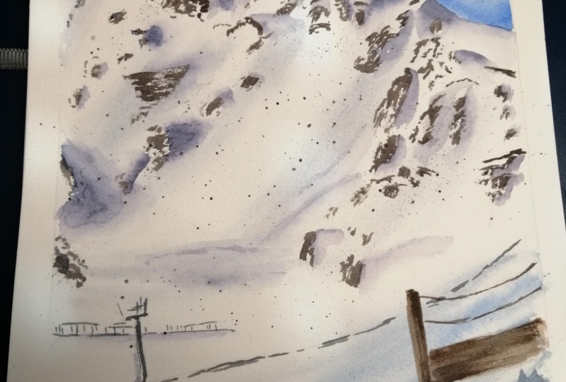
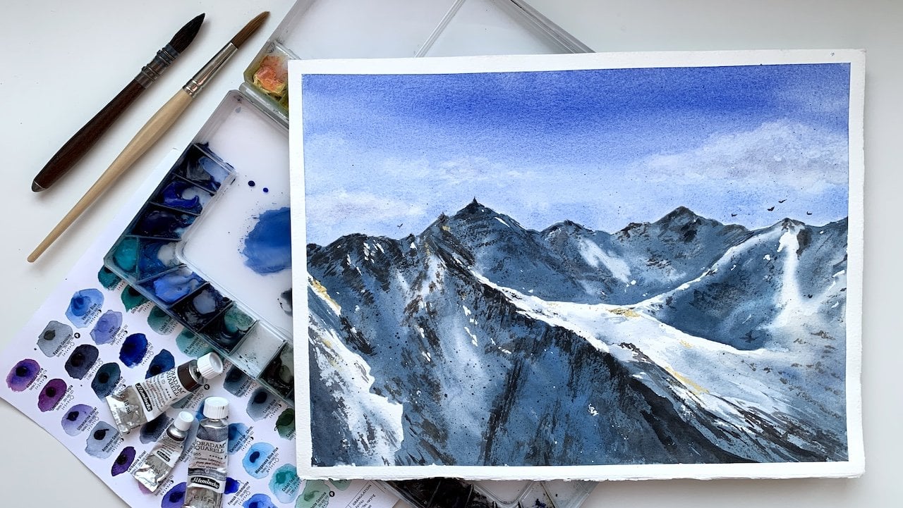
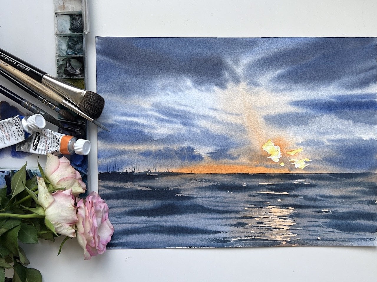
2. Analyzing the reference photo and thinking about the process: Today we are going to draw Austrian Alps. This photo was made in Kaltenbach ski resort. You can see a piste. And the mountain itself. I have already drawn this view, but today I wanted to do it a bit different. This is a picture I have drawn and this is a reference. I'd printed it and zoomed in a copy. I made it because I wanted to change the composition to add the piste, these wooden thing. And I also want to move the piste marker to show that this is skiing area and of course, all work is concentrated on the mountains. As usual, we start with analyzing reference and this object, and it's choosing colors and composition. Let's go through my checklist. The first is, what are the subject and the idea of the picture? Well, the picture shows the beauty and the majesty of the mountains. I think anyone who had been to the mountains would, we do them, had been overwhelmed with a feeling of majesty and amazement. And I wanted to express that feeling of standing and the foot of the mountain, looking at it and realizing it has been there for centuries. Although these mountain in considered to be young mountain, it has been there for ages and will be. And all our problems, all our troubles are nothing compared to this eternity. The second of my checklist is what emotion should the picture evoke within the viewer? And I want to express the state of some kind of majesty. The third from this where the emphasis and the seas more interesting. Why do I want to change the composition because there is no proper emphasis here. We can see a dark spot here. One more here, a dark spot here. All in all there are knotting. Took a chapter I, what do I want to do? I wanted to emphasize these areas. How can undo this? A human eye is instructed by the arrows of the highest contrast, the darkest and the lightest areas. Therefore, this part should be the darkest in the whole picture. Taken about the composition, I want the viewer's eye to move the following way. It looks here, then move here. We're whereas like and dark as well. As you can see this spot of the shadow cast by the stolen. I might take a bit more like this. So the cast shadow. Then the eye moves here to the wooden. Think he would be the customer. So I will have a rhombus, 12345. It's more polygon rather than a rhombus, but it doesn't really matter. I want to remove the crane. In fact, it is very important is they told us Nostra, they're building new skill it's about in this picture is totally odd for its natural landscape. Not an urban to have a crane. And there is enough of urban elements like these fans, the beach Schumacher, we think here. So it's an art. Let's go back to the checklist where the light source or wherever the shadow. That's easy in this case, look, the shadows are directed this way. So the light is coming from here, like this. Or even from here. The light sources here, therefore casts shadows are going this way. The shadows cast by snow are coming this way as well. And that's really important. Where are the lightest and darkest area? The right is this. Now of course, the darkest areas are these shadows, rocks, these fans, and that's it. I think. What are the areas of highest contrast? I've mentioned already, it's here. These errors, these, and these through I changed the composition slightly, or actually I changed it a lot. I still want to add contrast right here. In these areas. What are the dominant colors? We have this guy, so it's blue. And to learn and live in a job, I want to add some contrast. And my brother cool shades here, the shadows are cool as well. And the overall picture is grayish blue. So there are arcs should move on. So in fact, we need a couple of blue shades and a couple of brown and orange shades. We get gray by mixing blue with brown or orange. I will mix ultramarine with my beloved cadmium orange by Netscape allotropic. The brand doesn't matter. It could mention Han next, polyhedra mean and a brand Daniel Smith, mix it with any, it gives us great pigment. Just be sure to take these government orange that has big B or 20. Because if you don't have pigment below 20, if it gives you kind of green. And there I take four arcs, say Bay is deep, dark and warm color. To add more contrast, I take another brown color so they don't have the same color and tone because it looks boring. These brown is neutral and this is her own bear. Further, I might take one more brown and we'll see in a process, the pons is brown as well. The color range is quite narrow. For shadows, I will take rho, blue by cilia and add different shades of brown or orange to get different tones of gray. So URL blue is my favorite color. Now, about for the composition, I have chosen a portrait orientation. Here is the Szilard for the mountain, some rogues, some other things. I'm looking in my reference. This is a new copy. So the routes we've seen better. And I evaluate it. What I don't like here. And don't like too much or snow, it will look kind of boring. Therefore, the most part of the space is taken by the mountain. And the end of the pens is on the lower third. According to the rule of thirds. If we divide the sheet into thirds, these wouldn't think, would be here. And it's a lion a bit diagonally. These things that are here. So now I'm showing that wouldn't think and it should be really dig into it because of the interests in the picture. And there should be kind of dark here. And here. And the one thing is D2. On the second side, I will put the PhD Mark showing the way to the beach. And the beach Japan's will be here too. Well, I like it more this way. Because the mountain is main element. I will extend it a bit so that it's not just as spearhead 0, but it is caused by something. There is a stone and it casts the shadow like here. So we'll crop. There are trends. Nice way. One more important thing, In reference, I have blue skies, some clouds right over the mountain here. I want to change it to beat. I will leave the gloss to highlight the top edge or the mountain. The blue skies over eight would give us high contrast. Therefore, will lift the Cloud. Submit, look. There should be more contrast here. The contrast in reference is low. So I want a blue stripe and some gloss over it. So the top edge is white. And then in spring, it will give us more contrast.
3. Outlining pencil drawing: I did the sheet ground borders and let's do a preliminary drawing. And this one is very simple. I want to even do these frogs in pencil. I find it useful. What will we indicate? First of all, let's do the Szilard of the mountain here. Now, there is a small edge going this way. I'll show it as well to understand where it is. It's here. And the shadow is going this way. So that's the bands. We're just indicating clients. There is no banking here. It's not bank is important. Where in the mountains there should be a lot of snow. And then we are forming the Vista. Something coming here. I can't see them clearly. Then we form the beach to some things in here. I can't see them. But if they're at then a mine be another fans. But we in water color one do tread, it will just start to sanction. However, indicating these fans is a good idea. This is part of the beach towel. It goes all the way down. We will need these diagonal. And let's do like this. Now look, I did it this way and realized that they move the edge of the mountain a bit down to Putin and the upper third and have most guys and now alike space in here. As you can see, I'm choosing every moment. What can I do? I can leave the edge of the margin a bit and have too little of the skies. And that's not nice. I can also lower the bijector. And that's, that would be alright, here is, here, is diagonal, is here. Just remember, it should be seen behind this non-bank. Here are the picture and we can put the things here. It's kind of supporting bowl for the ski lift. So we're drawing it here. And I change my right again because now I have too much space in here. So I can see a part of the second PhD as well. I can't see the second bit here. Madame, I have no need to, you need for the mountain because the Mountain Man element. Therefore, I drew the things here. I need to low weight for there are some logic in the arrangement of the beaches. And I can just go to spontaneous speech to hear. Usually the beaches, ski PhD, so snowboard are connected. And this way it will look just strange. And now I take the eraser and remove these diagonal and the fans there too high. Look over it again. I want these things to be more diagonal. It, this digging out too much like a stick. I want to align in diagonally to have an angle just a little bit, but these livens up the feature as well. And it's important to live the picture because when we have kind of steroid elements, it looks boring. What else I want to indicate? I will indicate these rocks. In fact, they look really strange. I'm not sure if review them. Because one important rule is don't draw what you don't understand. I don't understand its construction. So I better move this big rock here. And my painting would be moralistic. Okay, so we're moving this rock. So now we have some rock hears. All right, Here. And here on the side, we make a cast shadow for the stroke. And notice that it should start here. So it starts here and then go further into shadow. So the shadow is here and the rocks are here. And one Morocco is here. Something like this. I am pressing the pencil lightly because I don't like it being visible on the final watercolor Beijing. So that bromine drawing is very easy, simple. Well, it's just simple.
4. Washing the sky: And now let's start watercolor painting. Festival or less than drawing. I wet the paints with a fine mist. And then I just dip my brush in clean water. You brush it over the sky. By the way, I often or date the drawing board. God, often. What I watched this guy, it might be a drawing board or escape Bu, think I walk it and I turn it upside down because it's easier that way. It's easier to wash the edge with clean water when the water is going down. So as you can see, it's easy. So this guy will beginning with ultramarine. Ultramarine is now by Netscape polyhedra and wash my sky. The part of it to form the earlier on the mountain. Please notice that my paper has an angle to the table because my paint flows down. I'll leave some white areas for the clouds. And I now I'm using the word brush. I like it because it blends the big event nicely. And I blend the blue-collar I've bought. Now, I'm adding some cadmium orange juice from marine and having kind of gray color. I like these kind of gray formed with the ultramarine and cadmium orange. It's exactly what I need. Just booted somewhere where on the bottom of the clouds. And all this knowledge that gray as shadow shouldn't be under the clouds above. And now again, I'm blending my payment, blending it over. And it's really important to leave some white areas because, you know, clouds are actually white. And if I go over everything with gray, it will be some nice dark THE my tablet and looking at what I have, I went to add some blue. I'm taking or train bit of cobalt. And I'm using it on the top. Coupled by the way, is warmer than the ultramarine. And it gives kind of different tone and I like it. And as usually, I'm also blending these colors. It doesn't have to be a god hardness orally. It could be a squirrel, some natural hair. And look, there is a decent blue stripe at the bottom. I don't like it. So I want to decant it anyway. And they technique is the same. I put the color that onto a baby towel to remove the excess water. And the brush should be kind of clean and help drive at the same time. Don't let it be red. Red brush will give us kind of spots and too much of water will force the pigment go out. So what else? I don't want it to be totally symmetrical. I can add a bit of blue here, but then it would be totally the same. There is a cloud coming out from the center to both sides. It's very surprising, but usually cemetery doesn't walk out in artworks. I add a bit more on this side and I squeeze the brush so it's really dry. Of course, I can darken the clouds, but it would distract the viewer's attention of the mountain. So I don't want it to happen. So I'm just blending. And and so I'm adding a little bit of blue now because I want to have more contrast. And just carefully and accurately having blue here, my baby begins to dry. So I should start working with this guy because my baby is not so wet for doing kind of a things.
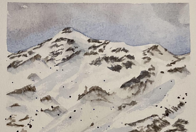
5. Setting tone for the snow: Now I'm going to create the earlier because the snow is generally white, but of course it has some shadows, reflections on this guy. And I wanted to do toilet sky is getting dry. I brought up the surface with water to their programs now because I want the edge to be sharp. So I'm just carefully waiting all the barrier to my edge. For shadows. I take grow blue and add a little evil little bit of sepia. Oh no, It's DevOps. So I'm adding more blue because I wanted to be rather BlueJ then grayish. I wanted to follow the direction of the snow. It rather diagonal. And I'm just randomly booting gray color. And also having in mind the fact that I have gotten vapor. So what, when it dries, it would be much better than now. So now it's kinda dancing. It's, now, it's some kind of undertone. I'm blending it to avoid such overs, diagonal stripes. Depth is important because be careful not to cover all the white space. I have done it too much and now I'm kind of blending and also cleaning out the big men from the paper. It depends from the paper. How well it could be cleaned. Some could be cleaned easily. Some papers can be not cleaned at all. Telos B, but is gleaned really easily. And these is an advantage and disadvantage at the same time. So now I have restored kind of white part here, and I can do it here as well. Now at the foreground is much darker than these areas here. So they might be heavy. Similar tone to this now. Again, mixing blue and said, Hey, I'm doing for the foreground. For gradient texture of snow, you can use a dry brush. I'm again mixing. Worry. Now it's ultramarine and am doing more dark spots here. Again, could be done with your garage. It could be done with my brush with a lot of water. And now again, I mixed and blend all these big meant to create a more even layer. Now we're waiting for everything to dry up. You can dry it with dryer or just wait.
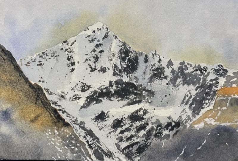
6. Painting stones: Hi, I'm Dr. my walk with the dryer. And how can we check out that the paper is dry enough to go on? It should not be called, let's say it should be of their own temperature. Called Paper means that there are some moisture and 11 site the sheet and you couldn't continue. The paint will simply get blurbed. The paper should be dried to get sharp edges. My baby's dry. By the way. Don't do it the way that I did. Because I am touching the paper with my fingers and there might be some sebum and eat might leave, fetch brains. So just you can try to touch the paper but do it with another side of your hand. I also wanted to mention that we should not get into the dry pigment. I had this mountain edge a little bit and dance or I tried to correct it with a bit of blue. And that was a big decision. Look what's happened. It means that the paper was already dry at the moment and the pigment contacted with the water. As a result, I got this overlap. This is not a disaster, but it's better to avoid it. Now let's move to the rocks wider. There are first and then shadows, not otherwise, because 1.5 or arcs, I can look for the cast shadows and I will put shadows over 8. Remember that we decided that we will move the things from here. Now we take a synthetic brush. Why? First of all, we need a sharp teeth to walk on the edges that we shouldn't overload the brush, brush with the paint. And with synthetic brush we can control the amount of water needed. I'm taking sit there, just beause it will give us two warm tone and I'm blending a little bit of ultramarine in it so that the color is brown but with a light gray undertone. Something like these. More or less. Yeah. A little bit more ultramarine. And I'm mixing paint for my stones. Yeah. So like this, Yeah. Now I take their operands. You can put it this way. And we'll look, where are we, where and how the rocks are placed. We are now drawing the rocks that are the darkest places. And I see them here. At this step, It's important to follow their friends. And we do the rocks, moving the brush lightly. I'm just basing their arcs and it's very important to look for reference. Again, there is a typical mistake and I make it as well. I got to involve and stop following their brands. And I draw things where I imagined them to be. It's called drawing with one's origination and fat visceral way because following the reference, make your painting true to life. By the way, one more useful to think that I can show you. It's called the dry brush. And how does it work? You take some paint on your brush, then wipe the excess paint with paper towel and do the rocks this way. It's like you are getting your brush parallels the paper. And then just trying to do the rocks. We move around throughout the whole painting. We are looking for that dark areas and trying to work with Arabic. What we see on the reference, I mix another brown tongue to live in my image. This is our sienna and a bit of ultramarine. So it's not that liberal. And I see that these rocks have been different tone, so I change it. Some rocks here, some other things. I can see the painting, stones like admittedly fork. We just painting withdrew brown colors. One is darker and trauma and other is less intense. And we're just trying to repeat what we see here. But be careful if you get too involved, you can cover the white areas. And this is not good for us because snow is white and we need. This now to be white. And we're moving like that all the way around doing all these rocks. Sometimes we can use dry brush. It works out well with drugs. So the brush movements are important in this stage. I mean that various strokes of the brush live and of the picture. And the more different strokes you have, the more adiabatic looks. And now we are moving on another part of the picture. And also mine that rocks are usually sharp and round rocks don't look natural. So like sharp edges. And again, mind of the white spots. Don't do the rocks all the way. There should be a contrast between white snow and dark rocks. And now we are moving like here. And these Blaze is really dark. It looks like a shadow to me. The sine, the sun shines on the mountain and it gets the shadow. So we can do some rocks and here and the rest will be the shadow. And dont makes rocks and shadows up. They are really different. They might have similar tone at some places, but they have different color. So there are rocks here, here, here. And I like the stroke as well. It has nice texture. And I edit using drugs or technique. Here, this alert of the upper edge. And we move to the center. You don't have to place our ox exactly the same way as there are in the reference and follow the proportions. I think it's important that they should look like rocks. We're going throughout all the rocks and painting them. Looking water. What I have here, what I have here, and I'm trying to obesity. So I see that here I have milestones. So since the page AND gate. So now I have two massive Suez of stones, one upper and one lower. And I'm just adding stones here and there, trying them to be different, different in strokes. And after that, we'll look what we're looking at, the results we have. And we are looking where we have stones on the reference that we don't have an hour Beijing. And when simply paying them, I'm trying to make stones in different positions of the vapor. Of course I'm looking at my reference, but I'm trying to have them in different places because it's nature. And nature is heretic. So few stones here to here. And then we can do some splattering. And how do we do this? First of all, we covered the sky with something, some paper that you don't need. Then we cover this. Now. We take the column. Would they regard on the brush? The paper might be, I think, wet. And then we just tap on the brush to get most bladders add more water to the paint. Look during this way, I get really big splatters. So more water versus butters. We don't need lot of them. Let's, let say here a bit. And that's enough. Now my reference is caused by the two, but that's alright. Now, look of the picture. We haven't done these places yet. There are rocks here as well. And we haven't done a big rock in here. So I'm painting it some way here. I want to extend the drug bit. So that's kind of Madonna's work. Could just look over it. Hi, I'm looking at my painting now. And it seems like, like mountains. It doesn't have cast shadows yet, but we will later and it will be okay.
7. Small details: fence, lift, piste marker: I think it's time to stop and move on to the cast shadows. To make shadows, I need everything to draw up. If a paint over it, it will get smudged. Some bots on dry already, some are not. And I can tell for shows, so I will do something else in the meantime, while awaiting to my boobies, Brian, to my teal, my paper is dry. I will do the fans and maybe the supporting bot and the leases lease by fans, these supporting bowl and the fans that we see in the foreground. I take a bit blue for the boil. It can be a mix of ultramarine with siblings or CNN or even indigo. It should be quite dark and thick, but not too thick. Toe structure tension. Just a few strokes like this. I'm just indicating kid without details because it's far and we cannot see the details. And that could be a little y going both ways for me, like this, but not too thick. And now I'm going to paint the fish defense. Actually, it's bright orange color, but we cannot burn bright orange here. It would distract attention and it's far. And we have to support it better than girls. And that to me, Do you that we why we just take orange? How can we make orange calmer of blue light, ultramarine. So we add Ultramarine to orange. And I have too much now, it's great. And then he just called my orange. Not so bright orange. Yeah. Not really gray, but not too orange. And indicating the fence with short light lines like this. And I want it to be brighter. Once again, when you have the problem like this, you start drawing and the color doesn't fit. It's either too bright or too pale. You can't change it in the process of drawing. It's okay. And many artists do we do this. And now I want to underline the bijector. There's the cast shadows along the border. It's heap of snow from the beach technical side. So we can take some blue. That's I'm taking girl blue mixed with some brown, then it doesn't really matter. Which Brown do you use? And I just indicate the piston. The line should not be solid and straight. And it shouldn't look like one straight line. Just indicate it in few places. We can also make some dots here at the France now bank to live in it up. The same dry brush technique. And I'm drawing some stuff in here. And we can do a bit of splattering on this stage. And we can add also some diagonal and sections here to show that there were some skills. So I am trying these to be not so even and I'm trying to do some strokes to make it look more different and more interesting. And now we can move through this bot that's the pants were taking brown again and I want it to be lighter. Mind the difference between tones. And we're taking brown and add a bit of orange. I, you sip it and cadmium orange. But it's not that important. We're just beginning with quite light color. And we are waiting for light color. Band where taking some dark color because it's dark on this side and will blend one color into another. And mind that these fans should be light at the top because the light is coming from the top. And I'm just trying to be different tones from right and left sides. I have been the blanks here in pencil, but I can't see them anymore. So they shouldn't be quiet here. And also dry brush technique works well with blanks, logs, and other would himself. I'm painting these planks where they're supposed to be. I don't know where they were because I don't see the benzo above the watercolor. And I'm adding some dark places, adding some contrast. And we can extend it down a bit. And then the strokes, something like like this.
8. Finalising: cast shadows: I'm adding some dark tones in my fans that it will look more contrast. Okay? And everything is dry already here. And that's called I'm mixing a dark color for the cast shadows. It even has a violet tone. And I'm taking royal blue. You have narrow blue, just play around with colors. It can be mixed with ultramarine, cobalt, and white paint. And do you need a bright blue color? And I want it to be more violet. So I'm adding a bit of Carmen. So you know that blue and red, violet. So I wanted it to be blue, but with violet undertone. And I will also add a bit of humor to take it darker and grittier. And that's the Gullah I've got yeah, it's alright. I wanted to be deep. I'll do the first layer now and then the second one, if I will need it. I'm careful looking camera friends and careful looking at milestones, what I have. And I'm going through the darkest area and covering them with my cast shadows. Color. This blue, violet, gray. There are cast shadows here. Here. Here. I'm looking where I have rocks. And of course, rocks should cast a shadow. And I'm painting shadows here. I'm taking another brush with clean water. And I'm blending shadows a bit because I don't want the edge of my shadow to be totally edgy. And again, it's very important to leave white spots. I need clean water. So I have changed the water. Otherwise, I would have kind of dirty dirty water for blurring the edges. And oh, I want to change my napkin to now. I'm working with two brushes. One brush has some paint in it and the other one has clear water. And the paint too thick. Because of we want the shadows to look natural. While drawing these shadow, I'm following the reference category. And while painting and other shadows, the shadows form stones. I'm looking for Muslims and painting the shadows from them. So it's very important that all natural objects should cast a shadow. Because otherwise you will have flat image and the viewable not understand why he will have the effect that it's strange, but he will not understand why it looks strange. And O object without, without shadows look strange. My technique is other things simple. I put a shadow blended with clean water. And I go on. And I'm just painting, blending, painting, bleeding. Most of all, I use blending. For blending. I use a brush, but sometimes I'm just using my fingers. And if I want my image to look more natural, I'm using both ways. I'm just looking at my reference. I see where I have shadows. And these, again, it's kind of whenever housework. But I love to paint shadows. So I love to paint mountains, select appends, zones. And I love their resolved there had better have. I'm looking over my chair and looking for places that miss the shadows. That means some rocks. Maybe. I can just cast shadow of a shadow that should be here. And I have added the shadow cast by the mountain. And I wet the area and then wash the brush, take the middle scholar and blended delete. I want the small emphasis sample some way here. Some thing gray, violet, blue. And I also want your ox here. And maybe here. I'm just looking over the whole picture and notice the areas where I want to add something. The areas that seem now empty. And if I want, I intensify some rocks. I make them DACA. And now I can see that I have no beak, violet shadow. So I'm painting it here because I have it on my reference. And these shadow, again is shadow guarded by another mountain and I am painting gate. Okay, So good. I'm blending these shadow. And I can see the shadow here. And if I say, I paint, it's easy. So I'm painting these shadow. And I have now do the shadows on the left. And I also have these shadows on reference. And I'm trying not to have big shadows where I don't have them on reference. For example, now I can see that I, I want to make shadows there above from kind of little stones. So I'm adding my shadow and blurring it. Anyway. And I'm doing like birth weight birth technique. And so I'm looking on my image where I have another rocks, where have another shadows. I can see that here. I have kind of empty area. I want to add more paint here, but it should not have sharp age because it's far away. So I am Washington it with clear water. I'm working in cotton paper, so it allows me to do these. And I'm taking my shadow color, simply, simply painting in these wet area. And now I'm taking my brush to blend the two over the paper. And again, bland and things. I'm underlining the snail here, adding some shadows from this now. And these walks that my image don't look flat. It looks natural and it has depth. I want to have some shadow here because I have stones and Don have shed. One shadow here. Now I have shadows, send-off have stones. So I'm painting stones on the top of my shadows. So now I'm working with little details. I'm looking for. Don't have shadows whenever I have stones. And the mixing and blending and creating the image that would look even more natural than now. I'm looking and I don't like the arrow here. It looks now. And some some shadow colors. And painting a little bit there. I think milestones here would be would look okay. So embedding stones and again, don't don't do this dance without shadows. Some small, small, small details. I even don't look on reference photo now because I am working on my painting and see what. Whereas missing where some small, small details, small rocks can be and where they can look great on my painting. And some darker spots. I'm using a dry brush now. And some splatters. I want just more hold x. How would it stones? Oh, my sky. Now have this guy nevertheless flattering without covering the rest of the picture. And the last step, I want to end it. Ischemia. I don't have human, there are plants, but that will be a small, small dot. So I'm taking just some dark color and painting the head, shoulders too lax and skis of us. Let's pretend that this would be ischium. Some final details. I think now it's time to conclude. It's important to know when you should stop. And now I feel that I should stop. My painting looking what I'm looking at one to be more contrast dots, some small, small details. Yes. I think it's time to stop. My favorite moment. I'm taking the masking tape off.
 Anna Zadorozhnaya, Watercolour artist