Transcripts
1. Trailer: Hi, my name is Anna, I'm watercolor artist, tutor and blogger. I'm fond of watercolor and mountains. And I want to share my passion with you. In this video tutorial, I will explain all the process of creating beautiful mountain scenery. We will together learn how to choose reference photo. What are the stages of preparation? How to select the color scheme, how to wash with watercolor. How do you use dry brush and masking fluid What to do if something goes wrong? We will pay attention to the drawing part and talk much about tone, contrast, coloristic, composition, all that base concepts that make your paintings look good. People are afraid of watercolour because of its unpredictability. But I will show you that these beautiful technique could be not only controlled. It could give real pleasure. So let's begin.
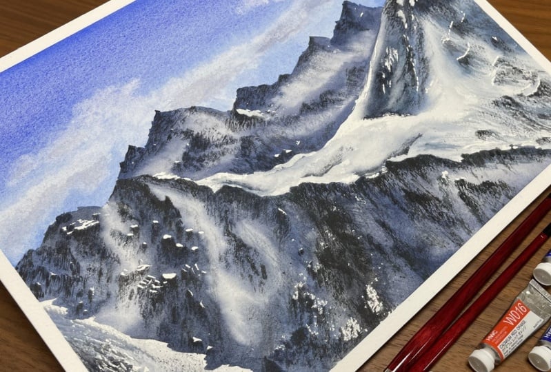
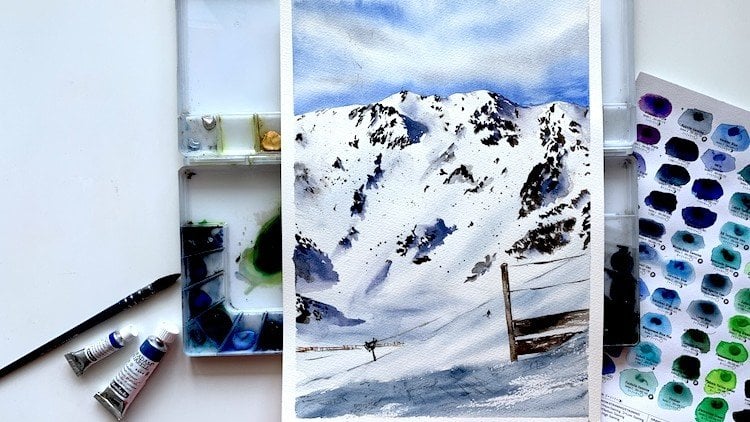
2. All about materials: paper, paints, brushes and other stuff: Festival, of course, Let's talk about materials, the main materials, pains, brushes and BBA. Firstly, about the paper. I use Saunders, Waterford, it's 300 grams and it's beer garden. It is not necessarily using strictly cotton for this painting. You can get such effects on Celeste paper too. But I recommend cotton because it gives you more freedom and more time, which is important while doing cautious with watercolor. Cellulose paper dries much more faster than cotton, so you can simply be late with some washes. My format is 28 centimeters and 38 centimeters. It's a quarter of full embarrassed or watercolor sheet. In this work, I prefer to leave horizontal orientation because I want my mountains to look more calm, is about sizing. I don't recommend format that is smaller than for because it's hard to paint small details on. So small format. Of course, if you'd like miniature paintings, you can try. But I think for me, between a4 and a3 is the most convenient in optimal, It's not so big. So you should not be concerned about huge washes and it's not so small that it will be difficult to make details. So now I want to talk about the brushes. These walk could we painted not only by me but by everybody with just three or four brushes. The first brush that we'll need is a soft round God brush, or any large round brush with natural hair. For example, squirrel, sable. I'm very fond of God brushes and use them very often for applying clean water on the paper, for doing large washes. And I also use it for shading and missing the pigment on the paper. I will show it later than two brushes with a mixed hair. I have mix of synthetic squirrel. They are elastic, they are obedient. They hold and give on the paper large amount of water and they should have a sharp tip. I show here two equal brushes because I often use two brushes with different brains in it. At the same time while painting. You didn't use not only mix of brushes, mix of hair, but also pure squirrel or so. It depends on what you like about the male. And the most important thing that these brush should have strong sharp tip. It's really important. Then the small synthetic brush, they told the little amount of water. It's important that these kinds of brush has a sharp tip because these brushes I use for creating details and also they are used for dry brush technique. Please use the artist's brushes, not the school and how the brushes. Because it's important. Because you want, have fun. If you have not so good materials. These plaid brush is with hot hair and it's used for lifting off the paint from the paper. So it's just ordinary cheap brush, but the hash should be kind of strong and not soft. That's how about masking fluid? I have similarly a masking fluid and the mascot fluid is used for protection. The white areas on the paper. I know somebody uses masking tape for this purposes and you can use it to if you have no masking fluid or simply don't work the paper with the paint and leave the sudden areas white. But masking fluid is just convenient to use for such purposes. And I can say one more time that you will induce special brush for the masking fluid. Because masking fluid reacts badly with the brushes and it's kind of a liquid rubber that is used for painting. So remember that Muslim fluids react badly with the brushes. And now let's talk about paints. I paint mountains in unlimited calls him. And for this work, I need only six colors. The main color, which I use quite often is similarly a royal blue. It's the widened and Kind of Blue Velvet. What should you do if you have no center layer, all blue? Of course, mix. It's not scaring. And as practice, Charles, practically every color in watercolor could do mix and can be changed by another color. One seconds, I'm opening my sketchbook and shown you that how I mixed royal blue when a head number of loops. So this is our original royal blue. And these scholar was made by me using ultramarine blue, cobalt blue, and a bike white. You can add more cobalt or more ultramarine or more white. And you will get the color similar to what you need. So just experiment and you will have kind of this velvety, gorgeous blue color for the sky. You can use cobalt blue and ultramarine Britain. You shouldn't be dedicated to the Spain because both gobbled and marine paints that are granulating much. And the granulations show much when we apply paint on wet paper. So if you don't want to do so much good relation in the sky, pay attention to the amount of water, both in your mix and your paper. For gray parts of the Cloud. And every cloud has its own shadow, and if you leave them just white, they will look flat. I usually makes ultramarine with cadmium orange. Cadmium orange would mix a perfect gray with blues if it is made on pigment, or 20, 20. So when you buy paints, just look that your cadmium orange is on bigger than b or 20. Such orange colors have White Nights, Van Gogh, current brand shaming, cash on hand peanuts. And now I have here White Nights. And it's important that cadmium orange shouldn't be on bigger and beyond 20. I'm repeated, give one more time, but it's important. And then about the main wash, the main wash or the watercolors, for me would be the mix of URL blue with some opposite color because it's too bright to be induced in a pure form. We use brown colors to muffle blues. I often use earth or a setback for this purpose. Leaky roof or brown mix and blue give you not so bright color. I, here, I'll use royal blue and I will change the hue we wash by adding one or another brown. So you will need, I think, to brand colors one more dog and dance, I have said there, and one more neutral browns I have for Uber. So in these areas, in the areas of shadows, we will mix our main blue-collar with different different brown colors. So you will need three blue colors, ultramarine, cobalt, and trial blue, cadmium orange from mixes. Gray, royal blue, four main areas. And of course, brown colors that I have said previously. You will also need masking tape, doublet, pencil and eraser, and then paper napkins, clean water. And I will also have a sketchbook for testing column mixing nearby. And I think that's all we need. So let's begin.
3. Analysing the reference photo and planning the technology of layers: To get a good artwork, I start with analyzing that our friends, the composition, the arrangement of objects, the kalos, the tones, et cetera. I tried to stick to my own checklist at the beating of almost any artwork, I do. The first two points are, what is the subject and the main idea of the picture, and what emotion should be evoke within the viewer. I think the subject is mountains, of course, and the absolute beauty, might and majesty. Next. Whereas the emphasis, the human eye is designed to give, attracted first by the areas of the highest contrast. The viewer looks at the lightest and the darkest places. I think that the highest contrast should be here at the combination of the dark shadow or each and the light snow. So I want to put emphasis here. And the next question of my checklist is where the light source, whereas the shadow, I'm looking at the mountains. There's one reach here and another one here. The light is coming from here. Without light, the picture will look flat. To mind it. I draw the light source on the tape when I'm painting. So the sunlight is coming from here and getting here and here. Next I've got what areas are the lightest and the darkest? The men lightest RMS error is here. The snow is light as well. The error is light. And probably here, I might darken it a bit not to distract attention from the main area which is here. Where are the areas of the highest contrast? They are the same. It's here and here, and my B here. And these area with soft fluffy snow, it governs the rocks in a particular way, giving such blade of girls that could be really nicely done in watercolor. So then next point of Middle East is about a couple of dominant and highlights colors. And you can see it in the last video about the materials. And I talked about Carl's that I will use for this painting. This is royal blue, cadmium orange, cobalt blue, ultramarine, and fat to brown colors. And then the next question is, what is sharp you what is blurred? I'm not trying to make it as real as in the photo. For why do we need to slowly realistic picture. We've got cameras and fonts for that. As for watercolor paintings, the contrast of the shop as a blue areas walked really well. If we make a sharp border and a sharp shadows here, then these plays can be blue with no areas of high contrast, with no sharp shadows. This area will be quiet blur. And we will give it some volume with the details. But the sharp areas are varied and the border line, the water line of the mountains, the rest is mostly blurred. The slopes of the mountain will be sharp as well, despite the laws of aerial perspective, according to them, the objects in the distance should be blue comparing to the object close to us. But I think it's important to make the mountains shop because it's sunny days and signing days in mountain. And we want all these shadows to look up. The last point in my list. If this doesn't work, what we're going to do, preliminary repelled pencil drawing to decay the silhouette and the main regions because they define the Charaka in the picture. And it's important to understand it in the parliament drawing. Then we'll watch this guy. These clouds seem strange to me. I think I want to move them and I will make lie to clouds and some volume. So I will remove these types of clouds and I will draw these small glass here. After this guy will drive the sheet was the surface of the mountain. And then we'll work on detail, rocks and rest. One more important step that I should be done before the watercolor painting is not essential, but it makes the work easier and getting to involve easily and very often, I forgot about some errors. They should be left white, the white in watercolor, dropping it the paper. So these areas should be left totally white. In such cases when we need sharp white borders, I use liquid mask. This step is not necessary. We can do each without just keeping in mind that these areas, these flags, beliefs, and these areas totally white, I will use the mask because it helps me. Even if I have got involved to merge, I can take the mask off and I have the white areas. And the last, but not least, a few words about the term. The term gives volume to the picture. So the total is most important element. The colors are less important than the tongue. What is the darkest? Of course, these areas are the jackets. Usually I divide the tone into three compounds. The brightest areas, the medium places, and the darkest places. Therefore, these areas are the brightest. These, yeah. This guy should have similar tone to these airlines Harris here. This guy should not be too dark because we should create as many areas of contrast as possible. If the sky is dark, then we will be low contrast with the mountain. And we want to highlight the mountain. So I will do a lighter sky and darker mountain. So in general, there are three light tones. The sky is literally the lightest one at the sky. And these Era, these arrows and medium, and this is big dark wash. So let's start with drawing.
4. Drawing a preliminary sketch and applying a masking fluid: Now let's start with the pencil sketch. We do this later, the mountains, we do some dashes where the hill points are. That's the first hill point. What's important about the mountains? These mountain suffer Bruce and they are quite young. So the hill points are shop. I didn't round here. Young mountains cannot have around points and they should be sharp. So these, there are sharp angles. And just simply indicating them. We don't have to make the exact copy, but we needed to look interesting. And these cuboid is bottomed. And while doing the pencil drawing, trying to depress the banjo has all the bands who will be visible through the watercolors. Watercolors are transparent colors. So, I'm sorry. If you don't see quite clearly what am painting grow drawing with pencil now. But I hope it will be now for you to see these pencil sketch. So understand what I am doing and why. I can say one more time that I don't like when the benzo is clearly seen upon the watercolors. Watercolors are transparent, so I'm painting condition to it. Now. I look for the position of the second according to the first one. It's a bit lower than the first one. And that one is a bit higher, but just a little bit. The second one is somewhere, I think, here. And we're indicating it lightly with pencil. And again, I want to tell you that I think it's important for the overall sled to look nice. I'm not copying every hill point. I'm not trying to be as accurate as it could be. I think it's useless. I'm just trying to indicate the whole silhouette and trying it in trying to do it to look interesting. And there's a shadow, but, and we will highlight it. I want to indicate the shadow too in pencil because I like the pencil sketch to be fast. And we can skip some bots because we will do it in watercolor. And now I'm looking for sharp shadows and edges and integrating them when with the pencil. And of course, these ridge is important. We are looking for the alignment of the rocks and they're each and the bot is narrower than this one. It's important takeaway indicating it with pencil. So he would be there reach. I think this is a quite approximate drawing where following the reference of course. But we don't try to show every single rock. We just need an overall silhouette. And the seeds. I'm showing some shadows. And I'm trying to indicate what would be easy if it would be indicated. So now I think that my drawing is ready. I'm just adding a few, few steps. And I am now searching for alignment of the rocks. And I'm indicating these bought on the left. I here would be yeah, I can see it in the reference that here varargs are aligned on the other side, north from right to left, diagonal, but probably left, right. And now it's time for masking fluid. I have transparent liquid. It can the blues, well, then it's really visible verities. So where do we need the masking fluid? I mark the contours. Well, I want sharp edges and where I want my baby to be white to left-right. I cover this area. I didn't cover the whole surface with it, just some borderlines. And if there are gaps, welcome coloring, they will remind me that these areas should be white and these will stop me. I'm putting the liquid, these flags to just some small, small dots. L little bit of heat here. These, they real dictionary the final work because the paper is kind of shining in these places. And I might do some small, small dots, all small, small stripes here. It's not desolate wide here, it has some blue-gray shade, but I will put a bit of masking fluids. Now. I think that might have practically done with my masking fluid. And now it's important to let it dry. Because you can paint only when the masking fluid is dry. It
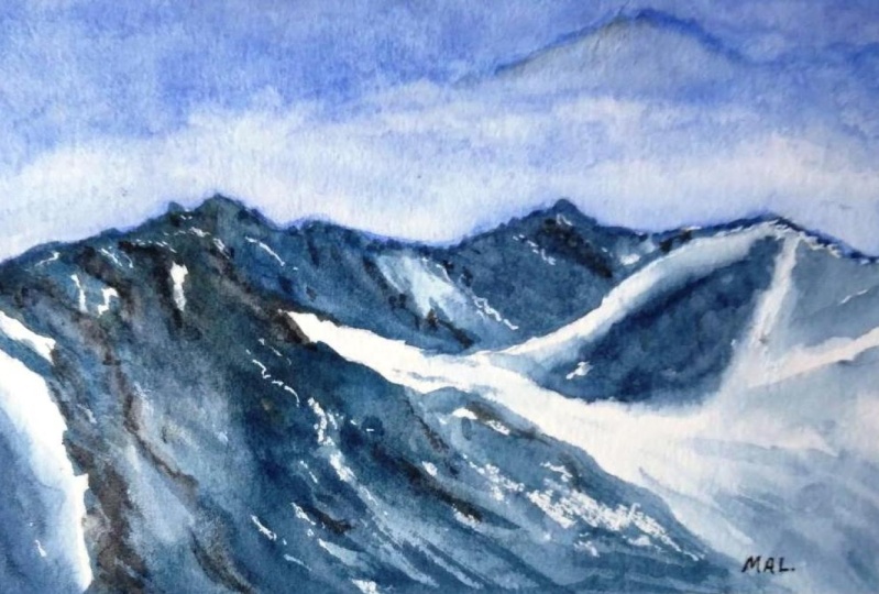
5. Washing the sky: I want the sky to be lighter here and dark here. Have a gradient wash here. There are several watercolor techniques, watercolor washes. I do it quite often in for some reason, people are surprised with it. I turn the drawing board games have done. Then I brush clean water or the sky. That's just water without pigment. I were this guy along the mountain border line. I brush clean water along the slit. I will I've indicated with pencil. So I'm just accurately applying clean water and paying attention to MySQL because the first rule of watercolor is that blurry edges. You can receive blurry edges, edges when you have the wet paper. Take your time. I do this lead first, then I take a bigger brush and just wet the east part of the sky with clean water. So I'm just mixing the water on my paper and trying to be evenly wet. So all parts of my sky should be, oops, I've dropped some water on this place and this, alright. I just smuggle it with my finger. So I put it in the light to check that the sled is probably wet and that will influence the result. If somebody an orbit enough like he's wrong, maybe here and I'm just touching the water to my baby. I want my sky to be easily washed with water. And now before we start, we should wet the colors. Usually I do it with a fine mist spray. And now I need for about two minutes till my back get not so wet. Meanwhile, I means the colors for the sky. I'm drawing upside down. That drawing what is tilted down and beat saw the color arounds down a bit. So the color here would be lighter, then color here, bottom. And the lighter color is cobalt. I just say P0 cobalt. And I will start with the painting visceral. It. I want it to be a buccal bold. So I put the color along the whole borderline gently during the silhouette. It's important moment because it will mark this lead of the mountains. So if we are doing these notes so evenly, correctly, it will be not so good. And then I blend a bit, a bit of ultramarine in my cobbled. So now it's made of cobalt and ultramarine. I need the sky to be darker here than in itself apart. It's also important that I'm drawing on gotta paper that consumes the color. That's important to remember while washing. One, it will be drive the color won't be so intense. So now I am taking much more carlo that I want to be on my finished image because it's common property of gotten the paper. So we call it the color, the color. In. Now, I'm blending the color with my favorite Goldberg brush. So my wash would not be like strips. So it will be an evil even gradient. Without stripes. There was three colors, cobalt makes all overthrow Maria and Maria in some places and I'm blending. And now I see that the bottom of my sky is too light. I want it to be darker so it's not a problem while my paper is wet. And I again, so again, putting here ultramarine and blending it. Now, I turn the board back and look where I want to do the gods. I take a clean paper towel and clean the pigment. The towel should be cleaned, otherwise, it will dirt the painting. I want to do my cloud here. It's spontaneous and maybe here. So I'm cleaning off my pigment to get the effort of the Cloud. Now, I take the clean brush and I'm doing this Cloud either with my towel or with my brush. While the surface of the paper is wet, I can clean the pigment easily, and it depends on the paper. Some papers can be wiped and cleaned of pigment even when they could dry. Minders, for example, of Winsor Newton. I have now suddenly switches fault. Saunders Waterford paper. And it doesn't allow such things. Once pigment drys up, there is nothing to be done with it. Okay? Not nothing but okay. And also, remember that clouds should be different. Not like to clouds at this on the same size, same level, same form. One of my clouds is big and others smaller. Vibing off a few places. So I am showing that the clouds should be different. It's really important because the nature give a south no straight froms. It gives us a little cemetery. So if you will do the gloss different, the, your image will look more interesting. One more thing, I take ultramarine and little bit of cadmium orange. I need a bluish gray color. And I'm mixing together with ultramarine and orange. And I'm adding some volume to the Cloud. I'm just mixing these colors on the Cloud and then I'm blending it with my favorite god brush to avoid the sharp borders. Because a real clouds are rarely have sharp borders and they don't have sharp borders in when they are volumes are, and sometimes of course they do, but usually they are solved. So the color should flow and sharp borders here are not nice. And again, I'm working with my God brush. I'm mixing the big man. I'm wetting some areas and I'm doing a little bit of gray in the bottom of the globe, not on the top but on the bottom because the Cloud, cloud has a shadow, so it's buttoned. What else is important while working with watercolors? Watch when the sheet starts to dry up and don't touch it when it begins to dry. I see that. I have just few more minutes till it dries up totally. If I'm adding anything else with about brush, my pigment will react with water and I will receive kind of strange places. So so B of our width, the paper is wet when it shines, when it began its dry and their efforts a hybrid cloud and here in stripe of quote here, but I don't like it. And I'm just removing good. That's easy. If you don't like something that our friends are in nature, you have the outdoor scene. There is a strange things. Just remove it. If you don't like something about the gloss, the don't draw them. That the difference between drawing and footer that we can add or remove objects just because we want to. And that's great. So now I cannot touch my sky anymore because the baby is glancing with water at some places and some where it's dried already. It's looked met but there are still some moisture inside the paper. Don't touch it. How did she can strike that? She gently with the back side of your palm. If the baby is cold, it means there is some moisture left and electronic. So hold on. I want Dutch my walk because I don't want to leave a fingerprint. But the basic rule is that if your VBA is the temperature of the mild per temperature, we can work further. And quite often, I also use a very handy watercolor technique. It's called a held, a hairdryer. I'm often in driving me my label with a dryer because I simply want to save my time. So I will do this. Now.
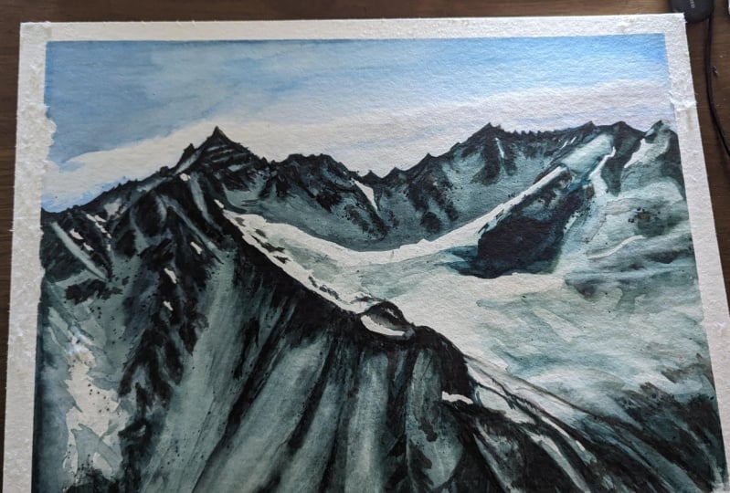
6. Painting massive shadow: The sky is dry and the paper is not called. Why should it be dried? Saw that we can do a sharp border in here. We're taking the dominant color for mountains. It's royal blue. It's really allied. Bu, Lu, Bu, a light blue. Take a lot of it. That's eyebrows, mountains as well. And these Karla, he is royal blue as well, mixed with a bit of brown. So you can see that the washes here, Luke, really like shadow in the snow. And these some areas were lighter. And it's important that first wash horizon tones. Some areas were dagger, some areas were lighter, and that reference zones are similarly Docker rare. But to live in it up a bit, I want to have different tones. And it makes the final drawing more interesting. If the color would be the same, but they don't. Where would be somewhere lighter and somewhere Docker. So its royal blue. Blue. Yeah. It's kind of to blue and I'm adding more brown color because it's too blue. Yeah. Now it seems gray hair. And mine, the density of the column. It should be danced. Dance. It should have a consistency of drinking yogurt. It should cover the branch densely, it shouldn't drop from your brush. I can move the brush and there are no drops that are falling on my palette. And that's important because we will be working with Dawn. And Tony's watercolor is regulated with the amount of water. What else do I see this funny thing here. Some kind of light that ID isn't masked. So I think I will indicate it by pencil and it should be somewhere here. In this area. I will put color and then wipe it. I don't need it to be totally white. So I didn't mascot. But I want to show these lighter area here. So it's important to look on your reference photo. And I'm just beginning to wash my mountains. The color should be dance and it should not spread. And somewhere in some places, virus masking liquid I've put. So I just wash my edge of the mountains and then I take a clean brush and wash the edge just a little bit. And then I wash the edge again. And high risk kind of watercolor effect. These that look, looks good here. It's kind of light sport. And it's surrounded by the dark washes. The first wash should be done really quickly. If you're stuck somewhere in one place, the gala would dry. I could have wet the whole sheet, so I would have more time to draw. But that would have made the column much paler. To avoid these pale color, I'm working on dry surface and I'm trying to walk fast. And these shading here. And now again, I'm taking a clean brush and brushing the shape, my shape with water. In some places, we needed for the difference of the structures, but we keep on using the same color. Oh, look. I have border left in here. And I want to changes, change it with some effect. That is called in Russian, it's called watercolor blooms. So it will look really nice when it dries up. I'm just adding kind of water here and water eggs with my pigment. And we will get a nice result when it dries. The DOM is different, but that's all right. It's kind of brown here. Blue are there. And that helps us, helps us because we need a washes to be different, different in tone, different scholars who I have mixed not enough paint. So now I'm mixing it again and again. I'm washing these big area and washing it, minding the gaps. So I'm doing like automatically, I'm booting the different tones. You can see that some places, some places lighter and some places are that I'm wetting this place with a kind of clean water. And I'm doing the wash here because it's in the corner of our painting and we didn't want to distract attention from here. And by aiding quarter, I receive my not sharp edges. Step-by-step. We are washing all the dark areas, let sweater between here because my paint begins to dry. And again, I'm telling you I think a million times, but it doesn't look good when the wash is the same everywhere. Similarities doesn't work well in artworks. So try to avoid them. I tried to change, don't strive to change colors. And there are estimates. So you can see that my paint now is much more darker that I been previously. We have reached the lightest light it's bought. And again, I'm washing gate. I'm very careful with my borders because, you know, they should be sharp. And we have done the sky before because we wanted these edges to be sharp. And I'm just washing gate and the process is the same. We're just washing. We're trying to do different tone. And that's all the color. Really the collar is the same. So for me it's royal blue mixed with or umber. And I'm just playing with dome, trying to do some places lighter and someplace that darker. Because you understand the shadows and reflections from sky. And we have the color of the sky, maintain the same. So when you go, oh, now I'm taking my brush with not soft hair and I'm vibing off the area. And I am vibrant pigment trying it to look really wide, but not so weiter as a white baby, you can see that white paper is more whiter than the places that I'm wiping off now with my synthetic brush. And now we begin to wash the rest of the Szilard or the mountains. And I'm just washing it. By the way. Don't be afraid of tilting the brush and laying the brush against the paper or banding eat. Feel free to do it because it works well. It might not be obvious while washing. But when you look over the finished wash, you see that the different brush movements give different results. We have reached this point and what do I have here? As sharp border line? And another is everything is brew. We take clean water, it should be absolutely clean. That's my typical mistake. My brush seems to be cleaned and my water seems to be clean. And it's clean but not Bureau. Also, these bottom line is visible. So bad stories, the brush. To be sure that it's clean, it's really important. It will be seen on your painting. If it's not clean. This area is wet. And we take the color again and we make it bluer. And I have added some ultramarine blue to make it more interesting. And now this Borderline should be sharp. And I have forgotten to brush it with water. So I'm working now with two brushes. I have one brush with my colleagues with ultramarine, raw sienna, or a blue and other brush with clean water. And I'm mixing and wetting my borders to have a soft edge. I'm changing victor Jones. I'm changing the color blue in some places, brown in other something lie that in process, I'm also trying to look with their results were half and to fix some mistakes and some places that I don't like. I think the place that I have done is a bit too hard. So I'm mixing a light tone and I'm trying to have the contrast in tone in these places also. And I'm taking my brush with water and kind of washing these blaze because it's important to have contrast everywhere. So now I'm looking for my shadow to be sharp in the bottom. And the kind of not sharp in other places. We are looking for areas in the reference that are lighter but not the white. And this area is here and here is light, but not totally white. We are taking clean water and we read the area that we're going to diagram. We put some water in here, but not too much. So we will receive the soft edges of the line. Shadows are blanks now. And now we take the sine same color, but now it's less dense. And so we just made the column thinner with water, remove that excess water out brush, and by the way, it should be habit. The water almost drops. It's much more liquid that he was before. And I'm taking few strokes here. And I'm using cotton baby. And I remember that it will turn paler. And next we're taking gourd brush or another soft brush. My base queries. But for me the goal is better. And we blend a bit our blesses places to add some volume. Then we should do areas that are not white. And we're of course, blending. And as the stage, it's really, really important to leave some totally white areas. So it should be just our paper. It could be covered with our liquid now, our masking fluid. Okay, I dug into it here. I don't pay attention to slice of drugs. I'm doing now the general toning and I do kind of another shadows later. And I might add some thinking here. And I'm just making this thicker. And again blending so that general rule, and as these paint is not as thick as previously, and we mixing it with water. And we are blending 8 to have soft edges. I am now working with three colors. It's ultimately in a soil blue and its own band. And now I am doing the shadow that I. Him down here. I haven't done previously. And again, I'm blending my edges so that would not be so sharp. And the contrast between sharp edges and soft edges, uh, give you the result. That seems interesting. And again, I'm blending it. And I'm trying to make my whole wash look interesting. Okay, So I have darkened my area and I look over the painting. I look at this area in here. And the spot here is really a jog and I make it darker. So here is the good side of garden paper that it allows you to do multiple layers. Because if you are working on cellulose paper, you can smudge the lower wash. And cotton paper. Always does. Another way. I'm now looking for my washers and looking for problematic places and I'm trying to fix it. I don't like the edge. These right edge. These piece of shadow is due even if it has the same term everywhere and the same tone isn't good. First of all, I can, I can add some kind of watercolor blooms with the paper. Dries up some clean water, pushes the pigment out of the paper and hear how the blooms beers. So I'm wiping some pigment. I'm adding it with water. And I'm just looking at my wash in general. And search for places that seem entering seem even seem not interesting. And I'm just creating the interests in my wash. I am wiping the main pigment out at some places because I'm trying to avoid similar big washes. Singularities. Not good for painting. Sometimes I even blend with my fingers. But remember that fingers should quickly. Yeah, something like this. The baby is still caught gold and wedging here. So a one do these rocks and other things right now because the paint will get bloomed and it will be nice. And these blades and here is dry. And there are some kind of gap here. This place is totally dark. And I want to add it because again, I'm trying to avoid similarities. There is a piece of a snow bank and these gap. So I'm looking for the shadows from the snow. I'm taking a brush that doesn't hold much water, blends. Blank Maya, maya. The bottom edge is sharp. So I'm carefully with doing these edge sharp and the upper edge is soft. So Washington with clean water. Okay. Now I'm carefully looking at my reference and trying to have my Beijing's places where the half shadows in the reference. I'm getting it on my painting. This place is dry now so I can finish it. I'm kind of dark spots here blending the borderline too because Shah boarded lies don't walk well in the corners. All the sharp edges should be in the area of much contrast. And again, adding some dark spots. And now my first big wash, my shadow was seems to be almost finished. I'm just adding a few details. Some few dogs bolts. And I will dry again my paper. And we will begin to walk on details.
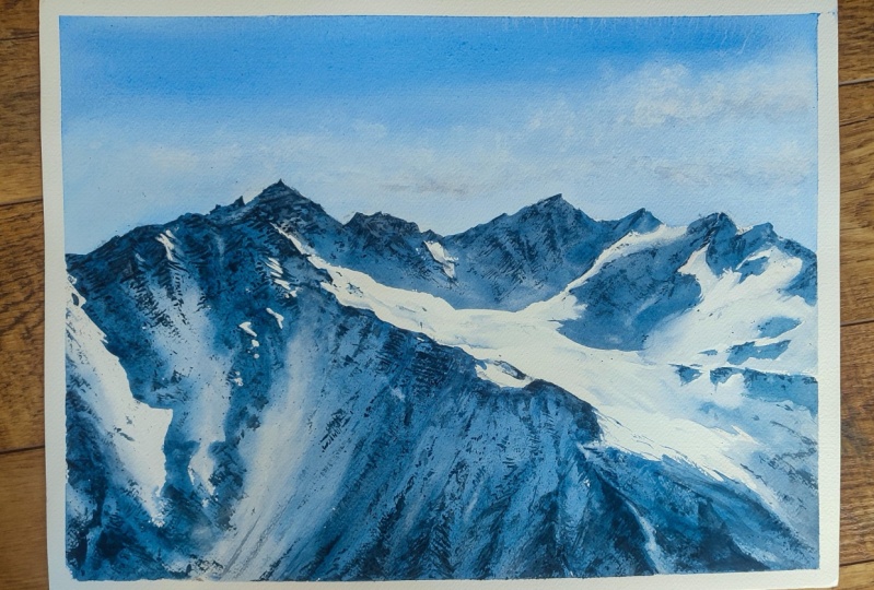
7. Painting stones: The main washes dry and I can move on to details. What are they? And the GI cleaves, there are regions that are rocks coming out of snow banks. There are arcs are at the mountain surface, so they aligned a bit diagonally. There each breaks here and we see its opposite sides. Rock change the alignment to that place. So about the color. I take a synthetic brush because, because I need nice and dry and controlled strokes, what color I mix? I take sepia. It's a dark, warm brown. By the way, blue is often by Brown and vice versa. Cp alone is to Brown and it will load jazz strange. So for I'm taking ultramarine and calm CBD. So mixing ultramarine sepia, I get gray and it's really dark. I see that it has too much of gray and I want it lighter. So I'm taking grow blue and edit. Now. It's grayish with brown undertone and exactly the Scala ID. And I put reference in front of me because I need to follow the details. And I paint the rocks. That's true. Shouldn't be horizontal and repeating the alignment of the rocks. I'm using one color. And maybe I might take one more to add some volume. In previous stage, I have forgotten to mention that these gaps, these white spots lived during the wars, are not a problem. And it doesn't mean that the wash has been done badly. It live in the picture up because the wash is not even and it's important. I have got the slight sporting here. And thus, there should be a shadow under the shadow of rocks because rocks are material and they have shadows. And the same with these mask spot. There should be a cast shadow under rocks as well. This is some sunlight on the snow that is lying on the rocks so they can or cannot be empty spot under the light. Sport is just laws of physics. And we keep on doing the rocks with horizontal strokes. And okay. And these are each break the rocks are standing against each other like a triangle or a cone. So I do triangle strokes. And the, there are some rocks below the arrow all the way down and they get narrower. There is no error here. So I need these triangles. Sometimes I start shaping keep from bottom. Okay? And the bottom is somewhere here. And I move all the way up here. Okay? I'm watching the reference carefully and I'm trying to understand where are the rocks. So these one more triangle, and I'm following cage. Baroque in here is totally dark and I can see, cannot see that direction of movement. So it's just a rock, so I'm painting gesture OK. And dry brush walks also well in rocks. So we take the paint. It's important that we are wiping the paint with a paper towel. And okay, I can see that here. The details that I should be more. Mobile dry brush. So I'm laying my brush first totally vertically. You can't see what I'm painting because it's my hand here. But I'm just creating a volume. It's kinda funny, very monotonous work. But okay. I'm seeing here that I have some rocks here. So the whole walk with the details is that you see what you have on your reference photo. You have what on your nature, if you will, working planning. And we are trying to repeat all these all these dogs places, all these small details. And if the stage is called stage because Java stage, because you are creating volume, I am moving throughout the slope surface. So looking for AUC and painting the painting them, I'm using a dry brush. I have forgotten to tell you about the broader brush technique, how it is done. So we're taking the paint, wiping it off with the towel. And then we are leading our brush on the side and doing the strokes and little pigment leave gaps on the surface kind of gaps. And it's the watercolor effect that is widely Explorer to in watercolor. But HIPAA breaches aligned diagonally leading us to that light bottle. And I show it. If that strokes direction and the texture are the same, that are friends of the mountain will look real. Previously I show i'm, I'm mixing another paint, ultramarine with raw sienna and with the sepia. I'm in, I think that these error looks empty and I'm covering the sky because I will do splashing. Splashing is a good technique to the rocks. I'm tapping the brush all over aka areas. I use these brush shade. It gives me much verus splitters. So firstly, I use another brush, my synthetic brush. Then I'm just digging on my brush. I'm doing the rocks tapping the brush all over the mountains. I can do it later. But when we're debating with brush, we can control the position of the objects we do and splatters or BIA chaotically. So I prefer to do some splatter and thoughts. Then look at the splatters. I have K, and it's really important to cover the areas. You don't want to be with this bladders. Because 0, I didn't go with this part with paper, so my Scholar is filled with rocks. How can I fix it? Firstly, cover the sky. Oh, and then I can try to wipe it with pen, paper, towel. That was not really helpful. Well, then I'll do some births. And here, there is a common joke that birds appear when the watercolors didn't cover his paper properly. Now, once I've done splattering and goes, God the frogs, I keep on working on them. And That's how dry brush works. Okay. I lay the brush, it's parallel to the surface. A brush. Brush should have very little of pigment and remove the excess paint with a towel and keep on painting with kind of parallel sofas and lethal amount of pigment. Let's say that the first layer of rocks, it gives us texture. I'm doing these jobs in here. And the column here on the stage is not crucial. It, some blue mixed with some brown and eight should be doc doc and tone and darker in color. So to highlight the border line, I take much darker color. And because the human eye is, he sees the first, the errors of the high contrast. So we have the snow and the snow is white. It's just the paper. And I'm creating more contrast here. There are some archaea and I can do them as well. But most of her books I have done with splattering. I've got two masking fluid in this era. And it will be a totally wide shining sport when air movement. A white shining spot in the darkness is so crucial to choose the tone correctly. If it will be too pale, the shine spot one Chion. It would look weird and dull. And I don't like doll mountains. Okay, and now I'm moving on. That should be kind of horizontal strikes here. And I'm combining dry brush with a bit less dry brush. So the company, the combination of dry and wet brush make the picture interesting. The East place in here seems totally empty, so I cover it with rocks as well. And it's important to direct them correctly. There are rocks here are aligned diagonally this way. And the movement of the airbrush where reflects the object that you see in nature. So if you move the brush diagonally, there will be kind of movement diagonally. And again, you are free to choose there to walk on. I'm a bit heretic. I just working on what I see. And later I will emulate the old overall pictures. So now it doesn't really matter. Anyway, all these drugs should be done.
8. Finishing small details: And also, it's important for this stage that the brush, let cheapo for your brush is really sharp. So the rocks aligned diagonally these ways. And I'm showing it. And of course, I'm going through the whole picture. I have told it, I think a 100 times, but again, you don't need to copy the exact arrangement of the stones. It's not necessary. Important is the right direction of your strokes. And k. And then I am walking Gleick and he, this area. And that technique is the same. I'm just doing stones with dry brush, with web brush. And I'm looking at my reference and again, I'm doing my my stones. And honestly, I don't know what to command on the stage because you will need time for doing canoe tails. Because you need to carefully look what details you have on your preference. What details do you have? Can you picture? You should see watch contrast, body have. You should look for the alignment of your rocks. And now, okay, and now I'm doing the diagonal rocks on that reach. Sometimes it's called meditation and artists meditation. And here I can use a mix of ultramarine and cadmium orange. It gives a bit different way. Kind of warned one, that gray is rather cool, these one is warm. And that combination of grace traits walks out well. So there are rocks can be somewhere as well. And I told the brash and arrange the rocks with the brush strokes. So it's the other gray and it gives US interests and in our painting. Oh, by the way, if you put the reference on your painting, do it carefully because these sheets of paper, if you are looking for reference from the printed copy, not from iPad, iPhone and so it can absorb the wet paint from your painting. Mirrors the scope of rocks and here, and I'm just copying, again, I'm copying bedrocks of the diagonals movement. And this area here is dotted with jog. So gladly be dog. Now it's time to do these stuff because the time has come. What is it? These are rocks comin out of the mountain with heaps of snow on it. And this now cast shadows. Now I'm doing, I want to do the shadows. I'm taking a royal blue and blend some brown Lee might be saved. Or row MBA, I can add a little bit of ultramarine to make a blue. And now look, the shadow is sharp at the bottom and blurred at the top. Shop at the bottom. And I take the brush to do the job, but it should be clean. And I'm blending it. And again, I'm sharp down here, and blue are up there. At the bottom is sharp, the top is blurred. And I think now it's time to mention one more important thing. I did this part. The results looked for me a bit awkward and the ugly. So I'm just removing it with the brush. I erase the stuff in here. I don't like when starting beating with different workshops. I wanted to talk. Perfect. All these artists are, they, have, they had done no mistakes. They hadn't worked troubles. They could always get the initial result. But initially, I wanted some suffering here and I failed. And I'm totally fine with that. We are artists who are not photographers and we can make mistakes and we can erase them, and we can feel totally okay with this. So I'm returning to my bot and doing again some rocks. Okay? Yeah. Okay. Diagonal here. Again, I'm having two shades of gray. One is a mix of ultramarine with SAP, and the other is a mix of ultramarine and cadmium. I am doing rocks, so with both of them. And I'm looking now for the empty areas that lack something. This place look empty and it should be filled with rocks. So I am doing kind of rocks here. That's why we need special brushes for the wash. Not just one synthetic brush for the whole work. Because I need some areas to get instantly filled with the color. So the brush should be loaded with paint. I continue dry brush because I want to have morally F. And I continue to have some shadows. Because I want my picture to look more interesting. Interests is the main thing that attracts attention. Let's add a bit of rocks here. Don't concentrate too much on the bots that are not necessary for a final result because these reduced, they get people's attention. And some places on the bottom, some places in the corners, they don't attract your attention. So much attention as the origins. So just indicates the stones show up in that direction. The alignment of the dogs bought their logs and that's it. Don't bend the rocks super thoroughly in the areas of that. Not so interesting. As we approached the borders of the painting, loses the sharpness. Just Washington, something like this. Now we move on. I'm looking for my whole image and looking for places that I haven't done a while painting all these stones. And I'm painting some diagonals strikes that shows us the stones may be shadows. I don't know exactly what it is. But these diagonals, strokes seems to be to two diagonal. Probably. It looks like the fans. So I will do something within because I don't want the fences and very diagonal and very even even strokes to be on the mountains because mountains and natural objects. And again brown, again stones. We're painting some final details and edit more contrast. And now I feel like darkening this area to oscillate. What do I mean? I take again and creating some stones and k. And here I want a really dark, dark image. So severe, really thick paint and ultramarine of the same thickness. I'm having an intense black gray color and I'm brushing it over here of the region. And these begin to draw the attention because it's the areas of the maximum contrast. So it's the contrast by tone. When we have to have some very dark blood somewhere, wild places and some splatters. And yeah. What else is important is to know when to step. Because I can keep on adding these frogs and just overwork the painting. And it's important because you don't want your bingeing to look a little bit too overworked. So I stop. Not stopping now, but I need to stop really in a few seconds. Okay. I'm stopping. So I let it dry and I can use a dry, doesn't matter. Then I will take really good mask off unrelated and see if I need more details. Okay, I dried the sheet completely and I'm taking my mask off. Some use eraser. I do it with my fingers. And I, I'm now looking for the result and interests of the mosques bought way too sharp. Blend them a bit, but be careful to save the white areas that we worked for with masking fluid. So just a little bit. What else? But despite I did my best to hide the Skype on splatters, they are still there. That's not a disaster. But if you see your work in front of you, they would be obvious. So then the me and always cover your sky or something else whose paper titles? I've got to involve some process. I will draw a couple of built somewhere here. Yeah. So the birds look like small dicks, quite approximate. Digs. Just a hint, if you do, but like that, you get really wide, but usually the rings are Simulink like widely opened. Now that's a white dQ, not a sharp one. Spread. These birds digs across the areas so it looks natural. Don't have many of these birds. Oh, that's a bad. Okay, let's have about and wonder about some way here. Okay. I have, I think, finished with my birds and let's take off the paper. And I'm looking on my painting. What do I like this era of contrasts in here? It really draws the eye because it's dark here. And there is a white paper here. If it would be just like, you know, the white paper, it wouldn't have contrast. That's what I love. The image I've got and I wish you luck. And I wish you joy in painting with me.
 Anna Zadorozhnaya, Watercolour artist