Transcripts
1. Trailer: Hi guys, My name is Anna
I'm watercolor artist, Tutor, art blogger and also
Schmincke and da Vinci. Brand ambassador. Today I want
to present you my new course dedicated to painting
the sae and the clouds. In this workshop, we
will learn how to choose and how to mix colors, how to avoid greens in
the sunsets and sunrises. How to paint wet on wet. How to paint see, how to paint clouds. How to create the feeling of beautiful sunsets in the sea, and how to avoid mistakes. This lesson is about
beauty of the nature, and also it's about
beauty of watercolor. So I hope that in this
class you will find some interesting and new
information and also have fun. So let's begin.
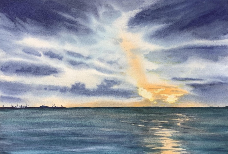
2. All about materials: Hi guys. Today we are going to paint these blogs, these
beautiful sky. This picture was taken on Parliament in my
Yorker in Spain. And these very beautiful
sunset, these clouds. I was really amazed with this
view and I want to share my feeling and I want to teach you how to
paint these sky. This is rather complex
image because there are many types of clouds here and also bright
light and the sea. But we will handle on these
and I will teach you how. Okay, you can paint these bonds. So the first video is
usually as about materials. So what do we need
for paint these plot? The first is, of
course, the paper. So the paper, I use, paper, 100% cotton. It's by honeymoon. It's my main working
paper and I paint practically everything on it
in texture is called press. And the size is 24 on 32. It's 300 grams. And I use this paper now in the blog because
it's more convenient. So if you use the
separate sheets, you will need also
the masking tape. I don't need masking
tape because my paper is glued on the block. So what do you do when you don't have access
to cotton paper? And why cotton
paper is important? Because mainly, or watercolor, painter on cotton paper because
it gives you more time, more time to paint, to wash, to make some nut, to crack some mistakes. It really dries slower
than not cotton paper. So if you don't have access to cotton paper, it's also fine. So you can use another paper. It's philosophy paper. For example. How many paper is rather well. Also, I know that
Jackson's paper as well. So you need the
watercolor paper, preferably 300 grams because it, you just throw the
thick and it's not waving and so on
about the texture. I think that for these plots, the texture is not important, but cold press is preferable
because of the extra texture or the lack of texture doll is not so
useful for this plot. But you can choose paints. I'm just making some doors, so I'm painting only
with shrinking. And now I will get here all the tubes that
I choose for these. Don't be afraid. It's not necessary to
have so many paints. I will explain you
the principle of choosing the color
for these plots. So here is, there are friends. So what do we see here? We see many, many shades
of blue and orange, and dark blue, and again, orange and wind and even yellow. So when I decide what
pains to choose, I look carefully at my
reference photo and decide how do I mix the colors and what are the main colors
for the sport? So for my opinion, the main color here is
ultramarine and also Delft blue. It's in the throne. So, and also I have icy
blue from shrinking. It's blue Carlo with whites. When I exactly don't know
which color do I need? I look at my swatch, swatch for my mixes
from my main palette. I have here like really
dark, dark blue. And if we're looking carefully, it's like more greenish. So and then I simply look at my swatches and
decide whether, what colors do I use here. And I have found these mix of helot
Jordan and sepia brown, reddish gives me the
color that it needs. It's really dark and
it's like greenish. So I decided that these, so you can see
that this color is swirly for what we
need for these sky. And also about not blue colors. Because I mix grays and get different shades of blue and gray with mixing
blues and oranges. So I wouldn't, I would need to decide what orange I will use. I know that these color is
like it's pigment b 020 and pigment p or 20
mixes with blues in a gorgeous, gorgeous grace. So these cadmium red, orange is also on these
pigments, be or 20. And transparent orange
is on pigment B or 71. We will simply test these
transparent orange. I know how my pen for x, but I want to show you what
do you do to understand. So this is my tube. I'm putting some
color from the tube. And I'm showing you this
process because you will understand how you should test your paints before starting. So this is the scholar, also gorgeous color palette. And then I'm like
doing a swatch. So it's just the the
color from the tube. And I'm simply swatching
it on the paper. And then I begin to mix the other colors
and look what it gets. So I have, this is mixed with ultramarine and it's
kind of brownish. I don't think that
it's super cool. And then I repeat this operation with
the other colors that I want to use
in the clouds. So I have like blue, it's in the throne. And I also look not only the colors that
I have for the mix, the colors, how colors look
together on the paper. So this is, okay, I like this. And I'm looking at my
reference and I see if I love the colors
that I have here. And also I can do this
operation with another. So I like this color because
it's really beautiful. So why I want to use it? So here and then we will use IC. And we will see if it is good. With this mix. I'm just looking on all the
colors that I have here. And I have found that these transport orange is very
beautiful color by itself. But it gives me the mixes
that I'm not satisfied with because I think that it's kind of dirty and these
kind of brownish. And this is okay. But I will use three blues. And two of these blues give me the index of the
color that I don't love. So this is the example of
how do you test your paints and how to find the paints
that that's you two units. So I want to use this color. And I will just make these persons again
for you to show you why. I will choose this. My base cadmium orange, because I know this
color very well. And it's, I think the
most used scholar in my buret in pure form. It will be for the sunset. And then if we're doing
glyco ultramarine, we get very beautiful
logo or gray color. So it's mixed, mixed
with ultramarine. So if I want these
make so look more. Gray or blue? I simply mix and add
more blue, ultramarine. So yeah. So let's do the separation
with in the trunk. So it's does bluish mean Care. And again, we get good gray and these good gray is allowed. And also we will
do this operation. We the icy blue. And I can see that here. It's really good. So you can see that here I
have mixed two orange colors. Here is a transport orange, and this is cadmium orange deep. So you can see that the colors mixes with
blues in different ways. And I'm looking at my mixes and decide
what color I will use. So now I have decided
that I will use here. I will use cadmium orange deep. I hope that the
principle of choosing the colors is understandable. And if you have any doubts
about what colors you choose, you can do these exercises. And it's basically not exercise. You just mix the
color that you will use and see if you love
the results to know. And I understand that here, the result is not
satisfying for my subject. So I, so I will use like these color for these areas and all mixes for
creating blues and grays. I have told you
about the paints. So basically, we will
need for these plots, cadmium orange deep, and please look that it makes
us good with your blues. So my three blues that will be about for the clouds is ultramarine blue in the
throne blue and icy blue. It's blue with the white van. We will need some
yellow for these areas. The era of bright sun. And we will need a haircut, swollen and sepia
brown for them. Dark, dark shadows on the
scene. About the brushes. First, you will need
some some brush for applying the water on the paper and for mixing that pigment. This is the Vinci makeup brush, and it's made of Bonnie
and I use this brush for mixing the areas and mixing
the pigment on the sheet. If you don't have
like these brush, you can use any squirrel or
any soft brush you have. I have like pretty gross pool. It's the Vinci squirrel. So basically, you will need some rather big brush to apply the water and to
mix than my mostly, I think use brush
is because I knew because I knew it's
imitation squirrel. So it holds the water and
it has really strong tip. So I will show you, for example, this is how tip
of my brush it looks like. And it's important
because it allows me to control the paint and
control my strokes. So I will use two
brushes for washers, for applying the
skies and so on. And also, I will use some
synthetic brush with a good, cheap and very
controlled brush to apply some small, small details. Maybe there may be like here, this yachts and so on. And about extra materials. We will use the paper towels. They are used for control the amount of water
in your brush. So if I have excess of
water in the brush, you simply wipe it off
with a paper towel. We will use spray. I use prey practically
everywhere. And by the way, the most cool and comfortable
sprays are made by EKF. So I have many sprays but I prefer and also masking fluid. So it's a liquid gum and it's used for
covering the areas on the paper that you
want to keep white. So I will use this masking tape for applying these
areas that should be white because later I will wash the whole sheet and I definitely want these
areas to be white. So I will use it. What do you do when
you don't have these? My masking fluid? This so you can use
wax as far about, for example, the candles from the birthday
cake and so on. Because wax, if you apply
the wax and the paper that it's also done to lead the
painter come in the paper. You can use the masking
tape and CSCA to cut that. These form that you need to be covered and simply imply
these masking tape. It's not so convenient, but it could be used and I
personally use these methods. And of course, you can simply
don't paint on these areas. So you can just make it with pencil and don't
apply the paper on it, the paint on it. But the most convenient way
is to use the masking fluid. I think that's all. That's all. That was about the materials and
the choose of Carlos. And now we're going to start to paint this
beautiful subject.
3. Pencil sketch and masking fluid: We're always starting
our watercolor painting with the pencil sketch. But in these plots, it's really sold so
easy that practically a so don't paint all these
skies with all these clouds. So with the pencil
because it's useless, you will do it with the
paints straight line. So we can just mark the
area over the Horizonte. Haha. I don't see anything special
in using the extra material. So for example, I use now
the ruler because this is Sky horizontal line and it
should be really straight. I just mark the place
where I will have my yachts and so on. I will do with brush. So basically, I will mark that area in C where
have the shadows. So I have a huge shadow
from the wave here. And I will mark these plays. So I will have here a dark area. So now I'm painting the shadow, then another shadow. So I'm like marking the areas where I will
have dark, dark areas. And also a very important
rule is the rule of perspective that these shadow should be larger than these. Because this is more
far from us than these. Yeah, This will be my C. And I have placed here the horizontal line because
these images about the skies. So the C is not very
important subject here, but I want to hear
to be my light, light zone on the sea. And it should be straight
under the sun, our sun. Now I want to apply
my masking fluid. I'm squeezing some of the
masking fluid on the palette. And I take that not
necessarily brush. It's some brush from
some school school set. And the masking fluid is really not good for brushes and
for the health of brushes. So when applying masking
tape or you should use a brush that you want regrets when it hair will
be glued with these resins. And I'm choosing the place
where I want my son to me. I think it will be
like here because it's a composition rule that it's not so good to make the object, the main object directly in
the center of the image. So I will use the
rule of thirds. And I will make here
my son. Maybe here. Yeah. And they're
important is now that I am like doing very large the image of my
son because I need to have the form
just like it was. And I took the blue masking fluid because
it's visible on the paper. And I I can so I'm
trying to make these I'm trying just to repeat the form that I
can see on my photograph. I'm not talking because
I am trying to make it look really, really nice. Like I prefer round brushes, but I don't have
unnecessary round brushes that I want regrets after they
using the masking fluids. So the other Barker have
here is this flat brush and I'm applying these. And I'm really trying
to repeat what I see on my photo. Okay. So that's all for
the masking fluid. And now I will wait till
this masking fluid dries. It's really important
because you cannot walk on the paper without the masking
fluid is totally dry, so wait till it dries and
then we'll begin to paint.
4. Sky wet-on-wet: And I'm beginning to paint and I'm applying
the water on the sheet. There should be lots of water. And I often I use just
spray to apply water. So don't be afraid that the
water would be too much. So don't, don't be afraid of water because
watercolor loves water. And the base concept of
watercolor painting is that when you need not vary, when you don't need
straight edges, when you want the edges
to be smooth and so on. You need to have water. And I'm applying all all
my sheet with the water. And I have really
many water here. And now I have
applied the water. And I will now mix the color, the color for the clouds. I'm taking icy blue. It's blue with white. And if you don't
have icy blue or so, you can use any royal blue. It's in the It's called royal
blue in incidental yeah, brand and there are many,
many different blues. So I'm mixing gleich, blue bar notch, bright
blue bar blue with them. Great, but I'm also taking
blue in their pure form. So you can see the difference that here is my grayish blue. And I'm beginning to
apply these blue. I have here one place
where it's really blue. And then I'm applying
these things so the paint flows. And that's why I love watercolor because
of the paint falls. So I'm blind, just
have excessive paint. I wipe the success of paint. Double. Then. I'll
take in orange. It's cadmium orange
that I have shown you. Cadmium orange deep Bushman cam. And I'm simply blank base. So I think that you
can be afraid to apply really tough
paint on the sheet, but I can tell you that
that's cotton paper, a walk. So this way that that one, the paper dries, it gets paler. And now I'm applying
these orange. So trying to hear the b
are really bright color. So it's pretty pure
orange from the tube. Then I can see that here
I have another orange. And I'm looking on my reference. Where do I have these orange? And also like blank here. And then it's time for my brush where I I'm mixing, like mixing the paint when you are doing can make up
with these movements. And I want it to be fairly
smooth transitions. Now, basically I'm doing
the layer that is. The layer, we not dark clouds, but the layer with these
transparent washes. And I want it to
be more orangey. So I'm applying the orange. Now. I should walk faster
because my paper dries. So this is industrial. I mix it with cadmium orange and getting a bit
of ultramarine. I just want to have
dark blue color. And don't be afraid of this. These will look really
pale law and I know this. And I'm applying these. I'm getting my brush also on the back to create the different
movements of the brush. And I'm trying to
repeat the clouds. I see here the form
of the clouds. I'm not afraid to mix my orange with these
darker areas because because it's mixing not with not with these
greenish type of zone. So I'm free here. And this is icy blue. And I'm putting ultramarine
blue and cadmium orange to get the balloon. Robot and other bloom. I'm trying to paint the cloths. While my paper is wet. It allows me to do these edges. So and again, I'm now mixing the pigment to create
the different views. Van, I can see that. I hope these were the orange, so this ray of light and why we need off very carefully
and mixing orange here. So basically, we are now applying the paint to get
this feeling of the Sun. And we're now applying
and supplying. And we're creating the dog. And also dark areas, ultramarine in the throne. So here I can see that
some of my clouds are. I can see that here is the
border that is clearly seen. So I am using the towel
to wipe off some paint. Not so many. I'm wiping off the paint in some places to read
the form of the cloud. So I'm looking at my
reference photo and trying to wipe some pains
so I can see here. But it can be odd or clouds
or darker on the bottom. So I'm applying these. And also I can see that I have clouds here in the
era of some sort. Hi, I'm trying to
repeat this form. And I can see that now I have left about 34
minutes so to paint, maybe less because my
paper begins to dry. How to understand that
your paper begins to dry. It doesn't shine on the light. So I'm looking where I have
shiny paper and we're not. So practically all my
paper now is beginning to dry and I have
not so many time. And I want to create
the dark layer. So I'm mixing ultramarine
in the throne and cadmium orange again. And to create these
dark blue here, and I want it to be blue. So nice. So this is the contrast, the contrast that is created by by the dark and light areas. And contrast is very,
very important. I don't want here to
be these sharp edges. So I'm just doing
it with pure water. Ok? And now again,
these blue here. So basically I look at my sky and I'm just doing
some minor changes. I look where I have two straight edges among want
more dark areas and so on. And I am applying. So basically here, I used to, I think four colors. It's cadmium orange,
It's ultramarine blue. It's in the throne, and it's icy blue. And now my paper
really begins to dry. So that's I think
all for the sky. And now I will use my hairdryer to dry
all the paint here. And we will begin
to paint the scene.
5. Painting the sea: I have Dr. my paper
and now I think it's time to get off
this masking fluid. And I know some people that
do it with the eraser, but I prefer to do
it with my fingers. And now we'll see
what we have here. And now it's time for
applying the yellow. So we can see on the
reference that oh, here is white and yellow. So here is yellow areas. But it's important to leave
the white areas, but also to. So I'm taking the
yellow that I have. And I'm beginning to
very carefully apply these yellow and also trying not to mark all my white areas
with this yellow column. So basically I'm voting
yellow in some places. But I'm trying not to. Because if I because if I get all these yellow color, it and I will have no white, it will be really not good. It's very process that
takes much concentrations. So now I'm not talking
so much trying. So I'm applying these
yellow and then I simply wash it with clean water. Okay. So I think that with the yellow It's all for now and
it looks law now. Okay? Because we don't
have contrast here. And there is no
light without dark. Now we don't have darker and darker will be our c of course. So now we'll apply our dark seed and you
will see the result. And these sun will look
even more brightened, more cool than it is. Now. What about the
base color of the sea? So we have darker areas, so where the waves and
the waves, but the whole, the whole see tome, it's ultramarine, its sibling. So I'm basically using the colors that I
used for the sky. Because these Carlos
Miro to in the scene, that clause of the
account off clouds. And I'm mixing
three base colors, so it's ideal to
marine cadmium orange. It will be that lighter
tone of my sky and then I will mix
that darker tone. I remember that it's
headed through them. It's like cold blue column. And here the Turonian
mix with severe. I have these colors
from my palette. So it's important
that these color, these paint must
be thick because we need a thick layer to
create the contrast by tone. So don't be afraid to mix many thick color
magnetic paint. Okay, So I'm like like missing
a halo cerulean sepia. And maybe I will get here a
little bit of industrial. So these thick paint
now looks like really so dark that I
basically see here no, Karla, but I know that
it's like a greenish. I will test my color. Yeah. I think it's huge. It's like greenish but
it's bluish and it's dark. And these, I need this
column for creating. So I have mixed here
too big, too big pains. So the first is for the
main main C collar. It's like bluish, grayish, and it's, it has more
water than this. So here the paint
practically flows, and here it's already
acidic and it's important because we need to
create the contrast. It's also important
that I leave here these the slide from the Sun. So I don't use mosque here, but I need to remember
that. I need here. I'm really concentrated to paint so I don't talk much now. And I'm getting to I really need to keep
these bright zones. And these bright
dawns should also be above, above the waves. And here I will fly. And I'm trying to copy the form that I
see on my reference. These work takes much
concentration and it should be done fast because we need to make the shadows while this while my wash is dry. So now I'm taking my dog and I began
to make the shadows. Of course, I was making these
shadows with the pencil, but I don't see my pencil now. So I just need to imagine
where are the shadows? Long. I'm taking another
brush and just, and just watching
clear the clean water. And I'm just painting, go here. These yachts. Hi, I'm basically blind. The feeling that there is
some some places here. Okay? And I'm using the
dry brush also. And I'm creating the feeling of these big waves with applying
really dark, Carlos. And now I'm also doing gleich, dark body under the
light bonds so that the contrast between these
light and dark areas will be more visible. Again, I'm playing more
and more dark colors. So this is basically
these one wash. And now I think you can see why
it's so important that it should be really thick. Okay. I think that
it's now okay. Maybe I will do like
these were here. And now I am applying
these yards. So I am taking my brush
with a sharp tip. It's very important because you need to make
very thin lines. And I simply began to I'm trying to look
at my reference to see where are these. Yeah. But it's not so important. So if you just painted where
you want, it's also okay. So I'm not counting the
number of the yachts. They have unmarried parents
because it's useless. I'm just trying to convey
the feeling of the lights. And here it's the lighthouse, but it's the small. And if you look on the photo, you also cannot see that
this is Lighthouse. I know that here is
likes the house, but on the painting
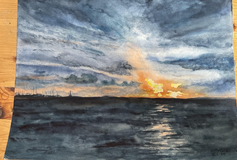
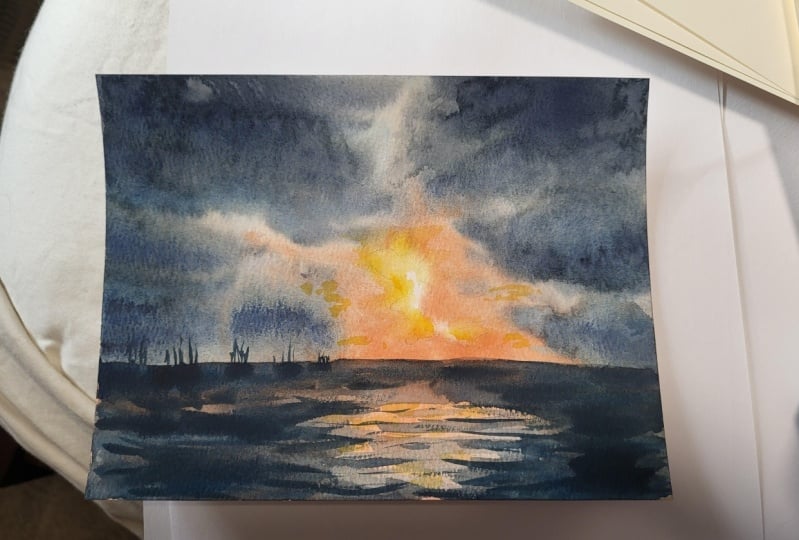
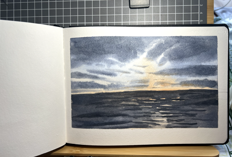
is just one stroke. Okay. Now, I think that practically my painting is finished and now I just look for some small details
that I can add. And that will do a
really good feeling.
 Anna Zadorozhnaya, Watercolour artist