Transcripts
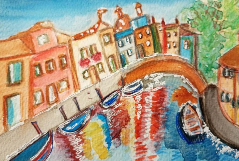
1. Introduction: Ever seen a vibrant cityscape filled with colorful buildings, intricate shapes, reflections and endless layers
and thought to yourself, This is way too
complicated to paint. If so, you are not alone, but I'm here to help
you break it all down into simple and approachable
steps to paint. My name is Mona, and I'm a
visual artist from Italy, and I specialize in painting, cityscapes and everyday
scenes in watercolor. In this class, we're diving
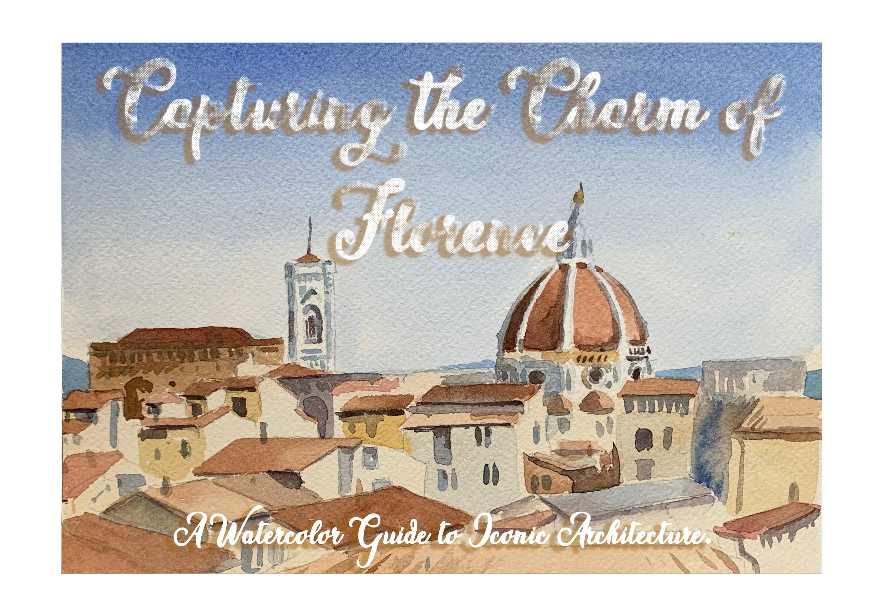
into the charm of Venice, one of the most colorful and picturesque
cities in the world. Watercolor is a perfect medium to capture the unique
atmosphere of Venice. Its fluidity lets you create
soft reflections in water. Its transparency helps
you build vibrant layers, and its versatility makes it fun to experiment
with textures, like, for example,
using a cutter to scratch light highlights
from your paper. This class is
designed to help you gain confidence
with water colors. You will learn how to
simplify a complex scene, build layers of vibrant color, creative realistic
water reflections, and use clever techniques
to make your painting pop. By the end of this class, you'll not only have
a stunning Venice inspired painting to share, but you'll also
feel empowered to tackle other cityscapes with
your own creative flair. So grab your brushes,
your paints, and let's bring the beauty
of Venice to life on paper. Can't wait to see
what you create.
2. 1-sketch: This is the initial sketch
I did for this painting. It's a light sketch
of the scene and try to begin by blocking out the main structures
that you see in the photo. For example, the
houses, the boats, and the reflection of the
colorful houses on the water. Use a light pencil
and then afterwards, try to look at it
carefully to see if the perspective is correct. Make sure the buildings when they go to the
point at the back, they become smaller and include some of the
essential details, but not too much because
we don't want to focus too much on
the on the details.
3. 2-The sky and the base color for the canal: Painting. We'll begin with
a soft wash for the sky. I'm going to use the
wetting wet technique. Using a flat brush, I'm going to cover my
whole area of the sky. Actually, the whole
area of the painting, and then I'm going to
mix a blue color for the sky and cover
the whole area. As you see, I'm using
a high quality paper. It's an arch, 100% 3,300 grams. 100% cotton and 300 grams that helps me achieve
better results. Okay. With my round wash, I mix some blue ultramarine and some cobalt
blue for the sky. It's going to be darker on
the top of the painting, and then using a
gradient technique, I'm making the color look lighter when I go closer to the buildings and
basically to the horizon. Darker on the top and lighter when I move down. The paper. And with my flat brush, I blend it a little bit
throughout the paper. For the water at this stage, I can cover a little bit, put the base wash and I'm
adding some emerald green to this mix of colors
I used for the sky. Using a very light
wash and paying attention to leave
some parts white because I can see
the reflections in some places that are white. Then I wash my brush and
then blend it because here, then afterwards, I'm going to put the reflection
of the houses. I don't want the color at the pigment to be too present and the color
to be too dark. Remember that this
is just the base
4. 3- Base color of the buildings: The most of this stage
which my paper is wet, I'm going to put the base
layer of the buildings. So basically, I'm going to use some warm and vibrant shades for the buildings like this color, which is a sienna and mixing
it with a little bit of ok. This is basically the base wash, and I need to keep
it really light. And my brush needs to be not too wet because I don't want the colors to blend into
the layer of the sky. And so I put very light
washes here and there. If I see there are
different colors, maybe I can at this stage
add also some layers for different houses which
are in different colors. For example, I see
this red house here and some red house
in the background. As you see, I'm putting
some really light washes. I see some blue houses at the background
using a dry brush. I can hint the existence of these houses and then just a
little bit more of red here some more a blue house here. As you see, my colors blend
into each other beautifully. I need some o for this this house here
and maybe a hint of yellow Pay attention to the colors, but don't make it an obsession. It doesn't matter if a
yellow house is next to a red one or is
next to the blue one. It's important to have the vibrant colors
and also to have the um nice base layers because we are then going to add the depth to them
and then correct maybe some of the
colors we put and make the pigment more intense, the color more
bright or or darker. Basically, this stage helps me have an overall
view of the painting. Because the background
is still wet, pay attention to
use dryer brushes and not to use too much water
because then you're going to have some effects
that you might not like. I'm going to mix these two
colors to have my red and my yellow ochre with a touch of Sienna for this
painting at the right, which is a bright pink or and let's also while
my paper is still wet, I can do also the pavement here. I'm making a gray, adding my purple to a
little bit of brown. This is burnt umber. Then I dry my brush and blend it into the rest of the painting. Why not? Let's just do also the bridge the base wash
of the bridge here. Using some sienna and
adding it to the color I used for the pavement so that I can have a nicer dark color
for that background there.
5. 4- The tree and the right side of the painting: Now let's also do this
tree at the background. So the Base wash. I'm using my light
green and yellow. I can see that my
background is now dry, so I'm putting my color
more freely right now. Add a little bit of dark green. This is the sub green to it to create already a
little bit of depth here. And also, I'm going to use the same color that I used
for this pavement here, which was a mix of
purple and brown, my my burnt umber. For this pavement here. So now I can say that I have the base wash for the
upper part of my painting. I just need for it to dry and then I'm going
to add more details and, like, work on the houses and then on the reflection of
the houses on the water. So now I just wait
for it to dry.
6. 5- Let's bring the buildings to life!: So now that we have laid
down our past watch, it's time to bring the buildings to life with some
vibrant colors. As you know, Venice is known for its bright eye
catching architecture. So don't be afraid to be bold
with your color choices. I'm going to start
with the background. And I'm going to use some
reds and yellows for the second wash of the buildings
I see in the background. So basically, I'm going
to apply the wash with a small round brush and work
from the right to the left. So basically from the
background to the foreground.
7. 6-Adding depth to the houses, part 1: What I'm going to do at
this stage is to add some depth to the buildings. So I'm using a darker
pigment and trying to find on the photo where
I can see the shadows. Using some brown here. This is burnt umber. And as you can see between
each of the two buildings, there is a little bit of shadow, and then we can
also do the roofs. So by looking closely at the painting at
the picture I have, I can just work on the
shadows here and let the painting the buildings
on the painting come out into life, come into life. So now I'm moving
to this blue one. So with the dark color, I'm only going to do you
know, the shadows here. And while I'm here, I can
also do some details. Why not? Here, I also have the roof over
this blue building. I can already edit. Some more umber, some
more senna here. And let's also put the shadows on this paint on this building.
8. 7- Adding depth to the houses, part 2: You to work on each of my buildings and
their unique colors. For example, on this one, the roof is more visible. This is the first
wash of this roof. I'm then going to add more details to it and
moving on to the other one. Getting some yellow oak here and some orange to get
the unique color of the dark part
of this building. And now, I'm going to
use a little bit of a darker color
here for the roof. And also for this part. So this is basically
umber here I'm using. Okay. For this yellow
building, sorry, for this red building, I'm
making a darker red colour, adding a tiny bit
of purple to it. And this covered this
whole triangle here where I can see it's darker and this way I can give this building and the
whole painting more depth. With my dark brown
and a hint of purple. I'm also going to work
on the roofs here. Woof. The same thing also
for this last house, which is lighter in color. Maybe I can add a wash
of super light gray to this really light because I just don't want it to
be completely white. Go.
9. 8- Adding details to the architecture: It's time to add some
details to the architecture. Also, I can work a
little bit on some of these houses at the
background that I didn't have. I didn't put too much
contrasting colors. Now I'm using emerald
color, green emerald, mixing it with blue
ultramarine and just saw these houses
here that I missed. Just some little
houses here and there. This one maybe also here. Just to have more
variety of colors. That makes the whole scene
more vibrant this way. I can see a yellow building
also here at the background. Now let's go and add
some details like the window frames
or other details. I don't know the shutters
or some other features like I don't know the balconies or some plants
that we see hanging here. But now let's start with the
ones that are already dry. And see what I can add here. Door frames, windows. I'm not completely copying the photo as it's not possible, but trying to be more
realistic as possible, adding as many details as I can. Maybe some window shutters. Here under some doors, always using my
dark colors here. And also, I can work on this building at
the background at the roof here and windows Okay. With this emerald green color mixed with a little bit of blue, I'm going to do
these shutters here. Just very simple without getting too much into
details, obviously, because it's not even visible and also I don't
want to exaggerate on the details because our
main point in this painting is basically the reflections. For this one, I'm going to
leave the frames white, the frames of the windows. Let's use some brown
color for my door here. Mixing this color with
a little bit of purple to have it darker in order to work some more on these details
here on the windows. Have a quick look at
everything you have here to see where you can add more
details or more colors. Maybe here just a little bit
of red would be a good idea. A little bit of emerald here. A little bit more of red here.
10. 9- Adding details to the architecture, part 2: So same thing goes also for
this building on the right, but a little bit of detail would do
because basically it's not that much visible. Like there are not
so many buildings here and they're
not too visible. I only hint that here
there is this building and this roof and then some window shutters here and here and also this
other building. It's important to
pay attention to the symmetry of the details
and to the perspective. We should always follow the correct perspective when we are working also on the details. Now I'm using a dryer brush
for this other building which is in the first one and it's bigger and dry
brush here works really well. And let's darken the frames. This is my umber with
a mix of purple. I'm using this dark
color for the you know, the shadowed frames and also some details
here, for example, the water pipes and more
details on this roof, for example, be
bold and don't be afraid of your brush strokes. I go to make a
little bit more of this dark color like
this dark gray, which as I said, it's a
mix of umber and purple. I really like this dark color. Now working a little bit
more on the shadows here. And the frames and everything.
11. 10- Adding more details, refining the tree and the dock : Red colors on my palette, it's called Carmio work a little bit on
these flower boxes. Not too much details, but only to hint that there are these boxes and then later maybe I can
add some shadows to this. Okay. So now that I'm working and trying to
finish the background, maybe I can also work a
little bit on the bridge. For now, I put the shadows
here under the bridge and also the remaining of the painting the buildings or there that are visible
under the bridge. And maybe also some more details
here and there, nothing too exaggerated,
the tree as well. I just need to add some
shadows to it in order to have more depth here. Adding a little bit of
sacren and blend it Okay. And you know, some of the branches here. And with my green, I can also, if needed, add more details. Wherever I feel is necessary. Okay. So at this point, I can leave the buildings and basically I can move
on to the reflections. But just before that, I thought
this can be a bit darker. I'm going to blend it here. And also between
these two buildings, I can have So dark color and also the pavement. You know, whenever
I feel like there's the need of some details here, I can add it using a little
bit of my ultramarine blue. I just put some strokes
here for adding a little bit more of color
variety to my background. Let's see if I can
also add some yellow, although it's not possible because it's already dark and I can add light color to
dark as in watercolor, but maybe a little bit. Amazing. At this point, I just leave it to
dry and then I will come back to it with
the reflections.
12. 11- The reflections, part 1: Time to move on to the most magical aspect
of this painting, the reflections on water. This step requires patience and we need to be
precise. Take your time. What we're going to do is to start by using the same
colors we applied to the buildings and we're
going to mix them with more water to create lighter
and more reflective shades. I'm going to start from
this part of the painting, and then I'm going
to move forward to the nearer buildings which have bigger reflections and
more detailed reflections. So I just check what
colors I put and try to use horizontal strokes with my round brush. Like this. Thin lines
and horizontal lines and the paint needs to be broken in broken
horizontal lines lines. I can also let it blend
a little bit going. Here. Then I have a look of the next building and
blend that color, those strokes to these ones. I had this yellow building here. You see my stropes are broken. The more I come to the
bottom of the painting, there is more space
between them. They can blend. The two colors can blend easily like this
one into the other. So now I'm basically working on the first wash of
the reflections, and afterwards, I can also add some darker colors
to the reflections. And I'm as you can see, I'm keeping a little
bit of separation between my strokes,
like between these two. And also where I put the color at the nearer to the houses, to the buildings and
then more space when it comes to the bottom and then my strokes can also
be bigger here. It Okay. For the next one, I'm going to need
yellow oak maybe here. In some parts, I let
the two colors blend together and in others,
I separate them. I see that I have some green
color buildings around here, so I can already put that.
13. 12- The reflections, part 2: Same thing goes for these
houses that are closer to us. So I begin at the top of
the canal and work my way down using horizontal strokes. But also consider
that here afterwards, I'm going to paint the boat. So there is also going to be the reflection of the
boats on the water. This is where the dark part of the shade of
these yellow houses, so I can already
use this dark color and put the shade over here. The same thing
goes for this one. So the red color that I use, the carmio and adding a
tiny bit of purple to it. For the shadow here. Okay. Now, for this one. I'm going to change my brush
because I need a bigger one. This is a medium round brush. You should basically use
the same colors that you used for the buildings. And here, because the window
frames are also visible, I can be more playful. You know, work also a little bit on the windows and the door. And now that I'm at it, I can also do the the reflection of the
windows and the shutters. Always horizontal strokes and just be playful because
it's a reflection on water, sometimes it's bigger, sometimes
there's more distance, sometimes there's less distance. Just try to have fun with it. And obviously to
respect the colors that you had used for the buildings. Well, at this point, I would say to also add some more of these strokes here with
more space between them. This yellow house over there adds a nice touch
to my reflection, so I can basically Be happy to add more
details over there. I was just thinking
about a tiny bit of details for this darker
part of this building. So basically right
under the shadow. I'm going to do this. And
the same thing goes here for the window shutters. So and the door. Okay, at this point, I would wait for this
whole thing to dry, and then I would add the boats and work more on the reflections of the boats will
add to which will come over the reflection,
the lighter reflections. And then we'll see what
other details I can add.
14. 13- Base color for the boats: So my next step is to
work on the boats, the first wash of the boats before working on
the reflections. I'm going to use a round brush, small one, and I'm
using blue color. This is my cobalt blue. Starting from the right, I first find out the boat here
which is covered. O. So pay attention that this
is only the base color. I'm not working too
much on the details. I'm not working on the
reflections or anything. Afterwards, when I work
more on the reflections, I can have the shapes of the boats a little
bit more realistic. Right now, because
I just left them all blank and I
didn't work on them, I'm just going to
find their shapes and also where they are located. Okay. Here for this one,
I can see that a little bit of emerald
would be a good idea. These horizontal lines
inside the boat. Okay. Then I go to
the other side. I can still use the cobalt blue here for the ones that
are at the background, so a few under the bridge, then there is one here
right after the bridge. I'm going to leave
this part and then add some white at the
end of the painting. Then I have this other one. Using this green emerald color. Can I put the third one. Also here, it's important
to pay attention to the perspective and
how they are located.
15. 14- The boats, part 2: And then I have a red
but after that one, I can use the red color
I already have here, which I used for the buildings. Paying attention
to the perspective and the light comes
from this side, so I can just blend it so that I can have a lighter
color on that side. Then on top of it, using my blue color, I can already put this
cover of the boat. Okay. And there's also another
blue one light blue here. I'm just putting the
shape as I said before. So don't worry if it's not exactly if you don't see
exactly the shadows there, it's important
just to know that, so in these spots, I have the bots. For example, here, we're
going to put the shade, like the shadow of this one, and then the form is
going to be more visible. And the last one, which is here and is bigger, I'm mixing my cobalt
blue and my ultramarine. And just adding some of these emerald
green and blending it so that I can have the base
color of this last boat. This would be my base color. Trying to figure out
the exact shape. Then I have this red
line, this white line, and then at the
bottom of the boat, I also have another
blue color here. Okay. So now that I'm here, I'm also going to
put this red one. Obviously, afterwards, I will
put the shadows over there. Okay, so I'll wait for it to
dry like everything to dry and then I will work on
the shadows of the boat.
16. 15- Shadows under the boats: Now let's work on the
shadows under the bolts, which is an essential
part of our painting. To start, we'll try to mix a muted tone
for these shadows. I'm going to combine my brown, which is a burnt umber
with my purple in order to create a dark toe
for the shadows. Then I can also
mix another color which is a mix of
blue and green. So a little bit of ultramarine
and some emerald green. I'm going to start by
putting that under with a dark color and apply it to directly under
the boats here. So with my small round brush, I just apply this
color under the boats. In order to make them
pop out a little bit and give it a sense
of weight and realism. This is the color I put
right behind the boats. For example, on this boat here, I see that the shape
is also more visible. I'll put this color here, and then with
horizontal strokes, I just blend it into the color of my tunnel, the water here. The same thing here, the
shape is more visible here and there is this dark shadow right
under this curve, which is going to be
applied right here. But then after that,
I'm going to use this dark color which I
created with blue and green. This color ensures that the
shadow color harmonizes with the surrounding tones while it still remains dark
enough to stand out. It's always darker on this side, which is the shadow. Also, the same thing
goes for these boats which are at the back
of the painting. Next thing is to put
the color of the boats, each of them the
same as what I have.
17. 16- Refining the boats and their reflections: Now, for example, for
this boat, which is blue, I'm going to apply this color
directly under the boat and I'm going to use
a light pressure of light pressure with my brush. Under the boat so
that the edges can be blended into the background
color of the water. This one is emerald green, using this green color
with a light pressure, I apply my strokes here. The next one is red. But first, I need to work a little bit on
the shape up here, the curve on the left. I remaking the color that
I used for this boat, like the dark color here, where there is the
shadow on this curve. And then also on the other side. Right now I have the shape. Maybe afterwards, I just work more on the shadow
making it slightly darker. Also adding a little
bit of my black here, just a tiny bit. That it goes right
under this curve. But then I want to put some red color right under this part of the boat. Following the shape of the
water here and then blend it. The same thing
goes for the boat, I'm using my ultramarine. This would be the base
color of the boat. Then here with a light pressure, I just apply the color
of the boat here. Then here maybe at
the top of the boat, I can blend it a bit. Also some blue color can be applied to the cover
of these boats. Same thing goes for those boats which are
on the background. Let's move to these ones.
18. 17- The boats on the right: For this part, I need to observe the direction of
the light in my scene. So the sunlight is coming from this side and this
part should be darker. So the opposite part of the
boats here on this part. The first thing I
wanted to do is to make the shape of the boat here
stand out a little bit. There's this cover and there are some folds here and this
part needs to be white. Under that, I'm going
to use a dark color. Basically, I'm
adding some blue to this mix of purple and amber. Going around this boat and
then on the opposite side. Very light washes here. Under the boat, and then the same thing goes
for this boat. But first, with this dark
color that I had before, I need to work on the
shadow of this boat very slightly blending it like this with a little
bit of pressure. And then I'm blending
some blue into this dark color so that these two colors
blend together naturally. Going a little bit also under the curve of
this boat so that the boat stands out and
here I need darker color. I'm going to use more
liquid pigment because I want to be able to blend
it more easily here. Maybe it's a better
idea to change my brush to a bigger
one and number nine. Here, I can see there is also
a little bit the shadow of the tree or the reflection
of the tree here. Now after that, I just blend it. So more of this color because I don't want my color
to be monotone. Okay. The next thing is, I just saw on this part
that it's a good idea to work some more on this
boat which is so close to me, to the viewer, this way,
it's more realistic. I need to finish this
one and then work on some details on the pavement.
19. 18- More details on the boats and the sidewalk\dock: So after that step, you can see that the boats
have a lifelike presence right now and my painting feels
more realistic right now. I want to add a little
bit of shadow over here. But before that,
I want to work on this outer part
of the sidewalks. I'm going to use the
color that I have here. A little bit of yellow oak and apply this color to the side of the sidewalk. Also some around here
behind the boats, and then afterwards,
I'm going to make it just a little bit darker. But right now I just want to cover these white
parts that I had left. Over here, I already
going to add this dark color while it's wet so that it
blends by itself. Okay. Let's apply some
dark color also behind this boat and let it
blend into that color. Okay. These shadows that I put under the boats enhances an overall
depth to my painting. Now going to work also
on this other boat. First of all, I'm going to apply the shadow over
here with my dark color. This also helps the shape of the boat to be more
realistic right now. Maybe some little bit
more of dark color and and some details
on the sidewalks. Now I can also put the shadow. As the reflection of
the shadow over there. Now I need the shadow
of this boat under it. Just a little bit just a hint and some more of dark
color right under it, right under the curve
so that it stands out. Okay. And with my dark blue
and a hint of purple, also the shadows that
are inside the boat. Okay. Working a little bit more on
the color here adding some more of this red.
I see that here. I have some strokes that I can add so that this boat
looks more realistic. Later, that this is dry, I'm going to work a little
bit more on this dark part. Um
20. 19- Adding the wooden poles: Now let's add also the wooden poles in the
water near the sidewalks. These ones that
you see. These are simple details that
may seem minor, but they actually play an
important role in the scene. They add character
to the whole scene, the character of Venice. Also they create some visual
contrast because everything is horizontal and
these are vertical, so it's good contrast. Also will guide the viewer's
eye through the composition. I'm going to mix
some warm brown, some sienna burnt
sienna with some umber. Okay. And if needed, maybe a slight touch of purple
to make it look darker. Perfect. So this way I can have
a wood appearance. Using my fine round brush, I paint these thin
vertical lines. Start by the background. This was not dark enough. Adding a tiny bit
of this dark color, this black and a tiny bit of purple to this color and a
little bit more of umber. Now I can at these wooden poles. Not all of them are completely
vertical as you see, some of them are a
little bit inclined. This one, I can see that there
is also some shadow. I make this part more the
light is coming from here, making it darker on
the opposite side. Also, for example, for this one, there is the reflection
in the water. Don't forget that
because otherwise it remains unattached
to your painting. Now here, now that it's dry, I can add more dark color here under this boat. And also under the
sidewalk here. Putting curvy applying
some curvy strokes because this way I can
hint at the curves on the water and a little bit also right
under the boat here. Then I'm going to leave
this part untouched and following the
curve that I just did. And then blend it. Because
this part of the sidewalk is lighter and so we want the
same thing on the shadow. Using this dark color, I can also darken this sidewalk here that
is completely in shadow. This house may be here or
these details can be darker.
21. 20-Final touches: Now that we've created the main scene and
the reflections, it's time for the
finishing touches, which basically bring
the painting to life. I'm still using my fine brush, but we can also use a finer brush here for
the final details. For example, I don't know, some details here on
the window sills, the shadows here under
the flowers over there. I start by that. Putting some
dark color on this side to highlight the shadows and then also maybe work a little on the window frames
or for example, here, there are some lines
I'm using my dark color. Just a very thin line to
to suggest some details, I don't want to get too
much into the details here, you know, which
is not necessary. Maybe some shadow I need between these
two paintings that I don't have by changing my brush. Okay. And what else? Maybe a little bit of dark color for these
wooden poles here. Some details on the water, it would be nice to
add some red here or some red color here. I'm going to darker this color
and make it more vibrant. Maybe add some shadow under
the bridge on this side. You see? Okay. And what else? The
shadow over there. Using this dark color here, add a little bit
more of purple to it and I'm going to apply it here. That also this boat is
more realistic right now. The shadows behind the
sidewalks on the part near the water and with my finer brush using
these dark colors, I can see that
here, for example, there are more
there is this line, this broken line over there. And this broken line also here, which is the shadow
of this sidewalk. What else? Adding some blue
under this boat maybe. These are the details
that you can look at your overall painting and
see what do you think is lacking here and
how can you make your painting more vibrant
and more realistic. But always pay attention not to add too much details because that's not what
we're looking for. Just some details where
there is necessary. Have a look at the
boat to see if there is anything you
can add some shadows for the covers or to make
the form pop out better. For example, this one, I can add a few details
also using another color. Okay. At this stage, I can say that I am happy with my
details because they are not too
much and they're not too little and so the forms
are perfectly visible, maybe just for this
terrace maybe. Unlike some anthems here and there on the houses. Step back and look at your work. Does it seem feel
balanced to you? If it does, it means that you can also
stop working on it. Otherwise, you can add a little bit more details to make the structure
pop against the water.
22. 21- Light effects using the scratching technique: Now, now that it's finished, my painting is finished, let's add some
beautiful highlight on the water surface to capture the shimmering
reflection of the light. This is an advanced technique
that we are using and it's scratching into the
paper with a cutter. Basically, this method
creates white lines that these lines mimic the way light dances on the surface
of this moving water. Instead of using a white
color of gouache or acrylic, I'm going to lift the color from the
surface of the paper. But before we start,
pay attention to this that this technique involves scratching
into your paper, make sure that the whole thing, the whole painting is fully dry. Before that, try on a small
piece to see if you're comfortable with it and
get comfortable with the pressure that
you need to use. Another thing is the positioning of the cutter that is like this. I'm using it horizontally
and I lift the color. I'm not going to use it a lot, just a few scratching is enough. So on the water here, I go to the darker parts and just scratch the paper. You see, just a little
bit, not too much. I just want the reflection
to be visible. Look here. Okay, as you can see now, these are nice effects of
the reflection of the water. Was just looking
here and thought, maybe I want to add some
more strops around here. And, you know, these
are the final touches. You can look to see if
it's any necessary. And at this point,
I would say that, yeah, it's I'm happy with it. Like, I don't want to
overwork it, obviously, just, you know, some
little tiny final touches. Okay. Okay, so at this point, I can confidently say that. The painting is finished.
23. 22- That's all!: Congratulations on completing your watercolor
painting of Venice. I hope that this class has inspired you to see the
complicated cityscapes in a new light and encouraged you to keep exploring
the world of watercolor. Remember that practice
makes perfect. Don't hesitate to try painting other scenes that are
similar to this one and put your skills into the
skills that you learned during this course
into practice. Oh
 Monna Lisa, watercolorist