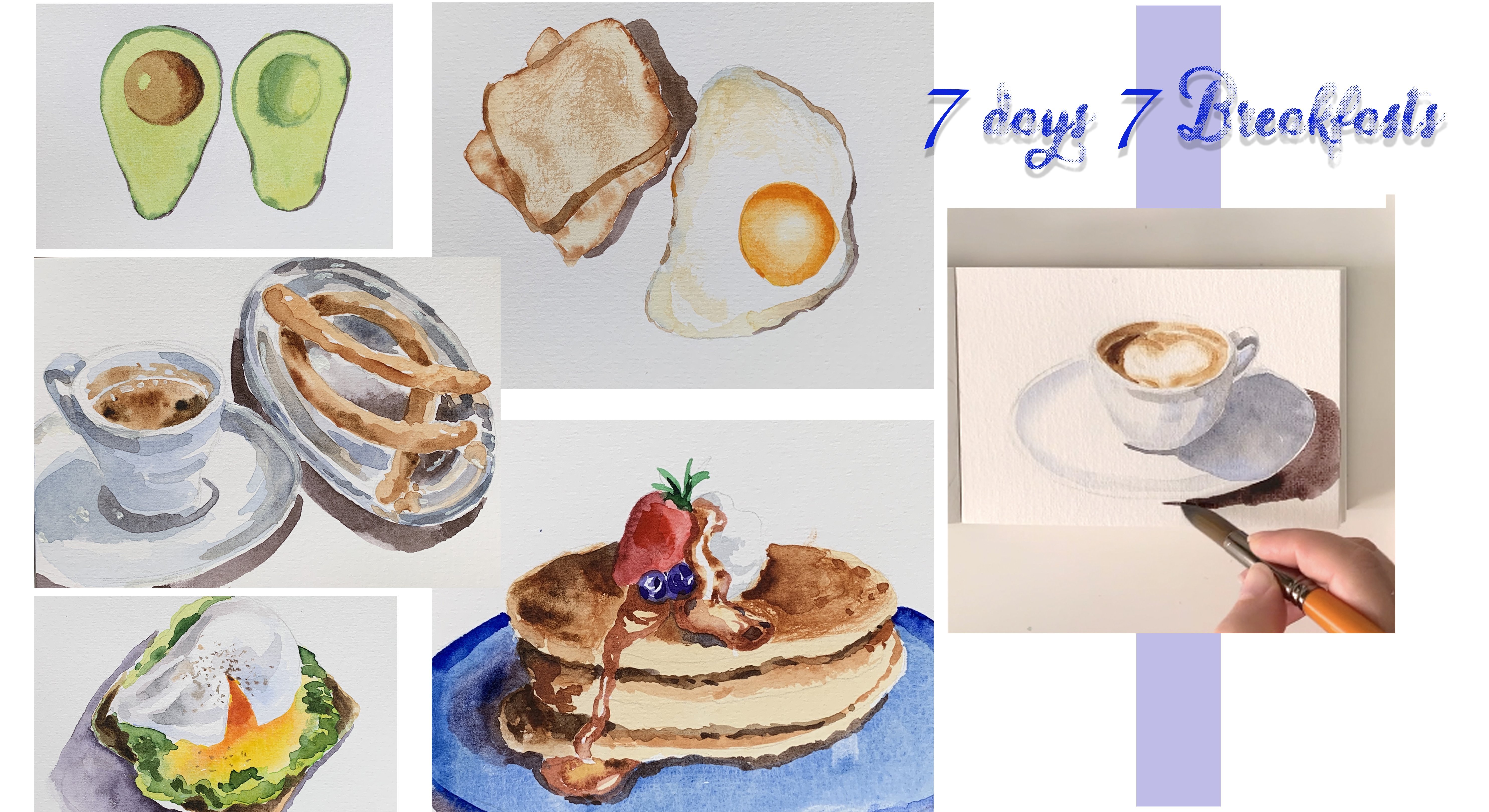
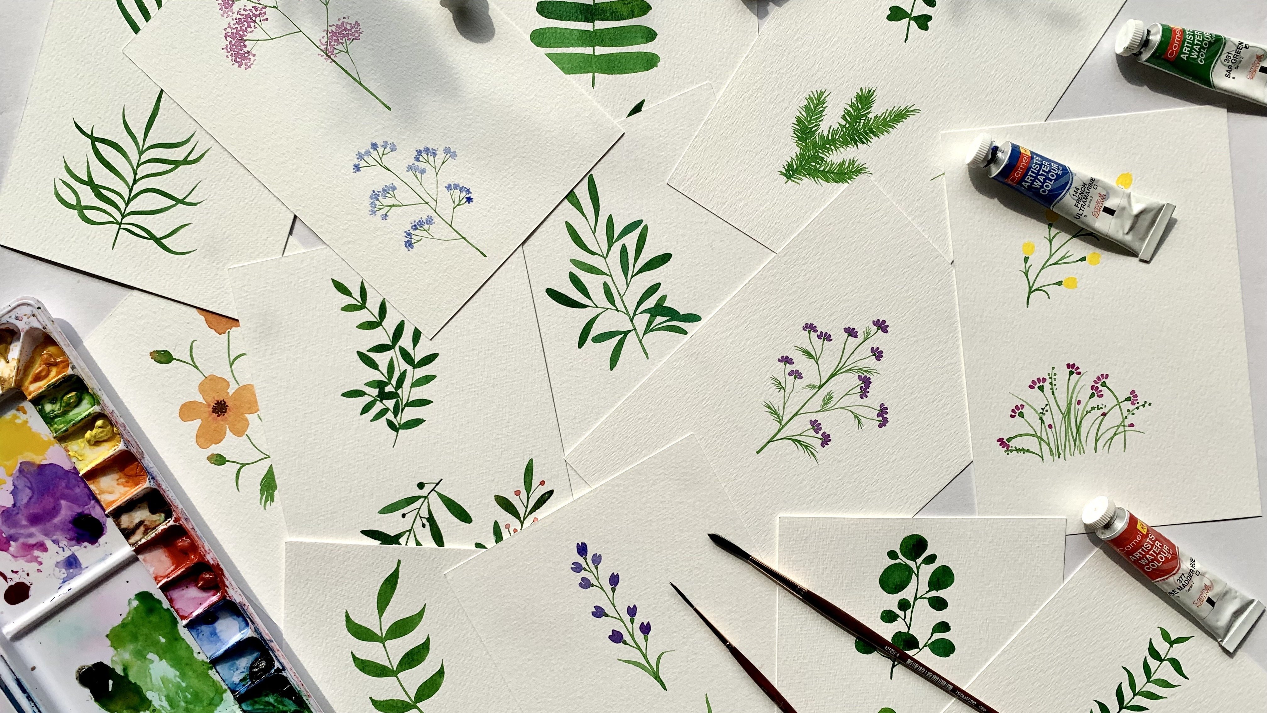
Transcripts
1. Introduction: Welcome to capturing
the charm of Florence, a watercolor guide to
iconic architecture. My name is Mona, and I'm a
visual artist living in Italy. With years of experience in
creating and teaching art, I specialize in
capturing everyday moments and scenes with
vibrant watercolors. In this class, we'll dive into creating a vibrant
watercolor painting of Florence's iconic rooftops
and the cathedral Duomo. We focus on essential
watercolor techniques like layering, blending, and adding architectural
details that capture the warmth and
beauty of Florence. This course is designed
for beginners and intermediate artists
looking to elevate their skills while painting
a stunning cityscape. By the end of this class, you'll have a beautiful
piece of art that showcases the charm and
unique character of Florence ready to share with friends or display
in your space. Your project for
this class is to create your own
watercolor painting of Florence's Skyline and share it in the project gallery. I can't wait to see
how you capture the city's magic with
your own creative touch. Join me, and let's
bring a piece of Italy into your
watercolor sketchbook.
2. What we will do: In this course, you
will learn how to paint an architectural
landscape, capturing the charm of Florence with watercolor
techniques that bring out the warmth of the
terracotta roofs and the iconic cathedral dome, Hildomo of Florence
and the Bell Tower. It's important to pay
attention to the details, but not too much because we are going to paint the details, but we are not going to focus
too much on the details. Your project is to create
a watercolor painting of Florence's rooftops
and Cathedral focusing on color harmony, architectural details,
and also the skyblnding.
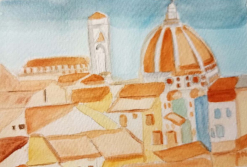
3. The sketch: Start with sketching
the composition. We need to start with the
cathedral dome Il Domo, placing it off center, as you can see in the
reference photo to create a visually
nice composition. And then lightly sketch
the main shape of the bell tower and the
rooftops and little houses. Keep your lines loose and simple and try to
avoid too much detail. The focus should be on capturing the basic shapes and
the proportions, not on overdoing the details. And pay attention also to
the layers of the rooftops, which can create
depth in our scene.
4. The sky: Going to paint the sky using
the wet and wet technique. I begin by wetting
the sky area with clean water and using
a large flat brush. I'm going to just wet the sky area and try to
avoid the buildings. After wetting the
whole area of the sky, I'm going to use a blue colour, a cold blue, and
I'm going to create a gradient with that color. This helps the watercolor
paint blend smoothly. Perfect. After wetting
all my sky area, I'm using a larger, a large round brush, and I'm mixing a cobalt
blue with ultramarine blue, and we'll start from the top of the sky area and gently
apply the color, the blue wash. First to the top and then
moving downwards, so it gradually fades as it approaches the buildings
and the rooftops. If I go a little bit
over the domo the dome, it's okay because anyway, the color is darker and I'm going to cover it later
with the dark color. I continue with this blue wash covering the whole
area of the sky. The gradient technique
helps me to have a more realistic sky. If I feel like I need to
make it a little bit darker, I can add some more of
my mix of blue colours, blue cobalt and
blue ultramarine. And while it's wet, I add it to the top of
the painting and then blend it downwards. Okay.
5. The base wash: I'm waiting for the sky to dry, I'm going to add the base
color for the buildings. I'm going to use a medium wash in number nine
and mix a light wash of burnt sienna with yellow oak. But as you see, the wash
needs to be really light. And then I'm going to apply this wash to the whole
area of the buildings. So each house is painted
with this light wash, and some areas I can live a little bit
lighter and some areas, I can look at the
reference photo and maybe use a darker color. The only parts that I'm
not covering is the Domo, the dome and the
bell tower because they have a lighter color. So at this stage, I'm avoiding the rooftops because they
are the darker parts, and I'm going to
paint them later.
6. The base wash for the Cathedral and the Bell Tower: Peace color for the bell
tower and the dome, basically the white parts. What I'm going to do is to
paint only the areas that aren't directly
hit by the light. So only these parts on the
left that are in the shadow. I mix a little bit of
cobalt blue with my gray, just a tiny bit of gray. But this color needs to be very diluted because I don't
want it to be too dark, so I add as much water as I can. And this color is
going to be used for the subtle shading on the white surface of the
dome and the bell tower. So as you can see, the
color is very diluted. And this color is for the parts of the dome
that I can see the shadows. Try to keep this layer extremely light because it just needs to give the illusion
of the shadow. So wherever you see on the dome, the shadow, you can put
this light over there. Also, this part, I can add
also on the bell tower. I'm just focusing
on the shadows you can see here on the bell tower. I'm only putting the shadows
with a very fine brush. Let's also do this window and a little bit of
these details here. Okay. So paint only these areas that aren't directly
hit by the light. This will show the
highlights and gives a three dimensional
look to the painting. As you can see here, I
have a warmer color, which I can use the same color
I used for the paintings, a mix of yellow and Bensena. Also here I'm using a
light wash and continue on this part while
it's a bit wet. It can blend into the
other color and it's fine. Let's allow this to dry before
adding the next colors.
7. Base color for the Dome: Mix, rich, warm, earthy color, kind of red brown color for
the rooftop of the dome. The same color I used for
the houses for the basewh, but I'm going to
make it a little bit warmer by adding more
of burnt sienna. A touch of yellow oak. And to this color, I'm
going to add cadmium red. You want a warm
tone that resembles this terracotta
color of the Domo. Okay, now begin by
applying an even wash over the dome area starting
by this first part. That is the lighter. And then blend it as it's the lightest part
where the light hits, it needs to be more
blended and less intense. Then continue by applying another wash to the next
part following its shape, but paying also attention
to leave these white areas. Try to keep the layer
light and avoid details. And continue. These two parts
need to be darker. That's why I'm adding more of this cadmium red and a hint of burnt umber to this so that it becomes a little bit
darker for this part. Especially this bottom part, which you can see is darker. And here is my darkest
part of the dome. Pay attention not to cover these white parts
because we need them. Okay. I can darken
a little bit also this bottom part here for a three dimensional
effect and then blend it to what I had before and
a little bit also here. I'm using the same color also for this part
of the bell tower. You see there is
this small triangle which has the terracotta color. It
8. The rooftops: Now for the rooftops, I'm going to use the
same red brown mixture that I used for the Domo, Berzena with a hint of
cadmium red and a hint of yellow oak for the rooftops. But what I'm going
to do is to vary the intensity slightly on different roofs so that I
can create visual interest. I don't want them
to be all the same. I try to vary the inset
intensity of the wash. Looking carefully at
the reference photo, I try to see where I have. Oh, this is one part
of the dome that I had missed these
little round shapes. And then I try to see where these rooftops are looking at my
reference photo and then applying
the wash over them. For instance, here,
as it seems that it's going a little bit
under this other rooftop, I'm going to make it slightly darker adding a bit
of burnt amber. Okay. I have also
some terracotta here. And the layers need to be light. This layer of the rooftops
needs to be light, but not as light
as the base layer. I can apply directly here
another color so that it varies from the other
rooftop so that I can have different colors
and different depths. Adding a little
bit of yellow oak because this one I
want it to be lighter. I use a lighter color and a lighter wash for
this big rooftop, that is at the end of the picture here
another rooftop. This one, I can see that it's
a little bit more, let's say, reddish, so I can add some red cadmium red here. Let's do the same also here. And yes, the same thing I have. Also on this building, which I think is the um Signoria and a darker color for
these other rooftop. Okay. So you see varying
the colors makes it more realistic and it's more interesting for the painting to have different shades
of the same color. I'm trying to figure out if
there are any more left. Okay. So at this stage, I can allow it to dry and then add some
little more details.
9. Shadows on the houses: See that some parts that are
shaded need to be darker. The light is coming
from this direction, so I need to leave these
parts like this and then make the parts that are
shaded a little bit darker. Mix, some yellow oak with
some natural sienna. And let's see where I can
apply this wash. For example, on this little house, I can see it needs to be darker. Same thing here. So by
applying this darker color, the painting becomes
more realistic and more depth is added to it. Okay. Here on this one, I can see the color is
slightly different. It's more like orange maybe. And so I added more yellow
oak to the mix I had. We this building here. Okay. More of Sienna. For this large building
here and for this one, maybe I can also
use a little bit of the gray color that I had
used for Domo because I don't want the whole
scene to be monocolor. Also, as you can see here, there's this building
here which is kind of gray adding some blue cold blue and covering this area. Okay. Also for this building, I can use this
light wash of gray. And cover this little house
with this gray color. Okay. Also under
this little dome, I have a shadow which I can
apply using the same color. Also here. Adding some little um, a little bit of burnt
umber to my mix. I want it to I want
to make it darker. For this part. Okay. And then I saw that I had forgotten this rooftop here. I didn't get hint of red. To my mixture, I covered
this part as well. Okay. Now, if the rooftop here, no, it's not dry. Let's allow it to dry and
then I will add more details.
10. Adding details to the dome and the tower: While waiting for these
houses and rooftops to dry, I'm going to add details to
the tower and to the dome. Using this gray color, dis diluted gray color, adding to it some emerald com. Just the hint of emerald
green not too much. I just want to make it a
little bit darker and a little bit different from the base wash. Then
with this color, I'm going to paint
the details on the white part of the dome and the arches and
the decorations. For example, on this maybe I need to change my
brush for this little lines. This is the finest brush I have. It's 40. Adding a tiny line of this gray to add depth. Tiny light also this part. Now, I can also work on
the top of the dome. Following the form, I see that the light is hitting
from the right. No, I need to have dark color to add depth to the whole scene. Cadumw is golden folder growth on the top, and then I need to add
some shadow later. Let's add a hint of purple
to this color because I think I needed to
be slightly darker. Now, there's shadow on the left of this part and
the other one as well. I'm trying to emphasize more ideas shaded
areas of the tome. I think at this point, it's better to darken also this area of the
dome which is shaded. Using a burnt umber, you see there are some
details here which I can add. What else? Some detail here and the lines and the round windows I
can do at this point. As you can see, I'm emphasizing the architectural
features of the dome, but I'm avoiding
too much details because I want to keep
the watercolor fill. But
11. Another layer on the houses: To add more shadows along the edges where
maybe the rooftops overlap or where they cast
shadows on each other or also maybe under
the rooftops, under the roof overhangs. Using the same dark color
that I used here for the windows of the dome,
Burnsena and purple, and using a fine brush, I add a little bit of
shadow under these roofs. Just a tiny line to
suggest a shadow. I'm not going to overwork here. For instance, here on this one, I can see that the
shadow is more present, so I make it like bigger here. Same thing I have. And this part. Oh, it seems like I forgot
to paint this rooftop. No problem. I can edit now. It's never too late. Okay. Moving on
with these shadows. Same thing here, I can see. I have these shadows and then other forms I can
add at this stage. Here, I have a rooftop
which is probably made of glass or solar plates, which is blue, so I'm using
my mix of blue for this one, and then the shadow underline. Just follow the
reference image to see where you have all of these shadows that you
can add so that you have more of detail
and more of depth. I see a slightly
dark building here, which I can paint at this stage that everything
else is already dry. This building also
needs to be darker. So adding Ciena and a
hint of burnt umber. I'm making this
dark brown color, and I want to apply
it to this building. And then after I let it dry, and then I need to
add more details, it goes along until
the bell tower here. Yeah. Okay. Okay, let's add some
more details and some more shadows on
the places that I can now see that I can
work on a little bit. You see, I'm just hinting
some forms and some, you know, dark colors. I don't I'm not going too
much into the detail. For example, I have
this window here. I'm going to show with this dark color
with this light wash. But I'm not going too
much into the detail. Okay. Maybe I just
noticed that here also, I had a rooftop, which I forgot. So I'm connecting it to the
one that was here before.
12. Adding details to the houses: Let's add some more details
like, I don't know, the window frames or some
other details that I can see. But as I was saying, keep these details minimal
because we don't want to overwork and we want to
avoid cluttering the painting. And use different
colors in order to have a more realistic result. Okay. I'm just looking for some more details like
these window frames, where there are shadows, they need to be darker
obviously and where are light, they need to be lighter. Okay. I'm just trying to
refine these rooftops. Let's see if I need to add some more adjustments
here and there. I feel like I need
to blend this line. And here I need to make an adjustment making these
parts slightly darker. Same thing here. It feels like
there's this terrace here. So the shadow under
the rooftop and then I'm adding these window
frames here and there. Okay. Now, you can see that there is more depth in my painting with
these final touches. I now need to work
some more on the Domo. Okay, here. A little bit of
refining is needed on this building and maybe an arch for a
window over there. So windows here and there. Maybe add a chimney here. So chimneys. You know, some details,
but not too much. Here I'm going to
add these lines to suggest the tiles, maybe. Okay. Um, I can also work there. On palazzocoT is
Palazzo Vecchio. Let's see what I need to refine, maybe add some shadows and work on the
architectural structure. And some shadows here. I see an arch. Okay. And, um, let's
make this rooftop, a little bit more reddish. Some more windows here. And a little bit darker
under this other rooftop. Okay. Now, what I
want to do is to, um, refine a little
bit more the dome. And yeah, that's it.
13. Adding details to the Dome: I need to use a darker tone for the
left part of the dome. This is the color that I used for the
rooftops and the dome. I'm adding a tiny
bit of purple to it. Then I'm going to cover this
shaded area, this dark part. Same thing here, and the shadow goes along
this white line. But now I need to
soften it and blend it. So I'm washing my brush and blending it. Okay. Just refining some
more of the details that I can add on the dome which gives the painting a sense of depth
and curvature here. Okay. Now, I also need to add a mix a dark color
for the windows of the dome, windows I have here. Burnt tumber purple,
and a little bit of my dark gray so that I can have a darker
mixed of gray here. And I need to put a tiny dot inside
also for this one. Here, it needs to be darker. And some peer. Okay. Now, with the dark color that I used for some
parts of the painting, I want to add more
details in order to add more depth to the dome. I'm adding some emerald
green to this color. So I need to have this
rounded shape around these windows and a little bit of decoration that
I have over there. Same thing here. So round
shape around this window. And here, how about some shadow
also under these curves. So this way I can create
more curvature here. So you see the light
is coming from there, so I need to have more depth also on
these little domes. Then I soften the
shadow by blending it. Okay. So more. Actually, I can change my brush and use
this super fine one because here I can see the details are
really, really fine. Same thing on the bell tower. So I try to highlight the
windows and details and add like tiny shadows around these details to have a more
three dimensional look. Here, obviously, I need to
refine and add more shadow. Okay. I think I need a
more intense color for some of these details. So adding a little
bit of pigment. Okay. You see the shadows
help my painting to be a lot more realistic
and three dimensional. Okay. So more details also
to the palazzo vecu here. You know, like, under the
roof and like some shadows. And some more shadows here. Let's see if I
missed any window or any more details I can
add at this stage. Yeah, just adding some details,
some windows, chimneys. I don't know.
14. Final touches: Now, at this stage, for the final adjustments, step back and assess
the painting. See if you need to
adjust any colors or if you see any color
that you think that needs to be strengthened
a little bit or details that
require refining. For example, I feel like I need to strengthen the
color of this rooftop. It's a little bit pale. So I add another layer to it. Yeah, but this stage is important to notice
that you don't want to add too much details and overwork a lot and
add so many layers, because you don't want to
overwork your painting. Just have a look, step back, look it from another angle and see if there's
anything you need to do. Just some colors for my
painting need to be, you know, it's some
strengthening. And if you feel like you
need to add final touches to balance out the composition
and enhance depth, you can do it at this stage. For instance, here, I feel
like if I darken this area, I can add more depth. Maybe some details for this one. Looking carefully
at the painting, I realized that, in order
to enhance the depth, maybe it's not a
bad idea also to put some blue colour on this
area that is on the shade, there's the shadow, and then add some shadows
for the chimneys. And maybe add some shadows or these windows here and
there, under the rooftops. Yeah. But at this stage, I can say that um my painting is almost I
wanted to say it's done, but then I realized that I'd like to add some more
shadow also here. Little bit of detail
of this chimney. Okay.
 Monna Lisa, watercolorist