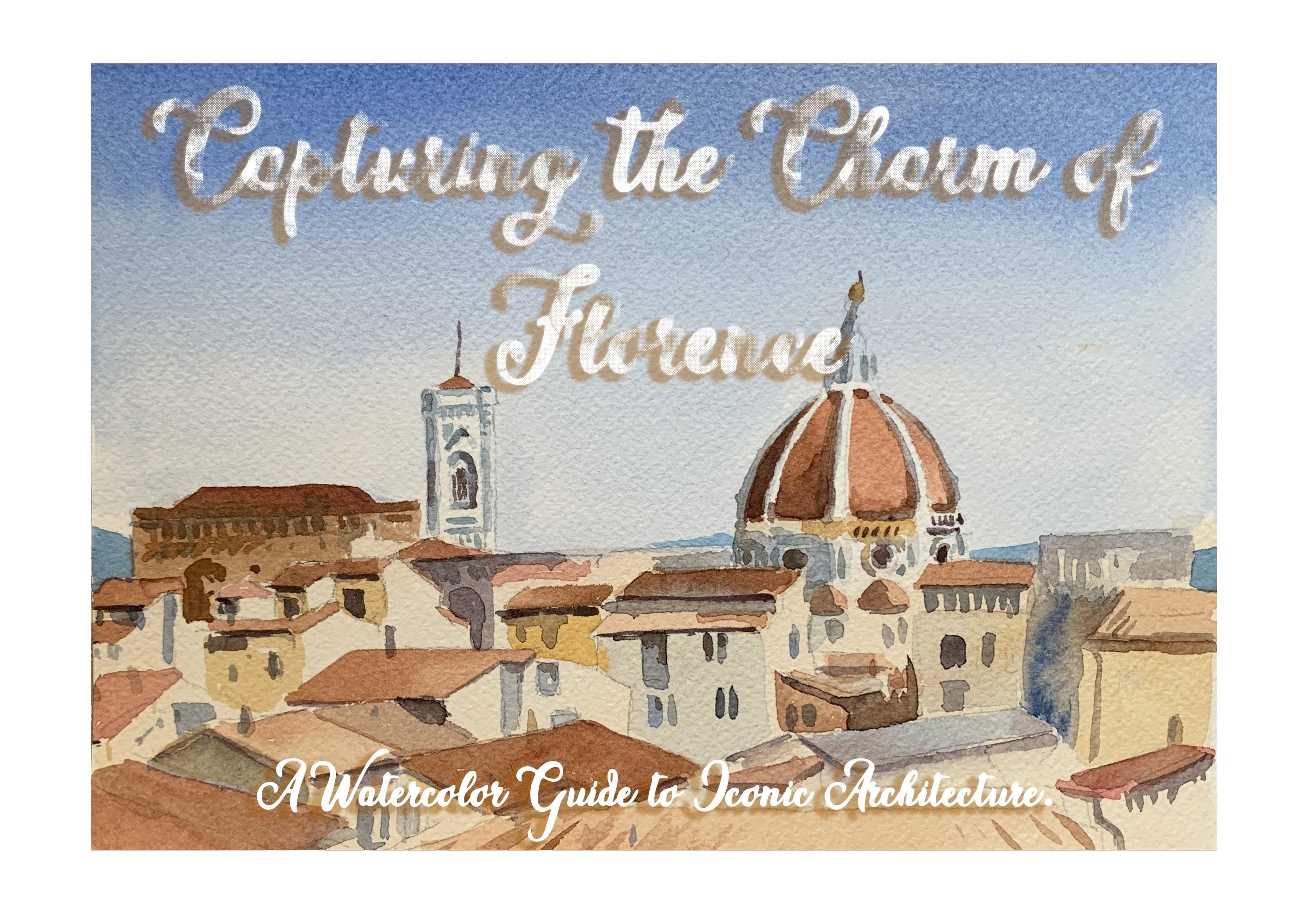
Transcripts
1. Introduction: Hi. My name is Mona, and I'm a visual artist
living in Italy. With years of experience in
creating and teaching art, I specialize in
capturing everyday moments and scenes with
vibrant watercolors. I'm excited to share my
artistic journey with you and help you develop
your watercolor skills. And, yes, I'm a huge
fan of breakfast. There is nothing more
exciting than having a beautiful plate
of food in front of you at the
beginning of your day. And I'm excited to
combine my passion for watercolor with my
love for breakfast. In this course, we'll be diving into seven days seven breakfast. A watercolor journey. Over the course of a week, you'll learn how to
paint a variety of breakfast themed subjects
using watercolor techniques, such as blending, shading
and texture creation. Whether it's an avocado
toast, stack of pancakes, or a cup of coffee
and croissant, we'll explore how to bring these everyday meals
to life through art. For the class project, you'll create your very own seven day breakfast derby by painting a different breakfast each day. By the end of the
course, you'll have a colorful collection of seven watercolor
breakfast illustrations, showcasing your progress
and newly refined skills. You also have the chance
to share work with fellow students for
feedback and inspirations. So if you're ready, let's start seven days
seven breakfast.
2. Let's start!: So let's start this course
with our first painting, which is our first breakfast. I had a sliced avocado
for breakfast, and I'm going to show you how
to paint it step by step. First, let's have a look at
the materials that we need. Obviously, watercolor paints
and watercolor paper. For this course, I am using a small size
watercolor paper, which the brand is aquapad. It's 300 grams. And the size is an A six, so it's a small size. And we need watercolor brushes. For this one, I'm going to use a number 12 brush
and a smaller one, a number three brush. What else? Obviously, the
water jar, the palette, and paper towels or tissues for cleaning and
drying our brush. Okay. So let's see what
is the first step. I have already sketched
the avocado slice. You start by lightly sketching the shape
of the slice avocado, draw the outer oval
shape for the avocado, and then leave the
round shape for the pit if your
avocado has a pit. Yeah let's start the painting.
3. Day 1- Avocado slice: Okay, so for the base color
for the avocado flesh, I am going to mix a light, soft green using my
watercolor paints. You can combine a little
yellow and green for this. So we are using a
larger round brush to paint the exposed
flesh of avocado. So I start with
this light green, which is a yellow green. Color And then I'm
going to add yellow. This is cadmium yellow to it
so that I can have a light, very, very light green color. We start with a very
light wash. As you see, I have a lot of water in it, and then obviously,
I can add water to the paint so it
looks translucent. I'm going to cover
the whole part of the two slices with
this bright color. The same thing for
the other slides. This light wash allows you to cover the whole area you
want to put the paint on. So it's really useful to
have it light. Perfect. Before anything else,
I'm just going to let the first layer dry before
continuing to the next step. H. Before continuing to the next step, which is putting the other
shadows, the layering shadows, while it is still wet, I'm going to add these parts. I'm going to use wet
in wet technique. I'm using this dark green, which is a sap green, it's called sap green. I'm going to put some very thin line here
to show the shadow. Then I'm going to dry my
brush and just blend it. Maybe continue also here because I have a
little bit of shadow also here and a thin
line also here. Then the same thing for these darker parts that
are near the skin. If your paint is still dry, it will blend by itself with
the wet and wet technique. I'll do the same thing
for the other slides. You see that it creates
a nice technique, a nice effect here. I actually can add a
little bit of shadow here. Also, I'm going to add a
little bit of yellow to my sap green and then
blend this darker part, this shadow part into
my lighter wash. Now I'm going to leave
it so let it dry. For the pit, I am going to
use a mix of brown color. I'm using burnt sienna and some brown and a
little bit of red. I'm going to start painting the entire prit
with a light wash. I start with the burnt sienna. And I'm going to use this color, which is a admbra
Buchata which is a darker brown I have in my palette and just
a tiny bit of red. As I said, I'm going
to use a light wash. I added a little bit of water and then looking
at the picture, I see that the light comes
from this direction. I'm going to leave this
part a little bit lighter. And then I'm going to
cover the whole pit with this light wash. Okay. I dried my brush so that I could blend this tiny point of light. While it is still wet, I'm going to add also
the darker parts, the shadows of the pit. If you look carefully
on this side, we have the shadows. Putting it here right now
while it is still wet, it can give me a nice um effect of wet in wet and it
will blend by itself. I will add a little bit of
burnt sienna as well here. Then I see that also here, I have a little bit of shadow. Okay, so now I dry my
brush and blend this. Okay? Why not add
a little bit of more dark color here? Okay, perfect. It looks nice already. You see how beautiful is
this effect of wetting wet. While the first
wash was still wet, I added my second wash and
it blended all by itself. Okay, we're going
to wait a little bit so that it dries completely, and then we are going to
add this tiny bit of skin, which is a little bit
visible in this photo, not that much, but, like, a little bit of very
thin skin we can add, and then we'll see
together if we want to add any more shadow and
depth to the slice. Now, I'm going to
mix this dark color, which is purple with a dark brown to create a
darker color for the skin. As you see, there is a tiny bit of skin that is
visible on the photo. I'm going just to add this thin line on this side of my avocado,
on the outer part. And maybe a little bit here and the same thing for the other
one, the other slides. I That looks nice. Maybe just add some of the avocado skin also
here and a little bit here. Then I'm going to use the
same color for this part of the pit in order
to deepen it and to add a little bit of texture, I'm going to darken
this area as well. And then blend it to
the previous wash. If you want, you can also add
a little bit of sap green, this dark green to the
first wash that I used for the avocado flesh so that I
can deepen also this part. Then before it dries out, I'm going to blend it
with my dry brush. Okay. Perfect. This is my
first breakfast.
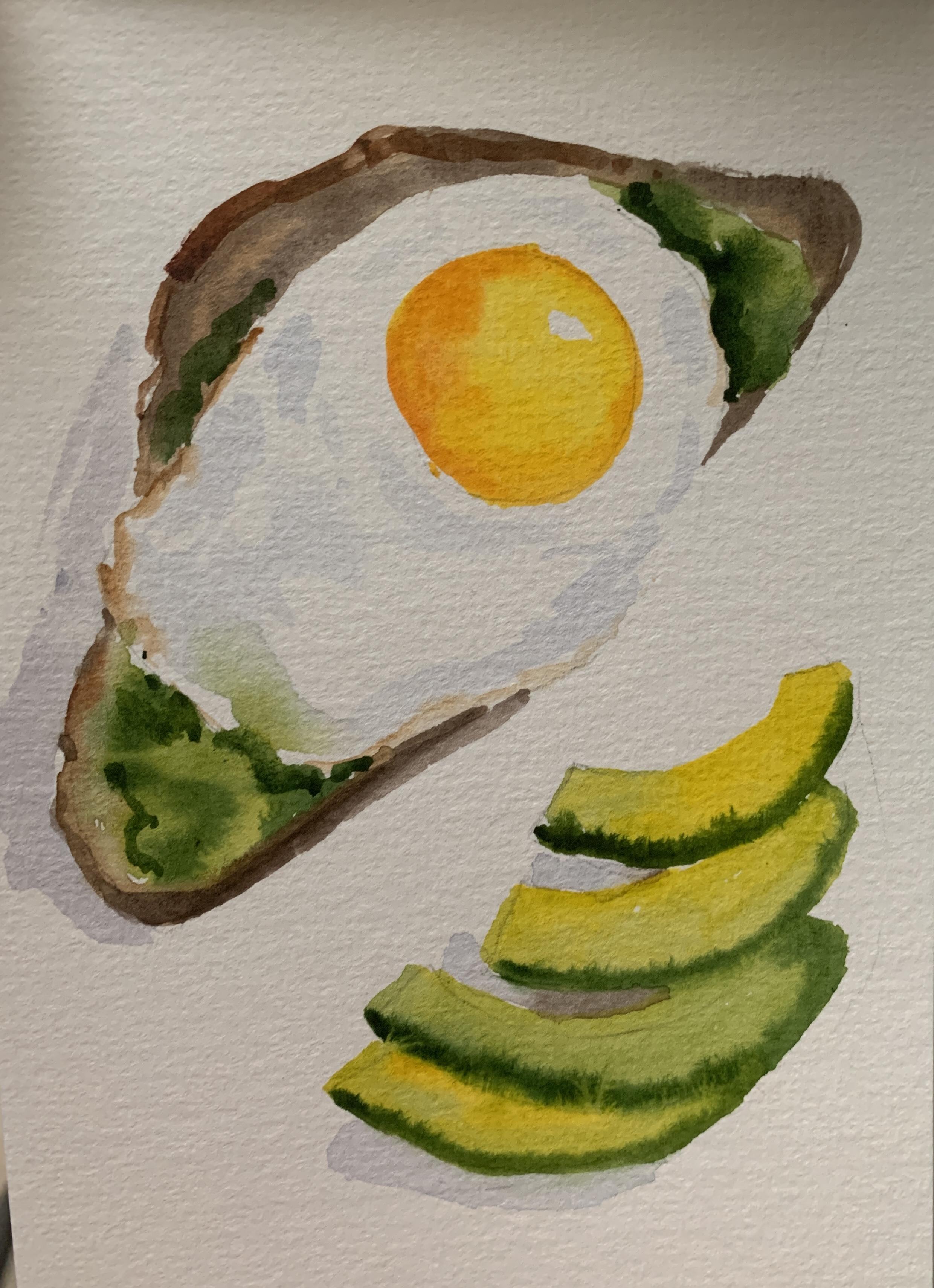
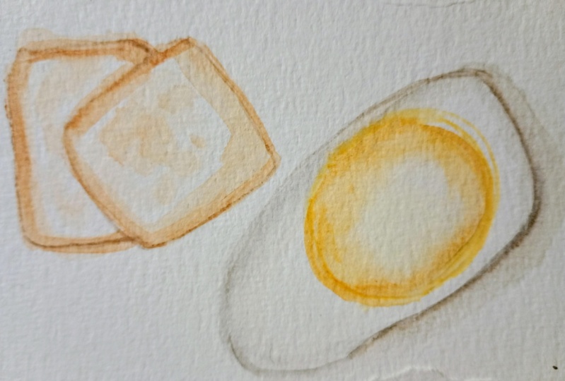
4. Day2- Toast and fried egg part 1: Here we are on the second day
and our second breakfast, which we are going to paint, two slices of toasted
bread and a fried egg. As you see on the reference
photo, there is a plate, which I'm not going
to paint because the important thing is to focus on the food
that is inside. So I have already sketched the slices of bread
and my fried egg, and I'm going to use brush number three
also for this one, and a brush number 12, and I'm also going to use a flat brush to create
the texture of the toast, which I'm going to
explain you later. Okay, let's start with the
base layer of the toast. I'm going to mix a light brown, so sienna with a mix
of beg or yellow oak. For the base of the slices. Here is my Terracina, and I'm going to add
some yellow oak. Maybe it's better to change the brush because
this one is too small for my bread. Okay. So a light brush, and then I'm going too
late on the bread. As you can see, it is darker on the outer part of the bread and
lighter on the inside. I'm going to use a
super Light brush? Because I don't want
to leave it white. Like the inner
part of the toast. I don't want to leave it white. I want to use a light brush
also for the other slice. Okay, so this would
be my um, base. Now that I have the base, I'm going to use a darker color, a burnt sienna for the
outer part of the bread, which is the part that is
toasted and it's golden. I'm using, as you see, a wet and wet technique
because it's not dried. The darker color blends by
itself into the lighter one. The same technique
for the other slice. Okay, and for this part. I already looks like a toast. Maybe I add some more
of dark color here. As you see this
wetting wet effect looks really nice on this toast. Perfect. Okay. I am going to leave
it so that it dries. And then if needed, I am going to use a dry brush to create
some texture on it. So let's start with the base
layer for the egg whites. Even though the egg whites are white they still reflect the light and
shadows, obviously. So I'm going to create a
very light wash of play gray or a mix of blue and
yellowish diluted with water. Okay. So in order to make that, I'm going to use my blue here and we'll add a little
bit of yellow to it, just a tiny bit to
create this gray color. And by looking at the picture, I want to make sure which
parts I see the shadows. Then I'm going to blend it into the white of the paper. As you see, there's
also a little bit of yellow oak color here which
while it's still wet, I'm going to add it
to my fried egg. Okay. A little bit
of yellow oak. I check the reference
photo to see which parts. Basically, I can
see the shadows. And some more of
this gray color. Also for the outer
shadow of my fry deck. On this part, I can
see that it's darker. I'm going to use this dark brown so that I can have some depth on this side of the fried egg. The light comes from
this direction. This part should be darker. I'm using a little bit of Bensena while it's still
wet for this part. If you see that it's
not wet anymore, you can immediately blend
it into the previous wash. So anyway, when we fry eggs, usually the outer part is a
little bit burnt in a way, so it should be darker.
5. Day2- Toast and egg part2: The egg yolk. I'm going to
mix a bright warm yellow, a cadmium yellow, and I am going to add a tiny bit
of orange for warmth. This is my cadmium yellow and a tiny bit of orange
for extra warmth. Then I'm going to paint the
yolk with a smooth wash of yellow while keeping the
color bright and vibrant. It's darker on the
outer part and a little bit lighter here in the middle. My wash is even
brighter in the middle. Why not? While it's still wet, let's use the wet
and wet color and create a warmer color with orange and adding it to the previous
color, the yellow. And then create this warm
color around the yolk. I dry my brush and blend it to my first wash. Okay. So the white part is dry. I can use a dry brush to create this texture
that I see here. This is the color that I
had used for the toast, which was a sienna
and yellow oak. I'm going to use a dry brush technique for this little texture
that I see here. If you look carefully, you can see that some
texture is added to my egg. I'm going to use the same
thing for the toast, so I need more color. You see, my brush is still dry. I didn't use any water. I use this dry brush to create some texture over my bread. And at this stage, I need to add some shadows and highlight to make the whole
painting look more realistic. As you see, between the
two slices of bread, I need to add shadows
and then I need to add the shadows of the slices. First, I use the burnt sienna
and with a little bit of brown to create this dark
part on the upper slice. So that I can separate the
two slices from each other because right now it looks
like there is only one. Okay. And I continue
on this part. And this way, these two are
separated from each other. I can also use a little bit of this dark color for the
parts that looks darker. Then using this dark
color that I created with violet and brown, I'm going to use it for
the shadow of my bread. On this part, as you can see, we have the shadows. This way, my painting
looks more realistic and I add depth to it. I can add a little bit
more pigment to it. So a little bit more
of the two colors. I also see that there
is shadow here. And also, I have shadow on
this part of the Friday. I already put some, but
maybe I can add some more. You see adding shadows really gives depth
to your painting. So never underestimate
the final details. Here, I'm not going to
use this dark color, but this lighter brown
or the shadows under the fried egg and Add a little bit
also here. Perfect. And as my yolk is already dry, I want to add some
shadows also to that one. So I'm gonna make this
color a little bit warmer. I'm going to add
just a tiny, tiny, little bit of red This is light cadmium red. Not too warm. It needs a little bit
more of yellow here. Now it looks perfect. On this side, maybe I can make it a little bit darker because light comes
from the other side. Okay. I wash my brush, dry it, and then blend this shadow
into the previous wash. You see, I left this
white spot here, which now you can see
that it works well and it gives depth also to my yolk. Maybe add some more here of this dark orange and some little bits here. Perfect. Here is my
second breakfast.
6. Day3- Poached egg and avocado toast part 1: Next breakfast is
an avocado toast with poached egg on the top. First of all, lightly
sketch the outline of the toast but keep
it faint since it's mostly covered by the
avocado and then sketch the mash texture
across the surface and outline the poaches. So for the egg white,
I'm going to use a very diluted gray or a light blue gray to lightly
wash the egg surface. I'm going to use
ultramarine blue. So the egg is the lightest
color that we have, so that's why we are
starting with this. I see where I can see the
lightest shadows on the egg. I put this blue tromarin
on those parts, trying to blend it immediately into the white of the
surface of the paper. And then I'm going to use a very soft and
transparent gray. This wash is going to help
me define the folds and the areas where shadows
fall on the egg. I'm using a mix of purple and dark brown so that
I can create a light gray. Then I use this color
to my blue ultramarine. So you can see here
I have this gray. By looking at the picture, I see where on my egg I have
these shadows and folds. Then when I put the color, I blended into the
white of the paper. I see there are more
details on this part. Maybe I can use the ultramarine blue also
for this part again, but then immediately blending it because I don't
want the color to be the blue color to be
true present on my painting. Then here I continue
with the gray. And add a little
bit of more pigment where I see on the photo that there is more
shadow or fold on the poached egg
and then blend it. I have left some parts
of the egg white untouched to represent
the highlights. I try to keep the edges soft
and the contrast that I have on the egg minimal so that it shows how delicate
this material is. Now, I'm going to
add the egg yolk. As you can see, I kept the edges soft and the
contrast minimal because it's a delicate material and I left some parts of the egg white untouched to represent
the highlights. Now I'm going to move
yolk to the egg yolk. I need a bright yellow
color and some orange. I'm going to start with the
yellow and step by step, I'm going to add orange to it. I feel like I need
a bigger brush. I'm going to use the number 12 or also number
ten would be fine. Okay, so right now I'm
putting some cadmium yellow, and then immediately
while it's still wet, I'm adding orange to this. I've left the yellow
on the inside and then I blended it
into orange and I'm going to go again
to yellow and add this to the previous color,
which was orange. And then the further
I go from the white, from the egg white, I
am going to blend it. Okay. If you think it's
necessary on the inside, maybe you can add a
little bit of orange and add a little bit of red to it so that you have a warmer orange on the inside as you can see, it's like this in the reference
photo that we're using. Also because on this part, we have the shadow, so it's the darker
part of the egg. Then I blend it into
the previous color, the previous yellow
that I had there. I'm not going to wait for it to dry out because I'm going to put the avocado also just immediately right
now before it dries out. Okay. For the base
color of the avocado, I need a light green. I'm going to use the
lightest green I have and then mix it with yellow, Cadm yellow because I
want a super light green. This looks nice. Then I put the green of the avocado around the areas that
I left my egg yolk. And then around the
egg, the white part. I'm not letting the color go inside the yellow
because I don't want it to look to get the mix together. But in some parts, it's okay if they mix together,
if they blend together. And what I'm going to do
right now is that I'm going to use another brush, dry it, dry it completely,
and then blend the green and yellow
together very lightly. Okay. The next step would be adding
the details to the avocado, but I need at this point
to wait so that it dries. Just going to add a little
bit also here because I see that there is more avocado here. Okay.
7. Day3- Poached egg and avocado toastpart 2: I'm not going to mix a darker green and begin layering it in small areas to represent the depth that we
have for our avocado. So I use this dark sap green, and maybe I just
add a little bit of brown so that it becomes
a little bit darker. And I'm going to focus
on the texture of the mashed avocado by
dabbing the brush like this or using short strokes
to create a sense of depth. So when looking at the picture, I just try to find where I
can see these darker parts, the shadows and try to
create depth on my avocado. I see a little bit of
shadow on this part more. I'm going to leave the yellow of my egg, the yolk untouched. And by looking carefully, I see that under the egg, I have the shadow. It's darker. Here I'm going to add more of this dark color. Maybe I can also plant
some of this dark color. Don't worry about covering the toes because we are going to add a darker color for that. So even if you go there,
it doesn't matter. And just a little
bit of dark green here on the other
side of the egg, where I have shadow here. Just a little bit more
of this dark green. And here as well. So when I look at this, I want to just remove some of this dark color here
to create this texture. So with a clean piece of towel, I just remove some
of the dark color. To create more
texture on this side. Okay, I now have
to wait and then do the toast and the
shadow that I have here. Use a light brown wash around the perimeter of
avocado to suggest the crust or parts of the
bread that peek through. So for this light brown, I'm going to use sienna color. And add a little bit
of yellow oak to it. And I'm going to
use this wash for this outer part of the toast
where I can see the light. So this is for the first
wash of the toast. But then obviously, I'm going
to add later when it dries, I'm going to add another layer, a darker wash for these parts. So as of now, I just
use this light brown to suggest the parts
of the toast that are visible behind the avocado and also a little bit on this side. A little bit more of
yellow oak is needed here. Okay. So I'll wait some
more for it to dry.
8. Day3- Poached egg and avocado toast part 3: I'm going to use a
slightly darker brown to indicate the toast texture, and these shadows, I'm
going to put under the avocado where
it meets the bread. For that, I'm going to use
a burnt umber and add it to the previous brown color that I created for the
lighter part of the toast. And I will add a little
bit of purple to this so that it becomes more
intense, as you can see. And then I will add
the shadows under the avocado where it
meets my bread, my toast. Just paying attention
to where I need to put darker and then I'm going
to make it look faint, like blended into
the lighter color. I can add a little bit of
dark to give more intensity and define the shadows better and the same
thing on this side. If I feel I need to, I'm
going to make the color more intense because here I had
the dark part of avocado so. Basically, I need a darker
brown color here as well. A here I will blend it maybe more of dark hair. The same thing on this side, I'm going to leave
this part where there is the lighter part of my toast, but on the other side, I'm going to cover
it with dark brown. I can simply intensify
it wherever I feel that a darker
color works better, like here, because there
is the shadow of the egg, maybe I need a darker color. Okay. I'm now going to focus a little bit on the shadows and highlights and the details. By looking at it before while
I'm waiting for it to dry, in order to add this shadow, I'm just going to
add some details. So let's have a look at the egg. I can see that on this part, I can add a little
bit of more shadow. So this was the orange
color that I had created. So I'm going to make
it a little bit darker by adding a bit of red. In order to have a more
intense or a darker orange. It looks good. I'm going
just to add a little bit of dark to give the idea of depth inside my
poached egg here. The important thing here is to blend this dark orange
into the previous wash. Then I feel like I need to
add a little bit of gray. I'm going to use this color I had used before
for the gray part, for the shadows of
the poached egg, and I'm just going to add some details and highlights
whenever it's necessary. By looking at the picture, I can identify where
I see these shadows, but make sure to blend it and not to leave it very present these shadows,
we don't need them to be Very present in our painting. Next thing, I'm going to work a little bit
more on my avocado, add some more details
here and there by using my dark brown and a little
bit of burnt umber. Just to give more
details and more let's say highlights
and more depth. A here, I see I can
add the details. Okay. And now you can see
there's pepper here. So we're using simply actually, I'm going to change my brush. This is the smallest
brush I have. It's a number zero, I think. So I just use a
little bit of brown. Sorry, black. Let just put these peppers This ground pepper. Where I can sit it. Maybe
at some parts I can use lighter brown so that it's It looks more
realistic, you know. Maybe I can add also
on this part because this ground pepper was
basically everywhere, let's say, when I prepared my um poached egg avocado toast. Okay. Let's wait a little bit
until this part dries out and then I put
the shadow and it's. Next thing I need is to make this to paint
this dark shadow, and I need to make
a darker color as my toast is already dark. So this dark color that I created for the shadow
part of the bread, I'm going to make
it a little bit darker by adding more purple. You can see here that
it's more intense. So more burn timber
and more purple. I can add also a little
bit of blue to this. Okay, looks nice and dark. Then I can simply cover the part here where I have my shadow
paying attention to leaving the parts that I
need to have brighter, like the part of the avocado. And then I will blend it
into the white of the paper. Basically, I want it to
be darker the closer it is to the object
to the avocado toast, and then I blend it and make it look softer the
further I go from my object. And you can see that there is this very thin line of
shadow also on this part. So I'm washing my
brush and drying it, and I want to blend
the shadow even more. Another time. One
more time. Okay. So I also want to add some shadow to this part as well because I
want it to pop out. And so just a fine
thin line also there. And I'm just blending it. Lightly into my paper white. Okay. If you want, you can add more details or
make the lines of the shadow finer if you
feel it's necessary. Okay, so now I think it
looks nice and tasty. I'm just adding some more
details to the, you know, dark parts of, like, the toast to deepen
it a little bit. And what I can do here is to get a little bit
of burnt umber with a dry brush to make the texture of my
toast look more realistic. And here is my avocado toast with a poached
egg on the top.
9. Day 4-Espresso macchiato part1: Next breakfast is an
espresso macchiato and a pistachio croissant, which is my favorite
kind of croissant. I sketch them in two
different papers on my blog because they're
quite large and I think they deserve to be
in two different papers. Start by sketching lightly the perso macchiato,
the common saucer, and then the curved
shape of the croissant and to indicate its
shape and its texture. And then we are going to start with the base layer for
the cup and saucer. Let's start by putting the base layer for the
espresso maketo cup. I'm going to leave the
white parts untouched, and I'm going to
mix a light gray, which I used a blue ultramarine and a touch of burnt umber
to create my base wash. So as I said, I'm going to leave the white
areas for highlight, especially where the light naturally reflects
on the ceramic. And then by looking at
my reference photo, I just try to find the parts that I
can put my first wash. So it needs to be really
light in order to show the material
which is ceramic. As you see, I'm leaving the
parts that reflects light. The white parts actually, okay. And whenever I feel
it's necessary, I just blend the shadows. I move to the saucer, and then afterwards,
when it dries out, I'm going to put the second
wash to give it depth. But right now I just
think about where I want to put my base wash. You see, it's super light
and transparent. I want it to look
really intense. And a little bit
inside of my cup. Okay, I'm using a smaller brush because I decided that I want to blend this
part a little bit. And just remove the color a bit. Okay. I can now move to
the espresso itself. So I'm going to
mix a warm brown, a burnt sienna or a mix
of brown and orange. Okay, let's see. I'll change my brush
to a smaller one and use some burnt sienna. Actually, I'm going to use a wet on wet technique
here because I want to create this
texture of the foam, which is really
soft and beautiful. So if I use wet
on wet technique, I can create the
milk foam texture. Then I'm going to
put my warm brown leaving the hard
shape untouched. As you see, because
it's wet and wet, it blends by itself. As you see, there is a little
bit of espresso also on the inner part of the cup, which I'm going to put that. Okay. And a little bit of burnt umber, mixing it with burnt sienna
to create this part, which is a bit darker. This is basically where
I have my shadow. And then I blend it again into the lighter
color I used before. Okay. I'm cleaning my brush
right now because I want to make the heart shape of the foam pop up
a little bit more. If you feel it's necessary, you can use a clean towel to just remove the color and make the heart
shape more evident. Okay, now I wait for it to dry, and then I put the shadows
on the cup and saucer. Let's use a slightly darker gray to one side of the cup to create a shadow,
giving it dimension. So I'm using a
smaller brush now. This was the gray that I used, which was a mix of ultramarine
blue and burnt umber. So now, my second wash
is a little bit darker, but still not too dark. Okay. So I start by the cup. I can see that here, I can add a little
bit of shadow, and I need also to focus on blending the shadow smoothly
into the lighter area. As you see here, oh. I put the shadow and now I'm going to
add before blending it. I'm going to add also just a touch of
ultramarine blue because here I see that there
is some blue on my cup. Maybe it's a reflection of
something on the ceramic, also here, just a
little bit of blue. But then I focus on blending
it into my previous layer. And a reflection of
blue also on this part, but not too much,
just a little bit, which I blend immediately
before it dries. And then next, I'm going
to move on to this part. Okay, I can blend
it right away and continue putting the
shadows in order to give it dimension to give
my cup dimension. Okay. I think I'm going to wait a little bit because
I'm going to make this part a bit darker and then move on to put
the shadow on the saucer. I need it to be dry.
10. Day 4-Espresso macchiato part2: Now for the next layer, I will start by putting some of my blue on the outer
part of the shadow, and then adding a darker tone of the gray I created before. Because I can see
on the photo that the outer part is
lighter and there is still the reflection
that I put on the cup. I can see it also on
the saucer. So why not? Start with the blue. And then add the darker shadow which I need to blend
into this blue. It's definitely a lot more
darker the closer I get to the cup and lighter
on the sides. That's why I put this
blue on the other side. As you can see, the form of
the saucer and the dimension, the depth is popping out when
we put the darker layer. Okay. If you feel like you
need to make it even darker, you can intensify the color. I think for now, it's fine. The only thing I
see is that maybe I needed to leave
this part lighter. I'm removing it right now. Okay, perfect. Well, also, I need to show also this dark shadow
right under the cup. And some more shadow
on the handle, which I'm going to blend
into the previous layer. For the inside the inner
part of the handle, I use some blue which
obviously needs to be blended. Okay. And also on this part, over the first layer, I put another layer of
this very light blue wash. Which here is
really important to blend it because as you
see, it's really soft. Okay, while I wait for it to dry in order to put the
last layer of shadow, I can work a little bit on
my espresso and the foam. I'm making a warm
darker brown h. Putting burnt sienna
and some burnt umber to create this nice,
intense, warm brown. As you can see, the light
is coming from here, so I need to intensify
this shadow on the inner part of my cup
and the espresso itself. Here, I basically have this
part that is in the shadow. Following the form,
I see on the photo, I create this part. As you can see, the form and the dimension is being
more realistic right now. A little bit darker
on this part, which is where the espresso is. Okay. I'm leaving this
tiny little white line. Okay. But then blend it. I
don't want it to be too separate from the rest. Okay. So let's just play around with this
nice form of heart. Maybe I can add a little bit
of benzena around the cup. You see, adding some details
is always satisfying. And if I feel that
it's too evident, I just blend it. Okay. Also, maybe on this
part of the heart, I can work a little
bit more also on the C Well, the next thing is to put
a layer of shadow here, and then the shadow of
the saucer on the table. I didn't paint the
teaspoon because it's not completely
visible and I'm not going to paint the table, but just just the shadow of the saucer and cup and the shadow of the
cup on the saucer. I'm going to make a darker color for the shadow
under the saucer by mixing purple and
burnt umber. Okay. A nice dark color will
work really well. And I leave a tiny part of the like a tiny super thin line. I leave it white and
then for the rest, I just cover it with my
dark color for the shadow. Perfect. And as you can see, this line should follow the
line of the so basically, this is the shadow of the cop, and it should be a
continuation of that shadow. Okay. Now, we were saying
that we're going to darken a little
bit this part. So to the previous dark gray, I added a little bit of purple and this is where
I'm going to put it. So this is basically my
last layer of shadow, which is not going to be
too pick because I'm going to blend it here. Okay. So blend it into the other layer, the previous layer so that it shows the shadow of the cup. More realistic. Okay. And I could also use a little bit of this dark shadow I just
created for the handle. It's not a bad idea. So I think there is one
more thing I want to do as this is the
white on the saucer, maybe I just put a super, super light brown or yellow or cush here to
separate the cup and the saucer from the surface so that this white of the
paper that I left pops out. So this is the brown that
I used for the espresso, so I add some yellow och to it. As I said, the wash needs
to be like super light. And then I pay attention to
leave the yellow, sorry, the white of the saucer
untacked I just blend it. The saucer and also the cup. As it's super light, it's so easy to blend. It can also continue
towards the shadow. Now, this is the white
color of acrylic. I'm using the color
directly from the tube, and I'm using my smallest brush. So I get a tiny bit of color. And then as you see here, I have this highlight, this little bit of light, which is really nice and
I didn't want to miss it. Okay. Looks nice. And why not? Why not add some white
also to the foam? And some white to the cup. Where I feel like
it's been covered, the white part of the cup
in some points is covered. Amazing. Last thing. Just a little bit of dark color here to emphasize
the form of the cup. I'm using the last
tone of the gray that I used and I put it here. Obviously, it needs
to be blended. A.
11. Day 5- Pistachio croissant part 1: Well, let's move on
to the croissant. For the croissant, I'm going to mix a golden yellow
like this one, or warm oak tone, and I'm going to apply a light wash over the
entire croissant, which will be the base color of these pastry layers
of the croissant. I still use the colors that
I use for the espresso. There is no problem. I
don't need to clean it. I'm mixing the yellow
ochrea and adding to it some sienna because I
want it to look like warmer. So this is the base
wash for the parts that I want to give the illusion of the light hitting the croissant surface. So this is the color that I use for the base
of the croissant. And then afterwards,
I am going to add some darker colors to it. Okay, I'm going to leave
you see that there is the pistachio cream coming out of Microsoun
going to leave that. And then paint it afterwards. Also some little bit of
the cream here and there. And just cover the whole
area with the spacewh. Worry if you go out of the line of your sketch because here
we are going to make it darker so it doesn't matter
if you get out of that area. The thing I'm going
to do right now is to blend this part that I left because I don't
want it to be very sharp. Okay. Then I need a darker brown, sunburnt sienna here
and sunburnt tumble. And while it's still wet, I can add some details. I'm interested in
leaving these areas of the previous wash untouched
to create this effect. A on this part, putting some more of this
warm brown color here. You see this effect when we're using wet and wet techniques
really beautiful. I really like how it makes watercolor
technique dreamy. You see? I I guess for the rest of it, I can wait for it to dry in
order to add more detail. So for the pistachio cream, what I'm going to do is to mix. This color, which is a
greenish umber, I'll show you. This is a greenish umber. I'm going to mix it with this yellow green color a little bit more of
the greenish umber. Okay. And to this mix, I will add yellow. This is my cadmium yellow. So now I have the right color
for my pistachio cream, at least for the
light part of it. And looking at my
reference photo, I just follow the
form of the part that the cream is coming
out of the croissant. Oh, my God, it
looks so delicious. Same thing for this other part. Okay. And then later on, I will add another layer for the
dark part of my cream. Next step, I'm going to paint the shadow
of the croissant. In order to do that, I will
use a ultramarine blue. For the first layer, you can see that there is also this tissue. A very light wash
because I don't want to make it really evident here. A very light wash,
which later on, I will make it darker by
adding some more layers. And while I'm doing that, let's just also
put the shadow of the saucer here. Okay. Just blending these two together and we'll wait a little
bit so that it dries, and then I put the darker layer. But right now, as the
croissant is dry, I can add already details to it. With the same color
I created before, which I used for the
wet and wet technique, I can still use it and add
some texture to my croissant. By focusing also not
only on the texture, but also on the
light and shadow. So basically, light
is coming from here, so the darker parts I
should put on this side. So more detail on the
other parts as well. Here you can see I'm mixing the colors
not on the palette, but with my brush. This is burned tamper,
this is burned Sienna. I want to create the, the crunchy texture
of the croissant. And continuing on this side. Not going too much into
the details because I already really like this
wet and wet effect, so I'm not exaggerating
here on the details. Just a little bit here
because maybe here, I needed more waiting
for the croissants shadow to get dry in order
to add other layers. I will work on the
shadow of the saucer. This is the same color that I use for the shadow of my cup, which was purple, burnt umber, and a touch of blue. So just going to intensify
it a little bit more. And just paint this shadow here. So this one was warmer. This other shadow
color that I created, this other dark gray
that I created. I can also use that one so that these two look
exactly the same. And and then blend it now. I will dry my brush and just blend the outer
part of the shadow.
12. Day 5- Pistachio croissant part 2: Making the green color again, but making it a
little bit darker. This time I'm not
mixing it with yellow. A touch of dark green
here and a touch here and just blending it. Same thing on the other
part of the cream. As you can see, there
are some pistachu parts, crunches of pistachu
also on the croissant. I just noticed we have some more cream also
here. Why not put it? These ones I can just
blend a little bit. I don't want them to
be super evident. I'm going to add a highlight
of yellow here because I can see it's golden. While waiting for
this layer to dry, I can use the same thing that I did for the
cup and the saucer, which was a super light wash
for the objects to pop out. So going to use a light wash of yellow
oak like super light, and I'm going to put it just around the saucer. So that the part that was
white and I left it pops out. Then immediately I blend it. You see the wash is
super, super light. It's basically almost invisible
if you look carefully. But, it gives you a possibility to make the white of
the paper that you left for the highlights pop out. Okay. Now, I think I need to perfect to make
the saucer look better. Okay. So now I think
it's nice and dry, and I can work on the shadow. Like the last layer of the
shadow of the croissant. Okay. So blue? I will I'm adding it to
the shadow that I had, which was burnt umber,
purple and blue. I'm adding a little bit
of more blue to it. So this is the shadow
of the tissue here. Well, actually, I wait because I don't want
to go over this. I wait for it to dry, and then I put the next shadow. I'd love to add some more blue to this shadow
because I think it works really nice together with the warm color of the croissant. Now, following the
form of the croissant, I can put the shadow. Don't worry about covering
this because you see there is this fine white line here,
but don't worry about it. We're going to ed it with the white color of
acrylic Oorgah. You see that also this shadow. This wash needs to
be really light. We don't want it to look
like thick and dark. Like, really nice light wash around the part of the croissant where
it meets the saucer. Blending it underneath
a little bit more and rounding
it on these parts. Also here a little bit, I'm going to blend. Okay. And so the next step, which is my last step is to wait for the whole thing to dry. And then I will do
add this white color of where the light
touches the tissue. I had to cover it right now, but I can add it later
with acrylic white. And also here, why not add some more shadow. While waiting, I
thought I could add shadows more shadows to microsom
to create more texture. Basically, I'm going
to add shadows where the layers fold
over one another, always using a darker
brown burnt umber. For instance, here, It needs to be darker. Deepening the shadows makes the object sit more realistically in our
whole composition. Also here under the
pistachio cream, it's nice to add a bit of
shadow. Same thing here. But as I said before, not too many details, just the right amount of details because I
don't want it to look like super dark or with so many details. Just the right amount.
I'm adding a bit of purple because I want to create
a different shadow here. So on this word and a little bit of shadow under the
last drop of cream. Okay. Looks nice. I want to give the idea of the texture of the cream, like, a little bit glossy, just adding a bit of
white acrylic white. Here. And here. Okay, and okay. This is not still dry, so just wait a few more
minutes before we continue. And last but not least, I want to capture this delicate
interplay of light and shadow by doing this fine line where the light
touches the tissue. So getting a little bit of
white directly from my tube. Okay. And after painting the line, I just want to color also this part of the tissue
with my white acrylic. Nice.
13. Day 6- Pancake stack part 1: Let's see step by step, how to paint a stack of
three pancakes with topping. First of all, lightly sketch
the composition and pay attention to the details of the toppings where
the syrup drops, and then we are going to start putting the paint on our paper. I'm going to start by putting the base layer
for the pancakes. I'm going to mix a
warm golden brown with a yellow oak and a
touch of burnt sienna. Then I'm going to add this
light wash over the pancakes, paying attention to the cream, which is the lightest
part of our painting. I'm going to leave
the cream untouched. But I put the first wash, which is really light over the whole painting where I can see the pancakes
and the syrups as well. So I cover the whole area. I can leave some parts
of the syrup white because that would be
the parts that the light is on the syrup dots. So I just leave
them these parts, I just leave them white. Then afterwards, when I go to my second or the later washes, I'm going to cover
the darker parts of the syrup and the pancakes. For now, my first
wash is complete. I can also go a little bit
here over the syrup drop. Okay. By looking at these
part of the syrup, I can see that there are parts where the
light hits the syrup. I just leave that white. Just like that. And by
using a smaller brush, I add a little bit more of my burnt sienna to
create the Shadows, the shadows, but also the glossy effect that
I can see on my syrup. And if I feel needed, I just blend it into
the previous wash, which is not yet dried. Maybe I can continue
doing the same thing on other parts of my sup like this. In order to have the
base wash of the syrup. But don't worry
about the details because we are
coming back to it. Okay. Let's also at this stage, do the cream as well. The cream is basically white. I just need a little
bit of shadow to show the depth and the form. In order to do that, I just
get a little bit of blue and mix it with brown a
bit of burnt umber. I need a super light wash
for these shadows. So Just following the form, I look at the picture to see
where I can see the shadow. This way, I can highlight
where the light hits my cream. Okay. No need to do too much of details because it's the
lightest part of my painting. So just a little bit of
shadow would be enough. And while waiting for the rest of the painting to dry out, I can also do my strawberry. I just need a red
colour, a bright red. I'm mixing it with cadmium. First, I put where I see the light part of
my strawberry and then I go towards where there is the darker part of
the strawberry. By adding a little bit
of this darker red, I can already make
the shape come out. Even if I go a little bit
over these blueberries, it doesn't matter because
my blueberries are darker so I'm later
going to cover the red color of the strawberry. Right now, I think I'm going
to stop, wait for it to dry. I'm going to go paint the plate. In order to do that,
for the first wash, I use this cobalt blue for
my base wash and then later, I will make it darker for the shadows by using
a darker blue. But for now, for the base wash, this cobalt blue
works perfectly. I just put it
around the pancake. The syrup puddle, even if
I go over the yu puddle, it doesn't matter
because afterwards, it's going to be
covered as it's darker. For the syrup puddle, I'm
going to use a dark brown, so I wouldn't worry
about it right now. I'm just covering
the whole area. Knowing that there would be another layer of blue
color for the shadows. Okay. Let's wait for a little bit, and then I will go do the
darker parts of my pancakes. Before continuing
with the pancakes, I need also to paint my blueberries because I
can see this white spot, which is not necessary
at the moment, so I'm just going to cover it and put the paste
wash for my blueberries. In order to do that,
I'm using purple and a touch of ultramarine blue. In order to create this
beautiful purple color. But here, I need to pay attention where the
light would hit these syrup drippings
over the blueberries. I'm going to leave
those parts white. I can see there
is this white dot here and also a spot here, which is white and
I'm going to leave it and also a spot in the middle of my
second blueberry.
14. Day 6- Pancake stack part2: So let's finish also the details of the
strawberry so that I wouldn't have too much
details to finish later. I just need a base
wash of green, which I'm using my sap green and a drop of this
lighter green. First of all, I want to create texture on the surface of the pancakes
and in order to do that, I'm going to use a dry
brush technique and gently add these details and
imperfections with a darker brown, which I'm going to
use bird sienna. Just a little bit of water. I dry my brush and then
continue with more pigment, burnt sienna and a
touch of burnt umber. Okay. Then I'm going to put
these textures over the, let's say, cooked part
of the um pancakes. But mainly on the first pancake, which we can see
more of its surface. I'm using the dry
brush technique, but I'm also
blending it a little bit to suggest the fluffy
texture of the pancakes. I'm going to blend a
little bit more on the outside of my first pancake and maybe continue
also the same thing for the other pancakes, but using a little
bit more of water. I don't need my pigment
to be entirely dry here. But just a little bit. I dry my brush, and then I blend the color following the form of my pancakes. Okay. Here I have the
lighter color and the same thing also
for my last pancake. But here, I don't really
need to use the dry brush. I'm just putting
this darker brown, like a golden dark
brown over here. Okay, perfect. Let's
deepen the shadows under each pancake using a
darker brown wash. Here, I'm going to use
some burnt sienna color. I'm going to mix it with a touch of ultramarine blue for death. Then by looking at my picture, I just check where I
can see these shadows. This way I can create depth
to my whole composition. I can see that here,
it's a little bit darker and also pay attention to the texture
of the other pancake. You see there are
some details here, and here I need a
very dark color because it is where the shadow. Is visible on my second pancake. I'm going to do the same
thing also for this one, which is way darker. Here, I'm going to use
a little bit more of my burnt sienna and mix it with a little bit
of burnt umber here. I'm going to put this here, which needs to be, as you see, there is the shadow here, so it needs to be a little bit darker comparing to
the other parts. Okay. Here I'm going
to blend, let's see. Where else? Also here? I need to deepen the shadows. Mm hmm. So more of this Bensena here on this part of
the whole stack of pancakes because this is
where the shadow hits. This is where the light
comes and this is where I can have my shadow. The whole thing
needs to be darker. But in order to not lose this dark color
that I put before, I just put some burnt umber and just blend
it into my previous wash. Okay.
15. Day 6- Pancake Stack part 3: Um, I want to mix a dark brown, a mix of burnt burn with a hint of red or
orange. Let's see. Let's mix it with a
little bit of red. And by looking at my picture, I just try to find the parts of the syrup
which are darker. And I want to make sure I can
mimic this syrup dripping. I also need to
follow the movement. But also making sure to leave in order to show
the highlights to leave the white of the
paper and not to cover it. This part, I want
to blend and then continue the dripping here, where it goes under the pancake, I put it I make it a
little bit darker, but on the outer parts, it's okay to leave it lighter and maybe also add a little bit of
a golden color here. Then I continue for the syrup puddle which
is formed on my plate. Here also, I want to suggest the shadow which is under the pancake so I make it darker, but then make sure to leave The white of the paper to suggest
highlights. Why not? Let's use a little bit more of the yellow oak to
have a golden color also here and just
some more of dark. I'm adding a bit more of burnt umber here
on the down part. Also, I have the syrup
dripping also here. Why not continue making my paste wash for the syrup, it goes around and over the
blueberry and the strawberry. It's definitely darker
on the outer part, and then I need to blend it
here to suggest the form. So little bit more
of dark color here. Maybe add more details
because I want to suggest this glazing effect
of my dripping syrup. I blend some of these parts. Also some here. I will wait for a few
minutes. Wait a second. I just saw that I
need more details also where the syrup is
dripping on the cream. Okay. Before moving on and waiting for the
shadows to dry, I thought maybe I can finish the details of the strawberry. I'm adding some purple
to my cadmium red. And I put this wash here to suggest the
shadow on the strawberry. And also adding a little
bit more of my sub green. I'm adding details
also to these parts. And blending this red a little
bit on this inner part. Okay. Final touches and final shadows. I need to paint
now the shadow of the pancakes on the plate and then add some details
to other dark parts. So purple. I add burnt umber
to this to create a super dark color
for my shadows. Then I see where I
feel it's needed. It's definitely needed
on these dark parts. Also here near my syrup and under the whole
stack of pancakes. On the plate. It needs
to be a dark color so that it's different
from the shadows I put on the first dark
wash of the pancakes. I make sure to blend it Also, I need to create the
shadow under the sir pedal. Here, it needs to be darker, so I'm adding more pigment. And create some texture here to show the form of the pancakes better. So darker color added also. Here you see it's the
details that makes your form pop out.
This is the fun part. So more details, some more
shadows near the syrup dripping and here I add a bit of burnt sienna. I blend it to this dark color. Just add a touch of blue to the shadow on the
plate and blend it. But now, if you look, although the plate is not
completely visible, but it's a good idea to also make it a bit more
realistic by adding shadows. If you look at the picture, you have a darker blue on
the outer part of the plate. And obviously more shadow under the plate which is a
little bit visible here. I'm putting the
blue, and then I add this dark shadow under that to suggest the
shadow of the plate. Here if you feel needed, you can blend it a bit more. What else? Maybe a
little bit more details for my blueberries, so purple and ultramarine blue. I suggest the shadows
on the blueberries. Also this other one. I'm just going to
add a touch of red here on my strawberry and
just blend it a little bit. I just wanted a brighter color. It looks nice. Let's have a look and see if you
need any other details, maybe just a bit
of shadow here and there and some details
to show the forms. I think I might want
some darker brown here where I had my cream, but blend it immediately. Okay. And more also some more
dark color also on the other part of the
shadow of the strawberry. So Just a bit of
dark also there, which looks nice now. And let's see. What else? Some more of dark brown where I have my Shadow. Okay. Look yummy. Okay, there you go. A stack of three pancakes and with topping and the
syrup dripping over it.
16. Day 7- Churros and coffee part1: Let's paint together a
plate of turos which is my favorite breakfast in
Spain and a cup of espresso. The important thing
for us now is to focus on capturing the
reflective quality of this metal plate
that you can see in the reference photo
and also the textures of the turos and the espresso. Let's see how we can
do this step by step. Start by putting the base
layer of the metal plate. I need to mix a light gray. A diluted mix of black and a touch of blue would
be a good idea. It really needs to be diluted because we don't want
it to be too dark, so I'm going to add a lot of water to it and also I add
to this a touch of blue. And this way, I can
have a light gray. I'm going to apply
this across the plate. I have to make sure to
leave white spaces where the light will hit the
plate for highlight. I can see that here, I have the light, so I leave it. But for the rest,
I cover the areas. Okay. And also, behind the jurors, don't worry about the parts
that you go over the tours because the color we are going
to use that it's darker, so it will cover that area. As you can see, in some parts, we have the reflection of
the true inside the plate. I'm going to do that later. But for now, just look
at the picture and see where you can put your gray. Add a bit more of blue
if you feel needed. As you can see, it's
really diluted, so it's not a heavy color. Leave the highlights. I leave the white of the paper and I won't cover it to have
the highlights here. Also in the middle of the plate. Now, mix some bird sienna
and some yellow oak. Also, this color needs
to be diluted because I'm using it for the plate. And for example, you can
see here that there are these reflections of the
turus I can already add that. And this part. Mm hm. And some more reflections here. And as it's still
a little bit wet, it's going to blend
into my previous wash. For my spritz of cup, I'm going to use
mostly a blue color. I want to also here
make it a light wash. I'm using blue
ultramarine with a lot of water and take a bit of the gray color that I
created for the metal plate here so that it's
not entirely blue. Then I look at the
picture I have and see where I
have the shadows. Making sure to blend
the color and also making sure to leave some white areas on the
cup for the highlights. A touch of the wash for
the inside of the cup. And also for the saucer. I didn't draw the sugar and the teaspoon because they
are not fully visible, I thought it's better
not to put them. By looking at the saucer, I follow the shadows
I can see there. Okay. It works well for
the first wash. I go to move on to paint my Turos because this
seems to be draw. Okay, I need some
golden yellow color to create my base
color for juros. I'm going to use yellow wok I'm going to mix it with a
little bit of burnt sienna. More yellow and more
of burnt sienna. Apply a light wash
across the Turos leaving some small areas of white for highlights where the
light hits them. Very small areas. I'm going to leave,
but for the rest, I just cover my tree it needs to be a light wash
because I'm going to come back to it later
for the shadows. Don't worry right
now for the shadows. Then the other one,
which is under Here, I can already add a
little bit of dark color, some burnt umber and
some burnt sienna. The technique here
is wet and wet. Because I thought, why not? Maybe I can already
put the shadows over there and continue
with my other juro, which is under and leaving some spaces white. Okay. I have some shadows
here and some here. But just make sure to blend. This way, I can show that
this juro is on the top. Because my wash
was really light, I can already put the shadows. This way, I can create the form and make it
look more realistic. We're deepening
the shadows here. The form comes out. Okay, I need more color here. This part because the
light is coming from here. So blend it to create the form. Make sure to look at the picture every now and then to see how exactly is the form
of the churos. Also here I need more shadow
because this one goes under. I just got a little bit of
a touch of burnt umber. And blend it. Okay. What else? I need shadow also on the
churo which is on the top. But I want it to be a
little bit lighter. I add some yellow oak and some more Brin sienna. And try to create also a bit of texture here and
there. You see? Making a darker color to create some texture over
here especially I need a dark color on the
inner part of my second uro.
17. Day 7- Churros and coffee part2 : So while I'm working
on the Turos, maybe I can use the same
color also for my espresso. Some more of yellow
and some more of burnt sienna and a
touch of burnt umber. And I can already have
my espresso color. On the outer part, it's lighter and
it gets darker on the inner part. Mm hm. I can see that some
of the espresso is some of the espresso is also on the inner
part of the cup. I'm drying my brush and try
to use a dry brush technique, although it's not entirely
dry, which is fine. But I create this effect of the preso that is on the
inside part of the cup, see? I can see here there is
this dark black color. I add a bit of black
to my dark brown burnt umber and I put this wash here. This way my espresso
looks more realistic and more similar to
the reference picture. So more of burnt umber
also for this part. And just blend it because I I don't want it
to be too dark. Okay. Let's wait a few seconds. Next step is to work on the
shadows of the espresso cup. Okay, so I need to make
a darker color here. For this wash, I'm using
an ultramarine blue, and I'm going to add
some burnt umber to it. By looking at the picture, I just want to make sure to put the shadows where
they need to be. The light is coming
from here and I have some shadows on this part. The washes is still light, so it's not really
heavy as you can see. Here, maybe I can bland. Uh, on the handle, here is darker and it
goes like this inside. Later, I will add a little bit of shadow over there as well. Obviously, inside the cup, I need to make
darker on the side where is the opposite of the
word where the light comes. On the saucer, this shadow
as well needs to be darker. Why not also on the saucer. Making it now a bit darker here. Okay. But just blend it as
well a little here. For now, I'm going to leave the saucer here and I
will come back to it. I'm going to use the same color for the dark parts of the metal
18. Day 7- Churros and coffee part3: Eight. So just have a
careful look at the picture to see where you need
to deepen your shadows. Burnt umber and
blue ultramarine. And I want to put some this part And I can see some details. Here. Oh and more details I can add also to this part I need some
dark color also here. Beside a picture. And some more dark color here. I'm going to add also some of this dark color under this one. Okay. Adding more blue. I want to deepen
also these shadows, but also it makes the
material which is metal, this metal plate
look more realistic. As for the darker parts, I'm going to make
another dark color which is some purple and
some burnt umber. Okay. I want to use this
color for the parts that I can see a little bit
of the shadow of the trues, but also the reflection of maybe other things
that are around. I just want it to be way
darker than the other one but also have a
bit warmer color, like a warmer shadow. I'm putting the same thing
here and some on the inside, which needs to be
blended immediately. I'm going to plant it. A little bit here, but here I can also
use the other color, the other gray color, and blend. How about dark some
dark color. Okay. Let's make more of
this dark color by the first shadow
color that I made, but adding some more of blue and see where I can
add more details. Adding a bit of this color
to the previous shadow I work on my details here. But as I said before, try not to cover the highlights because those highlights
help us show the material. You see, you can just leave
the white of the paper, but also the first watch that we had to make the material
look more realistic. Here I want to blend and Okay. Now, I am going to paint the shadows under
these two plates like the metal plate and
the Espresso saucer. Okay, let's make a dark color for the shadows under the plate. I'm using the same dark
color I made before by mixing purple and burnt umber. And putting it under my plate
where I see the shadow. But also paying attention
to a little bit of white for the highlights
on the plate. The same thing also
for the saucer. Also here, I leave some parts
of the I leave the white. I don't cover it because this
is where I have some light. And also underneath. Maybe continue this shadow here as well. I need shadows under
the cup as well. But for that one, I
use the other color, which is blue and burnt umber. As you can see this shadow needs to be darker, this wash needs to be darker comparing to
the previous one. Also I wanted to deepen the shadows here on the handle Obviously, the remaining details where you feel that you
need to add more details just add them and deepen the shadows and make your form look more realistic. I add some more of blue here
because I feel like here, these two colors need
to be separated. No Okay. And obviously, I will wend it here. And it feels like my painting
is finished just that I wanted to add this reflection of the true on the metal plate, which actually
looks really nice. In the photo and I want
to make it visible also on the painting. Okay, one thing we
can do right now is to use white color, like the acrylic white color to add some more highlights
where we think is necessary. I'm using this
acrylic color, white, and I'm going to use
my super fine brush. I'm going to use the color
directly from the tube. And on the metal plate, I see where I have all
of these highlights. And all of these white areas. This is where the light
would hit the metal plate. Here, as well, I can
add some highlights. Wherever you see that you missed the white of the
paper you covered it, you can obviously
use this white. But also, if you look
carefully at the perso, you also can add some details, some dots here and there. Also on the saucer, you have some yellow, sorry, some white parts and the
highlights here as well. What else? Let's look carefully. Maybe I can add a little
bit of white here and on the handle on top of the cup. I think it's done and I don't actually need
to add any other details. Okay, perfect. Looks nice and yummy.
 Monna Lisa, watercolorist