Transcripts
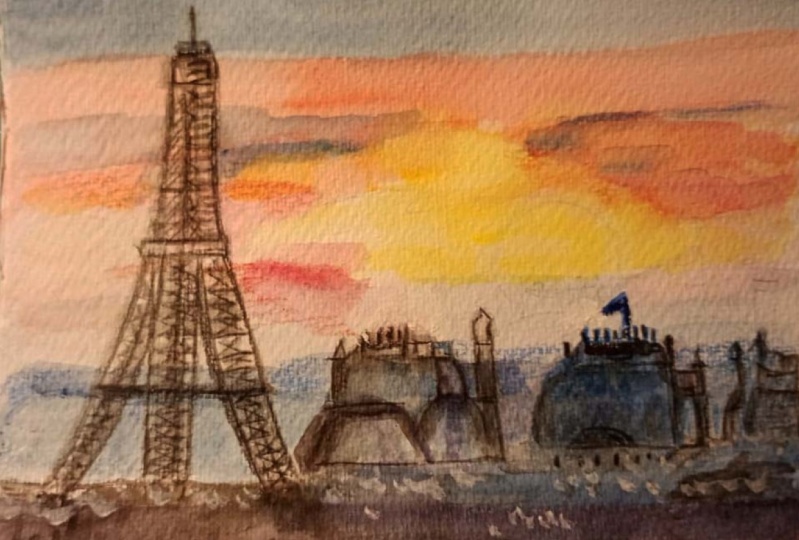
1. Introduction: Have you ever watched
a sunset over a cityscape when the sky burst into vibrant colors
and the details of the city seem quite
impossible to capture? It feels like magic, right? I'm here to show
you that it's not impossible at all to
paint a scene like that. In this class, you learn to
create the exact atmosphere, blending vibrant colors for
a perfect sunset sky while adding intricate
architectural details of a city like Paris. We'll focus on simplifying complex elements so
you can achieve depth, contrast, and the energy of the city without
feeling overwhelmed. You'll see that it's all
about balancing light and shadow to create a dynamic
breathtaking, final piece. By the end, you'll have
the confidence to paint a stunning Parisian
cityscape that captures both the beauty of the sky and the
charm of the city. Whether you're a beginner
or an experienced artist, I will guide you step
by step to achieve a masterpiece full of
textures and vivid colors. So if you're ready, grab your brushes and your paints
and let's get started.
2. Tape Down The paper: The first step is to tap down the paper to
our flat surface. We need masking tape and
we're going to secure a watercolor paper to the surface to prevent
it from wrapping. After that, we need to
lightly sketch the horizon. One third of our paper would be the scene and we leave
the rest for the sky. We're going to sketch the
Eiffel tower, the domes, and the rooftops really lightly, and we are only going to focus
on the basic shapes first. And we're not going to focus
too much on the details. Later, we will fill
in those details when we go further
into the painting. So as of now, it's
only important to do the initial shapes. Another important
thing at this stage is to mask the sun using
the masking tape. You need to cut out the shape of the sun and just put it over the sun because then
when we are going to wet the paper
and put the colors, we don't want to cover the sun. As you can see, it's really light and we don't want to lose the
shape of the sun. It's a good idea to use
masking tape in order to mask the sun at this stage. Now we are going to uh, wet the surface of the paper and continue and start painting.
3. Wetting The Paper: So now I'm going to use a flat
brush to pre wet the sky. The whole So now
I'm going to use a flat brush to pre wet the sky. We need to apply clean water
over the entire area of our paper and we need to be careful with this masking tape. The paper should be evenly
down, but not podly. I try to apply the water to the whole area
of the painting, although I'm going to only
paint the sky at this stage, but it's a better idea to wet the whole Area of the paper.
4. Applying Warm Colors to the Sky: Okay. Now using a
medium size brush, this is my number 12, I'm going to start with
a yellow at the horizon. On my palette, I'm going to put some cadmium yellow and apply it along the horizon line around the taped sun
around this area. This yellow will create some warm glow afterwards
when I remove the tape. Also, it's important to use
horizontal lines and strokes. Okay. And then I'm going
to blend this into orange. So cadmium orange here, which I'm going to
apply right after that and blend it into the yellow. I'm using gentle
horizontal strokes also here and letting the
colors blend naturally. As you see the
transition is naturally, I'm not forcing anything. Then as I move upwards, I'm going to introduce the red. This is a cadmium red. I use this for a deeper rete. As you see, it's a really
beautiful color and also here, I'm going to let it
blend naturally. Now I'm using another
brush which is dry because I want to make these colors blending together without using too much water. The same thing also
here near the horizon, I think it's a good idea to add some red here, some cadmium red. Then as you can see
that this brush is dry, it gives me some nice effect of horizontal lines
where I need it. It blends into the
previous color. Here I'm going to use more orange and just
let it blend here. Okay.
5. Belnding the Colors of the Sky: The paper is still wet, so I'm going to continue and
add the twilight colors. Basically, near the
top of the sky, I'm going to blend in
some ultramarine blue. I'm washing my brush, and this is my ultramarine. Blue. First thing is just to put the ultramarine
blue and then I'm going to add some purple to it to make it a darker color. I will apply it creating
a nice gradient. I'm having a look
also at my picture to see where I can see these clouds so that I can add those necessary strokes. Then at this point, I'm going to add more purple to this ultramarine to
make it a darker color. And by blending all
these colors together, I can have a nice gradient. If needed, I can also use dry this flat brush and use it to create a
softer transition of one color to the other. Here I need more of that twilight color
because as you can see, it's darker near the horizon and where I have the rooftops. Also at the edge of the paper. Don't worry about the
colors at the bottom of the paper because
that is where we are going to paint the rooftops and the horizontal line
and all the details. At this point, it
doesn't matter. I'm also using some cobalt blue here apply to the paper and then blend it with this
brush this flat brush. Maybe it's a good idea to intensify the upper
part of the paper here. How about adding some pink, some rose matter to it? This is my rose matter. I'm going to apply
to this to create a really nice color to
apply to the upper part of the the paper. Drying this out, I'm
going to plant this. You can see the transitions better when the whole
surface is dried. When the whole surface is dry, you can see how all these colors have
been blended together. Here I have another dry
brush, it's a small one, and I'm going to use it
to create these strokes, maybe remove some color here and there and just create what
I see in the picture. You see that I'm removing
basically some color here. If I get too much
color, I can dry it. Maybe add some more of
this cadmreello Okay, I would say at this point, to stop working on the sky. I'm satisfied with it. And uh afterwards, when the whole thing
is completely dry, I don't want to make a mess. So when it's completely dry, also to avoid tearing the paper, I need to carefully
peel off this tape to reveal the bright white
yellow sun that I have there. But before that, I
just hadn't looked at the picture and saw that it's a good idea now
that it's still dry to add some strokes also here. O as you see in the picture, it's more visible the clouds. This helps to create
some cloud effect. But it's important that I blend it into the rest of the papers, the rest of the colors. I'm going to stop
at this point and wait for it to dry and
then remove the tape. And
6. Softening the Edges of the Sun : As you can see, I
remove the masking tape from around the painting
because I work for me, it's more comfortable without
it because I can move it and if I want to add
some strokes or something, I can move the paper. So I removed the masking tape. Also, I removed the tape
that I had put for the sun. As you can see, it's perfectly white and the color
hasn't touched this area. The only thing that
I have to do is to soften the edges of the sun. So I'm going to use clean brush, a clean medium brush to gently
soften these upper edges. It needs to be a
little bit damp. I'm only going to
slightly soften these edges into the
surrounding area with some circular movements, and I'm blending
it into the sky. By doing this, I can create
some glowing effect and we lose that harsh,
edge that I had. And then with a clean towel, I just remove the extra water and the color a little
bit of yellow color. Okay, don't worry about
this button part because it's going to be covered by
the domes and the buildings. The only thing I want
to do at this stage is to add some strokes of
these, you know, clouds. Okay, so the orange
color that I used, and I'm going to add
to it a touch of light cadmium red
and just going to add these strokes. Of the clouds that
cover the sun. I don't have too much color on my brush because it's
easier for me to blend into the surrounding color and the background color. Also here it's going to be
covered by the building. I just needed this
because then at the next stage when I'm
going to paint the dome, I just wanted to make
sure that I already have these clouds,
these strokes.
7. Applying the First Layer of City Backgroung: Now, let's create the
silhouette of the background. I'm going to use the
wet and dry technique to have a solid coverage
for this background. Basically, the
mountains or the hills that form the skyline of Paris. So what I'm going
to do is to mix a little bit of
ultramarine blue, a little bit of cobalt blue, and a touch of purple. So as you know, my surface
is completely dry, so it won't create any problems
and I would be able to cover the whole area. All right. Okay. So basically
the line should start from here because here I have the Eiffel tower and yeah, so I put the first layer, dry my brush, and then I blend it into the surface
of the paper. And blend it some more when I go to the bottom of my paper. I think it's a nice color. Also, I don't have to
emphasize too much. I'm now adding a little bit of purple to it to
create a nicer color. I don't have to emphasize
that much on it because then I will have
the second layer, as you can see in the photo, the other part of the city
that is maybe closer to us, and then I will
have a third layer, which will be the rooftops
and the dome and then, yeah. So just going to let it dry, and then I will add
the second layer, and then I will go
to the next step.
8. Adding the Second Layer of the City: I want to add also this
second layer of the city, which is the part of city, which is closer to me and
I'm using a darker color. So to the previous mix, I added a tiny bit of
purple to make it darker. And also I'm using
a smaller brush because as it's closer to us, I can see some more details. So it's not flat as the other layer or the
previous layer layer, but it's just a little bit
more rough, let's say. More purple and More
blue ultramarine blue. I want to continue this t
here where I have the dome. But for the rest, I
think it's not visible. So I don't need to worry
about it that much. So it's time to blend this part into the
surface of my paper. Okay, I got to wash my
brush and then blend it. All this part into my surface. Is this roughness
gives the effect of the buildings or things
that are in the city? It's not visible
on the other part, so I don't have to
worry about it, just blend it perfectly. And I will wait for it to dry. The next step is not
what I said before. It's not the domes and the rooftops, it's
the Eiffel tower. Because if you look carefully at the picture, in terms of color, the Eiffel Tower is one grade darker than the
second layer that I added. First I put the Eiffel
tower and then afterwards, in my picture, in
this cityscape, the domes are the darkest part. I need to do them as
my last step because, as you know, in watercolor, we go from light to dark. I'll wait for this layer to dry, then I will work on
the Eiffel Tower.
9. Preparing the Color for the Eiffel tower : Now it's time to start
painting the Eiffel Tower. The first step is to mix the silhouette color
for the eiffel tower, which I'm going to make, I'm going to mix some dark colors to create a color which can
give me a solid coverage. Then I'm going to start
painting the Eiffel Tower. My drawing is not
that visible anymore, but I can refer to the picture and to the reference
picture I have, and it's really
important to focus on the triangular
shape of the tower. Okay, so first step, let's
mix the silhouette color. I have my purple here. I'm going to add
some more purple. Then I'm going to mix it
with some burnt umber, which in my palette is this one. You can add burnt
umber or you can add any brown color
that you have. As you can see, I
created this dark gray, this warm dark color, which is going to be
the gray that I'm going to use for the
silhouette color.
10. First Wash of the Eiffel Tower : No I need to use a fine
brush, my number three. I'm going to start painting the eiffel tower using
this color that I created. The consistency
should be creamy for this color in order to
have a solid coverage. It's important to pay
attention to the form and carefully outline
the eiffel tower. So first of all,
I'm going to start with the main structure. It starts from here from my second hill or second
layer of the city, from the previous one,
not from the background. I start here and just
as my first step, I need the color also to be really dark here. My first step would be to just outline the form
of the Eiffel Tower. In this step, don't
worry too much about the details because you just want to make sure
that the form is perfect. Going to make a lighter
color when I go to the top. This also helps me to check later to see if I need to adjust something because
if the color is too dark, then it's too hard to adjust. At this stage, it's better
to have a lighter one. Then this top part of the Eiffel tower. Now it seems that I have
the main structure. I can at this point focus also a little bit on more details here. I'm working on the
lower part here. Okay. Now I have my drawing back. The drawing that I
had covered with these dark colors of the sky. I have the paint structure. Now I can work on more details. Let's add a little bit of ultramarine blue to this
dark color that I created. Then I'm going to start carefully on the dark
parts of the tower, for example, this part, I have this dark part
here that I'm going to put then some shadows here on the inner
part of the tower. I'm connecting these
two parts together. Same thing here, just a
little bit of dark here. And also here, it's basically the dark parts that are overlaying
one over the other. Making some more of
the silhouette color by adding purple
and burnt umber. Okay. Now I'm going to continue to the center of the
tower, as you can see. So it's important that
you use a fine brush, a small brush because here there are details
and we don't want to miss putting a a
large paint here. Also, the further
I go to the top, I make my color
looser and lighter. What I mean is that I
add more water to it. I don't want it to be heavy. Here at the top, I have these dark parts here. Okay. As you can see, I'm not putting
too much details. I'm just suggesting the whole
form and the structure. Because as it's in
the background, it's not that we see that
much of details here.
11. Adding More Details to The Eiffel Tower : Now, using the mix
that I made before, I'm going to add more
details to the structure of my eiffel tower and I'm going to work on
the Lattice structure. Always using my small brush. I'm going to carefully paint
those crossbas I'm using, as you can see, short
and precise strokes. It's important that the strokes that you put on the paper, it's important that you
put them with confidence. They need to be thin,
but at the same time, confidence strokes to
capture the structure, but also to maintain the transparency and
the depth on the tower. On this part in the middle, as you can see in the picture, it's a little bit darker. So I'm going to omit the details and just put a dark stroke there and then continue by
adding gaps between the lines. And by adding these gaps, I can create some transparency. You can also zoom
in the picture to see exactly where you
have the dark parts, where you have the light parts. But as always don't focus
too much on the details, it doesn't matter that you
have the exact number of the cross frames or the exact number of the
triangles that you see. It's important that you give
the impression and create a nice structure for this
iconic Parisian architecture. Also, don't worry if you make a mistake because
at this stage, as your mix of the colors
is really diluted, even if you make a mistake
and maybe go out of the line or make an
imperfect triangle, you can always use a damp
brush to remove the paint. We can also work
on the railings. Some of the parts
are visible here, and at the top, it's a little bit darker, using a little bit more
pigment, I made it darker, add a little bit
more of burnt tumber make my color darker and a
tiny bit of ultramarine blue. In the middle or let's
say at the bottom, there is this part
that is darker and I just want to
deepen that part. I also need to work
on the shadows, not only in the
middle, but also under the arches and what is it? Maybe the observation platforms. That's why I need a
darker color here. Continue making it darker. Now, a little bit of bun timber and a tiny bit of
ultramarine blue, I have more pigment
on my brush and I'm going to focus on the dark
parts under the arches. Yeah, using really fast strokes. I just give the impression
that over there there are these lines and there
are these crossbeams. And then there's this kind of platform under the eiffel
tower, which is darker. So at this stage, I want to also create that one. I'm making my color
darker with more pigment. Okay, so on the right, I have
a shadow and on the left, it's a little bit lighter. So I put a color and
then it's important that you blend it
into your surface.
12. Refining the Eiffel Tower: Okay, so I have a careful
look at what I just painted, and I can obviously add some details more
to refine it and the finishing details when
everything is is dry. But for now, I just wanted to
blend this color into also the rest of the
background without any details because
I don't want it to look separated from
the whole scene. Then the other thing that
I want to do at this stage is to refine the
tower a little bit. Always with my small
brush and I just want to sharpen some edges and maybe reinforce some
of the shadows. It's almost dry, but
even if it's not, it's okay because it's just going to blend into the
color that I have there. Let's see, maybe I can
reinforce the shadows here. And also sharpen these edges
that I have this dark part. Same thing here, maybe
adding some detail. You can also use a smaller brush at this stage if you want. But pay attention not to cover the whole form because
we just want to maintain the light
background that we had and some of the
details that we used in our background, at this stage, I am using a
free hand, as you can see, I'm not really following any
order of the details here. I just want to make
it look more natural. Also some refining,
maybe it's necessary for the edges. Let's see. Maybe I can add some details here and
there, but not too much. Maybe these outer lines can
be refined a little bit. But I would say at this stage, I would say that it's
okay to leave it. And then if needed, I can always come back to it. When I finish also the
rest of the scene like these rooftops and these
large buildings that I have, I can always come back to it and see if there is any need to add more shadows or to
refine some of the details. But yeah, I think this
dark color is making the tower to pop out
perfectly right now. And yeah, I think it's
time to leave it. Okay. The only thing is that
I just want to connects these two layers together so that it doesn't
look detached. It looks nice. The form is
completely visible and I have enough details to make it look like a
perfect Eiffel tower. I'm going to leave it now
and then for the next step, I'm going to move on to the
rooftops and these buildings, these domes, these
things that I have here.
13. Applying the Base Tone for the Rooftops: Order to create an
atmospheric perspective, I'm going to use the same
neutral tin that I used for the tower also for the
rooftops and buildings. So a mix of bun tumber with some purple and a touch of ultramarine blue. I'm using a larger brush right
now because there are not so many details and so I can use a larger stroke
of paint here. And apply it with more
confidence basically. Let's start with a base
toone for the rooftops. I can see some rooftops here. My tower is completely dry, so I can now go above it
and over it and there are some maybe chimneys
because you know that Paris rooftops are famous for their chimneys and
then I can see some other shapes of rooftops. That make some more color
because I almost finished this. At this stage, I don't want
the color to be too strong. Whenever I feel that it's
becoming a little bit strong, I'm going to lighten
it with more water. There's no need to add too
much details because anyway, here we are in the dark
and in the shadow. So whenever you feel necessary, you can add details
if you actually see that in the picture. But when I zoom in, I don't see so many details
because it's the dark.
14. Painting the First Layer of the Domes: Well, it's still wet. I'm one also to find these domes and put
the main shape of it. Considering also the light and shadow here because
the light comes from this way and for example, at this dome, I can see that it's lighter at this
part and darker here. I just leave the base color that I used for the previous
layer here as my light. Then I mix a stronger tint here, and I want to work on this dome, which covers also
a part of my son. I think it's a better idea
to change my brush for this one or at least
for the top part of it. Just putting some details here and then also
on the other side. The same thing here, I have
the light coming from here, so this part needs to be darker, but as of now, I'm just going to
cover the whole thing and later I will come back to it and work more on the shadows. As the base wash, this could work
for me right now. Looking carefully
at the picture, I see if there is any detail
I can add at this stage. I also have this other
dome that I can add here. Again, change my
brush because here I thought I might need
something bigger. I might need to put a more
confident stroke here. For this one, I'm going to use the color that I have
on the background for my light and just connect it and blend it into the base
color so that much, they are not too detached. Then this part of the dome There is also this other dome which
I'm not going to put too much emphasis
on because for me, it's more important to give more attention on this
part near the sun. I'm just going to use some
strokes to hint that there is also another shape here
or another building here. Here, also, I can see that there is a dome here with a flag. Strongening my color. Now that I'm at it, why not? Put the flag as well. And Okay. What else? Now, let's just stop at this stage and
wait for everything to dry because I then want to work on the
shadows here and a few details, and maybe I use a dry brush technique and
add texture to some of the rooftops or use a darker tone in order to
make the whole scene pop out. At this stage, I
just leave it to dry and then I will come
back to it in a bit.
15. Preparing a Darker Color for the Domes: I continue with my small brush. And what I have to do is to make a stronger color that I used for the base
color of the domes. So I'm going to add
a little bit more of burnt umber to this mix. So that I have a warmer
and darker color, a little bit more
of purple again to this mix and just a tiny
bit of ultramarine blue. You see that it's way
stronger than what I used for the base wash.
16. Applying the Second Wash to the Domes: Going to deepen the domes first. I start with the one
that is closer to us and which is darker
because on the other one, I might want to use also some
red to reflect the sunset. But first, let's
finish this one. You can swim in the
photo to see where the details are or if there is anything that you need to add. So here on this part, I'm going to leave it on
this part of the dome, the base wash because I don't
want to make it darker. I'm just going to deepen this part which
is on the shadow. I have some details
here and there. Then on the dome, I have this curve and Also, there is a triangle here. I'm going to make it
dark on the outer part of the triangle,
leaving these curves. Let's leave also this line
here on the other side. I also have a curve here. There is this part, which I don't know what it is. It seems like I don't know, chimney or something needs
to be a little bit darker, I can deepen the domes by
darkening all of these parts. And just add the details. Not too much as always, only a little bit of details
to emphasize the shape and give it a little
bit of reality. Okay. And here I can see there
are some lines which I can put and some other
parts here and there. I am using confident
strokes as you see, I'm not really attached to the paper because it looks nicer if you use more confident
strokes on your painting.
17. Refining the Domes: Now, for this other dome, which is closer to my sunset, I want to use a warmer color. I'm going to mix a little
bit of carmine red, which is this color on my
palette to my previous mix. If you don't have carmine red, you can also use Alizarin
crimson or any red, just a little bit so that it becomes a little bit different from what we had
before so that it can hint the sunsets warmth. Okay. I'm mixing
a little bit more of the color because I saw
that I have run out of it. So, you see it's a lot. It's a lot warmer. Okay. Now here I can add some details. First, I am going to
finish the part which is completely on the
shadow, the dark part. I'm going to leave
this part which is light here in the
middle of the dome. Then, first of all, I just
want to finish this part, with a big stroke of color, I just cover this part. Also here, I want to leave some lines on
the other part of the dome to suggest
that depth. Okay. But now, the closer
I get to the sun, I want to use a warmer color. Now I shift here this is
a mix that we used for the sunset by adding a
little bit of purple to it, and a tiny bit of burnt umber, I can have a nice
dark color to add these details that are
right in front of the sun. Just some parts of the dome
that you can see here. Okay. Also for this part, it's a good idea
to continue with this warm dark color and
then blend it into my dome. Okay. Now I'm switching back to the dark color that
I used for the other dome. Now that I'm leaving the
part with the sunset. I need a similar dark
color to the other dome. I want to add some details
with some confidence strokes. You can also use a dry
brush technique here. There are some windows
maybe for the other dome, maybe I can use this
dark color also.
18. Completing Other Cupolas and the Rooftops: You can see, I gave more importance to these
two domes that are more visible and closer to us rather than these two others. But anyway, I have
also to work a little bit on them so that they don't remain unattached or
their form remains visible. Also on this little dome
or I don't know, rooftop, I need to deepen the shadow
on the left side and leave the right side as where
my light part is. Now some little details for the foreground and basically where I have the city
and normal buildings. For this one, I
need a dark color. I added a little bit more of ultramarine blue
to the previous mix also because I
don't want it to be exactly the same color
that I use there. Also, I thought maybe I can add some details here
with a different color. And by using a dry brush, I just add these details here and there whenever
I see, for example, a chimney, as I said before, um, famous chimneys of
the Paris rooftops and maybe some
windows if visible. Obviously not too much details, but it's important to add
the final touches such as, I don't know if you see
antennas or we can work a little bit also on
this flag pole that we had here just to refine it. Because the dark
color is different, so I can actually work on refining some of the
details that I put there. And how about Windows,
I don't know. Also, maybe I can darken
this cupola or these ones. Anyway, it's just about details, but not too much. I just want to create some
depth and some highlights. The best thing is to
use a confident stroke. And if you feel needed that you want to deepen
the shadows on some parts, maybe there are some buildings
out there that are darker, so we can use a negative
technique so darken the background so
that the chimneys on the foreground are
visible like this. I thought maybe it's not
a bad idea also too. Work on this final layer that is closer to us maybe
just add a flag pole here and refining the details
over this one. Maybe just adding a
little bit of details on this cupola the window shields, the window frames or also maybe looking at this one maybe it needs
to be refined as well. Okay. Let's leave it for a second to dry
and then I will come back to you to assess
the whole painting.
19. Evaluating the Painting for More Details: Step back from your painting to ensure there is
harmony between the sky, the domes and the rooftops
and the Eiffel Tower. Assess the painting for balance. See if everything seems to you perfectly balanced and
if you need to work a little bit more
on the details or maybe if you had put too
much details and you want to remove it with a
brush with a clean brush, on mine, I feel
like I need to add some more details on this stone because it looks a
little bit flat. Also, I wanted to use
a mix of blue with purple to create another
layer of the city here behind this dark dome because I felt that I
covered it completely. It doesn't have to be too
detail as you can see, I don't know what
is this building here that I can see
between the two domes, but just a glaze of this color, I think this blue
color would be nice. And then I want to blend
it into the other colors. Okay. We said that maybe a glaze of this warm color that I used for the other
dome, a diluted glaze. I need a lot of water here. I don't want it to be too dark. Yeah. So just like a glaze so that it has the same color for
both of the domes. Actually, here, I think
it's better to remove it. Okay. And so now I use this is my
dark it's a sepia color, and I'm going to mix it
with a little bit of blue to create this nice
green this nice dark gray. Then I use it for some of
the shadows on this dome. Just want to create
some more depth here. For example, on the
upper part and also on the upper part here,
on the other side. If it's too much, I can always blend it
into the background and a glaze of this color
also for this part. Yeah, just a super
diluted glaze here. Okay. Let's see if there is any detail that I want
to add or if there is anything that can add more depth and character
to my painting. I think at this stage, I can confidently say that I captured the beauty
of Paris at sunset. Also, it's really important
not to overwork the painting. So if you step back and
you feel like, okay, you have enough details
and you have captured the character of the city
and everything you can see in the picture in
your reference picture. Well, not everything obviously
because painting shouldn't be 100% copying the
reference photo. Just one thing. With
this dark color, I want to also work a little
bit on my Eiffel tower.
20. Final Touches on the Eiffel tower: To do that, I'm going
to use this dark color, dark cool color that
I created before with sepia and blue ultramarine,
add some touches. Obviously, I feel like my
Eiffel tower looks nice, so I don't want to overwork it, but just some final touches to deepen the shadows and
make the form look nicer. Basically, this color, I just
use it for the dark parts. This stroke that I just put, I blend it using a
negative technique, I leave the chimneys out there and maybe
some strokes here. Okay. And let's see. Okay, the closer I
get to the sunset, I think it's better to use
a warm dark color now. So always like my curmine with a mix of purple and a
little bit of bunt umber. Just to add some little
details using my fine brush. If you feel more
confident at this stage, you can also use a finer brush, but I feel fine with
my number three. Some of these triangles on
the darker parts and then maybe enhance the
shadow over the top. So Okay. I feel like I like
the background, the Eiffel Tower, and
everything on my painting. The only thing I want to add as the final step before
saying that I created this vibrant Persian
cityscape is to refine the white
of the sun here. So I'm going to change my water. I need clean water
and clean brushes and some white of acrylic
or gouache color.
21. Refining the Sun with White Acrylic Color: My white acrylic color. If you look carefully at
the at your painting, you see that we have
this nice balance on the sky and also our sun looks really nice and there is
yellow, there is white, but I just wanted to
refine the borders, the outer borders of the sun using a color that can
cover the background, so it needs to be acrylic color. I'm going to use it
directly from the tube because I don't need to
mix it with anything. I usually use my acrylic
white directly from the tube. Okay. Then just on the
outer part of the sun. So that the sun looks completely white
and the outer part looks completely
white and perfect. Also, maybe using a
negative technique, I can also refine around these details
here with some strokes, not too much of details. I just want to make sure that
everything looks perfect because the essence
of this picture is to capture the beauty of sunset and so we want our
sun to look really nice. If you look carefully, you can see that at this stage, at this point, my sun
looks really nice here. Maybe the over the sun, maybe I can also
put some strokes of my I don't know
orange or also on the
22. Final Step: Okay, so a little bit of red, a little bit of orange
and maybe some strokes if necessary on the sky and then blended into the
background of the sky. Okay. I want to step
back from my painting. And yeah, at this stage, I can confidently say
that I'm happy with it. Sorry, I just wanted
to add this line here. For my cupola. Before saying that I feel that
painting is finished. Okay. Now I can say that
my painting is finished. And yes, as you can see, we have this beautiful romantic
scene of sunset in Paris. Enjoy your creation
and please make sure that you share your final
work with the community so that we can see what is
the result of your painting.
 Monna Lisa, watercolorist