Transcripts
1. Introduction & Welcome: Hello, and welcome to my
very first Skillshare class; painting loose
watercolor leaves. My name is Priya, and I'm a watercolor artist based
in Honolulu, Hawaii. I'm also the creative owner behind petals by Priya
watercolor designs. You can find me online at petals.by.priya.com or check out some of my latest start work on Instagram at petals.by.priya. One of my absolute
favorite things to paint with watercolor. What actually got me
started painting in the first place was
loose watercolor leaves. That's what you'll be
learning in this class today. The skills that I'm
teaching are suitable for beginner and
intermediate artists. Please remember, you can always watch the videos
at your own pace. Pause, rewind, slow it down, whatever works best for you. In this class, we'll be covering the entire process of painting
leaves in a loose style, which will include color mixing, and how to create those
perfect earthy tones, the basic leaf strokes, thicker fuller leaves
using double strokes, two-toned leaves, how to create beautiful
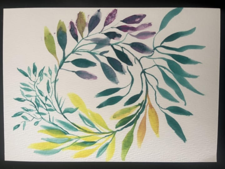
layered stems like this, adding depth and
dimension using the wet on wet and
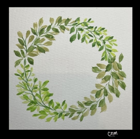
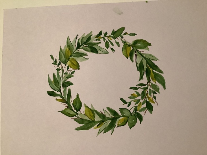
lifting techniques. Finally, we'll create a leafy wreath for
our class project. Now that we've gone over
the basics of the class, let's grab our supplies,
and get started. I'll see you in
the first lesson.
2. Supplies: The nice thing about
painting basic leaves is you don't need a
ton of fancy supplies. Here's what you will
need for this class. The first thing
you will of course need is watercolor paint. For our color mixing lesson, I'm going to be using Hooker's green as my base for
all of the mixtures. I love Hooker's green. It's a great neutral green that mixes well
with other colors. I'll also be using
this dark brown for my Woodlands Art
Philosophy palette. If you don't have this
palette, it's completely fine. I'll show you what
the brown looks like. It's just a nice dark brown. I'll also be using indigo
blue, Payne's gray. I love mixing Payne's
gray into my colors. Indian red will help us create a nice kind of muddy earthy
green for the leaves. And then finally I'll be using this color also from
my Woodlands palette. It's called Sand Ridge. It's a nice beigey, light, light brown. You will also need a
round watercolor brush. This is the one that I'll be using specifically
for this class. It is my all-time
favorite brush, size six round brush from Silver Brushes in their
Black Velvet series. You don't have to use
size six specifically. I also have the size four that I like using for
some smaller leaves. I just would recommend not using anything smaller than size four. It can just be a little
tricky to create those nice, full, thick leaves
with anything smaller. You will also need
watercolor paper. For this class, I'll be
using one of my favorites, Legion Stonehenge Aqua
Coldpress 100% cotton paper. If you're a beginner
or want to practice, any watercolor paper
will work fine, but I would recommend
looking into Canson XL student-grade
watercolor paper. You will also need a jar or bowl of clean water
to rinse your brush, a pallet or dish to mix
up all of your colors, and a clean paper towel to dab excess water from your brush. Finally, for your class project, it'll be helpful to have something round to
trace for your wreath. I'm going to be using
this simple bowl here and a pencil to trace
the circle of your wreath. In the next lesson, we'll go over color mixing
and how to create those perfect natural
earthy shades of green. I'll see you there.
3. Color Mixing: We're going to start by mixing five different shades of green. These are some of the color
combinations that I use most frequently when I'm
painting leaves and florals and I think
you'll like them too. As I said before, I'm going
to be using this hookers green as the base for
all of my mixtures. I'm going to go ahead, and add a little of this
green to my palette. Then for this first
green brown mixture, I will be using the color called bare from
my Woodlands palette. It's just this nice dark brown. If you don't have
this specific one, any dark brown, is fine. I'm going to get my brush wet, grab some of that bear, and add it to the hookers green. I added a lot of green, I'm going to have to
add quite a lot of the brown to get to the shade
that I'm looking to get. I'm going to grab
some more brown, I will probably do
one more round. That's looking really nice, I'm going to just do
a little test swatch here on the paper to see
how that turned out. I'm really liking that, I'm going to do a
lighter wash to see what that will
look like too. Love it, for our
second color again, we'll be using hookers,
green as the base, but instead of brown, I'll be adding in a
touch of Indigo red. Again, I'll go
ahead, and put some green into my palate, then touch of the pad. Now, I'll get my
brush wet again, and start mixing it up. I love how this color turns out, let me show you on paper, and again, I'll do
a lighter wash. I love that shade, I absolutely love it. That's one of the things I
also wanted to share is some of you mentioned that one
of the struggles you have, when you're painting
leaves is that, they don't look very realistic
they look a little fake. Color mixing is actually one of the biggest things that can help make your
leaves look natural. If you have just a bright green, or something that you wouldn't normally find
if you're out in nature, that doesn't look
very realistic. But when you make
these earthy tones, just gives your whole painting a more organic, natural look. Because these are all colors
that you would actually go see in nature if you're on a hike, or
something like that. Our third color, we're
going to be mixing is a really nice,
deep, moody green. I love using this
color combination if I have a moody vibe from
a floral composition, or if I'm using some
more vintage colors. This is going to be
hookers green once again, and then Indigo. The thing to know
about Indigo is just use a very small amount. It's easier to use a tiny
amount, and then add more, but if you add too much upfront, it's really hard to
take a step back. Then the Indigo just
overwhelms the whole mixture. Here comes the green again, a little more, then just a tiny dot will be Indigo. Let's see what this looks like, I actually want to add a little bit more Indigo than that. But because I started off
with such a little amount, it's very easy to
just add some more. Like I said, if I started
off with too much Indigo, there's no going back. Here we go again,
that is perfect, let me show you what
this looks like. The lighter wash, love that, the next shape will be similar
to the one we just did, creating that moody shade again. But instead of Indigo blue, we're going to be using
a touch of Payne's gray. I love adding Payne's gray, really any of my color mixtures. There's the green, and the gray, I'm going to add a
little more gray. Like I said, it's very similar
to the one we just did, love that hint of gray in it. I'm going to do even one more of a lighter wash, beautiful. Finally, if you're
the last color, we will be using hookers
green, surprise. This color called
the Sand Ridge. This nice beige, light brown, I'll add the green. The beige color is very light, so it might take me a
couple of rounds to get it to the shade of
green that I'm hoping for. I'll rinse my brush, and
do it another round. Loving that already, and I'll probably just
do one more to get it a bit lighter love it. There you go, these are my five most frequently
used color combinations for earthy green leaves. Now that we have our
palette all set up, and different color
options to choose from. We'll actually get started with painting leaves in
the next section.
4. Basic Leaf Strokes: This first lesson
is all about how to create the basic leaf shape by simply using varying amounts of pressure on your round brush, which is a technique
that can be used for painting all different
types of leaves. Before we start, it's
important to identify which parts of the
round brush we'll be utilizing for each leaf. The very tippy top of your brush is what
we're going to be using to start the leaf stem and to finish up the
pointy end of each leaf. The head of the brush is the area that will be
pressed onto the paper in the middle of the leaf to
create the thickest part. Let's get started with
some practice strokes. First, I'm going to
load my brush with one of the shades we mixed
up in the last lesson. Make sure you don't have too
much water on your brush, otherwise it might
pool up at the end. But you also don't
want too little. The basic steps for creating a leaf is to go light pressure, heavy pressure, and
light pressure again. That's the routine that
we'll be following. I'll do that again slowly. First, put the very tip of your brush onto the paper to
create a light dainty stem. Then as you create
the thicker part, you'll just lay your
brush down with more pressure and then end with light pressure again to create that
very pointy edge. I'll show you again with
a little closer up angle. The very tip of my brush, creating a thin
little dainty stem. Then applying more pressure as you create the thick part, and then lighten up again to create the very tip at the end. Let's do it a few more times. Light pressure, heavy
pressure, and light again. One of the problems you might
run into when you're first starting is you won't
get that pointy end. You might end up with something
like that, which is fine. If you do want the pointy end, you can just drag
it out a little further to get that point
that you're looking for. Let's do some more. You can also vary the
shape of your leaf. If you want something
a little more round, don't drag it out as far, just push your paintbrush
down and then bring it up. If you want a longer,
pointier leaf, then drag it out longer. Create the stem, push down, drag it out, and
pull it back up. Just go ahead and
keep practicing this. Play around with different
lengths of your leaf. Also, if you want to, again, give it a more natural look, you can give it a little
bit of character, a little bit of
swing at the end. One of my favorite ways
to add leaves to usually my rose compositions is to
have it just draping down. Don't feel like you have to have perfectly round or
oval-shaped leaves. You don't have to have
perfectly straight edges. Some of my favorite leaves
end up with a little bit of texture like
that on the side. One other problem that
you might run into when you're practicing
these leaves is you might get some pooling at the end if you have too
much water on your brush. That's what it looks
like when it pools. One way you can fix that, if it's not too much pooling, you can just drag your brush
around and even it out. If it is too much, then rinse off your
brush completely, dry it completely,
and then tap it back in there to help soak up
some of that excess water. I'm going to do that
again. Drying my brush, soaking up some of that excess. That's an easy way to
get rid of the pooling. Feel free to keep
practicing these or meet me in the next lesson to
learn how to create thicker, fuller leaves using two brush
strokes instead of one. This is personally one of
my favorite ways and my go-to way to paint
leaves. See you soon.
5. Double Stroke Leaves: Now we're ready to
create thicker, fuller looking leaves with two brush strokes
instead of one. This technique is very
similar to the one we just learned so you'll be
a pro in no time. The basic idea of the two stroke leaf is to create a leaf just like we
did in the first lesson. I'll go ahead and do that. But then starting at the base
of the leaf, not the stem, we'll be creating an identical
one right next to it, and then connecting
it at the top. I just love that big, full, thick look of that leaf. One thing to keep in mind
when creating this is to leave a little
bit of whitespace there in-between them. You don't have to do that. I'll show you what it
looks like if you don't, it'll just be a thicker
leaf, which is totally fine. But I do love that look of having a little bit of
whitespace in there. Let's review that. We'll create a basic
leaf just like you did. Then right next to it,
starting at the base, we'll create another one, leaving a little bit of
white space there in the middle and connecting
again at the top. Let me show you at
a closer angle. Create that first leaf, put your tip of your brush
right here at the base. Leave a little bit of white
space and connect at the top. Look how beautiful that leaf is. This is the one technique that I use most frequently when
I'm painting leaves. I tend to go for a little bit
of a fuller looking leaf. Let's practice that some more. Again, you can apply
this technique to as many different shapes
of leaves that you want. First I'll do a fat, more round shape leaf. Using a lot of
pressure on my brush and not really dragging
it out too far and then connect it or you can also use it for
longer skinnier leaves. I'm going to drag
this out really far before I lighten up on the pressure and make another one right next to
it and connect at the top. Like I said in that first one, if you want to add more texture, give the leaf a little
more character, you can make it droopy. Maybe have it pointing down a little bit and then you'll
just start right here at the base and connect
it like that. Let's practice a few more times. You can also make little
dainty small leaves using the same technique.
I'll do that up here. We can also try making
a two leaf stem here. I'll make a longer stem, paint the leaf, and then I'm
going to make one coming off of here too that's
hanging down a little bit. Again, for this method too, you're going to be using
the same exact routine of light pressure, heavy pressure, and light, and again, light, heavy, and light. Feel free to keep
practicing this. Muscle memory is a big thing in watercolors so the
more times you do it, the better you're going to get, the more easy it
will come to you. Keep practicing and I'll
see you in the next lesson. Next up, I'll show you just
how easy it is to create stunning two toned leaf petals using a simple dipping method.
6. Two-Tone Leaves: Now that you know how to create two different shapes of leaves, let's spice it up
a bit with one of my favorites, two toned leaves. Here's a little sneak peek
at what those look like. For this demonstration,
you're going to want to have contrast in the shades or the
colors that you're using. I'm going to be using a really, really light wash of that
beige green that we used. Then I'm also going
to use a really dark, the indigo green that we
used. Here's how you do it. Load up the entire brush
with your lighter color. Make sure it's not too wet, but just make sure enough for your brush has
the color on it. Then dip just the very tip of your brush into
the darker color. I'm dipping it into this indigo. Next we'll paint the leaf
the same way we did. I'm going to use the
two stroke leaf. Then that darker color
will show up in the stem, and throughout the
leaf and just give it a nice contrasting look. You can see in that the stem
is the darker indigo green. Then you can also see that
lined throughout the leaf. Let's do that again. This time I'm going to
use different colors just to mix it up. But you always want the
first color that you load your brush up
with to be lighter. Then the darker one on the
tip. Let's try it again. Love that. I'll load
my brush up again. It just gives your leaves a
little bit more dimension. This is what our first
ones looked like, which are awesome,
but they're all just the one color that we use. When you use this
dipping method, just gives them a
little more interest. Let's practice some more.
Let's keep practicing. I have my brush
all loaded up with a light green in the
head of the brush, and then the darker
indigo on the tip. Going to go light pressure stem, heavy pressure leaf
and light again. Same thing here on the bottom. See how that just adds
some interest to the leaf. I really love how that looks. If you want to, you can even try this method with colors that you normally would not
use for your leafs. Just for fun, I'm
going to try this with my tropical palette
from Art Philosophy. I'm going to load
my brush with the yellow, bright tropical yellow. Then I'm going to do
this pink on the tip. Let's see how this one looks. So cool. Sometimes it's easier to see with totally
different colors like these than it is just using a lighter color and
a darker color. I encourage you to just play around with other
colors that you have. Just experiment a little
more with this style. Look how awesome that looks. Nice little fiery leaves. Want to do one more
round because I just really love
this color combo. Beautiful. I love using this method when I want to add a little dimension and
interest to my leaves, feel free to keep practicing, try out with different
color combinations. I will see you in
the next lesson.
7. Layered Leaves: Painting layered leaf stems
are great for creating wreaths or using them as fillers and larger
floral compositions. You'd be surprised just how
easy they are to paint. The important thing
to know when you're painting layered
leaves like these is to always start with the lighter
wash or lighter color on the bottom and then add
darker layers on top. You'll find when painting
with watercolors, you can always layer
darker on top of light, but unfortunately, it just does not work the
other way around. Let's start with painting
a single leaf stem. Those are the same green
that we mixed up earlier, I just added some more
into this little palette. To create the stem, I'm going to use just the tip of my brush, create a long stem, and then a leaf on top, and I'm just going to use the single stroke leaf for this. Now that you know how
to paint the waves, the rest of the stem is
going to be really easy, so you'll just work
your way down painting dainty little alternating stems. One thing to keep in mind is
to just leave enough space in between each leaf, so don't make them too close together because when we
add our second layer, it'll be going in between. Add another little stem and another leaf and just
work your way down. There you go. I'm
going to wait for this first layer to dry and then we'll add the
second layer on top of it. Now that this first
layer is dry, I'm going to add the
second layer and remember you always want your
second layer to be darker, so in this case, I'm
going to be using the deep moody green that we
mixed with Payne's gray. Basically what you're going
to do is you're going to create another one
of these on top of it and just put each leaf
in between the first ones. You do want some whitespace, that's why you left
this whitespace here. But actually, when they overlap slightly on top of each other, it just makes it look
a lot more fuller, and that's when the beauty and
the depth really shows up. I'm just going to gently trace over the stem again
with the darker color, and then I'm just going
to branch off here for your leaf and do the same
exact thing all the way down. Again, see how that overlaps there, that's completely fine. I actually prefer it
to overlap a bit. Can have the darker ones
coming up a little bit. Let's give it some
varied direction. There you have it. I love the look of these
layered leaves, as I said before,
they're nice and thick. I use them as fillers a lot. I'm probably going to
use this technique in a class project at
the end as well. I'm going to do one
more practice 1, but I'm going to give the stem
a little more character by adding a bit of a curve to it, so I'm just mixing up
this lighter green. This is the beigey one. Want to do it right
next to the first one, but I'm just going to
have it loop down a bit. I'm going to do the
same exact thing and making the leaves a little fuller giving them
this droopy quality that I really like. Feel free to play around with different
color combinations. You could even just use
the same exact color and make one a little
lighter than the other, or like we did in the last one, you can use totally different colors than
you normally would, you can use triples, yellows, just have fun with it. Now I'm going to go back in to do the second
layer once it's dry, I'm going to actually try using this darker brown one that we created in the color
mixing lesson. [NOISE] Let's see
how this one looks. Trace over the stem, a nice and do the same
all the way down. There you have it. I love
using this technique. Like I said, it just
makes it look a lot thicker and fuller, and I just love it. It's one of my
personal favorites. I hope you enjoy it. That technique, it is one
of my personal favorites, I use it all the time. In the next lesson, I'll be showing you how to
add depth and dimension, and highlights to your leaves by using the wet-on-wet
and lifting techniques.
8. Adding Depth & Highlights to Leaves: You made it to the final lesson. We're going to be
going over how to add depth and dimension to each of your leaf petals using techniques like wet
on wet and lifting. These are a little trickier than the other methods that
we've learned in the class. But with a little practice, you'll be all good to go. First, let's talk about what the wet-on-wet method
really looks like. Wet on wet basically
means you're layering paint on top of another
layer that hasn't dried yet. It's still wet. You're putting wet paint on another
layer of wet paint. Using this technique creates beautiful organic blooms allows you to practice blending colors, and is truly the
most magical part of painting with watercolors. Remember this is different from the wet-on-dry method that we just used in the previous lesson to create the layered leaves. In that lesson, we waited
for the first layer to dry and then we put the
second layer on top. In this method, we'll
just be putting the second layer
directly on the wet. Let's practice the
wet-on-wet technique by creating some basic blooms. First I'm going to take a really light wash of the screen, rinse it off a little bit. I'm going to paint
a basic circle. Now before it dries, quickly load up your brush with a darker color or a darker
wash of that color. Simply drop some of
that onto the circle that you painted and
watch the paint bloom. You can add as
many dots as you'd like until you get
the hang of it. I'm going to paint one
more circle and try again. There's my circle. Loading in some darker
green. Watching it bloom. Putting a wet layer of paint on the layer that is still wet. Now let's try that again. But instead of blooms
will try actually blending the colors along
the edge of the circle. We have a very
light wash. Again. I'm going to paint
another circle. Does not have to be perfect. I'm going to load my brush
with the darker green. I'm just going to gently wine the edge of the
circle to create a nice little shadow
blended effect. If it's not blending
as well as you'd like, this one's not too bad. But you can always
clean off your brush, dab off the extra water, and then just
softly feather that out to help it blend
a little better. I'm just taking a clean, damp brush, hoping smooth
out the edges a little bit. You don't have to do this part. If you want it to look more
organic, you can leave it. But I'm just showing you in case you want to
blend it out of it. I'm going to do that
process one more time. Getting the very
light wash of green. I want to make it
a little darker , painting my circle. Now getting the darker. I'm going to try blending that out just
like I did the other one. Clean my brush, drying it. I'm just feathering that out to help blend
it a bit better. Now let's talk about
the lifting technique. Lifting is what
happens when you have a wet layer paint and you use a clean dry brush
to lift up some of the remaining color to create
a nice highlighted effect. Let's practice this method. When I start by painting
another circle. Just like we did. But before it dries, take a clean dry brush, just dabbing off excess water
here on my paper towel, and lift up some of that color to create a nice
little highlight. Remember, you can use
the same trick to help with pooling of water as well. Doesn't matter what
your painting, you can always use the lifting method to
create highlights. I'm going to practice
that one more time. Load up my brush,
create a circle, clean my brush, dab
the excess water, and soak up some of
that extra paint. That's what the lifting
method is and we'll be using that when we get started
painting leaves up next. Now let's get started painting the actual leaf and using the techniques that
we just practiced. I'm going to start
by lightly outlining the shape of the leaf
with this pencil. You certainly don't have
to sketch it out first. But if you do, just
make sure it's light enough that it
won't show up after you lay your paint
down on the paper. Once you paint over
your pencil marks, you won't be able
to erase any of it. I'm just going to sketch
out just a loose shape. It doesn't have to be perfect. I'm just going to go over that, gently dabbing with my eraser so that it's light enough
that you won't see it. Now I'm going to start
with a really light wash of the earthy green-brown
that we mixed up. I'm going to fill in the
leaf but not the stem. Next, before that layer dries, I'm loading my brush with a darker wash of the
same earthy green. I'm going to gently tap
in this darker color along the left side and
the bottom of the leaf. I'm also going to go in with a darker color and
create that stem. Once it connects with the leaf, you see that it blooms
right there at the bottom. Does adding in
that darker color, just like we did over
here with the circle. Maybe add a little
bit on this side. Now that we have the
darker shadow of the leaf will add a
little highlight by lifting some of
the original color towards the right
side of the leaf. I have a clean, damp brush
and I'm just lifting some of that color to create a
nice little highlight. If you do, again, find that you have any
harsh edges after it dries, you can always use a clean, damp brush to gently feather it out and help blend
it a little bit. I'm going to do it
again, but just at a slightly closer view so that you can see
it a bit better. This time my leaf is
going to be skinnier. You can choose whatever
shape you want to do. The methods that you learn
is the most important part. You can apply it to any shape. It also doesn't
have to be leaves. Whatever you're
painting, you can use wet on wet and lifting. Again, going in here with a light wash and I'm just filling in the
leaf, not the stem. You can do the stem, but we're going over it
anyways with the dark wash so you don't have to fill in the leaf making sure I don't have
too much pooling going on. Then I'm loading my brush
with a darker wash. I'm just going to tap it in gently to create
a little shadow. I'll also add the stem here. You can see when
it connects with the leaf that blooms and creates a nice little effect there. I'm going to do the same thing we did with the other leaf. Cleaning off my
brush, drying it, and taking a little highlight here using the lifting method. I also am not crazy
about this harsh line. It didn't blend as well
as the other ones. I have a damp brush and I'm
just going to feather it out here and help it
blend a bit better. Still not crazy about that. I'm going to wet the leaf again and add
in some more color. Just got that wet out, the darker color on my brush. I'm adding a bit more. There we go. I'm
liking that better. Again, this isn't a
perfectly clean edge, but personally, I
like that better. It just helps the leaves
look more natural, like something you'd
see out in nature. That's the technique for creating depth and
dimension in your leaves. I love doing that. It just adds a whole other layer to your floral compositions. Or if you're just
doing leaves on their own, I just love it. As I mentioned before, these techniques can be a little trickier and they definitely require more water
control and your brushes. Feel free to keep practicing
until you feel comfortable. I'll see you in the
next video to start our final class project,
the leafy wreath.
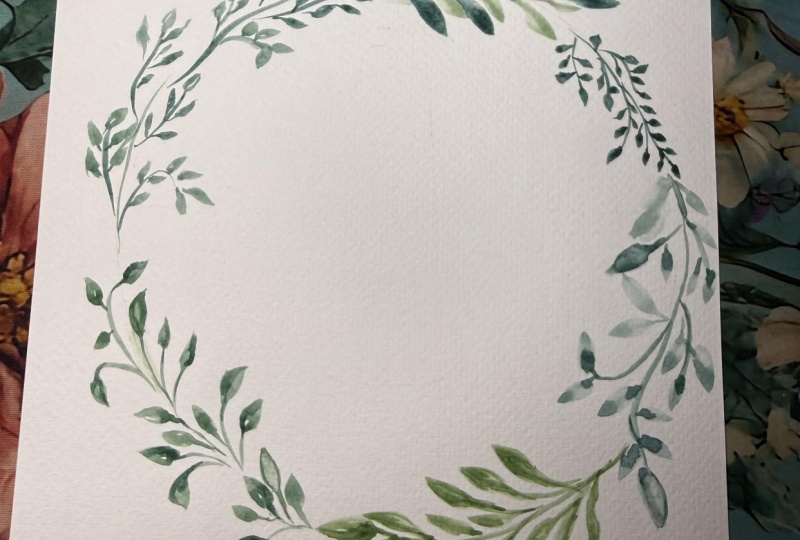
9. Class Project: Leafy Wreath: Now we can finally get
started on our class project. We'll be creating
a leafy wreath. We'll be using either one or several of the techniques that
you learned in the class. Choose your favorite
or a combination of favorites and we'll get started. We'll start by tracing a
circle for our wreath. You can use whatever you'd
like to trace the circle. I'm personally just
going to use one of our cereal bowls
from the cupboard. I'm going to place it
face down on the paper. Then just using a pencil
to gently outline it. There's my circle. Once
you've outlined yours, you'd like to choose which
colors you're going to use. For this one, I'm going to
be using some of the darker, moodier ones that we mixed up with Payne's
gray and indigo. I know it's running
a little short on the colors we originally mixed. I just went ahead
and made some more. As far as deciding which leaves you want to
use in your wreath, it's really up to you. You can choose one of your
favorites from the class. You can use a combination. I personally will
probably just use a combination and
just wing it as I go. Those are the wreaths that I
tend to lean more towards, are the ones that aren't
too planned out that just look natural and full. That's why I'm just going to do small sections at a time and just create the leaves as I go. A couple of other
notes before we begin, while it might be
tempting to trace the entire circle outline
with your paint first. I don't necessarily
recommend it because it's likely to get smudged with
your hand before it dries. I've noticed that the leaves in the wreath tend to look more natural and organic without
a perfectly lined circle, but instead by painting
small chunks at a time. Finally, don't feel like
you have to keep your leafy stems directly on the
circle that you outlined. You definitely don't
want them to get too wild and start
going off the page. But your wreath will look fuller if your leaves move
freely to the side and even if they overlap
slightly as you go. Here we go. I'm going to get started again. Feel free to use
whichever techniques you like or if you want to
follow along with me. As I said before, I'm just winging it and seeing what feels
natural to me as I go. But I'm going to just start in small little sections
and I'm going to be turning my paper as I
work my way clockwise. I'll probably start by
adding a little stem here and see how I went a little bit to the
left of the circle there. That's what I was talking about, how it looked more organic if it's not directly
on the circle. Don't be too rigid. I'm just adding
some leaves here. I'll probably make this
one into a layered stem. If you remember
from that lesson, I will end up going in
the second layer after this one dries and add some more leaves and
a darker shade of this. I'm going to grab darker shade. I'm going to go back over top. This is already dried. I'm going to go back
over the top and add some darker leaves here. Again, totally fine
if it overlaps. Don't be afraid to change up
the shape of the leaves too. You can see this one's a little
bit slanted to the right. Just adds a little
more character and interest to your leaf stem. There's the first
one. I'm pretty happy with that and now I'm
going to continue on at the top here
with another stem. I'm getting some
paint on my brush. Instead I'm just going
to do some curvy stems. I'm just going to
add the two stroke leaves that we learned
in the second lesson, but I'm going to make them
really small and dainty. I'm going to add
one more stem here. To make them small like this, I'm just using the
very tip of my brush. I'm still doing that
same pressure pattern where you do light,
heavy and light. But I'm just not putting
the entire brush down on the paper because that would make it a little too
big for what I'm going for. Don't forget to vary
the direction too. Like you can see, I
just made this one go slanting down a bit. Don't want it to be too uniform. Don't be afraid of
them overlapping. You can see I just
overlapped those two. I'm just continuing to
add leaves as I go. I'm going to overlap
this one here. You can see this little
bunched up here. They all are overlapping. It looks more natural. I know I've used the
word natural a lot, but that helps a lot when you're painting leaves because you don't want
them to look fake. Again, if you're having
trouble creating these, we're doing light pressure for little tiny stem,
heavier pressure, but not too much as you go down and then lighten up
again at the top. If you are struggling,
I really recommend just filling up a whole page
with practice strokes. That's the only way you're
going to get better. Practice. Each time you do, the next time you
bring out your paints, it's going to come back
to you a lot faster. Another trick you can use is make little stems
off of each other. Like this wasn't its
own original stem. I created one here and then just added a little mini
sprig right off of it. Whatever feels right to you as you're creating
these leaf stems. Just go with your gut. I'm really liking how
this one is looking. Now I'll move on to another one. Now I think I'm going to create two more layered
stems like this one. One bearing off to
the right and one a little bit longer into the left. I want to try using
the dip method. That's what we use to create those beautiful
two-toned leaves. I'm going to start,
I'm not using the dip method yet
because I'm going to draw my stems first. Like I said, one coming
off to the right, one coming off a little
longer and to the left. I'll probably add one more here. You want to make sure it still follows the curve of the circle. That's why I added this
one here so that it continues what we've
already started. Other reminder to do
the two-toned ones, you fill your brush
with a lighter color, dip the tip into the darker. Then create your leaf just
as you do with other ones. With a little hard to
see what this lighting, but you can just add a lot of depth and interest by having those two different
shades within one leaf petal. It takes a little longer to create the
two-toned petals just because you have to
read the bit more frequently. But that's
okay. [BACKGROUND] You can see on that
one a little better. The darker color
here for the stem and then just spread throughout. But you also have
the nice light areas here from that first color that you loaded onto your brush. I'm just going to
keep doing that same thing all the way down. Again, make sure you're
varying the direction. I'm going to have this
one going rogue a little bit and facing backwards. Don't be afraid to
do things like that. We're almost done here. That one's overlapping
below that. I'm really liking how
this is looking so far. One thing you can
notice is this is going a little rogue and so when
I start my next section, I'm just going to
really want to bring it back in and maybe
add some more leaves coming inward because
we don't want all of them going
outside of the circle. I'll show you what
that looks like next. In my next section, I noticed that I have
nice dark contrast here in this first layered
one that they're next to you. They are flat, they
have the same colors, so I'm going to bring back
some of that dark color. I'm just loading
up my brush here. I think for this one,
I'm going to use the single-stroke leaves that we learned in the
very first lesson. Now we're drawing some stems. Like I said, I want to
bring some direction back into the circle since this one's going a little
rogue outside. Just curving it back. Now, let's do the single-stroke leaves that we practiced
in the very first lesson. Light pressure, heavy, drag
it out and light again. I'm making these a little
longer and slimmer. Light, heavy, and light. Light, heavy, light. Also, make sure that your
previous layers have already dried so that your
arm doesn't smudge it. Light, heavy
pressure, and light. Loading up my brush again. Light, heavy, light. Again, if you end up
with some leaves like this that don't have the pointy tip that
you're looking for, you can just go
back in and add it. That's one of the things
that I just love about watercolor is that
it's very forgiving, you can always go back
and fix up your mistakes. Again, I'm going to add
some different direction here and just bring
that one backwards. That they can overlap
with the other leaf. I really love how
that one looks. I'm going to back this up
and take a look at it, a little hole, see
what's missing. I think these leaves are fuller than any other ones
we've created over here. I'm going to try to add some
more fuller leaves here. I might just do a few two-leaf stems here to
add some thicker parts. This part is still a little wet, so I'm just going
to be very careful not to lay my arm down in it. That would be a major bummer. I'm just going to do a few stems here and just map out where
I want these leaves to go. I think that looks good for now. Like I said, I really like these thick leaves over here at the top so I'm going to try to make these ones thick as well. Just pushing down. I'm doing the two-stroke leaf and just filling in
where those stems are. You definitely
don't have to copy this exact method
that I'm doing. If you had other
flowers that you liked better during the class,
you can use those. This is looking a
little too bare for me, so I'm going to go back
in and add some more. Again, just going
with my intuition. Seeing where it looks too bare and adding in some fillers. You can see I also
I'm making these extra leaves a little bit darker than the first layer. Another trick I like
to do when I'm working on leaf stems like this is to add some thin
strokes like this. I don't have to add
actual leaf petals at the end of them. It's almost like some
blades of grass. Just be loose with it.
I really like that. Let's move on to
the next section. For this one, I'm going to go back and do some smaller
leaves like I did here. I'm actually going to move from a size 6 brush to my size 4. [NOISE] Again, I'm still using this dark indigo
green and the Payne's gray. [NOISE] If you liked other colors that we mixed
up or colors of your own, as always, feel
free to use those. Let's see. I'm going to create a stem along the
circle that we outlined, and then again, just
do some branches off. I'm actually going to take it all the way to the end and
connect to where we started. Now, I'm just going to
add little tiny leaves. Do you remember how to
add these little leaves? If you don't, I'll give
you a quick refresher. I'm just using the
very tip of the brush, not really weighing
down the entire brush. Otherwise, that would
pick leaves that are thicker than what I'm
actually going for here. Still using the same
routine of light pressure, heavy and light, so just in a smaller leaf. Again, I'm going to
add some little sprigs here and just work my way down. I sped up that last section, but here's what the final
product looks like. I'm not totally done yet. I like to look at it from a further perspective at the end just to see
what's missing. You see there's a little
bit of a gap here. I think I'm going
to add some more of these petals first because
there's only this one section. I want to make it a
little more common and also to help fill that
gap a little bit. Feel free to do that
with yours as well. Just look at it a bit further
away and see if you can spot any areas that need
some more attention. Let's see. I don't want
it overlapping too much, but I'm going to
create one here. There's my first layer, and then I'm going to go back
in with my darker there, and I make that actually
a little bit darker. Remember to leave
enough white space between the first
layer and second, but not too much because
you do want some overlap. Then I'm going to have this one pointing backwards a little bit. I also see a bit of a gap here, so I'm going to add
one more leaf there. Actually, another
one in-between that. It's looking good. I just
see a little gap here. Also down here, usually
it's in-between the different sections that you start might look a
little bit jerky, so just go in and add some more. I'll probably add some of these
little wispy strokes here. Maybe another leaf. Just whatever feels
the best to you. I'm going to add some
more darker ones here. That's looking pretty good. This was the other section
I wanted to clean up. I'm really liking this. Actually, I see one
more white space here. Just go with your gut. If you have any areas that look a little bit jerky to you, just add some more fillers. There we go. I hope you're
happy with yours too. If you don't like it
right off the bat, you can either start over. Or what I usually end up
doing is just adding onto it, and then you'll end up
with something you like. If you don't, at least
it's good practice.
10. Final Thoughts: I want to sincerely thank you again for joining my first ever Skillshare class, painting loose
watercolor leaves. I had a great time, and I hope you did too. Don't forget to upload your final project to
the class project board. And also, If you do decide to share your artwork on Instagram, feel free to tag me
@petals.by.priya. Thank you again so much. It means a lot to
me that you took the time to watch the class. I'm really looking forward to seeing all of your projects, and happy painting
from me to you.
 Petals by Priya Watercolor, Watercolor Artist & Teacher