Transcripts
1. About the Class: When you think
about creating art, do you often feel like
you're just copying Instagram photos and reels
that you've liked and saved? Have you ever wondered how you're supposed
to go from taking a tutorial to creating something that you feel like has
your artistic voice? Hi, my name is Madeline, and I'm a watercolor artist
and content creator. And the most common question
that I get on social media is how do I simplify
the reference photos that I find to paint the
paintings that I do? In today's skill share class, I will be sharing with
you how to paint from reference photos and we'll go from where to find
reference photos, as well as how to look
at a reference photo. Break it down so that it doesn't
feel super overwhelming, but rather we digest it
and analyze it so that you can get points from the
reference photo to paint from. And then how to go on from there to find your
color palette. And how to adapt
your color palette to a photo that you
might want to create. I will not only be sharing principles that will
be helpful for you, I will also provide
you with plenty of examples in this lesson
of reference photos that I've found and the
thought process that went on in my head behind the scenes
of what I was painting, how I broke it down,
how I analyzed it, how I chose what I wanted to paint and what
I didn't want to paint. And you'll not only
see my final painting, but you'll get all
the behind the scenes that was going on in my brain
as I was painting them. So without furthermore,
let's get started.
2. Where to Find Reference Photos: In this lesson, I'll be sharing how to find
a reference photo. And we'll be starting
off with what not to do. And then I will
transition into sharing some of my favorite
websites to find them. This lesson is all about how to find a reference
photo to paint. While I don't believe that there is a right
and wrong in art, I do believe that
there is a right and wrong when it comes to finding references or inspiration
for you to create from. The great thing
about social media is that it makes content and education accessible to
anyone that has a smartphone, which is almost
everyone these days. Not only is learning so
easily accessible nowadays, you can also learn in
small, bite sized chunks. I'll admit that when I first started learning Instagram reels and posts were the main source of my inspiration and learning. However, now that I've been in the watercolor community on social media for
a few years now, I've learned that you cannot simply look at someone
else's artwork, copy it, and then post it, or use it as your own. There is actually an
etiquette to painting from other people's work when you see something that you
like on social media, and if this artwork or content isn't obviously a
tutorial or class, it's actually best
practice for you to reach out or message that creator
and ask them for permission. To either use their work as inspiration or to recreate
something similar. Asking for permission
is a way to be respectful towards
that creator's artwork. This is primarily
if the creator or their artwork is not obviously
in a teaching platform. If you're taking a tutorial or a class and you're planning to repost either a process reel or a photo of
your finished work. It's always best to credit the creator or the teacher
in your video description. Not only is this giving the creator credit for the
work that you are recreating, it also allows other artists
who may be looking at your work an avenue for them to find that original
tutorial or class. If you are taking tutorials and you're
simply just creating for your own recreation or you have no interest in posting it or sharing this
on social media, Then you can go ahead and create from any means without
really much of an issue. The things that I'm
referring to primarily apply to when you are re sharing
that work to social media. If you ever have intentions
of selling something that you've created from
someone else's artwork, class or tutorial, then it is always, always best to ask
for permission from the creator that
you are learning for if that is okay to them. For me being a larger
account on social media, what I've found
is oftentimes the easiest is creating art
from reference images. And now I'm going
to show you how and where to find reference
images for you to paint from. I love painting from
copyright free images. And there are several
websites that you can go to to search for photos
that you may be looking for. Some of my favorites include
unsplash pixels and Pixel. Be these websites are super resourceful because
you can actually search it like a search engine
kind of like Google or even Pinterest search and type in whatever you may
be looking for. Again, I primarily
paint landscapes, so I will type into the search
engine nature or sunrises. And then I can go through
and look at all those images and find a copyright free
image to paint from. Copyright free images are images that are available to the public at large to use without having to pay some sort
of copyright fee. Now, even though you're painting from
copyright free images, a lot of these photographs are done by professional
photographers. I like to use unsplash, and when you download
your photo on unsplash, it gives you an option to see the photographers social
media channels if I can. I not only like to
credit the name in my video description of whose
reference photo I'm using, you can even tag them, Tag their social
media channel in your post if you are re
sharing that reference photo. Like I mentioned earlier, Splash is my favorite
copyright free search engine. And here I typed in Sunrise. And I will go through all of the different photos
that are available to me. If I click on the photo, you'll see in the
upper left hand corner the photographer that
took this photo, as well as some information
about the photo. And then in the upper
right hand corner, you can download the photo
in whatever size you like. Once the photo is downloaded, it actually has the
photographer's name in the file name and
it's an easy way to always remember to credit the photographer as well as
the photographer's name. If you actually clicked
their profile here, you can actually get their
social media channels. So you'll see that
their Instagram and Twitter is available here. This is my favorite way to find reference photos and it's
a really great resource.
3. How to Simplify a Reference Photo: One of the most common
questions that I get asked on social media when people are
looking at my artwork, is, how do I simplify the
reference photos that I paint? In order to answer
that question for you, I want to take a step back
just for a minute for me to explain the bigger perspective on how I see
painting landscapes. When I first started painting, I like a lot of self
taught artists, started learning by watching
tutorials, taking classes, and copying the artist
styles that I felt drawn to. I watched people paint
live in real time. I studied the different
types of watercolor styles. Most notably, I really, really enjoyed when people
painted landscapes. A few years into painting, I realized that
there was a style of watercolor that I was
drawn to more than others. And that's this whole
concept of loose watercolor. I didn't want my landscapes to look like you were
looking at a photo. That it looked so real that you couldn't tell if it
was a photo or not. And the reason I liked this
style is because in my mind, it really let the watercolor or whatever painting
medium that you're using it let that art
medium show It was very obvious and clear that
you were looking at artwork. And I'm not saying I don't want my paintings to look realistic, I'm not saying I want there
to be something off about it. I'm mainly referring to how
I achieve that looseness. I've learned that simplifying my composition is a way for that looseness
to really show. So what exactly does
it mean to stay loose? When I'm talking
about looseness, I'm talking about
my brush strokes. My brush strokes
don't seem tight. Instead of taking ten brush
strokes to paint something, I might use three brush strokes. My overall landscape
doesn't feel cumbersome, it doesn't have
too much going on. It feels simple,
not overcrowded. I try not to overwork my colors so that my
colors are not muddy. Here are a few key principles
to simplifying a photo. I look at a reference photo. The first thing
that I do is find a focal point or focus point. It can be one thing up to
three different things. This step helps us pick just a few things from our reference photo
that we want to paint. And we are left with the
feeling of not needing to paint everything
in a reference photo, which sometimes can feel
really overwhelming, especially if you are
just beginning to learn. What I want to highlight in this step is this principle that you don't have to paint
everything in a reference photo, and I hope that feels
liberating or freeing for you. It may seem a little
silly that I'm giving you permission to not
paint everything in a photo. But you would be really
surprised how many people feel that unspoken pressure to like recreate a reference photo
exactly like how it looks. And that if they don't, they're not doing the
reference photo justice. Well, that's not the case. You don't need to do that. You don't need to feel
all of that pressure. You don't even have to use the same colors that a
reference photo uses. That's the beauty of painting. From a reference photo, you get to decide what you want to keep and what
you don't want to keep. And that leads me
to my next point. What is just as important
as figuring out what to paint is figuring
out what not to paint. And I'll be honest here, I sometimes will choose the parts of a reference photo that feel hard or
difficult to me, and I won't paint them. And not painting
them doesn't make me lazy or unwilling to
paint something hard. I think whenever anyone chooses to paint a
reference photo, they've already chosen
to do something hard. You don't need to make it
even harder on yourself. You can decide what in the
photo you don't want to paint. I know what I can and
cannot do in watercolor. And oftentimes, there's a very fine line
between something that I've painted hundreds of times to something I've
never painted before, and I have no idea how to do it. And I'll try to
find something in between that that feels a
little bit challenging, but doesn't feel
like, oh my gosh, I can't do this because I don't think you should
ever feel like, oh my goodness, I can't do this. That is oftentimes your inner
critic kind of taking over. And we are on a journey to not let that person have too much power in
your creative life. Those are my principles in
simplifying a reference photo. In the next lesson, I'm
going to share with you plenty of examples
of what that looks like.
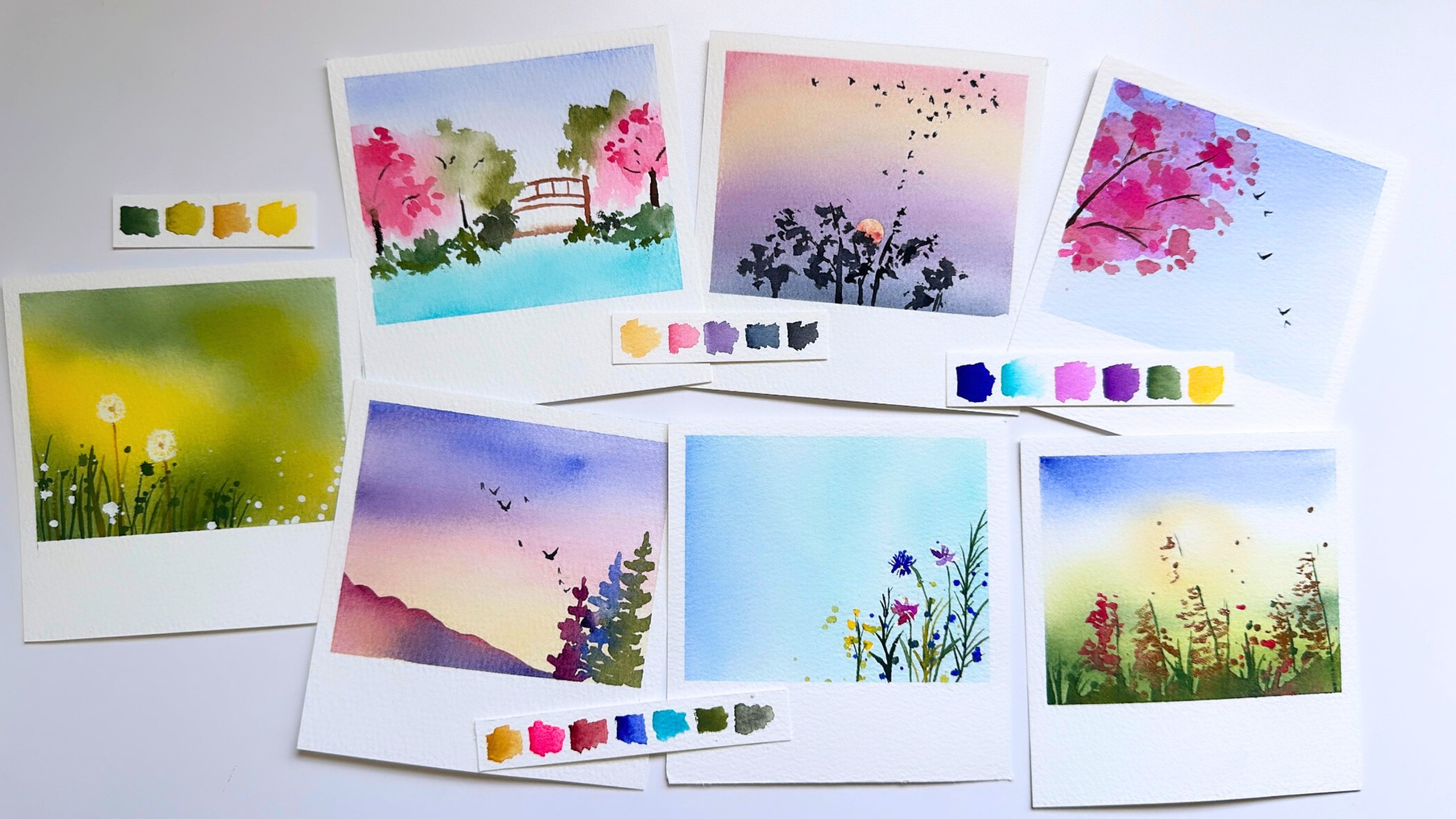
4. Examples of Simplifying: Let's look at some
reference photos together. I am going to share with you
different reference photos. And I'm going to
walk you through my thought process as
I analyze that photo, as well as show you my work having painted
from that photo. So the first thing
that we need to do is find our focal point. A focal point is an
area of interest. What do you want
your audience to see first when they
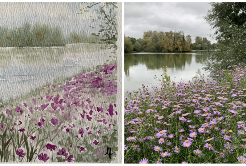
look at your painting? In this reference photo? For me, it's that really large
tree in the center. Now that I've picked
out my focal point, I'm going to pick out
one or two more areas of interest that I
do want to capture. It's going to be the sky and the little cute fence that we see in the foreground
of the photo. Now that I've picked
out a few things that I want to highlighted in
our reference photo, I'm now going to
find things that I want to make sure
I don't get bogged down by things that
I don't feel I need to paint from
this photo for me, I'm going to drop
the foliage that you see in the very front. It's just a lot going on. And while I do want
to keep the road, I want to simplify it
so that it doesn't feel as difficult to
paint perspective wise. And while I do want
to keep the road because it feels attached
to the fence for me, I'm going to leave out all
those different patches of grass that come
before the road, a little bit after the road, a little bit after the fence. There's just a lot of grass and a lot of area in the
reference photo. And so what I want
to do is I want to simplify that
and sort of bring our elements a little bit closer to each other so that I don't get really tied down by how
deep the perspective is. And this is what I painted
from this reference photo. You'll see that I created
a really soft sky. The reference photo just has
some blue and white clouds, but I decided to bring in
more of a pastel feeling sky. My tree is right in
the center though. You could also change where you want the tree
in your landscape. There's a principle called
the Rule of Thirds, where you break down a square or rectangle into three
different quadrants. And you can choose to put the focal point on the edge or top or
bottom of a reference. I'm not going to go into depth
about the rule of thirds, but I just want
to highlight that if the reference photo
has a tree in the center, you don't always have to have
your tree be in the center. I added a few trees
to the side of the larger tree and
you'll see that I did recreate a small
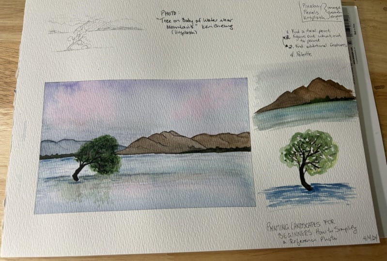
patch of grass in the foreground just to allude to there being more foliage. Here is our second
reference photo. In our last reference photo, I mentioned that finding a focal point should
be your first step. The beauty of painting from
a reference photo is that the photo might have a
very obvious focal point, but you could actually
choose something entirely different in that
photo to be your focal point. So in this reference photo, I feel like that
larger green tree on the bottom is likely the
focal point for this photo. But when I was thinking
about painting it, I actually wanted my focal point to be the mountains
in the background. I feel like in the
reference photo, the mountains are
sort of further back. And not necessarily
the highlighted item, but that's what I
wanted to highlight. When I painted it. I ended up making my mountains
much more prominent. I did keep the two
trees in my painting, and then I used very loose
brush strokes to signify the trees further back from the larger two in the lower
half of our painting. So how did I
simplify this photo? There are a lot of elements in this photo and as beginner, it could be a little overwhelming figuring
out what not to paint. I took out that stairway that you see to the
right of the trees, as well as the brook or river that we kind of see on
the left hand side. By taking out some
of those elements, I was able to highlight the
mountains and the trees. And instead of having a
really busy painting, I feel like my painting
is simple yet powerful. Sometimes when you're looking
at a reference photo, there might not be so
much going on that you have to pick what to
paint and what not to paint. This reference photo
is an example of that, where I painted pretty much everything in the
reference photo, but I simplified
it in other ways. In this reference photo, we have the lavender fields. We have the mountains
in the background and a really soft
and bright sky. Even though I paint
all of those elements, I was still able to
simplify this photo. The way that I did
the simplifying is I want you to look at
the reference photo and see the individual lavender
stalks in each lavender bush. And instead of painting every single little stalk of lavender that we see in
the reference photo, I used broad brushstrokes and mixed different
colors to sort of signify those actual
lavender bushes without having to
paint it exactly. And this is something I
love about water color. You can simply use color and mixtures of color to
communicate painting an object. Sometimes simplifying
a reference photo is simplifying an actual element
of that reference photo. So for example, using just
up and down brush strokes or little circular motions
is a way that I can paint trees or flowers
or bushes, for example. You might have a photo with
a house And instead of painting all the different
intricacies of a house, you could just use a flat brush and make a few brush marks. And those few brush
marks signify the house. Simplifying in this way is
a way to prevent yourself by feeling overwhelmed with the tediousness of painting things that are very intricate. Because I kept my lavender
fields so simple, I was able to drop in some metallic sparkle
accents in the rows between the lavender fields and even at the very tops of the mountains
that are being sun kissed. When you simplify a
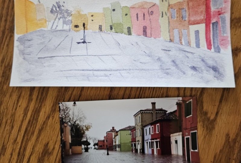
photo because you're not hindered or overwhelmed with all these different elements, it actually gives you room to add fun things like highlights. Let's move on now. This reference photo is
the perfect example of a really intimidating and somewhat overwhelming
reference photo. This was a really difficult
photo for me because there was just so many things
going on in the photo. Honestly, I was
overwhelmed looking at it and really unsure if I
could even paint it. But let's go back
to our formula. Let's first find
the focal point. So while there are many things in this photo that
could be a focal point, I chose mine to be the person on the little boat and the one that has the paddle to
move the boat around. There are people sitting in the boat that I
chose to leave out. I also knew that I wanted
my river to stand out. In the reference
photo, the water is sort of a muted bluish green. But I chose a really bright
turquoise to further highlight the boat and the person on the
boat, on the river. Now that I decided what I
wanted my focal point to be, how did I go about eliminating
what not to paint? I decided to do something similar to the last
reference photo, where instead of painting every single lavender stock
that we saw in the photo, I decided I wasn't going to
paint every window panel, window bar, and facet of all the buildings to the right and the
left of the river. I simplified it down to color. I looked at the different
colors of the buildings. I took that color and
I used the color to create that illusion of
buildings and windows. I actually used really
simple back and forth brushstrokes to give
those buildings structure in my painting. I let my brush strokes
bleed into one another instead of having it
be very specific, separate angles of the apartment buildings
or the buildings. And this was my way
of communicating to the audience that
there was a lot going on to the sides of the person on the boat
on the river without getting super weighed down by all the details
that it would have taken to paint those buildings. And as a result, you get the illusion that
there are buildings, but your eyes are directed to the middle of
the painting where I want your eyes to go on the
little person on the boat. And that's how I simplified
this reference photo. This is going to be our last
example for this lesson. This is actually a photo
that I painted recently. I saw it and immediately
was taken back. It was just so breathtaking
and it had so many of the colors that I really enjoy painting with When I saw it, I knew that I wanted to keep
the brightness of the sky. I also really loved the
contrasting blue mountains. So I would say the mountains and the sky are going to
be my focal points. I intentionally
contrasted the colors of the sky with the mountains to
create more of an interest. How did I simplify this photo? I reduced the
intricate mountains to just a few breast strokes. I allowed the dark
blue indigo that I used for my mountains to sort of bleed out into a softer,
lighter blue color. And the biggest
simplification of this photo, and what I chose
not to paint was I didn't paint each
individual tree. And I'm sure by
now you've noticed that I'm not a huge
fan of painting. Trees, trees are a huge
part of landscapes, but it's not something that
I enjoy tediously painting. So instead, I used up and down brush strokes to communicate the breadth of
trees that we have, sort of below the mountains. That way you still get
the feeling of trees. But you aren't left with painting each and
every single one. In addition to
simplifying the trees, I also chose to completely omit the rocks that we
see in the foreground. What I ended up painting, I feel captures the
essence of this photo. It highlights why this
photo is beautiful. It brings your eyes to that
sky and to that mountain. You're left with a very
powerful painting. The next lesson is going to be all about finding the
color of your voice.
5. How to Adapt Your Color Palette: In this lesson, we're
going to talk about what it means to find the
color of your voice, Or more specifically, how
to find your color palette. I love talking about color. I don't paint nature
in a traditional way. I use purples and pinks to
paint mountains and trees. I get asked often how I adapt my color palette
to my reference photo. The good news is,
it's actually fairly easy while I respect
the train of thought that a lot of
beginner artists get when asked about color and what colors or
paints they should buy. Most of us have
heard the thought, you should pick a
cool and warm yellow, blue and red, all
the primary colors. And then from there, go on to mix any color
that you could dream of. I personally found
that advice as a beginner artist extremely
frustrating and discouraging. Actually the reason is
because it actually doesn't encourage a beginner
artist to explore color. It's considered a
limited color palette. And I'm not saying that those
six colors are limiting, but it is just a limited
range of colors. While it's possible to create very pretty greens and
purples and whatnot colors, honestly not the most fun
way to approach color. What's easy with that train
of thought is because colors and because
primary colors can oftentimes have one or
two or many undertones, it can be really easy
to get muddy colors. As an artist, you know, there's so many different
blues and reds and yellows, it's hard to narrow down on the one that might provide you the greatest
breadth of color. While I respect that
train of thought and I can understand
why it is recommended, that's not what I'm
going to tell you to do. My advice, if you haven't purchased an
extensive color palette yet, is to actually go find paints in the realm
of handmade paints. A lot of times brand name paints will have paint ranges that are, most of the time,
single pigment colors. Single pigment
colors, as a result, don't have a very wide
breadth of color. For example, there
aren't a lot of pinks in single pigment colors, because pink is actually usually a mixture
of red and white. And same with purple. Purple is a mixture
of red and blue. As a result, handmade paints are actually half pans or tube paints of
already mixed colors. As a result, there are so many more colors for
you to choose from. For me, when I started
looking into paints, handmade paints
specifically, that's when the door to color really
opened up in my mind. For me, I was then exposed to so many different shades
of pinks and purples and greens and even blues and
reds and yellows and oranges. So many. There's literally no limit on all the different colors
that you can find in handmade paint maker brands. Handmade paint makers are already doing some of
the mixing for you. As a result, there are limitless possibilities
to what can be mixed. I think being able to
see the breadth of color available to you is just
inspiring in and of itself. My biggest advice, the most important principle when it comes to
finding the color of your voice is to find and choose the colors that
make you feel something. The colors that call to you
Art is all about emotion. Color is all about emotion. Colors make you feel things. That's one of the
purposes of color. My advice is to not limit yourself to what
colors you can use, to what colors you
can paint with. There is no limit when
it comes to color. If you're feeling
overwhelmed and you're not sure what to pick and there's
so many possibilities, pick what makes you
feel something. Pick what makes you feel
wow, That's beautiful. Not every single color
you get is going to end up wowing you
to the same extent. But this mentality of
finding colors that make you feel
something is something I really wish I knew
when I started painting, before anyone comes
to critique me and correct me that pink
is not actually a color. I'm here to tell
you that there are dozens and dozens
of shades of pinks, purples, blues, yellows, every
single color imaginable. Not only is there color,
there is granulation, which is a phenomenon
with paints where some of the heavier
particles separate out. When you paint them out, this is specifically
in water color. The granulation creates like
a grainy texture with color. It's like color within color. It's the color doing
something separating, creating something that you
can't even truly control. I think in those moments when the tools that
we're using create such inspiration and emotion in us that I think is
when your voice, your color is going to come out. My guess is there's
going to be colors that speak to you
and call to you. And I encourage you to
let those colors out. Let them on your paper, play with them, paint with them, create magic with them. There is really no
limit with color. In the next lesson, I'm going to share with
you reference photos, similarly like we did to the
examples in simplifying. I'm going to show
you reference photos and examples of how I adapted my color palette
to the reference photo. I will see you there.
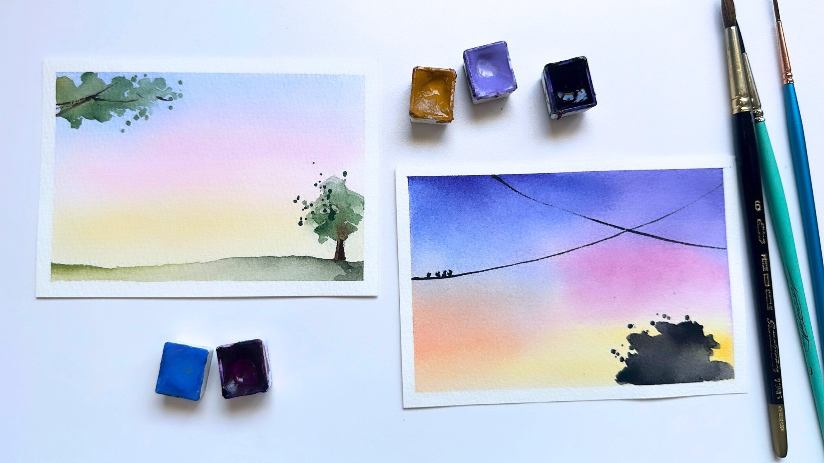
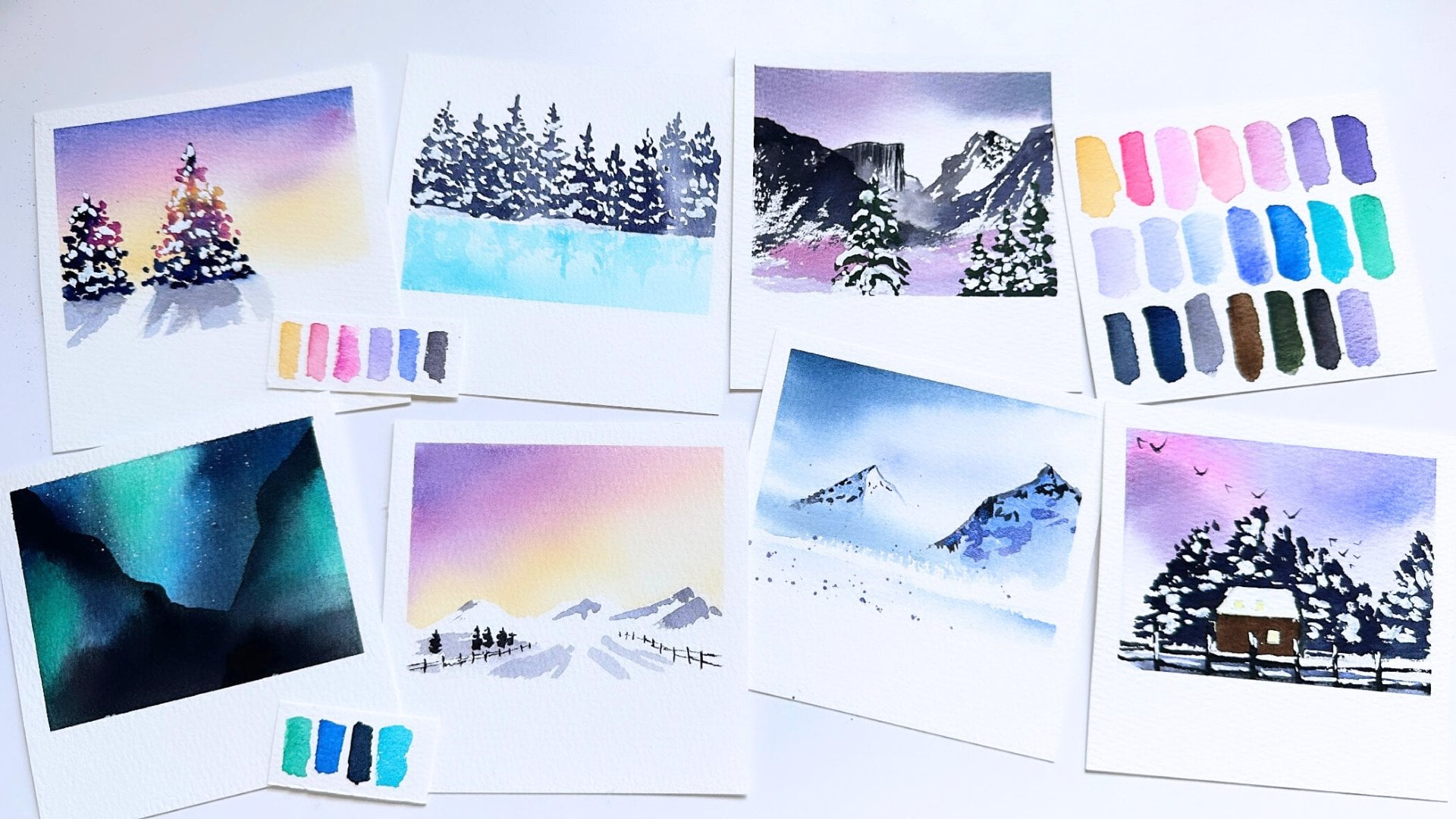
6. Examples of Color Adaption: Let's look at some
reference photos. I loved the glow of
this reference photo, but it was a little bit tricky because there was
a lot going on. Perspective wise, I knew I
wanted to capture the glow in the sky and how it touched those mountains
in the background, kind of highlighting them. And I love how the color
sort of cascades down to the ocean and even the sand that we see closest
to the viewer. I don't always love
the color orange. I sometimes find it to
be a little bit strong. And I personally like when colors have a sort
of softer pestel feel. So I decided to go
with yellow instead of orange for the color in the sky. And then instead of using a black or gray that you see
in the reference photo, I decided to go
with a warm blue. A darker blue though, so that it could help create
that moodiness for me. And instead of using
orange and brown and black for the trees that we
kind of see on the horizon, I ended up going with
pink and purple. The pink lends itself
to a softness that I am after and I carry that softness down into the
water and onto the sand. If you're going to
pick a color that you want to replace, a darker color, you want a color
that is going to be able to build up
to a dark color. Even though I didn't
use black or gray, I used a dark blue that
when very concentrated, does create a dark color. There are colors in the handmade
paint realm that because sometimes it can
be difficult for watercolor artists
in the beginning to know how to get
a color light, You actually have to dilute
a color to get it lighter, oftentimes diluting
it with water. But because that whole
diluting process can be a little bit
confusing for beginners, there are paints in the
handmade realm that are just very muted
and very light. And no matter how much paint that you get and you
put it on paper, it's not going to make that
particular color very dark. That's just something
to be aware of. You want to find colors that
are buildable in the sense that you can get a
light color and you can also very concentrated, get a dark color too. And something that
isn't necessarily in the single pigment realm
is this whole window, or this whole world
of metallic paints. Shiny paints, shimmery
paints, sparkly paints. I love painting with sparkle. I love using sparkle
to highlight things, to draw your eye towards what I want
your eyes to focus on. You see the shimmer that I use
in the water, in the sand. That's something that's
amazing about color. Quite honestly, my painting looks really different
than the reference photo. It's because I chose the
colors that I wanted to use. In that way, I made this
reference photo mine. I made this painting mine, and it has a stamp of my voice. When someone looks
at these colors, looks at this painting, the I have often thought, oh, this looks like Madeline. That's what I want you
to be able to find. I want you to be able to find your voice in the
colors that you choose. This was a really fun
photo that I painted, and I was able to take a really unique
colorful twist on it. I knew I wanted to
paint a purple ocean. When I was looking through
the reference photos, I wasn't exactly looking for a photo that already
had purple in it. I was I was going to
take any reference photo and use the colors that I wanted to in the
reference photo. I really like that sun
shining through the water, ripples, water waves at
the top of the photo, I knew I wanted to
capture the light. I also did want to capture the silhouette
of the coral reef. If you look at the
reference photo, the coral reef is
quite intricate. I knew I didn't want to paint the coral reef the
colors in the reference photo. And I didn't want my coral reef to feel cumbersome either. Instead, I used a silhouette. I picked pinks and purples, and I made the coral
reef a silhouette. This was my end result. This honestly goes
to show that you can paint any reference photo or any thing that you see in nature any way you want with any
colors that you want. After picking the elements of the photo that I knew I wanted, I simplified it by not
getting tied down or bogged down by all the details that we see in the
reference photo. I've painted this reference
photo a few times, each time with different colors. I really love how simple this
reference photo is already. I kept the colors really simple. I went with yellow for the sun and then I went with pinks and purples for the rest
of the landscape. By now, I'm sure you'll
recognize that there are colors that I
use more often, and it's because I enjoy
painting with them. This is probably
similar or as close to a monochromatic painting as I get with the examples
in this lesson. A monochromatic painting
means you choose one color and you paint the entire
painting in that color. Like I mentioned earlier, if you are picking a color to represent darker
parts of the reference photo, you want to make sure that
that color has a range. This isn't quite monochromatic because I actually use
three colors here. But you could go monochromatic. And it's simple enough that you're able to
explore color wise, how you would want this
reference to look. When painting with fewer colors, it's important to have that
range in depth and darkness. This is a very beautiful
reference photo that did have a foreground that felt really
intimidating to me. The trail that you see
in the foreground had a lot of layers and a lot
of perspective going on. I knew that I wanted
to simplify that. I kept the sky yellow and I
went with pinks and purples. One of the best ways to
communicate depth and perspective in water color
with color is light and dark. Things that are further away from the viewer are
going to be lighter, and things that are closer to the viewer are actually
going to be darker. I captured the mountain
in the background that we just have a silhouette of with the lightest
tone of pink. Then as I started painting and working my way towards
closer to the viewer, I gradually darkened and chose
colors that were darker. That is a way to
create perspective without even having to paint
things smaller or larger. You, by virtue of color, are able to communicate
that distance. Again, something that
I really like to do with my sparkly
metallic paints is to use that sparkle
to communicate sunlight hitting it
and creating a glow. You see actually some
of the birds as well as the tips of some of the foliage that I
painted in the midground, having that very faint but
accented sparkle to me, that is just a beautiful way to communicate sunlight
and brightness. This is going to be the
last photo for this lesson. As I've mentioned before, sometimes simplifying
a reference photo is only painting and picking out a few parts of
that reference photo. But sometimes it could look like our reference photo
today is this big. You see this tiny little
plant in the middle, and then you see this vast
background of water ripples. For me, I painted
just the tiny center, the little tiny plant, and just the ripples
right around it. Instead of painting the vastness of all the water ripples
in the reference photo, I just painted a little
bit and I gave it a sky. So not only can you pick and choose what you want to paint, you can also add elements
that aren't already there. And for me, it was a pink sky as a backdrop to the little
plant and the water ripples. I kept the plant green, but I went with a darker green. I wanted that plant to
contrast the water around it. I used a dark blue
and a dark purple to create the depth at the
bottom of the landscape. Really, the most important
part of this lesson is just making sure
that you have the range that you need to
create the depth that you want to communicate
in your painting. If you have the range, there's really no limit to
the color that you use.
7. Your Class Project: The class project for this
class is very simple. I have included all the reference
photos that I shared in this class as PDF
downloads for you, available to you in the projects and resources tab of this class. Feel free to download any reference photo
that I've shared. I would love to see
your take on it. I want to see how
you simplified it, What colors you felt called to use in the description
of the photos. I'd love to hear
what you learned. You don't even need to use
the references that I used. You could paint from an entirely different
reference of your own. If you don't want
to share what you learn and you just
want to simply upload the reference photo
that you used in the photo that you painted.
I'd love to see that. Also, if you enjoyed this class, I would love to hear
your feedback either as a discussion post or
as a class review. Class reviews are really great for helping my
classes get traction. If you enjoyed the class, I would love to hear
what you liked about it. Most of all, I hope that you
go on to paint many photos. I hope the things that
I've taught you today have been freeing or
liberating in some way. And I cannot wait for you to
find your artistic voice.
 Madeline Kerrii, Watercolor Artist