Transcripts
1. Introduction: Hi, planning, sleep. And I'm a digital fantasy
artist from Denmark. In my art, I tend to betray
mermaids and Evan characters in fairy tales settings all illustrated in
Procreate on my iPad. They all have one thing
in common though. None of them exist. So therefore, I often find myself having to
draw inspiration from multiple
sources in order to create the characters and
settings that I want. The art of drawing inspiration
from multiple sources is something that many people
can use in the art process, in many different art styles. So in this class, I'm going
to show you how I combine references to create
something brand new in my preferred
fantasy style. I'll be giving concrete
pointers to follow along on the way to prepare you
for creating your own pace. If you're looking
for more procreate or digital art classes. I have a variety on my page
on painting portraits, mixing colors, and even
landscapes to name a few. So when you're ready, get out your iPad file, procreate, and
let's get started.
2. Finding References: Depending on what
sort of audio making, you can find references from
many different sources. Since I wanted to give you guys my references
for this project, I made sure that they will
all free for commercial use. I tend to use sites like
Pixabay and Unsplash. However, if you're
doing personal work, you can find inspiration
on sites like Pinterest. When you have your images, I
find it useful to gather it all in a little mood board to really set the
tone for the art. Sometimes I include
color samples to know what's our palette
I want to go for. If I have many elements
in the painting, I can have a large amount
of different references. If you're new to using more
than one reference though, you can start by
just using a couple, unlike indicates for
this project three, and gradually add more intricate details
into your pieces. And therefore using
more references. When choosing what images
to draw inspiration from, I find it useful to
browse around until you have a pretty good idea of
what you want to paint. In this case, I knew I
wanted to paint a mermaid. So I looked for a beach photo of a woman in a post that could
translate well to a mermaid. Whatever gaps you have between your references and the
painting you want to do is something you have
to fill out with a mixture of knowledge
and imagination. So when you're
first starting out, I recommend finding images that are as close to what
you want to paint as possible to make it as easy as possible
to put together. I prefer the look
of very flowy fins like those of a better fish. So find a reference
of one of those that give a good idea how the
Finns could follow them. And finally, I was very inspired
by the speed sunset with such vibrant colors
in contrast to the dark and wanted to have
that as my background. Their references are used will be in the resource section, so you can download
them for yourself. I'll also be including my
favorite blending brush and the sketch
from this project. So you can play around
with it yourself. Now, let's get started
on that sketch.
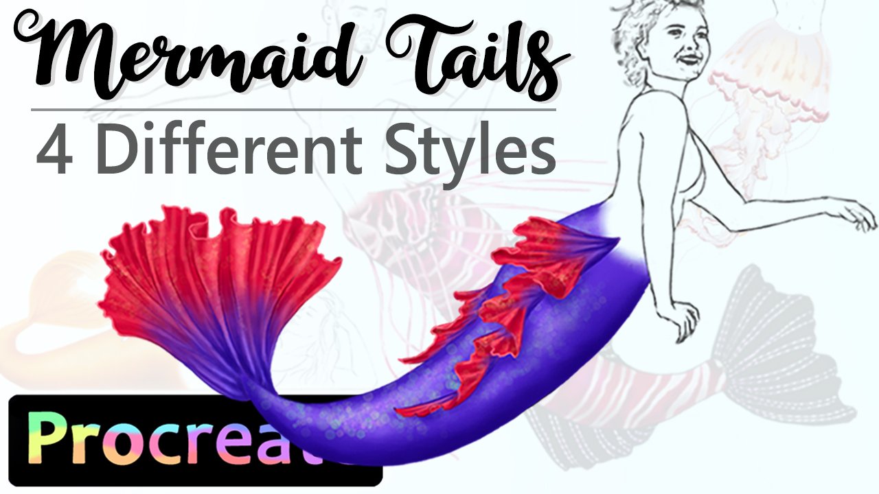
3. Sketching: For the sketching section, we'll be going over three points being getting down the basic component
for each reference, using imagination to fill in the blanks and making adjustments to make
it all come together. I always start by getting the
other basic component from each reference so I can see whatever gaps I need to
figure out afterwards. Since a mermaid is
the focal point in the foreground,
that's where it started. Most of my art features
some sort of character. So always look for
reference to help me get the look I want
for that character. I usually give all my
characters pointed ears, since it helps with the fantasy
feeling I like to go for. I also spent a good amount of time on the features
of the face, since I wanted the
perspective to be right. And in the end, I
want the face to be the most rendered part
of the finished art. This reference is very good for mermaid since it's
a beach photos, so the model is wearing
beach appropriate attire. This translates well to mermaid, since we often depict
them with some sort of top like a classic
seashell profits. Now, it also makes it easy to see the
proportions of the body, which is helpful since it leaves less up to
the imagination. I do have to pay
attention to the left, since the back leg won't translate to a tail and
will have to be adjusted. Next, we need to apply
some imagination. When it comes to the tail fin, I used a picture
of a better fish since I liked the look
of the flow events. Using this for reference, I rotated the image to best
fit the angle I needed for the field and then use my imagination to get
it to look right. A lot of it also comes down
to personal preference, since we are in the
realm of fantasy here. But having the reference as
a base can still be crucial. You also have to
envision how I feel like this might
look in movement. And in my mind, she's
flappy the end of hotel, making the FIN flag that way. For the background,
I already put down some basic lines for
the horizon and such. Since it all really comes
down to the colors. Then we can move to
the final point, adjusting it all
to fit together. This is sort of an extension
of the prior point, but we're looking at how
everything comes together overall and not just the
individual elements. Now, for instance,
the bad leg of the model now has to be adjusted since the moment
it looks too narrow, if it's only the
width of one leg. I played around with it
until it looks right to me. But as mentioned before, it's easiest to have a reference that is as close to what
you want as possible. Alternatively, you could sit
down in the same position and take a picture to see
the width. For guidance. In general, you can take
many references yourself. If you can find something
suitable for the mermaid top, I went with fins as it's what I usually do
for my mermaids, but you can do
whatever you like. That concludes the basic sketch. So let's recap. Get
the basic sketch down according to
each reference. Use your imagination
to fill in the blanks. Make adjustments to make
it all fit together. So now we can move on to colors.
4. Background and Color Scheme: For the background, we
have two points to cover. Firstly, we need to get the basic colors of
the background down. Since the background
color scheme affects the character and not
the other way round. This way, we can also
adjust the values of the picture as a whole
better along the way. Then if we left part blank. You can work in as many
layers if you want. I tend to add a new layer
whenever I'm unsure of something because then it's easier to adjust
said layer later. It also makes it easier to
keep separate layer for elements like the sky versus
the ocean in this case. So we only have to
focus on one at a time. I went for a painterly look, focusing mainly on the
corners to set the scene. Our second for this section, being mindful of the character feeling grounded in the scene. This is of course,
something to be mindful of later in
the process too, but it will benefit you
to think of it already. In this case, it means
that we make sure it makes sense for our mermaid to be
sitting where she isn't seen. Here I added in the rack
that the model sits on in the reference
to the foreground. And later I bridged the gap further by adding more
rocks to the background. Let's recap the section. Get down the basic colors
in the background first. Since the background
affects the character, be mindful of the
character feeling grounded in the scene so they
don't look out of place.
5. Shading Character and Light Source: Now let's talk shading
and light source. Both are set by the background, which is why we got
that down first. Now we can choose a base
tone that worked with this lighting and color
scheme of the background. If the character doesn't fit
with the same color wise, it looks really out of place. So this is an important point. A little tip is to keep the character on its
own separate layer, because we can then go into
adjustments and tweak the hue to find the color that fits
the setting the best wants. The basic shape of
the moment is bound. I use clipping masks
on top of that stay within the shape when filling
in the tail and fence. Those can also be adjusted. Hawaii's ensuring that
everything fits together. Next point is thinking
about the light source. This is important
in order to get the whole artwork to look
cohesive. In the reference. The model is lit naturally from above and
slightly to the right, leaving most of the
shadows on her left side. This fits okay with
our background, since the sunset is
to divide it and I made it is in the
background though, which means that
the light should be coming more from
the back and above. Figuring out sort of
things can be tricky, but does get easier
with experience. Like I said previously,
finding the reference best suited for your concept
makes it easier. So if you can find
a reference with the right lighting,
by all means do. In this case, I shaded the mermaid much like
the reference at first, but then adjusted to the scene
by adding more light and glow to the right side of the mermaid to account for
the sunset behind her. Light bounces off
everything around us, even sand and rocks. So the left side of the mermaid shouldn't be left
to dark and flat. You can also have secondary
light source is out of frame. So killing a bit
of basic shapes to all areas of the character
is a good place to start. Attempt to get a feel of how the artists coming
together shading and value wise is to cover the entire canvas and paste
that on top of the layers. Then go into adjustments and remove saturation
from this layer. That way turning it
integrated scale. Now we can see much clearer if the character look pasted on top of everything or if we need to adjust
the shading so more. The final part of
this section you may already have
guessed is to keep all the elements
on separate layers and clipping masks procreate. And digital art in general
gives us so much freedom for playing around and the option of changing things along the way. Opposite to traditional art, where things are
much more permanent. As many or as few
layers as you want, depending on your process. But keeping many is
a good thing when experimenting with fantasy
settings like this. I go back and forth between
the different layers, adding more shading
and highlights. And you can still have
returned to the base layer of the Mermaid and tweak a whole skin tone should you want to. You can also go into
the shading layers and go into adjustments to darken or 19 them over all without having to
completely rework them. So layers is a great
tool to play around and work your way to getting the odd looking how
you envisioned it. You shouldn't be scared
to undo things are race as it can be a trial and error approach to getting the
result you're looking for. Even if you aren't actually completely sure what it
is you're looking for. It's okay to figure
things out along the way too and see where the
process takes you. And seeing things
visually often makes it much easier to figure out when
things looks right or not. And your personal
style also comes into play when deciding when
something looks right. So let's recap. Choose bass tones that
works with the background. Think of light sources to get
a coherent lighting scheme. The whole canvas to
grayscale to see values compared to each other. Keep separate layers so colours and shading can
be changed along the way. Now, let's move on to
the finishing touches.
6. Details and Adjustments: When it comes to
finishing up artwork, it's ultimately up to you and your art style to determine when the artist actually done. For this finishing
touches section, we have three points to cover. The first is continue adjusting the different elements to each other in order to make
it all look cohesive. The longer you work on it, the further you get into
the smaller details. So keep going until you have the level of detail
that appeals to you. Thinking about bringing
tones of the background and surrounding scene
into the character. Once again, making it all look like it belongs
in the scene. I use some additional
layers with different blend modes to
make this a little easier. It's also a risk-free
way to play around since these layers can just be deleted if they doesn't
add anything in the end. I added some of the Blue
Ocean tones to the shadows and some pinks and orange from the sun's reflection
to the highlights. This all brings more
life to the character. The final point is to add any personal touches
you think is missing. To emphasize the magical
and whimsical field, I used a procreate standard
brush that illuminates in small bubble shapes to bring some subtle color
to the foreground. Like most things,
this is optional, but we'll make fantasy art. I really like adding
a bit of whimsy. Let's recap the section. Continue adjusting the
elements to fit together. Bring tones or texture of the background into
the character. At personal touches.
If you want.
7. Final Thoughts and Class project: Here we have the
finished artwork made following the points
we've covered in this class. So now it's your turn. The class project
for today is to paint your own
fantasy art piece, drawing inspiration from
multiple references and falling the points
given through this class. If you want to work with
the three references are used for this demonstration. I'll leave them in
the resource section for you along with this sketch, should you want to
play around with it. Thank you so much for
taking this class. I hope it's given
you some good advice on how to make unique output, drawing inspiration
from multiple sources. I also have other Procreate
classes on my page, like painting what traits? Mixing colors and painting skin. So have a look in that
tickles your fancy. You can also see more of my
personal ad on my Instagram. This is my red bulb is sharp. So have fun creating
and bye for now.
 Celine D., Digital Fantasy Artist